Skating Above It All

IB1

Is that a girl or a boy skating there?

Ken Parille, in a recent analysis of this Ivan Brunetti cover at tcj.com argues that it’s a girl, and, partially on the strength of that gendering, places the cover in a tradition of sentimental art.

With eyes closed, her face wears a contented expression. While traditional sentimentality sees a woman’s value as defined by her relationship to others (as wife, mother, daughter, etc.), Brunetti’s cover celebrates female solitude and introspection — a romance with the self.

When I initially saw the cover, though, I saw the figure as a boy — and the gender switch arguably changes the genre. As Parille notes, the person here may be engaged in contemplation, but she (or he) also seems to be violating the rules; he’s jumped the fence and is now skating on a chunk of ice where there’s some danger he’ll fall in. Seeing her as a her, Parille ends up underlining the ominous threat; “Her rebellious actions are admirable, even inspirational, but a little reckless. Perhaps she should open her eyes.” But is she’s a he, you might switch that about — it seems a little reckless, but even so, inspirational and admirable. She isn’t a girl in need of saving; he’s Tom Sawyer on an escapade. The figure isolated against the city isn’t inward turned and contemplative, but serenely pleased with his daring. The New Yorker readers get to identify with that lone figure, impishly crossing boundaries and frolicking where one should not frolic. The three drops falling from the title, which Parille reads as tears, might perhaps be seen as bright stars, confetti — a small tribute to the daring youth, and the viewer who dares with him (at least intellectually, in the way of New Yorker readers.)

Parille is probably right about the gender, as far as the artist’s intentionality goes (I get the sense that he’s probably spoken to Brunetti about it.) But of course no one can be right about the gender in an absolute sense; images don’t have gender really; a drawing has no genitals; even if you draw genitals, they’re just lines on paper. The gender is a convention, and part of that convention is genre — in the sense that the genre you see has gendered implications, and vice versa.

Though at the same time, I do wonder — are the genres all that different? Girls’ sentiment and boy’s adventure seem less like opposites, here, and more like a different way of looking at the same image; a gestalt shift. Is he mildly mournful beneath a sorrowful moon? Is she impishly pleased with herself under cover of darkness? Will they fall into their lovers’ arms, or answer the Bat signal? Which melodrama do you choose? Or will you stay, poised and refined above it all, avoiding those damply gauche pulp pleasures by skating upon a thin surface of ambiguity? Male or female, our iconic representative floats upon self-conscious, ostentatious whimsy, the genre of genius.

MegaReview

Optic Nerve #13 by Adrian Tomine (Drawn & Quarterly)

In his previous issue of Optic Nerve, Tomine seemed to be playing around with stylistic tics borrowed from Frank King and Dan Clowes. In the main story of the current issue, “Go Owls,” Tomine does some very assured drawing and storytelling in a naturalistic mode that in this case is a little reminiscent of Jaime Hernandez. But there is no doubt, he is his own man and he is getting better all the time. Here the artist breaks significantly away from his previous stories that dealt more with educated young urbanites to depict the relationship beween a Middle-American, more proletariat couple who meet in a recovery program. Reading it, I felt as if I knew them.

Tomine

The guy is an asshole, but Tomine manages to show that without hammering the point; he enables his story to unfold in a quite believable manner and elicit sympathy where he wants it directed with subtlety. The use of varying colors in a very limited palette throughout works nicely and is balanced by the exquisite control shown in the full color story in the back of the book, which also displays the high level of skill and delicacy that Tomine is growing into with his art.

_____________________________________________________________

The Daniel Clowes Reader, edited by Ken Parille (Fantagraphics)

This fascinating collection of some of Clowes’ best works is published in the form of a teaching guide, copiously annotated to the nearly absurd degree of including subglossaries defining miniscule details hidden in the author’s panels. In this way, editor Ken Parille begins to resemble Kinbote, the deranged poetry afficianado from Vladimir Nabokov’s Pale Fire, whose notes that introduce and permeate the posthumous edition of his idol/victim’s supposed masterwork begin to entirely supplant the work that they are supposed to supplement. It caused me to Google Parille to try to find out if he is real, or if he is an alter ego of Clowes himself. But, Parille apparently exists in his own right and while I might have chosen a few different stories if I had assembled this book, much of it is admittedly essential and well-served by the package.

Clowes

The collection includes the entirety of Ghost World, such seminal stories as “Like a Weed, Joe” along with relevant essays and commentary by sundry credible sources, plus Clowes’ excellent polemical pamphlet Modern Cartoonist and another of my favorite pieces of his, reprinted for the first time from Zadie Smith’s groundbreaking 2007 comics/prose anthology The Book of Other People: the brilliant color short “Justin M. Damiano,” a classic that needs to be read by anyone who writes criticism on the internet.

_____________________________________________________________

TEOTFW (The End of the Fucking World) by Charles Forsman (Fantagraphics)

Forsman’s epic minicomics series is collected into a small, thick trade paperback that I’d prefer was fully titled on the cover, rather than intialized as it is. The story resembles the real-life 1958 murder spree by Charlie Starkweather and Caril Ann Fugate, but transposed to modern times and with the gender balance in terms of sociopathy debatably reversed. Forsman’s pair of nihilists are shown to be the results of terrible parenting and are so estranged from human society that they have difficulty feeling emotions and pursuing a viable relationship together, much less to recognise when other people are not psychopaths.

Forsman

Forsman, a graduate of Vermont’s Center for Cartoon Studies, has a solid grasp of comics storytelling and his lightly drawn page compositions display an intriguing degree of variety. I’d imagine that this would have read in a much more disconnected way in serialized, episodic form; collected, the book reads smoothly and quickly.

_____________________________________________________________

Avery Fatbottom by Jen Vaughn (Monkeybrain)

To my mind, a good thing is that so many of the young cartoonists now emerging reject the contrived plasticity of technique and assembly-line methodology that defines contemporary mainstream comics to instead employ an auteuristic, handmade aesthetic in their work. This can be seen in the work of the cartoonists coming out of comics-oriented schools like that of the Center for Cartoon Studies. Another alumni of that program is Vaughn, who displays a breezy, humorous delivery for her comic Avery Fatbottom, a story of young renaissance fairgoers, which is expressively drawn with loose, appealing brushwork, handlettering and organic watercolor halftones.

Vaughn

Vaughn’s romantic sensibility does not take itself overly seriously and so, her evident pleasure in making her comics has an infectious quality. As with the works of Forsman, these efforts cause those who read them to also want to do their own comics, which is pretty much how I got into this game myself.

_____________________________________________________________

The Outliers by Erik T. Johnson (Alternative)

This comic, the first of a series which apparently is the result of a successful Kickstarter campaign (a large group of contributors are thanked in descending order of generosity inside), has some elaborate production values. It is a small square-bound “floppy” that is printed in two colors, including blue and a sort of lime green that gives it the look of a tract.

Johnson

The cover is comprised of sketches of alien-appearing creatures surrounded by squiggly lines and printed with silver ink on black paper, but one doesn’t notice this immediately because it is wrapped in a somewhat undersized full-color dustjacket. The story within has a sort of adolescent breathlessness and the art is brushy and dense while also suitably organic and (mostly) handlettered, as befitting a semi-underground coming-of-age fantasy comic featuring a Bigfootish monster.

_____________________________________________________________

Failure by Karl Stevens (Alternative)

Production values also dominate this handsome but ultimately frustrating trade paperback collection of panels from the author’s weekly strip in the now-defunct Boston Phoenix. Stevens’ clearly evident rendering abilities hark back to those of the engravers of yesteryear, but his photorealism makes me think of nothing so much as an alt/lit Alex Ross.

Stevens

After admiring the impressively labor-intensive application of crosshatched tonalities and watercolors, I wished that there was a bit more connective tissue to the semi-autobiographical bones and meat of the book than the most prominent theme of drunkenness.

_____________________________________________________________

Linen Ovens by Keren Katz/Molly Brooks/Andrea Tsurumi/Alexander Rothman (self published)

My favorite of the works I got at Brooklyn’s Grand Comics Festival, this is an anthology that takes advantage of the compatibility of poetry and comics. Poetry can be greatly enhanced by drawings which do not seek to be redundant with the accompanying words, but rather work in an oblique manner with the text, or run parallel to it.

Art by Keren Katz

Art by Keren Katz

Under Tsurumi’s striking cover, handlettering is intrinsic to these pieces; it guides the eye through the soft watercolors of Rothman, for example. Color figures most notably in the semi-abstracted panel transitions of Brooks and the unusual and effective pastel illustrations of Katz.

_____________________________________________________________

The Crow: Curare by James O’Barr and Antoine Dodé (IDW)

It feels to me like a thousand years have passed since the emergence of O’Barr’s pre-Vertigo character/property The Crow in comics and feature films, but here at this late date is a new miniseries drawn with rounded expressivity by Dodé, involving a cop’s desperate search for a child murderer, aided by the shade of one of the pathetic victims. In the two issues I read in PDF form, the title character has yet to rear his head, but the stage is certainly set in a most murky and moody manner by Dodé’s beautifully unforced storytelling.

Dode

The poignancy of the art is further facilitated by its being printed from uninked pencils which are then digitally colored with a limited palette of primarily sepia and pale blues. Of course, since this is an IDW publication, as with most mainstream comics, the lettering is digital, which tries but fails to detract from the rich personality displayed in the artwork.

_____________________________________________________________

March: Book One by John Lewis, Andrew Aydin and Nate Powell (Top Shelf)

This book is partly written by its subject, the distinguished civil rights pioneer Congressman John Lewis and since it details the early years of the struggle for desegregation in southern states by African-Americans, it justifiably boasts a back cover blurb by former President Bill Clinton. It is a story that we have heard before, but one that bears repeating in a time when a rotten cluster of power has gutted the voting rights that were so hard won.

Powell

One might have expected such a meaningful project to be published by a high-profile mainstream company such as Marvel or DC, who would presumably bring it to the widest possible audience; but instead it is the product of a smaller company known for artist-owned comics, Top Shelf. This makes it odd that the book is copyrighted only to Lewis and his co-writer/press secretary Aydin, omitting the artist who does much of the heavy lifting here, Nate Powell. Because, apart from the unquestionable historical importance of the very real experiences of Lewis, it is surely Powell’s dramatic layouts that make this narrative function as well as it does in the comics form and his lush halftones are some of the best I have seen since the glory days of Ditko and Wrightson in the Warren magazines.

_____________________________________________________________

XIII: The Irish Version by Jean Van Hamme and Jean Giraud (Cinebook)

I really looked forward to the English translation of this book because I wanted to see Giraud drawing in a contemporaneous mode—-and while I am not disappointed in his drawing and storytelling in any way, it is at the service of a somewhat standard adventure story in which the entire Irish/English conflict is boiled down to be the backdrop of the origin tale in a long-running superspy narrative that makes the artist’s Blueberry westerns seem progressive in comparison. Besides that, the art is printed in a format so reduced that it becomes difficult to read, much less show Giraud’s impeccable deep-space compositions to advantage.

Giraud

The coloring likewise suffers somewhat from a standardized approach, which drives the point home that Giraud is a much better colorist than anyone his work has been desecrated by since the peak years of Metal Hurlant. However, as he did on his final two Blueberry volumes, O.K. Corral and Dust, Giraud himself put his hand into the coloring to a limited degree to digitally “dirty up” the art, to add lighting effects and ruddier complexions, all of which go a long way to improving the look of what are, sadly, some of the last Moebius comics we shall ever see.

_____________________________________________________________

Not Best, Mostly American, Comics Non-Criticism

Hate fest is over, but hate is ever new. So I thought I’d reprint this review of Ben Schwartz’s Best American Comics Criticism which I posted at tcj.com a while back. The piece was part of a roundtable: you can see all the other pieces at the following links:

Opening contributions from Ng Suat Tong, Noah Berlatsky, Caroline Small, Jeet Heer, Brian Doherty and BACC editor Ben Schwartz; responses from Caroline Small, Ng Suat Tong, Jeet Heer, Noah Berlatsky and Ben Schwartz.

My review is below.
_____________________________

Ben Schwartz begins his introduction to Best American Comics Criticism with an anecdote: one day at a mall he heard two young girls arguing about what to call graphic novels. For Schwartz, this was a “definitive moment.” Comics used to be for nebbishy, perpetually pubescent, socially stunted man-boys — but that’s all over. Superheroes are dead, replaced by the teeming offspring of anthropomorphic Holocaust victims. Nowadays everybody from New York Times editors to real live tweens are enamored of the sequential lit. From a niche product for mouth-breathing microcephalics, comics have become our nation’s primary containment vessel for deep meaningfulness. Open them and feel your world expand.

But while comics may have generously embraced tween mall rats, the same cannot exactly be said for The Best American Comics Criticism. Schwartz’s keyboard lauds the heterogeneous appeal of comics, but his heart is still in some back alley, cheeto-smelling direct market basement, lost in a rapturous fugue of insular clusterfuckery. You’d think that if you were editing a tome focusing on comics criticism over the last 10 years, and if you further began your tome by genuflecting towards tween girls as icons of authenticity, you might possibly feel it incumbent upon you to include some passing mention of the 1,200 pound frilly panda in the room. Not Schwartz though; if he’s ever heard the word “shojo,” he’s damned if he’s going to let on. The only manga-ka who defiles these pristine pages is alt-lit analog Yoshihiro Tatsumi — and he only makes the cut because he was interviewed by that validator of all things lit-comic, Gary Groth.

The almost complete omission of manga (and the complete omission of online comics) isn’t an accident. Schwartz deliberately set out to produce a work which would appeal only to his own tediously over-represented demographic which would focus on the triumph of lit comics over the years 2000-2008.

Now, you might think that it takes a certain amount of chutzpah to title your book Best American Comics Criticism and then, deliberately collect a sampling of essays related to one particular strand of comics that happens to interest you and your in-group. You might think that in these circumstances your title seems, not like a description of the contents, but rather like a transparent marketing ploy. You might think that craven, and I would agree with you.

It’s only once you get over the fact that the book’s cover is a lie, though, that you can really start to appreciate the purity of the work’s cloistered lameness. Yes, only one female critic (Sarah Boxer) is included. Yes, Schwartz compulsively returns to the same writers again and again — three essays by Donald Phelps, two pieces by Dan Nadel, two by Jonathan Lethem, two by Dan Clowes. And yes there are not one, not two, but three interviews by Gary Groth, the book’s erstwhile publisher. But the most audacious moment of collegial nepotism is a pedestrian essay about Harold Gray by — Ben Schwartz himself! Even better, if you read the acknowledgements you learn that Schwartz wanted to include another of his own essays, but was prevented by rights conflicts. Really, it’s kind of a wonder he didn’t just put together a book of his own writings and slap that Best American title on it. After all, he’s the editor. If he thinks Ben Schwartz writes the best criticism in explored space, who’s to gainsay him? (It’s possible that Schwartz wanted to include the other essay instead of the piece he used… which means that he printed his second best as one of the top essays of the decade. If that hadn’t worked, would he have gone to his third best? His tenth? His grocery lists?)

To be fair, I’ve actually quite liked some of Schwartz’s writing over the years. A piece by him about Paris Hilton which ran in the Chicago Reader is one of my favorite things to ever run in that publication — I still remember its concluding paragraph clearly seven years later. And while using multiple essays by a handful of writers seems like a gratuitously ingrown way to structure a best-of book, if the results were provocative and enjoyable, I wouldn’t kick.

Unfortunately, the results here are… well, they’re really boring, mainly. Part of the problem is, again, the insular air of self-satisfaction. The worst in this regard is probably the Will Eisner/Frank Miller interview excerpt, in which the participants both pat themselves on the back so vigorously that they seem to be in some sort of contest to see whose arm will fracture first. In terms of abject sycophancy, though, the David Hajdu interview with Marjane Satrapi is close behind. “Like her work, Satrapi’s apartment is a mosaic of Middle Eastern and Western, high and low — a willful testament to cultural and aesthetic heterogeneity.” What is this, Marie Claire? Compared to such celebrity puff-piece drivel, the merely grating mutual admiration on display in the Jonathan Lethem/Dan Clowes interview seems positively tolerable. Sure, Lethem actually claims that what he and Clowes are doing is somehow “dangerous” while they’re both sitting on a podium in front of a herd of maddened, man-eating elephants — or are those rapturously respectful undergrads? Either way at least he doesn’t opine that Clowes’ bow tie is a sartorial sign of nostalgic doubling. You take what you can get.

When the book isn’t oozing complacency, though, it’s giving off an even worse miasma — anxiety. As any alt comics confession will tell you, the clubby smirks of the knowledgeable hobbyist hide a desperate desire to be accepted. The book is one long grovel, as if Schwartz hopes to win fame, fortune, and mainstream acceptance through sheer power of toadying. This is most visible in the egregious reliance on “name” authors. Ephemeral book introductions by John Updike, Dan Clowes and Jonathan Lethem all read like exactly what they are — celebrity endorsements. Alan Moore’s disjointed interview transcription about Steve Ditko is interesting but slight, while Seth’s essay on John Stanley seems padded out with an overdetermined breezy musing that is, I guess, supposed to be redolent of whimsical genius. “I’m sure when [Stanley] wrote these disposable comic books he could never have dreamed that, half a century later, grown adults would still be looking at them. It’s an odd world.” Or maybe it’s a clichéd world. So hard to tell the difference.

Schwartz pulls out a host of other gimmicks too — a fascimile of the court decision giving Siegel and Schuster back their rights in Superman; an Amazon comments thread about Joe Matt; a meta-cartoon by Nate Gruenwald, comprised of annotations upon a fictitious old school cartoonists “classic” strips. The first seems needless, the second is blandly predictable; the last actually has a lovely expressionist/modernist feel, though I think it probably lost a good deal in being excerpted. All of them, though, seem to come from the same place of nervous desperation. “I know no one here really wants to read criticism,” Schwartz seems to be saying. “So, um… here! Look! Bunnies!”

Schwartz does seem to prefer bunnies to criticism — perhaps because he has only the vaguest idea of what criticism is, or of why anyone would be interested in it. Specifically, for a critic and a supposed connoisseur of criticism, he seems to have a marked aversion to anything that might be considered an idea. Most of the pieces in the book say little or less than little. John Hodgman’s essays, for example, tells us that Jack Kirby thought of his Fourth World series as a long completed work… and now folks like Brian K. Vaughn also think of their series as long completed work, and ain’t that something? Rick Moody says Epileptic shows “this relatively new form can be as graceful as its august literary forbearers.” R. C. Harvey assures us that Fun Home is “Serious literature for mature readers for whom sex is only part of adulthood;” Jeet Heer insists that “Whatever he might have drawn from his personal memories, the emotions that Frank King explored are universal;” Donald Phelps emits his usual fog of avuncular gush; Paul Gravett bounces up and down in the backseat while chattering on about how “lots of people, writers, artists, editors and readers, are in this for the long haul, for however long it takes for the graphic novel to achieve its possibilities.” This is knee-jerk boosterism, platitudinous bunk intended to sell me crap, not to make me think. For Schwartz, it seems, the best criticism is marketing copy. Maybe he should edit an anthology of beer commercials.

There are some enjoyable pieces. In his review of comics commemorating 9/11, R. Fiore sounds like the ignorant blowhard at the end of the bar (Terrorism doesn’t work, Robert? Really? The KKK will be surprised to hear that Jim Crow never happened then.) But at least he has some personality and something to say, no matter how asinine. Sarah Boxer’s essay about race in Krazy Kat has moments of interpretive élan. Ken Parille’s dissection of Dan Clowes’ David Boring is so passionate about its obsession that it’s fascinating reading even for someone who, like me, really hates David Boring. And Dan Nadel’s evisceration of the Masters of Comics art exhibit is perhaps the strongest piece in the volume, not least because it hits so painfully close to home. “So, if the curators really want comics to be examined as a serious medium, the first step is not to establish a bullshit canon, but rather to be serious — avoid silly stunt-casting, attempt to provide rudimentary information, and for heavens sake, try not to commission an exhibited artist’s wife to write about another exhibited artist. Y’know, act like real, grown-up curators! Good luck.” Schwartz, man — that had to have left a mark.

But a few pleasant oases don’t make it worthwhile to cross the wasteland. The irony is that, in the end, this book proves exactly the opposite of what Schwartz intended. Best American Comics Criticism doesn’t give us comics as an engaged, vibrant medium, connected to ideas and to the broader world. Instead, Schwartz’s comicdom is a cramped little shanty, from which, every so often, a tiny face sticks out to lick the nearest boot or shout in a quavering voice, “I am somebody!” before diving back into the hovel. If you believe this volume, comics between 2000 and 2008 went precisely nowhere. They’re still as boring, still as self-involved, and still as desperate for approval as they ever were. I don’t actually believe that Best American Comics Criticism is an accurate reflection of the best in comics or in writing about comics. But if it is, we all need to give the fuck up.
 

Seeing and Being Seen

In the March Harper’s Bazaar, there was a spread by Chinese artist Liu Bolin. Bolin usually paints himself to blend into backgrounds, making a “powerful commentary on the individual and society,” as the Harper’s blurb says.

However, for the Harper’s spread, Liu painted, not himself, but other people. Specifically, he painted designers standing against their clothes and fabrics.


Angela Misoni, by Liu Bolin

In this context, the vanishing figures become less about the way individuals are overwhelmed by society, and more about the fashion industries obsession with visibility and identity. Fashion is a world in which you look obsessively, fetishistically, at (generally coded) straight female models, and in which you don’t look — as obsessively? as fetishistically? at (not all, but disproportionately gay and male) designers.


Alber Elbaz by Liu Bolin

The guy painted above, for example, is Alber Elbaz. Bolin shows him fading into his own dresses, while mannequin’s cavort visibly around him. The Women here are seen, but what’s seen isn’t really them — or maybe it’s truer to say that all they are is what is seen; they’re defined by surface. Elbaz, on the other hand, is no surface; his truth is the dresses, but you can’t see him there. Fashion, then, is a collaboration between those defined by appearance and those whose appearance is erased. Bolin’s pictures make that tension and its frisson more clear — the way in which fashion is both hiding in plain sight and appearing though unseen. The designers insist that they enjoy being behind the scenes (“All I try to do is be invisible,” says Elbaz), but they clearly are having fun, too, taking center stage in their own work for once. The point, perhaps, isn’t so much to hide or to be seen as it is to have some control over the look that defines you — as desired, as other, as absent. Or as Elbez says, “I think it’s a choice: to make clothes to make women visible or to be a star and to always be visible. I always preferred to be on the other side of the street and disappear.”


Jean Paul Gaultier by Liu Bolin

Looking at this series made me think again about Ken Parille’s recent piece over at tcj.com. Ken argues that the fully-costumed male body in comic books is a sign of repressed same-sex desire. Or as Ken says:

One explanation for the male cover-up—as for all cover-ups—is that there’s something to hide. Just as the mandatory Burka expresses fears about female bodies and male desire, the superhero costume reflects similar sexual anxieties. We often think of the mainstream superhero comic as a “power fantasy” without acknowledging its sexual dimension: it’s an erotic power fantasy. Perhaps some readers would be willing to admit that heroic tales are fantasies: “I would like to have the super power a superman has.” They might be less inclined to admit that these stories are heterosexual male domination fantasies: “I would like to have the power to control hot females” (yet to admit this would be to acknowledge that these comics’ chivalric code is a sham). Most readers would find it far too scary to recognize that these comics may be homoerotic fantasies: “Watching male bodies in close contact in the male-centric DCMV turns me on.” The hidden body is an unconscious emblem of forbidden same-sex desire.

I don’t have any doubt that idealized, fetishized male superhero bodies are objects of same-sex male desire. But…is it really the case that the more covered male body is less open to same-sex desire? Surely the full-body latex look is itself thoroughly fetishized? Would the Liefield drawing before really be any more sexualized if it had a boob window?

I wonder if the full-body coverage for (most) superheroes, then, might have less to do with disavowing a homosocial investment which couldn’t really be much more obvious anyway, and more to do with seeing and being seen.

Or, to put it another way, the issue is not that men are resisting desiring men, but rather that the kind of men that men imagine themselves desiring in comics are men who are covered. Why, after all, do supeheroes wear costumes in the first place? They wear them, as Elbaz says, to be invisible — or to be someone else. Bruce Wayne doesn’t want to be Bruce Wayne, the wounded child. He wants to be someone bigger, more powerful, more mysterious — a sexy-cool daddy behind what Ken aptly calls the “bat-burka.”

It’s interesting in this context to note that the few male superheroes that do show a lot of skin tend not to really be wearing costumes. Prince Namor, for example, isn’t really a supehero; he’s not dressed up to fight crime and/or hide from his childhood trauma. Similarly, the hypersexualized, phallicly-named Hulk comes busting out of his clothes whether he will or no. These characters are not deploying the power and mastery of clothes; they are not diegetically wearing a hood to control how they look. The characters were never playing with seeing and being seen to begin with; therefore, they might as well let it all hang out (for the delight, presumably, of readers of all genders.)

Fashion and costumes isn’t just about who is sexy and who is not; it’s about who is seen and how and in what way. Superhero men are sexualized — but unlike superhero women, they are sexualized in ways which figures them as covered lookers rather than as exposed lookees. I don’t think that’s because comic-book readers are afraid to own their sexual fantasies; rather, I think it’s a sign of what their sexual fantasies are and how they work. Visibility and invisibility are not just symptoms of desire; they are aspects of desire itself.

Forests and Trees

(Update: Should have noted this earlier: you can read a pdf of Moto Hagio’s Bianca here.

1.

In his first column for the new tcj.com, Ken Parille discusses Moto Hagio’s story Bianca. Ken says that the first time he read the story he was not very impressed. However, he says, he decided to try reading it over and over to see if it grew on him. And so it did.

What’s most interesting to me is the way Hagio carefully sets up the story to appeal to child readers, in this case, young girls. The central tension that animates “Bianca” is found throughout children’s fiction, especially fairy tales: hostility toward authority figures, such as parents, other adults, and even older children or siblings. Within the logic of such tales, the young child is often an innocent under assault by the actions and beliefs of manipulative older characters. Such stories dramatize a wish-fulfillment fantasy for the reader, who is imaginatively allowed to punish an authority figure, occasionally even committing fantasy patricide or matricide. We see this in tales like “Hansel and Gretel,” in which the evil step-mother, who had abandoned the title characters in the forest, mysteriously dies at the end, just in time to be deprived of wealth the children had taken from the witch, the step-mother’s doppelganger. Identifying strongly with the abused child characters, the reader (who likely resents authority figures who control her) might experience the death of both women as a fulfillment of a kind of revenge fantasy. In “Bianca” revenge is the real theme, enacted, as we will see, on Bianca’s cousin Clara.

Ken goes on to work through the structural contrast between nature (child) and civilization (adult). He concludes (as the above indicates) that Clara, the narrator, is on the side of civilization, and that Bianca is on the side of nature. Where other readers (like Kate Dacey) have seen Clara as allied with Bianca, Ken sees them as opposed. Or as he says:

Yet Clara’s paintings also seem false: every one idealizes Bianca, turning her into a cliché: a perfectly posed dancing ballerina. Clara caused her cousin pain, but she avoids representing this pain in her art. Perhaps Clara learned nothing from her short time with Bianca. Decades later, she still sits in the house (an imprisoned gothic victim?), creating paintings that are a whitewash, that erase all signs of her guilt and complicity. Is Hagio aware that Clara’s art shows none of the complexities and none of the darkness that “Bianca” does? As an artist of the child psyche, Clara is a charlatan compared to Hagio.

This is a stimulating and thoughtful review. I still disagree with it though!

In fact, Ken’s essay is an interesting object-lesson in the dangers of academic criticism. You can find tension and structure in any narrative. The longer you look, the more structure you’ll see; we’re meaning-making creatures. So then, is the point of criticism just to see whether you can play with that structure? Is the goal of evaluation to declare that you have done so? Ken does relate his structure to other ideas (childhood paranoia, fairy tales — lots of things) but his evaluative criteria pretty much all come back to, “look! structure!” Or as he puts it at the end of his essay:

It’s a sentimental-gothic fantasy that plays into a child’s paranoia about elders. And it’s fascinating.

Sentimental-gothic fantasies that play on paranoia aren’t all that original or special. Ken admits elsewhere in the essay that the handling of those themes here is “straightforward” rather than more ambivalent or complex (as Nicole Ruddick had argued). So by Ken’s own admission, we have a familiar binary between nature and culture presented in a straightforward way. Why is that interesting? Nothing in his essay really answers that question.

2.

I’d also argue that Ken’s binary take on the story leaves a lot out. For example, Ken overemphasizes the tension between Clara and Bianca. For Ken, as noted above, Clara is civilization, Bianca is innocent nature. But are they really so separable? They’re cousins after all…and Ken notes that they’re difficult to tell apart visually. They’re parallel. Indeed, it’s possible, without too much difficulty (and in light of Hagio’s story Hanshin) to see them as the same person. Bianca, who becomes adult Clara’s soul and inspiration, could be seen metaphorically as simply Clara’s youth — her younger, freer self. Certainly, she’s an aspect of Clara; her complement, not her antithesis.

In that vein, I don’t see anything in the story that undermines Clara as strongly as Ken wants her to be undermined. Ken above insists that Clara’s paintings are empty and trite. From this Ken concludes that Clara does not understand Bianca’s true conflicted nature.

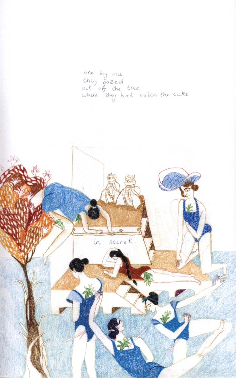
There’s another, simpler explanation for why Clara’s paintings are cliched and saccharine, though. It’s because they look like Hagio’s drawings! In fact, Clara’s paintings seem more ambivalent than Hagio’s, if anything.

This picture below is by Hagio as herself.

And this is Hagio drawing as Clara.

Contrary to Ken’s suggestion, it’s Clara’s picture, with its swirling backgrounds, stiff pose,and staring eyes, which seems (marginally) more haunted. Hagio’s version of the “real” Bianca is a straightforward confection. I really see no evidence (and Ken, despite his close look at many images, provides none) that Clara’s paintings consistently convey a less nuanced vision of Bianca than Hagio’s drawings do. It’s Hagio, who, as Ken says, “idealizes Bianca, turning her into a cliché: a perfectly posed dancing ballerina”. Both pictures are cloying; Clara’s is maybe marginally less so if you squint at it.

The main takeaway, though, is that Clara draws Bianca just like Hagio draws Bianca. Both idealize the child, and both are, in the logic of the story, right to do so. Again, Clara’s insight and artistry are not an antithesis to Hagio’s; they are (such as they are) one and the same.

3.

Similarly, I think Ken’s focus on binaries causes him trouble here:

Ken says of this sequence:

When Bianca looks into the mirror, she looks into an adult-free utopia in which the soul always sees its eternal sunshine reflected back at it. To look in the mirror is to look backwards, a nostalgic glance to the soul’s original perfection. The mirror tells us, “The world would be a child’s paradise if only all of those old people would stop screwing it up.”

Ken thinks Bianca is delighted by the mirror because there are no adults in it. But (in a panel Ken doesn’t reproduce) Bianca doesn’t say, “Hello no adults in the mirror!” She says, “Hello, Bianca in the mirror!” What’s delightful and exciting about the mirror has to do with Bianca herself. The sunshiny day is obviously a (very, very tired) symbol for a world with no troubles…but the playfulness here, the emotional charge, is in the flirtatious doubling.

The flirting with the mirror image reproduces the flirtation between Bianca/Clara. From Bianca’s first coquettery:

to the lover’s quarrel.

This ambivalent relationship between Clara and Bianca mirrors the relationship between Bianca’s parents, whose break-up diagetically accounts for Bianca’s volatility. Notably, it is Bianca’s mother who has left her father. Similarly, in the sequence above, Bianca rejects Clara — the implication being that both mother and daughter are free spirits escaping domesticity. Thus, it isn’t Clara who is acting like an adult; contra Ken, it’s Bianca.

4.
For Ken, the story is about punishing adults. Whether or not that’s the case, there’s not doubt that “Bianca” is more effective at punishing Bianca than it is at punishing Clara. Clara grows up and becomes a successful artist. Bianca suffers death by landscape.

The creator and manipulator of this particular landscape is, of course, Hagio herself. And so it is Hagio who, in an extremely contrived fashion, off the little darling. After which, Clara faints, and her mother swoops in to grab her:

Ken reads this through his familiar binary. It shows adults are bad.

On an interestingly composed page that employs many shading styles, Clara faints after learning of her cousin’s death. Hagio draws Clara’s mother as a series of swirling lines of different weights, and I assume this visual style mimics Clara’s impaired perception: we are “seeing” the mother through the eyes of the fainting girl. Yet these thick black lines give the mother a demonic aspect—and demonic is the deep nature of adults in Bianca’s world, who only appear to be friendly. Coming at a key moment, this visual approach amplifies my reading of the story’s intense antipathy to ageing and adult culture.

But how ominous is this? Clara looks like she’s in raptures. The swirling lines intensify the sense of orgasmic disorientation; it’s one of the loveliest pictures in the story. Moreover, the swirling obscures identity; the mother becomes someone else. Leaning down with her back to the reader, she’s not only a mother, but Hagio herself, protecting — or is that ravishing? — her creation. Bianca drops out of sight and leaves in her wake an ambivalent, melancholy ecstasy.

Clara goes on to spend the rest of her life making an aesthetic fetish of the girl who once rejected her and was then more or less instantly destroyed. For Ken, the fact that this is disturbingly morbid indicates that Hagio is criticizing her character. This rather ignores the fact that Clara and Hagio are doing the exact same thing. Hagio killed Bianca in order to turn her into an aesthetic fetish. Killing children to turn them into aesthetic fetishes is not an especially pleasant thing to witness. And this is why the story is, I’d argue, ugly.

5.

Hagio does not identify as a lesbian. Nonetheless, like almost all of Hagio’s work, Bianca is powered by its queer subtext — emotions unspoken, longings that grow and metastasize like faces in a funhouse mirror. The story desires Bianca, but that desire is not articulated, either by Clara or by Hagio. Bianca is freedom, but what freedom exactly — what emotions, what desires — can’t be named. So Bianca is safely done away with, at which point her image can be retrospectively and safely consumed.

Ken is somewhat stumped as to why Bianca is killed in the forest when (by his binary) civilization should kill her. She should logically die by falling downstairs or some such, if indoor/outdoor is really what matters. But of course that isn’t what matters. The issue isn’t civilization vs. the forest. The issue is getting rid of Bianca in a way that makes her ripe for mythologizing. Having her vanish into her nature —neatly eliding all the issues raised by having an actual, real nature, rather than a picture of one — works perfectly. One with the forest, she embodies freedom, a formulation which conveniently gets rid of her body and of any suggestion as to what in particular she would do with that freedom if she had it.

The point here is emphatically not that Hagio has to tell “Bianca” as a coming out story. But it does seem like there needs to be some acknowledgment that Bianca’s tragedy is not the destruction of her innocence, but the failure to destroy it. After all, Bianca doesn’t grow up. Clara and Hagio prevent her from doing so; they conspire to keep her the perfect, frozen ballerina on a cake so she will never become a friend, a sister, or a lover.

In Hanshin, in Iguana Girl, in Drunken Dream, Hagio is able to make art from an acknowledgement — rather than a refusal — of specific bodies and individual desires. In the story AA’, she confronts the bleak, frozen downside of innocence — of not knowing what you want or who you are —as well as its smiling surface. In all the best work of hers I’ve seen, she explores the queer knot at the heart of identity and love. But “Bianca” is not so courageous. It shakes its finger at the mean repressors for silencing the inner kiddies, while surreptitiously devoting its resources to putting those kiddies quickly and safely underground, so they can be either transformed into treacly images and ignored.

Ken looks at the structure of the forest, but he misses the thing dancing there under the trees. “Bianca” seems trite not because readers haven’t looked at it sufficiently closely. It seems trite because it’s a lie. “Bianca” is a story that celebrates freedom by embalming it. As a result, it’s an emotional and aesthetic failure, hiding what could have been its real concerns with shallow moralism and weak allegories. What’s left is only a shadow of an art that wasn’t; a false picture of a false picture.
____________________

This is part of an ongoing series on Moto Hagio’s Drunken Dream.

A comment on Ken Parille’s discussion of Robert Crumb’s Genesis

Before I forget and these connections are lost in the mists of time, I just wanted to add a link to Ken Parille’s lucid explanation of the attractions of  The Book of Genesis. Some notable excerpts:

“The fundamental achievement of Crumb’s Genesis for me is that it avoids something that’s central to so many illustrated versions of the bible or representations of biblical scenes: Crumb rarely idealizes his subject matter. He is not creating an  inspirational text, a magical text, or a sympathetic mythology — nor is  he mocking the bible. The wonder of Crumb’s Genesis is not the unknowable wonder of  God’s ways but of people’s actions as the bible recounts them. If there  is reverence in Crumb’s work, it’s for the flesh, for the materiality,  both ugly and beautiful  (though more often ugly), of biblical characters  and the things they do.”

” I feel a greater sympathy with Crumb’s strategy  than I do with, say, Michelangelo’s. In its refusal to idealize,  Crumb’s seems more ‘real’ to me. The thickness and gritty texture of  Crumb’s line and character designs (thick legs, thick lips, thick  fingers) tell a truth about the Book of Genesis obscured by more  reverential approaches. (It’s almost as if the medium of  cartooning is better than painting for this text . . .)”

Continue reading