How Clear is the Clear Line in Rutu Modan’s The Property?

I just got my hands on a copy of Rutu Modan’s The Property after reading some good reviews of it online here and here. Modan is one of those artists who people always seem to describe in terms of her sensibility, and I can see why. She has a singular way of treating heavy subjects with a visual brightness in her coloring and use of clear line, and a levity in her writing of dialogue, that brings the tragic into contact with the everyday without diminishing the reality nor the importance of either. Much like her last long-form graphic work, Exit Wounds, the story recognizes the power and importance of the past without wallowing counterproductively in it, or misappropriating it.
 

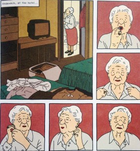
P47-Regina-putting-her-lipstick-on

 
The story follows Mica and her grandmother Regina as they travel to Warsaw to recover property lost to their family during WWII. As soon as Avram, the nosy Israeli acquaintance, Tomasz, the sexy but suspiciously philosemitic Pole, and Regina’s old flame, Roman, enter the scene, a series of omissions and half-truths turn the story into a dark comedy of errors. Mica winds up in a perverse reenactment of a Nazi roundup in the Warsaw Ghetto, she argues with family members she doesn’t realize are family, and she’s mistakenly led to believe that she will inherit a Hilton property. The past always looms present but not always as truth. Modan explains in an interview with Marc Sobel for The Comics Journal that she made the deliberate decision to divorce Regina’s story from those of the Polish Jews who endured the horrors of the war by having her emigrate to Israel with her parents before the war. As Modan explains it, all of the characters in The Property, aside from Mica, have a bad faith relationship with the past and seem bent on trying to exploit it for some form of personal gratification:

MODAN: In the story there is this old couple who are trying to feel again what they lost 70 years ago, and there is the Society of Jewish Memorialization trying to make kids experience the horrors of the war, and these Israeli high school kids going to visit the concentration camps like they go to some twisted summer camp, and Tomasz who’s trying to do a graphic novel, dreaming it would become the Polish Persepolis…  everyone, except for Mica, the heroine, is trying, in some way, to revive the past.

SOBEL: But even she is going back to reclaim the property…

MODAN: Yeah, but this is what I think happened to Mica in the end. She does connect to the past, but it’s by giving up the property, not by getting the property.

The past matters to Modan but perhaps because, being Israeli, “connecting with the past” is too closely tied to coercive political rhetoric, Modan’s heroine is only able to make an authentic connection to the past by abjuring any claims to personal gain from it.
 

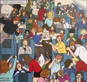
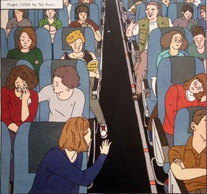
p-10-plane-shots-with-the-childrenp220-plane-shots-with-the-children

 
What I find most extraordinary about Modan’s artistic sensibility is how she approaches morally complex questions through richly colored ligne claire drawings (in notable contrast with Tomasz’s colorless cross-hatched drawings in the comic-within-the-comic). Glen Weldon’s review of The Property describes her use of ligne claire nicely: “Modan’s deceptively clear and simple line work — she can conjure a face in two dots and a single, expressive pen stroke — is a deliberate artistic choice […] Her clean and often brightly colored illustrative style serves in part to lift the fog of war, allowing us to see these conflicts, be they emotional or military, with new eyes.”
 

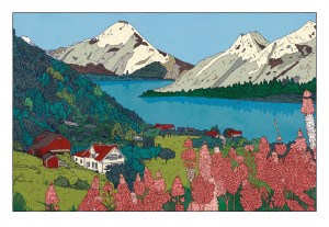
26_endpaper

 
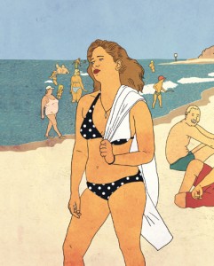
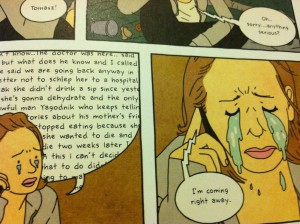
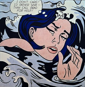
For Modan, the clear line is both a form of irony (i.e. reality isn’t so clear) and of observation, focusing the reader’s attention on human expression without the seduction of bad-faith historical realism. Unlike many comics in the ligne claire style, Modan’s clean line does not shy away from awkward embodiment just as her narrative refuses to shy away from awkward misunderstandings and cross-purpose communication. Modan’s clean line, in concert with her hyper-observant eye for human expression and the grotesquerie of embodiment, aligns her work with the surreal. And if you look at some of her illustrations and non-narrative comics, also in the ligne claire style, it’s clear that she has a surrealist sensibility (see the first two images below). Modan’s surrealism creeps in narratively, for example, during the reenacted Nazi roundup, but also visually in a panel showing Mica crying in which her tears appear like Lichtensteinian waterfalls on her cheeks (see Mica’s tears juxtaposed with Lichtenstein’s famous I Don’t Care! I’d Rather Sink below). Also, in Modan’s case, clean line drawing does not necessarily mean clean panels. The cluttered sensuousness and vibrant color palette of many of Modan’s panels betray a punk (I’m thinking Julie Doucet) and a pop art sensibility (see the two panels above showing the crowded flights to and from Tel Aviv). Of course, pop art drew much of its inspiration from the ligne claire style in comics, advertising, and illustration. And Modan is not unaware of this irony. In fact, this layering of visual histories and appropriations appears to be the visual correlate of the historical narratives Modan works with, a layered and endlessly contested space where she seems to be very much at home.
 

NYTimes-Sunday-Review859808CDED


larmes de MicaRoy_Lichtenstein_Drowning_Girl


Strange Windows: Ha, ha, ha, Moooo…! (Ligne Claire 1)

“Allow me to shelter you under my umbrella!”

France is well-known for its strong comic-strip tradition, la bande dessinée;  deeply linked to this is an equally strong  tradition of children’s books –a wondrous one. Much of this literature has crossed over into English; think of Babar and The Little Prince;  or go back two centuries, to when France gave England Mother Goose  (from Les Contes de ma mère l’Oye, by Charles Perrault.) Many of the most beloved fairy tales in the English-speaking world were translated from  French authors’ versions, either invented or re-told: ‘ Puss in Boots’, ‘Sleeping Beauty’, ‘Bluebeard’, ‘Little Red Riding Hood’, ‘Beauty and the Beast’.

Alongside these books grew an army of fine artists to illuminate them, and today I wish to spotlight perhaps the most successful –and charming– of French illustrators  for children: Benjamin Rabier.

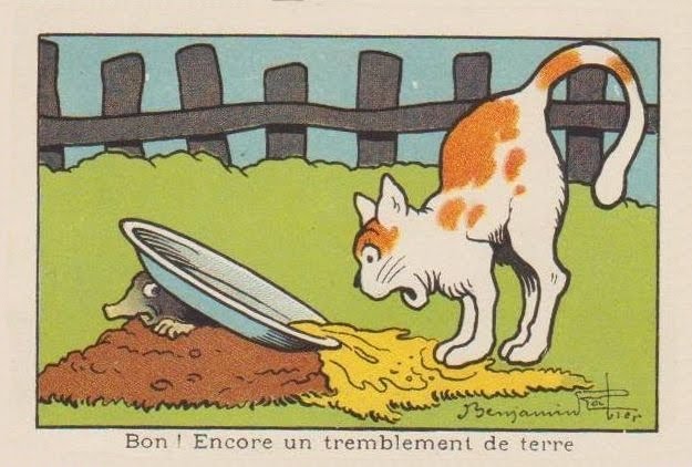
“Well! Another earthquake.”

Rabier (1864-1939) was the author of dozens of children’s books, mostly featuring animals;  he was also an early pioneer of both the comic strip and the animated cartoon; he was a successful playwright; but his greatest claim to international fame derives from a single image of commercial art, as we shall see. Benjamin Rabier: artistic polymath!

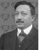
Portrait of Benjamin Rabier

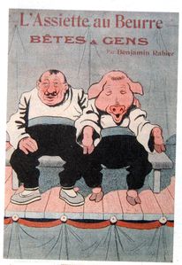
He came up from La Roche-sur-Yonne in 1899 to Paris, where he was employed as an accountant (a job which, despite his vast success as an artist, he kept until 1910, quitting for medical reasons alone.) At the same time, he started contributing to various humorous and satirical magazines such as  La Chronique Amusante , Le Gil Blas Illustré, Le Rire, L’Assiètte au Beurre in France, Scraps in Britain, and Puck in the United States;  in all he’d contribute to over fifty magazines and newspapers over his long career.

However, arguably Rabier’s most important contributions of that time –in light of his subsequent fame– were to the children’s publications of Arthème Fayard (La Jeunesse Illustrée and Les Belles Images). These were weekly anthologies of child-oriented prose and drawings; their success provided the template for the traditional French and Belgian comics magazines. In 1898, he produced his first book, about the adventures of a mischievous boy: Tintin-Lutin:

(If the title seems familiar…wait and see.) It was the first book of many.

In the 1890s, France introduced compulsory free education for all. Thus, millions of children learned how to read– creating a true mass market for children’s literature.

Add to this strong innovations in printing techniques– such as photo–engraving, linotype, and the introduction of cheap, vivid aniline dye-based color inks, and it is obvious that Rabier came along at the ideal time in history for an illustrator: a golden age.

He quickly became sought after for his anthropomorphic depictions of animals; his beasts showed the full range of human passions and emotions, from merriment to sorrow to rage– and yet remained recognisably animals.

He illustrated some of the great classics of animal tales, such as the medieval adventures of the trickster Reynard the Fox– collected in 13th century France under the title Le Roman du Renard:

He also illuminated at length the works of the 18th century father of zoology, Georges-Louis Leclerc de Buffon:

…showing he could be a most competent ‘straight’ animal illustrator, as shown in this scene of a farmyard:

…or this  drawing of an anteater:

Yet even his ‘straight’ illustrations show liveliness and emotion– witness the quiet anger expressed in this show of bearbaiting:

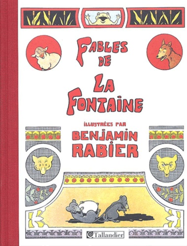
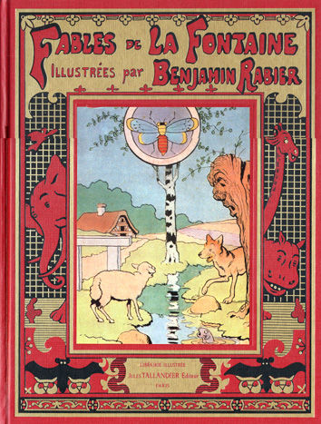
In 1906, he undertook a gigantic new piece of work: He illustrated all 240 of the rhymed fables of Jean de La Fontaine (1621–1695),  perennial classics known and loved by French children for over three centuries:

Some of these he drew in a comics-style sequence, as shown in these “collapsed” examples:

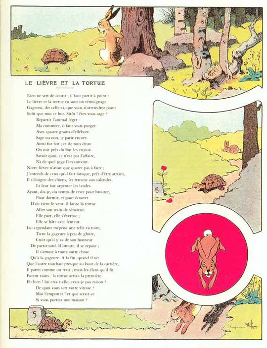
..and others in a ‘picto-fiction’ blend of text and art, such as this version of ‘The Tortoise and the Hare’:

…or of  ‘The Frog that would be as Big as an Ox’: Mark the merry expression on that bovine face: it prefigures Rabier’s most famous creation, to which we’ll turn shortly.

Note that Rabier was also a highly successful advertising artist, as can be seen from the below samples that parody La Fontaine to sell toothpaste, cough medecine, and shotgun shells:

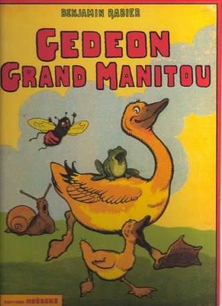
In 1923, Rabier introduced his most enduring creation, Gédeon the Duck, who would go on to star in 16 picture-books and several animated shorts:

As we’ve seen, Rabier was also an early adopter of the new art of the comic strip. This one is titled ‘The Phono-Trap’:

Panel 4: ‘Come, Medor, I’m caught!’ Panel 5: ‘Lunch is served!’

Or consider this oddly touching adventure of a fly: Rabier’s comics begin to take on a familiar look for aficionados of la bande dessinee. With their strong, simple linework trapping flat pastel colors, they seem obvious precursors of the Franco-Belgian school of cartooning known as la ligne claire, the  ‘clear line’, notably exemplified by Hergé, the creator of Tintin.

Hergé freely acknowledged the influence of Rabier:

«His drawings were very simple. Very simple, but sturdy, fresh, joyful and perfectly readable. In a few well-carpentered lines, everything was said: the setting was shown, the actors were in place; the comedy could start (…) And it’s for sure from this encounter that I date my taste for a clear and simple drawing, a drawing to be understood instantaneously. It is, before anything else, this readability that I myself have never ceased to seek”. –Herge, foreword to Rabier’s Fables de La Fontaine (tr:AB)

This influence went as far as stealing gags!

Rabier, 1920: Herge (in Tintin au Congo), 1930:

(Scroll quickly down the Rabier boa cartoon, and you’ll get a great simulation of animation. It demonstrates Rabier’s skill in panel-to-panel design.)

Some say Herge took the name of his hero from Rabier. I suppose it’s possible, though ‘Tintin’ wasn’t that rare a nickname (for ‘Augustin’).


The two Tintins

From 1917, Rabier collaborated with the father of the animated cartoon, Emile Cohl (1857–1938), in a series of cartoon short films. However, animation was to be dominated in the 20th century by a different style:

…a style that would come to dominate “funny animal” comics, as well.  Rabier’s work was to have little influence: another tantalysing possibility shoved aside by the brute force of Hollywood.

Note the smiling cow below. What would you get if, instead of smiling, the cow were laughing?

Why, you’d get a processed-cheese famous the world over, of course!


In 1921, Léon Bel introduced a new melted cheese packaged in individual, foil-wrapped wedges: La Vache qui Rit, ‘The Laughing Cow’. It was, and remains, an international hit product.

Two years later, Rabier designed the definite image of the hilarious bovine, and it remains– with few adjustments– the one used today:

2011

The origins of the laughing cow are obscure; it’s claimed that Bel’s wife coined the word ‘Wachkyrie” as a mockery of Wagner’s ‘Die Walküre‘. (‘W’ is pronounced like ‘V’ in both French and German.) There subsequently came out a successful dance by that name:


Naturally there were many imitators, and Bel fought numerous lawsuits against cheesemakers who introduced ‘the reading cow’, the smiling cow’, and many others: the Serious Cow (below) lasted as late as 1959.

Even Rabier got into the copycat act, with his Crying Cow:

Fun fact: in Indian restaurants, the fillings for cheese nans are almost always Vache qui Rit!

Over a century after Benjamin Rabier started drawing children’s books, not a single one of them has gone out of print.

Isn’t that a precious sort of immortality for an author– making generation after generation of kids laugh and smile?


Ad for Rabier-based toys:


A Gédéon figurine:

A laughing dog pull-scooter:


Rabier-designed cutlery holders:


A video clip in French about Rabier, with extracts from his animated cartoons.