The word “draftsmanship” is the loud, boozy, best-friend’s-sister of the artistic lexicon; available to all, understood by few. It’s a word which has come up in recent reviews of Art Speigelman’s exhibit at the Jewish Museum in New York. Some critics have raved over Speigelman’s draftsmanship, others have pooh-poohed it. The word itself seems misunderstood by some readers and critics or perhaps its older meaning is no longer even applicable in modern comix and illustration.
Draftsmanship is the quality of someone’s drawing (not just their rendering or painting). Like many qualities, it is not strained, it droppeth as the gentle rain of heaven and soaks the pages of both those that give and those that take. There is both good and bad draftsmanship and here’s the crux: how do you tell them apart?
In our post-modern, relativistic times, where nothing is certain except the fact that nothing is certain, readers of a philosophical bent will spit up their breakfast pablum at the implications of the above question. My reply to them is simple: if you refuse to make judgements, that in itself is a judgment and you’re probably oppressing someone, somewhere with your double-plus-judgemental refusal to make judgements. Naturally, my own judgements are non-judgemental, that’s the temporary prerogative of all soapboxes. I have no doubt that many HU readers will bring their own, equally sturdy soapboxes to the party later on and deliver some equally non-judgemental counter-judgements.
Good draftsmanship is an accurate, visually logical and harmonious depiction of reality. No genuine, long-term success in drawing is possible without first mastering realistic figure drawing, no matter how symbolic the style. The ability to make a human being look human or a horse to look horsey or a Princess telephone to look princessy — regardless of the level of symbolic distortion and compression — that is the basis of superior draftsmanship. But that is only part of it.
Draftsmanship is not just making clean contour drawings, and it is not at all about copying photographs. Good draftsmanship is the harmony, accuracy and design of reality processed through the eye and expressed through the hand. It can be as telegraphically crisp as a Japanese ukiyo print or as exuberantly messy as one of Blutch’s brilliantly inked pages.
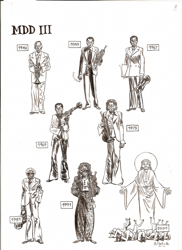
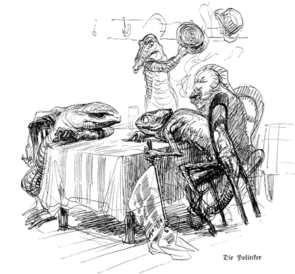
Blutch: Miles Davis
Good draftsmanship means that everything looks good, even when it looks ugly. This is where things get slippery. Our eyeballs operate by the logic of a non-verbal grammar and a good drawing is always, without exception, “spoken” in this abstract language — otherwise it is visual gibberish. I think that for comix readers and critics — many of whom seem to prefer using literary techniques to analyze comix — this concept is a head-scratcher. Perhaps this is one reason why so few artists write comix criticism; the verbalization of visual rules for even a professional audience is tricky, for a general audience it’s nearly impossible at times.
So, in art-school parlance, good draftsmanship means depicting reality with complete design fluency on every level. Any symbolic compressions of reality are designed so that the trained, so-called good eye is always satisfied by the parts and the sum of the parts. The core mark is always reality.
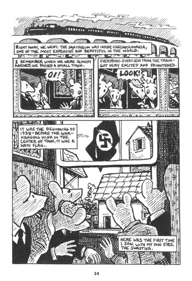
In any case, let’s look at a page from Maus, a page specifically posted by one critic as an example of the high quality of Spiegelman’s exhibit. Maus is many things, most of them good … but the draftsmanship is not.
The drawing of individual elements, such as the mouse-heads, is ungainly, even for cartooning. It is not that they should look more like real mice, that would be silly. The shapes/textures/lines are all where they should be to facilitate general navigation but they seem somehow squeezed into place. Taken individually, many of the shapes are inelegant and unsteady and note one thing: there are precious few lines of beauty.
Much of the detailing — clothing, hands, shading — is turgid and clotted, an effect exacerbated by the mono-width linework. Monowidth line-work needs air to breathe, and if you must cramp it, it must be fastidiously designed on every level, not just the over-all page level.
The rendering of volumes necessary to show the thrust of objects in space is often crude … example: the far-left mouse in the final panel needs his cheekbones and orbital bones indicated fluently. Yes, it’s a cartooney mouse but then why is it hatched? It would have been better to use a few simple interior contour lines to delineate the subsidiary planes.
In general, if one wants to use a weak, monotone contour system with fast, cursory crosshatching, the accuracy of shapes must be perfect. Here, the optically long lines (mostly describing backgrounds) are trembly and indecisive, the curved lines (mostly describing animate objects) lack the snap and bravura of the classic line of beauty. With pen and ink, one must always make a decision about how much of the hand’s presence should be visible on the page. You can go the slow Hergé route and hide the hand entirely or you can take the fast Herriman route and let the hand’s muscularity and nimbleness run amuck. Spiegelman’s inking style favours expressiveness but his draftsmanship betrays his aims. His hand is going faster than his eye can think.
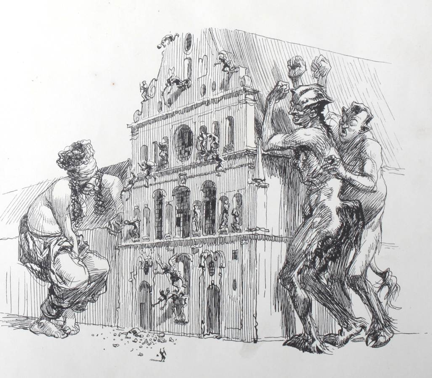
Heinrich Kley comes to mind as the successful epitome of this style of draftsmanship (see the two illos above). His hand is nervous but his eye is confident, thanks to his draftsmanship, his mastery of reality. In Kley, one senses the shape governing every line, even if the line is still searching for it. His hand is confident of the eye’s automatic guidance. Shapes and lines are rhythmically linked — a basic tenet of good visual grammar.
But in this Spiegelman page, the shapes are not “magnetizing” the lines in the same way, his nervousness stems from a lack of confidence in internally visualizing the reality being described. Roughly speaking, the visual, reality-based grammar governing the naturally pleasing agreement between contours, volumes and lines is too weak to please the eye consistently.
Spiegelman is not a superior draftsman, and I doubt if he himself thinks that he is one. Frankly, who of us are really good draftsmen? Not I … and it is not even necessary for Spiegelman’s purpose. He has made a living in the publications field for a long time and knows the score: do the best page you can at the time and above all, make it fit the story. There are better looking pages in Maus and in other works of his.
In fact, his usual style of story-telling does not require good draftsmanship and in a work such as Maus, a certain visual crudeness is more emotionally effective than a cleaner, crisper hand would have been.
Spiegelman’s work has never been about draftsmanship anyway, he’s a verbal illustrator, especially pre-Maus. He is also, to the eternal gratitude of everyone who makes comix in North America, the guy who made us at least semi-respectable to both a better class of reader and the people who send us royalty cheques. Younger readers have no idea how difficult it was to get the NYC suits to take you seriously before RAW began cracking the glass ceiling.
Most American golden and silver and iron-age corporate comix were nothing more than the step-and-repeat of modular, symbolic marks designed to rubberstamp the reader’s eyes into a stupor. Draftsmanship took a backseat to speed. And the draftsmanship of many contemporary comix is even more laughable in its absence. Too many North American comix are made by talented writers who cannot get into print by writing alone and must take up cartooning to tell stories. And the bar for comix submissions is lower than other fictions simply because the bar for visual competency is often set by non-visual editors, readers and critics.
Cartooning is now the default mode of drawing in North America, in both illustration and comix. It’s cheaper to purchase because it’s easier to execute and doesn’t require expensive, specialized training. And most cartooning is poorly drawn since the level of symbolic reduction is usually so extreme that the slightest defect is multiplied ten-fold and spoils the entire effect.
In any case, as I get older and crankier, I care less and less for the stories and thematic concepts of most comix, I look at only the pictures. My Holy Grail is a sequential art where the drawing is the meaning* as much as the story or words, perhaps even more so, to the point where the visual grammar will express a story in its own universal language. In fact, sequential art is the only popular visual art form which has the potential to utilize draftsmanship at this level, to make the medium and the message precisely the same. Music, architecture and dance still do this regularly. Why not comix?
*I think that Matt Madden’s experiments in constrained comix, his Oubapian work, is a major step in this direction. The implications of what he and others like him are doing may result in comix evolving into genuinely visual, absolute art at last. And to those that think that contemporary gallery art has this absolute value, I beg to differ. Any visual art form which requires a verbal explanation to understand the “message” is not visual art at all.
____
Mahendra Singh’s website is here.