Human Behaviour

Like comics, folk tales and fables are sometimes mistaken for children’s stories. The pretty palette and cutesy end papers of First Year Healthy belie enough abandonment, blood, and weird sexual situations to match the original Grimm brothers’ tales. That’s not to say it comes stocked with shriveled villains and plump children with rosy cheeks. There’s a baby, I guess, but it looks like the kind of thing you might find on a dusty shelf, in a jar. A quintessential Michael DeForge character, you probably wouldn’t want to touch it without latex gloves.
 

baby_1


The fuck is up with this baby.

 
Question number one: what is this thing, anyway? Not the baby, I mean, but the book. I suppose in terms of genre it falls somewhere between faux folk and modern myth. Is it, as the synopsis on the back suggests, a “parable about mental illness”? I’m not sure that captures its central paradox, so let’s say a sinister fairy tale, or an inscrutable fable. Horror-barf meets early Björk.


DeForge’s specialty is drawing charming things with a palpable sense of disgust, a sensibility that particularly suits First Year Healthy. A slender story with big illustrations and short typed paragraphs of text, it’s reminiscent of a Little Golden Book. Plot-wise, of course, we’re pretty far afield of the poky little puppy. This is the story of a troubled young woman—our narrator—trapped in a hostile landscape filled with joyless sex and uncaring neighbors. Her chief interests seem to be wound care and walking on thin ice. Mm-hmm, literally.
 

ice

“My hobbies include anything that sounds like a huge bummer.”

 
Our girl has recently emerged from an extended stay in a mental hospital. For what, we do not know, though we learn that her absence was long enough for her brothers to get married and have children to whom she has not been introduced. (Or is it possible she’s confused?) Her present-day life is full of intrigue, but it’s not exactly fraught. In fact, there’s something uncanny about the calm way in which she tells us her incredible story, which involves an orphan, several gangsters, and an enormous magic cat. All her observations seem to occur on a delay, as through a thick layer of static. Her flat affect hints at severe depression or even schizophrenia—or maybe she just doesn’t GAF.

The writing is well paced and strong, and the tension between it and the format, along with the wordless sequences with the magic cat, are probably what I would point to if someone were to get all Well, actually… about this book being not-comics. So far as I can see I stand alone in finding DeForge’s work aesthetically uneven. To me he’s at his best when he finds organic outlets for his inventiveness, like with the nightmare baby or the gray-faced gangster. The latter is the coolest thing I’ve seen in a while.
 

man

 
I like the artist’s weirdness less when it feels like affectation. Take, for instance, the opening image, an aggressively strange composition of some gore in a fish shop, or just the protagonist in general, whose inverse Cousin It situation is a bit much. (There are a million less ridiculous hairstyles that could’ve established a visual connection between the woman and the cat, who is—bear with me a moment—more or less her murder dæmon.) DeForge is more consistently successful with his use of color. While his tones here are earthy and muted compared to his penchant for neon, frequent shocks of pink and orange suggest that some things in our narrator’s world burn a little too brightly.

While it’s never clear how much of the story takes place in the narrator’s head, First Year Healthy doesn’t interrogate reality. The huge magic cat that silently lopes through these pages undeniably is. Many texts that explore mental illness are built around the anxious question of what is or isn’t real; that tension, and when and if it’s resolved, is what drives the plot. Remarkably, First Year Healthy is not about mental fragility. It is, rather, the story of a woman whose mind takes on a life of its own. It stalks her, but then again it eats her enemies. Is it a hallucination? Supernatural? Scary? Protective? DeForge’s answer seems to be whatever, and his utter lack of judgment is one of the things that makes this story so great.

Not for nothing, First Year Healthy is not just a portrait of mental illness; it is also a portrait of faith. Technically, it is a Christmas story (and therein are some iinteresting parallels), but what I see above all is a woman who is herself the most real and palpable thing in her universe. Her connection to the external world, and the people in it, is tenuous at best. Her closest personal relationship is with her boyfriend, who she refers to as “the Turk” in lieu of a first name. Her anonymous neighbors and nameless brothers barely register as beings in the story at all.

First Year Healthy’s focus on the narrator’s complex interiority makes it an interesting companion piece to the relentless biology of Ant Colony, DeForge’s full-length graphic novel from last year. Ant Colony’s glowing critical reception paid a lot of lip service to the young cartoonist as the next Great Pumpkin, but evidence of his genius in that volume was, to my mind, scant; its fresh look and flashes of humor couldn’t mask its Flea-grade nihilism and fundamental lack of depth. First Year Healthy is much shorter and sweeter, but beneath those trappings are big thoughts and surprising sophistication. Put another way, are we all just insects, fucking and fighting and oblivious to our own insignificance? Or is there meaning and magic in this hostile world for those who seek it? Of course the honest answer is a bit of both, but the latter makes for a more compelling story.

DeForge’s worlds are always weird but recognizable. They’re universal in that you’re meant to see yourself in them, but they’re always also Other. By design, Ant Colony explores the human condition from a sort of cold and alien vantage. First Year Healthy, which is set in the world of actual humans, is more warm-blooded. While its narrator is in many ways a familiar folk heroine—willful and self-reliant in the face of constant peril—her emotional detachment has a thoroughly modern feel. She’s brave but never spirited. Melancholy. Awkward. Alone. The strangeness of her life, which escalates quickly over just 30 pages, never fails to resonate. Like David Bowie, DeForge takes every flicker of sadness, self-doubt, insanity and total fucking loserdom you’ve ever felt and turns it into something unassailably cool.

Last month I went to see a Bowie retrospective at the Museum of Contemporary Art. It was called David Bowie Is—a perfect title, I thought, until I came to understand that the organizers approached the artist’s identity as a construct to be deciphered and explained. In breaking down Bowie’s influences, his context, and his impact, the exhibit failed to find his human heart. He is this, they told me. He is that. But the entire point of Bowie is that he can’t be reduced to a series of personas. He has always transcended any label you might wish to apply. To some degree the same is true for the rest of us mere mortals, perhaps especially when it comes to mental illness.

It’s one thing to make an old idea look new, or to make a new idea look old. It’s another to craft something unique out of what has been there all along. From David Lynch to Haruki Murakami, the weirdos who mean the most to me transform everything into something else—something other—the whole of which is greater than the sum of its parts. After weeks of thinking about First Year Healthy, I’m still not so sure what it means. Whatever. Should I someday come face to face with my own magic cat, I can only hope my first instinct won’t be to dissect it.
 

cat

Why Michael DeForge is the greatest cartoonist of his generation: The Critics Explain

wtdsd_1a

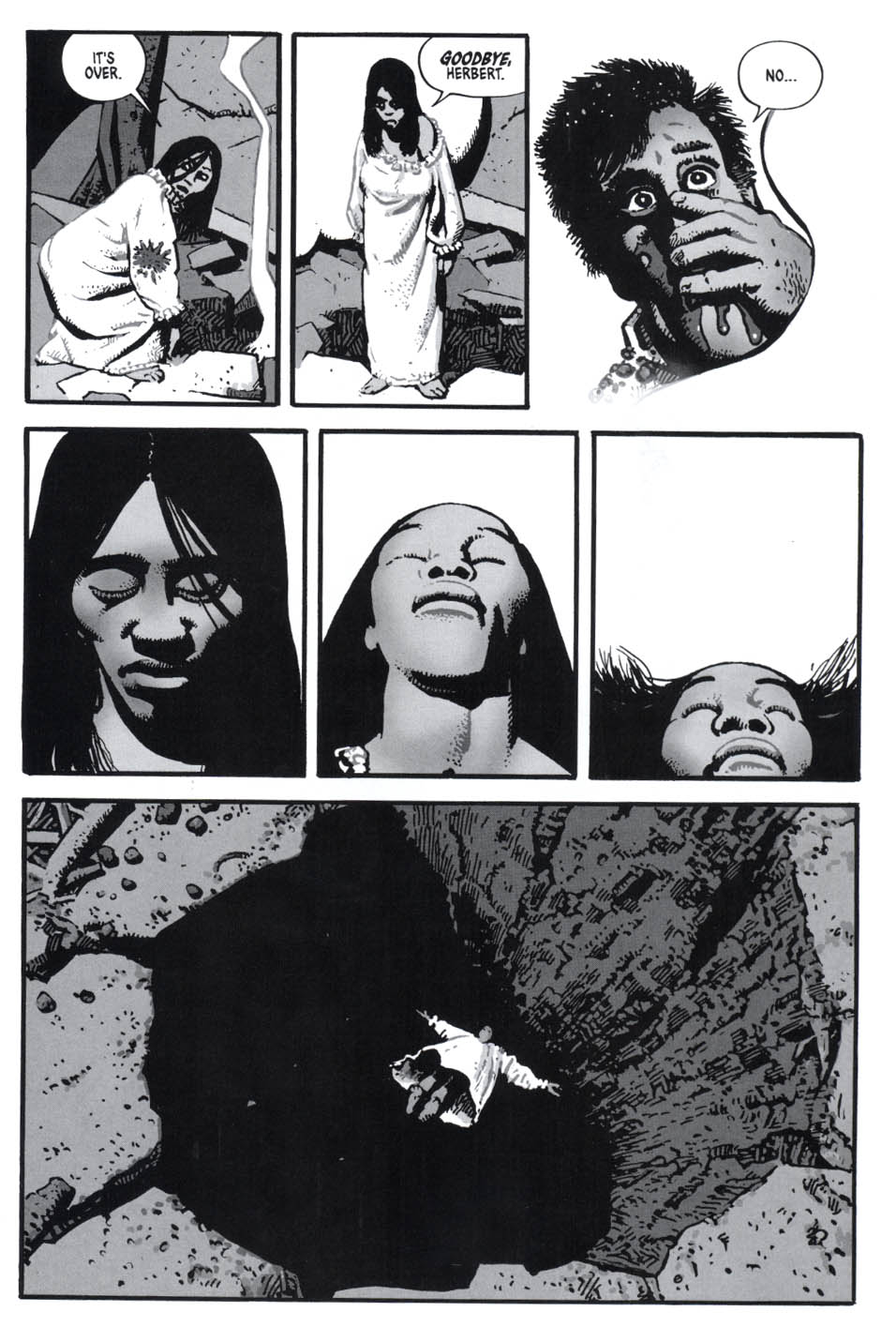
The word of mouth has been abundant and the acclaim unremitting, but what exactly can we learn from the outpouring of reviews of Michael Deforge’s Very Casual—that work of unremitting “genius”, and that artist soon poised to seize the crown now tightly held by the desiccated funksters who emerged during the 80s and 90s.

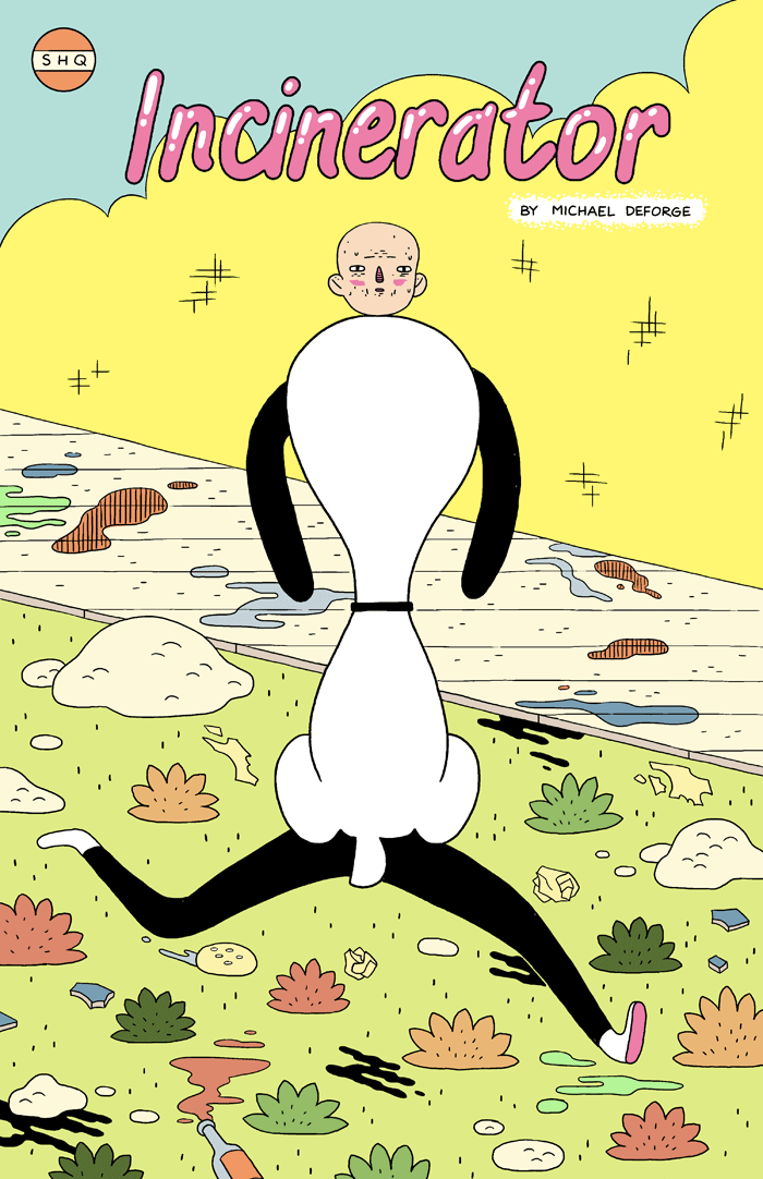
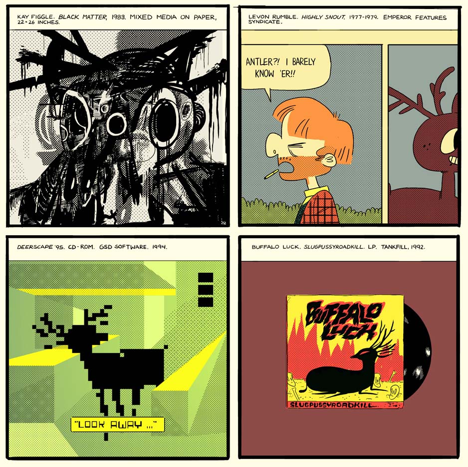
For the uninitiated, the simplest of descriptions: Very Casual is a collection of stories by DeForge variously published in places like Best American Comics 2011, The Believer, and Study Group Magazine. It won the 2013 Ignatz Award for Outstanding Anthology or Collection as well as the award for Outstanding Artist. His work is easily accessible online as are some of the stories collected in this anthology.

Fans, academics, and journalists have had their way with the likes of Chris Ware and Dan Clowes, thoroughly disinterring the design, complexity, and intelligence of their comics. But what have the esteemed critics of the internet done in DeForge’s service over the last 2 years? Here are some recurring words and concepts from a moderately long trawl: body horror, disgusting, reader beware, favoritebest, winner. The overarching feeling from reading a sizable chunk of Deforge reviews in one sitting is that he is artistically as spotless as a baby’s bottom, a veritable second coming of a cartooning Christ.

Rob Clough writing at TCJ.com in 2011 on DeForge’s early works is certainly entranced by his promise:

“He’s clearly someone who has read everything—superheroes, manga, undergrounds, autobio, etc.—and has a keen sense of comics history. DeForge combines that encyclopedic knowledge of comics with a strong sense of perspective regarding the medium, synthesizing and understanding its strengths and weaknesses. That allows him to comment on and critique not only the length and breadth of comics history, but also to closely examine his own work. Finally, his facility as a draftsman is jaw-dropping. He has a remarkable facility as a style mimic, and the control he has over the page (both in terms of design & line) is incredible for an artist as young as he is.”

Strike that. This isn’t a description of mere “promise”, it is a description of a cartooning God mowing down all obstacles in his way.

On the other hand, it is never entirely clear from Clough’s description why DeForge should be taken for a cartooning deity outside of these statements—is it purely his draftsmanship, his mimicry, and absorption of influence? Or is it perhaps his ability to convince Clough that “body horror” in comics can be a successful endeavor? Clough is also especially drawn to his work ethic and search for style:

“One of the reasons why I like DeForge is, like Shaw, he is an artist who just does the work. Whatever doubts he has about his own abilities or place in the world of comics doesn’t stop him from drawing story after story….I’m enjoying this restless phase of his career as he explores every nook and cranny of comics history, but I’m eager to see how he harnesses his energy.”

I read Clough’s long gloss on DeForge’s comics in 2011 and once again this year. On both occasions, I gleaned nothing in the description of form and content which suggested a mind on the cusp of genius.

Which brings us to the present day and the torrent of praise for Very Casual—the collection destined to put DeForge on the cartooning map. It’s certainly been covered in all the best places.

Douglas Wolk writing in The New York Times only has a fraction of the space allotted to Clough and this allows only for bare description. It seems mostly like a straight recommendation to buy:

“Everything and everyone in his drawings is dripping, bubbling and developing unsightly growths. He warps and dents the assured, geometrical forms of vintage newspaper strips and new wave-era graphics into oddly adorable horrors; his stories are prone to whiplash formal shifts.”

Sean Rogers at The Globe and Mail gives us description, biography, and recommendation. Once again, we are encouraged to believe that DeForge’s stories are “unsettling”:

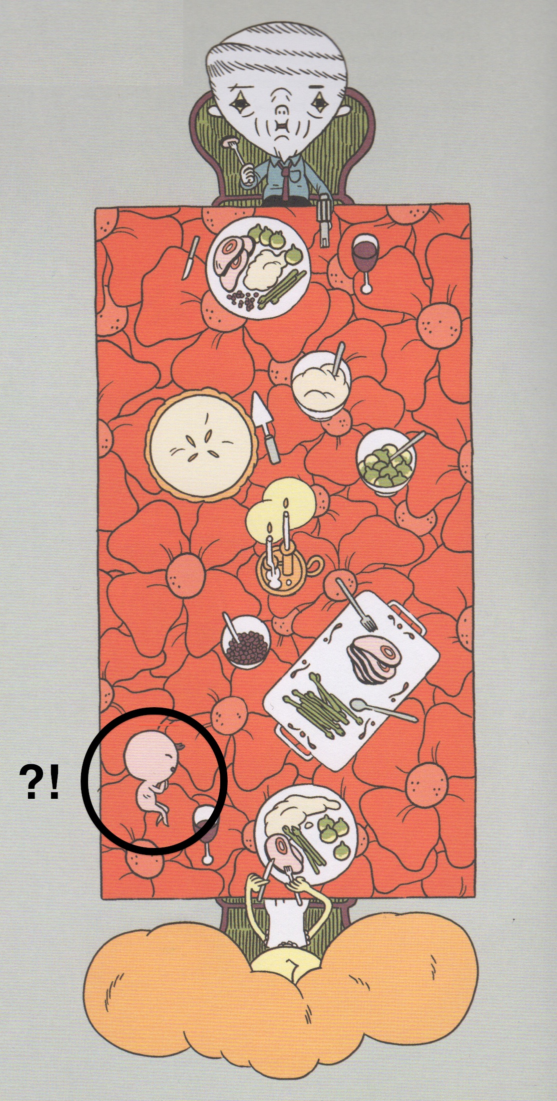
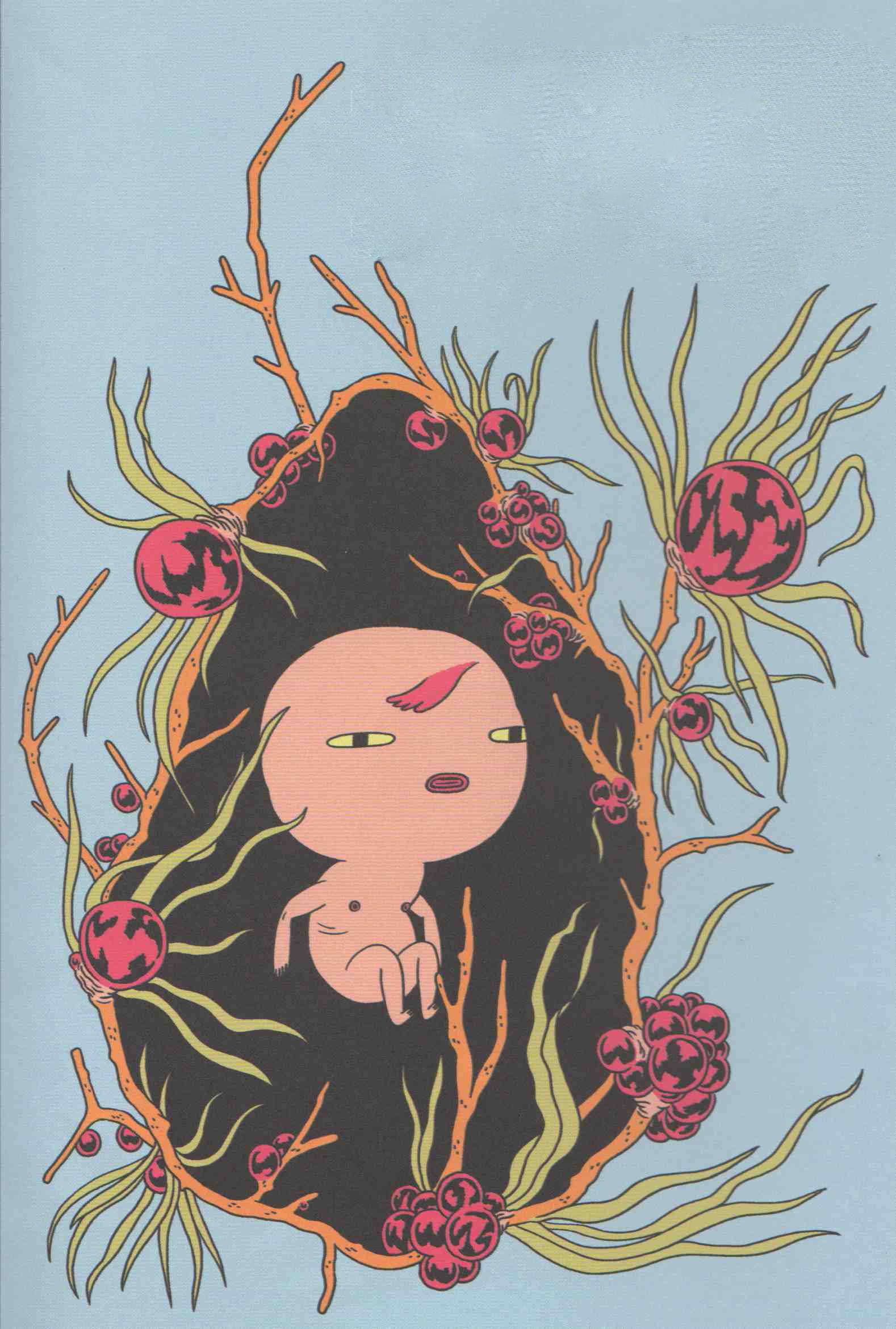
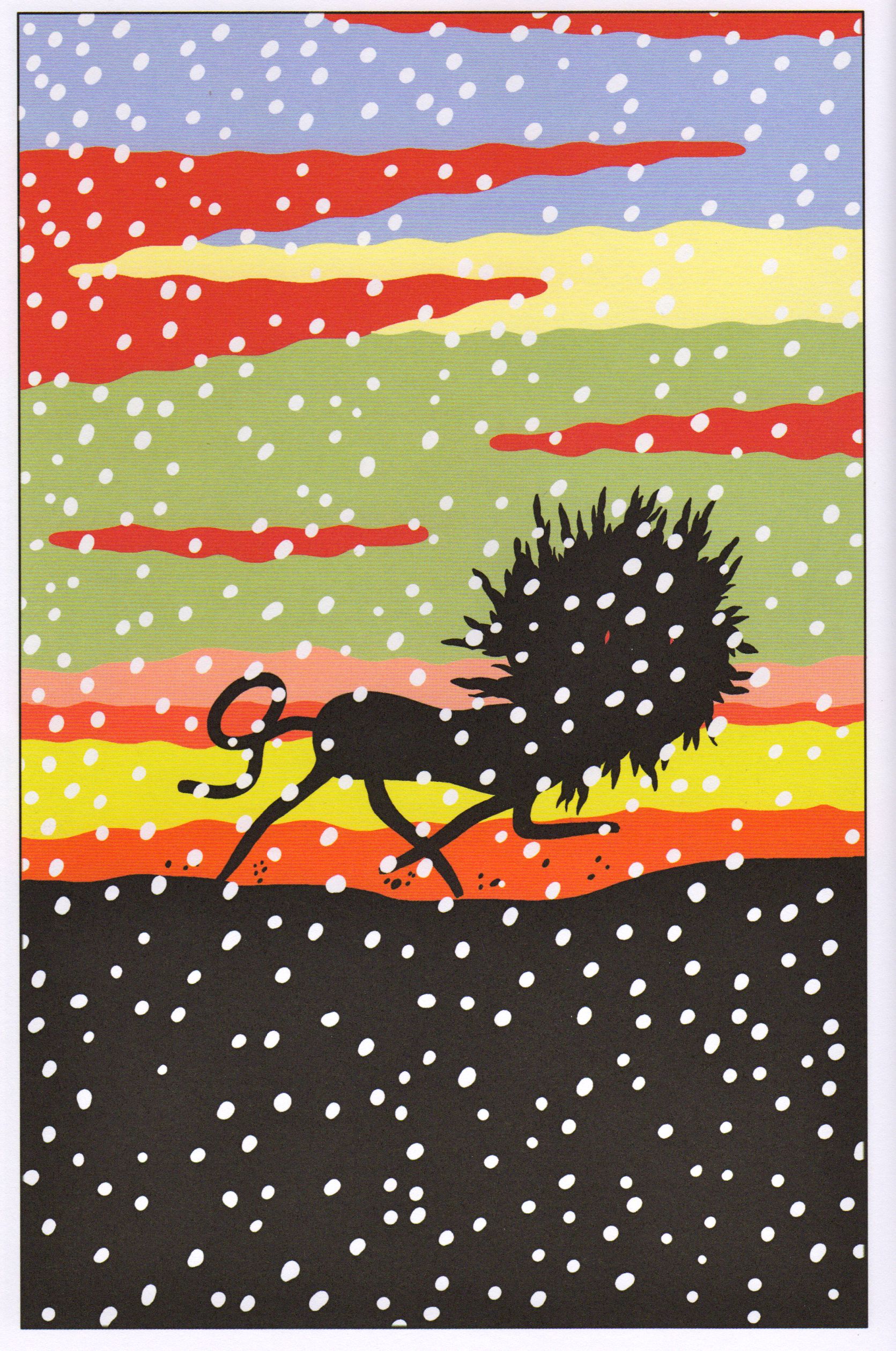
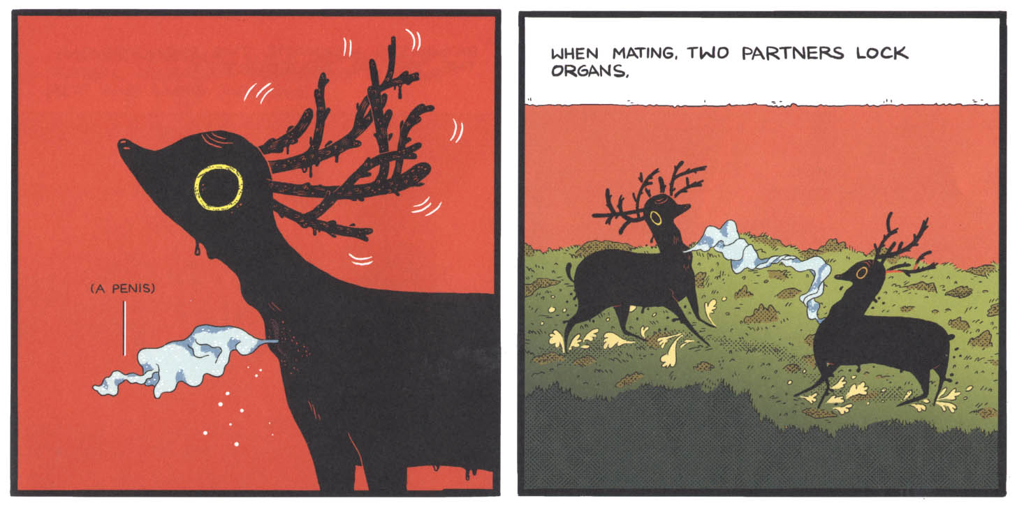
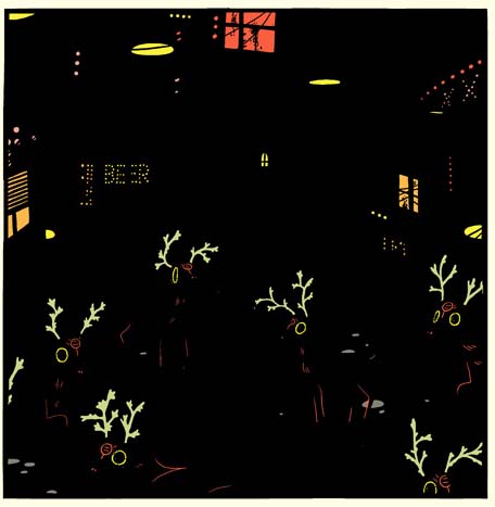
“DeForge’s is a world apart from our own, askew ever so slightly. It’s a world of uneasy cuteness, of pop art degeneracy, and it rewards the curious traveler with remarkable imagery and unsettling stories…Consider All About the Spotting Deer, which lends the volume its striking cover image. A disquisition on a breed of ambulant slugs that only look like antlered fauna, the strip resembles nothing so much as a bizarro Wikipedia page, explaining the social life of these creatures in deadpan, clinical terms.”

Well maybe if you’re a 90 year old spinster who only does crochet in her spare time.  The analysis once again offers nothing to bolster the prevailing belief that DeForge is the new messiah of cartooning. It is merely an encouragement to believe.

Brian Heater at Boing Boing is also concerned about his reader’s mental health when it comes to DeForge’s Very Casual:

“Speaking of exercises in public health, here’s a thing that probably shouldn’t be read by anyone — or at least not those prone to nausea and dramatic fainting… Very Casual is always fascinating, mostly grotesque and in the case of the biker gang with cartoon character helmets, actually pretty touch in the end.“

Basically buy because I said so. Really, just buy (if you’re not my grandma).

Timothy Callahan at Comic Book Resources invokes the names of Chris Ware, Dan Clowes, and Charles Burns. He has cited DeForge’s Lose #4 as the best comic of 2012. His reasons? DeForge’s ability to render “Lynchian oddness” and because the issue is “the lightning rod for his talents.”

In a more recent article, he connects the Day-Glo horrors of DeForge to his work on Adventure Time.

“DeForge started working as a designer for the “Adventure Time” animated series beginning with its third season, and that seems exactly appropriate for someone with his sensibility, but in the stories found in “Very Casual” it’s like we’re seeing the twisted underworld of the “Adventure Time” aesthetic.”

But then provides us with more marketing copy in an effort to encourage retail therapy:

“He revels in grotesquerie and absurdity and there’s a deep and profound sadness to much of the work even when the pages burst with a celebration of oddball joy. Disfigurement is not uncommon. And contagion is a leitmotif. DeForge’s comics are gloriously enchanting, but brutal…[…]…DeForge transforms his style and yet maintains a similar sense of tonal unease. These are comics that worm their way into your brain even as you try to process them. In the best way imaginable…There’s nothing, of course, clumsy, leaden, or inelegant in the pages of “Very Casual.” This is a work of supreme skill and unique sensibility.”

Jeet Heer on the other hand can be excused for resorting to the same when presenting DeForge with a 2012 Doug Wright Award:

“Visually, Spotting Deer is a delight, a virtuoso display of stylistic variety. The colours are startlingly unnatural as are the appropriations of different art styles, ranging from newspaper comics to video games to record cover art. It belongs to the line of artists like Richard McGuire and Gary Panter, who possess the ability to seep into your eyeballs and rearrange the wiring in your brain. You see the world differently, with sharper eyes, after reading DeForge’s comics. Like some of the best cartoonists of his generation, he’s bringing to comics some of the visual intensity of painting and forcing us to realize that the visual range of comics is much larger than we thought possible.”

The point of Heer’s statements was description and commendation preceding an award presentation. It is republished here as a stark reminder of how little it differs from all other descriptions of DeForge’s work online. The critic as award giver is certainly a perennial finding in this art form.

Sean T. Collins has written extensively on Michael DeForge but also confines himself largely to description when it comes to Spotting Deer—the centerpiece of Very Casual.  His most extensive examination of DeForge can be found in his review of Ant Comic at TCJ.com. Collins parodies his own predisposition right at the outset with his opening line:

“Oh, look, a Great Comic.”

The more detailed recommendation goes as follows—it is about important things and…

“…the bizarre visual interpretations of the bugs in question are pitch-perfect distanciation techniques, driving home their alien biology by depicting them in ways we’ve never seen, not even close…[…]…The power of these designs fuels the deployment of another one of DeForge’s go-to techniques: juxtaposing grotesque and high-stakes events with blasé, workaday reactions by the characters involved.”

In other words, we should read DeForge because he draws weird insect-humans and has a comedy shtick like the Black Knight with a “flesh wound” in Monty Python and the Holy Grail. It is also:

“…an existential horror story about going through the motions. Life is boiled down to the precious few biological drives ants possess—reproducing, eating, killing threats—which in turn become the social mechanisms that drive the entire colony.”

The question is, why should I read this particular existential horror story and not the hundreds of other existential horror stories lining the warehouses of Amazon.com? And why should I read about these  ant-workers as opposed to the ones covered by Emile Zola, Upton Sinclair, and John Steinbeck? Is DeForge, perhaps, a better writer or a man with a firmer grasp of the human-ant condition (this is entirely within the realm of possibility I assure you). What exactly does the ant metaphor add to the literature on the subject? Or is that completely irrelevant to our enjoyment?

And what of those who find DeForge less than spectacular you may ask. These are few and far between. In fact I found all of one.  Patrick Smith at Spandexless seems almost apologetic that DeForge’s comics don’t work for him. Smith’s review is a strange rambling psychological study in itself:

“…despite my fatigue for these books, I would still recommend them to anyone who might be interested in this kind of thing, because comics as a medium need this kind of work. The fact that it doesn’t work for everyone isn’t so much a point against it as it is a comment on the medium in general… the important thing to remember is that you need to be smart enough to know that something is competently executed and different enough in form that its exciting, but also having enough faith in your own personal taste that despite all that it still doesn’t resonate with you.”

As it happens the best intelligence about Michael DeForge comes from Michael DeForge himself. James Romberger’s interview with the artist at Publishers Weekly is at least a small font of information.

DeForge reveals the influence of silk screen gig posters on his coloring as well as the art of Jack Kirby, Kazuo Umezu, and Hideshi Hino. Drug induced dream states are also said to play a part, a practice which links him to the Undergrounds of old (just in case his art failed to elicit any of these connections):

“I want most of my comics to read kind of like dreams, or at least have a kind of dream logic to them, so inducing psychedelic states on the characters probably has to do with that. I haven’t really done a ton of hallucinogens, but I used to shroom a lot, and I was always struck by that buzzing, hyper-defined texture that everything would take on. I usually want my comics to read a bit like that, as if the whole world is filled with a prickly, hostile energy vibrating beneath the surface of everything.”

Of course, none of this tells me why Michael DeForge is the greatest cartoonist of his generation, a description which seems akin to an act of faith if the criticism available is anything to go by.

In most instances, the act of comics evangelism will succeed on the basis of sheer force of will—the overwhelming onslaught of “yay”-sayers. This heretic, however, wants an answer. Can Michael DeForge’s genius be substantiated? Or does it all boil down to the pretty pictures?

wtdsd_1b

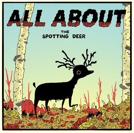
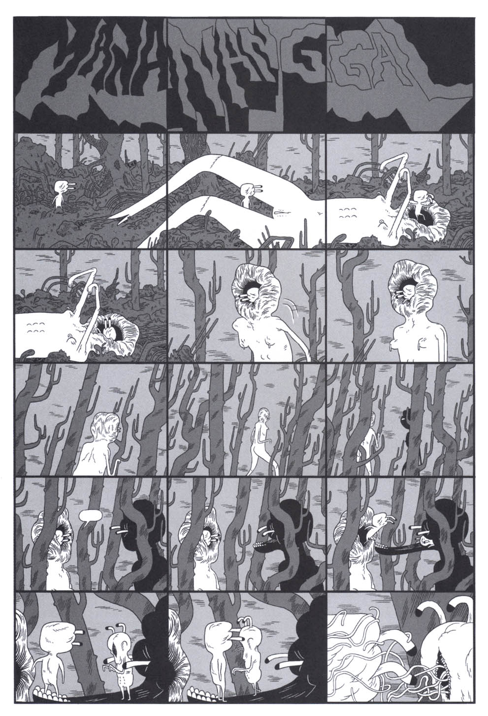
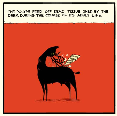
Take, for example, All About The Spotting Deer  (read at link) which is easily Deforge’s most accessible work not least because of its narrative clarity and congenial art work. It is a story which has been described numerous times in capsule reviews of Very Casual. The one thing Spotting Deer isn’t though is disgusting or grotesque. DeForge’s construct—a confluence between Bambi and a nematode—would make a fascinatingly creepy but family friendly plush toy (less the penis of course).

Shawn Starr and Joey Aulisio  (writing on an obscure blog) provide the longest and best commentary available on this story. For once the substance of the comic which they adore is addressed:

Starr: All the story beats are there, the uncomfortable section on mating rituals (DeForge’s depiction of the “Sexual Aqueduct” perfectly captures that feeling of awkwardness experienced in a sixth grade classroom) and the oddly nationalistic/hyperbolic statement on the animals importance in popular culture and ecosystem. The book is even designed like an old CRT monitor, and its use of the four panel grid is reminiscent of a slideshow presentation.”

Aulisio: I have found it difficult to explain why it resonated with me so much…I think DeForge started out trying to make a book savaging the “fanboys” and then by the end realizing he was just like them, which was the real horror of it all. That moment of realization rendered by DeForge is truly chilling, nobody draws disappointment and disgust quite like him.”

Starr: …I think the “savaging” is too intimate to be from a fanboy. My reading of it is more as an affirmation of DeForge’s place as a cartoonist. He may have started as an outside figure (the writer), but once he (the writer) appears it moves away from the first half’s exploration of “herd” (nerd) culture and becomes explicitly about cartooning.

…I think DeForge realized he was one of the spotted deer. A part of the “study group”…there is the “Deer in Society” section, moving away from home to the city (but not before being ostracized by your family/community), the “ink spot” neighborhoods, the livejournal communities and the “pay farms” where their “psychic meat” adapts the characteristics of other products…

DeForge has less to offer on the story but seems convinced that his coloring is purely “ornamental”:

“I think I’ve been coloring my comics the same way I’d go about coloring a poster or illustration—where I’m just trying to make something eye-grabbing, and maybe establish a mood or whatever—so it’s really just decorative. I’m never doing anything I couldn’t accomplish with my black and white comics. So if I do a comic in color again, I want to make sure the colors aren’t just there to be, like, ornamental.”

Some of this is apparent right down to the insistent use of what appears to be screentone to vary the color gradients in each panel. There are varying shades of red used to denote sexual activity; a panel blanketed in orange to signal an animal’s sixth sense; and the blue grey tinge of the deer’s penis which suggest less a fleshy protuberance than an extension of seminal fluid. The colors are descriptive, moving from the clear greens of the forest to the more murky environs found in the mechanized cities of Canada. Used as highlights, they add to the sense of desolation and isolation in his depiction of bioluminescent antlers stranded in dark space alongside beer halls and strip clubs.

wtdsd_6a

Spotting Deer is not mere parody of wildlife documentary but (as Starr and Aulisio indicate) a study in anthropology and sociology—a subject now quite familiar to the man on the street in the form of comparisons of human behavior to those of our simian forebears. It is a description of exclusion, exploitation, and half-hearted rehabilitation; a statement on the worm-like ancestry of third class citizenry. Not a simple representation of the dregs of society but a picture of their domestication—benumbed in this instance by soul stripping work and the allure of social networking. A strangely quaint and familiar argument popularly proposed by Noam Chomsky (using the example of sports) in Manufacturing Consent (among other places):

“Take, say, sports — that’s another crucial example of the indoctrination system, in my view. For one thing…it offers people something to pay attention to that’s of no importance.That keeps them from worrying about…things that matter to their lives that they might have some idea of doing something about. And in fact it’s striking to see the intelligence that’s used by ordinary people in [discussions of] sports [as opposed to political and social issues.”

DeForge’s story works best at the convergence of narrative sense and mystery, when the products of deer-dom are suddenly presented to the reader in a hodge podge of styles carefully cultivated by the artist—the detritus of the cultural landscape of the family Cervidae now made real. At this juncture, the story moves from curious amalgamation of mammal and nematode (and host and parasite) to a metaphorical sociology and autobiography. And thus we have sightings of conceptual art, a King Features strip homage, the pixelated nostalgia of a computer game and a quarter bin rock LP.

wtdsd_4a


Cold Dark Matter: An Exploded View 1991 by Cornelia Parker born 1956

[Cold Dark Matter-An Exploded View by Cornelia Parker]

A life exploded and examined; all of this enriching and complicating that mystical act of rutting and sex seen some pages before.


wtdsd_2a

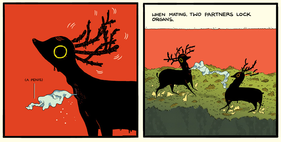
Descriptions of DeForge’s work often suggest a visceral or emotional experience not easily communicated but Spotting Deer goes beyond a mere fascination with line and imagery to a more amenable complexity both to mind and eye. The sexual act which DeForge depicts is not between creatures of the opposite sex but between two antlered “males” which happen to be hermaphrodites. Seen in congress with the story’s later developments this becomes not so much a picture of  biological procreation but of artistic influence. Acting at once in concert and opposition to this, the antlers begin to resemble genetic fate acting both as tribal headdress and familial enslavement.

If DeForge’s comics lineage can be traced (at least) as far back as the Undergrounds, then one thing is clear—the transgressive is regressive as far as comics are concerned. It has been for decades. The banning of comic books and the jailing of cartoonists may make the headlines but these headlines no longer make for great and lasting art. Not even if you charmingly distort the act of artistic “pregnancy” and transmission, …

MMC

…imagine a drug induced head trip as a cannibalistic ritual, or punk up Dilbert and Nancy and make them Hell’s Angels on a trip to transcendence. These may amuse with their playfulness and herald “promise” in terms of technique but they are not the comics masterpieces we will remember 10 years hence.  As much as half of Very Casual is inconsequential fluff with his Ditko “tribute” (“Peter’s Muscle“) taking the rearmost, being nothing less than a veritable time capsule of 80s  mini comics drivel.  What is required from critics celebrating the works of DeForge I feel is some degree of moderation in praise.

AC13

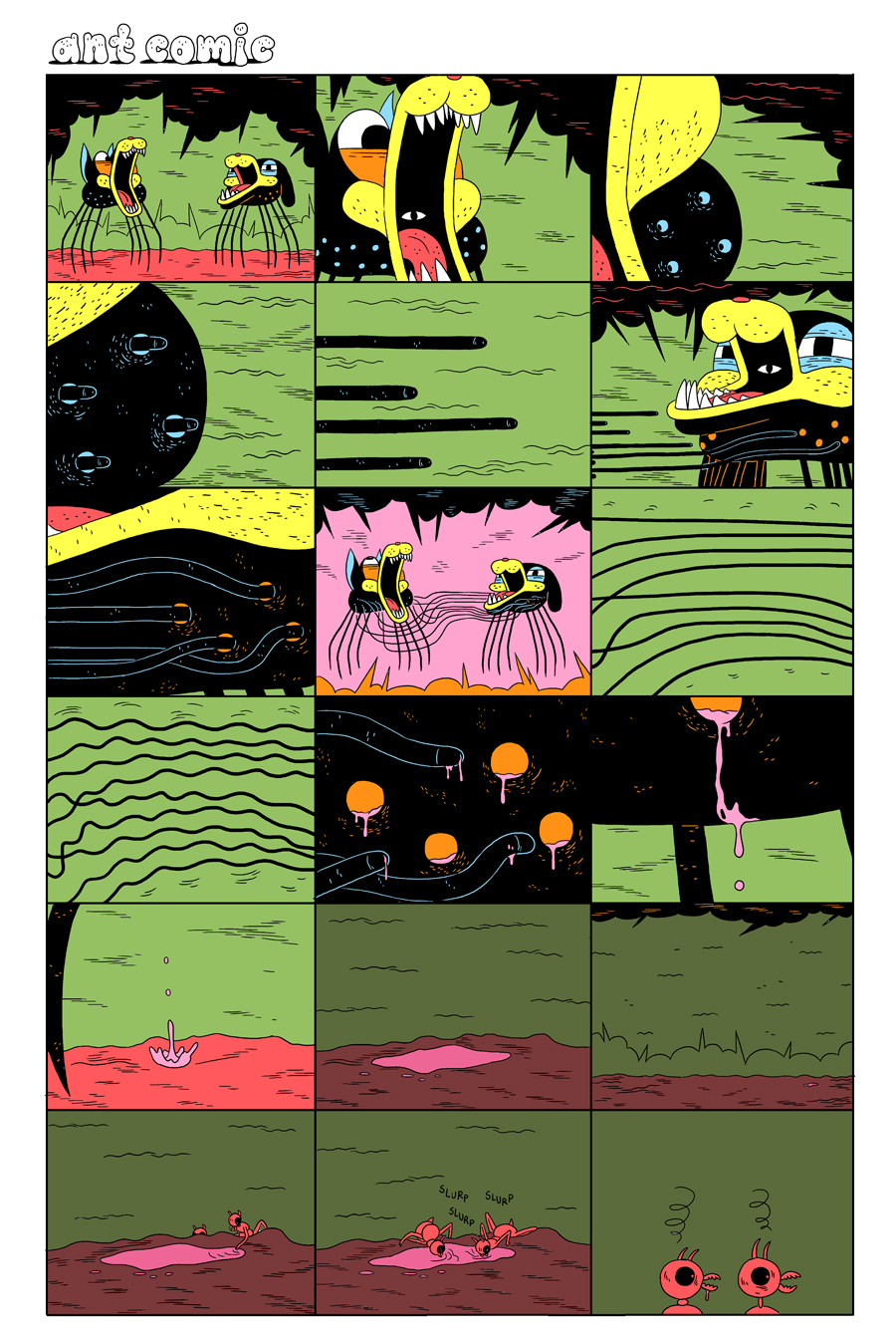
DeForge’s comics certainly seem far removed from the literary structures and complexities—the doublings, the repetitions, the triplings etc.—of the old hands. Despite its length, his Ant Comic largely dispenses with any sustained interplay between word and image or even panel layout.

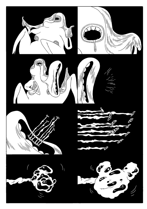
It can be read most directly as an exercise in straight adventure coarsened by bloodless massacres, sudden death, multiple episodes of attempted infanticide, and god-like interventions from humans. In this it resembles Anders Nilsen’s Big Questions where the protagonists are finches. It is differentiated by its greater scientific curiosity and playfulness in design (the architecture of the ant colony, the technicolor queen, the dog spiders). The most appealing pages here impart a kind of primitivization of action; where violence and sexual death are seen as a series of abstractions—shuddering tentacles, puncture wounds, and a pool of blood.  A familiar type of comics montage which is enriched by simplicity bordering on abstraction. The dialogue follows a similar path and borders on autism. In its stripped down self-centeredness and solipsisms, Ant Comic mirrors the naked and frankly ridiculous existential angst and egotism of the comics of Mark Beyer (Amy and Jordan) but here grafted to exuberant world building.

If Ant Comic generates some mood and the occasional flash of deadpan humor, then it should also be said that the gulf between the shock of recognition and our empathy is far too great to be surmounted; a case of technique—the whimsical creature designs and fascination with scale and detail—subverting feeling. It is telling that one of the few instances where any trauma registers is in DeForge’s delineation of the sorrows of war—his callous depiction of the rape and disfigurement of matriarchy (the somatically and anthropologically familiar ant queen).

AC45a

The natural world and entomology become proxies for an examination of primitive societies, a return to  the (seemingly) discredited theories that matriarchies formed a major part of the earliest human societies. It is a refutation of feminist utopias and a proposition that violence is biologically determined both in males and females. Both these themes have been explored quite thoroughly in feminist SF literature (Sheri S. Tepper’s The Gate to Women’s Country comes to mind) but here divested of ornamentation and boiled down to plot points—the matriarchal dystopia as a Sunday adventure strip; the Freudian longing for the mother wedded to a forlorn hope in the figure of a new queen towards the close of the narrative. Nature remains unpredictable; the future unknowable.

DeForge’s tools of reduction and humor bear comparison with the comics of R. Sikoryak as seen in Masterpiece Comics where we are presented with Crime and Punishment as a Batman comic by Dick Sprang, and Kafka’s The Metamorphosis as seen through the artistic tics of Charles Schulz. Even Mozart had his “musical jokes” and DeForge’s Ant Comic presents itself as a kind of artful popularization of martial and feminist themes, one where compulsion, sexual duty, and resurgent gynophobia and misogyny are brought into stark relief.

Taken as a whole, some might see in DeForge’s comics a kind of palate cleanser—primal offerings from the artist’s soul to a comics landscape sick to death of the worked out machinations and literary pretensions of the “heritage” cartoonists; the neglected bigfoot aspects of RAW, Fort Thunder, and Kramer’s Ergot once more brought to the fore even if few long form works of note have emerged from this tradition.

But all this is only guesswork.

As comics readers we have been constantly told what to love without being told how to love or even why to love by the critical community. In this we have a perfect metaphor in the form of DeForge’s Ant Comic where the ant drones directed by invisible hormonal signals congregate dutifully around the queen with a conscientious passion in the service of procreation and survival. And as with DeForge’s fable, the ultimate result of this docile compliance is death.


You’re a Dismembered Meme, Charlie Brown

Michael DeForge wants you to know that comics aren’t just for kids anymore.

inccov

The cover of DeForge’s Incinerator is a bland desecration of comics past. Snoopy’s instantly recognizable backside suffers a decontextualizing detournment, transformed into a torso for the wrong bald-headed kid walking through a typically scrungy alt comics landscape, his tail a bulbous, inexpressive phallus between legs lifted with jaunty incongruity above the junk and debris. Bleak plant-like and rock-like globs ooze at stochastic intervals, the stripped-down iconic style suggesting the world of Peanuts determinedly uglified by underground grunge.

The adultification, not to say adulteration, of Peanuts is a familiar alt-comics trope. Chris Ware and Dan Clowes tend to try to capture Schulz’s rhythms and then layer on sex, drugs, scat, and other supposed markers of maturity. DeForge, refreshingly, goes for a more blatant approach.
 

inc1

 
The sad, anatomically challenged amalgamation is set upon by a gang of college students; weaponized maturity mugs the beloved icon of childhood,leaving it groaning in a ditch. The torso has to be taken to a vet while the rest of the sorry creature goes to a hospital. Separated, the beagle body dies, leaving only that bald-headed kid, suffused with pathos.
 

Picture 2

 
Rather than the Schulz’s grass-level camera, we’re here treated to a crazy look down; a god’s eye view if god were stuck up there with the knick-knacks on the teetering top of a bookshelf. Or, perhaps, we’re looking down at the comics page itself; the sophisticated adults with the book of childhood spread out before us, distant and oddly angled, too small to fall into. We stroke our chin with the analyst in the chair, seeing the mundane neuroses in the formerly fanciful images.

The de-beagled hero goes through his alt comics paces, attending group therapy, reveling in nostalgia for the comic icons of his childhood,
 

Picture 5

 
participating in a tender romance. On the final page, the beagle torso, like all those childhood pamphlets, is chucked in an incinerator. The image before it burns is of the girlfriend in dominatrix garb whipping the naked protagonist as he barks. The innocent goofiness of childhood is chucked for sexual perversion. Get rid of that doofy tale and you can see the penis which was hidden there all along.
 

inc14

 
It’s certainly possible to see this as an absurdist Fort Thunder satire of the alt-comics and underground obsession with Peanuts, with being grown up, and with the conflation of the two — artsy hipster tripped out weirdos mocking the differently literal immature maturities of Chris Ware and R. Crumb. But it’s also possible to see Incinerator as a kind of avuncular celebration of those immature maturities; a humorous, self-aware, nostalgia for other folks’ nostalgia, and for the role it’s played in the development of comics past.
 

Picture 6

 
Growing up, trying new things, is energizing. The Rorschach-blot-feces lunch forms an interesting pattern, it’s very repulsiveness an ironic attraction. Adulthood is still what’s on offer, but an adulthood less bleakly blank than Ware’s or Clowe’s, in no small part because it sees Ware and Clowes as comfortingly familiar predecessors. Thus, adulthood here means building on Schulz’s absurdity (and Clowes’ and Ware’s) rather than on his (or their) existential despair. It means using Peanuts, and Peanuts’ successors, as visual tropes rather than as a blueprint. Adulthood becomes an at least intermittently pleasing agglomeration; lack of integration, the loss of the coherent circumscribed world of childhood, becomes its own pleasure. The lost thing provokes not just nostalgia, but joy at the missing piece. If Lacan’s child looks in the mirror and feels celebratory at the illusory image of an integrated self, DeForge’s adult looks at the comic and feels celebratory at the illusory image of a haphazard collage cyborg, the aging self as bits and pieces of one’s own past.
 

Picture 8

 
Part of that delightful adult collage, it seems, is the image of a woman. One of the female college students in the crowd at the beginning of the story later becomes our protagonist’s rom/com, Jeff Brown sweetie, and finally his dominating mistress.
 

Picture 1

 
That flaccid arm across her shoulder contrasts with the cruel, stark phallic trees framing the hearts which seem less like a vibrant expression of love than like de rigeur filligree tacked up to the moire background. This is not a story, but the garbled image of a story; not love but the parodic potency of recognizing parodic lack of potency. The girlfriend, as marauder or sweetie or dominatrix, never speaks. Unlike Schulz’s Lucy, or Sally, or Marcy, or Peppermint Patty, she has no tale of her own. The protagonist’s self is the past, but the woman’s self is simply image, signalling various comfortably denuded narratives of coherence: teen rebellion, love, sex. The silent, faceless Snoopy is discarded, the silent, many-faced female is picked up with new arms. The one coherent attribute of adulthood is a recognition of absurdity. All the rest, no matter how soaked in sentiment — be it comics, woman, torso, or heart — is just a part of the caducous bricolage.

Michael DeForge’s Sketchbook

Michael DeForge destroys his sketches. He finishes his sketchbooks and then throws them away. This is a different approach to art than I am used to. For me, the sketchbook has always been a personal object. The closest approximation to an artist’s brain without telepathy. Personal letters to oneself. Sketchbooks are the work behind The Work. Many artists keep all of their sketchbooks, whether they look at them again or not. DeForge tosses his when he is finished. So I rethink what it is a sketchbook is for.

Michael DeForge publishes a lot of work. He has comic books from Koyama Press and Drawn & Quarterly. He self-publishes minicomics. He has comics in various anthologies. He posts things on his blog. He does commercial illustration. I would imagine that for him, the work itself in its final form is the personal journal of his progress. It could be that the sketchbook is merely practice. Raw, unsentimental practice.

If an artist uses sketchbooks for practice and not as some sort of defacto art project in and of itself, perhaps that artist no longer has use of the preliminary work. After all, we cartoonists think nothing of erasing our pencil lines after the ink is dry. What is the difference, now that I think of it? Why should the bound book of rough drawings be fetishized? When the final project is published, the rough work is… ?????

________________________

My conception of sketchbook use was largely based around the idea of something between a diary and a catalogue of ideas. One problem for me is the struggle between practicing artcraft in a sketchbook and allowing the sketchbook to become the artwork itself.

I had a class in art school called Sketchbook Creation. The course was inspired by Alan Gordon, the professor’s travels across the country in which he made his paintings on the go in a bound book. His idea for the course was to help the students open up their imaginations through particular exercises and controlled free-associations. In the end most of us sort of ended up making work that looked like his. Some of us continued for years after graduation, making finished art in books of heavy paper. Portable, but shackled to a relatively restrained format. Sketchbooks weren’t practice anymore. They were the art itself.

Imagine having a sketchbook for your sketchbook.

Imagine sitting in front of the tool which is designed to be an outlet for experimentation and being unable to experiment because it has been recontextualized as yet another Grand Canvas. Sketchbook Creation was my best class in art school but it also shackled me and ruined me in some ways. I hardly doodled anymore. Every drawing had to be good enough to show people. To be fair to Alan, the film “Crumb” had previously contributed heavily to this tendency for me.

Things got better when I started talking to people who use their sketch books only to practice for projects that they were working on. It took a while to overcome the pressure that I had internalized about making “showpieces” in my sketchbooks but I feel as though I’m turning a new corner now.

________________________

As I get older I have been growing more acclimated to the idea of impermanence. Not simply the idea that things change but more the idea that things are never fixed to begin with. Age gives perspective. We see a larger picture as we get older because events and phenomena take up a smaller percentage of our perspective as our years of existence increase. Six years means “since forever” when you are six years old. Six years means “as long as you’ve lived in this city” when you are thirty. Six years probably means very little when you are eighty-six. Your view cannot help but change as you take in more and more life experience. Things were never as “stable” as I thought they were when I was a child, I just lacked the experience to notice the movements.

In many ways an artist’s work has a life cycle as well. It’s “conceived,” no pun intended, it grows as the artist pours more work into it. The work matures and is sent into the world. At this point, we consider the tangible remnants of an art work’s youth. Do we save it in a drawer as humans do with their children’s baby clothes, perhaps in hopes of some future use? Or do we discard the husk as insects do?

I’m neither seeking nor am I suggesting an answer. Ultimately it’s a personality and lifestyle choice. As I stand amid the chaos of my bedroom, I would do well to cast away my preliminary drawings like a snake’s old skin. Being unsentimental about these things could probably spur me forward into being much more productive, as I tend to clutch things I’ve made, things I own. On the other hand, there are artists such as my old professor for whom “sketches” and cast off ideas are as treasured and valued as gallery paintings. Of course there isn’t a right or a wrong answer. The question itself is rhetorical.
 

Drawing by Michael DeForge

Into the Inkwell

Mort Meskin: Out of the Shadows, edited by Steven Brower. Fantagraphics Books.

Mort Meskin’s studiomates in the bullpens of mid-20th century comics production remarked that he was a sensitive soul who was known to face a blank sheet with an artist’s block akin to sheer terror, until someone would scribble some random lines on the page, which he could then be sufficiently motivated to transform into his brilliant chiaroscuro images. Meskin’s best work was a powerful formative influence on other great comic book cartoonists such as Jack Kirby, Alex Toth, Steve Ditko and Jim Steranko. As the years passed, though, he became obscured in comics history. I was first made aware of him when he came up as I was interviewing Steranko. To identify the initiator of a comics storytelling technique, we consulted with the late, sorely-missed Dylan Williams, who had built a website about Meskin. Sure enough, MM turned out to have been the first to use the device in question, a Muybridge-like means of depicting rapid movement with multiple figures that Steranko called “strobing”. In more recent years, former Print magazine creative director Steven Brower has championed the artist, first with his 2010 Meskin biography Shadows to Light and now with a  career-spanning collection of complete stories.

Meskin’s drawings seem to emerge from blackness

Some of his greatest early work in Out of the Shadows like Fighting Yank and collaborations with Jerry Robinson such as The Black Terror display particularly dramatic drawing and effective storytelling. In some of the stories, the  color is unusually good; it is all wonderfully restored. Another highlight is that some of Meskin’s linework for Golden Lad is presented in incredibly crisp black and white. Sadly, there are no representations of Meskin’s work for his main client DC Comics on such inventive strips as Johnny Quick or even his later, apparently generic but no less animated and well-rendered short strips for their mystery and sci-fi titles, presumably because DC jealously protects its assets, even to the detriment of the legacies of its most innovative artists like Meskin and Toth. Still, it can be seen from Brower’s thoughtful selections that Meskin was a strong narrative draftsman and an architect of arresting images.

______________________________________________________

The Shark King by R. Kikuo Johnson. Toon Books.

In this graphic novella produced under Francoise Mouly’s Toon imprint, Johnson appears as an heir apparent to Meskin and Toth. Adapted from a Hawaiian mythology, The Shark King reportedly truncates and makes more palatable its source story, but it is a sharply rendered and very effectively colored short children’s book that displays a tremendous amount of kinetic energy. The characters move around the pages in a manner which deliberately facilitates and enhances the reading experience. Johnson is a very clean and controlled artist who gives his book an almost “golden age” feel. His use of black and colors define the forms and spaces with a rare mastery.

Johnson’s color is apparently built from hand drawn separations.

I am a little unclear as to the value of the message the story sends boys regarding their relative relationships with their mothers and their willfully absent fathers, but still, I much prefer this book to Johnson’s earlier adult graphic novel effort, his beautifully brush-drawn but callow coming-of-age tale, The Night Fisher.

______________________________________________________

Ragemoor #s 1-4 by Jan Strnad and Richard Corben. Dark Horse.

In an interview on TCJ last week, Rich Corben speaks of his upcoming Edgar Allen Poe adaptations and honestly, I wasn’t overly excited by the news; I have a pile of his previous Poe work and enlarging it seemed to me to be a redundant reworking of relatively quiet, morbid tales that do not show off the artist’s best abilities.  But maybe I should give him the benefit of the doubt. In recent years Corben has been doing a lot of work, some of the best of it in Mike Mignola-written Hellboy comics for Dark Horse. These have offered him ample opportunities to indulge in his trademark over-the-top horrific imagery, as well as the type of  inventively articulated, muscular fight scenes that he excels at. And, although I admit I’d prefer that Corben colors himself, the Hellboys have been very well colored by Dave Stewart. I also admire a few stories that writer Jan Strnad and Corben did together in the past, but as their new miniseries Ragemoor came out over the past few months, it was a little hard to love.

Perhaps the best art in the series, the cover to Ragemoor #2

For one thing, the art is black and white, not color and Corben does his own tones, but my initial impression was that the work here often looks a little awkward and rushed. His blacks are plenty juicy and his digital greys augment the maniacal depression that permeates the pages, but there is a chunkiness to the construction of the forms—a simplification of the drawing that often subverts Strnad’s scenario; it makes it quite difficult, for instance, to buy that the hero is smitten with the female character, who must be one of Corben’s least appealing ever for the pulpiness of her features…and that is saying something. He is known for constructing clay models to draw from, but here she seems smooshed by all thumbs. Yeesh!

The “splendorous angel” Anoria takes a dive in Ragemoor #3

However, it wasn’t until I had all four issues that I was able to truly appreciate this effort. In the end, Corben doesn’t disappoint….it works much better taken as a whole than it did as a serial. So buy them and read them all in one sitting. There are some genuinely frightening moments, not least what becomes of the hideous heroine.

______________________________________________________

Prophet #22-26 by Brandon Graham, Simon Roy, Farel Dalrymple and Giannis Milonogiannis, with Fil Barlowe, Frank Teran, Emma Rios and others. Image Comics.

I have Brandon Graham’s thick King City book, although I haven’t yet had a moment to read the whole thing. I can say, though, that his solo comics strike me as one of the few times (Damion Scott is another) that I have seen a cartoonist whose work effectively evokes the imagery of Hip Hop,  which through aerosol innovators like Phase 2 evolved from the graphic forms of Vaughn Bodé and Philippe Druillet to become commercially appropriated by corporate America, but criminalized in its public art form.

Graham recently took over the Rob Liefeld vehicle Prophet and is using it as a collaborative engine to work with other artists and in so doing to reinvent the esoteric science fiction promise of France’s Metal Hurlant, that has informed the cinematic science fiction of the past few decades but whose power disintegrated in the comics medium because of the mainstream American banalization of bad translations and airbrushed van-artiness of Heavy Metal.

Graham and Dalrymple form a compelling argument for collaboration in Prophet #24

I have no idea what Leifeld did in his earlier issues of this title, but bless him for enabling us to jump in on Graham’s stories for Prophet, which are dark and forbidding but keyed to the unique properties of comics,  written as they are to accommodate many double page spreads depicting far-flung vistas of more than passing strangeness and with odd diagrammatic passages that explain technical details. These disturbing scenarios have been drawn by a range of inventive talent, from several issues of Simon Roy’s fluid linework, to one with Giannis Milanogiannis’ slashing penstrokes, to one with some of the best work I have seen from Farel Dalrymple and then, the most recent issue is sparely drawn by Graham himself with echoes of Kirby and Druillet. All of the issues are beautifully colored. As the series goes on, an unusual sense of excitement, of discovery is engendered, a feeling that I have rarely had since my first exposure to Les Humanoïdes.

Graham draws his own script for Prophet #26

In addition, Graham has solicited some very interesting backup stories: #22 sported a short piece by the Australian Fil Barlowe, whose Zooniverse was a singular exponent of intergalactic multiculturalism in the early 1980s; #s 23 and 25 boast two parts of a Frank Teran strip and #26 has a piece by Emma Rios with an absolutely extraordinary panel configuration.

______________________________________________________

Spotting Deer and Lose #s 2-3 by Michael DeForge. Koyama Press.

I’m very encouraged when I see people such as Graham, Dalrymple and C.F. who seem to be influenced by sci-fi junk as much as anything and who are not afraid to work in genres that were formerly discredited by the alternative. Reality is fine as far as it goes, but comics also have potentials for world-building that aren’t scratched by stories about drinking coffee in cafes whilst bullshitting with one’s peers. Michael DeForge is another of the younger generation of cartoonists who uses sci-fi in his strips and this guy not only draws aliens, he draws LIKE an alien.

DeForge’s Spotting Deer: freaky deaky

His stuff reminds me a bit of my old friend Steven Cerio—-hmmmm…I wonder what happened to him?—like Steve, the work is bizarrely well-drawn while being frighteningly “othered” in conception. DeForge’s oddly shaped and thin but amazingly colored Spotting Deer book, for example, about a race of slug beings that mimic mammalian deer, is a real mindfuck prize and his erratic but engaging floppy comic Lose rewards examination, as well.

From Lose #3: nowhere to go but up

I don’t get why his main story in Lose #3  features an apocalyptic landscape with flying dogs who interact as if they are in a contemporary technological society, but it hardly matters; what counts is that DeForge uses the freedom of comics to make characters and places that follow his own rules. My favorite strip in this issue is “Manananggal”, a fearsome but indecipherable cinematic progression of otherworldly bioforms.

______________________________________________________

Raw Power Annual by Josh Bayer. Retrofit Books.

It can be difficult to explain to anyone, let alone someone not versed in the language of comics, the appeal of a Meskin, a Corben or a DeForge.  I find it equally hard to describe Josh Bayer’s fierce comic Raw Power. I’ll try, though. I could say his massive figures bring to mind a sort of Kirby on amphetamines (and he milks and remilks a line from Jack’s “Street Code”), that the art seems sometimes as if it is drawn with a stick dipped in mud, but then, it also has some quite delicate passages and the entire thing reads with an invigorating, furious energy that is impossible to ignore. The story veers wildly; a description of Jimmy Carter’s war to suppress punk music  (that I find completely believable and which was apparently imparted to Bayer by Jello Biafra and Ray Pettibone) segues from the origin of Bayer’s ultraviolent superhero Catman to a version of Watergate sociopath G. Gordon Liddy with the aspect of a fiendish motivational speaker and then goes into a revisioning of an issue of one of Marvel’s cheesy 1980s comics, DP7  (a little like Jonathan Lethem and Dalrymple’s reworking of Omega the Unknown), which I am certain is far more interesting than the original comic could have been.

Josh Bayer’s Raw Power: faster, harder, WTF.

Comics like these are why I still love comics—-they are full of the odd things that artists do that are personal tics, that perhaps are mistakes or maybe they are done on purpose, but they are what makes the stuff memorable and make us think that we also could make comics—-and we can! We can make them and print them ourselves! They are why, as I have discovered,  the healthy part of comics is not in the pathetically over-edited and suicidal mainstream, but in the alternative where the artists, writers and readers are in charge. We can make lines coalesce on paper to form worlds in our own image and share them. We don’t have to answer to authority.

______________________________________________________