Optic Nerve #13 by Adrian Tomine (Drawn & Quarterly)
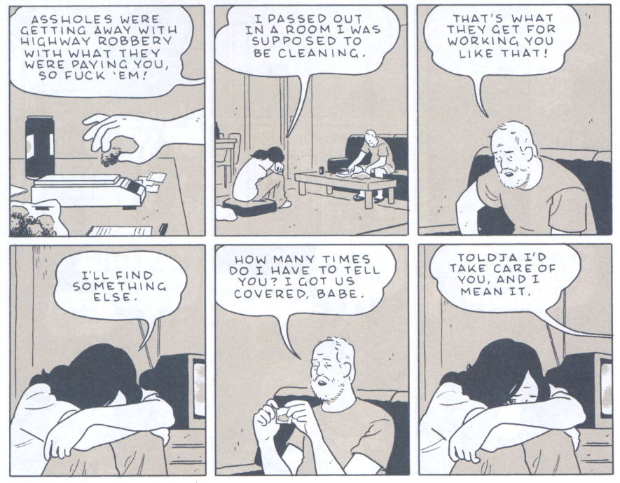
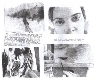
In his previous issue of Optic Nerve, Tomine seemed to be playing around with stylistic tics borrowed from Frank King and Dan Clowes. In the main story of the current issue, “Go Owls,” Tomine does some very assured drawing and storytelling in a naturalistic mode that in this case is a little reminiscent of Jaime Hernandez. But there is no doubt, he is his own man and he is getting better all the time. Here the artist breaks significantly away from his previous stories that dealt more with educated young urbanites to depict the relationship beween a Middle-American, more proletariat couple who meet in a recovery program. Reading it, I felt as if I knew them.
The guy is an asshole, but Tomine manages to show that without hammering the point; he enables his story to unfold in a quite believable manner and elicit sympathy where he wants it directed with subtlety. The use of varying colors in a very limited palette throughout works nicely and is balanced by the exquisite control shown in the full color story in the back of the book, which also displays the high level of skill and delicacy that Tomine is growing into with his art.
_____________________________________________________________
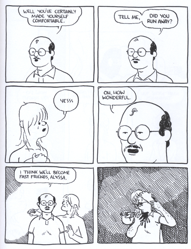
The Daniel Clowes Reader, edited by Ken Parille (Fantagraphics)
This fascinating collection of some of Clowes’ best works is published in the form of a teaching guide, copiously annotated to the nearly absurd degree of including subglossaries defining miniscule details hidden in the author’s panels. In this way, editor Ken Parille begins to resemble Kinbote, the deranged poetry afficianado from Vladimir Nabokov’s Pale Fire, whose notes that introduce and permeate the posthumous edition of his idol/victim’s supposed masterwork begin to entirely supplant the work that they are supposed to supplement. It caused me to Google Parille to try to find out if he is real, or if he is an alter ego of Clowes himself. But, Parille apparently exists in his own right and while I might have chosen a few different stories if I had assembled this book, much of it is admittedly essential and well-served by the package.
The collection includes the entirety of Ghost World, such seminal stories as “Like a Weed, Joe” along with relevant essays and commentary by sundry credible sources, plus Clowes’ excellent polemical pamphlet Modern Cartoonist and another of my favorite pieces of his, reprinted for the first time from Zadie Smith’s groundbreaking 2007 comics/prose anthology The Book of Other People: the brilliant color short “Justin M. Damiano,” a classic that needs to be read by anyone who writes criticism on the internet.
_____________________________________________________________
TEOTFW (The End of the Fucking World) by Charles Forsman (Fantagraphics)
Forsman’s epic minicomics series is collected into a small, thick trade paperback that I’d prefer was fully titled on the cover, rather than intialized as it is. The story resembles the real-life 1958 murder spree by Charlie Starkweather and Caril Ann Fugate, but transposed to modern times and with the gender balance in terms of sociopathy debatably reversed. Forsman’s pair of nihilists are shown to be the results of terrible parenting and are so estranged from human society that they have difficulty feeling emotions and pursuing a viable relationship together, much less to recognise when other people are not psychopaths.
Forsman, a graduate of Vermont’s Center for Cartoon Studies, has a solid grasp of comics storytelling and his lightly drawn page compositions display an intriguing degree of variety. I’d imagine that this would have read in a much more disconnected way in serialized, episodic form; collected, the book reads smoothly and quickly.
_____________________________________________________________
Avery Fatbottom by Jen Vaughn (Monkeybrain)
To my mind, a good thing is that so many of the young cartoonists now emerging reject the contrived plasticity of technique and assembly-line methodology that defines contemporary mainstream comics to instead employ an auteuristic, handmade aesthetic in their work. This can be seen in the work of the cartoonists coming out of comics-oriented schools like that of the Center for Cartoon Studies. Another alumni of that program is Vaughn, who displays a breezy, humorous delivery for her comic Avery Fatbottom, a story of young renaissance fairgoers, which is expressively drawn with loose, appealing brushwork, handlettering and organic watercolor halftones.
Vaughn’s romantic sensibility does not take itself overly seriously and so, her evident pleasure in making her comics has an infectious quality. As with the works of Forsman, these efforts cause those who read them to also want to do their own comics, which is pretty much how I got into this game myself.
_____________________________________________________________
The Outliers by Erik T. Johnson (Alternative)
This comic, the first of a series which apparently is the result of a successful Kickstarter campaign (a large group of contributors are thanked in descending order of generosity inside), has some elaborate production values. It is a small square-bound “floppy” that is printed in two colors, including blue and a sort of lime green that gives it the look of a tract.
The cover is comprised of sketches of alien-appearing creatures surrounded by squiggly lines and printed with silver ink on black paper, but one doesn’t notice this immediately because it is wrapped in a somewhat undersized full-color dustjacket. The story within has a sort of adolescent breathlessness and the art is brushy and dense while also suitably organic and (mostly) handlettered, as befitting a semi-underground coming-of-age fantasy comic featuring a Bigfootish monster.
_____________________________________________________________
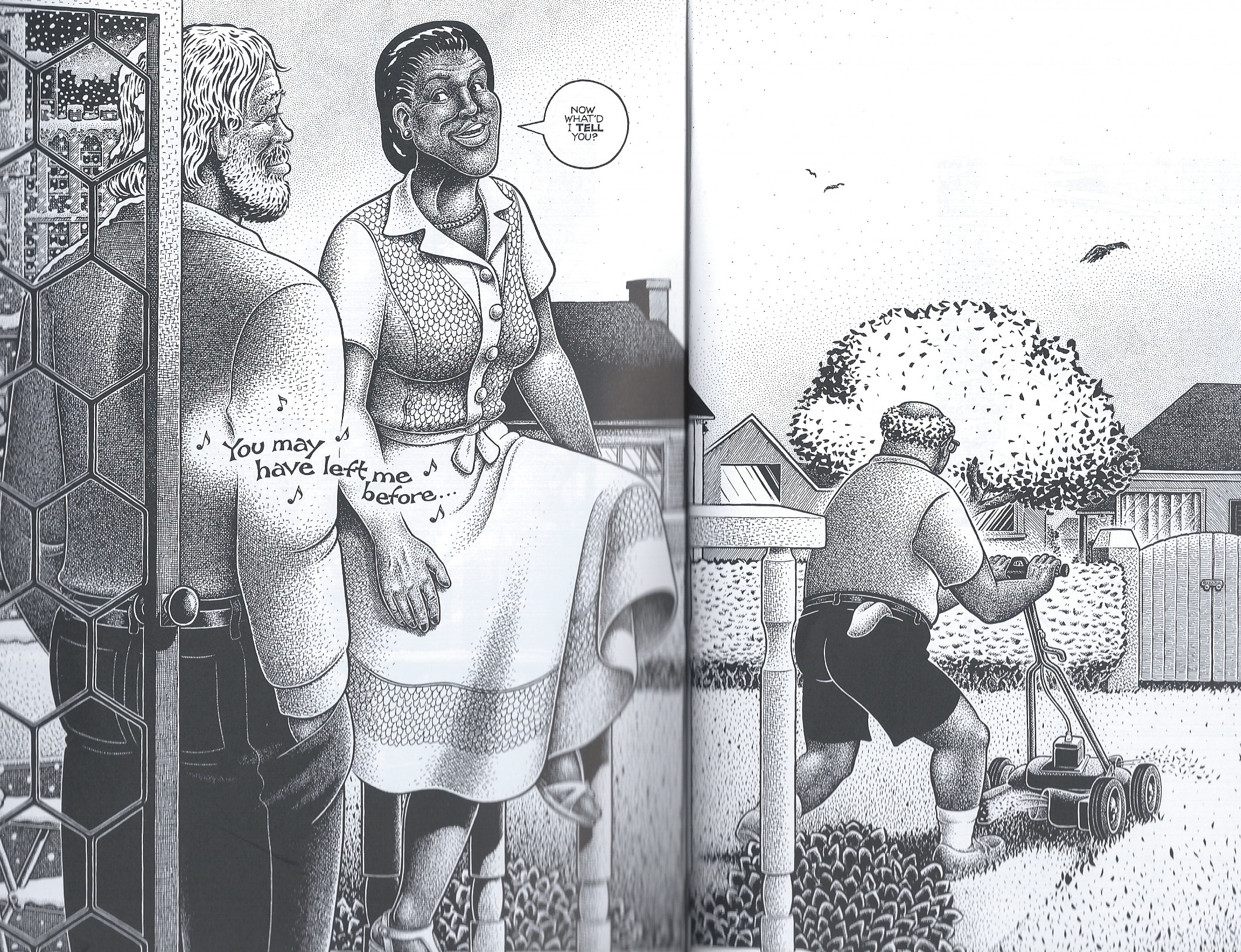
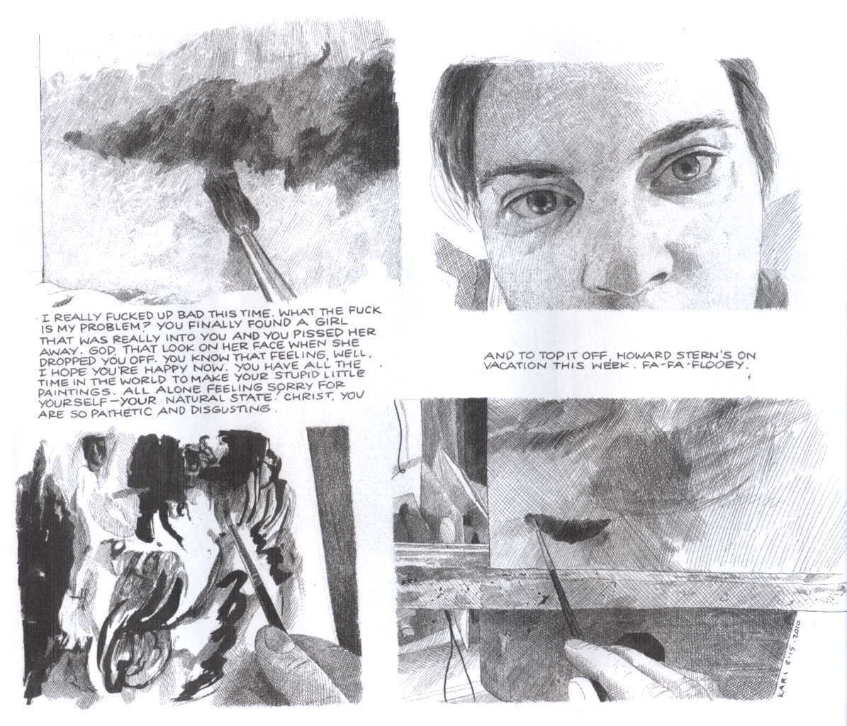
Failure by Karl Stevens (Alternative)
Production values also dominate this handsome but ultimately frustrating trade paperback collection of panels from the author’s weekly strip in the now-defunct Boston Phoenix. Stevens’ clearly evident rendering abilities hark back to those of the engravers of yesteryear, but his photorealism makes me think of nothing so much as an alt/lit Alex Ross.
After admiring the impressively labor-intensive application of crosshatched tonalities and watercolors, I wished that there was a bit more connective tissue to the semi-autobiographical bones and meat of the book than the most prominent theme of drunkenness.
_____________________________________________________________
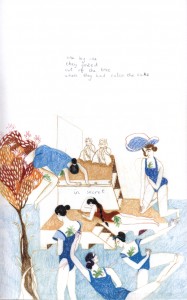
Linen Ovens by Keren Katz/Molly Brooks/Andrea Tsurumi/Alexander Rothman (self published)
My favorite of the works I got at Brooklyn’s Grand Comics Festival, this is an anthology that takes advantage of the compatibility of poetry and comics. Poetry can be greatly enhanced by drawings which do not seek to be redundant with the accompanying words, but rather work in an oblique manner with the text, or run parallel to it.
Art by Keren Katz
Under Tsurumi’s striking cover, handlettering is intrinsic to these pieces; it guides the eye through the soft watercolors of Rothman, for example. Color figures most notably in the semi-abstracted panel transitions of Brooks and the unusual and effective pastel illustrations of Katz.
_____________________________________________________________
The Crow: Curare by James O’Barr and Antoine Dodé (IDW)
It feels to me like a thousand years have passed since the emergence of O’Barr’s pre-Vertigo character/property The Crow in comics and feature films, but here at this late date is a new miniseries drawn with rounded expressivity by Dodé, involving a cop’s desperate search for a child murderer, aided by the shade of one of the pathetic victims. In the two issues I read in PDF form, the title character has yet to rear his head, but the stage is certainly set in a most murky and moody manner by Dodé’s beautifully unforced storytelling.

The poignancy of the art is further facilitated by its being printed from uninked pencils which are then digitally colored with a limited palette of primarily sepia and pale blues. Of course, since this is an IDW publication, as with most mainstream comics, the lettering is digital, which tries but fails to detract from the rich personality displayed in the artwork.
_____________________________________________________________
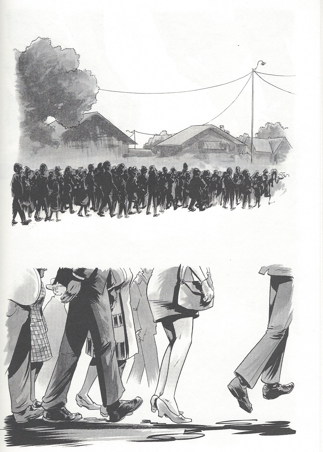
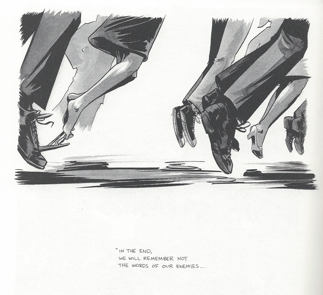
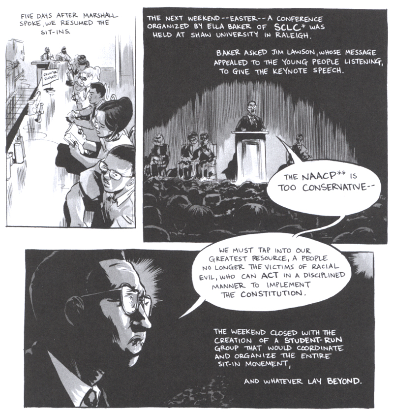
March: Book One by John Lewis, Andrew Aydin and Nate Powell (Top Shelf)
This book is partly written by its subject, the distinguished civil rights pioneer Congressman John Lewis and since it details the early years of the struggle for desegregation in southern states by African-Americans, it justifiably boasts a back cover blurb by former President Bill Clinton. It is a story that we have heard before, but one that bears repeating in a time when a rotten cluster of power has gutted the voting rights that were so hard won.
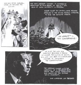
One might have expected such a meaningful project to be published by a high-profile mainstream company such as Marvel or DC, who would presumably bring it to the widest possible audience; but instead it is the product of a smaller company known for artist-owned comics, Top Shelf. This makes it odd that the book is copyrighted only to Lewis and his co-writer/press secretary Aydin, omitting the artist who does much of the heavy lifting here, Nate Powell. Because, apart from the unquestionable historical importance of the very real experiences of Lewis, it is surely Powell’s dramatic layouts that make this narrative function as well as it does in the comics form and his lush halftones are some of the best I have seen since the glory days of Ditko and Wrightson in the Warren magazines.
_____________________________________________________________
XIII: The Irish Version by Jean Van Hamme and Jean Giraud (Cinebook)
I really looked forward to the English translation of this book because I wanted to see Giraud drawing in a contemporaneous mode—-and while I am not disappointed in his drawing and storytelling in any way, it is at the service of a somewhat standard adventure story in which the entire Irish/English conflict is boiled down to be the backdrop of the origin tale in a long-running superspy narrative that makes the artist’s Blueberry westerns seem progressive in comparison. Besides that, the art is printed in a format so reduced that it becomes difficult to read, much less show Giraud’s impeccable deep-space compositions to advantage.
The coloring likewise suffers somewhat from a standardized approach, which drives the point home that Giraud is a much better colorist than anyone his work has been desecrated by since the peak years of Metal Hurlant. However, as he did on his final two Blueberry volumes, O.K. Corral and Dust, Giraud himself put his hand into the coloring to a limited degree to digitally “dirty up” the art, to add lighting effects and ruddier complexions, all of which go a long way to improving the look of what are, sadly, some of the last Moebius comics we shall ever see.
_____________________________________________________________