To celebrate my impending thirtieth, I decided to take a look at the comics being published during the month of my birth, September 1980. Last week, I reviewed a handful of mostly disappointing DC titles. Will Marvel fare better?
Peter Park, The Spectacular Spider-Man #46
Writer: Roger Stern
Pencils: Mike Zeck
Inks: Bruce Patterson
Colors: P. Goldberg
I’m not a Spidey fan. Don’t get me wrong, I don’t hate him the way I hate Superman, but even as a kid, I never had any interest in the character. It’s not that his books are particularly bad. Nor are they any more or less formulaic than the average serialized adventure. I would like to say that the incessant self-pity grates, but that’s not true. I loved the X-Men, but all they did was whine about how the world didn’t appreciate their awesomeness.
My indifference to Spider-Man actually came from his place in Marvel’s shared universe. Now in theory, a shared universe is supposed to excite young readers with the promise of team-ups and crossovers and guest appearances. But there’s a flip side: all of Spider-Man’s adventures take place in a world that he shares with Thor, the Hulk, the Avengers, the X-Men, etc. In other words, he’s a small fry fighting two-bit villains.
The standard tag line I hear from Spidey fans is that Spider-Man is a middleweight hero who struggles to overcome more powerful foes, and that’s what makes him relatable. But young me didn’t care about relatable. I wanted his stories to be big and epic, I wanted them to “matter,” and how could Spider-Man foiling a bank robbery matter when the Avengers were saving the planet at the same time? As an adult, I can see that this attitude was silly. And yet … Spider-Man still seems like the sideshow to me.
In this issue, Spider-Man fought a jewel thief named Cobra. It’s as inconsequential as it sounds. Meanwhile, the X-Men were saving the universe…
Uncanny X-Men #137
Writer: Chris Claremont
Co-plotters: Chris Claremont and John Byrne
Pencils: John Byrne
Inks: Terry Austin
Colors: Glynis Wein
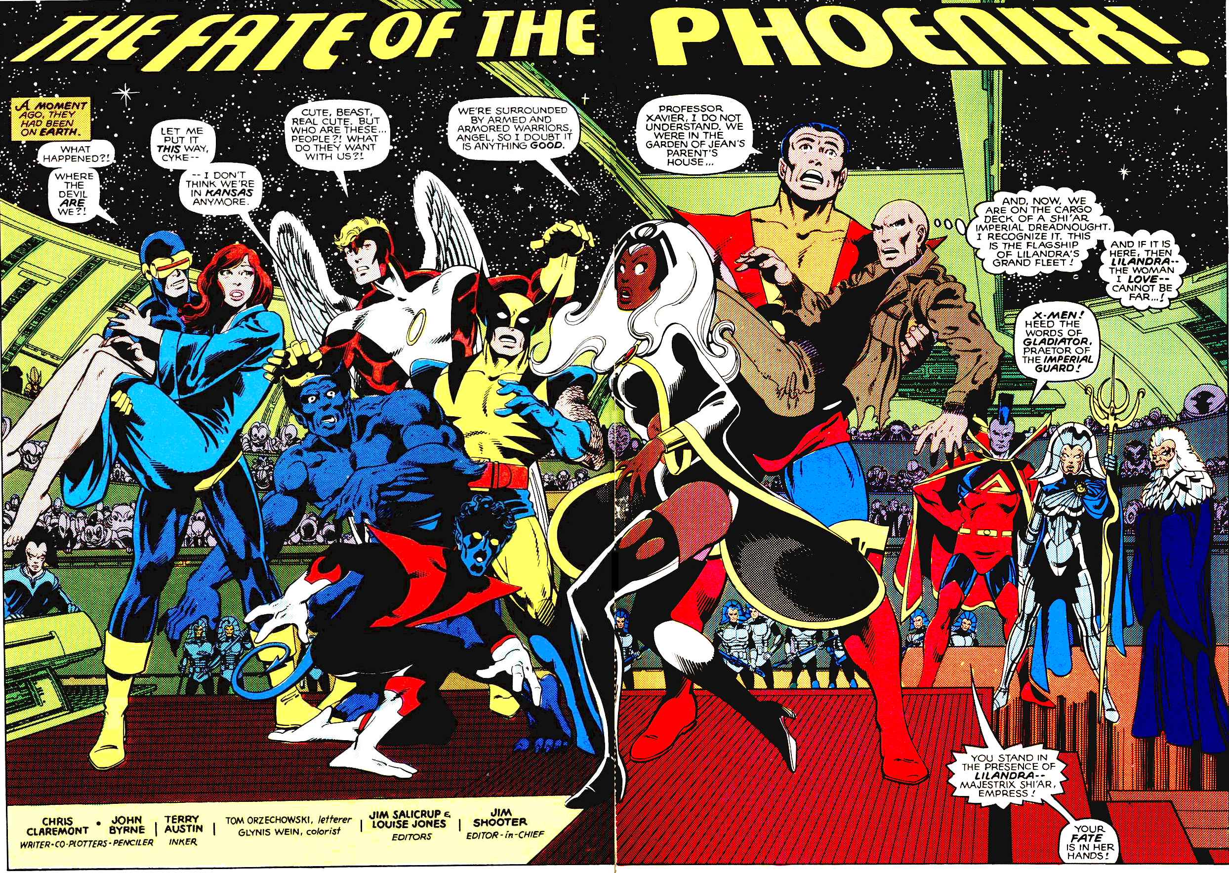
This is arguably the most famous issue in the history of the series. The star-spanning Shi’ar Empire comes to kill Jean Grey, a.k.a. the Phoenix, and the X-Men fight the Imperial Guard in a failed bid to save her. And since this was written by Chris Claremont, it begins with a crapload of exposition.
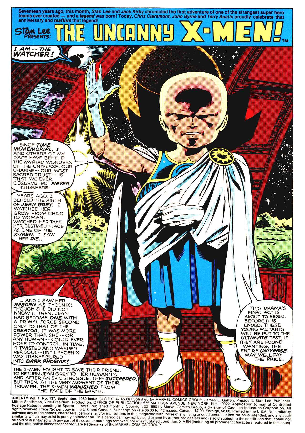
Jack Kirby created the Watcher way back when in the pages of Fantastic Four. From what I’ve read, the Watcher is a near-omnipotent entity who’s grand purpose is explaining the plot to lesser beings. He’s essentially a glorified recap page, and yet he narrates with such gusto. Look at the guy! He takes such pride in summarizing the preceding six issues, and he’s already convinced me that that this will be the greatest comic ever. Who knew that combining a giant bald head, a toga, and goofy boots would produce such a charismatic character? Jack Kirby knew, that’s who.
John Byrne drew a great double-paged opening splash. He fit all the characters onto the spread while still leaving just enough room for Claremont to give more lines of exposition to as many characters as possible. That’s teamwork.
Of course, the subtext of the storyline is still depressing. A woman gains absolute power, so naturally she goes insane and has to be destroyed. Rumor has it that Byrne and Claremont initially intended to de-power Phoenix as a punishment for her actions, but Editor-in-Chief Jim Shooter insisted that she die (because she’d committed genocide in an earlier issue). Regardless of their intentions, de-powering doesn’t change the subtextual problems.
Not that any of this mattered to my younger self. The sprawling melee on the moon remains one of my favorite action pieces from superhero comics. And the death of Jean Grey perfectly embodies why so many kids and teens were drawn to the X-Men: MELODRAMA.
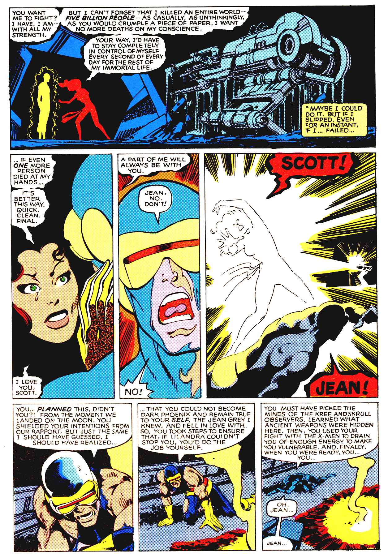
The romantic (and platonic) relationships and the overwrought drama were the main appeal of the book and what set it apart from its more traditional competitors. Of course, as time passed, the relationships became increasingly byzantine, to the point that a new reader would need a flow chart to understand who’s related to who. But in 1980, it was still crying and yelling and angst and Wolverine getting clobbered every other issue. It was a good time.
Fantastic Four #222
Writer: Doug Moench
Artists: Bill Sienkiewicz and Joe Sinnott
Colors: G. Roussos
In a few years, Bill Sienkiewicz would do incredible work at Marvel, becoming one of the few mainstream artists to reject the realist paradigm. But in 1980 he was another genre hack, cashing a check on the Fantastic Four. This splash page is just sad (and somewhat creepy).
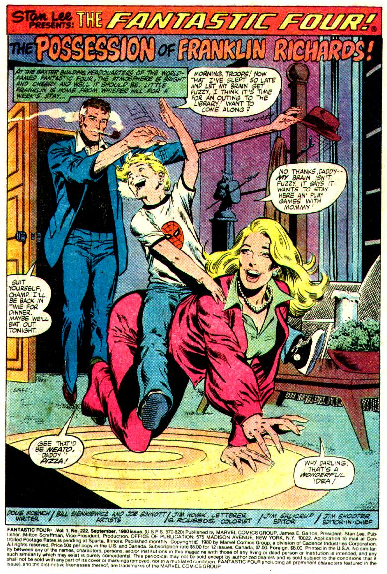
The plot downplayed the usual sci-fi nonsense in favor of seances and demon-possessions. It’s not a bad issue, truth be told, even with the disappointing art.
But Fantastic Four is one of those books that I can only enjoy intermittently. The family dynamic is supposed to be it’s main appeal, but I generally find the relationship of Reed Richards and Sue Storm to be tiresome. And adding the kid didn’t win me over. Maybe I’m one of those singles who doesn’t care about the trials and tribulations of married couples.
On the other hand, I liked The Incredibles, which is more or less a knockoff of the FF family. And if I had to pick the most significant difference between The Incredibles and the Fantastic Four, it would be in how they treated the super-kids. In the former, the children are revealed to be a heroes just like their parents. Without their help, Mr. Incredible could never have saved the day. But in Fantastic Four, Franklin is more a burden than a person. He’s always getting possessed or losing control of his powers or something equally terrible and his parents have to constantly worry about his well-being. Family life seems like a cross to bear, rather than a blessing. Why would I want to read a superhero comic about that?
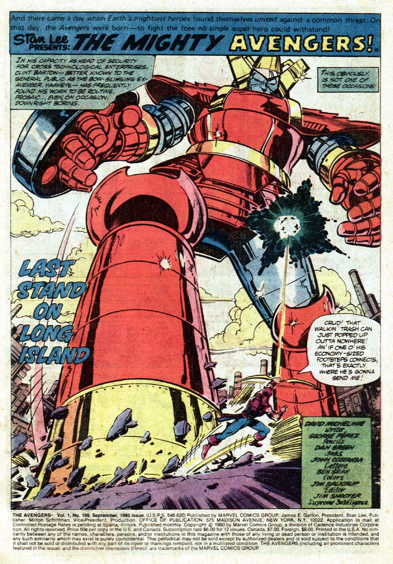
Avengers #199
Writer: David Michelinie
Pencils: George Perez
Inks: Dan Green
Colors: Jim Salicrup
This a great example of how hindsight can ruin my appreciation for a perfectly decent comic. There’s nothing wrong with this issue, in itself. Michelinie may be a hack, yet he knows how to pace a story and he at least gives the characters distinct “voices.” But the real star of the show is George Perez. He takes a generic heroes vs. robot storyline and crafts several exciting action sequences. Plus, I love the anime-inspired design for the robot, Red Ronin.
What ruins the issue for me is the sub-plot leading to the next issue, Avengers #200. A quick summary: the heroine Ms. Marvel is pregnant without a father and the fetus is growing rapidly. In the next issue, the storyline will go from vaguely unpleasant to outright disgusting when the baby is born and rapidly ages into the very man who impregnated her (I’ll let old-school fangirl Carol Strickland explain the gory details). It’s one of the most offensive and ill-conceived storylines I’ve ever seen in a mainstream comic (and I was reading comics in the awful ’90s).
Quality craftsmanship is all well and good, but it can’t hide the fact that many of the people creating these comics were creeps.
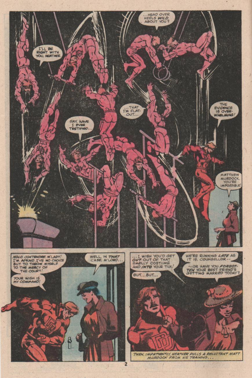
Daredevil #166
Writer: Roger McKenzie
Co-plotters: Rober McKenzie and Frank Miller
Pencils: Frank Miller
Inks: Klaus Janson
Colors: Glynis Wein
I’m no good with dates. I didn’t realize Frank Miller was working on Daredevil all the way back in 1980. He had to share writing credits with McKenzie, but the issue is full of unmistakable Millerisms, especially the tough-guy dialogue and the hard-boiled narration inspired by Raymond Chandler.
Miller was also drawing these early issues, and it’s an interesting sample of his early work.
As the image above makes clear, Miller loved to display Daredevil’s physical prowess. Much of the comic is hardly distinguishable from any other mainstream title, but the action sequences easily stand out as some of the best from the era.
I’m not going to claim that Miller is a brilliant artist (he isn’t), but he understands and appreciates violence in a way that few superhero artists do. That may sound like a criticism, but we’re talking about a genre characterized by violent confrontation, and it’s always amazed me that so few artists really understand or care about the anatomy of a fight sequence. For Miller, a cursory exchange of punches would never suffice. There’s a give and take between equally matched opponents, weaknesses are sought, and ineffective strategies are replaced.
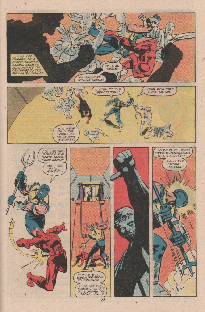
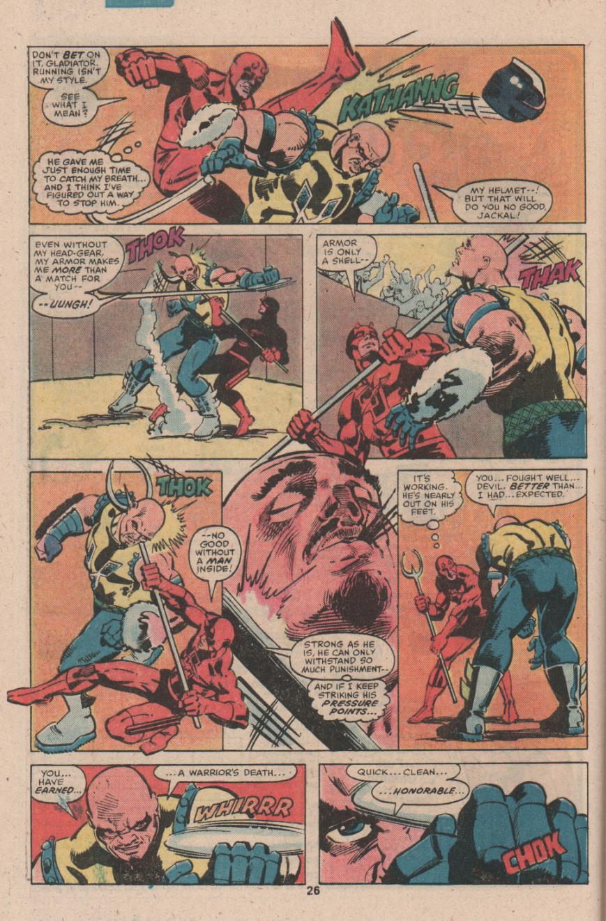
There’s also a realism to Miller’s violence, though it’s not necessarily graphic in nature (this was still the era of the Comics Code). Miller’s characters “sell” the blows, every hit looks painful, and the characters strike each other in ways clearly intended to cause serious harm.
It’s easy to see why Miller’s work became a success. Compared to Daredevil, the other comics I reviewed seem hesitant and even cowardly in their use of violence. The superhero publishers relied on violence to gain the attention of young boys, but it was always within strict limits. The superhero books were supposed to be morally uplifting. But Miller didn’t see violence as a mere tool to sell a book about selfless heroism. Instead, heroic violence was the whole point. Morality is all well and good, but most superhero readers aren’t looking for role models. They’re looking for cheap thrills, and there are few things as thrilling as seeing one man savagely pummel another.
_________________
And that brings my exercise in nostalgia to an end. Marvel’s September 1980 line-up was fairly impressive in terms of craft, even though it lacked the genre variety of DC Comics. However, when I read all these comics together, it’s obvious why Marvel could never attract female readers.