Neal Adams (1941– ) is one of the most famous and influential superhero cartoonists of all time; it thus comes as no surprise that, in the 1975 celebratory compendium The Art of Neal Adams, the cover shows a face-off between the superheroes of Marvel Comics (left) and DC Comics (right)
But who is that funny-animal in a cape playing the peacemaker between the two camps? Just a parody Adams dropped in to deflate the pretension of the set-up?
Not at all! That’s Atomic Mouse, a character created in 1953 by Al Fago (1904–1978) for Charlton Comics. Adams drew a couple of stories for the feature– he has stated that it was his favorite ever strip to work on. Atomic Mouse returned on the cover of the second volume of The Art of Neal Adams, in 1978:
Adams did humorous, funny animal and “big-foot” strips for several years; in fact, below is Adams’ first published comic book page:
Adams also worked for Harvey Comics (Hot Stuff) and did long runs on DC’s licensed Jerry Lewis and Bob Hope books. In his Shop Talk with Will Eisner, Adams stressed the necessity of a ‘big-foot’ style of cartooniness as a foundation for realistic comics art. In fact, Adams never really was a realistic draftsman as were, say, Gray Morrow or Alex Raymond. As Bill Sienkiewicz put it, Adams would basically triple-light Charlie Brown; and as John Byrne said about Adams’ characters, “That’s the way people would look, if people looked that way.’
Adams’ characters are all overactors.
In the theatre, there’s a severe distinction between acting and signalling.
Signalling means communicating by conventional signals of gesture and poise. For instance, after a scene of being rejected for a job, a signaller will literally let his shoulders slump. To show anger, he’ll furrow his brow and draw down the corners of his mouth while clenching his fists. Joy: skipping and smiling. Grief: burying his face in his hands, wiping away a tear.
Adams’ characters are all signallers.
And that’s fine.
Let’s look at probably the most famous sequence Adams ever drew (script by Denny O’Neill):
Panel 1 contrasts a realistic, old Black man (although we might be put off by his ‘shuffling’) with a hysterically over-tensed GL figure. The second panel also shouts ‘I’m doing realism!’ while affecting an extremely dramatic upward angle point of view. The third panel — a down shot for a ‘downer’ moment– shows Adams signalling as blatantly as any Vaudeville ham performer. GL slumps, stares down at the ground in shame…
But it all works. I think comics are more tolerant of overstatement than most other artforms. Whether this overstatement is necessary is another debate…cartoonists such as Adams, Jaime Hernandez, Robert Crumb or Jack Kirby navigate from the subtle to the blaring with a sure sense of what’s fitting.
When Adams turned his hand at overt, Mad-style cartooning his efforts seem a little too over-the-top, as in this TV parody (of McCloud) from Marvel’s Mad knock-off, Crazy — basically, he tries too hard:
Neal Adams in the ’70s
Much better were his relatively straight works for National Lampoon, such as Son O’ God or Dragula — the latter some sort of monument of homophobia in comics and comedy:
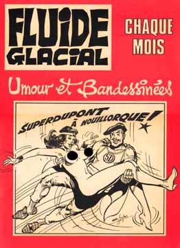
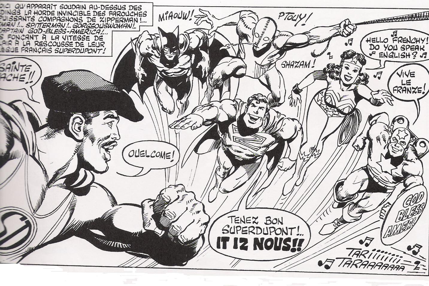
He is very much capable of satirising his better-known superhero style, as he did in this 1979 story published in the French humor weekly Fluide Glacial, over a script by Jacques Lob:
A sample panel:
The story featured some mild nudity; Adams only seems to have once really gone soft-porn, in the 1975 underground comic Big Apple. Comics
Neal Adams drew half the story, on the left-hand part of the pages, following the day of a fun-loving yuppie lady; the right-hand dealt with the grimmer day of a prostitute, and was drawn by Larry Hama and Ralph Reese.
I think this is the only published story featuring an Adams-drawn erect penis…
Do D.I.Y. posters—the Xeroxed or silkscreened posters you find on lampposts and kiosks in big cities, advertising bands and events—constitute a form of comics? The question is at least arguable. In 1975, theorist Pierre Fresnault-Deruelle posited that a comics page (and the double-spread that occurs after the turn of a page) is understood by readers in both linear and tabular ways. The panels on a page are read one at a time, in order, as the reader follows the linear progress of a narrative, but the page can also be read as a table or a map, as a single image subdivided and organized to impart information. (There’s a tradition of artists, beginning perhaps with Frank King and including Jim Steranko, Neal Adams and J.H. Williams III, who emphasize the overall tabular design of their pages much more than typical cartoonists do.) Both comics pages and D.I.Y. posters, then, function as single-illustration “tables” according to Fresnault-Deruelle’s definition—they have that tabular dimension in common.
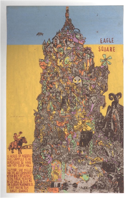
A related point: many comics artists have made posters, and vice versa. One excellent book on posters is the RISD Museum/Gingko Press exhibit catalog Wunderground: Providence, 1995 to the Present (2006), edited by Judith Tannenbaum and Maya Allison (with design by Helene Silverman and Dan Nadel). Wunderground assembles posters from the Fort Thunder renaissance of Providence’s underground, by such key Paper Rodeo/Kramers Ergot/Monster cartoonists as Mat Brinkman, Brian Chippendale, Jim Drain and Leif Goldberg. One of the first selections in Wunderground is Brinkman’s Eagle Square (2000), (Update: Eagle Square is actually by Brian Chippendale) an image designed to mobilize opposition to the construction of a new strip mall:
This poster has much in common with Brinkman comics like Teratoid Heights (2003) and Multiforce (2005), including the impossibly dense delineation of a surreal, maze-like environment and the focus on a single character navigating said environment (I imagine the cowboy on the left side of the poster following the path into the labyrinth). While I’m not sure how Eagle Square represents the cause—does the multi-colored tower represent the “historic mill complex,” the prospective strip mall, or neither?—the poster is an eye-catching companion to Brinkman’s sequential art. Robert Crumb’s album covers and comics reflect his love of “old-timey” music; Evan Dorkin channels his obsession with Ska music into his images for the American Skathic series of CDs and the milieu of his Hectic Planet series; and Mat Brinkman simultaneously makes comics, posters, and tapes of homgrown electronic music, ignoring distinctions between different media. Culture is culture.
I’m not writing this essay, however, to theorize the nature(s) of culture(s), even if such sweeping theories were possible. Instead, I want to tell a personal story about how comics enter into dialogue with music and with single-image posters. Teaching is part of the story too, since it happened during my “day job” teaching English at Appalachian State University in Boone, North Carolina.
In spring 2002 I taught my first class on comics and graphic novels, but it was a creative writing class, and I was charged with teaching the students the basics of visual storytelling. Which, frankly, was ridiculous: I can’t draw, I’m a mediocre fiction writer, and at that time the only comics theory and history I’d read was McCloud’s Understanding Comics. (No Feiffer, Kunzle, Witek: I hadn’t even seen Steranko’s History of Comics.) Still, I dove into the class because I was into comic books—especially, blindly, nostalgically, the 1960s Marvel comics of my childhood—and I got lucky: the students in that class were a ferociously sharp bunch, challenging me with controversial ideas (“Prince Valiant looks like book illustration to me, not comics!”) and generating better work than I expected.
One of the best students in that class was a junior named Chris Williams. Chris had been an Art major, but transferred to English when it became clear that his interest in cartooning (particularly Mike Allred’s American version of la ligne claire) didn’t jibe with the Art department’s emphasis on conceptual and abstract work. Some of my class assignments focused exclusively on writing—students were expected to write both a full-script comic and a Marvel-style plot—and Chris was very good at these. He truly excelled, though, when I asked the students to draw images to go along with their words. He put more background detail into his pictures than anyone else in the class, and his figure drawing, clearly inspired by Allred, was rubbery, expressive, and compulsively readable. My major critique of Chris’ art was that his images read too much like outlines, like ethereal diagrams of spaces and people, and I asked him to use cross-hatching and spot blacks to bring solidity to his pictures. Chris cheerfully ignored this suggestion, and even made a joke about my nagging; for one assignment, he turned in a splash page featuring a rocket blasting through outer space, but refused to paint the universe in shades of inky darkness. Chris’ astronauts flew instead through a field of white paper punctuated by lines indicating the bright areas of his fictional stars.
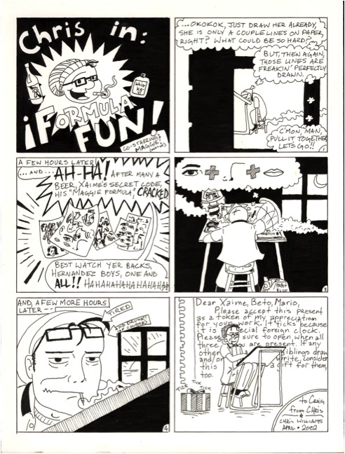
I did have an influence on Chris in one way, though: I loaned him all of my Love and Rockets collections (13 of the fifteen that collected the entire run of the original L & R magazine), and they blew his mind. He loved how Jaime Hernandez out-Allreded Allred, how Jaime stripped his drawings down until every line carried expressive meaning. (He also noticed that Jaime was a wiz at laying down big slabs of ink.) He fell for the stories too. Chris played guitar in a loud slow-core band called Maple Stave, and he connected with Los Bros’ love of rock and roll, and their attempts to import the speed and recklessness of the music (such as the out-of-control, almost abstract orgy in Gilbert’s “Bullnecks and Bracelets”) into verbal-visual terms. During this period, Chris drew and xeroxed a zine that combined an irreverent approach to the superhero genre, tonally very similar to “Mechanics,” with a stone-cold swipe of Jaime’s line-up cover to Love and Rockets #1 (which is itself—as revealed in The Art of Jaime Hernandez book [2010]—a riff on a Raymond Pettibon illustration on the back of a Black Flag 45). At the end of our class, Chris returned my L & R books, along with two surprises: he gave me the two volumes that I didn’t own (House of Raging Women and Hernandez Satyricon), and he drew me an original comic strip about what he’d learned (or tried to learn) from the art of Los Bros.
After Chris graduated from college, he went home to Raleigh and took a bookstore job. He also saw lots of bands in various Raleigh/Durham/Chapel Hill venues—Local 506, Nightlight, the legendary Cat’s Cradle—and Maple Stave occasionally opened for headliners like Port Huron Statement and Section Eight at these venues. Most importantly, he kept at his art, experimenting with screen printing and crafting images with splattery, phantasmagoric colors. Many of Chris’ interests collided in 2004 when bars and galleries started hiring him to screen-print gig posters, and he’s crafted over two hundred since, most of which can be seen at his Storenvy site here. I’m proud of the work he’s done, I delude myself that I had a little influence over his creative direction, and I’m impressed by anybody who can make art pay.
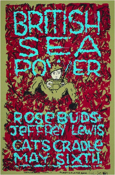
Chris has come back to ASU for visits (once to attend an opening reception for an exhibit of his work at the campus art gallery) and during these visits we’ll sometimes get together for a lunch that typically ends with Chris giving me copies of his newest posters. I like them all, but I have a favorite, an image of a soldier dressed in olive-green fatigues sitting in a field of red plants. The soldier is an immediately legible cartoon abstraction conventionally situated in the center of the composition, while the plants are a network of indistinct, slashing brush lines that represent energy as effectively and abstractly as Kirby Krackle: the result creates vibrant friction between two different modes of comic-book expressionism.
I’ve framed and hung this image on the wall of my living room, next to original art by Ben Towle and Richard Thompson, so I can’t scan it. My version of Chris’ image has no text on it, but he recycled the picture (and, presumably, the screen) for a 2008 gig poster, and it’s the following, without blue lettering, that greets guests as they walk into our parlor:
After decades of over-indulgent comic book reading, my default mode is to narrativize every image I see, wrap them in stories that tame their visual extravagance. Initially, the story I ascribed to Chris’ soldier-in-a-field was tragic: he’s manning a military radio, waiting for a message that’ll reassign him to the Front or bring him bad news about the point platoon. (Note the worn anxiety on his face.) Yet now I wonder if this original tale was too pessimistic. Maybe the soldier has exiled himself to the blood-red field, to tune a civilian radio and listen to stations and music banned in the barracks. Maybe his life was saved by rock and roll. Maybe a network of beats and notes link Jerusalem Crickets and Maple Stave, comics and posters, teacher and student, me and you.
The heroes of this comic, Spirou and Fantasio, in hiding while two jarringly offensive racist stereotypes and a corrupt cop look for them…but let’s back up a little.
Spirou was created in 1938 by the cartoonist Robert Welter (1909-1991), who signed his work Rob-Vel. Contrary to common practice in Belgian and French comics, he sold all rights to the strip to his publisher, Dupuis, in the late forties. As a result, from then to now it has been produced by different successive cartoonists, working either solo or in teams.
The team of writer Philippe Vandevelde – a.k.a. Tome — and artist Jean-Richard Guerts — Janry — had a run on the strip from 1982 to 1998. Commercially, it was Spirou’s most successful period: each album sold over 150 000 copies in its first year, and joined a steady-selling backlist of fifty titles. Though little-known in anglophone countries, as compared to his arch-rival Tintin, Spirou is one of the most successful comics franchises in European history, with sales in the hundreds of millions in over 30 languages.
Tome and Janry’s success is owed to the genuinely disciplined mastery of slapstick comedy, satire, and adventure combined with imaginative use of science-fiction and fantasy, all illustrated in a style that marries meticulous attention to detail with a wild fluidity of caricatured movement.
And yet something in this most accomplished comic strip stinks, something it shares with far too wide a selection of European comics for children.
For most of the history of public education in France and Belgium, kids went to school six days a week, with a half day on Thursday and Saturday. With parents at work on Thursday, there grew a whole industry of keeping the bored little sprouts entertained — and the kings of this industry were the weekly comics magazines.
When I was a kid in the sixties, the prize magazines were Le Journal de Tintin, Pilote, Le Journal de Mickey and Le Journal de Spirou. I was fortunate with the last, as this period in Spirou’s history was overseen by Andre Franquin (1924–1997), one of the greatest cartoonists of all time. Franquin gave up the title in 1968, when I turned 14 and dropped kids’ comics in favor of more adolescent fare. (It was the year I discovered Crumb.)
So when I checked in on the much later album I’m writing about here, I was shocked and outraged — but more than I should’ve been, as I’ll explain later on.
Let’s go to page one, where a shipful of immigrants arrive in New York:
Click on page to enlarge
Panel 2 sets the tone for the whole book.
In it, from left to right:
–a blubber-lipped African: “Pa’adise!” (French blackface “humor” mocks Black African accents by leaving out all “r”s.)
— an Englishman: “Fortune, at last!”
— an Italian, modelled on Marlon Brando as the Godfather: “Pizzas. Millions of consumers of pizzas!”
— a Chinese, yellow-skinned and buck-toothed, thinking literally inscrutable calligraphy.
(NB: all translations mine).
The rest of the page is a fairly acid satiric sketch in which the Englishman, having made a fortune, is so wiped out by bankruptcy that he no longer even has a gun to kill himself with. But the African — now his butler — informs him that:
“I’ve just lea’nt that my modest savings judiciously invested in the stock ma’ket have b’ought me a small fo’tune. With Sir’s pe’mission I have pe’haps a solution fo’ Sir.”
Next panel, of course, it’s the African who’s lost his vast fortune and his butler, the Englishman, who supplies his master with a gun. The last panel ends the scene with the African’s tastefully off-stage suicide.
And what of the Chinese? How does he make his fortune? See page 2:
In the morning, he sells good-luck charms to investors outside the Stock Exchange. In the afternoon, he sells them pisols to blow their own brains out . Those cunning, ruthless, wily Orientals.
Chinatown: on the left, all the shops sell good-luck charms. On the right, they all sell guns.
This is the global view of American life presented here. A Darwinian hellhole crammed with unsavory ethnics all out to do each other in. It’s pretty much the standard European far-right’s line for the last century.
The plot is basically a gang war between the cliched, spaghetti-slurping Mafia (who are shown as controlling all of Little Italy) and the vicious Chinese, who have the upper hand thanks to their supernatural power to curse anyone who gets in their way. Into this war stumble our two lovable Belgian heroes, Spirou and Fantasio, the only characters of sense and integrity — noble Caucasians thrust into the nightmare of an insidious, omnipresent Yellow Peril.
They completely control the police, for example. When warned of this by a taxi driver, Fantasio storms off:
“WHAT? We’ll see about that!…Policeman! I want to register a complaint, I’ve been attacked by a dog-pack of bandits…Asiatics…with yellow complexion…”
To his horror, he sees that the cop is himself Chinese. Later, we see the policeman phoning in the encounter to the Chinese gang.
Every ugly sinophobic, Orientalist stereotype is trotted out; Mandarins with four-inch fingernails wearing dragon masks, trick Buddha statues, Fu Manchu moustaches, a disgusting willingness to eat scorpions, cobras and tarantulas, barefoot coolies, pigtails, submissive cheongsam-clad lovelies…enough! My stomach can’t take any more.
The total effect is made worse by the high skill of the execution. Such was the case for such racist vileness as the films Birth of a Nation or the Nazi-era The Jew Suss. On its own minor level, Spirou et Fantasio a New York joins this unsavory company.
I’ve written before about the problem of racism in the comics, more particularly regarding Tintin, but acknowledging such problematic (a euphemism for “racist”) strips as The Spirit, Terryand the Pirates, Little Nemo, and Asterix.
All lovers of classic comics (and indeed of classic novels our films, for that matter) have to deal with this poison legacy. Generally we fall back on some pretty flimsy excuses:
— “It’s not really that bad”.
For example, The Spirit‘s Ebony White:
… may be a racist Blackface caricature, but he’s also shown as being brave and lovable.
Patronising. And it applies to none of the race stereotypes in the album under question: apart from the odd Black bystander, all the ethnics in SPEFANY are cowardly, treacherous and greedy, with no redeeming features.
— “It’s actually an ironic use, a parody of racism rather than racism per se.”
Irony is the vehicle for much weaseling; in comics, it’s evoked for the racism in strips such as Robert Crumb’s Angelfood McSpade or Morris and Goscinny’s Lucky Luke. That sort of “irony” strikes me as just a way to have your racist cake and eat it, too.
SPEFANY makes no pretense to irony, anyway. It’s crudely upfront in its racism.
—“You have to see the strip in the context of its time, the ’30s and ’40’s had different attitudes.”
First of all, plenty of people knew back then that bigotry is wrong, so it’s a weak excuse. But let’s grant it for the sake of argument.
Let’s turn to the copyright page of Spirou et Fantasio a New York to see what time period we need to ‘contextualise’ it in.
1987.
Nineteen eighty-seven.
Yes. As recently as 1987, this stew of racist bigotry was deemed perfectly fine to pitch at young children.
And it continues to this day.
Where in America, by the 1950s, blatant racism and other bigotry was being phased out of popular culture… and in Europe for the most part as well… children’s comics were given a free pass to perpetuate the ugliest ethnic and racial stereotypes. They still have this free pass.
I look back, now, at the Spirous and Tintins of my childhood and wince. Who knows how this ethnic propaganda may have warped me subconsciously? Or warped generations of European kids on either side of mine?
So, the above diatribe is not just my venting anger at an evil little book.
Note: This review of Abstract Comics was written close to three years ago. It was proposed to Art in America in the fall of 2009 and submitted for publication that November or December. Overbooking in the book reviews department, I was told, delayed its publication. Finally the following summer, sensing its age as a review and the need to jumpstart things before it was too late, I offered to expand the article into a feature length essay on the wider subject of abstraction in recent comics, including figurative and/or narrative ones like Dash Shaw’s Body World, Joshua Cotter’s Driven by Lemons, and Brian Chippendale’s If ‘n Oof. That proposal was likewise accepted, but then the magazine’s head editor was ousted. The new head editor, after another six months’ consideration, finally paid me a kill fee. I thought I might write the expanded version nonetheless and submit it to an academic journal, but then got busy with other things and lost interest.
If I were to write on this topic today, there are many things I would change. It is, however, precisely this thinking that has kept this piece buried inside my computer, where it does no one any good. Thank you to Andrei Molotiu and Derik Badman for pushing me in recent months to publish the review regardless. So here it is, more or less in the state it was three years ago. Keep in my mind it was written for an art world publication. There were also word count restrictions, hence its clipped nature. What you see here, if I remember correctly, was already about 300 words over length. I said I would change many things today, including its tone, but the core opinions and suggestions I still stand by.
*******************
Since the 1990s, there has been a rising tide against the word in comics. It has begun to gel into something like a movement, made up of artists, critics, and editors alike, involving both the creation and promotion of new wordless comics in a variety of genres as well as the republishing and anthologizing of related work from the past.
So-called “abstract comics” is one of the more extreme fronts. It names a form of wordless comics that not only dispenses with the word, but also those things traditionally allied with it, like speech, sound, plot, and interiority. Abstract comics has been a fringe genre, disseminated largely through blogs and self-published and small press booklets. With the publication of Abstract Comics: the Anthology (Fantagraphics, 2009), it has gained a more secure foothold in print.
The book collects work from 1968 to the present. It includes comics luminaries like R. Crumb, Gary Panter, and Lewis Trondheim, but is focused on new names from the past decade. Most of the work is deeply indebted to modernist abstraction, from Kandinsky’s dispersions and Cubist papier collé, to the nested squares of Albers and Abstract Expressionist blots and drips – all typically set into narrative motion across a handful of panels or pages.
Museum modernism also weighs heavily on the framing of the anthology. In his introduction, Andrei Molotiu, artist, art historian, and blogmaster of the same-titled Abstract Comics site, describes the genre as a whole in terms derived from a mix of vitalist philosophy and a classical modernist model of reflexive reduction. He writes:
Reduced to the medium’s most basic elements – the panel grid, brushstrokes or penstrokes, and sometimes color – they [abstract comics] highlight the formal mechanisms that underlie all comics, such as the graphic dynamism that leads the eye (and the mind) from panel to panel, or the aesthetically rich interplay between sequentiality and page layout.
In the same vein, Molotiu describes standard narrative structure as an “excuse to string panels together” and abstract comics as a distillation of the medium to the “feeling of sequential drive, the sheer rhythm of narrative or the rise and fall of a story arc.” In the artist profiles at the end of the book, Mark Badger – contributor of a maximalist geometric abstraction in comics form – laments how images in comics are “unable to claim their real power” while subordinated to narrative or representation. “Hopefully,” he continues, “this book will be one shot in claiming back comics from the typists.”
Abstract Comics thus offers itself as a manifesto in the tradition of high modernist art, without the extremism of its historical predecessors, but nonetheless sharing their characteristic denigration of narrative and the verbal sign as well as their calls to power through purification. The anthology, unfortunately, does not make the strongest case for the vigor of the movement it promotes. Much of the collected work is visually weak, and the modernist formalist discourse to which the book is indebted ceased to have any real traction after the socio-political and linguistic turns of art in the 1960s. Molotiu expends much of the introduction excavating precursors for this “genre without a proper tradition” from the oeuvres of art-world masters like Kandinsky, DeKooning, Alechinsky, and Johns, with only passing mention of relevant precedents within the comics medium itself. Trying to legitimize comics vis a vis the art historical canon can sometimes be self-defeating, and here it has the unintended effect of casting abstract comics as little more than a super-belated reworking of formalist painting. Especially considering the online presence of “abstract comics” and the computer-based creation of many of the contributions, it would perhaps have been more fruitful to explore the relationship of the genre to the return of various forms of abstraction in the computer age, beginning with Neo-Geo in the early 80s and then internet art and laptop music after the 90s. Instead, the top two-thirds of each page of Molotiu’s introduction are given over to rows of dingbats, a cute waste of valuable space and another statement of preference for pure aesthetic form over verbal discourse. One is left to dig through the artist profiles of Abstract Comics and the personal webpages cited therein to get any real sense of specificity to individual works and the promise that some do hold.
As is clear to any reader, the dominant trope of abstract comics is metamorphosis. Molotiu heralds work that “tells no stories other than those resulting from the transformation and interaction of shapes across a comic page.” Andy Bleck’s Haring-esque work is typical. Anthropomorphic blobs twist and tangle in goofball dances that are half cartoon tribal mating ritual and half protoplasm on a wet mount microscope slide. The contributions of the two most prominent Europeans in the anthology, Trondheim and Ibn al Rabin, make it clear that the defining figure of metamorphosis is the amoeba. Both of their works are short comedies featuring blobs swallowing nuclei and other blobs. There is a basic vitalist conceit at work here: to boil the comics medium down to pure formal dynamism entails exploring also the most basic forms of animate life.
by Andy Bleck
Most of the works are as entropic as they are dynamic, involving not only the transformation of form and energy, but also their disorganization and dissipation. Molotiu’s own works are a case in point. Produced with the aid of a scanner, “The Panic” begins with compound masses whose biomorphism once again evokes the biology lab. Over the course of a handful of panels, the masses pull apart into small globules.
Chaos, similarly, is a recurring motif. Alexy Sokolin’s “Life, Interwoven” layers ballpoint pen lines until almost the entire page is obliterated. Tim Gaze’s untitled collages are a gore-fest of inky smears and splatter, further mutilated through a technique similar to the cut-ups of William Burroughs and Brion Gysin. Billy Mavreas’ “Border Suite” again evokes the cut-up, now run repeatedly through a copy machine until all that is left is disintegrated borderlines and dispersed dust motes. In Abstract Comics as well as other statements on “sequential dynamism” in comics, Molotiu makes the musical analogy to opera. From these works, however, it is clear that noise and glitch aesthetics would be more apt in some cases.
Other works also manipulate source material. Proprietor of the reliable MadInkBeard blog, Derik A. Badman’s Flying Chief is one of the more intriguing contributions to the anthology. He has redrawn panels from a 1950 Tarzan comic without the characters, words, speech balloons, or captions. More so than abstraction or entropy, this strategy of absenting is highly effective in frustrating the viewer’s desire for an organizing figure. Badman’s image of a world without human agency raises more pointed questions than other contributors’ protozoan land before time and scenes of cosmological chaos.
Derik Badman, “Flying Chief”
Noah Berlatsky also runs a comics blog, The Hooded Utilitarian. His two one-page works are also in this appropriationist vein. He has taken pages from Asterix and X-men and redrawn them in such a mutilated fashion that frames and figure-ground relationships are splayed and then refused into an abstract mesh. There is a strong bit of Kandinsky in the results, but it’s also important to perceive amputated bodies akin to those of early Dali or later Sue Williams.
In these, as in a number of works in the anthology, there is an interest in what might be termed a logic of “vestigiality”: the organ divorced from its original function but still maintained, so that it oftentimes comes to impose upon the organism that had abandoned it. Might this principle also underlie the metamorphic comics? After all, their plasmatic substances have a striking resemblance to the spongy, pneumatic contours of the speech or thought balloon. If so, it seems that the abstraction of comics against the word and its supports is never total, but rather marked with traces of partial amputation. Abstract comics share this feature with many wordless comics, from pantomime works that gesticulate histrionically to make up for the ban on verbal expression, to indie comics around themes of melancholia, speechlessness, and pre-linguistic primitivism.
It is curious that Abstract Comics opens with R. Crumb’s “Abstract Expressionist Ultra Super Modernistic Comics,” first published in Zap Comix no. 1 (1968). First of all, its principle of non-sequitur juxtaposition is quite at odds with the smooth, linear sequentiality or serial modulation that characterizes most other works in the anthology. Secondly and more importantly, Crumb’s work was meant as a derisive parody precisely of the kind of genuflection to high modernism that Abstract Comics represents.
R. Crumb, “Abstract Expressionist Ultra Super Modernist Comics
Crumb is not alone. Burlesque has long served as a kind of prophylactic for comics artists against the perceived obscurantism and puffery of high art. A few years ago, designer Craig Yoe popularized an adequately lowbrow name for this mindset: “arf,” which is Popeye’s laugh, but comes off as a portmanteau of “art” and “barf.” At the very least, Abstract Comics represents a welcome willingness to look upon high art from the perspective of comics without such juvenile anxieties. One hopes that the future of the genre is towards aesthetic paradigms with greater contemporary relevance.
When the people I talk with say ‘this comic had minimal impact on the comics world’ they don’t just mean ‘oh it wasn’t talked about on the 2 or 3 comics blogs i read.’ They are primarily talking about how none of the comics people they talk to in real life are talking about these books. Or, at least not talking about them in the “wow, I’m really excited about this book” sort of way. I feel like this excitement is something that is often missing when I hear conversations (real life, not just the internet) about comics like “Wilson” or “Genesis.”
Maybe this excitement (or lack thereof) is something to think about? Something to talk about? Maybe excitement is the wrong word, because strong feelings against something can also be a big motivation for change, for thought. Maybe it’s just the lack of people demonstrating strong feelings one way or another. A lot of times I feel tired of the comics scene because people just act like they’re too cool to care.
I can’t divorce myself from the creation aspect of things, seeing as that’s what I spend the majority of my time doing. But I know that for me, what I’m excited about either at the time or in my past has a lot of bearing on what I produce. Sometimes it is wanting to explore an idea. Sometimes a technique. Sometimes I am so angry I want to just make something better, something that states my view of things. But strong feelings are the reason I make art and the reason my art changes.
I remember a while back Frank talking about jazz, how he was missing the interplay in the comics world, the building off of each other. Sometimes I feel the same way. Not necessarily that we (as creators) should only play from/with the past, but maybe that we should play more off of each other as peers. Maybe we should talk more about what we’re excited about and how it’s influencing our art, whether it’s in the comics scene or not. Maybe we should not be afraid to say that we disagree something without worrying about stepping on toes.
Maybe if we talk more about our influences, our excitements, our ideas, then we can make a space for comics in the greater sphere of creativity instead of an maintaining the idea of an insular world that is only influenced by itself.
I noted in response that ““If there’d been stronger feelings about the Genesis comic on this blog, we would have had fistfights.” L. Nichols replied:
Sure. But that’s just this blog, one blog, a blog with a history of people who like to get in long arguments about comics. I was more talking about people in real life. What’s the number of times I’ve heard Genesis being mentioned in real life by real life comics artists? I talk to comics people all the time and I’ve heard MAYBE one or two of them talk about Genesis. I’ve heard more non-comics people talking about it than I have any comics people I know!
I was more trying to say that people aren’t excited enough about comics to REACT to them in their work. I mean the type of excitement that wakes you up in the morning, keeps you up at night. The kind of excitement that makes you want to go draw “Exodus.” Or maybe the kind of excitement where you’re SO upset about Genesis that you just have to react some way against it in your own work. Excitement on the creation side of things.
The first major touchstone in Fredric Jameson’s epic 1991 Postmodernism, or The Cultural Logic of Late Capital Capitalism is Van Gogh’s A Pair of Boots.
Jameson refers to this as “one of the canonical works of high modernism,” and goes on to argue:
that if this copiously reproduced image is not to sink to the level of sheer decoration, it requires us to reconstruct some initial situation out of which the finished work emerges. Unless that situation–which has vanished into the past–is somehow mentally restored, the painting will remain an inert object, a reified end product impossible to grasp as a symbolic act in its own right, as praxis and as production.
This last term suggests that one way of reconstructing the initial situation to which the work is somehow a response is by stressing the raw materials, the initial content, which it confronts and reworks, transforms, and appropriates. In Van Gogh that content, those initial raw materials, are, I will suggest, to be grasped simply as the whole object world of agricultural misery, of stark rural poverty, and the whole rudimentary human world of backbreaking peasant toil, a world reduced to its most brutal and menaced, primitive and marginalized state.
Fruit trees in this world are ancient and exhausted sticks coming out of poor soil; the people of the village are worn down to their skulls, caricatures of some ultimate grotesque typology of basic human feature types. How is it, then, that in Van Gogh such things as apple trees explode into a hallucinatory surface of color, while his village stereotypes are suddenly and garishly overlaid with hues of red and green? I will briefly suggest, in this first interpretative option, that the willed and violent transformation of a drab peasant object world into the most glorious materialization of pure color in oil paint is to be seen as a Utopian gesture, an act of compensation which ends up producing a whole new Utopian realm of the senses, or at least of that supreme sense-sight, the visual, the eye-which it now reconstitutes for us as a semiautonomous space in its own right, a part of some new division of labor in the body of capital, some new fragmentation of the emergent sensorium which replicates the specializations and divisions of capitalist life at the same time that it seeks in precisely such fragmentation a desperate Utopian compensation for them.
There is, to be sure, a second reading of Van Gogh which can hardly be ignored when we gaze at this particular painting, and that is Heidegger’s central analysis in Der Ursprung des Kunstwerkes, which is organized around the idea that the work of art emerges within the gap between Earth and World, or what I would prefer to translate as the meaningless materiality of the body and nature and the meaning endowment of history and of the social. We will return to that particular gap or rift later on; suffice it here to recall some of the famous phrases that model the process whereby these henceforth illustrious peasant shoes slowly re-create about themselves the whole missing object world which was once their lived context. “In them;” says Heidegger, “there vibrates the silent call of the earth, its quiet gift of ripening corn and its enigmatic self-refusal in the fallow desolation of the wintry field.” “This equipment,” he goes on, “belongs to the earth, and it is protected in the world of the peasant woman. . . . Van Gogh’s painting is the disclosure of what the equipment, the pair of peasant shoes, is in truth. . . . This entity emerges into the unconcealment of its being;’ by way of the mediation of the work of art, which draws the whole absent world and earth into revelation around itself, along with the heavy tread of the peasant woman, the loneliness of the field path, the hut in the clearing, the worn and broken instruments of labor in the furrows and at the hearth Heidegger’s account needs to be completed by insistence on the renewed materiality of the work, on the transformation of one form of materiality–the earth itself and its paths and physical objects–into that other materiality of oil paint affirmed and foregrounded in its own right and for its own visual pleasures, but nonetheless it has a satisfying plausibility. At any rate, both readings may be described as hermeneutical, in the sense in which the work in its inert, objectal form is taken as a clue or symptom for some vaster reality which replaces it as its ultimate truth.
For Jameson, if the painting is not to be decoration, if it is to have meaning, then it needs to include meaning — which is to say, narrative, or history. The decoration, the burst of color, is merely a surface to be consumed unless it has a context attached to it. That context is both the past (the long path of the immiserated peasant through his life of toil, up to his door, and to the moment when he removes these, his boots); the present (especially in Jameson’s second reading, where the painting creates the peasant woman and the field and the earth around itself) and the future (as the burst of Utopian color, the yearning towards a decidedly material relief.) The painting calls for a story to complete it.
This is obviously a very Marxist reading. But it’s also a comics reading.
At first calling it a comics reading may seem a little startling, because there is often a very strong push in comics crit against ideological readings. Recently on this site, for example, Matthias Wivel argued:
Which brings me to the other issue I have with the critical reception of Habibi, and comics in general: the lack of sensitivity to how the visuals are integrally determinant of the work. Critics tend not to look beyond the surface qualities of the drawing in comics, and then proceed to discuss whatever conceptual issues are at stake without devoting much attention to how those issues are manifested visually. Even a cursory examination of the reviews published so far of Habibi should demonstrate this. Only a few have been entirely positive and several have been strongly negative in the conceptual assessment of the book and its ‘writing,’ but the majority of the reviewers have nevertheless taken time to commend the ‘art.’
Matthias argues that critics “tend not to look beyond the surface qualities of the drawing in comics” — which can not entirely finesse Jameson’s point that drawings are, literally, surface. Matthias goes on to a lengthy and thoughtful discussion of, among other things, Thompson’s line. But the discussion of that line itself seems flattened by Matthias’ circumspect refusal to give it a context. He criticizes Thompson for failing to convey complexity of emotion — but why exactly are we supposed to desire complexity of emotion? He points out the lack of spontaneity in Thompson’s line — but why does it matter if the line is spontaneous or not? Without the ideology that Matthias denigrates, the critique is left foundering in a thin (because untheorized or acknowledged) humanism or else, as Jameson suggests, in the even thinner realm of decoration, where the ink is appreciated in its inkness, a connosieur’s pleasure. (One could, of course, defend connosieurs and decoration — but I don’t know how you could go about doing that without wading into the deeper shoals of ideology.)
To be fair, Matthias isn’t calling for non-ideological readings; just ideological readings which pay more attention to surfaces. But (as is the way with such things) he ends up so chary of ideology that he seems to be paying attention just to the surface — looking so closely at the trees that the forest drops out of the peripheral vision. Jameson insists on looking beyond the image, on saying where it is coming from and where it is going to. For Van Gogh’s shoes to have meaning, they have to be in the world, affected by it and affecting it; they have to be made for walking. Matthias, in contrast, seems at times to want the line to draw a circle around itself, keeping the world, with its messy moral judgments and harumphing ideology at bay.
What’s strange about this tack is that it seems to miss the essence of comicness — to call for a focus on surface when sequential art has that “sequence” right there in its name. The comic book does exactly what Jameson does; it provides the situation for each image, and for each image the situation.
Comics in Jameson’s terms then seem to be what others have sometimes praised them for being; that is, resolutely committed to old-fashioned artistic values — a medium committed to Van Gogh rather than to Jameson’s post-modern exemplar, Andy Warhol:
Now we need to look at some shoes of a different kind, and it is pleasant to be able to draw for such an image on the recent work of the central figure in contemporary visual art. Andy Warhol’s Diamond Dust Shoes evidently no longer speaks to us with any of the immediacy of Var Gogh’s footgear; indeed, I am tempted to say that it does not really speak to us at all. Nothing in this painting organizes even a minimal place for the viewer, who confronts it at the turning of a museum corridor or gallery with all the contingency of some inexplicable natural object. Or the level of the content, we have to do with what are now far more clearly fetishes, in both the Freudian and the Marxian senses…. Here, however, we have a random collection of dead objects hanging together on the canvas like so many turnips, as shorn of their earlier life world as the pile of shoes left over from Auschwitz or the remainders and tokens of some incomprehensible and tragic fire in a packed dance hall. There is therefore in Warhol no way to complete the hermeneutic gesture and restore to these oddments that whole larger lived context of the dance hall or the ball, the world of jetset fashion or glamour magazines.
Yet this is even more paradoxical in the light of biographical information: Warhol began is artistic career as a commercial illustrator for shoe fashions and a designer of display windows in which various pumps and slippers figured prominently. Indeed, one is tempted to raise here–far too prematurely–one of the central issues about postmodernism itself and its possible political dimensions: Andy Warhol’s work in fact turns centrally around commodification, and the great billboard images of the Coca-Cola bottle or the Campbell’s soup can, which explicitly foreground the commodity fetishism of a transition to late capital, ought to be powerful and critical political statements. If they are not that, then one would surely want to know why, and one would want to begin to wonder a little more seriously about the possibilities of political or critical art in the postmodern period of late capital.
But there are some other significant differences between the high-modernist and the postmodernist moment, between the shoes of Van Gogh and the shoes of Andy Warhol, on which we must now very briefly dwell. The first and most evident is the emergence of a new kind of flatness or depthlessness, a new kind of superficiality in the most literal sense, perhaps the supreme formal feature of all the postmodernisms to which we will have occasion to return in a number of other contexts.
Van Gogh’s shoes look like they’ve just been tossed aside by a perambulating peasant; Warhol’s look like they’ve been purchased new from some shop window and then hammered flat. No one has worn them, no one will wear them; they are shoeness without story. If they have an ideology or a narrative, it is the narrative of no ideology and the ideology of no narrative.
In contrast, consider this sequence from Hideo Azuma’s Disappearance Diary:
The worker’s shoe here is not abandoned as in Van Gogh; instead, it is in its place, on the foot of an actual worker, inside a narrative. The upper right panel, showing Azuma tying his own shoe, wraps itself in time, the hands creating a whirlpool of motion with the shoe an anchor at the center. If the shoe in Warhol is dead and the shoe in Van Gogh points to life, then this shoe is actually alive, tied up with time. Azuma is effectively pulling on the working class identity, with its manual facility and expertise (“this made me look cool like a veteran.”) There is no burst of color, and no utopian vision, but the motion lines and, indeed, the panel progression still energizes the images. The narrative is in the picture and the picture in the narrative; the boot is not just its surface, but, as with Van Gogh, its story.
Comics then, can be seen less as an illustration of text than as a narrativizing of illustration — a form which pushes back against the shallowness of contemporary art practice by embracing the old-fashioned narrative and ideological virtues of prose. From this perspective, the achievement of R. Crumb’s Genesis is not giving flesh to every passage in the Bible, but rather giving narrative to every image. There are many, many Biblical paintings and drawings which show us Biblical characters as flesh and blood:
Crumb’s Genesis, however, is much more rare in insisting the the flesh of the Biblical image must be elaborated by the Biblical text itself. Crumb’s Bible is narrative; generations begatting through time, each with its own face that takes on weight only in relation to all the other faces.
In this sense, Crumb and comics themselves can perhaps be seen as analogous to doubting Thomas. Seeing is not enough; you also need the experience of narrative and the word. If post-modernism proffers the dehistoricized image, comics insists on reinscribing it. Backwards looking in every sense, comics does not exist without the preceding panel, the one that gives the present depth and meaning.
Boots in Space
In Postmodernism, Jameson specifically claims that the distinction between the modern and post-modern is in post-modernism’s spatialization of time.
A certain spatial turn has often seemed to offer one of the more productive ways of distinguishing post-modernism from modernism proper, whose experience of temporality — existential time along with deep memory — it is henceforth conventional to see as a dominant of the high modern.
Thus, Van Gogh’s shoes, imbued with a past and a future, become Warhol’s shows, shorn of history, existing as pure space. Or (though Jameson does not use this example specifically) the painful, crushing sense of a life passing in a stymied claustrophobia in Kafka’s parable of the man at the door of the law is replaced in Borges’ story “The Double” with a miraculous simultaneity, as an older Borges and a younger Borges suddenly exist in the same space, so that time becomes not an unavoidable weight but a sleight-of-hand juxtaposition. As Jameson says, “Different moments in historical or existential time are here simply filed in different places; the attempt to combine them even locally does not slide up and down a temporal scale…but jumps back and forth across a game board that we conceptualize in terms of distance.”
What would it look like if you turned time into space on a metaphorical gameboard? Maybe something like this?
The time of Billy’s journey is turned into a single schematic, a line which we can lightly trace. As Jameson says, different moments are simply filed in different places; the modernist pleasure of recuperation and depth is here replaced with the pleasures of surface and juxtaposition.
From this perspective, comics are not a backwards-looking modernist medium at all, but rather a post-modern engine for flattening time and narrative into space — of making time itself a manipulable, reified product. As an example, the Hideo Azuma boot-tying sequence:
Is the boot really energized and enriched by the narrative? Or does the existence of the narrative as spatial image allow time itself to become a mere decoration? The whipping hands and the boot so simplified it is almost a logo — Azuma presents this not so much as a specific boot in time, but as an iconic representation of a desirable skill, contained in a box and reproducible specifically for public consumption. Van Gogh’s boots were valuable for the life that had lived in them; Azuma’s are valuable because of their own image; they make him “look like a cool veteran.” Time — the working-class narrative of bootness — is flattened, mastered, and packaged for consumption. The boot points not to Marx’s utopian narrative, but to Lacan’s mirror stage; the exhilarating moment of mistaking a reflection for one’s past and one’s future.
You can similarly reinterpret Crumb’s Genesis.
Rather than using the narrative to give life to the image, the steady drumbeat of the images crushes the narrative. Generations are spread out across the page like moths pinned for display, or like collectable baseball cards. Narrative and ideology are systematized and controlled. The mystery of time becomes the fetish of space, patriarchs set together cheek by jowl with a repetitive obsessiveness reminiscent of Warhol himself.
Warhol’s treatment of Mao is more explicitly parodic, but for that very reason it is almost more respectful. Mao and Mao’s image are, for Warhol, worth defacing and worth queering. Crumb’s Genesis, on the other hand, is treated as meaningless — one of the most consequent texts in history becomes a mere decoration, lines on paper. Ng Suat Tong’s is right that Crumb is “watering down” Genesis, but he’s wrong to think that this is a bug rather than a feature. If Crumb’s Genesis has a point, it is precisely the evacuation of content, the rendering of the Bible as merely another surface pleasure, its long history become a mere image no difference from any other that flickers across our optical nerves.
Jameson barely mentions comic book’s in Postmodernism; there’s one throw-away line in which he talks about post-modern bricolage as comic-book juxtaposition (and as schoolboy exercise.) In contrast, he devotes a great deal of time to video art, of which he says:
Now reference and reality disappear altogether and even meaning — the signified— is problematized. We are left with that pure and random play of signifiers that we call postmodernism, which no longer produces monumental works of the modernist type but ceaselessly reshuffles the fragments of preesistent texts, the building blocks of older cultural and social production, in some new and heightened bricolage: metabooks which cannibalize other books, metatexts which collate bits of other texts — such is the logic of postmodernism in general, which finds one of its strongest and most original, authentic forms in the new art of experimental video.
Nam June Paik, Electronic Superhighway
But if video art is the quintessential post-modern genre, perhaps it’s possible to see comic-books as its fuddy-duddy dialectical twin. Where video art fragments, comics reify. Where video art erases, comics embalm. Where video art heightens the ADD of advertisement, comics channels advertising’s depthless, deathless monomania.
Stan Lee/Jack Kirby “Save Me From the Weed!”
Stan Lee’s advertising huckster sloganeering (“A weed the likes of which the world has never known!”) is the perfect soundtrack for a medium in which time passing is shown by compulsive iconic repetition. Kirby’s helplessly neotonic weed, straining virilely against its roots, is a pre-Internet self-contained viral meme, its image replicating across the page like an embedded video or Warhol’s fecund Maos. Video art fractures identity into a unassimilable riot of images; comics turns repetitive image into identity. The evil weed next to the evil weed next to the evil weed might as well be a series of toys each in its box on the shelf in Wal-Mart, every iteration a pitch for all the others.
Comics’ crass refusal of the past as history, its suffocating nostalgia for and commodification of even the most dunder-headed images simply because they are images, can be a depressing spectacle. Yet, if comics epitomizes some of the worst excesses of the zeitgeist, is that not a sign of its relevance? As Jameson notes, there is no getting outside post-modernism; to the extent that we have a narrative, it is our narrative; to the extent we have a surface, it is our surface. We can mourn the rich texture and context of Van Gogh, but our mourning is itself post-modern, a loss based in our position after the modern has gone. If we pick up Van Gogh’s shoes again:
to illustrate a point or create a narrative, then those shoes become ours, not his. They lose their lodging in the past and find a space in the present, digitally replicated ad infinitum, almost like a comic book.
We’ve had several posts on race this week, so I figured I’d finish up by reprinting this piece from Comixology. I think it’s one of Jeet Heer’s least favorite things I’ve written, if that’s any incentive.
__________________________
As cartoonists go, Robert Crumb is quite, quite famous. Still, there’s cartoonist famous and then there’s rock star famous. Which is to say that for all his notoriety and the cultural currency of “Keep on Truckin'”, the Crumb image that has been seen by most people is probably still his iconic 1968 Cheap Thrills album cover for Big Brother and the Holding Company featuring Janis Joplin.
It’s somewhat unfortunate that this is one of Crumb’s defining images. Not that it’s bad. On the contrary, the inventive layout, with images radiating out from a central circle is pleasingly energetic, and the drawing, as always with Crumb, is great. Plus, cute turtle! The only thing is….
Well, it’s kind of racist.
Crumb’s oeuvre not infrequently delves into reprehensible blackface iconography. Sometimes, (as in his Angel McSpade strips) he seems to be trying, at least to some extent, to critique or mock the imagery. In the upper right of the Cheap Thrills drawing, though, he seems to use blackface simply because (a) that’s how Crumb draws black people when he’s drawing cartoons, and (b) racist iconography = funny!
The racist image in question is an illustration of Joplin’s cover version of the famous Gershwin tune from “Porgy and Bess.” The song itself, written by a Jew to capture the sound of African-American spirituals using elements from Ukrainian folk tunes, is one of America’s great cultural mish-mashes. Though its lyrics evoke the happy darky stereotype (“Summertime, and the living is easy…”) its mournful, heartfelt tune suggests a barely suppressed sadness — a weight of hardship hidden for the sake of love beneath a lullaby. My favorite take on the song is probably Sarah Vaughn’s effortlessly heartbreaking rendition. In comparison, Joplin’s hoarse bombastic reading sounds strained and clueless. The rendition is bad enough that it even becomes borderline offensive: almost the very minstrelization of black experience that Gershwin, through a kind of miracle, managed to avoid.
In that sense, Crumb’s image for the song could almost be seen as parody; a vicious sneer at Joplin’s blackface pretensions, caricaturing her as both a wannabe black mammy and as the whining white entitled brat looking to the exploited other for entirely undeserved comfort. As I said, it could almost be seen as that — if Crumb hadn’t thrown in another entirely gratuitous blackface caricature in the bottom center panel, just to show that, you know, he really is exactly that much of a shithead.
Given the grossness of the Cheap Thrills cover, it’s interesting that Crumb has, in the intervening years, gained a reputation as a particularly thoughtful interpreter of the black musical experience. His passion for 1920s-30s blues and jazz records is well known, and he’s done some cover art for blues releases. He’s also written comics focusing on blues history, perhaps the most lauded of which is “Patton” from 1984, a 12-page illustrated biography of legendary delta bluesman Charlie Patton.
“Patton” absolutely eschews blackface caricature. Indeed, it more or less eschews cartooning, opting instead for a more realist style which seems to draw from photo-reference for its portraits of Patton, Son House, Robert Johnson, and others. Walk-on characters, though, are also portrayed as individuals. A black man and woman contemplating buying a phonograph, for example, are humorous not because they’re exaggerated, but because they aren’t; their faces are fixed in ambivalent desire and nervousness as they try to determine whether this, right here, is going to break the bank.
At the same time — it wouldn’t be quite right to say that Crumb dispenses with caricature. He just uses it more subtly. Some of his drawings of women in the strip are impossibly mobile, curving rubberlike to accentuate the more interesting bits:
Crumb’s fascination with the female form is no particular surprise given his oeuvre. Here, though, it’s subsumed within a grander project of fetishization aimed at Patton himself. Crumb’s recounting of the bluesman’s life is matter-of-fact, but there’s little doubt that not just Patton’s musical genius but his shiftless, earthy, sex-and-violence drenched life is a huge source of attraction for the cartoonist. You can see it in the enthusiasm with which Crumb’s pen limns the posterior in that picture above, as well as in the gratuitously R-rated fight scene below:
But I think Crumb’s fascination also comes out in subtler moments. There’s this passage for instance:
“The tin-pan alley blues barely touched the remote rural black people of the Delta region, where the real down-to-earth blues continued to evolve as an intense and eloquent expression of their lives.”
That statement may or may not be entirely true (the back and forth between rural and urban was arguably not quite as hard and fast as Crumb makes it out to be.) But the important point is that Crumb is making a distinction between Ma Rainey and Charlie Patton — and Patton is the one who is intense, who is eloquent, and who is “real”. In his appreciation of the form, then, Crumb has bypassed not only Janis Joplin but even Sarah Vaughn and her compatriots to arrive, at last, at the genuinely authentic expression of the blues.
In “Patton”, appreciation is not passive contemplation; it’s more like passion or desire. Crumb, for example, shows two consecutive panels of men appreciating the playing of seminal bluesman Henry Sloan. First Charley Patton looks at Sloan with an intense, almost needy fascination; then W. C. Handy looks at Sloan with a glance that holds more surprise, but no less yearning.
These meaningful stares are complemented a couple of pages later by this panel:
This doesn’t seem to quite be Crumb — his self-caricatures are generally instantly recognizable. But, at the same time, it clearly is Crumb; the white connoisseur who appreciates the “rich cultural heritage” of those African-Americans who (according to Crumb in the next panel) see the “old blues” as “too vivid a reminder…of an oppressive ‘Uncle Tom’ past they’d rather forget about.” Only the white listener can appreciate the lower-class, un-PC genius of the blues, undistracted by a history of oppression which regrettably (if understandably) blinds the music’s most direct heirs.
Of course, as we’ve seen, Crumb himself is responsible for at least one of the most widely disseminated modern examples of vicious Uncle Tom iconography in existence. Given that, it seems fair to wonder whether he isn’t protesting a bit too much here. Are black folks really disdainful of the blues because the music is not as uplifting as gangsta rap? Do they really see blues songs about violence, sex, and drinking as somehow Uncle Tomish? Or, you know, is the music just really old pop culture, and therefore not of particular interest to most people, as is generally the case with very old pop culture?
Perhaps the real question is not why black people don’t love the blues enough, but why Crumb loves it so much. After all, what is he getting from this story of authentic black people carousing and fighting and making great timeless art which only he and a select few like him understand?
It’s not really that difficult a question, obviously. White American culture (and not just American), from Gershwin to Joplin to Vanilla Ice and Madonna (to say nothing of Elvis) has long been obsessed with adopting, miming, parodying, and exploiting black culture. Because they have been oppressed and marginalized, blacks have taken on a kind of totemic value; they and their culture are the ultimate expression of resistance to the man, of purity and heart in the face of a monolithic culture of indifference. Being black is being cool — and through his love of old blues, Crumb can be blacker than Janis Joplin, blacker than Bessie Smith, blacker than non-blues-listening African-Americans — blacker, in other words, than black. On the last page of the story, we see a ghostly Charlie Patton floating above his girlfriend Bertha Lee — and you have to wonder if that’s how Crumb sees himself, an intangible, unseen observer, both watching and inhabiting the long-dead African-Americans he animates and desires. We haven’t, after all, come that far from Cheap Thrills; it’s just that, instead of drawing blackface, Crumb has — circuitously and with less painful racist connotations, but nonetheless — donned it himself.
____________
Karen Green had a thoughtful comment at Comixology.
In fairness, Noah, the two gratuitously naked and/or nubile women you show in the Patton comic would likely have been gratuitously naked and/or nubile even if they were white woman. As a woman, I’m well aware of how Crumb prefers to depict us!
There’s no excusing the Cheap Thrills cover, however.
I think you’ve touched on something quite insightful, though, in concentrating on WHY Crumb loves the blues–especially to the extent that he loves it. There is clearly the love of the arcane, the elevation of self into a particularly rarefied aficionado. (And I would wager there are just as many African-Americans pursuing that arcane love of the blues as there are whites.) But there’s also a possibility that a man who grew up seeing himself as marginalized and miserable–regardless of how easy his life was in comparison to former slaves–might find something kindred in that music.
That possible sense of kinship is what makes the Cheap Thrills cover all the more distasteful. Like Al Jolson in blackface gleefully reading the Yiddish paper The Forvert in the film “Wonder Bar,” it’s as if Crumb has embraced that black experience but still wants to prove that he exists apart from it–a particularly unpleasant wink at the audience.
And I responded:
I’d agree that it’s hard to tease Crumb’s misogyny out from his racism. My point here isn’t that he’s racist rather than misogynist, but that his fetishization of women bleeds over and inflects his fetishization of Patton. (Through his emphasis on Patton’s sexuality, through the use of significant glances sexualizing the blues, etc.) I think you could argue that it goes the other way as well, though (that is, the fetishization of blackness as earthiness inflects his misogyny.)
Art doesn’t belong to anyone; there’s absolutely nothing wrong with white people being into blues. There is, as you say, though, something unpleasant in the way Crumb seems to want to set himself up as more in tune with “authentic” blackness than some black people — especially given his really unfortunate history with racist caricature.
_________
This is a belated entry in our roundtable on R. Crumb and Race.