Framing the Dead

Actually, this post should be titled “Framing, Abstracting, and Closuring the Walking Dead,” but that’s way too many verbs, plus closuring isn’t a word. Or at least it wasn’t. Maybe it is now. This post is also a follow-up on three previous “Analyzing Comics 101” posts on, you guessed it, framing, abstraction, and closure.

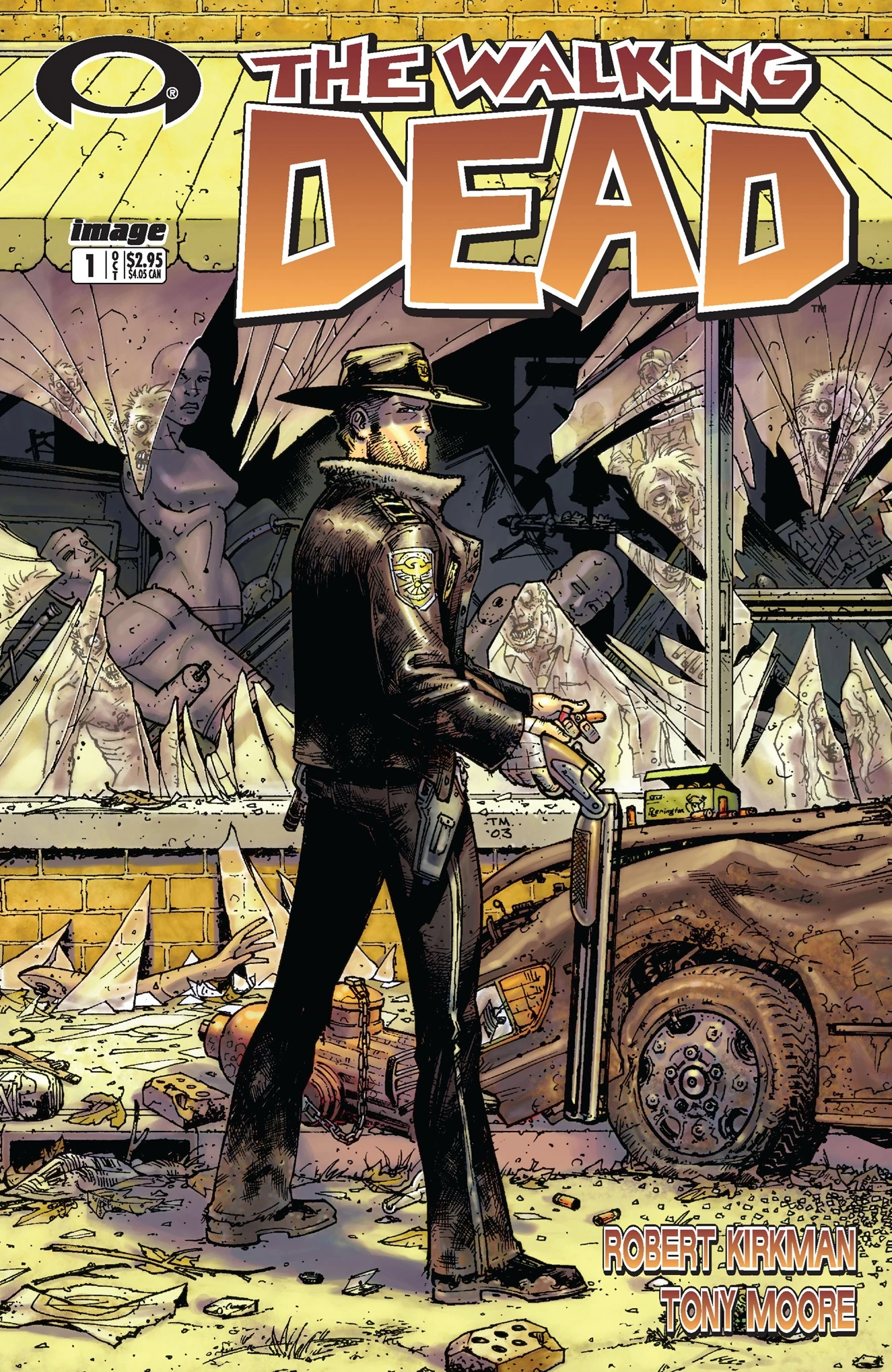
I’m once again picking apart the corpse of Tony Moore and Robert Kirkman’s The Walking Dead #1 to show how these concepts can come together. This time, just the first two pages will do the trick.

http://s13.postimage.org/q0zzzhedz/image.jpg

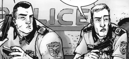
So framing first. The top full-width panel is symmetrical and misaligned, so the right side includes more than the primary subjects of Rick, Shane, and their police car which appear cropped in the foreground, plus the escaped convict and his truck in the middleground. The rectangular panel could include all of the rectangular police car, but instead provides surrounding detail, including a horse (the first hint at the Western motif), a Rotary Club sign (suggesting a small community theme?), and distant mountains in the background (further establishing the rural setting).

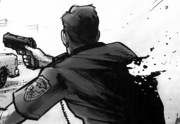
However, it’s the bottom panel that gives the initial framing its biggest meaning, since the open foreground space of that first panel parallels the page’s most important image in the bottom panel: Rick being shot. The bottom frame is symmetrical and proportionate, making the first misaligned framing a form of spatial foreshadowing. Moore also shifts the parallel angle of perspective, effectively rotating the shooter to the background, Shane to the middleground, and Rick to the foreground, the most significant visual space. Note also that Rick occupies the right side of the image, gaining further significance since as Anglophone readers we conclude the panel on right. We read top to bottom too, so Rick being shot occupies the concluding space of the overall page too (it’s also the peak image in an implied 4×2 grid, but we covered visual sentences and layouts elsewhere).

Rick is also emphasized because our perspective moves with him, beginning in panel five. These four middle framings are symmetrical while vacillating between proportionate and abridged, because the figures are sometimes cropped mid-chest, adding to the sense of Rick and Shane being trapped in a cramped space. Though drawn smaller than Shane in panels one and two, when Rick stands in panel three, he encompasses more space: his action literally makes him larger. Because the angle of perspective is the same in panels two and four, Shane remains the same.

Closure between the images is minimal. The first panel establishes the overall area, and the following five panels work within it, demanding little spatial closure. Though the time span of each panel and the gaps between them is inherently inexact, the first four transitions suggest no significant gaps, and so they imply a steady movement forward in time, requiring only basic temporal closure. The fifth transition, however, implies a gap in which Rick turns around to face the shooter. So in addition to temporal closure, the panel transition requires causal closure because the action of Rick turning is undrawn; we infer it in order to explain why Rick’s back is no longer turned to the shooter as it was in the previous image.

Finally, Tony Moore’s drawing style is roughly 3-3 on the abstraction grid, so it shows both a moderate amount of detail (translucent) and a moderate amount of contour warping (idealization). Arguably, the figures show a level of 3-4 abstraction, with intensified contours. In the second panel, Shane is impossibly wide and Rick impossibly thin, with Rick’s head roughly half the width of Shane’s shoulder.

shane and rick abstraction

The effect characterizes each through visual exaggeration and further establishes them as foils. Meanwhile, the shooter’s head contrasts the straight lines that compose Rick and Shane’s bodies with frenetic lines and lopsided features.

crazy guy

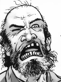
Though the effect is more striking, the shooter’s lines contours remain within an idealized range. Rick’s bullet wound, however, is intensified or even hyperbolic.

rick's wound

Since no human being could survive a wound that extreme, the image creates higher closure demand after the page turn because we retroactively understand the image to be exaggerated. There’s an overt abstraction gap between what is drawn and how it is drawn. And because a literal understanding of the image contradicts the story, we ignore it (diegetic erasure).

http://s13.postimage.org/9r9twl3pz/image.jpg

The leap to page two is major in other ways too. The image requires a great deal of temporal closure with details that also require a range of casual closure. After being shot, Rick was taken to a hospital–perhaps by paramedics in an ambulance, though most of the casual facts go unconfirmed. He is in a bed in a bedroom, not a critical ward or operating room, so presumably his wounds were successfully treated and he was left to recuperate. The time gap is ambiguous, but his beard growth suggest several days.

The framing marks a major change too. Though still symmetrical, the full-page panel is also expansive. Rick’s figure is the subject, but a great deal of the surrounding room is drawn for a spacious effect unlike the previous page’s variously proportionate and abridge panels. The angle of perspective shifts from parallel to downward, so we are no longer viewing the image as a character would but as if from a more omniscient vantage.

The style of abstraction has shifted too. While Rick remains at 3-3 (translucent idealization), the room is closer to 2-2 (semi-translucent generalization). The level of detail is much greater than on the previous page and the line contours are only warped slightly below the level of photorealism. Notice the line quality of the shadows and reflected chair legs on the floor.

The 2-2 image is also a full-page panel, giving it further significance. When the first zombie later appears on page six, we retroactively fill in additional closure into the temporal gap: the zombie apocalypse occurred while Rick was unconscious and safe behind his bedroom door. Page two is the most significant image in the issue, because it is 1) the most detailed and least abstracted image in a stylistic context of less detail and higher abstraction, 2) the first of only two full-page panels, 3) the most expansively framed image, and 4) the image demanding the highest amount and range of closure.

There’s plenty more visual analysis available on these two pages (haven’t even started to talk about the difference in Moore’s rendering of sound effects and speech yet), but you get the picture.

Analyzing Comics 101: Visual Sentence vs. Page Layout

Having taught my spring term seminar Superheroes a half dozen times now, I’m converting it to one of the gateway courses for Washington and Lee students entering the English major. The overhaul means jettisoning the pre-history of the genre (I love that stuff, but I could just hand my students On the Origin of Superheroes and be done with it) and focusing much more on comics as an art medium. So I’m trying to boil down the basics, the must-know criteria for analyzing a comic book.

So now it’s time to invite Neil Cohn to the lectern. If you haven’t read his The Visual Language of Comics, please do. Meanwhile, here’s my boiling down of his visual language grammar.

Narrative panel types: images may be categorized according to the kinds of narrative information they contain and how that information creates a visual sentence when read in sequence:

Orienter: introduces context for a later interaction (no tension).

Establisher: introduces elements that later interact (no tension).

Initial: begins the interactive tension.

Prolongation: continues the interactive tension.

Peak: high point of interactive tension.

Release: aftermath of interactive tension.

Cohn only looks at comic strips, which typically express a single sentence in a linear arrangement of three or four panels, but longer graphic narratives can express multiple sentences on a single page or extend a single visual sentence over multiple pages.  To analyze the different ways that can work, I’m adding some terminology to Cohn’s.

Closed sentences: two sentences that begin and end without sharing panels.

Overlapping sentences: sentences that share panels.

Interrupted sentence: an overlapping sentence that does not complete or initiate its tension before another sentence replaces it; sentences might share an Orienter, or an Establisher may introduce two elements that do not interact until later as a form foreshadowing.

Dual-function panel: in overlapping sentences, one panel performs two narrative functions. A panel may, for example, serve as the Release of one sentence and also the Orienter, Establisher, or Initial of the next. Or an Orienter may  serve as the Establisher of an interrupted sentence that initializes tension later.

Sentence Layout: the relationship of visual sentences to pages.

Page sentence: a sentence that begins with the page’s first panel and ends with the page’s final panel.

Multipage sentence: a sentence that extends beyond one page.

End stop: a page and a visual sentence end simultaneously.

Enjambed: a page ends before the visual sentence ends, also called a visual cliff-hanger.

This is all awfully abstract, so let me give specific examples from The Walking Dead again.

Robert Kirkman and Tony Moore like enjambment. Their first issue includes several cliff-hangers. The bottom row of page five begins with an Establisher (introducing the door to the already established figure of Rick), is followed by an Initial panel (Rick removes the piece of wood holding the door closed), and ends with a Peak (Rick is opening the door).

http://s13.postimage.org/5yqbguo7r/image.jpg

But the Release only appears after turning to page six. That full-page panel is also a dual-function panel because it serves as the Establisher (introducing the zombies to the already established Rick) for the next, overlapping sentence.

http://s13.postimage.org/osc4dumfr/image.jpg

The turn from page nine to ten is similar. The first panel in the bottom row of page nine is an Establisher (Rick and the bicycle), followed by the page-ending Peak of Rick’s shocked reaction. The top of page ten provides the Release (we finally see what he sees).

http://s13.postimage.org/5sh7ri4gn/image.jpg

 http://s13.postimage.org/548d8k5qv/image.jpg

A similar grammatical pattern repeats on pages thirteen and fourteen. The first panel in the bottom row of thirteen is an Orienter. The second is an Establisher (Rick’s face seems to be reacting to something, a sound presumably), and the last panel is an Initial. Turn the page, and there’s the Peak.

http://s9.postimage.org/5ejovcyn3/image.jpg

http://s9.postimage.org/aeh53b49r/image.jpg

The visual grammar also shows that cliff-hangers only work on the final panel of a two-page spread, in order to prevent a reader’s eye from skimming to the critical image prematurely (which happens in my arrangements above).

Also, Moore and Kirkman don’t always enjamb their visual sentences. Page one, for instance, ends on a Peak. The page also begins with an Initial, followed by four Prolongation panels. Page one is a complete page sentence, both beginning and ending on a single page.  

http://s13.postimage.org/q0zzzhedz/image.jpg

Instead of a Release, the next page begins with an Orienter (Rick in his hospital room) for the next visual sentence, which does not overlap.

http://s13.postimage.org/9r9twl3pz/image.jpg

In terms of interrupted sentences, page ten begins a new visual sentence with the top Establisher (introducing the bicycle zombie to the already established Rick), followed by two Initials (Rick and the zombie interact) in the second. The bottom row begins with two Prolongations, followed by a Peak (Rick’s tear) and a Release (the zombie closes its mouth).

http://s13.postimage.org/548d8k5qv/image.jpg

The visual sentence appears to have ended when the next page begins a new sentence with no further interaction between Rick and the zombie. So page ten reads as a complete page sentence, until the bottom of page twenty-three continues the interaction with a Prolongation panel, retroactively showing that the visual sentence was interrupted.

http://s9.postimage.org/5fy82ipun/image.jpg

Page twenty-four provides a new Peak (Rick shoots the zombie), followed by two Release panels (Rick looking down, the zombie with a bullet hole in its forehead).

http://s9.postimage.org/54grpr9en/image.jpg

Rick’s tear is also a Prolongation of his tear on page ten, an additional overlapping sentence that reaches its Peak in the next panel when Rick wipes the tear away. The final three panels are Releases. They’re also their own overlapping, three-panel sentence: Initial (Rick and the car), Peak (Rick gets into the car), and Release (car has driven off).


The Rhyming Dead (Analyzing Comics 101: Page Schemes)

The Walking Dead Volume 1 “Days Gone Bye” is anti-feminist, anti-government, pro-gun, libertarian fantasy propaganda. So pretty much my opposite on the political spectrum. And yet I teach it every year in my first-year writing seminar. It helps that it pairs so well with George Romero’s Night of the Living Dead (which is nihilistic, anti-everything fantasy propaganda). It helps even more that I like the Walking Dead TV show so much.  I always assign open essay topics, so I get a range of gender critiques, pro-family analysis, and (my favorite) the meaning of Rick’s hat. That one requires a deeper level of visual analysis, and that’s what I want to focus on today.

On a previous blog, I laid out my thoughts on layout, and now I want to apply them a little more systematically to one specific comic: The Walking Dead #1 (October 2003) by Robert Kirkman and Tony Moore. I’ll work through the issue page-by-page first, then follow up with a page scheme analysis: how the layouts of separate pages combine for issue-wide effects. I’m working with the general principle that pages have base patterns, and when those patterns repeat, their pages relate at a formal level (they visually rhyme) and so the content of those pages are connected too.

PAGE 1:

http://s13.postimage.org/q0zzzhedz/image.jpg

Irregular 4-row layout, with top and bottom full-width panels. The bottom panel is also unframed and merges with the underlying page panel, giving it additional significance.

PAGES 2-3:

http://s13.postimage.org/9r9twl3pz/image.jpg     http://s13.postimage.org/3rm2sxixj/image.jpg

Full-page panel and a regular 3×3. Often a comic establishes a single base pattern, but the 3×3 contradicts the 4-row (and the implied 4×2) of page one.  The full-page panel is ambiguous since it can divide into any layout pattern, and so it is an effective bridge between the two base patterns.

PAGES 4-5:

http://s13.postimage.org/ml7vpxh5j/image.jpg     http://s13.postimage.org/5yqbguo7r/image.jpg

The irregular 3-row begins with 3 panels, but then switches to a 2-panel bottom row that breaks the 3×3 pattern established on the previous page. The next page is also a 3-row, but since the top, full-width panel could divide into three panels, I’d say the page is still using 3×3 as its implied base pattern.

PAGES 6-7:

http://s13.postimage.org/osc4dumfr/image.jpg   http://s13.postimage.org/xorhvj2fr/image.jpg

Another full-page panel (on the left side of the spread like the full-page panel of page two, so the positioning rhymes as well) and another 3-row with a top, full-width panel that implies a 3×3 base pattern, same as page five (which was also on the right side of the page spread, so another positioning rhyme).

PAGES 8-9:

http://s13.postimage.org/3y4d9rhg7/image.jpg  http://s13.postimage.org/5sh7ri4gn/image.jpg

And here Moore and Kirkman completely break any base patterning. The bottom row would suit a 3×3, but the top two-thirds could suit an implied 4×2. The top two-thirds also shift to an irregular 2-column layout, with the first column combing three panels to establish the reading path for the paneled second column.  The next page then switches back to an irregular 3-row. The top, full-width panel is unframed and merges with the underlying page panel which slowly darkens to black gutters, a motif continued on the next page.

PAGES 10-11:

http://s13.postimage.org/548d8k5qv/image.jpg  http://s13.postimage.org/c8q6hld07/image.jpg

Another atypical page, a 3-row but now with a bottom, 4-panel row, which is a new layout element. Like the preceding page, the top, full-width panel is unframed and merges with the page panel which darkens to black gutters again. The next page returns to a regular 3×3, same as page three.

PAGES 12-13:

http://s9.postimage.org/6sbbqnxwf/image.jpg  http://s9.postimage.org/5ejovcyn3/image.jpg

A 3-row and implied 3×3, since both the top unframed full-width panel and the middle framed full-width panel would divide accordingly. The implied 3×3 is further suggested by the actual 3×3 of the facing page.

PAGES 14-15:

http://s9.postimage.org/aeh53b49r/image.jpg  http://s9.postimage.org/54c6c0k0v/image.jpg

Atypical again. The bottom row partly evokes 3×3, but the panels are closer to half-page height, and they are also insets over the full-page panel image that dominates the top half of the page. The next page is an irregular 3-row, though now with a bottom, 4-panel row (as first seen on page ten).

PAGES 16-17:

http://s9.postimage.org/hx0abxvmn/image.jpg  http://s9.postimage.org/y9ac1o9y7/image.jpg

Two irregular 3-row pages, with a total of three full-width panels, two 3-panel rows, and one 2-panel row. (That all black background at the bottom of 16 is interesting, but not part of today’s focus.)

PAGES 18-19:

dead  http://s9.postimage.org/g914xahr3/image.jpg

More irregular 3-rows, with three 3-panel rows, two full-widths, and one 2-panel. The second page repeats the exact layout of pages five and seven, with a top, full-width implying the 3×3.

PAGES 20-21:

http://s9.postimage.org/vj104hd9b/image.jpg  http://s9.postimage.org/sqcdy72an/image.jpg

Two more 3-rows with an implied 3×3 base. The first page repeats page nineteen, seven, and five, and the second partially echoes page fourteen, though here the top two-thirds of the page fit a 3×3 pattern by combining two implied rows into a single unframed panel. Also the the bottom panels are insets over the full-page panel which darkens into black gutters–so close to page fourteen, but not an exact match, more of a slant rhyme.

PAGES 22-23:

http://s9.postimage.org/rqm32hn4v/image.jpghttp://s9.postimage.org/5fy82ipun/image.jpg

The fifth iteration of an irregular 3-row with a 3×3-implying top full-width panel. The second page’s irregular 4-row also brings back the implied 4×4 of page one, now with black gutters.

PAGE 24:

http://s9.postimage.org/54grpr9en/image.jpg

Mostly an irregular 4-row, though the first panels of rows one and two are combined into a half-page column, the only column seen since page eight. This is also the sixth page to include black gutters.

So how does any of this combine into any meaningful analysis?

Since well over half of the pages (fourteen or fifteen depending on how you feel about page twenty-one) are irregular 3-rows, there’s a dominant base pattern. Eleven of those pages follow a flexible 3×3, and the two full-page panels can be added to that count too. Those two full-pages deserve special attention, rhyming the two formally largest moments in the narrative layout: Rick waking up for the first time after his apocalypse-triggering injury, and the first, apocalypse-signifying depiction of zombies. Pages fourteen and twenty-one are the next visually significant, with their top panels dominating more than half of their layouts: Rick being struck by a shovel, and a zombie appearing behind a fence. Frankly, the shovel shot seems a bit gratuitous to me since the moment is not that narratively important (a character-introducing misunderstanding patched up by the next page), but page twenty-one is key to Rick’s development since he learns not to waste a bullet by killing a zombie unnecessarily, setting up his character-defining mercy killing on the concluding pages. The two concluding pages also rhyme with page one, creating implied 4×2 bookends to the issue. The black gutter motif also begins on pages nine and ten, when the bicycling zombie is introduced, further linking to page twenty-one’s black gutters and harmless zombie.  

So the page scheme shapes Rick’s character development in different ways than just the words and image content.  There are other angles of interpretation available here (I’d tackle all of those top full-width panels next, or maybe those two brief columns on pages eight and twenty-four), but the point is that layout doesn’t simply transmit narrative. The formal qualities shape the narrative, adding meanings and relating moments that in terms of story alone are not directly linked.

Issue 1

Stay-at-Home Dad vs. Muslim Zombies

World War Z poster

According to World War Z, two things can trigger a zombie apocalypse: 1) stay-at-home dads, and 2) kindness to Muslims. It is nice, however, to see an American blockbuster starring Brad Pitt as that most un-American of creatures, a U.N. Investigator.

My book club recently spun off a zombie club of college professors, two in Economics and one in English,  me (a Philosopher may be joining us soon too). I presented a conference paper on The Walking Dead last winter, but my knowledge base is dwarfed by the guy who makes guac on movie nights. So far we’ve only watched The Night of the Living Dead. We’d schedule Dawn of the Dead (the remake for some reason), but postponed when a wife (also an Economics professor) got called to Abu Dhabi on a family emergency.

George Romero, director zero in the genre contagion, gave his ghouls a clear cause: radiation from a returning Venus space probe. Brad spends most of WWZ’s 116 minutes and $190 million dollars searching for clues. Walking Dead creator Robert Kirkman doesn’t care. But in terms of theme and discourse, the answer is always scene one.

Every zombie story (and, arguably, every story of every genre) begins with something rotten in the state of Denmark. It takes less than ten minutes (including the insufferably slow credits sequence) for that creepy old man to lurch at Barbra in the cemetery, but Night of the Living Dead has already provided a horde of apocalypse-triggering conflicts spawning across issues of religion, nation, capitalism, and family:

Johnnie’s stopped going to church and jokes about being damned. Romero shoots the American flag flapping backwards from a veteran’s grave. Is the exploitive funeral industry stealing the wreath off the grave and selling it back to them every year? The family unit is shattered in multiple directions: parents vs. children, brother vs. sister, grandparent vs. grandson. The kids discuss digging up the only vaguely remembered dad so they don’t have to drive hours out of town on their mother’s orders.  Time itself is upturned. The first line of the film is a complaint about daylight savings.

World War Z is simpler. The pre-zombie preamble is an ode to the domesticated male. Brad Pitt is the perfect stay-at-home dad. His blissfully happy daughters joke that all he does since quitting his job is make breakfast, but his pancakes are better than Michael Keaton’s in Mr. Mom. Brad doesn’t mind scolding everyone to put their dishes in the sink, but in thematic terms, this is an apocalyptic inversion of stability. His bread-winning wife doesn’t even help with the plates.

When things heat up during the morning commute (Brad is chauffeuring everyone to school and work), his wife takes the wheel while he assumes the traditionally maternal duty of calming and comforting the asthmatically panicked daughter. If you were hoping for a 21st century vision of shared gender roles, the formal plot doesn’t start till the wife is safely tucked away with the children. Her only job now is being a mom. Dad, meanwhile, reveals the secret depth of his professional prowess, including the power to call rescue helicopters down from the sky. In fact, he may be the only man left with a shot at saving the world. Sure, he only takes the job to safeguard his family, but at that moment the world has already been righted. Zombie plague restores domestic order.

Kirkman plays a similar game in Walking Dead. The comic book is a paean to traditional gender—though kudos to the TV team for trying to shake that up a bit. The zombie ur-heroine Barbra is significantly worse, a knock-off of Hitchcock’s Melanie in The Birds. When the going gets tough, the gals collapse into semi-catatonic dementia. Fortunately, Barbra retreats to a farmhouse first, which Ben (he wasn’t black until Duane Jones showed up for the casting call) boards up. This is where economic theory comes in. How do external threats alter group behavior? Which is the more profitable strategy: staying mobile or hunkering down?

World War Z is explicit about both. Director Marc Forster literally spells it out in subtitles: “Movement is life.” Not that those very nice but ultimately very stupid Spanish parents listen to Brad. And look who gets eaten in the next scene. Meanwhile, Israel boards up their whole country. But they also let in Muslim refugees, figuring a grateful live Muslim is better than an angry dead Muslim. Cooperation skyrockets as Israeli soldiers nod and smile and even hand over the PA system for group singing. I’ve never seen an airport customs line half as chummy.

But as every zombie fan knows, hunkering never works for long. Images of Middle East peace last two, maybe three minutes. Romero boarded up the Monroeville Mall (about two miles from my childhood home) for his first sequel, Dawn of the Dead, but its collapse is nothing to the geysers of Palestinian zombies flooding into the last nation on Earth. CGI turns Romero’s lurching latex-painted extras into blood cells gushing through urban arteries. Israel dies from its own kindness—a political allegory a lot of right wingers can probably live with.

That’s where Romero would have left things, with Brad ascending from the Tel Aviv airport into the ambiguous but not particularly hopeful unknown. WWZ is a 1950s scifi. When Don Siegel tried to end Invasion of the Body Snatchers with a chillingly open-ended “They’re coming!”Hollywood sent him back to the editing booth to tack on their contractual, world-is-saved last scene. Forster uses the same one. It turns out zombies dissolve in water! Or something like that. Which is also why at its surprisingly non-gory heart, WWZ isn’t a zombie movie.

Yes, these zombies are sprinters. And, no, they don’t eat the flesh off our bones—just a quick nibble and it’s welcome to the team. But their real genre faux paus is their willingness to bow to the deus ex machina of the human spirit. That’s the formula and American self-image Romero so thoroughly gutted in 1968. In Night of the Living Dead, the center doesn’t hold. Daughter eats mother, brother eats sister, and a posse of deputized rednecks gun down the last rugged individual. In fact, there never was a center. Government, family, God, those are just boards we nail around ourselves while waiting for oblivion to splinter through.

Not true of WWZ. Sure, the American experiment fails (our cops are just more lawless looters), but the world government holds. Instead of retreating to upstate Maine to wait out the vampire plague of I Am Legend (Romero’s literary influence), Brad’s patriarchal family reunites in Nova Scotia. Yeah, that’s right. Canada and the U.N. save humanity. Talk about a horror story!

night_of_the_living_dead_3