Comics and High Art: Not a Juxtaposition

SK_2014-Snax-20

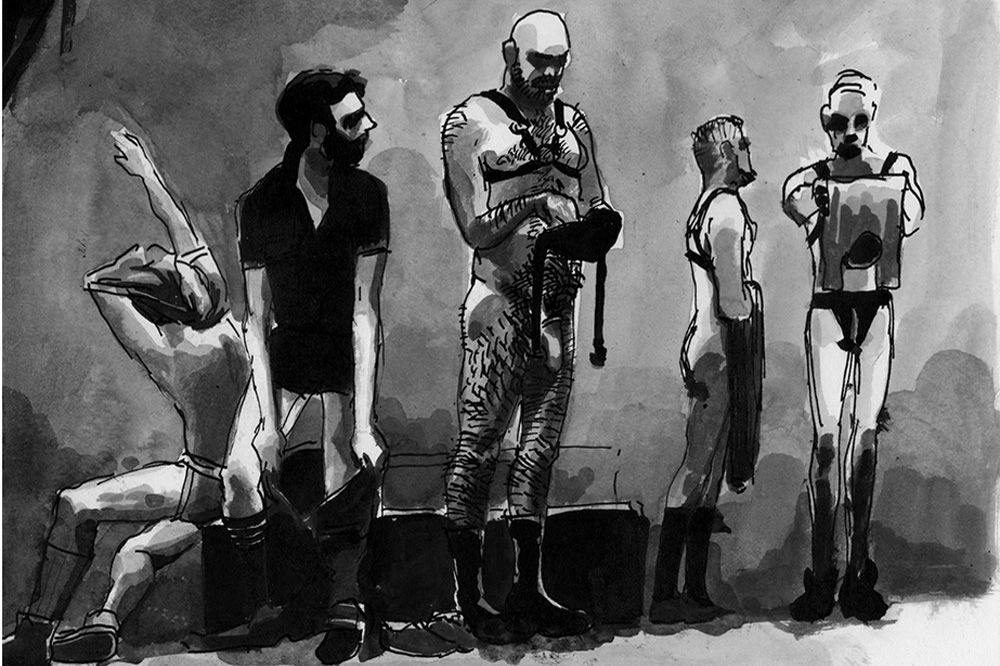
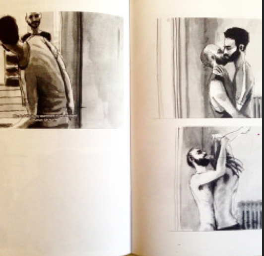
Sholem Krishtalka, Snax (detail), 2014

 
Sholem Krishtalka moved to Berlin a couple of years ago, and has been making visual and cultural representations of the city since May 2013. They are mostly online, scanned from analog sources. Looking at the work, with the pictures interlaced with text, they could be thought to be comics. Even talking to Krishtalka, he sees them as similar to Hogarth, the British painter and print artist from the 18th century. The two big books in the mid 1990s that tried to claim comic as art, or tried to talk about the semiotics of comics as their own thing, place Hogarth in their canon. For Scott McCloud, Hogarth is comics, because he fits their essential definition; namely, that they are “juxtaposed pictorial and other images in deliberate sequence, intended to convey information and/or to produce an aesthetic response in the viewer” (McCloud, Understanding Comics, 20). For Robert Girard, it is a possibility that Hogarth’s early work could be comics, and his entire first chapter is about the English tradition of printing, that reached its zenith in the 19th century.In this capacity, Hogarth and comics can be defined by “Skill for exaggeration and ironic juxtaposition of words and pictures…an aesthetic template” (12, Comics, Comix, and Graphic Novel)
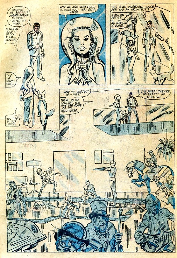
 

Screen Shot 2015-10-13 at 10.42.43 PM

From A Berlin Diary

 
Krishtalka work could be considered comics by Girard and McCloud–especially for the problems of (possibly ironic) juxtaposition of words and images. However, when he spoke to me he disputed this taxonomic claim: “It’s not created as a comic (this isn’t any form of snobbery, it’s just not constructed, laid out, etc etc the way a comic book is). If I have my way, it’ll look more like a monograph than a comic. Again, I’m interested in medium specificity — if it’s going to be a book, I want it to make sense as a book, i.e. I want the form of the book to impact the drawings and vice versa” Thinking about the art historical tradition in which Krishtalka works (the book and the print), the juxtaposition between words and text might not be the sole purview of comics or comix.

The art historical tradition could consist of the Los Angeles legend Ed Ruscha, who never claimed that his photographic work were works in themselves, but “pictures for a book”. By extension, Ruscha makes the point that his drawings are, in a similar fashion, just pictures in a book. But, this does not mean that pictures in a book cannot be juxtaposed.

Ruscha’s use of banal texts — or his absence of text — asserts that the mash up of words and pictures is not the most interesting juxtaposition, which can occur within a set of formal choices, within or at oblique angles to a larger tradition of image making. The tradition becomes a kind of moving target that never quite remains stable. In this sense, the media becomes the message. Ruscha’s use of banal forms, or pop’s use of banal forms, are as much of a figure of media choices than other formal problems. Thus, the comics are comics, because Hogarth turned paintings into cheap etchings, which were then made even cheaper by vernacular forms. The translation into vernacular forms are more important than either words or pictures. To read a tradition is not to just read words or pictures, but to place both into a social context, which pays attention to the methods of production.
 

OPEDRuscha950

Ed Ruscha, from The Seasons

 
So, the “the juxtaposition of pictures and words”, in Krishtalka’s context, must be considered in the media tradition of queer narrative artists, in Europe, at the beginning of the 21st century who have a tense relationship to digital methods of distribution. Within this media are very specific messages, even messages that connect to Hogarth, but elide either comix or comics. This tradition, a half century earlier, would include David Hockney, especially his illustrations of certain poems of Cavafy or his work on the Rake’s progress.

Cavafy was a cult poet–Greek, friendly with the novelist EM Forster, and known for hinting at desire without stating sexuality directly. Hockney’s illustrations of the poems of Cavafy, make explicit the homoeroticism implied in the text. Thus, in this act of translation, the work allows for an explicit overlap between text and image. The lack of contrasting effect in the work means there is no juxtaposition between word and image This appropriateness refuses one tradition of seeing pictures and words together (they do not startle).
 

david_hockney_illustrations_for_fourteen_poems_from_cp_cavafy_d5532577_002h

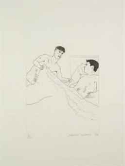
Hockney illustration for Cavafy’s poems

 
There are other ways of images and words working together where Hockney playing with Cavafy would work perfectly. There have been private presses from the beginning, printing queer erotic work, and for the idea of queer erotic work being passed from hand to hand. Homerotic work has medium concerns, has a tradition that cannot be included in the problem of genre. That these works eventually become public, and that Hockney makes them more explicit than Cavafy’s hints, has a kind of intertextual narrative progression. Cavafy writes tight, heart breaking odes of masculine sex. In a couple of decades, using a media that is both attached to a tradition and a break of tradition, Hockney illustrates these odes. These illustrated odes are scanned because of Hockney, and through the problem of the net, finally develop a kind of fissure. This fissure, between image and text, allows for an unmooring of desire. This ambivalence of forms and history, also through the net, can be seen in the best of Krishtalka work. It has an embodied disembodiment, which is shared by Hockney. The juxtaposition is between reader, author, tradition, medium and heritage. The words and the pictures matter less than all of the other concerns.

If Hockney’s etchings around Cavafy are about intimacy of scale, than his stage designs for Stravinsky’s operatic adaptation of the Rake’s Progress fit within a tradition of printmaking. That the libretto of the Opera was written by the poet WH Auden and his partner Chester Kallman indicates a queer reclaiming of Hogarth’s work. If the sexual outlaw was subject in Hogarth’s work and if the juxtaposition at least partially was between who was being depicted, and the audience for those being depicted, the making queer underground tradition epically visual. When Hockney uses the form of etching, he also turns those etchings into opera curtains–adding the performative nature of time to this ongoing hand to hand playing of the homoerotic potential of English masculinities. Thus, the work he did for the Rake’s progress does not juxtapose words and pictures but juxtaposes the oral and written languages in ways that are within the tradition (the tradition of English music hall, but also the tradition of opera queens and another kind of performative queerness.) The refusal of juxtaposition, the sameness that occurs with the updating of the etchings, suggest that not all pictures with words are comics.

Hockney’s adaptation of Rake’s Progress functions as a formal act–where the medium becomes the message. It plays with the visual syntax of Hogarth but not the form. But then what to do with Cavafy’s etchings? As illustration, ephemeral, connecting perhaps to the cheap traditions of pornography and the expensive connections of private printed editions, but do they juxtapose? In Krishtalka’s depictions of the dance clubs of Berlin, is he functioning as an outside observer–juxtaposing audience and performer, or is he placing himself within a tradition of visual depictions–like Auden and Kallman writing an opera to make the visual queer? This is the ongoing problem of juxtaposition. It’s not a useful word for figuring out the complex lattice of forms that visual work constructs. The beginning assumption is that juxtaposition only exists within a context of high modernist shock. The integration of forms, and of medium, that rely on a familiarity of influences is not rewarded via juxtaposition. Outside of a comics context, the art historian Hal Foster writes about this on his introductory discussion of early pop. “Warhol and Lichtenstein’s ..juxtaposition of high and low registers might shock, but only in the first instance…it is the unexpected fit between tableau and its cultural others (cartoon, ad or comic) that counts…”(Foster, First Pop Age, 71)
 

David Hockney"DROP CURTAIN FOR THE RAKE'S PROGRESS FROM THE RAKE'S PROGRESS" 1975-79Ink And Collage On Cardboard14 x 20 1/2"© David HockneyCollection The David Hockney FoundationPhoto Credit: Richard Schmidt

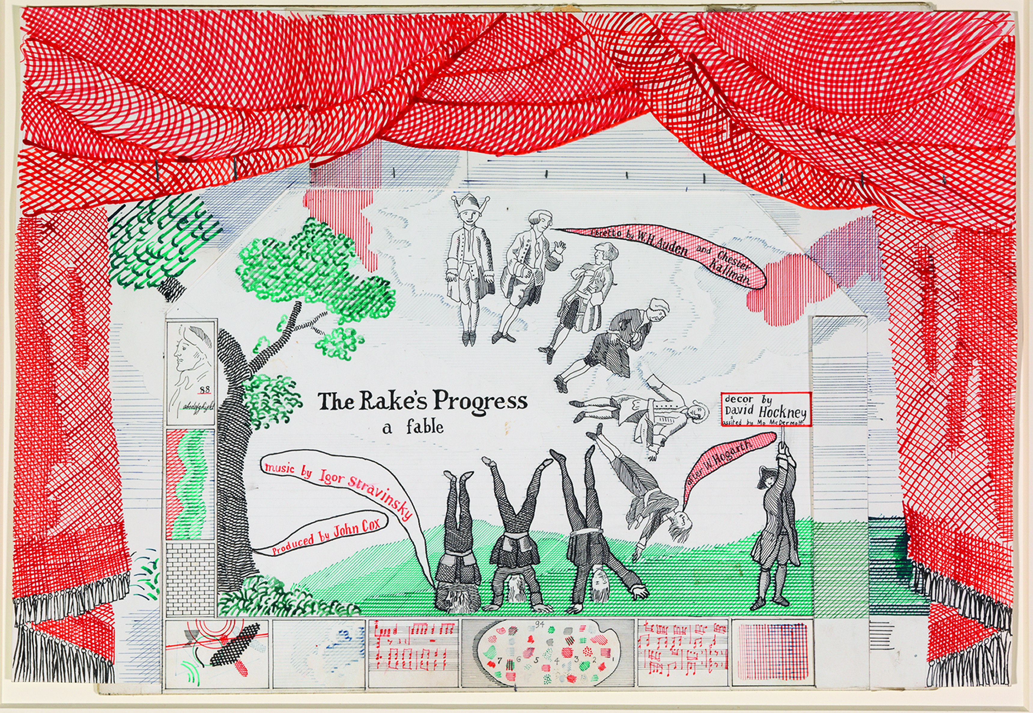
David Hockney, The Rake’s Progress

 
How Hockney constructs his relationships to personal experiences, and selfhood is one unexpected fit. There are others. For example, Lichtenstein’s mirror paintings from the late 1960s to the mid 1980s, and how they both refuse a direct correlation between the narratives of self, and the medium of quoting, destabilizing forms. (They are pictures of mirrors that are literally unreflective). Even if Lichtenstein wasn’t queer– his work suggests that identity has become labile, more prone to failure, and less willing to endure the juxtaposed enjambment as the only way of moving forward. Krishtalka’s work approaches Pop’s move away from juxtaposition as a formalist identity, and towards a large series of unstable and negotiated allowances, not the usual beyond the fourth wall or the playing with panels, but with a recognition of multiplicities of media. Lichtenstein’s mirrors recognize the infidelity of the mirror’s ability to feed information back to the viewer. This tension between how something is represented, and what it shows, could be a continual central problem of contemporary aesthetics. Another example: Warhol was shit at silk screening, if he did it himself, it was splotchy, runny, the colors bleed. The formal instability of the silk screen medium, so close to the problems of painting, is a reminder of the continually instability of form, just as Lichtenstein’s mirrors which cannot see, resemble the idea of mirror, without embodiment. This is not to suggest that comics are incapable of this kind of reminder, but the juxtapositions that historians of comics keep trying to embody are not the only games that are being played. It might be useful to think of this as a number of spectrums: between future and past, between precedents, about identity (like queerness itself is a spectrum), between fidelity and infidelity to any of these problems–but also between soft introductions and hard shocks, between the primary shock and the continual renewal of problematic forms.
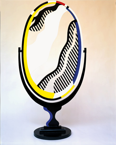
 

6_Mirror_600

Roy Lichtenstein


Hogarth was straight and bourgeois, and Lichtenstein was as well, but the others we have mentioned had a queer heritage, and part of that problem of reproducibility has a queer energy. Part of the queerness is the ability of the private book, the broadsheet, the mimeograph, the computer, the smartphone, to allow for early adopters to invent and depict new sexual forms. Part of it is that queerness functions as a kind of paratextual interloper, it slides between genre or forms with some ease. Part of it is the artificial reproduction has a queer edge–eluding biology, eluding the ordinariness of how we usually create more things, the mechanical and later digital, allow for a wilderness of desire, that overwhelm simple understandings of one thing juxtaposing with another. This queerness then infects how narratives are constructed, but does not position a simple way of working through one form or one methodology.

These spectrums working with Krishtalka’s queer work and his historical canon, work out an ongoing problem of how to depict the visual impact of new reproductive media. One of the reasons why paintings become prints in Hogarth is because of the emergence of cheap and ready ways to do so. One of the reasons why Warhol worked in both film and in silk screens, was a way of finding his own identity in the history of mass production. The blankness of Ruscha is only possible because of the new interstate Highway system. The anxiety of Lichtenstein’s mirrors is about how to see in a new machine age. The ongoing problem of how to construct meaning in new narratives of image reproduction has a weird consistency.

This fraught relationship between how to see and what to see is not only visual. Krishtalka’s project is named the Berlin diaries. For most of Krishtalka’s audience, this brings to memory the novelist Christopher Isherwood’s Berlin Stories, which gave birth to a stage production, which gave birth to a film, which gave birth to another stage production. The interplay between film, stage, and written text was introduced by one of last century’s definitive opening lines, recalling an ironic visual neutrality of new technology: “ “I am a camera with its shutter open, quite passive, recording, not thinking. Recording the man shaving at the window opposite and the woman in the kimono washing her hair. Someday, all this will have to be developed, carefully printed, fixed.”

Isherwood wanting to be an impersonal camera, and never succeeding at it, summarizes a history of a whole tradition of 20th century attempts to answer the problems of the reproducibility of technology. Thinking about the series that Krishtalka did before he worked on the Berlin Diaries, this problem of reproducibility has some definitive queer shades. The series is called Lurking, and it is beautiful depictions of mostly watercolour and pencil of youngish, cutish men. They translate a form that has been popular from the Mannerist era, but the formal translation has something to say about the distribution methodology of the form (from Facebook to analog media, to digitial scanning, to Tumblr.) Though, this translation is one that Krishtalka disputes: “On the other hand, you’re always a victim to the speed of people’s dashboard feeds, and the culture of image consumption on the internet in general. Which means that people don’t linger on the images on the net, or at least I assume they don’t. What was interesting about watching people consume the images live, i.e. during the run of my gallery show, was that people really did linger.”

Looking at Krishtalka’s Lurking Drawings on Tumblr, reinforces the desire to linger, just as the desire to cruise, the desire to form one’s singular narrative, is complicated when they are imbued by other creators and other forms. The Tumblr feed is a collective feed, and one whose narratives are out of the control of the artist. They become a monstrous problem of this reproduced form. But the formal component is still vital. Lurking is part of that talk about the internet’s return of the visual, the tension of the digital, formal juxtaposition, all become part of this self perpetuating traditional crisis of narrative making. But a formal crisis and one interlaced with the usual problems of aesthetics (maybe even a problem of beauty.) So though comics flirt with the edges of this problem of reproducibility, is the problem of formal reproducibility explicitly one of comics?

In the hi/lo tumblr everything is visual without being explicitly within the form of comics or watercolour or prints–the problems of transmuting that the Cavafy etchings in texts are part of this construction, and the form of Lurking is more suited to Tumblr. The work will shift meanings and culture, when they are taken out of the visual stream of the tumblr wall, and emerge into a written book. Just, as our understanding of Hogarth changes, when we see what Hockney has done with it.

In this sense, comics becomes one way of looking at the juxtaposition of word and text, one way to translate, but not the simplest or the only method. The book refuses the juxtaposition, and abstraction of the digital form, as Krishtalka allows: “My ultimate ambition for this project is that it be concrete, that it exist as a book. If this ever does see the light of day, it won’t look like a comic. It’s not created as a comic (this isn’t any form of snobbery, it’s just not constructed, laid out, etc etc the way a comic book is). If I have my way, it’ll look more like a monograph than a comic. Again, I’m interested in medium specificity — if it’s going to be a book, I want it to make sense as a book, i.e. I want the form of the book to impact the drawings and vice versa.”

The Berlin Diaries as they are working right now (as text, as writing, as a cohesive way of working through identity, as a piece aware of and working around these traditions, as a problem of desire, as a problem of medium, as an edited work, as a work of excess, as a print series, as a work of nostalgia, as a work that is unstable in a medium that is unstable, as queer–not in the subject matter, but as a formal problem) refuse juxtaposition in favour of more explicit forms (what Krishtalka calls “medium specificity” When they become a book, the concreteness of the form does not make them any more of a comic, just as when Hogarth moved from paintings to prints, they were the proto comics that we wish them to be.

The transformation is the key taxonomic category, but not the singular one.

People Who Make Art…Shouldn’t Appropriate Hulk!

1956447-0edba91f_0037_40c9_8f1c_1b03812f42f0

 
One of the few Hulk comics I own is a 1981 effort by Bill Mantlo and Sal Buscema titled “People in Glass Houses Shouldn’t Hurt Hulk!” I was never that into the big guy honestly — though I got a year or something of Peter David’s run whenever that was. But I’ve been asked to do a talk on Marvel’s greenest property, so I thought I’d revisit this story (one of two in the issue), which I still remember fairly clearly after three decades.

Why I remember it is not especially obvious, I have to say. The title does have a goofy charm, I guess, and the story has a kind of inevitable progression which is compelling, if not exactly competent.

The narrative starts with Bruce Banner passed out on a Malibu beach; a woman all in white with a white dog finds him and brings him to her house. She cares for him and shows him her sculptures; all glass statues of men. She then seduces him and keeps him for a month, promising to do his sculpture too. Finally, she reveals that she is some sort of witch (the plot rather breaks down here) and tries to turn him to glass with her magical glass hands. But he turns into the Hulk and destroys everything and escapes; she accidentally touches herself with her own magic hands and ends up a glass sculpture at the bottom of the sea. Hulk bounds away. The end.

So this is obviously a basic noire set up, with Glazier (that’s the glass lady) as the femme fatale and Banner as the dupe she bamboozles. The noire paranoid misogyny is firmly in place, which is also the noire terror of/fascination with female sexuality.
 

hulk1

 
At the top of the page you’ve got Glazier’s nefarious boasting about how she collects men juxtaposed with the image of the glass guy frozen underneath the pond — entrapment imagery doesn’t get much less subtle. (Mantlo and Buscema subtly have Banner give us a thought bubble telling us that the statue looks horrified in case we couldn’t tell from looking at it.) Then, at the bottom of the page, Glazier comes on to Banner, who — courtesy of Buscema’s shaky drawing and some preposterous eyebrows — looks deeply uncomfortable. The caption is odd too: “He cannot resist. He can think of no reason why he should want to.” He’s presented as being both overpowered and as ambivalently acquiescing. The implication is that he should be able to think of a reason not to (like the guy in the pond, dumbass!) but he’s too busy thinking with his dick, or his eyebrows, or whatever.

Then we skip ahead a month, with Banner in his ridiculous white suit (connoting elegance? his captive status? the tail end of the 70s) whining about how he’s a kept man and he’s bored. So far, still noire, with Buscema trying lamely to create some sort of interesting light effect with the moon and the white and the interior glass, though mostly it ends up looking like they’re inside some sort of jello mold.
 

hulk2

 
And then the noir coup de gras, where the conniving evil bitch destroys the douchey guy, to the horror/delight of all.
 

hulk008

 
Except that, as you can see, the grace doesn’t coup (or something like that.) The vampiric consummation doesn’t drain the victim; instead it causes him to improbably and greenly tumesce. The mark walks out, the man walks in, and puts the uppity woman in her place. The masochistic sex fantasy of noire is violently rent like Banner’s stupid white suit, to be replaced by the sadistic violent empowerment fantasy. It’s sort of like rape/revenge with the male rapist replaced by a female succbus and the female revenger replaced by a big green steroidal phallic lump.

The gendered reading is fairly obvious, and even unavoidable. But I think there’s a genre reading as well. Again, we start with noire; which is linked to sophistication, sex, and adulthood. And then suddenly we switch up and have Hulk babbling in his infantile dialect and brutishly smashing up all the high art he can see.
 

hulk009

 
Glazier even explicitly explains that she was trying to catch Hulk in the moment of transformation for her collection; she wanted to turn the comic-book monster into a gallery piece, as if she’s some sort of acquisitive feminized Lichtenstein. But of course it doesn’t work, and moments after she insults Hulk’s intelligence, his gargantuan bulky authenticity smashes the effete museum to smithereens. Your puny art world institutions cannot contain team comics! “Stupid to build a house out of glass!” as Hulk says.
 

hulk010

 
As I’ve mentioned before, Bart Beaty in Comics vs. Art argues that in discourses around high art and comics, comics are always already feminize; they are the weak thing that high art masters. However (as, again, I’ve noted before) masculine and feminine are a bit more fluid in these discussions than Beaty suggests. Here, in particular, higher art (both as gallery art and as the relatively sophisticated pulp genre of noir) are presented as feminine, and the children’s, and even child-like, art-form of comics is presented as victoriously hyper-masculine. Bruce Banner is trying his darndest to find a different, more highbrow narrative, where he gets to have sex (he doesn’t know why he shouln’t) and has cool lighting and is placed in galleries. But Hulk comes along and stomps all that hoity toity namby pampy crap.
 

hulk011

 
The narrative comes across, then, as an extended effort to excuse, or justify, it’s own helpless comic book crappiness. Sal Buscema’s efforts to convey grace, or even style, are utterly ridiculous, foiled by clumsy drawing, clumsy layout, and banal imagination (is that a gallery or a gym?) But grace and sophistication are, we learn through the story, evil, meretricious and not to be trusted. Thick, awkward, clumsy, stupid — those are big, manly qualities you can count on. Fuck high art…or, you know, don’t fuck it. That’s way too dangerous. Just smash.

Pop Art Vs. Comics: Who’s On Top?

One of the recurring themes of Bart Beaty’s Comics vs. Art is the way that art is always on top — sexual connotations very much intentional. Art, Beaty argues, is insistently seen or figured as rigorous masculine seriousness; comics is relegated to the weak feminine silliness of mass culture. Thus, Beaty says:

Lichtenstein’s paintings failed to rise to the level of aesthetic seriousness. The core problem was the way pop art foregrounded consumerism — a feminized trait — through its choice of subject matter.

Beaty goes on to argue that Lichtenstein was eventually recuperated for high art by emphasizing his individual avant garde genius — in other words, by claiming that he transformed comics material from feminine to masculine. Either way, Beaty argues, whether pop art wins or loses, comics are the feminine losers. For Beaty, the anger at pop art, therefore, is an anger at being feminized. In this context, the fact that the Masters of American Comics exhibition focused solely on male cartoonists was not an accident; rather, it was comics rather desperate and certainly contemptible effort to establish its high art bona-fides through an acculumulation of phalluses, and a careful exclusion of those other much-denigrated bits.

Beaty’s analysis is convincing — but he does perhaps gloss over an important point. That point being that, while it may often be figured as masculine in relation to comics, high art’s gendered status in the broader culture is, in fact, extremely dicey. For example, in Art and Homosexuality, Christopher Reed notes that Robert Motherwell, a married heterosexual, was rejected for military service on the grounds that being a Greenwich Village painter meant that he must be gay. In other words, at that time art was so thoroughly unmasculine that artists were almost by definition unmanned.

If art could be seen as effeminiate, comics as mass culture could be seen, in contrast, as normal, robust — as manly, in other words. Thus, Beaty relates this anecdote about cartoonist Irv Novick and Roy Lichtenstein.

[Novick] had one curious encounter at camp. He dropped by the chief of staff’s quarters one night and found a young soldier sitting on a bunk, crying like a baby. “He said he was an artist,” Novick remembered, “and he had to do menial work, like clearning up the officers’ quarters.”

Novick was one of the artists whose work Lichtenstein later copied with such success. Beaty correctly reads the anecdote as an effort to feminize Lichtenstein — a kind of revenge for the way in which Lichtenstein feminized Novick. However, Beaty doesn’t really consider the extent to which this feminization of Lichtenstein is successful because high art is already feminized. The anecdote is effective in no small part because artists like Motherwell were always already gay until proven otherwise — and often even if proven otherwise.

The point here is that the gendered relation between art and comics is not necessarily always about masculine art taking advantage of feminine comics and comics responding with resentment at being so feminized. Rather, on the one hand, comics’ antipathy to art is often tinged with contemptuous misogyny — a denigration of high arts femininity. R. Crumb’s loud denunciations of high art, for example (or Peter Bagge’s) are inevitably tinged with the insistence that artist’s are effete fools, distanced from real life in their ivory towers.

On the other hand, high arts’ interest in artists like Crumb or Novick often seems inflected with a kind of envy or desire. Certainly, Lichtenstein’s work, and pop art in general, can be seen as a campy appropriation of mass culture to feminize the often quite homophobic art world, particularly in contrast to the desperate masculinity of Ab-Ex. But Lichtenstein’s appropriations can also, I think, be seen as a performance of desire for masculinity — a bittersweet effort to capture comics’ masculine mojo while acknowledging his distance from it.

I don’t think that these readings are necessarily mutually exclusive. But I do think that recognizing them both as potentials creates possibilities that Beaty doesn’t really wrestle with. If art is not masculine (always) and comics is not feminine (always), then it’s much more difficult to see them as polarized (always.) Rather than art elevating, exploiting, or denigrating the hapless, accessible body of comics, art and comics start to look more alike — both occupying unstable cultural positions in which, at least historically, constant assertions of masculinity have been seen as vital to prevent a collapse into a devalued femininity. From this perspective, Comics fights Art not because the two are so different, but because their cultural positions and anxieties are so much the same.
 

A Russ Heath panel and the Roy Lichtenstein painting based on it.

The Origin of Roy Lichtenstein

In comics circles, Roy Lichtenstein is often condemned as a no-talent snob who condescended to comics artists even as he made millions by ripping them off. R. C. Baker in a takedown from last year, for example,not only nails Lichetenstein for his knee-jerk dismissal of his sources, but even sneers at him for his compositions, claiming that Lichtenstein’s “flabby lines, blunt colors, and graceless designs are invariably less dynamic than the workaday realism of the comic pros.” Lichtenstein took the vital, outsider pulp energy of comics and flattened it out into flaccid high-brow capitalist dreck. Rather than elevating commercial product into art, he turned art into commercial product.

This criticism, obviously, doesn’t erase the high-art/low-art binary so much as it flips it. High-good/low-bad becomes high-bad/low-good. Lichtenstein may be a transformative genius or a parasitic hack, but either way he’s defined through his relationship to something else; the thing that is not high art which he is blessing or debasing.

Seeing the current Lichtenstein retrospective at the Art Institute of Chicago calls that narrative into question in some interesting ways. Mainly, the show makes it clear that Lichtenstein didn’t copy pulp because it was pulp. He copied pulp because he copied everything. From his early AbEx experiments which look more like half-hearted imitations of AbEX than like the real thing; to his lifetime of imitating other high art painters from Picasso to Matisse; to a series of bizarre Chinese landscape images which include, for no apparent reason, Lichtenstein’s famous imitation Ben-Day dots; to a series of drawings of his own studio in which Lichtenstein imitates his own most famous imitations — the man was a compulsive aesthetic magpie.

Moreover, the way he treated his non-pulp sources was in many ways similar to the ways in which he treated his pulp sources. For instance, here’s his version of the Laocoon:


I’m not sure that this really comes across in the reproduction, but in the massive original, there’s a stark contrast between the flat moire patterns Lichtenstein uses in the background and the AbExy swoops of paint that define the figures. Lichtenstein also, of course, obscures the characters’ expressions and blurs the narrative action. Some of the energy and pathos of the original are retained, but only in a deadened form. The emotion is presented as thin; a few slashes of paint against a surface that asserts itself precisely as patterned, meaningless surface.

Of course, this is what happens in Lichtenstein’s comics, too. The romance and war panels are lifted out of their narratives. The larger than life emotions end up as merely transparent, flat signs of “larger than life emotions”.


Like Laocoon, the drowning victim here is abstracted from her predicament and inflated; the energy, concentrated and expanded, collapses under its own weight. The panel is just its surface, there is no Brad outside it, and the only thing to do (for good and ill) is to sink.

I think the usual way to read this is as a playful satire of authenticity; a repetition which parodies the original and mocks its melodrama. Often this is seen as a mockery of comics or pulp in particular, but pieces like Lichtenstein’s Laocoon suggest that his target is not so limited. Rather, he seems to be sneering at sincerity and vitality itself — not at melodrama per se, but at emotion. Whether low art romance comics or high art tragedy, both point to depths, and are therefore ridiculous.

I’m sure there’s some truth to that reading…but it’s not necessarily how I see what Lichtenstein’s doing. Rather, at least for me, his work is suffused not so much with contempt as with a kind of etiolated longing. Surely there’s something almost quixotic in those Ben-Day dots; the painstaking hand-crafted effort to replicate the incidental byproduct of mass production. It’s as if Lichtenstein is trying not to ridicule the melodrama, but rather to reclaim it. the replication in this reading is not playful mockery but compulsive failure. He’s trying to frame that originary energy, and is condemned to keep trying and trying until he succeeds, which he never can.

My wife, who is a Lichtenstein skeptic, commented that he’d just had one idea, and it wasn’t all that great an idea, and he’d just kept at it with a numbing regularity. There’s definitely truth to that, and you certainly can see his inability to bottle the energy he alternately/simultaneously mocks and covets as related to his own aesthetic limitations.

You can also see it, though, as part and parcel of the historical moment Lichtenstein was in…and which we’re still in, to a large extent. Late capitalism is not an ideology that cares much about origin myths. Social authority doesn’t come from the divine right of kings, but from the repetitive images of value and community that circulate endlessly without any necessary prototype. Even the Founding Fathers are little more than a subcultural marketing trope at this stage; George Washington is just a cutesy infantilized placemat distributed for fun and profit. Which, not coincindentally, is what Lichtenstein’s version of George Washington crossing the Delaware looks like.


Lichtenstein is obviously a beneficiary and an exploiter of post-modernism…but he also can be seen, perhaps, as a victim of it. Imitation isn’t necessarily flattery, but it almost always has something to do with desire. When he has one of his cartoon women declare , “Why Brad, darling, this painting is a masterpiece!” it may be a sneer at pulp’s idea of high art, but it also seems like a nostalgia for that instantly recognizable work of genius, which that character, and that comic, may believe in, and so perhaps achieve — but which Lichtenstein himself can only wish for.


It’s tempting to see Brad’s sad frowny face as self-portrait; a depiction of that distance and that distress. But of course Lichtenstein is never in his paintings. At best, he’s on the surface.
___________

Folks may also want to check out Kailyn Kent’s recent discussion of Lichtenstein. Scroll down for numerous comments.