Is Marilyn Monroe a Character in a Comic Strip?

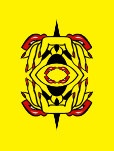
I’ve been obsessed with Andy Warhol’s Marilyn Monroe series lately. When I found out the poster art for Night of the Living Dead isn’t copyrighted, I made this Warhol-inspired knock-off:

Zombie Girl FINAL

Warhol painted his series in 1962, as a kind of requiem for Monroe after her August death. Because it is a grid of nine squares–a classic 3×3 comics panel layout–it looks a lot like a comic strip to me. And so a part of me wants to say it is a comic strip. Consider Scott McCloud’s definition: “Juxtaposed pictorial and other images in deliberate sequence, intended to convey information and/or produce an aesthetic response in the viewer.”

Clearly the nine images are “juxtaposed.” And that would be true even if the images were all identical, as in my variation on Warhol’s source photo (like I said, obsessed):

Marilyn 3x3

But it’s the “deliberate sequence” part that gives me pause. I’m not exactly sure what “deliberate” means here (can a sequence be non-deliberate? even if the process of composition is random, the resulting arrangement becomes deliberate once finalized by the artist), but “sequence” is fairly clear. Most dictionary definitions include the phrase “a specific order.”

So the individual images form a specific path for the viewer to follow. That implies there are wrong paths–or at least paths that don’t produce the aesthetic result that following the intended sequence will produce. I don’t think that’s true of Warhol’s painting or my two variants though.  Their arrangements are aesthetically deliberate, but your eye needn’t begin, for example, in the top right corner and proceed to the right in a Z-pattern in order to best appreciate all those juxtaposed Marilylns and Zombie Girls. If you instead focused first on the center square and then scanned up and to the left or any other direction, the aesthetic content doesn’t change. If order doesn’t matter, then the arrangement must not be a sequence. And if comics are sequences, Warhol’s painting isn’t one.

The term “image” is a problem too. Comics have to have more than one. As I mentioned in a previous blog, that’s why the French flag is not a comic. Though it is composed of three parts (a blue rectangle, a white rectangle, and a red rectangle), we read it as a single, unified image:

So is Warhol’s Marilyn Monroe a sequence of images or just a single, flag-like image?  Is it made of nine juxtaposed images (and so then possibly a comic), or is it one image made up of nine parts (and so definitely not a comic). It’s hard to say since there’s not always a clear distinction between a visual element that is an “image” and a visual element that is “part of an image.”

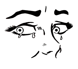
This variation on Roy Lichtenstein’s “Crying Girl” is, I think, clearly a single image–even though it is made of the identical component image flipped and juxtaposed four times:

Crying Mouths

Would it be a comic if I divided the four quarters with frames and gutters? I doubt it. What about images that don’t repeat any of their parts? Consider this entirely abstract composition I’ve ingeniously titled “39 Lines”:

39 lines

It consists of thirty-nine visual elements, but I would say it is only one image.  No individual lines or clusters of lines produce a response that’s separate from the composition as a whole. Now consider this:

Words are imagers

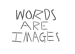
It is also composed of thirty-nine visual elements–the same thirty-nine that make up its sibling image. But it is also a sentence, one quoted from comics artists Will Eisner. Unlike “39 Lines,” “WORDS ARE IMAGES” also has linguistic meaning. It is composed of three, separable linguistic units. The first eleven lines form the word “WORDS,” not because of some intrinsic qualities of the lines themselves, but because of an English-reading viewer perceiving that particular conceptual unit. That linguistic property is so obvious that it’s easy to forget that words are also always rendered images–which was Eisner’s point.

But, unlike the French flag or the Warhols, sequence does matter. The lines that compose the sentence “WORDS ARE IMAGES” must be perceived in a very specific order for the linguistic meaning to occur. That’s why McCloud includes the adjective “pictorial” in his definition, to distinguish comics from sequences of lines that produce only letters, words, sentences, etc.

“39 Lines,” in contrast, has no specific order for taking in its constituent visual elements. Your eye is free to enter the image at any spot and then wander at will. There’s no sequence that produces additional meaning. The same is true of “26 Parts”:

FACE 2

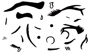
It’s just lines arranged to form an abstract image. But consider those same twenty-six visual elements in this arrangement:

FACE

Your eye is still free to enter and wander freely, but the arrangement of the same ink (or pixels) now conveys an additional meaning. It represents a face. That’s another kind of conceptual unit. The arrangement produces a meaning that is not an intrinsic quality of its individual parts. Like “39 Lines” and “26 Parts,” it’s a single, unified image made of individual parts, but, like “WORDS ARE IMAGES,” the face-lines produce an additional aesthetic response, one that’s pictorial rather than linguistic. The difference is that linguistic images must be perceived in a specific order, and pictorial images do not.

So pictorially, my next Warhol variation isn’t a sequence either:

Superhero Girl FINAL 4

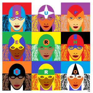
Your eye is once again free to wander through the nine faces in any order. But this time, some of the visual elements are letters, and if you read them in the right order, they spell “SUPERHERO.” That’s a sequence. Since those letters are also part of juxtaposed pictorial images, this 3×3 grid fits McCloud’s definition of a comic, while all of the previous examples do not.

But is “SUPERHERO” a comic when expanded with wallpaper-like repetition?

superhero girls new FINAL 12x12

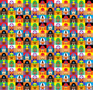
The repetition isn’t itself the problem. I could create a wallpaper-like expansion of this three-panel arrangement of Rodin’s “The Thinker” and still produce sequential meaning:

Thinking

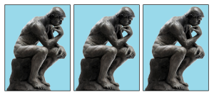
Unlike my earlier layout of the identically distorted Monroe photo, the left-to-right repetition of this identical image can suggest a continuation of behavior through increments of time. It’s ambiguous how much time is passing (seconds, hours, months, etc.), but the figure can be understood as a living figure who is holding a pose as he sits and thinks. That’s not the case with this next Warhol-esque variation on “Crying Girl.”

3x3 crying girl roygbiv

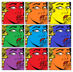
Like the repeating Thinker figure, the repeating Crying Girl figure doesn’t change her pose. But because the pose is transitory and unmotivated (why and for how long would someone look askance like that, and the laws of physics would have something to say about those suspended teardrops), time does not seem to be passing. The face, like Warhol’s Monroe, does change colors–but those seem to be changes to the image of the woman, not the woman herself. This is not a left-to-right sequential representation of time passing. It is a sequence though. Unlike Warhol’s Monroe, the changes follow a specific order: ROYGBIV. Which produces a pun: “ROY” and “Roy.” So is that sequential element enough to call that 3×3 grid a comic?

What about this one?

Crying ROY (Lichtenstein & Warhol Parody)

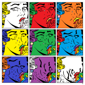
Here, finally, is something that strikes me unequivocally as a comic. It’s a sequence of an incrementally changing image. In addition to color changes, twenty-six parts of “Crying Girl” move from their face-signifying positions to a non-pictorial clump in the bottom half of the final frame. It tells a kind of story. Which I think is what McCloud means by “deliberate sequence.” He wants comics to be narratives.

That produces another problem. While the vast majority of comics are narratives, some are not. Check out Andrei Molotiu’s Abstract Comics and you’ll find meaningfully juxtaposed images that include no words, no people, nothing but non-pictorial lines:


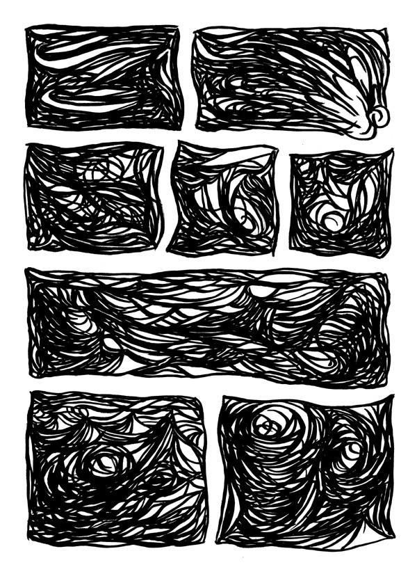
Some of the pages in Abstract Comics, however, appear no more sequential than Warhol. Which could mean some of them aren’t actually comics. They might just be subdivided images. Many are even subdivided into panels and gutters, but do they use those visual elements as panels and gutters? Do they produce a sequence?

Part of the confusion is the non-pictorial content. Visual storytelling typically involves drawings of settings and characters. But it doesn’t have to. Consider this four-image sequence:

4 abstractions

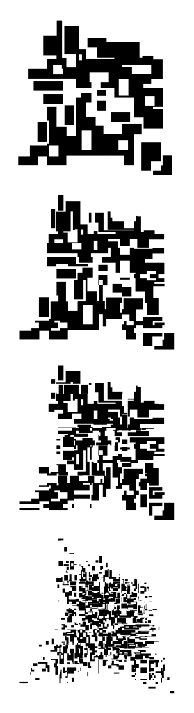
There’s no setting but a white background, and there’s no character in any traditional sense. But it does tell a kind of “story.” The first abstract image appears to change into each of the subsequent abstract images. Even though the image doesn’t represent anything else, it does represent itself. According to Bill Blackbeard’s definition, comics are “about recurrent, identified characters, told in successive drawings.” The cluster of black shapes is both identifiable and recurrent. That makes it a kind of “character,” one able even to undergo a change or “character arc.”

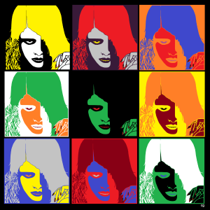
I can apply the same narrative to Monroe:

Marilyn

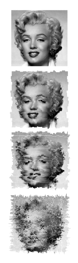
In this case, the first image, because it’s a photo of Monroe, does represent something other than itself. But that’s not true of the rest of the sequence. Each change is a change to the photo only. They don’t represent changes to Monroe herself. She’s not the character of this abstract, four-panel comic. Her photo is. The same is true of my previous “Crying Girl” variations. Even though they’re representative images of a woman, the woman is not the character of the narrative. Her representation is.

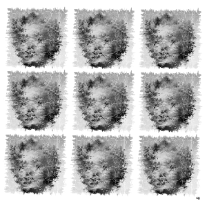
Incremental changes to a repeated visual element, however, don’t guarantee a story. These chessboard permutations strike me as a single image made up of many, evolving but ultimately dependent parts:

CHESS

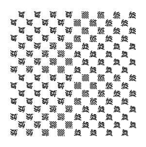
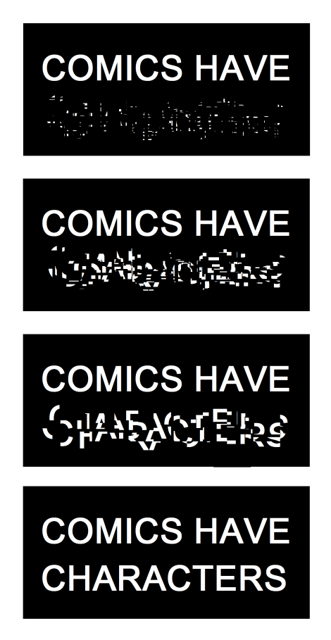
There’s no specific order to the parts, and so there’s no story, and so it’s not a comic. Characters, especially abstract characters, need a sequence in order to become characters. That’s true of  images that have linguistic rather than pictorial meaning too. Even words, because they’re images, can be visual characters in their own abstract but sequential plots:

Comics Have Characters

So is the Monroe image in Warhol’s painting a “character” too? It undergoes similarly abstract changes, but those changes still aren’t sequential. Neither Monroe nor the repeated representations of Monroe are segments in a visual story.

Which is all a very long way of saying: No, Warhol’s painting is not a comic.

It just looks like one.

Why Simple Is So Complicated (Analyzing Comics 101: Abstraction)

I’m teaching “Superhero Comics” this semester, and so I’m once again pulling out Scott McCloud’s abstraction scale:

Image result for mccloud abstraction scale

It begins with a photograph of a face and ends with a face comprised only of an oval, two dots, and a straight line. McCloud calls that last face a “cartoon” and the middle face the standard for “adventure comics,” ie superheroes. All of the faces to the right of the photograph further “abstract [it] through cartooning” which involves “eliminating details” by “focusing on specific details.” Computer programs can do the same kind of stripping down:
 

clip_image007

 
But some “simplification” isn’t so simple. Look at the different between this photograph and its cartoon version.

make a caricature profile picture of you

McCloud’s scale actually combines two kinds simplification. Each step to the right of his spectrum appears simpler because: 1) the image contains fewer lines, and 2) the lines are in themselves less varied. A line becomes smoother by averaging its peaks and lows into a median curve, and so the second kind of simplification is a form of exaggeration. Since exaggeration can extend beyond averaging McCloud’s spectrum actually requires two kinds of abstraction. Each face is altered both in density and in contour quality. Density describes the number of lines; contour quality describes the magnification and compression of line shapes. Abstraction in density reduces the number of lines; abstraction in contour quality warps the line shapes. The less density reduction and the less contour warpage, the more realistic an image appears.

I like McCloud’s five-point scale though, so I’ll offer two of my own.

The Density Scale:

  1. Opacity: The amount of detail is the same or similar to the amount available in photography.
  1. Semi-Translucency: The amount of detail falls below photorealism, while the image still suggests photorealistic subject matter.
  1. Translucency: While reduced well beyond the range of photography, the amount of detail evokes photorealistic subject matter as its source material. This is the standard level of density in superhero comics art.
  1. Semi-Transparency: The sparsity of detail is a dominating quality of the image, and subject matter can evoke only distantly photographic source material. Semi-Transparency is more common in caricature and cartooning.
  1. Transparency: The minimum amount of detail required for an image to be understood as representing real-world subject matter.

The Contour Scale:

  1. Duplication: Line shapes are unaltered for an overall photographic effect. Though naturalistic, reality-duplicating line shapes exceed the norms of superhero art by reproducing too much information.
  1. Generalization: Line shapes are magnified and/or compressed to medians for an overall flattening effect that conforms to naturalistic expectations. Generalization is the standard level of abstraction for objects in superhero art.
  1. Idealization: Some line shapes are magnified and/or compressed to medians while others are magnified and/or compressed beyond their medians for an overall idealizing effect that challenges but does not break naturalism. Idealization is the standard level of abstraction for superhero characters.
  1. Intensification: Line shapes are magnified and/or compressed beyond their medians for an overall exaggerating effect that exceeds naturalistic expectations. If the intensification is explained diegetically, the line shapes are understood to be literal representations of fantastical subject matter within a naturalistic context. If the intensification is not explained diegetically, then the line shapes are understood as stylistic qualities of the image but not literal qualities of the subject matter. Explained or Diegetic Intensification is common for fantastical subject matter in superhero art; unexplained or Non-diegetic Intensification occurs selectively.
  1. Hyperbole: Line shapes are magnified and/or compressed well beyond medians for an overall cartooning effect that rejects naturalism entirely. Hyperbole is uncommon in superhero art because the stylistic qualities of the image dominate and so prevent a literal understanding of the subject matter. Hyperboles in a naturalistic context are understood metaphorically.

The two scales can also be combined into a Density-Contour Grid:

1-5 2-5 3-5 4-5 5-5
1-4 2-4 3-4 4-4 5-4
1-3 2-3 3-3 4-3 5-3
1-2 2-2 3-2 4-2 5-2
1-1 2-1 3-1 4-1 5-1

Both scales take photorealism as the norm that defines variations.

McCloud’s photographed face is the most realistic because it combines Opacity and Duplication, 1-1 on the grid, demonstrating the highest levels of density and unaltered contour. It’s opposite is not McCloud’s fifth, “cartoon” face, which combines Transparency with Idealization, 5-3; its level of density reduction is the highest and so the least realistic possible, but its contour warpage is moderate and so comparatively realistic. Replace the oval with a circle to form a traditional smiley face, the contour quality would rise to Hyperbole, 5-5, the most abstract and so the least realistic position on the grid.

Image result for smiley face

Cartooning covers a range of grid points, but most cartoons fall between 4-4 and 5-5, both high density reduction and high contour warpage. Charles Schulz’s circle-headed and minimally detailed Charlie Brown is a 5-5.


The characters of Archie Comics are some of the most “realistic” of traditional cartoons at 4-4.

 
McCloud’s middle, “adventure comics” face combines Translucency and Idealization, 3-3, the center point of the grid and the defining norm of superhero comic art.
 

Image result for superman

Like all grid points, 3-3 allows for a variety of stylistic variation between artists, within a single artist’s work, and even within a single image, but it does provide a starting point for visual analysis by defining areas of basic similarity.

What It Really Takes to Get from Here to There (Analyzing Comics 101: Closure)

Reading a comic book is easy–even when there are no words to be read. You just look at a picture, and then at the next picture, and so on. But why do any of them make sense side-by-side? What is your brain doing as it leaps from image to image?

In Understanding Comics, Scott McCloud defines the Gestalt psychology principle of “closure” as the “phenomenon of observing the parts but perceiving the whole” (though it more specifically indicates a viewer filling in visual gaps between disconnected parts) and applies it to comics gutters: “Nothing is seen between panels, but experience tells you something must be there!” He goes on to explain: “Comics panels fracture both time and space, offering a jagged, staccato rhythm of unconnected moments. But closure allows us to connect these moments and mentally construct a continuous, unified reality.”

McCloud focuses his analysis on gutters and therefore types of transitions possible between panels (though closure is independent of panels and gutters, since insets and interpenetrating images work the same ways). He comes up with six types:

Image result for scott mccloud panel transitions

They work reasonably well, but his focus on panel transition has always struck me as slightly off. When I use it in class, students often don’t come to a clear consensus when analyzing any particular panel sequence. Moment-to-moment and action-and-action, for instance, are often ambiguous, sometimes combining identical leaps in time. And since actions do occur in McCloud’s moment-to-moment examples (a women blinks!), it’s not exactly clear what constitutes an “action.” Aspect-to-aspect can also be indistinguishable from subject-to-subject, both of which may or may not involve a movement in time, and so may or may not also be moment-to-moment or even action-to-action. And scene-to-scene might be a location leap and so also a kind of aspect-to-aspect at the big picture level, or a scene-to-scene can be in the same location but at a different time–so then how much time has to pass for an old scene to become a new scene?

These are annoying questions, but they really do come up when you try to breakdown a panel sequence with a roomful of students. So instead of categorizing transitions, my colleague Nathaniel Goldberg and I categorized types of closure while drafting our essay “Caped Communicators: Conversational Depiction and Superhero Comics.” Instead one all-purpose “perceiving the whole” process, we see four very different kinds of closure, each of which can occur by itself or in combinations.

Spatial:  Subject matter drawn in separate images is depicted as existing in physical relationship to each other, typically as a result of panel framing. (What McCloud identifies as aspect-to-aspect, subject-to-subject, and some scene-to-scene transitions require spatial closure.)

Temporal:  Undrawn events are depicted to take place outside of events drawn in separate images, typically as a result of panel transitions and so occurring as if in gutters. (What McCloud identifies as moment-to-moment, action-to-action, and some subject-to-subject and scene-to-scene transitions require temporal closure.)

Causal: Drawn action is understood to have been caused by an element absent from a current image but drawn in a preceding image. (None of McCloud’s transitions, not even action-to-action, accounts for this type of closure.)

Associative: A metaphorical relationship is depicted between two images in which one image is understood to represent some idea about the other image. (Though McCloud does not identify this type of closure, Jessica Abel and Matt Madden in Drawing Words Writing Pictures add “symbolic” to McCloud’s list of transition types. Such symbolic transitions require associative closure.)

It always helps to look at specific examples, so consider this three-panel sequence at the top of page 28 in Watchmen #8:

In the first image, artist Dave Gibbons draws the shadow of a statuette cast over the face of a frightened man lying on the floor. The second image shows the statuette in the fist of an attacker. Taken together, spatial closure is required to understand that the two images occur within a few feet of each other, each image drawn from one of the two men’s points of view. The second image also requires temporal closure because the statuette is behind the attacker’s head at an angle that would not cast the shadow seen on the victim’s face in the first image. Gibbons therefore also depicts a movement forward in time during which the attacker has cocked his arm back to strike.

The third image depicts a jack-o-lantern crashing to the floor with some falling books. It uses all four forms of closure. The pumpkin exists in the same space as the two now undrawn men (spatial closure). The pumpkin is crushed at a moment immediately following the second image (temporal closure). The falling books have been knocked down by the now undrawn attacker of the previous image (causal). And, because it resembles a human head and breaks open at the moment a reader anticipates the statuette striking the man’s head, Gibbons implies that the man’s head has been similarly damaged (associative).

A close reading of the sequence also reveals some confusion. Regarding causal closure, it is unclear how the attacker overturned the books at this moment since the act of swinging the statuette at the victim on the ground does not clearly involve his intentionally or unintentionally knocking over the bookcase in the same gesture. Instead, Gibbons may have attempted to suggest that the attacker struck his victim and then afterwards overturned the bookcase—an ambiguous two-step action otherwise absent.

I’m guessing Gibbons was fulfilling a directive in Alan Moore’s famously meticulously detailed script, producing this unintended gap in its execution. To address panel transitions that cause only confusion, McCloud includes “non-sequitur” as a type of transition that “offers no logical relationship between panels whatsoever!” So then a non-sequitur produces no closure at all–and so isn’t really type of closure, but is the absence of closure. Which is why we don’t include it as our fifth category.

So our closure types are deeply indebted to McCloud, but I think they also improve on his. I’ll be testing these out in my classroom soon, so hopefully my students will agree. More on that later.

Voices from the Archive: Caroline Small on Delany, Definitions, and Comics

DelanyKC
 
Caroline Small wrote an interesting commenton Samuel Delany’s view of comics and Scott McCloud; thought I’d reproduce it here.

Jeet and Noah: I guess I am still deeply skeptical about the assertion that Alan Moore and Neil Gaiman represent “Delany’s taste” in comics, rather than a strategic choice of writers to call attention to. I guess I just disagree that “taste” is what’s at stake here at all, or even that “taste” is a particularly useful category for understanding the role that Gaiman and Moore play in what Delany has to say about comics. (I realize I’m making a big deal out of something that I’m sure Jeet said casually, but it seems to me a particularly fecund slip…)

It’s not that I don’t agree to some extent: I find it deeply unpalatable when Delany uses words like “powerful, insightful and brilliant” to describe Scott McCloud. McCloud is the epitome of “middle-of-the-road” as far as I’m concerned. But I tend to read Delany’s praise as strategic rather than sycophantic.

I’m not sure what else from comics Delany could engage OTHER than Gaiman and Moore, given his project of deconstructing the binary between art and genre: despite those writers being palpably middlebrow (and with that I certainly agree), comics just doesn’t have a Marge Piercy or even a Sam Delany of its own that he could grapple with instead. And Gaiman/Moore have the strategic advantage, even over Piercy and Delany himself, of being very familiar to a great many people and therefore valuable as illustration. Jeet, are there comics creators/writers whom you think he should write about instead, that would be less disappointing, but still effectively work for his project?

I think the way I phrased my initial comment led to this notion that Delany exhibits some “highbrow” taste in literature, and that he hasn’t shown as sensitive an “ear” for comics. But — to use Jeet’s examples — Nabokov and Updike are really no less middlebrow than Gaiman and Moore. Delany’s fiction leaves no doubt that he reads and engages writers much much much more ambitious than Nabokov and Updike. But his project (and possibly but not necessarily his taste) dictates that he not privilege the highbrow at the expense of the lowbrow. I prefer to view him as capable of such great appreciation of human creativity that he privileges instead a synthesis of the entire spectrum: low, high, and middlebrow. There’s a “hippie appreciation” to his writing about art that I think has to be recognized and taken in context rather than at face value.

So for me the “disappointing” thing here is not that Delany has less sophisticated taste in comics than he does in literature: I don’t think we have access at all to his taste through his criticism, because he is far too fine a critic to be concerned with matters of taste.

What’s disappointing — although, really, it’s not so much disappointing as fascinating — is that as a writer he wasn’t able to make as much hay out of his perspective in comics as he was in fiction. Sam Delany’s prose SF really does participate in and advance his project of challenging the ways in which we presume genre cannot be art: Dhalgren is an essential, if not the essential, text for re-examining the conventional wisdom about how the strictures of genre characteristics preclude literary experimentation. But you both pointed out that his comics do not challenge the binary between genre and art in the same way. That’s interesting. Saying that he has middlebrow taste in comics is not sufficient to account for the fact that what Sam Delany has to offer can’t complicate and “elevate” graphic genre fiction in in the same way that it did prose genre fiction…

It’s a fun thread in general; Caro has some more thoughts, as do Robert Stanley Martin, Jeet Heer, and others.

Loss of Interface: Teaching Cartoons Without Form

As the definitive ubiquitous stylized two-dimensional simplification of reality in the world since the advent of access to print and cinema images, cartoons, particularly comics, seem extremely promising to advocates of literacy and art education.  There’s good reason for this enthusiasm, as many young people have a sufficiently strong interest in comics and animation to learn the rules and expend the labor needed to produce a “readable” work of art.  But this is only the first step in beginning to envision a work that will interest and entertain strangers.  Understanding Comics creator Scott McCloud, praised as the grand popular theoretician of the graphical user interface, relates this kind of vision to knowledge and tangibility: “a vision of something which can be, which may be,” he expounded (with the visual aid of PowerPoint) in his 2005 TED talk.

It should be frankly acknowledged, however, that the vast majority of young people, who might get a lot of pleasure from consuming cartoons, absolutely do not have the level of focus and discipline to even approach, let alone excel in this area of highly specialized practice.  And for teachers trying to get students to that first step of readability, the challenge is to simultaneously foster artwork that is “expressive,” but at the same time a storyline which is in some measure coherent, as well as “appropriate” for school.  It is likely that both the student and the teacher will fail.  But after all, as queer theorist Judith Halberstam says, “…failure allows us to escape the punishing norms that discipline behavior and manage human development with the goal of delivering us from unruly childhoods to orderly and predictable adulthoods” (2011, p. 3).  Drawing on my experience of 15 years teaching comics and animation in a wide variety of contexts in the Chicago area, I would like to think more about the fascinating nature of failed attempts at “sequential art.”

The last two decades, the ones in which I have been an adult teaching with cartoons (as opposed to a young person responding somewhat intuitively to cartoons) have seen the widening Western embrace of Japanese manga and anime, as well as the expansion of independently-produced animation on cable and online, not to mention a vast proliferation of print and online comics.  I don’t consider myself a true aficionado of any particular era or genre of cartoons, but as an enthusiastic dilettante, it is my sense that popular cartoons now are less and less narrative, and more and more visual, than at any point in my lifetime.  The problem for teachers who want to teach literacy, or relate the technical basics of producing cartoons systematically, is that the techno-primitivist works produced by young people are in many ways more relevant to cartoons being made now than is Scott McCloud’s rational visionary, questing after a “durable mutation,” yoked to a functional ideal of clear visual storytelling.  Young people’s comics pages are dominated by unprovoked emotion or violence interspersed with hypnotic patterns of line, and animations dominated by shapeless images and choppy, chaotic repetition.  Dialogue, if it exists, is in no particular order, as text or speech is generally sparse, garbled, or absent.


I want to make it clear that, while I am neither the most (nor the least) gifted art teacher in the world, I have always provided students with a great variety and quantity of examples, demonstrations, exercises, and preparatory steps, not to mention tireless encouragement.  Many students may not be inordinately proud of their work, but this does not mean that students did not, in some sense, make the work they wanted to make.  Elements of fantasy and pleasure, which dwell more in the implicit than the explicit schooling curriculum, flow throughout the transformations between the “input” of perception (to mangle Stuart Hall’s famed metaphor of cultural reproduction) and the “output” of participation.  The deficits of my students’ comics and animations, their lack of smoothness in plot, rendering, or motion, can be seen as an incomplete effort, a first level of scaffolding, but it can also be seen as an unrefined but equally undiluted reflection of what moves these young people, and stays with them.  They explicitly say a lot less than what highly realized cartoons have the ability to say, but they can express quite a bit about what we may not realize we all get from the experience of a cartoon.

It should be understood that cartoons have a distinguished history of blissful and brutal nonsensicality.  Contemporary with the dawn of European Surrealism in the 1910s, Winsor McCay and George Herriman drew comic strips that made no more sense then than, I would argue, they do now.  Max Fleischer and Lotte Reininger directed meandering somnambulistic animations that relied almost entirely on visual amazement rather than anything like a story.  Even superheroes, like Captain Marvel, Wonder Woman, the Flash, and Plastic-Man, contributed to the general fever-dream nature of “golden age” mass-media cartoons.  In the world of Japanese cartoons, the aimlessly cavorting animals and monks of medieval scrolls have now given way to black-magic tech warfare and mystical post-gender romance, in stories created more for the beatifically glazed than the alertly attentive.  The late-century boom of uplifting Disney movies, banal newspaper strips, and patriotic comic books was perhaps the anomaly.  And even in those, the moments of absurdity and chaos were not entirely absent.

Actual plot lines did exist in many of my students’ comics—particularly the more “literate” ones.  There were sumo-wrestling hamsters, croquet-mallet wielding heroines, time machine hijinks, animal zombies, friendships, romances, and disappointments, supernatural power struggles, practical jokes, and many basketball games and ninja/samurai battles.  But in most comics I primarily see a visual density, an appreciation of certain shapes and atmospheres, reflecting a synthesis of what the artist is comfortable rendering and what she perceives as necessary for a complete comics page.  In animation there is the challenge of simply executing a successful simulation of movement, which severely restricts the options available to the artist.  But, in one of my earliest and most low-tech claymation classes, in which we simply recorded the camera fast-forwarding a series of still shots, one pair of students created an amazing vignette of a monster throwing a victim into a construction-paper lake, where he sank to his doom through the process of removing successive sections of the victim’s body.   This is certainly a plot line, but this, among all the dancing words and shapes and balls of clay my students have animated, is perhaps the exception that proves the rule.

In many ways, the chaotic power struggles of dramatic play are a more social and kinetic version of the chaos of a cartoon.  There is the sense that an ideal, unified world exists to be created by a story, but every element (every image in a cartoon or every player in a drama) is a misshapen contingent challenge to that world, in a way that words, written or spoken, or even audible sounds, which exist discretely in a temporal listening or reading experience, are not.  In the case of a cartoon, however, the contents of the artist’s or artists’ idea of a stylized reality can be discerned—as when I, as a five-year-old who had never in my life seen explosions before, drew pictures of Star Wars scenes featuring, primarily, numerous clouds of flying debris.   To correct this somehow (as I eventually did on my own), to bring my storytelling in line with the somewhat mundane plot of the film, was something of a pity—especially when, in Star Wars as in many cartoons, the visual world is what makes the experience worthwhile.  Around the same time, I also drew dozens of biomorphic mazes, with a focus and glee that probably would have raised some autism-spectrum flags in this day and age.
 

maze1

 
What Gilles Deleuze said of Francis Bacon could be said (if immodestly) of my mazes and explosions, of Ben Strassman’s smudgy ninja story in my 2006 comics class at the School of the Art Institute of Chicago, Victoria Gooden’s graveyard scene from a 2005 SAIC comics class, Joshua Franco’s seismograph-esque shading in his piece for my 2002 co-curated (with David Heatley) anthology The New Graphics Revival, or Austin Traylor’s amazing animation of a flying ball from a 2007 class at SAIC: “What interests him is a violence that is involved only with color and line; the violence of a sensation (and not of a representation), a static or potential violence, a violence of reaction and expression.”  (2003/1981, p. x).  There are myriad forms of music, imagery, choreography (including fight choreography), stories, poetry (including lyrics), and other practices that mirror these vivid elements that draw young people to cartoons in ways they both fail to articulate, yet triumph in expressing.
 

benstrassman

Comic by Ben Strassman


Austin Traylor’s animation

 
This may be even more true with the use of pattern and superimposition in the romantic and reflective pages of students both Japanese and American, from a variety of backgrounds, but primarily female.  On back to back pages in The New Graphics Revival, Yesenia Limon’s nostalgic lament for her Mexican homeland and the wordless illustration of a flute-player by Japanese high-schooler Juri Ishii both create, through inwardness and repetition, the sense of jouissance, an unbounded field of emanating love. 
 

yesenialimon


juriishii

Yeseni Alimon, top; Juri Ishii, bottom

A similar impression is created in a hazy backlit stop-motion animation of paper heart shadows that two of my students at Bowen High School created last year.  Again flirting with grandiloquence, these recall for me Julia Kristeva’s reverie in The Powers of Horror (1982, p.12):

When the starry sky, a vista of open seas, or a stained-glass window shedding purple beams fascinate me, there is a cluster of meaning, of colors, of words, of caresses, there are light touches, scents, sighs, cadences that arise, shroud me, carry me away, and sweep me beyond the things I see, hear, or think.  The ‘sublime’ object dissolves in the raptures of a bottomless memory.


Certainly these students could be encouraged to expand their skill base and use these powerful images in the service of a conventional format and narrative, but they also could be exposed to works of visual culture, highbrow and otherwise, that share these qualities of ecstatic levitation.

This is not to denounce storytelling or literacy education in any way.  But I would suggest that, in the attempt to include “youth culture” in teaching while encouraging a critical creativity, imagination (versus production) can be a useful place to spend some time.  While language, numbers, and music can seem baffling, an image has a presence that, even speaking as someone with a visual handicap, doesn’t seem to demand comprehension; thus the appeal of picture books for young readers.  There are no end of images that young people can use to make more images, through drawing, video, collage, assemblage, etc.  If the images and the goals of the project can be made meaningful, a story can be generated.  But beware demanding closure; encouragement is worthwhile, but when a student is done with an image, for the moment or for good, more than likely that student is done.  Closure, like clarity, is only an issue if the teacher lets it be one.

And if she does make it an issue, there could be resentment, or it could potentially yield benefits to a student, both in terms of building discipline and in learning how to generate meaningful content.  But my experience has been that only the most rudimentary comics, one to two pages in length, can be expected from an average student.  Animations may reach ten seconds, but don’t expect to necessarily have a soundtrack, or any edits.  Another interpretation of this problem, if it is a problem, is one of motivation.  So a different pedagogical design might be proposed, as cultural-studies-inspired education scholars Henry Jenkins and Mimi Ito have proposed, in which peer-to-peer learning, driven by student interests, should ideally be taking place over diverse, flexible, productive networks (Jenkins et al. 2009, Ito et al. 2013).  In one sense, of course it should, and it will, especially if teachers can facilitate student access to larger public learning spaces, online or physically.  This could recall the “trans-local” preservation of culture through games that has been practiced by African-American girls for generations (Gaunt 2006), or any other tradition of informal learning.  In another sense, though, this streamlining of education and culture into a rationalized mode of production is not necessarily a departure from McCloud’s idea of art as interface, form as content.

Georges Bataille opted for a third term, something without form or content, a concept he called informe, or “formless.”  Instead of simply affirming the universe as knowable, infinitely visible as McCloud might propose, Bataille might counter that:

affirming that the universe resembles nothing and is only formless amounts to saying that the universe is something like a spider or spit. (p. 382)

Bataille did not expand much on this concept, but others have, including a creatively indexed 1997 catalog of art and writing entitled Formless: A User’s Guide by the art historians Rosalind Krauss and Yves-Alain Bois.  To make the concept of informe part of an art lesson is not challenging, once the idea of a singular goal is put aside, perhaps to be returned to at a later time.  The experimental animations of Ivan Maximov, the Brothers Quay, or Norman McLaren, illustrational oddities of Trenton Doyle Hancock, Remedios Varo, Clamp, or W. W. Denslow, the surprising collages of Arturo Herrera, Wangechi Mutu, or John Stezaker, or the montages of Christian Marclay, could provide great jumping-off points for exploration of the twilight area between narrative and bedazzlement.

Certainly every student should be encouraged to build skills and pursue projects that she sees as meaningful, but the use of communicative media, like cartoons, to transmit various forms of noise is not a potential that should be overlooked.  As pointed out by Jacques Ranciere (2013), the aesthetic dimension of social revolutions in the modern era has made abundant use of the incomplete and unresolved, often more movingly than visions of the achieved ideal.  In an instrumentalized economy of symbols, the possibility of lending focus to formlessness could be a worthwhile purpose for teaching about and with culture.


Works cited

Bataille, G. (1985/1929). “Formless.” A. Stoekl, Ed. Georges Bataille. Vision of Excess. Selected Writings, 1927-1939, A. Stoekl w/ C. R. Lovitt & D. M. Leslie Jr., transl. Minneapolis: University of Minnesota Press (p. 382).


Deleuze, G. (2003 (1981)). D.W. Smith, transl. Francis Bacon: The Logic of Sensation. New York: Continuum.


Gaunt, K. (2006). Games Black Girls Play: Learning the Ropes From Double-Dutch to Hip-Hop. New York: NYU Press.


Halberstam, J. (2011). The Queer Art of Failure. Durham, NC: Duke University Press.


Ito, M., Gutierrez, K., Livingstone, S., Penuel, B., Rhodes, J. Salen, K., Schor, J. Sefton-Green, J., & Watkins, S. C. (2013). Connected Learning: An Agenda for Research and Design. (PDF file). Retrieved from www.dmlhub.net, December 17, 2013.


Jenkins, H. w/ Purushitma, R., Weigel, M., Clinton, K., & Robinson, A. J. (2009). Confronting the Challenges of Participatory Culture: Media Education for the 21st Century. Cambridge, Massachusetts: MIT Press.


Kristeva, J. (1982). L. S. Roudiez, transl. The Powers of Horror: An Essay on Abjection. New York: Columbia University Press.


McCloud, S. (2005). “The visual magic of comics.” (video lecture). Retrieved from www.ted.com, December 14, 2013.


Ranciere, J. (2013). Aisthesis: Scenes from the Aesthetic Regime of Art, Z. Paul, transl. London: Verso.

Seeing the Big Picture: The Use of Composition in Comics

Editor’s Note: This is part of a series of student papers from Phillip Troutman’s class at George Washington University focusing on comics form in relation to Scott McCloud’s theories. For more information on the assignment, see Phillip’s introduction here.
_______________________

In his book Understanding Comics, McCloud talks a lot about the balance of words and pictures, and how a change in this dynamic can affect the feeling of a comic as a whole. This relationship is so important that McCloud dedicates an entire chapter of the book to it. But even so, McCloud doesn’t go far enough. He deals with the pictures and words in a comic on only the most basic level, treating words as merely the means to convey written information, and pictures as merely the means to convey  visual information. He completely ignores the element of how the information in communicated, which, given that Understanding Comics is meant to be an examination of  the medium, is quite the oversight.

The choices that the comic creator makes in what to show  within the pictures, where to put the words on the page, and how the reader is to progress from one panel to the next (and not just in the chronological sense) are all crucial to comics. In addition to words and pictures, these aspects constitute a third aspect of the comic: its composition.

The pictures and words contain the base information of the comic — the what. The way they are presented to the reader is the composition — the how. Based on different compositions, the same scene can have a very different feel to it. For example, the pictures and words may dictate two people having a conversation. Imagine this conversation was drawn as a close-up of the two people’s faces, or possibly a wide, full-page panorama of the area surrounding them. Imagine if their text balloons overlapped, or alternatively were as far apart as the page would allow them to get. Those kinds of presentations would create different undertones to the raw information of the scene.

That’s what the composition does. The composition is the perspective the information is shown from. It is how the comic creator controls the reader’s pace, direction, and reaction throughout a comic. No comic illustrates the power of thoughtful composition quite like Alison Bechdel’s Fun Home. Fun Home is an autobiographical piece by Bechdel, which primarily details her relationship with her father. The book discusses her efforts to come to terms with her homosexuality, her love of literature, and  her father’s death in a possible suicide.  Bechdel tells her story through eloquent prose littered with literary allusions and illustrated with deceptively simple drawings. But where Bechdel really shines is in her extremely deliberate compositions, with their masterful use of visual metaphor and layout.

Composition generally happens on two levels: the makeup of individual panels and their contents, and the layout of entire pages. The individual panel scale dictates smaller, more discrete decisions, such as the angle from which to view a scene. The layout uses the larger scale of the entire page and includes matters of sequence, such as how panels flow together and how the narrative progresses. In Fun Home of these levels contribute significantly to how the comic works.

In it’s most basic form, one can think about composition as literally the physical composition of individual panels. It is the way in which the author uses light/dark contrast, line-work, movement, etc. to make the reader look at specific parts of the picture. Take for example the panel below, showing Bechdel and her siblings overhearing their parents fighting.

Notice how all the dominant lines in the image, such as the banister, the wall, the kid’s bodies, all point to the sound effect in the corner. Every part of that image is focused on that one small word and it gives the sound effect a much bigger impact. Even the tails off the text balloons point to the crash. No matter what part of the image the reader looks at, Bechdel is leading them back to the sound.

But composition goes much farther than physical presentation. Arguably the most prominent aspect of composition in Bechdel’s work is her use of visual metaphors; that is, the deliberate setting up of a scene to convey a certain emotional subtext. Take for
example the image below.

This is at face-value just Bechdel and her father doing yard work. But the long shot showing the physical distance between them suggests the emotional distance as well. The fact they were doing yard work and that at that particular moment Bechdel was far away from her father doesn’t convey any textual information, but the choice of composition does convey important subtext.

Visual metaphors can be found throughout Fun Home. For example, look at the image below (which has been edited slightly for the sake of context).

The intimacy of the dancers in the background correlates with the conversation in the foreground. Bechdel states in the panel that she’s “never had the nerve to approach somebody” in the club, so for her, the fact that she’s talking to someone else is so radically different from the norm that she and the approaching girl may as well be kissing, just as the dancers behind them are doing. And while the reader may not consciously notice the background, it nonetheless gives the entire panel a feeling of intimacy. Thus Bechdel’s use of these background elements affects our view of the foreground.

Bechdel also uses visual symbolism in Fun Home. In the book, Bechdel’s father is obsessed with their family home, and spends a great deal of time trying to keep it in pristine condition. The house, then, becomes a central symbol for the family’s relationships. For example, Bechdel often shows us the house from outside, with different characters framed in different windows, emphasizing their isolation. You can see this in the image below, which shows two panels from different parts of the book.

From the reader’s point of view, the windows create a literal barrier that surrounds each family member and prevents them from interacting. Towards the end of the book, however, Bechdel begins to feel closer to her father. To emphasize this shift, she shows herself and her father in the same window for the first time in the comic.

This compositional choice perfectly accentuates the resolution of the book.

Beyond single panels, composition on a larger scale is about the sequence of moments, the transition between panels and the like. McCloud touched upon this subject in Understanding Comics when he discussed how comics move through time. However, transitions don’t only move a reader through time, they move a reader through mood. Here’s one example

As Bechdel walks between the two panels, the scene gets noticeably darker, reflecting the pessimism expressed in the narration.

Or look at the image below

Here, Bechdel illustrates every beat of the conversation, even the moments of silence, and thus makes the reader experience it in the same awkward, slowed-d/wn pace as she did herself.

But perhaps the best example of how Bechdel uses composition to set mood occurs when Bechdel visits the Gay Union student group at her college.

Bechdel sets up a large amount of suspense on page 209, calling the group the
“underworld.” Then page 210 she resolves the tension by revealing they’re
just normal people. The narration of course shows how nervous Bechdel was about taking this step down the path to accepting her homosexuality, but the real genius is the fact that she makes this transition over two pages. She uses
the physical action of the reader turning the page to suggest how she herself is physically opening the door. In that moment, Bechdel’s anxiety is the reader’s anxiety. If these panels had been on the same page, they would not have had nearly the same impact.

Perhaps the best approach to thinking about composition is by relating it to movies. If the pictures are the actors, and the words are the script, then the composition is the director. He’s never seen on screen but his hand is in every part of the final piece, choosing how to show the actors, determining what is and isn’t relevant enough to include, and deliberately focusing the
viewer’s attention where he wants it to go.

This is the role composition plays in comics. It fleshes out and gives the pictures and the words meaning that they wouldn’t have on their own. As Fun Home shows, composition is what changes a book of illustrations into a comic book.