Evolution of a Comic Book Page

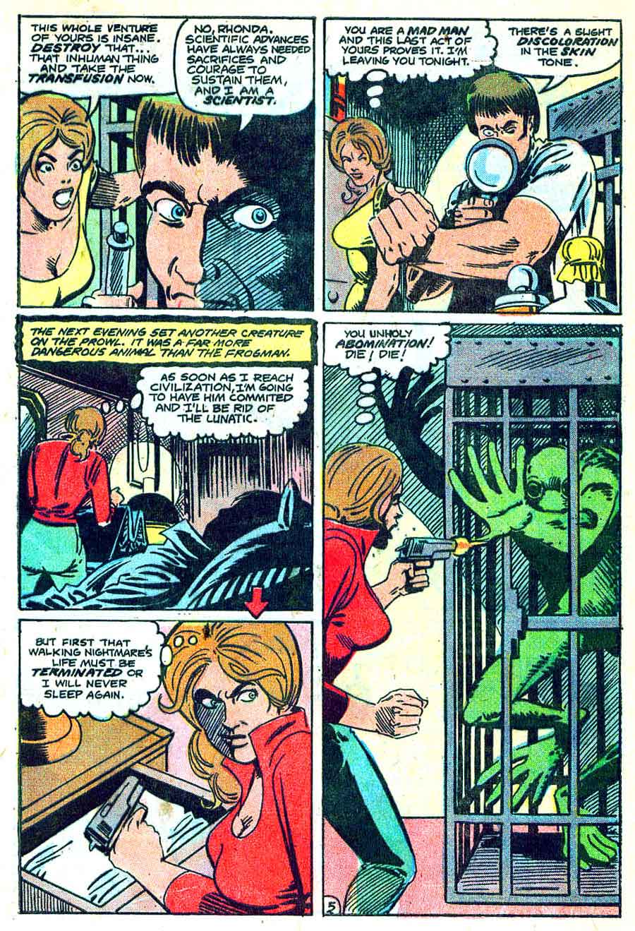
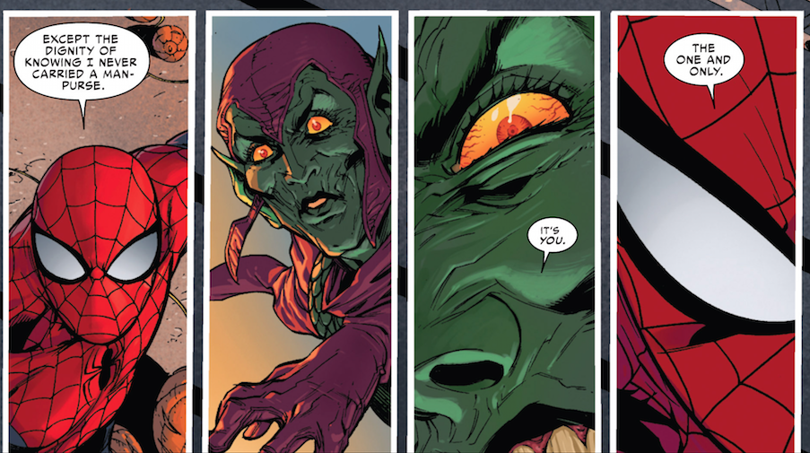
Along with Spider-Man’s debut story, three other Ditko-Lee collaborations appeared in Amazing Fantasy No. 15, including the five-pager “The One and Only!” According to comics collector James Horvath, however, the story was really drawn by his grandmother, Lydia Horvath, a Golden Age artist who spent her career ghosting for bigger names.

Or at least that’s the premise of my novel The Patron Saint of Superheroes. My agent suggested the manuscript include a sample comic book page, so I went in search of an artist who could pretend to be Lydia Horvath pretending to be Steve Ditko. Sean Michael Robinson swooped to my rescue.

And at the risk of revealing myself to be an Alan Moore-level control freak, I think our email correspondence reveals a few things about the collaborative process of writing and drawing comics.
 

original script (2)

 
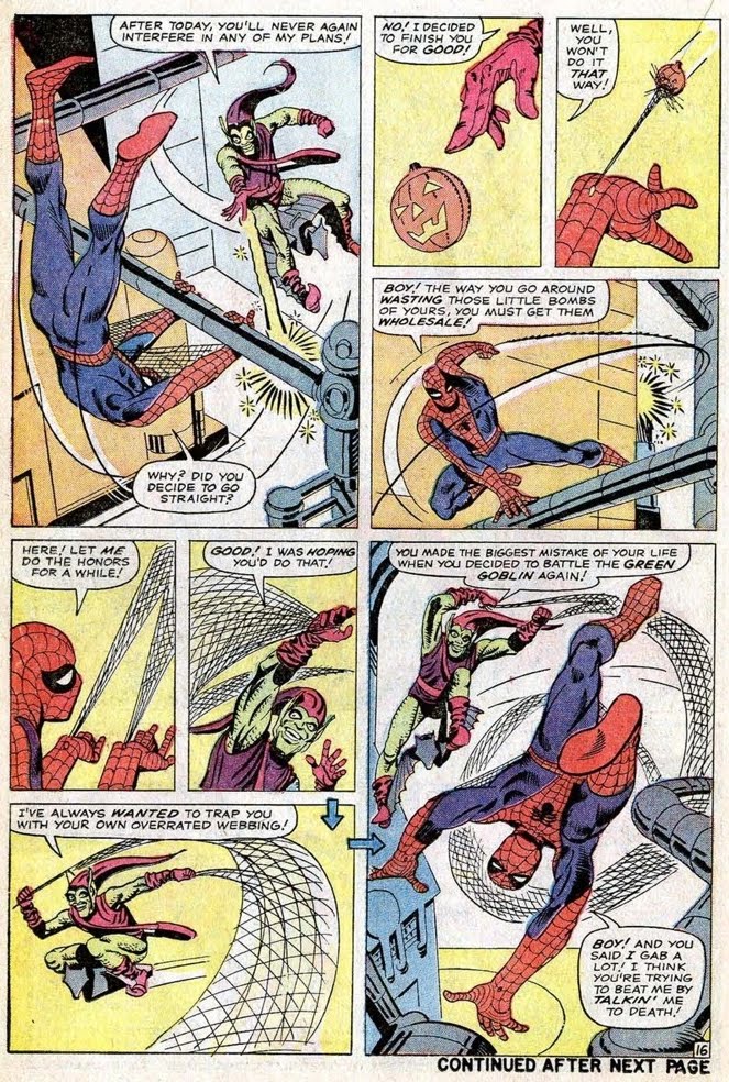
SEAN: Your page from the script you shared looks great– just enough stage direction. My only practical concern with it– Ditko very rarely broke more than 9 panels a page. In fact, in my cursory Ditko flip-through this morning (“Essential Spider-man V 1”, “Steve Ditko Archives” V 1 + 2) I’m seeing the majority of the page breakdowns hovering around 6-7 panels, with a few outliers in the 8-9 range.

Was this actually drawn by Ditko? If not, are there any “tells,” or should it look as much like his work as possible?

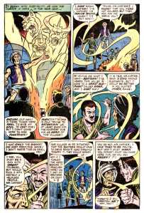
CHRIS: It sounds like we were looking at Essential Spider-Man simultaneously this morning. And you’re absolutely right, the panel layout is nothing like Ditko’s—and that’s actually the one “tell” I want the page to have. I’m attaching the PAGE THREE script, which includes the layout. (The gutters form a St. James cross, which is the artist’s secret signature, and a big part of the novel.)
 

first layout

 
SEAN: Okay, here are two rough (very rough!) layouts. You’ll notice I make a few script suggestions in the margin for the sake of space. Also, I’m not sure how to approach visually the third panel on the 1st tier– substituted a far-off climbing Jim. Feel free to send a sketch my way. Are we seeing just the hand? The top of his head or pack? The view down the cliff face?

Also substituted a close-up for the 1st p 3rd tier– let me know how it strikes you.
 

Singulus_layoutAlt

 
CHRIS: Yes to trimming the first caption. So it would now read:

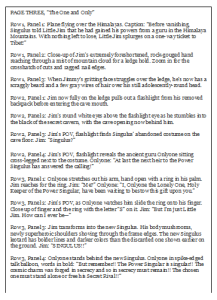
Before vanishing, Singulus told Little Jim that he had gained his powers from a guru in Tibet. Nothing left to lose, Little Jim splurges on a one-way ticket!

For panel 1.2, try a downward view from the very top of the cliff with mostly just Jim’s giant hand reaching up.

1.1, 1.3, 2.1, 2.2 all look good–I especially like how the cave opening worked out. 2.3 and 2.4 look good too, but I’d like to move the talk balloons, so that 2.3’s “Singulus?” is at the bottom of the panel with the balloon arrow pointing to the left gutter (and so Jim in 2.2), and Onlyone’s bubble moves to the top of 2.4. I think that way it will be clearer to see that the flashlight is moving up from the discarded costume to Onlyone, because currently the balloons partly block the partial views of Onlyone’s legs and the costume.

For 3.1, I really like the first version, with Onlyone extending his arm with the ring–but try rotating the panel 180 degrees so Onlyone is at the top and Jim at the bottom. Their dialogue can be reversed so Onlyone speaks first and Jim responds with “Me?”

Yes about lowering the hand on 3.2, so we can see more of Onlyone’s face. Also Jim should slide the ring onto his left ring finger, as he would a wedding ring.

The close-up of Onlyone is good though, so could you place it in the final panel instead? There’s no need for Singulus to appear at all in 3.4. And Onlyone’s emphatic talk bubble can go at the the bottom of the panel, ending the page.

For the big Singulus! 3.3 panel, let his talk bubble punch through the top of the panel into the bottom of 2.3 (which could make a nice effect with the previous “Singulus?”) and let his elbows jut into 3.2 and 3.4. Also, if it’s not already, leave 3.3 unframed.

SEAN: Does this work?

Two versions of the 1.3 panel– pls let me know which one is closer.

Singulus_layoutA  Singulus_layoutF (1)

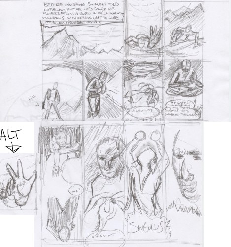
CHRIS: Go with the alt for 1.2. The bigger the hand the better. It should overwhelm all of the other visual information, so 1.3 then is an answer to the implied questions: what’s going on? where are we?

Good talk bubble flip on 2.3.  Flip 2.4 too.

3.1 looks good. Same for 3.2, though maybe make Onlyone a little smaller so 3.4 is more of a revelation.

Nice elbows on 3.3, but I think the “Singulus!” will work better at the top of the panel, especially since the 3.2 and 3.4 talk bubbles are at the bottoms.

I also attached images for combining into the Singulus costume: Superman’s original boots, Amazing Man’s waist and chest belts, Wonderman’s collar and v-neck, plus standard briefs, long sleeves, no gloves, no cape. (I’m not sure about the Ultraman helmet.)

amazing man wonderman ultra man 1940

SEAN: Here’s the promised costume rough (emphasis on rough). Feedback? I have the v-neck and the collar turning into the shoulder of the cape, if it’s not clear. Also added some horizontal stripes in the speedo area. Not sure about that helmet, and the only pics I can find of the character don’t really help in terms of how it’s put together :)

Anyway, all thoughts welcome.

Singulus_costume_RUFF (2)

CHRIS: This looks great, Sean. Some possible fine-tunings:

Gloves or wrist bands that match the boots.

And maybe simplify the lines in the chest by having the v of the shirt merge into the v of the criss-crossing belts?

I’m also debating whether the helmet is too much. Maybe instead add a lone ranger mask?

Singulus_costume_RUFF_C

CHRIS: I really love your face, which is lost with the mask, so let’s not have a mask, and you tell me whether you think the helmet works or not.

The wrist bands, briefs and collar all look good.

Should the wrist bands cover the forearms the way the boots cover the calves?

Ditko_practiceInks (1)

CHRIS: Yes, I can see Ditko coming through in that.

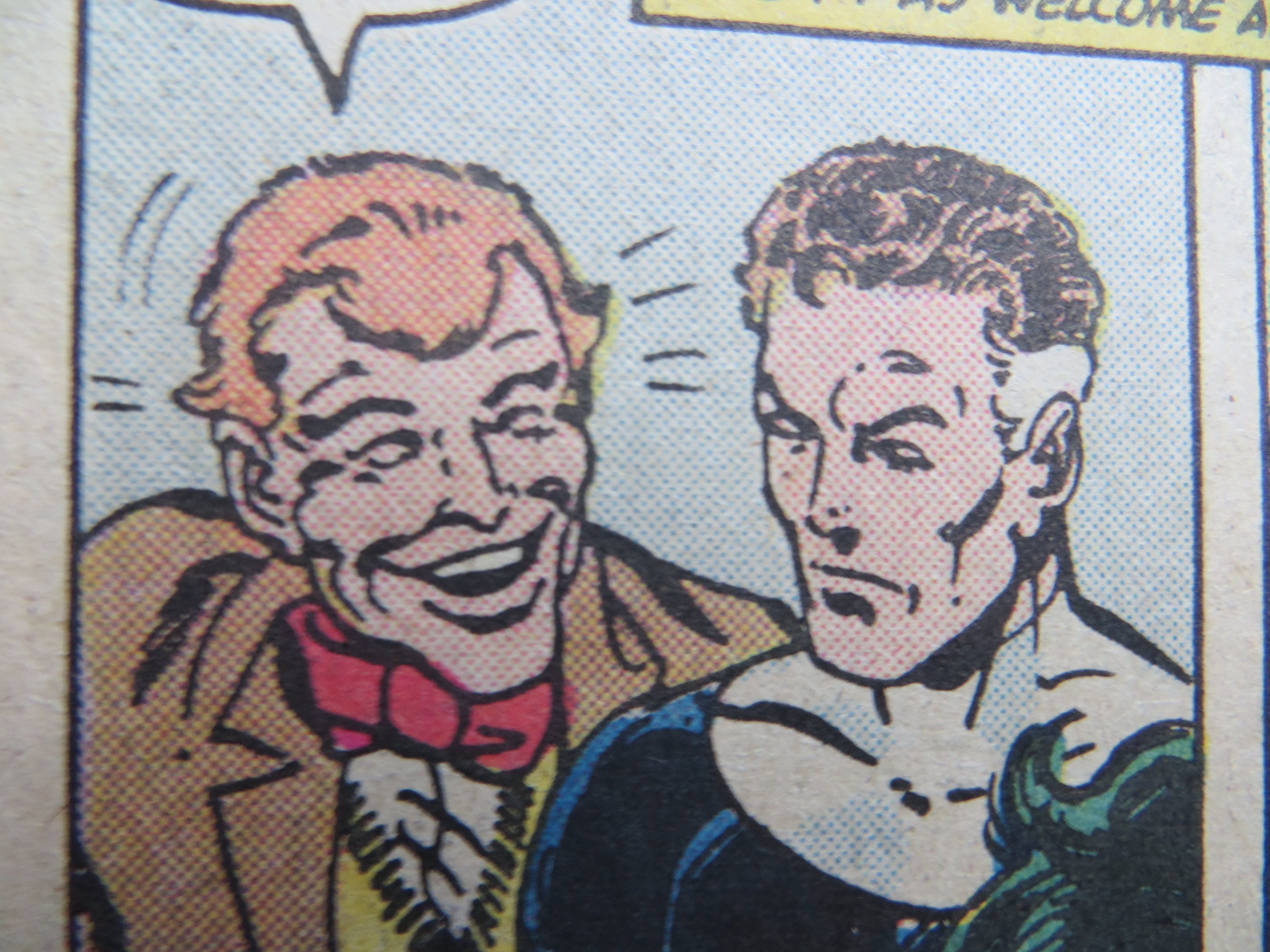
If Singulus’ face is unmasked, young, good-looking, with a full set of hair, Jim should be a bit chubby with a receding hairline.

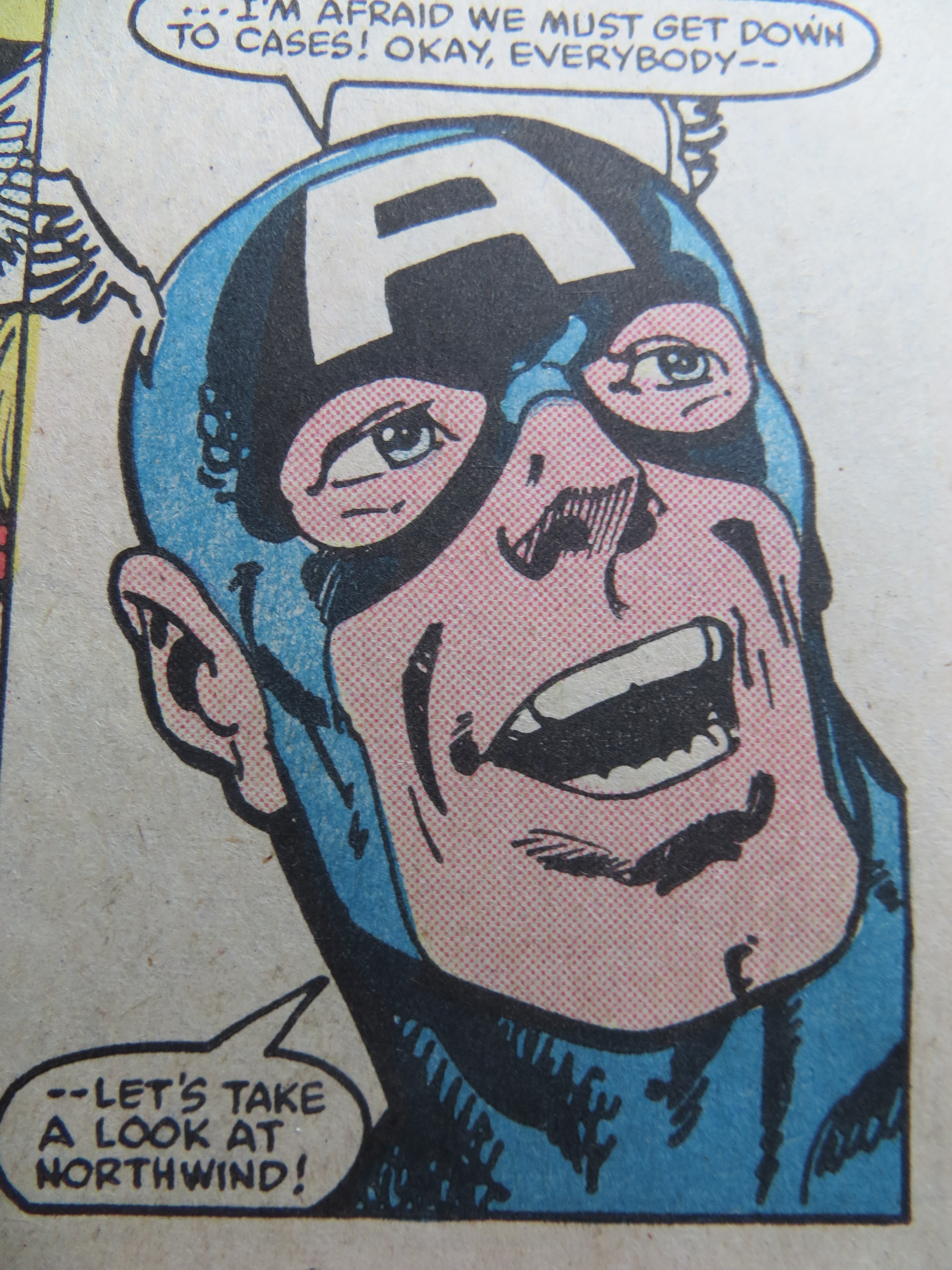
And keep Onlyone’s body as boney as possible, with almost skeletal arms, definitely a bald head, and a face of ancient raisin-like wrinkles–underneath which is Stan Lee’s face.

Singulus_pencils_full_B     Singulus_pencils_full_C     Singulus_pencils_full_A

SEAN: Three versions here. Thoughts? I’m hoping the rendering will take it into firmer Ditko territory…

CHRIS: Go with Singulus facing left away from the last panel, and with Onlyone’s head larger. Final fine-tunings:

Make Onlyone completely bald and super wrinkly.

Give Jim even more of a gut.

Let the words “Singulus!” burst out of the panel frames in 3.3. His right elbow protrudes into 3.2 well, and so let his left elbow protrude into 3.4 too, maybe slipping slightly behind Onlyone’s head?

To clarify the spatial relationship between 1.3 and 2.1, can you lower the bottom of the cave opening so this becomes the moment that Jim enters the cave? Also, can the same mountain that’s in the background of 1.3 be in the slightly more distant background of 2.1?

SEAN: Okay, here are two versions. I have a strong preference for B, but either one is fine with me!

Things that can be done to make it a bit more “Marvel”:

1. Re-letter this using a font close in style to that decade’s Marvel letters. I can’t get close to that look myself (being left-handed is a big impediment to that, believe it or not :)   ) I can look around on some sites if you want me to find a 60’s Marvel copycat font.

2. appropriate artwork stamps on top

3. color “old page” tint to the page (depending on your needs).

CHRIS: I agree that B, with the elbow cut off by the panel frame, looks better, so let’s go with that. And yes also to “old” tint and the artwork stamps. Oh, and can Onlyone be more wrinkled in that final panel close-up? And if you think refonting would look good, go with that too.

SEAN: Here is the finished color file. Thanks again for working with me on this! It was a lot of fun and quite the challenge :)

singulus_fullcolor_flat

Henry James Inked Me

henry james

After reading The Time Machine in 1900, Henry James wrote to H. G. Wells: “You are very magnificent. . . . I rewrite you much, as I read—which is the highest praise my damned impertinence can pay to an author.” It’s a strange compliment, and he expanded it two years later: “my sole and single way of perusing the fiction of Another is to write it over—even when most immortal—as I go. Write it over, I mean, re-compose it, in the light of my own high sense of propriety and with immense refinements and embellishments. .  . to take it over and make the best of it.”

James’s damned impertinence turned his highest praise into an actual invitation to collaborate with Wells on a science fiction novel: “Our mixture would, I think, be effective. I hope you are thinking of doing Mars—in some detail. Let me in there, at the right moment—or in other words at an early stage . . . .” The two authors shared a literary agent, James B. Pinker, and James wanted to take over and make the best of a Wells manuscript before Pinker saw it: “to secure an ideal collaboration . . . I should be put in possession of your work in its . . . pre-Pinkerite state. Then I should take it up and give it the benefit of my vision. After which, as post-Pinkerite—it would have nothing in common with the suggestive sheets received by me, and yet we should have labored in sweet unison.” He ends his letter “your faithful finisher.”

This is a bizarre request. Give me your rough draft to rework however I wish. Wells declined. Of course Wells declined. But first he tested whether the offer was one-sided, asking to peruse the notes to James’ next novel, The Ambassadors. Although James had a “carefully typed” 20,000-word prospectus, he did not share it with Wells. “A plan for myself, as copious and developed as possible, I always draw up,” he explained, but “such a preliminary private outpouring . . . isn’t a thing I would willingly expose to an eye but my own.” And he wouldn’t expose it to another’s over-writing hand either. He was his own finisher.

James’s notion of an “ideal collaboration” is laughably outside the norms of literary authorship, but it also reveals the damned impertinence of comic book production norms. Pencillers hand over “suggestive sheets” to inkers, or “finishers,” who literally draw over them, refining and embellishing according to their own sense of propriety. That includes erasing. It may be some lowly office helper—Stan Lee in his earliest days—holding the eraser, but it’s the inker who decides what stays and what goes. James’s final pages “would have nothing in common” with Wells’ erased and overwritten rough draft. And yet the plot, the chapter structure, the scene-by-scene movement—what comic book creator would call the layouts and breakdowns—they would still be Wells’. Reworking a sentence—adding flourishes, curving the grammar for new stylistic effects, while preserving and augmenting some paraphrasable meaning—that’s an inker’s job.

Four years later, after reading Wells’ The Future of America, James wrote again, revealing his inking style: “you tend always to simplify overmuch . . . But what am I talking about, when just this ability and impulse to simply—so vividly—is just what I all yearningly envy you?—I who was accursedly born to touch nothing save to complicate it.”

James would have added complexity to Wells’ overly simplified language—how Eric Shanower inked Curt Swan’s pencils for The Legend of Aquaman.
 

300px-Aquaman_Special_1989

 
Swan was nearing the end of his career in 1989, but according to Mark Waid (via Eddy Zeno’s Curt Swan: A Life in Comics) Swan considered the special issues a personal high point. The face, the anatomy, the foreshortened movement, those are recognizably Swan, but look at the background, the clouds, the meticulously scalloped waves, that’s Shanower, an artist renown for his details. His Age of Bronze is almost calligraphic in its precision, each scallop of chain mail a painstaking wonder.
 

6-_Eric_Shanower_extrait_-_L_Age_de_bronze_3_Tahison_2e_partie_-_janvier_-_2010

 
Would Wells have benefited from such a finish by James? Probably. But Swan wasn’t always grateful for Shanower’s efforts. During a visit to my campus, Shanower told a table of professors how he would erase Swan’s background buildings in order to correct all the perspectives errors. Swan didn’t thank him. He thought Shanower was wasting his time, but, like Wells in James’ “ideal collaboration,” his opinions were irrelevant once the sheets were in Shanower’s hands.

Compare Shanower’s chain mail and seas scallops to the inked versions of Swan by other artists, and you’ll see what Swan considered an appropriate attention to detail. Bob Hughes at Who Drew Superman? credits Swan for dominating Superman during that other Bronze Age while collaborating with a dozen different artists. Bob Oksner inked Superman No. 287 in 1975:
 

Superman287-08

Vince Colletta inked Superman Spectacular in 1977:

SupermanSpec77-50

And Al Williamson inked Superman No. 410 in 1985:

superman410-05

Look at the full-page layouts, and you’ll also see Swan’s signature breakdown: the top 2/3rds divided into 4-5 panels, anchored by a bottom rectangle featuring Superman flying toward the right margin:

Superman287-08 (2)     SupermanSpec77-50 (2)    superman410-05 (2)

 
The Swan-Oksner background buildings look pretty detailed to my eye–though some of those perspective lines might be a tad wonky beyond Superman’s right shoulder.  The Swan-Colletta and Swan-Williamson backgrounds are comparatively sparse. In fact, sparseness was Vince Colletta’s signature “style.” Though his best work is revered for its own Shanower-esque precision, other artists dislike his high sense of propriety.

Editors kept Colletta employed because he got his work in on time, but pencillers, like Wells, avoided the sweet unison of collaboration. Joe Sinnott (who also inked plenty of Jack Kirby’s Fantastic Four pages) said Colletta “wrecked” his romance stories because Colletta “would eliminate people from the strip and use silhouettes, everything to cut corners and make the work easier for himself.” Marvel writer Len Wein agreed that Colletta “ruined” art, and Steve Ditko and later Kirby refused to work with him.

Ditko, like Wells, preferred to ink himself. PencilInk documents a range of examples (Amazing Spider-man No. 3, 1963; Monster Hunters No. 8, 1976; Iron Man Annual No. 11, 1990):

AMAZING-SPIDER-MAN-003_011Monster-Hunters-08-20Iron-Man-An11-(43)

But sometimes even Ditko would have to willingly expose his preliminary outpourings for the benefit of another artist’s vision. Wayne Howard, for example, inked House of Mystery No. 247 in 1976:

Superboy-v1-257-13

And Dan Adkins inked Superboy No. 257 in 1979:

House-of-Mystery-247p

But the most discordant of Ditko’s finishers was John Byrne. As an artist used to getting top-billing as both writer and penciller, he, like James, took possession of Ditko’s pages, applying his own immense refinements and embellishments. Look at Avengers Annual No. 13 from 1984:

comics 002

The thug’s left foot–only Ditko would draw the impossibly upturned sole. But that’s a Byrne mouth on Captain America, the musculature too. When Mr. Fantastic appears, he seems to have beamed in from Byrne’s Fantastic Four run, but that’s a glaringly Ditko-esque face grinning open-mouthed beside him:

comics 003

The mixture of the two is even stranger:

comics 004

 
Is this what a Wells-James collaboration looks like? James would have placed his name first–though only because cutting Wells from the credit box entirely wouldn’t be an option too. That’s what Alexander Dumas did with his collaborators. Auguste Maquet co-authored both The Count of Monte Cristo and The Three Musketeers, but it’s only Dumas on the covers because Maquet was his employee, what Marvel calls “work for hire.” Maquet produced rough drafts for his boss to write-over. He later sued for co-credit, but the French courts ruled in favor of Dumas.

In comics, the prestige position is reversed. Swan and Kirby had so many inkers because their editors wanted them pencilling as many titles as possible. At Marvel, the penciller was the primary creator, laying out stories with empty captions and balloons for the so-called writers to fill-in. In Kevin Smith’s Chasing Amy, Jason Lee plays Ben Afflleck’s inker and takes insult when called a “tracer.” Lee’s name also appears below Affleck’s in the actual credits. By the end of the film, Lee has ended their collaboration. H. G. Wells was wise never to begin one with Henry James.
 

hg_wells_787445

 
[And if you’d like to read more about their correspondence, check out Nicholas Delbanco’s Group Portrait: Joseph Conrad, Stephen Crane, Ford Madox Ford, Henry James and H. G. Wells. ]

New Ditko-Lee Collaboration?

Two pages from the original artwork for the Spiderman comic.

 
The final issue of Amazing Fantasy (No. 15) featured not only Spider-Man’s debut but three shorter Steve Ditko and Stan Lee collaborations, including “The One and Only,” a five-page tale made in the late 1950s and dropped into Amazing Fantasy as back filler. Ditko is credited for the art, but comics collector James Horvath, grandson of Golden Age artist Lydia Horvath, believes his grandmother actually drew it. Ms. Horvath was renowned for her ability to imitate other artists, including Joe Shuster for whom she ghosted as a member of his studio before leaving Cleveland in 1940 to begin her freelancing career with Timely and Paragon Comics.

The script for “The One and Only” was assumed lost, until Horvath recently discovered it in his late grandmother’s private papers. It is a parody of Golden Age knock-offs of Superman and features a Jimmy Olson-like character losing his newspaper job and searching for his beloved hero “Singulus” who went inexplicably missing during the 1950s. It has a dark twist ending which I won’t spoil, but here is an excerpt:
 

PAGE THREE, “The One and Only”

Script: Stan Lee

Row 1, Panel 1: Plane flying over the Himalayas. Caption: “Before vanishing, Singulus told Little Jim that he had gained his powers from a guru in the Himalaya Mountains. With nothing left to lose, Little Jim splurges on a one-way ticket to Tibet!”

Row 1, Panel 2: Close-up of Jim’s extremely foreshortened, rock-gouged hand reaching through a mist of mountain cloud for a ledge hold. Zoom in for the crosshatch of cuts and ragged nail edges.

Row 1, Panel 3: When Jimmy’s gritting face struggles over the ledge, he’s now has a scraggly beard and a few gray wires of hair over his still adolescently-round head.

Row 2, Panel 1: Jim now fully on the ledge pulls out a flashlight from his removed backpack before entering the cave mouth.

Row 2, Panel 2: Jim’s round white eyes above the flashlight eye as he stumbles into the black of the secret cavern, with the cave opening now behind him.

Row 2, Panel 3: Jim’s POV, flashlight finds Singulus’ abandoned costume on the cave floor. Jim: “Singulus?”

Row 2, Panel 4: Jim’s POV, flashlight reveals the ancient guru Onlyone sitting cross-legged next to the costume. Onlyone: “At last the next heir to the Power Singulus has answered the calling!”

Row 3, Panel 1: Onlyone stretches out his arm, hand open with a ring in his palm. Jim reaches for the ring. Jim: “Me?” Onlyone: “I, Onlyone the Lonely One, Holy Keeper of the Power Singular, have been waiting to bestow this gift upon you.”

Row 3, Panel 2: Jim’s POV, as Onlyone watches him slide the ring onto his finger. Close up of finger and the ring with the letter “S” on it. Jim: “But I’m just Little Jim. How can I ever be—”

Row 3, Panel 3: Jim transforms into the new Singulus. His body mushrooms, newly superheroic shoulders shoving through the frame edges. The new Singulus leotard has bolder lines and darker colors than the discarded one shown earlier on the ground. Jim: “SINGULUS!!”

Row 3, Panel 4: Onlyone stands behind the new Singulus. Onlyone in spike-edged talk balloon, words in bold: “But remember!! The Power Singular is singular!! The cosmic charm was forged in secrecy and so in secrecy must remain!! The chosen one must stand alone or free his Secret Rival!!”

Sadly none of this is true. Lydia Horvath does not exist. Her grandson, James Horvath, is the fictional narrator of the novel The Patron Saint of Superheroes, which my agent is pitching to acquisition editors in New York publishing houses. The story is about Horvath’s attempts to preserve his dying grandmother by collecting her lost artwork—a mission that leads him to stealing the original printer pages for Amazing Fantasy No. 15 from a millionaire’s wall and later donating them anonymously to the Library of Congress. That actually did happen in 2008, and my novel is, among other things, the story behind that story.

My agent thinks the novel should also include the art for “The One and Only.” But that’s a little hard to do since the Ditko knock-off story doesn’t actually exist. At least not yet.

I’m looking for an artist interested in being Steve Ditko. Or rather an artist interested in pretending to be Lydia Horvath pretending to be Steve Ditko. If/when some wonderful editor buys the manuscript, the project will expand, but for the current pitching stage, we’re looking for one drawing. The page scripted above.

There’s plenty more to tell (the complete letter-like script was published as a short story in The Pinch in 2011, and the description of another Horvath comic as a prose poem last year in Drawn to Marvel), but these are the essentials. If you’re an artist interested in collaborating, contact me at chris@gavaler.com.

Image result for steve ditko art library of congress 2008

Spider-Kant

Superior-Spider-Man-31-1

 
In the above scene by Dan Slott and Giuseppe Camuncoli, the Green Goblin at first thinks he’s fighting Doc Ock in Spidey’s brain (as Osvaldo Oyola explains in his review of the arc.) But Doc Ock doesn’t joke — so when Peter makes a snide remark about GGs’s tote bag, the Goblin realizes he’s confronting the real, the true, the one and only Peter Parker. Peter’s identity is his humor; his self is his jokes.

Which makes sense, to some degree; Peter’s wise-cracking has been one of the characters consistent tropes through the years, more reliable than even his (occasionally black) costume — a point of stability in what Osvaldo correctly points out is decades of ret-conned, indifferently written incoherence

And yet, looking at that sequence, I realized that Spidey’s humore has never exactly made sense to me. Peter Parker is not, as he’s generally written, witty or even particularly cheerful. His backstory is all about trauma; he’s a bullied, bitter, guilt-ridden, whiny nerd, worrying about his Aunt May and filled with insecurity and neurosis. And then all of a sudden, he puts on the costume and he’s nattering on about man purses like he’s got not a care in his webhead.
 

ditko-spidey

 
You could explain this psychologically if you wanted to I suppose, and I’m sure someone has — the happy-go-lucky Spidey front hides Parker’s deep pain; the double-identity gives him the opportunity to explore aspects of his personality that nerdy Peter has to repress. You could also, and somewhat more convincingly I think, explain it as a by-product of Marvel’s creative process; Steve Ditko laid out this bitter, depressing story, and then Stan Lee came in afterwords and filled in the text bubbles with obliviously cheerful blather.

Either way, though, the point is that the multiple-personality disorder that Osvaldo diagnoses in the character is not, or not just, a function of decades of continuity burps and generations of hacks writing on deadline, only occasionally paying attention to what the hack before, or the hack after, happened to do. It’s also something in the character from the beginning. Spider-Man was never coherent; he always had a double identity.

Double identities are a standard superhero trope, obviously. Nor is it unheard of for the superself and the nonsuperself to have different personalities. The Hulk is the most famous example, but the truth is that Superman and Clark Kent, early on, seemed less like one guy in two outfits, and more like two different people — one helpless, nerdy masochistic nebbish; one sadistic wise-cracking swashbuckling asshole. Superheroes from early on, and even iconically, are not one person; they don’t have a single identity. They’re more than one; their selves are multiple.

As folks pointed out in the comments to Osvaldo’s post, this has some interesting moral implications. Kantian morality, in particular, is based in a particular notion of identity and the divided self. For Kant, the true self is the moral self, or the moral law that speaks within you. Immorality is the accretion of transient desire, or really transient personality, that ties you to the phenomenal world, and distracts your brain, or more your conscience, from noumenal contemplation. From this perspective,you could see the split personality superhero as a kind of Kantian parable. Peter Parker is the phenomenal self, riven by neurotic doubts and distractions; Spider-Man is the noumenal self, devoted to the single-minded pursuit of duty.

That doesn’t actually sound much like the Peter/Spidey we know, though. Spidey is hardly a serene slave to duty; on the contrary, as Osvaldo explains, Spidey is all over the place, sometimes a self-sacrificing martyr, sometimes a cheerful babbler, sometimes a brutish thug. He’s hardly a consistent example of WWKD.

Maybe that’s the point, though. Chris Gavaler has argued that the figure of the Clansman was an important pulp precursor and inspiration for the superhero trope of double identity. The KKK, of course, used the double identity as a way to wreak evil — being somebody other than who they were allowed them to sidestep duty and the moral law, and embrace the exhilarating phenomenal pleasures of violence and evil. Kant presents good as arising from an eternal, unwavering identity. It makes sense, then, from his perspective, that to abandon morality you would first abandon a stable self.

And that, again, is what superheroes do. Peter Parker puts on a mask to go hit people really hard without legal authority or due process of law. That’s not duty; it’s vigilantism. And that vigilatism is enabled by forswearing one identity; Peter Parker wears a mask so that he doesn’t have to be Peter Parker, with all the attendant moral and social obligations, just as the KKK put on the hoods to escape their dull selves bound by law and duty not to shoot and lynch their fellow citizens. As Doc Ock’s possession of Spider-Man suggests, superheroes escape their identities in order to become supervillains. The more continuity renders their selves incoherent, the more true to themselves they are — that self being, at its coreless core, bifurcated, morally adrift, and un-Kantian.
 

WhoAmI_02-1024x837

From Spider-Man, “Who Am I?” by Joshua Hale Fialkov and Juan Bobillo and JL Mast

The END of the ANCIENT ONE!

Steve Ditko’s art for Dr. Strange was perhaps my favorite of all of early Marvel art, and some of my favorite comics art, period. Elegantly twisted combatants posed against patterned surreal landscapes, the sublime and the absurd slid together in bombastically perfected patterns.
 

de2e587e7

 
Ditko’s work was inimitable — and yet, later Marvel artists worked to imitate him. In particular, Marie Severin drew a number of issues of Dr. Strange in 1967. I only have one of them; #157, scripted by Stan Lee, and featuring, like the title says, the death of the Ancient One(!)
 

detail

 
As you can see here, Severin is fairly deliberately working to copy Ditko’s style. Dr. Strange and The Ancient One have their hands bent into eloquently elaborated gestures; the mystical background is represented by weaving patterns of force. Through an effusion of mystic might, she has made it appear that the mighty mystic…remains!

Sort of. In fact, the Ditko influence hangs a little oddly. Those gesturing hands, for instance; they’re certainly twisted in Ditko fashion, but the twisting ends up being too realistic. The clutching here seems expressive of pain, rather than expressive of a world where everyone’s hands are trying to soberly communicate words of mystic significance in an eldritch language. The fact that the baddie has giant mace-like thingamabobs instead of hands is telling too; would Ditko ever have covered his most precious instrument that way? It’s like Severin is trying to cut her losses — she only has time to draw so many of those damn hands!
 

ST157_Zom

 
If Stan Lee were smart, he would have written in the bubbles, “What kind of Ditko monster do you think I am? Fingers, damn it! I want fingers!”

The background swishes also advertise their not-quite-Ditko-ness. Ditko’s swirls tended to be solid; they emphasized the surface of the page, perhaps, but in the way a paint swath emphasizes a surface.
 

planes

 
Severin, though, actually draws lines as lines. It’s as if she started to imitate Ditko, and then stopped, leaving the schematic evidence of not being the right guy behind her.

The sense that we’re seeing not only an imitation of Ditko, but a self-consciously incomplete imitation of Ditko, is even stronger in this panel, which I think is the best in the issue.
 

Scan 3

 
Again, the background is rendered not through mystic shapes arranged as design, but simply through an actual geometric doodle of lines. The Ditko pose is similarly rendered as a reductio ad absurdum of a Ditko pose, Strange’s body dramatically distorted, as if the effort to reach Ditko levels of posture has caused Severin’s drawing fingers to short-circuit. And, of course, Ditko’s digits are the most overheated, contorted bit of all, the gesturing appendage absurdly extended, the fingers a grotesque mockery of a hand. Meanwhile, Stan Lee burbles away in the caption. “I must escape or become a nameless, shapeless, nihility!” Is that Doc Strange struggling there? Or is it Severin, trapped in a factory system where she’s supposed to grind out product in someone else’s image, twisting and distorting herself into someone else’s shape and name?

None of this is to say that Severin’s art is bad. On the contrary, it’s great — arguably even in some ways better than that of Ditko himself. The sense of strain, the distance between the Ditko we should be looking at and the not-quite Ditko we see, gives the issue a clumsy charm, and even a poignancy, that is almost truer to Ditko’s spirit than Ditko himself. In the issue, the Ancient One, Dr. Strange’s master, is killed, and his death allows him to channel his mystic energy into his disciple. It feels like something similar has happened for Severin; though the Ancient Ditko is lost, his spirit gestures on — more mighty even than before.
 

ST157_LivingTribunal

 
The final (splash) page of the story nicely summarizes the issues pleasures. Strange is off to the side, his body twisted in on itself, his fat-fingered hands raised — he seems to be looking at them, or at the Living Monolith’s equally blocky fingers, as if horrified to realize that somehow, someway, he’s stumbled into the wrong comics page, where Ditko does not reign. The Monolith itself is distinguished by being not all there; it’s head floats a bit above its body — so the limbs are controlled by some disconnected, distant brain. It’s wrong and clumsy and lumpy in a way Ditko rarely was — which seems right, since Ditko isn’t here. And yet he is, in that space between preposterous head and preposterous body, or in the awkward way our hero seems to have temporarily lost control of his limbs. Ditko’s the pattern that’s gone, or, if you preferthe master who’s dead, leaving behind a gift not of power, but of wrongness; the beauty of the bits that don’t fit together, and so make something strange.
____

This post is something of a bookend to this piece on the Dr. Strange movie, fwiw.

What If the X-Men Were Black?

Image 1. Black X-Men

An edited image from the series X-Men of Color.

“The X-Men are hated, feared and despised collectively by humanity for no other reason than that they are mutants. So what we have here, intended or not, is a book that is about racism, bigotry and prejudice.”
Longtime X-Men writer Chris Claremont

Imagine a work of fiction that focuses on the Civil Rights Movement of the 1960s except that in this work, white men have replaced all of the people of color. Martin Luther King Jr. and Malcolm X both have white stand-ins and white followers. In fact, almost all of the characters are white men. It may seem bizarre, but this is the X-Men.

The first issue of X-Men was written by Stan Lee and published in 1963. The fictional world, which continues today in the Disney-owned Marvel Universe, featured super-powered teenagers who worked in a group as the X-Men. Unlike other characters that Stan Lee created, these teenagers do not become superheroes through a freak accident, but were instead born with a genetic mutation known as the x-gene that manifests as superpowers (“mutations”) around the time of puberty. They hide their identity as super powered humans for fear that they will be killed by angry mobs.
 

Image 2 Angry Sledgehammer Man

An image of mob violence from the Stan Lee and Steve Ditko era.

 
Stan Lee has explained that his main impetus for having the superheroes be mutants was that he wouldn’t have to invent origin stories for every new character. However, he also claims that the comparison to Civil Rights was present from the start. In a recent interview he said, “It not only made them different, but it was a good metaphor for what was happening with the civil rights movement in the country at that time.”
Since the original, largely unpopular episodes written by Stan Lee, dozens of other writers (most of them white men) have built and expanded the world of the X-Men. New characters were added, and the discrimination that mutants like the X-Men face in the Marvel Universe was developed. Over time, the dynamic of the “feared and hated” mutants who nevertheless defend ordinary humans has been used to explore different dynamics of power and privilege*. These include anti-Semitism, racism, and LGBT issues (ableism and sexism, though extremely relevant, are almost never addressed).

Noteworthy X-Men events with social implications include:

—The founding of Genosha, a fictional country where mutants are enslaved – a direct reference to Apartheid.
—A genocide of 16 million mutants.
—The development of a cure for the x-gene mutations, causing a schism in the mutant community.
—The spread of the Legacy Virus, a disease that targeted only mutants. The virus is a clear reference to the AIDS virus and its impact on the LGBT community.


Image 3 Legacy Virus

 
Despite the flexibility of “mutantity” to be a stand in for various aspects of privilege, the Civil Rights movement and racism are topics that come up repeatedly in the X-Men comics and films. Professor X is repeatedly compared to Martin Luther King, and the dream of “peaceful integration.” Magneto, his enemy, advocates for violent mutant revolution and quotes Malcolm X**. Characters in the comic use the fictional slur “mutie” and compare it to racial slurs.
 

Image 4 Storm Tokenism

This sequence from God Loves, Man Kills by Chris Claremont shows how Storm and other nonwhite characters are used as props to legitimize the idea that the X-Men are an oppressed minority.

 
What’s disturbing about the series is that is that all of these issues are played out by a cast of characters dominated by wealthy, straight, cisgender, Christian, able-bodied, white men. The X-Men are the victims of discrimination for their mutant identity, with little or no mention of the huge privileges they enjoy.

Neil Shyminsky argues persuasively that playing out Civil Rights-related struggles with an all white cast allows the white male audience of the comics to appropriate the struggles of marginalized peoples. He concludes that, “While its stated mission is to promote the acceptance of minorities of all kinds, X-Men has not only failed to adequately redress issues of inequality – it actually reinforces inequality.”**
 

Image 5 Wolverine's Cross

An unedited image from the comics.

 
I wanted to remix these stories and imagine what they could have been if they had dealt with actual instead of fictional dimensions of privilege. Searching through 50 years of X-Men comics, I selected a half dozen iconic images and scenes relating to discrimination. In these images, I edited the comics so that every mutant had a skin color that was some shade of brown.
 

Image 6 Days of Future Past

 
In the alternate universe where the all mutants are black, many events in the X-Men history become actual social commentary because they are dealing with real dimensions of power. Reading about black teenagers standing up to a largely white mob is different than reading about white teenagers in the same situation. These images show that when the writers of the X-Men do comment on social issues, the meaning of these comments is hampered and distorted by the translations from reality to fantasy and fantasy back to reality.
 

Image 7 Colossus mob<

Left, the original frames in which Colossus stands up to a mob. Right, the edited version of the same sequence from the project X-Men of Color.

 
Re-coloring the X-Men so that all mutants are people of color not only makes the themes of discrimination more relevant, it also introduces hundreds of non-white characters who are complex and fully realized. This is something that’s lacking from the current Marvel Universe. Why is Psylocke not only an Asian person of British descent, but also a ninja? Why is Storm not simply a mutant of color, but an African witch-priestess? As comics great Dwayne McDuffie said, “You only had two types of characters available for children. You had the stupid angry brute and the he’s-smart-but-he’s-black characters.” There’s certainly more roles for a non-white characters now than when he said that in 1993, but most super hero comics are written about characters that were invented decades ago. By recoloring the comics, we can grandfather characters into the Marvel Universe who are not defined by their race.
 

Image 8 comparisson of emma frost

Before and after comparison of Emma Frost.

 
Simply changing the skin color of the mutants obviously doesn’t address all of the issues around privilege in the Marvel Universe. The visual and narrative sexism that permeates superhero comics remains intact. Some characteristics of white characters also become negative stereotypes when applied to non-white characters. Wolverine is a symbol of wild, untamed, white male power, but when I recolor his skin to imagine him as a person of color, his snarling, predatory aggression reads as a stereotype of wild black men. This is a great demonstration of the way that white male characters are free to inhabit any role, whereas centuries of accumulated stereotypes shape the way we understand people of color in fiction***.
 

Image 9 Wolverine

An edited image from the series X-Men of Color.

 
Promoters of the X-Men have spent years trying to convince audiences that these white characters are tapping into the struggle of black Americans. Strange as the substitution of white men for black activists may seem, it’s not unique. Fantasy universes often comment on social issues through the veil of imaginary prejudices****. My goal is that by looking at these images people will question whether an invented minority is really the best way to understand our country’s history and practice of race-based violence.

You can find a few more images at my website.)

Other resources related to this issue:
More NonSense: No More Mutants by Michael Buntag http://nonsensicalwords.blogspot.com/2010/10/more-nonsense-no-more-mutants.html
We Have The Power To Change MARVEL and DC Comics: Support Diversity, Support Miles! by Jay Deitcher http://www.unleashthefanboy.com/editorial/we-have-the-power-to-change-marvel-and-dc-comics-support-diversity-support-miles/44986

* The most appropriate metaphor for the original Stan Lee comics is probably invisible dimensions of power such as LGBT issues or religion. In the original comics, the X-Men hide their mutations in order to pass as humans (Angel uses belts to strap his wings down under a suit coat). In later generations, some of the mutants are visibly mutated to the point they could never pass as humans.
** Shyminsky also notes that recent generations of X-Men writers have reacted to the politics of appropriation in the series’ history. He cites Grant Morrison’s U-Men as an example.
***I think it’s interesting that the same characteristics that make Wolverine a white male icon are also regressive stereotypes of black men.
****I often think of house-elf slavery in Harry Potter, but it actually starts much earlier:
 

Image 10 New Yorker Comic

When Puberty Lasts a Lifetime

ultimatespiderman1variantmain

“I grew up in Indiana,” writes Chris Huntington, “and saved a few thousand comic books in white boxes for the son I would have someday. . . . Despite my good intentions, we had to leave the boxes of yellowing comics behind when we moved to China.”

I grew up in Pennsylvania and only moved down to Virginia, so I still have one dented box of my childhood comics to share with my son. He pulled it down from the attic last weekend.

“I forgot how much fun these are,” he said.

Cameron is twelve and has lived all those years in our southern smallville of a town. Chris Huntington’s son, Dagim, is younger and born in Ethiopia. Huntington laments in “A Superhero Who Looks Like My Son”(a recent post at the New York Times parenting blog, Motherlode) how Dagin stopped wearing his Superman cape after he noticed how much darker his skin looked next to his adoptive parents’.

Cameron can flip to any page in my bin of comics and admire one of those “big-jawed white guys” Huntington and I grew up on. Dagim can’t. That, argues Junot Diaz, is the formula for a supervillain: “If you want to make a human being into a monster, deny them, at the cultural level, any reflection of themselves.” Fortunately, reports Huntington, Marvel swooped to the rescue with a black-Hispanic Spider-Man in 2011, giving Dagim a superhero to dress as two Halloweens running.

Glenn Beck called Ultimate Spider-Man just “a stupid comic book,” blaming the facelift on Michelle Obama and her assault on American traditions. But Financial Times saw the new interracial character as the continuing embodiment of America: “Spider-Man is the pure dream: the American heart, in the act of growing up and learning its path.” I happily side with Financial Times, though the odd thing about their opinion (aside from the fact that something called Financial Times HAS an opinion about a black-Hispanic Spider-Man) is the “growing up” bit.

Peter Parker was a fifteen-year-old high schooler when that radioactive spider sunk its fangs into his adolescent body. Instant puberty metaphor. “What’s happening  to me? I feel—different! As though my entire body is charged with some sort of fantastic energy!” I remember the feeling.

It was 1962. Stan Lee’s publisher didn’t want a teenage superhero. The recently reborn genre was still learning its path.  Teenagers could only be sidekicks. The 1940s swarmed with Robin knock-offs, but none of them ever got to grow-up, to become adult heroes, to become adult anythings.

Captain Marvel’s little alter ego Billy Baston never aged. None of the Golden Agers did. Their origin stories moved with them through time. Bruce Wayne always witnessed his parents’ murder “Some fifteen years ago.” He never grew past it. For Billy and Robin, that meant never growing at all. They were marooned in puberty.

Stan Lee tried to change that. Peter Parker graduated high school in 1965, right on time. He starts college the same year. The bookworm scholarship boy was on track for a 1969 B.A.

But things don’t always go as planned. Co-creator Steve Ditko left the series a few issues later (#38, on stands the month I was born). Lee scripted plots with artist John Romita until 1972, when Lee took over his uncle’s job as publisher. He was all grown-up.

Peter doesn’t make it to his next graduation day till 1978. If I remember correctly (I haven’t read  Amazing Spider-Man #185 since I bought it from a 7-EIeven comic book rack for “Still Only Thirty-five” cents when I was twelve), he missed a P.E. credit and had to wait for his diploma. Thirteen years as an undergraduate is a purgatorial span of time. (I’m an English professor now, so trust me, I know.)

Except it isn’t thirteen years. That’s no thirty-two-year-old in the cap and gown on the cover. Bodies age differently inside comic books. Peter’s still a young twentysomething. His first twenty-eight issues spanned less than three years, same for us out here in the real world. But during the next 150, things grind out of sync.

It’s not just that Peter’s clock moves more slowly. His life is marked by the same external events as ours. While he was attending Empire State University, Presidents Johnson, Nixon, Ford and Carter appeared multiple times in the Marvel universe. Their four-year terms came and went, but not Peter’s four-year college program. How can “the American heart” learn its path when it’s in a state of arrested development?

Slowing time wasn’t enough either. Marvel wanted to reverse the aging process. They wanted the original teen superhero to be a teenager again. When their 1998 reboot didn’t take hold (John Byrne had better luck turning back the Man of Steel’s clock), Marvel invented an entire universe. When Ultimate Spider-Man premiered in 2000, the new Peter Parker is fifteen again. And he was going to stay that way for a good long while. Writer Brian Bendis took seven issues to cover the events Lee and Ditko told in eleven pages.

But even with slo-mo pacing, Peter turned sixteen again in 2011. So after a half century of webslinging, Marvel took a more extreme countermeasure to unwanted aging. They killed him. But only because they had the still younger Spider-Man waiting in the wings. Once an adolescent, always an adolescent.

The newest Spider-Man, Miles Morales, started at thirteen. What my son turns next month. He and Miles will start shaving in a couple years. If Miles isn’t in the habit of rubbing deodorant in his armpits regularly, someone will have to suggest it. I’m sure he has cringed through a number of Sex Ed lessons inflicted by well-meaning but clueless P.E. teachers. My Health classes were always divided, mortified boys in one room, mortified girls across the hall. My kids’ schools follow the same regime. Some things don’t change.

Miles doesn’t live in Marvel’s main continuity, so who knows if he’ll make it out of adolescence alive. His predecessor died a virgin. Ultimate Peter and Mary Jane had talked about sex, but decided to wait. Sixteen, even five years of sixteen, is awfully young. Did I mention my daughter turned sixteen last spring?

Peter didn’t die alone though.  Mary Jane knew his secret. I grew up with and continue a policy of open bedrooms while opposite sex friends are in the house, but Peter told her while they sat alone on his bed, Aunt May off who knows where. The scene lasted six pages, which is serious superhero stamina. It’s mostly close-ups, then Peter springing into the air and sticking to the wall as Mary Jane’s eye get real real big. Way better than my first time. It’s also quite sweet, the trust and friendship between them. For a superhero, for a pubescent superhero especially, unmasking is better than sex. It’s almost enough to make me wish I could reboot my own teen purgatory. Almost.

Meanwhile the Marvel universes continue to lurch in and out of time, every character ageless and aging, part of and not part of their readers’ worlds. It’s a fate not even Stan Lee could save them from. Cameron and Dagim will continue reading comic books, and then they’ll outgrow them, and then, who knows, maybe that box will get handed to a prepubescent grandson or granddaughter.

The now fifty-one-year-old Spider-Man, however, will continue not to grow up. But he will continue to change. “Maybe sooner or later,” suggests artist Sara Pichelli, “a black or gay — or both — hero will be considered something absolutely normal.” Spider-Man actor Andrew Garfield would like his character to be bisexual, a notion Stan Lee rejects (“I figure one sex is enough for anybody”). But anything’s possible. That’s what Huntington learned from superheroes, the quintessentially American lesson he wants to pass on to his son growing up in Singapore.

May that stupid American heart never stop finding its path.