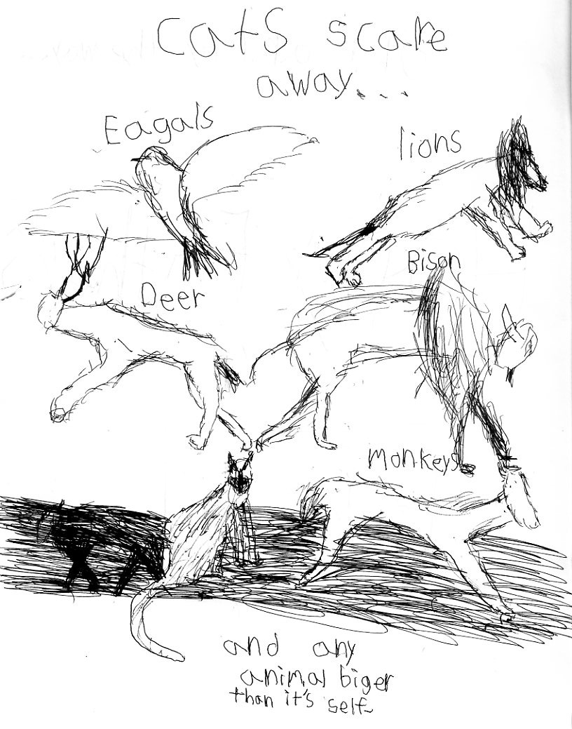
That’s the amazing father’s day car my son drew for me. In case you can’t quite follow, it says [w/idiosyncratic spelling corrected], “Cats scare away….eagles, lions, deer, bison, monkeys, and any animal bigger than itself.”
One of the fun things about the card if you’re a comics fan is the way that it both does and doesn’t read as a comic — or maybe the way it just scrambles comics and related genres, like advertising and birthday cards and children’s books, indiscriminately. You could put panel borders around each of those animals, and, indeed, since the page is structured like a grid it almost asks you to do that. But, at the same time, the space is all one space — which doesn’t so much make it not a comic as point to the way that in comics, even when divided by grids, the space can all be one space, the images you look at separately are actually right there next to each other. The eagals are getting tied up on the deer horns; you just don’t see it that way, usually, because the codes tell you not to see it that way. That’s maybe emphasized too by that weird band at the bottom, which reads as a kind of grassy floor (which would mean that not just the eagle, but the lion, deer and bison are floating in the air) and also as an erasure, marks on the surface of the page.
I like the weird rhythm of the images too. On the top two layers, the animals are arranged back to back almost heraldically; the eagle (who of course is on top so it can fly away) and the deer racing off to the left, the lion and the bison racing off the right. On the bottom, though, the Siamese cat on the bottom left is turned to the right, so it has to turn its head away demurely in order to avoid staring at the monkey butt. The cat’s also in the wrong place narratively; any competent comics artist would presumably put it either at the top or at the bottom right, either beginning or ending the “story,” since it’s the most important element. Placing it where it is is weird and disruptive; it’s like it’s not anchored to the text, but has wandered out of place. Which, of course, fits very nicely with the narrative, in which the cat is in fact a disruption, causing all around it to scatter in a regular excess of chaotic scribbles. (I like that shadow animal at the bottom too, scratched out by the scribbles at the bottom, as if the cat was going the other way, fit in its place, until it turned around, causing all the other animals to flee.)
Also, check that insouciant tail looped at the bottom. It’s like a little semi-circle warning to any animal bigger than itself.
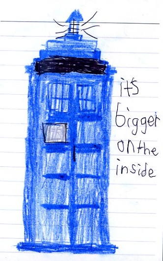
And hey, here’s another one.
That’s the Tardis, obviously. Which I understand is bigger on the inside.
Again, I think what I enjoy about this one is the way it ties comics to other stuff that is obviously like comics, but maybe doesn’t always get thought of next to comics all the time. This is a scrappy little alternacomics scribbly picture of a mega-property. (Which is the sort of thing that happens (a little disguised) in Axe Cop comics, now that I think of it….) But the image/picture juxtaposition is less alternacomics, more icon and advertising slogan. I don’t know…there’s just something about seeing this obviously hand-made, personal image of reproducible corporate bric-a-brac that seems to get at how comics often function. They’re the intimate face of the behemoth; low tech corporate crack, which looks innocent enough on the outside (even pretty adorable in this case), but is, as the boy says, bigger on the inside.
Probably all to the good to be plugged in though; you’ve got the culture you’ve got, and it’s best to figure out the workings early on. You want to be able to make those bigger insides run.


