Analyzing Comics 101: Rhetorical Framing

I’m stealing an idea from Thierry Groensteen, from his 2013 book Comics and Narration. After discussing “regular page layout” (pages with rigid panel grids), Groensteen describes “rhetorical layout, where the size (and sometimes the shape) of each frame is adapted to the content, to the subject matter of the panel.” Groensteen then goes on to talk about the relationships of panels to each other, especially “irregular” layouts that have “no basic structure,” but he doesn’t talk much about subject matter. So his “rhetorical” layout may be the same as any “irregular” layout, in which case the term is superfluous.

Except his definition, “the size (and sometimes the shape) of each frame is adapted to the content,” is really useful. But it doesn’t define a type of layout. It defines a type of framing. In fact, it defines all types of framing, since a frame always has some sort of relationship to its subject matter. And this is true whether panels follow a rigid grid or if the layout is irregular, because the rhetoric has to be analyzed one panel at a time.

So let me offer additions to Groensteen’s term.

Framing rhetoric: the size and shape relationships between frame and subject.

Symmetrical framing: the subject and frame are similar shapes.

Symmetrical and proportionate: the subject and frame are similar shapes, and the subject fits inside the frame; because content and frame are balanced in both size and shape, the effect draws no attention to their relationship and so appears neutral.

Symmetrical and expansive: the subject and frame are similar shapes, but the subject matter is smaller than the frame, so the panel includes surrounding content. The effect is spacious.

 Symmetrical and abridged: the subject and frame are similar shapes, but the subject is larger, so the frame appears to crop out some of the subject. The effect is cramped, as if the subject has been sized too small.

Symmetrical and broken: the subject and frame are similar shapes, but the subject is larger, with elements of the subject extending beyond the frame. The frame-breaking elements are often in movement or otherwise expressing energy, implying that the subject is more powerful or significant than the frame.

Symmetrical and off-centered: although the subject and frame are similar shapes and the subject appears as if it could fit the frame, the frame appears to crop out some of the subject while also including surrounding content. The effect is of a misaimed camera.

Asymmetrical framing: the subject and the frame are dissimilar shapes.

Asymmetrical and proportionate: although the subject fits inside the frame, because of their dissimilar shapes the panel includes surrounding content.

Asymmetrical and expansive: because the subject is smaller than the frame, the panel includes surrounding content, and because of their dissimilar shapes, the panel also includes additional surrounding content.

Asymmetrical and abridged: the subject is larger than the frame in one dimension, creating the impression of the frame cropping out content, and because of their dissimilar shapes, the panel also includes surrounding content. The effect is an image placed in the wrong shaped panel.

Asymmetrical and broken: the subject is larger than the frame, with elements of the subject extending beyond the frame edge; because of their dissimilar shapes, the frame-breaking elements further emphasize imbalance.

Asymmetrical and off-centered: although the subject appears as if it could fit inside the frame, the frame appears to crop out some of the subject while including some surrounding content; and because of their dissimilar shapes, the panel also includes additional surrounding content. The effect is of a misaimed camera.

Unframed image: an image with no frame. (Duh!)

Secondary frame: surrounding panel frames border an unframed panel.

Implied frame: an unframed image implies a symmetrical and proportionate frame, while usually remaining inside its undrawn borders.

Interpenetrating images: adjacent unframed images and their implied frames overlap.

Secondary frames, implied frames, and interpenetrating images may be analyzed in the same rhetorical relationships of size and shape as framed images.

That’s all really abstract, so check out some examples:

Nick Fury’s body fits inside the full-height column but intrudes into the second column. The unframed panel is symmetrical and broken.

With the exception of the top right close-up, each panel shows Beast’s whole (or nearly whole) body, which is drawn to fill the shape of the panel, and so is symmetrical and proportionate. 

Wolverine’s body, however, does not entirely fit; his feet, part of his arm, and the top of his head are cropped. The column panel is symmetrical and abridged.

The top panel is symmetrical and proportionate. The second panel crops the face (part of the lower lip and both eyebrows are missing) but includes a lot of surrounding space. The panel is asymmetrical and abridged, as is the third. The last is symmetrical and proportionate again.
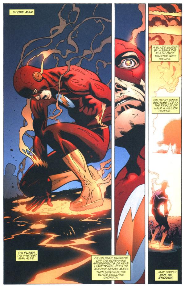
The first panel is asymmetrical and proportionate (or off-centered depending on whether you consider his elbow primary content). The second column is drawn as if too thin to contain all of Flash’s face, so the panel is asymmetrical and abridged. The last is asymmetrical and expansive.

The top panel is asymmetrical and expansive, with detailed elements of the wall in the foreground.  The bottom left panel contains Spider-Man, but with ample additional space around the figure, so that non-essential elements of the city landscape are included in the frame. The panel is symmetrical and expansive.

The bottom, page-width panel includes its two primary subjects, Batman and Alfred on the balcony behind him, but the angle and distance includes additional content, including the entire moon, distant buildings, and the wall below the balcony. The panel is symmetrical and expansive.

The second row includes a face with a corner of an eye and mouth cut off. The panel, however, is large enough to include those complete features, but the subject has been drawn off-center to produce the cropping effect. The panel is symmetrical and off-center.
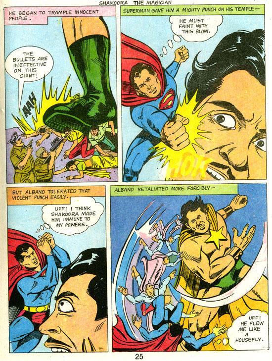
The face in the bottom left panel is cut off at the mouth, even though the subject matter could be drawn higher in the panel to include the entire mouth. The panel is symmetrical and off-centered.

The top right panel content could be composed to include Cyclops’ face, but instead his head is more than half out of frame. The panel is symmetrical and off-centered.

The top panel is wide like the subject matter of the street and so is symmetrical and proportionate. The subject matter of the second frame (the heads of the passenger and the driver visible through the car window) fit the frame, but the frame shape extends to the left to include the reflection of a building in a backseat window, so the panel is asymmetrical and proportionate.

,

The width of the second panel of “Avengers Mansion” also includes several distant buildings, the front yard, and fence–elements included as if the wide panel shape requires a view of more than the primary subject of the mansion front. The panel is asymmetrical and proportionate.
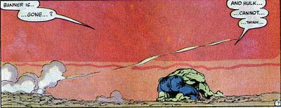
Not only is the subject of the Hulk much smaller than the frame, the frame itself is shaped so that it must include more than the subject. The panel is asymmetrical and expansive.

Image result for comic book pages

The shape of the full-width panels of  the second and third rows extend beyond the subject of the two figures. The panels are asymmetrical and expansive.
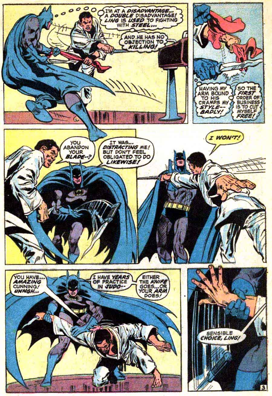
Batman’s leg extends beyond the frame, as if his movement was too fast for the frame to capture. The hand in the final frame also breaks the panel border, again emphasizing action. The panel is asymmetrical and broken.

Every panel of the fight scene but the last is symmetrical and broken. The last is symmetrical and off-centered, cutting off Bucky’s chin while leaving space above his head.

The second row begins with a symmetrical and expansive panel; the second panel is symmetrical and proportionate; and the third symmetrical and abridged. The sequence suggests physical and psychological intensification, but exclusively through framing since the Hulk’s expression remains essentially unchanged.

The first panel of a figure stepping through a door is symmetrical and proportionate. The next symmetrical but expansive panel includes its subject matter (the individuals in the classroom and the classroom itself) but also the darkened top of (presumably) a bookshelf. The spaciousness contrasts the cramped effect of the subsequent panels which are mostly asymmetrical and abridged, except for the second which is symmetrical and abridged.

And, on a last note, I intend to use framing rhetoric instead of film terms for camera distance (close-up, medium shot, etc.), because the film terms don’t account for frame shape (in film the frame shape typically does not change). Also, “camera distance” doesn’t suit a drawn image because there is no camera and so no distance between it and the subject; there’s just the subject and the frame.


Thierry Groentseen, densité, and Carol Swain’s Gast

Scan 2 

Carol Swain’s new graphic novel Gast (Fantagraphics, 2014)

 
After finishing Carol Swain’s Gast a few days ago, I found myself returning to Thierry Groensteen’s discussion of densité from Chapter 3 of Bande dessinée et narration (see pages 44 and 45 of the original French edition and page 44 of Comics and Narration, Ann Miller’s English translation). Gast, like Elisha Lim’s 100 Crushes (which I hope to write about soon), is a comic I’ve been enthusiastically recommending to friends. Swain tells the story of a young girl name Helen who, with the help of two dogs, a sheep, and a few birds, searches for clues about her neighbor Emrys and his sudden death.

I want to say very little about Helen and the small Welsh village where she and her family live. The mystery of Emrys’s life and death should reveal itself to the reader in the same slow, deliberate fashion that Helen comes to understand it. I’ll focus my attention instead on some of Swain’s page designs so as not to give away too much of the story. In Gast, the “density” of Swain’s compositions suggest the distance between Helen and Emyrs, a character who haunts the narrative. Like the protagonist of Chris Ware’s Jimmy Corrigan or Art Spiegelman’s Maus, Helen has the impossible task of piecing together the fragments left behind by a man reluctant to tell his story. Swain conveys Helen’s joy and confusion in a series of regular, nine-panel grids. These repetitions convey the density, I think, of Helen’s curiosity and of Emrys’s loneliness. At times, in fact, it is not clear where one begins and the other ends—an important point to consider, especially for the reader, who, like Helen, is left to decide why Emrys took his own life.

In order to apply Groensteen’s idea of densité to Gast I am thinking phenomenologically. Doing so opens up a number of theoretical possibilities, especially if the densité Groensteen describes can be read as synonymous, for example, with the density philosopher George Yancy examines in his recent book Look, a White! First, let me quote from Ann Miller’s English translation of Bande dessinée et narration before I consider density in relation to Yancy’s discussion of race: “A further consideration for the critical appreciation of page layout needs to be introduced,” Groensteen explains.

This is density, alluded to above. By this I mean the variability in the number of panels that make up the page. It is obvious that a page composed of five panels will appear less dense (as potential reading matter) than a page that has three times as many. (Groensteen 44)

What role does density serve, then, for both the artist and for the reader? Later in the chapter, Groensteen argues that, in Chris Ware’s comics, these dense and complex page designs have an expressive purpose: “Symmetry, in particular,” Groensteen argues, “is used by Ware to heighten the legibility of the binary oppositions that structure the spatio-temporal development of the story, such as interior/exterior, past/present, or day/night. But when two large images mirror each other on facing pages,” Groensteen adds, “this can also signify other oppositions or correspondences” (49-50). The “binary oppositions” Groensteen discusses here are also present in Gast: male/female, old/young, urban/rural, animal/human. The use of words and pictures to convey meaning in comics also implies the phenomenological density of consciousness itself: the sudden awareness of the self in relation to the other.

In Chapter 1 of Look, a White!, Yancy argues that what he describes as “the lived density of race” (17) demands new forms of expression. Although he is writing here about philosophy, I am interested in how we might apply his ideas to the  comics we create, read, and study:

To communicate an experience that is difficult to express, the very medium itself may need to change. On this score, perhaps philosophers need to write poetry or make films. When it comes to a deeper, thicker philosophical engagement with issues of race, the medium has to change to something dynamically expressive, something that forces the reader/listener to feel what is being communicated, to empathize with greater ability, to imagine with greater fullness and power. (Yancy 30)

Notice that in his second sentence Yancy refers to poetry and film, two forms with close ties to comics (see, for example, Hillary Chute’s recent essay from Poetry Magazine). How might a page filled with words and pictures, for example, enable “the reader/listener to feel” with greater intensity? For Yancy, of course, this affective experience must accompany or inspire real change. Feeling something is one thing. Acting on a feeling of identification requires radical selflessness and love.
 

Scan 5

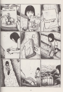
Page 127 of Gast

 
For Helen, the gradual shift from theory—her curiosity about Emrys’s life and death—to praxis takes shape on page 127, where she finds one of her neighbor’s books. In the first panel, we see a copy of Zane Grey’s Riders of the Purple Sage. The book is fragile. In the second panel, she tears the illustrated cover from its binding. “This book belongs to Emrys Bowen,” reads a note written on the back of the cover. In the fourth panel, she tucks that slip of paper beneath her arm, and holds the book in her hand in panel #5. She runs her fingers across the pages. Bits of paper fall like leaves.

Like Gatsby’s worn edition of Hopalong Cassidy in the final pages of Fitzgerald’s novel, Emrys’s copy of Riders of the Purple Sage reveals, perhaps, the dream image he cherished of himself. But, then again, no—as Helen tosses the book aside in the next panel, she implies that Emrys refused to play the role of the rugged cowboy. She conceals the torn cover in her bag.

Swain implies that, as readers, we would be wise to be suspicious of allusions. This sudden reference to another text cannot convey the full complexity of Emrys’s consciousness. As I read Gast, I thought of another writer who spent his career recording the silences of rural spaces. Most of the late John McGahern’s novels are set in Country Leitrim in northwest Ireland, not far from Yeats’s home of Sligo. In the introduction to his 1974 novel The Leavetaking, McGahern, who revised the novel in 1984, discusses the challenges of writing both self and other. “The Leavetaking was written as a love story,” McGahern explains,

its two parts deliberately different in style. It was an attempt to reflect the purity of feeling with which all the remembered “I” comes to us, the banal and the precious alike; and yet how that more than “I”—the beloved, the “otherest,” the most trusted moments of that life—stumbles continually away from us as poor reportage, and to see if these disparates could in any way be made true to one another. (McGahern 5)

Like Yancy, McGahern suggests other terms we might use to describe the density of experience expressed on page 127 of Gast: where do the “I” and “the ‘otherest’” meet?

As I study the last three panels on page 127, I find myself wishing I could retrieve Emrys’s copy of Riders of the Purple Sage. What if we missed something? What if the book contains the key to understanding Emrys? But the grid prevents me from turning back. I must follow Helen as she walks to Emrys’s house, just as I must follow McGahern’s narrator as he moves from rural Ireland to Dublin to London and back again (as I try to disentangle the real from the imagined in McGahern’s autobiographical fiction, most of which takes place in the same region of Ireland where my paternal grandmother, Mary Anne Bohan, was born in 1910).

Both McGahern and Swain tell their stories with clarity and compassion. Swain’s use of the grid, I think, is a reminder of the inevitable barriers between the subject and the object being observed. These barriers, like the borders that separate one panel from the next, suggest that densité is both an aesthetic choice and a phenomenological imperative: the storyteller and the reader must take into account what McGahern calls “the banal and the precious alike” in order to make less terrifying the space between the “I” and “the ‘otherest.'”

Can we read Groensteen’s densité, then, as a synonym for the density that Yancy describes? Can you think of other page designs that seek to express the phenomenology of the self? Do comics provide a means of eliminating the distance between the two?

References

Groensteen, Thierry. Bande dessinée et narration: Système de la bande dessinée 2. Paris: Presses Universitaires de France, 2011. Print.

Groensteen, Thierry. Comics and Narration. Trans. Ann Miller. Jackson: UP of Mississippi, 2013. Print.

McGahern, John. The Leavetaking. London: Faber and Faber, 1984. Print.

Swain, Carol. Gast. Seattle: Fantagraphics, 2014. Print.

Yancy, George. Look, a White! Philosophical Essays on Whiteness. Philadelphia: Temple University Press, 2012. Print.

This is a cross-post from my blog. Thanks to Qiana and Adrielle for inviting me! Thanks also to my dad’s cousin Oliver Gilhooley of Mohill, Co. Leitrim, for taking us to the John McGahern Library at Lough Rynn Castle in the summer of 2012. Oliver, a great storyteller himself, also gave us a suggested reading list of McGahern’s fiction.
 

>photo

The McGahern Library at Lough Rynn. Photo courtesy of Allison Felus.

An Erotics of Page Layout?

This is the fourth in a five-part roundtable on page layout in comics. I recommend reading the first three here if you haven’t already. And be sure to scroll down to the comments where you’ll find some good discussion about the merits of various approaches (neutral vs. baroque, artificial vs. natural, narratively-driven vs. dream-rebus-like) to layout. It seems the terminology we use to describe different layouts (“rhetorical,” “neutral,” “regular,” etc.) poses some problems, as does the assumption that there is such a thing as “natural” or “easy” reading. This is perhaps the result of the fact that we tend to experience our ingrained reading habits as natural even though they are shaped by the reading culture we were raised in. But there is no such thing as a layout that is not “rhetorical” (i.e. “motivated”) or “artificial” in this sense. The most challenging layouts force readers to confront the cultural constructedness of their reading habits in ways that can feel discomfiting. Comics scholars and artists, in trying to identify an underlying grammar or semiotics of comics, do often conflate pure description with prescription. And we should be suspicious of “pure” description since there cannot be such a thing, rigorously speaking.

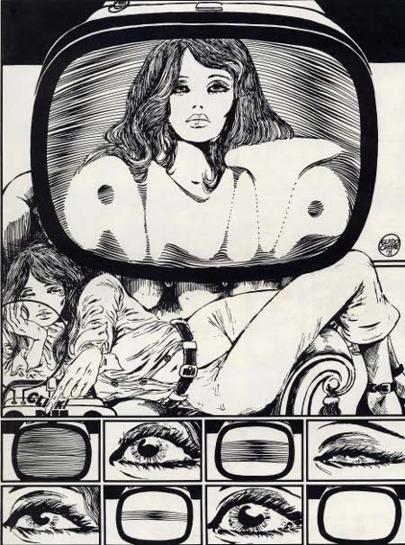
In any case, I don’t have much more to add to the debate(s). But, picking up on Adrielle Mitchell’s discussion of rhetorical panel layout experimentation, I thought it might be fun to reflect on the example of Guido Crepax, the Italian comics artist known specifically for his erotic narratives and his surreal McCay-esque experimentations with page layout.

tumblr_mjk2o90FBw1qi7w1po3_500

 
As phallocentric and macho as he appears to readers today, Crepax was a great innovator of narrative and visual techniques meant to delay the reader’s erotic gratification. His experimentation with page layout seems to have been intended to slow time down, to break the erotic moment and the body into endless fragments. Belgian comics scholar and Tintin specialist, Pierre Sterckx, describes Crepax’s work in these terms:

Commençons notre analyse en nous intéressant au retardement par le dessin : Crepax faisait son dessin en noir et blanc, ce qui produit un retardement du plaisir par rapport à un dessin colorisé et en volumes. Faites un dessin en couleurs et en volumes et ça devient du porno. Crepax a un trait extraordinaire, qui oscille entre la caresse et la flagellation.

Il existe un très beau texte de Roland Barthes consacré à l’œuvre de Crepax et dans lequel il dit qu’en parlant, les personnages retardaient leurs actes. Il y a une sorte de contrat qui s’installe entre ses personnages : entre la femme et son bourreau ou entre le maître et l’esclave. Dans ce contrat entre les deux, il y a la parole. C’est une autre manière de retarder l’action, qui est une méthode scénaristique chez Crepax. C’est quelque chose d’assez rare dans la BD. Ainsi, Crepax exalte le masochisme car il sépare le désir du plaisir et il place la douleur entre les deux.

Let’s begin our analysis [of Crepax] by paying attention to the delay [of gratification] through drawing: Crepax drew in black and white, which brings about a delay in pleasure compared to a colored drawing with depth. If you draw something in color and with depth, it becomes pornography. Crepax has an extraordinary line that wavers between a caress and a whipping. 

There’s a lovely text by Roland Barthes devoted to Crepax’s work and in which he say that the characters delay their [sexual] acts by speaking. A sort of contract emerges between these characters: between the woman and her executioner or between master and slave. In this contract between the two there is speech. This is [yet] another way of delaying action; it is a plotting method for Crepax. And this is quite rare in comics. In this way Crepax exalts masochism because he separates desire from pleasure and places pain between the two. 


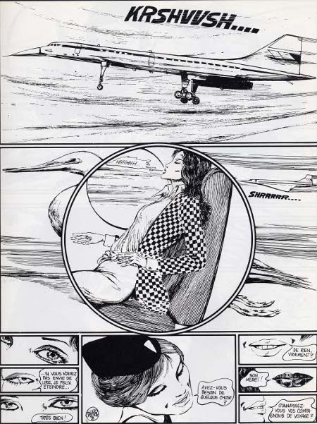
2_Emmanuelle

 
His page layouts are superb and often disturbing. I love how the round panel superposed on the rectangular panel, where a Concord jet is foregrounded by a heron-like bird in flight, suggests an organic erotics of acceleration. The gravity of the page layout centers on Emmanuelle’s pelvis where the reader is compelled to share in her erotic enjoyment of the Concord’s takeoff. More than just delaying gratification, the page layout here mirrors the reader’s body, directs the reader’s corporeal response down to the pelvis. Meanwhile, the bottom of the page opposes three sets of eyes and three sets of lips in two columns of three panels between which we see a single panel that frames the flight attendant’s face as an erotic object caught incommensurably between the scopic and oral drives.
 

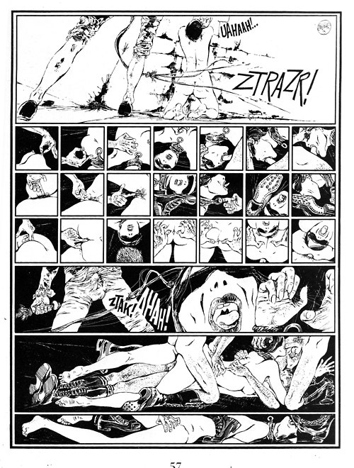
tumblr_lu3forNv8Q1qzekceo1_500


Valentina-by-Guido-Crepax

 
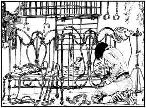
The panel above juxtaposed with the page layout above it (where the proliferation of panels slows the apprehension of even a highly explicit BDSM scene) suggests an interesting rapport between the constraints of panel arrangement and the techniques of BDSM. The cages and intersecting lines in the above panel echo comic book page layouts of various sorts, ranging from the geometrical to the organic. The vegetal art nouveau lines of the bed seem to refer visually to some of the page layouts we see in Windsor McCay’s work while the superposed grids as cages (or decoration?) seem much more autoreferential.
 

maurymoore-2010073131656-021-original

 
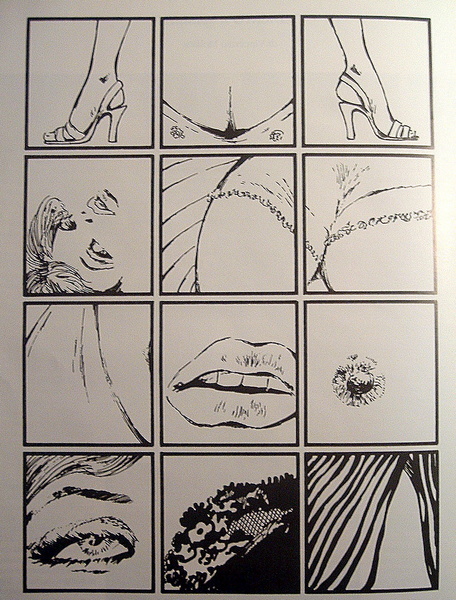
I wanted to conclude with at least one (rare) example of a regular waffle iron type layout in Crepax’s work. The above page layout, composed of twelve evenly spaced cube-shaped panels, is far from neutral. If anything, the geometric regularity of this page layout points to the synechdotal/fetishistic violence of (masculine?) desire and links that violence to the comics art form. More specifically, it links the representational violence of the medium to cadrage, or framing. The top three panels of the above page layout present what looks at first to be a relatively spatially coherent presentation of Valentina’s body (two outwardly pointing high-heel clad feet framing her bust) but the rest of the panels flit from erotic liminal zone to erotic liminal zone, from parted lips to a single erect nipple, from the edge of a lace bra to a hairline. The overall effect is one of scopic violence, as erotically compelling as it is disturbing, but it also reads as experimental and “rhetorical” (or “motivated”) in its imposition of a fetishistic erotic gaze onto a regular grid layout.

When is a Grid Not Just a Grid? (Groensteen and Page Layout Roundtable)

pekar

The previous contributions to our roundtable have raised important questions about Thierry Groensteen’s approach to page layout in Comics and Narration. While a rich array of images in Adrielle Mitchell’s post encouraged us to consider how frame irregularities produce meaning, Roy Cook set the stage for an important conversation about the values comics readers attribute to different panel arrangements. Roy’s post really got me thinking about the way Groensteen privileges the layout pattern of the “waffle-iron” by identifying stability, simplicity, and transparency as fundamental attributes of the orthogonal shapes. Groensteen further conceptualizes the grid in the narrative rhythm of comics as the “basic beat” against which the visual and verbal elements of comics can improvise.

From this perspective, it’s not difficult to see how one might characterize the grid as “regular” or “neutral” or “invisible,” but I remain troubled by the relative nature of these terms, who defines them and in what context. To complicate the issue, my first instinct was to seek out comics that delight in the wildly experimental layouts that Groensteen might find “more sophisticated (or more hysterical),” but Adrielle’s post provides several excellent examples already. So I thought I would ask instead about comics that use the grid, but in unexpected ways: how do comics adapt the basic panel layout in order to stray from what Roy described as Groensteen’s “waffle-iron way of truth”? When is a grid not just a grid?

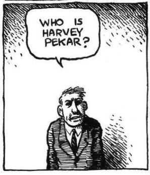
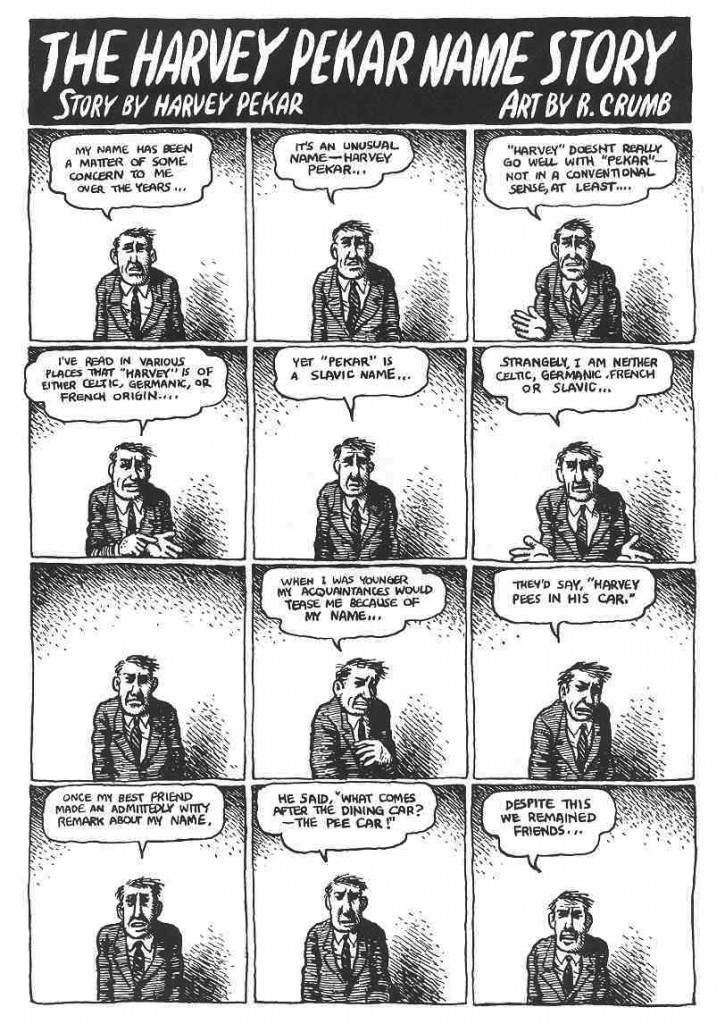
I wonder, for example, how a comic like “The Harvey Pekar Name Story” fits into our understanding of frame regularity and rhythm. Though we may be inclined to make assumptions about its uniformity at first glance, R. Crumb has not simply drawn 48 identical copies of the same man in the squares of this four-page comic about the different Harvey Pekars listed in the phonebook.


PekarNameStory

The text varies and so too do the hand-drawn panels that reveal each frame’s scratchy imperfections. The careful reader’s eye becomes attune to the nuances of Harvey’s expression and posture. It is a “basic layout pattern” and yet it has “irregularity as a common feature” (43) — a fitting contradiction for a story about Harvey Pekar’s search for his own unique identity. It seems to me that a comic like this one actually exposes the illusion of neutrality by calling attention to the grid’s own constructedness.

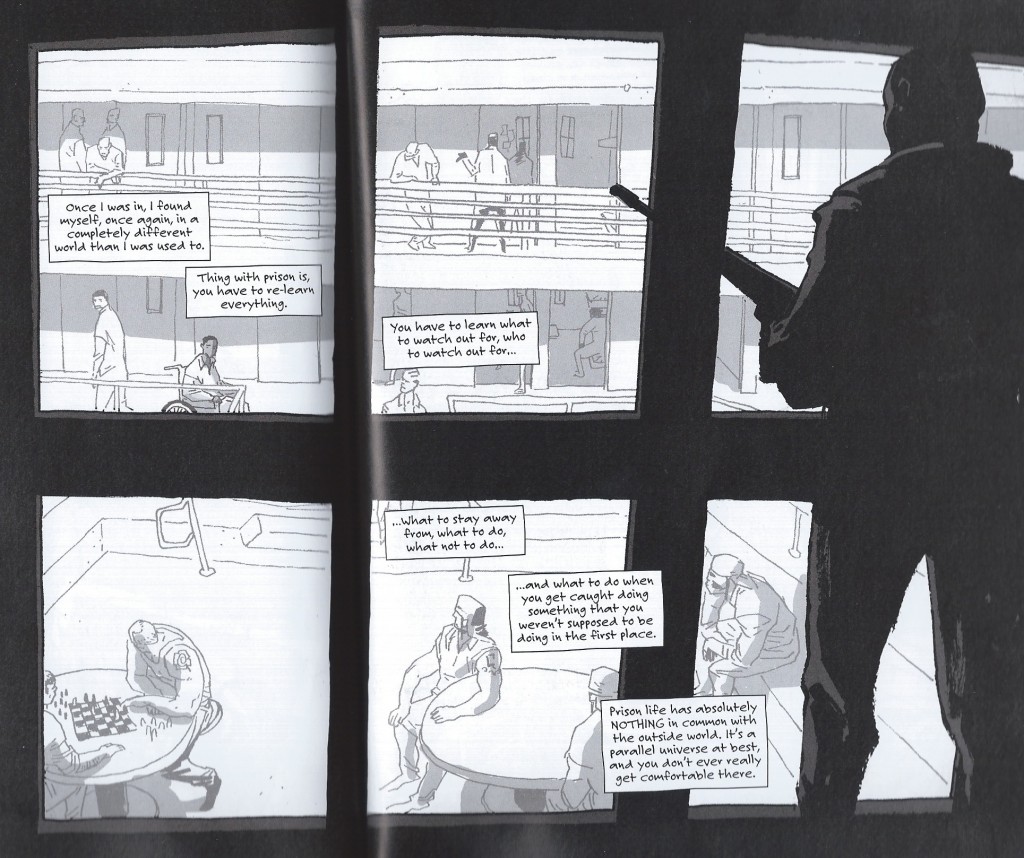
Another example that comes to mind for me is a two-page spread from Percy Carey’s graphic novel memoir Sentences: The Life of M.F. Grimm with art by Ron Wimberly. During Carey’s time in prison on a drug conviction, Wimberly uses the bars of the jail cell to structure the layout of the page, building barriers between us and the detained bodies, the narrative boxes, and the armed guards

sentences

Groensteen describes the thick borders that Chris Ware uses in Jimmy Corrigan as having “an almost carceral appearance” (48) and given the emotional constrictions of multiple generations of the Corrigan family, Ware’s panel choices aid in the production of that meaning. Alternatively, Sentences is a comic that has an unpredictably fluid design with layered panels and splash pages to convey the early days of hip-hop and Carey’s experience with music, drugs, and violence during the 1990s. The waffle-iron pattern is not the norm by any means; when the grid above appears, it actually disrupts a narrative rhythm that the writer and artist have already established. The uniformity of the panels might also be said to reflect the carceral lens that would continue to follow Carey after being released from prison.

Is this frame neutral or invisible? How might the perspectives of these two comics help us to reconsider the notion of the “basic panel layout” in other comics?

Are Some Panel Layouts Inherently Superior to Others? (Groensteen and Page Layout Roundtable)

This is the second installment in the PencilPanelPage roundtable on panel layout and Theirry Groensteen’s work (The System of Comics, Comics and Narration). Check out Adrielle Mitchell’s first installement in the series here!
 
ComicsNarrationIn Comics and Narration Thierry Groensteen introduces a four-part taxonomy by which we (or at least he) categorizes comics in terms of the nature and structure of panel layout. The taxonomy consists of different ways in which the payout of the panels might be more or less regular:

  1. Do all pages have the same panel layout (or are they all variations on a single such template, etc.)?
  2. Are all the tiers of panels on a particular page (or all the tiers in the comic, etc.) the same height?
  3. Are all the panels within a single tier (or all the panels on a page, or all the panels in the comic, etc.) the same width?
  4. What is the number of panels placed on each page (i.e. what is the density of the page)?

A page for which the answer to (2) and (3) is affirmative is a waffle-iron grid. Further, the more variation with respect to (2) and (3) found on a page, the more irregular the page. Factoring in (1), we also have a criterion for measuring (roughly) the regularity of the panel layout of an entire comic.

WaffleThe density of panels on a particular page – i.e. criterion (4) – while discussed at the same time as the first three criteria, is somewhat orthogonal to measuring the regularity of a page although variation in density from page to page obviously increases the irregularity of the comic in the relevant sense. Clearly, however, if the number of panels on a page varies from page to page, then as a matter of geometrical fact their layout must as well – thus, with regard to measuring regularity criterion (4) is redundant, subsumed under criterion (1).

This taxonomy is interesting, and allows us to categorize comics in terms of three distinct (although not completely independent) dimensions: the regularity of panel height (on a page), the regularity of panel width (in a tier or on a page), and the uniformity of these when considered page-to-page. Taxonomy is, of course, a wonderful tool for analysis and explanation, but a taxonomy is only as good as the explanation of, and analysis of, the relevant phenomena that it provides.

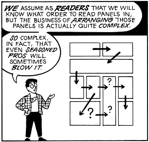
McCloudLayoutDigression: One pet peeve of mine is the tendency of scholar in the humanities – comics scholars definitely included – who propose taxonomies as if a system of categories is an intellectual end in and of itself (and as if they are following a more ‘scientific’ methodology). A taxonomy is a tool, however, not a result.

So, the obvious question is this: Are there any theoretical questions that can be answered by attending to the complex geometrical framework for analyzing comics panel layout provided by Groensteen? Groensteen seems to think so: he argues that, in general, the more regular the panel layout, the better the comic and its narrative (all else being equal). His argument for this claim is somewhat indirect – he identifies a regularity-eschewing ‘movement’ in comics, which he calls the neo-baroque and characterizes as preferring:

… the destructuring of the hyperframe by images that bleed off the edge of the page and intrusions into the gutter, the use of multiple insets, the maximization of the contrast between large background images and the inset panels, the vertical or horizontal elongation of panels (as if to achieve a shape as far removed from the square as possible!), and the frequent stacking of very narrow horizontal panels… (Comics and Narration p. 47).

Groensteen stridently disapproves of such strayings from the waffle-iron way of truth:

It is as if the simple succession of panels was no longer deemed sufficient to ensure the production of meaning: the apparatus must become more sophisticated (or more hysterical) by piling special effect upon special effect (Comics and Narration, p. 47).

It is worth noting that Groensteen’s complaints have a bit of a Euro-elitist tone to them: He explicitly blames the neo-baroque movement on the pernicious influence of manga (pp. 47, 61) and 1980s American superhero comics (p. 47, fn. 17, p. 61).

Setting this aside, however, it is worth asking whether Groensteen could be right: Are some panel layouts (and maximally regular waffle-iron grids in particular) better suited for effective narratives than others? There are two possible questions one could ask here:

  • In general, are comics better the more regular their panel layout?
  • If comics had to restrict itself to a single layout, would a more regular layout be better than a less regular one?

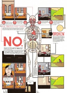
WareLayoutGroensteen seems to think the answer to the first question is affirmative, but I just can’t see how this could be the case. As many scholars have argued (and see the predecessor to this post by Adrielle for some evidence) panel layout can be carefully attuned to the type of story being told and the way in which the teller is telling it, resulting in narrative effects that are both theoretically interesting and likely unachievable by other, more ‘traditional’ means. Chris Ware’s work, for example, would be far less compelling had it been produced in a regular 3×3 grid (interestingly, Ware somehow gets a pass from Groensteen, despite his vast deviations from panel regularity in Groensteen’s sense.)

More promising, perhaps, is the second question (although it is not, I think, what Groensteen himself has in mind): If all comics had to be produced with the exact same panel layout, would a regular one be preferable? The answer here might be affirmative – it might be the case that a regular waffle-grid is neutral in a certain formal sense, so that it is amenable to functioning in all sorts of different narrative environments in a non-interfering manner (although the positive contributions of panel layout of the sort mentioned in the previous paragraph would be ruled out). Of course, certain metafictional comics that make direct use of panel layout would be impossible. But the second weaker claim regarding super-regular waffle grids does not seem immediately absurd in the way the first does.

So, are some panel layouts inherently superior to others?
 

Charles Johnson’s “It’s life as I see it” and Single Panel Cartoons

Johnson 3

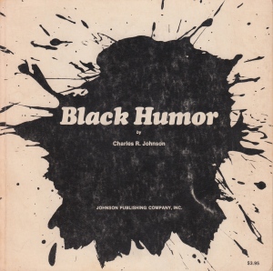
The cover of Johnson’s 1970 collection.

Note: This essay on Charles Johnson’s Black Humor is a cross-post from my blog. It’s also a preview of a roundtable on Thierry Groensteen’s Comics and Narration that will begin here at Pencil, Panel, Page in a few weeks. 

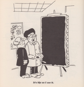
Early in Chapter Two of Comics and Narration, theorist Thierry Groensteen extends some of the questions he first posed in The System of Comics, also available in an English translation from the UP of Mississippi. “Can an isolated image narrate?” he asks. “Can it, on its own, tell a story?” (Groensteen 21). I’d like to consider this question in relation to “It’s life as I see it” from Charles Johnson’s 1970 collection Black Humor. Groensteen borrows some ideas from film theory in order to explore the narrative potential of single, static images: “Some film theorists,” he points out,

most notably André Guadreault, have asserted that an intrinsic narrativity is associated with movement, because it implies a transformation of the elements represented. Obviously, the same cannot be said of the still image. Given that its narrative potential is not intrinsic, it can only arise, where it does arise, out of certain internal relationships between objects, motifs, and characters represented. (Groensteen 21-22; English translation by Ann Miller)

With Groensteen in mind, I’d like to consider the “internal relationships” of the “objects, motifs, and characters” in this single-page cartoon, in which an African American artist explains his work to an older, white visitor. As I took notes on Johnson’s work, I thought again about Qiana’s “What is an African American Comic?” from earlier this year on Pencil, Panel, Page. I am thinking about how theories from African American literary theory and philosophy might inform our readings of comic strips, comic books, and graphic novels. But I also have larger questions in mind—what secrets will Johnson’s cartoon reveal when also read as part of the tradition of American literary discourse? What affinities might we discover, for example, if we juxtapose Johnson’s “It’s life as I see it” with Phillis Wheatley’s poem about the work of artist Scipio Moorhead, for example?

Of course, by writing about Johnson’s cartoon, I’m cheating a little. Is this really a single-page comic? It might be read as a work containing at least three panels—the image itself, as well as the artist’s two paintings: the one hanging on the wall and the other work-in-progress on his easel. So I should revise what I asked earlier: how do we read a single panel or page like this one that includes other, smaller images embedded within a larger frame? Here is “It’s life as I see it” from Black Humor:

Johnson 1

 Johnson, as Tim Kreider points out in his 2010 TCJ essay on the artist, is best known as one of the most influential and visionary American novelists of the last thirty years. Middle Passage, which won the National Book Award in 1990, is now a perennial text in 20th century American and African American literature courses—I’ll be teaching it again in one of my classes this fall—and Dreamer, his 1998 novel about Dr. Martin Luther King’s experiences in Chicago in 1966, is, like Edward P. Jones’s The Known World, one of the most complex and evocative historical novels of the last two decades.

Scan 5

Jill Krementz’s 1974 publicity photo of Johnson for the
writer’s first published novel, Faith and the Good Thing (Viking).

 Writing about Johnson’s early work as a cartoonist, Kreider writes, is like trying “to give a magnanimous little career boost to a struggling unknown cartoonist named Wolfe or Fellini.” But as his introduction to Fredrik Strömberg’s 2003 book Black Images in the Comics makes clear, Charles Johnson has a deep affection for comic books and comic art. In the conclusion to his essay, Johnson includes a discussion of the kinds of comics he would like to read:

I long—as an American, a cartoonist, and a writer—for a day when my countrymen will accept and broadly support stories about black characters that are complex, original (not sepia clones of white characters like “Friday Foster” or “Powerman”), risk-taking, free of stereotypes, and not about race or victimization. Stories in which a character who just happens to be black is the emblematic, archetypal figure in which we—all of us—invest our dreams, imaginings and sense of adventure about the vast possibilities for what humans can be and do—just as we have done, or been culturally indoctrinated to do, with white characters ranging from Blondie to Charlie Brown, from Superman to Dilbert, from Popeye to Beetle Bailey. (Johnson 17)

Johnson’s argument here raises interesting questions about the page from his 1970 book. As readers, with whom do we identify? With the artist who shows his work or with the man who stares at the black canvas? Do we immediately identify with one or the other based on our race? What role does gender play? Do we identify with neither but find ourselves observing what Groensteen calls the “internal relationships” between these two men and the objects that surround them? I think an answer to these questions might lie in the juxtaposition of the artist’s two canvases. One is abstract. The other, the one on the easel, is the more realistic of the two, although it is less figurative than the one hanging on the wall. “It’s life as I see it,” the artist explains.

I find myself working in collaboration with Johnson as I read this page. First of all, where are we? This appears to be the artist’s studio. Is this a studio visit by a curator? By a patron? Why is the middle-aged, balding man so startled? Was he expecting something else? The artist’s other work appears more conventional—a variation on Pollock’s Abstract Expressionism. Now the artist is a minimalist. Then again, I don’t know if the painting on the easel is finished. Maybe it’s still in progress. The painter, after all, is holding a palette and brush and he is wearing a white smock.

The questions raised by Johnson’s cartoon are also present in Charles W. Mills’ “Non-Cartesian Sums: Philosophy and the African-American Experience,” the essay that opens his 1998 book Blackness Visible. In the essay, Mills describes the obstacles he faced as he designed a course on African-American philosophy. First, for example, he “had to work out what African-American philosophy really was, how it related to mainstream (Western? European/Euro-American? Dead White Guys’?) philosophy—where it challenged and contradicted it, where it supplemented it, and where it was in a theoretical space of its own” (Mills 1). Mills turned to Ralph Ellison’s Invisible Man as a guiding text. As he reflected on the experiences of Ellison’s narrator, Mills began to formulate a conceptual basis for his course:

African-American philosophy is thus inherently, definitionally oppositional, the philosophy produced by property that does not remain silent but insists on speaking and contesting its status. So it will be a sum that is metaphysical not in the Cartesian sense but in the sense of challenging social ontology; not the consequent of a proof but the beginning of an affirmation of one’s self-worth, one’s reality as a person, and one’s militant insistence that others recognize it also. (Mills 9)

In Johnson’s cartoon, the artist asserts his subjectivity. The painting, like the cartoon’s caption, is a simple statement of fact: life as he sees it. The painting breaks the silence that Mills refers to in this passage. The humor in this cartoon—the disconnect between what the man in the suit expects to see and what he finds on on the easel before him—is part of Johnson’s narrative, I think: a cartoon is a work of popular art that challenges our notions of fine art, just as the painter’s canvas challenges the observer’s narcissistic complacency.

This new painting, then, is like a course in African American philosophy, one that makes certain demands on the curriculum as it articulates “a (partially) internal critique of the dominant culture by those who accept many of the culture’s principles but are excluded by them. In large measure,” Mills continues, “this critique has involved telling white people things that they do not know and do not want to know, the main one being that this alternative (nonideal) universe is the actual one and that the local reality in which whites are at home is only a nonrepresentative part of the larger whole” (Mills 5-6). The subject of Johnson’s narrative is the dissonance between what the observer believes and what the artist knows to be true.

As I look at the cartoon, I also wonder if I might trace its origin to one of the earliest collaborations of words and pictures in American literature, that of Phillis Wheatley and artist Scipio Moorhead.

Wheatley’s poem about Moorhead’s work appears in her 1773 book Poems on Various Subjects, a text that includes an engraving based on Moorhead’s portrait of the poet (you can read more about Wheatley and Moorhead here and here). “To S.M. A Young Painter, On Seeing His Works” opens with a question as the speaker studies one of Moorhead’s paintings:

To show the lab’ring bosom’s deep intent,

And thought in living characters to paint,

When first they pencil did those beauties give,

And breathing figures learnt from thee to live,

How did those prospects give my soul delight,

A new creation rushing on my sight?

An important difference between Johnson’s cartoon painter and Moorhead, however, is that Moorhead’s work, with the exception of his portrait of Wheatley, has not survived. As we read this poem, we must imagine his drawing, the evidence of his “lab’ring bosom’s deep intent” which has brought life to these “characters” and “beauties.” After a detailed description of her response to Moorhead’s work, Wheatly concludes the poem with a plea:

Cease, gentle muse! the solemn gloom of night

Now seals the fair creation from my sight.

But while night and shadow might obscure Moorehead’s drawing, it remains vivid and startling in her memory. When I first saw Johnson’s cartoon, I immediately thought of Wheatley’s poem (and of Adrielle’s early Pencil, Panel, Page essay on comic scholarship and ekphrasis). At the end of the poem, as night falls, the speaker can no longer see Moorhead’s painting, so she does the next best thing: she writes it from memory and, therefore, gives her friend the lasting fame that Shakespeare’s speaker promises to his subject in the Sonnets. The poem, like Johnson’s panel, is filled with light and meaning that some observers, like the old man in the suit, might fail or refuse to see.

Johnson’s “It’s life as I see it” is an interesting test case for Groensteen’s theories, not only because it is a single image that narrates, but also because it is part of a collection of other cartoons. At the end of Chapter Two of Comics and Narration, Groensteen discusses Frans Masereel’s woodcut novels and Martin Vaughn-James’s The Cage (see Groensteen 35). These examples, of course, are not collections of single-page cartoons, but Groensteen’s suggestion on how we read and respond to these texts might shed light on how we read a collections like Black Humor. “In works of this type,” Groensteen explains, in which “there are never more than two images visible to the reader at any one time, split across two pages,” the reader’s imagination and memory play a crucial role: “The dialogue among the images depends on the persistence of the memory of the pages already turned” (Groensteen 35).

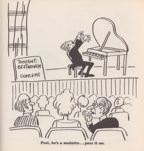
The next page in Johnson’s book, for example, shares affinities with “It’s life as I see it.” An older white gentleman and his wife listen to a Beethoven recital. The pianist, his hands perched dramatically over the keyboard, is about to begin. A gray-haired old man in the audience whispers, “Psst, he’s a mulatto…pass it on.”

Johnson 2

The cartoon that appears on the page opposite
“It’s life as I see it” in Johnson’s Black Humor.

By placing these two cartoons together, Johnson, according to Greonsteen’s theory, is also challenging the reader—how does our reading of one page shape our understanding and recollection of the images on the pages that preceded it? Both of these cartoons invite us to consider two African American artists–a painter and a musician–and the white audience members who observe them.

But how do you read “It’s life as I see it”? Is it a single-panel cartoon , and, if so, what can it tell us about “the persistence of memory,” as Groensteen describes it?

References

Groensteen, Thierry. Comics and Narration. Trans. Ann Miller. Jackson: UP of Mississippi, 2013. Print.

Johnson, Charles R. Black Humor. Chicago: Johnson Publishing Company, Inc., 1970. Print.

Johnson, Charles. “Foreword” in Fredrik Strömberg, Black Images in the Comics: A Visual History. Seattle: Fantagraphics, 2003. 5-18. Print.

Kreider, Tim. “Brighter in Hindsight: Black Humor by Charles R. Johnson.” The Comics Journal. January 18, 2010. 9:00 am. Web.

Mills, Charles W. Blackness Visible: Essays on Philosophy and Race. Ithaca: Cornell University Press, 1998. Print.

Wheatley, Phillis. “To S.M. A Young African Painter, On Seeing His Works.” Poetry Foundation. Web.

Make It Bigger

It’s easy to see that comics do not enjoy the prestige or financial backing of the fine arts. It’s harder to justify why not. Many arguments are primarily emotional– the textbook Art Since 1900 discusses comics with thinly veiled disgust, and a cartoonist or publisher can self-righteously reply that art world acceptance is something owed to them.  Some argue that differing treatment is a matter of different histories. The broadsheet ancestor of comics branched off  from the ‘fine art’ lineage centuries ago, but this ignores the rampant interbreeding of art and comics, and the intersection of their audiences, for the last fifty years.  An alternative, manifold hypothesis is given by the prolific comics scholar Thierry Groensteen in his book, Un Objet culturel non identifie (An Unindentified Cultural Object, 2006). Groensteen proposes five ‘symbolic handicaps’ crucial to the devaluation of comics.  Beaty offers an aggressive treatment of these in his book Comics Versus Art (2012):

“First, he argues that comics are a ‘bastard’ genre resulting from the ‘scandalous’ mixture of text and image; second, that they are intrinsically infantile and consumed by adults who are seeking to prolonge their adolescence; third, that comics are associated with one of the most degraded branches of the visual arts, caricature; fourth, that they have not been integrated into the development of the visual arts throughout the course of the twentieth century; and finally, that the images produced in comics do not command attention as a result of their multiplicity and tiny format.”

Beaty disregards the first two handicaps only in that they rely “heavily on the intersection of the form with pre-existing aesthetic discourses that had little to do with comics per se… “ Yet he only seriously considers handicap number four, comic’s segregated development from the contemporary art-world, as an obstacle to wider readership.

While this angle a deserves a book on its own,  Groensteen’s third and fifth handicaps are worth a harder look. Beaty points out that comic’s relationship to caricature is used to elevate comics more than devalue them, but this association also creates a glass ceiling, where comics can not rise above the marginal place of caricature in the art-world. Beaty dismisses Groensteen’s last handicap, saying,

“Similarly, when Groensteen suggests that comics suffer because of their format, their small printed size and the multiplicity of images, it is difficult to accord this factor any great weight. Groensteen himself devotes very little attention to the suggestion and is not able to mount a particularly compelling case for it. While monumentality has been an important aspect of the visual arts for centuries, it does not seem to follow that small-formatted works have been particularly disparaged specifically for their size.”

Yet perhaps without realizing it, Beaty cites at least three major examples where a comic panels was magnififed and isolated from their sequence in order to elevate their source.

Comics Versus Art presents a thorough history of comic-centric art shows. One of the first major gallery shows dedicated exclusively to comics was held by SOCERLID (Societe civile d’etude et de recherché des literatures dessinees) in 1967 at Paris’ Musee des arts decoratifs, which is part of the Louvre. The show featured three sections on comic art, although the curators didn’t showcase any original strips or pages. Instead, they hung ektachromes and photographic enlargements of individual comic panels, with the coloring removed. The curators argued “thanks to the quality of the paper and clarity of the blacks and whites, the photographic enlargement makes it possible to free the comic strip from the small size that stifles it and to exhibit it in the usual dimensions of the works of art to which the public is accustomed.”

Many more gallery shows sidestep comic narrative altogether in favor of what the curators believe to be the form’s mosts substantial contribution to society—its characters. In a survey of several museum shows that drew inspiration, but did not include, comics, Beaty concludes, “these exhibitions indicated that it is the iconography of comics, rather than the formal—that is to say sequential—elements that is mostly commonly appropriated by artists influenced by comics.”  The Institute for Contemporary Art’s 1987 show Comics Iconoclasm featured sections on cartooning technique as well as sequential storytelling, rare for most comics-centric gallery shows, yet both of these sections were dwarfed by the section on cartoon icons.

The legacy of Roy Lichtenstein and his comic panel appropriations, often accused of barring comic’s high-brow acceptance, could be the best example of all. Lichtenstein’s work has ensured immortality for the ‘look’ of mid-twentieth century romance and war comics. Museums adore and celebrate Lichtenstein’s accessible iconicity in their marketing, even as this look has been endlessly adopted by advertising. The look engulfs whatever meaning Lichtenstein has an artist, or his paintings have as individual works, and today the ben-day dot women function as stylistic, feminized stick figures. Yet this wouldn’t have happened without Lichtenstein’s blow-up treatment, and the strange prestige it accorded it.

Pawn shop NYC subway

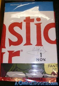
Beaty documents related examples in the world of mainstream comics publishing. Maximum FF, a deluxe-edition book published in 2005 by Marvel Comics, was one telling attempt.

“An oversized hardcover with an elaborate fold-out dust jacket, Maximum FF is a 234-page version of the first issue of Fantastic Four, by Stan Lee and Jack Kirby, originally published as a twenty-five-page comic book in 1961. Mosley and Sahre expanded the original work almost ten-fold by dramatically restructuring it: by disaggregating the individual panels and presenting them one per page, one per double-page spread, and even, on two occasions, as quadruple-page gatefolds.”


Maximum FF

Beaty goes on to say that the ‘splash’ page and double-page spreads,

“…are particularly valued by collectors of original comic book art because they often present characters drawn on a larger scale than is typical for a comic book and, consequently, are more impressive when framed. For some collectors, the splash page and comic book cover are the most valuable parts of the comic because they are most akin to traditional gallery and museum aesthetics—they are not tainted with the sequentiality that is often held to define the comics form.”

Groensteen would agree with the idea that comics is tainted by its sequentiality, or at least sequentiality is not very relevant or attractive to most of society. Tellingly, the earliest definitions of comics focused on its use of recurring characters and speech bubbles than on its sequentiality—something Beaty recognizes in the first chapter of his book.

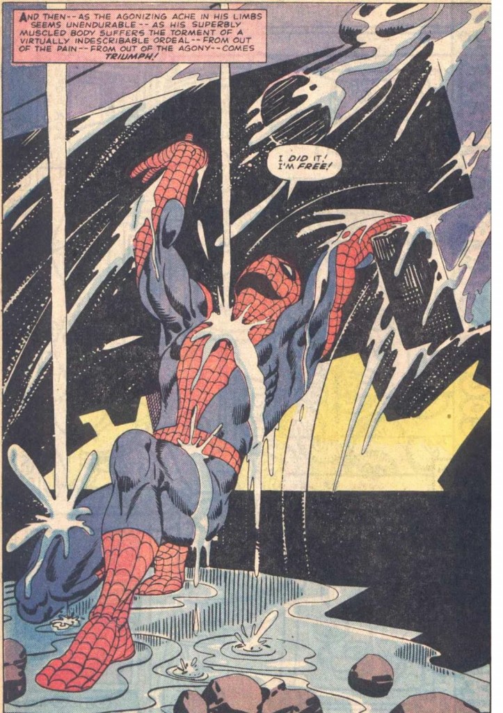
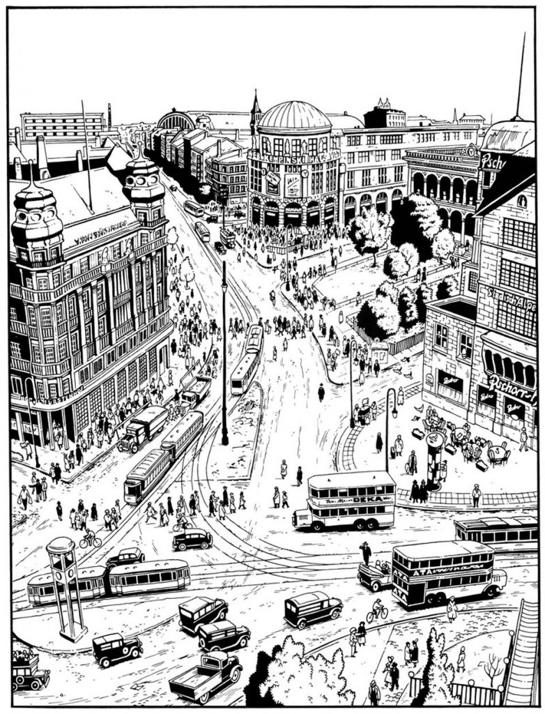
It’s worth wondering about the phenomenology of the splash page and double-page spread, and what happens when they are used in comic books. The splash page is a ubiquitous element of many comics, from American superhero books to manga to independent minicomics. It’s use isn’t random—splash pages most often introduce a story, establish the grandiosity of a setting, or monumentalize the climax of a single issue or narrative arc. The effect is always intended to be eye-catching, attention-grabbing, and big.

Spiderman Splash Page

Steve Ditko and Stan Lee, Amazing Spider-Man, Issue #33

Inuyasha Double Page Spread

Rumiko Takahashi, Inuyasha, Book 1

berlin_splashpage

Jason Lutes, Berlin, Volume 1

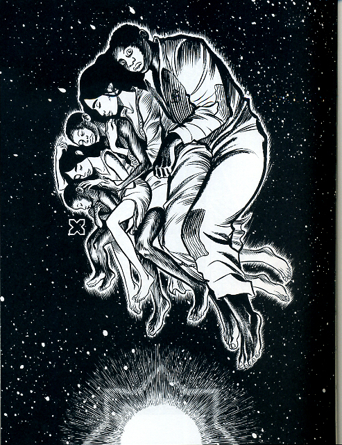
The splash page is a part of the vocabulary of comics, (or at least its grammar,) and some cartoonists play with or complicate the concept more than others. Within the limited scopes of alternative comics, a few recent examples come to mind. In Craig Thompson’s Habibi, (2011) (which I reviewed here,) a preponderance of splash pages marks the end of the book. Thompson’s loud pages erupt with obvious, mystical-religious imagery, asserting not only that an epic moment has been reached, but that moment is ever-present. The artwork grasps at transcendence, and the narrative, increasingly interrupted, begins to break down.

Habibi Splash Page

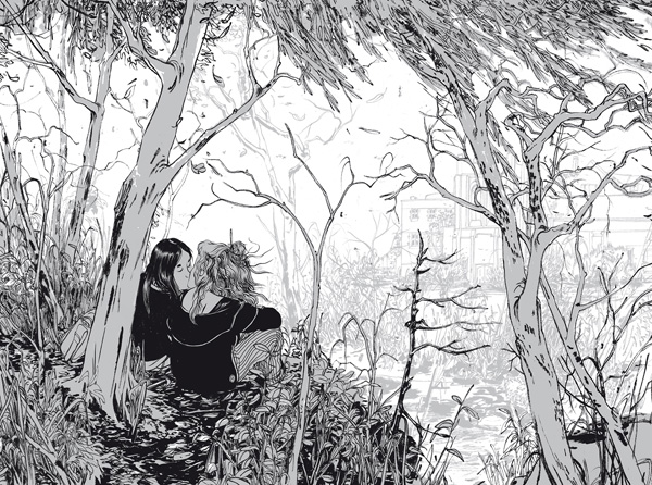
Skim, by Mariko and Jillian Tamaki, (2008), paradoxically uses splash pages to transition between scenes, layer impressions, and create a sense of passing time, even though  only a single moment is presented. Both approaches use splash pages earnestly, but where Habibi’s splash-pages-on-steroids amplifies their stillness and power, Skim  converts this potential energy into emotional movement.

Skim Double Page Spread

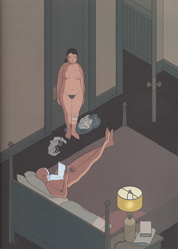
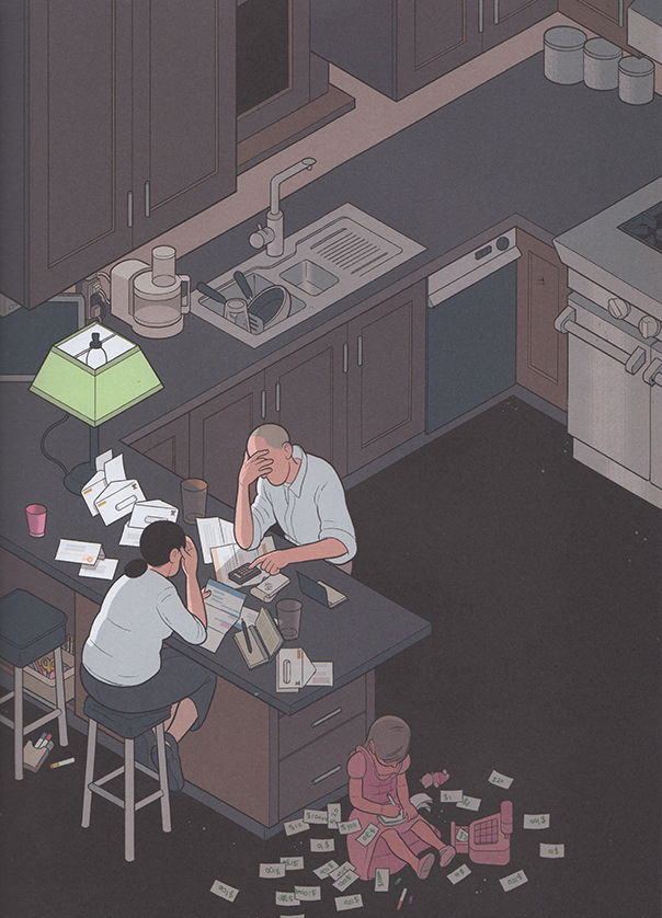
In Chris Ware’s Building Stories, (2012), the cartoonist ironizes the epic quality of the splash page by depicting banal moments in the life of his characters. However, the splash page has the last laugh, fostering a sort of ‘epicly banal’ or ‘very depressing’ feeling, which hasn’t escaped the notice of critics like Douglas Wolk. Perhaps Ware’s splash pages are better read as mislaid covers; they share the cheeky realism of his illustrations for The New Yorker, and one of these pages was featured as a ‘joke cover’ on the New Yorker site. It seems difficult to use the splash page insincerely– it transforms its content into something remarkable, whether the artist meant it to be read that way.

buildingstories_splashpage_2

buildingstories_splashpage

It’s funny that one of the most prominent and dramatic techniques in comic storytelling is one that makes a comic behave a little less sequential, fragmented, even hybrid-like. While captions and speech balloons are often present, they feel less like a competing element, especially in terms of scale, (aside from the author credits and copyright jargon jammed into some mainstream pages.) The splash page isn’t actively read as much as it is passively gazed upon, or absorbed, as if on a wall. That jump from reading to gazing is partially what makes experiencing a splash page feel profound. But only one moment can be presented, and there often isn’t much to figure out. The splash page is the opposite of the comics gutter, the space between the panels that contains the ‘unshown,’ and according to Scott McCloud, generates the medium’s storytelling power. While splash pages and individual panels are the easiest to display, a cartoonist’s panels and gutter transitions better capture the essence of a narrative work.

Its not surprising that the art-world and collectors, unsure of how to hang comics on a wall, would favor panels and pages that behave more like paintings. But is it possible to successfully bring comics narrative– small, printed, sequential and ambiguous– into a museum setting? Or is its special breed of profundity incompatible with what attendees expect from a gallery show? Outside of more people reading actual comics, (and how would they be convinced to do that?), is there a venue, or a kind of oration, that better matches the type of transcendence a comic book achieves, rather than what it reaches on one page or panel? As long as the gallery-show remains the standard by which high-brow acceptance is judged, discussion of what makes the comics medium work, (or even great,) will be locked onto their resemblance of fine art. Artists with greater technical skill will be rewarded most, despite the fact that the art world has bucked judgements of skill, chaining comics to a quaint nostalgia for draftsmanship.  And severing panels from their original sources does not an art movement make– shows will remain an oddity, a fun, occasional diversion from looking at real art. Many people would not mind. Some readers will always need comics to act a little bit more like other things, in order to love them in those kinds of ways.