The Extended Laces; or Drusilla’s Fatal Brochure

The Extended Laces
or, Drusilla’s Fatal Brochure

By Claudia Fonce Earbrass

Author of The Unsprung Trampoline, A Thousand Pins, Why?, The Applecramp Sextet, Did She Remember?, The Fantod Regrets, and A Scent of Cedared Fields


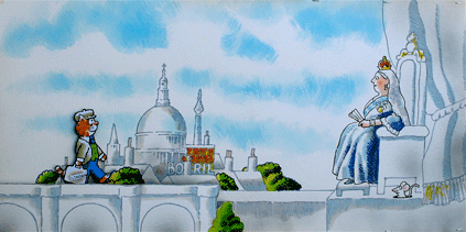
Hello to everyone at xL Design Studios. Neil here and very happy we have this chance to work together. So, the title page. Very much suggest central image plays on sneaker and laces, with the laces in advanced state of extension, just sprawling out there. That’s recto. Verso, we have the comic book, and that’s tattered and it looks like it’s been flung wherever it is—pages splayed, whatever. Placement of the title and byline and the “Author of” book titles: entirely up to you. Whatever works, and never mind about using all the book titles – we’re perfectly comfortable with their serving as design elements at your disposal. That being said, Scarlett said to tell you she likes The Applecramp Sextet.

 
Drusilla was left for the day in her family’s unexplored new home.

All right, first page. Think we discussed the kinetics, the set up for the flow we want from page to page. Kieran’s handling that, am I right? Hello, Kieran.

Drusilla, house, car. Car’s taking off, house looms, Drusilla looks at it, her back to the car. Car: mid-’70s vintage Volvo. House: not a teetering wreck, not necessarily a haunted house, but a big pile with many windows and ledges and little roofs, and so on. Drusilla’s look: as discussed. Skirt, sweatshirt, sneakers. Alinor, did you send the studio the character profiles? She says yes, so I expect you’ve got it. If not, text her, she’s on duty to look out for such things.

Just want to reiterate here that Drusilla’s sneakers and laces are in view from the outset and page by page. Always in view, laces always untied and getting longer.

 
Her parents absented themselves to join in a sordid debauch.

Tricky one. We want a very post-hippie, mid-70s feel: longish hair, wine glasses, joints,, jeans, tennis shorts. Perhaps a stereo with speakers out on the lawn, if feasible with regard to panel space. But here’s the balancing act I was talking about. As discussed, we want all that in the idiom of our source artist. At the very least, probably kohl darkening around the characters’ eyes. Anyway. When we see them, the participants are sprawled on the lawn in a sodden tangle. And there’s suggestiveness, what with shorts, blouses, etc., tugged awry.

 
Drusilla set herself to know her new surroundings.

Hi. Alinor here. Neil has to field a thing, so I’ll be passing on his notes and so on. All right. All … is this page 3? All right, his notes say: “inside house, big stairs leading up, dark, Drusilla at foot of stairs, one foot edged to ward them, expression dubious—posture like p. 1, Gilded Bat.” And he has “Period detail, if poss: ’70s again.”

 
There was a box under a bed she did not like to think about.

All right, that’s pretty clear. Bed, box under it. A cardboard box, quote, “as from a liquor store,” but Neil says no brand names, etc. Unmarked box. “Packed full a long time, strained at seams, flaps dented and wrinkled.”

Drusilla looking at box, Neil says: “expression similar to-—“ Oh, sorry, can’t make it out.

 
But its attraction proved too powerful.

Neil just texted to say Professor Bloom very much likes Scent Cedar Fields. I don’t know. I guess you know what that is.

Anyway, Drusilla pulling out the box.

 
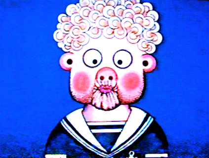
The pamphlets she found baffled her understanding.

Now we have the comics, magazines, etc., that are in the box. Neil says, “Tricky, the balance again.” I guess you know what that is. Okay, quote, “suggest no pictures, titles on covers, except House Mystery, H. Secret, 1 of each.” And he says have the comics, quote, “really flung about, a couple small drifts of them.”

 
She read them with an undeniable fascination.

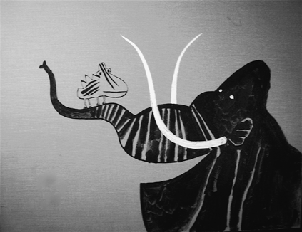
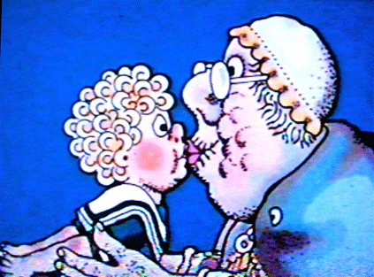
And this is like before, but now she’s on her stomach and reading one. And, because this is triple underlined, and behind her, in the doorway, the doorway’s left side, we see the last bit of a superhero ankle and heel, like, quote, “a superhero was just passing by and this is all we glimpsed.” Drusilla doesn’t see, and that’s underlined too: “Drusilla no idea.”

 
Her parents’ return startled her. Pushed by an instinct she could not name, she hid the booklet.

And now she’s moving about, getting the comics back in the box. Neil’s note says, quote, “Drus’s posture v.v. Gilded Bat. Visual humor from contrast of frenzied activity and elongated, immobile posture. Gilded Bat good reference.” So he wants you to look at Gilded Bat. And the “v.v.” means “very, very.”

 
Henceforth, she regarded the whole matter with misgiving.

Hallway, the doorway, Drusilla. I mean, Drusilla’s out in the hallway and looking through the doorway, and we can see a corner of the bed. Drusilla’s expression, the notes say, her expression is, quote, “the comic, blank foreboding found on G’s children, white faces, slit eyes, features minimal.” And then he has “Wugg-Ump.” I don’t know.

 
Years passed.

Note says “Drusilla. Same skirt, sweatshirt as before, but she’s teen. Dinner table, parents, rec parents from crowd on p 2, the sordid debauch. Refer character profiles.” Okay, and I sent you those, so we should be okay. He has “Kieran: D seated panel right, profile left.” So if there’s a Kieran, I hope you get that.

 
At college she made difficult friends.

Neil, quote: “Spooky, emptied-out coffee shop, student hangout but depopulated. Suggest great elongation, extension of decor—not just an unhealthy-looking rubber plant but one that twists its way higher up than it should and looks like it may collapse of its own sickness. And on like that. Standard items found in a college coffee shop, but seen a certain way.”

Okay, Drusilla and two friends at center but in the background … Oh, hi! Should I …

Hi, Neil, here. Yeah, okay, Ali, thanks for that. All right, page 11. They have the character profiles, right? Okay, two friends as described in the character profiles, use your design judgment as to where they’re placed in frame. But, and this is key, Drusilla’s laces are getting long now. We start to notice.

 
She searched for her creativity.

Drusilla at a performance art piece by students. I mean, she’s one of the students, taking part. Knock yourself out on this, re: costumes. Note: all girls more elongated and slinky than Drusilla, who looks a bit slumped around them. And there’s the laces. By this point, looking at them, one might wonder how she walks without tripping.

 
The childhood pamphlets sometimes returned to her mind, always at unexpected moments.

Right, same performance. Drusilla, foreground and to the right, eyes on one of the tall, elongated girl students striking a mock-Superman pose, a generic superhero sort of thing, with cape behind her, leg flung back, arm flung forward, all this suggesting flight. Nothing else to suggester superness, just the cape, which is blank, and the posture.
 
And there’s Drusilla looking. Laces in view.
 
In the background, as if peeping in from backstage behind the performance art show, there’s a superhero’s gloved hand and the edge of his caped-and-cowled shoulder and side of the head. Just enough so that a sharp-eyed reader can see.

 
Her parents remained irritating.

The dining room table, as in the “Years Passed” picture. Drusilla home from college. Parents older, squabbling, entirely caught up in each other. Maybe D has a Discman on and its playing. Laces longer; we can see one or both lying along the floor like a snake sunning itself.

 
In the city she found a career.

Drusillla, same posture, same place in panel as on page before. Now she’s at an office, computer screen in front of her. The monitor is one of those clunky jobs from the 1990s. Scarlett adds, quote, “Very then.”

 
And spent time alone.

Now in a movie theater. Same posture as last two pages, but now she’s angled toward the panel’s rear, toward an out-of-view movie screen. Empty seats on either side of her, other people spotted here and there in the hall—some couples, heads together. Suggest focus on the thin carpet peeling up at one corner, laying bare cement floor. Certain shabbiness so extreme it’s desolate—think that’s a G sort of thing to do, visually.

 
Her difficult friends became too difficult or too successful.

Drusilla at happening sort of downtown art party. She’s in foreground. One of her friends is there with her, sulking at her. The other is in the panel’s background, surrounded by a crowd of limp-looking hipster types, being lionized. Lot of room here to play with ’90s hipster accoutrements and decor in a G idiom. Want to stress elongation wherever possible, especially upward. A sort of pinched, unhealthy, looking-like-it’s-about-to-topple upward growth in all things, except Drusilla.

 
Parties confused her.

Okay, same party as before, different angle. The two friends still in view but off to the sides, one still being lionized, the other getting chatted up by a dubious type of some sex. Drusilla front and almost at center, looking toward us, face bleak. More with the ’90s hipster decor. Laces.

 
She became a waif.

Now Drusilla, still at the party, same place in frame, same clothes as ever—the sweatshirt, skirt and sneakers—but she’s sitting down with legs stretched in front of her. Still looking straight at us. Laces are distinctly longer than ever.

 
None of her poems were published.

Drusilla in her apartment, facing left—you have that, Kieran?—and an opened letter in her hand. It’s a rejection slip. Maybe a pile of them on kitchen table, but don’t overdo—sparseness important in all things with G. Apartment: sticks of furniture, little portable TV, Discman and scattered discs, scattered posters on wall for Lalique, Russian ballet, Nirvana.

 
She decided to work from home.

Drusilla trudging out of the office, with a box for her belongings in standard fashion. Box is almost empty, though. Coworkers look on grimly, supervisors frown, etc. Really she’s been fired, that’s the message.

 
She endured seeing her parents for the weekend.

The dinner table again, but with angle flipped—D now at panel left, the left end of the table, not the right. Parents older, quarreling harder than ever.

 
She found the thought of her journal burdensome.

Drusilla in her room at her parents’. Notebook and pen in foreground on table, Drusilla in background, to left, sitting by window. She’s trying to look out the window but can’t—her eyes are pulled unhappily toward the notebook.

 
Basic cable appalled her.

Downstairs in the dark, on a big couch. White glow from the screen. D on stomach, one leg folded so foot sticks up in air behind her; laces dangle a long way down. She has chin propped on hands and as she looks at the screen with a blankness that would appal one.

 
She found one of the pamphlets again.

Her room. She’s rooting about in a closet and finds a comic.

 
Without knowing why, she sat down to read.

Drusilla same position, same spot in panel as on page 8. On stomach, doorway behind her. Same clothes. But now she’s old and we see it: gray bits in hair, lines near mouth. One leg folded, foot up in the air behind her, and now the laces are spilling everywhere, a life of their own.


fin

And as before. Differences: her face isn’t propped up anymore, now it’s flat with the comic; shadows growing everywhere, especially among the folds and tangle of the laces; and in the background we have the fingers of a superhero gauntlet clutching the upper right side of the doorway, and the edge of a superhero cowl in view above the fingers, as if the creature were about to come and get her.

All right, that’s it. The professor just this instant texted to make sure we have all that about the superhero’s hand and cowl. “Job done, Hal, don’t worry :).” And Scarlett texted to say she likes, for the visuals, she likes a, quote, “Clean look, ex. Epileptic Bike, Rem Visit.” So there’s that.

Ali, you sent them the character profiles? All right, I’m off, thanks, looking forward to the magic I am sure you will—”

 
________
… collaborated with the actress and the professor to come up with an appropriately Gorey-like text. “The three of us developed a sort of electronic round robin,” Mr. Gaiman explained. “There was much buzzing of ideas back and forth via pocket devices.”

“The Extended Laces” recreates Mr. Gorey’s drawing style by means of digital techniques. Mr. Gaiman said, “They tell me we have some 15,000 signature lines and curves in the memory banks, and these are recombined.” He added, “It’s a painstaking process and, in the final analysis, really quite like an art.”

… early on the collaborators decided on updating the time setting, which for Gorey was typically Victorian or Edwardian. “Scarlett felt strongly that the 20th century was the new ‘creepy day of yore,’ to use her phrase,” Mr. Gaiman said. “Having spent so much of my life in that century, I could not say she was wrong.”

There is the possibility of a “syntha-Gorey” series, but no products are due to appear beyond “I am a Waif” t-shirts and sweatshirts. These feature the book’s heroine looking dejected and unsettling in the Gorey manner, and with overgrown sneaker laces. “We adamantly rejected the idea of marketing actual extended sneaker laces,” Mr. Gaiman laughed.

“There are these odd moments when one sees around corners,” Mr. Gaiman reflected when asked what attracted him to Mr. Gorey’s work. “I expect everyone has those. Mr. Gorey can in part be described as someone who was always seeing around corners, from one to the other, and who never learned how to stop.” He added, laughing, “If he wouldn’t find it presumptuous of me to say so.”
__________

Click here for the Anniversary Index of Hate.

Voices From the Archive: Kurt Busiek on Why Batman Is Not Green Lantern

Way back in 2009, Tom Crippen asked why Batman wasn’t given the poewr ring instead of Hal Jordan. I suggested that this showed that the whole shared world concept was idiotic. Kurt Busiek took the opportunity to explain the pluses and minuses of DC’s shared world.

[Noah]:My point is just that the whole continuity/shared world aspect of the big two’s output has some real downsides; it’s kind of ridiculous and incestuous and can lead to a lot of idiocy. I think Tom’s question gets at that. The real question, for me, at least, isn’t so much — why doens’t Bruce Wayne get a ring? As, why is it a good idea to have this kind of fan-fiction shared world in the first place?

Because it’s fun to have the characters meet.

It’s fun to have Batman stories, and it’s fun to have Superman stories, but it’s fun to have Justice League stories, too. It’s not really any more complicated than that. It’s entertaining.

The stories are the cake, and the shared-universe stuff is frosting. Things tend to go horribly wrong when people start to think the frosting is more important than the cake, and then get better when they remember that it’s about the cake after all.

The real answer to questions like, “Why doesn’t the Flash clean up Gotham City, too?” is “It would make Batman’s cake lousy. People read BATMAN because they like crimefighter stuff where Batman’s cool, and don’t really want to see Superman or the Flash or Green Lantern mess with that particular cake.” On the other hand, people who like stories where Batman and Superman and Green Lantern work together have the JLA cake, and some people like both kinds of cake.

But if you start to tie it together with logic foremost rather than entertainment, then you need to explain why Superman doesn’t help all the other heroes almost all the time, and why aren’t the crimefighters turned into SF-type heroes to make them more effective, and you end up with everything being JLA cake, and no solo Batman cake left. Or you come to the conclusion that it doesn’t work, so Batman shouldn’t be in the JLA, which maybe preserves the Batman cake, but it messes up the JLA cake.

So in the end, the answer to all of these questions is: Don’t mess with my cake.

Batman cake, when well done, is good. JLA cake, when well done, is good. But if you pay too much attention to the frosting, the cakes all start to taste the same, and that might be logical, but it’s boring.

This is also known as the Go ‘Way Kid, You Bodda Me school of comics continuity. Shared universes are fun as long as they make reading comics more fun, and not fun when they start to tangle things up and mess with the individual series concepts. When that happens, you can either go with it even though it messes things up, in the name of logic and continuity maintenance, or you can sweep it under the rug and look the other way.

Much as I love continuity, I’m a big fan of sweeping it under the rug and looking the other way. If it serves the X-Men series better to let Kitty Pryde age while it serves FF better to have Franklin age a lot slower, then that’s good — that’s cake, and both the FF cake and the X-Men cake should be good on their own terms. You just don’t have the characters talk about how they’re aging at different rates.

And if Batman could solve most of his cases by getting on the JLA communicator and asking Superman or Rip Hunter or someone to use time-travel or super-powers to solve the mystery, then you ignore it, because that’s frosting, and the important thing to do is make it a good Batman cake. He can do all that stuff with Superman or Rip Hunter in the other cakes, where those flavors enhance the story rather than messing it up.

[Noah:] But that’s probably just me…

Not really. But just like readers who don’t let it bother them that Nero Wolfe was 40 years old for 40 years straight, or that Linus was in kindergarten when Sally Brown was an infant, and later they were in the same class, there gets to be a point where you decide whether you want it to be strictly logical, or you want it to be fun.

Used to be, things sold better when they didn’t tie in too much, and nobody asked why the Avengers didn’t show up to help out with Galactus or where Spider-Man was that day. Nowadays, it seems like you can’t do a big story without it sprawling over most of the other books in the line, and that’s selling well…for now. But next year, or five years from now, who knows?

Maybe the individual cakes will be more important. Or maybe it’ll be mostly frosting, and Batman _will_ have a power ring.

Kurt has several other comments on that thread, so be sure to click through. Also, I discovered while putting this post together, Kurt actually collected his comments together on his own blog here (and that’s where I got the nifty image below by Joe Quinones.)
 

Voices from the Archive: Alison Bechdel on Fun Home

Alison Bechdel commented briefly on Tom Crippen’s Fun Home review.

Tom, I think you’re spot on about my dad and his experience with grad school. I don’t think he had a nervous breakdown, but he certainly freaked out when faced with stiffer competition. I definitely did not follow that path to its proper end in Fun Home. At the time it seemed just too complicated, like it would drag the narrative off track. But of course that’s probably an indication that it was worth pursuing.

And thanks for corrective critique, Noah et al. Really. The praise gets a bit wearing. I’ve been rather surprised that no one called FH pretentious before.

The description of me as a one-armed tennis player is eerily apt—I often feel like that. And lemme tell you, it’s fucking exhausting.


Robert Binks: More Works by an Unassuming Master ( part 4 )

Hello! We come to the end of our second round of posts devoted to Robert Binks, illustrator and artist extraordinaire. Illustrations will be our focus this week, with a sampling of Mr. Binks’ freelance, private and on-staff work (for the Canadian Broadcasting Corp.).

As always, work done for the CBC is © CBC/Bob Binks, and Mr. Binks’ private works are © Bob Binks. Our previous posts can be found here, and scans of his illustrations for a book of  Ogden Nash’s poetry are here.

First, an illustration done for the Toronto Star newspaper during the 1970s:


The picture grabs the eye, as a newspaper cartoon has to, but it does the job in a way that’s quite unusual. The drawing is built around two sets of steps — the products rising up from the TV, and the animals making up the audience — that zigzag up from the lower right to the higher left. How often do you see that? And the shapes making up each group tend to get bulkier as the group rises.

More dogs, this time in a card Mr. Binks made for a friend who had lost a pet:


A pair of subtle, unorthodox touches: the tiny drop of the composition’s central line from left to right, and the spare but warm placement of color among the picture’s gentle grays. The red motto and polka dots are presented front and center, then left on their own until color reappears at the far right of the drawing, just where the gently dropping central line comes to rest.

Now for six drawings taken from a group of nineteen. As we have seen before (that is, here, here and, if you scroll down, here), Mr. Binks finds something provocative about cows, and especially cows  juxtaposed with such unexpected settings as the typical modern metropolis. Or, as he puts it less pretentiously, “Recently I felt I just had to write and illustrate a cow story for my grandchildren. Again, the theme is about a cow and the big city.”

Below is a selection of illustrations from his privately made book and its story of one cow’s heroic odyssey:


A triumphant sequence! Which brings us to our clean-up pair of pictures. First, from the Toronto Star, a drawing that Mr. Binks has also used for cards congratulating friends on their birthday:

And a studio graphic that the CBC show Take Thirty used for station breaks:

That’s good advice, as we hope to present another Binks sequence a little down the road. In the meantime, enjoy a healthy and prosperous 2012.

Robert Binks: More Works by an Unassuming Master ( part 3 )

The above says it all, or pretty much. Welcome to the Christmas installment of our series on Robert Binks, the Canadian illustrator, painter, sculptor and greeting card designer who has spent more than half a century creating beautiful and playful works of art. His greeting cards, all made privately for friends and family, come in for special but not exclusive attention this go-around.

As always, Mr. Binks’ private works are © Bob Binks, and you can find all our posts to date here and Mr. Binks’ illustrations for the poet Ogden Nash here.

Our opening picture shows the offbeat way Mr. Binks likes to play with old images and contrasting styles in his cards. He says:  “I created this personal Xmas card in 2009. I tried to combine the old with the new — I love that old photograph and I had used it in one of my CBC animations circa 1980 about the history of Toronto.” The CBC is the Canadian Broadcasting Corp., where he worked for most of his career.

The card is a favorite of mine. The whiteness and the giant mod Christmas bulb set off the solemnity of that black-and-white child from long ago.  The combination is vivid and funny at the same time.

Now a pair of sculptures:


The artist calls these the “Goodie Gals.”  Mr. Binks:
“Back in the ’50s, while working as a display designer in Eaton’s Department Store, I created a graphic idea of a woman wearing a large brimmed hat filled with goodies. In 2010 I finally brought this idea to fruition creating these two ceramic heads with removable plates.” Take the plates off and the two women becomes vases for flowers.

Next a very Canadian recipe page:


Mr. Binks drew the illustrations for the Globe and Mail, Canada’s leading newspaper, back in the early 1960s.  Like the “Good Girls,” they show his knack for generating feeling from a few simple lines. The two drawings also reflect his tendency to pile simple geometric shapes into a block, and to fill spaces with dense texture or textures (often ones that show a strong contrast, as with the tree’s bark and the little girl’s blanket).

Another greeting card, this one from 2008:


Santa’s red hat is actually a flap; you lift it up and there’s his party hat for New Year’s Eve. The balancing of the modest script greetings atop Santa Claus’ hat is very Binksian, if I may coin a term.

A trio of  wood statuettes:


Mr. Binks:  “The hot dog man was made for my grandson. In the square base of the Santa is a music box movement that plays ‘Toy Land.’
The piano with the abstract design plays ‘Yesterday.'” I love the hot dog man’s mustache and matching hat-brim shadow, and the piano shows the same sort of splashy but clean-lined color arrangement that shows up in some of Mr. Binks’ paintings.

Two holiday-season cartoons with a distinct ’60s flavor:


Mr. Binks:  “This Christmas page was done for Chatelaine magazine circa 1965.” The party cartoon’s elongated shapes crowded together are again very Binksian. But what I like best is how the charm characteristic of Mr. Binks’ work coexists with the Peter Max trimmings.

And now a run of highly inventive Christmas cards. The first is from the mid-1990s:


Mr. Binks:  “The card is received in a flat envelope. When opened, the house and trees pop up and Santa’s hat appears in the chimney. I wrote the poem to support the card.”

A card from 1986, this one with a uniquely adjustable Santa schnozz:


Nudge the chain and Santa gets a new profile. Caption:  “… a nose is a nose is a”

Next, a card from the mid-1980s. Mr. Binks:  “Card flaps open up in stages to reveal a Superman Santa.”


Finally, a combination Christmas and New Year’s card:

It’s from 1976. Mr. Binks: “I just had to do a card with Guy Lombardo ushering in the New Year. This is a multilayered card housing an elastic band to animate the action. When the Christmas tree is pushed down, the TV screen changes from Santa to Guy Lombardo. The cat wakes up to the sound of the New Year festivities.”

I think it’s fantastic: the concept, the drawing and the use of Lombardo’s lividly tinted photo. That poor cat!

And on that note, a Merry Christmas and Happy Hanukkah. Next week we’ll have the last entry in this round of posts. The focus will be dogs and cows — don’t miss it.

Robert Binks: More Works by an Unassuming Master ( part 2 )


Welcome to part two of the second round of posts devoted to Robert Binks and his work. All our posts to date can be found here, and Mr. Binks’ illustrations for the poet Ogden Nash are gathered here. All the works in this post are © CBC/Bob Binks.

Let’s start with a look at Mr. Binks and hat design. He models the work himself, along with a clown nose for added high spirits:
  

“This hat celebrates a new CBC building to be erected,” Mr. Binks writes by email. The occasion was lunch in 1984 for CBC graphic designers.

Now two illustrations Mr. Binks drew for broadcast around 1960, during the era of black-and-white television. They were part of a story called “The Frolicking Mastodon.”

“The drawings were done in India ink on beige window blind with added white paint,” Mr. Binks writes.

The next three works were done about 1980 as part of a story broadcast on the CBC children’s show Mr. Dressup. The story’s set-up is simple: Queen Victoria hires a cat to rid her palace of mice.

“In contrast to this world of high tech that we now live in, we created simple animated solutions by moving cut-out shapes,” Mr. Binks says. “The stagehand at the back of the graphic would move the magnetized cat cutout along a felt pen line that determines the action. The camera follows the action of the cat as it crosses the bridge along the path to visit Queen Victoria.”

“The stagehand moves the magnetized mouse up out of the hole.”

“Part of the castle door is on another level to allow the mouse to appear and travel down the path following a curved line.”

Next, three panels belonging to a feature created during the mid-1970s for the CBC television program Such Is Life. Their collective title is “Strange Beliefs of Children.”

Mr. Binks: “The animation was preshot by myself on an animation stand. This was a simple animation technique where I used paper cut-outs and I double framed each shot.”

The first two center on the longstanding trepidation felt by little boys over contact with their grandmothers’ insistent, wrinkled mouths.


In the first shot, “the little boy was moved up to Grandma’s mouth by moving her long arms,” Mr. Binks writes. Then “a match dissolve changes the little boy’s normal lips to puckered lips. The eyes go from normal to crosseyed.” And that is what happens to the poor blighters. The CBC was on the case all those years ago.The next picture also addresses a widespread problem:

The boy is about to encounter something horrible. From the script: “There’s this thing which lives in the toilet and likes it and when you go in the night and flush the toilet it wakes the thing up. So you’d better hurry getting out of there — but this kid was too slow.”

Mr. Binks used a series of cutouts to show the boy flushing the toilet, then being seized and dragged into the toilet by a wormlike creature with a suction-cup head.

So this is what the CBC wants to show young people! Mr. Binks notes that his nephew, when small, was given a look at the sequence and suffered nightmares as a result. “As an adult he still has vivid memories and requested a copy,” Mr. Binks adds, which tells us something about the bizarre power of nostalgia.

Finally, a foldout Valentine’s card Mr. Binks made around 1980. Its recipient, of course, was his wife, Katharine. It’s a lovely piece of work, even in the miniaturized form we must settle for here:

Next week: A dog and cows!

Force For Good

I’ve recently finished reading Ben Saunders’ book, Do the Gods Wear Capes?: Spirituality, Fantasy, and Superheroes. It’s a really enjoyable study. The chapter on the Marston/Peter run on Wonder Woman in particular filled me with bitter envy; I wish I had written it, or that if I had it would have been done so thoughtfully.

Anyway, perhaps in recompense for my blighted hopes, I thought I’d talk a little about the non Marston-Peter parts of the book and about some differences I have with it. In doing so, I’m going to refer to Ben as “Ben”, because we’ve been corresponding, and so it feels weird to call him by his last name. Hopefully he won’t resent this or other liberties.

So as the title of the book implies Do the Gods Wear Capes? looks at superheroes in terms of religion. However, Ben is not (thank God) adding to the dreary discourse which attempts to validate superheroes by asserting that they are modern myths. Rather, he makes the much more interesting claim that superheroes are myths about modernity. To quote his conclusion at some length:

Superheroes do not render sacred concepts in secular terms for a skeptical modern audience, as is sometimes claimed. They do something more interesting; they deconstruct the oppositions between sacred and secular, religion and science, god and man, the infinite and the finite, by means of an impossible synthesis. They are therefore fantasy solutions to some of the central dichotomies of modernity itself. A cynic might conclude that the suspension of disbelief required to enjoy such fantasies applies no less to their unlikely depictions of ethical perfection as it does to the spectacle of men and women who can fly, climb walls, and see through satellites. But, less cynically, we might instead interpret these stories as testaments to the strength of not just our will-to-power, but also of our will-to-love — our will-to-kindness, concern and decency. The dream of the superhero is not just a dream of flying, not just a dream about men and women who wield the powers of the gods. It’s also a dream about men and women who never give up the struggle to be good. W.B. Yeats once wrote, “in dreams begin responsibilities.” But perhaps possibilities of all kinds begin in dreams. And perhaps among these possibilities there is still the prospect of a spiritual awakening — even from within the skeptical, rationalist, materialist assumptions of modernity.

Ben works this theory through in terms of a number of characters…but he starts, logically enough, with Superman. For Ben, Superman isn’t defined as the quintessence of strength or the quintessence of power — rather he’s defined by “essential goodness”. Various creators have attempted to struggle with what “essential goodness” means in various ways. Ben talks about the early Siegel/Schuster issues, in which Superman beat up capitalists, suggesting an uneasy antagonism between the good and the democratic/capitalist institutions of the United States. In the 1950s, Ben says, Superman comics linked “the good” and the United States in a more straightforward manner (“Turth, Justice, and the American Way!”) Later, in the 70s and 80s, creators who worked on Superman struggled with his establishment image. For instance, Ben points to the Eliot S! Maggin story “Must There Be a Superman?” in which Superman is told by the Guardians of the Universe that his presence on earth is hurting the moral development of humanity, and in which he is confronted with the moral dilemma of how, or whether, to encourage migrant farm workers to organize.

People often argue that superheroes are dumb because they’re simplistic; because they create a bone-headed binary between good and evil. Ben’s argument is that, in fact, Superman stories have traditionally not so much asserted as investigated this binary. In the light of late modernity, as religion has faded, Superman asks “how can human beings be good?”

Ben finds one of the most effective answers in the Morrison/Quiteley All-Star Superman, in which Superman-as-reporter=Clark-Kent visits Lex Luthor in prison. Luthor spends the entire visit boasting about his greatness and threatening Superman and so forth. Unbeknownst to Luthor, though, riots and chaos are breaking out in the prison around him, and Superman-as-Clark has to save his life repeatedly. Ben concludes:

At such poignant moments, we see that only Luthor’s vanity could allow him to think of Superman as his enemy. In fact, Superman is his gentle savior — so gentle that even as he preserves Luthor’s life, Superman allows him to maintain his illusions of power and control. Thus, through Luthor, we see that Superman’s devotion to humanity is such that even the worst of us will always be treated with infinite patience and compassion. The results are both funny and moving, and leave the reader in no doubt as to the most incredible aspect of Superman’s character. Few human beings are ever so good. This, perhaps, is the final, paradoxical lesson that we can draw from the 70 years and more of Superman’s adventures — that it may be easier to fly, to see through walls, and to outrace a speeding bullet, than it is to love your enemy.

The sentence that most stays with me from that paragraph is this: “Few human beings are ever so good.” I like it’s simple wistfulness, and I like the way it suggests that, while few are, some might be — that goodness is, after all, something we can share with Superman. Being good isn’t a fantasy. It’s something people can strive for.

But while I like that sentiment, I also feel it’s perhaps a little misleading. Because while human beings can be good, they can’t actually be good in the way that Superman is being good in Ben’s description. The goodness Superman offers, in Ben’s telling, is the goodness of providing complete physical protection while simultaneously allowing the object of that protection to not know what is happening. Obviously there’s a metaphorical sense in which this could happen — anonymous charity, for example. But, in the first place, we’re not reading about anonymous charitable donations, and part of the reason we’re not reading about anonymous charitable donations is, surely, because we would rather watch Superman exercise his many, many superabilities. And, in the second place, even the “anonymous charity” analogy is a vision of the good dependent on a disproportion of power.

Ben is attempting to disaggregate. He looks for the most essential superquality, and that quality is goodness. All the others — strength, speed, flight, superbreath, and on and on — are just gilding on the basic concept. Superman is not about the powers. He’s about the good.

But what if, instead, he’s about both? Or what if, even, the good is essentially one of his powers? Tom Crippen suggests something like this in his own take on Superman and modernity.

Superman has a fine temperament and a lovely smile. It’s not a question of him personally being cold. I saw him on the cover of a kids’ book of math problems, or possibly it was a display ad for an insurance company. But he was taking off into the air and looking delighted about it, and why not? The reaction was perfectly right for him. He’s agreeable and fun loving; that’s not the whole of his personality, but the stuff is in there. It’s there along with all the other qualities the best sort of personality would have. You can assume the presence of all of them, whatever they are; they’re implied, and any of them can surface. If Superman flies off looking keen and determined, that suits him too. So the problem isn’t so much that Superman himself is pompous, either in his icon form or as a continuing-story character. It’s that, as a character, he seems like an afterthought to himself. Everything about him is derived in such a straight line from the central premise—this man is super—that there’s not much point to experiencing him.

Tom sums up the point by saying that Superman, “By definition, by being super, he is the best of whatever comparison he finds himself in. If he is one of two large men, he is the best—that is, strongest—of the two of them.”
By the same token, there are two good people in a room, Superman is the most good.

And part of the reason he is the most good, I think, is because he is also the most strong. The goodness of Superman can’t be disaggregated from the superness; the two are intertwined, and that intertwining has meaning. If the ultimate good is the ultimate force, then it seems logical to conclude that goodness and force rely upon each other.

Here’s another take on force and heroism from Simone Weill’s The Iliad, Or The Poem of Force.

Force, in the hands of another, exercises over the soul the same tyranny that extreme hunger does, for it possesses, and in perpetuo, the power of life and death. Its rule, moreover, is as cold and hard as the rule of inert matter. The man who knows himself weaker than another is more alone in the heart of a city than a man lost in a desert…

Force is as pitiless to the man who possesses it, or thinks he does, as it is to its victims; the second it crushes, the first it intoxicates. The truth is, nobody really possesses it. The human race is not divided up, in the Iliad, into conquered persons, slaves, suppliants, on the one hand, and conquerors and chiefs on the other. In this poem there is not a single man who does not at one time or another have to bow his neck to force.

There is one Superman tale I can think of that captures some of Weill’s insight into force. That would be Alan Moore and Curt Swan’s “Whatever Happened to the Man of Tomorrow?” In this “imaginary” story, Superman deliberately kills an overpowering enemy..and then, in expiation, exposes himself to gold kryptonite, destroying his powers. Here, force and goodness are definitively separated; the first, as Weill suggests, must be cast off if the second is to survive. But when force disappears, so does Superman. What’s left is a good man who is not a superhero — a good man who decisively declares “Superman was overrated. Too wrapped up in himself. Thought the world couldn’t get along without him.” At that point, the comic ends. Superman is still supergood, but he can no longer perform superfeats…and the superfeats were, as it turns out, the point.

I think Ben would respond to this by saying that superhero comics have confronted these very issues — that they explicitly question the goodness of power. Ben talks about this most directly in his last chapter, which focuses on Iron Man (aka Tony Stark). Ben notes that from his inception, Iron Man expressed

ambivalence towards technology — desired as a source of power, but feared and resented, as the cause of a crippling dependency for those who rely upon it…. [This is a] fundamental element of the original version of the Iron Man character — built into his armor, we might say, in the form of his chest plate, which is not only the main energy source for the suit, but also prevents the inoperable fragments of shrapnel embedded in his chest during his days in Vietnam from reaching his heart and killing him. Tony Stark’s very life depends on this piece of equipment; consequently, he can never remove it, amking it a resonant symbol of the double-edged nature of his techno-dependence, as well as a literal barrier to intimacy.

Ben argues that this ambivalence about technology — ultimately an ambivalence about power and humanity’s wielding of power — cryztallized in a 1979 storyline by David Michelinie, Bob Layton, and John Romita, Jr. known as Demon in a Bottle. The story centered on Stark’s effort to get out of the armaments industry, and the government’s subsequent plot to take over control of his company. In addition, the arc follows Tony’s struggles with alcoholism. In the story, Ben argues, dependence on alcohol and dependence on technology are linked. Both alcohol and the Iron Man suit are technologies of control; alcohol providing the illusion of control over one’s own emotional state, the suit providing the illusion of control over….well, everything else.

The cure for both forms of dependency, it turns out, is to acknowledge that the fantasies of radical independence — absolute power, total control, complete self-reliance — are just that: fantasies. The answer to the problem of negative dependence is therefore not the pursuit of independence…but the radical acceptance of interdependence.

In a virtuoso move, Ben then links this realization to the ideology of Alcoholics Anonymous — an ideology which Ben argues is specifically focused on modernity’s obsession with control and power. Leslie Farber, a psychoanalyst whose theories were central to AA, is quoted by Ben as follows:

“Nietzsche, I believe, was not as interested in theological arguments about the disappearance of the divine will in our lives as he was in the consequences of its disappearance. Today the evidence is in. Out of disbelief we have impudently assumed that all of life is subject to our will. And the disasters that have come from willing what cannot be willed have not at all brought us to some modesty about our presumptions.

For AA, of course, the solution to this solipsistic mania for control is to put one’s faith in a nondenominational higher power — to acknowledge that one does not have the ultimate power over one’s own life, much less over the world. Ben links this realization to a Warren Ellis/Adi Granov Iron Man story from 2005, in which Stark experiences something like a crisis of faith, and is able to go on only by acknowledging the limits of his own power and knowledge. Stark in this story does not know that he is doing the right thing…but his uncertainty is itself the (ambivalent, uncertain, but still) sign of his goodness. Like a recovering alcoholic (which Stark is), the acknowledgment of his own limits allows him to function, and to function for good.

The problem, though, is precisely with the “function”. AA critiques alcohol as a technology of (false) control. But the solution it offers is a solution — which is to say, it is a technology itself. The 12-step program is a program, a system, a utilitarian fix. It specifically brackets content (what exactly is that higher power?) in the interest of getting the alcoholic back to becoming a functional member of society. As Ben says, AA does not insist on the existence of God, but rather “insists on the necessity of the God concept.” God is not a transcendent hope; he’s a convenient tool, like a socket wrench.

Tony Stark does not, then, take off his suit of armor to find vulnerability and connection; he takes off his suit of armor to put on a bigger, badder, better suit of armor. The acknowledgment of his dependence and powerlessness is not the beginning of a different kind of story. Tony Stark does not change his life; he is still committed to an existence where he gets up, suits up, and shoots bad guys in the face with repulsor rays. The change for Stark is simply a retooling; humility is a necessary pit stop on the way to greater feats of godlike power. The means, in this case, justify the end. AA is a part of, not a solution to, the technological pragmatism of modernity, in which even god is valued solely as a cog in an ever-more-functional machine.

That’s the case for superhero comics as well, I think. Ben is right when he sees superheroes as a myth of modernity. But I think he’s overly-optimistic when he sees in that myth a hopeful sign of a possible spiritual reawakening. Rather, it seems to me that superhero comics suggest not modernity’s possible salvation, but its depressing limits. For both superheroes and modernity are genres in which the good waits upon the powerful.