What It Really Takes to Get from Here to There (Analyzing Comics 101: Closure)

Reading a comic book is easy–even when there are no words to be read. You just look at a picture, and then at the next picture, and so on. But why do any of them make sense side-by-side? What is your brain doing as it leaps from image to image?

In Understanding Comics, Scott McCloud defines the Gestalt psychology principle of “closure” as the “phenomenon of observing the parts but perceiving the whole” (though it more specifically indicates a viewer filling in visual gaps between disconnected parts) and applies it to comics gutters: “Nothing is seen between panels, but experience tells you something must be there!” He goes on to explain: “Comics panels fracture both time and space, offering a jagged, staccato rhythm of unconnected moments. But closure allows us to connect these moments and mentally construct a continuous, unified reality.”

McCloud focuses his analysis on gutters and therefore types of transitions possible between panels (though closure is independent of panels and gutters, since insets and interpenetrating images work the same ways). He comes up with six types:

Image result for scott mccloud panel transitions

They work reasonably well, but his focus on panel transition has always struck me as slightly off. When I use it in class, students often don’t come to a clear consensus when analyzing any particular panel sequence. Moment-to-moment and action-and-action, for instance, are often ambiguous, sometimes combining identical leaps in time. And since actions do occur in McCloud’s moment-to-moment examples (a women blinks!), it’s not exactly clear what constitutes an “action.” Aspect-to-aspect can also be indistinguishable from subject-to-subject, both of which may or may not involve a movement in time, and so may or may not also be moment-to-moment or even action-to-action. And scene-to-scene might be a location leap and so also a kind of aspect-to-aspect at the big picture level, or a scene-to-scene can be in the same location but at a different time–so then how much time has to pass for an old scene to become a new scene?

These are annoying questions, but they really do come up when you try to breakdown a panel sequence with a roomful of students. So instead of categorizing transitions, my colleague Nathaniel Goldberg and I categorized types of closure while drafting our essay “Caped Communicators: Conversational Depiction and Superhero Comics.” Instead one all-purpose “perceiving the whole” process, we see four very different kinds of closure, each of which can occur by itself or in combinations.

Spatial:  Subject matter drawn in separate images is depicted as existing in physical relationship to each other, typically as a result of panel framing. (What McCloud identifies as aspect-to-aspect, subject-to-subject, and some scene-to-scene transitions require spatial closure.)

Temporal:  Undrawn events are depicted to take place outside of events drawn in separate images, typically as a result of panel transitions and so occurring as if in gutters. (What McCloud identifies as moment-to-moment, action-to-action, and some subject-to-subject and scene-to-scene transitions require temporal closure.)

Causal: Drawn action is understood to have been caused by an element absent from a current image but drawn in a preceding image. (None of McCloud’s transitions, not even action-to-action, accounts for this type of closure.)

Associative: A metaphorical relationship is depicted between two images in which one image is understood to represent some idea about the other image. (Though McCloud does not identify this type of closure, Jessica Abel and Matt Madden in Drawing Words Writing Pictures add “symbolic” to McCloud’s list of transition types. Such symbolic transitions require associative closure.)

It always helps to look at specific examples, so consider this three-panel sequence at the top of page 28 in Watchmen #8:

In the first image, artist Dave Gibbons draws the shadow of a statuette cast over the face of a frightened man lying on the floor. The second image shows the statuette in the fist of an attacker. Taken together, spatial closure is required to understand that the two images occur within a few feet of each other, each image drawn from one of the two men’s points of view. The second image also requires temporal closure because the statuette is behind the attacker’s head at an angle that would not cast the shadow seen on the victim’s face in the first image. Gibbons therefore also depicts a movement forward in time during which the attacker has cocked his arm back to strike.

The third image depicts a jack-o-lantern crashing to the floor with some falling books. It uses all four forms of closure. The pumpkin exists in the same space as the two now undrawn men (spatial closure). The pumpkin is crushed at a moment immediately following the second image (temporal closure). The falling books have been knocked down by the now undrawn attacker of the previous image (causal). And, because it resembles a human head and breaks open at the moment a reader anticipates the statuette striking the man’s head, Gibbons implies that the man’s head has been similarly damaged (associative).

A close reading of the sequence also reveals some confusion. Regarding causal closure, it is unclear how the attacker overturned the books at this moment since the act of swinging the statuette at the victim on the ground does not clearly involve his intentionally or unintentionally knocking over the bookcase in the same gesture. Instead, Gibbons may have attempted to suggest that the attacker struck his victim and then afterwards overturned the bookcase—an ambiguous two-step action otherwise absent.

I’m guessing Gibbons was fulfilling a directive in Alan Moore’s famously meticulously detailed script, producing this unintended gap in its execution. To address panel transitions that cause only confusion, McCloud includes “non-sequitur” as a type of transition that “offers no logical relationship between panels whatsoever!” So then a non-sequitur produces no closure at all–and so isn’t really type of closure, but is the absence of closure. Which is why we don’t include it as our fifth category.

So our closure types are deeply indebted to McCloud, but I think they also improve on his. I’ll be testing these out in my classroom soon, so hopefully my students will agree. More on that later.

Seeing the Big Picture: The Use of Composition in Comics

Editor’s Note: This is part of a series of student papers from Phillip Troutman’s class at George Washington University focusing on comics form in relation to Scott McCloud’s theories. For more information on the assignment, see Phillip’s introduction here.
_______________________

In his book Understanding Comics, McCloud talks a lot about the balance of words and pictures, and how a change in this dynamic can affect the feeling of a comic as a whole. This relationship is so important that McCloud dedicates an entire chapter of the book to it. But even so, McCloud doesn’t go far enough. He deals with the pictures and words in a comic on only the most basic level, treating words as merely the means to convey written information, and pictures as merely the means to convey  visual information. He completely ignores the element of how the information in communicated, which, given that Understanding Comics is meant to be an examination of  the medium, is quite the oversight.

The choices that the comic creator makes in what to show  within the pictures, where to put the words on the page, and how the reader is to progress from one panel to the next (and not just in the chronological sense) are all crucial to comics. In addition to words and pictures, these aspects constitute a third aspect of the comic: its composition.

The pictures and words contain the base information of the comic — the what. The way they are presented to the reader is the composition — the how. Based on different compositions, the same scene can have a very different feel to it. For example, the pictures and words may dictate two people having a conversation. Imagine this conversation was drawn as a close-up of the two people’s faces, or possibly a wide, full-page panorama of the area surrounding them. Imagine if their text balloons overlapped, or alternatively were as far apart as the page would allow them to get. Those kinds of presentations would create different undertones to the raw information of the scene.

That’s what the composition does. The composition is the perspective the information is shown from. It is how the comic creator controls the reader’s pace, direction, and reaction throughout a comic. No comic illustrates the power of thoughtful composition quite like Alison Bechdel’s Fun Home. Fun Home is an autobiographical piece by Bechdel, which primarily details her relationship with her father. The book discusses her efforts to come to terms with her homosexuality, her love of literature, and  her father’s death in a possible suicide.  Bechdel tells her story through eloquent prose littered with literary allusions and illustrated with deceptively simple drawings. But where Bechdel really shines is in her extremely deliberate compositions, with their masterful use of visual metaphor and layout.

Composition generally happens on two levels: the makeup of individual panels and their contents, and the layout of entire pages. The individual panel scale dictates smaller, more discrete decisions, such as the angle from which to view a scene. The layout uses the larger scale of the entire page and includes matters of sequence, such as how panels flow together and how the narrative progresses. In Fun Home of these levels contribute significantly to how the comic works.

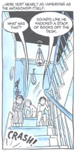
In it’s most basic form, one can think about composition as literally the physical composition of individual panels. It is the way in which the author uses light/dark contrast, line-work, movement, etc. to make the reader look at specific parts of the picture. Take for example the panel below, showing Bechdel and her siblings overhearing their parents fighting.

Notice how all the dominant lines in the image, such as the banister, the wall, the kid’s bodies, all point to the sound effect in the corner. Every part of that image is focused on that one small word and it gives the sound effect a much bigger impact. Even the tails off the text balloons point to the crash. No matter what part of the image the reader looks at, Bechdel is leading them back to the sound.

But composition goes much farther than physical presentation. Arguably the most prominent aspect of composition in Bechdel’s work is her use of visual metaphors; that is, the deliberate setting up of a scene to convey a certain emotional subtext. Take for
example the image below.

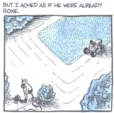
This is at face-value just Bechdel and her father doing yard work. But the long shot showing the physical distance between them suggests the emotional distance as well. The fact they were doing yard work and that at that particular moment Bechdel was far away from her father doesn’t convey any textual information, but the choice of composition does convey important subtext.

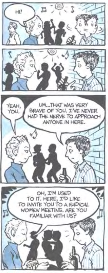
Visual metaphors can be found throughout Fun Home. For example, look at the image below (which has been edited slightly for the sake of context).

The intimacy of the dancers in the background correlates with the conversation in the foreground. Bechdel states in the panel that she’s “never had the nerve to approach somebody” in the club, so for her, the fact that she’s talking to someone else is so radically different from the norm that she and the approaching girl may as well be kissing, just as the dancers behind them are doing. And while the reader may not consciously notice the background, it nonetheless gives the entire panel a feeling of intimacy. Thus Bechdel’s use of these background elements affects our view of the foreground.

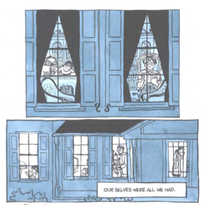
Bechdel also uses visual symbolism in Fun Home. In the book, Bechdel’s father is obsessed with their family home, and spends a great deal of time trying to keep it in pristine condition. The house, then, becomes a central symbol for the family’s relationships. For example, Bechdel often shows us the house from outside, with different characters framed in different windows, emphasizing their isolation. You can see this in the image below, which shows two panels from different parts of the book.

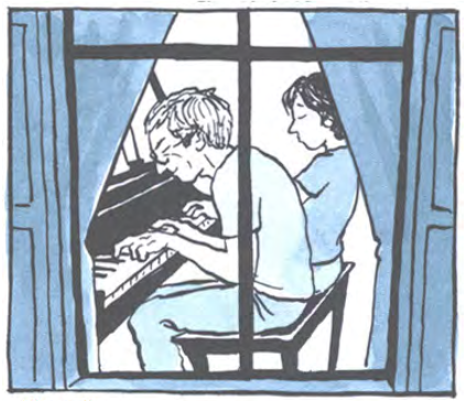
From the reader’s point of view, the windows create a literal barrier that surrounds each family member and prevents them from interacting. Towards the end of the book, however, Bechdel begins to feel closer to her father. To emphasize this shift, she shows herself and her father in the same window for the first time in the comic.

This compositional choice perfectly accentuates the resolution of the book.

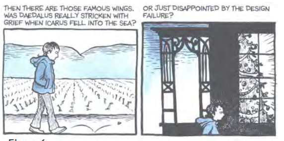
Beyond single panels, composition on a larger scale is about the sequence of moments, the transition between panels and the like. McCloud touched upon this subject in Understanding Comics when he discussed how comics move through time. However, transitions don’t only move a reader through time, they move a reader through mood. Here’s one example

As Bechdel walks between the two panels, the scene gets noticeably darker, reflecting the pessimism expressed in the narration.

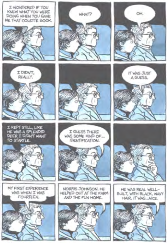
Or look at the image below

Here, Bechdel illustrates every beat of the conversation, even the moments of silence, and thus makes the reader experience it in the same awkward, slowed-d/wn pace as she did herself.

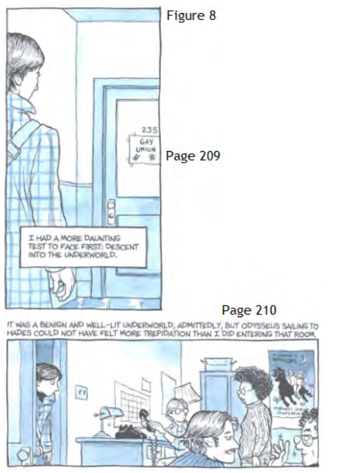
But perhaps the best example of how Bechdel uses composition to set mood occurs when Bechdel visits the Gay Union student group at her college.

Bechdel sets up a large amount of suspense on page 209, calling the group the
“underworld.” Then page 210 she resolves the tension by revealing they’re
just normal people. The narration of course shows how nervous Bechdel was about taking this step down the path to accepting her homosexuality, but the real genius is the fact that she makes this transition over two pages. She uses
the physical action of the reader turning the page to suggest how she herself is physically opening the door. In that moment, Bechdel’s anxiety is the reader’s anxiety. If these panels had been on the same page, they would not have had nearly the same impact.

Perhaps the best approach to thinking about composition is by relating it to movies. If the pictures are the actors, and the words are the script, then the composition is the director. He’s never seen on screen but his hand is in every part of the final piece, choosing how to show the actors, determining what is and isn’t relevant enough to include, and deliberately focusing the
viewer’s attention where he wants it to go.

This is the role composition plays in comics. It fleshes out and gives the pictures and the words meaning that they wouldn’t have on their own. As Fun Home shows, composition is what changes a book of illustrations into a comic book.

The Color Question

Editor’s Note: This is part of a series of student papers from Phillip Troutman’s class at George Washington University focusing on comics form in relation to Scott McCloud’s theories. For more information on the assignment, see Phillip’s introduction here.
_______________________
 
Color remains a question rather than an answer in comics: Some artist’s embrace it, while others continue to ignore it. Whatever its use, color plays an important role in forwarding the message of the artist. Yet such a message is ambiguous. In his analysis Understanding Comics, Scott McCloud notes that color promotes comics by reaching toward reality, making a panel appear to be a much more relatable image to the reader, who lives in a world beyond black and white. Mirroring life itself, which is far from flat, colored images add an extra dimension to the page. But is this the true purpose of color in comics? McCloud suggests otherwise; however, due to the brevity of his designated chapter, he never explains why. Indisputably, comics serve to simplify life, easing the ability to communicate some sort of integral message to the reader. Breaking the fourth wall, color magnifies the author’s claim. Minute tidbits of otherwise unseen details reveal themselves through the additional lens of color.

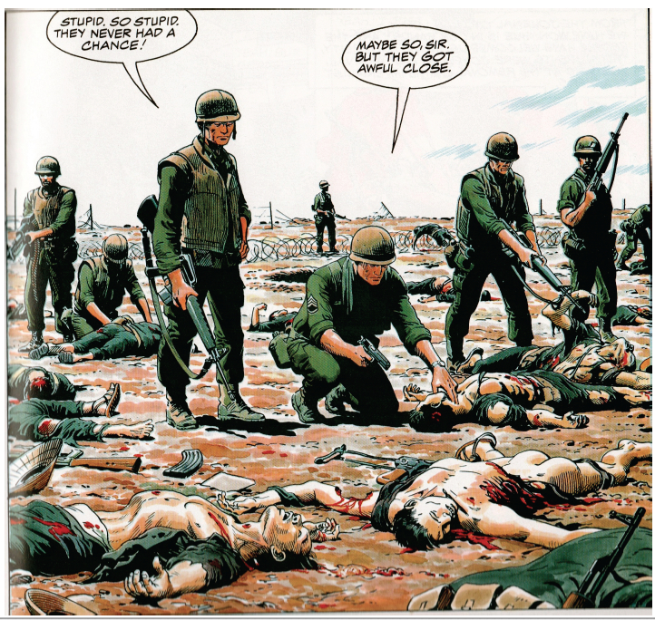
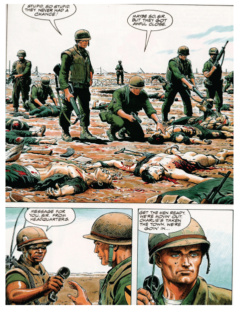
The following image derives from Doug Murray and Russ Heath’s “Hearts and Minds: A Vietnam Love Story.” The panel displays the death and destruction caused by the detonation of a grenade during a battle in the Vietnam War.

Throughout my analysis, I will revisit this image in order to touch upon the overlooked meanings that color specifically reveals.

Color magnifies important details that forward the cartoon’s claim. Though images may appear more realistic, the purpose of color remains for graphics to appear more simplistic. Noting the simplicity of cartoons, McCloud emphasizes that, overall, cartooning is a form of “amplification through simplification” (30). Comics pride themselves in exaggeration, which empowers a point rather than detracts from it. In this sense, color is yet another mouth for exaggeration. Heath’s image exhibits excessive exaggeration due to the use of color. Studying certain features of Heath’s panel, readers must digest uncomfortable truths that the artist is emphasizing. For instance, the two Vietnamese corpses expose gruesome depictions to readers.

In the first image, color contrasts the white bone protruding from the dead man’s neck from the background. Clean and crisp, this bone appears as though it is out of place. Looking as though it were a plastic piece in the board game Operation, the bone could easily slide back into the dead man’s body. Though, in reality, this bone would be muddled with blood and dirt rather than in this immaculate condition. Instead of showcasing visual reality, color emphasizes a statement: Another man’s bullet pierced a bone through another man’s throat. The same argument is displayed in the second image. Here, color bolds the blood that pours from the man’s dislocated torso. Yet this blood is pure red. In reality, such blood would not beam from a corpse; it would be dirtied and dried. Color again simplifies reality, highlighting to readers what happens during war.

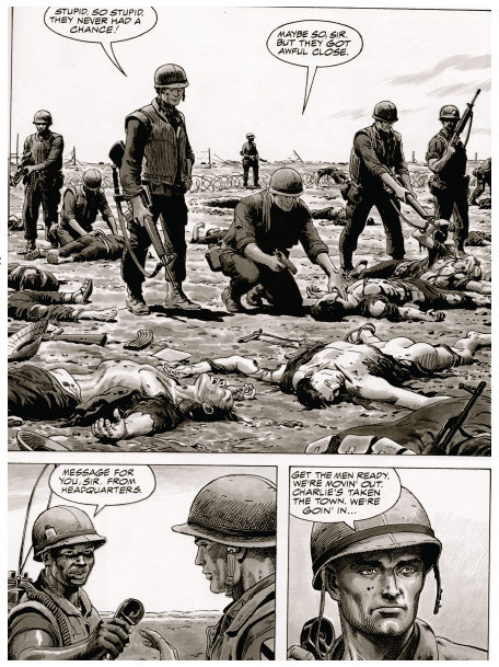
When the same images are displayed in black and white, such an effect is lost. Though readers may understand that the two men are dead, they do not see death’s marks etched in the corpses. The bone is barely visible, and the blood blends with the shading. The colored images are blatant to readers, who inherently understand what each detail represents. Such a technique attests to McCloud’s claim about drawing style: “By stripping down an image to its essential ‘meaning,’ an artist can amplify that meaning in a way that realistic art can’t” (30). Heath’s color truly “strips down” the panel to its bare essentials.

By simplifying a panel to its bare essentials, Heath presents color as an icon. As McCloud defines the term, an icon is an image that represents a person, place, thing, or idea (27). Cartoonists rely on icons to transmit a clear and obvious message to readers. In the case of this panel, the clearest example of an icon is the color red, which represents blood. Readers immediately connect the image of blood with its more powerful meaning: carnage. Heath chooses to depict such carnage through the visual device of an icon, and such an icon is displayed through color.

Beyond functioning as an icon, color breaks the flow of sequential art, emphasizing the subject matter of an image rather than the panel transitions on the page. Referring to the purposeful placement of juxtaposed panels, sequential art stresses the movement from one panel to the next, which, in turn, unconsciously forwards the plot. Looked at as an abridged filmstrip, sequential art carries readers from one important scene to the next. Yet, color seemingly cuts this artificial current.

The selected image comes from a page with three separate panels. Despite the wholeness of the story, color slows the sequential flow of these transitions. The first panel encompasses over a half of the page, warranting some sort of inherent importance in its size. Obviously, the artist wants readers to not only look at this image, but to study it in detail. Despite its size, readers may easily browse from one panel to the next. However, Heath installs color to prevent such an easy transition. After reading this page in its entirety, readers are inclined to revisit the first panel due to its colorful graphic content. The secret to such a phenomenon lies in the highlighter-like quality of color.

For example, moving left to right in the first panel, the focus shifts from the line of soldiers to the sprawl of bloodied corpses. Bold outlines of blood and flesh segment each corpse from the next, hinting that each image has a different story to tell. In fact, each body could be a separate panel. In the panel, four separate Vietnamese bodies are macabrely drawn: An American soldier tests the pulse of a clearly lifeless Vietnamese shell; another American soldier picks at a mangled corpse with his gun; and the final two corpses, torn and shattered, lay brutally close to the reader at the front of the panel. Subject-to-subject transitions would individually highlight each corpse and its features; yet, Heath decides to include multiple scenes in one panel, separating them by color. By choosing this method, color simplifies four possible panels (one panel for each corpse) and gift-wraps them for the reader. Realistically, each corpse deserves its own panel in order to communicate its graphic content, but color simplifies such reality into a single cartoonish image.

By segmenting sequential art, color also simplifies the significance of McCloud’s illustrious gutter. McCloud defines the gutter as the space between panels where closure occurs in reader’s minds. Through closure, McCloud suggests that the message of the comic is conveyed to readers. Such a claim raises the possibility that closure could be misconstrued: Reader’s could interpret a different idea than the artist intended from the panels. Color counteracts such discrepancy. Creating its own sense of closure, color illustrates the artist’s message clearly to the reader. Revisiting the panel sequence, I have manipulated the colors to a black and white format.

Reading the page, readers find that it is naturally much easier to follow the storyline in black and white. The first panel describes the recent conflict, and the gutter to the bottom left panel suggests to readers that such a massacre is a daily display for soldiers, as the sergeant plans to move out to another town. But, in color, such a transition is not so smooth. Color isolates the first panel, giving the gutter transition between the first and second panel a much different meaning. Studying the images in color, readers realize that the comic is exposing the absurdity of death through battles in war. The gutter seemingly empowers this statement, as it quickly introduces another future conflict that promises to be just as gruesome. Murray and Heath seem to be showing readers the horrifying realities of war. Graphic imagery, highlighted by color, communicates a “War as Hell” message to readers, who must digest an unnerving panel. Such closure can only be deduced when the panels appear in color. Without the red blood and displaced flesh, which are both only noticeable through color, the comic’s philanthropic message is lost in translation. Clarifying these important details, color simplifies Murray and Heath’s message. Rather than using words to communicate a difficult idea to readers, Murray and Heath rely on the simple but powerful effects of color.

Rather than making comics more realistic, color is highlighting the simple message of the images. Comic artists utilize color to highlight their ideas rather than bring them closer to reality. Magnifying minute details, colors strip down panels to their bare essentials, successfully forwarding the message of the artist. Manipulating the flow of sequential art, color simplifies complex depictions into a single panel. And, transforming the gutter, color clarifies a complex idea through universally understood graphics rather than confusing words. As viewed in a single page of Murray and Heath’s “Hearts and Minds,” a war related comic promises to introduce many ideas to readers. With so many themes floating throughout the comic, some sort of technique should aim to clarify and polish the author’s intended message. With that said, color in comics aims to simplify ideas so that readers better understand the artist’s message. Highlighting death and the absolute brutalities of war, color serves as a trail-marker for the artist, who only hopes to easily communicate some sort of message.

When an artist prepares to finalize his product, he must ask himself the color question: Could color simplify life more so than the comic already does? Heath’s artwork answers such a question. Indeed, even with color, simplification proves to be the root goal of comics. Color thereby is not so much an aesthetic choice to the artist as much as a literary tool.