Make It Bigger

It’s easy to see that comics do not enjoy the prestige or financial backing of the fine arts. It’s harder to justify why not. Many arguments are primarily emotional– the textbook Art Since 1900 discusses comics with thinly veiled disgust, and a cartoonist or publisher can self-righteously reply that art world acceptance is something owed to them.  Some argue that differing treatment is a matter of different histories. The broadsheet ancestor of comics branched off  from the ‘fine art’ lineage centuries ago, but this ignores the rampant interbreeding of art and comics, and the intersection of their audiences, for the last fifty years.  An alternative, manifold hypothesis is given by the prolific comics scholar Thierry Groensteen in his book, Un Objet culturel non identifie (An Unindentified Cultural Object, 2006). Groensteen proposes five ‘symbolic handicaps’ crucial to the devaluation of comics.  Beaty offers an aggressive treatment of these in his book Comics Versus Art (2012):

“First, he argues that comics are a ‘bastard’ genre resulting from the ‘scandalous’ mixture of text and image; second, that they are intrinsically infantile and consumed by adults who are seeking to prolonge their adolescence; third, that comics are associated with one of the most degraded branches of the visual arts, caricature; fourth, that they have not been integrated into the development of the visual arts throughout the course of the twentieth century; and finally, that the images produced in comics do not command attention as a result of their multiplicity and tiny format.”

Beaty disregards the first two handicaps only in that they rely “heavily on the intersection of the form with pre-existing aesthetic discourses that had little to do with comics per se… “ Yet he only seriously considers handicap number four, comic’s segregated development from the contemporary art-world, as an obstacle to wider readership.

While this angle a deserves a book on its own,  Groensteen’s third and fifth handicaps are worth a harder look. Beaty points out that comic’s relationship to caricature is used to elevate comics more than devalue them, but this association also creates a glass ceiling, where comics can not rise above the marginal place of caricature in the art-world. Beaty dismisses Groensteen’s last handicap, saying,

“Similarly, when Groensteen suggests that comics suffer because of their format, their small printed size and the multiplicity of images, it is difficult to accord this factor any great weight. Groensteen himself devotes very little attention to the suggestion and is not able to mount a particularly compelling case for it. While monumentality has been an important aspect of the visual arts for centuries, it does not seem to follow that small-formatted works have been particularly disparaged specifically for their size.”

Yet perhaps without realizing it, Beaty cites at least three major examples where a comic panels was magnififed and isolated from their sequence in order to elevate their source.

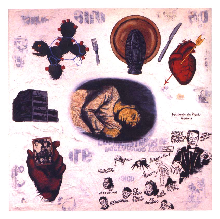
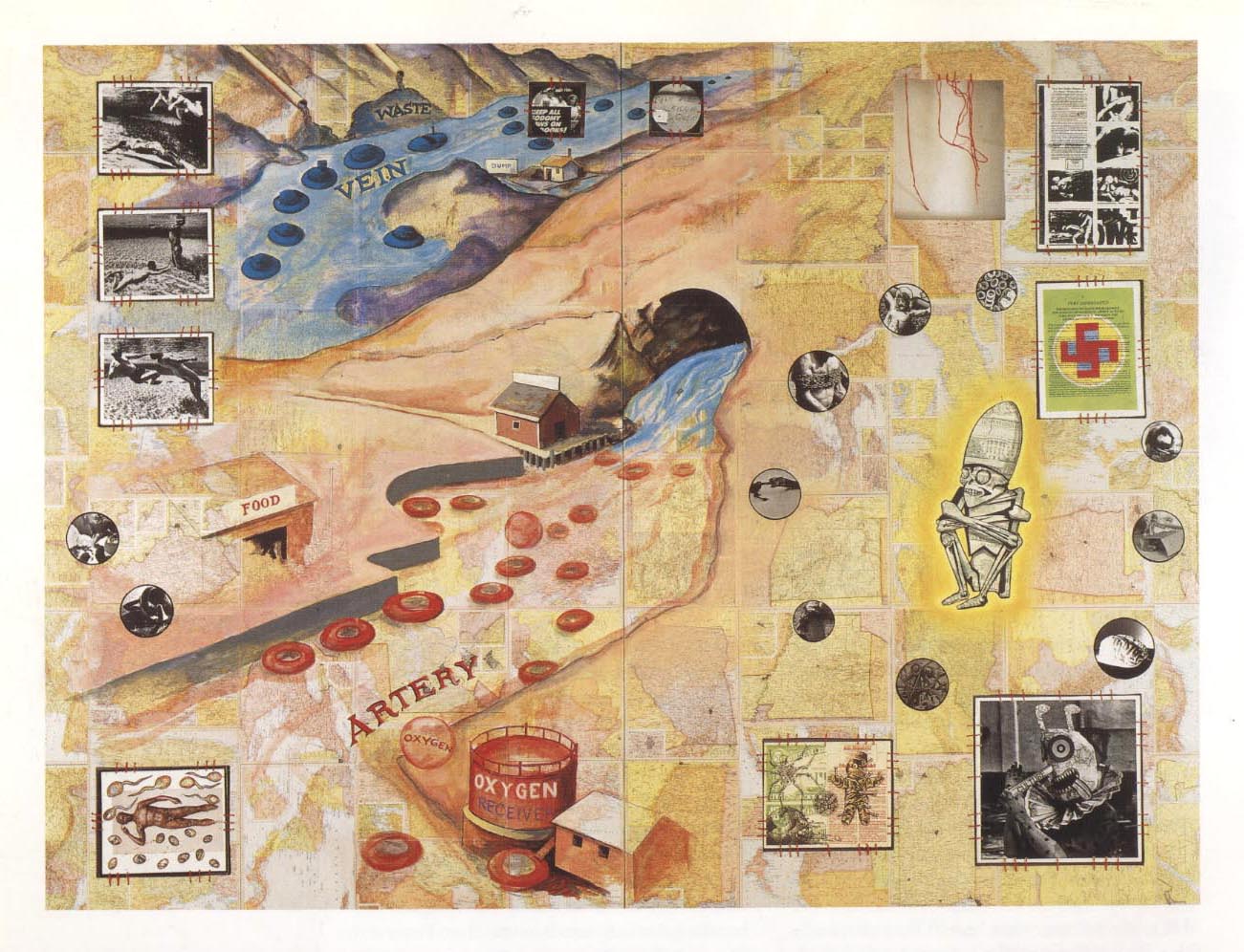
Comics Versus Art presents a thorough history of comic-centric art shows. One of the first major gallery shows dedicated exclusively to comics was held by SOCERLID (Societe civile d’etude et de recherché des literatures dessinees) in 1967 at Paris’ Musee des arts decoratifs, which is part of the Louvre. The show featured three sections on comic art, although the curators didn’t showcase any original strips or pages. Instead, they hung ektachromes and photographic enlargements of individual comic panels, with the coloring removed. The curators argued “thanks to the quality of the paper and clarity of the blacks and whites, the photographic enlargement makes it possible to free the comic strip from the small size that stifles it and to exhibit it in the usual dimensions of the works of art to which the public is accustomed.”

Many more gallery shows sidestep comic narrative altogether in favor of what the curators believe to be the form’s mosts substantial contribution to society—its characters. In a survey of several museum shows that drew inspiration, but did not include, comics, Beaty concludes, “these exhibitions indicated that it is the iconography of comics, rather than the formal—that is to say sequential—elements that is mostly commonly appropriated by artists influenced by comics.”  The Institute for Contemporary Art’s 1987 show Comics Iconoclasm featured sections on cartooning technique as well as sequential storytelling, rare for most comics-centric gallery shows, yet both of these sections were dwarfed by the section on cartoon icons.

The legacy of Roy Lichtenstein and his comic panel appropriations, often accused of barring comic’s high-brow acceptance, could be the best example of all. Lichtenstein’s work has ensured immortality for the ‘look’ of mid-twentieth century romance and war comics. Museums adore and celebrate Lichtenstein’s accessible iconicity in their marketing, even as this look has been endlessly adopted by advertising. The look engulfs whatever meaning Lichtenstein has an artist, or his paintings have as individual works, and today the ben-day dot women function as stylistic, feminized stick figures. Yet this wouldn’t have happened without Lichtenstein’s blow-up treatment, and the strange prestige it accorded it.

Pawn shop NYC subway

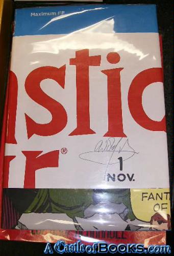
Beaty documents related examples in the world of mainstream comics publishing. Maximum FF, a deluxe-edition book published in 2005 by Marvel Comics, was one telling attempt.

“An oversized hardcover with an elaborate fold-out dust jacket, Maximum FF is a 234-page version of the first issue of Fantastic Four, by Stan Lee and Jack Kirby, originally published as a twenty-five-page comic book in 1961. Mosley and Sahre expanded the original work almost ten-fold by dramatically restructuring it: by disaggregating the individual panels and presenting them one per page, one per double-page spread, and even, on two occasions, as quadruple-page gatefolds.”


Maximum FF

Beaty goes on to say that the ‘splash’ page and double-page spreads,

“…are particularly valued by collectors of original comic book art because they often present characters drawn on a larger scale than is typical for a comic book and, consequently, are more impressive when framed. For some collectors, the splash page and comic book cover are the most valuable parts of the comic because they are most akin to traditional gallery and museum aesthetics—they are not tainted with the sequentiality that is often held to define the comics form.”

Groensteen would agree with the idea that comics is tainted by its sequentiality, or at least sequentiality is not very relevant or attractive to most of society. Tellingly, the earliest definitions of comics focused on its use of recurring characters and speech bubbles than on its sequentiality—something Beaty recognizes in the first chapter of his book.

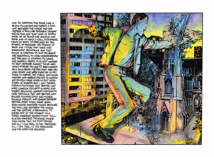
It’s worth wondering about the phenomenology of the splash page and double-page spread, and what happens when they are used in comic books. The splash page is a ubiquitous element of many comics, from American superhero books to manga to independent minicomics. It’s use isn’t random—splash pages most often introduce a story, establish the grandiosity of a setting, or monumentalize the climax of a single issue or narrative arc. The effect is always intended to be eye-catching, attention-grabbing, and big.

Spiderman Splash Page

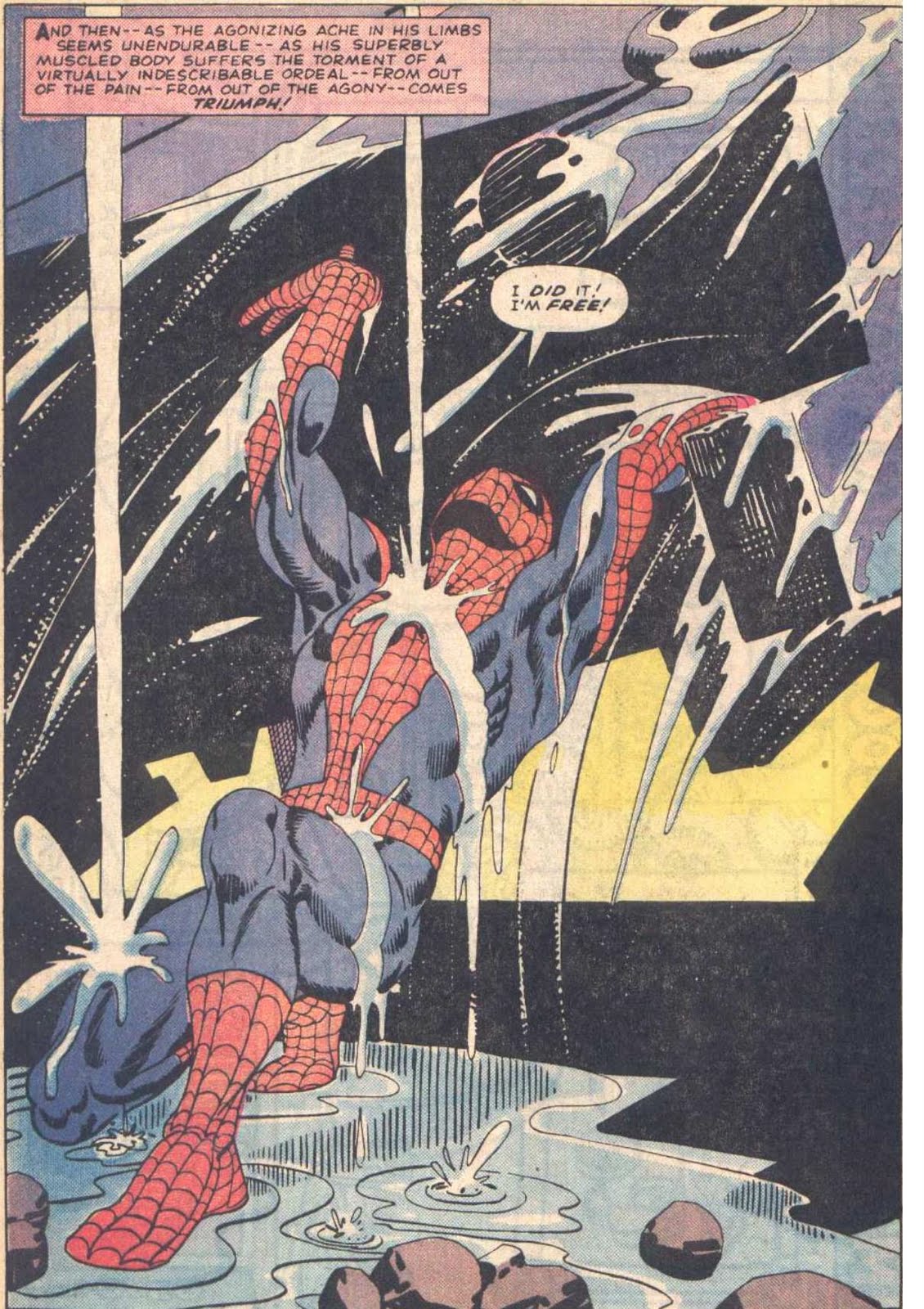
Steve Ditko and Stan Lee, Amazing Spider-Man, Issue #33

Inuyasha Double Page Spread

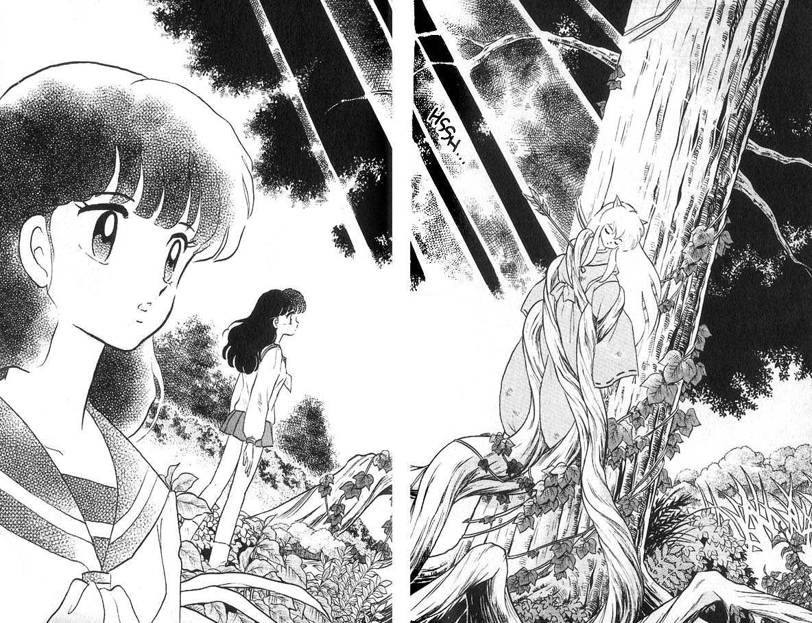
Rumiko Takahashi, Inuyasha, Book 1

berlin_splashpage

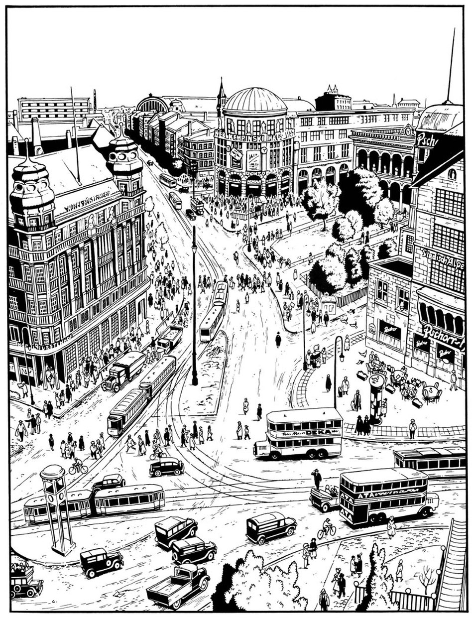
Jason Lutes, Berlin, Volume 1

The splash page is a part of the vocabulary of comics, (or at least its grammar,) and some cartoonists play with or complicate the concept more than others. Within the limited scopes of alternative comics, a few recent examples come to mind. In Craig Thompson’s Habibi, (2011) (which I reviewed here,) a preponderance of splash pages marks the end of the book. Thompson’s loud pages erupt with obvious, mystical-religious imagery, asserting not only that an epic moment has been reached, but that moment is ever-present. The artwork grasps at transcendence, and the narrative, increasingly interrupted, begins to break down.

Habibi Splash Page

Skim, by Mariko and Jillian Tamaki, (2008), paradoxically uses splash pages to transition between scenes, layer impressions, and create a sense of passing time, even though  only a single moment is presented. Both approaches use splash pages earnestly, but where Habibi’s splash-pages-on-steroids amplifies their stillness and power, Skim  converts this potential energy into emotional movement.

Skim Double Page Spread

In Chris Ware’s Building Stories, (2012), the cartoonist ironizes the epic quality of the splash page by depicting banal moments in the life of his characters. However, the splash page has the last laugh, fostering a sort of ‘epicly banal’ or ‘very depressing’ feeling, which hasn’t escaped the notice of critics like Douglas Wolk. Perhaps Ware’s splash pages are better read as mislaid covers; they share the cheeky realism of his illustrations for The New Yorker, and one of these pages was featured as a ‘joke cover’ on the New Yorker site. It seems difficult to use the splash page insincerely– it transforms its content into something remarkable, whether the artist meant it to be read that way.

buildingstories_splashpage_2

buildingstories_splashpage

It’s funny that one of the most prominent and dramatic techniques in comic storytelling is one that makes a comic behave a little less sequential, fragmented, even hybrid-like. While captions and speech balloons are often present, they feel less like a competing element, especially in terms of scale, (aside from the author credits and copyright jargon jammed into some mainstream pages.) The splash page isn’t actively read as much as it is passively gazed upon, or absorbed, as if on a wall. That jump from reading to gazing is partially what makes experiencing a splash page feel profound. But only one moment can be presented, and there often isn’t much to figure out. The splash page is the opposite of the comics gutter, the space between the panels that contains the ‘unshown,’ and according to Scott McCloud, generates the medium’s storytelling power. While splash pages and individual panels are the easiest to display, a cartoonist’s panels and gutter transitions better capture the essence of a narrative work.

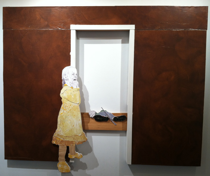
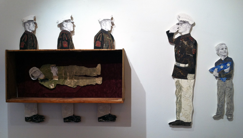
Its not surprising that the art-world and collectors, unsure of how to hang comics on a wall, would favor panels and pages that behave more like paintings. But is it possible to successfully bring comics narrative– small, printed, sequential and ambiguous– into a museum setting? Or is its special breed of profundity incompatible with what attendees expect from a gallery show? Outside of more people reading actual comics, (and how would they be convinced to do that?), is there a venue, or a kind of oration, that better matches the type of transcendence a comic book achieves, rather than what it reaches on one page or panel? As long as the gallery-show remains the standard by which high-brow acceptance is judged, discussion of what makes the comics medium work, (or even great,) will be locked onto their resemblance of fine art. Artists with greater technical skill will be rewarded most, despite the fact that the art world has bucked judgements of skill, chaining comics to a quaint nostalgia for draftsmanship.  And severing panels from their original sources does not an art movement make– shows will remain an oddity, a fun, occasional diversion from looking at real art. Many people would not mind. Some readers will always need comics to act a little bit more like other things, in order to love them in those kinds of ways.

Nick Black’s Super-Awesome Urine-Recycling Alien

Artist Nick Black had an awesome kinetic sculpture up at Happy Dog gallery here in Chicago. It’s a giant floating bulbous faced alien with a raygun peeing pink pee into a giant vat. The pee is constantly recycled, so there is never an end to the urinating.

Katie Fizdale took some pictures and kindly shared them with me.


And click here to see the recycling urine in action.

I think this piece fits in nicely with our recent discussion of modernism and post-modernism and comics and fine art. It’s using underground comics references pretty obviously, I think (the alien could be a Johnny Ryan drawing.) At the same time, it’s turning a mechanistic system which might well be modernist and turning it into a representation of itself; parodic/pastiche divorced from utilitarian function and turned into a sign of itself as pornographic pulp. There’s still the nostalgia from the comics, maybe, but the 3-D giant action figureness of it kind of deliberately cheapens the nostalgia…or inflates it, depending on your viewpoint. (The piece was priced, very much tongue in cheek, at over $5 million.)

Weirdness and Conscience in the Work of Craig Norton

Craig Norton’s recent show is a different beast than what you’ll find in galleries around Chelsea and the New York art scene. Tim Came Home From the War and Isn’t Timmy Anymore, at Jim Kempner Gallery until June 23rd, is an emotional and explicit rendering of the schizophrenic divide between America at war and at home, and the egregious neglect of veterans. Norton is also a hyper-realistic and self-taught draftsman who makes narrative art. These factors are not the taboos they were fifty years ago, but they are no longer typical in contemporary art either. To compare, the famous Gagosian Gallery is showing a famous photographer’s gargantuan, historic prints of other famous people. I’m currently writing this piece next door, in a miniscule gallery called Family Business, where we are exhibiting a group show entirely comprised of sticks.

Conceptual strength and skillful execution are crucial to the success of any art work, past or present, even if the faces of these terms have changed. In Tim Came Home… concept and skill manifest in ways the wider public would expect them to—ironically, this quality makes him an outsider in today’s art world.  I hope Norton’s pop-out, transfixing murals can function as a gateway for casual viewers into contemporary art, and a call for artists to consider the perspective of those unversed in it.

Norton’s work rejects the idea that art is by nature morally and politically apathetic, ineffective, and/or isolated, ideas that philosophers, artists and critics have argued for centuries. Artists periodically challenge this claim, but perhaps no population rejects it more often than those outside of the art market, whose faith that art ‘matters’ may be the art world’s most regular misguided compliment, (and art has suffered for it through many censorships and its co-option by propaganda.) Along these lines, many still believe that art is a showcase of technical skill, and that virtuosity isn’t inherently absurd.   Norton caters to these ideas, but in doing so, his work also fulfills conservative expectations about ‘art’ that we have a good reason to question. Tim Came Home… is a riveting, provocative show, but it lets the art-world context essentially “talk behind its back,” rather than directly address the inherent weirdness of politicized art in the contemporary gallery.

Today's Enemy, Tomorrow's Friend

Norton’s work is not only political, but fascinatingly journalistic. Reminiscent of the Wall Street Journal portraits, Norton renders faces, hands and firearms out of tiny marks and stipples. Oftentimes the hands and faces are blown out of proportion, which distorts the figures into punchy homunculi, and brushes caricature without slipping into it. The clothing and bodies are made of boldly colorful wallpaper collages. He ‘draws’ folds with wood-relief style incisions. This mimicry of print illustration is bolstered by the fact that he designed the installation to tell a story. Instead of accompanying a news article, Tim Came Home… could be read as the article itself, or as a history museum exhibit where the story is told through the dioramas alone.

Detail from No Welcome Mat

The effectiveness of the hanging contributed to the shows emotional resonance, but also to what is problematic about it. From a strictly “graphic narrative in the gallery” perspective, I was thrilled to see the show explore the layout’s control over the narrative. Tim Came Home… was hung two different ways, which created two different ‘stories.’

Initially, the viewer would walk into the gallery and encounter a crowd of happy, urban passerby. Viewers would then typically start over to the left, with No Welcome Mat.

No Welcome Mat


This crowd scene erupts into the first, with injured veterans parachuting down into the unworried crowd. Moving to the right, around the front desk, the second act focuses on the tragic integration of these two worlds. The first is a military funeral. The second is called My Daddy is A Decorated War Veteran, where a young girl claws at her face, before a crumpled man and a shotgun.

My Daddy Was A Decorated War Hero

The forceful disruption of the “side scrolling”, frieze-like perspective allows you to peer straight through the wall, to the scene behind the girl, and at an impossible angle inside the coffin. The effect is very moving.


Another Casual Casualty of War

 Unfortunately, gallery visitors sometimes didn’t notice the “second act” around the desk.  The Jim Kempner Gallery rehung the show so that visitors first emerge to see My Daddy Is… No Welcome Mat still begins the show, but the scene doesn’t bleed into the urban passerby. Instead, the warfare peters out into negative space, and a small pocket of the passerby lead back into My Daddy Is…. Around the desk, the two parts of the military burial flank the rest of the happy-go-lucky city-dwellers. Life goes on, and no one is the wiser—the second hanging, while a compromise of the original vision, is rhythmically more complex, less melodramatic, and damning.

various figures

Norton’s past work focused on the Civil Rights movement, and he was challenged about his right, as a white man, to depict moments as iconic as Martin Luther King Jr.’s arrest. Norton responds in his personal statement, “I make art about mankind. Lots of people care only about their own identity groups… and I’m not going to sit back and do nothing because the victims are different from me. It’s a human issue.” He goes on to say “Art is the way I bring about awareness and dialogue—and hopefully inspire change.”            

This statement plays into the editorial feel, where a piece documents and somewhat universalizes the particular. Norton doesn’t comment on the role or the effect of the gallery context on his plea. The gallery is treated like a culturally heralded space, where people seek meaning, information, and often go to look at pretty things. This is not untrue, but it ignores other currents too. At the risk of being grotesque, art is a luxury commodity, and fetishistic, which the neutrality of the gallery amplifies. The art world is also a complex and hierarchical social scene that partially takes place in the gallery, transforming openings and installations into sets to act inside of. A truly thorough contemplation of a work will consider the historical context and precedents of the piece. Norton’s work is a little strange in that it appears to be descended from editorial illustration more than anything.  This does not mean that Norton’s work doesn’t belong there, but that the conditions of its “immigration” are unusual and inextricable.

Is the art gallery a useful place to encounter Tim Came Home…? Ultimately, yes— it does raise awareness for an important social issue, even if the scenario is ironic. But is a private collection a useful place for this piece? How about an art museum? Is Norton’s work best designed for public spaces?  If Norton’s wish for awareness and dialogue attaches a use-value to his work, certain environments could be more successful than others, and Norton’s work would also violate ‘art for art’s sake.’ No big deal: art pour l’art has been rejected before, and chances are it’s a mental illusion, (people use art without admitting to it, and for reasons they can’t articulate.) Finally, Norton’s arresting photorealism individualizes the subjects, but it is also hypnotic, exciting the eye with spectacle of torment, violence, and artistic wizardry. Norton’s process receives a paragraph of the artist’s statement before the political component is even discussed.

I apologize: I won’t attempt to answer these questions in this review, but the questions themselves are illustrative. An artist doesn’t have to have a fully elaborated concept to start working. Here, the ideas and context don’t dovetail together to create an Eureka moment—instead, Tim Came Home highlights the mess of understandings about what art is and what it does. Which are, more than ever, important questions to ask.

All photographs are courtesy of the artist and Jim Kempner Gallery


Tim Came Home From the War and Isn’t Timmy Anymore

Jim Kempner Gallery, May 12th – June 23rd, 2012

Looks like We’re in for Heavy Concepts

Franklin’s blog on Friday alerted me to this post by Nathan Schreiber. Schreiber’s point — about the art world being dominated by elites while the book world isn’t (as much) — ties into the conversation Franklin and I were having on Thursday.

But what really struck me about Schreiber’s post is that it was just really nice to hear someone in comics say something really positive and affectionate about fiction, because it just doesn’t happen all that often. Franklin quotes a Facebook post from Schreiber:

My post was really an expression of frustration with comics trying to climb further into the art world. Because I think comics are “stories” and while stories can be art, I think they’re stories first and art second. The art world is full of ambiguities, dominated by concepts over content, and is controlled by elites where the world of stories, well, it just makes more sense. There’s more or less universal recognition of what a good character is, a tight plot, hell, even mood.

Although he’s not necessarily talking about literary fiction (and I haven’t seen this Dash Shaw to know whether I agree with his evaluation), this comment vaguely acknowledges something extremely important that comics (and probably fine art too) should listen to: great fiction writers retain their craft even as they layer in more and more conceptual complexity. Nabokov, Pynchon, Delany, Woolf, Swift, Chaucer — there’s no shortage of concept, but there’s also plenty of craft. The craft enables the concept: the more solid the prose is, the more concept can be layered in. And sometimes the concept also illuminates the craft.

There are worthwhile exceptions, usually experimental ones — nobody’s ever going to claim that Burrough’s The Soft Machine is even a remotely good example of the writerly craft, but it’s an overt experiment, a conscious effort to figure out how to do something new and challenging. But he — and writers like Pynchon who followed him — made a successful effort afterwards to reintegrate craft with the formal and conceptual lessons learned from the experiment.

(It’s possible the caption under this Dash Shaw image in the Schreiber post is sarcastic, but it also doesn’t seem that far-fetched to claim an interest in concept for Shaw.)

There are some really brilliant avant-garde cartoonists who are on really exiting trajectories toward merging experiment and craft, like Jason Overby and Warren Craghead, and I’d like to see more cartoonists follow their lead and incorporate their insights and build on them to make new insights and eventually get to the point that cartoonists are making graphic fiction that’s as strong conceptually as literary fiction.

To do that, though, people have to get past this knee-jerk notion that craft and concept are an either/or choice. A lot of indie/alt cartooning has turned punk and underground ways of seeing the world into a fetish for harsh, angry expression and just plain ugliness, as though ugliness itself is sufficient to make a work edgy — as if ugliness is somehow inherently more meaningful than beauty. Like scatology and mundaneity, ugliness in indie comics is often a shortcut, a way of giving the illusion that something significant is going on when it really isn’t. Comics critics have mostly embraced this extremely facile way of thinking about concept as mere symbolism. In the alt comics subculture at least, I do think some of it comes from the mild contempt for writing that so many people seem to think is necessary in order to appreciate art. Maybe more of it comes from the fine art world as Franklin so often suggests. I’m willing to consider the assertion that in truly non-narrative work, an allusive, symbolic, suggestive use of concept can be successful, but I stick to the opinion that in narrative work, concept needs to be crafted so that it works with the narrative in interesting ways.

Ugly or otherwise, though, a lot of the work — in fine art or comics — that claims to be so “high concept” doesn’t really strike me as actually being all that high concept. It’s more “heavy concept” than “high concept.” Blunt, poorly wrought, overdetermined concepts weigh art down; elegant ones elevate it. I don’t think there’s a forced choice between beauty and concept; there is an aesthetic aspect to the conceptual constructs of an artwork as well (Pale Fire, which really is high-concept, is a great example, as is, say, Grünewald’s Crucifixion). But the artist just has to be willing to spend a lot more conceptual energy than most cartoonists — most artists period — are willing to do.

Postscript (added 1pm ET)

I want to be sure it’s clear that of course there’s a good bit of subjectivity involved in saying that this one thing is ugly and some other thing is not. There’s not an absolute standard. I find Ariel Schrag’s work a little aesthetically harsh, for example; Noah finds it really beautiful.

So I don’t want that pithy encapsulation up there about ugliness as a shortcut to be interpreted as a critique of any particular specific comic. It didn’t arise out of a specific reading — more an overall experience of seeing too much scatology, too much ugliness, too much mundaneity and not enough richness, not enough concen with beauty. Not from any specific cartoonist in any specific instance, but in the aggregate. The collective drive for and commitment to those aesthetics overall within indie comics often seems to be standing in the place of a drive for and commitment to more meaningful conceptual engagement.

In general, it raises the question of whether ugliness and rawness can simply be substituted for beauty and craft without any loss to the artform overall. Can you operate from a belief that ugliness is beautiful without transforming where you end up, collectively, at the end? I don’t really think you can — I think ugliness and rawness have semiotic content; I think they signify in a different way from beauty and craft. And I think their potential as such to hold a richness of meaning is more limited. But I also think — and this is the point of the post — that questions of how ugliness and beauty become meaningful, and what kinds of meaning they make, and what work is necessary to connect form and concept are discussions worth having.

Wojnarowicz’s Apostasy

by James Romberger

“Ants are the only insects to keep pets, use tools, make war and capture slaves.” — David Wojnarowicz

A Fire in My Belly, a film with a depiction of fire ants swarming over a crucifix, was removed from the Hide/Seek exhibition at the National Portrait Gallery of the Smithsonian through the intercession of the president of the Catholic League, William Donahue and the Ohio Republican and House Minority Leader John Boehner, who had not seen the film in question. In the center of the current controversy over this act of censorship is the late artist David Wojnarowicz, who did attack the Catholic Church and other politically active religious institutions repeatedly—and for good reasons.

David’s oeuvre was never only about his reactions to organized religion, nor was it ever only about the AIDS crisis. Certainly the disease that would kill him in 1992 gave his work a powerful impetus, but David always took a greater global view. He examined the way that the natural world works and how our relationships with each other and the planet fit within the continually shifting narrative of history. He also expressed a complex interiority as he engaged with different media to make his sometimes lyrical, sometimes enraged or explicit, but always thoughtful and heartfelt art.

David took on heroic proportions because of his outspoken response to the AIDS epidemic. He watched his friends falling around him. After his own diagnosis in 1988, he made a concerted effort to understand the disease and to combat the people and institutions that he was able to identify as enablers of the virus through their homophobia and suppression of information. David protested the New York archdiocese with Act-Up at St. Patrick’s Cathedral, for the Church’s closure of health care clinics in the middle of an epidemic and for their condemnation of condoms, safe sex, birth control and reproductive rights. When in 1989 David described Cardinal O’Conner as a “fat cannibal from that house of walking swastikas up on fifth avenue” in his essay for the catalog of Witnesses: Against Our Vanishing, a exhibition funded by the NEA, he faced censorship and a subsequent national reaction not unlike the current turmoil.

But even earlier, in 1986 and 1987 as he watched his mentor, the photographer Peter Hujar, waste away and die, David believed the Roman Catholic Church had abandoned everyone he loved. He knew that some gay men find closeted refuge in priesthood, while their Church publicly preaches against homosexuality. David wrote in a biographical outline that he “remembered beatings and having to kneel on bags of marbles” in Catholic school at the age of eight. The imagery of Catholicism suffused his work from the beginning. David’s friend and my partner, the interdisciplinary artist Marguerite Van Cook says he had “a crisis of faith,” certainly his beliefs were sorely tested. He knew even then of the widespread pedophiliac component of the Church, and mentioned to us that he knew the infamous Father Bruce Ritter of Covenant House. In 1990, Wojnarowicz became national news once more after his work was used by the Reverend Donald Wildmon’s American Family Association to lobby against NEA funding for the arts. After successfully suing the Christian fundamentalists for defamation, David posed questions about the separation of church and state:

“Do some politicians have a direct communication with God?…Should one person’s interpretation of God determine whether another person lives or dies?…How many members of minorities are afraid to speak if they think they are the only ones who feel the way they do?…Does the denial of information that causes people to become ill and die a permissible thing?…Would it be a crime if that denial of information only killed people you didn’t feel comfortable with?”

A Fire in My Belly has been defended as being about AIDS and not about his anger towards the Church, but David’s later motivations should not be retrospectively applied to a film that he made earlier. The Smithsonian has posted a “Q&A” on their website which claims, “This imagery was part of a surrealistic video collage filmed in Mexico expressing the suffering, marginalization and physical decay of those who were afflicted with AIDS.” However, what is being shown on Youtube and elsewhere online is not the original film, its intent has been changed because elements have been added that are misplaced in time. The versions in circulation now both have imposed soundtracks and their meaning is altered with added imagery that was made years later. David made A Fire in My Belly in 1986, before he was diagnosed with AIDS.

I am one of the few who saw David’s original film. He showed it to me privately at his apartment (formerly Hujar’s residence, over the movie theater on 2nd Avenue) in 1987 when we began collaboration on our graphic novel Seven Miles a Second. He had me sit in front of his big TV, next to his baby elephant’s skeleton and insisted that I watch his Mexican film. What followed was an assault on my senses, a view of a world completely out of control. The strobed, often violent scenes of wrestlers, cock and bull fights, lurid icons, impoverished dwellings, clanking engines, an enslaved monkey, cripples begging for coins, for bread, a burning, spinning globe—it was a picture of indifference to the value of life, Mexico as a grinding machine of poverty and cruel spectacle. I didn’t enjoy the experience. The images and soundtrack combined to create a powerful feeling of unease and angst. I was obviously shaken as it ended, but David just laughed. We moved on to discuss our intention for the comic book, still the afteraffects were hard to shake. He told me later that he had disassembled that first version.

The film in all its incarnations connects strongly to Mexican Diaries, the second show David did at Ground Zero, the gallery that Marguerite Van Cook and I co-directed from 1984 to 1987 (obviously, named long before 9/11). David showed with us because he liked our own artwork and because we offered him shows unfettered by any restraints at a time when he was disillusioned with the art world system. In their quest for success, the galleries of the East Village were turning away from their initial wildness. The Neo-Geo movement encouraged highly polished presentations, more like the staid Soho scene that we all reacted against in the first place. Marguerite embodies the punk ethic of embracing change and encouraged our artists to make concise conceptual statements as gallery-transformative installations. For my part I wanted their most intense expression, to befit a gallery called Ground Zero, the epicenter.

David’s first show with us in December 1985, You Killed Me First, gave us both our wish. It was a horrific, anti-commercial installation that David said had an intended similarity to Marcel Duchamp’s voyeuristic final work. The gallery was made over to resemble an empty garbage-strewn lot, lit only by a broken window. The patrons could enter this forbidding alley to look though the window and see a scene that resembled a panel from E.C. Comics’ Tales from the Crypt. Three dessicated corpses sat around a decomposing thanksgiving feast, their blood spattered on the walls, while a TV in the corner played a looped film, also titled You Killed Me First.

The Cinema of Transgression’s most sophisticated photographer, Richard Kern, directed the film that stands as one of the most effective works of the entire movement. David channeled his own father to play the violent patriarch, while Karen Finley did a piercing performance as the mother. An ingenue called Lung Leg played their gothish daughter. After a series of conflicts with her family, the girl murders them all at dinner. The installation was contextualized by the film, which revealed to the viewer that the putrid crime scene before them was the result of a violent reaction to bullying and abuse. Also, David in effect kills his Dad and himself, since it is his cadaver slumped to the right.

In Semiotext(e), David’s confidante, the photographer Marion S. expressed the artist’s satisfaction with the piece: “he really loved making that movie with Richard…and the installation at James and Marguerite’s that related to the film. It was so scary, so great, and so exciting.”

For his next solo show at Ground Zero a year later, David made five paintings. They were inspired by a trip to Mexico where he shot A Fire in My Belly, his next film project. Mexican Diaries opened in January of 1987, so the images in the show were all painted in 1986, despite the later dating that has been ascribed to them in books about David. The paintings share their imagery with the film, which is dated in its credits as done in 1986.

You Killed Me First, installation views, 1985.

The paintings and the film inform each other. Portrait of Bishop Landa, the painting with the paper-mache head of Jesus seen exploding in the video, had a substantial number of live fireworks glued to it. The opening reception for the show was packed. We had to guard the painting against the self-immolating artist Joe Coleman, who insisted in lurking nearby, waving his lit cigar. The piece survived the opening, only to be destroyed for the filming of A Fire in My Belly. Our slide shows the relationships between the painting and the film, in the prominent fire-breather, also seen to dramatic effect in the film, in the overarching intent of the piece as a portrait and in the significance of its destruction.

Portrait of Bishop Landa. Mixed media, 1986.

Bishop Landa is profiled on Wikipaedia:
Diego de Landa (12 November 1524–1579) was a Spanish Bishop of the Roman Catholic Archdiocese of Yucatán. He left valuable information on pre-Columbian Maya civilization, and…destroyed much of that civilization’s history, literature, and traditions…Landa was in charge of bringing the Roman Catholic faith to the Maya peoples after the Spanish conquest…After hearing of Roman Catholic Maya who continued to practice idol worship, he ordered an Inquisition in Mani ending with a ceremony called auto de fé. During the ceremony on July 12, 1562, at least forty Maya codices and approximately 20,000 Maya cult images were burned.

Portrait of Bishop Landa was a literally explosive piece about the destruction of culture as a means of control, in other words, about censorship. David uses Landa to represent the way the Church’s views are still pressed on the world. Landa takes on the face of Christ to do violence. Christ breaks out of the flatness of the painting, the modern, the 3-dimensional supplants the flat visual iconography of the Incan civilization. It is a collision of cultures, each with their own chaotic violence. In the film, David consigns religion with its politics and theater, its suffering and sacrifice to the flames.

Mexican Crucifix, acrylic and collage on panel, 1986

The large multitych Mexican Crucifix furthers the theme that Catholicism functions in Mexico as a means of control, to indoctrinate people from a young age through just enough religious education to have a passive acceptance of their state of poverty and ignorance. The religious components in the paintings of Mexican Diaries are more prominent than any reference to AIDS, and this could also be said of his original version of A Fire in My Belly.

A large piece called Street Kid that alludes to David’s own often-homeless adolescence was papered with Mexican wanted posters and overlaid with wrestling graphics and a giant bandaged hand holding a few coins that is seen in the Youtube edit of the film. The painting was reproduced in the Art In America review of our exhibition, but years later I saw it again in the back room of PPOW and it had been completely altered. David had covered the entire piece with a dense lattice of winding green vines, nearly obscuring the original image.

Street Kid, acrylic and collage, 1986

David began his travels in Mexico with filmmaker Tommy Turner. In our show was a painting called Tommy’s Illness, a pale color field with the likeness of our mutual friend sleeping in the center while eidetic imagery floats about him: a place setting, the meal a Virgin Mary icon, a linear turtle superimposed on a cactus, a heart with an arrow through it and a procession of monsters such as Frankenstein. At Ground Zero, a Mexican marionette identical to the one seen dancing and burning in the film was suspended over the painting as part of the work.

Tommy’s Illness (Mexico City), acrylic and collage, 1986, sans marionette.

David wrote that driving through Mexico, he felt as if he was “passing through the future of New York City…rolling through neighborhoods more and more desperate until suddenly in the middle of it all we rolled into a spanking new section.” He describes “a day filled with rich people and poor people; a day of diamond rings on lifeless fingers, a day of armless and legless men in the dawn…” He later worked on various photomontages using isolated imagery from the footage he shot there. He made a tiny painting of a suited organ grinder’s monkey, also seen in the film, that he told us was Hujar’s favorite of the pieces in the show.

Untitled, acrylic, 1986

There was a soundtrack on the film David showed me in 1986, he turned it up loud. The original score was a collection of his tape-recorded incidental noise mixed with snatches of industrial music, which was equally as chaotic as the images. It was not the tape-recorded ACT-UP demo that the National Portrait Gallery’s curators added to their edit. The Diamanda Galás score that is attached to the Youtube version is also a later addition, but one which is more in keeping with the feel of the original soundtrack. According to the Washington City Paper, Galás’ “music was part of a seven-minute edit of the 13-minute work made after Wojnarowicz died in 1992.” But, Galás was David’s friend and the symbolism she adds is apt:

“THIS IS THE LAW OF THE PLAGUE was composed in 1986. I will presume this is the music composition upon which David’s film FIRE IN THE BELLY was based, or with which he felt a strong affinity…My liturgical treatment of LEVITICUS is a march of the priests and lawmakers forcing the unclean from the gates of the City into warehouses out of town, and is very gently illustrated by David’s depiction of the crucified Christ covered with ants. Ants are only one of the many insects and animals that would cover a man removed from his village and deposited in a leper asylum.”

David’s original title and the Youtube version with a detail of Street Kid

When David shot the film that he used in A Fire in My Belly, he was traveling through Mexico shooting whatever caught his eye. He made a script for editing purposes (with no indications for the soundtrack) which is in the collection of NYU’s Fales Library, along with the fragments of David’s film that were chosen for the exhibition at the Smithsonian’s National Portrait Gallery by curators Jonathan Katz and David C. Ward. I have not been able to find information about their process to know if Katz and editor Bart Everly used the script to guide the editing of their version.

I did once see a document that David made for a film that was left in the care of his friend and collaborator Marion S. It was a very carefully worked-out storyboard elaborating how disparate bits of film would be montaged, to form a sort of moving version of what his later photographic art pieces look like, the ones that have the circular insets, i.e. all parts of the film would be moving and shifting, within the insets as well as the overall backgrounds. Marion says that “life didn’t give us enough time to go through with the project.” She prefers not to continue a joint work in the absence of her partner.

But not everyone is as concerned as Marion with ensuring the integrity of David’s art. Even before the film was removed from the show, David’s voice had been recontextualized. The Smithsonian’s curator Katz says that the film was “edited in terms of length, not to remove content. We felt the imperative to represent David Wojnarowicz’s work as he designed it. We included every scene that’s in the video, we just truncated the length.” Notwithstanding this explanation, the fragments of A Fire in My Belly from the Fales collection were altered and an anachronistic soundtrack was added to a film that was thought to be silent. The images of David with his lips sewn shut are also misplaced in time. They are from Rosa von Praunheim and Phil Zwickler’s 1989 film Silence=Death and impose a focus on the AIDS crisis on a work from a time just before David primarily dedicated his work to his ordeal with AIDS. Unfortunately, some of the response to the Smithsonian’s subsequent removal of the film from Hide/Seek has thus far also suppressed David’s intent regarding religion.

David said, ‘Draw me huge, smashing 5th Avenue.’ From Seven Miles a Second, 1996.

David Wojnarowicz’s own feelings about nationalism and the imposed borders of “the preinvented world” aside, he was a great American artist and so his work has a place in any institution dedicated to presenting and preserving the American experience. It would be difficult if not impossible to find a work by Wojnarowicz that does not address religion on some level, let alone other controversial issues. Still, whether or not freedom of religion entitles religious institutions to be exempt from criticism should be subject to debate, as well as if the Smithsonian failed in their trust.

__________________________________

Photographs by Karen Ogle

You Killed Me First David Wojnarowicz w/Richard Kern, Ground Zero, 10/12/1985-1/05/1986

Mexican Diaries David Wojnarowicz, Ground Zero, 1/07/1987-1/25/1987

Courtesy of Ground Zero/The Arteries Group

A Fire in My Belly copyright 2011 by the Wojnarowicz Estate

Wojnarowicz’s final painting: Why the Church Can’t/Won’t Be Separated from the State. Mixed media, 1991. Courtesy of PPOW and the Wojnarowicz Estate.

Seven Miles a Second copyright 2011 by Romberger /Van Cook and the Wojnarowicz Estate

____________________________________

SOURCES

David Wojnarowicz: A Definitive History of Five or Six Years on the Lower East Side. Interviews by Sylvère Lotringer. Ed. Giancarlo Ambrosino. NY: Semiotext(e), 2006.

Scholder, Amy, ed. Fever: The Art of David Wojnarowicz. NY: Rizzoli, 1999.

Smith, Paul, “David Wojnarowicz at Ground Zero,” Art in America, 9/1987, pg. 182-83.

Wojnarowicz, David. “Postcards From America: X-Rays from Hell.” Witnesses: Against Our Vanishing (catalog) NY: Artist’s Space, 1989.

Wojnarowicz, David. In the Shadow of Forward Motion (catalog). NY: PPOW, 1989.

Wojnarowicz, David. Tounges of Flame. (catalog) Illinois State University, 1990.

Wojnarowicz, David. Brush Fires in the Social Landscape. NY: Aperature, 1994.

Wojnarowicz, David, James Romberger and Marguerite Van Cook. Seven Miles a Second. NY: DC/Vertigo Verite, 1996.

Diamanda Galás’ statement about A Fire in My Belly

Q&A with “Hide/Seek” curators Jonathan Katz and David C. Ward

Smithsonian Q&A Regarding the “Hide/Seek” Exhibition

Wikipedia on Bishop Landa

On Exhibit: The Vorticists’ “Mad Modernity”

Nasher Art Museum at Duke University
Durham, NC
Through January 11

Peggy Guggenheim Collection
Venice, Italy
25 January – 15 May 2011

Tate Britain
London, UK
Tuesday 14 June – Sunday 4 September 2011

“What is Vorticism? Well, like Futurism, and Imagisme, and Cubism, essentially it is nonsense. But it is more important than these other fantastic, artistic, and literary movements because it is their sure conclusion. It is important not because it is the latest, but because it is the last phase of the ridiculous rebellion which has given the world the “Portrait of a Nude Descending the Stairs” and the writings of Gertrude Stein. It is the reduction ad absurdum of mad modernity.”

When The New York Times published this dismissal of “modernity” in August of 1914, only a couple of months had passed since the Vorticists had published their manifesto in the first volume of their magazine Blast. Earlier that year, Dora Marsden had established her journal The Egoist, Vorticist leader Wyndham Lewis had broken with the Bloomsbury artists and established the Rebel Art Center, and the Vorticist poet laureate Ezra Pound had published his anthology “Des Imagistes.” “Mad Modernity” was in full swing (despite that little matter of an assassination).

On the same day that the Times “blasted” Vorticism, they also published a glowing review of a show of American art in Paris featuring work by the figurative painters Ernest Lawson, Bryson Burroughs, and Harry Lachman, as well as the sculptor Cecil Howard. From the vantage point of New York, then conservative and academic, all the European modernisms were madness — the same madness.

Throughout 1914, however, Pound and Lewis were at great pains to emphasize that Vorticism was not the same. In June, they publicly rejected Marinetti’s attempts to co-opt them as a sub-movement of Italian Futurism, despite having previously taken advantage of his high profile for a fundraiser for the Rebel Art Center. Blast 1 is littered with aggressive criticism and rejections of all the modernisms, in an effort to publicly situate Vorticism as a uniquely advanced synthesis. In the introduction to the excellent exhibition catalog for the exhibit reviewed here, Philip Rylands describes it as the “most advanced, the most sharply characterized of the London-based avant-gardes,” including the Bloomsbury movement that fostered Virginia Woolf.

This is even clear from the first time the term “Vorticist” appeared, in a 1914 advertisement for the upcoming Blast 1, printed in the literary magazine The Spectator:

The Manifesto of the Vorticists. The English Parallel Movement to Cubism and Expressionism. Imagism in poetry. Death blow to Impressionism and Futurism, and all the refuse of naïf science.

The Exhibit

The exhibit of Vorticist art currently on display at the Nasher Museum of Art at Duke University, curated by the Nasher in cooperation with the Guggenheim in New York, is the first exhibition of Vorticist art in the United States since Pound mounted his own exhibition at the Penguin Club in New York in 1917. For that reason alone, it is worth attending.

The exhibit is organized in five parts: A display of major works, including Gaudier-Brezska’s Hieratic Head of Ezra Pound (below), Wyndham Lewis’ The Crowd (right), and Jacob Epstein’s Torso in Metal from Rock Drill (below, third), begins the exhibit. That is followed by “re-creations” of the three exhibitions, including Pound’s at the Penguin, held between 1913 and 1917 when Vorticism was a current avant-garde, and a section devoted to the movement’s magazine Blast.

“Re-creation” is a strong word, as many of the originally exhibited artworks are lost – but the curators attempted to gather as many works from the original exhibitions as possible. Of particular note are the paintings by Helen Saunders, which were believed lost but turned up in boxes at Roosevelt University in Chicago, and the vortographs of photographer Alvin Langdon Coburn.

The impact of seeing all these works collected together – as opposed to the usual one-off buried in a room of “minor modernisms” – is significant. In this context, the aesthetic consistency among the movement’s practitioners, their debts to Jacob Epstein and to both Cubism and Futurist painting, and the inspiration they found in the urban landscapes of Northern English cities and English industrialism, all become readily visible.

The section focusing on Blast doesn’t make nearly the same impact. That section and the opening display of “major works” are both haunted by the spectres of literature and philosophy – particularly Pound, who coined the term Vorticism, and Wyndham Lewis, who was as much a novelist and essayist as a painter. Their mutual “friend” T.E. Hulme – in scare quotes because that friendship was characterized by competition and melodrama, which led to Hulme’s exclusion from Blast 1 – was almost singlehandledly responsible for Vorticism’s philosophical orientation, culled from his translation of Bergson and his friendship with the Expressionist philosopher Wilhelm Worringer. Add in Pound’s influential friendships with the feminist anarcho-individualist Marsden and the writer T.S. Eliot (who was also published in Blast), and it’s indisputable that Vorticism was as much a literary, philosophical, political, and social movement as it was a visual aesthetic one. (There was even Vorticist music, eventually.)

The Nasher exhibit emphasizes Blast as a material object, however, displaying original copies of both volumes in long cases, with framed original drawings for the magazine hanging above the cases. Although the physicality of this presentation gives a geeky thrill, Blast was never intended to be enclosed within a display case (to the exhibitors credit, a new facsimile edition of Blast 1 was developed just prior to the exhibit and is available in the gift shop or here).

There is no Vulgarity in Revolt

The manifestos of “mad modernism” depended on mechanical reproduction and fed off the vibrancy of their artistic activism. The avant-garde was here set against both aestheticism and academicism, as Lewis’ stated directly in Blast:

To make the rich of the community shed their education skin, to destroy politeness, standardization and academic, that is civilized, vision, is the task we have set ourselves.

To believe that it is necessary for or conducive to art to “improve” life, for instance, make architecture, dress, ornament, in “better taste,” is absurd.

The Latins are at present, for instance, in their ‘discovery’ of sport, their Futuristic gush over machines, aeroplanes, etc., the most romantic and sentimental ‘moderns’ to be found. It is only the second-rate people in France or Italy who are thorough revolutionaries. In England, on the other hand, there is no vulgarity in revolt. Or rather, there is no revolt, it is the normal state. … the nearest thing in England to a great traditional French artist is a great revolutionary English one.

The spirit in these quotes from the preface and manifesto, not to mention its influence on the experience of the visual art works and literature reproduced in the subsequent pages, is lost when the book is put in a case. Blast-as-exhibit can only suggest it; experiencing the historical materiality of the book can’t even begin to substitute for reading it – even in non-facsimile reproduction.

Likewise, the materiality of the traditional exhibit space doesn’t even evoke, let alone “recreate” the rebellious, radical spirit and context of the wartime exhibitions. The Penguin Club is a case in point: the Club had been founded shortly before the 1917 Vorticist Exhibition by Walter Kuhn, one of the progenitors of the Association of American Painters and Sculptors, who put on the influential 1913 Armory Show that introduced Duchamp, and Hopper, and Kandinsky, and the post-Impressionists – among many others – to American audiences. The club was a gathering place for modernist artists rebelling against the constraints of academic art, including Man Ray, Francis Picabia, and Joseph Stella. The club held exhibitions, put on costume parties and satirical theatrical productions, offered classes by its members to its members, and encouraged criticism, discussion, and debate. The sedate blue and cream walls of the exhibition don’t begin to capture the frenetic environs from which Vorticism emerged and in which it perpetuated itself. Mad Modernism indeed.

Which is to say – by all means you really must go to the exhibit if you are anywhere near Durham, Venice, or London. Read the wall tags, admire the materiality of the art, and marvel at the lost-but-now-am-found paintings. But be sure to flip through the facsimile edition of Blast and the superb exhibition catalog, too. Otherwise you’ll have seen Vorticist art, but missed what makes it Vorticist.