
Vom Marlowe posted earlier today talking about the visual mess that is Brave and Bold #33 Among the pages she pointed out was this one:
Vom said:
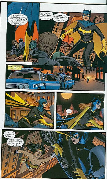
I stared at this page and tried to figure out what the heck is happening. Finally, I decided that her bike flies between panel 4 and 5, although I don’t know why. Apparently so we can see Wonder Woman hanging onto the middle of the bike? I don’t even know.
David Brothers felt this reaction was disingenuous.
The Batgirl thing is similarly dishonest. We see street in the background, and then we see skyline. Two plus two: Batgirl is higher now than she was before. Next panel: the reason why.
This isn’t hard. This isn’t being steeped in continuity with no lifeline. This is basic stuff that is in almost every comic book ever made. You can find yellow pee lines in Peanuts. Done in Schulz’s style (thin lines, with maybe sweat marks around the lines), of course, but it’s the same effect. How did Wonder Woman lift the bike? By getting low to the ground and scooping it up, I assume, same way everyone has ever lifted everything.
I was talking this over with another non-superhero comics reader, and she said that she too couldn’t make heads or tale of the Batgirl sequence either. Whereas, I — who have read way too many superhero comics — parsed it instantly. I presume David’s experience was more like mine, which may be why he just assumed that others’ confusion was a put on.
This seems pretty interesting to me. I can’t necessarily point to anything in that sequence and say “well, this is why I followed it”, but I do wonder if there are tip offs you don’t necessarily even know you’re getting when you’re familiar with an art form or genre. I think things which “feel” natural and obvious can really not be at all.
In thinking about it more: the panel/panel/pull back and reveal move — that seems like something that’s done a lot in modern superhero comics. In this case, it’s done really confusingly; among other things, I think the horizontal movement of the panels works against the fact that the action is vertical. That is, from the panels, it looks like Batgirl is going side to side, but she’s supposed to actually be going up. I think this is in theory intended to make the reveal more surprising. In practice, though, it messes with the visual rhythms; it doesn’t feel from the panels like she’s going up at all, so even when you’re told (via the skyline) that she’s going up, you kind of have to convince yourself.
Rotating the angle of the bike messes with the rhythm too; the camera isn’t so much pulling back as it is swooping out and swinging around, though all in a single leap. It’s disjointed and clumsy; its like Cliff Chiang, the artist got to the bottom of the page and didn’t have enough panels, so he just cut out bits and hoped it would work.
And for me it does work — not in the sense of being a stylish or pleasurable progression, but in the sense that I can follow what’s happening. And I think I can follow what’s happening because I’ve seen it so often before. I mean, this is clearly somebody who loves Watchmen too, and who’s used to seeing comics imitating film movement more-or-less poorly, the way superhero comics these days tend to. I can follow the page better than VM not because I’m especially visually ept or because VM is pretending not to get it, but because it’s using tropes so familiar to me that I can parse them even when they’re not deployed very skillfully.
Another interesting thing about this to me is that, if I were reading this comic on my own, I don’t think I’d even notice that the tropes weren’t used very well. I’d read that page, understand it, and just go on. In some ways, being familiar with the tropes makes you see the comic less clearly. I can follow the images, but I wouldn’t have actually seen what they was doing if Vom (and David as well) hadn’t pointed it out to me.
Update: Telophase has a mess of fascinating comments (starting here) explaining the different ways in which manga and western readers read comics. Basically, manga readers look for clues in the art first, then if that doesn’t work go right to left; western readers go left to right first, and if that doesn’t work look for clues in the art. Telophase kindly marked up the page above to show how a manga reader (going left to right of course!) would parse the page.

The visuals at the bottom of the page end up to be particularly nonsensical, which might help explain why VM had such trouble figuring out what on earth was going on.