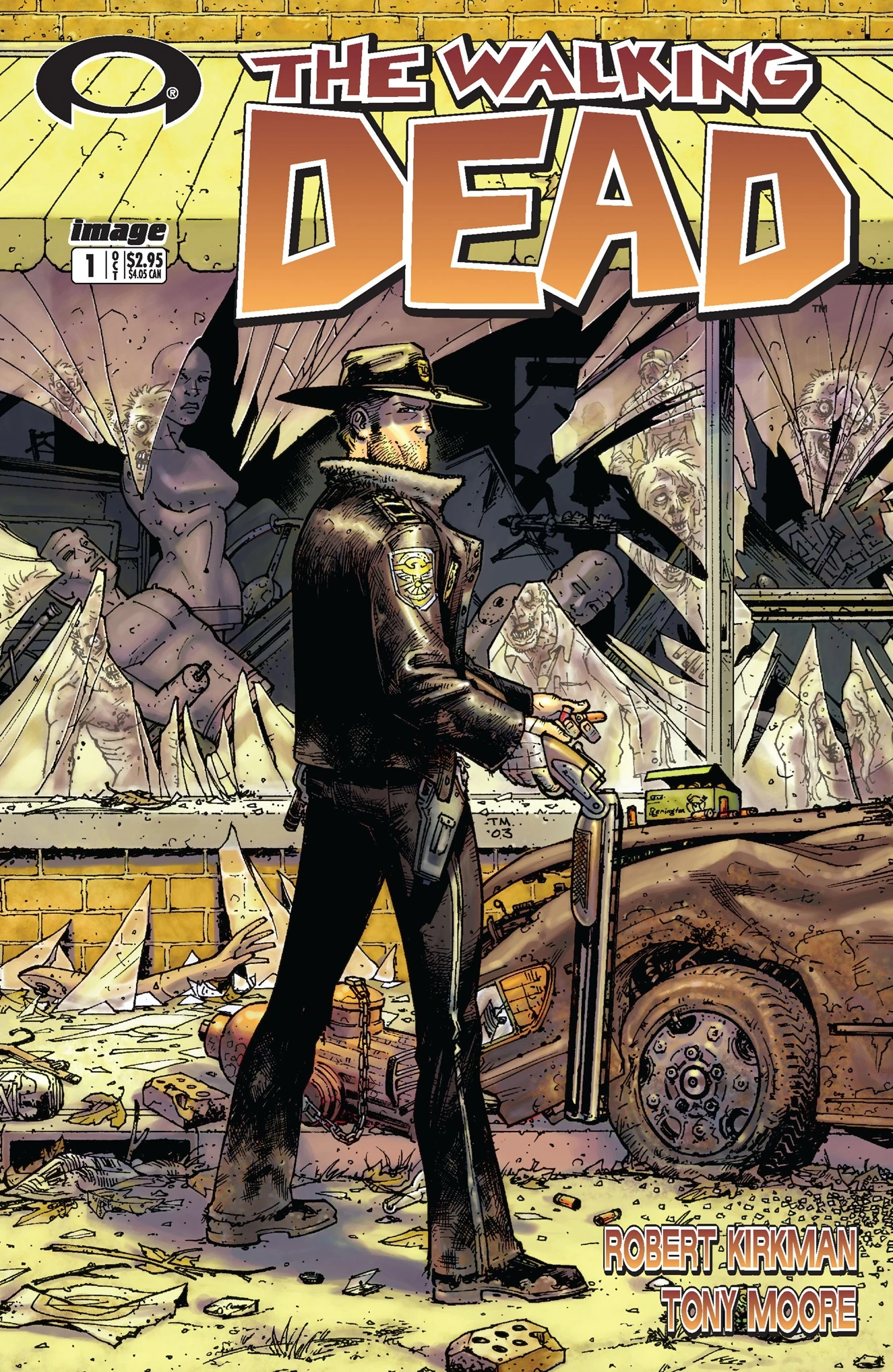
The Walking Dead Volume 1 “Days Gone Bye” is anti-feminist, anti-government, pro-gun, libertarian fantasy propaganda. So pretty much my opposite on the political spectrum. And yet I teach it every year in my first-year writing seminar. It helps that it pairs so well with George Romero’s Night of the Living Dead (which is nihilistic, anti-everything fantasy propaganda). It helps even more that I like the Walking Dead TV show so much. I always assign open essay topics, so I get a range of gender critiques, pro-family analysis, and (my favorite) the meaning of Rick’s hat. That one requires a deeper level of visual analysis, and that’s what I want to focus on today.
On a previous blog, I laid out my thoughts on layout, and now I want to apply them a little more systematically to one specific comic: The Walking Dead #1 (October 2003) by Robert Kirkman and Tony Moore. I’ll work through the issue page-by-page first, then follow up with a page scheme analysis: how the layouts of separate pages combine for issue-wide effects. I’m working with the general principle that pages have base patterns, and when those patterns repeat, their pages relate at a formal level (they visually rhyme) and so the content of those pages are connected too.
PAGE 1:

Irregular 4-row layout, with top and bottom full-width panels. The bottom panel is also unframed and merges with the underlying page panel, giving it additional significance.
PAGES 2-3:


Full-page panel and a regular 3×3. Often a comic establishes a single base pattern, but the 3×3 contradicts the 4-row (and the implied 4×2) of page one. The full-page panel is ambiguous since it can divide into any layout pattern, and so it is an effective bridge between the two base patterns.
PAGES 4-5:


The irregular 3-row begins with 3 panels, but then switches to a 2-panel bottom row that breaks the 3×3 pattern established on the previous page. The next page is also a 3-row, but since the top, full-width panel could divide into three panels, I’d say the page is still using 3×3 as its implied base pattern.
PAGES 6-7:


Another full-page panel (on the left side of the spread like the full-page panel of page two, so the positioning rhymes as well) and another 3-row with a top, full-width panel that implies a 3×3 base pattern, same as page five (which was also on the right side of the page spread, so another positioning rhyme).
PAGES 8-9:


And here Moore and Kirkman completely break any base patterning. The bottom row would suit a 3×3, but the top two-thirds could suit an implied 4×2. The top two-thirds also shift to an irregular 2-column layout, with the first column combing three panels to establish the reading path for the paneled second column. The next page then switches back to an irregular 3-row. The top, full-width panel is unframed and merges with the underlying page panel which slowly darkens to black gutters, a motif continued on the next page.
PAGES 10-11:


Another atypical page, a 3-row but now with a bottom, 4-panel row, which is a new layout element. Like the preceding page, the top, full-width panel is unframed and merges with the page panel which darkens to black gutters again. The next page returns to a regular 3×3, same as page three.
PAGES 12-13:


A 3-row and implied 3×3, since both the top unframed full-width panel and the middle framed full-width panel would divide accordingly. The implied 3×3 is further suggested by the actual 3×3 of the facing page.
PAGES 14-15:


Atypical again. The bottom row partly evokes 3×3, but the panels are closer to half-page height, and they are also insets over the full-page panel image that dominates the top half of the page. The next page is an irregular 3-row, though now with a bottom, 4-panel row (as first seen on page ten).
PAGES 16-17:


Two irregular 3-row pages, with a total of three full-width panels, two 3-panel rows, and one 2-panel row. (That all black background at the bottom of 16 is interesting, but not part of today’s focus.)
PAGES 18-19:


More irregular 3-rows, with three 3-panel rows, two full-widths, and one 2-panel. The second page repeats the exact layout of pages five and seven, with a top, full-width implying the 3×3.
PAGES 20-21:


Two more 3-rows with an implied 3×3 base. The first page repeats page nineteen, seven, and five, and the second partially echoes page fourteen, though here the top two-thirds of the page fit a 3×3 pattern by combining two implied rows into a single unframed panel. Also the the bottom panels are insets over the full-page panel which darkens into black gutters–so close to page fourteen, but not an exact match, more of a slant rhyme.
PAGES 22-23:


The fifth iteration of an irregular 3-row with a 3×3-implying top full-width panel. The second page’s irregular 4-row also brings back the implied 4×4 of page one, now with black gutters.
PAGE 24:

Mostly an irregular 4-row, though the first panels of rows one and two are combined into a half-page column, the only column seen since page eight. This is also the sixth page to include black gutters.
So how does any of this combine into any meaningful analysis?
Since well over half of the pages (fourteen or fifteen depending on how you feel about page twenty-one) are irregular 3-rows, there’s a dominant base pattern. Eleven of those pages follow a flexible 3×3, and the two full-page panels can be added to that count too. Those two full-pages deserve special attention, rhyming the two formally largest moments in the narrative layout: Rick waking up for the first time after his apocalypse-triggering injury, and the first, apocalypse-signifying depiction of zombies. Pages fourteen and twenty-one are the next visually significant, with their top panels dominating more than half of their layouts: Rick being struck by a shovel, and a zombie appearing behind a fence. Frankly, the shovel shot seems a bit gratuitous to me since the moment is not that narratively important (a character-introducing misunderstanding patched up by the next page), but page twenty-one is key to Rick’s development since he learns not to waste a bullet by killing a zombie unnecessarily, setting up his character-defining mercy killing on the concluding pages. The two concluding pages also rhyme with page one, creating implied 4×2 bookends to the issue. The black gutter motif also begins on pages nine and ten, when the bicycling zombie is introduced, further linking to page twenty-one’s black gutters and harmless zombie.
So the page scheme shapes Rick’s character development in different ways than just the words and image content. There are other angles of interpretation available here (I’d tackle all of those top full-width panels next, or maybe those two brief columns on pages eight and twenty-four), but the point is that layout doesn’t simply transmit narrative. The formal qualities shape the narrative, adding meanings and relating moments that in terms of story alone are not directly linked.