I have seen the future, and it is MOTION!

Spider-Woman: Agent of SWORD, Episodes 1-3

Written by Brian Michael Bendis
Art by Alex Maleev
Spider-Woman/Jessica Drew voiced by Nicolette Reed

This is my first foray into comics blogging, and rather than waste everyone’s time discussing primitive sheets of paper, I thought I’d take a look at the cutting edge of comics technology. Books are for Luddites, motion comics are the future, so what does the future look like?

Short answer: a really cheap cartoon with an impenetrable plot.

Long answer:
After her solo title was canceled in 1983, Jessica Drew vanished into character limbo while the Spider-Woman name got passed around to various heroines, none of whom found any lasting success. In the mid-2000s, Brian Michael Bendis pulled Drew from obscurity and placed her on his high profile revamp of the Avengers. Spider-Woman: Agent of SWORD is the first serious attempt at a Spider-Woman ongoing in more than 20 years, as well as Marvel’s first go at motion comics.

Considering that motion comics are sold through iTunes rather than the Direct Market, you’d think that Marvel would target the casual “I liked Downey, Jr. in that movie” fan. But Marvel is nothing if not predictable, and instead the story launches out of the last mega-crossover, Secret Invasion (also by Bendis). Jessica Drew was apparently kidnapped by Skrulls, a shape-shifting alien race, and replaced by the Skrull queen. So the Spider-Woman that readers had been following for the last couple of years in New Avengers was a fake. Now the real Spider-Woman is back and she’s understandably pissed. Lucky for her, Abigail Brand, director of S.W.O.R.D. (Sentient World Observation and Response Department), offers Spider-Woman a job hunting down Skrulls, thus allowing her to work out her issues and beat up illegal aliens at the same time. Spider-Woman’s first assignment takes her Madripoor, the crime capital of Asia. As these things always go, her mission quickly goes to shit and she’s on the run from HYDRA (like G.I. Joe’s Cobra, but no ninjas). And just when you think things can’t get more complicated, in episode 3 Spider-Woman is targeted by the Thunderbolts, a super-powered hit squad run by Norman Osborn, the Big Bad of Marvel’s current Dark Reign mega-crossover. In other words, it’s a story only a hardcore superhero fan could love.

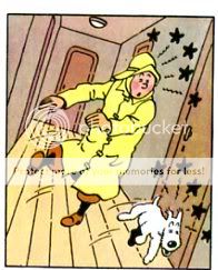
Thankfully, Alex Maleev’s artwork is easier to appreciate. His penciling is fairly realistic and detailed, but he applies multiple layers of color to his work, causing every image to appear dark and washed-out. While the coloring can make certain details hard to see, it effectively establishes the mood and atmosphere of an espionage thriller.

The main attraction though of Spider-Woman: Agent of SWORD is neither the story nor the art, but the format. Each motion comic episode runs about 10 minutes, and consists of three types of visuals. The first type is a sequence of still images accompanied by dialogue and other sound. During conversation scenes, the images are frequently re-used. The second slightly more sophisticated visual involves moving an image in the foreground while keeping the background still. The third type of visual, which is used for the vehicle chase scenes, is just low budget computer animation (which seems like cheating to me).

Several critics have accused Spider-Woman, and motion comics in general, of simply being low budget animation, and there’s a pretty strong case for that. But comparing motion comics only to animation ignores their biggest flaw, namely that the subtle communication between artist and reader is sacrificed without replacing it with the advantages of actual animation. While it probably goes without saying, comics are a sequence of artistic panels usually accompanied by text. But there’s more to reading a comic than just proceeding from top-left to bottom-right. The layout of panels, their size, the level of detail, and the amount of text per panel are all part of the communication between artist and reader. Motion comics take most of that away. Every “panel” is now just another background that fits the standard aspect ratio. And the pacing of the story is set by the motion comic producers rather than the artist and readers. Motion comics, in short, are something less than comics AND something less than animation.

Of course, motion comics do have one element that comics can never have: sound. The music and sound effects in Spider-Woman are used quite well, adding to the atmosphere of the story but generally remaining unobtrusive. The dialogue and Spider-Woman’s inner monologue are another matter. Bendis has a peculiar approach to the English language, which seems to consist mostly of repetitions, redundant statements, and pointless asides. Presumably Bendis is going for realism, but I can happily say I’ve never talked to anyone who speaks as strangely as the characters in this comic. I feel pity for the voice actors who had to read his lines and try to make them sound like something non-assholes would say. Nicolette Reed, who voices both Spider-Woman and Madame Hydra, doesn’t seem to quite know what to do with her lines, so Spider-Woman comes across as flat (and British?) while Madame Hydra quickly becomes obnoxious. But her performance seems Oscar-worthy compared to her co-stars. Particularly shameful are the “actors” who voice the Madripoor police detectives, who seem to take the Breakfast at Tiffany’s approach to portraying Asian men.

So the execution of Marvel’s first motion comic is not so good. Maybe a better example would change my opinion of the medium, but I doubt it. Still, it gave Marvel an excuse to come up with another corny character theme song. Behold, the Spider-Woman music video!

Update: the entire first episode is available for free for a limited time on Youtube. Check it out if you’re interested.

Update 2: David Weman was kind enough to provide a link to an animated short based upon Edgar Allen Poe’s “The Telltale Heart.” It isn’t quite the same thing as motion comics, but it’s a similar combination of still images and simple animation. And needless to say, Poe is a somewhat better writer than Bendis.

Music For Middle-Brow Snobs: The Fool

Cheesy contemporary country and other tales of heartbreak:

1. Mariah Carey — Betcha Gon Know (Memoir of an Imperfect Angel)
2. Lee Ann Womack — The Fool (Lee Ann Womack)
3. Miranda Lambert — Greyhound Bound for Nowhere (Kerosene)
4. George Strait — She Told Me So (It Just Comes Natural)
5. Bonnie Raitt — I Can’t Make You Love Me (Luck of the Draw)
6. Emmylou Harris — Lovin’ You Again (Cowgirl’s Prayer)
7. Merle Haggard — Learning to Live With Myself (The Bluegrass Sessions)
8. Kieran White — Hummingbirds (Wayfaring Strangers: Lonesome Heroes)
9. John Villemonte — I Am the Moonlight (Wayfaring Strangers: Lonesome Heroes)
10. Pearls Before Swine — Morning Song (One Nation Underground/Balaclava)
11. ????? — Rashomon (????)
12. Sokai Stilhed — Howl (Second)
13. Arthur Rubinstein — Chopin: Mazurka #47 in A Minor, Op. 68/2, CT 97 (Chopin: 51 Mazurkas)
14. Brandy — Almost Doesn’t Count (Never Say Never)

Download: The Fool.

And if you missed it, last weeks download is here,

Awkward Introductions

Hey everyone. Having worked my way up the ladder from lurker to commenter, Noah graciously offered me a position as the newest associate utilitarian. I’m unprepared and completely unqualified, but I’m pretty good at bullshitting, so I hope you’ll all bear with me.

Quick bio: I’m single, late twenties, middle class, white, and male. The entire entertainment industry is built around catering to me. Sorry.

I grew up in northern Virginia, specifically Fairfax County. My educational background is in history and public policy. Like many of my classmates, I ended up working for the federal government (in case you’re wondering, your tax dollars have in fact gone into my pocket. No, I didn’t really work that hard for it. Sorry). I’ve specialized in immigration, having worked for both the Department of Homeland Security and the Department of Justice. If that sounds exciting to you, then you’ve clearly never worked in government.

I don’t have the typical comic geek background. For starters, I’ve never set foot in a comics shop. I started reading X-Men in my early teens, back when they could still be found in supermarkets, but I gave it up as soon as I got my first car. I didn’t care about comics at all until just a few years ago, when an old college friend lent me her copies of Sandman, Watchmen, and Maus. Being totally honest with you all, I never got past the first couple pages of Maus, but the other two books were enough to get me interested in comics again. And so I began reading everything I could find and looking for people on the Internet who shared my obsession. And it turns out that there are a freakin’ lot of people who blog about comics. So one more can’t hurt.

Thanks to Noah; hopefully I can contribute something to the HU.

Utilitarian Review 10/9/09

Hoods Here

This week was devoted for the most part to our bande desinee roundtable. Special thanks to Derik Badman for his special guest contribution. Please check out his own blog, won’t you?

Despite my ongoing struggles with mediafire, I did post a mix last week, including Sonic Youth, experimental chinese music, Michio Kurihara, the inevitable Chopin, and other dreamy drony things. Download it now before mediafire makes it disappear in their mysterious way.

Hoods There

Bunch of stuff this week. First, I have an article about why Bob Wills is country and not jazz over at Splice Today.

The point here isn’t that Wills was ripping off Count Basie like Elvis ripped off Jackie Wilson. Rather, that “ripping off” doesn’t really do justice to the pervasive way in which race and marketing have affected American music. Because the fact is that Bob Wills is different from Count Basie. He used different instruments, he played different songs, he didn’t use the same musicians. (Segregation meant he couldn’t have, even if he wanted to.) Those differences could have been less important than the similarities, but, because of history and marketing and race, they weren’t. Similarly, Elvis is different from Jackie Wilson, and contemporary R&B is different from contemporary country. How music gets labeled affects who listens to it, who loves it, who uses it, and, thus, what it is.

My interview with Andee at the amazing San Francisco record store Aquarius Records is online at Madeloud. Here’s an excerpt, including a little bit that didn’t make the published version:

Me: Looking at these lists online, you sort of get the feeling that the store itself must be gigantic. How big is the store? How many records do you have in stock at one time?

Andee: That’s funny. It really does. And I sometimes feel bad when someone finally gets to visit, having come all the way from Japan or the UK, I feel like we should apologize for how small the store is, but almost always, people dig it. It’s small-ISH, but there’s tons of records, cds, plants in the windows, posters and flyers, and crap all over the walls, doors and posts and windows have been painted by artists, there are video games (a Tron, a Rastan and a Joust, and we usually have a Ghosts And Goblins, but that one’s broken), there’s good music playing, it’s just really comfortable and worn and home-y, the way a record store should be. I love places like Amoeba and Virgin and Tower, but that’s a whole different vibe, places like aQuarius are more inviting to just hang out, browse, shoot the shit with whoever is working, play some Joust. I like it like that. As for how many records we have in the store, only a fraction of what’s on the website. we’re usually full to capacity, but the cool thing about visiting is, there’s always plenty of stuff that is NOT on the site, maybe stuff we haven’t reviewed yet, stuff that we were only able to get a few copies, not enough to post on the site, some stuff that just won’t make it on the site, for whatever reason, not to mention TONS of awesome used stuff, and new arrivals and more…..

Also Splice Today has reprinted my review of Julia Cameron’s The Artist’s Way, which ran some years back in the Baffler. (I think it was my first published essay, actually.) And I have a review of a Tommy Cash reissue at Metropulse.

Hoods Everywh…Oh, Wait, Those Aren’t Hoods

A note on this website points out that the deevolutionizer in this issue of Wonder Woman apparently inspired Devo. Who knew?

Diana Kingston-Gabai explains that crossovers still suck.

This is a great fucking essay by Terry Eagleton about what atheists are stupid and god is great, even if he isn’t real.

And so the very act of attempting to close history down has sprung it open again. Both at home and globally, economic liberalism rides roughshod over peoples and communities, and in the process triggers just the kind of violent social and cultural backlash that liberalism is least capable of handling. In this sense, too, terrorism highlights certain contradictions endemic to liberal capitalism. We have seen already that pluralistic liberal societies do not so much hold beliefs as believe that people should be allowed freely to hold beliefs. The summum bonum is to leave believers to get on with it unmolested. Such a purely formal or procedural approach to belief necessitates keeping entrenched faiths or identities at a certain ironic arm’s length.

Yet this value—liberal society’s long, unruly, eternally inconclusive argument—also brings vulnerability. A tight national consensus, desirable in the face of external attack, is hard to pull off in liberal democracies, and not least when they turn multicultural. Lukewarmness about belief is likely to prove a handicap when one is confronted with a full-bloodedly metaphysical enemy. The very pluralism you view as an index of your spiritual strength may have a debilitating effect on your political authority, especially against zealots who regard pluralism as a form of intellectual cowardice. The idea, touted in particular by some Americans, that Islamic radicals are envious of Western freedoms is about as convincing as the suggestion that they are secretly hankering to sit in cafés smoking dope and reading Gilles Deleuze.

This is actually the last chapter of Eagleton’s latest book, “Reason, Faith and Revolution,” which is amazing. Best purchase on Amazon I’ve made in a good long while. If you want to check it out, it’s here.

Zombie: A Mindless Affair

I’m going to be in an art show on October 23. Here are the details:

Zombie: A Mindless Affair
Curated by: Edra Soto

Also Project Wall Space:Irene Perez
ZOMBIE ARTISTS:
C Through Outfit (Erik Brown, Catie Olsen, Carl Warnik and Dawn Reed)
Deborah Boardman
Nate Lee
Jason Mena
Mindy Rose Schwartz
Amanda Browder
Derek Chan
Christopher Simkins
Christopher Smith
Ann Toebbe
Harold Mendez
Paul Nudd
Noah Berlatsky
Vladimir Kharitonsky
Dan Peters
Gretel Garcia
Susannah Kite Strang
Rachel Hewitt
Corinne Halbert
Bert Stabler
Beatriz Monteavaro
Miguel Cortez
Edra Soto
Candace Briceno
Death by Design Co. (Teena McClelland and Michelle Maynard)
The Wiener Girls (Sydney Croskery and Katey Rafanello)
Betsy Odum
Jen Thomas and Bobby Lively
Chris Hammes
Andrea Jablonski
Jeff Libersher

ABOUT: Zombie: A Mindless Affair

Celebrations that invite us to observe a historical occurrence are still strongly practiced in contemporary culture. Halloween, as celebrated is America, profoundly depicts the strongest features from gothic and horror literature, film, TV, and graphic arts. Among the repertoire of traditional characters, the zombie distinguishes itself for possessing the biology and behavior of a normal human being, yet lacks consciousness. This exhibition uses the vernacular of the mythological zombie as a starting point to engage in ideas of death, mindlessness and symbolisms for the occult and inexplicable. The term zombie also intends to address issues referring to the mindless self in a social spectrum: leading and following; acts of automatism and fanatic behaviors.

From 6:30-7:00pm on opening night:
Join author Scott Kenemore, artist Mindy Rose Schuartz and collaborators Teena McClelland and Michelle Maynard from Death by Design Co. in conversation. They will talk about the darkness that enlightens their work. Screening of the film made by Death by Design Co. immediately after the conversation. Moderated by Edra Soto

Opening Friday October 23 from 6pm-10pm
October 23 – November 21, 2009

ANTENA
1765 S. Laflin St.
Chicago IL 60608
www.antenapilsen.com
antenapilsen (at) gmail.com
_______

And, hey, here’s the piece I’m showing for those not in the Chicago area (it’s better in person…no, really! Trust me!)

Sequential Surrender Monkey: The Case Against Tin Tin

1. Slapstick

Rereading Tin Tin, what struck me most was just how French it is (or how Belgian, I guess.) Everything’s just so darn greasepaint-precious. “Ooooh hooo hooo…the cursing captain…he fall down and bump ze head! Oh stop — the Thompson Twins, they’re hats, they are pulled down over their eyes so only ze bristley mustachios are showing! Oh, ze little doggie, he is drunk!” In Asterix, the physical humor is explosive and go-for-broke; when you hit the roman soldier, he rockets out of his sandals in a riot of motion lines and explosive puffs; when he lands in the next panels on his head, you get to watch his toes violently twitching. In Tin Tin, on the other hand, the slapstick almost seems to be in quotes, like you’re watching mimes. Motion lines are little curlicues, and the bashed tend to look startled and dizzy rather than actually bashed about. If Asterix is analogous to Bugs Bunny, Tin Tin is Disney; skilled, tasteful, and kind of boring.

2. Characterization

A Wikipedia entry on Tin Tin compares Herge’s characters to Dickens’. It’s not a comparison that serves Herge well. Dickens did use caricature, but those caricatures are multi-layered, encompassing both biting satire and a knowing humanism. In Bleak House, for example, Richard Carstone’s rationalizations around money are both funny and tragic, and feed naturally into his gradual embitterment. Or there’s this passage from the same novel:

“There has been only one child in the Smallweed family for several generations. Little old men and women there have been, but no child, until Mr. Smallweed’s grandmother, now living, became weak in her intellect and fell (for the first time) into a childish state. With such infantine graces as a total want of observation, memory, understanding, and interest, and an eternal disposition to fall asleep over the fire and into it, Mr. Smallweed’s grandmother has undoubtedly brightened the family.”

The Smallweeds here are a very particular kind of stultified; enlivened by the one senile figure in their midst. The joke comes out of that specific contrast.

Herge’s caricature’s on the other hand, seem much more broad and tired. Captain Haddock is a sailor who curses and drinks too much. Professor Calculus is an absent-minded (and deaf) professor. The Thompson twins are bumbling cops. Those are the jokes, and they were pretty old, I have no doubt, even 50 years ago when Herge was writing these. Not that they’re handled poorly or that they aren’t often funny or surprising…but overall, and especially if you read a bunch of them in a row, they start to feel decidedly thin. The truth is that Herge’s penchant for racist caricature and easy anti-semitism wasn’t an accident; virtually all his characters are based around easy stereotypes and fusty gags; it’s just that making fun of sailors looks more innocuous these days than ridiculing the stupidity of black people or the avarice of Jews. Fagin is offensive as well, of course, but he’s also got enough depth and texture that you feel that there’s something to him beyond the anti-semitism…or at least that the anti-semitism is somewhat textured. But when Herge uses a stereotype, as he almost always does, the stereotype is pretty much all there is happening.

3. Art

Herge’s obviously a very skilled illustrator, with an amazing facility and capacity for rendering detail. And in the abstract, I can certainly appreciate a complicated tour de force like this:

But in terms of visceral appeal, though, his art just doesn’t do that much for me. The cleanness and perfection of it, the evennness of the lines; it almost seems produced by machine. For example, compare Herge’s camels:

with Harry G. Peter’s elephants.

Herge’s drawing is much more correct anatomically, but it’s also much less fun to look at. The camels are too smooth; they have the same weight as everything else. They might as well be boxes, for all the character they have. The bits of personality — the one camels’ smile, the other camel’s knowing look — actually comes across as irritatingly smug. Again, it feels Disneyfied to me — a lack of personality gilded with cutesiness.

4. Layout

Given his status as one of the great figures in comics, it’s amazing how little interest Herge seems to have in the page as an aesthetic unit. He does vary panel sizes to accommodate action, and so he can fit big objects like planes:

And he will use bigger splash panels for effect, as with the camel image above. But in terms of unifying an entire page….he just doesn’t bother. Look at this for example:

The most striking visual motif on the page is the binocular frame. It’s used in three panels…but that’s pretty much all that can be said for it. Those three images aren’t balanced out in any particular way that I can see; they’re just placed on the page at the point where they logically occur in the narrative.

You really see this in the use of text as well, which sometimes just overwhelms the pictures.

That’s gratuitous as well; that text is just restating things you already know. It’s off-putting, ugly, and unnecessary. I don’t think it’s laziness, — Herge is never less than entirely professional and meticulous, and writing out all those words was probably actually a fairly irritating task. But it does suggest that he doesn’t have much of an eye for, or interest in, design.

_____________________

Overall, then, Herge’s perfectionism and professionalism, which are impressive in small doses, become irritating and burdensome the more you realize that that’s all he has to offer. I remember being a bit bored by them as a kid, and as an adult…I’m maybe even more bored by them. The plots bop along, and there are still some excellent gags: the Thompson twins bizarre affliction — whereby their hair grows excessively fast and changes myriad hues, is visually spectacular and completely ridiculous. And I had forgotten how weird and disturbing some of the dream sequences are. Tin Tin turning into a giant bottle of wine with his head as the cork which Captain Haddock tries to twist out; the weird fever dream of a prophet grasping a picture of a giant spider — such moments come close to thematizing the oppressively flat unreality of Herge’s world. Mostly, though, that flat unreality isn’t disturbing or affecting. It’s just flat.

_______________

You can read the entire roundtable here.