Hooded Polyp: Earthy Anecdotes

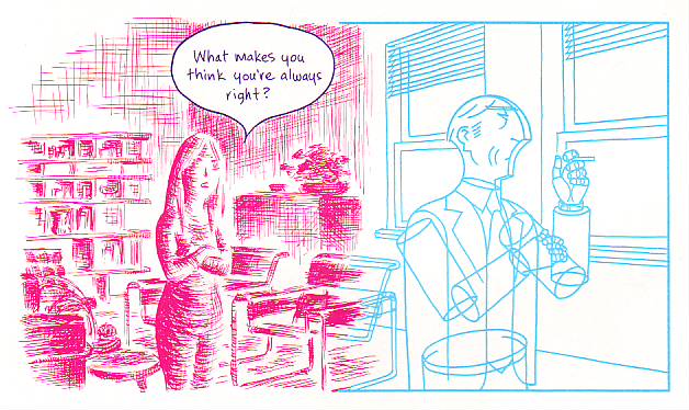
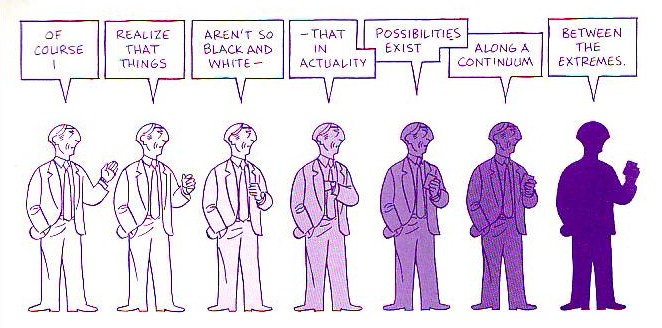
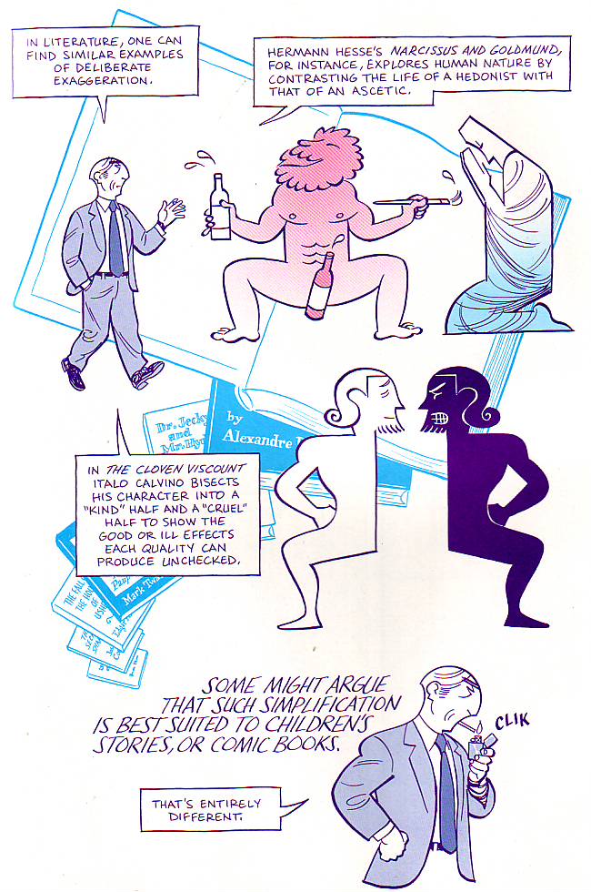
In Caro’s recent post she argues that Asterios Polyp fails to deliver a kind of literary complexity.

The result is the reiteration – on the level of performance if not assertion – of a hierarchical division between “the literary” and the “graphical”: a dichotomy that is aggressive and dismissive in precisely the same way as Asterios’ treatment of Hana. It is completely uninformed about how literary fiction works. It creates a destructive incoherence at the center of the book.

I’ve probably bashed Asterios Polyp enough for one lifetime at this point. But I thought it might be interesting to look at a couple of examples of works that I think demonstrate the kind of literariness Caro is looking for.

I’ve been rereading Wallace Stevens recently, and I’m quite taken with this poem, the first in his first collection:

Earthy Anecdote
Every time the bucks went clattering
Over Oklahoma
A firecat bristled in the way.

Wherever they went,
They went clattering,
Until they swerved
In a swift, circular line
To the right,
Because of the firecat.

Or until they swerved
In a swift, circular line
To the left,
Because of the firecat.

The bucks clattered.
The firecat went leaping,
To the right, to the left,
And
Bristled in the way.

Later, the firecat closed his bright eyes
And slept.

As with a lot of Stevens’ poetry, nobody seems all that certain what the fuck this means. I’ve seen various efforts to parse it as some sort of allegory (the firecat means “change” was one particularly painful example.) But none of them are very convincing. Even the relation of title to poem seems maddeningly obscure. How is this earthy? Is there some sort of bizarre sexual double entendre known only to Stevens? That seems fairly unlikely — and yet, no other explanation presents itself.

The confusion here is, I think, on one hand simply a result of looking too deeply, or of coming at the poem from the wrong perspective. A lot of Stevens’ writing seems to me to be inspired not by abstruse epistemological theories or Romanticism, but by children’s poetry. “Earthy Anecdote” makes most sense if read not as allegory or complicated symbol, but as nonsense verse. Dr. Seuss’ battling tweetle beetles aren’t symbols of the futility of martial endeavor. They’re just goofy fun for kids. Similarly, the clattering bucks and the firecat are entertaining images. It’s fun to say “bucks went clattering over Oklahoma.” (Go ahead, try it. I’ll wait.)

At the same time…Stevens was also, and undoubtedly, inspired by abstruse epistemology and Romanticism. And he was writing verse for adults, not kids. Starting his first volume of poetry off with a bit of extravagant silliness is a fairly dramatic line in the sand — even if the line is curved. It’s a certain kind of statement; an elliptical declaration of love for the earthy, clattering bucks rushing about in glorious, purposeless panic — metaphors in frantic search for a meaning. In that vein, perhaps you can see the firecat as Stevens himself, leaping here and there to goad his images (and perhaps his readers) into a lather, before closing his bright eyes in self-satisfied pleasure. Or, alternately, Stevens might be the bucks, thrashing this way and that in an effort to avoid a meaning which is always leaping to thwart them — and which, in lazy triumph, curls around the poem at the end despite every horse’s best efforts.

None of these explanations are “right”, I don’t think. Rather, the point of the poem is the pleasurable possibilities of the point of the poem. That’s how the modernist puzzle works; the poem is playing with its own interpretation. Form and content (buck and firecat?) aren’t separated, or even separable; the content of the poem is its own metaphors. The reader doesn’t so much understand the poem, as shuttle about inside it. It’s a joke where the punchline is that the form of the joke is the punchline.

There are not a ton of comics that play these kinds of shell games with meaning, form, and content. But one example that does spring to mind for me is Yuichi Yokoyama’s Travel. In my review on Comixology I wrote:

Yokoyama had wrong-footed me. I was looking for realism, and so I found the epistemological uncertainty frustrating. But the book isn’t realism — or not exactly. It’s pomo; Yokoyama’s tongue is in his cheek the entire time. Take the scene of ducks flying over the plane as hunters shoot at them. The footnote points out that the hunters all miss, and indeed, you can see the ducks traveling in a perfect V, not even disturbed by the shells exploding in pristine, regimented bursts all around them. The demands of narrative (somebody shoots, somebody hits) are sacrificed, with a wink, to the exigencies of layout. It’s as if the hunters and the ducks are not adversaries at all, but part of some single great mechanism, controlled by one guiding hand. As, of course, they are.

In Travel, as in Stevens, the sleight-of-hand manipulation of the tropes of the medium, the formal elements of the work, are themselves the content. As a result, modernist works like this are like two facing mirrors; absolutely flat surfaces leading into infinite depths.

I’m not saying that this is the only kind of worthwhile art by any means. I don’t want all art to be playful modernist puzzles anymore than I want all art to be slasher films or shojo. Still, Stevens and Yokoyama are great, and I wouldn’t at all mind seeing more comics that followed in their hoofprints.

Hooded Polyp: Parallax Review

Following links from Noah’s kickoff post through Matthias’ earlier essay on Asterios Polyp and on into the plethora of reviews gives a tour de force of puzzle-book annotation: Hellenistic references, astronomy, symmetry, architecture and fine art, the metaphorical/symbolic use of color and styles of linework, the yin-yang, and so forth. All of this clever, creative, and well-executed formalism works in the service of the book’s themes, which, the critics tell us, are myriad permutations on emotional naturalism and the limitations of duality – pretty much every duality you can think of.

What this emphasis on parsing the puzzle pieces and tracking the themes all adds up to is another tour-de-force: this time of modernist reading. Matthias sums up it up when he asserts, beautifully and certainly accurately, that the “graphic representation happens on a narrative level above that directly experienced by the characters, directing the reader’s understanding of their inner lives and states of mind.”

I’m going to pick on Matthias here, kindly I hope, because I found his essay to be far and away the most sophisticated and compelling articulation of this approach to interpreting Asterios Polyp — but it’s an approach that I find neither sophisticated nor compelling. With attribution to Bart Beaty (although Doug Wolk also makes the point), Matthias describes all this meaning-rich formalism as a “delayed Modernism,” and to some extent it is – particularly the Joycean puzzle-box elements and the self-conscious effort to push and expand the ways the form can make meaning. But for whatever motivation, this Modernism is small in a way that the more timely Modernisms of the early- to mid-20th century were not: it is primarily a modernism of technique rather than a modernism of ideas. Pound’s dictum of “Make it new!” finds its manifestation here not in new ideas about the world, but in new ways of representing and documenting old ideas about the world using the comics medium. Taking on the project of modernism 75 years after its time has passed is art in the defensive mode: starting from the assumption that comics has something to prove rather than something to offer.

I want to posit for the sake of argument that Asterios Polyp is in fact not a work of Modernist fiction that yields its greatest insights and makes its strongest contribution through this puzzle-box formalist reading but that it is a work of Postmodernist fiction that yields equally well to readings of its “deep structure.” This is, I think, somewhat inaccurate: Mazzucchelli clearly intended all those clever references and allusions and manipulations of formal elements, and it is unarguable that they form the most impressive and coherent texture of meaning in the book.

But there is content in the form overall: it’s apparent when we redirect the attention we’ve been paying to Asterios and Hana as archetypes of gendered characters and instead abstract them into archetypes of cultural genealogy and influence: the Hellenistic and the Japanese. The book works passably well – although it is difficult to knit all the elements in – as an allegory for the gradual shift of Western culture (particularly art culture) away from rigid Hellenism to incorporate the more fluid and holistic perspective of the East. Read diachronically, it is a representation of the history of this evolution across the 20th century; read synchronically, it depicts their aggregated and therefore simultaneous presense in contemporary art and culture. (This reading accounts for all those niggling elements that felt anachronistic, but renders many of the specifics of the formalism irrelevant.)

I’m going to pick on Matthias again – I think this is extremely literary. But I want to take a fairly passioned exception to the assumptions about literary meaning – and even to the definition of “literary” – implicit in sentences like this one: “A textbook example for the literary crowd if one is needed — and it might well be — that graphic novels are not, actually, novels with pictures in them.”

There are two obvious ways to respond to the contempt for the “literary crowd” that drips from this sentence. The first is to point out that any literary-minded person who has been paying attention to graphic novels enough to have an opinion at all by now should be fully aware of this fact. The second is to point out that the main reason why a literary-minded person who is paying attention would agree with the statement “graphic novels are not, actually, novels with pictures in them” is that graphic novels are not, yet, consistently rising to the level where a literary person would grant the appellation “novel.” (Asterios Polyp indeed comes closer than most.)

For “literary” people, “literary” entirely stopped denoting “tightly constructed narrative story” sometime between Joyce and Coover. The deconstruction of that idea, of the very concept of narrative coherence as a “literary” attribute, was the project and product of literary Modernism. Statements like these miss that entirely:

Furthermore, the centrality of autobiography as a genre to the development of the European comic book is almost by default primarily a literary achievement. And, almost without exception, the artists who have found greater audiences – the Satrapis, the Sfars and the Trondheims – work within relatively traditional visual idioms and privilege their storytelling over graphic experiments.

“The point being, firstly, that most of the visual innovators of the last couple of decades have primarily explored the already existing visual tropes and strategies of narrative cartooning, rather than go beyond them, and secondly, that they have predominantly done so in service of a tightly constructed, “literary” narrative.

Both the quotes and my stock responses reproduce a contrived and unnecessary distinction — even a hostility — between the literary and the visual. Both ignore the extent to which that binary – that particular binary – is not only just as false as any of the binaries in Asterios Polyp, but specifically, and inherently, and inescapably false in comics more than in any other medium. Claiming that comics are a visual medium and not also a literary one is not only misunderstanding what literature is after Modernism, it is using as the model for “art comics” a “formalism” more like what literature espoused before Modernism.

And that is the great failure of both this book and its critics: this subject matter and medium in the hands of our greatest literary figures would not be just a meditation on history or emotional naturalism or the limitations of binaries; it would be a performative enactment of the ways in which comics defies the binary between literary fiction and visual art. Cartooning by definition deconstructs its “constitutive binary logic.”

The formalist instantiation of that deconstruction is the great opportunity for “metafiction” that is missed here.

As Noah rightly pointed out, this book pays disproportionate attention to one side of the binary, the “visual.” Neither Mazzucchelli nor his reviewers learned the book’s lesson – at least not as anything more than an aphorism. The result is the reiteration – on the level of performance if not assertion – of a hierarchical division between “the literary” and the “graphical”: a dichotomy that is aggressive and dismissive in precisely the same way as Asterios’ treatment of Hana. It is completely uninformed about how literary fiction works. It creates a destructive incoherence at the center of the book.

The “delayed Modernist” project in comics, especially insofar as it describes a formal project focused on making the medium’s visual components more fully saturated with meaningfulness, arrogantly rejects – against the spirit of Modernism – any exploration of the ways in which the experiments in prose conducted in literary modernism and postmodernism are applicable to the graphic form. This disciplinary prioritization of the visual is not delayed Modernism. It is delayed Enlightenment. But comics were always already postmodern. So this is also nostalgia, in academic’s clothing.

Comics rightly should stimulate conversation between the best of literary post/Modernism and the best of visual post/Modernism, with the aim of generating increasingly subtle and sophisticated hybrids and an increasingly subtle and sophisticated understanding of the possibilities and internal logics of those hybrids. For whatever reason – be it the technical demands of drawing, the training of art school, or just plain imaginative disposition – the dominant trend is to privilege and prioritise the “visual” over the “literary” – a category which critics and cartoonists seem incapable of understanding as anything other than a synonym for “well-wrought prose storytelling.” I hope comics won’t have to lose an eye before you figure out how stupid that is.

Note: updated for clarification June 6 1:20pm.

Update by Noah: You can read the entire Asterios Polyp roundtable here.

Update by Noah 6/20/10: This comments thread was damaged in a blog outage. I have manually restored the damage, but time stamps are off and one or two comments may be out of order. Please let me know in comments if you notice errors.

Talking Polyps

I thought we’d take a pause in the middle of our Asterios Polyp roundtable to highlight some of the points that have come up in comments.

Craig Fischer had a fascinating comment on Mazzucchelli’s use of word balloons:

You can see how appealing and effective Mazzucchelli’s word balloons are by comparing them to the balloons in most contemporary mainstream comics, which look ugly to me: resolutely rectangular, filled with text that looks like it was generated by computer.

Mainstream creators have struggled with personalizing captions, especially when the text moves across panels and the speaker is unseen in the second panel.

Kurt Busiek will sometimes write one panel where a character says something like, “If we can’t stop that dinosaur…” This panel is then followed by another that (1.) visually eliminates the speaker (showing, say, only the rampaging dinosaur); but (2.) continues his/her speech (“…we’re all DEAD!”) in a caption.

Alert readers realize that the words in the second-panel represents the character continuing to talk. But Busiek and his collaborators have tried to insert other cues to eliminate any ambiguity about who’s speaking. One solution: characters are assigned different colors, and their captions are always in that color.

When Busiek wrote THE AVENGERS, he sometimes included the logo of the speaking character at the beginning of the caption box. For instance, a little shield appeared at the beginning of the caption if Captain America was talking but was unseen.

All of this really cluttered up the visuals, though–sometimes you’d have five different logos and colors for the captions littering a single page–and was nowhere nearly as elegant as the balloons in ASTERIOS POLYP.

Suat compares Asterios Polyp and Born Again (scroll down in comments for my response.)

What’s also interesting is that Born Again is filled with hoary cliches: damsel in distress, betrayal and redemption, the hero’s “rebirth” etc. Exactly the kind of thing which Noah decries in his review of AP. How many times have we seen the noir hero pull himself up from the gutter? (Darwyn Cooke’s Parker must be the most recent example/adaptation in comics)

And yet Born Again seems less tiresome in that respect when compared with AP which is similarly choked with cliches (or archetypes, whichever way you want to look at it). Does genre work at a different level than work of more serious intent? Does it appeal to some subconscious craving particularly in the male mind? I imagine that some of Born Again’s success must be put down to its pacing and the detailing of emotions(the later of which is lacking in AP possibly by choice). But is it only that extra twist of lemon in the plotting and the characterization?

Sidenote: You can actually see some of the dry brush work mentioned by Derik (re: the rocks in AP) in Born Again. I presume it became an even greater aspect of his art following his sojourn in Japan. Born Again would appear to be a steep learning curve for Mazzucchelli – you can see him improving as an artist right up to the final issue.

Robert Stanley Martin provides a choice Mazzucchelli quote

Here’s Mazzucchelli’s account of his collaboration with Miller on Born Again, from TCJ #194:

Frank was writing full scripts, but we were also discussing the stories. In fact, it was Frank’s idea to list our credits on the book as just reading “by Frank Miller and David Mazzucchelli,” not broken up into writer/artist/whatever. He asked me if that would be okay with me, because he didn’t want there to be any confusion. And as far as I was concerned it was perfectly acceptable, because the way we were working, there were ideas going back and forth where it would have been difficult to draw a clear line of demarcation–this came from one person, this came from the other person. Frank had the ideas for the stories, and he would call me up and we’d talk about it. And we’d hash it out and I’d have ideas of my own: “Well, what if this happens? And how about if we show it this way?” or whatever. And then he’d write a full script and then we’d have another long discussion about the script and then I’d draw from that. In fact, as I recall, everything that happens in the first three issues or so Frank initially wanted to put into the first issue. But because of discussions we had, we ended up expanding that, so that it was much slower, more densely packed.

And Daniel BT highlights the fact that the roundtable has been awfully cranky.

Anyways, one thing that bothers me about all this reviewing about Asterios Polyp is that nobody seems to ENJOY the comic. Rather than point out the innovations in the drawings, they’d rather point out how superficial the story is, how one-dimensional the characters are, and how unlikeable the main character is. I don’t like Woody Allen that much either, but I prefer Asterios better, since he’s not as neurotic, even when the spotlight keeps shining on him.

Lot’s more chatter in comments, and three more reviews to go (by Caroline Small, Robert Stanley Martin, and Matthias Wivel) before the roundtable winds down.

Utilitarian Review 6/5/10

On HU

Most of the week was devoted to the ongoing Asterios Polyp roundtable. Derik Badman, Craig Fischer, Vom Marlowe, Richard Cook, and me have all had our turns; Caroline Small, Robert Stanley Martin, and Matthias Wivel are still to come.

Also this week, Erica Friedman talked about condescension in comics.

Utilitarians Everywhere

On Splice Today I reviewed Prince of Persia.

So, okay, it’s true—this is a big, dumb, Hollywood action-adventure vehicle with nothing in its head except things blowing up, sword fights and pretty actors staring soulfully into each others eyes for a moment before more things blow up.

I’m okay with that.

Also on Splice Today, I talk about hook up culture, teens, and how the Atlantic Monthly is turning into an exploitation rag.

If you want to know whether girls have become more or less promiscuous, you don’t look at what they’re reading or listening to, or even at what big sex scandal occurred in which random college or prep school. You look at teen pregnancy rates. You can find out in less than 120 seconds that teen pregnancy rates fell in virtually every state between 1988 and 2005. After 1995, teen pregnancy rates nationwide declined every year for a decade, hitting their lowest point in 30 years in 2005, smack dab in the middle of Flanagan’s hook up decade. It’s true that the next year, in 2006, rates rose by three percent, and preliminary findings suggest they may have risen again in 2006. Even so, rates remain historically low; in 2006 teen pregnancies were only 71.5 per 1000, as compared to, 83.6 per 1000 in 2000, 99.6 per 1000 in 1995, and 116.9 per 1000 in 1990. To suggest, as Flanagan does, that teens were especially promiscuous in the past decade and a half is simply wrong. On the contrary, teen pregnancy has apparently declined for more than a generation, the growth of the Internet notwithstanding.

Other Links

Dara Lind explains why Facebook sucks.

Alyssa Rosenberg talks about MIA and Courtney Love.

Tucker Stone and Benjamin Mara have a long, thoroughly entertaining discussion about The Rise of Arsenal, of all things.

Hooded Polyp: Smart Cardboard?

David Mazzucchelli’s formal innovations in Asterios Polyp are almost sixty years old.

The image above shows two 1953 “Pogo” newspaper comic strips by Walt Kelly (as published in Pogo, volume 10 – Fantagraphics Books). Sarcophagus Macabre, the vulture, “talks” in courier font (June 10) while the Deacon Mushrat speaks in Gothic Blackletter (June 11). Plus: Sarcophagus’ speech balloons have the format of a condolence envelope. You can read a brief, but interesting essay about politics in Pogo, here.

As we can see above David Mazzucchelli also used different speech balloons’ formats and fonts as characterization (see also Derik’s post).

Sarcophagus Macabre’s name, species, and ascribed balloon format are enough to know what he is, but the courier font needs an explanation: he’s an hypocrite because he expresses condolences sending form letters written with a (cold, of course) machine. The Deacon talks in Gothic fonts because he’s a cleric (he reads the Bible and he’s a conservative, not because he’s a Christian, but because he’s defined by Middle Age writing).

In Mazzucchelli’s case Asterios’  mother “talks” in D’Nealian cursive script (an anachronism) indicating candor and childishness while the father talks in pseudo Greek fonts. He was indeed Greek, but since ancient Greece is known, among other things, for its Mathematicians and Philosophers, the fonts also connote a rational man. Notice also the wavy line that defines the mother’s speech balloon and the father’s rectangle (with no edges; he’s a mild-mannered man). 

Saul Steinberg drew the two couples above (as published in The Passport, 1954). Do we start to see a pattern… and a problem? Men are “square,” rational beings, women are vague, intuitive, entities.

As we can see above (in a panel from Asterios Polyp), adding magenta (hot) for Hana and cyan (cold) for Asterios it’s the same view of men and women, the same stereotyping… Ooops! I used the “s” word!…

In a famous essay art historian E. H. Gombrich mentioned “wit” to describe Saul Steinberg’s drawings. Here’s what he said:

In many of his drawings it is the line of the graphic medium which seems ‘an echo to the sense’. His ‘Family’ […] shows us the father firmly modelled, the mother with undulating lines, the grandmother all but fading away between hesitant pen strokes, and, of course, the child drawn in the style of children’s scribbles.

From here it is but one step to the representation of what are called our synaesthetic reactions, the depiction of one sense modality by another.

The ekphrasis sounds familiar by now… The synaesthesia I frankly don’t see (it lacks that “one step,” I suppose). I will not deny the wit and creativity of Saul Steinberg’s visual solutions (some would say visual writing), but drawing attention (pun intended) to just a singular personality trait is a simplification. It has great applications in political satire, no doubt, but it’s not so great a device in a serious (graphic) novel.   

David Mazzucchelli agrees with me (or, his character does, as seen above), but he risked the blunt approach nonetheless as seen below (with a pint of self-irony: comic books, really?!)…

Comics are sequences, so, David Mazzucchelli could explore Saul Steinberg’s ideas in a more complex way: showing mood transformations, for instance (see below).

Hana goes from undefined (painterly, as Heinrich Wölfflin put it) to defined (linear; ditto). Wölfflin’s opposition (inspired by Friedrich Nietzsche’s Apollonian-Dionysian dichotomy) was one of Asterios’ favorite aesthetic theories; the other two being essentialism and Louis Sullivan’s famous diktat “form follows function.” She goes from magenta (irrational, life) to cyan (rational, thinking).

The procedure is welcomed, but were the googly eyes and the Utamaro mouth really necessary?…

If you read ’til here you must be saying by now that I hate Asterios Polyp. Well, I don’t, I like the tour de force, but I must plead guilty of double standard. I’m not the only guilty one though: many critics forgive a cliché and a stereotype (calling it “an archetype”) in adolescent and YA genre comics while vigorously attacking the same flaws in art comics. I did the opposite and I still think that Asterios Polyp is one of the best comics published in 2009. I’m sure that I’m misguided though because I failed to read all those marvels published by the big two…

____________
Update by Noah: The entire Asterios Polyp roundtable is here.

Rocks fall, everybody dies: Asterios Polyp

This comic made me cranky.  I thoroughly enjoyed the art, which has a clean open feeling and lovely line work, and thought the story was sweet and rather sad, if a bit rote, and then….

I read the ending. 

‘Rocks fall, everybody dies’ is a phrase sometimes used in manga circles to describe a long running manga that the artist, for some reason (usually boredom) hates and cannot figure out how to end.  So they put the characters somewhere, dump a bunch of boulders on them, and there’s your insta ending. 

This comic took a story about small character changes and growth and slammed a big artistic fist down on it.  I’m sure I’m supposed to think Deep and Meaningful thoughts about why it’s an asteriod and whether Asterios is related to asteroid and whether personal changes have any effect compared to outside forces, but the story is not strong enough.  I don’t care anymore.  The artist took a boring subject that was drawn beautifully and poured a big can of paint on it (or insert your artistic edginess metaphor here).  I no longer care because the weird ending just made the whole story immaterial. I’m sure someone, somewhere, could make it an interesting artistic statement, but this is not that comic. 

And yeah, I appreciated, vaguely, the double layers everywhere.  The man with confidence who dreams but never creates, the woman who builds but has no confidence, the two forms of design, the car, all of it, but I don’t care anymore.  Not in a hateful way, but just in a bored way.  Ah well.
_______________
Update by Noah: The whole Asterios Polyp roundtable is here.

Overthinking Things 6/3/10

True story – I was in Wales with a Welsh friend who said to me, “You wanna learn some Welsh?” I said yes and she replied, “Baaaah.” I said, “That’s only funny if you say it – if I said it, it would have been condescending.”

Last month, my comments about “comics being condescending” were analyzed thoroughly by readers here – and it made me think over what I really meant when I said that. What I mean is this:

When I call dorky guys who obsess over comic art of women with unrealistic body proportions but treat actual women with fear and intolerance, “Loser Fanboys,” I am *absolutely* being condescending.

On the other hand, when I make a joke about lesbian dating and u-hauls, well then that’s tiresome, but acceptable. If *you* make that joke, you are not only being tiresome, you are also being condescending.

To me, condescension is not just talking down to someone, but talking about them in a dismissive, disempowering way. Stereotyping is condescending because it renders an entire group of individuals into a homogenous series of simplistic, often insulting, characteristics.

Erica’s Simple Guide to Condescension:

1) If you are not part of an ethnicity/gender/sexual orientation and you are depicting/referring to that group of people in a way that can be simplified into less than 10 words or one comic panel, you are being condescending.

2) If you are not part of an ethnicity/gender/sexual orientation and you are depicting/referring to that group of people in a sentence that begins with “They,” you are being condescending.

3) If your main character has two adjectives in front of his/her name, you are probably going to be condescending.

This last rule might seem weird, but let me present you with two not-at-all-random examples: Tantric Stripfighter Trina and Executive Assistant Iris. The former is a Tokyopop OEL manga, while the latter is an American comic from Aspen Comics.  (And, yes, I’m going to do that thing that irritates the hell out of everyone – use two examples to make a point and act like they typify an entire industry.  If that is likely to enrage you and you do not enjoy being enraged, you might want to stop here. You have been warned.)

In Trina, we are introduced to a *Tantric Stripfighter,* for pity’s sake, so you just know there’ll be no racial or gender stereotypes there. In a crucial moment (not really, it’s like the only moment I actually remember from the whole volume) Trina touches the one other woman in the series and “stimulates her pleasure centers,” so, the other woman follows her like a puppy for the rest of the volume. Presumably hoping to be “stimulated” once more. Trina is from a super advanced race that has mastered all sorts of mad fighting skills and energy work and all sorts of cool stuff, but is taken completely unaware when some brainless mooks land on their planet and slaughter everyone. And she wears pasties over her nipples which somehow makes the story suitable for teens.

In Executive Assistant Iris, a submissive Asian secretary is in reality a sex ninja assassin. To make it better, she’s the product of prison-like system in which unwanted Asian girls are trained to be assassin sex ninjas. The ringleader is – of course – a fat Chinese gang boss, with a liver-spotty face who smokes cigars.

Iris has a number of “sisters”; other repressed, silently angry, abused Asian women, who nonetheless fight for the organization that mentally, emotionally (and probably physically) raped them during their childhood. Because that’s what they were trained to do.

It’s not just the exhausting racial stereotypes that make both Trina and Iris condescending – although they certainly contribute. The gender politics are so sad, that I can barely find it in myself to comment on them. And it’s not that the teams that create both these masterpieces are comprised of male writer and male artist. Because that’s, like, a given. It’s that these were published at all.

It is everyone’s fault that condescending crap like this is still on the shelves.

It is the publishers’ fault. Publishers – when you put money into a project that condescends like these do, you are saying, “We approve of this. This speaks for us. ” It can be argued that publishers only publish what sells, which is exactly why I chose these two specific series. I can pretty much *guarantee* than neither of them sold all that well, if at all. And, instead of investing in something groundbreaking, or heck, something marginally less sad, the publisher said that they approved of this utter crap. I’m all for having comic company execs walk around with signs that say, “Why yes, we ARE condescending assholes.”

It’s the fans’ fault. I’m reading Trina and I swear I sprained my eyeballs rolling them so often, what with the constipated dialogue and hole-filled “plot.” With Iris, it was my jaw that took the hit, from yawning. The plot was the same as Dark Angel, with an extra helping of racial stereotyping for flavor. Really, fans – this is OKAY for you? You like being treated like eternal, slightly slow on the uptake 12-year olds? Never once do you look at a series and say – wow, this was insulting to my intelligence and to all Asian women? Never? Why not? What is, in fact, wrong with you? Demand better – buy better – and better will be published. When you buy crap like this and say that it’s fun and I’m “just overreacting” (which I am not, I’m just overthinking – there’s a difference) you are saying that racial and gender stereotypes are okay with you – you have no interest in seeing past them. You think that portraying all women with nearly identical, unrealistic body types and no will of their own, presented crotch and breasts first even if that requires a reshaping of their anatomy,  is not only okay – it’s what you want to read. Here, have a “condescending asshole” sign.

It’s the artists’ and writers’ fault. When you draw Asian women with Western body proportions, who serve a fat Chinese triad boss as a sex ninja assassin or are a master of Tantra AND Shaolin martial arts (something I object to because the energy use for these are contrary and you’d probably only make yourself sick trying to do both at once,) you are condescending. Yes, I know you are only making entertainment, not a political statement. And yes, I am very aware that male body types in comics are just as disproportionate and extreme these days.  Still, perpetuating stereotypes is not cool, or cute or clever. It’s trite and exhausting. Here’s your “condescending asshole” sign. Wear it proudly.

I am also very well aware that there are gazillions of comics that don’t fall into any of these potholes – superhero comics, manga, indie comics. I’m picking at a scab, but one that’s large enough that we should address it at least once. (“I got this scar reading comics for nearly 40 years.”)

Women do read comics – I dare say I’ve been reading and collecting them longer than most of you reading this column have been alive. Women are not opposed to sex ninja stories, or women with idealized body types in comics. What we want is to not be condescended to. It’s not that hard.

Publish something worth reading, draw/write something worth reading…read something worth reading. That’s all it takes.