Fear and suspense can be effectively created by the inference of the unknown. What is shown can be less harrowing than what is implied and then forms in the imagination of the reader. The late cartoonist Alexander Toth disliked drawing explicit horror and violence in the style of E.C., what he called “gore-gulping grind and grunge.” His preferred taste was for adventure fare appropriate for general audiences. However, throughout his career as an interpretive comic artist, he worked mainly on short stories for anthology titles and so he drew many horror stories. The artists of Toth’s generation drew comics primarily for children. When called upon to actually show ghouls and demons, he most often made them as flimsy as the harmless monsters he designed for children’s TV cartoons. Still, Toth is one of the greatest of America’s horror comics stylists because he believably renders the emotions of characters who face shadowy, barely-seen terrors.
As a cartoonist, Toth remains in a league of his own. His succinct, seemingly effortless realism is underlaid with intuitive storytelling and a consummate artistry gained from observation, research, inspiration and dedicated effort. At his best, Toth’s stories fully immerse the reader because he found a way to believe the stories himself. His characters act. Their gestures, movements and expressions are thoughtfully rendered. Everything in his comics is elegantly composed in deep space and insofar as it was in his power to do so, accurately drawn.
Toth’s son Eric recalls that his father “would never use scrap for anything,” that any research he did was committed only to his memory. Toth was like a human camera akin to his primary influence, the brilliant draftsman and graphic journalist Noel Sickles, but with a much more pronounced talent than his idol for dramatic narrative and oblique design. Because of the breadth of his abilities, Toth was highly in demand for designs and storyboards in the much more lucrative field of television animation, but he continued to draw comics because he loved the form.
In the mid-1970s, Toth’s wife Guyla suffered through an initial round of cancer treatments. His general aspect understandably darkened and he had already felt that values were declining in the world. He began to speak and write against the antihero image, which was then becoming prevalent throughout popular culture. He saw it as a negative influence in comics, and in the scripts he was asked to draw. As his wife’s condition worsened, Toth began to withdraw from comics and from the world in general. His work for Warren’s magazines Creepy and Eerie stands as some of the best of his career, but a look at his late works for that publisher also shows the narrowing of his sensibilities.
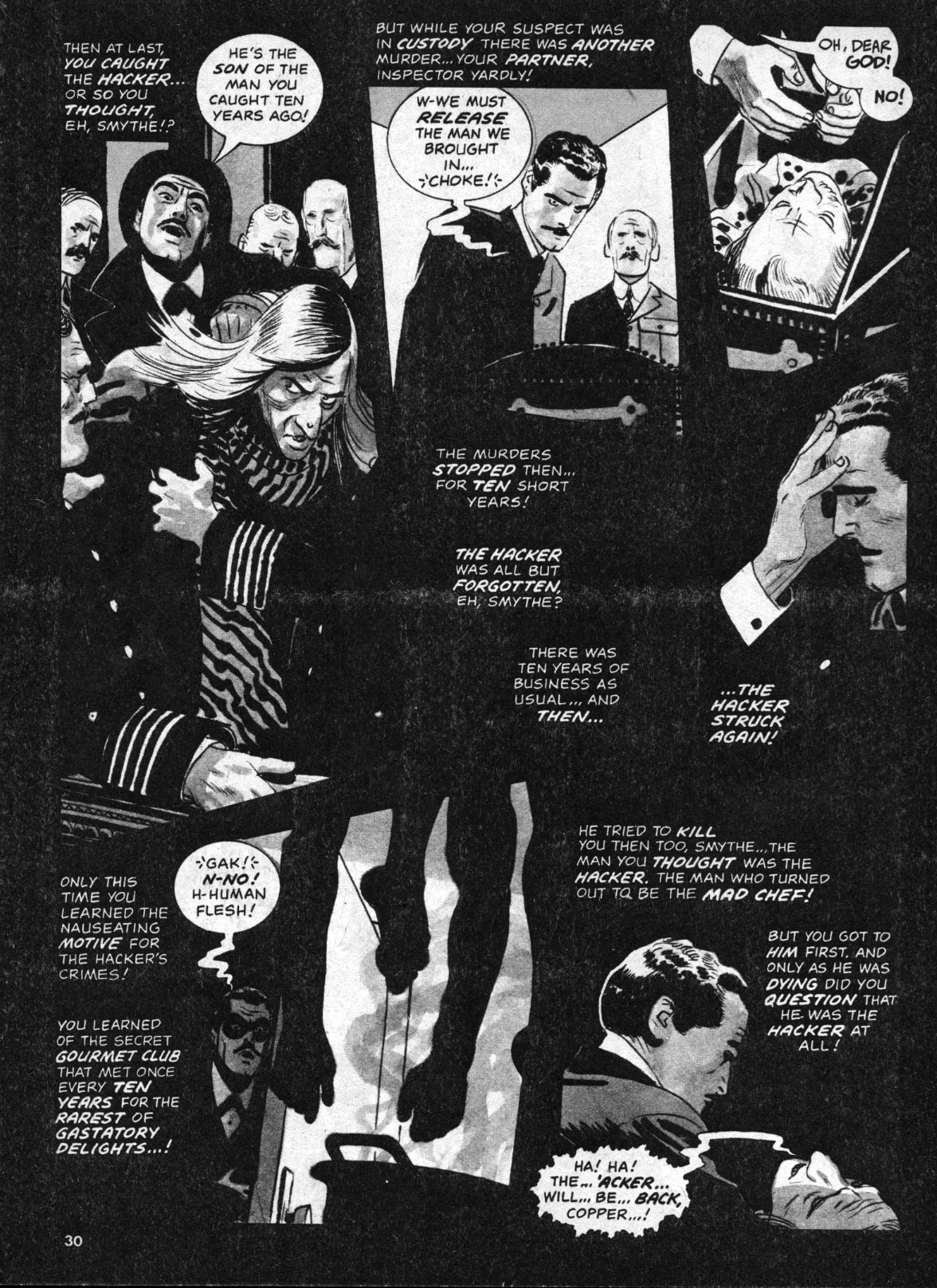
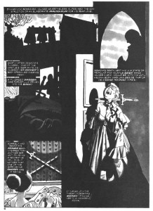
In 1975, a time Toth called an “awful trauma” for his wife and himself, he drew a pair of stories written for Eerie by Steve Skeates about The Hacker, a Jack the Ripper clone. It was impossible for Toth to avoid rendering the bloodletting that the stories demanded. Both episodes also show extensive editorial tampering with Toth’s artwork. During Bill Dubay’s tenure as editor of the Warren magazines, panel borders and lettered captions were often reversed to negative by the production staff. On Tothfans.com in the early 2000s, Toth annotated several of his Warren stories from this period and repeatedly excoriated “damn Dubay” because the alterations interfered with his painstaking orchestration of word and image.

Reversed borders and captions destroy continuity, from The Hacker’s Last Stand.
In his first installment, The Hacker Is Back in Creepy #65, Toth used linear crosshatching to create tonal values, a technique rarely seen in his work. However, the printed story has additional watery grey tones that are clearly applied by another hand. To my eyes, it has the look of a halftoned version of color art. At this time, Warren was running color sections in their magazines and this story might have originally been intended for that purpose. Toth applied tones himself to the second story, The Hacker’s Last Stand in Creepy #67, but the reversed borders and captions muddy his designs and in some places make the work nearly unreadable.
He liked DuBay’s successor, Louise Jones (now Simonson) much better, even though his captions continued to be reversed. Toth wrote his next four Warren stories, all involving subjects of interest to the artist such as U.F.O.s, photography and the early days of film, all without any gruesome spectacle. The artist apparently had something of a phone crush on his editor. In a column written in 1999, his comments about Jones-Simonson are over the top: he calls her “deliciously-irresistibly-sweet,” says he would “walk on hot coals for her” and refers to Walt Simonson as a “lucky devil.” His story Kui from Creepy #79 (1976) features a heroine named Louise, who looks remarkably like Jones (albeit with blackened eyeballs) and becomes caught in a trap-laden pyramid with her explorer lover, who in turn seems to be drawn as a self-portrait.

This is not meant to imply that Jones intended any seduction. She was cajoling work from a notoriously difficult artist, but traumatized people can act oddly and a lonely and obsessive artist might grasp at any sign of appreciation or affection. Perhaps Guyla’s illness and hospitalizations deprived him of his muse, so Toth deflected that role to a friendly feminine voice on the telephone. Regardless, given the end of Kui, Toth seems to have punished them both for his own wayward imagination. Ironically, the same issue of Comic Book Artist that features Toth’s still-enraptured descriptions of his former editor also has an interview with Jones-Simonson, who describes Toth as “brilliant” and as “a very cool guy,” but then claims she had a “long-distance crush” on John Severin. One can only imagine Toth’s reaction when he read this, as he surely did: “damn Severin!”
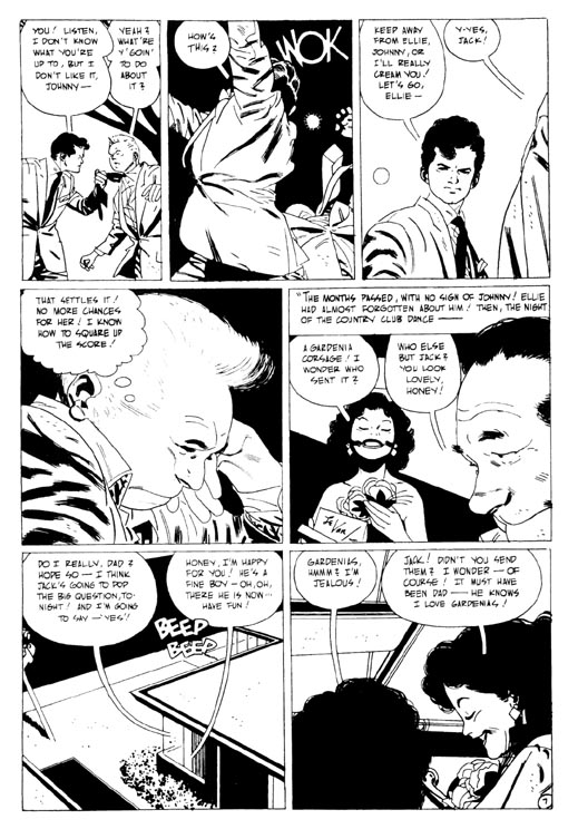
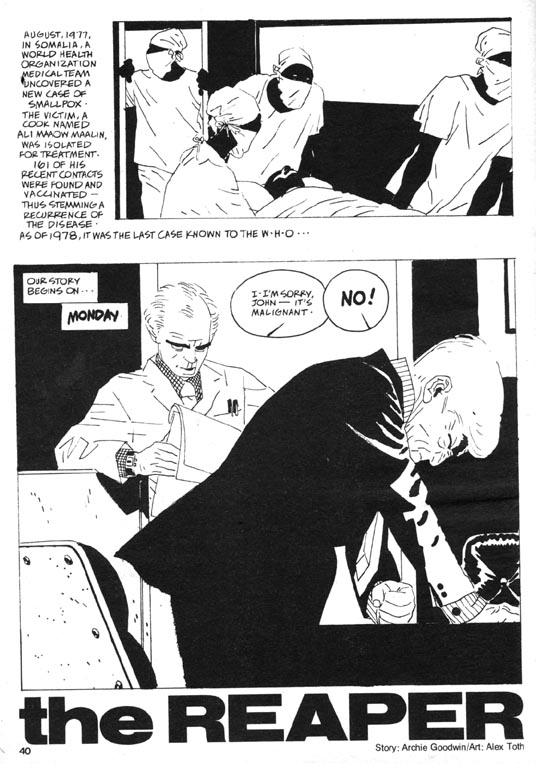
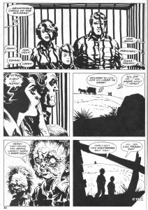
Toth’s comics work ceased for several years, until he finally returned in Creepy #114 (1980) with The Reaper, his last great horror masterpiece. He both drew and lettered Archie Goodwin’s effective story about a biotech lab worker stricken by a tumor. The Reaper is an impressive piece which bookends Toth’s career as a reflection of, and advancement upon, his early masterpiece The Crushed Gardenia from Who Is Next? #5 (1953), which was done just prior to his conscription into the Army. A short crime story by an unknown writer, The Crushed Gardenia is Toth’s breakthrough of high design in psychological comics narrative.

In The Crushed Gardenia, Toth transcends Sickles and Caniff to find his own way.
The spare script inspired Toth’s most plastic, angular drawing and a singular elegance in sequencing and panel structure. He controls all aspects of his pages, lettering the job himself. The distortions of the character drawings reflect the mental state of the sociopathic protagonist. Of Gardenia, Toth wrote to Greg Theakston, “my drawing/storytelling/ characterizations took a new road in this story. I’d found other ways to approach the script-get the feel of it-low key, really–’til action demanded hotting-up–and, design was used more aggressively–so the work wasn’t ‘newsreel-literal’–but had an abstract element in and out of its strung-together continuity.”
The Reaper also features an antisocial lead and throughout, the attenuated oddness of the drawing echoes the idiosyncratic and also somewhat Baltic appearance of the characters that the Hungarian artist drew in Gardenia. However, Reaper pushes farther than Gardenia into the stylization of drawing and page design. It reflects more recent influences: one can see traces of the clear lines of Moebius and the brisk, elegant brushwork of Hugo Pratt, both artists that Toth admired.
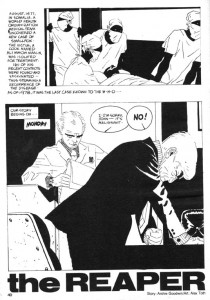
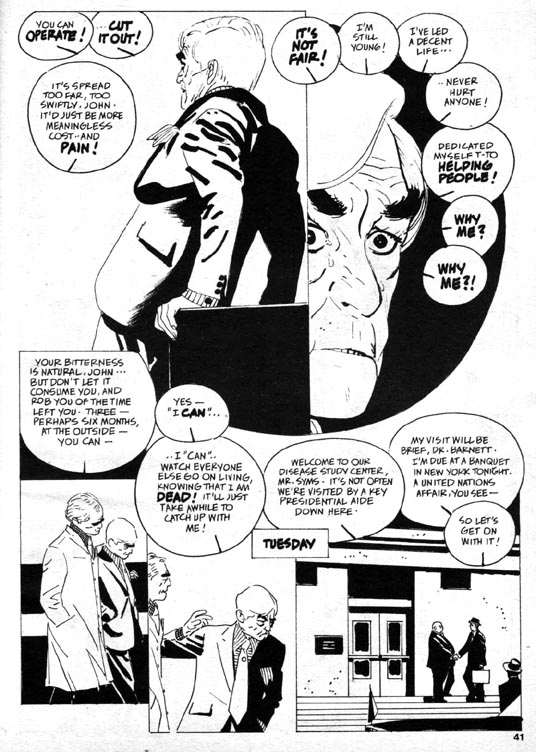
The Reaper, page 2: graphic contrast and othering.
As in all the stories that Toth inked and lettered himself, the incorporation of the text is part of the design of the pages. Throughout his career, he experimented with different forms of lettering and sound effects and tried variations on caption, balloon and tail shapes. In comics, a tail is usually a double line that converges to a point, which hangs from a word balloon and aims at a speaking character. In The Crushed Gardenia, the tips of Toth’s balloon tails hang open and at times converge with the characters’ heads. In The Reaper, the speech balloons have interiorized tails, a single line contained inside the balloon that is inclined in the direction of the speaker. They resemble pressure dials, or clock faces ticking away the progress to disaster. They also contain, quarantine or privatize the confidential conversations taking place in a doctor’s office and a secured laboratory.
In many of his works of the 1960s and thereafter, Toth often subdivides character monologues into multiple balloons, which he distributes in such a way as to lead the reader’s eyes through the narrative and create visual rhythms on the page. In Reaper he does this several times so that the speech balloons multiply into curves across the pages. There are no spaces between the panel borders except to accommodate captions. The panels throughout the story press together or overlap and when overlaid with the staccato clock/dial balloons, form a compositional density that compresses time and adds urgency to the narrative.

The Reaper, page 3: speech balloons multiply into curves which lead back to the protagonist’s "breast" in panel 1.
Toth renders the main character unsympathetically as effeminate and bitter. Biolab technician John Andrews’ escalating fear and isolation in his disease create a resentment of the masses of “healthy people” who are oblivious to his suffering, and so he takes a vial of smallpox from his job and looses it in the world. John is a compact, well-dressed and sophisticated man who seems modeled on actor Claude Rains, but also apparently wears eyeliner.
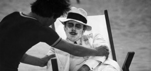
The first time I read this story, John brought to my mind the pedophile played by Dirk Bogarde in the Visconti film Death in Venice, who drains of life on the beach with his makeup running down his face, as the plague closes in.

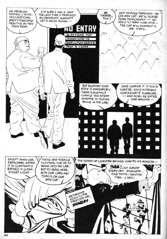
Skater hater: The Reaper, page 6, an interactive patterned composition with nuanced gestures.
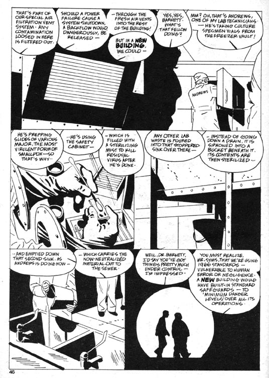
Toth’s depictions in this story indulge in some visual “othering.” In the prologue which depicts Egyptians and Africans dealing with plagues from the past, Toth entirely blackened their skin, which is graphically effective but also serves to obscure and flatten these figures. He also feminizes the eyes of Dr. Barnett, the corpulent head of the lab where John works. The story alternates sequences back and forth in time, between John’s doctor visit and his subsequent grappling with his condition, and a tour of the lab facility that Dr. Barnett gives to a visiting Presidential advisor, Syms. Toth artfully reveals the inept security and lax containment of the lab, as well as the integrity of the atypically badly-drawn (read: ineffectual) Syms.
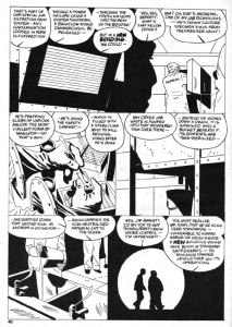
The Reaper, page 8: superlative page architecture, pathetic safety protocols.
The horror of The Reaper is not supernatural but rather is in the realm of the possible, and so the story carries a weight that is rarely seen in Toth’s comics. The artist works here at the height of his abilities, but it was to be his final solo art job on a horror story. Toth tried to draw more comics, but his depression and his perfectionism worked against him. He would be sent scripts and begin to work on them, sometimes drawing multiple versions of the first few pages of the stories, only to abandon them.
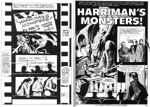
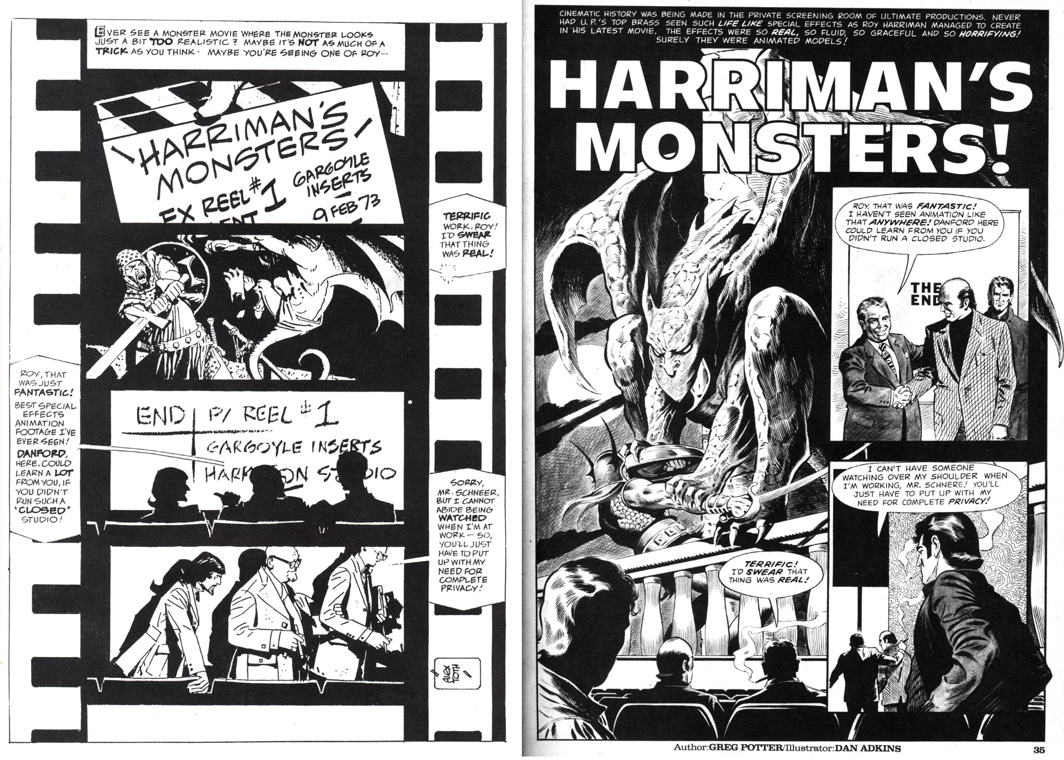
Left: Alex Toth’s self-rejected page. Right: published page by Dan Adkins from Creepy #123 (1980).
It hardly seems fair to hold Dan Adkin’s polished but standard (and unfortunately swipe-laden) effort up against the work of an artist as accomplished and complex as Toth, but a comparison of the two versions of the page above from Harriman’s Monsters is instructive. Toth not only adds a comprehensive design strategy tied to accurate visual references to film production, he also rewrites and refines the captions and dialogue while lettering the story. Still, he gave up and sent the script back to the editor because he felt his art “was too slick and far afield of my usual approach”, a rationale he later could not justify, even to himself. This example of Toth’s inability to complete work emphasizes how terrible his blockage was and how great the loss was to comics as a medium.
Though Jones left and Bill DuBay resumed as editor in 1980, Toth returned to Warren’s pages with his self-written magnum opus Bravo For Adventure (in The Rook #3 and #4, 1980), a fairly straightforward B-movie on paper. He also inked five stories that were pencilled by Leo Duranona, Alexis Romeo, Leo Summers and Carmine Infantino. One can only guess his reasons for doing these. In 1979, Toth had been commissioned by a fan to ink a Jack Kirby drawing. He considered the result to be “inhibited…the whole thing was a mistake,” but perhaps it opened his mind to doing futher collaborations with pencillers. Inking completed pencils might have enabled Toth to avoid the blockage he was experiencing otherwise.
Summers inked by Toth, from the same issue of Creepy as the Adkins page above.
The Toth-inked stories have the feel of experiments and hold clues about his visual thinking. His own sensibilities of light and contrast can be seen in how he chooses to interpret the pencils, especially if one is familiar with the styles of the respective pencillers. Leo Summers’ drawings for an earlier Warren story are clearly influenced by Noel Sickles’ famous illustrations for Hemingway’s The Old Man and The Sea. Perhaps that inspired Toth to ink Summers pages in Kiss of the Plague that are actually far grislier than anything in The Hacker. Several explicitly-drawn impalings are countered by a cartoony but still frightening ghoul at the end. Toth here takes the opportunity to do some unique tonal work, which displays shifts of focus where the artist allowed his markers to bleed.
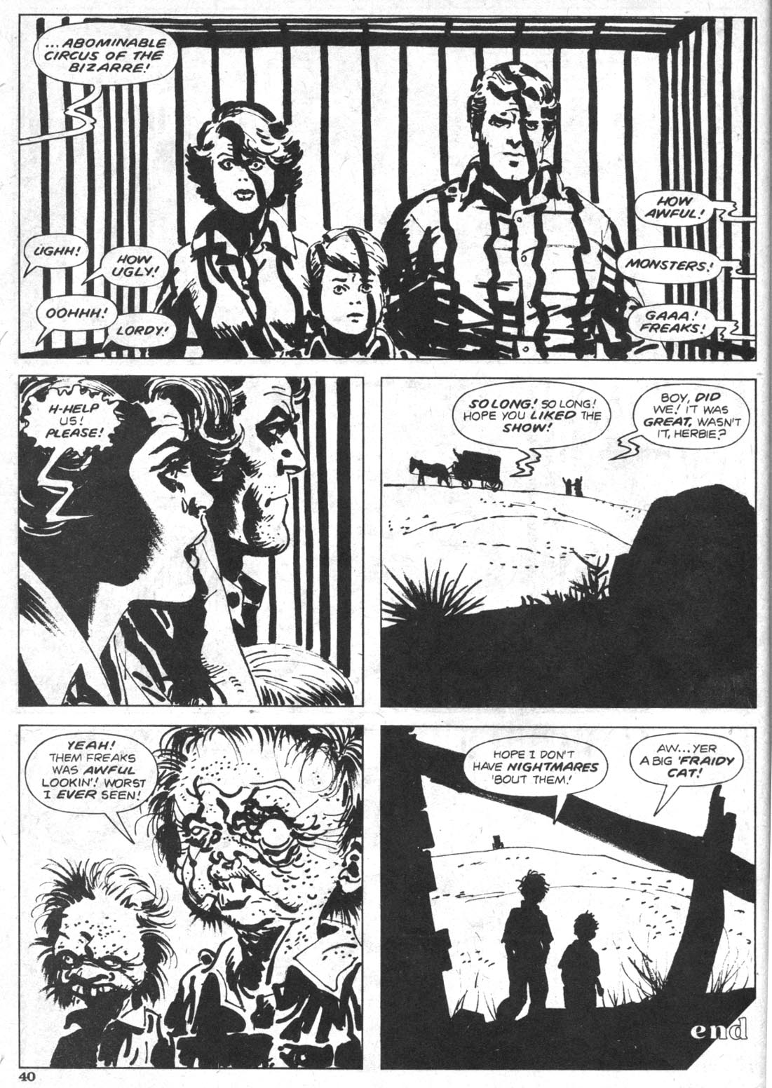
Infantino inked by Toth, from Circus of the Bizarre, Creepy #125 (1981).
The collaboration with his old friend, former DC executive Carmine Infantino is also remarkable in that so much of its loose, expressive cartooning resembles the art of Harvey Kurtzman, and that the caged family on the final page so aptly represent the extinction of Toth’s wholesome American archetypes. This is his last horror comics page. His final efforts for Warren were not in the horror genre, but rather are his two sophisticated Torpedo stories in Vampirella (#108 and #110, 1982). Through 1983 he wrote and drew a few stories for alternative publishers and pencilled several stories for DC, all were in the adventure mode he loved and those were his final completed comics.
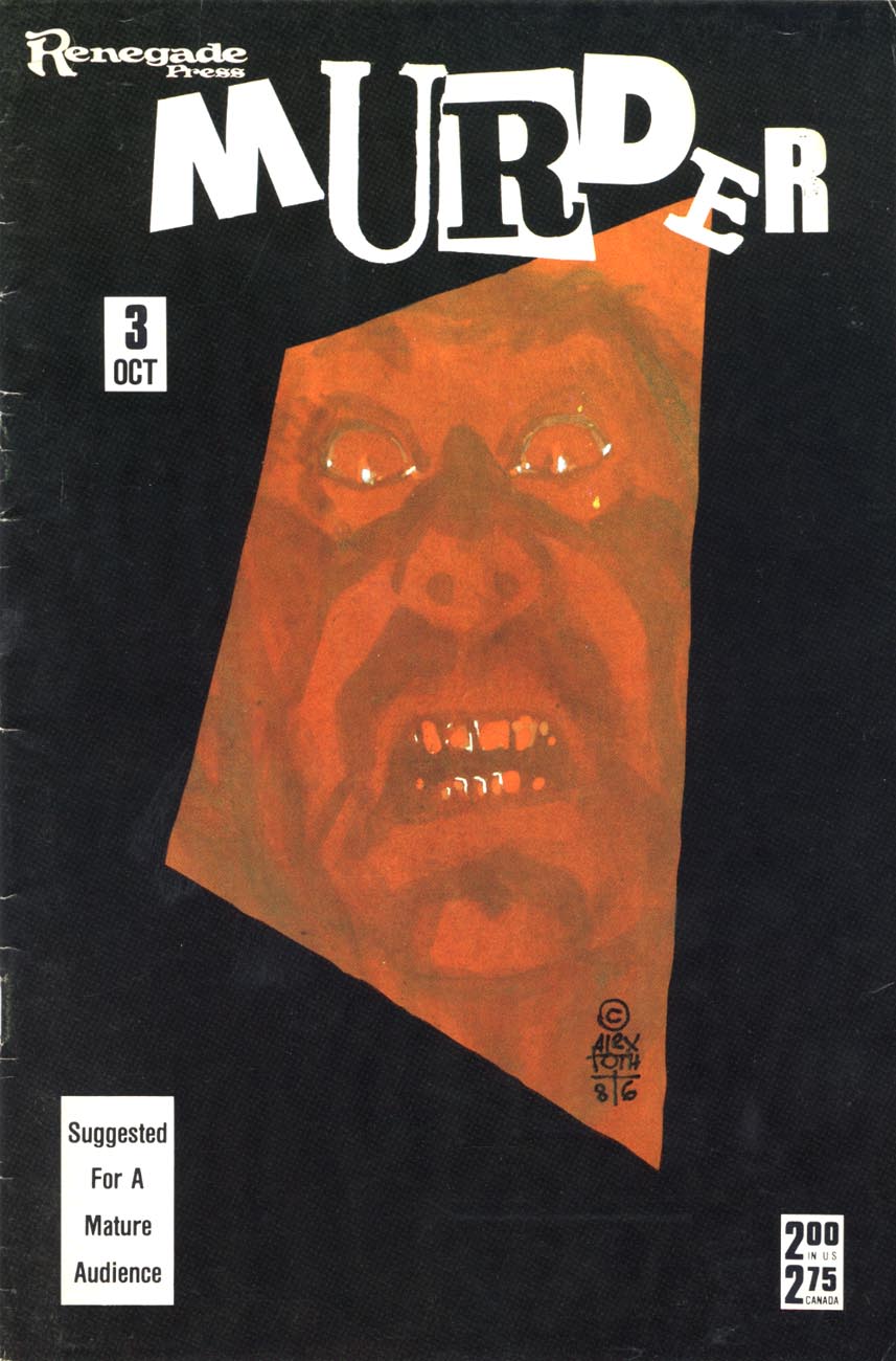
When Guyla died in 1985, he shut down almost completely. He began two decades of letters, mailing a profusion of postcards and sketches to friends and fans until his death in 2006. Toth had written to inker Terry Austin in 1980 that he didn’t want to contribute further to a medium that he believed was destroying itself, “…and so I expectorate, and curse the coming darkness.” Without his wife, for him the world was a bleak and degraded place. His final published horror work was his cover for Robin Snyder’s anthology Murder in 1986. It eloquently embodies his state of isolation. It is a fully rendered color composition of great intensity: a glistening face constricted in a grimace of utmost terror, caught on the tilted, receeding event horizon of a massive black border.

References:
Auad, Manuel. Alex Toth. 1995. Northhampton, Ma.: Kitchen Sink.
Austin, Terry. A.T.T.A. Boy Productions, Inc. Alter Ego, Vol. 3, No. 63, 12/2006.
Cook, David. Alex Toth Biography.
http://www.tothfans.com/adisplay.php?a=359
Cooke, Jon B. Weezie Jones Simonson. Comic Book Artist #4, Spring, 1999.
Hitchcock, John and Alex Toth. Dear John. 2006. Octopus Press.
Theakston, Greg (Ed.) Alex Toth: Edge of Genius Vol. 1. 2007. New York: Pure Imagination.
Toth, Alex. Before I Forget. Comic Book Artist #4, Spring, 1999.
Toth, Alex. Under The Covers. Jack Kirby Collector #34, 3/2002.
Vandeboncoeur, Jim. Alex Toth: a Comic Art Index. Comic Book Artist #11, 1/2001.
Remembering Alex Toth – Part 2, Transcript of panel discussion with David Armstrong (moderator), Irwin Hasen, Dana Palmer, Eric Toth, Mike Royer, Paul Power, Rubén Procopio, John Hitchcock and Tom de Rosier. San Diego Comic-Con, July 23rd, 2006.
http://www.tothfans.com/adisplay.php?a=368