Moving Boxes

I moved recently, a wholly unpleasant but not unexpected enterprise, as I have moved quite a few times in the past few years.  And as a recurring part of the process I once again found myself explaining the many mangled cardboard boxes marked “COMICS”  to the movers.  “Are those really comics?” asked the burly, hung-over moving guy I found on craigslist.  Yes, in fact, they are.

I’ve been reading comics since I was a girl.  And yes, I am a girl.  A slightly off-kilter one, but a girl nonetheless, and one who has been buying, reading, and collecting comic books and their slightly cooler cousins graphic novels for over twenty years.  The boxes that I dragged from my parent’s suburban home to my college dorm to the scroungy, shared apartment to the slightly better apartment above the gas station and finally to the real, honest-to-goodness house (with a real, honest to goodness mortgage!) contain the texts that accompanied me from braces to bifocals.

The X-Men issue where Wolverine loses the adamantium?  Yup, it’s in one of those boxes.  The Age of Apocalypse series?  It’s in there too, along with Ghost and Preacher and Hellboy and Ghost World and American Splendor and Love and Rockets.  And yet, I am an adult (for the most part).  So why do I keep lugging these boxes from place to place?  I have work to do and people to look after and Top Chef isn’t going to watch itself.  I simply do not have time to open the boxes and read the comics again, but somehow I can’t seem to part with them either.

My books have already been unboxed and placed on the shelves, talismans of hours spent reading “legitimate” literature, but my boxes of comics remain in the basement, lonely and unappreciated.  Some of my friends hauled their boxes of comics out of attics and storage units and donated them to libraries and charities, preserving the comics for future generations and pledging themselves to mature, uncluttered lives.  I applaud and envy these people, and I think that realistically, perhaps it is time to donate my treasure trove.  Yet as I reminisce about what is in those boxes—Rogue and Batgirl and Concrete and Grendel, I get a twisty feeling in my stomach for these friends who have meant so much to me, and I cannot seem to let them go.  So I ask of other comic lovers and kindred spirits, what have you done with your boxes of comics?  How and when do you say goodbye?


photo by agr

Dyspeptic Oroborous: The Divine Hobby

A couple of days ago, my twitter feed displayed the following message from TCJ.com.

Today we worship the latest by @xaimeh with pieces by Dan Nadel http://bit.ly/oZjPF2, Frank Santoro and Adrian Tomine http://bit.ly/mV9U8W

I’ve liked things that both Dan and Frank have written in the past — Dan’s piece on the Masterpieces of American Comics exhibit was probably my favorite selection in the Best American Comics Criticism volume that Fanta published a year or so back. And tcj.com has been doing a lot of good things since they sent us packing (this lovely piece by Craig Fischer, for instance. So I was assuming that that “worship” was just a bit of jocular hyperbole. Obviously the pieces would be laudatory, but I had hopes they wouldn’t be sycophantic.

Alas, if you click the link you get what the tweet says; Jaime’s comics transubstantiated into communion wafers, less to be read and discussed than to be consumed as a path towards union with the divine. Thus, Frank expresses awe, reverence, and wonder, talks about breaking down into tears, lauds the purity and uniqueness of Jaime’s talent, and finishes up with what reads like literal hagiography.

No art moves me the way the work of Jaime Hernandez moves me. I am in awe of his eternal mystery.

Tomine’s piece is more of the same, albeit shorter. In comments, Jeet Heer suggests that it might be worthwhile to compare Jaime’s work to Dave Sim’s. This does seem like an interesting juxtaposition, but Frank nixes it insisting, “Lets be careful to not make this thread about Sim. This is a Jaime celebration.” No criticism at TCJ, please. Only celebration, worship, and gush.

To be fair, neither Frank nor Tomine are making any pretense of trying to explicate, or really even engage, with Jaime’s work. Instead, both of their pieces are testimonials — personal accounts of having seen the light. From Frank’s piece

Something extraordinary happened when I read his stories in the new issue of Love and Rockets: New Stories no. 4. What happened was that I recalled the memory of reading “Death of Speedy” – when it was first published in 1988 – when I read the new issue now in 2011. Jaime directly references the story (with only two panels) in a beautiful two page spread in the new issue. So what happened was twenty three years of my own life folded together into one moment. Twenty three years in the life of Maggie and Ray folded together. The memory loop short circuited me. I put the book down and wept.

We don’t need to see the two panels in question reproduced (or, indeed, any artwork from the story reproduced), because it’s not about the panels. It’s about the effect of those panels, and of Jaime, in Frank’s life. Jaime is transformative because Frank says he’s been transformed. It’s a witness to true belief by a true believer for other true believers. The imagery of short circuits and closed loops is unintentionally apropos.

Dan’s essay is nominally a more balanced critical assessment. In practice, though, it’s got the same religion minus the passion, resulting in an odd combination of towering praise coupled with bland encomium. Frank’s piece has the energy of an exhortation; Dan’s, on the other hand, reads like a painfully distended back-cover blurb. “The Love Bunglers”, Dan declares, is the story of Maggie “finally holding onto something.” Jaime’s art is great because it is personal, so that “this alleyway is not just any alleyway — it’s an alleyway constructed entirely from Jaime’s lines, gestures, and pictorial vocabulary.” And the big finish:

In the end we flash forward some unspecified amount of years: Ray survives and he and Maggie are in love and Jaime signs the last panel with a heart. “TLB” is also a love letter from its creator to his readers and to his characters. It’s a letter from an old friend, wise to the fuckery of life, to the random acts that occur and that we have no control over. Jaime, I think, used to be a bit of a romantic. He’s not anymore, but in this story he gives us something to hang onto: A piece of art that says that you should allow fear and sadness into your life, but not let those things cripple you. That sometimes life works out and sometimes not, but the things we can control, things like comics and storytelling, carry redemption.”

Let fear and sadness into your life but don’t let them cripple you. Sometimes life works out and sometimes not. It’s criticism by fortune cookie. And…signing the last panel with a heart to show us the power of love? Gag me.

The point isn’t that “Love Bunglers” isn’t great. I haven’t read it; I don’t have any opinion on whether it’s great or not. But I wish instead of telling us that this is one of the greatest comics in the world no really it is, Dan would have taken the time to develop an actual thesis of some sort — a reading of the comic that elucidated, unraveled, and interracted with its greatness, rather than just declaiming it.

I’m talking here specifically as someone who is interested in and conflicted about Jaime’s work. I would like Dan, or someone, to write something that would allow me to see why this particular sentimental melodrama dispensing life wisdom is better than all the other sentimental melodramas in the world that are also dispensing life wisdom. But instead all Dan provides is assertion (“It just works. They’re real.”), predictable appeals to vague essentialism (“There are no outs in his work — what he lays down is what it is.”) and paeans to nostalgic retrospection (“As I took it in, I realized that I remembered not just the moments Jaime was referring to, but also the narratives around those moments. And furthermore, I remembered where and how and what I was when I read those moments. I remembered like the characters remembered.”) If I am unconvinced by standard-issue authenticity claims and do not have years and years of reading Jaime comics to feel nostalgic about, what exactly does “The Love Bunglers” have to offer me?

Part of the trouble here may be that it’s difficult to write about something you like as much as Dan likes Jaime’s work. Love can sometimes reduce you to gibbering — which is understandable, though not a whole lot of fun to read for someone who isn’t under the influence of similar giddiness. I think it can also be especially tricky to write about soap-operas, where a large part of the point is personal emotional attachment to individual characters. If the narrative deliberately figures the reader as fan or lover; it can be hard to say anything other than, “I adore this character! I adore this author! I’m in love I’m in love I’m in love! It’s so awesome!”

I don’t have a problem with people writing to say that something they love is awesome. I’ve been known to do it myself even. But this is TCJ,…and it’s Jaime Hernandez — the most prestigious publication devoted to comics criticism focusing on one of the most lauded contemporary cartoonists. If they wanted to run one love letter, I guess I could see it…but two or three? Surely, nobody in TCJ’s audience needs to be told that Jaime is awesome. Everyone knows Jaime is awesome. Except, possibly, for a few weirdos like me who are waiting to be convinced. But if this is the case, why forego actual nuanced and possibly convincing discussion of his work in favor of vacuous cheering?

Partially no doubt it’s because comics remains permanently tucked in a defensive crouch. No matter how unanimous the praise of Jaime is, no matter how firmly he is canonized it will never be sufficient to undo the brutal unfairness of the fact that he’s not as popular as…Frank Miller? Harry Potter? Andy Warhol? Lady Gaga? Somebody, in any case, can always be trotted out to show that the really famous and canonical person you love is not famous and canonical enough.

But there’s also a sense in which TCJ’s tweeted fealty is less about Jaime (who surely doesn’t need the flattery) and more about the celebration of fealty itself. You worship at the altar of Jaime because worshiping at the altar of Jaime is what the initiated do. The sacramental praise both constitutes an identity and confirms it for others. You are in the club and enjoying the hobby in the proscribed fashion. Fellow travelers shall take you to their bosoms, and even the chief muckety-muck shall weigh in with a heartfelt and avuncular hosannah.

Comics was long a subculture first and a subculture second and an art a distant third. TCJ set itself to change that. Certainly, it has altered the list of holy objects. But the rituals remain depressingly familiar.

____________
Update by Noah: This is part of an impromptu roundtable on Jaime and his critics.

Termite Assault on Precinct 13

I’m pretty sure I saw this a while back when I was obsessed with John Carpenter films, but somehow I never wrote about it. I can see why; while it’s an enjoyable and neatly-plotted film, it doesn’t exactly require complex exegesis. Evil forces of chaos in the person of a (carefully mixed race) LA gang converges on a soon-to-be-decommissioned police station. Good forces of order (with an equally mixed racial profile) resist. Good takes some losses, but ultimately wins. Yay!

Of course, you always know good is going to win in these sorts of films. What’s interesting, maybe, is how little affect goes along with it. It’s possible I’m just jaded, but the sides were drawn so broadly, and the characters were in general so flat, that it was difficult to really feel especially exercised one way or the other about their survival or lack thereof. Ethan Bishop (Austin Stoker) is okay as the inexperienced lieutenant in charge — the actor has some charm, but the writers seem somewhat paralyzed by the film’s audacity in choosing a black man for the role. As a result, the romantic heat gets apportioned out to Napolean Wilson (Darwin Johnston), a dangerous killer turned ally, whose ingratiating bad boy swagger works for about twenty minutes less than the film’s run time. I knew these characters weren’t going to get killed, but if they had I wouldn’t exactly have mourned.

For that matter, the emotional motivator of the film, the senseless shooting of a little girl played by Kim Richards, rather spectacularly fails to emote. Richards, who played Disney roles, trots out every ounce of grating cuteness she can muster, and the actor who plays her dad turns in an Oscar-worthy performance when he merely looks mildly pained rather than actually rolling down the car window and retching noisily. When the kid finally gets shot, my reaction wasn’t stark horror so much as relief that somebody had finally shut her up and I wouldn’t have to hear her whining for ice cream anymore. If civilization demands the defense of this sort of egregious mugging, I think I’m on the side of the faceless Mongol hordes.

If the theme is staid and the plot is predictable and most of the characters are still-born, what’s to like? Well, I like the the way shabby bureaucrat Starker (Charles Cyphers) walks, one shoulder tilted up, so his clothes stick up like he’s wearing a cardboard cutout of a suit rather than the real thing. I like the way one of the gang members looks around the table at his fellows slitting their arms to make a blood pact, turns to his own arm, and slaps it with grim decision to make the vein pop up, as if he’s the world’s most farcically determined Red Cross donor. I liked the ice cream man looking nervously in his mirror at the car driving back and forth, back and forth, and the abrupt irritation with which he turns off his music when he tells that damn girl that the truck is off duty. And I liked just about everything Laurie Zimmer does as the unflappable police secretary Leigh, from the way she barely blinks when she gets shot in the arm to how she languidly sticks a cigarette in Napolean’s mouth to the way she lights the match in a single intense motion. Watching her performance, it’s hard to believe Zimmer never became a star; she’s simultaneously bad ass, vulnerable, and sexy as hell. Sigourney Weaver and Linda Hamilton have nothing on her.

So if the film’s virtues are predicated on its individual moments, does the ideological baggage (good! evil! civilization!) just get in the way? That’s Manny Farber’s termite art point, perhaps — that it’s the small instants of beauty that matter, not the lumbering, gross stabs at significance.

But would those small moments exist without the ideology. It’s the film’s rote latness, the starkness and even clumsiness of the civilization-vs.-chaos schematic, that makes Leigh’s match-strike and all its controlled lust echo with iconic urgency and pleasure. It’s the figuring of the gang as feral beasts which makes that guy striking his arm so hyberbolically sublime. It’s not so much that the moments add up to the ideology as that the ideology makes the moments enjoyable. The meaning is there so you can appreciate the form; the signified points to the sign. If something’s behind you in Plato’s cave, it’s there to add a little shiver between your shoulder blades when Leigh lights that match and the shadows jump out, sexy-cool, against the wall.

Neal Adams: Ultraviolence

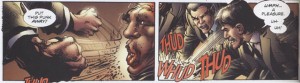
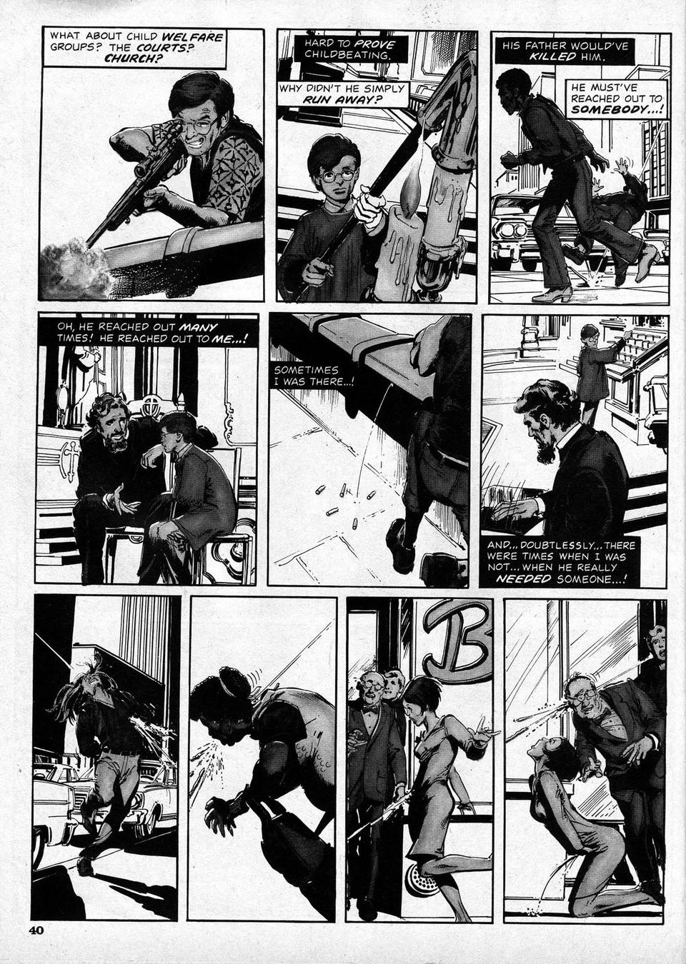
From "Blood," chapter 3, Dark Horse Presents V.2 #3.

CLICK ON IMAGES TO ENLARGE

In the seventies, Neal Adams’ realism, comprehensive draftsmanship, hyperkinetic storytelling and page design, sophisticated coloring and in addition his efforts on behalf of creators’ rights marked him as a potent force in American comics. He seemed poised to do something substantial in comics, something that would pull all of his skills together in a complete and meaningful statement. But instead, he has dedicated his energies to running his studio/publishing house Continuity for many years.

I’ve not been to Continuity and cannot speak to their effectiveness in the world of advertising, and it should be considered that through it Adams has given a lot of artists work, but the comics they have published are literally a bargain bin explosion of histrionic superhero titles. In a reflection of the old comic book studio system, the books are drawn by various often highly competent artists who apparently must all work within Adams’ stylistic parameters. The boss is to my mind too eager to redraw his artists’ drawings. The result is Neal Adams-ish product that is debatably unified in a visual sense, but that is difficult to read and has an aura that can be described as luridly aggressive.

I do respect Adams’ abilities though, and anyone working within mainstream comics can thank him in some part for the much more creator-friendly contracts that are standard now. And so, I have made repeated efforts to talk to the artist when I saw him at conventions in New York. He doesn’t make it easy. For years it seemed he only wanted to talk about a sort of anti-visual comic he was doing about “two guys in a bar” discoursing on theoretical geology. The book still hasn’t come out, but on his site he has posted pages with lots of dense ballooning, big heads with earnest expressions and gnashing teeth, and some dinosaurs. I heard about it first-hand from him several times, but it felt like he didn’t talk to me but through me to a space somewhere behind me. Now, he owes me nothing, he’s more than paid his dues…and maybe it was just me, or perhaps I caught him at a few odd moments, or maybe it is a sort of canned spiel he does at cons just to deal with all the people who approach him.

Adams has more recently emerged with an assortment of covers and then a series of stories: “Blood,” serialized in the new incarnation of Dark Horse Presents and the bewildering DC miniseries Batman: Odyssey. He’s obviously putting a lot of effort into this work, it is all elaborately drawn, but also, much of this recent work has ultraviolent depictions of over-the-top violations of bodily surface and splattering blood.

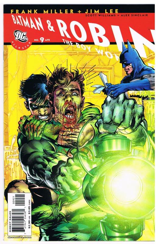
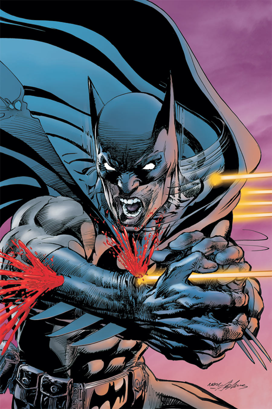
Cover for All-Star Batman and Robin #9.

Flipping through a few of his recent efforts, I see heroes spitting blood from between teeth so clenched that they might shatter from the pressure, muscles and veins popping, threatening imminent cardiac arrest. I see men tied to chairs and tortured gleefully, bullets ripping through flesh and exploding heads. The images are linked to superheroes, a genre still considered to be in the realm of children, in that the majority of the population would think that a superhero comic would be okay for a child to look at. In that context and even if considered as adult entertainment, Adams’ images are disturbing.

So, at the New York ComicCon this last weekend, I talked to Adams about his explicit handling of violence.  I asked him if, in his position as the premiere uber-American superhero artist, he felt that he was representing the Guantanamoid, Saw franchise mentality so prevalent in America now. Torture has become normalized by being disseminated through the media to the point that people have become inured to such behavior, because “that’s how we roll now,” after “everything changed.” Adams’ Batman has bullets gouging through his arm, his heroes strangle each other or shoot people with guns or squirt streams of blood as they are beaten to a pulp. The basic question was what is he trying to say, or does he think he is saying anything?

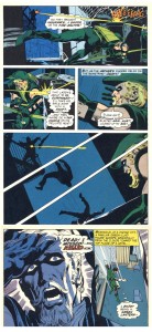
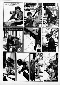
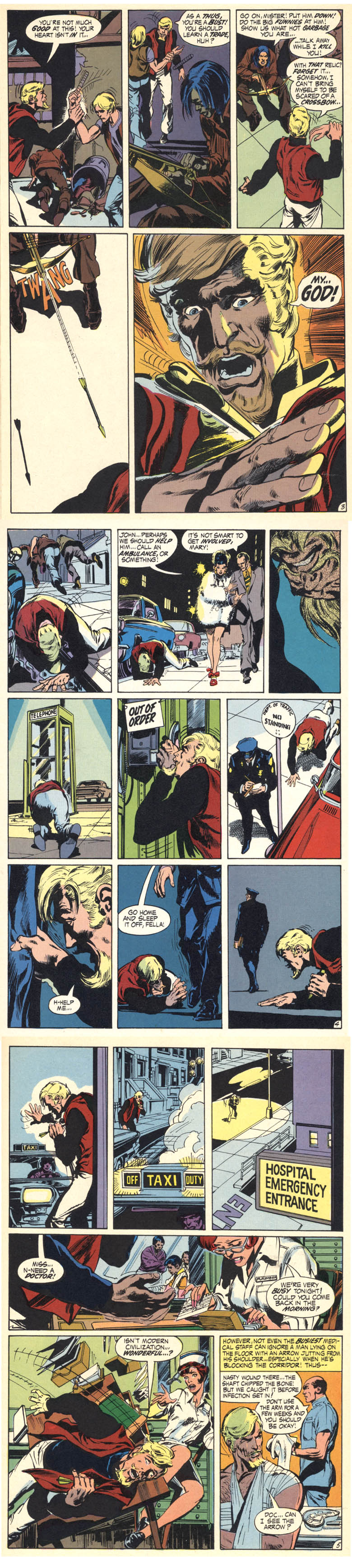
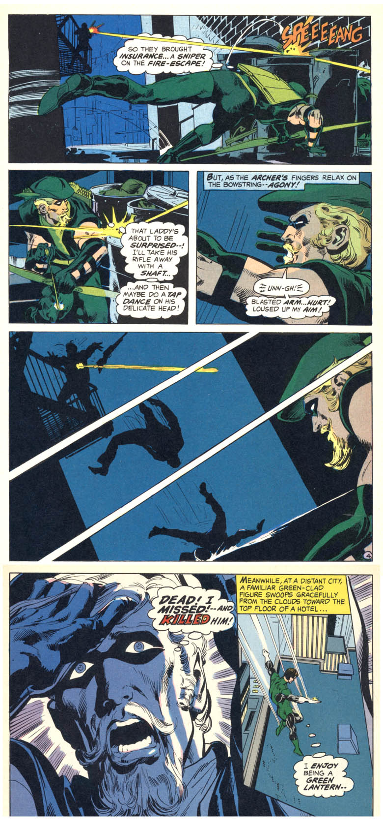
He proceeded to the most considered response I have gotten from him. It wasn’t a formal interview, I didn’t have a recorder, so I’m going on memory for my account of the conversation. In essence, he said that much of his work was about the repercussions of violence. He pointed first to two of his stories involving the superhero Green Arrow. In the first, Adams and writer Denny O’Neil portray GA mugged by young drug addicts, who shoot him with one of his own arrows that they have gotten from his charge Speedy, who has become a junkie. Adams drew the justly famous sequence below where the wounded hero takes himself to the hospital, that well represents the artist’s ability to achieve cinematic realism on paper:

From "Snowbirds Don't Fly" Green Lantern #85, 1971.

In the second, GA mistakenly kills a perp with an arrow and in horror and guilt forsakes his crime-fighting identity to join an ashram:

From "The Killing of an Archer," The Flash #217, 1972.

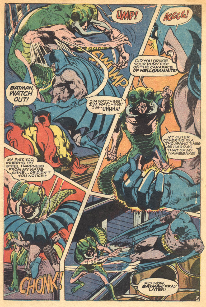
Until Adams reminded me, I had forgotten that his body of work does display a consistent theme of showing violence in as real a light as possible. From his earliest handling of Batman, he gave the action a substance that had a visceral impact on the reader:

From "And Hellgrammite Is His Name," story: Bob Haney, Brave and Bold # 80, 1968

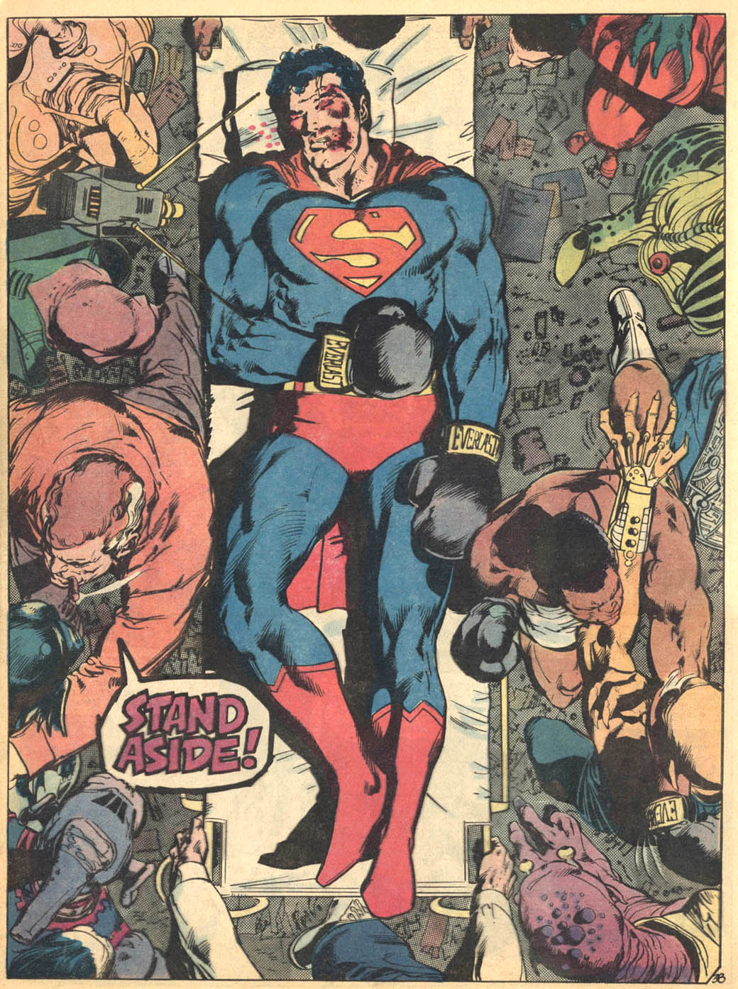
By sheer force of will, Adams defined the look that allowed DC to update their staid image and compete with Marvel. He had to fight every inch of the way, as far as I can tell. He ran the heroes through the wringer visually, but the work then often had a humanistic edge. This became less apparent as time passed. It should be said that the mainstream comics industry itself resists taste and significance. For whatever reason, his comics output dwindled. In an interview Adams said with what seemed like some chagrin that he considers Superman vs. Muhammed Ali to be his finest effort:

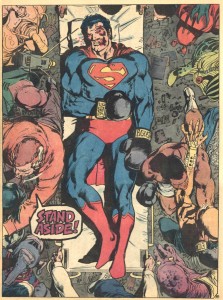
From Superman vs. Muhammed Ali, 1978.

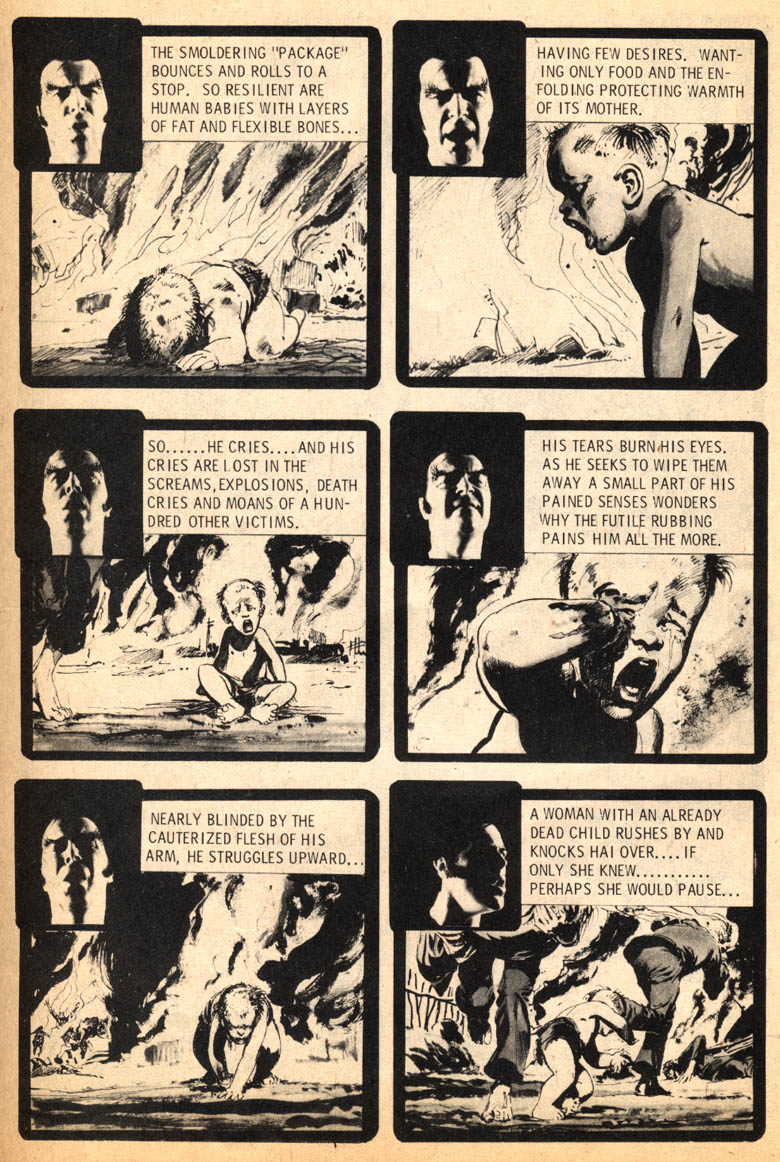
There’s a world of potential content that doesn’t involve superheroes and Adams did on occasion make stabs in those directions, also on point with his stated theme. In a potent solo story for the fanzine Phase One in 1971 (reprinted in Marvel’s b&w magazine Unknown Worlds of Science Fiction #1 in 1975), “A View From Without,”  the reader is brought very close to the last moments in the life of a napalmed Vietnamese baby:

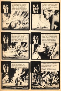
From "A View From Without"

It was a singular gesture for its time from a major American cartoonist.

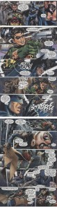
Another strong piece was “Thrillkill,” written by Jim Stenstrum, about a sniper who kills randomly from atop a tall building, based on a then-recent true event. Adams drew explicitly rendered gunshot wounds specific to the elevation of the shooter:

From "Thrillkill," Creepy #75, 1975.

It remains one of the most immediate and horrific pieces Warren ever printed. I felt the same discomfort when I first saw Thrillkill as I do with Adams’ current work.

Adams didn’t want to discuss that story, I think because here he is doing superheroes again and that’s what he wants to talk about. He’s pushing them even farther than he had previously. He had a convincing rationale for the cover I mentioned where Batman is shot through the arm:

Cover image for Batman Odyssey #1, 2011.

Adams said that when his father was in the military he had been shot in the arm in exactly that way. Okay, the image was based on a memory that was impressed upon him by his dad, that he felt strongly.

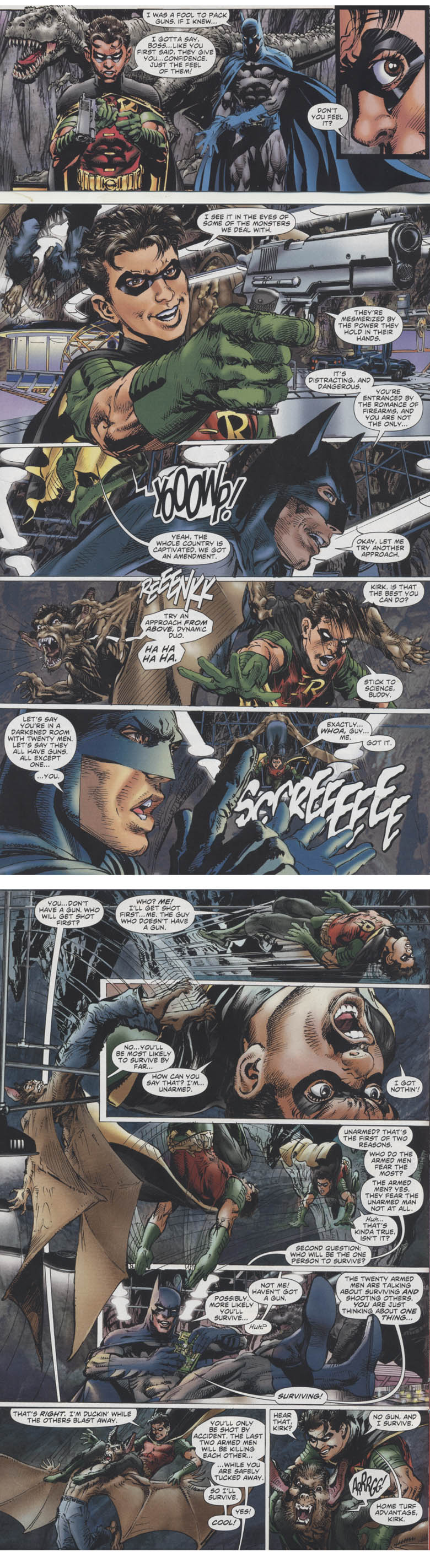
He then explicated on the sequence below, where as I had noted to him, Robin gets a fetishistic pleasure from holding a gun. Adams acknowledged that creepiness, but emphasized Batman’s explanation of why it is best to be the only unarmed man in a room full of trigger-happy thugs:

From Batman Odyssey #1, 2011

Okay again. Adams does make statements about gun control and against violence by graphically showing what happens to someone when they are beaten or shot. It’s about consequences. He cited the old “knock-out” that in comics one recovers from spontaneously, would actually put one in the emergency room. Showing the repercussions of violence is an antidote to harmless fake violence.

I had taken up enough of his time and other people were waiting for him, so I thanked him and moved on, but I looked at the works in question again later. The sequence with Batman and Robin at least makes sense to me now, but I still have a few problems. Such as, any intended examination of  gun control in Batman is counteracted by the prevalence of typical comics imagery of cool money shots of dudes, including Batman, shooting guns. At best, the comic is sending a mixed message.

One could say, who am I to talk, since my first commissioned work for Vertigo was also Brian Azzarello’s first DC story, “Ares” in Weird War #1. But in my more recent books for them I made every effort to deglamorize the violence, to make it look as pathetic as possible. It is not easy because cool money shots of dudes with guns are a longstanding meme in comics, they’re written into the scripts.

What about readers becoming inured to all sorts of extremes by overexposure? On the one hand, brutal images are suppressed; our press is imbedded and we allow limitations to be placed on war imagery, the lack of violent imagery enables a population to think their wars are bloodless. On the other hand, what we did get was the pictures from Abu Ghraib and torture images have been exponentially spreading through pop culture. Even if they are intended in a cautionary way, does the audience actually get off on ultraviolent images?  Adams’ grisly covers are the most problematic in this regard, because as covers they are the primary images being used to sell comic magazines. Oh hell, it’s Gaines and the severed head in court again.  But I’d like to see the sales figures on those covers—do we, the audience, desire such representations? Do they represent for us the secret violence of the wars fought in our name, or are they a sort of violence pornography, like old Midnight tabloids and wrestling mags full of pictures of bloody bitten foreheads?

My reading of Batman Odyssey is complicated by the overload of visual information caused by the techniques that Adams and his studio use. As comics, the pages strike me as counterintuitive, but I could say that about many mainstream comics. The writing is, well, unclear, but I can’t even read it properly because the design is so hyperactive. The characters seem to be operating at fever pitch constantly and the drawings slide around in full bleeds everywhere, running the pages together in the gutters and off of the pages and all elements are brought to a uniformly overworked plastic finish. Bloody hell!

What I responded to in Adams’ art in the seventies is how far he pushed the limitations of newsprint in four colors…his moody color was one of the best things about his work. He can also watercolor very effectively, although I have not seen him do a finished story in that medium. Here, the color destroys the realism of the drawings and thus the reader’s ability to fall into the story. It’s roughly the same type of pulp material that Adams brought to life in the seventies on newsprint for 12 cents or a quarter, but now the colors on the shiny, expensive paper lack texture, or such texture as there is looks photographic. It is a cold, resistant surface that repels the reader. The suspension of belief due to the surface plasticity undermines the narrative and so the artist’s message.

Adams didn’t do the color but I can’t even fault the no doubt painstaking efforts of the digital colorist—it is a sterling example of a look that is everywhere in mainstream comics now. It occurs to me that perhaps these types of comics are not selling so well nowadays because only a relatively small audience can relate to the machined wall of digital coloring and the inertia of font lettering. These techniques negate the intimate, hand-done, illuminated quality of comics.

A reason why comic art is not illustration is that a illustration supplements a text which is complete on its own. The text can be read independently from the illustration and I can enjoy my Noel Sickles book without reading the stories he illustrated. In comics, the art cannot stand on it’s own, nor can the text. If they could, then my collection would have a lot more French albums. In comics, art and text are interwoven; the art shows you how to read the text, it forces you to read the text in order to comprehend the story. Likewise, the text cannot read apart from the art since so much of the narrative is comprised of what is depicted in the art. The overly busy design and cold surface of Adams’ recent work actually goes against the medium by resisting reading, so what comes across is the splatter and the cool money shots of dudes with guns.

Adams did an impressive widescreen drawing in Batman Odyssey #1 of the character on top of a speeding train, so I know he hasn’t lost his chops. However, and leaving aside myriad other issues that emerge when one actually deciphers the comic, what the work gains in flash and bombast, it loses in clarity. The trumpets can be made more resonant by allowing for some quieter passages. Whatever substance he’s putting in there is not coming through, because everything is playing at top volume all of the time. I don’t have the other issues in the series, but arrrgh. I’m thinking they should come with an Advil.

Lilli Carré’s The Fir Tree

This first appeared at the Comics Journal.
_________________________

Lilli Carrés version of Hans Christian Anderson’s “The Fir Tree” functions in general as an illustrated books…but there are many moments which showcase Carrés familiarity with comics. One of the most memorable of these is a page that shows our protagonist, the fir tree, talking to a stork. The layout makes dramatic use of white space and of bleeds; the tree is at the bottom, its lower two-thirds chopped off by the edge. The stork is dead center at the top, its wings spread majestically, its legs extended straight out below it, and its head cut off by the top of the page. In the space between bird and fir, three pale speech bubbles are arranged in a graceful curving tier. The fir’s words reach up on the left-hand side, as if trying to follow the stork up, up, and off the page: “Oh, how I wish I were tall enough to go on the sea. What is the sea and what does it look like?” And on the right, floating down negligently, as if casually dropped, the bird’s speech bubble replies, “It would take too much time to explain.”

I know folks swear by Chris Ware’s complicated virtuoso every-which-way page layouts, or by J.R. Williams’ dense formalist virtuoso page layouts, or by Dave Mazzuchelli’s archly formalist virtuoso page layouts. And, you know, I can appreciate all of those too. But simplicity can be a kind of virtuoso move as well, and if there’s been a more quietly beautiful page in American comics this past year, I’ve missed it. The way the bird’s dark feathers spread out against the top of the page, both emphasizing the vertical movement upwards and dynamically freezing the moment; the way the fir tree is bent slightly back to watch the departing flight, its branches twisted in delicate, eloquently pleading curves; and of course, the blank space itself, across which want and time float and reach and never meet.

You almost don’t need the rest of the book, because Anderson’s whole story is right there. Carré captures The Fir Tree’s fey clarity, the sense of a reality made unbearably vivid by its passing. The stork is more beautiful because it is indifferent and it is gone; the sea is more beautiful because it is blank and unknown; childhood innocence tugs at our heart because of the inevitability of death. Whether you’ve read this story or not, you know what’s going to happen, which is why the temptation is to just stay on this perfect page — even though the end is here, too.

Music For Middle-Brow Snobs: Destined to Fester

Death metal mix download. Download Destined to Fester here.

1. No Truth — Atheist
2. Veralder Nali — Rimfrost
3. Onward Into Countless Battles — Unleashed
4. The Art of Corruption — Inevitable End
5. Passage — Oppressor
6. Hung, Drawn, and Quartered — Cancer
7. The Ancient Ones — Morbid Angel
8. Eternal Hate — Massacra
9. Beyond the Flesh — Disincarnate
10. Reflections of the Dark — Carbonized
11. Nostalgia — Gorguts
12. Destined to Fester — Autopsy
13. Bonesaw — Autopsy
14. The Lurking Fear — Repulsion
15. Black Breath — Repulsion

Tatsumi: The Facsimile as Homage

A review of Tatsumi. Directed by Eric Khoo. In Japanese with English subtitles. Released 17 May 2011. Un Certain Regard 2011 Cannes Film Festival. [Comics reproduced in article read from right to left.]


Tatsumi (a cartoon adaptation of the manga of Yoshihiro Tatsumi) could be described as something of an anomaly — a project originating from Singapore which was made on the tiny island of Batam, Indonesia; a project no Japanese animation studio would have taken up if only because of its subject matter: slow, serious, immodest, and unsafe for children. The project’s unlikely instigator is one of Singapore’s most prominent directors, Eric Khoo, whose eighth feature this is.

Tatsumi represents Khoo’s first foray into animation. He dabbled in cartooning in his younger days, and those early works often reflect the urban angst and alienation found in many of his movies. As with Adrian Tomine (editor of the new Tatsumi translations published by Drawn & Quarterly), Khoo developed a passion for the gekiga of Tatsumi through the 1988 Catalan edition of Good-Bye and Other Stories. The motivation behind this project would appear to be simple. When asked about the impact of A Drifting Life (Tatsumi’s autobiographical manga) on him, Khoo had this to say:

“I could not stop thinking about it after reading it for three days and that’s when I decided I had to make a tribute film for Tatsumi.”

At 98 minutes, this is a bare bones version of A Drifting Life, charting in short and somewhat cumbersomely narrated sections his beginnings as a young artist, his meeting with Osamu Tezuka, his family travails, and the birth of gekiga. The film is remarkably faithful to the source text with Tatsumi’s comics panels providing the key animation frames and serving as a near rigid storyboard. Interspersed with the snippets of autobiography are adaptations of  at least five works from the author’s 70s oeuvre, namely “Hell”, “Just a Man”, “Occupied”, “Beloved Monkey”, and “Good-bye”. These stories can be found in the collections Abandon the Old in Tokyo and Goody-bye, and are derived from the best period of Tatsumi’s work. There are also short sequences from Tatsumi’s pulp comic,  Black Blizzard, highlighting and fetishizng its trashy roots by means of a faux four color process not dissimilar to the effect found on the cover of the Drawn & Quarterly edition of the same manga.

Despite Khoo’s personal affection for A Drifting Life, the fragments in the film derived from that novel are undoubtedly the weakest sections, serving largely as somewhat forgettable links to the five main manga adaptations found therein. Even cut down to its basics these segments will try the patience of viewers with any familiarity with the source material. The segment on Tatsumi’s meeting with Tezuka are the most coherent, the rest is inconsequential filler with little emotional drive. Worst of all is the clumsy and melodramatic episode depicting the destruction of the young Tatsumi’s art by his ailing brother.

The real aesthetic failure of Khoo’s film occurs in the differentiation between the autobiographical scenes and the fictional story elements. This blurring of lines may in fact be intentional — a reflection of the largely unvarying style Tatsumi uses for all his projects and also a subtle suggestion that Tatsumi’s violent themes emerged from his own torn psyche. The autobiographical sections are done in a kind of animation short hand (undoubtedly the product both of intention as well as budgetary constraints) and are shown in color for the most part. The fiction adaptations are done in raw black and white, and are more purposefully two dimensional to indicate the source material. Blurred elements intrude into the frame to mimic a camera lens’ shallow depth of field, and the figures are designed and drawn in a vigorous scrawl typical of Tatsumi’s pre-70s comics. They have none of the refinement of Tatsumi’s ink work found in stories such as “Sky Burial” and “Abandon the Old in Tokyo”. The light and breezy tone of A Drifting Life barely registers, and the segments covering it remain resolutely stiff and leaden, no different from the pre-70s strips they unwittingly mimic. The overall effect is not unlike a slightly evolved motion comic. The lack of aesthetic separation between the two narrative strands leads to a certain monotony; life and art inseparable yet flat in affect.

Sound is the one enhancing element in Khoo’s film. While the dubbing of the American soldier in “Good-bye” is calamitous (imagine John Wayne in a sex scene), the panting and gasping of coitus is wisely heightened to a pornographic hyper-reality which is totally in keeping with Tatsumi’s narrative ethos. Where Tatsumi shows us no more than one page of incestuous licentiousness, Khoo’s version is a loud, drawn out fucking.

It surpasses its source material because of its perverse animalism and utter lack of subtlety. The central hook of incest in “Good-bye” might have been sufficient in Tatsumi’s era but no longer.  Producing an adaptation some 40 years later, Khoo periodic attempts to intensify the audience’s disgust and revulsion is largely a successful one.

This isn’t the only time that the film adaptation highlights minor weaknesses in the original. The  words streaming across the panels in an apartment scene in “Beloved Monkey” (see below) fall short of the more effective and annoying repetition of a stuck record player in Khoo’s movie.

__

Similarly, the crowd in the final moments of the same story is considerably more threatening — closer, less accommodating, and more menacing — in the film version .

__

This may be a case of creative licence. The placidity of Tatsumi’s pedestrians suggest an over-reaction on the protagonist’s part, a festering agoraphobia. Khoo’s adaptation assures us of the validity of this fear. Whether these divergences simply reflect the relative strength and weaknesses of the respective mediums is a subject for another day.

The decision to animate the pornographic graffiti in “Occupied” also yields good results; coarsening the almost asexual nature of Tatsumi’s depictions of female nuditity.

Yet Khoo oversteps the material near the end of his adaptation, introducing a cacophony of siren sounds where none exist in the manga; dampening the faint ambiguity of the manga’s conclusion. It is never clear from the manga whether the protagonist of “Occupied” is apprehended by the police. The film makes certain of this by adding the sound of handcuffs.

The subjective lengthening of the material which works so effectively for the scenes of lasciviousness has its occasional drawbacks. For instance, the opening scenes of a bombed out Hiroshima in “Hell” which are tediously drawn out and which quickly outstay their welcome. Every scene Khoo includes in his adaptation may be found in the original comic, and those 3 pages of ineffectual drawing are faithfully refashioned into a ham-fisted opening sequence only likely to impress the naive and uninitiated.

One might say that the weaknesses in Tatsumi’s stories are brought to vivid life in Khoo’s animation. The manner in which the secretary (Okawa) propositions her elderly boss towards the close of “Just A Man” drew giggles of disbelief from the audience on the night of my screening. In contrast, the panel work in Tatsumi’s manga simply slips past the reader in a matter of seconds causing little if any consternation.

More damaging than all of this is the frigid depiction of creativity; devoid of any sense of the artist’s passion except through the histrionics of the young Tatsumi (in the animation) and the personal claims of the narrator. The final act — that final moment of artistic revelation — where Tatsumi creates a drawing of his old neighborhood falls flat on its face due to the consummate mediocrity of the final product.

Still, the sheer faithfulness of Khoo’s adaptation makes it a perfect tool for publicity, particularly in reference to those who still see comics and animation as the province of children. As Khoo suggests in his interview at Indie Movies Online:

“Because I’m such a fanboy, I hope that people will see Tatsumi and realise “Hey, there’s something to these stories,” and maybe go and buy A Drifting Life, and read 800 pages-worth of his life.”

This is a perfect encapsulation of the film’s worth — a paean to a cartooning deity, a devoted act of promotion, and middling entertainment for the most discerning.


_______________________________________

Related Material

A substantive interview with Eric Khoo at Indie Movies Online

EK: What I told everyone is that, “We will use all his panels as the storyboard of the film.” We do not create any additional shots. Everything must be from the source. And what that meant was that some of the stories I had to edit. The hardest was his life. 800 pages! I had to condense it down to 35 minutes!