Voices From the Archive: Dirk Deppey on Lost Girls As Reactionary Art

Dirk and various Utilitarians had a long discussion about the manga YKK. By the by, Dirk wrote this brief discussions of Alan Moore and Melinda Gebbie’s Lost Girls.

Indeed, Lost Girls itself strikes me as a reactionary work of art. Moore clearly approached its pornographic goals from an almost Calvinist left-wing-Anarchist perspective that viewed the enormity of sex through an inflexible set of rules and dogma that would have made any bondage disciplinarian proud. He further piled all of the sexual imagination’s strawman-style villainies upon the characters who Don’t Share Our Values — the bit about soldiers secretly wanting to fuck each other wasn’t exactly what I’d call a nuanced observation. Lost Girls seemed less like an exploration of Dionysus than a series of checklists ticking off the Various Correct Ways To Think About Sex, intent on bringing order to chaos with a determination that Cotton Mathers could only dream of maintaining. Modern porn and its appeal to our baser instincts — this is the future that Moore fears, and he damn well means to roll it back. You could practically feel his anus clench as he plotted Lost Girls out.

Unfortunately, your average Buttman video is almost certainly a far more accurate vision of the libido — certainly the male libido — than is Lost Girls. Sex isn’t a series of wholesome, socially liberating poses; it’s the monkey part of our brain in its purest essence, with all the good and bad that this entails, which is precisely why we have so many taboos surrounding it. Lost Girls had no sense of surrender to the Animal Inside Us, a necessary component of good erotica/porn, as well as an essential part of the explanation for why men and women alike so often do things in the pursuit of sensuality that strike others as utterly insane.

Lost Girls had all the eroticism of a Presbyterian sermon on the joys of the marriage act. Nevermind the catalog of kinks and positions that Moore assembled; the story’s biggest flaw is that his sense of imagination never left the missionary position. Lost Girls is a retreat into rigid dogma, which makes it reactionary regardless of the fact that said dogma is left-leaning in nature.

(Adding insult to injury, Lost Girls is also a virtual catalog of unquestioned assumptions once you stepped outside of Moore’s need to present sex correctly. I especially loved the way that Dorothy fulfilled every hick-farmgirl stereotype available to Moore at the time. Kinda dumb? Check! Jacked off a horse? Check! Fucked her dad? Check! I’m surprised that she didn’t come right out and state that her mom was also her dad’s cousin before marching off to lynch her some neegruhs while she was at it. I’d call Lost Girls any number of things, but “progressive” is the last term I’d use.)


Utilitarian Review 6/16/12

News

I’m going to be moderating a panel on queer anthologies at the Chicago Alternative Comics Expo (CAKE) tomorrow. Here are the details.

3:30pm – 4:30pm, 8th Floor Auditorium

Queer Communities, Queer Anthologies

with Annie Murphy, Justin Hall, and Robert Kirby
moderated by Noah Berlatsky
sponsored by Little Heart, a Comic Anthology for Marriage Equality

A sense of aesthetic community is perhaps one of the most essential and undefinable aspects of assembling an anthology. Similarly, defining a queer community can be both incredibly tricky and unconditionally inspiring. The editors of three powerhouse LGBTIQ comics anthologies discuss the overlap and feedback between grouping and identity and what forms of community queer comics can build.

If you’re in Chicago, come see us! And check out the rest of CAKE programming too; it looks pretty awesome.
 
On HU

Featured Archive post: Bill Randall on Tatsumi covers here and in Japan.

I explain why the Watchmen movie sucks.

I ask Do you have a right to piracy?

Jones, One of the Jones Boys, argues ethics and aesthetics in Before Watchmen.

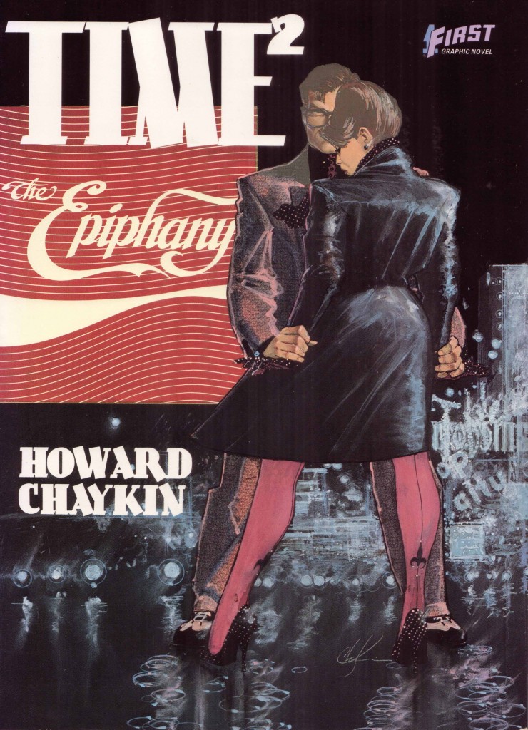
Ng Suat Tong on the original art of Howard Chaykin’s Time².

Cheryl Lynn Eaton on comics’ marketing confusion at Book Expo America.

Travis Reynolds on panels, closure, and blood in the gutters (part of our comics criticism 101 series.

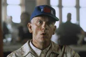
I talk about gaze theory and Being John Malkovitch.

 
Utilitarians Everywhere

At the Atlantic I explain why reading doesn’t necessarily set women free. (An essay which has attracted some really unpleasant sexist trolling in comments for some reason.)

At Splice I talk about Kelly Hogan’s mediocre new album.

Also at Splice, I talk about the Melvin’s awesome new album.

Jeet Heer quotes me in his piece on gay superheroes.

 
Other Links

Andrew Hickey with a very convincing negative review of Darwyn Cooke’s Minutemen.

Why evolution vs. creation doesn’t really matter much.

Aaron Kashtan on some problems with Hillary Chute’s Graphic Women.

Alyssa Rosenberg on rape in Tomb Raider.
 

The Master and John Malkovich

Being John Malkovich is an almost certainly intentional, not to mention deliberately parodic, riff on film theory. As I am not the first to point out, the movie gleefully presents the viewer with mirror images, women who want the phallus, explicit sadistic fantasies of control, identification with the gaze, identification through the gaze, and a chimpanzee with a traumatic backstory —all couched in an absurdist narrative. At one point we even get a tour through John Malkovich’s subconscious which begins (of course) with a primal scene as young John watches his parents do that thing that Freudian parents do.

It’s pretty clear that writer Charlie Kaufmann and director Spike Jonze are both referencing and undermining Laura Mulvey’s gaze theory. On the one hand, Craig Schwartz, the protagonist, is the protoypical sadistic viewer — he is a puppeteer by profession, and he explains at some length how he loves to get inside other people, to enter their skin and feel what they feel. This speech is made by Craig to Maxine, a woman with whom he is sexually obsessed — and soon thereafter he makes a puppet of her to play with, so the fetishistic content is not exactly subtle. Craig wants to enter others as a way of fucking others; empathy and identification are for him a means of sadistic control.

At the same time, the film messes with Mulvey’s formulation, in which the male viewer is supposed to be the subject of the gaze and a female character is supposed to be the object. For instance, the person Craig inhabits and controls is not a woman, but a man, John Malkovich. In the movie’s main absurdist conceit, Craig finds a secret, moist tunnel in his office which literally leads into Malkovich’s consciousness. This not only feminizes Malkovich (the tunnel is literally referred to as Malkovich’s “cunt” at one point) but it also feminizes Craig. In the first place, he’s engaged in male-male sex too; Maxine calls him a “fag.” And furthermore, towards the end of the film he essentially experiences a full-body castration, giving up his own life and self in order to inhabit and become Malkovich.

The film also critiques/parodies Mulvey by handing the male gaze over to a woman. Craig’s wife, Lottie, also uses the tunnel into Malkovich’s head — and she finds the experience both exciting and sexually stimulating. Indeed, after entering Malkovich while he’s taking a shower, desire and identification flip, and she decides she wants to be a man. Later, she goes into Malkovich again, and rides along as he receives a sexually charged phone call from Max…with whom both Lottie and in consequence Malkovich instantly fall in lust. The sadistic male gaze, therefore, becomes a sadistic female gaze, giving women access to the phallus and (not coincidentally) to objectification of other women.

The point is further driven home (if that’s the right metaphor) by the fact that Max reciprocates Lottie’s affections — but only when Lottie is in Malkovich. Malkovich is the phallus himself, but he cannot have the phallus — just as is supposed to be the case for women in Lacan. Actual women, on the other hand, can hold the phallus and wield it for their own pleasure — the only caveat being that to hold the phallus they have to hold the phallus. Masculinity and mastery, contradictorily, seem to inhere, not in men, but in women. Even paternity becomes a female prerogative — Max becomes pregnant when Lottie is in Malkovich, not when Craig is. Lesbians, it seems, are better men than men are.

The film, then, in some ways seems to deliberately mock masculinity — or at least, Mulvey’s formulation of masculinity. In other ways, though, its position is less clear. In particular, it seems significant that Malkovich’s castration is in many ways actually a kind of apotheosis. Malkovich is, after all, famous for being other people. The film, then, becomes an extended allegory of his talent; Malkovich is everyone, and everyone is Malkovich. The very funny scene in which Malkovich goes through the passageway into his own head and ends up in a restaurant where he is literally all the people in the room, whether women, dwarfs, waiters or patrons, definitely ridicules his persona. But it also elevates that persona into existential dilemma. Similarly, Malkovich’s vituoso performance as Craig inhabiting John Malkovich becomes the ultimate version of disappearing into a role. No costume, no props, and yet he is magically (and convincingly) doing a quadruple-layered acting feat, playing John Cusack playing Craig playing John Malkovich playing John Malkovich. This is in part about Lacanian misrecognition, where even your self is someone other than your self. But it’s also about method acting. To not be who you are may be a traumatic crisis of selfhood, but it’s also, as an actor, the mark of mastery. The more castrated Malkovich is, the more his phallus grows.

The same is true of Craig. Early on we see Craig performing a puppet show of Abelard and Heloise. Abelard was, famously, castrated. In the puppet show, however, his incapacity is supplemented, or superseded, by Heloise’s insistent sexuality — the puppet humps the wall between her cell and Abelard’s. The blatant display, performed by Craig on a street corner, is so convincing it prompts an irate father to hit him in the face. Craig is castrated like Abelard…but like Malkovich, his belittlement becomes the sign of his mastery. And that mastery is routed through the inhabitation of female desire.

Which raises the question…is the lesbian relationship in the film a rebuke to male fantasies of possession? Or is it an embodiment of them? At one point, Craig enters Malkovich when Maxine thinks Lottie is inside; as a result he weirdly gets to have lesbian sex — a not at all uncommon male fantasy. At the film’s conclusion, Craig is presented as trapped in the consciousness of Lottie and Maxine’s child, staring out impotently forever at the two women he can never have. Again, though, the masochism is perhaps just a little too convenient. Are we really supposed to believe he is not getting off on this fantasy of being inside a woman — and, more, inside the sexual relationship of two women? Who is pulling whose strings, exactly?

In one of his puppet plays, Craig’s doll (made in his own image) looks up deliberately, as if seeing the man who controls him. Being John Malkovich, too, with its absurdist, self-referential plot constantly reminds the viewer of its status as fiction — and of its status as tour-de-force. Writer Charlie Kaufman’s script is as auteurish as Malkovich’s performance, and in the same way. When Malkovich and Kaufman erase and feminize themselves, it is only so that they can be all-the-more controllingly present, all-the-more wielders of the phallus. Masochistic lesbophilia seems, from this perspective not so much an upending of patriarchy as it is a means of creating a more all-encompassing phallic order. Perhaps that’s why there is, running through the film, an air of smug, over-determined self-congratulation. Despite its cleverness, and its deliberate eschewal of traditional storytelling, it still comes across as surprisingly conventional Hollywood narrative cinema, less problematic for Mulvey’s theories than any B-movie slasher.
______________
 
As a brief addendum, I just saw Eternal Sunshine of the Spotless Mind, which painfully confirms my sense that Kaufman’s absurdist trickery conceals all-too-typical masculine self-pity and predictable Hollywood idiocy. The film’s heroine/love object Clementine claims several times that she’s not just a cipher for male desire and dreams, but again alas the fact that she’s a self conscious magic pixie dream girl doesn’t make her less of a magic pixie dream girl — quite the contrary, in fact. Maybe if there were some vague effort to balance the amount of time we had in our drab hero Joel’s head with the amount of time in bouncy, unpredictable Clementine’s I’d believe that the film saw her as her own person. But virtually all her screen time occurs either when she’s with Joel or when she’s not even herself, but is instead (and significantly) a mental projection inside his head. And, of course, we’ve got not one, but two romances in which Hollywood-hot younger actresses turn down attractive men their own age in order to aggressively seduce significantly older, character-actor-homely men. The PKD meditation on memory and self looks a lot like a feint to distract from the puerile, self-serving wish-fulfillment.

Is there any similar quirky, high-concept, mainstream American film that is told primarily from the point of view of a woman? There may well be. Chalie Kaufman sure isn’t going to write it, though.


Blood in the Gutters

Editor’s Note: This is part of a series of student papers from Phillip Troutman’s class at George Washington University focusing on comics form in relation to Scott McCloud’s theories. For more information on the assignment, see Phillip’s introduction here.
__________________

Scott McCloud is quick to introduce the concept of closure as the defining aspect of comics and is nearly as quick to locate it as existing in “the gutter”, the blank space between the panels in comics.  This is a useful shorthand, but as he further develops these ideas it becomes clear that closure is actually a continuous involuntary act on the part of the reader that does not rely on the panel or gutter at all.  In fact, closure occurs within panels quite frequently and is the result of time being represented, usually implied by sound or motion.  As McCloud explains, in a purely visual medium like comics, time, or the motion and sound that implies time, can only be represented through the space on the page.  In comics, space and time are the same.  This reduces the panel and its negative space, the gutter, to icons that indicate that time and space is being divided.  In effect, the panel and gutter have less to do with the actual process of closure, that is, perceiving the whole from parts, and more to do with indicating what is a part.


So as this image from McCloud’s Understanding Comics demonstrates, closure can occur without the use of intervening gutters to indicate the passage of time.  As McCloud explains, the movement of our eye across the page is enough for us to understand that time is passing and to make sense of what is happening.  Gutters are not necessary.  This leads me to conclude that it is the act of scanning the page that generates closure.  By scanning I mean the almost involuntary movement of our eyes across the page and the unconscious synthesis of the images on the page into a narrative.

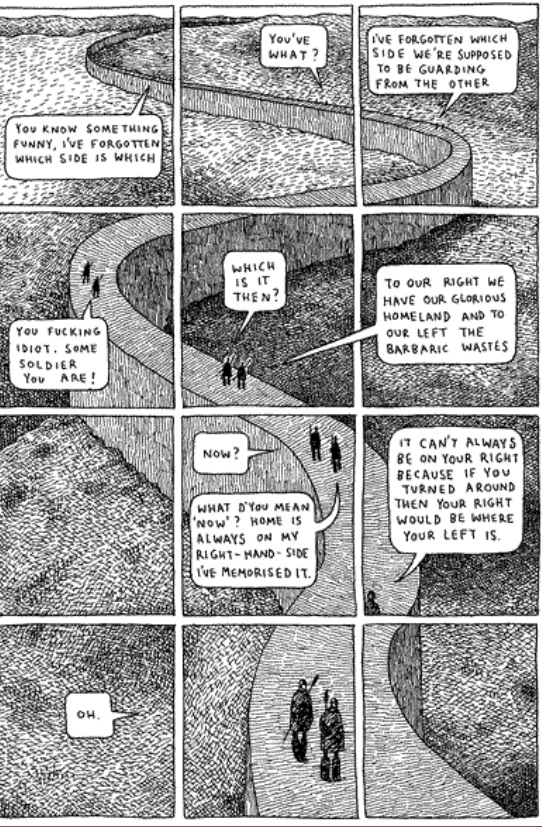
Consider the polyptych, a technique used in Guardians of the Kingdom by Tom Gauld.  A polyptych in the comics world is where “a moving figure or figures is imposed over a continuous background” (McCloud pg 115).  The polyptych provides an example of closure occurring in one setting, likely with one subject or a small group acting or talking (that is, providing sound or motion to imply time and generate closure), but it is a technique that requires the use of panels as an organizational framework, despite the fact that all the closure-generating action of a character occurring within one setting could only logically be explained as a passage of time.  Otherwise it would appear as the sudden multiplication of one character into many copies, something I think it is safe to say could easily be ruled out through context.


For example, this polyptych from Gauld’s aforementioned work uses one scene and only two characters, both moving and speaking and thereby implying the passage of time.  It also has a very basic set of panels dividing the image which helps to emphasize and clarify the passage of time.  The panels help to organize the image on the page, but they are not necessary to understand the image, which is to say, to generate closure.  If there is some doubt about this assertion, imagine the page without the panels.  Although it might be momentarily confusing, reading the whole page would provide the necessary context for closure to occur.  In fact, in this particular instance, even that much probably wouldn’t be necessary, as the reader would be aware that there are only two characters in this book. Nonetheless, the panels do help and McCloud’s characterization of them as icons for the division of time seems to make sense, although they might be more accurately described as indices.  An icon bears a visual similarity to the thing it represents, whereas an index does not necessarily resemble anything, but indicates that what it represents is occurring. As panels and gutters can’t be said to visually resemble the passage of time, but instead indicate that it is happening, they are indices.

Why, if they are not necessary, do we see panels and gutters so often in comics?  The answer is that while they are not necessary for closure, they are necessary for comics as a format.  They help us to organize the page and are the author’s means of steering our scanning of the images.  Imagine, once more, the page above without panels.  But this time imagine that it is huge, far larger than any book would allow, so large that it would take some time to scan the whole image from top to bottom.  In that case, the winding wall and real time needed to scan the page would provide all the indication of the passage
of time necessary.  Closure would certainly occur without the panels.  In essence, panels are not necessary for closure; they are an accident of the format that has been developed by authors as a means of directing the process of closure, thereby shaping the meaning we draw from the comic.

There is further evidence to suggest that while closure doesn’t strictly require panels, comics do.  More broadly, any visual narrative art requires panels and if those panels are not explicitly drawn, they are implied.  The Bayeux tapestry, an 11th century embroidery depicting William the Conqueror’s successful invasion of England, although clearly not a comic in the modern form, works just like one.  It combines images, definitively on the iconic side of the spectrum, and words to tell a story.  It scans from left to right and is
broken down into a number of scenes, although none are explicitly numbered or
otherwise differentiated.  But the fact remains that the panels are implied.  The need for organization in the images was still present and panels, or in this case scenes, are apparently the instinctual way to depict this.

It is my contention that closure occurs constantly through our scanning of the images and the involuntary creation of meaning out of the juxtaposed images on the page.  The panels and their negative space, the gutters, act only as a way of organizing these images for, no doubt according to the author, more meaningful scanning.  Further, I would argue that panels are actually just a formalization of our natural scanning and is due mostly to the physical format that comics take.  The fact that comics generally come in books, that
is on pages read left to right, top to bottom, has necessitated the use of panels. Specifically it solves the problem of moving down the page, something the Bayeux tapestry doesn’t have to deal with and consequently didn’t create a system like explicit panels to direct the reader.  I do not disagree with McCloud that “closure is comics”, indeed any visual narrative must have closure because that’s how we make sense of them. And I would go farther, perhaps, than McCloud by stating that comics are panels, whether those panels are implied or explicit, because the format demands it.  But, as I believe I have shown, there is no transitive property at work here; panels and their gutters are comics, comics is closure, but panels and gutters are not closure.

Comics at Book Expo America 2012

The comics industry, the publishing industry, and the convention industry are all on the cusp of a great change due to shifting priorities, new formats, and new audiences. Can the three use work together to confront these challenges? Based on my attendance at Book Expo America, the country’s leading publishing exhibition, I would say that the answer is “no.”

At the June 6 convention, organizers seemed more concerned with extracting as much money from vendors as possible via exorbitant exhibition fees than in providing a sensible layout. Comic companies, though smartly grouped together for the most part, were located nowhere near the Children’s Pavilion. And yet, the majority of the librarians I’ve encountered outside of larger cities still continue to view graphic novels as a format for children and reserve them for children’s libraries. In bookstores, graphic novels often provide a buffer between the rapidly growing Young Adult section and Science Fiction. Though some comics creators may bristle at the suggestion, wouldn’t it have been best to place comic companies near the Children’s Pavilion—the very place librarians and book buyers would expect them to be? Placing them against the back wall and far from high traffic areas gave the signal that comic companies are not a priority. Why should those comic companies want to spend large sums of money to return? Poor service combined with high fees may hurt BEA in the long run as vendors begin to reconsider the necessity of the event.

Comic companies on the whole—perhaps too familiar with comic conventions–did not seem to fully recognize their status as miniscule fish in a massive pond. Displays were mostly limited to a selection of wares. The lack of a “hard sell” was completely evident. In every instance, I had to approach representatives and speak to them first about products—or even say “Hello.” While this is not an issue in a comic convention full of rabid fans, it very much is one in a convention full of disinterested buyers. One cannot afford to be aloof. However, once approached, many reps were friendly and knowledgeable.

Here’s a brief assessment of the comics booths I visited.

Fantagraphics: This company possessed the best location (strangely nestled in a section full of academic publishers) and the most stylish booth—complete with seating! It also had an extensive set of galleys to peruse and provided free sample books to those who had questions. Eric Reynolds even took the time to help a lapsed reader like me sort through the intricate history of Love and Rockets, which was greatly appreciated! I was highly impressed.

Image: I was also pleased with Image. The booth, though in a lackluster location, was well stocked with a wide array of free comics and had friendly creators behind the booth signing wares. Jennifer De Guzman even took the time with me to help pick out a selection of comics for a coworker’s young son.

BOOM!: Free wares were not available, which I feel was a tremendous mistake. Instead, I was offered a checklist of recent and upcoming graphic novels. While this is very useful to a fan, what would a buyer want with a list of books he is not familiar with? What librarian would take the time to stand and read several comics at a booth?

Marvel: Marvel did not have a separate booth and was inadequately represented by Disney. I was shocked by how poorly staffed and stocked the booth was given the wealth of the company, the bulk of content available, and the amount of exhibition space purchased. I picked up a pamphlet advertising a “Marvel book, magazine, and app program for young readers”—no backlist, no Masterworks, and no material geared toward adults or teens available. The impression was given that Marvel merely produced products for young children featuring traditional icons. The lack of a diversity of titles was disappointing.

DC: DC had no booth available on the exhibition floor; instead it made due with two autograph sessions—one by Scott Snyder, author of Batman Vol. 1: The Court of Owls and another by Peter Tomasi, author of Batman & Robin Vol. 1: Born to Kill. While pushing well-known creators is a wise move at an event now dominated by celebrities, the lack of a booth was a huge misstep. And given that both authors signed books featuring Batman, there was a drastic lack of diversity.

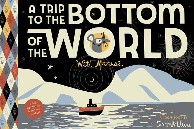
However, comics and graphic novels were not limited to the exhibition floor. I attended Heidi MacDonald’s fabulous panel showcasing monumental works of 2012. Prior to the panel, a small survey sheet was provided to members of the audience, presumably to obtain basic information regarding audience demographics. I am very curious to know who attended the fairly populated event and hope that MacDonald releases that information at a later date. Though light on mass market, heroic fare, MacDonald and her peers seemed to know their audience and cater to it, providing a list   featuring critical darlings and charming children’s books for an educated urban audience. Two popular examples include Alison Bechdel’s Are You My Mother?: A Comic Drama and A Trip to the Bottom of the World with Mouse by Frank Viva. (The list was about quality, not commerce. Still, had I been a book buyer I might have preferred a collection of mainstream books that would sell extremely well to a suburban audience. There is no point in stocking one’s shelves with only Nabokov when customers want Fifty Shades of Gray. Give ‘em the thwip! There’s no shame in a little bit of spandex.

Perhaps even more interesting than the books on display were the rumors swirling about the show floor. Will next year’s exhibition be open to the general public? Will smaller vendors displeased with poor foot traffic avoid next year’s show? I could easily see BEA falling prey to the crass commercialism that consumed SDCC and E3. Though it would mean more money for Reed Exhibitions, it would not necessarily make for a more enjoyable show. Still, a four-day show featuring a renovated floor plan, with Thursday and Friday reserved for those in the industry and the weekend open to the general public, would serve the needs of all via a sizable audience and a variety of exhibitors.
 

The Nearly “Worthless” Art of Howard Chaykin

Time² was an opportunity for me to do a magic realist-fantasy fiction version of my life. The three guys—Max, Azriel, and Dani—are idealized versions of me and my brothers, and Rose is my mother. It was an absolute hoot. I loved doing Time². It’s my most personal work, my favorite work, and of course, nobody really responded to it.”

Howard Chaykin, Conversations

Howard Chaykin hasn’t gone back on his word. I’ve been told quite recently that he still has a fondness for that forgotten comic and holds his original art from Time² in high regard, only having recently been persuaded to part with the bulk of it. The pricing on those sheets of paper has barely managed to keep up with the rate of inflation. They were selling for little more than $100-150 (if memory serves) around the turn of the millennium and are now available at 200 Euros each (about $260), this pricing having little to do with their actual saleability or desirability (Chaykin’s early American Flagg! art is in greater demand among collectors).

Part of this has to do with the simple fact that the comic in question was one of Chaykin’s least popular, never managing to gain the critical acclaim of his work on American Flagg! or the notoriety (and multiple printings) of Black Kiss. It was allowed to fall out of print as soon as possible, the thin tomes with their horrendous glue binding gathering dust in innumerable back issue clearance bins ever since.

Yet it remains an impressive example of design and the use of narrative confusion—a technique which Chaykin perfected in the pages of American Flagg!—a magnificent synthesis of the planning and drawing of Howard Chaykin, the lettering of Ken Bruzenak, and the painted art of Steve Oliff. This is easily one of the high points of this collaborative team.
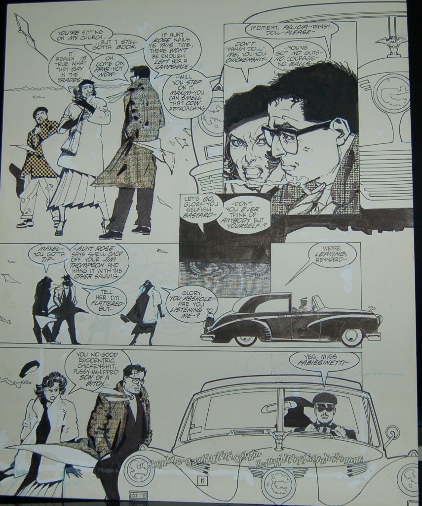
The original art itself is larger than your average modern day superhero board though not quite twice-up, bare and carrying with it all of the scars of production, as good an example as any of how the physical comic book is the final aesthetic object. The rest belongs to nostalgia, history, and scholarship. Consider page 12 (above) and its battlefield of whiteout marks, repositionings, and white spaces. The blue background denoting memory is confined to the bluelines created by Oliff as is the horizon line in the distance. The Yiddish radio transmission (or primal scream?) cutting through that space, unifying the facing pages, and signalling the imminent arrival of a crazed delicatessen owner is nowhere to be found.
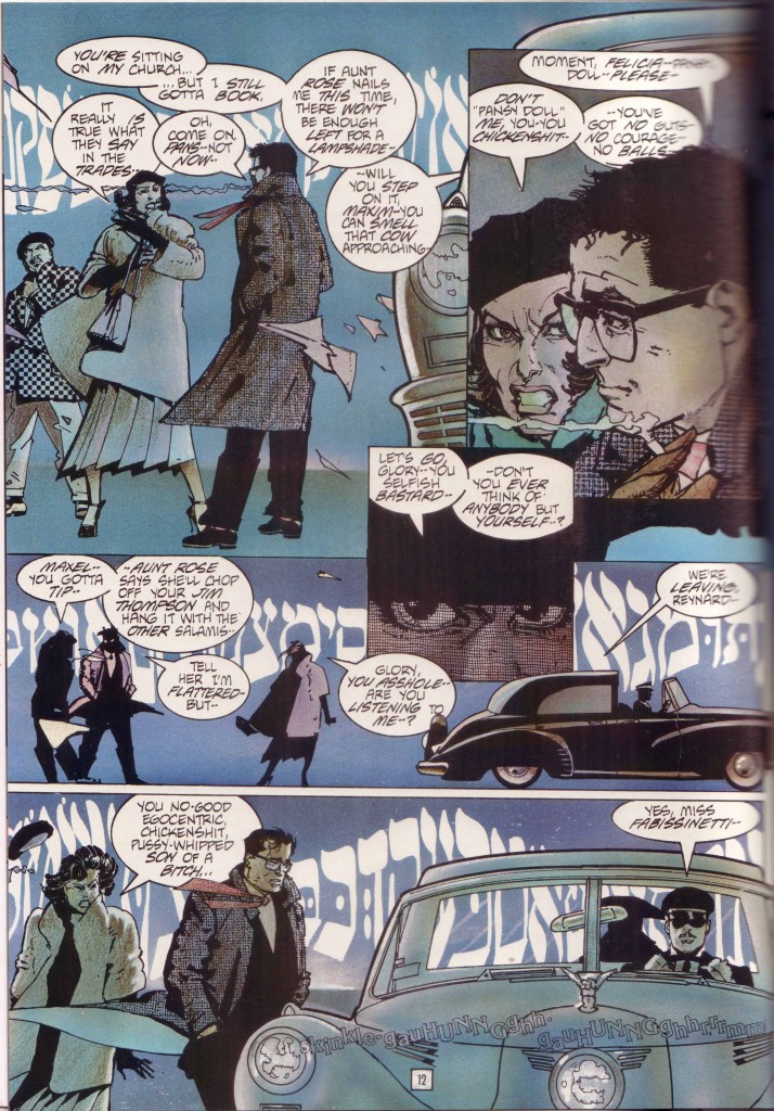
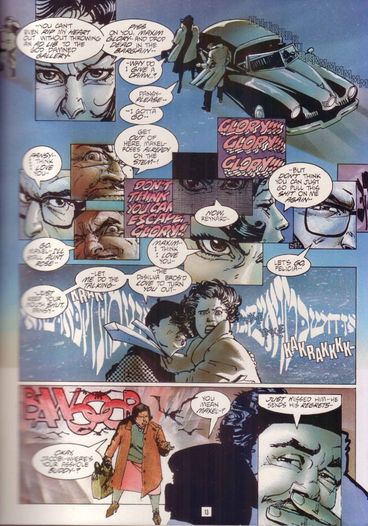
This big mysterious flashback in which we see the protagonist (Maxim Glory) acting out his lines for the first time is now strangely quiet—strangled faces on aging paper. Much of Time² was built on the concept of double page spreads and this one will never tell its tale (or part of its tale) without its partner.

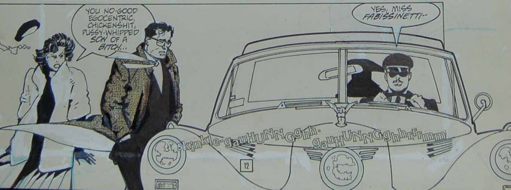
The correction marks and whiteout (that comics pentimento) suggest minor inking errors and space made for that Chaykin specialty—overflowing word balloons. Chaykin was never one to care about crushing a page with text and his words are cramped into a number of tight corners by Bruzenak. If anything it transforms from hurdle, to design element and hence to feature, like the controlled improvisations of a jazz artist.
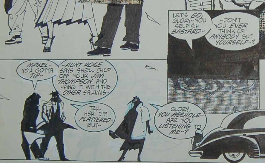
In the second panel of page 12 we see the female figure moved to the right to make space for this dialogue, her words now protruding into the hatched lines of the center panel inset meant to denote a shadowy countenance and a veil of anger; the words “bastard” and “asshole” now inserting themselves into the schema as a central theme as it were.

So too the interaction between the silhouette in the back of the chromed luxury vehicle (Miss Fabissinetti) and her chauffeur, Reynard; the former’s dialogue straying into the edges of the first panel and her discourse with her driver shoved to the right border like an unwanted intrusion. All of this not making sense in the flow of dialogue, a distracting placement meant to mimic her encroachments into Maxim and Pansy’s conversation. The panel borders are removed in the bottom tier to balance the page and accentuate the prominence of the vintage automobile which dominates the entire right half of the art. Maybe Chaykin just liked drawing cars (he seems to have one on every other page), or maybe it’s a link between the robot killer and Maxim who negotiate and pepper their vehicles with acts of violence (physical and verbal) towards women.
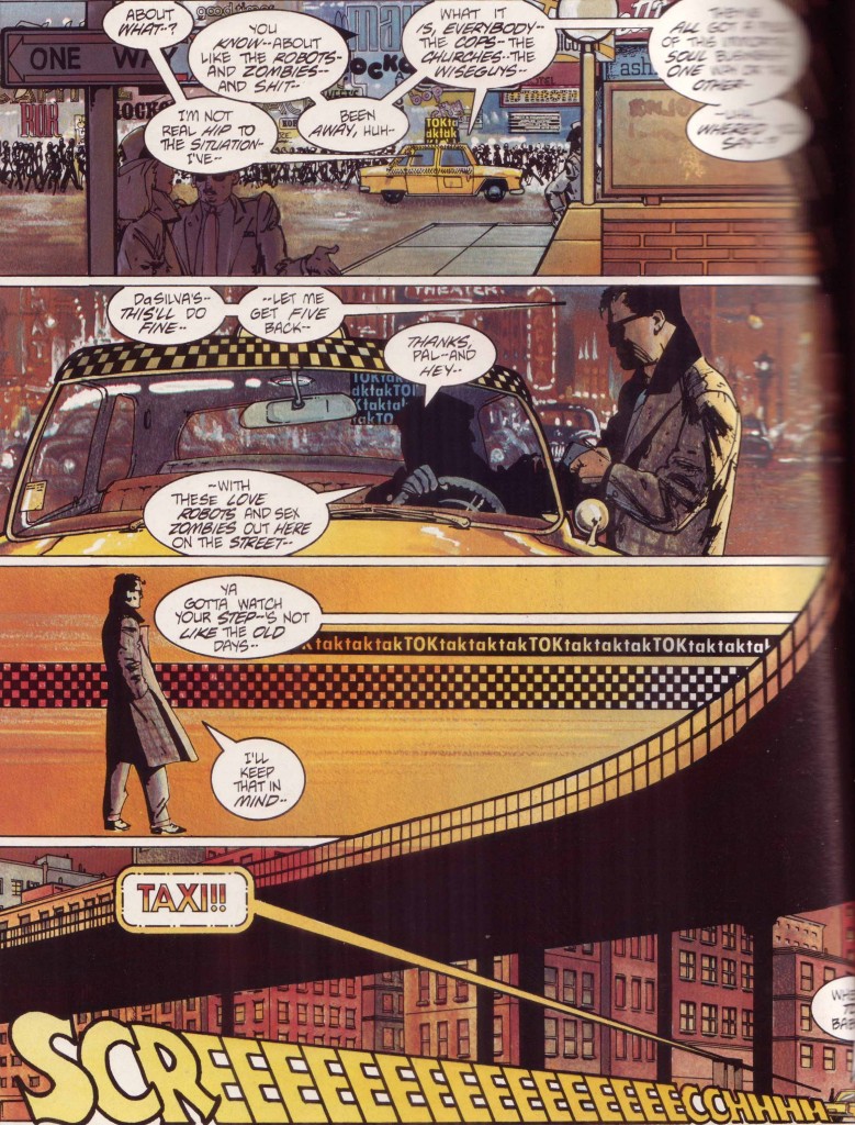
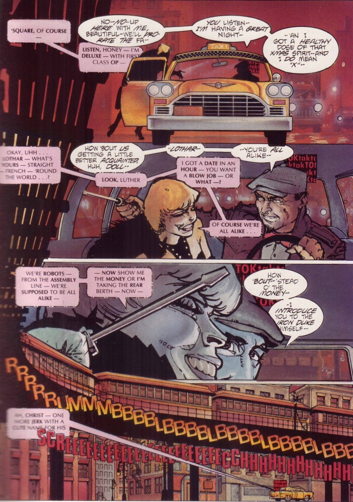
Such is the case with the double page spread on page 16 and 17, the original art for page 17 now available but orphaned from its partner.
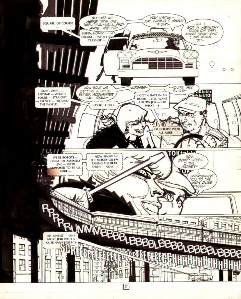
The dividing line is a rattling subway train, the multi-hued congestion and city lights once again lost to the bluelines. The yellow streak of a taxi also disappeared.
At other times, the original art reveals the joins in some of Chaykin’s bravura maneuvers. Page 4 is a smear of red neon and fury (not blood since robots don’t bleed).
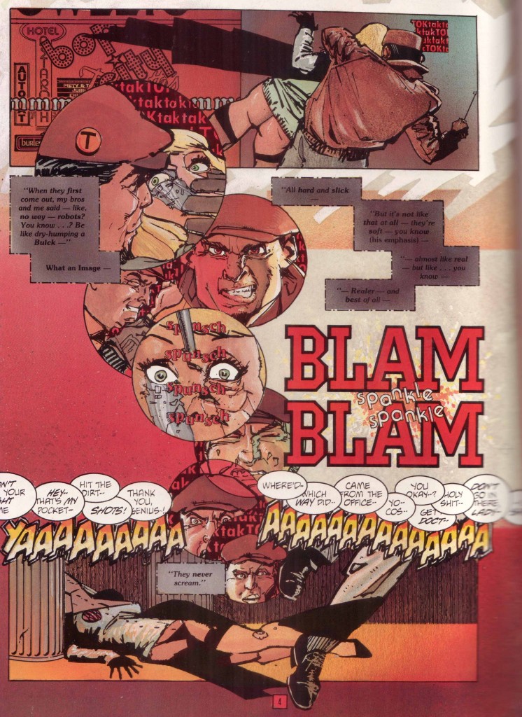
Everything else comes to the fore once the parts are no longer unified by Oliff’s colors and the obscuring vision of the printing press,
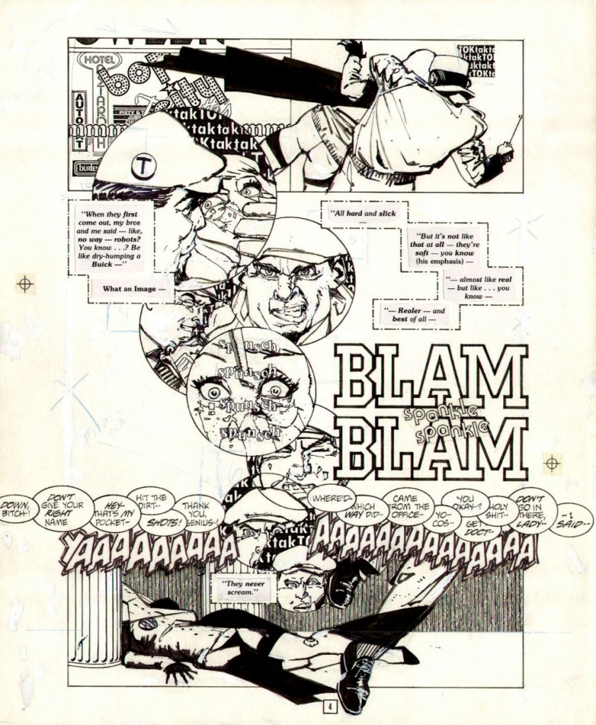
The thick paste-ups of Bruzenak’s letters which seem so integrated in the comic are now seen in their rough state, the jarring changes in type (sizes, fonts, shape) a soundtrack for the city. The ink lines more clearly reveal their purpose—circular panels rising like thought balloons from the corpse at the bottom of the page, the killer’s face cracked and distorted in its final moments, the final cognitive dissonance of the android.

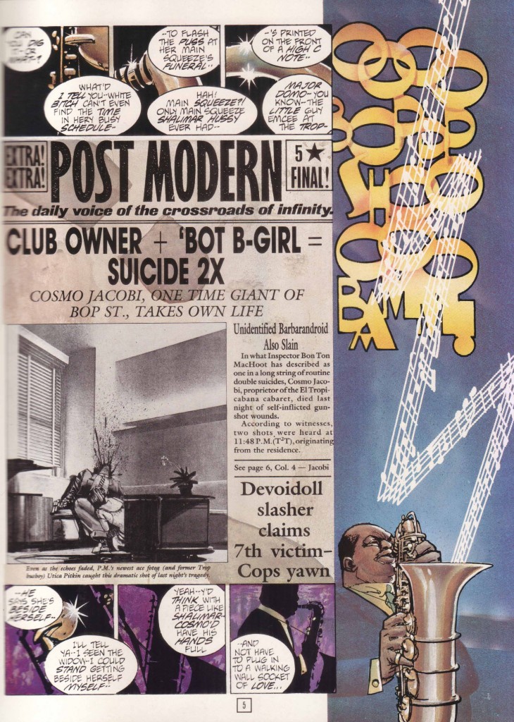
The string of disembodied dialogue sitting on the upper border of the bottom panel is a mystery to the first time reader, a cacophony floating across Time² and Chaykin’s world. That final word balloon (“-I said–“) connecting to the following page which announces the funeral and then the suicide of Cosmo Jacobi, this inverted revelation part of the Chaykin bag of tricks.

The murderer is using a screwdriver to do his work but gun shots ring out from an unknown source, for a moment overshadowing the “taktaktak” of mechanical parts and heels. A scream tears across the bottom of the page even as we’re told, “They never scream.” All of this applying to the opposite facing page: the double bang of a double suicide, the horror and morbid delight in its discovery. It is Oliff’s colors which form the dividing line between the grey marble interiors of Cosmo Jacobi’s office and the dirty red pavement of a back street killing. We might find something comparable in that confusion of sound and image seen at the start of Segio Leone’s Once Upon a Time in America where Robert De Niro remembers the past through an opium haze.

As the narrative of Cosmo’s death and the lack of despondency of his widow gathers pace, Chaykin continues to demonstrate his (over)confidence in his reader’s abilities. Page 6 begins with the neutral words of radio hack, Diogenes Pilgrim, passing through placid disconnected dialogue into anger with an unknown person, hence to a live radio transmission (colored yellow), an electronic signal (in dotted square balloons), and then the crackly end of a burbling radio in Shalimar Hussy’s apartment on the opposite page. So goes the rest of the comic, words from separate characters melding into each other as evidenced by the strangely adherent word balloons.
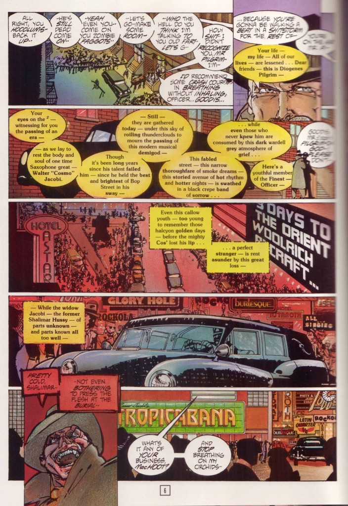
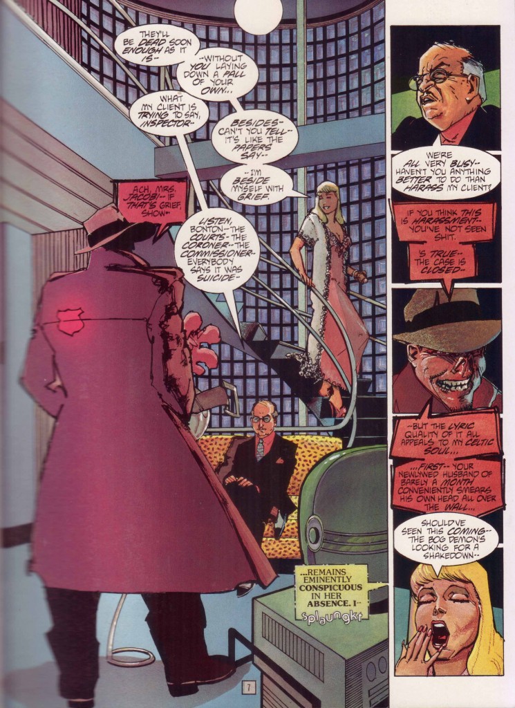
These are instruments singing from a score, a decadent and dissonant symphony of the city: the vanishing dialects of urban America; the genteel persistent cussing which never resorts to the word “fuck”; the elemental force of Jewish relatives; and the electric jazz cool which is (presumably) America’s greatest contribution to world culture.  Chaykin states that “at its core, what Time² is, is the underworld of the city of tomorrow as visualised in the 1939-40 New York World’s Fair.”   This is a world where matrons pimping demons from delicatessens are the norm, and religion and the after-life have been capitalized and released as IPOs; a lost America of the early 20th century with its bebop soundtrack, constructivist sculpture, fine dressing, and limousines with open driver compartments—a memory never never land of every time.

Jaime S. Rich links the innovations here to the work of J. H. Williams III:

“It’s a mash-up of art deco design, the seediness of old-school New York, and a cynicism about the idea of a better tomorrow. It is simultaneously nostalgic for a past Chaykin knows never was and a future that can never be….Chaykin is talking about the artistic process and living with one’s mistakes, about the clash of old-world superstition and new-world technology, about learning not to care about the stupid crap and also how to deal with relationships as an adult who actually knows a thing or two—again, heavy-duty stuff you’ve had to live through to appreciate.”

Rich sees a richer theme beneath this exercise in noise and style and I have no doubt that had Chaykin’s series reached fruition, that is exactly what we would have got. As it stands, and even with its sequel (the less satisfying The Satisfaction of Black Mariah) what we have in these 48 pages is dense prologue; a baroque joke where the punchline is totally inconsequential because its reason for being is ornamentation and counterpoint, a stream of consciousness tapped from Chaykin’s mind and life without neat ribbons or meaningful closure. As Jog puts it:

“[Time²] feels like an exercise in extended free-associative linkings of Chaykin’s internal iconography. Maybe that’s why it didn’t do all that well with readers. Proper plots do eventually emerge, more or less, but they are immediately submerged beneath the sheer import of existing in Chaykin’s universe, a pure pop surface cityscape that somehow feels achingly personal, if only through the way its creator lavishes his attention upon it.”

It is always painful when the public rejects that big personal statement and values it at rock bottom prices. A communal failing which should be seized upon gratefully by any comic art collector.


*          *          *

Notes from the web:

(1)  Bluelines as described at Steve Oliff’s site

“…. a full color method developed in Europe, which a few American publishers used in the years just before computer coloring became the industry standard. It involves coloring on an art board that has a blue version of the line art printed on it. Then the black is shot separately, and there is an acetate overlay to show the colorist what their final product will look like. These bluelines are the actual color that was photographically reproduced. The colors are opaque watercolor (goauche), acrylic airbrush paint, colored pencil and Pantone film. They are larger than guides, and fully rendered color…”

(2)  And from Frank Santoro’s inquiry into Oliff’s coloring:

“One of the main things that separates Time² from my earlier coloring jobs was that I mixed up my own special palettes of colors to airbrush, and then I used some of those same colors to paint with. Then on top of that, I was using some of the leftover frisket (a masking film) to create patterns of color. For instance there is a big shot of a girl sitting on a couch. The pattern on the fabric is mostly used frisket pieces. We used spatter and colored pencil extensively to give texture. I also used Pantone films to cast shadows over the colors once they were rendered. And finally, Howard came back in and gave a lot of the faces hard edged color. He felt some of my color edging was too soft, so he cut in some highlights.”

Who Watches the Watchers of Before Watchmen?


Who's the smartest man in the world now?

So: Thursday 7 June 2012, a day which will live in infamy.

I’m not going to go into why Before Watchmen is an all-round immoral “product”, why the *cough* artists involved are sell-outs and scabs, and why those who buy it are endorsing and enabling exploitation. Others have made that case better than I could — I particularly agree with most of what Noah says here.

And, yes, I do agree with that, in spite of my — admittedly rather dopey, it even says as much in the title — earlier post here, where I detailed in tedious detailly detail just how extensively Alan Moore’s own career has relied on the exploitation of other people’s characters, often in ways that the original creators would find abhorrent. My point there wasn’t exactly a tu quoque — i.e. that if it’s okay for Moore to do it, then it’s okay for Dan Didio and his homies to do it too. My point was that — money aside, and that’s a big thing to put aside — Moore has harmed the interests of (e.g.) Lewis Carroll just as much as Didio et al. are harming the interests of Moore. It doesn’t hurt Lewis Carroll — again, money aside — any less just because he’s dead.

This is because I hold the philosophical view (prima facie very counter-intuitive) that the dead have interests just as much as the living, and that we can harm them or benefit them in similar ways that we can harm or benefit the living. Weird, right? But that doesn’t mean that it’s wrong for Moore to fuck over Carroll, or that it’s okay for Didio to fuck over Moore, because ceteris ain’t paribus here. There’s a benefit to society from letting creators mess with the creations of others, but there’s also a benefit from postponing such messing in favour of some length of copyright. So even though Moore has done Carroll wrong, what he’s done is nevertheless morally okay because that harm is outweighed by a greater good. And contrariwise for what DC is doing now.

Which more or less chimes with what Noah’s said.

But to the extent that my post may have contributed to anyone’s impression, in even the slightest way (I have no illusions about the extent of my online persuasive powers), that Before Watchmen is morally acceptable, then mea honest and sincere culpa.

Now, all that said, I want to move on to a much more discomfiting thought. At least, it discomfited me. And this is directed at all of us who have taken the moral high ground on this “package” and exciting new “development” of the “property”, so other people like Noah, Tom Spurgeon, Dan Nadel, Sean T. Collins, Abhay Khosla, Chris Mautner, J. Caleb Mozzocco, Tucker Stone, et al.. You know who we are.

Um, we know who you are?

Eh, whatever. Anyway, here’s the thought: how much of our moral disdain is due to the fact that we have 99.9% certainty that Before Watchmen is going, as Socrates might have put it, to suck dead dogs’ balls?

Let’s look into our hearts here: hasn’t DC made it incredibly easy forus conscientious objectors to conscientiously object because, come on. J. Michael Straczynski and Darwyn Cooke? Shit, DC, why don’t you make it really tempting for us and chuck in Brian Michael Bendis and Jim fucking Lee? Of all the *cough* artists involved, Brian Azzarello and Jae Lee are the only ones I’d personally piss on if they were on fire; many of the rest of them I’d only piss on if they weren’t on fire.

Not Dan Didio, though. He seems like the kind of guy who’d be into that.

Let’s imagine an alternate universe where the “talent” involved was actually talented. Let’s imagine that, instead of Andy Kubert and JMS, the line-up consisted of Chris Ware, Jim Woodring, Lewis Trondheim and Junko Mizuno. Or Anders Nilsen, James Stokoe, Los Bros, Jason, and Naoki Urasawa. Or a young-alt-star-all-star line-up, drawing six hundred pages of nothing but hardcore yaoi fucking, Dr Manhattan as top and Rorschach as bottom: Johnny Negron! Lisa Hanawalt! Michael de Forge!

Or whoever floats your boat. The particular names don’t matter, what matters is that we imagine a line-up of artists who are actually, you know, good and who would almost certainly produce something that’s actually, you know, good.

In the real world, with the line-up we’ve in reality got, there’s essentially zero chance that Before Watchmen will be as good as Watchmen. Hell, there’s essentially zero chance that Before Watchmen will be as good as The First American.

But imagine — just imagine — that it was probably going to be good. Maybe even great. How loud would our denunciations be then? How many of us would still boycott?

Yeah, lots of us would would still denunciate, lots of us would still cott the boys. But, let’s be painfully honest, lots of us would be slinking off to the LCS to buy it, put it in a brown paper bag please or if you don’t have a brown paper bag could you please hide it in the covers of Pee Soup um I’m buying that for my friend

Uh his name’s Dan.

In other words: while we’re all basking in the warmth of our moral outrage — and I’m there basking too, man, that one place in the sand where there’s just one set of footsteps and it looks like I just nicked off to do my own thing? that’s where I stopped to carry you I LOVE YOU GAIZ!!! — while we’re all there basking, let’s also take a reality check. The reason it’s so easy for us to think DC management are arseholes for publishing Before Watchmen, the reason it’s so easy to think the *cough* artists are arseholes for making it, and the reason it’s so easy to think the readers are arseholes for buying it — that’s not because we are not, ourselves, also arseholes.

We’re just arseholes who, this time, got lucky.

Boringly sensible post-script: Yeah, yeah, some of us would still resist, just as there are some people who find meat delicious but still turn and remain vegetarian. And there are also some people who genuinely do like the artists involved in the real Before Watchmen and are still loudly denouncing it, with David Brothers leading the charge. Good for them.

Second post-script: Come to think of it, an alt-comix tijuana bible/doujinshi sounds like a good idea. Internet, make this happen! Paging Ryan Sands

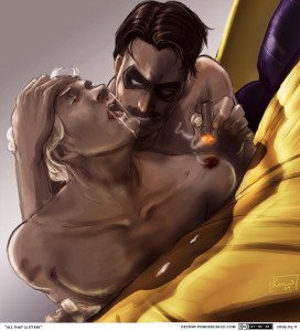
Image attribution: Ah, Google. Seek “Watchmen yaoi” and it shall be given. Art by Pond; I hope s/he doesn’t mind the borrowing. I just wanted to build on his/her legacies and enhance them and make them even stronger in their own right.