When I sit in my chair and and listen to the author speak, his or her voice carries me to a place of imagination. In many cases this experience helps put the listener into a frame of mind to absorb the work. Hearing the words with the author’s own inflection, tone and cadence has a transformative effect on the text.
In comics, the imagery is a literal part of the text. Image. Imagination.
The role that author readings fill in the experience of consuming prose is that of a facilitator. It serves to help guide the reader further into the author’s imagination. As they say, ninety percent of communication is through voice and facial response. Author public readings can enhance the audience’s relationship with the text.
In comics, one notices, the author’s imagery is already an aspect of the text.
What I find instead is redundancy and overstatement of the author’s worldview by placing the images upon the screen and also acting them out. Comics are, of course, a subgenre of the literary form drama. Drama, referring to plays, motion pictures: literature that is expressed through performance and acted out. While plays are acted out on the stage and motion pictures are acted out on the screen, comics are acted out on the page.
One would not attend a screening of a film and expect the director or screenwriter to be stand off to the side with a microphone, delivering all of the dialogue along with the actors. But this is what is done in comic author readings. There is an audience, a slide projector and the author not only telling the audience what is on the screen but actually reciting what is plainly spoken by the characters.
This sort of performance actually degrades the author’s own work by performing a redundancy. In trying to mimic the activities that their cousins, the print authors, undergo to create an intimacy with the audience, comics authors actually sabotage their own work. The result is a hollow imitation of both comics and prose.
The reason that these public readings enhance the experience for prose audiences is that they help guide the audience into a sense of an author’s imagination–an entirely new dimension to the work. The reason that public readings are corrosive to comics is that this extra dimension of immersion is actually competing for the audience’s attention against comics’ innate best attribute which is imagery itself.
_________
Image from Guy Delisle’s Jerusalem
A blues and gospel download mix, with maybe some other things too. Download Tuesday Is Just As Bad.
1. Over the Rainbow — Sarah Vaughan
2. His Eye Is On the Sparrow — R.H. Harris and the Soul Stirrers
3. West End Blues — Louis Armstrong
4. Nobody Knows You When You’re Down and Out — Bessie Smith
5. Crazy He Calls Me — Dinah Washington
6. Call It Stormy Monday (But Tuesday Is Just As Bad) — T. Bone Walker
7. Kindhearted Woman Blues — Robert Johnson
8. Down Baby — Lightnin’ Hopkins
9. Pretty Polly — Estil Ball
10. Bulldoze Blues — Henry Thomas
11. Somebody Touched Me — Edna Gallmon Cooke
12. I’m Going to Tell God — Mahalia Jackson
13. Won’t It Be Grand — The Consolers
14. Jesus Gonna Make Up My Dyin’ Bed — Josh White
15. Shall These Cheeks Go Dry — Marion Williams
16. Poor Pilgrim of Sorrow — Robert J. Bradley
17. Lover Man (Oh, Where Can You Be?) — Carmen McRae
18. Try a Little Tenderness — Aretha Franklin
19. 99 1/2 — Dorothy Love Coates
&ngsp;
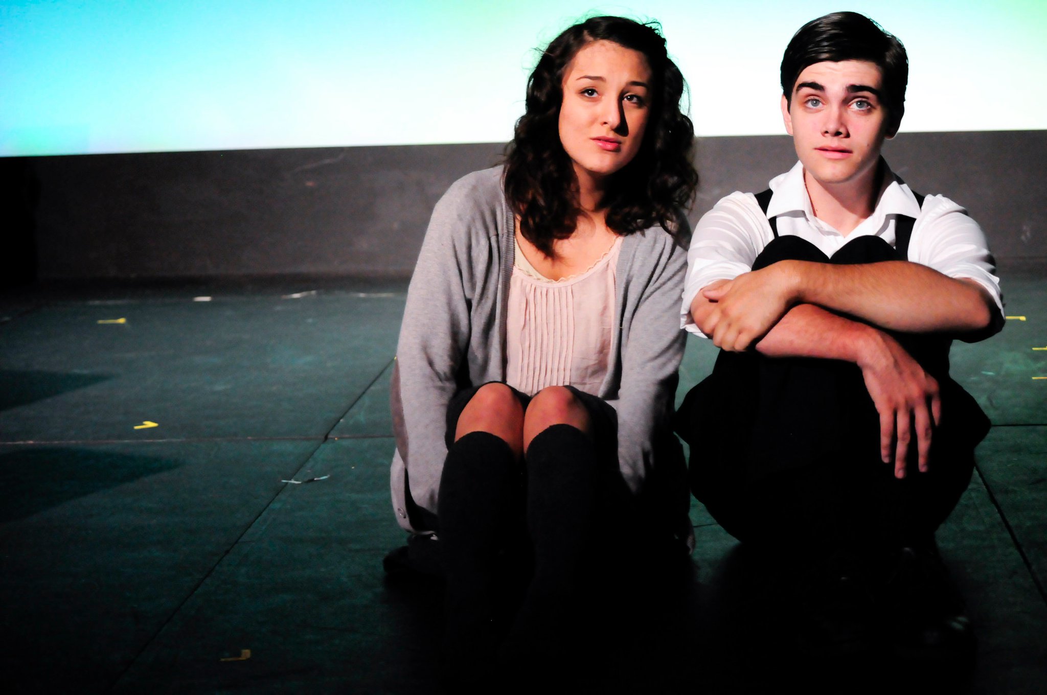
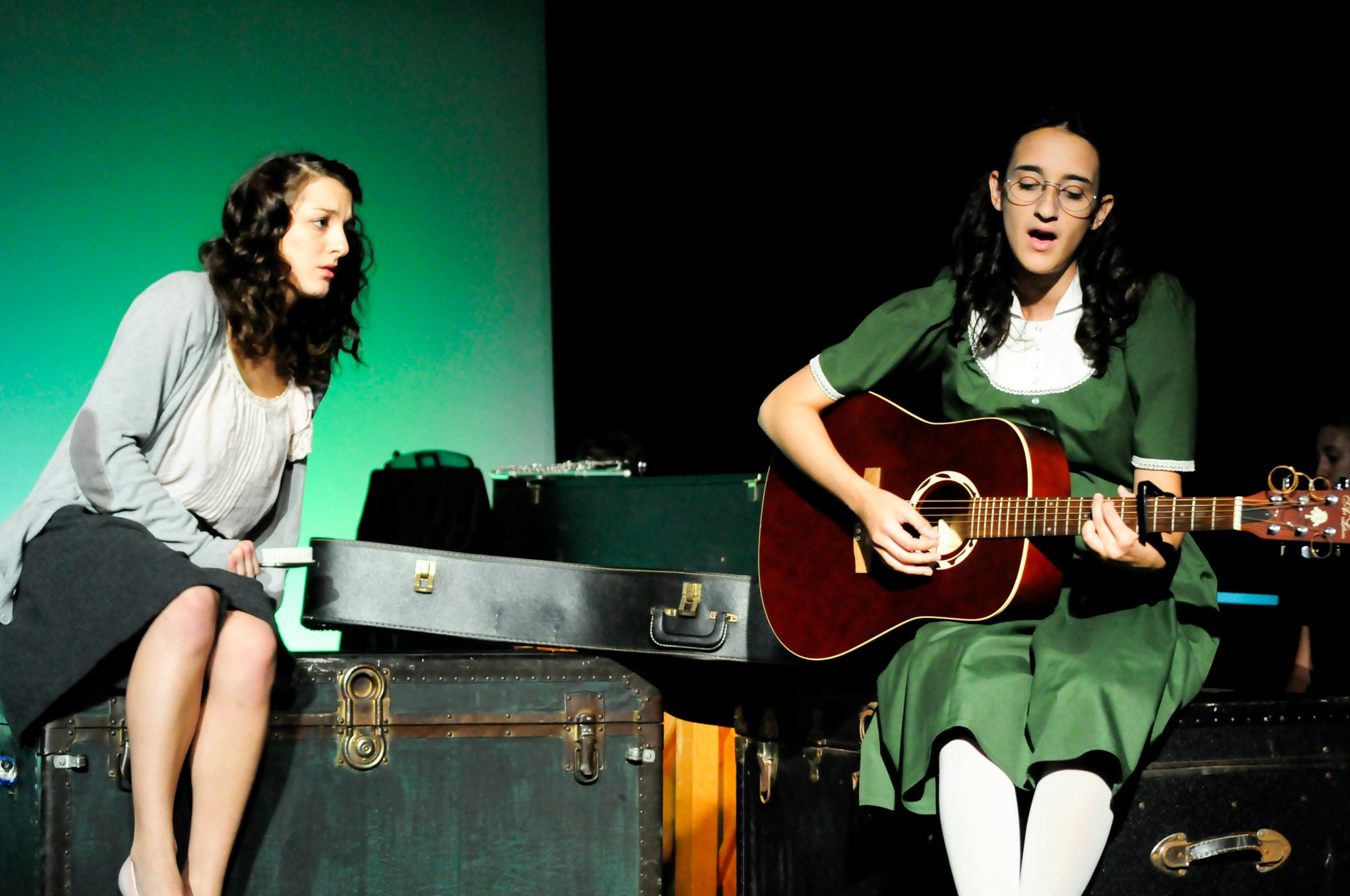
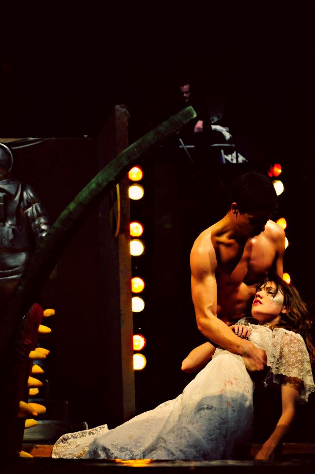
Sara Villegas and Anthony Pyatt as Anne and Peter.
Anne Frank and Peter van Daan flirt playfully in the crowded attic space, alternately shy and forward. They move lightly and talk softly, all to the accompaniment of a delicate instrumental on piano, guitar, flute and glockenspiel. It’s the first few notes of “We’ve Only Just Begun,” the treakly ballad co-authored by Paul Williams and Roger Nichols for a bank commercial in 1970, and later popularized in a syrupy easy listening version by Richard and Karen Carpenter. But, beyond the intimacy of the stage and among the small watchful crowd, the audience doesn’t seem to recognize it—or if they do, it’s a slight titter of recognition, and then transformation, the overtly sentimental lyrics (“We’ve only just begun/ to live/ white lace and promises/ a kiss for luck and we’re on our way/”) replaced by a soft flute that sends out echos of memory of these sentiments, the words casting delicate shadows on the moon-lit moment.
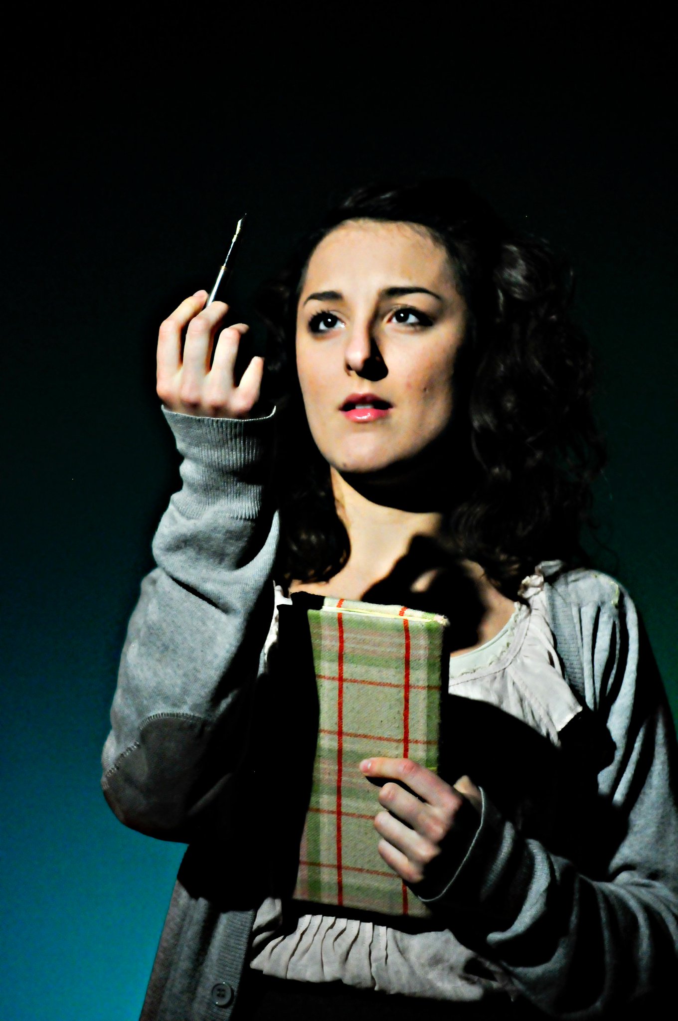
It was one strange moment of many in a forty-five minute performance filled with strange moments– 2011’s Anne Frank Superstar, a play constructed by Orlando high school theater teacher James Brendlinger, and acted, crewed and even directed (senior Cody David Price) by current students and recent graduates of Lake Howell High School. (A non-recent graduate, myself, was brought in as musical director.)
The show is the definition of high concept: The Diary of Anne Frank, set to the music of the Carpenters. Described by reigning Orlando theatre reviewer Elizabeth Maupin as “telling a sacred story through songs that have often been called kitsch,” the show was wild– and wildly successful, at least critically. The concept is almost stupidly simple, and some of the audience each night seemed prepared to hate the show, or at least mock it. After all, do “Rainy Days and Mondays,” “Yesterday Once More,” and “Top of the World” really belong in a story of profound loss and human tragedy, with a backdrop of indescribable horror?
But the success of the show– and if one can gauge a show’s success by what percentage of your audience is unable to stand after it is over, this one was truly successful—was directly due to this juxtaposition, a combination that set both elements in a new light, one that seemed to change each aspect of the material. Coming out of the mouth of an adult woman, a line like “hanging around/nothing to do but frown/ rainy days and Mondays always get me down,” is at best maudlin, at worst painfully trite, especially when set on a backdrop of gooey sentimental strings and turgid playing. But out of the mouth of an expressive, and doomed, teenager, the words are transformed into something sad, and possibly true. The songs were also served by the intimate arrangements consisting of piano, guitar, glockenspiel, oboe and flute, supplied by myself, two high school students, and the cast member playing Margot.
Likewise, the story of Anne Frank herself was transformed, or at least recast—it’s become so buried in weight and solemn reverence now that its easy to forget that the girl herself was a teenager, a pop culture enthusiast who wrote, drew, danced, had crushes on boys, worried about her period and her parents, who could have done so many things with herself but was instead doomed to never move on from that adolescent state. She is in many ways the ultimate teenager, having had all of the fears of adolescence made literal in her circumstance. For Anne Frank was trapped–puberty really was the end of the world.
There are additional resonances that present themselves throughout the play, both direct and tangential, including Karen Carpenter’s own doomed life. And much of the power of the play comes from the hopeful use of those songs, so hopeful that, by the time the Nazis actually arrive, it seemed as though the audience had managed to forget that they already knew the ending to this story.
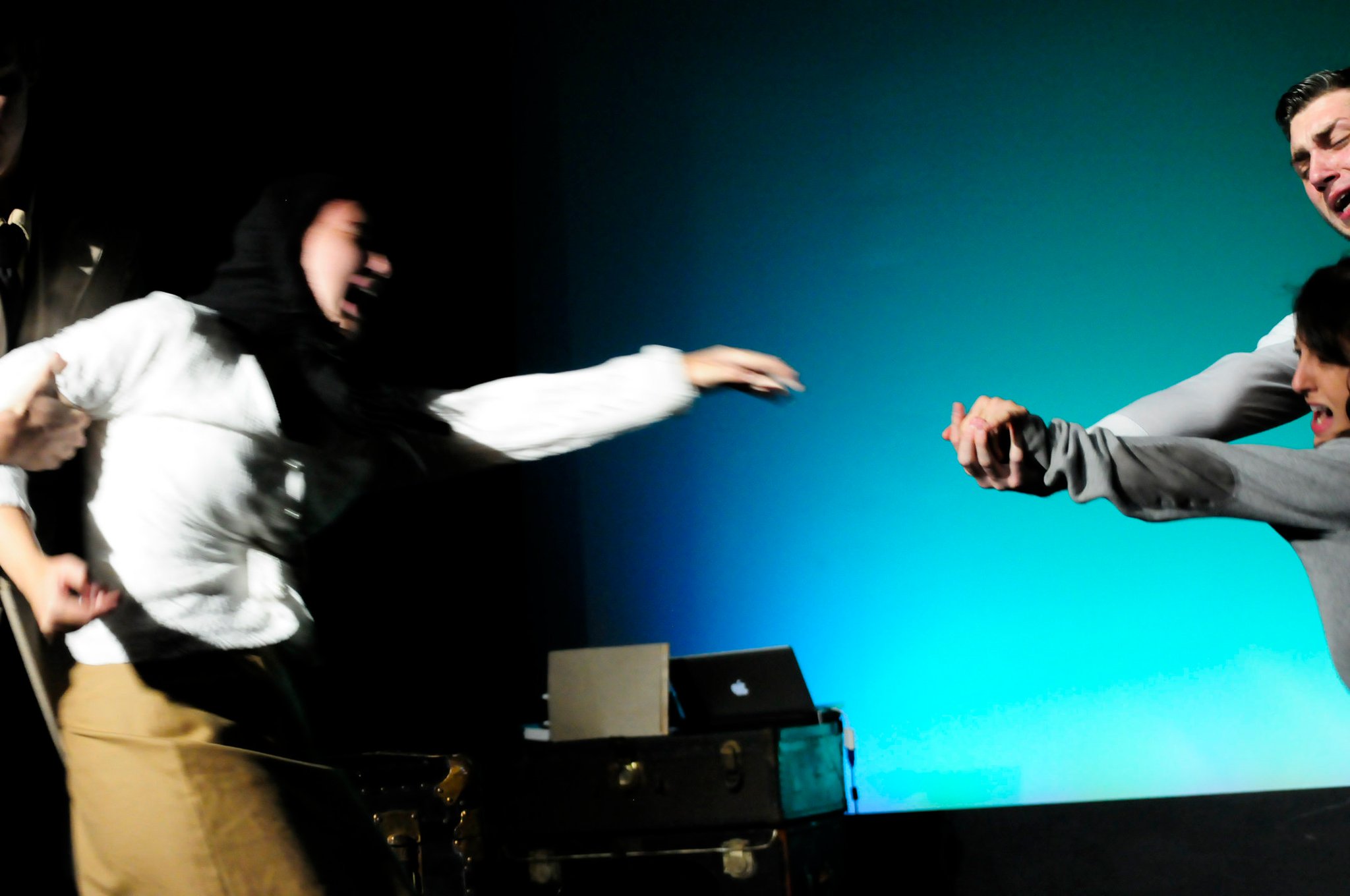
But if the jubilant “Top of the World” and the small thrills of the budding romance have caused them to forget, they’re soon reminded by the violent, silent violation of the attic, accomplished as the three teenagers enjoy strawberries in the annex. After the violation of the attic and the tearing apart of the family, the ending sequence presents Mr. Frank on the now-bare stage delivering a monologue regarding the fate of his family, as footage of concentration camp victims inter-cut with an increasingly emaciated Karen Carpenter is projected onto a sheet held by two Nazis, to the mournful accompaniment of an instrumental of the Carpenters song “Superstar.” At the conclusion of this monologue his doomed daughter comes out one more time and touches his shoulder, to sing/whisper a few lines of the song. “Don’t you remember you told me you loved me baby/ you said you’d be coming back this way again baby/ baby baby baby baby baby/ I love you/ I really do.” He reaches back, trying to touch her hand, but she is a finger length beyond reach, led off stage by the waiting Nazis. Slow blackout on Mr. Frank, alone on the stage, and house lights up twenty seconds later. No curtain call.
It seems implausible on paper that anyone would attempt such a juxtaposition, or that any audience would stand for such a thing. But at every single performance the reaction was the same—the house lights coming up on a stunned and reeling audience, many of them still sobbing.
Here’s the thing I haven’t brought up yet, which doubtlessly many of you have already thought—the show was in every way illegal.
The Carpenters songs were not the biggest barrier—although it would be a convoluted argument, as long as we weren’t using the name or logo of the group in the promotion of the show, we would have a reasonable chance of making that portion work legally—you can, after all, perform covers of songs written by other people with simply a venue’s membership to ASCAP, and we could probably make the argument that having a repeating theater performance that happens to feature songs popularized by a certain group isn’t fundamentally different than an all-lesbian vegan Led Zeppelin cover band playing at the local ASCAP-member Mexican restaurant.
Anne Frank’s words, however, and the translation of her words on which we were relying for much of our text, were a different matter, as was the authorized play (Diary of Anne Frank), which provided much of the rest of the text. All of these elements are still under copyright, and will continue to be so for several years. (In fact, copyright in the theater is more restrictive than in almost any other field. You can, after all, read a book or listen to an album any way that you wish once you’ve purchased a copy–but to publicly perform a play one must conform to a dizzying array of limitations set out by the author or the author’s agents–usually, that every word of the play will be performed, i.e. no cuts or insertions without permission, and that the appearance, gender and even staging etc will honor the stated intentions of the author regarding the script and contract.)
It’s no secret that a certain entertainment megalith has spent the past fifty years waging a war on the public-domain, its army of lawyers doing its damnedest to insure that their prized Mouse never legally becomes the public figure that he is. But its been only very recently that the full consequences of this have really been examined in the public sphere. The kind of theater that we created is not an unknown phenomenon—it’s just rarely seen in theaters. Instead, you’re more likely to see works that collide concepts with abandon on the Internet, in streaming video—in short, in places where authorship is more unsure and its not always clear who’s neck is on the line.
And I have no doubt that a not-insignificant portion of the people reading this might think, at first blush, that this is fine—that there’s no compelling reason for such a perverse transformation, and that if there’s a law to prevent such a perversion, all the better.
But at this point, seventy years after her death, is there any person that should be able to claim the words of Anne Frank? Is there any one person that can speak for her as directly or truthfully as she spoke for herself? Who owns her words? Who owns her name?
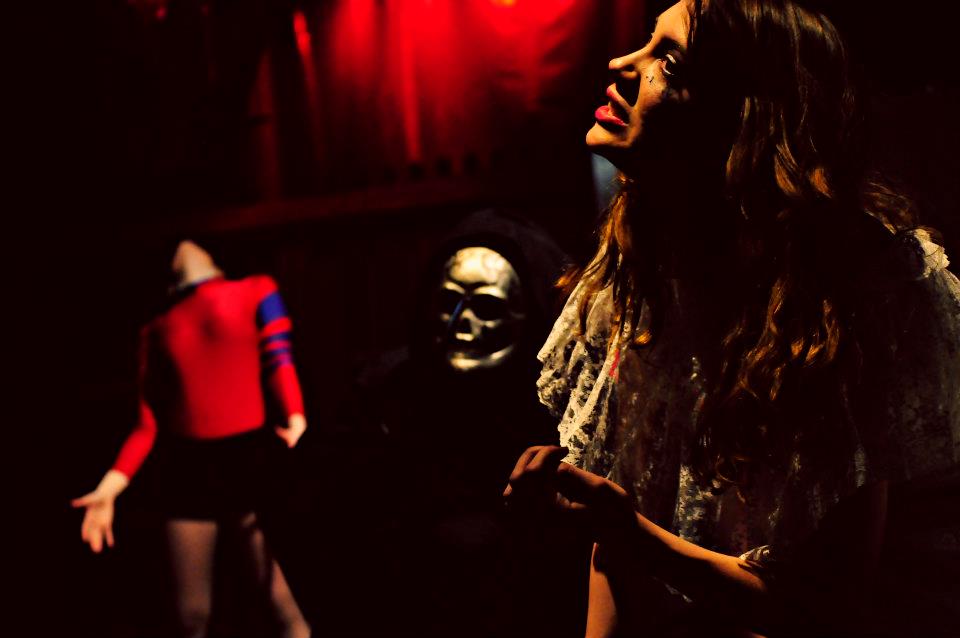
Victoria Camera as Margot.
The show was the brainchild of high school theater teacher extraordinaire James Brendlinger, who, as a young boy in rural Pennsylvania filled scrapbooks with elaborate collages, depicting himself rubbing elbows with celebrities cut from the pages of the dozen odd magazines to which he subscribed, cut from the pages to mingle with each other, with himself—a glorious life of rubber cement living rooms and glossy paper courtship. Concurrently he filled binders with his other love, never-ending Gothic soap opera novels of his own creation, the concepts and characters lifted in the beginning from episodes of Dark Shadows and slowly over many years grown, like the show that spawned it, to monstrous proportions, labyrinthine and tawdry and tangled. (Dark Shadows itself, of course, lifted these concepts itself, whole cloth, from an array of Gothic horror novels)
But after graduating college with a teaching degree, James didn’t move to glamorous Hollywood, but to Hollywood’s hick second cousin to the south—Orlando, FL. He took a job at Lake Howell High School, which is where I met him in 1998, during his first year.
Since then he’s put almost fifteen years into well over a hundred plays and projects at the school, an incredible tally of productions. But somehow he makes it happen, with an incredible expansiveness and a desire to involve as many students as possible.
This ties in nicely with his tendencies for the grandiose, for making something as big and as bold as it can possibly be—always more songs, more choreography, more dancers and aerialists and elaborate props and staging. After graduation I occasionally contributed to this craziness, lending a hand with set design and visual conception, and eventually supplying music. Most of his plays have virtually none of the “restraint” of AFSuperstar. Most of the time they’re much larger, as grandiose and spectacular as possible.
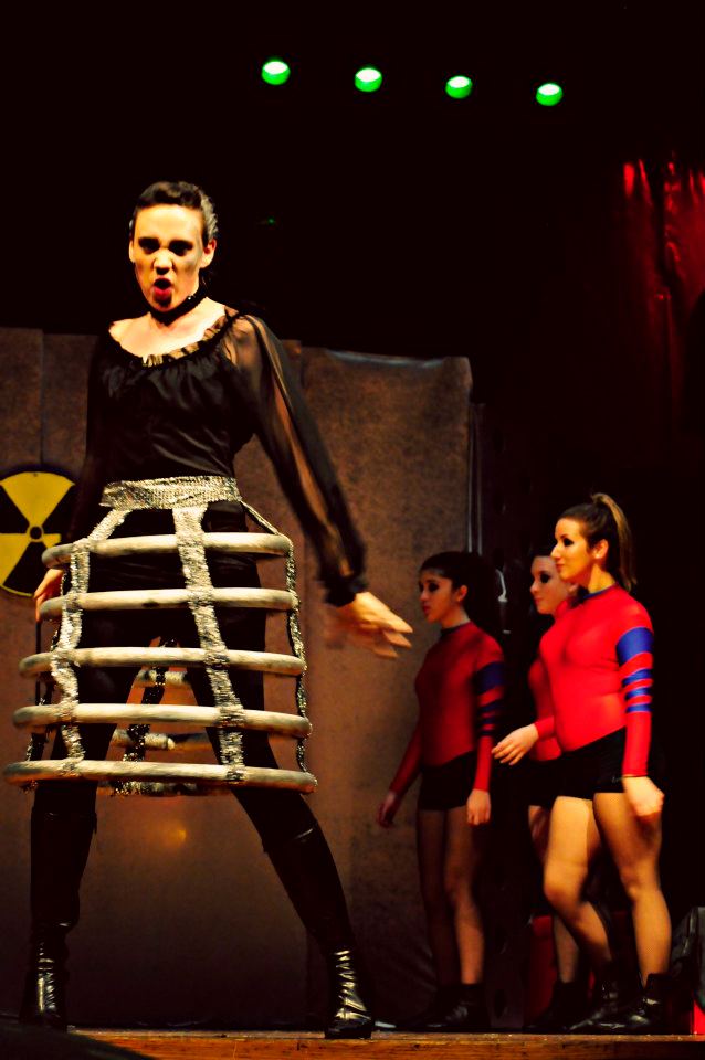
One of the more recent of these provides an interesting point of comparison– a little play called SpaceMacbeth, written by (ahem) William Shakespeare.
Jordan Wilson and Cara Fullam as Macbeth and Lady Macbeth
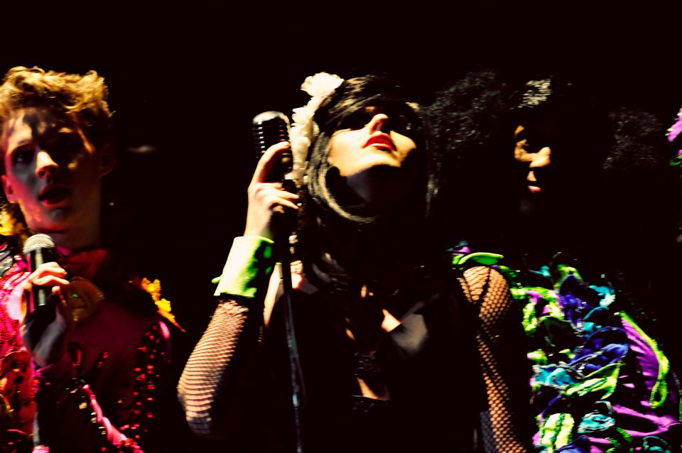
The title and the concept were mockingly suggested to Brendlinger via an angry multiple-page letter from a theater professor from a local private college who was upset by one of Brendlinger’s earlier adaptations of Macbeth, Lady Macbeth, which featured two “sisters” in the roles of Macbeth and Lady Macbeth. Like its predecessor, SpaceMacbeth is the sort of play that, by virtue of its dense bricolage, defies easy description. (it largely defied logic or common sense as well, but that’s another matter.) Rather than attempt to summarize, I’ll hit you with a few highlights–
–a live band (consisting of piano, marimba, violin, flute, oboe, guitar and drums) to one side of the stage, a thicket of mannequins to the other side, both plastic and flesh. It appears that the three witches stir up so much malice and death not only for their own amusement, but also to expand their collection of mannequins, which continues to swell with the bodies of the dead as the show continues.
–dozens (a hundred?) references to various tawdry pop-culture science fiction films and television series, ranging from the obvious (teams of astronauts and “space ninja” in mass battle), to the bizarre (tremendous flesh-eating puppets at the front of the stage to which Lady Macbeth delivers her enemies as food) to the inexplicable (previously mentioned astronauts entering the stage in march to an a capella rendition of the “Star Blazers” theme song).
–a truly berserk, yet somehow still believable, Lady Macbeth, played (and sang) to perfection by senior Cara Fullam. When she’s not busy scheming and pining after her husband, Lady Macbeth spends the first act concocting various ominous experiments, including creating giant dancing spiders with the aid of her nuclear reactor and designing some kind of sonic weapon while singing Kate Bush’s “Experiment IV.”
–At the top of act two, Banquo and the other slain men are reanimated by the witches, as drag queens. The witches explain their process, if not their reasoning, in an elaborately choreographed performance of the Scissor Sister’s “How Do You Make A Lady.” In the subsequent dinner scene Banquo teases Macbeth coyly from various places atop his giant castle machinery, batting her eyes, waving her hands and blowing kisses at the increasingly distressed king.
–Lady MacBeth’s final scene is sandwiched by two dramatic vocal performances. The first is a funereal version of Lana Del Rio’s “Video Games,” delivered as she drags herself out of bed to dispose of the evidence of the murders by feeding them to her giant pet at the front of the stage, who eats the bloodied clothing and weapons whole. She then disposes of the rest of her possessions in a similar way before dangling her feet into the edge of the pit as her android attendants dance around her.
After lying comatose for several scenes as people talk about her bedside, she rises for one final song—the huge and truly theatrical “Dreams,” written by KISS co-writer Sean Delaney and previously performed by Grace Slick. Flanked by two Death’s Head creatures that emerge from beneath her bed, she stalks the stage gathering together all of her creations and attendants, so that she can kill them all in the frenzied climax of the song. “I believe in magic,” she insists, throwing her attendants into the pit. “And I believe in dreams.” At the final hit of the song she stands poised with the knife above her for a moment, before plunging it into her chest as her attendants pop up and slap the stage.
Here’s my question to you, gentle reader– does an event like this diminish Macbeth the play? Or is the play itself so strong, so elastic as to survive being bent even in such an extreme way? Is it a simple matter of repetition, that when a play has been staged ten thousand times something is broken, that it becomes untethered from some platonic concept of faithfulness and can instead be bent and chopped and rearranged at will? Or is it that certain stories or certain works of art are themselves impervious to adaptation, that the more spins one puts on a text like Macbeth, the more possibilities appear? Is it possible that so many adaptations, so many different stagings and interpretations and resuscitations have helped make the play what it is today, have in fact created that feeling of timelessness and “bottomless”ness that so many feel when they approach the material?
To my mind, a play like Macbeth has proved its durability, has proved that familiarity and exposure don’t have to distance, but can instead comfort in the face of the unfamiliar. I can’t pretend to know what audiences experienced when they saw the play, but I can remember for myself how those bits of familiar things interacted with each other, rubbed against each other, even changed each other by their proximity. And in my mind it’s in the best interest of all of our respective art forms to allow works to pass into this state, that there will be a time when these kinds of transformations will be legal after the death of an author, when the art that is capable of being made through juxtaposition isn’t outlawed, or kept from larger audiences by the will of lobbyists working for a company that was itself founded on the adaptation of public domain works.
I want to live in a world where Lady Macbeth and Lana Del Rio are neighbors, attend the same cocktail parties, sing the same sad songs, a world where a thunderous performance of Kraftwerk’s “Metropolis” is the perfect accompaniment for a blood-soaked space duel.
I want to live in a world where Anne Frank is free to sing “Rainy Days and Mondays” whenever she damn well pleases.
The Marston/Peter Wonder Woman roundtable index is here.
________________
I’m not a fan of the superhero genre in general, and, while I do own a volume of the Marston & Peter run of Wonder Woman (henceforth WW), I find I enjoy reading Noah’s posts on the series more than reading the series itself. That’s not a bad thing, I guess, good criticism should increase our enjoyment of a work, right? (And now I’ve set myself up for failure.) So why am I participating in this roundtable: there’s something about I love about Harry Peter’s style. But what does that even mean? What is style in a comic: how do we talk about it, and what is distinctive about Peter’s that appeals to me? That is what I am going to try to address. We’ll see how it goes, as this post is as much an investigative process for me as it is any kind of coherent result. Let’s consider it a kind of close reading.
What constitutes the (visual) style of a comic, and more specifically how can we address the individual’s style? There is surprisingly little written about this subject in regards to comics (or else, I’m just not finding it, suggestions in the comments please). Harvey, in his Art of the Comic Book, lists style as one of the four “distinct graphic threads”, yet punts on the issue saying its “storytelling role” is “too subtle for much elaboration here.” (9-10) McCloud addresses style in Understanding Comics in the form of his big triangle and his charts of panel transitions, but he tends to generalize his discussion into broader groups and effects (and the placement of artists on that triangle often seems pretty random). Wolk writes about style in a very broad way when comparing the “mainstream” to “art” comics, but his discussion tends to over-generalize to make his point. Groensteen offers a decent introduction to comics style in his La Bande Dessinée: Mode d’Emploi, pointing out the inclusion of elements other than just the drawing/inking/coloring in the style of comics and comparing a few different artist’s styles, but it’s an introductory book so he doesn’t go into a lot of detail.
Style in comics is more than just line, tone, color, composition, and the way the images are drawn (realistic, caricatural, detailed, minimal, etc.), it is also the page layout, the découpage (“narrative breakdown” is what Harvey calls it, but I feel that the French word is less specific to narrative comics–not to be confused with shellacking paper onto boxes). All these elements work together to give the comic its style (one could, depending on the work and its context, add other elements, but for the purposes of a comic book like WW, this should do). For a single author work it is easy to attribute all these factors to the stylistic of the author, but this attribution is more difficult for the corporate comics structure that Peter worked in for WW.
Page layout, découpage, and perhaps composition can be partially or wholly attributable to the writer. Some comics writers write detailed scripts breaking down the narrative into panels, pages, even describing specific images and compositions (I’m looking at you, Alan Moore). Without seeing a script it is hard to ascertain this level of credit. Similarly, many of these comics are inked by a different artist than the one who pencilled the images. How can we then attribute the visual style of line, tone, detail? The inker could faithfully or loosely follow the pencils; the inker can add or leave out details; the inker can exaggerate or tone down the penciller’s figures. (Probably the most prominent place to see this addressed in discussions concerns the various inkers of Kirby’s work, though I’ve found it relevant in looking at Toth’s work also.) Color can also be wholly or partially attributable to hands other than the artist. Most corporate comics are colored by someone else (nameless in the days of Peter’s work), and who picked the colors is not always clear. It seems to have been common that newspaper strip artists provided color guides, but I believe that would be unusual for comic books at the time of this work.
The Grand Comics Database credits Peter did his own inks on WW, though Nadel notes that he was “aided by a number of usually female assistant” (28). This calls into question how much of the pencilling and inking we can consider “his.” But for the purposes of this post, I must assume that Marston gets credit for the story and text as well as at least some credit for the découpage, and Peter gets credit for everything else except the coloring (maybe the lettering, but I’m not concerned about that). Much of this is supposition on my part as I have not seen one of Marston’s scripts, and I don’t know the historical details of who did what. These basic assumptions give me some limitations to work within. I’ll start at the broader level and move towards the specific. For better analytical purposes, I will be discussing both issue 28 (Mar/Apr 1948) and issue 3 (Feb/March 1943). Images will be cited as ISSUE: PAGE.PANEL where I am using the page numbers on the art itself (in both cases consisting of a number and a letter (for the parts of the issue)): so the fourth panel on page 2 of issue 28 is “28: 2A.4.”
Page Layout
At first there appears to be nothing unusual or stylistically distinct to note about Peter’s page layouts. Other than the splash pages, every page in Issue 3 has 3 horizontal strips, each divided into 2 or 3 panels (6-8 panels per page). With only 2 exceptions (3: 7B,9B) every page is based on the 9 panel conventional grid layout. Even the splash pages have the single small panel that is basically 1 panel from a 9 panel grid.
Issue 28, 5 years later, shows some development in Peter’s layouts. The splash pages are now just single images. All but two of the remaining pages have between 5 and 7 panels, still quite conventional. Most are still based on a 9 panel grid, but he varies some of the panels in size to fit the composition/content: tall panels for dramatic full body images or vertically-based action, wide panels for large groups or horizontally-based action. The pages are still primarily formed out of three horizontal strips of 1 to 3 panels each, but a number of pages are formed of two strips, most often in what Chavanne calls a “fragmented” layout. For instance on page 3A the top strip starts with one tall panel (a focus on full figures) followed by two stacked panels (horizontally-based action). (For an example see the full page image in the composition section below.)
This use of the fragmented layout is not unusual to contemporary readers, as it is, at this point, a convention. I didn’t think much of it either in the context of Peter’s work until I started looking at other comics I had on hand from the time period (or a bit later, I don’t have many comics from the late 40s). Tarzan No.2 drawn by Jesse Marsh, also dated March/April 1948, proves to be even more conventional with all but 2 pages having 6 panels (3 strips, two panels each). The first three comics (drawn by Lily Renée, Matt Baker, and Warren King) dated in 1949 from Romance Without Tears all have pages with 3 strips and 6-7 panels each. The first few stories in Krigstein: Comics from 1949 also show no use of the fragmented layout. Peter’s own Man o’ Metal comic (found in Nadel) includes a couple uses of the fragmented layout, though I notice that each time it’s used Peter has included little arrows to direct the reading path. This is an another indicator that this particular type of layout has not become convention. So perhaps Peter’s layouts, with the use of these fragmented layouts, are a little more unusual for the times than I thought, though I still don’t think we can consider them a distinctive stylistic element.
More subjectively, it’s hard to say that anything about the layouts are expressive. They are mostly invisible, in the sense that unless you really look at them, they go by unnoticed. They just serve the narrative neutrally, panels placed into the page to fit the content and keep the narrative continuing smoothly. Of course, dividing the page in these ways is also the simplest from a production standpoint, which is important when you’re trying to draw a lot of pages on a schedule.
Panel Composition
Like most comics (especially at the time), characters/figures are the primary focus of the compositions. I count 8 (issue 3) and 6 (issue 28) images that are (arguably) not focused on a character or group of characters, and only 3 and 1, respectively, of those have no figures at all (it’s the monkey changed into a “prehistoric tree fox,” in issue 28 in case you’re wondering). That said, Peter does not neglect the backgrounds (since the figures are the focus, I feel safe calling everything else the “background”). He creates and maintains a sense of the settings, only occasionally eschewing any background at all, usually in cases of crowded figure groups (28: 7A.2), close-ups, and panels with lots of text.
On the whole he uses, to apply filmic terminology, medium and long shots for his compositions. Most of the scenes show the characters at a consistent size (where we can see full or almost full figures) across panels. Peter rarely uses close-ups: a few heads tightly framed with word or thought balloons, and one notable close-up of Eviless’s hand as she surreptitiously steals WW’s lasso (28: 4A.1). This last unusual panel is fittingly also a key narrative turn in the story (without it we really wouldn’t have the rest of the plot). Issue 3 has two close-ups of textual content (a letter and a news story) but otherwise is similar.
Dramatic angles (high or low) are almost never used in these two issues. The view of the characters stays at eye level and shifts only for action that almost requires a high or low angle (28: 10B-11B) or for longshots that show more of the setting.
Peter maintains a surprising sense of depth throughout issue 28. It’s not an extreme depth, we rarely see anything large and close cropped in the foreground, but all the non-close-up images at least retain some semblance of depth: groups of characters shown in deeper space or background elements placing the characters into space. The panels in Issue 3 are less deep as he used a lot of sharp, angular planes in the background that flatten the space (3: 8B.4 is a good example of an outdoor scene).
Many of the compositions in issue 28 have a strong forward (that is, to the right) motion. WW’s (and the other characters’) actions tend to direct her to the right (8A, 11A, 10B, 3C). An exception to this are the chaotic fight scenes that punctuate the story (6B-7B are a good example) where the chaos is emphasized by the composition losing that forward motion. I think this element is one of the highlight of Peter’s style and what makes his style effective for this type of action comic. Notice how everything moves forward/right in the following page with the except of the three central figures (panel 4) how are fighting against WW (also here is one of those fragmented layouts).
Figures
For many people the way figures are drawn is the key index of an comic artist’s style. Since comics are so figure-based it becomes natural that artists can be identified solely by their figure work. In common parlance the “style” of an artist is often used to mean the way their imagery is, or is not, in accordance with ideas of the “realistic.” The “photorealist” style of artists like Alex Raymond, Stan Drake, or Neal Adams as compared to a cartoon/caricatural style of Schulz, Barks, or Segar. This usage of “style” tends to come down to the way the figures (and objects) are shown to be close (or far) from “reality” as far as proportions, shape, and detail, as well as to the actual rendering of line and tone.
I’d rather not attempt to unpack these concepts here, except to note how Peter fits into these general conceptions. Peter’s figures are certainly naturalistic in many ways. They generally have “normal” proportions and move in natural ways (both the bodies and the faces) (a key exception here is Etta Candy, who is far more caricatural). Where the proportions are abnormal is where Peter starts to be distinguished. His characters are large in the shoulders and head, while hips, waist, and legs tend to be much narrower. He also draws men differently than woman, which is so befitting of this series one wonders how much it is a general aspect of his style and how much it is something he took on for the series. His male characters (which are very few in issue 28 and not much more plentiful in issue 3) have really outsized heads and shoulders, with angular, blocky faces with prominent cheeks, jaws, and foreheads. All of which often renders them bit grotesque. Steve Trevor is one weird looking dude (28: 10A.5, below). Peter’s women tend to be more glamour girl-ish, a gender distinction which is not unprecedented in comics. Cliff Sterritt’s Polly and Her Pals featured Polly as a stylish glamour girl while her parents were caricatured figures. The eyebrows on Peter’s woman are also quite pronounced and arced, in a way that is reminiscent of Caniff, while their eyes are often enlarged (more so in issue 28).
Peter’s figures have a strong sense of movement and dynamism to them in Issue 28. His generally curved line adds to this effect as does the way his figures curl in upon themselves. Even in action WW’s legs and arms are often bent in towards her body (leaping with legs bent in at the knee). One could almost read that as working in conjunction with Marston’s bondage themes. The characters’ actions are both freeing and restricted.
I note in comparing issues 3 and 28 that the figures in issue 3 are stiffer, a bit more awkward looking, while in issue 28 they are softer, more rounded. Another example of Peter’s evolving drawing style, though also potentially an effect of changing assistants. Personally, I find the earlier work more distinctive if considerably more rudimentary looking from a pure figure drawing point of view.
Line
Peter’s line work is one thing that really attracted me to his work when I first saw it. There was something vibrant about his lines and the way they curved and bled together that was so unusual in the early issues I read. Issue 28 is a disappointment in this regards. Peter’s inking seems to me really conventional for the issue, though it is technically competent. He has a pretty consistent line weight that tapers at the ends and thickens on the curve and to emphasis volume and shadow (a nib pen, clearly). His characters are drawn with a line that is mostly consistent to that used on the backgrounds. His blacks (most notable in this issue on the some of the villains’ clothing and on the bodies of the half-ape people) tend to be a little messy looking, a conglomeration of feathered strokes. He doesn’t make much use of pattern or texture, with the exception of costuming (stars, leopard spots, prison stripes), and the occasional banal brick pattern. The work does not show the flair that makes you really notice and appreciate him solely for the way he used a pen or brush.
Much of the above seems to work against the distinctive aspects of Peter’s style. In so many ways, his work in these issues seems so conventional for the context. Or perhaps I am missing some aspects by ignoring the color and the découpage or all the other aspects of comics I haven’t even addressed. On the whole Peter is not what you’d call an innovator: he’s not pushing the form, nor is his art particularly ostentatious.
The Idiographic
I steal this usage from Charles Hatfield’s Hand of Fire to label the distinctive aspects of an artist’s style, those that work as signs to identify that particular artist. We might say that it is a combination of all these factors (and more that I’ve surely missed) which work together as a kind of networked sign of “style,” but I think we can draw out certain aspects that veer away from the conventional aspects of the work and those indistinct aspects which were/are shared with many other artists. There is a certain amount of subjectivity to this endeavor. These are the parts of his work that I see as distinct.
The older issues of the series (like issue 3) have this scribbly, curly-cue line that is really distinctive, used in clouds and hair and foliage. The early issue also seems to be more curvy in general, where the folds in clothes, muscles and visible bone structure (knees, clavicles, shoulder blades), and flanks of animals all have a distinctive curve to them. That little bit of excess seems stripped out in issue 28. Is this just a result of Peter changing his style, becoming a little more conventional? Or is this a result of changing assistants (or adding assistants since those early issues)? It is a good reminder that style is variable over time.
I’m particularly enamored of the clouds and puffs of smoke or gas that pepper the series (3: 6D.7; 3: 12A.4):
Or these gowns with their thick, swirling curves (3: 6A.5-6):
Another aspect that stands out is Peter’s drawings of the materially insubstantial–the flames and power rays–and the non-diegetic (I struggle here for the right term, the elements that are not actually there in the story world)–the motion lines and thought waves. Below is great example with the licks of flame and the “blue hypnotic ray” (28: 11B.4):
Or these panels (28: 2C.5-6) with the flames, the wavy black lines of smoke or shadow, and the little glow around the sword WW carries. The curly hair in those two panels are also very Peter to me.
The next page (28: 3C.1-4) offers some great Peter motion lines that add such dynamism to the panels (and often counteract the stiff figures in bondage).
I don’t even know what this little pink puff is (some kind of Paradise Island foliage?), but I love it (3: 10A.2):
(see full panel below)
In comparing my “Archive Edition” volume with scans from the original comics (below: the top image is page 102 from the Archive volume, the second is the original), I can also see another factor that affects how one reads a style, the reproduction. The archive edition has a thicker line to it, which causes some of the tighter line work to bleed together. Some may cry foul at that, the scans and printing have changed the work, but I actually like Peter’s work that way (the updated colors are another story). The drawing takes on a bit of a woodcut flair to it because the black becomes more prominent and denser on the page. Am I perhaps then a fan of a Peter that never existed, a creation of modern reproductions, an artist in my own mind?
References
Benson, John, ed. Romance Without Tears. Fantagraphics, 2003.
Chavanne, Renaud. Composition de la Bande Dessinée. Éditions PLG, 2010.
Groensteen, Thierry. La Bande Dessinée: Mode d’Emploi. Les Impressions Nouvelles, 2007.
Hatfield, Charles. Hand of Fire: The Comics Art of Jack Kirby. U Mississippi, 2012.
Harvey, Robert C. Art of the Comic Book. U Mississippi, 1996.
Marsh, Jesse, and Gaylord DuBois. Edgar Rice Burroughs’ Tarzan: The Jesse Marsh Years. Dark Horse, 2009.
Marston, William and Harry Peter. Wonder Woman No. 3. DC Comics, 194
–. Wonder Woman No. 28. DC Comics, 1948.
–. Wonder Woman Archive Edition v.2. DC Comics, 2000.
McCloud, Scott. Understanding Comics. HarperPerennial, 1994.
Nadel, Dan, ed. Art in Time: Unknown Comic Book Adventures, 1940-1980. Abrams ComicArts, 2010.
Sadowski, Greg, ed. B. Krigstein Comics. Fantagraphics, 2004.
Wolk, Douglas. Reading Comics: How Graphic Novels Work and What They Mean. Da Capo Press, 2007.
This article originally appeared on Splice Today.
_____________________
“We’ve been travelin’ over rocky ground,” the chorus declares on Springsteen’s latest, Wrecking Ball. And who can deny it? The recession has kicked America in its stained blue jeans; it’s wrestled us to the factory floor and stepped all over our soaring dreams of a good day’s work for a good day’s pay. But the Boss is here to tell you that we will overcome. A sample of gospel here, a neo-soul quasi-rap there, and, of course, that big, bad beat, performed by Bruce Springsteen himself, repeatedly and emphatically smashing his earnest face into the drum. Whump! Whump! Whump! Yeeeeeeeeeeeeyuuuuuuh! This recording matters! Preach it!
Springsteen has arguably been capable of nuance in the past — Nebraska is, at least, a quiet album. But the recession is big and, obviously, it calls for a big response. An anthemic response. A response that causes hogs in the next county to prick up their ears and fart for freedom. We need drums that smash and guitars that soar, and maybe some horns that also soar. We need people to scramble up onto the roofs of their underwater homes and light candles to show that even though we collectively made atrocious financial decisions in the past, we are not so defeated that we can’t continue to appreciate atrocious music in the present.
With an almost simian acumen, Spingsteen limns the troubles of our time, speaking for the working man and working woman inside of rock stars everywhere. “I’ve been down but never this down/I’ve been lost but never this lost/This is my confession/I need your heart/in this depression,” he sings on “This Depression.” You see what he did there? It’s, like, a play on words, because “depression” means both an economic depression and being really sad. So he’s saying he’s really sad, which is what you say in a pop song, plus he’s talking about how the country is having trouble economically. Fucking A, that’s deep.
The whole album maintains that high level of wordplay and perspicuity. “We Take Care of Our Own” is about how we don’t really take care of our own anymore. “Where’s the promise/from sea to shining sea?” he asks, because you can never have enough songs mourning the passing of America’s constantly regenerating hymen. Springsteen’s innocence, too, seems charmingly unbreakable. All the way back on “Born in the USA” he was triumphantly shouting tired patriotic tripe over fist-pumping music only to undermine said patriotic tripe with fairly obvious caveats when he got away from the chorus. The result being huge mega-hits because everyone loves triumphant patriotic bellowing, and the few people who don’t love it can love the caveats instead. The only downside being that it’s utterly ineffectual as protest. But a couple decades in, Springsteen hasn’t figured that out, no doubt because of the purity of his heart, or possibly, because he’s been distracted by raking in the gobs and gobs of cash.
But what the hell, I don’t begrudge him his wealth. I just wish that he could support himself in the style to which he is accustomed in some other profession — maybe as one of those robber barons he (of course) anthemically decries in “Death to My Hometown”? I hate Wall Street as much as the next Occupy sympathizer, but at least for the most part the salivating financiers and malevolent hedge fund vampires who rule over us are willing — eager even — to suck our life-blood quietly. Springsteen, on the other hand, insists on taking the musics of oppressed peoples — African-American gospel, traditional Irish, blues — and rolling it all together with the proportional subtlety of a herd of bilious ungulates.
I appreciate Springsteen’s concern for my bottom line, and, it is in the spirit of helping him help me that I offer the following earnest, heartfelt advice. Boss, if you want to lift my oppression and my standard of living simultaneously, then please, at long last, shut up.
Our roundtable on the Marston/Peter Wonder Woman continued. with criticism by Sharon Marcus, Ben Saunders, and Richard Cook. Plus William Marston on sorority hazing rituals. And also, a fan comic by Vom Marlowe featuring space crocodiles, matriarchal otters, and a guest appearance by Etta Candy.
Erica Friedman wrote about Maurice Sendak and learning to care — and not to.
And in our new voices from the archive feature, Gail Simone discusses Wonder Woman and Mary Sues.
As I’ve mentioned, we have moved our archive from our blogspot address to here. I thought I’d make use of that to start a series highlighting some of the comments from back in the day. Voices from the Archive will be an occasional series; maybe once a week? We’ll see.
Anyway. Since we’re in the middle of a giant Wonder Woman roundtable, I thought I’d start out with some comments by Gail Simone in response to a post of mine in which I suggested that her version of Wonder Woman was a Mary Sue. Gail was extremely patient and forgiving, given the post in question. She left several comments.
This is a fun read. let me get that out first. I enjoyed it, in non-ironic fashion, honestly. But good lord, your premise is absolute and complete nonsense. I don’t like Mary Sues, I don’t believe in them, and I sure as hell don’t WRITE them. I find them intrusive, amateurish and insulting to the audience. The ‘evidence’ seems to be that:
a) I like the character, and
b) I like to show her in a positive light.
Well, dang, you caught me. She’s OBVIOUSLY a Mary Sue. Along with, oh, virtually every lead character ever written by anyone in a superhero comic. ;)
If I had a Mary Sue character, trust me on this, it wouldn’t be Wonder Woman, or Superman, or any of the other icons. I have absolutely no such connection.
Additionally, I found you REAAAAAAAAAAAALLLLLY stretching to make your point in this article, which is a little funny, given the smugness that it embraces. I always say, wrong is okay, smug is okay, wrong AND smug is a little weird. ;)
I’m glad you liked some of the book, but of course sorry if you were disappointed overall. Wonder Woman is very subjective, and your piece here reminds me a lot of what I read on message boards, wherein there’s some resentment that the book’s author doesn’t write the Wonder Woman that the poster holds in his or her own imagination. It’s understandable, I’ve been there myself many times.
As for Mary Sues, hmm. Well, while I can see your definition, I’m not certain that it is actually the prevailing one. And there’s no question that blatant Mary Sue-ism is mostly pretty hideous stuff to actually read, even when it ISN’T amateurish fan-fic.
But simply declaring a character to be a Mary Sue doesn’t make it so, as I’m sure you’ll agree. Whether or not you believe a Mary Sue is a bad thing (and I think your article betrays you here, because in it, you certainly imply uncharitable things about the practice), the evidence is far too scant to make the case. In this particular case, I find the basic argument to be fallacious on its own merits simply because the charge could be applied literally to almost every recent lead portrayal in a superhero comic. If the definition is that open-ended, so much so that it defies sub-categorization, then I’m sure you’ll agree that it loses all potency. And meaning, for that matter. If any such portrayal can qualify, then using the term at all has little meaning….
I do find it interesting that you seem to dismiss the Circle as mostly pure pulp, as I think that story has quite a lot of interesting subtext about maternity and womanhood, in an kind of blemished manner that the book normally doesn’t embrace. I hope you pick up the next volume, as it fits more with some of your complaints about this book, and I admit it was more of a personal “I love this kind of shit” story than The Circle was, all about d-list forgotten barbarians and the like.
I completely admit that I wrote it because I do love that shit, and your charge of ‘continuity porn,’ which really doesn’t apply to the Circle (most of the elements in that book are new characters with little reference to DC obscurities) apply in godawful force in volume II, The Ends of The Earth. I admit it, and if you had written this article about that volume, I’d have to sheepishly take the heat. :)
It was worth it. Diana and DC’s Beowulf make a surprisingly strong dynamic, and it was good fun all the way through to write. Hope this volume hasn’t turned you off to that one.
You can read more of Gail’s thoughts, my responses, and the original post here.

 When I sit in my chair and and listen to the author speak, his or her voice carries me to a place of imagination. In many cases this experience helps put the listener into a frame of mind to absorb the work. Hearing the words with the author’s own inflection, tone and cadence has a transformative effect on the text.