Monthly Stumblings # 13: Carl Barks

Walt Disney’s Donald Duck “Lost in the Andes” by Carl Barks

The book with the title above is the first (the seventh, according to editor and publisher, Gary Groth) of a new Carl Barks Library published by Fantagraphics (the first CBL was published by Another Rainbow). There are a few differences between the two: CBL 1 was published in 30 handsomely made volumes encased in 10 slipcases – CBL 2 will probably also be 30 volumes, but with a more comic booky look (i. e. smaller); color wasn’t completely absent from CBL 1, but it was way above 90 % b & w – not so CBL 2 which will be in color. That last aspect occupied most of the pre-publication discussions about the project on the www. We all know how bad the coloring of the classics has been until recently, but new printing technologies solved said problem. The only obstacle to a good coloring in comics reprints these days is the absolute disrespect for both the material and the readers that most comics publishers always showed. Not so Fanta, right? Well… yes and no…

Only a fool could think that in a colored drawing the color isn’t part of the art. So, how come that we can continue to say that a drawing is by Carl Barks alone when it was colored by someone else? The fact is that we can’t and that’s all good and dandy if the colorist is the original one because those were the creators of said drawing even if we have no idea of what the latter’s name was. In this reprint we do, don’t we?: Rich Tommaso. So, what we’re buying isn’t really “Lost in the Andes” by Carl Barks… what we’re buying is “Lost in the Andes” by Carl Barks and Rich Tommaso.

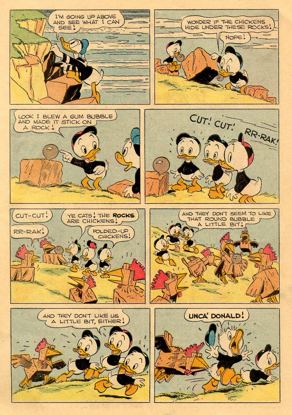
“Lost in the Andes!” by Carl Barks and an anonymous colorist working at the Western Publishing Production Shop (I can’t believe that no one was curious enough to investigate who these colorists were): Four Color # 223, April 1949.

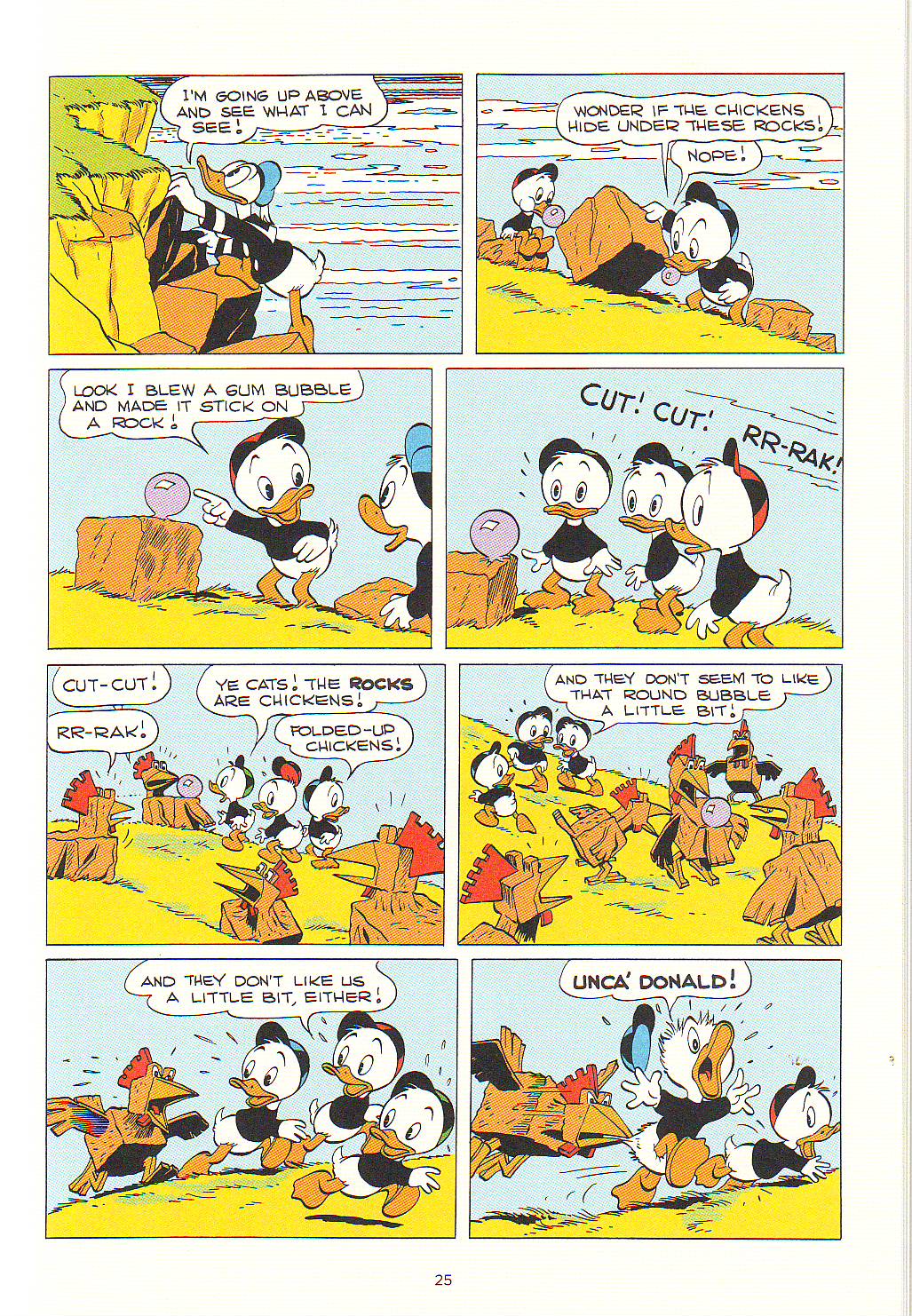
The Same page by Carl Barks and Rich Tommaso, Walt Disney’s Donald Duck “Lost in the Andes,2011.

When there’s no contour line the colors are really the drawing and there’re differences between the original and the recolored page. This can be seen above, but it’s more clear in “Truant Officer Donald” (Walt Disney Comics and Stories # 100, January 1949). In said story’s reprint the shadows in the snow are completely different. Another problem is caused by the absence of the old Ben-Day Dots. Some may think that these were a nuisance, but the dots had a transparency sorely lacking in modern coloring: while the old shadows look like shadows, the new ones look painted on the ground and lack flexibility. Even if mostly true to the original (all the one-pagers were originally published in black and magenta but “Ornaments on the Way” – Four Color # 203 – and “Sleepy Sitters” – Four Color # 223) many of the colors are also too saturated in the reprint version (which is odd because Rich Tommaso said that he toned the colors down), but that’s a problem even in Fantagraphics’ excellent Prince Valiant reprints.

To be blunt: if kitsch is something pretending to be something else this edition is definitely kitsch, but you know what Abraham Moles said: kitsch is the art of hapiness… 

All these problems were avoided in the Popeye series. Why did Fantagraphics proceed differently in their CBL project? Beats me, but I can guess: Fanta wants to have its cake and eat it too. They want to produce a collection both for the serious collector and for children. Well, this serious collector is perfectly happy with CBL 1, thank you!…

Another hint suggesting that I’m right is the time period in Carl Barks’ career selected to start this new CBL. Any collector would expect a reprint in chronological order, but no such luck. What we have is a potpourri of longer stories, ten-pagers and one-page gags from December 1948 to August 1949. In this Gary Groth did agree with Barks himself who considered this to be his most and best creative period. Besides he also said that “Lost in the Andes” was his favorite Donald Duck story. I beg to differ: I prefer later, darker, more satirical, Barks, but that’s irrelevant, really, because I would start a CBL where most things usually start: at the beginning. Yet another Barksian coincidence re. the commercial part of the enterprise is the quantity of Christmas stories included in a book that was published just before… Christmas. If you can’t see the irony of this in a Carl Barks book I gather that you don’t know much about his work… 

None of this matters much though. The above mentioned potpourri isn’t that bad  (I would repeat what was done in CBL 1, but that’s just me) and collectors can always put this tome on the shelf in the seventh place.  

To favor interested adult readers and smart inquisitive kids each story has a presentation by a comics critic. The critics are very good. Their texts are interpretations of the stories; convey information (I was pleased to learn about American life during the forties reading Jared Gardner’s comments), and give us close formalist readings that are brilliant: Donald Ault is particularly good at this (his intro is also great if slightly hagiographic; his analysis of “The Crazy Quiz Show” – originaly published in Walt Disney’s Comics and Stories # 99, December 1948 – is an instant classic of comics criticism).

Don’t get me wrong , I love Barks. He’s one of four or five genre mass media artists that I admire… but… is there really a need to whitewash him? Because that’s what we see in the above mentioned comments.  This book has its share of racist imagery and the critics don’t hide the fact. The problem is that they make up excuses. Jared Gardner does it commenting “Voodoo Hoodoo” (Four Color # 238, August 1949). To quote him:

[…] our “villain,” Old Foola Zoola [fool Zulu?] is drawn with all the maniacal monstrosity of similarly racist representations of African witch doctors that remained largely unchanged from nineteenth-century cartoons in Puck  and Life through Abbott and Costello’s Africa Screams (1949). And yet  Foola Zoola’s outrage for the wrongs done to him and his people by Scrooge and his hired thugs is presented as entirely justified.

That’s just the problem: it isn’t presented as justified at all. If it did he wouldn’t be a fool and he wouldn’t be a racist caricature, would he? Also, why are there quotation marks on the word “villain”? That’s what Foola Zoola is, period.


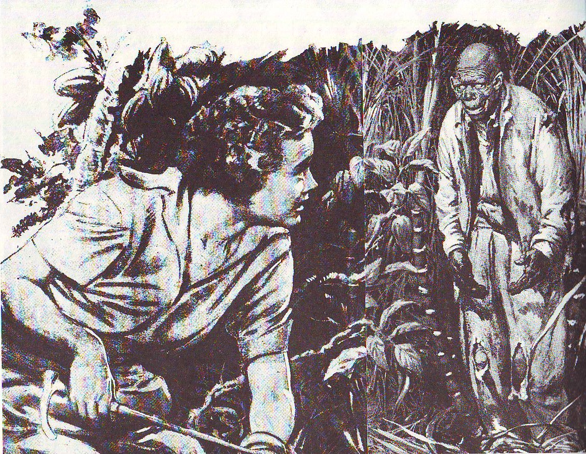
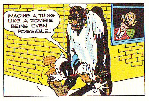
  As can be seen below (panel from “Voodoo Hoodoo” in CBL 2; is that a Barks cameo at the window?) Bombie the Zombie was inspired by the above illo drawn by Lee Conrey (American Weekly, May 3, 1942; as published in CBL 1).  

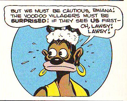
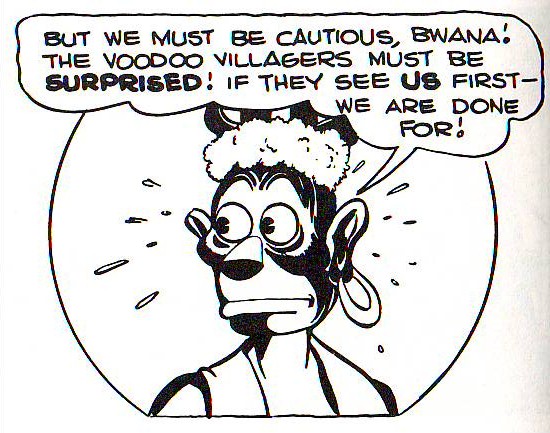
 Whitewashing, as it were, in another “Voodoo Hoodoo” panel (in CBL 1, this time). Not much of an improvement if you ask me (November 1986). Above: the same panel as published in Fantagraphics’ CBL 2.

Uncle Scrooge may be presented as an impossibly rich miser, but he’s never a villain. Carl Barks (in an interview with Michael Barrier, 1974):

I never thought of Scrooge as I would think of some of the millionaires we have around who have made their money by exploiting other people to a certain extent. I purposely tried to make it look as if Uncle Scrooge made most of his money back in the days before the world got so crowded, back in the days when you could go out in the hills and find the gold.

If Uncle Scrooge is or isn’t a thief is just a matter of perspective. He would be if he exploited white people, but oh,  no!, he could never exploit the noble savages because they have no use for their riches. Dorfman and Mattelart saw this perfectly well (in How to Read Donald Duck, Imperialist Ideology in the Disney Comic, 1975 [1971] – translation by David Kunzle):

There they are in their desert tents, their caves, their once flourishing cities, their lonely islands, their forbidden fortresses, and they can never leave them. Congealed in their past-historic, their needs defined in function of this past, these underdeveloped peoples are denied the right to build their own future. Their crowns, their raw materials, their soil, their energy, their jade elephants, their fruit, but above all, their gold, can never be turned to any use. For them the progress which comes from abroad in the form of multiplicity of technological artifacts, is a mere toy. It will never penetrate the crystallized defense of the noble savage, who is forbidden to become civilized. He will never be able to join the Club of the Producers, because he does not even understand that these objects have been produced. He sees them as magic elements, arising from the foreigner’s mind, from his word, his magic wand.

That’s what Francesco Stajano and Leonardo Gori refused to see when they mentioned the people abused by Gladstone (in “Race to the South Seas,” March of Comics # 41, 1949) while failing to mention the stereotyped natives mumbling “Ola eela booka mooka bocko mucka!” and worshipping Uncle Scrooge or Uncle Scrooge’s spats, of all things, or both… The above is also valid to describe the Plain Awfulians in “Lost in the Andes.” Said people is just one in a series of noble savages that Scrooge and Donald meet over the years. Barks had a bucolic sensibility: against superficial interpretations that present Uncle Scroge as an apology of Capitalism, he believed that the earth is the true value and gold is worthless (cf. for instance “The Twenty Four Carat Moon,” Uncle Scrooge # 24, December 1958). These inhabitants of utopia live in a primeval innocence: Donald Duck (at the end of “Lost in the Andes”):  

[they get their warmth] […] from their hearts! They had so little of anything, yet they were the happiest people we have ever known!

Stefano Priarone says that “Lost in the Andes” is a satire of conformism. A leftist reading would say that it is a comment on the vulnerability of third world peoples to American mass culture. Both readings are possible and it is also possible that, following Donald’s speech above, there’s no satire at all. All interpretations are ideological, of course… One could expect a Marxist reading from David Kunzle, but here’s what he wrote (Art Journal Vol. 49, No. 2, Summer 1990):

How much real sympathy does Barks show for natives, the victims who through weakness and stupidity, or else innocence and simplicity, become willing accomplices to, indeed the very instruments of, their own dispossession? It is hard to say. The facts that our contempt for Scrooge, the great dispossessor, is mixed with admiration for his energy, that Huey, Dewey and Louie are cast as virtue incarnate, and that Donald himself is a victim (actually, a loser on the winning side) tend to neutralize our sympathy for the foreigner-victims. But their resistance, funny and futile as it so often is, lends them a measure of dignity – and reality. 

The star of the show isn’t Uncle Scrooge, though. The star is undoubtedly Donald Duck. Even to Dorfman and Mattelart Donald is a sympathetic character (Carl Barks: interview with Edward Summer, 1975):

Instead of making just a quarrelsome little guy out of him, I made a sympathetic character. He was sometimes a villain, and he was often a real good guy and at all times he was just a blundering person like the average human being, and I think that is one of the reasons people like the duck.

Dorfman and Mattelart (in How to Read Donald Duck – translation by David Kunzle):

We Latin Americans tend to identify more readily with the imperfect Donald, at the mercy of fate or a superior authority, than with Mickey [Mouse], the boss in this world, and Disney’s undercover agent.

David Kunzle (also in How to Read Donald Duck):

Donald Duck […][is] an example of heroic failure, the guy whose constant efforts towards gold and glory are doomed to eternal defeat.

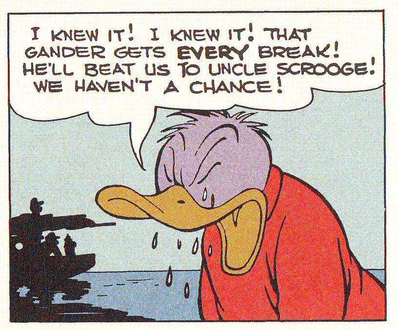
Donald Duck, the eternal loser, becomes purple with envy, in “Race to the South Seas” as published in Walt Disney’s Donald Duck “Lost in the Andes.”

Carl Barks was no ordinary genre creator. He followed some tropes of pulp, but he also had his own formula (Donald Ault cited by Thomas Andrae and Geoffrey Blum in the CBL 1):

Th[e] emphasis on cosmic irony led Barks to create a formula for his ten-page stories: a six-to eight-page buildup of our expectations against mounting probabilities, following by a two-to four-page reversal culminating in the fulfillment of our original expectations, but in a surprising and ironic manner.

[F]our narrative impulses […] inform Barks’ stories. In the order of their complexity, these are: 1) excessive coincidence; 2) conflicts escalating in a chain reaction; 3) events threatening to move beyond control of both the characters and the narrator; and 4) reflection on the narrative processes controlled by Barks himself.

The cosmic irony mentioned above is my favorite Barks’ trait: he was a master satirist. Carl Barks (in an interview with Donald Ault, Thomas Andrae and Stephen Gong, 1975):

I read some of my stories recently and thought, ‘How in the hell did I get away with that?’ I had some really raw cynicism in some of them.

I told it like it is. I told the kids that the bad guys have a little bit of good in them, and the good guys have a lot of bad in them, and that you just couldn’t depend on anything much, that nothing was going to always turn out roses. (Interview with Donald Ault, 1973.)

Readers can attest to that reading and viewing his masterfully paced, written, drawn and designed pages in Walt Disney’s Donald Duck “Lost in the Andes. All this in spite of this edition’s recoloring problems… if these are viewed as problems at all, that is… which I very much doubt…


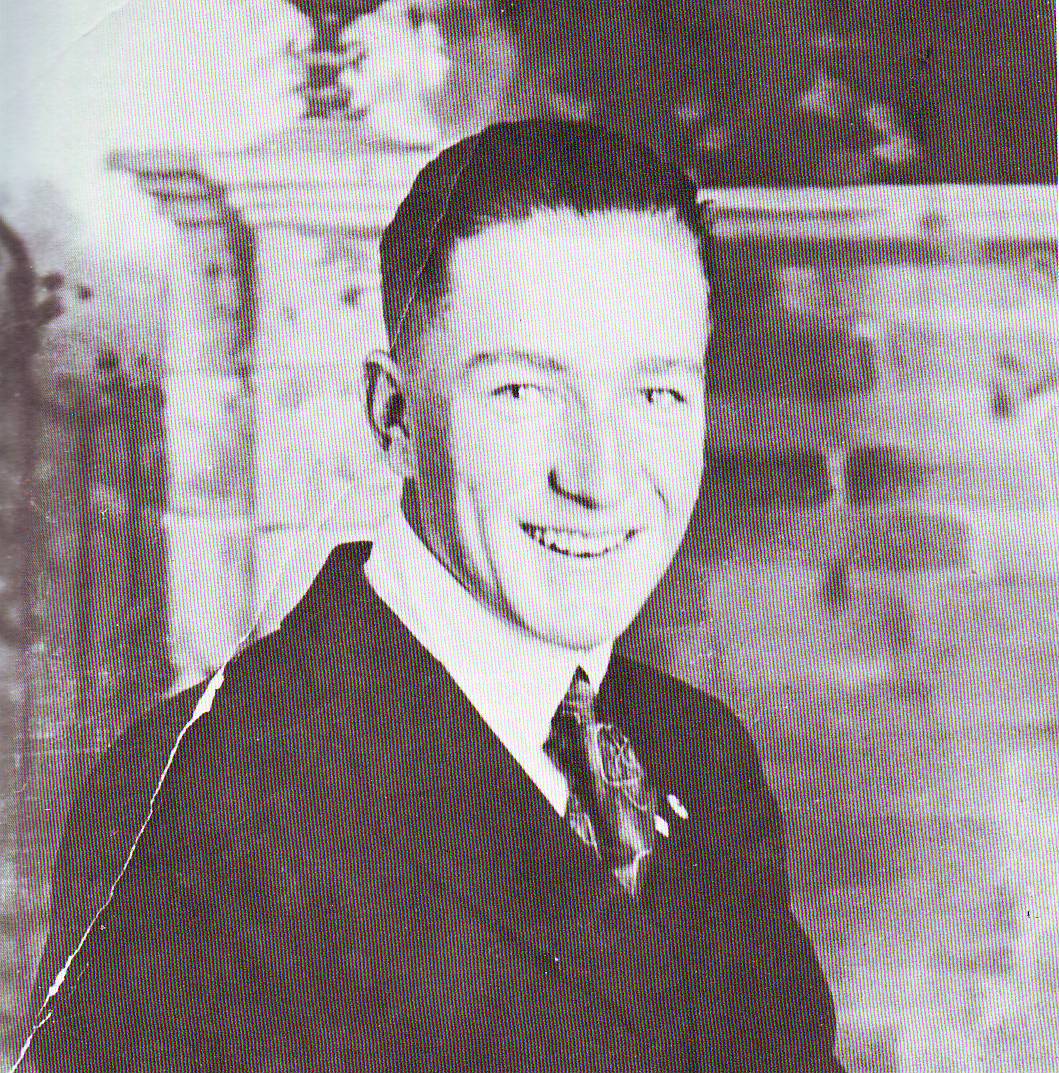
 Carl Barks circa the end of WWI. Photo as published in Carl Barks and the Art of the Comic Book by Michael Barrier, 1981.

Mystery Train

This first appeared on Comixology
___________________

I first learned about Yuichi Yokoyama’s Travel — a wordless chronicle of a train journey — through a preview in the Comics Journal. The sample pages reproduced looked wonderful. An elongated rectangular image of a train racing in front of a waterfall particularly stuck in my head. The stark vertical of the fall was centered behind the stark vertical of the train, and both were contrasted with the diagonal slashes of rock in the moutainside, with half-circles of foam, and with the kinetic splatter of water striking water at the bottom of the page.

The elegance of the composition, the inspired simplicity of the stylization, the silent drama of the scene — it could almost be a Hiroshige or Hokusai print, if either of them had lived another century or so and adopted geometric constructivist modernism. So a whole book of that shit? Sign. me. up.

Probably I set my expectations too high. In any event, reading through the whole book for the first time ended up being something of a disappointment. I had hoped for page after page of stunning landscapes. Instead, the first quarter of the book is given over, not to spacious vistas, but to narrow, cramped interiors. The three anonymous protagonists begin their journey by walking in step through what seems to be the longest train on earth. It’s like being suspended in a Kafka dream; you go on and on, towards some indeterminate, unreachable destination. And just to make the suspended tedium more disorientingly intolerable, random details leap out at you, weighted with heavy symbolic importance.

Here’s a panel devoted to a row of chairs. Here’s one of a passenger with oddly patterned clothes, even more oddly coiffed hair, and a face from which the ruthlessly angular, schematic stylization has removed any lingering trace of emotion. Much of the time I couldn’t even tell what was happening. A group of uniformed men sit in rows in an upper-berth; a camp-fire is lit; a space-station floats overhead — is this all happening in the train?

Even when our peripatetic protagonists do finally sit down and open the window shade, allowing us to see what’s happening outdoors, there often seems to be some key missing. Why are those white hexagons spread across the panel? Are those two men painting a sign — and if so, why is the sign entirely black? What are we looking at, and from what perspective? Even though there were no words, I felt like I needed a translator. If I were Japanese, presumably, all these references and odd in-jokes would make sense. What I needed, it was clear, was an extensive set of foot-notes.

And sure enough…I reached the conclusion, was duly befuddled by the end (are they at the seaside there?), turned the page — and ta-dah! Brief end-notes are provided keyed to just about every single page! Yay! Now all will be explained!

Well…yes and no. Yokoyama’s annotations do occasionally provide some straightforward logistical help: for instance, it turns out that the campfire was on a television screen in the train, rather than on the train itself. In most cases, though, the author seems as baffled as I was. He writes for example, that the uniformed men on the second level of the train are “tourists…dressed like soldiers. The symbol on their helmet is unlike those belonging to any currently known nations.”

In other words, they’re not mysterious because I’m from a different culture and don’t know what’s going on. They’re mysterious because they make no sense. What are they doing there? Why are they dressed like that? Why, later, do they all get off at a train station in the middle of nowhere? Yokoyama doesn’t know either. It’s just one of those things.

Yokoyama had wrong-footed me. I was looking for realism, and so I found the epistemological uncertainty frustrating. But the book isn’t realism — or not exactly. It’s pomo; Yokoyama’s tongue is in his cheek the entire time. Take the scene of ducks flying over the plane as hunters shoot at them. The footnote points out that the hunters all miss, and indeed, you can see the ducks traveling in a perfect V, not even disturbed by the shells exploding in pristine, regimented bursts all around them. The demands of narrative (somebody shoots, somebody hits) are sacrificed, with a wink, to the exigencies of layout. It’s as if the hunters and the ducks are not adversaries at all, but part of some single great mechanism, controlled by one guiding hand. As, of course, they are.

The book, in other words, actually revels not in realism, but in artificiality. It’s virtuoso performance. The motion lines throughout, for instance, are emphatic and solid, drawing attention to themselves as elements of the design. As a result, every movement is like an explosion; the two page sequence depicting one of the travelers taking out and lighting a cigarette is choreographed with all the delicate finesse of a Jack Kirby Thing-vs.-Hulk encounter.

Or, as another example, there’s one page which opens with an extreme close-up of a toothed maw. In the next panel we pull back dramatically to see that the mouth belongs to a wild dog, now only a tiny silhouette on top of a towering rocky outcrop, howling as the train races by beneath it. Then, in the next panel, we’re looking at the train through the gigantic horns of a moose…and then we pull back again to the perspective of the train itself, and watch the moose passing by far below. The movement from close-up to way down to close-up to high above is not natural or intuitive, but insistently self-conscious.

The thing is, there is a sense in which, when traveling, insistent self-consciousness is natural. When taking a trip , I, at least, sometimes have this sense of alienation, of hyper-sensitivity. When you’re knocked out of your routine, it’s hard to tell what matters and what doesn’t, and so everything — the man opening a book, the light flickering off a pen, the patter of water on the roof — becomes the most important thing in the world, equally vital and equally mysterious. It’s an experience analogous to Emerson’s description of the “transparent eyeball” — a humorous, grotesque, and sublime sensitivity, which feels, in its otherworldliness, almost inhuman.

Emerson’s philosophy was influenced by Buddhism. His all-seeing, all-receptive eye is similar to the roving eye of the Japanese woodblock prints, where landscapes are viewed sometimes from a mouse-level vantage, looking past a horse’s foot, and sometimes from far up in the sky, behind a bird’s wing. This perspective, which is everywhere and nowhere and which finds beauty in all things is, at least by implication, divine.

In Yokoyama’s work, too, the viewpoint swoops and swerves, now with a skier on a high mountain pass, now underneath the train. There is certainly a celebratory, joking tinge to Yokoyama’s impossibly mobile camera. But there is also something ominous. In one sequence from the book, our protagonists’ train passes another going in the opposite direction. A whole page is devoted to the faces on the other train. They are shown in four tiers of three blocks each; all are streaked with violent motion lines; all are the same shade of grey as the window frame, all stare intently outward at the viewer. The scene is oddly disturbing; the repetition of the faces, the repetition of the expressions; the lines going through them, the grid — it’s dehumanizing, as if the faces are not people at all, but manikins, or masks. Yokoyama’s note to the image reads:

“All of the passengers in the passing train are looking this way. Whether the naked eye could actually instantaneously register these individual faces is questionable, but this scene may not represent a human perspective at all.”

If it’s not a human perspective, then what is it? And is it beneficent or not? The ukiyo-e artists created individual images; magical windows that captured an instant. What’s vibrant about a Hokusai print is that it captures a moment; there’s a sense of time stretching before and after which energizes the image, giving it power and grace. By showing a sequence, on the other hand, Yokoyama’s world is less vibrant, more dead. To see as God does, for a moment, is exhilarating; to have that vision extended becomes oppressive. Yokoyama’s geometries, his angular series of iterated, impossible scenes, suggest a kind of literal deus ex machina — a deity made out of clockwork.

In the last pages of the book, the three travelers march again, moving in eerie unison out of the station, across a field, and to the shore. There they stand in their aggressively patterned shirts before a sea so turbulent it can be apprehended itself only as surface patterns of spray against rocks, the depths barely visible as smaller splashes of design which suggest a fathomless and unperceivable distance. Space flattens out, until inside and outside, interior and landscape, become one. Self-consciousness is the consciousness that the self slips through your fingers; it is nowhere, or everywhere, part of a design that moves forward and backward through time. The image of man and universe in eternal synchronization is both devotional and sinister. Read and re-read, Travel seems less like a journey than like a single, unyielding now.

2011, Year End Utilitarian Review

As our traffic bar graph above shows (click to enlarge), this has been an amazing year for HU. I thought I’d do a quick tour through some of the highlights.

Greatest Hits

There’s no doubt that the highlight of the year was Sean Michael Robinson and Joy DeLyria’s post in which they reimagined the Wire as a Victorian novel. Originally part of our Wire Roundtable, the post unexpectedly became a massive internet meme, picked up by everyone from Harper’s to the Baltimore Sun. It got more than 100,000 hits, and still, more than half a year later, is a fixture in our most popular posts list. A massive chunk of that leap in traffic up there is because of Sean and Joy’s post. I doubt we’ll ever reach those heights again, honestly…which is maybe for the best, as they busted our server.

Sean and Joy also landed a book contract on the strength of the post; the book should be out in a couple of months, I believe. Sean and Joy also had a post about Wuthering Heights, Unicorns, and joys of the publishing process, while Sean (by himself this time) had a nice piece about how being a meme affected his artistic process.

The other major traffic generator this year was Robert Stanley Martin’s International Best Comics Poll. More than 200 cartoonists, academics, critics, and other comics industry folk submitted lists to determine the 10 greatest comics of all time. Robert put an enormous amount of effort into organizing the poll, most visible maybe in the carefully annotated lists for every participant. It was a fantastic project, and HU was very lucky that Robert decided to run it here, and that so many other folks put in their time and energy to make it work.

Another post which drew a lot of attention this year was Nadim Damluji’s discussion of Craig Thompson’s Habibi and Orientalism. The post sparked a long, occasional series of responses, including Nadim’s interview with Thompson.

Finally, this didn’t generate tons of traffic, but one of the things I’m most proud of this year was our Illustrated Wallace Stevens roundtable. A whole host of talented cartoonists and artists drew works inspired by Wallace Stevens poems. I couldn’t have been happier with how it turned out.

Kicked to the Curb

As some of you may remember, we started out this year as part of Tcj.com. In February, there was a shake up over there and we were fired with two weeks notice. Derik Badman did an amazing job setting up a new space for us, including engineering this site redesign you’re looking at. Thanks also to Edie Fake for creating our awesome oozy banner.

I talked about our year at tcj.com here, and commented on the pros and cons of their changed direction here. Finally, Mike Hunter eulogized the end of the TCJ message board.

More! More! More!

Here’s a sample of some other memorable moments from throughout the year.

Richard Cook on the Marvel Swimsuit issue.

Ng Suat Tong’s juried selection of theBest Online Comics Criticism.

Matt Seneca’s interview of CF.

My interview of Sharon Marcus, focusing on queer theory, lesbian identity and (of course) Wonder Woman.

An unexpected visit by Diamanda Galas, Evil Bitch Fist and Party of One.

An extensive roundtable on Eddie Campbell’s Alec.

Tom Crippen presented a number of galleries of work by the cartoonist and illustrator Robert Binks.

Throughout the year we’ve had a bunch of posts on Twilight, of all things.

Tom Gill with a massive post on Tatsumi Yoshihiro and Tsuge Yoshiharu and fetuses in the sewer.

Anja Flower on the queer, interspecies allure of Edward Gorey.

Mahendra Singh on Jeffrey Catherine Jones.

My essay on Wonder Woman, superdicks, and Christ.

Yoshimichi Majima and Timothy Finney on questions about the original art sold by Manga Legends,

Kinukitty on Stevie Nicks.

A series of posts on R. Crumb and race, including Domingos Isabelinho’s post on the work ofAlan Dunn.

A roundtable on Chester Brown’s Paying For It.

Qiana Whited on Blues and Comics.

A blog crossover on Cable/Soldier X with Tucker Stone.

Ng Suat Tong Anders Nilson’s Big Questions.

Anne Ishii on Miyazaki and women in the animation industry.

A roundtable on the Drifting Classroom.

A roundtable on Jaime Hernandez and his critics.

Erica Friedman on what’s the big deal about Sailor Moon.

A series of posts by James Romberger on Alex Toth.

A (still-ongoing!) roundtable organized by Caroline Small on Godard. This included the amazing shot-by-shot remake of Breathless by Warren Craghead.

And, of course, an occasional series of downloadable music mixes.

Utilitarian Future

We’re going to finish up the Godard roundtable, I know; there’s been agitation for a Jaime Hernandez roundtable; we may have some sort of celebration in September of our 5-year anniversary (presuming we make it that far!) — and beyond that, we’ll see. Thanks to all our writers, commenters, and readers for making 2011 a great year at HU. We’ll see you tomorrow to get started on 2012!