The Color of Hate

I am a generally happy person. A cockeyed optimist. A Pollyanna. Hell, you know, I’m from the Midwest. I like to like things, and I try very hard to do so. As a self-directed blogger with no editorial mandate to adhere to but my own, I skip merrily through the world of East Asian comics, content to linger over what pleases me. I rhapsodize over the books I enjoy and blow through the rest as quickly as possible—like a panicked sprint through the unexpected cloud of gnats on an otherwise peaceful summer stroll.

For a person like me, “hate” is a fairly nebulous concept, and not all that easily accepted or even understood. For me to hate something—to really loathe a thing—it needs to hit me where it hurts. I can’t vigorously hate a book or a comic or a Broadway musical, say, for simply being incompetent (*cough* Baseball Heaven *cough*). I must be truly, inconsolably offended in order to come even close to real hate.

That said, there are a number of comics I’ve disliked intensely over the years—mainly since I began reviewing things I wouldn’t necessarily choose for myself. Notable objects of my rage have included gender-regressive shoujo manga like Black Bird; creepy, campy BL like Tricky Prince; and the fat-shaming caricature that is Ugly Duckling’s Love Revolution. One of these titles even prompted an experiment to discover how often and how thoroughly I must trash a single series before the publisher would stop sending me new volumes (answer: to infinity). The thing is, when I go back and read my reviews of these books, each of which has incited rage, they seem kind of… weak. Despite my wrath, I could never truly commit to hating these comics, due to their lack of serious intent. Nobody thinks Tricky Prince is Serious Business, including Tricky Prince, and it’s hard to work up genuine, lasting hatred over something that was intended to be disposable from the start.

Then came the Color trilogy.

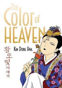
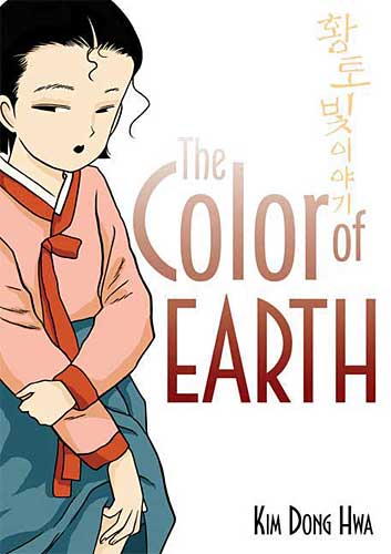
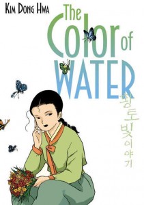
In 2010, I volunteered to host the first manhwa edition of the Manga Moveable Feast. A number of titles were suggested and put to a vote, including some personal favorites, like Byun Byung-Jun’s quirky short comic Run, Bong-Gu, Run!, Uhm JungHyum’s moody romance Forest of Gray City, and JiUn Yun’s sumptuous collection of ghost stories, Time and Again. Unsurprisingly, however, the vote ultimately came down to Kim Dong Hwa’s critically acclaimed manhwa trilogy, The Color of Earth, The Color of Water, and The Color of Heaven, published in English by the lovely folks at First Second. Though I was a big fan of Korean comics in general (and certainly knew of Kim’s series), I hadn’t read read more than a few excerpts myself, so I dug in with verve. And then the hate… oh the hate… it was like nothing I’d experienced as a comics reader before.

The Color trilogy is a coming-of-age story revolving around Ehwa, a young girl in pre-industrial Korea who is being raised by her mother—a widow who runs the local tavern. The story spans Ehwa’s life from the age of seven (when she is first made aware of the existence of penises, thanks to a boys’ pissing contest) through her wedding night (when she gets to know a very special penis on more intimate terms). I choose these parenthetical descriptions purposefully, because that’s what this series is really about: penises and the pursuit of same—that is, when it’s not too busy going on about the lusty beauty of a ripening young woman (yes, these words are chosen purposefully as well).

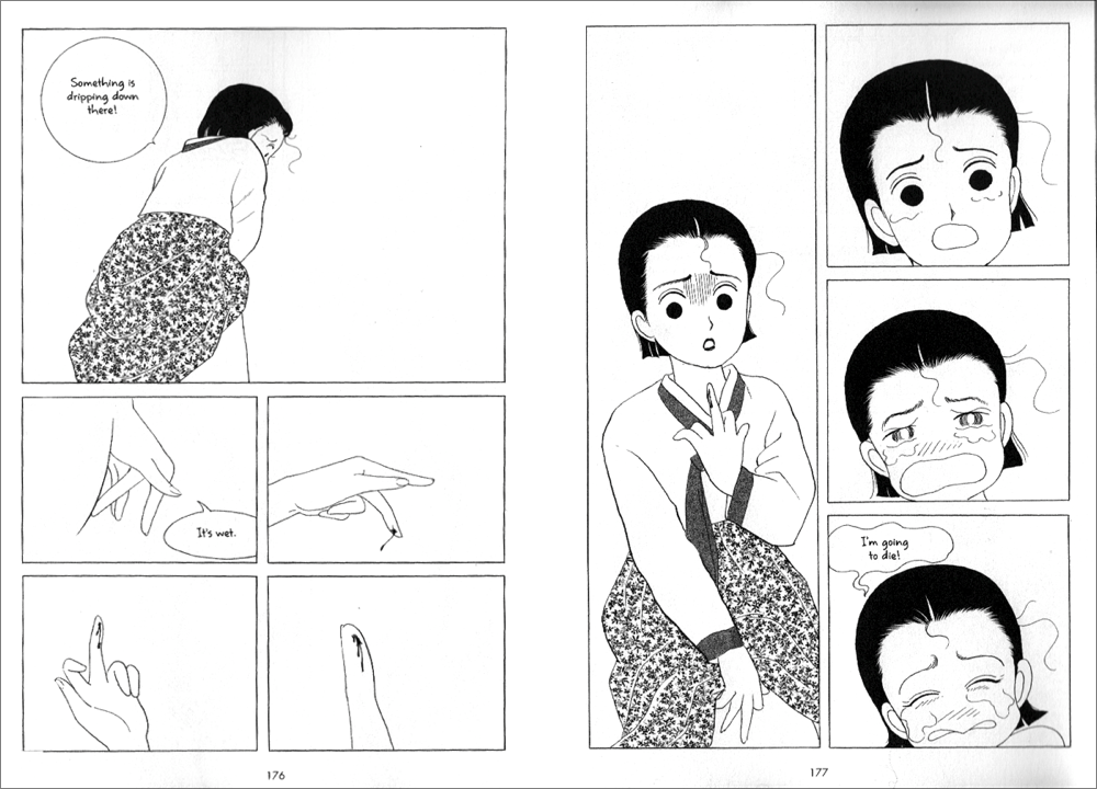
First, the penises. As I mentioned, the story opens with Ehwa, at seven, stumbling upon a pissing match between two local boys. The boys are deeply proud of their own “gachoo” (chili peppers, also a euphemism for “penis”) and they ask Ehwa to show them hers. This sends Ehwa into a tizzy, as she wonders if not having one indicates that she’s deformed. One of these boys is so consumed by his love affair with his own penis that he will later be portrayed as being unable to take his hands off of it.

(click image to enlarge)

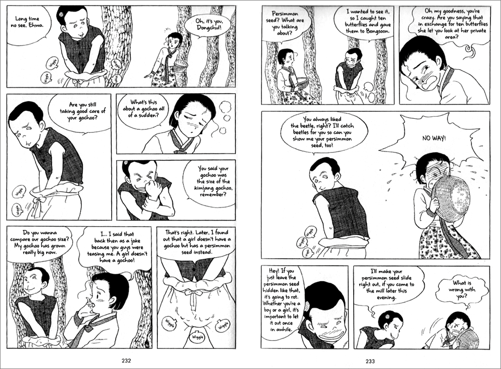
Hey, why should he? It’s a really awesome thing, that gachoo. As Ehwa’s mom explains to her later (after buying a whole lot of ginseng to cook with in order to boost the, uh, energy levels of her traveling suitor known only as “The Picture Man”) when a man’s gachoo comes into contact with a woman’s “persimmon seed” (seriously, this is the kind of language Kim uses throughout the series), something magical happens.

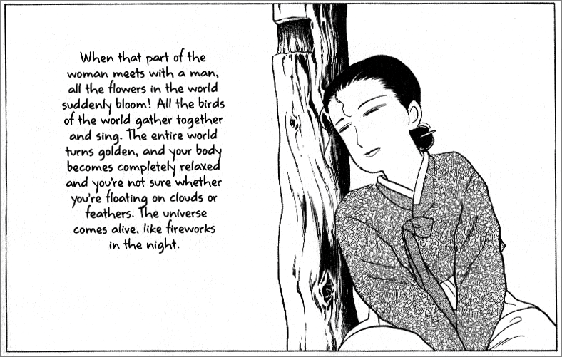
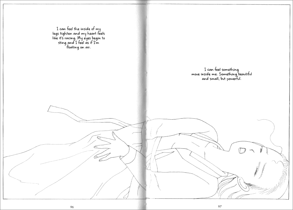
Fortunately, Ehwa gets to experience this magical, floaty, firework-y business for herself at the climax of the book (Get it? “Climax”??), as she’s losing her virginity to her new husband. Though in her case, fireworks and floating on clouds feels more like… a super-phallic bell choir? Mortar and pestle? Um… ?

(click images to enlarge)

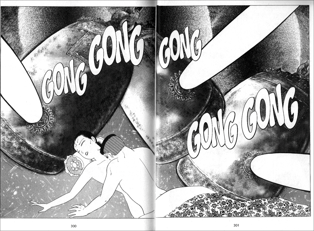
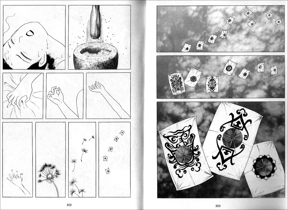
Though I joke about this being the “climax” of the series, it actually is just a few pages from the end. Ehwa’s journey really does quite literally span the time between discovering penises and getting to be penetrated by one. The entire point of her existence as a character can be summed up this way.

What happens in the middle is largely waiting. Waiting, waiting, waiting. Both Ehwa and her mother fall for wandering men—the kind who spend most of their time traveling for work or simply out of restlessness, but stop in for sex every few months or so. (I once described this type as “… a big, strapping man who values the freedom to wander, is good in a fight, a stallion in the bedroom, and offers questionable financial security. Another male fantasy?”) While this is undoubtedly appropriate to the period and to these women’s circumstances, Kim spends so much time lingering on the wistful beauty of the lonely woman, it begins to feel like a bit of a fetish.

(click image to enlarge)

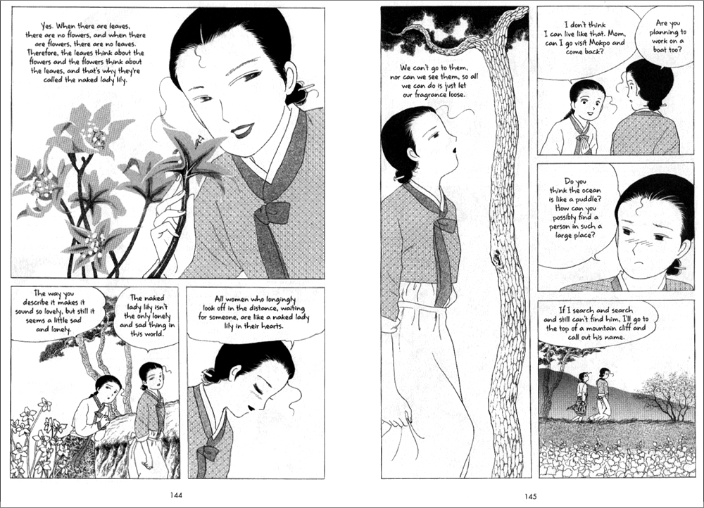
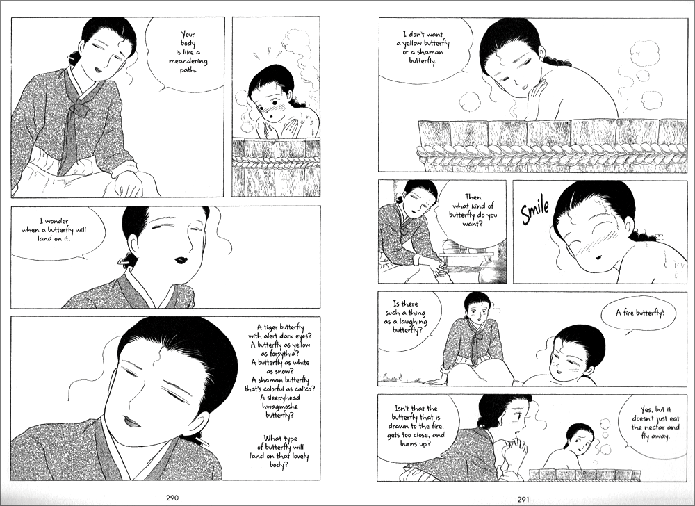
Scenes like this are peppered throughout, along with long-winded discussions in which the lonely, waiting women, the wandering men, and generally everything else of consequence in the story are described as various types of local flora and fauna—to the point that it eventually becomes difficult to remember what or whom all the different flowers, insects, and trees stand for. More than anything else, however, Kim lavishes over the beautiful pain of Ehwa and her mother with genuinely lovely artwork and flowery language worthy of Anne Shirley’s Rollings Reliable Baking Powder story.

But while Kim’s obsession with the feminine loveliness of his characters’ longing reads as simply insulting, his fascination with Ehwa’s burgeoning womanhood borders on downright creepy. Kim is quoted as saying that “the process of a girl becoming a woman is one of the biggest mysteries and wonders of life.” And it’s clear from his portrayal of Ehwa that he considers that process to be entirely sexual. Ehwa has no interests outside of sexual attraction and whatever else is happening with her body—not the tiniest thing. In fact, despite being the only child of a single woman running a tavern all on her own, she doesn’t even seem to have chores to take her mind off her dramatic puberty. Growing up mentally, emotionally, or even just practically seems to be of little consequence to Ehwa or her mother (who remembers just as Ehwa is about to get married that maybe she should teach her how to cook). And while I feel vaguely ashamed for wishing that a female protagonist might take some interest in housekeeping, it at least would give her something to care about besides the long-cherished promise of touching a man’s gachoo.

But while personal interests, hobbies or even standard domestic pursuits appear to be superfluous to “the process of a girl becoming a woman,” the relevant items seem to be:

Getting her period.

Learning to masturbate.

And attracting penises butterflies penises.

Yes, Kim Dong Hwa, these truly are the most important aspects of a young girl’s blossoming into womanhood. Thanks for noticing.

Of course, in the end, it’s not Kim’s romanticization of regressive gender roles that really bothers me here, or even his semi-creepy fetishization of womanly “blossoming” (seriously, everything’s got a flower metaphor in this series), not when you get right down to it. I’m a manga fan, after all. I’ve read Black Bird and Hot Gimmick. I survived the first omnibus of Love Hina. I’ve participated in a (not entirely scathing) column on boob manga. What makes me really hate the Color trilogy, is that it’s so widely praised and admired, by male and female readers alike. It is absolutely Serious Business, and that makes it rare fodder for my hatred.

In the books’ endnotes and in Kim’s official bios, he’s referred to repeatedly as a “feminist” writer. He is credited with possessing an “uncanny ability to write from a profoundly feminine perspective.” When, during the Manga Moveable Feast, Michelle Smith and I accused Kim of regarding his female characters’ limited life choices and oppressive environment with “loving nostalgia,” we were criticized in turn for expecting more progressive sexual politics from a period piece. The Color of Earth was published in 2003, yet even Tezuka never treated his (highly questionable) female characters with this kind of rosy condescension.

I tried very hard to like the Color trilogy, but even my most sincere, Pollyanna efforts failed me on this point. In the end, it may be one of the very few comics this midwestern optimist could ever truly hate.

__________
Click here for the Anniversary Index of Hate.

Why I Hate Watchmen

When Noah announced this hate-fest, I knew immediately that I’d write about Watchmen. What was less clear to me was why—what is it about this book that irks me so much? Why do I silently roll my eyes every time someone starts waxing poetic about Moore’s genius?

The truth is, I should adore Watchmen.

It’s a comic book-loving English major’s wet dream—multi-genre, intertextual, metafictional. So much of what people identify as masterful in Watchmen matches up nicely with the things that gives me incredible intellectual joy in other books, the kinds of thing I try to get my students excited about in class.

Plus, it has superheroes in it. Despite the entrance fee to the comics scholars club being a complete disdain for all things superhero, I really love a good superhero story well told.

So, Watchmen should be a perfect storm of all things that fill me with geeky, intellectual joy. The only problem? I really, really dislike this book. So much so, that I’ve never managed to read all of it, despite numerous tries.

My husband bought Watchmen for me the first year we were married. Comic books moved into my house along with my new husband. I was hooked, powerless to resist the heady combination of new love and Spidey angst. While I would eventually develop my own comic book preferences (I quickly began to favor alternative, autobiographical, talky, snarky books), my comic reading tastes have been forever shaped by the books my husband loves best — Marvel’s superheroes. He loves Spider-Man; so do I. He adores Avengers; so do I. He thinks Kirby is a genius; so do I. He finds the X-Men insufferable; so do I. So when he, and every fanboy I knew, said I should read Watchmen, I fully expected to love it.

But I didn’t. Not even a little. I figured it was me, that there was some context or history or secret code I just wasn’t getting that prevented me from liking the book. But each time I’ve tried — when students ask about it in class, when the film came out, to write this piece — I have the same reactions.

I find Watchmen dull, flat, and, above all, pretentious. And I say this as a person who regularly tries to get students to see how funny Melville’s “Bartelby, the Scrivener” can be.

First, it is ugly. So ugly. I get that aesthetic and artistic quality are in the eye of the beholder. I love Jeffrey Brown’s and James Kolchaka’s styles, and wouldn’t call them pretty at all. My students and I regularly have arguments about whether or not Charles Schulz could draw well. So, yeah, I get that we can enjoy comics drawn in a bunch of different styles. But, c’mon, people. You can’t really enjoy looking at this book. It’s visually crowded, the people are unattractive, the colors are weird. And yes, the visual style is working actively to help tell the story of the ugliness of the world. I get it. But it doesn’t make this book any more pleasant to look at it.

I could let the ugliness slide, though, if the characters were in any way interesting. I feel no connection to these characters. I don’t care enough about Dan Dreiberg/Nite Owl to trudge through his ornithological articles. Laurie Juspeczyk and Dr. Manhattan’s relationship fails to induce any sympathy. Rorschach and Ozymandias are just dicks. I don’t have to like characters to enjoy a story, but I do need to care something about the narrative arc they travel. And in Watchmen, there’s no single character whose life I care enough about to carry me through to the end.

And don’t get me started on that fucking pirate comic. Good god, people!


Most of all, though, I find the books seeming raison d’être, a critique of the superhero concept, to be just plain annoying. I just don’t buy that superhero stories are necessarily fascistic, that enjoying a superhero story makes you necessarily suspect, that we should always be suspicious of do-gooders. The cynicism of the story, and, frankly, the cynicism of many of its fans, is just plain tiresome — not artful, not clever, not profound, just tiresome. Like the hipsters slouching in the corner, smoking American Spirits, harshing on the squares, I find Watchmen guilty of trying way too hard.

So, let’s make a deal: I promise to nod politely whenever you to start to gush about this book, as long as you don’t expect me to join in.
__________
Click here for the Anniversary Index of Hate.

Funky Flashman

DC Comics’ “Himon!” by Jack Kirby (Mister Miracle # 9, Jul.-Aug. 1972) is not the comics story that I hate the most. That dubious honor, if I remember correctly, goes to Pedro and Me (2000) by Judd Winick, but since there’re 100 miles between yours truly and my copy of said “graphic novel,” “Himon!” will have to do as a target for my participation in the 5th Anniversary Hooded Utilitarian Hate Roundtable. “Himon!” isn’t even the worst Jack Kirby story… on the contrary, Charles Hatfield, in his book about Kirby Hand of Fire (2012, 206), included it among “the most deeply personal comics Kirby ever made.” Since Charles did such a good job analyzing “Himon!” I must agree with him that said story has its merits. This is good because I don’t want to incur in the same fault I accuse superhero comics artists and writers of (i. e.: of being Manichean). Then again is it fair to judge an artist for a really small amount of his input while most of it is big corporation owned dreck produced in a work-for-hire situation? In any case I’ll use other aspects of Boy Commandos, New Gods, The Eternals and the aptly titled Mister Miracle Super Escape Artist series to illustrate my points.

1 – Manicheism:

“Mystivac!,” Mister Miracle # 12, Jan.-Feb. 1973.

Jack Kirby’s superhero comics are Manichean. Reality is seen in black and white in these primary colored comics. From a purely visual point of view this means that the baddies are ugly (as seen above) and the goodies are mostly good looking. We can find the roots of this line of thinking in the ancient pseudoscience of physiognomy: the absurd idea that one’s outer appearance is a mirror image of our personality. To further examine how Jack Kirby used physiognomy we just need to compare Mister Miracle and Big Barda…

“Apokolips Trap!!,” Mister Miracle # 7, Mar.-Apr. 1972.

…two young athletes owning handsome physical appearances… with Granny Goodness and Darkseid below…

“The Pact!,” New Gods # 7, Feb.-Mar. 1972  (as reprinted in Jack Kirby’s New Gods # 4, Sept. 1984). Scott Free (Mister Miracle) arrives in Apokolips. (Stupid! Stupid! Garish colors! Give me old Benday Dots anytime! And yet, need I say it?, this is still thousands of times better than today’s gradient-ridden computer coloring.)

The former is an old woman and the latter is a stony faced Neanderthal. The baddies’ mugs are more masks than proper faces; their facial expression (it’s mainly one) shows that they’re always in a bad mood. In a Manichean war of good vs. evil Jack Kirby equated good with youth and good looks and evil with old age and other species or subspecies. We can’t also forget that young people were the reading target for these comics (Kirby’s clients) and our shallow hedonistic media revere youth and good physical appearances. Instead of choosing racist stereotypes like Ming in Flash Gordon (fortunately Jack Kirby may be accused of many things, but not of being a racist – Mister Miracle # 15, for instance, is there to prove it), Jack Kirby, as I mentioned above, advocated speciesism. His bad guys were surely insect-like and reptilian (with the occasional furious cat, mad dog, and devilish goat thrown in for good measure).

Insecto-Sapiens! Untitled, Mister Miracle # 16, Oct.-Nov. 1973.

(Below is an intelligent attack on physiognomy – I know, it’s an easy target, but still…)

James Gillray, “Doublures of Characters or striking Resemblances in Phisiognomy. “If you would know Men’s Hearts, look in their Faces.”,”  Anti-Jacobin Review and Magazine, November 1, 1798. On an unrelated note: look at the hand-coloring and weep!

Manicheism, of course, is part of an us vs. them ideology in which we, obviously, are always the good guys. Listen to Jack Kirby himself (in “Kirby on Survival,” Jack Kirby’s New Gods # 6, 1984):

They are evil, we are good. They are plotters and traitors, we are loyal and clever.

In “Himon!” Manicheism is still a problem, but at least it is aptly used to show how, in a dictatorship, almost everyone (Auralie, for instance, is an exception) is infected by the ugliness of the leader.

To paraphrase Charles Hatfield in Hand of Fire (219), everyone’s infected… “Himon!,” Mister Miracle # 9, July-Aug. 1972.

2 – Formula:

It’s no secret: superhero comics are formulaic. If you let me indulge in a personal note for a sec. I must say that this is reason enough to stop me from enjoying these stories: if the comic is Manichean and it’s just an endless row of fights why should I bother reading it if I know beforehand who will win? This is exactly what happens in most of the boring issues of the Mister Miracle Super Escape Artist series: Mister Miracle vs. Steel Hand; Mister Miracle vs. Overlord and Granny Goodness; Mister Miracle vs. Doctor Bedlam; etc… etc… ad nauseam… Trying to understand why people like these comics and films I suppose (and I use the word advisedly because this is no scientific conclusion) that readers and spectators like to feel the epinephrine of violent action (without the consequences produced by violence in the real world, of course). They also like to root for the righteous good guys… It’s kind of a sports thing, I guess…

Joe Simon and Jack Kirby in self-referential mode. Boy Commandos # 1, Winter 1942 – 43 (as reprinted in Mister Miracle # 6, Jan.-Feb. 1972).

In the image above two characters that stand for Joe Simon and Jack Kirby explain how “[They]’ve been getting [their] characters in and out of jams.” That pretty much sums it all up: in these formulaic comics the heroes get in a jam and, then, they get out of it. In Mister Miracle # 5 the baddie, Virman Vundabar, says to Mister Miracle, after he got out of yet another jam (to quote the fanboys when talking about art comics: “yawn!”):

I know! A mother box! [everything is emphatic in these stories] With the aid of a mother-box, you thinned your atomic structure and transferred yourself out of the coffer!!

To which the latter answers:

Not so! […] I play it fair — and you know it!!!

Mister Miracle won by three exclamation marks to two. On the other hand I reckon that he was wrong and the baddie was half right: it wasn’t the mother box that saved Mister Miracle, but he was far from playing it fair. He escaped because of the formula imposed by the author, Jack Kirby. The game is definitely rigged. In “Himon!” the same thing happens to ruin my enjoyment of the story. The dei ex machina are an easy solution to every problem: Scott Free (Mister Miracle) is blinded by the ideology imparted in Granny Goodness’ school?, no matter, Metron and Himon will put him out of his wrong ways; Himon is killed by an angry mob?, of course not, he has the ability to replicate himself (it was one of those replicas that seemed to be assassinated); Scott Free fights some of Darkseid’s minions?, piece of cake… he easily wins… etc… In conclusion: Everything is too easy for yours truly’s taste.

“Himon!,” Mister Miracle # 9, July-Aug. 1972: you bet that’s not him.

3 – Cardboard Characters:

These characters are as thin as the paper they were printed on. Mister Miracle barely exists. At the beginning he’s just a strange being who came from another world. We know nothing about him except that he’s a super Houdini. From Mister Miracle # 4 (Nov.-Dec. 1971) until Mister Miracle # 7 (Mar.-Apr. 1972) a series of short stories (two and four pages) give us some feedback to understand Scott Free a little better, but is that enough? He was born in Goodiesland (aka New Genesis), but because of some kind of pact between Darkseid and Highfather (a kind of Moses) he was transferred to Baddiesland (Apokolips) where he grew up in Granny Goodness’ orphanage to become part of Darkseid’s military elite. The truth is that no real characterization exists. If the hero (the main character) is flat what can we expect for the other characters? Nothing at all…

At the end of “Himon!” we find the melodramatic panel below:

“Himon!,” Mister Miracle # 9, July-Aug. 1972. Is that eye leaving stage left? 

That’s OK, by me, but… who are you exactly? How can one find something that doesn’t exist?

These cyphers can only be used as personifications in allegories, but we all know how heavy handed that can be. Plus: a Manichean one can only achieve kitchy results… Certainly not the status of great art that some claim for Kirby’s work…

4 – Glorification, Glamorizing, Sanitation of Violence:

This is the part in which my love/hate relationship with Jack Kirby’s art reveals itself. Not being completely blind I can see how (see above when I guess why people like action comics and films) the drawings are powerful. That’s exactly the problem: they’re too powerful. So much so that Art Spiegelman put the topic in the following terms (in The Comics Journal # 181, Oct. 1995, 106):

[…] the triumph of the will, the celebration of the physicality of the human body at the expense of the intellect, is very much an impulse in Fascist art. It has a lot to do with the motor for Kirby’s work, even though I understand that his work is filled with characters who fought the Fascists.

Kirby’s double-page spreads are particularly good examples of the above. With them Kirby aimed to grab the reader by the guts from the beginning. To do so he knew that he needed to create the most spectacular images that he could muster. This meant huge battle scenes with lots of what Charles Hatfield called Kirby’s technological sublime and the clash of titans. 

“Earth — The Doomed Dominion,” New Gods # 10, Aug.-Sept. 1972 (as reprinted in Jack Kirby’s New Gods # 5, Oct. 1984). The mannerist composition dividing the realm of the gods from the realm of the humans (or… whatever they are) is quite interesting.

We have seen that there are a few problems with Jack Kirby’s superhero stories, but enlightened readers tend to value the drawings and the drawing style instead of the narratives. As if the former can be, in comics, totally separated from the latter. It can’t: both the iconical content of the drawings and the lines as such are a unit, a meaning generator. The Manichean content, for instance, is in the text, but it is also in the narrative drawings, as we have already seen. Plus: it’s the lines, colors, and textures that convey the physicality and the powerfulness of the images; marks have meanings. Kirby’s graphic style is a cubo-futurism that underlines and glorifies, technology, youth and violence. In the above panel, for instance, extreme violence is given to us in awesome spectacle. Being a children’s comic the nasty consequences of such a shock are spared to us because these are super beings and nothing can really harm them. What escapes my reckoning is why do they attack each other if there are no consequences of the attack? Logic doesn’t matter though, what really matters is that the kinetic and colorful show must go on.

Czech writer Milan Kundera wrote the following about kitsch (in The Unbearable Lightness of Being, 1984, 248):

Kitsch is the absolute denial of shit, in both the literal and figurative sense of the word; kitsch excludes everything from its purview which is essentially unacceptable in human existence.

Also (253):

Kitsch is a folding screen set up to curtain off death.

Giving us not only a fascistic glorification and aestheticization, but also a sanitized version of violence Jack Kirby’s work is the perfect embodiment of kitsch.

Again, “Himon!” is a bit different. In the below panel we don’t see them exactly, but innocent people die (my question is: aren’t Jack Kirby’s readers so inured to violence that they couldn’t care less? Besides, who cares about cyphers?):

“Himon!,” Mister Miracle # 9, July-Aug. 1972. 

5 – Feminism?

Of course not. Even if Big Barda is a physically empowered woman (as we have seen, there’s no intellect in Jack Kirby’s comics) look below to see who the only scantily clad character is:

“The Closing Jaws of Death!,” Mister Miracle # 4, Sept.-Oct. 1971.

On the other hand the panel below could be a poster to announce a SlutWalk, so, I may be wrong…


“Mystivac!,” Mister Miracle # 12, Jan.-Feb. 1973.

In conclusion (a):

(After probing into a small part of a huge corpus):

On the mass culture side of things Jack Kirby not only contributed enormously to the superhero mythos, he also inspired ideas for films like Star WarsMan in Black, or Pure Steel (more than dubious feathers to wear in one’s cap, but anyway…).

Jack Kirby’s superhero stories are Manichean formulaic romps performed by cardboard characters. His drawing style and visual imagery are an emphatic cubo-futurist fascistic glorification and glamorizing of violence, youth and technology. On the positive side he was particularly good creating complex panel layouts and used the comics medium to great effect sometimes; for instance (note the sequence of the archers’ movements from left to right):

“Apokolips Trap!!,” Mister Miracle # 7, Mar.-Apr. 1972.

Jack Kirby could also surprise the reader from time to time breaking, for example, the dichotomy handsome/good vs. ugly/bad:

“Mother!,” The Eternals # 10, Apr. 1977.

Other times he committed crass mistakes. Probably because of an excess of work and deadline pressure:

The final sequence of “Paranoid Pill!,” Mister Miracle # 3, July.-Aug. 1971.

The continuation of the sequence above in “The Closing Jaws of Death!,” Mister Miracle # 4, Sept.-Oct. 1971. Where did those ropes come from?

Being such a loud comics artist Jack Kirby’s work seems to have been created by his character Funky Flashman. Even if said character is a caricature of Kirby’s, by then, rival Stan Lee…

Conclusion (b):

What about “Himon!,” then? It’s as simplistic and Manichean as all the other stories, but, at least, Kirby used Manicheism to show how the dictator’s ideology infects the people (the “lowlies”). The narrative formula is also there (the use and abuse of the dei ex machina, Metron and Himon, is too facile a device; on top of that Scott Free can’t lose a fight and he can’t be killed – even if “in a jam” we know that he will end up all right). The characters are flat, but, at least, there’s some internal conflict in Scott Free (that’s a slight improvement over other, more pedestrian, stories). Apart from the above there are some pursuits, fights, and explosions (yawn!) and the usual glamorizing followed by sanitation of violence. The sequence in which Willik orders the burning of the “lowlies” may go against the grain (up to a point, as we’ve seen above), but that’s one exception, not the rule. So is the story “Himon!” in Jack Kirby’s oeuvre.

__________
Click here for the Anniversary Index of Hate.

The Purest Hate of All

A little background…

This started as a comment on the Benjamin Marra interview over at The TCJ Website, but I wanted to make sure it didn’t get buried under the contract negotiations with Dave Sim. The danger of posting it here is that it’s going to get mixed in with the whole “Hate Week” thing, and I don’t want people reading this as inspired by hate. (That said, by the end you’ll see some self-hate in action, so if you’re here for hate you can just skip to the last paragraph or two.)

In actuality, two decidedly non-hateful things inspired the comment. The first was an aside made by Joe McCulloch some time ago, I think during one of his “This Week’s Comics” features over at TCJ. Bascially, he wondered why there wasn’t much controversy over Marra’s work given the content. The other inspiration was Darryl Ayo’s thoughtful post about Marra on his blog. Ayo’s piece moved me to read the interview, which in turn led me to write this post.

If I have these story ideas, I can’t censor myself or else I won’t do them, because I won’t think that it serves the artwork in the end if I try to water it down based on this illusion of how I think people will react. That’s not a viable gauge to base decisions on, because it’s not real. It’s only real after.

Benjamin Marra, from the tcj.com interview

Here’s the thing, when a person writes and draws a comic they have to make choices. They make choices about what to put into a panel and what to leave out. They make choices about how to present information within a panel. Marra understands this. At one point he says that a profile-shot at eye level is a good way to convey action. He’s basing this assertion on the imagined reaction of an audience. Yet later he says that anticipating reaction is not a “viable gauge” for making decisions about whether or not what goes in might come across as racist. Contradictions like these suggest intellectual laziness, and this laziness is particularly problematic when the goal is satire. It is problematic because the difference between effective satire and just playing stereotypes for shits and giggles largely comes down to careful consideration and execution. Based on this interview, Marra is committed to the execution but not to the consideration. However, he also realizes that for his work to come off as anything other than racist, it needs to come off as satirical:

“Gangsta Rap Posse is underground comics, it’s not on a lot of people’s radar, but the things is, I’ve never gotten anything but a positive reaction to it. I’m sure if it was distributed to a much wider audience it would get a really negative response, if people took it seriously — not as satire, not as a comment on myself as a white suburban artist making a comment on black urban culture from a specific time period. I think people might react negatively.

Note that Marra explicitly calls Gangsta Rap Posse a work of satire. It is, by his account, a self-referential commentary on commentary. This might very well be Marra’s intention, but it doesn’t really show up in the work itself.  This is because Marra’s stated goal of making comics that read as though they were created by someone who didn’t know what he was doing is at odds with the meta-commentary he’s after. Put another way, if you strive to make your work look earnest, then you can’t expect people to see it as self-reflexive commentary.

And Marra seems to recognize this tension, hence his over-the-top author photos designed to convey a “Hey, I’m only sort of serious about all this” attitude. However, even he seems to think that this sort of paratextual gesture might fall short of the goal. Note that in the same quote he imagines that given wider distribution Gangsta Rap Posse would get more negative responses. I think he’s right about this, and I think that this should be a red flag for us.

What Marra is saying is that we’ve failed as readers of and writers about comics. We’ve completely passed on the opportunity to discuss his comics from the perspective of race, gender, or any other political or ethical lens. Instead, we’ve decided to discuss them from the perspective of other comics. We’ve skipped over the tough questions about representation to play facile games of spot the influence. As a result, we’re missing out on some good conversation, something that gets beyond the usual “you’re so great, you’re so cool” stuff that gets passed off on us as a long form interview. Aren’t we bored of that by now?  That we don’t seem to be bored suggests a certain intellectual laziness on our part. Ah, self hate, the purest hate there is.
 
__________
Click here for the Anniversary Index of Hate.

Why I Dislike Betty and Veronica to the Utmost of My Abilities

Growing up, I wasn’t allowed to use the word “hate.”  I was thus forced to create an alternative phrase and came up with  “I dislike [it] to the utmost of my abilities.”  So let me say this clearly: I dislike Betty and Veronica to the utmost of my abilities.  I feel guilty admitting it; Archie and the gang are just so wholesome, so American, and in recent years I’ve even heard that Archie has developed a decidedly liberal bent, but when I was a child Archie’s main girls Betty and Veronica were the bane of my existence.  I think most of us have guilty pleasures—embarrassing pastimes or pursuits that give us a tingly, happy feeling, but reading about the catfights and hijinks of Betty and Veronica was a guilty obsession that brought me no pleasure; instead these “best friends, worst enemies” only made this girl feel much, much worse.  This is, of course, a very personal reaction, and I’m looking forward to reading Craig Yoe’s upcoming The Art of Betty and Veronica after abandoning the comic in high school.  Perhaps I will be able to gain some distance and a better perspective on the iconic role the pair has played in American culture.

However, when leafing through some old issues of Betty and Veronica from the 1980s, I was immediately overcome with that same strong, repellent feeling from the past as I remembered that, in fact, Betty and Veronica are horrible.  In saying this I mean no disrespect to Dan DeCarlo, an artist long associated with updating the look of Betty and Veronica, and well known for his stylized, sexy, and strangely wholesome female characters.  Rather, it is the stories, the lives, and the characters of B & V that cause immediate distress.  While others might praise the fact that Betty and Veronica remain best friends despite fighting over Archie continuously, I cannot help despising the triangle and the participants in the first place.

Teen magazines frequently asked the question: Are you a Betty or a Veronica?  It was a question that I imagine led many girls to despair.  I, myself, was certainly no Veronica.   Oh yes, she’s gained a cult-like status as a take-charge, empowered female radiating self-confidence and verve, and the comic got a great deal of mileage gently mocking Veronica’s exorbitant wealth and privilege and her lack of real-world knowledge, yet in this playful teasing the stories also served to affirm the great gifts and pleasures of privilege.  I had little of Veronica’s sass and grew up in a distinctly middle-class household, examining the riches of the Lodge mansion with a critical eye, all while feeling a sickening jealousy for the girl who had everything, well, except for the feckless Archie.  Over and over, Veronica’s slapstick romantic battles with Betty brought out the worst in both, and I couldn’t help but wonder—this is all over Archie?  The goofy redhead with the curious, pockmark freckles and crosshatched hair? 

If Veronica represented the unattainable dream of confidence, poise, and affluence, Betty acted as I knew I should.  As a fellow helpful tomboy who got good grades and tried to please my parents, Betty was more relatable to me.  Still (and this likely says something about me), I disliked Betty even more than Veronica: her namby pambiness, her awful subservience, her generic prettiness, and that relentless good cheer.  In her upbeat, serviceable wardrobe, Betty was unceasing resourceful, always lending a hand when Archie’s car broke down or Veronica needed help covering for one of her misdeeds.  Yuck.

Veronica was downright mean, and Betty, well, she was a doormat.  What was there for a little girl to emulate?  What kept me dissecting the pages?  I believe, if anything, it was Dan DeCarlo’s artistic style that kept me returning to the comic throughout my tween years, despite the queasy feeling the comics gave me.  I scrutinized the two female leads intently, studying the perfect hourglass figures, the cutting edge fashions, the upturned noses and wide, perennially surprised eyes as templates for perfection in dark and light.  Yet as time went on I slowly gave up the “realistic” teens, gravitating to the superheroes that seemed somehow more real than Betty and Veronica.  Spiderman, Batman, Rogue, and Wolverine lived with fear and pain and shame, and yet there was a spark of greatness within them.  Somehow, watching these troubled characters make their way, swinging and clawing and punching, felt much more comforting than viewing Betty and Veronica lounge and play on the manicured lawns of Riverdale.  Thanks anyway, Archie, but I’ll take the X-Men any day.  I guess I really do hate Betty and Veronica.
 
__________
Click here for the Anniversary Index of Hate.

The Devil You Thought You Knew, The Devil You Wish You Didn’t

Hating comics is a strage business for me. I’m not against it – I’m not a Team Comics guy, worried about hurting Brian Bendis’ feelings. I’m a big Comics of the Weak fan, and I’m writing for the Hooded Utilitarian. I’m down with hate. But I find it unexpectedly difficult to hate comics.

Most comics, even some corporate ones, are the product of one or two idiosyncratic minds putting pen directly to paper. Even if I don’t particularly care for them, they tend to fascinate me as art objects. And the truly focus-grouped editorially-driven corporate comics? I’m frankly not invested enough in most of them to care if they’re all that bad. A bad comic of that sort is far more likely to inspire mere apathy. It takes something more than poor quality to drive me to hate.

To hate a work of art, I have to feel trapped or confronted by it in some way. Popularity will do it, sometimes. I almost wrote this essay about 100 Bullets, and then almost again about The Walking Dead. Neither of those books are the worst things I’ve ever read, but I also don’t find much to value in them, and their various levels of critical and commercial success serve to turn my general distinterest into a sneer of disgust. (You might think that sounds petty, and at one point I would have agreed with you. But I’m more inclined these days to see the general public reaction to a work as a legitimate part of that work’s existence, and worth reacting to in its own right. Plus, frankly, it’s just sickening to hear constant praise of work you consider undeserving.)

But most comics aren’t really that popular or that talked about. And unlike a movie, for which you sit passively in a dark room for a predetermined amount of time with nothing to focus on but Bradley Cooper’s “punch me” face, reading a comic at all requires active participation. If I’m not enjoying a comic, my energy for that participation just slides away, and I toss the book aside. I’m not trapped in it.

I can’t even fall back on old, reliable superhero nerd rage. Up until embarrassingly recently, I could become greatly offended by terrible superhero comics that violated my vague platonic ideal of what a superhero comic should be. A few years ago, I might have found it in me to write this entire essay on Identity Crisis, or a Mark Millar comic. But now, I try, but it fizzles. Superhero comics were never the most relevant things to begin with, and for me they’ve now spiralled off into utter inconsequence.  (Superhero movies, on the other hand, are a constant presence in the cultural conversation, as well as being formally dominating experiences, and I have little to no problem hating THOSE. I hate that new Batman movie and I haven’t even seen it yet.)

So to write about a comic that I truly hate, I have to pick one that affected me on a personal level. I’ve picked a comic that, although it isn’t particularly important, let me down tremendously, and that I came to hate through sheer disappointment. That comic is Matt Wagner’s Batman/Grendel II.

I wonder for how many people Matt Wagner’s name still resonates. Briefly glancing over a chronology of his work, most of his output over the last decade-and-a-half seems to be scattered projects from DC or Dynamite, mostly writing franchised characters like Zorro or Madame Xanadu; some short work writing his own characters, some work drawing Batman. But nothing much to suggest that, for a time in the late eighties and early nineties, Wagner was one of the most consistently interesting and experimental of mainstream-minded American cartoonists. His was a mixture of complex but balanced geometric page layouts, high fashion and art deco-influenced design, a deliciously cartoonish line embellished with painterly colors, all mixed with a strong, semi-modernist writing style.

His earliest major work, Mage, a traditional fantasy quest recast to then-current ’80s urban America and strained through a cheeseclotch of comic book iconography, was the kind of thrilling learn-on-the-job opus that only a young cartoonist can deliver – from page to page and chapter to chapter you can see Wagner gaining confidence and competence in equal measure, his skill rapidly catching up to his ambition. In the middle of Mage, Wagner began his other major early work, Grendel: Devil by the Deed, a re-make of his first comics series, a crude but vibrant entry into the ’80s black-and-white boom called Grendel, about a young, wealthy sociopath named Hunter Rose who becomes the world’s greatest criminal mastermind out of want for a challenge. Foregoing the previous work’s lightly-manga-influenced adventure comics style, and having substantially improved as a draughstman, Wagner re-told (and expanded) the entire Grendel story in a series of tableaus and captions, the panels of the comics page divided up to somewhat resemble the composition of a stained-glass window. It was an experiment that earned high praise from then-fresh superstar Alan Moore in his introduction to the collected edition, and arriving as it did simultaneously with the virtuoso final issues of Mage, together they announced Wagner as most definitely someone to watch.

Wagner’s career post-arrival followed what now seems like something of a familiar path for eye-catching independent artists working in a mainstream idiom. He only occasionally drew his own characters again in comics form, instead making the likely economically expedient (as well as, admittedly, often aesthetically interesting) choice of writing a long run of Grendel stories for other artists to interpret, and plying his drawing skills on various franchise characters (including a Terminator comic that was actually fairly excellent, if memory serves) and many, many cover art jobs. Through the ’90s he did draw several short Grendel stories (the character of Grendel long-since transformed into a sort of freefloating symbol of the evils of mankind, with many different characters through time and space taking on the persona of the devil), and delivered a long-awaited sequel to his Mage series. The latter, though, is best discussed through the prism of the twin projects that are my true, belated subject today: 1993’s Batman/Grendel and 1996’s Batman/Grendel II, or rather, the aesthetic distance between these two works, both written and drawn by Wagner himself.


The Aesthetic Distance.  (Left, Batman/Grendel.  Right, Batman/Grendel II.) 


Batman/Grendel is far from the best comic ever made, but it does happen to be one of my personal favorites. Wagner, operating at his most formally innovative — with page layouts to die for, and the most elegant linework of his career (not to mention beautiful coloring by Joe Matt) — delivers a comic that on the surface purports to be about an epic battle between two wealthy playboys who enjoy violence on rooftops while wearing masks, Wagner’s own perverted inverse of Bruce Wayne versus the genuine article. The heart of the comic is actually, however, the story of two women, Hillary Ferrington and Rachel King.

The narrative consistently paints both Grendel and Batman as obsessive, destructive, meticulous, and both more than a little inhuman, both callous to the emotional realities of human life, the only difference being that one is callous out of sadism and the other out of expediency. And in the vein of the best of Will Eisner’s work on The Spirit, their entire superheroic clash of wills is constructed largely as backdrop to the story of Hillie and Rachel’s friendship, their tortured pasts, and their struggles against an increasingly hostile world filled with terrors such as wealthy playboys who enjoy violence on rooftops while wearing masks.


Wagner still fulfills the genre demands of a Batman story – there’s plenty of Batman puzzling things out at a computer, or thinking terse caption thoughts about how the weights in his cape are perfectly suited for urban combat – but he structures the big emotional beats of the story all around Hillie and Rachel. It’s a comic that uses the superhero setting to tell a human story, and unlike 99 percent of the stories that try that trick, it unembarrasingly succeeds.

Again, it’s still a Batman comic, still an inter-company superhero crossover, and still indebted to genre and melodrama in ways that could be argued to work to its detriment as a piece of art for the ages. It isn’t the best comic ever made. But I think that its formal mastery, compelling story, and welcome attention to gender politics and genre critique make it something kind of special. I love it a lot.

Batman/Grendel II, released three years later, takes a huge shit on everything that made Batman/Grendel even a little bit special.


The sequel finds Wagner in a different mode of storytelling. Gone are the tightly constructed and narratively functional layouts. In their place are splash pages crowded with unmoored smaller panels that often lead your eye in the wrong direction, to no good aesthetic effect. The most functional visual device is a re-hash of Frank Miller’s already decade-old television narration from The Dark Knight Returns. Gone, too, is the elegant linework. In 1996, Wagner had begun to loosen up his art, freeing himself from his devotion to the angles and fashions of 1980s illustration. The result is art that may very well have been more fun and personally fulfilling for Wagner to draw, but which looks clumsy and ugly on the page when compared to his previous style.

Most importantly, gone is any thematic or narrative resemblance to what made Batman/Grendel a minor miracle. This is not a story about any kind of human experience. This is a story about Batman fighting a cyborg from the future. Overwrought captions describe in agonizing detail how each of them feel about every moment of the story, endless verbiage that unironically calls Batman “The Dark Knight” and Grendel “The Devil” as it painstakingly narrates their utterly pointless and generally uninteresting fight to a stalemate that Wagner pompously postures as enigmatic and ambiguous in a desperate attempt for any kind of meaningful resonance.

Batman/Grendel II‘s thorough betrayal of everything Batman/Grendel did right can be summed up by its very first page, in which Hillary Ferrington, the narrative and emotional heart of the former work, makes a cameo appearance that is used for exactly three purposes: (1) to display via her close-shaved head and multiple piercings that Wagner has ditched the elegant art deco stylings of old, (2) to lay exposition regarding the book’s fatuous internal free speech debate, and (3) to talk about how awesome Batman is. That Wagner is seemingly fine with disrespecting one of his best characters in this way speaks to the loss of something in him. And it is a loss that can be seen in his work through to the present.

After Batman/Grendel II, Wagner delivered his aforementioned Mage sequel, which displayed a similarly loose pencil and disinterest in the formal rigors of his previous work. It also, like Batman/Grendel II, displayed a much less nuanced sense of irony in regards to its straight-ahead mythic-adventure story. Where once Wagner used fantasy tropes to explore human situations, now the tropes themselves had become the focus. The same can be said of his post-’96 corporate superhero work (which makes up the bulk of his post-’96 work, in toto), at least that which I’ve read. Even the latter-day Grendel stories that he still occasionally writes for other artists are laden down with all the self-importance and forced darkness of a goth teen. Where once he used genre trappings as a delivery system for something bigger, he seems dedicated now to wallowing in those trappings for their own sake.

There’s a large degree of unfairness to what I’m saying. A perfectly valid view of all of this would be that I’ve merely gotten older, and my tastes have changed, while Wagner too has matured, and his art has shifted gears, just in a different direction. In some ways, his looser artwork may speak to Wagner achieving a more direct and free form of expression on the page. That I’m frustrated at the lack of particular thematic or formal tics in his current work is perhaps as much to do with my own nostalgia as any artistic lack on Wagner’s part. And like I said up top, Batman/Grendel II isn’t the worst comic in the world. If what you want is Batman fighting a murderous cyborg from the future, it might even be a pretty good one. But I can’t tell. I’m too sad at the loss of a cartooning voice I cherished, and too angry at the imposter that strolled in and tried to take his place. It’s an irrational feeling, but then again, so is hate.
__________
Click here for the Anniversary Index of Hate.

In Offense of Wonder/In Advance of Discrete Funk

“The man who has no sense of history, is like a man who has no ears or eyes” -Hitler

I hate Berlin by Jason Lutes, but I feel bad.

I feel bad for singling out Lutes (as opposed to other more successful folks I hate like Brandon Graham or Frank Quitely), some poor dude who is just working hard doing something he loves. Something decidedly uncool. With little hope of any reward. I feel bad for the version of myself (the idealistic, formalist one) who grew up in the nineties, but I hate him too.

And let’s just get it out of the way that I haven’t read Berlin – only early chapters of it many years ago.

[pic of my copy – er, um, sold it – imagine a space on the shelf big enough for a “graphic novel”]

But I don’t think my lack of familiarity with the book makes much difference because I’m well enough acquainted with it (I’ve read/listened to interviews with Herr Lutes, in fact) to know that it’s what I find quintessentially boring, concerned with the past as parts, with correctness and historical accuracy, with piecing together a clockwork apparatus that utilizes the “comics medium” properly. parts is parts…


I have these two competing metaphorical agents operating inside my brain: the quick, spontaneous, associative agent and the slower, more organized analytical agent.  The analytical agent seeks order, control – building systems that are self-contained and complete.  The unresolved nature of the work produced by the quick, spontaneous part of my brain is more interesting, though, to me because its success or failure just seems to happen – I can’t unpack the way it functions.

So, yeah, here’s what I hate: when cartoonists give themselves over completely to their fascistic, organizational side, when the design of the system they’re building is the goal, when the components of the work are these discrete, mechanical operators that are masterfully controlled to achieve a particular end.  I can appreciate the craft (and, really, the nineties college kid in me would love to be this sort of craftsman, where deeds would get him into heaven), but the work itself eschews excitement and delight in favor of propriety and cleverness.

It is creative process as control fetish, reducing life to pedantry and toil, cutting out the weirdness, the unexpected beauty that keeps me going.
 

Nuff said!

__________

Click here for the Anniversary Index of Hate.