The index to the Indie Comics vs. Context roundtable is here.
____________
I was one of nine hundred and seventy-one backers of Reading With Pictures’ The Graphic Textbook Kickstarter campaign. I pledged $10, and the other backers collectively pledged $77,410. I think it’s safe to say that the other backers were, like I was, impressed with the advertised concept of “A comic that every teacher will actually want to use… and a textbook that every student will actually want to read!” It made me think of Larry Gonick’s comics, which I read devotedly as a kid and were a really useful supplement to my lessons about physics, math, and especially world history. If The Graphic Textbook brought that kind of academic rigor and energy to a new generation of elementary schoolers, it would certainly be worth my $10 donation.
The Graphic Textbook and its accompanying teachers’ guide are a project put together by the organization Reading With Pictures, founded by comic book writer Josh Elder in 2009. Its mission statement is to “revolutionize the role of comics in education,” and The Graphic Textbook is their latest major step towards achieving that goal. The Textbook boasts a diverse group of writers and artists, each assigned a general area of education (Language Arts, Social Studies, Math, and Science). Every section has three to four comics in it, each nominally meant to teach a standard lesson in an entertaining way. The teacher’s guide suggests that The Graphic Textbook is meant to supplement larger lesson plans, where a teacher might go over the basics on any given topic and then ask the class to read the associated story. The concept of a comic being used as a supplementary educational material is an intriguing one, and I was eager to see how Reading With Pictures chose to execute it.
Close to a year and a half after their Kickstarter surpassed its goal, Reading With Pictures finally sent backers near-complete previews of the textbook and teacher’s guide. I’ve had time to take a look at them over the past few days, and, frankly, I’ve been very frustrated with what I’ve read. Brief flashes of inventiveness are completely buried under ugly art, terrible pacing, confusing attempts at humor, walls of text, and unclear (sometimes actively incorrect) information. The question I found myself wondering most frequently as I was reading through the book was “why does this need to be a comic?” It’s a question the book struggles with, is deeply insecure about, and never manages to overcome.
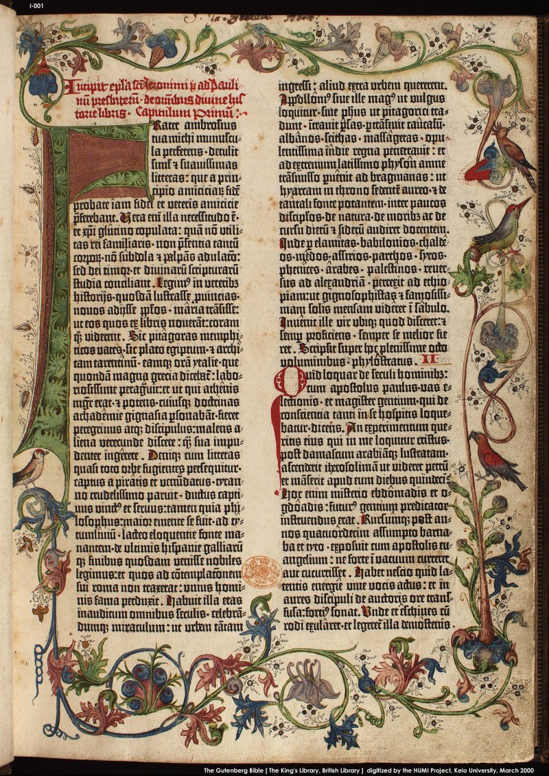
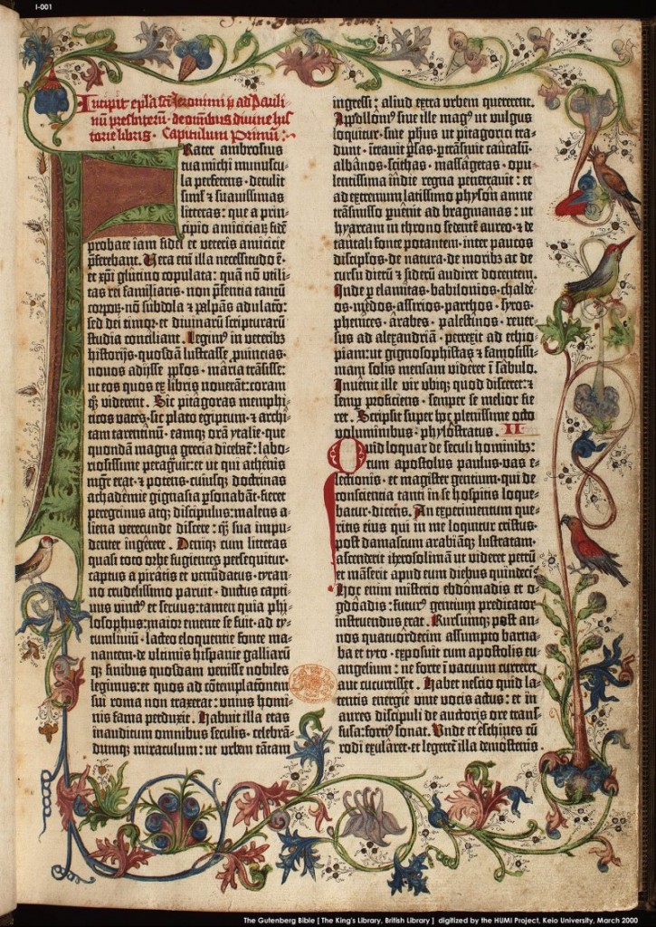
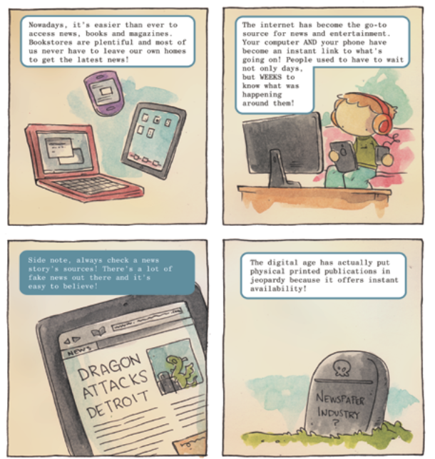
I’ll start with the textbook itself. The first subject the book covers is language arts, and the first comic in that section is “The Power of Print,” by Katie Cook. The comic takes the form of a short essay on the history of print and the written word, arranged in a six panel grid with an illustration under each small block of text. The text itself makes many enormous generalizations, most likely because there is only space for a few words in each panel. More frustratingly, though, the illustrations do nothing to accurately convey the appearance of the artifacts being discussed. Cave drawings, hieroglyphs, and the Gutenberg Bible are depicted in a blurry, washy style that does not adequately communicate the subject matter. Ironically, the comic begins with the words,
A long time ago, there was no form of writing. Stories, information and more were all passed from generation to generation by word of mouth… this was terribly inefficient. Have you ever played the game “Telephone”? Things get lost and change as each person passes on the information.
Just as information is lost and changed when people retell stories without writing them down, information is lost and changed when crude drawings are created to substitute for actual pictures of the artifacts being discussed. As someone who not too long ago was reading textbooks, I know that this:
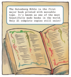
Is no substitute for this:
I’m assuming the artists/writers of these chapters had very little editorial oversight, because the narrative bounces around unforgivably for something that’s supposed to be a straightforward teaching tool*. From the chapter on print:
Where did that panel about checking sources come from? In a traditional textbook that information, if it were deemed important for the lesson, could be put in a ‘did you know’ type textbox on the side, not disrupting the main narrative. In this case, though, the (already shaky) narrative of the history of print is disrupted by a warning about checking sources, and then slingshots to “print is dead” because there isn’t any space for any real facts or examples. There is no good reason for this to be presented as a comic instead of a short prose section with illustrations.
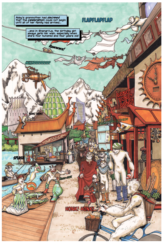
The chapters immediately following the one on the history of print made me much more optimistic about the rest of the book. Tervor Mueller and Gabriel Bautista’s story about an alien learning about metaphors is cute and fairly informative, although quite generic. Mike and Janet Lee’s “Special Delivery to Shangri-La,” lettered by Jim McClain, is a very standard kids’ comics story about Jules Verne and his adventures in an orientalist fantasyland version of Tibet (two stories in the Textbook feature bizarrely orientalist appropriations of stereotypical “Asian” culture without much reason or explanation.) The goal of the “Special Delivery” story is to teach kids vocabulary using visual cues, and I guess it does that alright (“Unhand that parcel, you pilfering primate!”) but the ‘Tibet is inhabited by monkeys and sasquatches’ premise was distracting. It probably wouldn’t have bothered me as much if I hadn’t been reading it as part of a textbook, but in the context of a textbook, where several comics are nominally portraying concrete facts, the weird orientalism seems especially irresponsible.
Fred Van Lente and Ryan Dunlavey’s “George Washington: Action President!” is one of the best-executed comics in the book. Van Lente and Dunlavey take the Gonick approach, splitting a complicated biography of George Washington into manageable little chunks, illustrating each one with a gag. My only complaint about the story would be the very light touch it demonstrates when brushing on the topic of slavery, choosing to portray Washington and his valet, William Lee, as equals and friends rather than as owner and (relatively) privileged slave. The story also makes several references that are too clever for their own good – for instance, this is the final panel of the story:
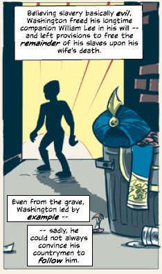
It’s a clear homage to the classic “Spider-Man No More” panel from Amazing Spider-Man #50, but is it appropriate in this context? None of the students reading this book will understand the reference, making it potentially confusing, and it seems tonedeaf to compare a slave being freed from a lifetime of bondage to Spider-Man temporarily throwing away his costume. It’s a problem that crops up many times in the Textbook: coy, self-congratulatory references to the history of comics, especially superhero comics, that add nothing to the lesson and will be ignored at best and confusing at worst.
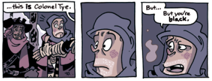
Chris Schweizer’s “The Black Brigade” is by far the best comic in the Textbook. Both it and “George Washington: Action President” fall in the social studies chapter, which makes a lot of sense – it’s much easier to tell a compelling comic-book story about real events that happened to real people than it is to try and spin abstract concepts into a comic. “The Black Brigade” is the only comic in the textbook that could stand on its own, and it reminds me a lot of the dense historical comics in Spirou collections I enjoyed as a child. It plays to the medium’s strengths by not trying to depict too broad a swath of history, instead focusing on a brief skirmish during the revolutionary war. The art is lovely, and the story is not burdened with too many superfluous characters like many other comics in the Textbook seem to be. It made me wish that Schweizer had been assigned more chapters, since his is without question the best in the book.
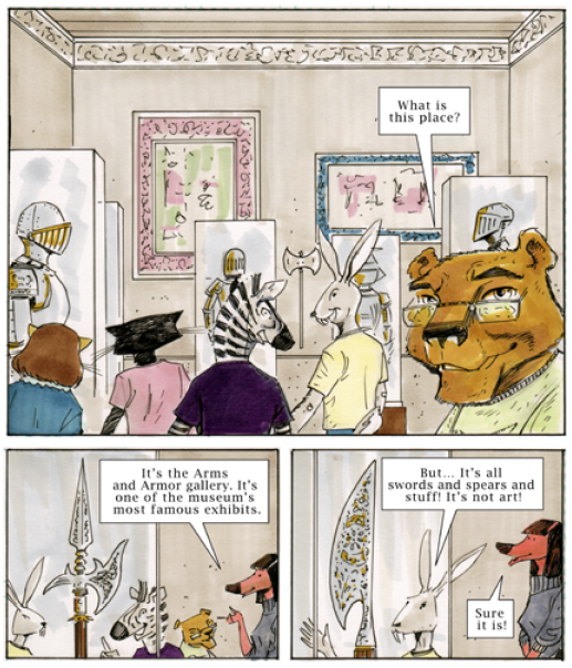
Unfortunately, the remainder of the stories in the Textbook are all actively bad (with one exception, which manages to only be mediocre.) The final comic in the social studies chapter, “Field Trip” by Russel Lissau and Marvin Mann, falls into the same trap as “The Power of Print.” The very under-developed plot (anthropomorphic animals look at armor and ancient weapons in a museum and imagine their uses) constantly makes reference to the interesting and intricate nature of the artifacts being discussed without ever showing a real picture or careful drawing of one. Given that the main character of the story, snobbish Caleb, considers all forms of art except weaponry “boring,” I think he would find this comic the most boring art of all, since it eschews actual pictures of the artifacts in question. This story falls especially flat for following directly after “The Black Brigade,” which manages to show an exciting battle scene without having anyone stand around wistfully talking about it first.
Although it might not seem like it, up to this point my dislike of the Textbook was only moderate. I believe that, despite the crushing mediocrity and odd choices made by some of the stories in the previous sections, elementary schoolers still have the potential to learn and retain some facts from these chapters (especially if led by a creative and adaptable teacher). It is with the math section that the Textbook stops being mediocre and begins being actively bad.
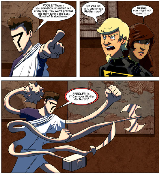
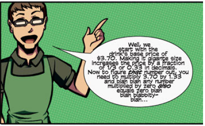
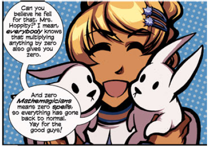
The first story in the math section is “Lumina: Celebrity Super-Heroine: Menace of the Mathemagician!” written by Josh Elder and drawn by Jen Brazas. It’s a shitshow. Keeping in mind that the teacher’s guide describes this as a story aimed at grades 3-6, I can not understand how Elder, the founder of Reading With Pictures, thought that a nonstop string of Twitter jokes, selfie jokes, and tired pop culture jokes (Gangnam Style? Really?) would be comprehensible, much less appropriate to the lesson. The art is very muddy, and the text almost unreadable. The story surrounding the lesson is laughably complicated; as an adult with a pretty good understanding of 3rd to 6th grade math, I could not easily parse out the math lessons contained in the piece (to be fair, there are several placeholder pages, so maybe a fantastic, clear math lesson is going to go in that empty space. Unlikely). Most of the math in the story is not real, but rather an idiotic series of plot devices (“For my first feat of prestidigitation, I multiplied Alpha Male’s 1 percent body fat by a factor of 70, thereby proving that bigger isn’t always better”).
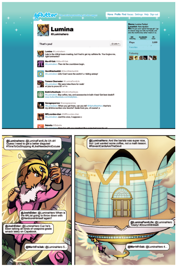
(This is somehow an entire page of a comic that’s supposed to be teaching fractions.)
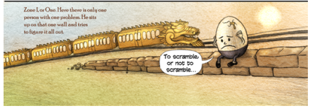
“Lumina” is followed by another miserably poor attempt at an educational comic, “Finding Ivy” by Michael Bramley. Bramley’s story is bizarrely high-concept, to a point that seriously undermines its simple lesson. The goal of the story, as far as I can tell, is to teach students how to read an analog clock, solve simple, time-related math problems, and recognize roman numerals. Maybe Bramley thought this would be too easy for 3rd through 6th graders, because the story he ended up writing is nearly incomprehensible. In “Finding Ivy,” time is represented as twelve different “zones,” each of them numbered. Each zone is arbitrarily inhabited by some magical character (and I do mean arbitrarily – zone one is inhabited by Humpty Dumpty, whereas zone ten is always Halloween because October is the tenth month). Three trains race from zone to zone, each representing a different hand on a clock. The zones are a big metaphor for a clock! Oops, I should have said ‘spoiler alert,’ because I just gave away the big reveal.
What I just summarized is only the framework for the story. The actual story itself is about a lost little girl named “Thyme,” who is assisted by a young man named Jung. Jung helps her escape from the station guard, who is a monster of some kind. They ride the trains around until Thyme is reunited with her family, and Jung gives her a pocket watch, which doubles as a map in Bramley’s needlessly complicated Neil Gaiman-nightmare of a universe.
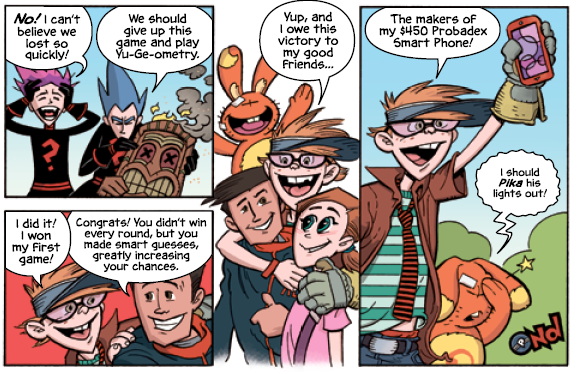
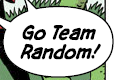
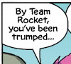
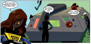
Continuing the math section’s streak of embarrassing failure is Geoffrey Golden and Nathan Pride’s “Probamon,” a Pokémon parody that would have been horrible in 1998, and is no better now. “Math Addem” (GET IT?) is a Probamon trainer who doesn’t understand probability, causing him to lose all his Probamon to Team Random (referred to as Team Rocket in one panel, oops). Of the four stories in the math section, this one comes closest to actually teaching math, but buries its only useful diagram repeatedly underneath dated pop culture references and Pikachu jokes. It reads like the worst ripoff Mad Magazine parody of Pokemon possible, and emphasizes everything it possibly can over the math parts, which it seems to consider boring.
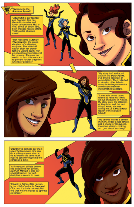
The final math comic, Jim McClain’s “Solution Squad,” is bad to the point of making me not even wanting to write about it. The story itself is constituted of unreadable walls of boring text, and does not contain any useful math concepts. Oh, and the only black member of the eponymous Solution Squad is named “Equality.” The story is so devoid of anything actually relating to math that the teacher’s guide suggests having the students calculate the number of handshakes that would take place if every member of solution squad shook every other member’s hand, an exercise that would work just as well if the students were shown a picture of any six people in the world**. It’s a completely worthless addition to the book, and, if the teacher’s guide is followed as written, a waste of a math period.
The final section in the book covers physics, and while it isn’t quite as bad as the math section, it’s not for lack of trying. It opens with Roger Langridge’s “The Adventures of Doctor Sputnik: Man of Science!” a story nominally meant to teach the basics of Newtonian physics. The problem is, Langridge does a terrible job of illustrating the principles he’s trying to teach, to the point that some panels would give a student learning these principles the completely wrong idea. For instance, in demonstrating the law of inertia, Langridge uses this panel:
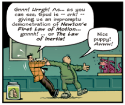
The problem is, the law of inertia states that an object at rest will stay at rest unless acted upon by an outside force. By drawing the professor yanking on Spud’s arm, Langridge is representing a strong outside force being placed on Spud, who is resisting it, thereby completely misrepresenting the law.
Langridge then makes the baffling decision to jump straight from Newton’s first law to trying to explain how friction works, something well beyond the scope of this lesson. What’s worse, not only does he bite off more than he can chew, he makes another fundamental error in his illustration of air resistance:
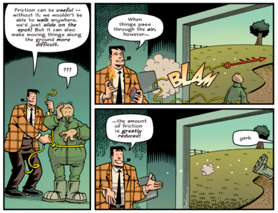
Langridge’s illustration suggests that it is easier to move Spud because the force moving him is flying through the air, which is again painfully wrong. Spud’s mass and friction against the ground haven’t changed, meaning that the forces acting on him have nothing to do with friction, and everything to do with the mass and velocity of the object exerting force. To a first time reader, though, this sequence clearly shows that it’s easier to move things if the acting force is moving through the air. (All of this, by the way, comes before Langridge even gets to Newton’s second law of motion.) It’s a mess, and could actively harm students’ understandings of basic science, which is inexcusable.
The second to last comic in the Textbook is the exceptionally bland “Like Galileo,” by James Peaty and Tintin Pantoja. It’s a very straightforward biography of Galileo, illustrated without humor or nuance. There’s really no reason for it to be a comic, since the drawings are all very static images that could be swapped out for more useful images such as a photograph, a detailed drawing of a telescope, or a portrait of Galileo. This is about as bland and traditional as educational comics get.
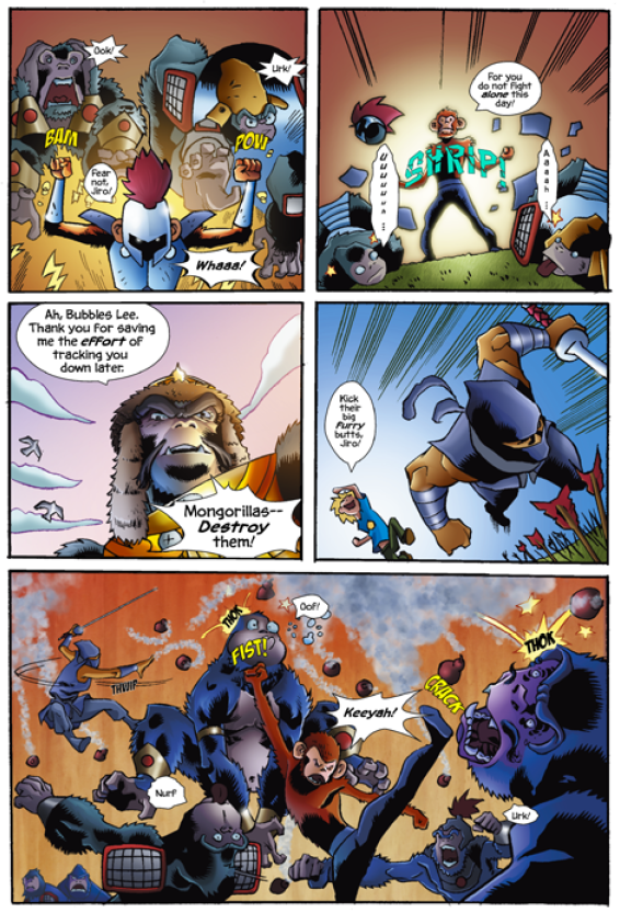
The final comic in the book is also one of its worst. Written once again by Josh Elder and illustrated by Tim Smith III, “Genghis Kong and the Silverback Horde” is a long, violent mess of a story containing only one scientific concept and a host of orientalist tropes. The story doesn’t have much body to it, just a giant gorilla dressed in his D.W. Griffith best and a lot of idiotic ninja fighting. The one scientific principle in the story is the square-cube law (which determines how large an object/creature can plausibly get), which I cannot remember ever appearing on any elementary science curriculum (and if it did, certainly not on its own). The teacher’s guide recommends spending 2-3 class periods on this garbage comic, a sample of which is below:
Given the quality of Josh Elder’s contributions to his own project, I begin to see why the rest of the book is riddled with so many terrible decisions. There appears to be no unifying editorial oversight, and the focus seems to be on drawing comics first, and then retconning them into being somehow educational second. Unfortunately, that’s not at all how textbook-writing works.
There is one more document to look at before I pass a final judgment, and that’s the teacher’s guide, specifically, the comics included with it. Upon opening the Teacher’s Guide, the first thing a reader sees are a couple pages about how to read comics. That’s useful information (although I would think it better suited in the textbook itself, for the students). What follows, though, blasts past the line between “useful” and “self-congratulatory” and gets well into “masturbatory” territory: an eight page comic about the maligned wonders of comics. Created by Fred Van Lente and Ryan Dunlavey, “Comics and the Classroom: A Match Made in History” is a crudely drawn mess. It presents a history of the American comic book, starting with Gaines and E.C., and moves clumsily through stories of various other heroic white men, contrasted against uninteresting, prudish, “others.” It’s just so totally unnecessary as a forward for this teacher’s guide, and it reads like a crash course on a very specific type of comics culture, one that a teacher should not have to be a part of to use The Graphic Textbook. Most jarringly, Van Lente and Dunlavey include this panel:
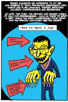
Again, this is an instance where a scan of a Milton Caniff original would have been fine. It frankly disgusts me that they took the time to re-draw this kind of racist trash, and that they seem to think it’s all a big joke. There’s no condemnation of this image other than as ‘propaganda,’ I mean, they could have saved 8 pages of terribly drawn comics history and just said, “COMICS ARE WRITTEN BY AND FOR WHITE MEN.”
The other comics in the teacher’s guide are both boring and unimportant (one is a two page comic that reads, in its entirety, “Everyone has heroes. Some real, some fantastical. But did you ever wonder… who they consider heroes?” HINT: THE ANSWER IS A TEACHER LIKE YOU! THANX FOR BUYING THIS BOOK!) The final comic drops all pretensions and apes Larry Gonick outright, presenting the reader with a nerdy professor/narrator who takes the reader through time, showing examples of comics through the ages. It’s unfunny and awful, and it made me wish for the hundredth time that I was just reading real Larry Gonick comics instead of poorly planned, unedited junk.
In keeping with the educational theme, I would give The Graphic Textbook a D-. As a teaching tool it’s largely a gimmick, far too few of the comics inside even topping mediocrity. Notable exceptions like “The Black Brigade” are drowned out by the sheer terribleness of entire other sections. For this project to have worked, it would have required an editor ensuring a consistent level of clarity and accuracy, this seems to have had neither. It pales in comparison to Larry Gonick’s similar books, and frequently does not justify its own existence. If this is comics’ ambassador to the elementary classroom, it might be better if comics keep out.
—————————————
* “Comics are effective teaching tools because they require readers to not only passively receive information, but to interact with the text and images to construct meaning, and that is the key to the magic,” boasts the teacher’s guide.
**The exercise would actually be improved, because no students would have had to read “Solution Squad.”
—————————————
Update 3/14:
Since writing this review, Kickstarter backers received complete PDF files of the finished textbook and teacher’s guide. Some things have changed dramatically, and I wanted to address them.
An introductory section has been added to the textbook, containing a one page comic by Gene Luen Yang (summary: Comics! They’re great! I’M great!) and a prose introduction by Josh Elder. Elder’s introduction contains the same kind of bombast as the Reading with Pictures site (this is only a small sample):
…The Graphic Textbook uses the comics format to make traditional educational content more engaging (especially to struggling readers), more efficient (for more advanced readers) and more effective (for all readers).
(This infuriates me about as much as you would expect given the actual quality of the textbook.)
Except for their order, the majority of the stories in the textbook are completely unchanged from the pre-publication copy I reviewed. I was disappointed to see that nobody had changed the obvious typo I pointed out in the “Probamon” story (doesn’t anyone read my scathing reviews? Anyone???) but I guess it’s stupid of me to expect any level of editing in this book.
(oops)
Two stories have changed majorly since my initial review. Those are “Solution Squad: “Primer,”” written by Jim McClain and illustrated by Rose McClain, and “Lumina: Celebrity Superheroine in “Menace of the Mathemagician,”” written by Josh Elder and illustrated by Jen Brazas. I’ll write a little about each, since I would feel unfair if I left this review as-is, given that the stories differ significantly from their pre-publication equivalents.
Jim and Rose McClain’s Solution Squad has undergone the most dramatic transformation between the pre-publication and final copies of the textbook. Instead of the highly truncated story in the pre-publication copy, McClain republished the entire first issue of his independently published Solution Squad (minus some supplementary character background information). The infamous “handshake problem” is no longer the focus of the lesson – it’s been replaced with a fairly thorough explanation of how to find prime numbers using the sieve method. So do I like it better?
Unfortunately, the answer is still a solid no. The Solution Squad story is now twenty-four pages long. Twenty-four pages! The first twelve pages are completely (and I mean completely) unnecessary. They contain zero math concepts, instead focusing on the day-to-day minutiae and incredibly complex backgrounds of the members of Solution Squad. Six full pages are devoted to the workings of a prime number sieve (a standard textbook could explain this simple tool using one or two small illustrations and a short text explanation), and the remaining six pages are, again, unnecessary exposition.
Now, I know I’m purposefully missing the point here – Josh Elder might say, “yes, the comics are decompressed, but it helps kids understand these concepts better when sympathetic characters are acting them out and taking the time to explain them!” I can respect that, but I’m sorry to say that it’s not what I’m seeing in this case. If the comic was limited to the six pages that explained the sieve, I might be more sympathetic, although the art is fairly confusing. At its core though, this is a fine lesson: here’s how to find prime numbers, and now let’s use that to decode a message. Very good. What I can’t tolerate is that seventy-five percent of a twenty-four page math lesson is completely devoid of math. The story reads like Jim McClain wanted to write a cool superhero story and the math was an afterthought. None of the complicated character dynamics, arcane backstories, elaborate seatbelts or pneumatic tubes Solution Squad moves through are important when it comes to the only relevant part of the story: those six pages that explain, step by step, how to make a prime number sieve. If anything, those six pages frustrate me more than anything else in Solution Squad, because they indicate a potential for actual educational value that much of the textbook lacks. If a good editor had made McClain focus more on the teaching parts (he’s a math teacher with twenty-seven years of experience! He knows his stuff!) and less on the “wow, I get to write a really complicated superhero comic!” parts, it could have actually been good (or at least, you know, educational), instead of the confusing space-filler it is now.
Josh Elder’s Lumina story has also been lengthened by several pages in the final version of the textbook. Unfortunately, that added length does not bring any added quality; the new pages are entirely consistent with the pages I’d seen previously. Josh Elder, despite his boisterous claims about the quality of his educational comics, does not seem interested in teaching anything. Math is treated in this comic like Star Wars is treated in The Big Bang Theory.
Pages and pages of Twitter jokes (outdated even now, since the site has gone through one if not several redesigns since this comic was drawn) crowd out the fleeting references to actual math. When I originally reviewed this section, I worried that I wasn’t being fair and that the placeholder pages indicated that something much more substantial was coming. I was being much too generous. This story teaches literally nothing about math. Math is referenced only tangentially (“Rabbits, you see, just love to multiply”), and treated as boring. Yes, there are panels like this:
but I refuse to acknowledge these as actually teaching math. Math isn’t taught in throwaway panels, and you can’t teach math through brief, winking references. Elder’s story fills ten full pages of this so-called “textbook.” One and a half pages are devoted to shitty Twitter jokes. The rest aren’t any better (“Flight achieved by subtracting 90% of his personal gravity– like a boss!”). This is pathetic. And I’m not even able to say, “at least it’s a fun comic!” The story is terrible, the art is uninteresting, and the math is missing. Hardly “more efficient” and “more effective.”
I would be remiss if I didn’t mention that an entirely new page was added to the math section since my initial review. Written by Jason Allen and drawn by Heidi Arnhold,“Squirrels vs. Birds “Prime-Composite Showdown!”” is a one-page word problem that simultaneously undermines the concept of the book and yet manages not to rise above Lumina’s standard of quality. Here’s the page in question:
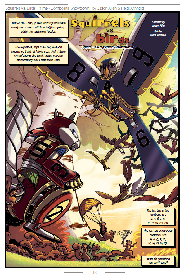
Seeing this page immediately after Lumina is jarring. Given that it’s only a page long and it has more math in it than Lumina did (not that it explains anything – what are prime and composite numbers?), it’s hard not to read it as an argument in favor of traditional textbooks. This is, essentially, a basic word problem with a pulpy illustration. It’s clearly a better use of space – you don’t need ten pages of bad Twitter and Gangam Style jokes to teach a basic math concept. Unfortunately, the problem doesn’t make any sense. In keeping with Graphic Textbook tradition, no editor seems to have looked at this page. In fact, this page would work significantly better without any illustration, because the words and images work together to make this question incredibly confusing. The robots have prime and composite numbers painted onto them, and the word problem draws no connection between the number (or strength) of either side and their respective number sets. So, when the question asks, “Who do you think will win? Why?” there’s no good answer. Will the robot with bigger numbers painted on it win? Will the robot whose set gets larger more quickly win? It’s totally unclear. What is clear is that Allen and Arnhold wanted to draw some robots. Contextually I take it the squirrels are supposed to win, since the birds’ robot is described as a “monstrosity.” This page isn’t referenced in the teacher’s guide, though, so the “correct” answer remains a mystery.
Despite the differences between the pre-publication and final versions of the Graphic Textbook, my review score remains an emphatic D-. Reading through it again to write this update has rekindled my frustration with the book, especially since Reading With Pictures recently announced that the textbook will be distributed by Andrews McMeel Publishing. The thought of kids having to read this book depresses me. Hell, the thought of the earnest, well-meaning people who made this book depresses me. Despite all the good intentions in the world, The Graphic Textbook is a waste of money and time. With only a couple exceptions, none of the comics in this book are worth reading for any reason, much less educational ones. This textbook is amateurish and bloated, and accomplishes exactly zero of its stated goals. It’s bitterly ironic that a book so invested in the idea of comics getting respect deserves so little. Without question, there are opportunities for comics to be used constructively in the classroom. But educational materials require an understanding of their audience that this cudgel of a book does not have. This book fundamentally underestimates kids – it underestimates their attention spans, their sense of humor, and their ability to learn. If any good comes of this book, it will come in the form of rebellion against projects like this. Kids demand higher standards than The Graphic Textbook can dream of.