The Sex Element, part 1

We’re doing another series of themed posts, this one about sex and comics. Decades ago Peter Cook did a funny routine about a coal miner who wanted to be a novelist but whose novel got turned down “because it lacked the sex element.” I’ve always loved that phrase.

I can list seven sorts of comics that involve the sex element.

1)  European works that involve fancy drawing and some kind of non-sex draw, such as satirical future fantasyscapes where women in strapless gowns have television sets for heads. This is the Heavy Metal category. The result of the sex element is that everything else in the work gets skipped.
2)  European works that involve fancy drawing and no sort of non-sex draw. This is the Milo Manara category. The result of the sex element is that the reader spends 20 minutes rooted to one spot at Jim Hanley’s Universe and wonders if anyone notices.
3)  Self-revelatory works where the artist gets down to the inner recesses of his being and finds the usual sort of crap we keep there. I guess Crumb is the big example. The sex element in these works might or might not strike you as sexy; it doesn’t have to in order to get its job done. Whereas in the first two categories it does.
4)  Works about daily life that show people having sex because that’s what people do. Alison Bechdel, Alex Robinson, Terry Laban. Robinson’s Box Office Poison has one of the most effective sex scenes in comics, but the scene is not sexy. It just gets across the experience. A problem with these works is that you can feel like the author is demonstrating a point: See how mature and adult I am? 
5)  Tijuana Bibles. I’ve never seen one of those. (UPDATE:  But Matthew J. Brady says you can find them here.)
6)  Japanese pervy stuff. The kindergarten aspect of these works is very offputting.
7)  Lost Girls. Man, did that suck. For one thing, the artwork made everything look like copulating trombones. For another, Alan Moore can be very, very silly. He wanted to do intellectual pornography, which is right up there with wallpaper you can hum or toothpaste that rhymes. Also, his idea of what constitutes an idea can be awfully generous, not to say lax. 

Comics of the Future…Today!

Best American Comics 2053
Edited by Philoctetes Crumb, Jr.

Yes, it’s still got the same title, even though the Galacticon/Cylon Confederacy officially conquered the planet five years ago. I guess it’s a nostalgia thing? Or a political statement? Because nothing says, “Fight the power” like fourth-generation underground comics royalty editing a boring fucking anthology, I guess.

So what do we got here anyway? Hip, Viagra-addled eightysomethings whinging about their artificial nether-prosthetics? Check. Ivan Brunetti with a raw, tasteless strip about how he’s sorry he can’t kill himself now that he’s transplanted his brain into an invulnerable titanium computer? Yep. Some Frank Miller clone (yes, literally ) writing the newly public-domain Jimmy Corrigan as a two-fisted Wolverine knock-off (“I’m the most complexly ambivalent at what I do…but what I do isn’t very nice”)? You betcha. (Actually, that last one is pretty funny. I knew the orphaned works law would be good for something.)

Naturally, there’s still no manga coverage. At least, though, the venerable series has finally, finally, finally decided to acknowledge the existence of Psycomics. Guru McCloud himself is represented with an excerpt from his latest: Defibrilating Comics. With the new lasex surgery laws, his icon doesn’t have glasses, and it’s hair is white — and, of course, it appears on the inside of your eyeballs. But never fear, it’s still blocky and ugly and it still won’t shut up! “Gosh, gee, the brain stem is just another medium to deliver the ever expanding, ever inventive world that is comics and I’m going to show you all of its wonderful potential by standing stock still and nattering on and on just as if I’m one of those hideous nanotisements from the twenties! Ain’t progress grand!”

As has been the case since the early forties when the remnants of the big two merged, there’s one entry devoted to the latest DC/Marvel crossover kerfuffle. The average super-hero reader is, of course – well, actually, there are only two of them. They are both 98 and male and have been reading comics for approximately 90 years a piece. Apparently what they want are comics entirely about Hulk rape. “Hulk rape Thing! Hulk rape Ms. Marvel! Hulk rape Dr. Light! Hulk rape Jughead!” That’s all this strip is; 35 pages of Hulk rape. I think that makes it sound maybe more interesting than it is, though. Because while Hulk is raping the text is mostly devoted to a lot of explication about how the heroes are the greatest heroes ever, and then they’re still the greatest heroes ever and aren’t the Justice League of Avengers the best? Then in the middle Hal Jordan explains why Bruce Wayne isn’t Green Lantern, which has to do with Superman being depowered and eating Galactus (hopefully not in a sexual way. Ugh.) And Sue Dibny is resurrected as Caspar the friendly Ghost III. Or maybe she’s actually the Phantom Girl or something; there was a mini-series they were all telling me to read over at Occasional Superheroine because, you know, it featured a woman, but…well, I didn’t. Sorry. Anyway, as it turns out, Hulk can’t rape you if you’re incorporeal, so that’s a plus.

I know, I know…the Beat’s gonna be on my case for not being sufficiently nice. And I have to admit, it’s not all downside. Sure, the content in Best American Comics 2053 is wretched. But at least you can’t actually buy it anywhere. Thank God for the ongoing economic contraction and the horrific, systematic destruction of our civilization. No race that produces crap like this deserves to live, anyway. All Hail the Cylons!

imaginary comics, part 3: “portnoy’s complaint”

I guess it’s not surprising that Philip Roth is the latest literary darling to jump on the trend of adapting his work to comic-book form. Perhaps inspired by David Mazzucchelli and Paul Karasik’s City of Glass or Asaf Hanuka’s Pizzeria Kamikaze, or in a bid to seem relevant amongst younger Jews-about-town like Michael Chabon and Jonathan Lethem, Roth has commissioned a graphic novel of his 1969 opus Portnoy’s Complaint.

What is surprising is his choice of artist. Rather than R. Crumb or Art Spiegelman, artists with similar enshrined statuses in their fields and somewhat Rothy down-and-dirty semi-confessional aesthetics, he tapped prince of the pretty-boys Craig Thompson.

Portnoy’s Complaint the graphic novel is a fairly slim volume (it was apparently drawn right before Thompson began the final pages for Habibi) coming out next year from Houghton Mifflin. I was of course able to get a galley due to my mad connections in the jewy/comicky/academic world.

Thompson’s drawing style fits the narrative seamlessly sometimes; his swoopy expressionism sets off the various flashbacks well, and the scenes set in the psychologist’s office show Alexander Portnoy (Good Bye Chunky Rice style) adrift on his couch in a swirling sea, while Spielvogel looms like an impassive, wooden dock. Thompson also has had a lot of practice conveying acute shame on pious young boys, which make the bar mitzvah lesson scenes and the liver masturbation scene even more tortured and memorable than in prose.

But in the adult flashbacks, there’s a real tension between the approaches of the two authors’ literary personas: Roth the great misogynist and Thompson the rapturous girl-worshipper. Despite a lot of similarities one can draw between Thompson’s oeuvre and Portnoy (flashbacks, childhood trauma as a key to adult dysfunction, outsized sexual longing), I got to wondering if Roth chose Thompson for the book just to watch him squirm.

The squirm of the artist is practically palpable in the oral sex scenes (man do I wish I was allowed to scan and post those). And when portraying the shallow, illiterate supermodel lust/hate object known as the Monkey, Thompson, without veering from the text, makes her a lot more human than Alexander can see (maybe as a working class small-town Midwestern boy himself, Thompson identified with her more than the protagonist).

Sometimes Thompson goes too far in trying to pretty everything up; the Portnoys mostly seem like nice, vaguely ethnic people rather than the “Jewish joke” Roth described them as. But the mis-fit of Thompson and Portnoy makes a really fascinating text and counter-text (or second text) interplay. Thompson foregrounds the fight that is often overlooked in the text, by embodying with his art style the Nice Jewish Boy masking the Dirty Jew-boy inside.

It’s a bit rocky in places, but I think it’s my favourite Roth creation, and just might be my favourite Thompson creation as well. You should look out for it.

Imaginary Comics, part 2: “Uneven Hills”

Bill made up a cartoon sketched on a series of tea leaves. What I have is a set of pages that were not published as part of the Absolute Sandman series. Neil Gaiman, hitting the crest of his early comics career, did not contact an aging Jack Kirby and, in a fit of sentimentality and cross-talent brand promotion, persuade him to illustrate the gala fiftieth issue of Sandman, which was not titled “Uneven Hills” and did not concern Morpheus fallen among the Amazons and embarrassed by his long-ago affair with Hippolyta, Wonder Woman’s mother, with implications for Lyta Hall’s eventual vendetta against him.

Kirby did not draw a Morpheus with doorknob-sized cheekbones and a forehead reaching three feet above his nose. The following elements did not appear: Amazons with cantaloupe-sized muscles and shoulders the width of Victorian cabinets; sly references to Kirby’s part in creating the previous Sandman, Lyta Hall’s late husband; playful juxtapositions of Morpheus’s cheekboned languor and the Amazons’ beefy force; a four-page sequence, tailored to Kirby’s skills, in which Amazons hauled the stricken Morpheus on a massive chariot past trophies of the ages.
Kirby did not balk at Gaiman’s idea, which he did not have, of a row of Amazons archers, each one missing a breast because of Gaiman’s fidelity to classical sources. Roz, Kirby’s indomitable wife, did not have to intervene and did not spawn a winsome anecdote Gaiman retailed in later interviews about a telephone being wrestled from one Kirby to the other while Neil reasoned with the elderly artist. The nonresulting Amazon chests did not resemble the Astrodome standing next to a parking lot.

The nonexistent project did not have to be aborted because of Kirby’s illness, and there were no rumors that Walt Simonson would finish the art so the issue could appear in a  Sandman trade paperback. In the late 1990s, Vertigo did not transplant a character from the nonexistent issue, a spunky and undernourished teen Amazon named Hy (for Hyacinth), into The Dreaming and then give her a pocket-size manga series written and drawn by Jill Thompson.
The 17 more or less fully drawn Kirby pages and three remaining penciled roughs were not given pride of place in volume 3 of Absolute, the lines’ charcoal black not glowing against pages the color of whipped cream.
All that happened was that I wrote this post.
UPDATE:  Big Barda should be in there someplace, possibly a big fight sequence between her and an Amazon (some old rival of Wonder Woman’s?) in which Kirby could draw big fists and Gaiman could do some destabilizing of gender patterns. 

Imaginary Comics: Tea-Time #1

Review of Tea-Time #1
By Anonymous?
From a tea farm in Taiwan
Four leaves, $9.95/2 oz
Green Oolong

Like everyone else, I wake up with hot caffeine. Lately, it’s been loose-leaf oolong tea. The leaves’ pellets unfurl in the water. Usually I reinfuse them a couple of times and toss them in the compost.

Today the sun caught them just so and I noticed lines. Puzzled, I laid them flat on a screen and air-dried them. I was surprised– nay, astonished– at what I saw.

Each leaf has drawings on it.

And you can arrange them into a story.
Because the lines are thinner than the flesh of the leaf, they catch the light. I can’t tell if they’re hand-scrawled or genetically engineered, like those Chinese pears biotweaked into volleyballs. I also don’t know who the artist is. The characters on the side of the package read ? ??– I know the first means “leaf,” but is it the art form? The artist? Is it a marketing gimmick or Labor’s cheeky revenge?

I do know the critic’s job is vicious precision, so I must say I’m disappointed. The drawings suck. No verve, no bounce in the line. And the story’s just a four-panel gag. With all those leaves, ? ?? could have told a multigenerational epic. Love, death & tea on Tung Ting Mountain, spanning from the Occupation through martial law and the Kaohsiung Incident to the uncertain present? Instead it’s just the parable of a pleasant cup.

Drink and you miss it, I guess. But it raises a problem for the diligent reader: that everywhere around, comics wait to be discovered. A bored dentist’s doodles on the panels of your teeth, Fibonacci storytelling on sunflower seeds. No word on whether Sebastião Salgado’s printing his worker-saint photos on each ground of Illy’s coffee, but I’ll keep my eyes open.

Manga: What is the Point, deluxe edition

One of the fun things about Bill’s post is that it puts chip-on-the-shoulder manga defenders like me in our place. I mean…why do you need to defend manga anyway? From what? Certainly, manga in Japan is facing a lot of challenges right now, but those challenges just can’t be said to include moderate skepticism — or, for that matter, outright hatred — on the part of some American consumers.

So, having admitted my defensiveness is kind of ridiculous, I’ll proceed with it anyway. One thing Tom said in comments kind of bothered me:

On the pacing issue … to me the problem isn’t so much fast pace, since I like speed in comics, just the idea that on any page of manga all you’ll get is picture-word balloon-sound effect, with the word balloon constrained to hold not much at all. For example, I like the caption-picture juxtapositions Moore and Gaiman used to do in the 80s. I gather that in manga such tricks are impossible and so are any other word-picture gimmicks/innovations a clever writer or artist might come up with. Yikes.

I don’t think that’s right. Yes, manga is designed for faster reading, and uses fewer words than American comics. But I think that manga-ka use a lot of thoughtful word-picture juxtapositions. In comparison, I think a lot of Moore’s tricks (using quotations to comment on different action sequences, juxtaposing image with image to fade from one scene to the other, etc.) are pretty clunky (though I often like the clunkiness; Moore’s heavy hand is its own kind of pulp sublime.)

Anyway, I thought I’d look at a couple pages from one of my favorite series, Let Dai by Sooyeon Won. It’s from Korea, so it reads left to right. I chose these pages more or less at random. Here’s the first:

Photobucket

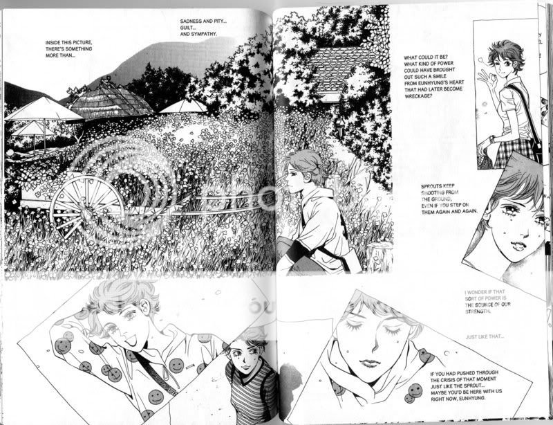
Here the characters are looking at a series of pictures of a friend. So the panels here become the photographs. The upper-left image is very detailed, suggesting the sharpness of the memory. The rest of the images are distributed around the page, like photos spread out. One of the pictures on the right is actually cut off by the page edge. So you go from a very vivid memory to a sense of diffusion or loss; of a memory cut off and lost. The text at the same time is questioning the memory, “Inside this picture, there’s something more than…sadness and pity…guilt…and sympathy” and then on the other side of the page, “If you had pushed through the crisis of that moment just like the sprout…maybe you’d be here with us right now, Eunhyung.” The text, in other words, is encouraging you, not to fast forward through these images, but to look at each picture of her face to try to understand her, and why she is gone — an understanding which can, of course, only be partial (again emphasized by the fact that the pictures are partial and in one case actually cropped off.)

Here’s the following page:

Photobucket

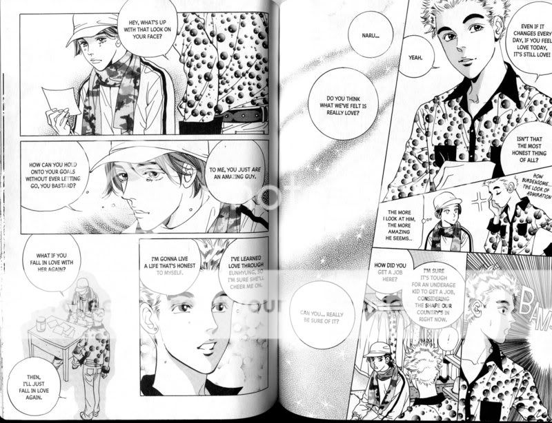
This is less daring, obviously, but there’s still a fair bit going on. I like the way, on the second page, the conversation shifts to being more philosophical, about love and uncertainty, and so the image turns to just designs and filler; a sort of celestial, indeterminate test pattern, I also like the move to hyperdeformation in the middle of the second page. “The more I look at him, the more amazing he seems” thinks Jahee (in the baseball cap) and this sort of goofily childlike idea visually infantilizes him.

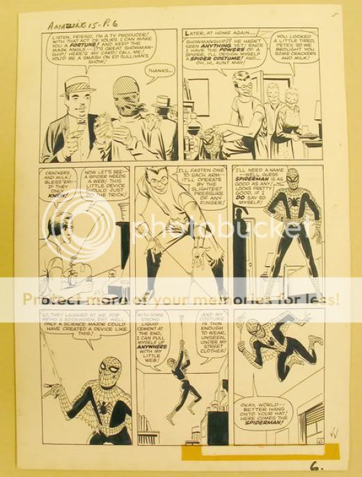
I mean, obviously everyone isn’t going to like this. You might not like the melodrama, or, like Miriam, the art may not do it for you. But I think it’s pretty clear, even in just these two pages, that the creator is attentive to how words and images go together, and that she uses various techniques and resources to combine them and tell her story. Certainly, she’s got more going on than this stuff, where the pictures and story both go happily on their way as if completely unaware of each other:

Photobucket

I’m just sayin’, is all.

Going back to Let Dai for a moment, Miriam asked in her post:

Can you take a really good shojo or shonen manga, and read it several times, and see different shadings or interpretations each time? If not, then I guess I’m not the target audience for shojo manga, much as I love romance and heartbreak and interpersonal intrigue and all that stuff.

I haven’t read Let Dai over, not because I don’t think it could take it, but because I’m not sure I could — reading it the first time kind of reduced me to a weeping wreck, and I’m not ready to go there again. But…yeah, the manga series I’ve loved have totally held up on rereading. For what that’s worth.

Update: Hey, look, something on the Internet that pisses me off! Katherine Farmer responds to Tom’s post by throwing herself at her high horse, missing, and bashing herself in the head.

What’s more, it irritates me intensely when people stand up and say “I am ignorant; educate me!” when, frankly, the resources are out there for them to educate themselves if they cared to put the effort in. I considered making a comment to Crippen’s post, but decided against it, because hey! I don’t actually give a damn if he likes manga or not, and it’s not my job either to do his homework for him or to defend the honour of manga. Manga needs no defence, from me or from anyone else.

Okay. But then why do you go on and on snarkily defending it? Why brag about how you didn’t leave a comment because you don’t care and then write a gigundus post about how much you care?

It’s a freakin’ conversation, not an exercise in moral climbing. Take a lude. And stop making me embarrassed that I like this stuff, would you?