Utilitarian Review 3/8/13

News

Tom Spurgeon reports that Kim Thompson has been diagnosed with cancer. I had my first online troll battle (via email) with Kim way back when. I hope he beats this thing and is around for many more. You can find the address to send well wishes at the link.
 
On HU

Featured Archive Post: Jog on Alan Moore and his collaborators.

Me on Darkest America, a book about the black blackface tradition.

Me on Nate Silver and the morality of prediction.

Alex Buchet on the cartoons of bandleader Xavier Cugat.

Kailyn Kent on gallery art and comic book splash pages.

We started organizing our upcoming music roundtable.

I argue that film Boromir is better than book Boromir.

Domingos Isabelinho on Jochen Gernet. Watch Betty and Veronica race to the war!

Jacob Canfield on poetry about the Legion of Super-Heroes.

Our Friday music sharing post, featuring Brooke Valentin’s The Thrill of the Chase.

 
Utilitarians Everywhere

At the Atlantic:

— I talk about Julia Stiles’ YouTube series Blue, and the obsession with the secret lives of prostitutes.

— I review the Suuns new album — indie rock for the state fair.

— I review the documentary It’s a Girl, about sex selective abortion in China and India.

At Splice

— I argue that if you’re not going to moderate comments, you should just get rid of them.

— I review Tweet’s lovely new ep.

images

 
Other Links

Slate on Shirley Jackson.

C.T. May on Isaac Hayes and the alternative minimum tax.

Felix Salmon tells internet freelancers to abandon all hope.

Molly Westerman on how her son fell in love with a girly book series.

The Producer of the film It’s a Girl responds to my review.
 
This Week’s Reading

I finished Anne Bronte’s Tenant of Wildfell Hall (which was a bit disappointing.) Read Christine Yano’s Pink Globalization about Hello Kitty’s global reach for a review. Started Stephenie Meyer’s The Host, also hopefully for a review.
 

Monthly Stumblings # 20: Jochen Gerner

Panorama du feu (a view of fire) by Jochen Gerner

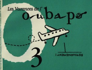
Jochen Gerner was a founding member of the OuBaPo (Ouvroir de Bande Dessinée Potentiele – or, the Workshop for Potential Comics, best represented in the US by Matt Madden, Jason Little and Tom Hart). Modeled after the OuLiPo (Ouvroir de Literature Potentielle – workshop for potential literature) created by Raymond Queneau, the OuBaPo aimed to explore new ground for comics using, paradoxically, constraints as a creative motor. The OuBaPo published four books to date (the last one in 2004) all by the dominating force behind the project, Jean-Christophe Menu and L’Association publishing house. Even if engaged in other projects the work of Jochen Gerner is never very far from OuBaPian creative processes.

1


Les Vacances de l’OuBaPo (the vacations of the OuBaPo), Oupus 3, L’Association, October 2000, illustration by Jochen Gerner.

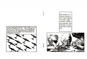
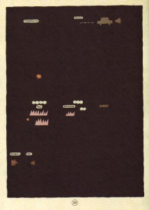
Jochen Gerner views himself as a draftsman who does comics among other things. Represented in France by Anne Barrault Panorama du Feu was part of Jochen Gerner’s second exhibition at said art gallery in 2009 (the first one happened in 2006). The theme of the exhibition was the four elements: earth, air, water, fire. A year later L’Association published Panorama du feu (the “fire” part of the exhibition, of course) in a cardboard box, surrounded by a paper ribbon with the word “Guerre” (war) written on it, containing fifty-one booklets numbered from zero to fifty. Each booklet is the reworking of what’s called in France the “petits formats” (the little formats), cheap, mass art comics imported mainly from the UK (published there by Fleetway) and sold in newsstands from the 1950s (or even earlier) until their decline in sales during the 1980s and disappearance in the early 1990s. The genres included in Panorama du feu are War, of course, but also Western, Espionage, and even a Tarzan look-alike produced in Italy, Akim. In each of these eight page booklets (cover and back cover included; booklet number zero has twelve pages with an introduction by Antoine Sausverd) Jochen Gerner used two creative strategies: (1) the cover was blacked-out with India ink leaving a title formed by expressions found in the book and the name of the collection plus explosions and signs (circles, crosses) in (not so) negative space; (2) the interior retained some didactic essays, advertisements and other paratexts published in the original comic books, plus what Thierry Groensteen called “reduction” in Oupus 1 (L’Association, January 1997): the stories were reduced to four, five or six panels (one per page).

In Panorama du feu Jochen Gerner chose visual rhymes (airplanes or trucks in all the panels, for instance). He also favored more abstract images and close-ups.

1b


Airplanes (in perfect order and in chaos) in booklet # 40 of Panorama du feu, L’Association, September 2010: visual rhymes.

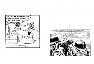
Besides being a non-conceptual reflexion (as Jochen Gerner stressed, saying that his is not a theoretical approach) on violent representations in petit format comics during the Cold War, what I find fascinating in the comic book reductions performed by Jochen Gerner is the contrast between said supposedly entertaining violence and a clear intention to be didactic including in the books many scientific essays. Below there’s an unexpected encounter between something as frivolous as Bettie and Veronica (Archie is here called Robert, by the way) and yet another image of violence. By mixing didacticism and comicality with the violence of war, the violent message was somewhat undermined or, at least, balanced by a variety of things, advertisements included.

Given the fact that Jochen Gerner reduced whole stories to a few panels it’s no surprise that many make little sense letting the reader with the strange sensation that something incomprehensible is going on (cf. below: infra-narrativity).

1c


Betty and Veronica run to join the French war effort during WWII? booklet # 33 of Panorama du feu, L’Association, September 2010: comicality undermines seriousness.

2


Page 38 of TNT en Amérique by Jochen Gerner, L’Ampoule, 2002.

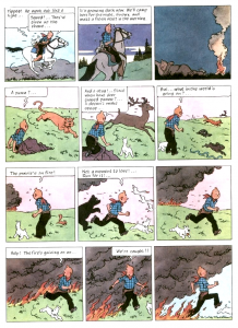
The blacking-out of covers and interior pages (as seen above: a détournement of Hergé’s Tintin en Amérique Tintin in America -, 1946 version) has its roots seven years before. In the above page the word “feu” (fire) appears (twice) and pictographs representing flames and smoke (plus a car and the words “poursuite” – “chase” -, and “route” – “road”) are similar to the covers in Panorama du feu. A look below at Hergé’s page blacked-out by Jochen Gerner in TNT en Amérique helps us to reach interesting conclusions:

3


Page 38 of Tintin in America as published in 1973 by Methuen (originally published in black and white in 1931 /32 and reworked by Hergé in 1946).

Diegetically two things happen in this Tintin page: Tintin escapes a persecution and flees a fire. In the tradition of creating suspense at the end of every odd page Tintin is almost caught by the flames in the last panel. The persecution (by the baddies) is represented in TNT en Amérique by a car and the words “chase” and “road.” In spite of Tintin riding a horse (the stereotype of the American cowboy imposes itself to a formulaic narrative) Jochen Gerner used a car pictogram to update the story. The animals on tiers two and three are almost ignored (the “almost” goes to the star pictograph, a symbol of trouble – emanata would have been more effective, maybe, but who am I to question Jochen Gerner’s choices?, maybe he sees emanata as too blunt a sign?). Most of the attention goes to the fire with an ironic devil chasing the hero: can he be a villain destined to burn in hell’s eternal flames in spite of his virtuous persona?

The general conclusion that we may extract from the TNT en Amérique example is that the two creative tactics described above (blacking-out and reduction) have the exact same result of reducing the deturned story to a skeleton.

4


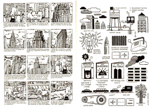
On the left: page from Courts-circuits géographiques (geographical short-circuits), L’Association, 1997; on the right, the same page as reworked for XX/MMX, L’Association, 2010.

The image above shows, on the left, a page of Jochen Gerner’s autobiographical book Courts-circuits géographiques; the image on the right shows the same page reworked for publication in XX/MMX (an anthology commemorating L’Association’s 20th anniversary). As Jean-Christophe Menu noticed in his thesis La bande dessinée et son double (comics and their double, L’Association, 2011), the evolution from representational (even if caricatural) to ideographical is clear, but even the older page shows a tendency to what Thierry Groensteen called, in Bande dessinée récit et modernité (comics, narrative and modernity, Futuropolis, 1988) “the inventory” (a subset of his concept of the infra-narrative).

5


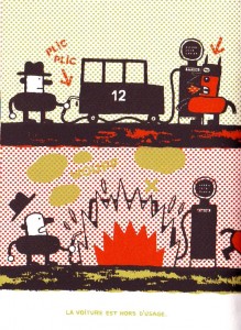
Malus by Jochen Gerner, Drozophile, 2002. A boon to a Ben-Day fetishist like me.

In Malus, as seen above, a silk-screened comic, Jochen Gerner illustrated real traffic disasters reported in newspapers. A creative tension is caused by the caricatural and schematic drawings depicting tragic events. A distance is created by the inadequate relation between form and content, or, to be more precise, the content isn’t exactly what one would expect given the source material. An ironic Dadaistic distance pervades all of Jochen Gerner’s work, but Malus is the height of this propensity. It shows Gerner’s tendency to explore – and short-circuit; cf. the Betty and Veronica example above – violent undercurrents in the mediasphere. TNT en Amérique lays bare, by reduction, how violent Hergé’s stories really are (TNT being, obviously, a reduction of Tintin’s name and an explosive). The same happens in Panorama du feu.

6


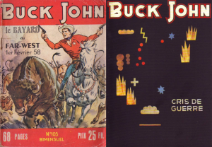
Left: Buck John # 105 (Buck Jones, I guess), Imperia, February, 1958; right: a deturned by black-out Buck John comic (not necessarily # 105, of course), Panorama du feu, L’Association, September 2010.

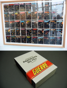
As we can see below Panorama du feu is a dual object corresponding to its two lives in 2009 (in an art gallery) and 2010 (as a series of fifty one comic books):

7


Up: Panorama du feu as exhibited in Anne Barrault’s gallery, September 2009; down: Panorama du feu as a box containing fifty one booklets, L’Association, September 2010.

In 2009 the fifty books were, as Jochen Gerner put it, like a giant battle ground as seen on a big control panel. Seeing the deturned covers behind glass encased comics come to mind. The act of reading is out of the question. On the other hand L’Association’s edition does almost the opposite, readers have access to the booklets’ content, but the ensemble is lost. Can these two forms of presentation be reconciled? I don’t think so, but one of the best solutions, I think, involved Jochen Gerner. I’m talking about Salons de lecture (Reading Rooms), an exhibition at the La Kunsthalle in Mulhouse:

8


Salons de lecture, La Kunsthalle, Mulhouse, February 3 – April 3, 2011.

In Salons de lecture readers /viewers were invited to sit and read, as we can see above. As I said, reading and viewing can’t be reconciled, but I like this Duchampian solution: it’s a visual arts exhibition because the La Kunsthalle is a place where contemporary art is shown. Plus: there’s the design with different colors for the six rooms available.

Here’s Jochen Gerner’s opinion:

Simply to place the boards adjacent to each other in a linear fashion is like trying to reproduce the phenomenon of reading a book. This can’t be right. But the exhibition Reading Rooms plays effectively with the principle of the book on a flat surface. The effect in this exhibition is almost that of a wall placed horizontally on trestles. The exhibition design and the graphic systems used to mark the placement of the books, plus the captions printed on the table propel these books into another dimension.


The Good Boromir

I’ve written a couple of posts about ways in which Peter Jackson stumbles in his treatment of Tolkien. Basically, these criticisms come down to volume; Jackson tends to want to turn it all the way up all the time. Tokien’s a pretty slow-going — or, if you’d prefer, boring — writer in a lot of ways, and the slowness and the boringness is central not just to the form and experience of the novels, but to their themes. Tokien is someone who, like the Ents, wants to sit back in some wooded glade and tell you the names of everything. He likes being slow, he likes being boring — which is to say, there’s a lot of room in his adventure novels for the appreciation of the joys of having nothing in particular happen. The way his narrative continually stalls out is central to the novels’ rejection of violence — a rejection which is ambivalent, but in many ways determinative. Jackson can understand and rejoice in Tolkien’s battle scenes (as Tolkien does himself) but not in Tolkien’s various numerous nothing scenes. The films, therefore, are garish and loud and busy all through, embracing Tokien’s flash and fire and drama, but not his long, slow, Treebeard-like pauses.

There are a couple of instances, though, where I think Jackson’s version is better than Tokien’s. One of the most noticeable of these is in the character of Boromir.

In the Fellowship of the Ring (which I’ve just about finished reading to my son), Boromir — like most characters in the novel, with the exception of Frodo and perhaps Sam and Bilbo — is not given a whole lot in the way of subtle characterization. We learn that he is very strong and proud, and also that he’s strong and not especially trusting, nor, perhaps, trustworthy. He helps the company by plowing through snow with his body when they’re trapped on the mountain. He disagrees with Gandalf and Aragorn about the path the company should take. He boasts about Minas Tirith and the strength of men. And that’s kind of it. He doesn’t become friends with any of the company. For that matter, he doesn’t become friends with the reader. He’s a mighty, proud man, off there being mighty and proud, and then he tries to take the ring from Frodo like a dickhead, and then he dies mightily and proudly in battle. And overall it’s just hard to care that much.

The film, though, is quite different. In part, this is Sean Bean’s doing; he’s an incredibly charismatic actor, and he gives Boromir a jaunty, frat-boy, devil-may-care charm for which the book offers no textual warrant at all. But the writers, who commit many an atrocity to Tokien’s text, here also surpass him. There’s a wonderful scene where Boromir is teaching Merry and Pippin and (I think) Sam to swordfight in which they all end up together laughing and rolling on the ground. And there’s also a scene after they’ve left Moria, where the Hobbits are grieving for Gandalf’s death, where Boromir begs Aragon to give them a minute to recover themselves. In the books, his questioning of the leadership is almost always based on ignorance, or stubbornness; here, instead, it’s based on sympathy and care for his companions.

There are other little moments too. The writers split up Boromir’s speech at the end of the book; part of it, where he speaks of the ring as a little thing, and wonders why it holds such power over them, is delivered on the journey. The ring has come loose, and Boromir picks it up by its chain and gazes at it and addresses it, before handing it back to Frodo, cheerfully declaring “I care not!” as he ruffles Frodo’s hair. That “I care not,” in Tolkien (uttered when Frodo won’t show him the ring) comes across as sinister; a man trying to deceive. Sean Bean’s reading, though, sounds more like a man trying to deceive himself without even knowing he’s trying to deceive himself.

The earlier moment with the ring also makes it more responsible for Boromir’s corruption; it’s almost like it’s gunning for him. And the scene where he tries to take it from Frodo…again, in the book, Boromir was never all that pleasant to begin with, so it’s just an intensification of his unpleasantness. In the film, though, Bean manages to show Boromir’s corruption as the flip side of his virtues; his boisterous courage turned into aggression; his mercurial good cheer turned into petulance. It’s a virtuoso performance of a good man doing wrong.

The script also adds a level to Boromir’s character that is almost completely absent in the book; his relationship with Aragorn. In the book, the two men are mostly in sync; Boromir wants to go to Minas Tirith to aid the city, and Aragorn (as the returned king) plans to join him (though after Gandalf falls he worries he should go with Frodo instead). In the film, though (thanks no doubt to Peter Jackson’s need for more and more drama) Aragorn is deeply mistrustful of men (including himself), and wants nothing to do with the kingship. Boromir is at first resentful of Aragorn’s position (which will displace his father’s line of stewards), and angry at Aragon’s mistrust. But as he grows to know Aragorn, he changes — and as Aragorn grows to know Boromir, he changes too, drawing faith in men and rekindling his love of Minas Tirith from Boromir’s faith and love. At Boromir’s death, Aragorn vows, for the first time, to defend Minas Tirith — and Boromir, for the first time, pledges his loyalty. “I will not let our city fail,” Aragorn says, and Boromir repeats it with a kind of desperate satisfaction. “Our city…our city!” His final words — “I would have followed you, my brother; my captain; my king” — are, then, in many ways, the conclusion of a love story — a bittersweet consummation, with Boromir finally embracing the future he will never see. The scene always makes me cry…as opposed to his final words in the novel the Two Towers (“Farewell, Aragorn! Go to Minas Tirith and save my people! I have failed.”) which pretty much just makes me shrug.

It’s interesting, perhaps, that not only is the Boromir arc one of the few things that I think Jackson unequivocally did better than Tolkien, but it’s also one of the best things in the films, period. Jackson’s twitchiness and Hollywood instincts — his need to give Boromir something to do, his need to make a star appealing — get filtered through Sean Bean’s considerable skills and end up turning a dour nonentity into a nuanced character. If for Tolkien and more complicatedly for Jackson, Boromir’s strength turns to weakness, it’s nice to see Jackson, in this instance, turn his weaknesses to strengths.
 

Boromir34_b

Make It Bigger

It’s easy to see that comics do not enjoy the prestige or financial backing of the fine arts. It’s harder to justify why not. Many arguments are primarily emotional– the textbook Art Since 1900 discusses comics with thinly veiled disgust, and a cartoonist or publisher can self-righteously reply that art world acceptance is something owed to them.  Some argue that differing treatment is a matter of different histories. The broadsheet ancestor of comics branched off  from the ‘fine art’ lineage centuries ago, but this ignores the rampant interbreeding of art and comics, and the intersection of their audiences, for the last fifty years.  An alternative, manifold hypothesis is given by the prolific comics scholar Thierry Groensteen in his book, Un Objet culturel non identifie (An Unindentified Cultural Object, 2006). Groensteen proposes five ‘symbolic handicaps’ crucial to the devaluation of comics.  Beaty offers an aggressive treatment of these in his book Comics Versus Art (2012):

“First, he argues that comics are a ‘bastard’ genre resulting from the ‘scandalous’ mixture of text and image; second, that they are intrinsically infantile and consumed by adults who are seeking to prolonge their adolescence; third, that comics are associated with one of the most degraded branches of the visual arts, caricature; fourth, that they have not been integrated into the development of the visual arts throughout the course of the twentieth century; and finally, that the images produced in comics do not command attention as a result of their multiplicity and tiny format.”

Beaty disregards the first two handicaps only in that they rely “heavily on the intersection of the form with pre-existing aesthetic discourses that had little to do with comics per se… “ Yet he only seriously considers handicap number four, comic’s segregated development from the contemporary art-world, as an obstacle to wider readership.

While this angle a deserves a book on its own,  Groensteen’s third and fifth handicaps are worth a harder look. Beaty points out that comic’s relationship to caricature is used to elevate comics more than devalue them, but this association also creates a glass ceiling, where comics can not rise above the marginal place of caricature in the art-world. Beaty dismisses Groensteen’s last handicap, saying,

“Similarly, when Groensteen suggests that comics suffer because of their format, their small printed size and the multiplicity of images, it is difficult to accord this factor any great weight. Groensteen himself devotes very little attention to the suggestion and is not able to mount a particularly compelling case for it. While monumentality has been an important aspect of the visual arts for centuries, it does not seem to follow that small-formatted works have been particularly disparaged specifically for their size.”

Yet perhaps without realizing it, Beaty cites at least three major examples where a comic panels was magnififed and isolated from their sequence in order to elevate their source.

Comics Versus Art presents a thorough history of comic-centric art shows. One of the first major gallery shows dedicated exclusively to comics was held by SOCERLID (Societe civile d’etude et de recherché des literatures dessinees) in 1967 at Paris’ Musee des arts decoratifs, which is part of the Louvre. The show featured three sections on comic art, although the curators didn’t showcase any original strips or pages. Instead, they hung ektachromes and photographic enlargements of individual comic panels, with the coloring removed. The curators argued “thanks to the quality of the paper and clarity of the blacks and whites, the photographic enlargement makes it possible to free the comic strip from the small size that stifles it and to exhibit it in the usual dimensions of the works of art to which the public is accustomed.”

Many more gallery shows sidestep comic narrative altogether in favor of what the curators believe to be the form’s mosts substantial contribution to society—its characters. In a survey of several museum shows that drew inspiration, but did not include, comics, Beaty concludes, “these exhibitions indicated that it is the iconography of comics, rather than the formal—that is to say sequential—elements that is mostly commonly appropriated by artists influenced by comics.”  The Institute for Contemporary Art’s 1987 show Comics Iconoclasm featured sections on cartooning technique as well as sequential storytelling, rare for most comics-centric gallery shows, yet both of these sections were dwarfed by the section on cartoon icons.

The legacy of Roy Lichtenstein and his comic panel appropriations, often accused of barring comic’s high-brow acceptance, could be the best example of all. Lichtenstein’s work has ensured immortality for the ‘look’ of mid-twentieth century romance and war comics. Museums adore and celebrate Lichtenstein’s accessible iconicity in their marketing, even as this look has been endlessly adopted by advertising. The look engulfs whatever meaning Lichtenstein has an artist, or his paintings have as individual works, and today the ben-day dot women function as stylistic, feminized stick figures. Yet this wouldn’t have happened without Lichtenstein’s blow-up treatment, and the strange prestige it accorded it.

Pawn shop NYC subway

Beaty documents related examples in the world of mainstream comics publishing. Maximum FF, a deluxe-edition book published in 2005 by Marvel Comics, was one telling attempt.

“An oversized hardcover with an elaborate fold-out dust jacket, Maximum FF is a 234-page version of the first issue of Fantastic Four, by Stan Lee and Jack Kirby, originally published as a twenty-five-page comic book in 1961. Mosley and Sahre expanded the original work almost ten-fold by dramatically restructuring it: by disaggregating the individual panels and presenting them one per page, one per double-page spread, and even, on two occasions, as quadruple-page gatefolds.”
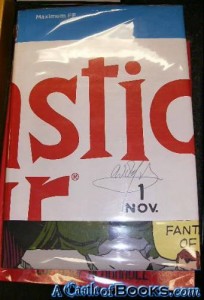
 

Maximum FF

Beaty goes on to say that the ‘splash’ page and double-page spreads,

“…are particularly valued by collectors of original comic book art because they often present characters drawn on a larger scale than is typical for a comic book and, consequently, are more impressive when framed. For some collectors, the splash page and comic book cover are the most valuable parts of the comic because they are most akin to traditional gallery and museum aesthetics—they are not tainted with the sequentiality that is often held to define the comics form.”

Groensteen would agree with the idea that comics is tainted by its sequentiality, or at least sequentiality is not very relevant or attractive to most of society. Tellingly, the earliest definitions of comics focused on its use of recurring characters and speech bubbles than on its sequentiality—something Beaty recognizes in the first chapter of his book.

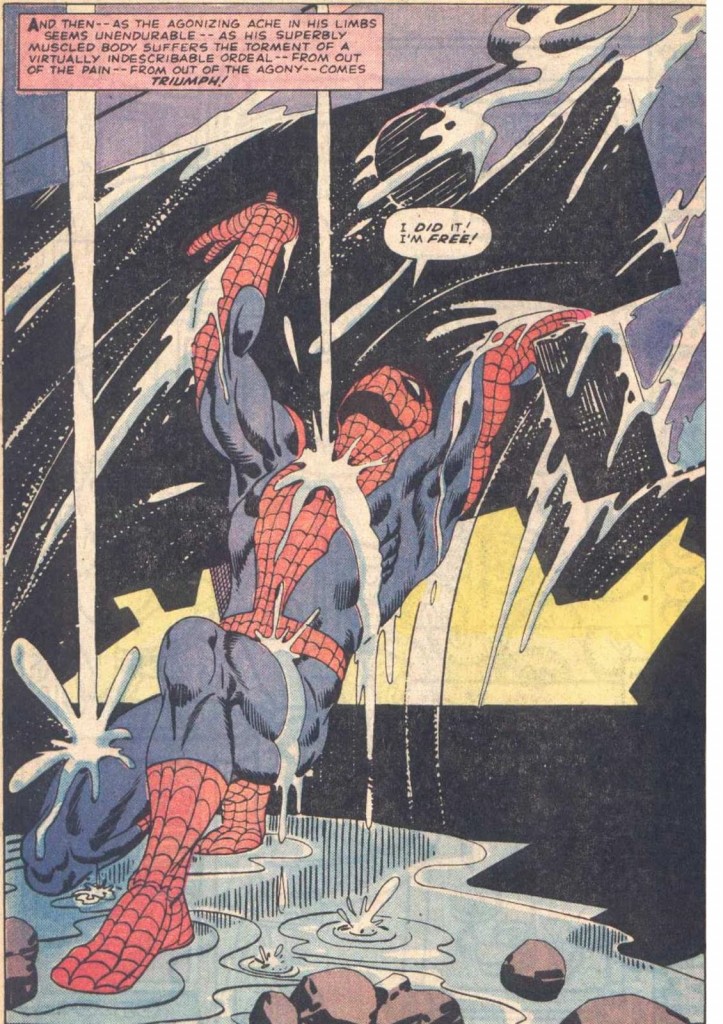
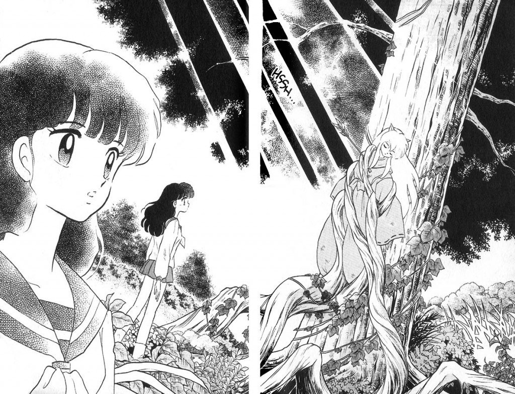
It’s worth wondering about the phenomenology of the splash page and double-page spread, and what happens when they are used in comic books. The splash page is a ubiquitous element of many comics, from American superhero books to manga to independent minicomics. It’s use isn’t random—splash pages most often introduce a story, establish the grandiosity of a setting, or monumentalize the climax of a single issue or narrative arc. The effect is always intended to be eye-catching, attention-grabbing, and big.
Spiderman Splash Page

Steve Ditko and Stan Lee, Amazing Spider-Man, Issue #33
Inuyasha Double Page Spread

Rumiko Takahashi, Inuyasha, Book 1

berlin_splashpage

Jason Lutes, Berlin, Volume 1

The splash page is a part of the vocabulary of comics, (or at least its grammar,) and some cartoonists play with or complicate the concept more than others. Within the limited scopes of alternative comics, a few recent examples come to mind. In Craig Thompson’s Habibi, (2011) (which I reviewed here,) a preponderance of splash pages marks the end of the book. Thompson’s loud pages erupt with obvious, mystical-religious imagery, asserting not only that an epic moment has been reached, but that moment is ever-present. The artwork grasps at transcendence, and the narrative, increasingly interrupted, begins to break down.
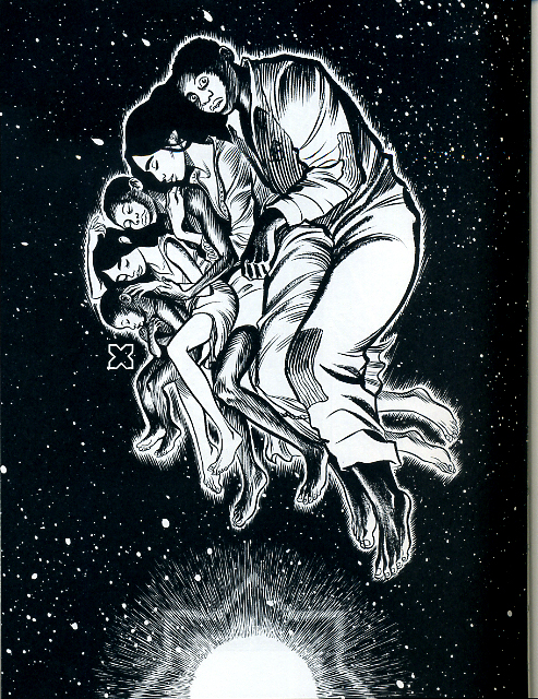
Habibi Splash Page

Skim, by Mariko and Jillian Tamaki, (2008), paradoxically uses splash pages to transition between scenes, layer impressions, and create a sense of passing time, even though  only a single moment is presented. Both approaches use splash pages earnestly, but where Habibi’s splash-pages-on-steroids amplifies their stillness and power, Skim  converts this potential energy into emotional movement.
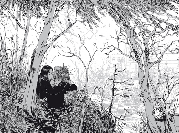
Skim Double Page Spread

In Chris Ware’s Building Stories, (2012), the cartoonist ironizes the epic quality of the splash page by depicting banal moments in the life of his characters. However, the splash page has the last laugh, fostering a sort of ‘epicly banal’ or ‘very depressing’ feeling, which hasn’t escaped the notice of critics like Douglas Wolk. Perhaps Ware’s splash pages are better read as mislaid covers; they share the cheeky realism of his illustrations for The New Yorker, and one of these pages was featured as a ‘joke cover’ on the New Yorker site. It seems difficult to use the splash page insincerely– it transforms its content into something remarkable, whether the artist meant it to be read that way.
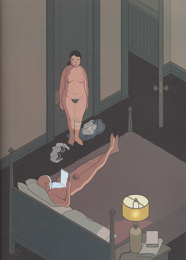
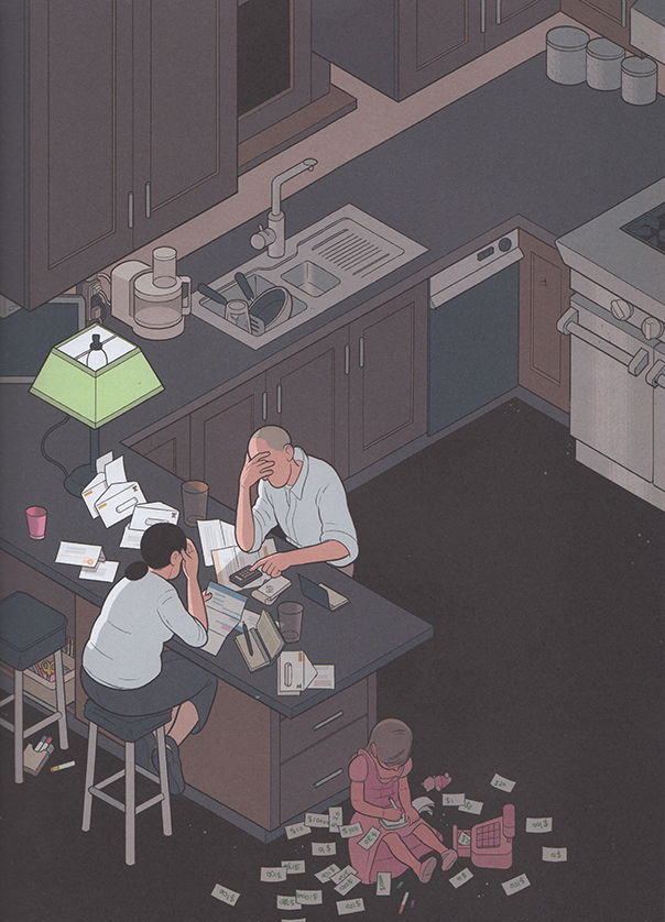
buildingstories_splashpage_2

buildingstories_splashpage

It’s funny that one of the most prominent and dramatic techniques in comic storytelling is one that makes a comic behave a little less sequential, fragmented, even hybrid-like. While captions and speech balloons are often present, they feel less like a competing element, especially in terms of scale, (aside from the author credits and copyright jargon jammed into some mainstream pages.) The splash page isn’t actively read as much as it is passively gazed upon, or absorbed, as if on a wall. That jump from reading to gazing is partially what makes experiencing a splash page feel profound. But only one moment can be presented, and there often isn’t much to figure out. The splash page is the opposite of the comics gutter, the space between the panels that contains the ‘unshown,’ and according to Scott McCloud, generates the medium’s storytelling power. While splash pages and individual panels are the easiest to display, a cartoonist’s panels and gutter transitions better capture the essence of a narrative work.

Its not surprising that the art-world and collectors, unsure of how to hang comics on a wall, would favor panels and pages that behave more like paintings. But is it possible to successfully bring comics narrative– small, printed, sequential and ambiguous– into a museum setting? Or is its special breed of profundity incompatible with what attendees expect from a gallery show? Outside of more people reading actual comics, (and how would they be convinced to do that?), is there a venue, or a kind of oration, that better matches the type of transcendence a comic book achieves, rather than what it reaches on one page or panel? As long as the gallery-show remains the standard by which high-brow acceptance is judged, discussion of what makes the comics medium work, (or even great,) will be locked onto their resemblance of fine art. Artists with greater technical skill will be rewarded most, despite the fact that the art world has bucked judgements of skill, chaining comics to a quaint nostalgia for draftsmanship.  And severing panels from their original sources does not an art movement make– shows will remain an oddity, a fun, occasional diversion from looking at real art. Many people would not mind. Some readers will always need comics to act a little bit more like other things, in order to love them in those kinds of ways.

Music Roundtable Brainstorm

steely-dan-album-C_jpg_600x1000_q85

 
So, as I mentioned in comments the other day, I’m thinking it would be fun to do a music roundtable here at HU. I haven’t been exactly sure what topic to have us round upon, though, so I thought I’d throw out a few ideas and see if anyone liked them, and/or had ideas of their own.

So here are some possibilities:

— we could do a roundtable in which everyone writes about their favorite album. The advantage is that it makes participation easy. Disadvantage is that it’ll be fairly diffuse…and maybe just too conventional.

— we could try to pick a particular band or group or something to focus on. Steely Dan? The Beatles? Problem is that it might be hard to find something a quorum wants to write about…and also could seem somewhat random.

— we could pick a year and have everyone write about music from that year. I kind of like this idea. It would give enough range that lots of people could participate, but maybe enough focus that there’s be something to talk about. We’d have to figure out what year to talk about, obviously (I’m thinking about 1991 or 1992 for some reason…but obviously other suggestions would be welcome.)

— we could write about a genre…I’d kind of love to do a metal roundtable, but I don’t know that anyone else would (except Bert, of course….and actually I do know a couple of other people…hmmm. Maybe a small roundtable on metal would be fun….)

— Brian Cremins suggested everybody writing on their favorite album from when they were 10 (I think?) I’m a little leery of that I guess because I feel like I don’t necessarily want to determine that all the responses would be personal beforehand…though I guess if there’s a huge enthusiasm for it maybe I could go along.

Sooo…let me know if any of those sound appealing, of if you’ve got other ideas.

Car-TOON cha cha cha

This is part of a series on people who, renowned for other accomplishments, have also been cartoonists– some professional, some amateur

xaviercugat

Francisco de Asis Javier Cugat Mingall de Brue y Deulofeo (1900–1990), better known by his stage name Xavier Cugat, was the prime big-band maestro of Latin American music: rumba, mambo, cha-cha.

He was also a professional cartoonist and illustrator all his life.

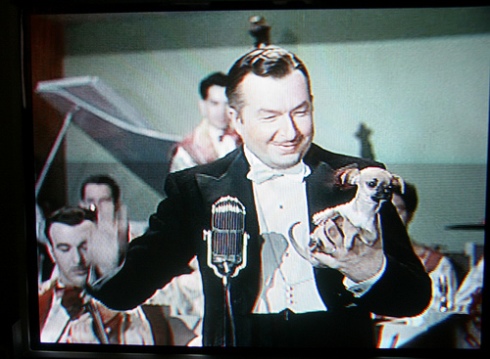
Cugat and his band at New York’s Waldorf-Astoria hotel. One of his trademarks was conducting while holding a Chihuahua dog.

Born in Catalonia, Spain, Cugat moved with his family to Havana, Cuba, when he was three. A trained violinist and arranger, he packed up and moved to Los Angeles, where he worked as a cartoonist for the Los Angeles Times newspaper during the day and played in  a band at night.

This is a neat reversal of the usual situation of an artist working a day job and cartooning in his free time.

Greta Garbo

After a few years of playing smaller clubs in the Los Angeles area, Cugat  got his big break when he and his band played the prestigious Coconut Grove nightclub in 1928. His style of music caught on; in the ’30s and ’40s he was nicknamed “The Rumba King” because of his popularization of that dance.

But despite all his success in concerts, records, radio, movies and (later) television, Cugat never quit drawing, providing humorous covers for several of his own record albums, publishing collections of his star caricatures and even producing an illustrated curtain for Grauman’s Chinese Theatre.

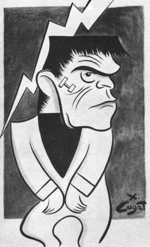
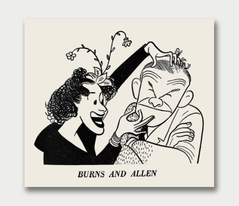
His caricatures are spare and assured, reminiscent of those of Al Hirschfeld. Below are some radio comedians:

An album cover:

A painting done for his personal pleasure:

Finally, a self-portrait:

In previous installments of this series on part-time cartoonists (with more to follow), we saw a talented amateur in Enrico Caruso, and a skilled dilettante in G.K.Chesterton.

Cugat stands out because he remained a professional cartoonist all his life, taking his graphic work as seriously as his music.

For which I tip my hat…and dance a few steps…cha-cha-cha !