The Tyranny of Comforters

This was first published at Splice Today. I thought I’d reprint it since it touches on some issues raised in this comments thread.
____________________________

Usually we think of empathy as a generous emotion; a gift of love. Just as often, though, it can be a crabbed, demanding, jealous thing — an insistence that others act like, think like, and even be oneself.

Michael Chabon is a writer of literary fiction, which means that in many ways, even more than a politician, he is a professional empathizer. Last week he was plying his trade as a guest-blogger for Ta-Nehisi Coates. As a matter of course, he wrote about the Tucson shooting, and specifically about Obama’s speech.

His post on the subject was mostly about the distance he felt from the speech, the audience, and indeed, from the nation. He began the post by declaring, “I’ve been thinking about the president’s speech all night and this morning, how something about it left me feeling left out.” He acknowledges that he was moved by Obama’s vulnerability and his exhortation to live up to the memories of the victims, “And yet…”, he says:

Was it all the weird, inappropriate clapping and cheering? Or the realization that I am so out of touch with the national vibe that I didn’t know that whistling and whooping and standing ovations are, when someone evokes the memory of murdered innocent people, totally cool? I never would have thought that I’d spend so much of that solemn Wednesday thinking—first on publication of Sarah Palin’s latest piece of narrishkeit about the blood libels, then all through the memorial service—please, I beg you, can you not, finally, just shut up? It was distancing. Distracting. As he joined in, at times, with the applause, the president’s hard, measured handclaps, too close to the microphone, drowned out everything else in my kitchen right then, and seemed to be tolling the passing of something else besides human lives. I don’t know what. Maybe just my own sense of connectedness to the cheering people in that giant faraway room. I didn’t feel like applauding right then, not even in celebration of the persistence and continuity of human life and American values. And then I was ashamed of my curmudgeonliness. Those people, after all, many of them college students, were in a sports arena; architecture gives shape to behavior and thought. Maybe if the service had been held in a church, things would have played differently.

Chabon then goes on to sneer (empathetically, thoughtfully) at Obama’s final image in the speech; the moment when he suggested that Christina Taylor-Green, the nine-year-old killed in the shooting, might be jumping in puddles in heaven.

I tried to imagine how I would feel if, having, God forbid, lost my precious daughter, born three months and ten days before Christina Taylor-Green, somebody offered this charming, tidy, corny vignette to me by way of consolation. I mean, come on! There is no heaven, man. The brunt, the ache and the truth of a child’s death is that he or she will never jump in rain puddles again. That joy was taken from her, and along with it ours in the pleasure of all that splashing. Heaven is pure wishfulness, an imaginary solution to the insoluble problem of the contingency and injustice of life.

Chabon concludes by noting that the image was okay after all if you inverted it and saw it as a metaphor for loss.

But I’ve been chewing these words over since last night, and I’ve decided that, in fact, they were appropriate to a memorial for a child, far more appropriate, certainly, than all that rude hallooing. A literal belief in heaven is not required to grasp the power of that corny wish, to feel the way the idea of heaven inverts in order to express all the more plainly everything—wishes, hopes and happiness—that the grieving parents must now put away, along with one slicker and a pair of rain boots.

So. That’s Chabon.

As for me, I spent most of “that solemn Wednesday” without any expectations in particular. As somebody without any connection to any of the victims, I didn’t even experience it as especially solemn. I didn’t watch, and don’t intend to watch, Sarah Palin make a fool of herself, because I know she’s a fool already, and why would I want to be irritated? I’ve enjoyed reading a number of pundits make fun of her, though (this is probably my favorite.)

I didn’t watch the president’s speech on Wednesday, either. In fact, I’ve been more or less avoiding news about the speech and about the people shot, because I find hearing about people getting shot upsetting. Especially young children — not because I’m empathetic or thoughtful, but because, like Chabon, I have a kid (he’s 7) and thinking about him dying makes me feel sick. I skimmed a transcript of the speech a day or so later. And I watched the video today because I was thinking about this article and felt like I had to.

The speech itself — well, it made me cry. I don’t know if that’s a testament to the president’s eloquence particularly. I cry pretty easily, and a bunch of people murdered for no reason is sad.

The cheering didn’t bother me. It’s odd, really, to think of it as an occasion for aesthetic approbation or denigration. People express grief in various ways. It seemed mostly like they were trying to let Obama and each other know that they were a community. Or maybe like Chabon says, they were just brainwashed by the architecture into behaving inappropriately. Whatever. I noticed that Giffords’ husband was clapping. I don’t feel I’m in a place to judge him.

As for rain puddles in heaven; yes, it’s trite. But it seems a little duplicitous to think of that triteness as causing Christina Taylor-Green’s parents more pain. If my son died, it’s not clear to me what anyone could say that would make things any worse or any better. Besides, you spout trite nothings when someone’s loved one dies, because what else do you say? A polished prose style is a lovely thing, but that doesn’t mean it’s an adequate response in all circumstances.

This, indeed, seems to be the cause of part of Chabon’s dyspepsia. Artists, especially successful artists like Chabon. receive such fulsome praises that I think they can occasionally mistake themselves for priests. Which is maybe why he felt qualified to proclaim with such certainty that heaven isn’t real and that death is just absence. To suggest otherwise is a stylistic error — rectifiable only by transforming the clumsy words of the President through the magical gifts of a real writer.

But I’ve been chewing these words over since last night, and I’ve decided that, in fact, they were appropriate to a memorial for a child, far more appropriate, certainly, than all that rude hallooing. A literal belief in heaven is not required to grasp the power of that corny wish, to feel the way the idea of heaven inverts in order to express all the more plainly everything—wishes, hopes and happiness—that the grieving parents must now put away, along with one slicker and a pair of rain boots.

Job’s comforters are a standing reminder that most people will engage in condescending assholery if offered half a chance. No reason that a lauded author should be any different, I guess.

Still, it’s worth analyzing the exact nature of the assholery. Job’s comforters were jerks because they believed that Job was suffering for a reason. His injuries were his fault or they would lead to a greater good. The comforters believed they could read tragedy. They were its interpreters.

Chabon isn’t coming from exactly the same place, but there’s some overlap. He too, believes that the tragedy should speak to him. He is irritated when he is excluded. Why doesn’t the President move me, he asks? Why doesn’t the event address me? Why this talk of heaven when I’m not a believer? Why don’t all these people who I am not interested in — why don’t they all, as he puts it, “shut up”?

The answer to all of these questions, of course, is fairly straightforward. That answer is: “It’s not about you, Michael.” Even your empathy, however well expressed, doesn’t make it about you.

Of course, lots of people who weren’t immeditately affected feel personally connected to the shootings. I do too, to some extent. But it’s important to recognize that that extent is limited. The separation Chabon felt from the people in that arena wasn’t because the people in Tucson are gauche, or because Obama is a Christian. If those things matter at all, it’s only as symbols of the way in which each person is different; a mystery, one to another. Art and love and religion bridge the distance partially and sometimes, but not entirely, and not on demand. God perhaps can love and know each individual, but for a human to try to do so starts to look like blasphemy. Even if, or perhaps especially if, you don’t believe that God exists.

Robert Binks and his art ( part 1 )


Robert Binks is a Canadian illustrator and cartoonist with a fresh, wry and humane touch. His drawings and art pieces are still delightful  thirty and even sixty years after their creation.

His illustrations for the Ogden Nash collection The Old Dog Barks Backwards (1972) can be seen in four posts gathered here. As a result of these posts, Mr. Binks got in touch with me and sent along more of his works, which I will be presenting over the next few weeks. I’ll note that everything Mr. Binks produced for himself is © Bob Binks. Works that he produced for the Canadian Broadcasting Corp. are © CBC/Bob Binks.

Mr. Binks wrote me the following:

I retired 20 years ago after a 35 year career as a graphic designer at the Canadian Broadcasting Corporation. During those years I also free-lanced for 2 Toronto newspapers doing editorial art and had an agent in New York where I illustrated several books including  The Old Dog Barks Backwards.

A personal endeavor I have enjoyed all my life and continue to do, is making Xmas and birthday cards for my friends and relatives.

Since retirement I continue to be productive in art — fine art painting, small ironic wood constructions and clay creations.

We’ll be seeing samples of all the above during the next few weeks.

Born in 1926, Mr. Binks studied commercial art at a Toronto technical school, then fine art at the Ontario College of Art. In 1947 he became a display designer at Eaton’s, a department store giant that was a Canadian institution. Ten years later, at age 30 or 31, he joined the Canadian Broadcasting Corp, where he spent the rest of his professional life.

His work combines simplicity with unexpected detail and craft. These student caricatures from his days at Central Technical School provide an example:


As you see, they’re from the same set as the self-caricature that opened the post.

Now a far less characteristic work, but an interesting one. Mr. Binks produced this beach scene at age 14, during his second-year illustration course at Central Tech. He was trying to be like the painter Paul Cadmus (1904-1999) and made a good job of it:


Most of Mr. Binks’s work is, to put it mildly, not much like that of Paul Cadmus, who was a bitter moralist and who specialized in elaborate, pyrotechnically designed  canvases that are heavy with detail. The best Binks-Cadmus parallel I can come up with is that the two reverse each other. Mr. Binks produces clear, appealing works that show more detail than expected. Cadmus produced improbably dense works that communicate themselves with surprising clarity and speed.

At age 22, Mr. Binks painted columns in the women’s wear department at Eaton’s. A display from his time at the department store provides an example of his clear but subtly detailed work:


From the 1970s, we have some CBC work that shows a Binks trademark: the combination of simply outlined figures with involved but bold composition. From left foreground to right foreground, the artist turns a series of squiggles — dress pattern to hand-mike cord to snake to giant-mike cord — into a sort of meta-squiggle. It coils toward us where the reporter is standing with his hand-mike, then coils away, passing from snake to giant-mike cord:


Below is an item done freelance for the recipe page of the Globe and Mail. Mr. Binks tends to amplify the effect of the texture in a given work by creating high, narrow rectangles jammed with detail. In this case the cart’s vegetable bins do the job:


Below we see the same trait, only more so. This picture makes texture its centerpiece; usually texture is more of an accent, from what I’ve seen.


Here we have a page from a mod dictionary that Mr. Binks illustrated. The pictures remind me of his work in the Odgen Nash collection. His strengths come together very nicely here. The illustrations have the simplicity cartoons need, but with a good deal of weight to the drawing:


Another favorite, this one from the cover of a Toronto paper’s weekend magazine supplement. I like the nimble but unobtrusive way Mr. Binks handles the three interlocking compositions of cityscape, the first group of authors, and the second group of authors:


Again, the drawing still works as a cartoon. The composition is involved but clear, and it doesn’t produce a brushback effect, as when the reader’s jaw is supposed to drop a little and she/he to stand abashed at the sight of improbable ability. I find the drawing cuddly in a way, comforting. For example, take the tourist boat chugging along in the foreground.

To close, a Christmas card Mr. Binks designed for his own use. The paisley Santa and his colors grab me:


The card has pulled off a neat trick, which is to survive the pop art ’60s without having become dated. I love the way the raspberry, gold and tan patterns look trapped against the white.

Unfortunately I don’t know how to analyze the card’s use of color and patterns, beyond saying that Mr. Binks sometimes uses contrasting patterns to kick up a drawing’s effect, and that here he adds high-contrast colors and a white background. The result is a caricature that jumps out at you, a trippy Santa Claus whose trippiness doesn’t rely on the usual signifiers of psychedelia (beyond paisley, anyway).

Next week we’ll have some intensely involved line work and a sequence about a cow traveling by subway. Hope you can make it!

The Wire Roundtable: Cherchez la femme

The Wire may or may not be the Greatest TV Show Of All Time, Now And Forever, In Any Language And Genre, In The Whole World, And Throughout The Whole Extent Of Spacetime — but one thing’s for sure. It’s definitely The Most Praised Show Of All etc. Time, Entertainment Weekly and the Guardian have all labelled it the greatest, as have lots of other folks with and without column space. Metacritic.com assigned the fourth season an aggregate score of 98%, which is higher than the rating for God Himself; more strikingly, it’s even four points higher than the score for Kanye West’s most recent album.

The Wire‘s legion of enthusiasts regularly point to a couple of features that merit especial praise: the show’s realism; its panorama of an entire society at every level; its giving voice to the marginalised and disempowered. Realism: swearing! Panorama: Drugs! Unions! Politicians! Schoolkids! Settling old grudges Journalists! The marginalised: Black people! Gay people! Gay black people!

In interviews during and after the show, creator David Simon consistently claimed the highest ambition for the show and its themes. In particular, the show would

with each season, slice off another piece of the American city, so that by the end of the run, a simulated Baltimore would stand in for urban America, and the fundamental problems of urbanity would be fully addressed.

First season: the dysfunction of the drug war and the general continuing theme of self-sustaining postmodern institutions devouring the individuals they are supposed to serve or who serve them. Second season: the death of work and the destruction of the American working class in the postindustrial era, for which we added the port of Baltimore. Third season: the political process and the possibility of reform, for which we added the City Hall component. Fourth season: equal opportunity, for which we added the public-education system. The fifth and final season will be about the media and our capacity to recognize and address our own realities, for which we will add the city’s daily newspaper and television components.

Throughout the whole show, however, there’s one group of marginalised and disempowered that is not given proper representation; one type of individual that gets eaten by institutions but is not explored; one group which has historically faced, and continues to face, massive inequalities of opportunity.

That’s right: I’m talking about the ladies.

Simon identifies The Wire‘s great theme as “institutions devouring the individuals they are supposed to serve or who serve them”. And throughout all five seasons, the show develops this theme in detail, in a variety of institutional contexts and with a variety of individual players. Institutions fuck over McNulty, Daniels, Bubs, Wallace, D’Angelo, the Sobotkas, Bunny, Randy, Bodie and plenty more besides.

But, from Snot Boogie’s sad demise at the very start to the much-exploited homeless guy at the end, The Wire is singularly unconcerned with how women fare in these institutions, the fates they face, the options open to them.

Consider: by my count, over the course of five seasons, thirty-seven cast names appear in the opening credits. Of these, four are women. These are the actors playing Beadie, Kima, Pearlman, and (!) Alma Gutierrez. Beadie is in the credits only for season 2, despite playing a sizable role in the final season too. Shardene and Snoop never make the credits. By contrast, Burrell, Rawls, Sydnor, Clay Davis, Clarence Royce, Maurice Levy and Chris Partlow do.

Chris Partlow makes the cut and Snoop doesn’t.

(This gender imbalance is presumably, totally unrelated, in any way whatsoever, to the fact that ten out of the eleven writing credits throughout the show are men)

Or consider: of those thirty-seven cast members, the relationship status of three of the women are plot points. Pearlman fucks McNulty and then Daniels; Beadie fucks McNulty; Kima struggles with her (de facto) wife and child. Alma gets nothing, but that’s only because she has no internal life to speak of or, really, any kind of life to speak of, beyond learning at the feet of the great David Simon Gus Haynes.

Sure, much is made of who the guys are fucking, too — McNulty and Omar in particular. (And, of course, if Pearlman is fucking Daniels, then Daniels is fucking Pearlman too). But, for a lot of the male characters, it’s simply not an issue. They may be married or have a girlfriend, but it doesn’t matter much to their character. Prez has a wife onscreen for all of one scene, as I recall; Bodie, Herc and Carv take dates to the movies and that’s about it; Marlo and Avon are mostly asexual; Rawls’ sexuality is a throw-away gag (well, two gags, if you include the graffiti in the homicide toilets); and who the hell knows about Royce, Davis, Burrell, Levy, Sydnor et al. The point isn’t that the show isn’t interested in who the guys are fucking; it’s that the show is much more interested in who the women are fucking.

And once you get beyond the “main” cast — even if you include a couple of extra characters not in the opening credits, such as Shardene, Snoop, Prop Joe, Jay Landsman and the like — it gets even worse. Most of the tertiary female characters are WAGs, would-be WAGs, one-night stands, or mothers. Going down the cast list, if we skip the few women who actually do appear in the opening credits, we get: Snoop; Marla Daniels, who’s fucking Daniels at first and then she’s not; Cheryl (you know, the one with her coupons); Theresa D’Agostino, who fucks McNulty and then tries to fuck Carcetti; Grace Sampson, who used to fuck Cutty; Donette, who fucked D’Angelo and then Stringer; Elena McNulty — look, it’s too depressing to go on.

The biggest missed opportunities comes in season four, with the introduction of the school. Here you have an environment with a lot of women and a lot of girls, the powerful and powerless. Maybe they couldn’t fit in a new major character as a teacher, given that they already had Prez undergoing his learning journey and growing into his new role. Maybe there wasn’t any need. But surely — surely — they could have made one of the four kids that we track a girl?

For the point of season four is, in part, to show the options available to black children in marginal environments. Randy, the budding entrepreneur who ends up traumatised by his glancing contact with crime. Michael, the child of abuse, who’s recruited to crime by way of protecting his family. Namond, who’s too weak for the streets and lucks into a way out. And Dukie, poor Dukie whose fate seems sealed from the moment we see him.

We see what the boys can do, what can become of them, what few roles are offered by the system — the systems — that surround them. But what are the fates for girls? Do they become dealers, junkies, citizens? What specific options do they have that the boys don’t have? Questions not answered by the show; worse, they’re not even asked.

The show isn’t altogether clueless on gender. There’s a nice bit in season four when all the neighbourhood mothers converge on Cutty, as one of the few eligible bachelors going. Or the bit in season one when D’Angelo lets his casual misogyny slip to Shardene. And the instigating incident of season two — the dead sex slaves — suggests a show not entirely uninterested in how women are used by power. But is that enough for a show that aims to reveal an entire society, and how that society grinds down its members? Is that enough for the Greatest TV Show Of All Time?

Or, to quote the great Bunk Moreland: Happy now, bitch?
_________________

The entire Wire roundtable is here.

Sammy Harkham: Naturalism and Specificity

Sammy Harkham’s Crickets #3 rivals in substance and importance two other comics that were published in a similar format: David Mazzucchelli’s Rubber Blanket #3 and Daniel Clowes’ Eightball #23. Harkham seems to be best known for editing the chameleonic, graphically revolutionary anthology Kramer’s Ergot and he has served his artistic community well with those efforts. However, Harkham’s own work is among the best in KE.

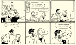
A careless moment, from Lubavich, Ukraine 1876

His Lubavitch, Ukraine, 1876 in the sixth issue depicts the artist’s namesake living in an orthodox community way back in the day in an intimate and momentarily heart-stopping tale. Harkham conveys a delicacy of gesture rarely seen in a medium that has been dedicated largely to overstatement and explosive violence. That is not to say he is entirely adverse to spectacle, his sprawling post-apocalyptic cover for the impressively oversized Kramer’s Ergot #7 is gorgeous, but his single page broadsheet strip in that issue has a touch of Hergé and Frank King and reads like a pivotal moment near the end of a very sweet unmade Coen bros. film.

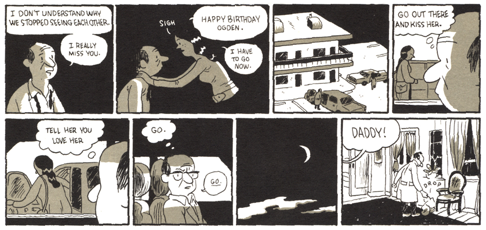
The latest issue of Harkham’s solo comic Crickets is subtitled “Sex Morons” and this is an apt description of the characters in the two major stories inside. The first is a reprint of The New Yorker Story, which probably should have appeared in The New Yorker itself, but instead ran in Vice, the iconoclastic and often disturbing free magazine of fashion, politics and youth culture. In four dense pages, Harkham shows the final crisis in the midlife of a writer and Yale professor as he cheats on his wife, fails to care for his daughter and betrays his colleague. A lot of information is packed into a short piece which seems oddly realistic, given how cartoony the drawings are.

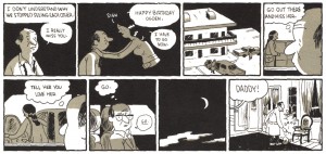
Ogden achieves stasis, from The New Yorker Story.

Harkham’s earlier fantasies and vignettes seem more freeform or improvisational, with hermetic, interiorized visuals. By that I mean non-referenced, non-observational drawings with some apparent influence from artists such as E.C. Seger and other early daily/Sunday comic strip artists, along with hints of Moebius, Chester Brown and Al Columbia. By contrast, the narratives in Crickets #3 are informed by research into the particular times and places shown. The stories veer towards a form of naturalism, perhaps closer in spirit to the more serious and/or historical comics narratives long produced in Europe by artists such as Jacques Tardi and Vittorio Giardino.

The condensed but ultracoherent narrative style of The New Yorker Story carries through into the main story, Blood of a Virgin. Harkham has a talent for dialogue and he draws believable continuity and nuanced expressions. His storytelling is clear and his page designs, panel framings and lettering incorporations are elegantly composed. His hand is light and his line is still cartoony in that it increasingly evokes the direct but fragile emotionality of Charles Schulz, but now it also recalls the vigorous simplicity of Roy Crane’s Wash Tubbs.

I wrote to Harkham with some questions about the work in Crickets #3. “There is an emotional clarity you can get across with characters in comics that can be a hinderance or a real asset depending on what you are doing/aiming for,” he told me. “Cartooning is knowing how to use the sickeningly stupid blunt emotion of each panel and build something emotionally complex of it. This really came together for me working on The New Yorker Story. The panels were so small, the most important thing was that they were easy to read. So that meant I didn’t have room to make beautiful drawings or to be vague about what was happening in a given panel.” Still, for all their functionality the drawings are beautiful, particularly when the visual parameters that they describe are qualified and given body by the color overlay. Harkham often uses a single additional color in his work. Here, the pale olive layer affords the spare drawings considerable weight, space and light.
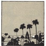
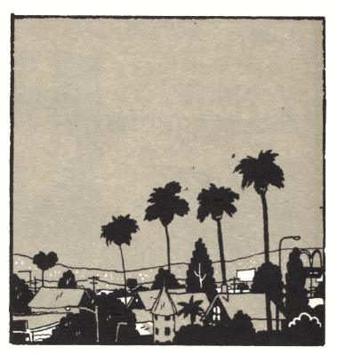
Harkham's L.A.

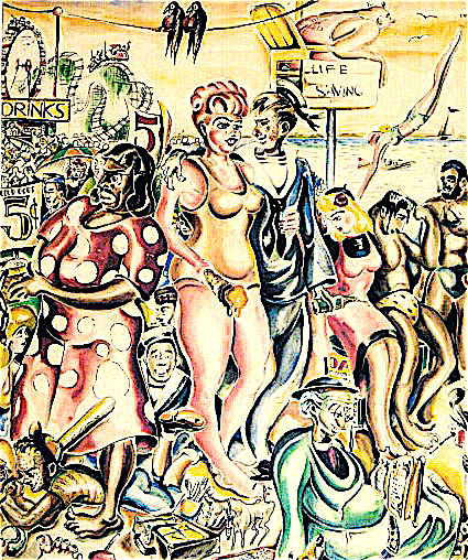
Harkham says, “I don’t really strive for realism, but more for specificity.” To that end, he researched the trappings and landscape of the period shown in Blood of a Virgin. He says, “I wanted to do a story about Los Angeles. Much of the inspiration to work on it is driving around the city and day dreaming, looking at old college yearbooks and photos and getting excited to draw a weird pair of woman’s shorts or a haircut or living room.” As someone who came of age in the 1970s and realizing Harkham wasn’t born until the next decade, I’d have to say his story is as close as I’d like to come to reliving those years. Somehow, he perfectly captures the bleak feel of 1972, as the ideals of the 1960s coagulated into opportunism and excess.

Harkham’s protagonist Seymour fights for a chance to write and direct his first feature film while working a day job editing trailers for Val Reed, a producer of exploitation films. He holds his temper as his boss insists on buying his “werewolf script” cheap. Seymour is given to understand that whatever film emerges from the process will bear little resemblance to what he wrote, and that the job of directing the project will most likely be given to another man. He must eat these indignities, because he needs his mentor’s help and connections.

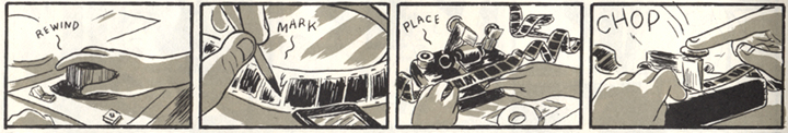
The story is told in a cinematic style, in other words the sequencing and viewing angles chosen by the artist simulate the vantages of a camera moving around the characters and environment. It also deals with cinema. Harkham imbeds the story with specifics of the then-contemporaneous LA and the horror movie culture and filmmaking process of the time. There are several explicitly instructional micropanel passages in Blood of a Virgin, including one that depicts Seymour editing film at his job.

The Moviola grind

“I worked on those manual editing bays at CalArts,” says Harkham. “I went back to refresh my memory when drawing the comic.” I showed Harkham’s editing sequences to my friend, animator and commercial director M. Henry Jones, who said, “That’s a Steenbeck, no, wait…hmmm, maybe it’s a KEM….okay, he’s got that right, but he’s using a flat plate….actually, I think it’s a Moviola. Wow, look, he drew the trim bin. And the bit about trying to use the phone with strips of film hanging around your neck…nice. When I’d hit the floor, I’d just stay there.” As usual, it is a little hard to nail Henry down, but he attests to the basic accuracy of the process that Harkham drew.

“I also spoke with Joe Dante about what the daily life of being an editor back then was like. Very similar to being a cartoonist—solitary hours, bad backs,” Harkham says. He characterizes Dante, director of The Howling, Gremlins and Small Soldiers, as one of “that first wave of ‘monster kids’ who grew up watching Universal horror movies on tv, reading Famous Monsters of Filmland, the generation of guys who wanted to work in horror and sci-fi and didn’t look at it like a stepping stone to legitimate cinema, but a place to BE. Kind of like comics.” As with Seymour, Dante was initially a writer for horror zines like FMoF and Castle of Frankenstein. He began his film career working for exploitation movie mogul Roger Corman in the period Harkham depicts, in a similar capacity to that endured by Seymour. Dante’s early film Hollywood Boulevard was created when Corman bet another producer that he could make a film in a week. Like the project Seymour is unwillingly used for, the movie was assembled using extra footage from other productions. But under examination, there is more to “Blood” than these correspondences.

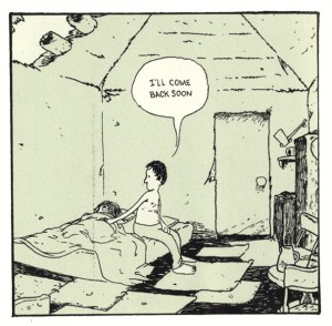
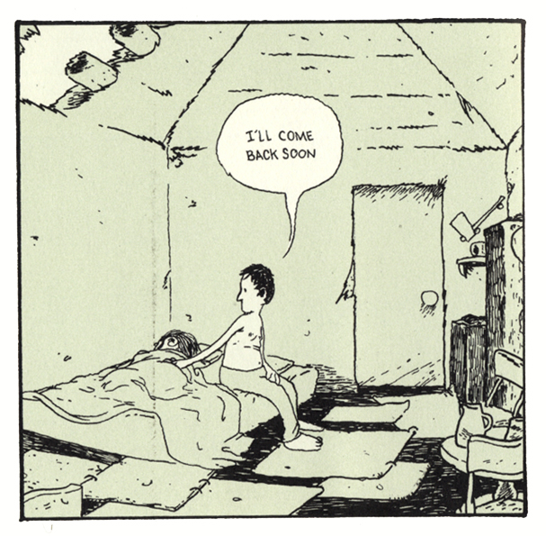
Off he goes, from Poor Sailor

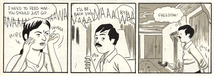
The story explores themes also seen in Harkham’s earlier work Poor Sailor, wherein a young husband realizes his dreams of adventure at the expense of his arm and the lives of his brother and his wife. In Blood, Harkham depicts experiences which might be considered common to young couples who are trying to get ahead in their careers while (supposedly) sharing the responsibilities of small children. He shows both vantage points on the marriage and motivates both partners’ actions. Seymour’s passage through the story is deliberately timed. He keeps a tight schedule for work, always having to considering the delays of LA traffic, but is often late when it comes to his family. At one point, he promises to be home at a certain time and is on his way out the door from work, but then stops to watch some “sadist” footage with a co-worker. Forty-five minutes later, he’s late and has brought the wrong thing home.

Seymour makes dinner for his wife and himself, but she must eat hers alone because he “has to” take what is ostensibly a business call. Much later, his plate is cold and he’s still on the phone, now simply blabbing about film trivia. Then he is frustrated that his wife does not respond to his advances and that she cannot listen as he reasons a way to tolerate working on his now-adulterated dream project, because she is exhausted from taking care of the baby on her own. Seymour shares some of the childrearing, but his resentment and impatience are obvious when he tries to skip his “turn” and grabs the baby’s leg too tight while changing a diaper.

Seymour keeps his overtired wife awake by watching a version of the then-common pathetically absurd late night horror film hosts on TV until he finally falls asleep. In a moody two-page passage, Harkham renders the tonal-scale test pattern that used to come up after a TV station signed off for the night with a set of square panels of Seymour loudly snoring. His wife finally kicks him out of the room with a dictate to take the garbage out. Seymour sleepwalks outside into the misty wee hours, a scene reminiscent of the fog-enshrouded sets of classic horror films, as well as of the hypnotic dreamscape meditations of Harkham’s friend and contemporary Kevin Huizenga.

Harkham often deals with brittle relations between men and women. In Blood of a Virgin odd things are done to women, often involved with covering their heads and faces. Seymour meets Joy at the house of some “effects guys” who are making a cast from her head. The careless FX artists hurt her by forgetting to apply vasaline to her eyelashes and brows at the beginning of the casting process.* Joy and Seymour worked together on productions in the past and a closer link is implied. She had apparently attempted suicide since he’d last seen her, she has healed cuts on her arm. Was it connected to something he had done?

The costuming of the characters for the Hollywood Halloween party that is the centerpiece of the story is telling. Joy dresses as death, Seymour’s “costume” consists only of a scar on his cheek, his unnamed wife dresses as a clown. Her presence at the party is specifically requested by his boss, but she is unable to attend because the babysitter doesn’t show up. She resignedly removes the clown suit and makup as Seymour leaves alone, and the relief he feels is the first of a series of overt infidelities.

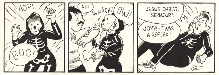
Seymour gets a break and hits a new low.

This three-panel sequence is indicative of the layers of irony that Harkham imbeds in his orchestrations of word and image. The dense overlapping lettering of the first two panels does not close down their general feeling of openness of composition, it represents the apparently chaotic but interconnecting sounds of a family. In the third panel, despite what Seymour is saying as he slithers out, the perspective of the background contracts, encasing him, doors are closed, his arm is behind him in submission to an accusatory click.

At the party, Seymour proceeds to get wasted and becomes involved in a coked-up, sexually violent subparty. The worst of it happens across from a gentle page containing twenty-four square panels that show Seymour’s spouse changing diapers, putting the baby to sleep, making cookies, being made to feel old by a group of trick-or-treaters, smoking a cigarette and being ignored by their neighbor—the contrast of maybe-death and life, of the perverse and the mundane is powerful.

Joy takes her lumps again.

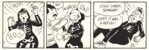
Back at the party and furthering the overarching motif, Seymour “accidentally” elbows Joy in the face when she surprises him while wearing her skeleton mask….there’s much more, but I do not want to continue except to note that Seymour justifies his behavior over the night to himself as a reaction to the oppression of time.

For all of Harkham’s more accessable qualities, such as clarity, accuracy, and his thoughtful handling of human relationships, his work has a transgressive edge that becomes sharper when one considers his comic as an object. The images on the exterior covers are unsavory. They are printed in black underlaid with a reddish purple that amplifies an aura of extreme sleaze…but why does it present so? On the front cover, the white logo is done in a generic psychedelic style of the late 1960s, early 1970s. A woman is drawn with slashing ink brushwork and wash, close to the picture plane reclining against a window, in black panties and vinyl boots, her legs spread and a breast exposed, her head and other breast covered with a checkered cloth. The cover color can then be seen as that of blood or otherwise a color of bodily interiority and in such proximity to female genitalia, evokes the “blood of a virgin” or perhaps menstrual blood. On the back cover, the drawing is done in a cheesey cartoon style like the gags in old men’s magazines. In the foreground, a man in a bonnet or nun’s habit sweats as he ogles the buttocks of a woman in dancer’s tights bending over before him, in apparently refined setting. The subtitle runs in white letters along the bottom, in Italian.

Hidden on the inside front and back covers are two elaborate line drawings printed with full color separations, which have the aspect of illustrations in The New Yorker. The subjects are carefully posed and give the impression of absolute stillness. On the inside front cover, a woman in Victorian dress stands in an elegantly furnished, high-ceilinged room. Her face is covered with a black dripping substance (ink? tar?), reemphasizing the motif of women with obscured faces. She holds a butterfly and the angle of her raised arm echoes that of the pallid, phallic candles leaning from a wall fixture. The inside back cover shows a room with modern furniture and a Van Gogh painting on the wall. A green, cut-off male head is laying on the floor, dripping green gore. A red woman lays on her back on the floor, her legs on a coffee table, her head under the skirt of an easy chair, her arm raised as she makes the peace or V for victory sign.

The images on the covers relate to the stories, if obliquely. Perhaps the head on the floor on the inside back cover is the same as that on the table of the feeble late light TV horror hosts. In three of the four covers, women’s heads are obscured. The scene on the front cover reflects a sequence in the main story, but with some discrepancies. The checkered cloth over her head is different than that seen in the story. In our contemporary context, a covered female head brings to mind the practices of the Taliban and the checkered fabric also reminds one alternatively of Arab headgear and an all-American picnic lunch. Her position and the color might also suggest a return to the womb. The design and images presented to the reader make the package look like a particularly cheap and degraded vintage fetish mag, in seeming denial of the sophistication of the sensitive cartooning bound within.

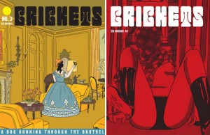
Right: the published cover

If the covers were stapled inside out, it might be a more commercial product…or not. One wonders, in a time so challenging to print media, what sells more magazines, refined drawings or pornography? Some online vendors are using Harkham’s original cover concept to represent the issue. Harkham’s decision to use the crimson cover was probably only possible because the book is self-published. It affects the possibilities for store display, the impact on the potential customer and the overall reading of the work.

The intended audience comes into question. Truthfully, your standard superhero comic cover is often no less psychosexual, but the cover for Crickets #3 is encoded with some powerful porn signifiers. Is the comic directed to men who read porn, who also might form a significant part of the comics public and who might not be married? In my mind, married or cohabitating readers with small children would be the prime demographic for, and the optimum beneficiaries of the cautionary aspects of, what lies within these covers. Then, are men the only audience for something that looks like porn? Questions and ironies multiply in Sammy Harkham’s strongest work to date.

________________________________________

*Another micropanel “how-to” in Blood of a Virgin explains the process of building an exploding head, using a model cast from the mold made of Joy’s head. Harkham made a short film with similar SFX that is online: at sammyharkham.com or at youtube.com.

________________________________________

Sources

George, Milo. “Moving Pictures:The Sammy Harkham Interview.” The Comics Journal #259. Seattle: Fantagraphics, 4/2004.

Harkham, Sammy. Crickets #3. LA: self-published, 2010.
Harkham, Sammy. Poor Sailor. Madera, CA: Ginko Press, 2005.
Harkham, Sammy. “Lubavitch, Ukraine 1876.” Kramer’s Ergot #6. Buenaventura Press, 7/2006.
Harkham, Sammy. Correspondence with the author, Feb 8-10, 2011.

McConnell, Robin. “Sammy Harkham.” Inkstuds: Interviews with Cartoonists. Greenwich, Nova Scotia, Canada: Conundrum Press, 2010.

Romberger, James. The Affordances of Parametric Images. Online at Comic Art Forum
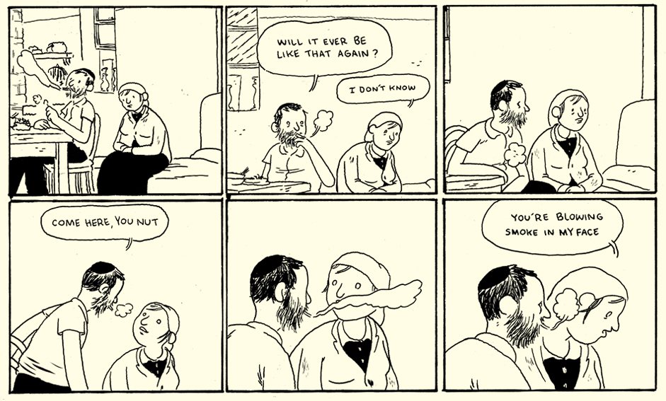
The Travelogue as Masturbation

In her article on Graphic Journalism, Erin Polgreen states that:

“[Travelogues] are often meditative explorations of a foreign landscape in which the reader unpacks their cultural baggage with the author, exploring a strange land with them. The key here is in viewer identification: The comics creator has a strong voice leading the narrative, and we trust them to impart facts and dissect stereotypes for us. Sarah Glidden’s How to Understand Israel in 60 Days or Less is a near flawless example of the travelogue. Glidden isn’t going for an objective non-fiction work here, which can seem counter-intuitive to journalists. Rather, she’s looking to use her experiences as a lens for dissecting her own cultural (mis)perceptions and takes the reader along for the ride.” [Emphasis mine]

There are many words which come to mind when I think of Sarah Glidden’s How to Understand Israel in 60 Days or Less, but “flawless” doesn’t even come close to capturing the essence of any of them.


An overwhelming emptiness developed in my gut as I was reading this slim volume of tightly arranged panels depicting a young woman’s frankly insipid account of her first trip to Israel on a “Birthright Israel” tour. Glidden’s comic condenses the “promised land” into a  series of flat, non-descript images and dialog sequences. Hence Masada becomes a mound of amorphous light brown soil, its history and controversies distilled to a shallow recital comparing the works of Josephus to her guide’s Zionist spiel. Would that she had read better books and developed a better mind for such analysis.

Where Matisse once suggested that “one square centimeter of any blue is not as blue as a square meter of the same blue,” Glidden proposes that a systematic dabbing of color will do the trick. Her vistas are almost infallibly debased to non-entities. Here a village landscape becomes only a momentary pause — an empty space —  and quite secondary to the dialog preceding it.

The following montage of a street parade has much the same problem, passing fleetingly before our eyes like a colleague’s holiday slideshow.

Only close to the Western Wall and the Dome of the Rock do we see a some recourse to the establishment of atmosphere and place, though still to somewhat hollow effect.

Once free of the strictures of the tour (and in the final chapter of the book), the cartooning which was once crudely serviceable begins to display a bit more polish, a dividend from weeks of practice and, perhaps, a process of trial and error. A more skillful practitioner might have used variations on the nine panel grid to engineer some points of conjunction and disjunction between text and image, but Glidden uses this device largely to preserve the steady voice of the storyteller and hence an effortless flow in her account. This is a hallmark of the plain narration advocated by autobiographical stalwarts like Harvey Pekar and his ilk. As such, Glidden’s authorial voice resides largely in her simple drawings and not in whatever talent she has for narrative or language.

What follows is a summation of Glidden’s entire experience (and conclusions) in the form of a series of conversations between the author and various people: citizens, both young and old, who have made Aliyah; a progressive rabbi delivering a message of reconciliation and calling for a striking of archaic laws from the Talmud; and, finally, an Israeli with whom she finds the peace to disagree. Those who have a place in their hearts for Glidden’s comic will undoubtedly point to these exchanges as the basis for their affection; the author’s heart always on her sleeve, her emotions ever on tap, her youthful idealism and barely formed intellect crushing all before her. This is a vision of comics journalism as a mediator for those who have little interest in reading.

I was about three quarters of the way through this comic before I realized that there was a fatal flaw in my approach to this comic. I was half expecting a travelogue in the tradition of Theroux if not Levi-Strauss. But the potential reader will need to reorient herself to the requirements of this cartoon journal for the best results. It is altogether more pleasing if one sees it as a self-lacerating memoir impaling the author’s younger and more foolish self  (of course, Glidden recently celebrated the revolution in Egypt with all the superficiality of a 10 word Twitter missive, but I suppose that too could be seen as self-satire.)

Nowhere is this more evident than in Glidden’s visit to Yad Vashem. The author is justifiably irritated by one of the more prevalent experiences you might find on a package tour — the headlong rush through a famous museum in order to get to a meal (or some shopping). Yad Vashem is quite naturally reduced to that complaint, probably a purposeful disclosure of her rather mean spirit at that point in time.

The guide’s voice becomes a consistent drone, and the sights and sounds of the Holocaust distilled into an understated bitching session.

When all is over and she is given some time to herself, a moment of tranquility in the Hall of Names; Glidden’s tribute to what the Holocaust experience is all about:

What lies beneath this is of course much more insidious and encapsulated in the following sequence of panels:

Here Glidden yearns for the “true” Holocaust experience; to connect and emote with the inhumanity dealt to some 6 million Jews  — she wants to be that crying child in the group in front of her. Perhaps she wanted to be struck with awe at the incalculable evil and misery; to feel deep in her heart of hearts the tragedy of it all.

Like a friend who once told me eagerly about his tour of Auschwtiz, this is Yad Vashem as an amusement park ride; that all too familiar cry of, “What can I get out of it,” from cattle on a drive through unfamiliar territory. More damning than the reams of sexposès or masturbatory fantasies in the indy comics of the early 90s, for here Glidden reveals herself as a tourist and travel writer with absolutely nothing to say. That dullness captured in the ironic title of her book — How to Understand Israel in 60 Days or Less — for the creator knows full well that the country of her visitation is impossible to capture in that period of time. Glidden’s comic is a work of self-condemnation; a “warts and all” cautionary to all those who would seek to traffic in their trifling insights, for therein lies undistinguished banality. It is the rotting carcass of the autobiographical genre in comics.

Sexless Superman

This article first appeared in The Frontiersman #6, © Broken Frontier 2010.
_________________________

Let’s be mature about this. And let’s be honest.

For some time now, Superman has been more than simply a superhero comic book character. That’s not a slight to the medium or a slam to the genre; it’s just a fact. Superman is an icon, an identity, a cash cow, a cottage industry, a brand, and an ideal all in one. What he’s not, what he’s never been, is a sex symbol nor a sexual being. Superman lacks libido.


from Action Comics #592-#593 by John Byrne.

Maybe *somewhere* there’s a stray issue that a mylar-bag Geek-keeper can cite to point out Supes giving a rare leer at a lady — not a hoax, not a dream, not an imaginary story! Perhaps Superman has shown fleeting glimpses of hypothesis-shattering lust. To which, I say two things:

First, the words “stray” and “fleeting” are key; these are by no means general traits of the character. Second, how many devoted readers have read or think fondly of a “sexy Superman” story? At best, such a tale is a trivia-winner; at worst, it’s a back-in-the-bin forgotten day for the Man of Steel.

This sexless Superman, this chaste strange visitor, is far more a function of his comic book adventures than, say, his film or television personae. Christopher Reeve had a subtle swagger to his portrayal of Superman, particularly when slyly commenting on the color of Lois’s underwear. In fact, during the filming of Superman: The Movie, rumor has it that a particular grip was assigned to carefully monitor Reeve’s crotch while in costume: if his package jostled too much as to upset a shot, this keen-eyed professional voyeur would halt the action and call for the scene to be redone. (Better fixed now, logic would have it, than have a super-member ruin opportunities for the editors later.)

Whether or not actors like Tom Welling, Brandon Routh, or Dean Cain had to suffer similar indignities, they each have engaged in far more physical episodes with their Loises, Lanas, and Kats than their two-dimensional counterpart. In fact, only Cain’s Superman on Lois & Clark has the distinction of sharing Superman’s in-comics marital status: he is married (and that only lasted 19 episodes for Cain before the show was axed). Now, within the bonds of holy wedlock, one might think Superman has license to yearn openly for Lane flesh. However, even this expression of healthy spousal sexuality is rarely shown, with the pair more often longing to hold each other than, frankly, fornicate.

One argument for Superman’s restraint with his own wife could be Larry Niven’s sensational “Man of Steel, Women of Kleenex” explanation: If Superman had sex with Lois, he’d likely kill her, “simultaneously ripping her open from crotch to sternum, gutting her like a trout. Lastly, he’d blow off her head. […] Kal-El’s semen would emerge with the muzzle velocity of a machine gun bullet.” Garth Ennis and Amanda Conner played this for good laughs with the Superman parody the Saint and his inaurgural orgasm in The Pro.

Yet, Superman’s in-continuity encounters with other, shall we say, more durable females has yielded little carnal result. For Action Comics #600, writer/artist John Byrne had Wonder Woman and Superman exchange an entwined, mid-flight, full-mouth kiss with each other… that left the two friends rather cold. (Mark Waid and Alex Ross would have their Elseworlds Kingdom Come peck be even colder, though it leads eventually to a procreative result; Frank Miller would remain outside continuity but fully deliver the aeronautic goods in The Dark Knight Strikes Back and All-Star Batman.)

The scholarly, Ivory Tower academic explanation for this is twofold (so pay attention, students). First, Superman, fashioned in the late 1930s American sensibility, has a strong streak of Puritanism woven into his DNA: Sex is sinful, lust is bad, and love should only be agapic, not erotic. John Byrne tried to breed it right out the Kryptonians in his 1980s reboot, standing for approximately 20 years! John Shelton Lawrence and Robert Jewett say that it is this removal from society, this state of isolation, that characterizes most American heroes from those of the Campellian monomyth. The Lone Ranger must only shoot the guns out of outlaws hands – not shoot the outlaws – and he must keep himself apart (socially, sexually) from the civilization he protects. The same goes for Natty Bumpo, Mary Poppins, and Rambo – do not think of them ever getting a sex scene (separately or together).

The second collegiate explanation for a sexless Superman would likely reference the go-to essay for all superhero scholarship, Umberto Eco’s “The Myth of Superman.” In short, Superman must never age (for a whole litany of reasons, making the essay required reading rather than easily summarized here). And, if Superman were to reproduce, then that would be a very concrete, very Oedipal passage of time; a Superman Jr. would consume Kal-El in a way that fantasy stories like the “Saga of the Super-Sons” or “Son of Superman” do not by admitting to their oneiric haze outside continuity.

But, regardless of those two points, we don’t live in the Ivory Tower, and that’s certainly not where Superman is written and sold. America is continually growing out of its Puritanism (though, some days, it feels like one step forward and two steps back). Even if it weren’t, one could fight fire with fire and accuse Superman’s marriage of being suspect for its lack of reproduction, as the good Lord of Plymouth Rock intended, naturally. To the second point, the rewriting of time (or undoing of time) is now so easy in the superhero genre that a begetting Superman could maintain his never-ending status with a plot loophole as easily as you could say, “Brightest Day,” frankly.

Today, in an era where sexuality need not be the same as lust and our heroes can have fully human lives (whether it’s as Tony Stark playboys or as Matrix-esque monogamous passions), this is the one corner of Superman that has not escaped its origin as juvenile literature. And it’s simply a matter of story and storytelling that prevents it currently – yes, DC Comics, I have a pitch right here on my laptop – not some inherent prohibition in the character. Find the comics creator who can handle it with panache, sensitivity, maturity, and some levity, and we can have a red-blooded Superman equipped to handle adulthood and the twenty-first century along with Lois in a negligee.

For a character with an emphatically phallic origin story, a bevy of L.L. suitoresses, and the most archetypically skin-tight costume, sex is conspicuously absent. Stop teasing Superman for wearing his underwear on the outside and, instead, grow up by putting a little more weight in that package.
______________________
A. David Lewis is a national lecturer on comics, currently receiving his Ph.D. from Boston University. In addition to co-editing Graven Images: Religion in Comic Books and Graphic Novels and serving as an Editorial Board Member for the International Journal of Comic Art, he is also the co-creator of The Lone and Level Sands and Some New Kind of Slaughter graphic novels.

What is Graphic Journalism?

A new crop of comics artists are merging their craft with the journalistic process to create stunning works of reportage that depict everything from war torn countries to wineries. They work in ink, watercolors, and Wacom, telling stories that might not make the front page, but offer a level of nuance and meditative depth often reserved for the best investigative reporting. They are “graphic journalists,” and their work is a little-known facet of the infographic revolution that is sweeping the journalism world.

In two weeks, I’ll be at the National Conference for Media Reform in Boston, presenting on the role that comics play in the future of journalism as part of a panel I’m co-organizing with Sarah Jaffe. Since HU is dedicated to comics analysis and scholarship, I’d like to give you all a sneak peak at the ideas we’ll be grappling with. I’d also like to give a special thanks to Sarah, Susie Cagle, and Matt Bors for working with me to develop our working criteria for graphic journalism.

What is it?
Graphic journalism is an emerging form with a colorful mishmash of influences that include comix, infographics, film, and autobiography. There are multiple ways to categorize and analyze this work. From AlterNet to the Awl; The Rumpus to the Oregonian, graphic journalism offers a powerful opportunity for news organizations to reach out to new readers and experiment with new ways of storytelling without compromising journalistic integrity.

Here’s a short overview of the different forms that comics journalism can take. As this is an emerging field that we’re working to define and develop, I’d love to hear your recommendations and thoughts in the comments.

Travelogues
Since the underground comix revolution of the 1970s, comics have been used as an autobiographical medium. The late Harvey Pekar used comics to tell the stories of everyday people and everyday life in an accessible manner. Today’s travelogues are direct descendants of early diary comics. These works are often meditative explorations of a foreign landscape in which the reader unpacks their cultural baggage with the author, exploring a strange land with them. The key here is in viewer identification: The comics creator has a strong voice leading the narrative, and we trust them to impart facts and dissect stereotypes for us.

Sarah Glidden’s How to Understand Israel in 60 Days or Less is a near flawless example of the travelogue. Glidden isn’t going for an objective non-fiction work here, which can seem counter-intuitive to journalists. Rather, she’s looking to use her experiences as a lens for dissecting her own cultural (mis)perceptions and takes the reader along for the ride.

At Cartoon Movement, Matt Bors is publishing pages from his experiences in Afghanistan last summer. While the narrative has yet to fully unfold, so far Matt is taking a more ethnographic/documentary approach, focusing less on how the travel impacted him and more on documenting the landscape around him.

Portraits
The portrait style of grpahic journalism is even more immersive than travelogues, though the two forms often overlap. In a portrait comic, the creator steps back and lets the facts or individuals speak for themselves. Joe Sacco, a pioneering graphic journalist, often lets his subjects tell their stories, letting their words tumble out around portraits of his subjects speaking. By focusing in on facial expressions, the reader is effectively looking over Sacco’s shoulder and engaging in a dialog with the subject. The same principles apply to an “over the shoulder” style of interviewing common in documentary films and video journalism. By removing the interviewer from the panel, Sacco is able to increase the readers identification with the subject at hand.

There are many ways to increase identification via portraiture. While Sacco tends to focus on faces, Wendy MacNaughton takes a much more experimental approach in her works for The Rumpus. Through her innovative use of white/negative space, MacNaughton presents comics that are free of an overbearing narrative presence. She often pairs words with snapshots of objects and landscapes to create an experiential identification with her subjects. In MacNaughton’s work, the reader is encouraged to focus on and identify with the forms on the page, absorbing the places and things that pepper her subjects lives as a meditation. This approach encourages internal identification from the reader. Instead of presenting her subjects as an interview, she wants us to experience life through their eyes.

Choosing Your Own Adventures
While Susie Cagle creates great non-fiction narrative work, she also experiments with how to make infographics more interactive by introducing comics techniques. Here’s a short “choose your own adventure” comicgraphic that Susie did for the SF Public Press. When I interviewed Susie a few months ago for a separate article, she said that infographics and comics have “got a lot of the same things going for them. … [But] my problem with comics journalism is that most comics journalists come to it from an art school background and the writing and research isn’t there.” Infographics and expository illustrations like the image below are helping fill that gap.

Merging Multimedia
Dan Archer has been experimenting with integrating comics and journalism for years. As a Knight Journalism Fellow at Stanford, Dan is creating annotated comics that source back to videos, audio, and other data that supports his reporting. Readers experience journalistic stories as digital, interactive landscapes. Each click of the mouse–or swipe of the finger–allows the reader to dive further into Archer’s reported world. Archer and developer Chris DeLeon recently released an iPhone app comic on the Honduras Coup.

What’s next?

This is just a short overview of a few archetypes I’ve been able to identify in the last few months of studying graphic journalism. These definitions are sure to evolve as additional organizations and journalists begin to experiment with illustrated narratives as a means for telling stories and creating experimental works of journalism. I’m looking forward to identifying new artists and connecting the dots as the field moves forward.