Monthly Stumblings # 7: Aristophane [Boulon]

Les soeurs Zabîme (the Zabîme sisters) by Aristophane [Boulon]

Can you imagine yourself in Kupe’s lighthouse (that ideal comics library filled with books that don’t exist in Dylan Horrocks’ Hicksville)? I do sometimes, but, even if I wholeheartedly agree with Kupe’s point of view (which is: “The official history of comics is a history of frustration. Of unrealised potential. Of artists who never got the chance to do that magnum opus. Of stories that never got told – or else they were bowdlerized by small-minded editors…”) my particular lighthouse has a few books whose content does exist, but isn’t available. Books like Santiago “Chago” Armada’s Sa-lo-mon, or Rafael Fornés’ Sabino, or James Edgar’s and Tony Weare’s Shannon Gunfighter or Isepinal and the Apaches, or Héctor Germán Oesterheld’s and Francisco Solano López’s Amapola Negra (Black Poppy), or Martin Vaughn-James’ The Park

Cuban artists “Chago” Armada (left) and Samuel Feijóo (photo published in Signos # 32, 1984). The drawing is Armada’s.

Continue reading

Monthly Stumblings # 6: Otto Dix

Der Krieg (the war) by Otto Dix

When I think about German Expressionism the Isenheim Altarpiece (1506 -1515) by Matthias Grünewald comes quickly to my mind. I know that it isn’t exactly an Expressionist painting (I’m aware of the anachronism), but all expressionism (and some Surrealism too: Max Ernst, for instance) is there already.

One of the topics explored by Matthias Grünewald in his altarpiece is ergotism, as we can see in the polyptych’s wing shown below:


It represents Saint Anthony being harassed by demons, but if you look closely on the lower left corner of the painting you will see a patient afflicted with Saint Anthony’s fire. This disease was caused by the ingestion of ergot infected rye and other cereals. Ergotism produces  seizures and hallucinations (hence the demons) as well as gangrene of the limbs and peeling. Ergotism also explains the strange look of Matthias Grünewald’s Christ in the aforementioned altarpiece. There was a spiritual connexion between the son of God’s suffering and the suffering of the diseased.

The depiction of human pain (often psychological pain instead of physical agony) isn’t the only theme explored by Expressionist painters (and it certainly isn’t this artistic movement’s monopoly), but it certainly is an important part of the aforementioned style. Otto Dix remembered Matthias Grünewald and the polyptich form (a tryptich with a predella: a gallery comic) when he painted Trench Warfare, 1929 – 1932, his own version of human suffering in WWI:

Continue reading

Monthly Stumblings # 5: Bruno Lecigne

Bruno Lecigne’s “De la confusion des languages” (on the mixing up of the languages)

My monthly stumblings are, sometimes, restumblings, really… This past weeks I restumbled at least twice: on Otto Dix’s Der Krieg (the war) and Bruno Lecigne’s “De la confusion des languages”  (Controverse – controversy -, May 1985). In “De la confusion…” Bruno Lecigne presented eight chapters about comics criticism. I will summarize them trying to avoid misrepresentation:

(I) After being a subculture designed to amuse children comics reached adult readers and achieved official recognition in France. This meant that, after being devalued in their totality, comics started to be valued also in toto. It’s the amalgam: “there’s a distortion between the genre’s reality, which is multiple, and its image, which is assembled.” This means that a comics auteur is just a comics professional. It doesn’t matter if s/he does stereotyped products for children (normalized distractions for everyday consumption) or ambitious, personal work: “there’s confusion between the “auteur” as a professional (social status) and/or as a creator (artistic status)[.]” This means that institutional prizes and grants are given both to innovative, personal, work and commercial successes without any creativity. It also means that critics value everything, without any criteria.

(II)  Comics in France started by being an infraculture rejected by the official instances. Academia either ignored or denigrated them. In the latter case academics based their attacks on three major points: comics are morally corrupt; comics are culturally harmful because they deturn from the real culture (particularly from literature); comics are aesthetic junk. Facing this rejection and suffering from a lack of legitimization the comics fans are going to organize a milieu in which a parallel legitimization is going to appear (through magazines, fanzines, conventions, collectors, specialized critics; everything in closed-circuit):  a paraculture was born (the word “subculture” could also be used, I suppose). This subculture is not completely watertight though: some intellectuals will function as ambassadors to the mainstream media and academia. They will defend comics as: 1) just another art form; 2) unpretentious and fun; 3) ultraculture (the underground).

(III) There’s no objective reality of artistic creation. Concepts like “auteur” or “producer” are historically determined. They’re part of a mentality, of an ideology. Denouncing the mixing up of the criteria means denouncing a cultural manipulation: “a morality of consumption can’t be, without deception, credited to an ideal of creation.” The social status of the artist varied through history: “archaic phase: the wizard; classical phase: the craftsperson; Romantic phase: the artist; modern phase: the creator.” These categories are sociological, not artistic. These historically determined concepts may be seen as “values” and used retrospectively (e. g.: the work of Alfred Hitchcock or Howard Hawks seen as auteur creations). “All speech about art presupposes an implied or confessed ideology which supports economical strategies within the field, new to comics, of the institutionalized culture. The brand of creation is bandied about indiscriminately by certain editorial policies [.] […] The propaganda of cultural activities, for instance, dissimulates a real practice of commercial criteria – these contradictions […] are stifled by the amalgam though.”

(IV) The reviews are the privileged place of the mixing up of the languages: two examples: an anti-intellectual review in (A Suivre) (comics are fun and intelligent means boring) and a review in L’Année de la bande dessinée 84 – 85 in which the writer (Thierry Groensteen) praises François Bourgeon as a craftsman to claim his status as an auteur afterwards. He bases his claim in nothing: “Bourgeon is an auteur because he is an auteur.”

(V) In this day and age we view creation as a detachment from commercial constraints. In the comics milieu it’s rarely the case: even Tardi (with Adéle Blanc-Sec) and Chantal Montellier (with Andy Gang) must submit themselves sometimes to the restrictions of the series. Auteurs should also be free from editorial policies, but, again, that doesn’t happen a lot. The point isn’t that commercial and editorial constraints lead to an inevitable lack of quality. “What’s questionable is a speech based on the freedom of creation which cannot be valid because it hides “industrial” constraints and imposed rules – self-imposed or not.” An autor like Tardi (or Guido Buzzelli, sez I), is in a schizoid position: his personal work coexists with his alimentary production. “[A] dynamism art/commerce is, as everywhere else, sustainable, but its ambivalence, if doctored by a speech, is a falsification.”

(VI) New approaches to art creation include the viewer as “producer of meaning” and stress art’s polysemy. As Revault d’Allones put it: “The abuse that constitutes calling  works of art productions may allow an ideological manipulation in reverse: mistaking industrial products for works of art, veiling, in this way, the nakedness of the profit under the patched vest of beauty.” […] “The problem is not to determine which doctrine of creation is the “true one,” or the more adequate to comics (where all strata coincide: production / mass consumption, innovative or avant-garde explorations, fetichization, etc.), but to dispute the mixing up of the languages, namely the absurd support that a global positive cultural image  gives to production conditions that are just commercial. The “vest of beauty” may not fit on everybody, that’s normal; but the universal acceptance of clichés may dress everybody and that is a pity, or it is indeed sinister.”

(VII) If real comics criticism doesn’t exist what passes for comics criticism in the media does have a strong presence. It privileges the adventure series for children: “escapist comics guided by the stereotypes of the heroic fantasy where the image is in the service of the anecdote, without an aesthetical surplus. Being an easily digestible product it implies a consumer’s reading: at the first degree of the narrative’s transparent content, evaluating the images by their effectiveness and their “prettiness.” These rules of the readers are also, quite often, those of the critics who are going not to distance themselves, but to reiterate these principles fixing them in a speech.” The escapist series becomes the epitome of comics greatness. “Integrating has their sensitive model the laws of the series, critics are in accordance with commercial recipes, to which they give the legitimation of the “artistic” speech and the “cultural” value judgment: here’s the language of the mixing up.” Comics critics are also archivists and hagiographers.

(VIII) After a feminist manifesto by four French comics artists (Nicole Claveloux, Florence Cestac, Chantal Montellier, Jeanne Puchol) published in the mainstream newspaper Le Monde (1985) anti intellectual attacks followed (feminists lack humor and comics are fun, as we already know!): “[the manifesto] rubbed the wrong way  a certain mantra of self-satisfaction; instead of linking filled box-offices with creative qualities, variety of style, contemporary inspiration, the Monde‘s page links it to clichés, uniformity, poor imagination or complete absence of imagination in favor of a cocktail of formulas.”

To fully understand the above we need to go back 25 years and understand its social and historical context. It’s a controversial text, almost like a manifesto, because Bruno Lecigne felt during the eighties that the revolution which started a decade earlier was being stifled by the temple sellers. In his interview with Jean-Christophe Menu (L’éprouvette # 3, January 2007) he calls the eighties “les années fric” (the dough years). On the other hand I will not underline enough the fact that this is my selection, my reading of Bruno Lecigne’s text, not the text itself, obviously.

Is the divide between art and commerce that wide? Bruno Lecigne himself says that it isn’t. He wanted to attack comics’ pseudo-critics and their blindness, not any artists (he even says that commercial and editorial constraints may lead to quality books). The problem is that citing Hitchcock and Hawks, as he does, without questioning (or not) the Cahiers du Cinéma‘s legitimacy to call auteurs to these directors (or, at least, to write briefly about the subject) undermines a bit, in my opinion, Lecigne’s points. These are painfully difficult questions and things seem (even if they aren’t) too clear cut in “De la confusion…”

That said I’m fully with Bruno Lecigne, as all of you who are still reading know perfectly well. I think that the movie industry didn’t impose as many stereotypes and  formulas to Hawks and Hitch as the comics industry does to their hired hands (as Lecigne also says: enforced from outside or self-imposed doesn’t really matter).

Did things improve during the last twenty five years? I don’t think so. Amalgamation is still being practiced and a lot more pseudo auteurs are being lauded than the real ones (as the year 2000 lists painfully proved to me; I don’t know if comics critics are viewing things differently ten years later, but I doubt it). The best though is to listen to Bruno Lecigne himself because Jean-Christophe Menu asked him just that in 2007: “There was, back then, a clear cut frontier between what was “culture” and what was not. That line doesn’t exist anymore. […] Everything that was minor or subculture […] lives perfectly well, in a general way, in a global production and consumer system of “cultural goods” and “cultural contents.” […] There’s an openness which is the one we fought for, but the other side of the coin, that we didn’t predict, is that everything is equal to everything. […] There’s a generalized softness, everything floats with its bellies up, without determination, without any definition. The great antagonisms ceased to exist. Since comics won the economical combat in France (it’s a profitable part of the book industry), it won its cultural combat as well at a moment in which it doesn’t matter anymore.”

Can you find a more pathetic irony?

Monthly Stumblings # 4: Dominique Goblet, Nikita Fossoul

Dominique Goblet’s and Nikita Fossoul’s Chronographie (Chronograph)

Some of you monolinguists may ask yourselves why do I bother to write at the HU about foreign books written in a foreign language (?)… There are a variety of reasons which explain why a columnist chooses his or her topics. Being a foreigner myself (and someone who manages to, at least, understand Latin languages) I have access to many books that aren’t available in North America. In this day and age though you’re just a few clicks way from these great comics (I’m old school, so, don’t expect me to say “graphic novels” very often).

My last post was about a scriptwriter who wrote in Spanish. His comics are a bit verbose (this isn’t a negative criticism: as I said elsewhere: I prefer great words to mediocre images and vice-versa, of course), not to mention completely out of print, but my other stumblings were wordless or almost wordless. (Unfortunately that’s not what happens with the links below: they mostly lead to not so silent French and Belgian sites.)

When I say “almost” I’m not implying that the words don’t count (contrariwise to a somewhat goofy comment that I wrote answering to another comment by Noah who “accused” me of just writing about European art comics). For instance, I didn’t mention in my first post that Pierre Duba wrote a few phrases in Racines about identity and quoted  Norwegian writer Tarjei Vesaas. (I thank my friend Pedro Moura who linked Racines to another central book in the ideal comics canon: The Cage by Martin Vaughn-James; maybe I’ll come back to Duba one of these days; I have to, I’m afraid!…)

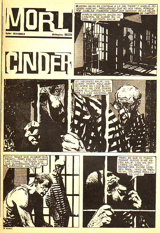
I wrote about Héctor Germán Oesterheld because I think that he is the best comics writer that ever existed (yes, better than Alan Moore) and the world needs to know more about him. Being an Argentinian he’s at a disadvantage (like everyone else that worked or works in comics outside of the holy trinity: Japan, U.S.A., France-Belgium). This applies even to countries with fairly important traditions in the field like Spain and Italy…

My other posts just mean that a comics avant-garde scene (Bart Beaty calls it a postmodern modernism – 2007) truly exists in Europe (this is an idea that goes back to Jan Baetens in his analysis of Autarcic Comix – 1995 – as reported by Paul Gravett in the link above). What interests me the most in comics are those borderline examples that push the limits of the form. Publishers like L’Association, Six pieds sous terre, Ego comme x, Frémok frequently publish, with the help of grants from the French and Belgian governments, highly experimental books that shatter to pieces our expectations of what a comic is supposed to be. Authors like Vincent Fortemps or Jochen Gerner are part of this unpopular (to quote Bart Beaty again) cultural movement.

I will stumble on some North American comic one of these days, I’m sure, but I don’t know exactly when… (North American comics authors respect comics’ mass art tradition too much for my taste. They are afraid of being called pretentious or elitists if they forget goofy caricatures, I suppose; maybe they should embrace Milton Caniff’s, Hal Foster’ s, Alex Raymond’s tradition instead to tell contemporary adult stories? Are the technical skills a problem though? Sadly, I suppose so… those giantly talented graphic artists are hard to match.)

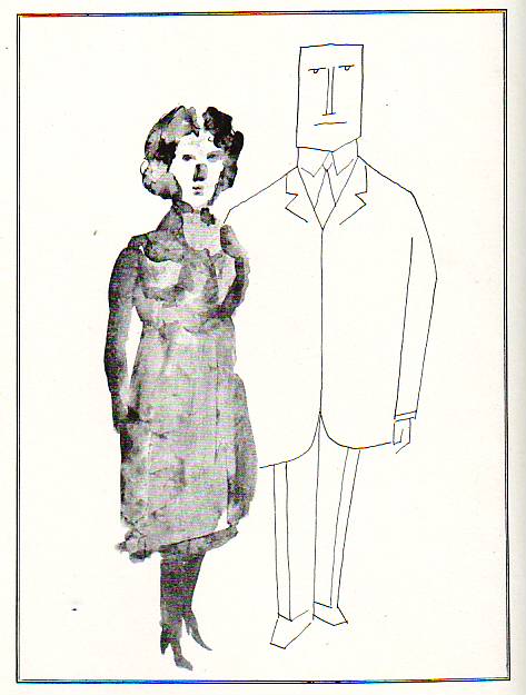
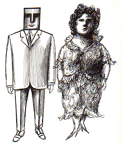
Dominique Goblet is also part of that nineties’ European comics revolution that I mentioned above (she’s a Belgian). Nikita Fossoul is her daughter.

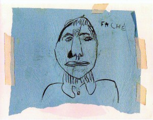
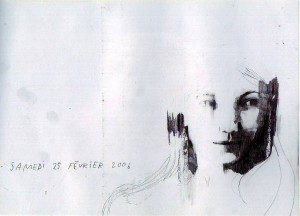
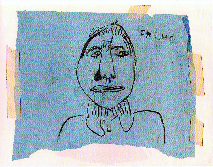
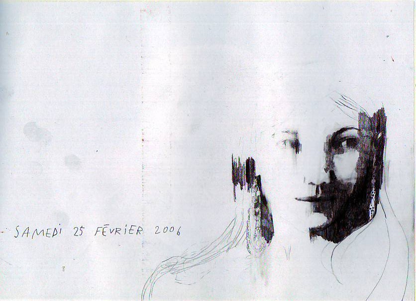
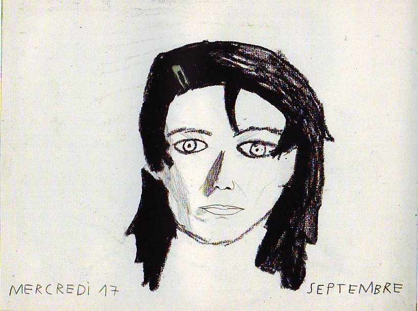
In Chronographie (another quasi-wordless book) they publish ten years of their more or less biweekly portraits of each other (Fossoul was seven years old when they began and Goblet was thirty one). Words are few and far between, but when they appear they add important meanings, not as an anchor in a Barthesian sense, but as time and context info and as emotional descriptors. It’s mostly Nikita who uses the latter saying thinks like: “Faché[e]” – “Pissed off.” Being in a powerless situation children need to pay attention to the adults’ moods. This doesn’t necessarily mean that Dominique was pissed off at the time though: it may simply mean that she appears to be pissed off and Nikita noticed this after doing the drawing (see below). (Curiously enough the words gradually disappear from Nikita’s portraits. I’m sure that there’s a paper here somewhere.)

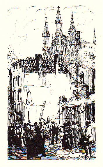
Confronted with these kinds of books this television show host asked: “Can we still talk about comics?” I would answer definitely yes, but I hardly count… My answer is in accordance with my expansion of the comics field to include things from the distant or recent past (said expansion may be seen as an anachronism and a decontextualization). What’s new in this case is that these authors really are comics artists. L’Association (Chronography‘s publisher) is a comics publishing house (whose publisher Jean-Christophe Menu, as been one of the most vocal actors in the comics field to defend that really there is a comics avant-garde). If Frans Masereel never thought about  it, I’m sure (I include him in comics history without his permission), they, on the other hand, want to do comics in a contemporary high culture context. As Dominique Goblet put it, answering the question:

We are at the crossroads between the visual arts and comics. The link that unites all this is a passion to tell stories.

(I would replace “tell stories” for “do sequences” because many things in, for instance, the Fort Thunder style shatters the narrative. On the other hand I suppose that it is defensible to say that two images put together, no matter what they represent, do tell a story of sorts… Also: the visual arts always have been a part of comics, so, I don’t see where the crossroad is. What Dominique Goblet says is understandable though: the visual arts have an important history of experimentation and comics don’t.)

In almost every session Goblet and Fossoul chose the same technique, the same composition solutions, explored the same particular aspects; they even shared model poses sometimes (see below). This coherence can only mean that Dominique Goblet was the art teacher and Nikita Fossoul was the student.

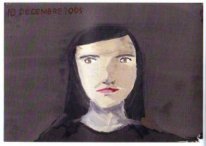
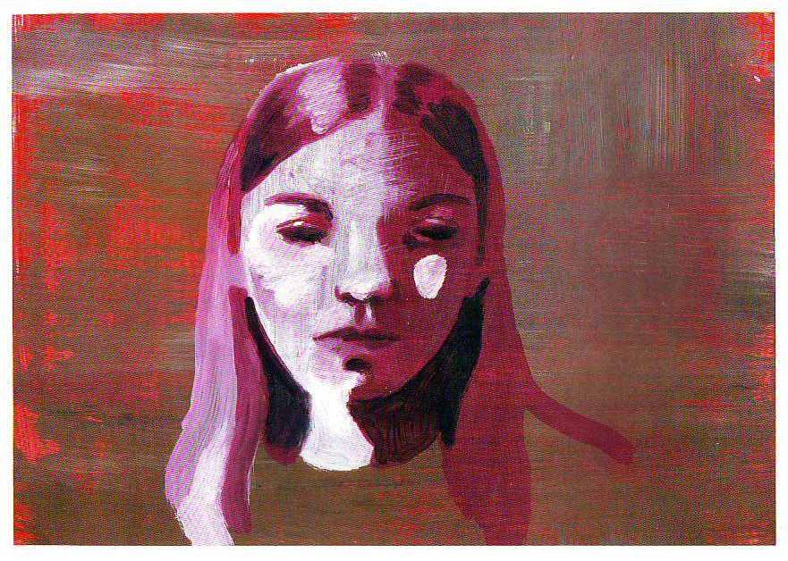
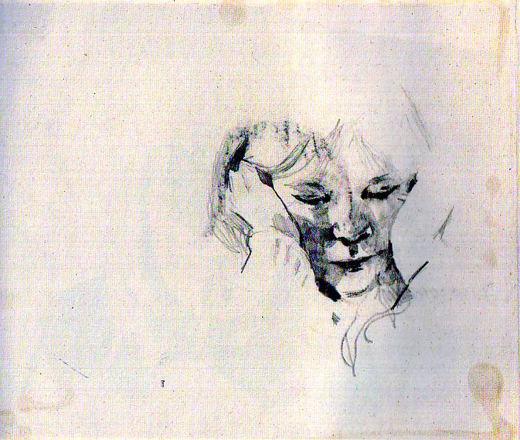
The book begins with graphite and black colored pencil  line drawings. It continues exploring washes, pastels, collages, acrylic paint. The supports are all kinds of paper (old papers, drawing papers, etc… two of the drawings seem to have been done on some sort of synthetic board).

The problem of resemblance is at the center of the portrait genre. If Dominique Goblet solves this problem easily Nikita Fossoul doesn’t even address it. As she put it in the book’s postface (in both French and English, by the way):

So I drew what I sensed (almost) more than what I saw: a mood, a special complicity… Thanks to this lack of interest in strict likeness, I too could let go and no longer be afraid of ‘going wrong[,]’ and that is how I dared to carry on.

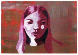
As she also says drawing was a game at first, but an evolution can easily be traced in her drawing skills. As for Dominique Goblet she draws in a contemporary sketchy (sometimes fragmented) style, but she never destroys her model’s face. She obscures it sometimes because she has a real interest in shadows and light (great vehicles to convey mood). Sometimes she just did beautiful simple drawings like the two below.

Ten years is a long time in a person’s life and Chronographie is about the passing of time, but what story do these faces tell us? When she began this project Dominique Goblet wanted to explore a mother / daughter relationship:

I have always wondered about what is called ‘maternal instinct[.]’ To be honest, I have never fundamentally understood what it could mean.

In any case, to my great regret I have never been sure of anything that obvious. I don’t know if I resemble those mothers who talk about unconditional love, instinct, the need to unreservedly  protect.

One more time we reach the conclusion that philosophy, science, the arts start with the same impulse: the will to explore, the will to know beyond all clichés and common sense. A book depicting saccharine moments between a mother and a daughter would be a kitschy thing indeed. But that’s not what Chronographie is: there are moments of laughter, there are moments of bliss and there are moments of sadness. Life is a lot more complex and interesting than any pop myth (Dominique Goblet again):

Many things were said without words. The sequential work is carrying on, in a way, very slowly. What is told here traverses the prism of an imperceptible movement. The years spent together…

The essential is told, we have given more of ourselves than any memory would have done. This is no longer about details, let alone anecdotes.

The myth of the mother-daughter bond appears in another form: a silent tale.

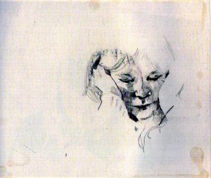
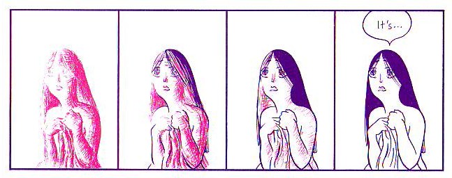
Imagining myself as a devil’s advocate I could say that Nikita Fossoul’s drawings are amateurish and Dominique Goblet’s drawings are sometimes great, sometimes not so great. All that is true, but is it really important? What matters is the inquisitiveness, the patience, the bond between mother, daughter, and the readers… life being lived and shared (that’s what real art is all about)… those rare moments in which we receive our rewards and get some answers… That’s why I finish this post with the only portrait in the book in which a  young artist (she was twelve years old) captured her mother’s likeness, without even trying… It’s no wonder that she saw her with a pair of worried, slightly sad, eyes the size of the world… her world…

Dominique Goblet’s site

Monthly Stumblings # 3: Héctor Germán Oesterheld, Francisco Solano López

Héctor Germán Oesterheld’s and Francisco Solano López’s “Enterradores” (gravediggers)

A curious thing happened when Argentinian scriptwriter Héctor Germán Oesterheld found his own comics publishing house, Editorial Frontera. For a brief period of time, 1957 – 1963, mainstream adolescent comics raised much above the business as usual, pervasive formulaic dreck. Oesterheld proved to me a very simple and often forgotten truth: it’s easy to dismiss a whole category if we base our judgment on the worst examples (usually those are the only ones that the judges know about). It’s easy to debase something when the judge is socially much above the subject of her/his scorn; in these circumstances s/he can only be applauded by her/his peers while all outraged reactions can’t be heard outside of the attacked subculture.

I don’t defend adolescent comics, mind you, I’m just saying that when the best comics writer ever decided do try a hand at this particular genre (if we can call it that) the inevitable happened. Here’s what he had to say in Hora Cero Suplemento semanal (zero hour weekly supplement) # 1 (September 4, 1957):

There are bad comics when they’re badly done only. Denying comics all together, condemning them as a whole, is as irrational as denying cinema all together because there are bad films. Or condemning literature because there are bad books. There are, unfortunately in a huge ratio, lots of bad comics. But these don’t disqualify the good ones. On the contrary, by comparison, they should underline their quality. […]

Oesterheld is a German family name and Héctor inherited a German tradition which, according to Christian Gasser (in the Lisbon comics convention catalog, 2003) dates from the enlightenment:

This didactic interpretation of literature is a product of the 18th century. At that time, the qualities of literature and art were used to educate and morally elevate the common people. Meanwhile, these efforts became obsolete in literature, but not in the restricted domain of children’s literature where people continue to ask: “Very well, what can a child learn from this book?” The pedagogic function continues to be overrated.

Oesterheld viewed the, then, popular medium of comics as an opportunity to reach hundreds of thousands of children and adolescents. At a certain point he felt the need to put the following warning on the cover of Hora Cero Suplemento Semanal: “Historietas para mayores de 14 años” (comics for those who are older than 14). The anti-comics crusade was still on and he didn’t want any trouble. Anyway, he wanted to both educate and entertain. What he meant by “educate” wasn’t exactly what may be on our minds today though…

He aimed at four goals: (1) to be accurate with his data (pedagogic texts about warfare punctuated his comics; he wrote stories in a lot of genres – Western, Science-Fiction, Historical, Noir –, but War – WW2, to be exact – remained the bulk of his magazines’ content); (2) he didn’t want to edulcorate reality or bowdlerize his stories; (3) he wanted to convey moral values of self-sacrifice, unselfishness, team work (he strongly opposed the individual macho hero as he – it’s usually a “he” – is seen by North American mass artists; ditto the glorification of violence… besides, the main character is usually someone socially “invisible” who reacts unexpectedly in a stressful situation); (4) linked to (2): Oesterheld didn’t want to hide what’s darker in the human condition, but, at his best (he produced hundreds of stories, so, lots and lots of them aren’t that good) he was never Manichean.

Four great draftsmen drew Oesterheld’s stories at Editorial Frontera before working (immigrating even) exclusively for the UK. After these artists disbanded the graphic quality of Frontera’s stories dwindled dramatically. Not even a young José Muñoz could equal them:

Hugo Pratt:

Hora Cero Extra! # 4 October, 1958.

Hugo Pratt did very rare unprejudiced portraits of black people in the 50s. In this Hora Cero Extra! cover he illustrated a story by Oesterheld about Senegalese soldiers fighting for France during WW2.

Arturo del Castillo:

Hora Cero Suplemento Semanal # 58, October 8, 1958.

An impressive Western scene from “Randall.” Castillo would do for the UK the best The Man in the Iron Mask comics illustrations ever.

Carlos Roume:

Frontera Extra # 7, May 1959.

Roume was a great animal artist. In this Frontera Extra cover he drew Pichi, the Pampa dog. A story scripted by Héctor’s brother, Jorge.

Alberto Breccia:

Misterix # 749, March 22, 1963.

Alberto Breccia and Héctor Germán Oesterheld’s Mort Cinder (a series that, in my view, isn’t as good as Ernie Pike) remains one of the most famous of Oesterheld’s creations (along with Argentinian cultural icon: El Eternauta – the eternaut). This doesn’t surprise me because of comics fans’ bent for fantasy. Even so the story to which the above page belongs, “En la penitenciaria: Marlin” (in the penitentiary: Marlin), is one of the series’ best ones.

I immersed myself in Oesterheld’s oeuvre for the last year. Reading hundreds of his stories I can safely say that he could have been one of those world famous South American writers like Jorge Luis Borges. Borges and Oesterheld knew each other and used to take walks together. Oesterheld was an inventive plotter and a purveyor of ideas and great phrases. Even when the story is no good at all (as I said, he produced too much) a phrase sparkles suddenly making the reading worthwhile.

I stumbled upon lots of Oesterheld’s great stories, but I had to choose one for this Stumbling. I chose “Enterradores.” In it a German major freshly arrived from Berlin to the Stalingrad front is shocked when he discovers that two German soldiers (Wesser and Hofe) of the disciplinary battalion (whose mission is to bury corpses) are burying Russians and Germans together:

Hora Cero Extra! # 1, April 1958.

The drawings are by Francisco Solano López. To be honest I don’t like Solano’s drawings as much as I like the work of those four artists above. I find his understanding of the human figure a bit strange and his lines a bit heavy and formless sometimes. Even so it seems to me that he captured the facial expressions of the veterans well in contrast with the major’s. The overall darkness of the atmosphere is more than adequate to convey the theme of the story.

The captain explains to the major how desperate the situation is (he wants to excuse the two men’s lack of discipline). Here’s what Oeserheld wrote in the last two strips: “It was in the Steppe, near the Don. / There stayed a shared grave different from all the others. A grave in which Russians and Germans mixed. / That grave was the revenge of soldiers Wesser and Hofe of the disciplinarian battalion.” Equally impressive are the eerie shadows walking into oblivion at the end…

Can you imagine such a story in a children’s comic today? It wasn’t even suitable for a children’s comic back in the 50s. And yet, Argentinian kids bought Hora Cero and Frontera in their various incarnations. Judging from Oesterheld’s example, maybe I’m not against children’s comics… maybe I’m against children’s comics that insult their readers’ intelligence, that’s all…

Monthly Stumblings # 2: Frans Masereel

Frans Masereel’s Route des hommes (men’s path)

In my humble opinion the best Belgian comics artist is not Hergé… The best Belgian comics artist is Frans Masereel…

I vaguely remember mentioning this to a couple of Masereel’s fellow countrymen and I’ve got two different answers (I must add that, in my view, of course, I chose my collocutors well): (1) a nod of approval; (2) something like: In Belgium we don’t view Frans Masereel as a comics artist.

(Needless to say that, besides some puzzled expressions asking “who are those?,” most of my possible Belgian interlocutors would react in a third way calling me a lunatic, or worse, depending on the person’s degree of Tintinophily.)

The first reaction was understandable because said person is an artist himself and what he does is akin to Masereeel’s work. The latter one is more interesting to me at this particular moment because it permits me to enter one of the muddiest territories in comics scholarship once again (when will I learn, right?…), the old conundrum: what is a comic?…

I’m not going to answer that question because it can’t be done. All the answers that one can come up with are rigged because they depend on a previous particular view of what’s essential in a comic (and that’s not only prescriptive, that’s also arbitrary). To Bill Blackbeard, for instance, speech balloons and image sequences are essential so (even if there are older examples, namely, here or even, here) comics started with Richard Felton Outcault’s Yellow Kid in 1896.

Saying this though, doesn’t get us very far (my thoughts on the subject, are here, by the way). What interests me right now are two related points: (1) the sociological side of the problem; (2) anachronism. (1) Words have a (social) commonly agreed meaning. The dictionary tries to stabilize it, but significations aren’t fixed. There’s a reason why we call Maus a “comic.” The sense evolved to include serious work while the signifier stood still. Even so I accept that “comics,” to most people, don’t include Frans Masereel’s oeuvre. Perhaps it will, someday… (2) Frans Masereel didn’t view himself as a comics artist. As far as he was concerned he did wood engravings, that’s all… To call his cycles “comics” is an anachronism. Maybe so, but it seems to me that we are guilty of anachronism all the time and nobody cares. To go back to Tintin, the expression “bande dessinée” didn’t exist when Hergé started doing comics. Why do we continue to say that he did comics, then?… Did the Lascaux painters call what they did “painting?” Is that important? How logocentric can we get?…

As you can see in this 1915 illustration above Frans Masereel was a naturalist. But working for the pacifist newspaper La feuille in Geneva as a political cartoonist during WWI Masereel needed a less detailed, more urgent, style. As Josef Herman put it:

Working for La Feuille posed two main problems for [Masereel], both of a technical nature. One was that the drawing had to be done quickly, leaving no time for the careful, detailed draughtsmanship he had practised until then. The other was how to achieve maximum effect using poor quality paper, on which thin lines were simply lost. He solved these two problems with the true instinct of a man of genius. He avoided drawing with a fine pen and took a thick brush, in the process giving up the search for tonal texture. He now used large planes of intense black, drawing lines wherever needed with a brush. The emotional effect he achieved was staggering.

Maybe the times weren’t right for nuanced views of the world (?). I love Frans Masereel’s verve and variety (he did manga in the original sense of roaming drawings), but his ideological views and Expressionist style push him into a less than complex view of the world sometimes (the fat, jeweled, cigar-chomping capitalist, for instance, is a regrettable stereotype). You can see one of Frans Masereel’s political cartoons as published in La feuille below:

Frans Masereel was 75 years old when he published Route des hommes (1964). He did “novels without words” all his life (more than 50, according to David Beronä). Route des hommes is far from being one of his best (that would be Passionate Journey – 1918 – and, my personal favorite, The City – 1925).

Route des hommes is about the horrible and great things that happen to humankind. We find in the book Masereel’s usual topics: war, famine, exploitation, but also progress, team work, joy, etc…

The greatest thing about this edition of the Musée des Arts Contemporains au Grand-Hornu and La Lettre volée (2006) is that it shows both Masereel’s prep drawings and his wood engravings. In this way we have access to the artist’s creative process as never before.

We can see above how Frans Masereel cites another Belgian painter, James Ensor (ditto Jacques Callot at some point). It’s interesting how what seems to be a tree in the foreground of the drawing becomes a sinister figure in the wood engraving (death waits us all at the end). His composition changes (increasing the two background figures’ size) greatly improve his work.

Masereel used allegory a lot. In this drawing the cars represent careless rich people. The city lights aren’t just that, they connote poor people’s acceptance of the status quo: they’re hypnotized, alienated (as Marxists liked to say)…


…But, to tell you the truth, I prefer allegoryless Masereel. He could be very poetic, as we can see above…

Hooded Polyp: Smart Cardboard?

David Mazzucchelli’s formal innovations in Asterios Polyp are almost sixty years old.

The image above shows two 1953 “Pogo” newspaper comic strips by Walt Kelly (as published in Pogo, volume 10 – Fantagraphics Books). Sarcophagus Macabre, the vulture, “talks” in courier font (June 10) while the Deacon Mushrat speaks in Gothic Blackletter (June 11). Plus: Sarcophagus’ speech balloons have the format of a condolence envelope. You can read a brief, but interesting essay about politics in Pogo, here.

As we can see above David Mazzucchelli also used different speech balloons’ formats and fonts as characterization (see also Derik’s post).

Sarcophagus Macabre’s name, species, and ascribed balloon format are enough to know what he is, but the courier font needs an explanation: he’s an hypocrite because he expresses condolences sending form letters written with a (cold, of course) machine. The Deacon talks in Gothic fonts because he’s a cleric (he reads the Bible and he’s a conservative, not because he’s a Christian, but because he’s defined by Middle Age writing).

In Mazzucchelli’s case Asterios’  mother “talks” in D’Nealian cursive script (an anachronism) indicating candor and childishness while the father talks in pseudo Greek fonts. He was indeed Greek, but since ancient Greece is known, among other things, for its Mathematicians and Philosophers, the fonts also connote a rational man. Notice also the wavy line that defines the mother’s speech balloon and the father’s rectangle (with no edges; he’s a mild-mannered man). 

Saul Steinberg drew the two couples above (as published in The Passport, 1954). Do we start to see a pattern… and a problem? Men are “square,” rational beings, women are vague, intuitive, entities.

As we can see above (in a panel from Asterios Polyp), adding magenta (hot) for Hana and cyan (cold) for Asterios it’s the same view of men and women, the same stereotyping… Ooops! I used the “s” word!…

In a famous essay art historian E. H. Gombrich mentioned “wit” to describe Saul Steinberg’s drawings. Here’s what he said:

In many of his drawings it is the line of the graphic medium which seems ‘an echo to the sense’. His ‘Family’ […] shows us the father firmly modelled, the mother with undulating lines, the grandmother all but fading away between hesitant pen strokes, and, of course, the child drawn in the style of children’s scribbles.

From here it is but one step to the representation of what are called our synaesthetic reactions, the depiction of one sense modality by another.

The ekphrasis sounds familiar by now… The synaesthesia I frankly don’t see (it lacks that “one step,” I suppose). I will not deny the wit and creativity of Saul Steinberg’s visual solutions (some would say visual writing), but drawing attention (pun intended) to just a singular personality trait is a simplification. It has great applications in political satire, no doubt, but it’s not so great a device in a serious (graphic) novel.   

David Mazzucchelli agrees with me (or, his character does, as seen above), but he risked the blunt approach nonetheless as seen below (with a pint of self-irony: comic books, really?!)…

Comics are sequences, so, David Mazzucchelli could explore Saul Steinberg’s ideas in a more complex way: showing mood transformations, for instance (see below).

Hana goes from undefined (painterly, as Heinrich Wölfflin put it) to defined (linear; ditto). Wölfflin’s opposition (inspired by Friedrich Nietzsche’s Apollonian-Dionysian dichotomy) was one of Asterios’ favorite aesthetic theories; the other two being essentialism and Louis Sullivan’s famous diktat “form follows function.” She goes from magenta (irrational, life) to cyan (rational, thinking).

The procedure is welcomed, but were the googly eyes and the Utamaro mouth really necessary?…

If you read ’til here you must be saying by now that I hate Asterios Polyp. Well, I don’t, I like the tour de force, but I must plead guilty of double standard. I’m not the only guilty one though: many critics forgive a cliché and a stereotype (calling it “an archetype”) in adolescent and YA genre comics while vigorously attacking the same flaws in art comics. I did the opposite and I still think that Asterios Polyp is one of the best comics published in 2009. I’m sure that I’m misguided though because I failed to read all those marvels published by the big two…

____________
Update by Noah: The entire Asterios Polyp roundtable is here.