
Editor’s Introduction: This is the first of what we hope will be a monthly column, “Sequential Erudition”, which will reprint academic work in the field of comics studies. The numerous discussions around the Best American Comics Criticism volume brought up how divorced the academic writing about comics is from popular writing about comics, not because of style, content, or interest, but because so much of the academic work is not easily available to the average reader (those without access to an academic library). In an attempt to help spread some of this academic work to a broader audience, this column will be reprinting works from journals and other academic venues. If you are an academic who is interested in having his/her work reprinted, please contact me, Derik Badman (email: first name dot last name at gmail dot com). Much thanks to Andrei for agreeing to have his article reprinted. -Derik.
Permanent Ink: Comic-Book and Comic-Strip Original Art as Aesthetic Object by Andrei Molotiu
[Author’s Note, 2010: I gave an early version of this article as a talk at the 2006 meeting of the College Art Association, in a session, organized by Christian Hill, on “Gallery Comics.” Expanded from that talk, the article was then published in the Fall 2007 issue of the International Journal of Comic Art, as part of a symposium on the same topic; hence the references to “gallery comics” in the first section, below. While, as a concerted movement, gallery comics seem more or less to have fizzled since, the notion of combining the comic form with the display context of the gallery wall clearly still informs the practice of many contemporary artists (or cartoonist/artist hybrids), such as Mark Staff Brandl (another participant in the session and symposium), Warren Craghead and, well, me; not to mention many other comics artists who have turned to showing their work in gallery spaces in recent years, such as Mat Brinkman or Ben Jones.
In any case, I mention this original presentation and publication context just to explain some references that might otherwise seem puzzling (Christian opened both the CAA session and the symposium with a presentation introducing the notion of gallery comic; even in the absence of his text, though, I think the definition of this new-ish artform should be pretty clear from my discussion of it); I primarily used the topic to introduce my main subject: the display on gallery and museum walls of comic art that had not originally been intended for this purpose, and how this new display context affected our appreciation of it.
The text below varies in a few minor points from the version published in 2007; in one or two instances I re-thought the wording, and I have also added, in brackets, a couple of notes expanding or correcting some of my earlier claims. -Andrei Molotiu]
While the aesthetics of comics have received increased scholarly attention over the last couple of decades, most of this attention has been paid to comics in their final, printed form, with little of it devoted to original comic art.[1] At the same time, traditional drawings experts have shied away from art that is often seen not as an end in itself but as a tool in a creative process, the end of which is the printed comic. Of course, the lowly status of “popular” culture has also played a large role in this neglect. However, original comic art deserves significantly more study from comics scholars, art historians, museum curators, and even from critics and theorists. I would like to make the case for it by emphasizing the specificity of original art as aesthetic object, and by distinguishing between the aesthetics of the printed comic and those of the actual original-art object, as collected and displayed.
Comic Art Originals as Gallery Comics
As this symposium is devoted to gallery comics, I would like to begin by exploring how my topic fits into this larger theme. Doing so will also highlight some of the principal characteristics of original comic art and the distinct kind of aesthetic appreciation it invites.
A gallery comic, by definition, offers a hybrid of the visual experience of gallery art and of that of the comic-book page. That is to say, it transcends the traditional identity of a comic as a (visual-verbal) text intended to be consumed for narrative information and replaces—or commingles—it with the experience of a two-dimensional artwork on a wall. As such, a gallery comic not only allows but appears to require a longer period of viewing than is usually necessary to get a page’s narrative gist, and ultimately offers a different experience of sequential art, one that goes beyond a comic’s immediately readable meaning toward what we might think of as its quality as object: the comic not simply as visual-verbal text but as text inseparable from its material support. Additionally, gallery comics seem to have a different relation with their “mechanical reproducibility,” as Walter Benjamin might say, than mainstream or even alternative comics. They are either hand-drawn or hand-painted by the artist, or appear as small-run prints.[2] Gallery comics, of course, also tend to be larger in size than their printed cousins, befitting the visual experience of seeing a piece on a gallery wall, rather than reading it while holding it in one’s hand
Now, though the medium of gallery comics is still in its infancy, we of course already have had many works fitting the definition, though they may not necessarily have been intentionally created as such. Take for example the many museum and gallery shows devoted to comics in recent years, such as “Masters of American Comics” in Los Angeles, Milwaukee and New York, Ivan Brunetti’s “The Cartoonist’s Eye” at Columbia College, Chicago—or the show, “Comics as Art,” that I organized with John Begley at the Belknap Gallery at the University of Louisville in the fall of 2005. These exhibitions tended to display both printed comics, in the shape of comic-books, usually in a vitrine or a glass case and open to a particularly visually arresting spread, and pieces of original art. For many comic-book readers who went to such shows, the experience of a book permanently frozen on a single double-page spread and whose leafs one could not turn to see what comes next was to some extent frustrating. Comic-books are designed for a specific kind of viewing/reading experience, and we feel that, no matter how much we admire the few panels on view, we are getting only a partial experience of that specific artwork.
Coming face-to-face with original comic art generates a different experience. Looking at an original comic page, even if it is a so-called inside page (that is, neither a splash page nor a cover), the plot and what happens in it past the few panels before us are usually far from our minds. What is intriguing, to begin with, is simply the beauty of the page itself, the quality of its draftsmanship. In the comics-reading experience, except in rare cases, the art is intended to have, at least partly, a utilitarian and eminently consumable function: namely, to carry the plot forward and get out of the way. Thus, the usual comics reader does not spend more time poring over the art than is necessary to comprehend the events depicted. When considering original art as an aesthetic object in its own right—an experience greatly facilitated by the act of displaying it in exhibitions, on gallery walls, or in private collections—this situation is turned on its head. Images meant to be consumed in the space of a minute or less demand, when exhibited, a different kind of attention, one that shifts away from the utilitarian aspects of the art to those that are not so easily consumed by narrative—to what might be called its non-logocentric qualities.[3] This is true even in the case of single-strip or one-page gags, where the original art presents not a fragment of a larger narrative, but carries the entire gist of the printed piece: once we have gotten the joke, the materiality of the piece continues to confront us and does not allow our eyes to slide as easily to the next strip over as they would when reading, say, a newspaper comics page.
Conveniently for gallery spaces, comic artists have traditionally drawn their originals at either “twice-up” or “half-up” size—that is, either twice or one and a half the size of the finished printed artwork.[4] This difference in size between original art and printed comic was developed for purely practical reasons, to allow the artists more space in which to draw the smaller details, as well as to allow more sweeping hand gestures and therefore a more consistent and confident line quality. For the purposes of museum exhibition, however, this difference in size also helps the original art function better as an exhibit object, not only having a more impressive visual presence on the gallery wall but also displaying the drawn marks at the scale at which they were created, and therefore emphasizing the indexical relationship between the draftsmanship and the hand and body of the artist.[5]
Identifying the distinct qualities of original comic-art pages which set them apart from their appearance in printed form can help us elucidate the differences between the respective aesthetic attentions invited by comics in their two distinct guises. The great majority of scholarly studies that have so far addressed what can be called the aesthetics of comics—from Scott McCloud’s Understanding Comics to Thierry Groensteen’s The System of Comics, and many others—have naturally focused on the printed final product. In doing so, they have analyzed primarily the rhetorical, narrative, and generally meaning-making devices of the medium, such as types of panel-to-panel transitions, word and image interaction, or the semiotic interdependence of panels within each page’s layout. These elements can of course still be studied in the original art from which the printed comics were produced. However, a strange development occurs when we confront the original, hand-drawn boards: rhetorical devices, narrative techniques, and so on are lessened in importance proportionally with the de-emphasis of our attention to story and plot. The material support of the narrative sequence no longer presents itself as a (ideally) transparent medium, and the rhetorical, meaning-producing level of the text is revealed as belonging only to the most superficial layer of a thick palimpsest of brush and pen strokes, touches of white-out, blue-penciled editorial interventions, traces of penciling, marginal instructions from writer to inker, and so on. Furthermore, as plot fades into the background, so does our immediate tendency to scan the page in the same direction and order as any written text (left to right, and top to bottom, in the Western tradition), which is replaced more with the perpendicular, centralized gaze of the viewer of paintings or drawings. Looking at a piece of original art hanging on a wall, the eye does not immediately go to the top left panel, nor does it feel compelled to follow the narrative sequentially, instead gaining a new freedom to skip across the overall surface of the board independently of the prescribed sequence. Such a redistribution of visual interest places more emphasis on the overall composition of the page, and the viewer’s attention, more easily than when reading the printed product, is able to focus on the semiotic and formal interplay between panels even when these panels are not sequentially continuous.
Now, the moment we display—and admire—comic art originals in gallery spaces, and that we begin considering their own aesthetic qualities separately from those of the printed comic, an objection may arise. In thus glorifying what might be thought of as just a tool in the comics-production process, and not the finished product itself, are we somewhat betraying the intention of the artist and also falsifying the historical context of production and consumption of the image—as if we were admiring Goya’s copper plates, rather than the printed etchings of the Caprichos? This complex question alone could warrant a full study. However, within the scope of this article, let me just point out a few relevant facts. To begin with, the often-invoked original art/printmaking plate analogy has been forcefully countered by Richard V. West, in his afterword to Robert C. Harvey’s exhibition catalogue, Children of the Yellow Kid. Seeing the printmaking plate as the “matrix from which a number of images are printed,” West argued that comic art originals do not fit into this category:
In the case of comics, the original drawing can’t be considered the “matrix” for the printed version. The true matrix is the printing plate produced by photo-mechanical means from the artist’s drawing. Like many true matrices, the printing plate is normally discarded or recycled after it has served its purpose. Fortunately for us, the inked drawing is not destroyed (at least not intentionally) in the process of making the plate, and remains as a sort of “proto-matrix” from which, presumably, a new matrix could be made.[6]
Of course, a further difference between printmaking plates and comic art originals is that, while the former only record the image in sunken grooves or raised ridges on a metal plate or wooden block, and thus do not visually resemble the artist’s intent for the final product, original comic art usually features black shapes on a white ground, and thus is much closer to the final, published images, particularly in the case of black and white comics.
Further justifying the attention paid here to comic art originals is the fact that many recent artists, such as Ivan Brunetti, Tony Millionaire or Gary Panter are clearly paying as much attention to the published end-result as to the original art itself, which they intend to display in a gallery or sell. Therefore, they are creating not with one, but with at least two (overlapping) audiences in mind: the comic-reading public, and the gallery-goers and collectors of original art. For these artists and many others like them, original comic art is as much “gallery comics” as production tool. Similar attitudes could be found among comic artists of past generations, even when they were producing work for hire for mainstream companies, at a time when originals were routinely disposed of,[7] and long before a well-organized market for original art had developed. For example, a well-known story about Jack Kirby, told by his long-time assistant and biographer, Mark Evanier, reveals Kirby’s and his wife’s attitudes toward original art. Discussing a period in Kirby’s life when the artist’s strained relations with Marvel Comics led to a great amount of mental stress, Evanier writes:
During the period of depression I just mentioned, he would occasionally finish an especially good full-pager for Thor and show it to his wife, who was equally unhappy with how Marvel was treating Jack. Roz would look at the page and say, “It’s too good for them.”
Jack would say, “You’re right,” and instead of sending it in to Marvel, he’d give it to her. She’d put it in a little folder she kept as “her” Kirby Art Collection.[8]
Formal Characteristics of Comic Art Originals
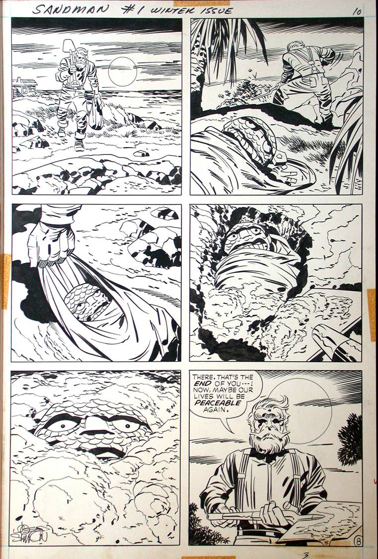
Figure 1. Jack Kirby (pencils), Mike Royer (inks), Joe Simon (script), original art for page 8 from The Sandman no. 1, DC Comics, 1974. Copyright DC Comics, 1974, 2007.
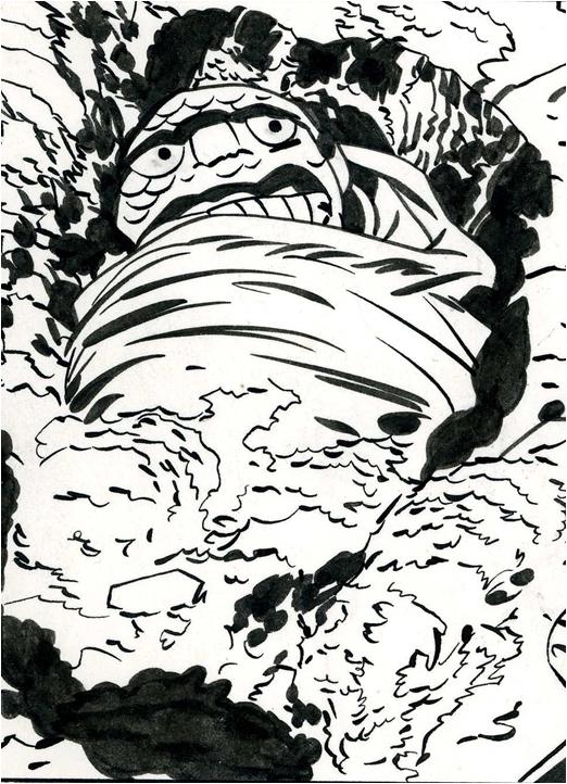
Figure 2. Detail of fig. 1.
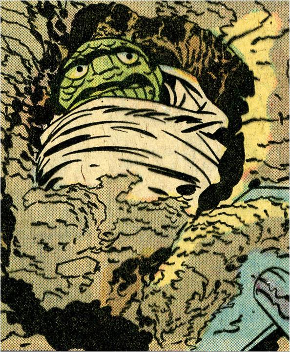
Figure 3. Jack Kirby (pencils), Mike Royer (inks), Joe Simon (script), The Sandman no. 1, DC Comics, 1974, page 8, detail, as printed. Copyright DC Comics, 1974, 2007.
What mainly justifies this attention paid to original art, however, is the inherent visual qualities of the art itself. There are a good number of such qualities that viewers can see in a piece of original art, but not in the printed comic. To begin with, even though many assume that a pure black and white image can be translated into a printed black and white comic or into the black lines of a color comic with minimum loss, this is hardly the case. As can be seen when comparing a panel from Jack Kirby’s and Mike Royer’s original art for a page DC Comics’ Sandman no. 1 (1974) (figs.1, 2) to the printed product (fig. 3), oftentimes the reproduction process thickens the inked lines, which lose some of the gracefulness they had in the original drawing. Additionally, for the sake of reproduction, printers increase the black and white contrast, which gives lines a somewhat raggedier appearance (the proximity of lines to the color screen-dots also emphasizes this visual degradation). We would expect that the use of more sophisticated imaging technology would have corrected this situation. Actually, if anything, it has made it worse. As you can see in this comparison of the original and the printed versions of a panel from Ivan Brunetti’s Schizo 4 (figs. 4, 5, 6), line thickness is significantly exaggerated in the printed version, and so is the raggediness of the line edges.[9] Now, of course, one might argue that the artists created their original pages advisedly, accounting for the later transformations—in the same way that painters in the eighteenth century knew to work a little too brightly, so that some of the brightness of their color might survive under the painting’s darkening protective glazes. Yet, the liveliness and confidence of the application of the lines that, in the originals, really draw out the abilities of comic artists such as Brunetti and Royer survive only partially in the reproduced images.
Figure 4. Ivan Brunetti, original art for page from Schizo no. 4, Fantagraphics Books, 2005. Copyright Ivan Brunetti, 2005.
Figure 5. Detail of fig. 4.

Figure 6. Ivan Brunetti, Schizo no. 4, Fantagraphics Books, 2005, detail, as printed. Copyright Ivan Brunetti, 2005.
A study of the original art on the level of the graphic marks also reveals a variety of visual qualities derived from the specific tools used, and which disappear in the printed version. As part of their “DC Showcase” series, DC Comics has recently reprinted a page of Metamorpho, from 1967, penciled by Sal Trapani and inked by Charles Paris, the original of which can be seen here (figs 7, 8). DC appears to have reproduced the page from the original negatives and using better printing techniques and paper, and thus managed to maintain the line quality of the original much better than in the original printing. Nevertheless, the reprinted version does not—and can not—reveal the slightly more faded, grayish tint of the lines describing the outline of the character, the Thunderer, compared to the darker black of some of the other lines, which also show a different edge quality. That is because the inker drew those outlines with a brush, and in this specific panel, most probably with a brush still containing some water, which somehow diluted the ink. In general, brushes apply thinner layers of ink than pens do, allowing the white of the paper to come through more. In contrast, Paris drew the three fine lines at the top of the character’s nose with a dip pen with a flexible nib, such as a crowquill. He most likely used the same pen to indicate the outline of the speech balloon, as can be seen in its inflected lines, thinning from the edge of the panel to the tail of the balloon. Finally, the borders of the panel were drawn with a technical pen, such as a Rapidograph, which lays down a line of consistent width. In some panels—and this is almost impossible to show in a reproduction—the ink line applied by a flexible dip pen is so thick as to be slightly in relief above the surface of the paper, giving a fascinatingly tactile quality to the image.
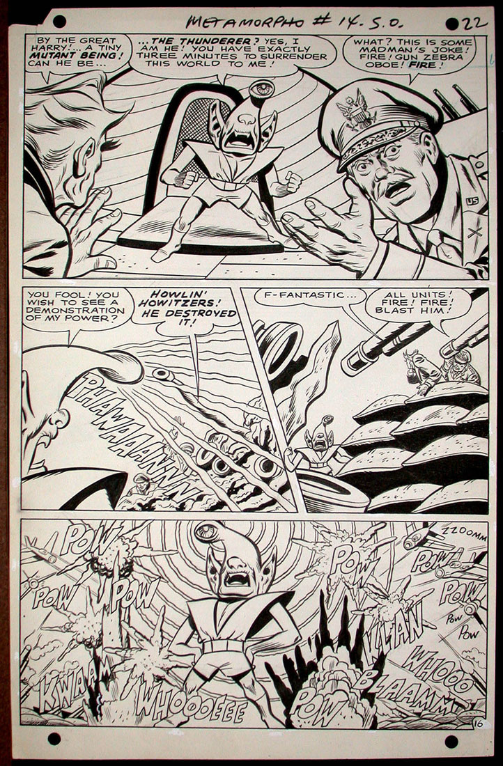
Figure 7. Sal Trapani (pencils), Charles Paris (inks), Bob Haney (script), original art for page 22 of Metamorpho no, 14, DC Comics, 1967. Copyright DC Comics 1967, 2007.
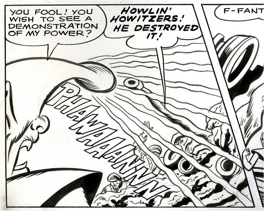
Figure 8. Detail of fig. 7.
Besides the manner in which the artist applied the ink, original boards, when studied closely, present an entire palimpsest of marks that do not show up on the printed image. In a 1968 splash page from the Archie comic Josie (fig. 9), we can detect erased pencil lines, which indicate the freedom with which the inker departed from the penciler’s indications. The page was penciled by the great Archie artist Dan DeCarlo, creator of “Josie.” We do not know who the inker was, but clearly it was someone familiar enough with the DeCarlo’s work to feel comfortable not to follow the pencils very tightly.[10] In two panels from Ham Fisher’s newspaper strip Joe Palooka from 1931-1932[11] (fig. 10), the hand throughout is Al Capp’s, who then worked as a ghost artist before launching his own very successful strip, Li’l Abner. The character of the young boy is a dead ringer for the later-created Abner. As can be seen in the original artwork (but as the newspaper and comic-book readers could not), the boxer’s suit was originally intended to be checkered, only later to be covered up with ink and made entirely black.
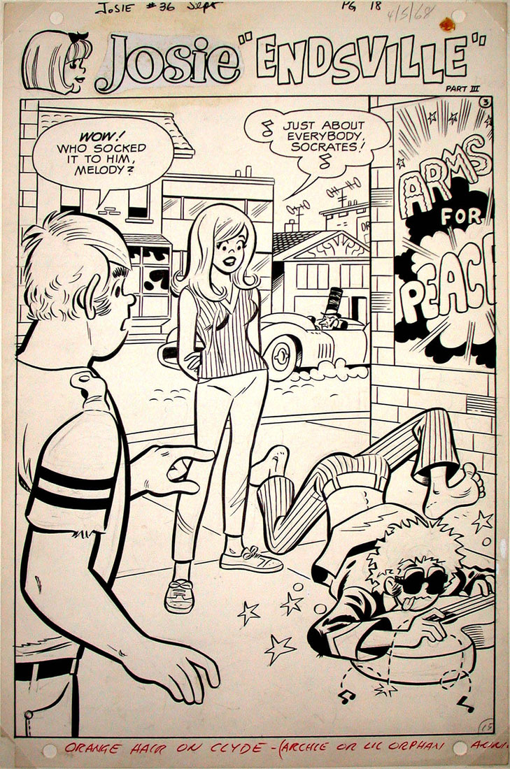
Figure 9. Dan de Carlo (pencils), original art for page 18 from Josie no. 36, Archie Comics, 1968. Copyright Archie Comics, 1968, 2007.
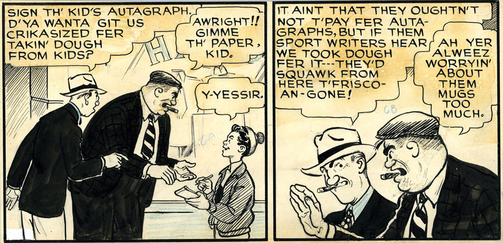
Figure 10. Al Capp (ghost artist for Ham Fisher), panels from Joe Palooka newspaper strip, early 1930s.
Erased pencil lines and double layers of ink have a certain intrinsic aesthetic appeal, adding to the visual interest of the page formal elements that are invisible in the printed version. Other marks that are visible only in the original artwork are traces of production manipulations, and do not necessarily add anything on their own from an artistic point of view. However, they do contribute to a “thicker” experience of the original page, as well as to our understanding of the comics-making process. The same Joe Palooka panels, for example, bear blue-penciled color codes (“6A,” “6B”), indicating what tint should be added to each area of the drawing.[12] This may indicate that the panels here originally came from a Sunday strip (the only newspaper strips that were printed in color); however we cannot be certain of this, as the Joe Palooka newspaper strips were also later re-used to make comic books, which were also in color. This later re-use also explains a couple more facts about the image: it is usually strange to find only a couple of panels, rather than an entire original board. However, when re-formatted for comics, the original pages were simply cut-up and then re-pasted in the shape of a comic-book page—which fact accounts for the panels’ acid yellowing, coming through from the glue on the back.
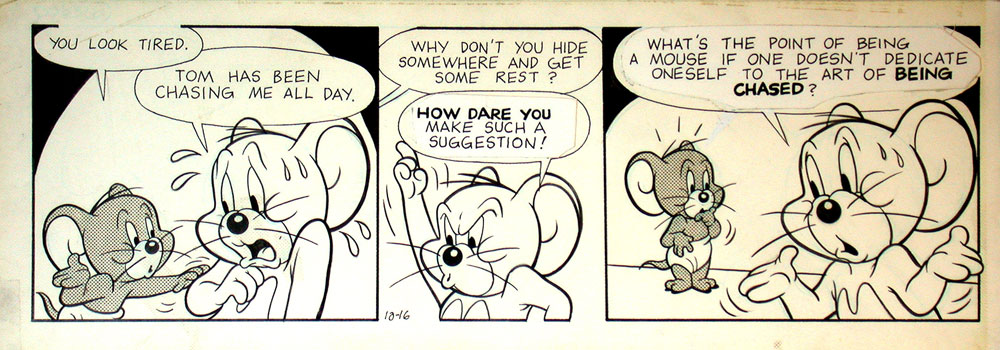
Figure 11. Kelly Jarvis, original art for Tom and Jerry strip, 10/16, unknown year (probably early 1990s). Copyright Turner Entertainment Co., distributed by Editors Press Service, Inc.
Editorial intervention constitutes another type of visual evidence barred from readers of the printed comics, but discernible in originals. In a Tom and Jerry newspaper strip by Kelly Jarvis (fig. 11), not only are the entire contents of the last two speech balloons pasted on, but the tail of the last balloon was moved to Jerry from his younger companion; clearly, the original joke was completely different. In a 1968 page from a story chronicling the adventures of the parody hero, Sooper Hippie (fig. 12), we can see touches of white-out consistently applied over the cleavage of the villainess, Mary Boppers—clearly indicating that Howie Post, the artist, had gone a bit far in indicating her charms, and that some censorship was in order. One can also see editorial blue-pencil lines correcting the name of the hero to “Sooper Hippie,” indicating that this name was arrived at quite late in the production process—after the penciling, but before the lettering.
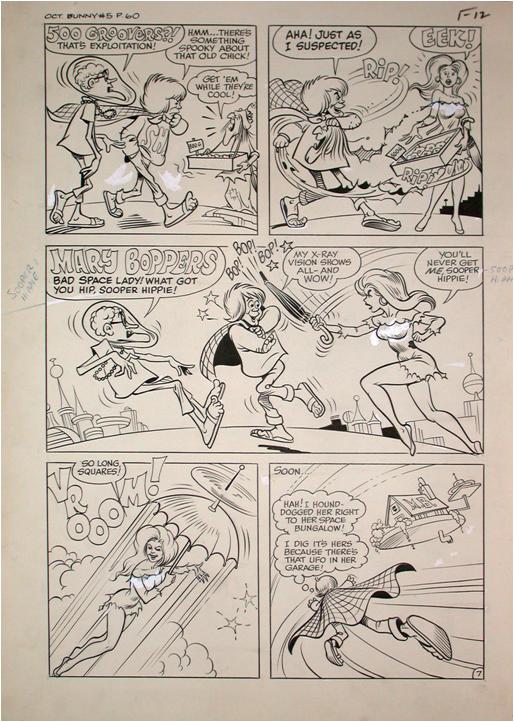
Figure 12. Howie Post (pencils and inks), original art for page from “Sooper Hippy,” published in Bunny, The Queen of the In-Crowd no. 5, Harvey Comics, 1968.
Touches of pro-white and of blue pencil, ghostly pentimenti of erased penciling, marginal notations, brushstrokes that reveal their speed and their directionality, penstrokes that seem to be in relief due to the thickness of the ink deposited—all these marks emphasize not only the inescapable presence of the artwork (a presence, which, given the shift of attention I am here proposing, can be felt as strongly as the impasto brushwork in a painting by Van Gogh or the chisel marks in a late, unfinished Michelangelo), but also the comics-creating process. This process, in traditional mainstream comics as well as in most “alternative” product, has been generally repressed in favor of creating a nearly mechanical look of homogenous blacks (whether or not accompanied by coloring screens)—a look that facilitates ease of reading by de-emphasizing the image’s presence as image. It is exactly this presence of image as image that is highlighted when a piece of original art is framed and exhibited on the wall, akin to traditional fine art such as painting or drawing.
Fragmentation and Temporality in the Display of Original Comic Art
As mentioned above, in such instances of display, the framing as well as the very circumstances of exhibition help place more importance on the overall formal qualities of the page. Furthermore, in the case of comic-book art, the incidents depicted in the particular piece of original art are usually wrested out of a larger narrative continuum. Yet the shift of attention that takes places in the move from the book to the wall—toward form and materiality, away from story—does not completely negate the page’s narrative content, but reframes it. The narrative is fragmented, and the act of exhibiting a single page creates a sense of mystery as to the specific events portrayed, which is satisfying in its own way since it avoids the simple consummability, and therefore disposability, of a plot. For example, as a work of art, the page reproduced here from Kirby and Simon’s Sandman no. 1 (see fig. 1) is much more successful than the story from which it derives. The combination of the night-time setting and the sense of suspense suggested by the silence of the first five panels and by the buried creature’s open eyes makes for a powerful narrative episode, the impact of which, in the comic-book, is diluted when we learn the too mundane explanation for the creature’s existence.[13]
To a large extent, it may be that our ability to appreciate such fragmentariness as a positive aesthetic quality has developed out of Pop art, and especially out of Roy Lichtenstein’s technique of isolating, scaling up, and exhibiting in gallery environments single panels—an instance of the little studied influence of Pop art on comics, rather than the other way around. More generally, however, it also seems to satisfy what we may call a certain modernist appreciation of incompleteness, at a time when the mainstream, as well as most of what we might call “alternative” culture, is as enthralled with notions of plot and narrative closure as any nineteenth-century novelist.
If pieces of comic-book original art undergo such an aesthetic transformation primarily when wrested out of the narrative continuum to which they belonged, could a similar transformation possibly be identified in the case of single-page strips? After all, since the originals contain the same amount of narrative information as the printed pages—in this case depicting a complete story, from beginning to end, or, perhaps more aptly put, an entire joke from set-up to punchline—the issue of fragmentariness no longer applies. And yet, I would argue that their transition from printed page to “gallery comics” is accompanied by a parallel transformation in aesthetic effect: a subtler transformation, perhaps, but also one with even more fascinating results. Take the example of the Ivan Brunetti strip from Schizo 4 (see fig. 4) or of a 1967 strip from Archie’s Joke Book, possibly drawn by DeCarlo, but more likely by one of his close imitators (fig. 13). In both cases the joke (word which probably should be in quotation marks for the Brunetti piece) is soon gotten. The narrative meaning being thus out of the way, we can pay attention to the non-logocentric dimension of the piece. There is more to it, however. Temporally, we relate differently to a picture on a wall than to a page in a book. In the gallery or on one’s wall, the strip persists—longer, much longer than the time it would take us to read it then flip the page, long past the time required for its simple narrative effectiveness. In the time required to get the narrative point all we needed to do was engage in a regular top-to-bottom, left-to-right scanning of the page for content. However, as the displayed page continues to hail our attention (largely due to the “thicker” visual experience it provides, as discussed in the previous section, but also simply due to the fact of it display), such scanning becomes a continuous circling, in which the Van Gogh bunny goes on being disappointed in love and cutting off his own ear, in which Betty and Reggie keep dancing and Veronica keeps teasing Mr. Lodge, forever.
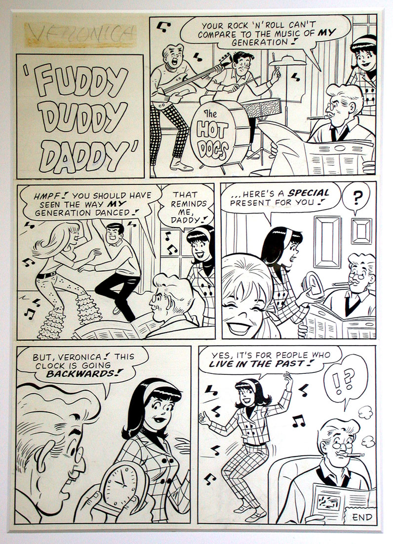
Figure 13. Unknown artist, original art for “Fuddy Duddy Daddy,” Archie’s Joke Book no. 110, 1967. Copyright Archie Comics, 1967, 2007.
These characters attain perhaps the tragic eternity which the French phenomenologist Emmanuel Levinas saw in statues: “The eternal duration of the interval in which a statue is immobilized differs radically from the eternity of a concept; it is the meanwhile, never finished, still enduring—something inhuman and monstruous.”[14] Levinas wrote this in an early essay, “Reality and its Shadow,” in which he attempted to apply his developing ethical philosophy to the field of aesthetics. For Levinas, representational art can only present a tragic parody of real life, inasmuch as the unboundedness of life, which allows individuals free will, is denied to characters confined within the (literal) frame of a painting, or the (temporal) frame of a novel: “The characters of a novel are beings that are shut up, prisoners. Their history is never finished, it still goes on, but makes no headway. A novel shuts beings up in a fate despite their freedom.”[15] Sculpture, with its appearance of having frozen human beings in eternal, unchangeable poses, offered a particularly apt metaphor for this effect that, to the philosopher, every artwork had: “Every artwork is in the end a statue—a stoppage of time.”[16]
Such a stoppage is literalized in the temporal transformation that occurs when original comic art is used as gallery comics. It is particularly poignant, I feel, that this happens, especially in the Veronica joke, in the course of a transition from the pure disposability and ephemerality of a children’s comic-book into the permanence of a gallery piece. In this case, it is not incompleteness that forms the primary rhetorical regime of the new aesthetic appreciation the piece requires, but repetition—another modernist aesthetic strategy that the move from the page to the wall, from horizontality to verticality, adds to, or perhaps discovers in, the original comic strip.
We are already a long way from simply looking at brushstrokes and white-out marks. These meditations on the singular phenomenological transformation that occurs when comic art originals—originally tools in the comics-creation process—are granted status as artworks in their own right and appreciated as such could be greatly expanded, particularly in some of the philosophical directions at which my last few paragraphs have hinted. For now, let me just conclude by emphasizing the aesthetic specificity of original art, which cannot simply be subsumed under, or subordinated to, the aesthetics of comics as we have known them so far. And let me leave you with one question: is the move from the page to the wall—especially in the case of pieces not originally intended for gallery display—simply an act of violence that, as proponents of the “printed book as intended and sole aesthetic object” view would have it, decontextualizes the original images, re-framing them in a false context for which they were never intended—and in which they become yet another commodity for the art market to sell? Is it perhaps simply a creative act, in which those who effect the transition from one context to the other are responsible for adding aesthetic qualities that were never intended to be read into such pieces? Or—third possibility—is it rather a creative, and even philosophical act, in which unknown or hidden energies, that nevertheless inherently lived in the piece, are released and valorized in the re-framing? I am sure that, as the art-world tendencies that this symposium is intended to explore continue, we will be confronted with such questions more and more—and the demand for finding an answer to them will become increasingly urgent.
Andrei Molotiu is the author of Fragonard’s Allegories of Love (J. Paul Getty Museum, 2007), Abstract Comics: The Anthology (Fantagraphics, 2009) and Nautilus (Fahrenheit, 2009). He teaches in the art history department at Indiana University, Bloomington. His art has been featured in solo and group shows across the country, including the upcoming “Party Crashers,” at the Arlington Arts Center, Arlington, VA, opening November 19.
[1] I am using the term “original” here in its most empirical sense, to refer to the drawings created by cartoonists with the intention of having them reproduced for publication; this is a term of art used in the comics industry, as well as commercially, for example in the section “Original Comic Art” on eBay.com. No further metaphysical claims of “originality” are implied.
[2] In such cases gallery comics fit within the artisanal world of minicomics—many of which have recently borrowed more and more their aesthetics from the “high art” world, and primarily from artist’s books.
[3] The term “logocentric” derives of course from the work of Jacques Derrida, particularly his book Of Grammatology (1967), and denotes not simply the quality of being word- or speech-centered, but more generally that of being centered upon (intentional, verbalizable) meaning.
[4] The entire industry shifted from the former to the latter size sometime around the mid-1960s, largely for reasons of economy.
[5] I should add that most pieces of original comic art, even when intended for color, tend to be in black and white, which in itself constitutes a specific aesthetic quality. Traditionally, the color in comic books was added in the printing process. In the few instances in which one finds a hand-colored piece of original art, that color was added after the art had already been photographed for printing, returned to the artist, then probably given as a gift, for which purpose the artist aesthetically enhanced it. In recent years, despite changes in production and printing methods, many artists have tended to hold to much of the same formula, hand-drawing a piece of art in black and white, scanning it in, then coloring it on the computer.
[6] Richard V. West, “Comics as ‘Ding an Sich’: A Note on Means and Media,” p. 170, in Robert C. Harvey, Children of the Yellow Kid: The Evolution of the American Comic Strip (Seattle: Frye Art Museum and University of Washington Press, 1998).
[7] See, for example, the pulping of much original art at DC from the forties to the sixties, or the stories of editors at Marvel in the sixties and seventies freely giving away original boards to visitors.
[8] Mark Evanier, “Jack F.A.Q.s,” The Jack Kirby Collector vol. 12 no. 43 (Summer 2005), p. 14.
[9] This variation generally results from converting the original comic page into a strictly black and white bitmap image with such digital tools as Photoshop (using features such as Levels and Threshold).
[10] The inker can conceivably have been DeCarlo himself. [Note, 2010: having researched the topic some more, I’ve concluded that’s unlikely. Nevertheless, the distinction drawn in the rest of this note is probably still worth mentioning.] Artists oftentimes pencil much more sketchily when they know they will ink the art themselves—while others, who only penciled, such as Jack Kirby, provided what are known as “tight pencils,” in which case the inker’s job, while still creative, is much closer to tracing than redrawing the lines.
[11] I have not been able to find their original publication date, but they clearly date from the time Al Capp worked for Fisher.
[12] In the aforementioned 1968 splash page from the Archie comic Josie (see fig. 9), a similar editorial color comment at the bottom tells the colorist to put “Orange hair on Clyde” and suggests it should match the hue of “Archie or Little Orphan Annie.” Additionally, the title word, “Josie,” which had to be reproduced at the beginning of each chapter, is a pasted-on photostat.
[13] When I posted an image of this page on the Comics Journal message boards, the California artist and illustrator Coop responded tellingly to it: “What is that weird doll/statue/creature, and why is that dude burying it? I love how creepy and surreal this page is, taken out of context. It’s more of a headscratcher than twenty issues of Kramer’s Ergot.” Another poster, Art Baxter, responded by emphasizing the value of that single page over the overall issue: “The rest of the issue is late Simon/Kirby disposable nuttiness that includes a Japanese Kamikaze pilot named “General Electric” who survived his crash and now has an electronic brain. He is making the dolls to…oh who cares. That silent page is the best part of the issue.” http://www.tcj.com/messboard/viewtopic.php?t=2046&start=20, posted Jun 2, 2007.
[14] Emmanuel Levinas, “Reality and its Shadow,” in Sean Hand, ed., The Levinas Reader, (Oxford: Blackwell, 1989), p. 141.
[15] Levinas, p. 139. [Note, 2010: I have recently found a parallel to, and confirmation of, Levinas’s thesis in an unexpected place—Mo Willems’s most recent installment in his highly successful series series of “Elephant and Piggie” children’s books, We Are in a Book (New York: Hyperion Books for Children, 2010). There, the two anthropomorphic protagonists realize that they are characters in a book, and are saddened by the prospect of the book ending. Then they come up with a solution—asking the reader, on the last page, to read the book again. Probably because I already knew the Levinas essay, I found this particularly—though, perhaps, unintentionally—poignant when I heard my son read the book aloud for the first time.]
[16] Levinas, p. 137
Pingback: Madinkbeard » Sequential Erudition at Hooded Utilitarian
The first thing that came to mind in rereading this article is the recent books that reprint work as original art rather than as the printed form. For instance, Jerry Moriarty’s Jack Survives and the McSweeney’s edition of Justin Green’s Binky Brown. (I’ve only read the former.)
Reading the Moriarty book, I found myself reading the volume in two ways. I was reading it as a comic, following the narrative and the flow of panels, but then returning to the images and looking at them as single images. I think it’s partially the book format (the juxtaposition of many pages) that made the former way of reading/viewing the first for me.
It’s also occurs to me that I often look at certain comics more as original art than narrative comics, for instance, when I’m looking at scans of old comics, where I’m interested in the artist but have no desire to read the actual story.
Andrei-
Interesting article- loved the discussion of changing meaning with the changing context. The article reminded me of the great sequence in… hm. one of the “Paul” stories by Michel Rabagliati, where he comes across some original comic art in a museum as a preteen and is shocked at the realization that real people are drawing the comics he enjoys.
A couple of technical corrections for you-
1. You say when discussing older printing techniques- “Additionally, for the sake of reproduction, printers increase the black and white contrast, which gives lines a somewhat raggedier appearance (the proximity of lines to the color screen-dots also emphasizes this visual degradation)”
The printer wasn’t “increasing” the contrast when preparing a plate- they were maximizing the contrast- no grey, only black or white- that’s the only way you can create a plate, unless you’re making a halftone image. And in the past, using offset printing, that didn’t lead to any type of jaggedness at all- the plate itself is a continuous surface, will create a continuous image. That being said, color screens can indeed make the edge of a line appear jagged due to their overlapping a contour line- but this is only really noticeable, to me anyway, when the color screen is close in value to the black line (or is a black screen tone).
You follow this up with information on digital printing-
We would expect that the use of more sophisticated imaging technology would have corrected this situation. Actually, if anything, it has made it worse. …. line thickness is significantly exaggerated in the printed version, and so is the raggediness of the line edges.[9]
This is a sad fact- digital printing has radically altered the look of black and white line art- but it does not have to be the case. If a company and artist are printing offset from digital files, a resolution of 1200 pixels per inch is enough to produce a continuous image for an offset plate. Plenty of beautifully-printed black and white books are currently being produced in such a manner (along with an equal amount of hideous pixellated messes), but it’s often overlooked when printing full-color books. Why? Maybe a matter of convenience- it’s more difficult to work with a document that has different resolutions for different layers, and since 400 ppi is okay for most full-color printing (because of the coarseness of the screen that will be applied to achieve the full-color), most books just include the line work that way as well.
…. to the detriment of those of us who care about these things.
The strangest thing about the whole mess of modern printing is the amount of times I’ve been told a certain phrase by a member of the (digital, short run) print trade. The line is usually delivered in a snide voice, with a hint of a smile and a patronizing head shake. “The human eye can only see 300 dpi”. Hm. I guess the human eye is incapable of perceiving the crow-quill hatching I routinely make on an ink drawing, because if I were to print them at a resolution of 300 dpi, they would exist as a few unconnected boxes. Ah, the wonders of digital print….
A minor point– offset printing wasn’t widespread in commercial comics until the 1980’s. Before that, letterpress printing was the norm, with raised sections on the plate corresponding to line in the original artwork. Advantage being that these plates could survive a phenomenally high print run, a million or more, and went very well with the cheapest pulp paper.
Recently IDW published Dave Steven’s ‘The Rocketeer’ as repros straight from the original art, warts and all; the same has been done for Jack Kirby’s ‘Captain Victory’.
There’s obviously a market, and thus satisfaction for the viewer, in acceding to the ‘raw stuff’…
I do wonder a little whether all the examples here really seem like they’d benefit from the greater scrutiny of a gallery context. I can see the Kirby, and I know people love Ivan Brunetti but…the Tom and Jerry? That anonymous Archie page? The Howie Post? Even the DeCarlo page, honestly…they just seem fairly banal to me. I guess you could argue that any page, whatever it’s quality, would look different in a gallery context, and that that could be of historical or cultural interest or what not.
But it seems like part of what’s different about hanging a piece in a gallery is a qualitative assertion: this is worthy of being considered as art. I just have trouble seeing many of these pieces holding up to that claim without some serious curatorial intervention (i.e., wall text that makes it clear that the work is of historical interest, or placing it as supporting context for more accomplished work, or whatever.)
Alex,
Thanks for the correction.
I didn’t realize IDW’s Rocketeer collection printed the work that way- it’s a very strange phenomenon, although as a cartoonist I find looking at full color repros of original art fairly interesting. IDW has committed some pretty major print atrocities- they put out a volume called “Star Trek Omnibus” with incredibly pixellated line art and “remastered” color(i.e. original color replaced by flat digital colors of approximately the same hues as the original) that, to my eyes anyway, made the book completely unreadable.
Well, unreadable even beyond matters of content- content wise the book would have been unreadable no matter the format it was presented. As for why I was looking at this book in the first place… well. Googling my name and Star Trek might give you an answer or two… ^_^;
That’s not the commercially available Rocketeer: Complete Adventures hardcover. Alex is talking about the Artist’s Edition which cost $100 and which is now out of stock. Most of the joy in owning the latter edition (and the art) has to do with the formal issues mentioned by Andrei above. It may be that only the most technically accomplished artists would benefit from this “deluxe” treatment.
Certainly it’s thrilling for me to see the Eisner and Kurtzman originals reproduced in the Masters of American Comics hardcover that came out in conjunction with the MOMA show of the same name… Thanks for clarifying in regards to the Rocketeer- it makes a lot more sense as an art book rather than as their main edition of the material.
Sean:
“The printer wasn’t “increasing” the contrast when preparing a plate- they were maximizing the contrast- no grey, only black or white- that’s the only way you can create a plate, unless you’re making a halftone image. “
I’m not sure I see the distinction there—to maximize something you have to increase it, don’t you? In any case, that’s what I meant—they were making a pure black and white plate, to begin with by shooting the art on high-contrast film.
“And in the past, using offset printing, that didn’t lead to any type of jaggedness at all- the plate itself is a continuous surface, will create a continuous image.”
Continuous, sure, but the conversion of the smooth line of, say, a brush to high contrast sometimes still made things more jagged, usually by the arbitrary way in which the high-contrast film stock transformed grey (over, say, 50%) into black, and gray under 50% into white. Which means that adjacent areas that were close in tone ended up being fully separated into B&W. Often—and this worked hand in hand with printing on porous newsprint stock—this also resulted in the printed black lines looking a lot thicker than in the original art.
“That being said, color screens can indeed make the edge of a line appear jagged due to their overlapping a contour line- but this is only really noticeable, to me anyway, when the color screen is close in value to the black line (or is a black screen tone).”
No, that’s not what I meant. Look more closely at many old comics on newspaper stock. The black lines were usually printed last. There was no time to let fully dry the CMY inks, so often the ink from the black lines seeps into the adjacent C, M or Y dots, completely negating the smoothness of the brush or pen work.
““The human eye can only see 300 dpi””
That is the most ridiculous myth. I know that I, myself, when looking at 300 dpi art (for example, everything printed through Lulu), am constantly aware of (and annoyed by) the pixels that make up the art.
Alex:
“Recently IDW published Dave Steven’s ‘The Rocketeer’ as repros straight from the original art, warts and all; the same has been done for Jack Kirby’s ‘Captain Victory’.”
I haven’t seen the Stevens book, but the “Captain Victory” was not printed from the original art—rather, it was printed from photostats of Kirby’s pencils–pencils which no longer exist, as they were covered over by the inking. It’s an important document, but different from, say, reproducing (photographically, in color) the original Kirby/Royer art. Unfortunately, very little Kirby art intended for publication survives as just Kirby’s pencils—almost all of it was inked over by others. Greg Theakston, whatever his sins, at least lightboxed his inks for “Superpowers,” so for that late title Kirby’s pencils have survived. I would love to see that book reprinted from the pencils—and not, like TwoMorrows do, reproducing the pencils with the quality of a photocopy, but much more faithfully.
Noah:
“I do wonder a little whether all the examples here really seem like they’d benefit from the greater scrutiny of a gallery context. I can see the Kirby, and I know people love Ivan Brunetti but…the Tom and Jerry? That anonymous Archie page? The Howie Post? Even the DeCarlo page, honestly…they just seem fairly banal to me. I guess you could argue that any page, whatever it’s quality, would look different in a gallery context, and that that could be of historical or cultural interest or what not.”
Well, yes, that was exactly what I was arguing, but not so much for its historical or cultural interest—rather, that the art itself looks different when you look at the original. Which makes, for me, those originals a lot more interesting than their printed versions. Presumably I could have chosen more “important” art to discuss, but I was limited to what I actually have had a chance to study closely, in person. That meant, in this case, either art I own or have owned, or art that was included in the University of Louisville show that I mentioned. (I saw the “Masters of American Comics” show, but, with only one afternoon to see it all, I didn’t get a chance to study closely any single piece.) In any case, I was also using them primarily as examples of what graphic qualities disappear or are muted in the printing process. Feel free to go ahead and find these qualities in art you would judge “less banal.” Paradoxically, perhaps, I actually find these more interesting than art from comics that are objectively “better.” I remember seeing all those Crumb originals in the MoAC show, and they barely held my interest: they were so perfect (and, interestingly enough, smaller that I would have imagined) that seeing them was not significantly different from seeing the printed comics. I have had the same experience with Jaime Hernandez original art—and I love both Crumb and Hernandez.
In any case, I should add that the DeCarlo comes from probably the greatest story Archie comics ever published, Josie no. 36. Try to read it—it will blow your mind. And there is both there and in the Tom and Jerry the beauty of that anonymous, smooth, inflected brushwork that is one of the great achievements of the American comics industry.
I was not making any claims about this or that piece being worthy of being considered as art. Rather, I was asking what is the difference in our perception when we *do* consider them as art—and by “art,” here, I don’t mean a supposedly higher kind of object, one that is “qualitatively better”—it’s not a metaphysical distinction. I just ask what it means to confront the image in all of its materiality, and what more you can see into it when you do so. A phenomenological distinction, if you will.
Hey Andrei. Thanks for replying…and for reprinting your article here in the first place!
Your note about the Josei story is interesting, since it suggests that there are virtues in the completed story that may not be apparent in a single original page (sort of the opposite of the point about the Kirby page, which is better out of context.)
I understand the distinction you’re making — that a different context allows us to look at the art differently. I guess to me, at least, there is a practical question of “why bother looking at this differently?” I can see why a specialist would want to get a look at original art — but what additional bonus would there be to hanging that art in a museum context? On the other hand, it’s hard to see why a non-specialist would want to see the art this way if you aren’t also making some kind of claim for the value of the art as art.
I guess the point is that hanging a piece in a gallery vs. printing it for mass distribution does bring up qualitative issues which I find interesting to think about — though you don’t have to be similarly interested, of course!
In relation to the lack of Kirby originals because of the inking, it occurs to me how much the age of digital images, scanning, digital editing and creation will change the “original” comic art of the future. For instance, I do all my work digitally from start to finish. The original doesn’t really exist. Or at least, not in the same sense. But in a different sense, I have multi-layered digital files where one could interactively look at layers of sketch, “pencils”, “inks”, and various color layers. You could have interactive originals.
Andrei-
I’m not sure I see the distinction there—to maximize something you have to increase it, don’t you? Nitpicky, I know. :)
Which means that adjacent areas that were close in tone ended up being fully separated into B&W I understand in theory what you’re saying here, but we’d have to look at the photographic negative of a page to prove it, to separate it out from the other variables you do such a good job explaining a sentence or two later. You’d have to have an awfully fine line that would break up/become jagged just because of the photographic stage, or an awfully gray line. (and I’ve certainly seen that). In fact, correct me if I’m wrong, but some line thickening sometimes came from changing the photographic exposure so as to allow more gray-ish lines to “pass the threshhold” and not break up in reproduction…
this worked hand in hand with printing on porous newsprint stock
Now that I buy.
There was no time to let fully dry the CMY inks, so often the ink from the black lines seeps into the adjacent
That too! Interesting- never realized this before. Thanks for the info.
I suppose we could add plastic printing plates and over-inked/under inked plates to this list as well….
Thanks again for the article, and the interesting discussion. It would be interesting to see a piece that addressed the ways that print technologies have shaped/continue to shape the art being made.
“…they barely held my interest: they were so perfect (and, interestingly enough, smaller that I would have imagined) that seeing them was not significantly different from seeing the printed comics. I have had the same experience with Jaime Hernandez original art—and I love both Crumb and Hernandez.”
The point was mainly about the Crumb art at the Masters of American Comics show but I’ll talk about the Jaime Hernandez part of the equation (not part of the MoAC show for those who don’t know).
It’s probably true that Jaime Hernandez originals are very slightly smaller than your average modern day superhero page. I haven’t bothered to measure them but that’s my impression anyway. They’re not always as perfect as they are made out to be though. For example, one of those pages I mentioned recently has a considerable amount of whiteout around Maggie’s sister Esther (mainly to change her hairstyle) and he’s definitely changed his mind with regards panel sizing in the past. He’s not an anal perfectionist in those early pages.
His brother, Beto, would appear to be even more liberal with the art changes. The few Chris Ware pages I’ve seen seem pretty spotless but there’s a lot of blueline underdrawing which adds to the interest (and they’re pretty huge).
Funny, two days ago I found in a used bookstore “Dread and Superficiality: Woody Allen as Comic Strip,” the new book from Abrams ComicArts collecting the best of Stuart Hample’s 1976-1984 Woody Allen strip. To my great surprise, ALL of the strips are reproduced photographically from the original art–which, actually, makes them a lot more interesting than seeing them in plain line art (I ended up buying the book, and enjoying it, and I probably wouldn’t have done either had it been only line art–which I guess is a further answer to Noah’s objection.) Here, from the sleeve copy, is the publisher’s justification for their choice of reproduction:
“This compilaton of over 300 of the best of the comic’s comics, each photographed form the original art, reveals the nuances and details of process and pre-production, such as pencil roughs, paste-up corrections, printer marks, handwritten marginal notes, and the signs of age and wear. Presenting these *comics as art* [my emphasis, A.M.] this collection offers a unique look at what was–until now–essentially regarded as a disposable medium, presented merely as black-and-white line art.”