Abstract Comics

Note: This review of Abstract Comics was written close to three years ago. It was proposed to Art in America in the fall of 2009 and submitted for publication that November or December. Overbooking in the book reviews department, I was told, delayed its publication. Finally the following summer, sensing its age as a review and the need to jumpstart things before it was too late, I offered to expand the article into a feature length essay on the wider subject of abstraction in recent comics, including figurative and/or narrative ones like Dash Shaw’s Body World, Joshua Cotter’s Driven by Lemons, and Brian Chippendale’s If ‘n Oof. That proposal was likewise accepted, but then the magazine’s head editor was ousted. The new head editor, after another six months’ consideration, finally paid me a kill fee. I thought I might write the expanded version nonetheless and submit it to an academic journal, but then got busy with other things and lost interest.

If I were to write on this topic today, there are many things I would change. It is, however, precisely this thinking that has kept this piece buried inside my computer, where it does no one any good. Thank you to Andrei Molotiu and Derik Badman for pushing me in recent months to publish the review regardless. So here it is, more or less in the state it was three years ago. Keep in my mind it was written for an art world publication. There were also word count restrictions, hence its clipped nature. What you see here, if I remember correctly, was already about 300 words over length. I said I would change many things today, including its tone, but the core opinions and suggestions I still stand by.

*******************
 
Since the 1990s, there has been a rising tide against the word in comics. It has begun to gel into something like a movement, made up of artists, critics, and editors alike, involving both the creation and promotion of new wordless comics in a variety of genres as well as the republishing and anthologizing of related work from the past.

So-called “abstract comics” is one of the more extreme fronts. It names a form of wordless comics that not only dispenses with the word, but also those things traditionally allied with it, like speech, sound, plot, and interiority. Abstract comics has been a fringe genre, disseminated largely through blogs and self-published and small press booklets. With the publication of Abstract Comics: the Anthology (Fantagraphics, 2009), it has gained a more secure foothold in print.

The book collects work from 1968 to the present. It includes comics luminaries like R. Crumb, Gary Panter, and Lewis Trondheim, but is focused on new names from the past decade. Most of the work is deeply indebted to modernist abstraction, from Kandinsky’s dispersions and Cubist papier collé, to the nested squares of Albers and Abstract Expressionist blots and drips – all typically set into narrative motion across a handful of panels or pages.

Museum modernism also weighs heavily on the framing of the anthology. In his introduction, Andrei Molotiu, artist, art historian, and blogmaster of the same-titled Abstract Comics site, describes the genre as a whole in terms derived from a mix of vitalist philosophy and a classical modernist model of reflexive reduction. He writes:

Reduced to the medium’s most basic elements – the panel grid, brushstrokes or penstrokes, and sometimes color – they [abstract comics] highlight the formal mechanisms that underlie all comics, such as the graphic dynamism that leads the eye (and the mind) from panel to panel, or the aesthetically rich interplay between sequentiality and page layout.

In the same vein, Molotiu describes standard narrative structure as an “excuse to string panels together” and abstract comics as a distillation of the medium to the “feeling of sequential drive, the sheer rhythm of narrative or the rise and fall of a story arc.” In the artist profiles at the end of the book, Mark Badger – contributor of a maximalist geometric abstraction in comics form – laments how images in comics are “unable to claim their real power” while subordinated to narrative or representation. “Hopefully,” he continues, “this book will be one shot in claiming back comics from the typists.”

Abstract Comics thus offers itself as a manifesto in the tradition of high modernist art, without the extremism of its historical predecessors, but nonetheless sharing their characteristic denigration of narrative and the verbal sign as well as their calls to power through purification. The anthology, unfortunately, does not make the strongest case for the vigor of the movement it promotes. Much of the collected work is visually weak, and the modernist formalist discourse to which the book is indebted ceased to have any real traction after the socio-political and linguistic turns of art in the 1960s. Molotiu expends much of the introduction excavating precursors for this “genre without a proper tradition” from the oeuvres of art-world masters like Kandinsky, DeKooning, Alechinsky, and Johns, with only passing mention of relevant precedents within the comics medium itself. Trying to legitimize comics vis a vis the art historical canon can sometimes be self-defeating, and here it has the unintended effect of casting abstract comics as little more than a super-belated reworking of formalist painting. Especially considering the online presence of “abstract comics” and the computer-based creation of many of the contributions, it would perhaps have been more fruitful to explore the relationship of the genre to the return of various forms of abstraction in the computer age, beginning with Neo-Geo in the early 80s and then internet art and laptop music after the 90s. Instead, the top two-thirds of each page of Molotiu’s introduction are given over to rows of dingbats, a cute waste of valuable space and another statement of preference for pure aesthetic form over verbal discourse. One is left to dig through the artist profiles of Abstract Comics and the personal webpages cited therein to get any real sense of specificity to individual works and the promise that some do hold.

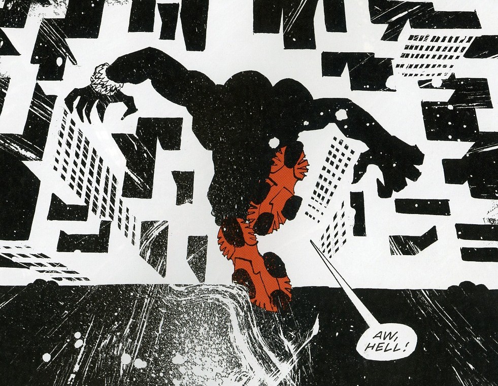
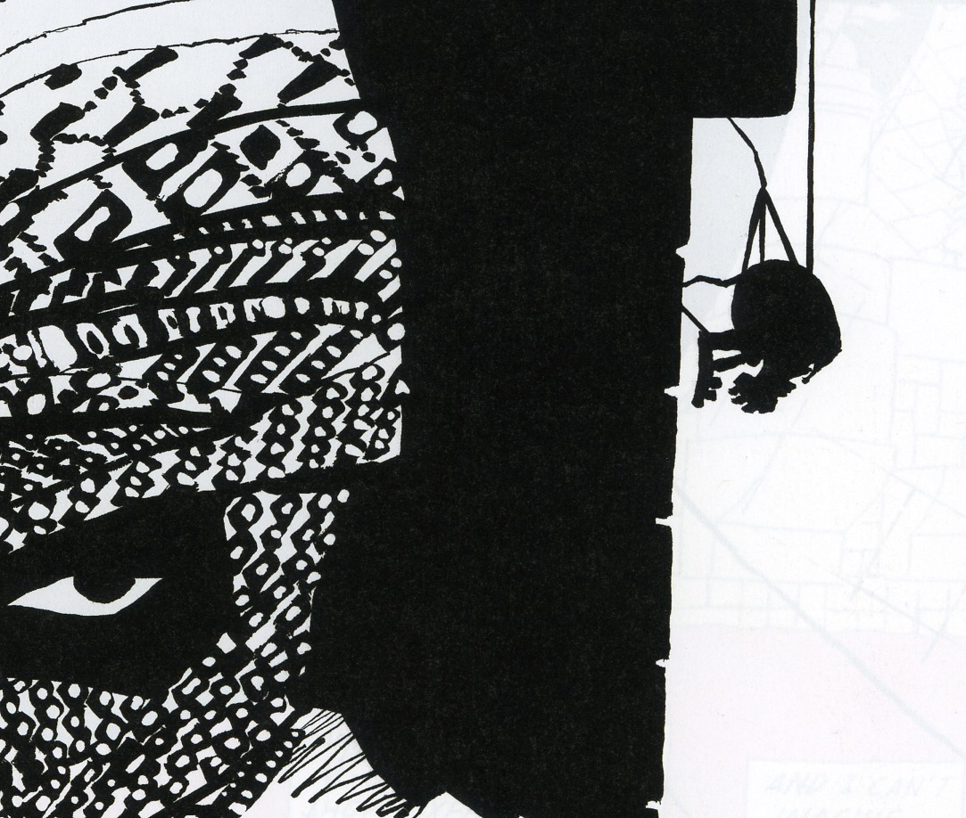
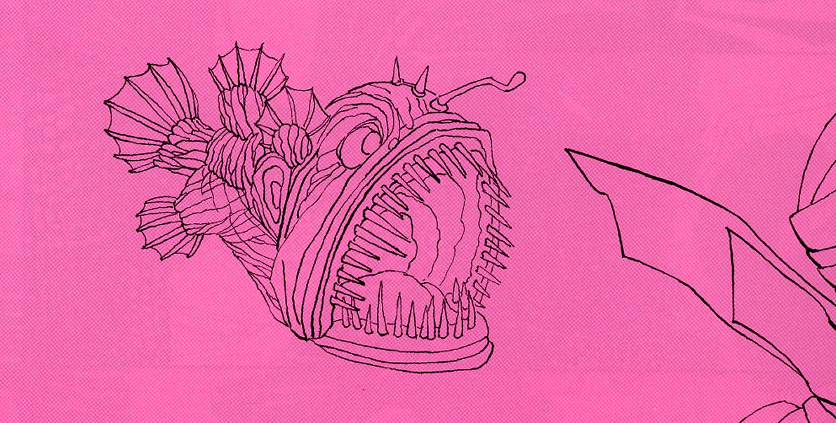
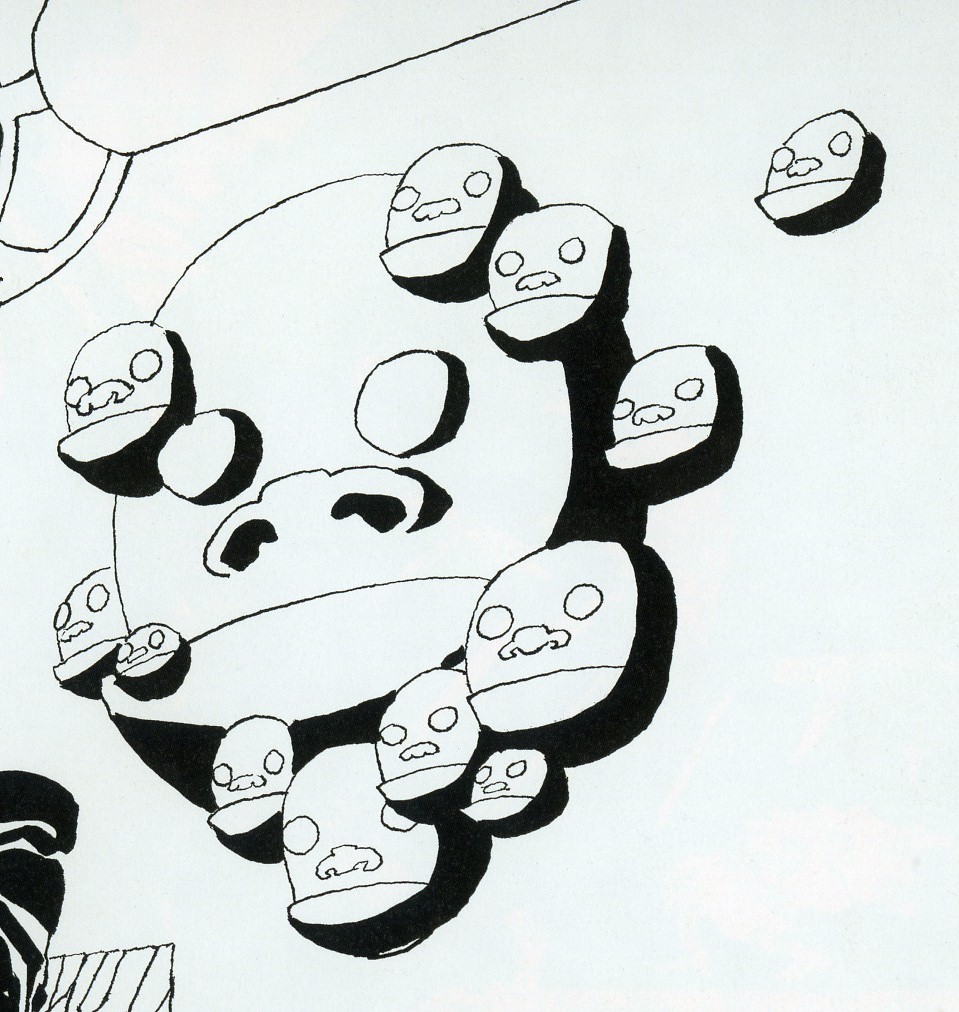
As is clear to any reader, the dominant trope of abstract comics is metamorphosis. Molotiu heralds work that “tells no stories other than those resulting from the transformation and interaction of shapes across a comic page.” Andy Bleck’s Haring-esque work is typical. Anthropomorphic blobs twist and tangle in goofball dances that are half cartoon tribal mating ritual and half protoplasm on a wet mount microscope slide. The contributions of the two most prominent Europeans in the anthology, Trondheim and Ibn al Rabin, make it clear that the defining figure of metamorphosis is the amoeba. Both of their works are short comedies featuring blobs swallowing nuclei and other blobs. There is a basic vitalist conceit at work here: to boil the comics medium down to pure formal dynamism entails exploring also the most basic forms of animate life.

by Andy Bleck

Most of the works are as entropic as they are dynamic, involving not only the transformation of form and energy, but also their disorganization and dissipation. Molotiu’s own works are a case in point. Produced with the aid of a scanner, “The Panic” begins with compound masses whose biomorphism once again evokes the biology lab. Over the course of a handful of panels, the masses pull apart into small globules.

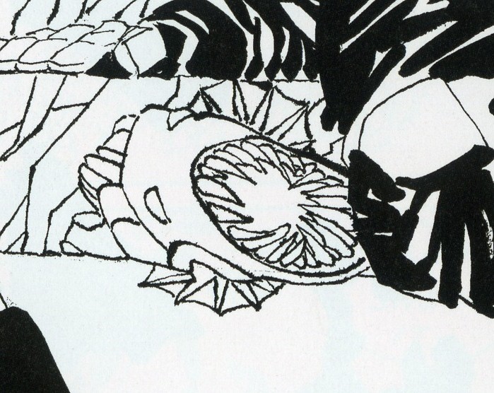
Chaos, similarly, is a recurring motif. Alexy Sokolin’s “Life, Interwoven” layers ballpoint pen lines until almost the entire page is obliterated. Tim Gaze’s untitled collages are a gore-fest of inky smears and splatter, further mutilated through a technique similar to the cut-ups of William Burroughs and Brion Gysin. Billy Mavreas’ “Border Suite” again evokes the cut-up, now run repeatedly through a copy machine until all that is left is disintegrated borderlines and dispersed dust motes. In Abstract Comics as well as other statements on “sequential dynamism” in comics, Molotiu makes the musical analogy to opera. From these works, however, it is clear that noise and glitch aesthetics would be more apt in some cases.

Other works also manipulate source material. Proprietor of the reliable MadInkBeard blog, Derik A. Badman’s Flying Chief is one of the more intriguing contributions to the anthology. He has redrawn panels from a 1950 Tarzan comic without the characters, words, speech balloons, or captions. More so than abstraction or entropy, this strategy of absenting is highly effective in frustrating the viewer’s desire for an organizing figure. Badman’s image of a world without human agency raises more pointed questions than other contributors’ protozoan land before time and scenes of cosmological chaos.

Derik Badman, “Flying Chief”

Noah Berlatsky also runs a comics blog, The Hooded Utilitarian. His two one-page works are also in this appropriationist vein. He has taken pages from Asterix and X-men and redrawn them in such a mutilated fashion that frames and figure-ground relationships are splayed and then refused into an abstract mesh. There is a strong bit of Kandinsky in the results, but it’s also important to perceive amputated bodies akin to those of early Dali or later Sue Williams.

In these, as in a number of works in the anthology, there is an interest in what might be termed a logic of “vestigiality”: the organ divorced from its original function but still maintained, so that it oftentimes comes to impose upon the organism that had abandoned it. Might this principle also underlie the metamorphic comics? After all, their plasmatic substances have a striking resemblance to the spongy, pneumatic contours of the speech or thought balloon. If so, it seems that the abstraction of comics against the word and its supports is never total, but rather marked with traces of partial amputation. Abstract comics share this feature with many wordless comics, from pantomime works that gesticulate histrionically to make up for the ban on verbal expression, to indie comics around themes of melancholia, speechlessness, and pre-linguistic primitivism.

It is curious that Abstract Comics opens with R. Crumb’s “Abstract Expressionist Ultra Super Modernistic Comics,” first published in Zap Comix no. 1 (1968). First of all, its principle of non-sequitur juxtaposition is quite at odds with the smooth, linear sequentiality or serial modulation that characterizes most other works in the anthology. Secondly and more importantly, Crumb’s work was meant as a derisive parody precisely of the kind of genuflection to high modernism that Abstract Comics represents.

R. Crumb, “Abstract Expressionist Ultra Super Modernist Comics

Crumb is not alone. Burlesque has long served as a kind of prophylactic for comics artists against the perceived obscurantism and puffery of high art. A few years ago, designer Craig Yoe popularized an adequately lowbrow name for this mindset: “arf,” which is Popeye’s laugh, but comes off as a portmanteau of “art” and “barf.” At the very least, Abstract Comics represents a welcome willingness to look upon high art from the perspective of comics without such juvenile anxieties. One hopes that the future of the genre is towards aesthetic paradigms with greater contemporary relevance.

Excess Meaning

Above is a art project Bert Stabler and I worked on together. I wrote the words and he drew the image.

Except, as you’ve probably noticed, there are no words. When it came down to it, Bert decided that the pictures looked better without the text. So he took them out.

In some versions of comicdom, this could be seen as a cardinal sin. As Joe Matt says, “”I’ve gotta draw minimally to serve the storytelling! The writing always comes before the art!” Similarly, Ed Brubaker argues “I’ve always felt that the writing was far more important than the artwork… As long as the art supports the story…” It’s hard to see how Bert could have more thoroughly violated these precepts.Not only does his art not serve the storytelling, but in the name of the art, he actually went ahead and removed the words altogether!

Of course, in our project, the words were always subordinated to the drawing; Bert did the artwork first, then I provided words…and then he decided the words didn’t fit (in some cases literally — too much text for the boxes.) But that merely underlines the point that art here was not subordinated to storytelling.

Bert’s piece takes several steps towards abstract comics. Appropriately enough, Andrei Molotiu has taken on a lot of these issues at his Abstract Comics blog (from which I pinched the Matt and Brubaker quotes). Specifically, Andrei has argued that art in comics should not be, and often is not, subordinated to the demands of text or narrative. Speaking of the art-must-follow-story meme, Andrei says

This is exactly the logic of illustration–which is a form of logocentrism… And here we can expand the discussion beyond abstract comics, which occupy only the extreme position (like “purely harmonic music”) in a wider range of art that exceeds narrative demands.

In another post, Andrei goes on to look at some examples of non-abstract, art-superfluous comics.

For instance, he talks about a Bob Kane story from 1941, in which Kane used a ton of circular panels, as Andrei shows:

Andrei goes on to say:

Now, what does this mean? Probably nothing. (Which is not to say it’s not significant; just that it’s probably not meant to mean.) One can obviously draw the parallel between the circular panels and the moon–but the resulting interpretation (Batman as creature of the night, etc.), would be generally valid for ANY Batman story: so why specifically this one? Similarly, one can find some connection to the closing words of the story, where Bruce Wayne, with a wink, tells Commissioner Gordon: “I guess the life of Bruce Wayne does depend quite a bit on the existence of the Batman!” There is a kind of circularity implied there, I guess, and we can then claim the circularity is echoed formally in the art… And yet, if that’s the great realization, the theme of the story–again, the Bruce Wayne/Batman dichotomy is a constant throughout the strip. Why this story specifically?

I don’t know. Maybe Bob Kane had a brand new compass he had purchased the day he drew this story, and he was just dying to use it. But my point here is: I’m not so much interested in fully motivated signs, portentous (a la Wagner) leitmotifs charged with meaning as you can find in, say, “Watchmen” or “The Dark Knight Returns”–works in which their creators seem fully in control of their formal language, in which every single (or almost) signifier can be seen as adding something to the story’s theme. Rather, I’m interested in what, at this point, may be called automatisms, tics perhaps, that nevertheless affect our experience of the comic.

Andrei is drawing a distinction between formal elements that can be collapsed into the theme and formal elements that are tics, excesses over meaning. As an example formal elements linked to theme, you could perhaps take this Gruenwald painting, where the idiosyncratic formal use of scale illustrates the phrase “He must increase, but I must decrease.”

And as an example of formal tics that do not link to theme, you could take the insistent circular repetitions in the Frank Miller Spider-Man/Daredevil crossover which Andrei analyzes.

In Gruenwald, the formal elements relate directly to the spiritual meaning; in the Frank Miller, the circles are just a way of organizing space; an abstract, musical surplus, which contribute to pleasure or experience without, Andrei says, contributing to narrative or meaning.

The question I have here though, is this: are narrative and meaning synonymous? Obviously they aren’t; Gruenwald’s painting isn’t a narrative, but it’s intended as an illustration of a thought or a metaphysical insight. But what about in Miller?

Perhaps one thing that the circular motif does is to insist on its own integrity. It draws a border; looking at those images, it’s hard to avoid the sense of space. In both of the sequences form Miller above, the words are literally pushed off to the edge, allowing the circles to spread — Daredevil’s senses, his “sight”, reaches out across the page, marginalizing the text. Logocentrism is (again, literally) replaced by iconocentrism. This is the case even in instances where the text is more interspersed with the circles, as below.

The spinning multiple figures against the whiteness demand attention. It draws you down into an excessive, vertiginous whirl of motion that makes the banal text (“Got you fella! Hang tight!”) seem like the superfluous bit.

Thus, the image spilling over the words does not exceed meaning. Rather, its meaning (or one meaning) is the excess itself. When Andrei says illustration is excess, he is not illustrating the way in which illustration does not mean; rather, he’s illustrating that very meaning, which is excess. The circle is a hole in narrative — a vortex that escapes the story’s staid linearity and in its place spins out an ever-expanding circumference of pleasure.

Bert’s excision of text can also be seen as a kind of deliberate overtopping, or annihilation, of narrative content.

In Bert’s drawing, the Peanuts characters flow and morph, losing their coherence as they dissolve into a kind of post-modern iconic glop. They don’t cease to mean; rather, their meaning is unanchored from its original context and sent oozing along the chain of signifiers. So Schroeder turns into a guitar which turns into tombstones haunted by a cute little death and Linus and Lucy fuse into a single terrified/terrifying blob of torment and tormenter. It’s a violent detournement — and the violence is not only in the drawing, but in the (lack of) text. The Peanuts characters are all caught in the boiling cauldron of narrative meltdown, and their blank, stunned, failed efforts at speech only emphasize their tortured transformation. The speech bubbles hang emptily in the design — the last, sad trace of the vanished stability of logos, as around them rages the free-associative chaos of the image.

_____________
In the examples so far, Andrei’s conception of the visual as excess (beyond meaning in his formulation, of meaning in mine) has worked fairly well. I think it is possible to find instances that call it into question though. For example:

This is one of Hokusai’s One Hundred Views of Mt. Fuji. It’s title of this particular plate is “Fuji as a Mirror Stand.” The point, or meaning, is, then, a kind of visual pun — the image of Fuji in the background with the sun sitting on top of it recalls a mirror sitting on its base.

If that image is what the print is about, though, what to make of all that action in the foreground? The man with his dog crossing over the bridge can be seen as a visual mirror of the mirror, perhaps — but Hokusai makes it very difficult to see the action there as pure formal doubling. Instead, we want to see it as narrative. What (we ask with the dog) does he have in that bucket? Where is he going, and where are those boatmen going under the bridge? Will they speak to each other? Do they see each other? What’s their story?

In this case, we might say that the narrative, or the demand of narrative, acts as an excess; an addition balancing on top of the mountain. Human stories pass over and pull under the image; what you see is disturbed by the demands of what happens. You can look for your reflection in the serene and distant mountain, and you may even see it, but your dog is still beside you, excessively nuzzling, demanding that you move on.

Here’s another view from the same series which works in somewhat similar ways.

The title is “The Appearance of Mt. Fuji in the Fifth Year of Korei.” It is supposed to show the actual date of the appearance of the mountain. Befitting such a momentous occasion, the figures gathered here are intently focused on Fuji. On the left, government officials stare, their attention riveted — so much so that their hands imitate the curve of the mountain’s top. On the right, a group of villagers gaze with similar single-mindedness…for the most part.

There is one exception though. A single villager has been distracted; he points off to the side at…what? A bird? Falling bird poop? Godzilla?

You could easily read this as in line with the last image. The meaning of the drawing — its purpose and point — is the view of the mountain itself as miraculous and devotional presence. But there’s a story in excess of that image; something has happened, and though we don’t know what it is, it draws us away from the image and on to the next panel, even though, in comic-book terms, there isn’t one.

But while you could read this as narrative excess over the meaning of the image, you could also read it as image excess over the meaning of narrative. The scribe next to the pointing man has been recording the story of the mountain on the day of its new creation. But he is distracted by sight — first of the pointing finger, and then, presumably, of whatever it is over there that we can’t see. For us, the hint of a story is a distraction from the view. But for the writer in the image, the hint of a view is a distraction from the story.

Of course, outside the print, there isn’t really a view or a story — just a mystery waiting to be charged with meaning. Narrative and image both leap at the chance, climbing one on the other, each over each, like Mt. Fuji rising through Hokusai’s frame.

“Built By a Race of Madmen”

Ok, here’s the deal. At Noah’s request I’m publishing here (in blockquotes below) what is largely an unrevised text of a rant I posted on the comixscholars listserv, a rant written as fast as my fingers could type. I would have liked seriously to revise it, but time is, as always, in short supply, and besides Noah says he likes the energy of the original post, so I’ll let it go with just minimal copy-editing and corrections of typos, plus the expansion of a few points I’m not sure were clear enough in the first version.

First, though, I should explain where it came from. When Holy Terror first came out, I didn’t bother to pick it up; no matter how much I’d admired Miller in the past, and how important most of his work from his early run on Daredevil to Batman Year One and Elektra Assassin had been and still is to me, I had been burned too many times since then, especially by the nadir that was The Dark Knight Strikes Again. Nevertheless, I soon found myself in a bookstore, skimming the new book; and though I didn’t purchase it on the spot, it stayed with me, an unscratchable itch to explore it in more depth (it certainly looked better than DKSA—none of those horrid gradients!—or the recent installments of Sin City). I finally gave in, bought it, and meant to review it—but by that time two things had happened: first, consensus had built up online that it was a disastrous career-ender, and hideously paranoid and anti-Muslim to boot; and secondly, Miller posted his notorious blog post fulminating against the Occupy movement, which brought even more contempt rained down upon him. Honestly, at that point I didn’t care about the book so much that I wanted to take the plunge into these muddy waters, and to brave the comment-shitstorm that would have been sure to ensue.

So I decided not to review: yet, even after that decision, I found myself turning back to Holy Terror, and in a strange way my fascination with it grew. And then—and then, two more things happened. A strangely belated discussion about it started a couple of weeks ago on the said comixscholars listserv; and Ken Parille posted a review of the book on the Comics Journal website. Ken’s post was the first I had seen that had something both positive and articulate to say about it (though in the end I didn’t quite agree with him), and that managed to see past its (perceived or real) paranoia and xenophobia to address the substance and artistic achievement of the book itself.

When the thread on comixscholars-l started, I first dipped a toe in with the following remark, appended to a commentary on its supposed “Orientalism” (a question to which I return below):

“Holy Terror” … is an utter mess (and politically abominable, I hasten to add, to shore up my bien-pensant credentials) but in a way kind of a fascinating one. I keep meaning to write about it somewhere.

Ken then chimed in to say he agreed with me, and linked to his TCJ review. However, while I had called it “an utter mess” he discussed it there in terms that made it seem much more conventionally successful: “It’s a fascinating hard-boiled love story, an attractively designed romance set against the backdrop of a post-9/11 America in which love is a disease… Holy Terror’s artistry triumphs over its political will.” He also ended up giving it an A—higher than Habibi, Carnet de Voyage, and Asterios Polyp (relative judgments with which, I should add, I don’t disagree). When the discrepancy between his and my verdicts was pointed out, he explained that he found it a mess ideologically, but successful artistically. This was the immediate cause for my rant, which, none too soon, follows (images added for the sake of clarification):

Now I’m wondering if we read the same book… :) As I said, I do find it fascinating–and I’ll get to that in a second–but it is a mess far beyond just its ideological message. To begin with, the plotting is so rudimentary as not even to deserve to be termed “plotting.” Notice how the book is divided exactly in half, presumably originally for publication in two installments, but also corresponding to the two periods in which Miller is supposed to have worked on it, and easily distinguishable from each other by the utterly different inking treatment (first half, splashy; second half, mostly linework and large areas of solid black). So. First half: Not-Batman chases Not-Catwoman across the rooftops of Not-Gotham City. They fight. They have sex. Bomb explodes. Nail ends up in Not-Catwoman’s leg. It hurts. It really hurts. It really REALLY hurts. We hear about it for pages on end. Flashback to suicide bomber. Same bomb explodes again–NAILS! The city lies in ruins. Not-B and Not-C swear revenge. As does Not-Commissioner Gordon.
[Note: I borrowed the “Not-Batman” and “Not-Catwoman” coinage from other reviews I had seen across the web. Indeed, soon after writing the original rant, I googled the two terms, and found a review that contained a sentence extremely close to the one right before this note, including the term “Not-Gotham.” I honestly don’t think I had read that review previously, and maybe it was just a case of serendipity, but I may also have indeed read it, and forgotten all but that one phrase that remained stuck somewhere in the back of my mind. To the writer of said review: apologies for my unintentional borrowing.]

Second half (interspersed with montages of terrorists and various US and international political and public figures): Not-B and Not-C (who has quickly gotten over her wound–and, by the way, may I ask why she’s supposed to be wearing Christian Louboutin sneakers?) swing over the rooftops.


They kill some bad guys, capture one and torture him… He talks and then they blow him up. Meanwhile a Muslim woman is being stoned and Americans are watching “Transformers.” More bombs–Not-Statue of Liberty is blown up. Ex-Mossad agent, whom we know is Israeli because he has the Star of David tattooed on his face (always a good choice, tattooing your country’s flag on your face when you’re trying to be a spy) tells them about the Not-Gotham City mosque, center of terrorism. Bizarre undeveloped subplot about Not-B falling in love with Not-C. Generic Muslim man beating up his wife. Not-C goes into the mosque. Is captured and taken to the leader of the terrorists who turns out to be, umm, Irish? They want to kill her, Not-B swings in and blows their heads off, big scary bomb explodes but somehow they manage to get out. Six weeks later: Not-Commissioner Gordon is shivering in his bed. “No wonder we call it terror.” The end.

There is no narrative arc, no suspense, no attempt to develop the characters beyond the purely convenient labels of their names. All of these things Miller would have been able to do quite masterfully back in the Daredevil or DKR days, but by now any hints in such directions have become nothing but narrative tics, empty gestures. Maybe Batman telling Catwoman that he is falling in love with her might have meant something–a tiny tiny something–if those had been the actual characters speaking, with decades of history behind them, but replacing them with Not-Batman and Not-Catwoman, simple place-holders undeveloped in any way beyond simply being not-the-characters they had started off as being, reveals how whatever romantic punch this narrative element was supposed to carry would have been totally unearned, as it relied *entirely* on the readers’ previous knowledge of the characters. Same goes for Not-B’s constant reference to “my city.” If this had been Batman speaking, ok, it might have resonated with Miller’s earlier work–but since it’s not, it again reveals Miller’s reliance upon shorthand and the readers’ previous emotional cathexes, and it comes off as–I don’t know how to put it exactly, but not plotting, simply the emotional exploitation of stereotypes stored in fans’ psyches.

Then there are all the narrative tricks which, once again, seem like foggy reminiscences of when Miller knew how to tell a story: the thought-captions in the first section come directly from DKR, but, again, seem blank, just storytelling tics that carry none of the psychological weight that they carried two and a half decades ago…

So, what do we have instead? Things happen, done by blank characters who are brought on stage for the sole purpose of enacting a revenge fantasy. For that reason, I suppose, they need have no more personality than figures in a masturbatory, erotic fantasy need have one. The plot again (shorter version): Terrorists do bad things to us. We kill them. The end.

That’s also why, I should add, I was saying there is little actual “Orientalism” in there: the bad guys are as much blank placeholders as the good guys. There is none of the Orientalist texture of, say, “300.” Everything is just… empty.

Further issues with the storytelling? How about the strange crosscutting, in the second half, between Not-B and Not-C’s doings, and the montages of characters from Bush and Cheney to Obama? Is this happening in one night or over a decade? I suppose a sympathetic reading might make one of those strands extra-diegetical, as if the book reflects both the time of its story (one night) and the time of its making (ten years)–but, if so, I don’t particularly see that as intentional on Miller’s part.[Note: on second thought, maybe it is, or maybe the book itself knows, and says, things more clearly than its author might.]

Ok, the positive (not yet the fascinating): yes, there is all the narrative energy in the first half, a mastery of dynamic art, etc.–everything that Ken pointed out–but, while not as bleached out as the narrative tics I was talking about, it still reads like Miller on auto-pilot. All the splashed ink and white-out in the first half seem like an attempt to go in the direction of more “artsy,” painterly artists such as Sienkiewicz or McKean, and it’s fine, well-done, but again, to me not earth-shattering in any way.

I actually like the second half much better, which does away with such painterly tricks (and which has been criticized, as a consequence, as Miller forgetting how to draw or not giving a damn anymore). And here we are getting to the fascinating part–because, well–there’s that snail. Huh? In the panel of Not-C deciding to go into the mosque, there is a beautifully drawn, purely built out of uninflected lines, snail–a giant snail, obviously, given the perspective of the drawing:

It is in no way given a narrative reason for being there. It just is. At this point, Miller enters a mode of strange narrative excess, going well beyond the requirements of the story–and he continues with it, the snail is not just a one-off. Look at the large, almost page-sized panel of the tower-like structure underground:

First of all, it’s important to realize it’s a swipe–from one of Piranesi’s “Carceri” (Miller at least gets points for creativity in swiping)–specifically this one:

Now, interestingly, this is not the first time that Piranesi has been swiped in comics recently–see the cover of the Act-I-Vate primer–but this is a much more, shall we call it, original kind of swiping. It’s also a much more interesting swiping than the one he practices in the first half of the book, where this panel of Not-C leaping off a building:

is clearly intended to evoke this famous image from “The Story of Gerhard Shnobble,” by Miller’s hero, Will Eisner:

The swipe from Eisner is clear fan-service, intended to give the thrill of recognition to the literate comics reader, and to help Miller claim for himself, one more time, Eisner’s mantle. I don’t think any such kind of knowing reference and recognition is intended with the Piranesi borrowing—it is not an homage, but neither is it done out of laziness or for simple convenience. The image is transformed, worked over too much for that to be the case. Look at the brackets holding up the tower’s cornice: In Miller, they have been replaced by symmetrical pairs of faces–one Gahan Wilson-like, the other best described as Humpty-Dumpty-as-dying-Vader:

Again, what??? Then there are the strange ovoid faces toward the bottom of the tower:

and the double garland of Spartan helmets festooned across the upper left corner of the panel:

Miller makes a gesture toward explanation in a caption (“The old city–built by long forgotten ancients. Archaeologists have only been able to shake their heads, bewildered by its ornaments. Some say it was built by a race of madmen”)–and, if in the context of the book, that seems like just a convenient excuse to doodle whatever he feels like in the images, it’s also strangely self-referential: yes, we too can only shake our heads, bewildered by the book’s ornaments which are completely unrelated to the book’s overt message. “A race of madmen”–and we almost feel that Miller’s gone nuts.

Then–then there are the strange Cheshire cat grins on the brick walls:

the gargoyles and dinosaurs sticking their heads out:


the strange silhouetted ball-with–feet-and-hands rappelling down the wall behind one of the terrorists:

There’s the deep-ocean angler fish in the few feet of water into which Not-C jumps:

There’s the monocled Erich-von-Stroheim-in-The-Grand-Illusion half-face on the ground, behind the short veiled “highly-verbal” Persian-looking guy:

There are the Pop accumulations of figures, including a woman, from the back, in star-spangled hotpants and some kind of viking-monster, in the panel where Not-B leaps in:


There is the monumental statue of Buddha (recalling Bamiyam? But again, why? If the Taliban blew it up there, why would Al Qaeda live with it here?) behind a sound effect of–har har–“Budda”:

There are all those accumulated faces and grins behind Not-B when he fires his bazooka thing:


… and so on.

There is, overall, a strange, unsettling kind of image excess over the requirements of the story. It’s as if Miller couldn’t stay faithful to his ideological convictions, or even his hatred of terrorists, and began doodling. Is it some kind of Baroque horror vacui, or–more appropriately, perhaps–some kind of outsider art horror vacui? At times, and mutatis mutandis, it almost reminds me of Rory Hayes. I like how at this point Miller’s mastery fails: the slick paintwork of the first half gives way to the red-background two-panel of Not-B and Not-C waiting for the bomb to explode, that looks so awkward, almost untaught, as to completely negate the slickness of the first half:

It’s a mad, bizarre book. I had hated Dark Knight Strikes Back, thinking Miller had gone crazy, but now I realize it’s just that he had not gone crazy enough. I have no idea where he can go next–but there is a strange breakthrough here (maybe with no exit, with nowhere to go) that is more interesting than any other comic I’ve read this year, and hinting at a kind of artistic madness that most artcomics can only aim toward, but not quite reach.

Whew. I’ll stop here.

And stop I did. After my rant, in response to a post by Charles Hatfield who declared himself so morally outraged by the book and by my discussion of it that he refused to engage it critically formally (even seemed to see it as immoral for anyone to do so), I responded:

Hey, Ken’s response to Holy Terror was much more positive than mine! Why is it mine that warrants this rant?

I’d be happy to explain, at length, what Miller’s work has meant to me over the last two and a half decades–in view of which, at least, he still does warrant my critical attention, whatever his current political positions. I’d also be happy to get into a discussion whether any artist’s political positions that you (or I, for that matter) may disagree with are enough to put their work beyond the pale of critical discussion (Ditko, anyone? T.S. Eliot? Ezra Pound? Seurat, for that matter, who had clear left-anarchist associations? Where do we draw the line?). But I’ll just say that I was addressing the work, not the man, and the work definitely does warrant such critical attention. And given that the work is intended to convey a certain political position, and that many of the elements I discussed actually end up undermining, deconstructing in some way, that position, I’d say it is exactly analyzing it in such “art terms” that can provide a constructive critical, and even political, perspective on the book.

(I’m quoting my response to provide some shield, some defense against similar critiques that may be raised. And, ok, maybe I’m being paranoid too, in a different way.)

If I were to expand this and properly re-write it, I would emphasize further the strange self-consciousness of the book that I hinted at on one or two occasions: the apparently braided diegetic and non-diegetic strands (the only way it seems to me the book’s temporal contradictions can be resolved) and the comment about “the race of madmen.” Holy Terror feels like a strangely self-knowing book, but one that in the same gesture paradoxically foregrounds the lack of self-reflection on the part of the artist, the contradiction between the resulting work and its intended ideological functioning. I would also tone down my criticism of the rudimentary plot: it more and more seems to me that Miller’s abandonment of the (genre-based, admittedly, I say to preempt any griping) narrative sophistication of his ‘80s work is fully intentional; and the fascinating bizarreries I point out here would have been impossible had such sophistication not been abandoned. I would also compare the book to Miller’s contribution to 9/11: Artists Respond, which refreshingly rejected any and all ideologies:

(Homework assignment: what happened?)

Also, as I’ve been thinking a lot about Kirby lately, I can’t help but feel that the rhetoric of visual excess I use here to discuss Holy Terror is not all that different from what I and others have said to defend the King’s work of the seventies and after. I don’t know if that constitutes some kind of redemption for Miller; I don’t know if connecting the two in such a way is at all legitimate (I am only referring to my own rhetoric, which I do know is strangely similar)—but I know for a fact that my just bringing up the notion is sure to prompt yet another, additional, shitstorm in the comments. (James? Charles?) Have at it, all.
__________________

Editor’s note: Andrei writes more on Frank Miller at his own blog here.

Brecht vs. Godard

We’ve had an interesting discussion of Godard’s relationship to Brecht in comments, and I thought I’d highlight it here.

Charles Reece started it off by comparing Brecht to Godard in his post on One Plus One.

As our reality was becoming increasingly mediated by images, where the representation of life was replacing life and human relations were displaced through commodities (compare Pierrot le fou’s famous dinner party scene in which the guests communicate through ad-speak to Guy Debord’s Society of the Spectacle), Godard radicalized his films in Brechtian fashion by subverting cinema’s conventions, calling attention to their mediating effects (albeit Debord and the Situationists weren’t fans): music pops up arbitrarily, dialogue doesn’t sync with the images, quotes (both visual and textual) are used in abundance but frequently have no logical connection to what little plot is involved, etc.

This prompted a series of interesting responses in comments, first by Craig Fischer:

I think you’re the first person to invoke the “B” word in your post–labeling Godard’s films “Brechtian”–and I’d agree that SYMPATHY’s separation of elements, etc. follow the techniques of Epic Theater. Personally, though, I’ve always had trouble with Brechtianism, because (a.) it presumes that the author (or auteur) can create a text that can effectively govern reader/audience reactions, and (b.) it assumes that escapism is a bad thing. What about the counter-argument, made by the great Hollywood director John Sullivan, that escapism is “all some people have? It isn’t much, but it’s better than nothing in this cockeyed caravan…”?

Then Andrei Molotiu responded:

You’re making Brecht’s point for him. Of course, escapism is never “all some people have.” A choice to educate oneself (for example in critical theory, which is only as far as the nearest public library), or to be a creator rather than just a passive consumer, is always possible. But the entertainment industry would like people to believe that is all they have, so as to keep them coming back as obedient consumers. There is a clear connection between corporate interests, the promotion of escapism, and the definition of film as exclusively narrative, fictional and diegetic (therefore providing a story and a place to escape to). From this point of view, “Brechtianism” is exactly the corrective that is needed. Furthermore, if I’m not mistaken, Godard is influenced by Brecht from the very beginning; the jump-cuts in “A Bout de souffle” are already such a verfremdungseffekt, though later they get absorbed fully into narrative filmmaking, forcing Godard to push alienation further and further (especially in “Weekend” and “La Chinoise”–I haven’t gone back to read your review of the latter since reading this comment, but I’m not sure how one can enjoy it without being aware of exactly that intent–I mean, it’s pervasive!)

(I’d also like to point something out here–about how your comment seems to posit “escapism” and “Brechtianism” as the only two choices… But discussing that would take forever. Let’s just say I see it at least as a sliding scale, with many hybrid possibilities in the center, and also other approaches–Brakhage, say–that do not fit on the scale at all, though a Brechtian approach certainly could prime viewers for them.)

Your other “trouble with Brechtianism” is that “it presumes that the author (or auteur) can create a text that can effectively govern reader/audience reactions.” But isn’t that exactly what Hollywood does–indeed, isn’t that Godard’s main problem with the Hollywood institutional style? It’s just that Hollywood does this through emotional manipulation, counting on an (ideal) ideologically-blinded viewer, while Brecht (and again, I haven’t read him in decades, so I’m working from memory now) undertakes to educate the audience as to its own risk of being manipulated, and then refuses to manipulate it emotionally (for example, through catharsis, which, IIRC, was one of Brecht’s bugaboos), rather trying to educate it and therefore (hopefully) to help it judge rationally the presented ideas and narrative?

Well, that’s the theory, at least. In practice, as shown by Godard, verfremdungseffekts can clearly be used without a single-minded didactical purpose, can be used more “modernistically,” I guess you could put it, but, nevertheless, the Godard/Brecht notion involves a more aware cultural consumer, one who is conscious of the possibility of his or her own ideological manipulation–a much more positive scenario, I’d say, than the ideal consumer of Hollywood spectacle that Sullivan’s comment implies.

And then Craig again:

My mistrust of Brechtianism stems from Brecht’s assumption that much of the misery in life is a product of capitalist ideology. Brecht, like Marx, is at heart a utopian; if we offer the masses an alternative to mindless escapism, Brecht says, they can take steps towards liberation. The problem with this, however, is that sometimes life can be brutal in ways that have little to do with ideology. People die and shit happens regardless of the nature of the social order, and during those times escapism can be a balm. The examples that come to me are personal ones—how after my mother’s death I re-read old comics to escape into a nostalgic haze for a while—but I do think that SULLIVAN’S TRAVELS is a credible rebuttal to Brecht. Sometimes life sucks, and escapism helps.

In some ways, we’re on the same wavelength here: we both lament the overwhelming dominance of Hollywood escapism, and you’re right when you say that Brechtian aesthetics are a corrective. Given that Hollywood operates within a pathetically narrow narrative field, other types of films—Brakhage’s closed-eye abstractions, Bergman’s psychodramas, Antonioni’s languorous ennui, etc.—function as radical alternatives. I’d also agree that it’s a sliding scale between the extremes of Hollywood storytelling and Brechtianism, a point that Brecht himself acknowledges when he categorized his own plays into “culinary” Epic Theater (with enough old dramatic tropes to give pleasure to a mainstream audience) and Lehrstucke (much more experimental, and designed for already enlightened participants).

I’d disagree, though, that the Godard of BREATHLESS was Brechtian. The jump cuts and formal play in his earliest movies jolt the audience, but many of the pre-1965 Godard films don’t follow that jolt with any political content or point-of-view. There are plenty of exceptions—the Algerian War in LE PETIT SOLDAT, or the critique of consumer culture in A MARRIED WOMAN—but movies like BREATHLESS, A WOMAN IS A WOMAN and BANDE A PART give us Brechtian form but virtually no radical content. In his book A CERTAIN TENDENCY OF THE AMERICAN CINEMA, Robert Ray points out that plenty of late 1960s-early 1970s Hollywood films (BONNIE AND CLYDE, FIVE EASY PIECES) borrow flourishes of Godard’s style, but since the content (and the emphasis on narrative) doesn’t change very much, the result is a jazzier version of Hollywood business-as-usual. I’m reluctant to call a text “Brechtian” unless it has both radical form and content.

Also, I’m sorry I wasn’t clearer about my “trouble with Brechtianism.” I’m perfectly happy to extend my skepticism about texts controlling audience/spectator/reader response to ALL texts, Brechtian, Hollywood, and otherwise. I stick close to the Cultural Studies belief that a text generates a multiplicity of responses, only some of which were anticipated by the creator(s) of said text. That doesn’t mean that Brechtian movies can’t have a radical effect—just that I think our assumptions about their radicalism should be humble and skeptical until proven otherwise.

In her book INTERPRETING FILMS, Janet Staiger argues that films (and the historical moments in which films are watched and discussed) generate a plethora of reading strategies, though some of these are much more dominant than others. I relied on Staiger’s work in my dissertation, where I argued that US critics read Godard’s late 1960s and Dziga Vertov films in many different ways, though by far the dominant reading was to co-opt them into a conservative “Godard as auteur” paradigm. That’s happened here at HU too: the thread following John and Sandra’s post is a list of favorite directors formidable enough to make Andrew Sarris blush. But is there tension in claiming that Lynch, Bresson or Godard are “radical” while admitting them to the canon and labeling them “great artists”?

__________
Images of Godard and Brecht with 3-D glasses from BRRRPTZZAP! the Subject.
 
The index to the Godard roundtable is here.

The Eyes Have It: The Sublime & the Precognitive Graze.


For certain of us, the thrill of opening a comic book cannot be overstated. Particularly if the page is crammed with dynamic lines, swirls of motion, color and a plethora of panels. Instantly, our pulses race. Immediately, synapses begin to fire. We are overwhelmed by the scope and variety of the material before us and we savor the moment before our rational, superior divided-self checks the terror of confusion and steps over the direct and unarticulated response to the material to communicate the simultaneously terrifying and exciting instant of speechlessness. We perhaps articulate that moment with “Cool” as we hover between pain and pleasure. We experience the sublime.

Edmund Burke, a clever man, thought at length about the sublime[1] and developed certain theories about how humans take in visual stimuli:

VISION is performed by having a picture, formed by the rays of light which are reflected from the object, painted in one piece, instantaneously, on the retina, or last nervous part of the eye. Or, according to others, there is but one point of any object painted on the eye in such a manner as to be perceived at once; but by moving the eye, we gather up, with great celerity, the several parts of the object, so as to form one uniform piece.

The unknown writer of Bernard Krigstein’s final comics work 87th Precinct thought about this too and produced the following intersecting and bizarrely Saussurean  commentary :

But to return to Edmund Burke for the moment, he wants to think about a painting, and more importantly for us, a single object and how its representation would be taken into the eye:

If the former opinion be allowed, it will be considered, that though all the light reflected from a large body should strike the eye in one instant; yet we must suppose that the body itself is formed of a vast number of distinct points, every one of which, or the ray from every one, makes an impression on the retina. So that, though the image of one point should cause but a small tension of this membrane, another and another, and another stroke, must in their progress cause a very great one, until it arrives at last to the highest degree; and the whole capacity of the eye, vibrating in all its parts, must approach near to the nature of what causes pain, and consequently must produce an idea of the sublime.

Today Burke’s ideas on the function of the eye in apprehension seem amusing, but he raises interesting points that touch the optic nerves of many comic book artists and readers.

There is some theoretical talk out “there,” in the sublimity of discourse concerning how the comic page is perceived, but I find that like our eighteenth century predecessors who made admirable attempts to codify or to supply language to visual experiences, there remains a dearth of language available with which to tackle certain experiences. I remain unable to find any language that addresses the moment before we begin the instinctive work of decoding what we see. That it is a form of the sublime I am sure, but this does not give language to the effect. After the first consumption of the page in its entirety comes a focus to determine the form of the page, a first step in the decoding. Yet, it seems there is not diction for these interstitial movements and this will become a greater problem, because it will affect how we understand comics and the relationship of the image to text into the far-foreseeable future. It will limit how we are able to articulate the seminal first moment.

Our inability to express how we see text and image in relation to each other still requires work. I am not suggesting that this necessitates an infinitude of new expressions; we do not need to find a thousand ways to say white, although perhaps the Alaskan Inuit were onto something. (In previous posts, I have shown white panels, and there are many examples from which to choose, whether empty or filled with white.)

In considering this issue, I recalled the use of Flash cards, which became an annoying part of my life when my son was in Pre K, inasmuch as other parents felt free to flash them at random during any conversation. Here, the act of offering an image to symbolize text is described by flash, but the action of the child upon whom this ocular violence was enacted was given no particular name for their reception of the image. So that from early childhood we are left without words to accommodate that primary moment, before assimilation. The next step of what was meant to happen, “learning,” found linguistic form, but again the first step in the process has no particular vocabulary to describe it. One does not hear: “when I thrust my flash card into the range of sight for my child he or she immediately perceived the textual, spatial, object relations to supply language.” It would be silly since it would be out of place, but where it would be helpful in the discourse of comics, when we avail ourselves of the pleasure of the first flash, our response remains unnamed.

Chris Ware’s Lint: a diagnostic of the acquisition of language: in the startled / blank eyes of the infant can we register prelinguistic sublimity?

“Apprehend” might be close to what is required, but still it seems too much tied to the first stage of interpretation of the material. Andrei Molotiu produces some interesting abstract comics that extend that moment of apprehension, since the mind is unable to rest, or find comfort in the ciphers that it makes. There is a suspended moment that recalls the sublime in certain respects. The work at the very least challenges the limits of reception and formal responses to comics. Douglas Wolk [2]writes of the anthology of Abstract Comics compiled by Molotiu that “it’s a fascinating book to stare at, and as with other kinds of abstract art, half the fun is observing your own reactions: anyone who’s used to reading more conventional sorts of comics is likely to reflexively impose narrative on these abstractions, to figure out just what each panel has to do with the next.” Wolk’s observation is helpful  as he grapples with the first response and the challenge that abstract comics present. His use of the word “stare” both signals a stalled but receptive state, yet it allows one to return to the way that we experience a page before we enter into its complexities. The moment that presages the “stare,” whether in abstraction or narrative comics does not yet differentiate between the two. We have not had time to seek faces, identify text, or to participate in the experience of the page on any level than that of its visual inter-kinetic.

Andrei Molotiu provides a space in which we can linger on the verge of  another mental state of apprehension.

Part 2. Focus on the Eye.
Edmund Burke’s insistence upon the physical response to visual stimuli in the outside world has remained more entrenched than one might suppose, particularly within the realm of cartoonists and artists. Artists whose work relates singularly to representation of objects seen or imagined, frequently draw upon, or just draw images of the eye to connect their characters with their constructed outside world. Perhaps for artists there is a deep-rooted fear in any trauma to the eye, which informs their identity as their livelihood requires that they “look” and “see,” which I understand as separate actions. This is not solely my distinction, it is a Miltonic reference, in that man must look and see his world, the second part, see, meaning comprehend, or internalize the meaning of what man is shown by higher powers. We expose ourselves to the pleasure of the page in anticipation of that experience of catharsis. And here I will diverge from any more highly aesthetic or spiritual understandings of what is happening, to suggest instead that we are animalistic in this pursuit. We act primarily to satisfy the limbic brain; to fulfill the impulse of the deep primitive brain. This brain causes us to pre-cognitively, visually graze for stimulus so that we can trigger the pleasure response. Comics are part of our system of desire. Animators apparently made this link and described the anatomy of the active “graze” that prefigures the “gaze” to hilarious effect. In Tex Avery’s brilliant depiction of the wolf looking at the songstress there is a pause before the wolf gathers the import of what he is seeing. There is a pause before his eyeballs pop out of his head. Sex and comics…well, both are sometimes both painful and pleasurable.


Avery’s wolf scans the female form as some of us do the page; hungrily before we can calm down to think rationally about what we are seeing.

Doselle Young/ Tony Salmons/ Sherilyn Van Valkenburgh,  Jericho, HeartThrobs :

Out of control: Already consumed in the pleasure of reception.

Elsewhere, the tension of sight and meta-engagements in depictions of eyes as signals of human responses litter the pages of comics with a startling degree of anxiety. Recall my earlier quotation of Burke’s:

So that, though the image of one point should cause but a small tension of this membrane, another and another, and another stroke, must in their progress cause a very great one, until it arrives at last to the highest degree; and the whole capacity of the eye, vibrating in all its parts, must approach near to the nature of what causes pain…

Archie Goodwin/Steve Ditko, Collectors Edition, Creepy #10 famously demonstrates anxiety about the eye’s pain sensitivity .

Al Feldstien/B Krigstein/Marie Severin, You, Murderer,  Shock Suspenstories #14 offers a representation of the ineluctable power of the eye and its ability to penetrate the human body and mind and to override our deeper impulses and will.

Hugo Pratt’s Banana Conga allows us to perceive how much of own volition and active consciousness is accessible to us in respect to the gaze.

Perhaps, finally, one must consider the agreement of the reader to the contract between himself and the comic artist; a relationship much desired by the artist who craves the interchange. The many demonstrations of ocular distress in comics perhaps reveal how deeply the artist is aware of the commitment of this particular form of intimacy, or the risk of abandonment.  Conversely, for readers there is an agreement to relinquish part of our civilized nature when we agree to look at a comic.  The anticipation of pleasure that precedes the viewer’s acquiescence to employ his powerful sensory aperture, the eye, is a self-revelatory act. Every time we open a comic, we stand before it in our savage nakedness. As readers, we too risk disappointment; that the pages might fail to deliver. Let us not forget that in comics we want the words as well as the pictures; we want it all. We want the whole package.

[1] Burke, Edmund. A Philosophical Enquiry. Part IV. section 9. UK : Oxford University Press, 1990.

[2] Douglas Wolk, New York Times Book Review, Holiday Books edition, December 6, 2009

Permanent Ink: Comic-Book and Comic-Strip Original Art as Aesthetic Object by Andrei Molotiu

Editor’s Introduction: This is the first of what we hope will be a monthly column, “Sequential Erudition”, which will reprint academic work in the field of comics studies. The numerous discussions around the Best American Comics Criticism volume brought up how divorced the academic writing about comics is from popular writing about comics, not because of style, content, or interest, but because so much of the academic work is not easily available to the average reader (those without access to an academic library). In an attempt to help spread some of this academic work to a broader audience, this column will be reprinting works from journals and other academic venues. If you are an academic who is interested in having his/her work reprinted, please contact me, Derik Badman (email: first name dot last name at gmail dot com). Much thanks to Andrei for agreeing to have his article reprinted. -Derik.


Permanent Ink: Comic-Book and Comic-Strip Original Art as Aesthetic Object by Andrei Molotiu

[Author’s Note, 2010: I gave an early version of this article as a talk at the 2006 meeting of the College Art Association, in a session, organized by Christian Hill, on “Gallery Comics.” Expanded from that talk, the article was then published in the Fall 2007 issue of the International Journal of Comic Art, as part of a symposium on the same topic; hence the references to “gallery comics” in the first section, below. While, as a concerted movement, gallery comics seem more or less to have fizzled since, the notion of combining the comic form with the display context of the gallery wall clearly still informs the practice of many contemporary artists (or cartoonist/artist hybrids), such as Mark Staff Brandl (another participant in the session and symposium), Warren Craghead and, well, me; not to mention many other comics artists who have turned to showing their work in gallery spaces in recent years, such as Mat Brinkman or Ben Jones.

In any case, I mention this original presentation and publication context just to explain some references that might otherwise seem puzzling (Christian opened both the CAA session and the symposium with a presentation introducing the notion of gallery comic; even in the absence of his text, though, I think the definition of this new-ish artform should be pretty clear from my discussion of it); I primarily used the topic to introduce my main subject: the display on gallery and museum walls of comic art that had not originally been intended for this purpose, and how this new display context affected our appreciation of it.

The text below varies in a few minor points from the version published in 2007; in one or two instances I re-thought the wording, and I have also added, in brackets, a couple of notes expanding or correcting some of my earlier claims. -Andrei Molotiu]

While the aesthetics of comics have received increased scholarly attention over the last couple of decades, most of this attention has been paid to comics in their final, printed form, with little of it devoted to original comic art.[1] At the same time, traditional drawings experts have shied away from art that is often seen not as an end in itself but as a tool in a creative process, the end of which is the printed comic. Of course, the lowly status of “popular” culture has also played a large role in this neglect. However, original comic art deserves significantly more study from comics scholars, art historians, museum curators, and even from critics and theorists. I would like to make the case for it by emphasizing the specificity of original art as aesthetic object, and by distinguishing between the aesthetics of the printed comic and those of the actual original-art object, as collected and displayed.

Comic Art Originals as Gallery Comics

Continue reading