I start with a disclaimer. I’ve been following Eddie Campbell’s career for two decades now. We’ve never met in person, but, since he does an autobiographical series (among other things), I feel that I know him well. Apart from that we’ve discussed Scott McCloud’s definition of comics in the now defunct The Comics Journal Messboard and I appear, sort of, in page 454 of the massive book that I’m now reviewing: Alec “The Years Have Pants” (A Life Sized Omnibus), 2009 (originally in Bacchus # 50, January 2000). That said, I’m not going to say that what follows is unbiased (it never is), but rest assured that I’m not deluding myself into thinking that I’m at a very polite tea party (no political pun intended).
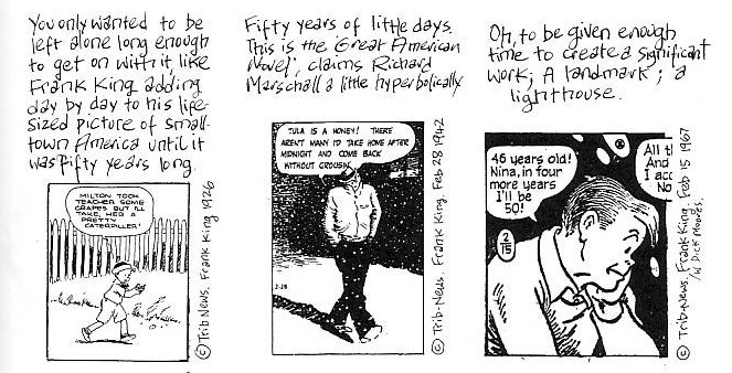
Explaining the concept of the “graphic novel” to Dirk Deppey in The Comics Journal # 273 (page 83) Eddie Campbell said: “the graphic novel doesn’t exist. “Graphic novel” is an abstract idea. It’s a sensibility, it’s an advanced attitude toward comics. […][T]he culture of the graphic novel respects this, respects that, admires that and venerates this other thing. The graphic-novel sensibility is more interested in Frank King than it is in Jim Steranko, whereas comic-book culture is more interested in Jim Steranko than it is in Frank King.”
Alec: How To Be An Artist (March 2001). Published for the first time in Deevee # 12 (October 1999).
The above quote may be correct and I agree with it up to a point… What baffles me is the overrating of Frank King’s Gasoline Alley by the supposedly “advanced attitude toward comics.” In spite of some wonderful Sunday pages the aforementioned newspaper strip is a toothless, bourgeois, kitschy, idealized, and bowdlerized view of suburban life (not forgetting the usual racism that we can find in many comics published during the first half of the 20th century). Taking Gasoline Alley as a role model (“graphic-novel culture”) to oppose it to Jim Steranko (“comic-book” culture) is a bit like jumping from the frying pan into the fire.
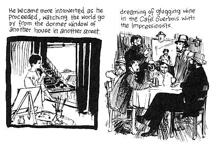
Eddie had other role models though: “I did an enormous amount of painting when I was 14 and 15. […] I wanted to be an Impressionist: sit with Monet and Renoir on the banks of the Seine.” (interview with Sam Yang, The Comics Journal # 145, 1991, page 60).
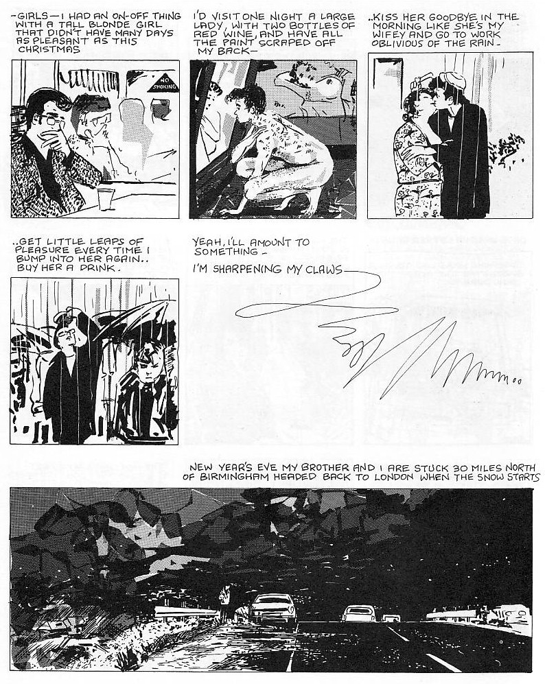
After the Snooter (June 2002). Published for the first time in Bacchus # 45 (July 1999).
The Impressionists are known for their technical innovations related to scientific discoveries about light and color. They are usually referred to as an optical art movement because they were more interested in visual perception than in any other aspect of the human experience. They also helped to establish a taste for the sketchy and unfinished, for exploration and experimentation. Monet, in particular, is a painter that should be more associated with comics than he has been until now because he painted in series. Japonism, an interest in photography and painting en plein air could also be cited as the most interesting aspects of the Impressionists, but, being figurative painters, they had to paint some themes. What they chose were, going against the grandiloquence of academic history painting, the old 17th century Dutch genre painting themes: bourgeois portraits, genre views, landscapes, still lifes. Pierre-Auguste Renoir in particular, is famous for showing a new leisure and joie de vivre (deliberately forgetting the difficult lives of his models or the executions of the Communards in the same place where he painted, five years later, the Dance at the Moulin de la Galette). He is definitely associated with Eddie Campbell’s genre scenes at the King Canute and elsewhere.
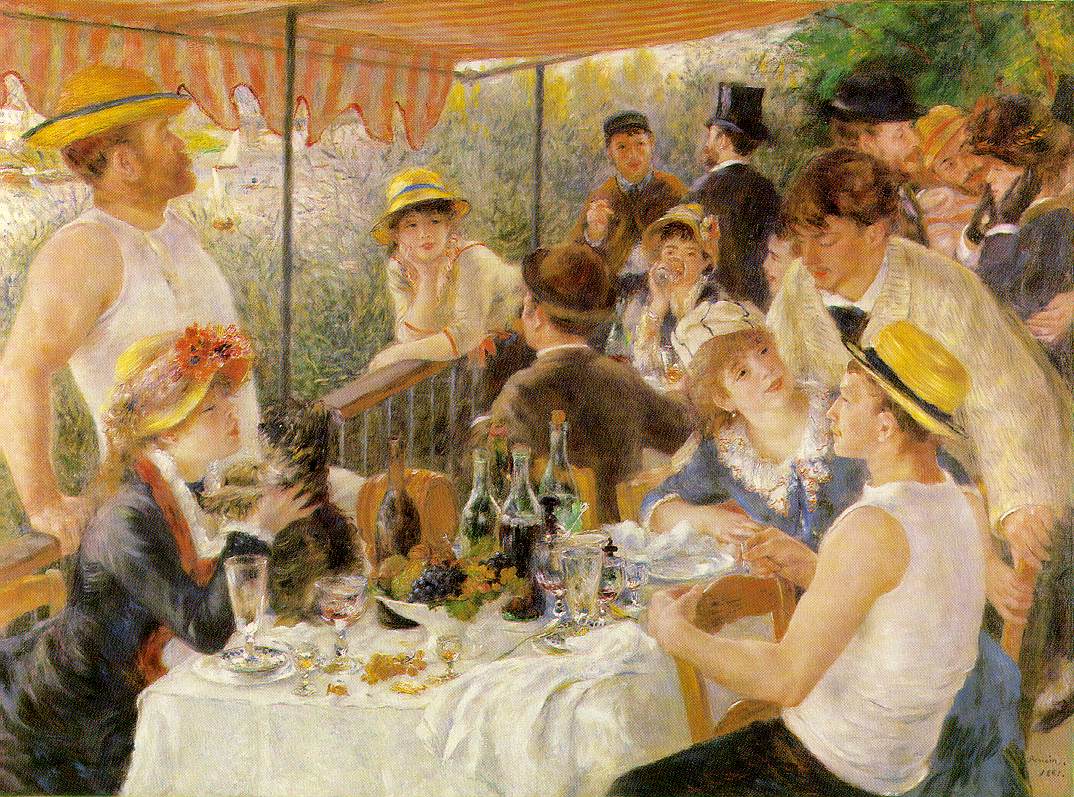
Pierre-Auguste Renoir: Luncheon of the Boating Party, 1880 – 1881.
In the above painting, for instance, we can see the same sense of bohemian lightheartedness that characterizes the King Canute crowd.
Taking into account these two references all sorts of positive feelings among the characters are conveyed to the reader: good-fellowship, tenderness, joyfulness. Which isn’t bad, of course, but is just part of the whole picture and risks superficiality. Whenever a group of humans get together for a length of time, rivalries erupt, people quarrel, stop talking to each other, there are misunderstandings, etc… etc…
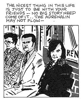
“The King Canute Crowd” in The Complete Alec (1990). Collected for the first time in Alec: Love and Beerglasses (June 1985).
The panel above conveys the same idea: “no big story need come of it.” The problem, of course, is the attack of a monster called “banality.” Eddie Campbell is always on the edge between pointlessness and the profound, deeply felt touch. Let me just tell you, for now, that the former isn’t always the winner. Sometimes a story with drunk people in it is just that: a story with drunk people in it. I don’t mean the first story in the book though because in the repetition of the nine panel grid, the repetition of the point of view and the repetition of the framing, combined with the smooth dialogue, we know that we are witnessing the birth of a new friendship (forgive the corniness).
And yet… Alec “The years Have Pants” (A Life-Sized Omnibus) (which isn’t really an omnibus because there are a few Alec stories that weren’t reprinted) is very far from Gasoline Alley. For starters it’s full of sex and booze. Sexism rears its ugly head a couple of times in The King Canute Crowd, but I don’t want to be an essentialist and say that Alec’s sexual partners entered the game with different expectations than he did and were hence deceived.
“The King Canute Crowd” in The Complete Alec. Collected for the first time in Alec: Love and Beerglasses.
For the above travesty of marriage (and I mean the caption more than the image) there’s no excuse. Let me just remind you a very basic rule of narratology though: even if the author depicts her/himself in the work of art s/he’s not the character.
In the last panel we can find a distinctive trait of Eddie Campbell’s graphic style: the more or less chaotic use of zip-a-tone (better reproduced in the so-called omnibus). It’s another inheritance of Impressionism even if the latter is a bit absurd in black and white. It adds to the overall feeling of sketchiness, unfinishedness, of rapidly stealing an instant to the constant flow of living. A vivid memory of a slice of life that’s always fragile because it’s always on the verge of disappearance…
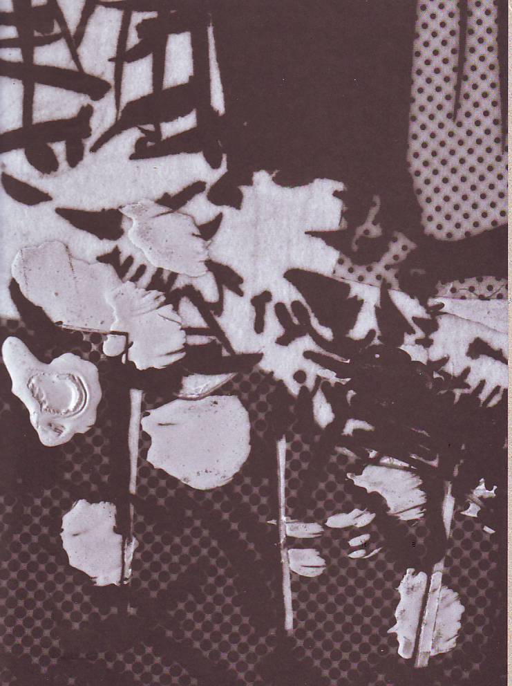
One of the Endpapers of the hardcover edition of Alec “The Years Have Pants” (A Life Sized Omnibus).
I don’t know who chose the endpapers design reproduced above (Erik Skillman, Eddie Campbell?), but I do know that it is perfect: it’s akin to a close view of a Monet or an abstract expressionist painting. It’s also a modernistic device that shows the readers beforehand the secrets of the trade: Eddie’s high contrasts of mechanical regular and handmade irregular textures, Eddie’s contrasts of black and white.
Giving the notion of a fast, lively, and yet precise drawing (and I mean things like composition and proportion, for instance) isn’t an easy task. From Eddie Campbell’s first efforts in the book (which he regrets not having redrawn) until his best pages (see below), there’s a huge step forward that, I suspect, was tremendously indebted to his participation in From Hell (written by Alan Moore).
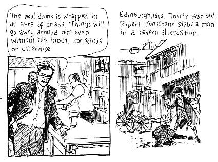
Detail of “The Complicated Demise of Robert Johnstone” in Alec “The Years Have Pants” (A Life Sized Omnibus).
Even if most of Eddie Campbell’s books are filled with innocuous humor he usually ends them in a high note. The chaff is put aside and the wheat comes to the foreground. That’s what happens in The King Canute Crowd (when everything ends in mayhem), How to Be An Artist (with a fascinating account of the Big Numbers affair), The Dance of Lifey Death (with, well, the dance of lifey death and an adaptation to the comics form of Edward Lear’s poem The Jumblies), After the Snooter (which is mixed throughout – Eddie’s reminiscences of his childhood are great -, but ends with a strong critique of Hollywood’s vacuousness and the insight that with age “everything reminds [us] of something else” – see below – I won’t comment the Freudian overtones). All the others, for better or for worse, aren’t part of this bunch.
After the Snooter (June 2002).
Graffiti Kitchen, whose original cover I present to you below, is an absolute masterpiece of the comics art form.
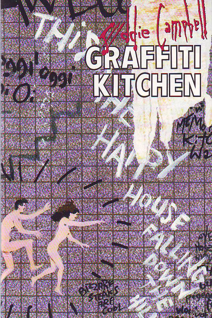
Graffiti Kitchen, 1993.
This is the real deal, there’s no flat material here. Eddie Campbell used an almost gridless nine panel grid as usual. The drawings are reduced to very simple, but very effective dynamic “nervous wrecks.” Visual metaphor is used to good effect (see below how depression is seen as a dark cloud chasing Alec). The topic is mainly passion (with a bit of Lolita thrown in too) which demands a very cold and careful approach to avoid sentimentality. That’s what Eddie does even if he can’t avoid depicting Alec bursting into tears once (see also below).
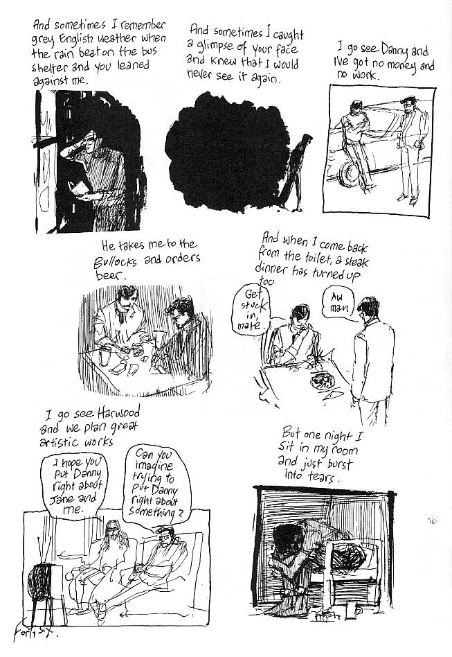
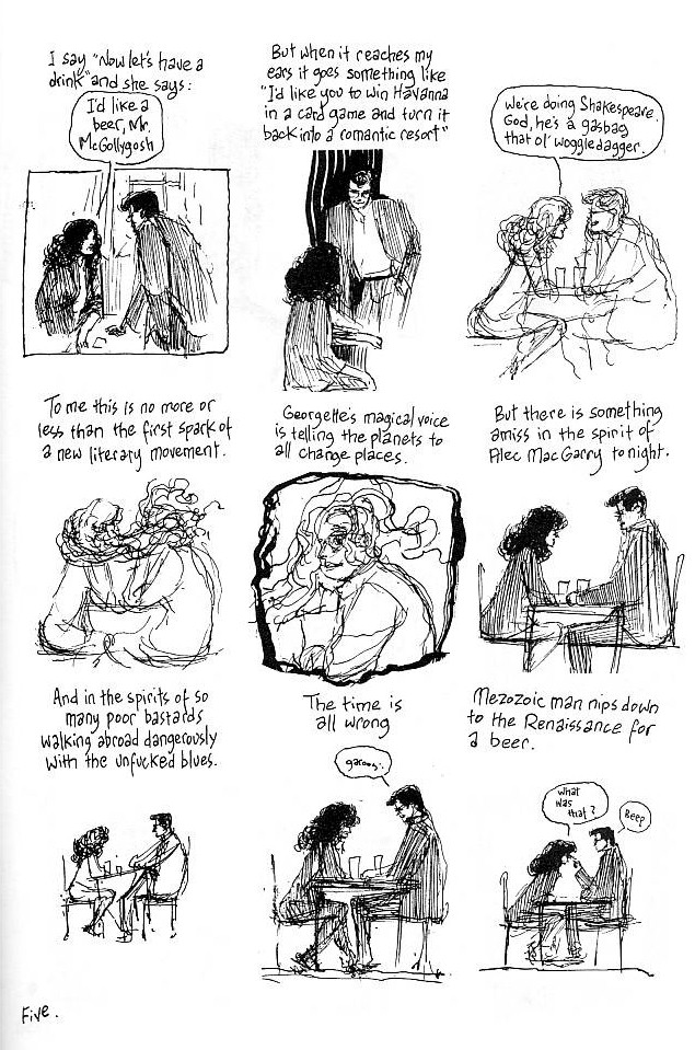
One of my favorite pages in Graffiti Kitchen is the one in which Alec falls for Georgette. The way her hair involves him is absolutely masterful. The wavy lines convey a feeling of abandonment and formless involvement with her (it’s like being inside a warm bath, see below again).
In his great book Journal (III) Fabrice Neaud used three devices to convey the exact same situation. The second one is similar to what Eddie did above (…er… you know, see below).
Journal (III) by Fabrice Neaud, 1999.
I guess that…
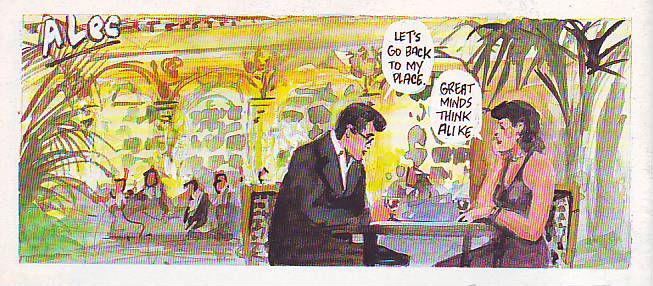
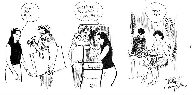
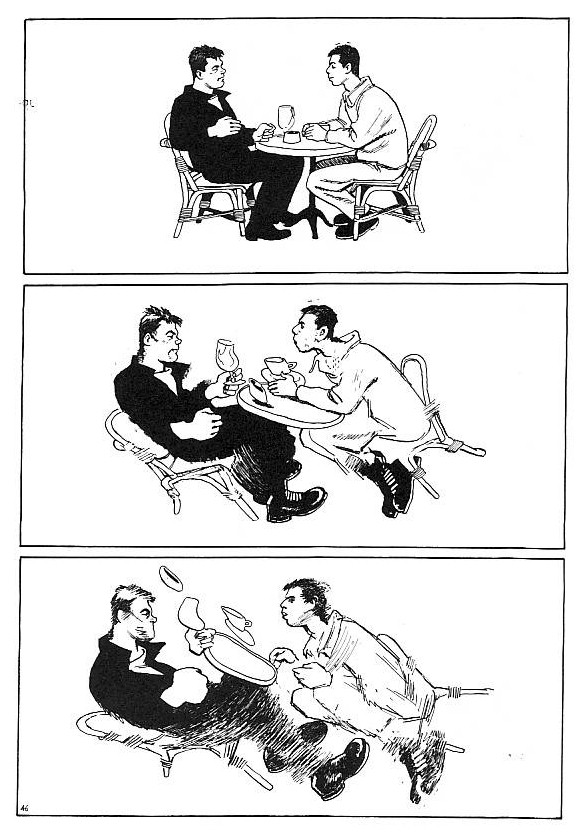
“Alec” in Bacchus # 8, December 1995.
But seriously though, Fabrice Neaud got a lot of trouble from Dominique and his friends for depicting him in Journal (III). Chester Brown said: “The stuff people are reluctant to talk about is often the stuff that’s most important, I think.” (Inkstuds, page 41.) I totally agree, but that’s a big problem for autobiographical writers and artists. Eddie Campbell talking about Steve Bissette: “It’s an inexplicable terror, the fear of having to take something personal out from inside you onto the page for everybody to dissect. That actually does take a degree of courage.” (The Comics Journal # 273, page 109.) In autobiography that problem exists, but it’s more complicated than that because the creative process also implies those who socially interact with the artist. Changing the names of the characters may not be enough to guarantee the peace of mind of all who are involved. That’s why Alec’s wife, Annie, for instance, isn’t developed enough as a character (we know very little about their relationship). We may see her drawn body in more or less private situations, but we can only witness her public self. It’s more than understandable, but there’s a price to pay: being defensive lame autobio is what we get… As a result Graffiti Kitchen remains an anomaly in Eddie Campbell’s body of work.
To end this post where I started it, look at the two following images:
“Life for Beginners” in The Complete Alec. First collected in Alec: Episodes From the Life of Alec MacGarry, June, 1984 (dated September, 1981).
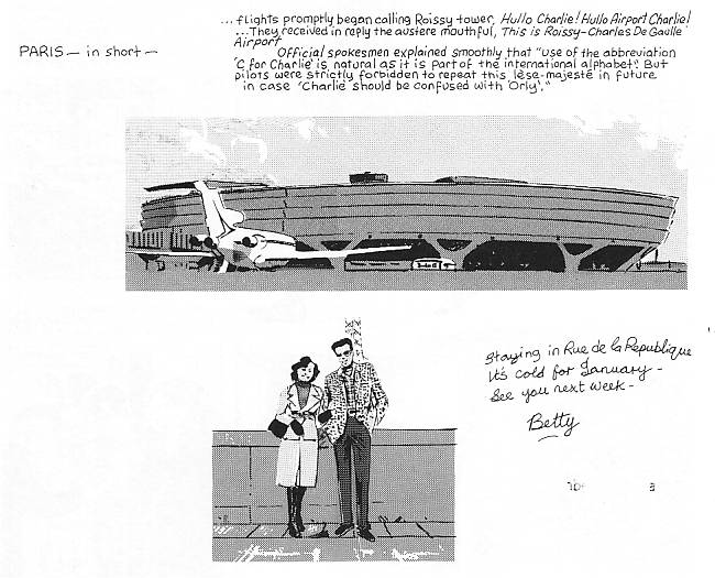
After the Snooter. Published for the first time in Bacchus #54 (August 2000).
“Betty Boop” (in 1981) is now (2000) called “Sharon.” I don’t know what you think, but I prefer the second version by far. The postcard aesthetic is no more. I’m not saying that the first version was false and the second one is the truth. What I’m saying is that the second version goes deeper in the exploration of what it means to be human. Of one thing I’m certain though: the second version hints at the fact that Alec’s sexism was a posture. He behaved according to what his male peer group, and especially his pal Danny Grey, expected of him. It also seems to me that the shadow cast over Sharon is a nice touch of melancholia.
Haha, I thought of you when I re-read that passage about the Portuguese wine! Good stuff.
And a fine observation, I thought, about the Sharon in “Snooter” — those three panels were amongst the ones that hit me the hardest this time around.
I totally disagree with your take on Gasoline Alley, predictably, but this is not the place, nor the time :)
Argh, ‘the Sharon sequence’ — that’s what I meant.
Thanks Matthias! Agreed about the Gas…
I see little reason to set up an artificial conflict between a long-dead strip cartoonist who never did a “graphic novel” and an innovative comic book cartoonist who did do an early “graphic novel”, as if interest in their works were mutually exclusive. Frank King’s work does not make my heart beat faster, I find it well-crafted but sentimental and somewhat boring. Steranko has not drawn comics for decades and most of what he did involves the dreaded superheroes, but his approach to comics narrative still can inspire—-even obviously thoughtful “graphic novelists” such as David Mazzucchelli. But, apparently that makes him a “comic book culture” philistine.
What might be helpful would be for “graphic novelists” to know the history of their young medium, an history that does not exclude any of the significant practitioners, and also find inspiration from outside the world of cartooning altogether.
I remember a time when we would talk about “alternative comics.” There was even a comics publisher with that name. The alternative was an alternative to the big two. So, it was a us vs. them kind of thing, an alternative to superhero comics (that’s Steranko who is just a shortcut, a representative of “comic book culture” in this context). Then Joe Matt discovered Frank King… and the rest is history. I don’t know who said that artists rebel against their fathers, but embrace their grandfathers. I think this is what happened here. The forgotten “newspaper comics culture” was available has a role model… Meanwhile in another dimension… Gary Panter was a great alternative cartoonist who liked Jack Kirby. Years later Brian Chippendale came on board of the King’s fan club. Maybe other Fort Thunder guys like his pulp too… Anyway, all this is history, now… but I can’t forget the godfather of many an alternative cartoonist: Charles Schulz. Needless to say that all this is extremely depressing…
No it isn’t, if you take the long historic view.
*I see little reason to set up an artificial conflict between a long-dead strip cartoonist who never did a “graphic novel” and an innovative comic book cartoonist who did do an early “graphic novel”*
James,
Campbell’s point is right there in your statement. To him, the “graphic novel” has nothing whatsoever to do with format and everything to do with artistic intention. This is obviously subjective to the observer, but to Campbell, Frank King was involved in exploring truths about life, whereas Steranko was involved in making his super-hero images as exciting as possible. Campbell’s point is not that there is value in one and not the other, but that in terms of discussing the concept of the “graphic novel,” one is useful and the other is not.
Talking about history, there’s a missing link to your Campbell-Neaud connection, I believe. I’m quite convinced that Neaud derived that sequence from Dave McKean’s very similar one in Cages, which in turn was likely inspired by Graffiti Kitchen.
Oh! Thanks Matthias, I’ll check it out.
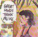
I’ve seen it, good find! It’s in _Cages_ # 5. It’s been great to look again at these comics that I haven’t touched for way more than a decade. The problem is that, now, my “great minds think alike” comment goes down the drain. Oh well!… It was a joke, anyway…