Jacen Burrows and the Mystery of Providence

Alan Moore’s Providence has been well served by the online community of researchers and critics over the past year. Of greatest note, perhaps, are the detailed annotations at the Facts-Providence blog. It would also be remiss of me not to mention Craig Fischer’s long overview of Alan Moore and Jacen Burrows’ Lovecraft cycle at The Comics Journal.

For once the backcover blurbs accompanying Providence have been largely correct. The work is easily Moore’s most heavily researched and intricately devised comic in years. Yet of the many mysteries of Providence, there remains one which has sternly defied explanation.

Why did Alan Moore choose Jacen Burrows to draw Providence?

Was it a true appreciation of Burrows’ art, a choice made for the sake of consistency (since Burrows worked on The Courtyard and Neonomicon), some connection on the personal level, the path of least resistance (Burrows being Avatar Press’ best artist), or some combination of all these (and more)? Whatever the reasons, I think there is little doubt that the choice was fully within Moore’s hands.

Some perspective on this issue might be gained by listing out a few of the artists who have worked with Moore on his long form works over the years: Stephen Bissette, Brian Bolland, Eddie Campbell, Alan Davis, Melinda Gebbie, Dave Gibbons, Ian Gibson, Gary Leach, David Lloyd, Kevin O’Neill, Bill Sienkiewicz, Curt Swan, John Totleben, Rick Veitch, J.H. Williams III, and Oscar Zarate.

Some might argue that the work of Jacen Burrows exceeds one or two of these artists, but I think it’s safe to say that many more would consider his contribution to Providence to be somewhat indifferent and strangely out of place among these illustrious names. Certainly, on a purely technical level, it is very hard to place Burrows ahead of most of these cartoonists but this also assumes that this was Moore’s primary consideration in choosing Burrows to be his partner on Providence.

If Moore’s contributions are generally always visible in his careful structure at the level of both page and book, his obsessive research, and his sometimes baroque dialogue and themes; then the contribution of his collaborators is even more apparent. Eddie Campbell’s contribution to From Hell is an unrelenting crepuscular inking, the rush of lines swiftly scratched across the page suggesting something indistinct, something hidden; the figures in deep black coats suffocating entire panels in impenetrable night. When William Gull does his work, he is the darkest point in the room, his tunic bleeding into the stains hemorrhaging from his victims; the rest is a kind of rolled-on hatch work candlelight.

A quick flip through the scripts of From Hell at hand suggest that Moore was capable of giving Campbell free reign to exercise his imagination (and research) in a number of scenes, while Campbell himself felt free to change Moore’ suggested panel progressions and compositions across entire tiers of panels.

From Hell_0001


From Hell_0002

By comparison, J. H. Williams’ work on Promethea is almost lightness personified; the manifestations of the comic’s matriarchal thaumaturgy might be colorful, labyrinthine, and decadent but it rarely seems truly frightening. Which is a roundabout way of saying that Moore seems to choose his partners with great intent (more so as his reputation has grown), seemingly tailoring his scripts to their abilities. Which makes the choice of Burrows all the more puzzling.

There is of course the simple matter of reliability and temperament with Moore’s experience on Big Numbers being the main point of provocation (Bill Sienkiewicz having shown a distinct distaste for working on Moore’s detailed scripts). This is perhaps one of Burrows’ main selling points—his willingness to subsume much of his own artistic vision to that of Moore’s; you can almost sense his desire to pay obsessive attention and deference to the details of the script. The plainsong delivery of Providence seems to provide us with an almost unfiltered expression of Moore’s writing (which is arguably not the point of a collaborative piece where we want both distinct voices to be heard).

The clarity of Burrows’ expression is such that almost every element depicted has the impression of being placed in space under the direction of Moore (with a modicum of artistic direction by Burrows). What I am describing is the effect of Burrows’ drawing style and it may be something very far from the truth—its scrubbed cleanliness, its theatrical violence, its precision if not in draftsmanship, then in obsessive depiction and placement. Consider Providence #5 where Robert Black and Hekeziah Massey ascend and descend the same set of steps on different pages, the disparity in their heights across two different pages presumably accounted by the height of the steps they are traversing.

Providence 05-10


Providence 05-12

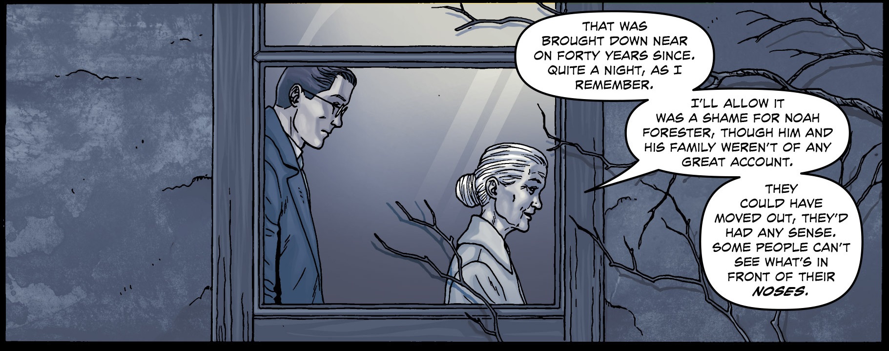
Such is Burrows’ attention to detail that the reader is left to wonder if the height of the steps is sufficient to account for the difference in their heights as seen from the exterior of the house (Massey is considerably shorter than Black as is). The house is based on that in Lovecraft’s The Dreams in the Witch House;  an abode existing in indeterminate time and space. The branches which cast their shadows across the facade of Massey’s house were first seen on the cover to issue one of Providence (depicting the site of Lovecraft’s story, Cool Air) suggesting an arcane connection. In this and other scenes, Burrows seems almost mathematical in transcribing Moore’s script.

Providence 01-000

In this sense, Burrows is the artist who most resembles Dave Gibbons as far as Moore’s oeuvre is concerned. That earlier pairing appears to have been a bit more collaborative in nature; more taken with the squalor and boisterousness of life and drawing. Whatever your opinion about Gibbons’ work, there is something to be said for the way he managed to work around Moore’s voluminous scripts despite the constrictions of the nine-panel grid—a format which forced him to engage in a series of medium shots and close-ups for much of Watchmen.

This is not to minimize Burrows’ own contributions if Dave Gibbons’ experience on Watchmen is anything to go by. Here’s a typical interview by Gibbons explaining his contributions just before the launch of the Watchmen movie.

“…people unacquainted with graphic novels, including journalists, tend to think of Watchmen as a book by Alan Moore that happens to have some illustrations. And that does a disservice to the entire form, because comics are stories in words and pictures.”

“…like the notes where I plot the rotation of a perfume bottle through the air — might not be particularly obvious to anyone who reads it. But those who do will note the consistency, the reality behind it all that exists in great depth. It gives it a more magical quality…”

Burrows describes a somewhat similar experience for his work on Moore’s scripts in various interviews. At the very least, the reader will find a substantial amount of his contributions in the character designs, the style of dress, and the everyday objects which populate Providence—the kinds of things which people only notice when they go horribly wrong. Burrow’s greatest contribution appears to be in the recreation and reimagining of various outdoor locales. While he is not an architectural maestro of the level of a François Schuiten (or even a Dave Gibbons), he seems most comfortable when dealing with the facades of buildings (his interior spaces are another matter; see below). Perhaps the photo referencing helps in many of these instances.

An uncredited writer at Facts-Providence is one of the rare unadulterated defenders of Burrow’s work and suggests other aspects of his art which might be due some appreciation:

“As far as gore and grue goes, it can be honestly said that few artists in the industry get quite the mileage out of their anatomical studies as Burrows does—both in terms of making sure every organ and muscle is in its correct place, and for not shying away from the nipples and genitalia.”

“…the sense of space. Some of the subtle but effective visuals and layout choices focus on shifting perspectives in the same space, with visual cues directing the readers’ attention rather than dialogue, forming an effective visual rhetoric.”

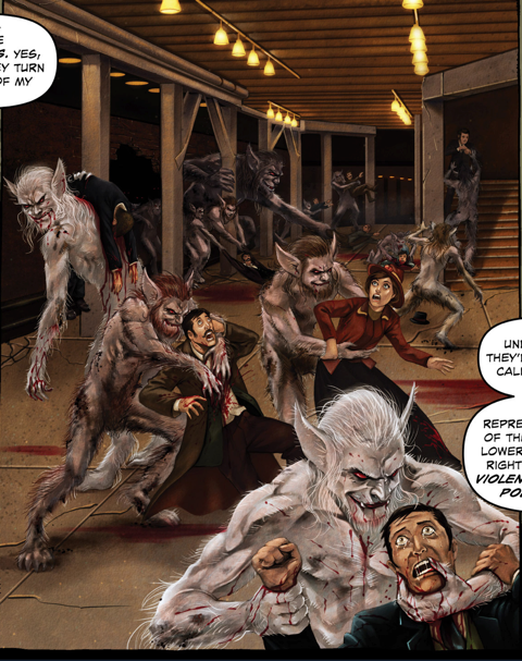
In any case, Moore has persisted with Burrows and his faith in the artist has paid off in a way. Providence is undoubtedly Burrows best comics work to date, and it is done with a level of confidence and brio which suggests a greater sense of mission brought on by the new script. The oft cited stiffness has been reduced in severity throughout. Much of this has to with a better grasp of proportion, a more naturalistic placement of figures within each panel, and a greater variety in his panel compositions.

Having said this, some awkward foreshortening still rears its head at times and there are other more significant difficulties.

Providence 05-15a

The scene above comes from a less than successful sequence in Providence #5 where Robert Black talks to Frank Stubbs at a meteorite crash site. Like many other parts of Providence, there is lengthy exposition through dialogue here with two figures talking and striding across a barren landscape, almost always equidistant from each other with the occasional reverse shot.

Providence 05-13Providence 05-14

Providence 05-15


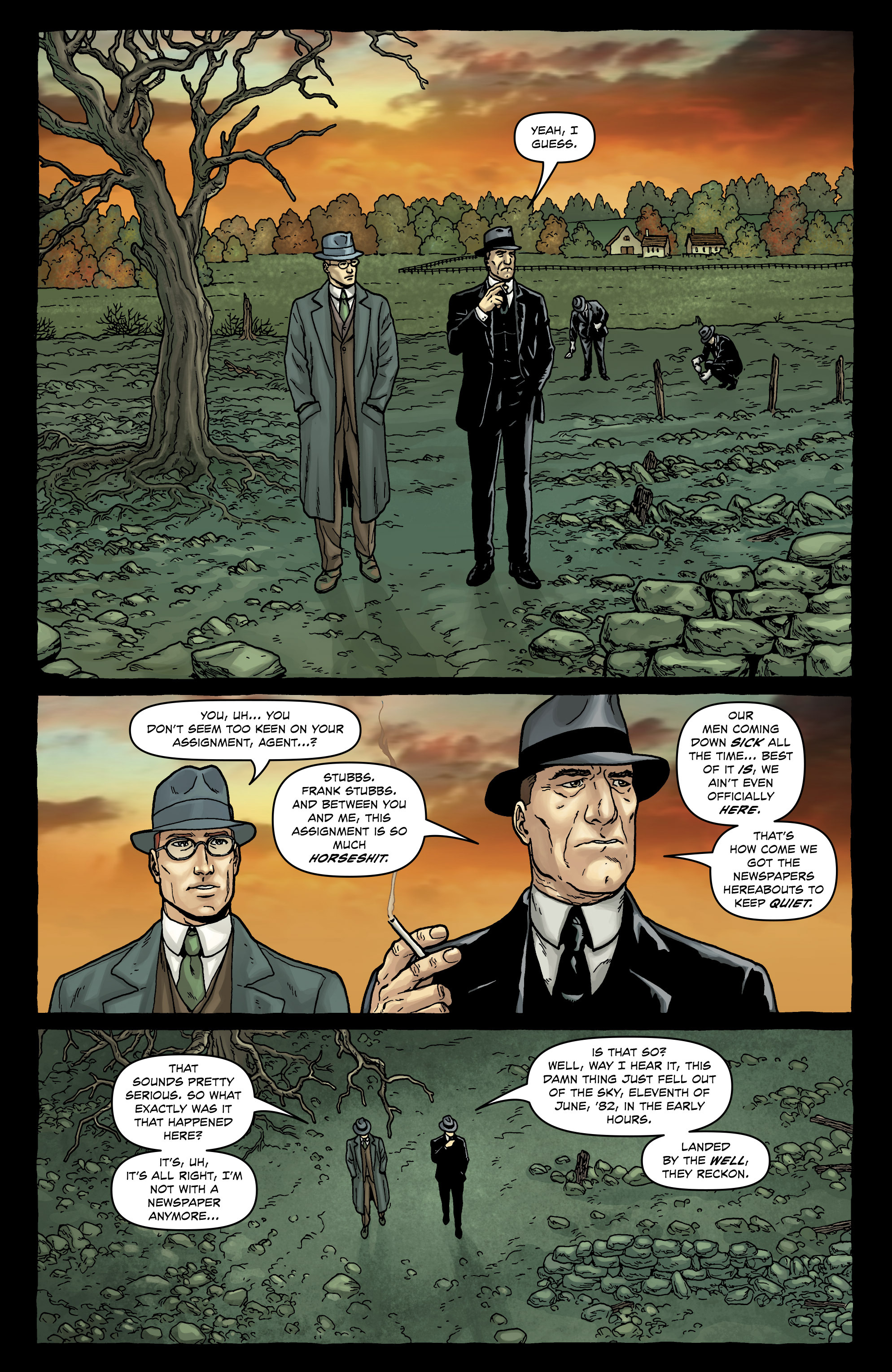
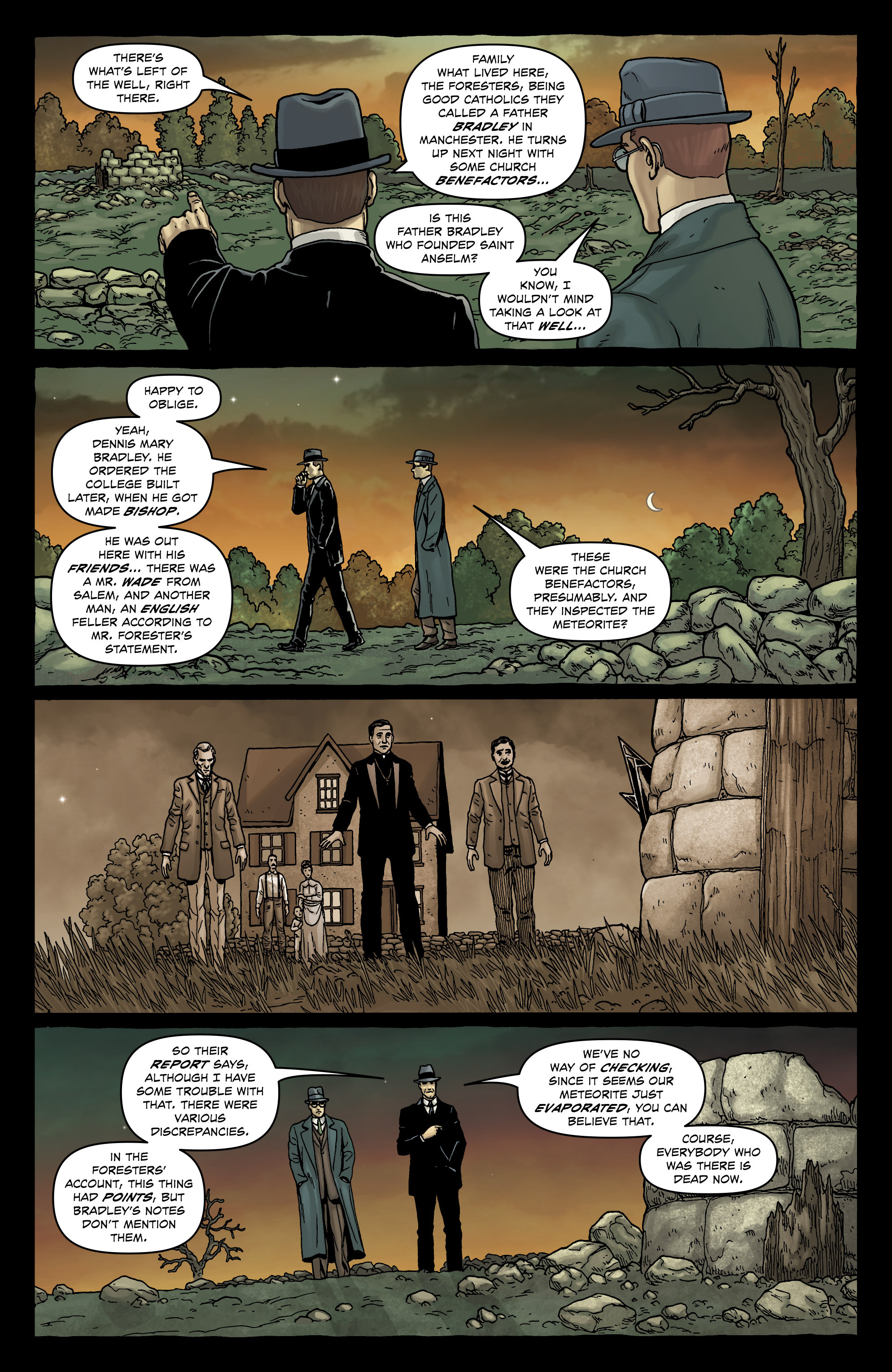
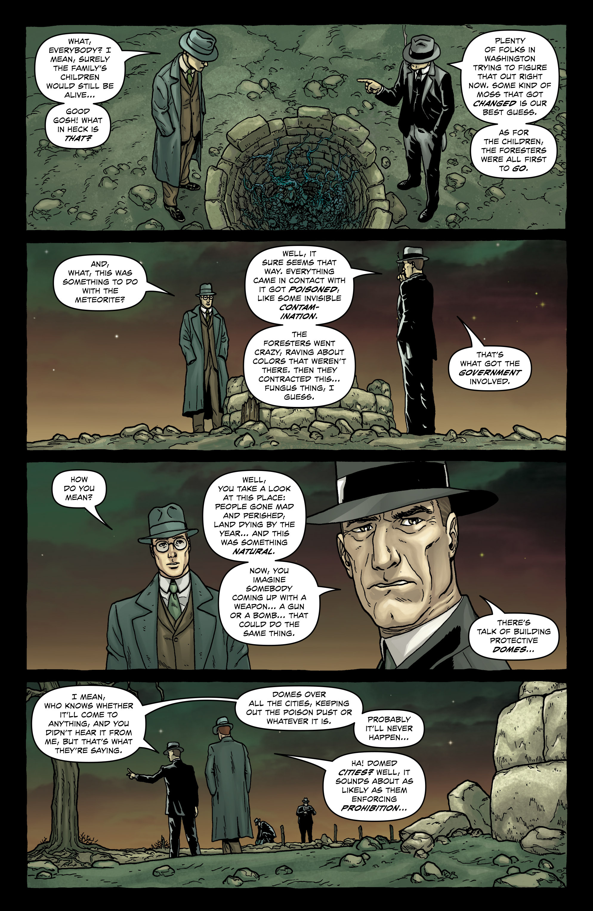
The foliage, background and foreground are unremarkable, the figures seem to pace forward like graceless stick figures wearing whalebone corsets, hands largely in their pockets and at their sides except for the odd stray cigarette hand; and it just seems like a very tired exercise in drawing, perhaps a combination of fatigue, boredom, and time pressure. We can see what a relatively old hand like Vittorio Giardino does with a similarly unremarkable sequence set in a barren landscape in the page below.71oqeiiAjyL

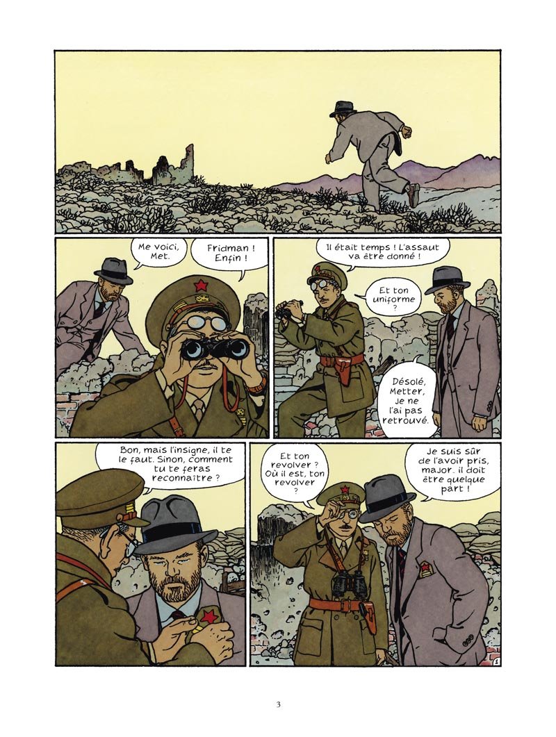
An unfair comparison perhaps because of the lack of expository dialogue (and the demands of the script) but also a useful one because of Giardino’s passion for naturalistic clean-clear lines. You might have qualms about the art, but at the very least, these people seem like human beings and their clothes lived in

Burrows’ failure at such pedestrian scenes of everyday dialogue is in sharp contrast to an episode later in the same issue where a placid, bulbous hag sits comfortably breast feeding her familiar (Jenkins).

Providence 05-20

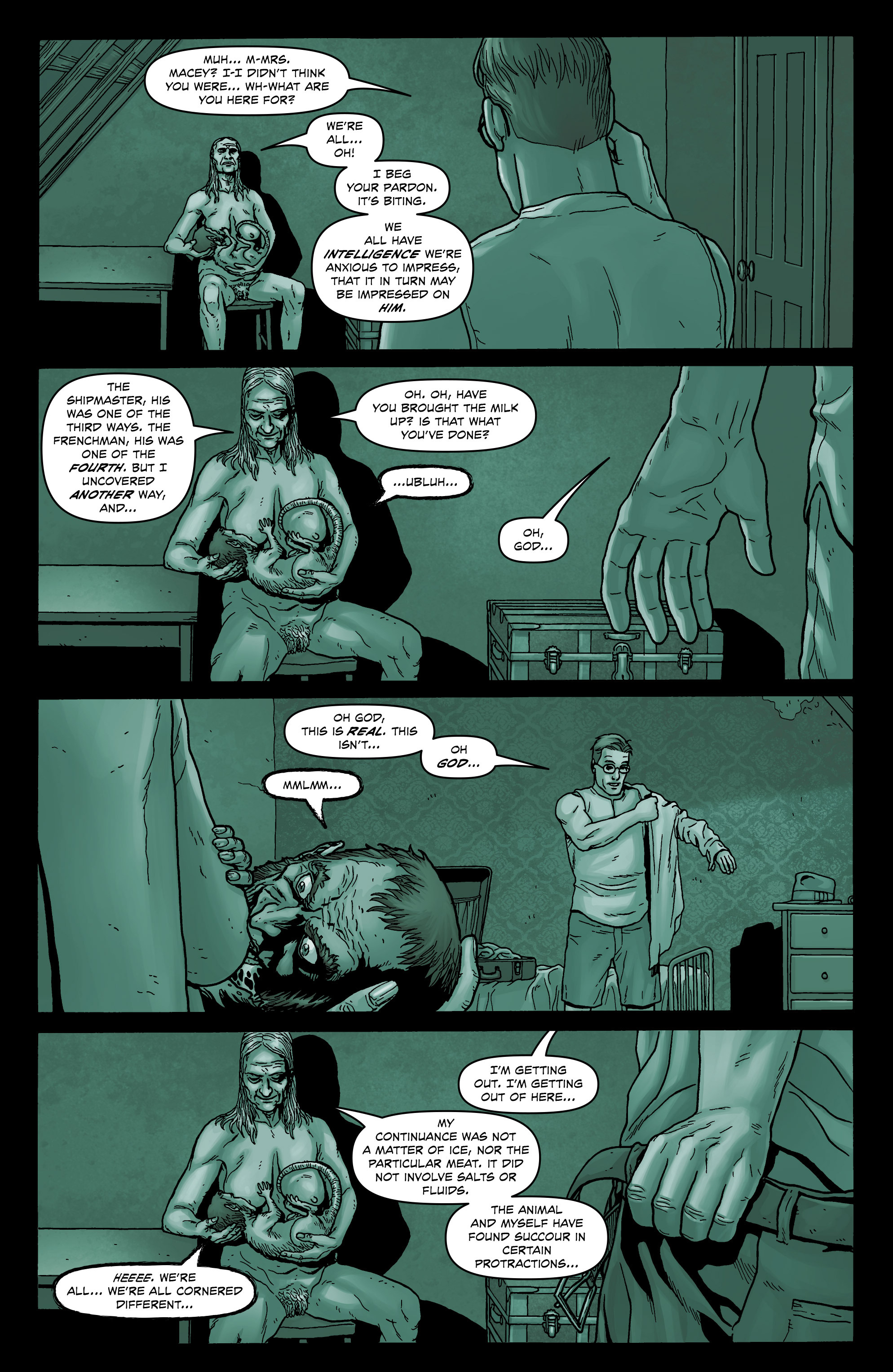
This almost seems to be drawn from nature when compared to many of the somewhat staid and geometric beings who otherwise inhabit Providence. Yes, the protagonist (Robert Black) doesn’t seem especially distressed as he puts on his clothes in a situation which would have most wetting themselves; he could just as easily be speaking to his wife after breakfast in bed. But Burrows’ feeling for the grotesque helps obscure his deficiencies in depicting the commonplace. One could almost make a case that the sheer tedium and falsity of the everyday images throughout Providence is exactly the point—the real world is the one we should be rejecting.

The six page sequence where Black encounters the ghoul King George shows a similar limitation in facial expression. The postures are once again unnatural and repetitive and the reactions of the protagonist fall far short of the requirements. For an encounter of such psychological terror, Black seems almost sphinx-like in parts.

Providence 07-18Providence 07-19


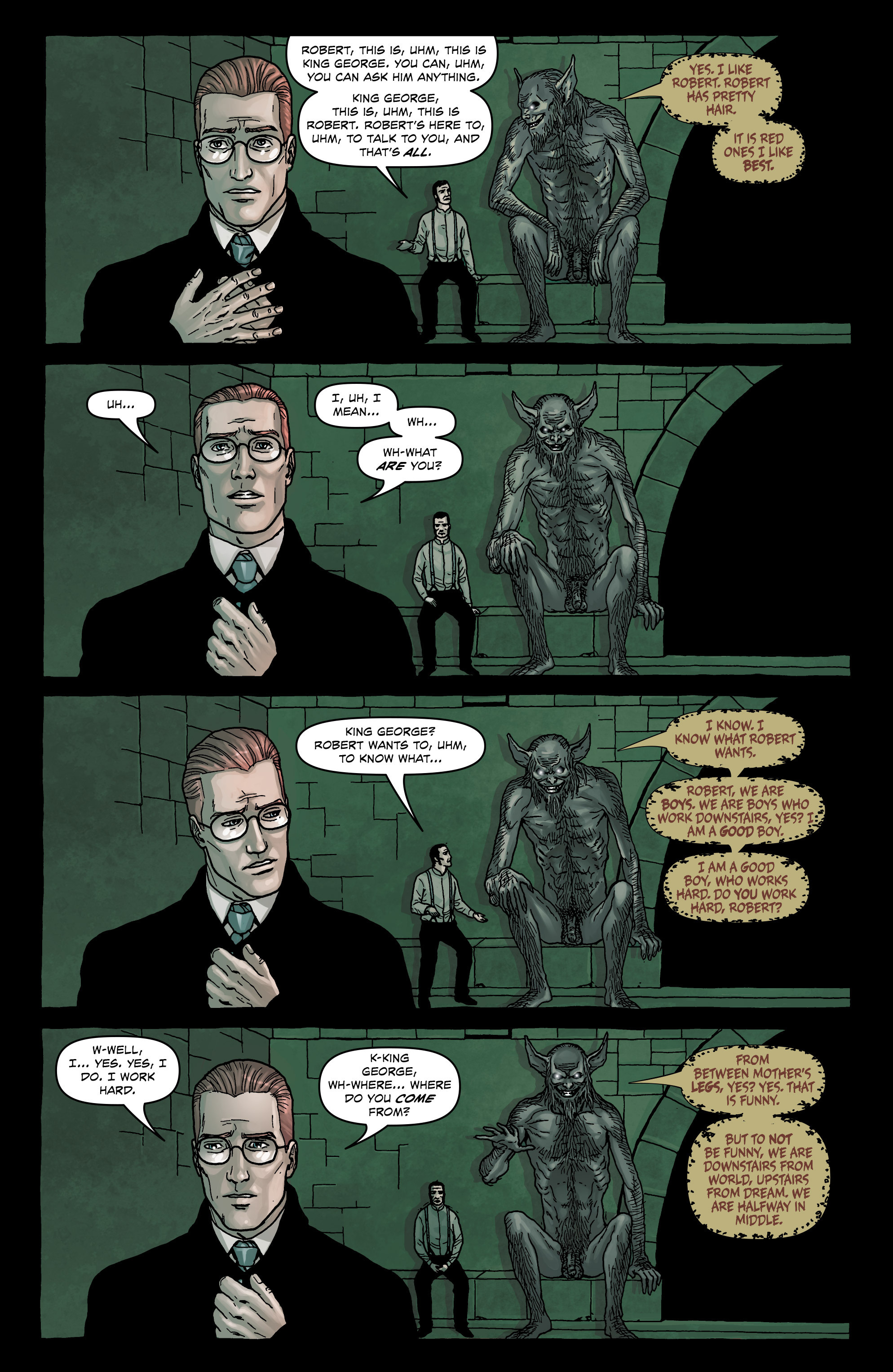
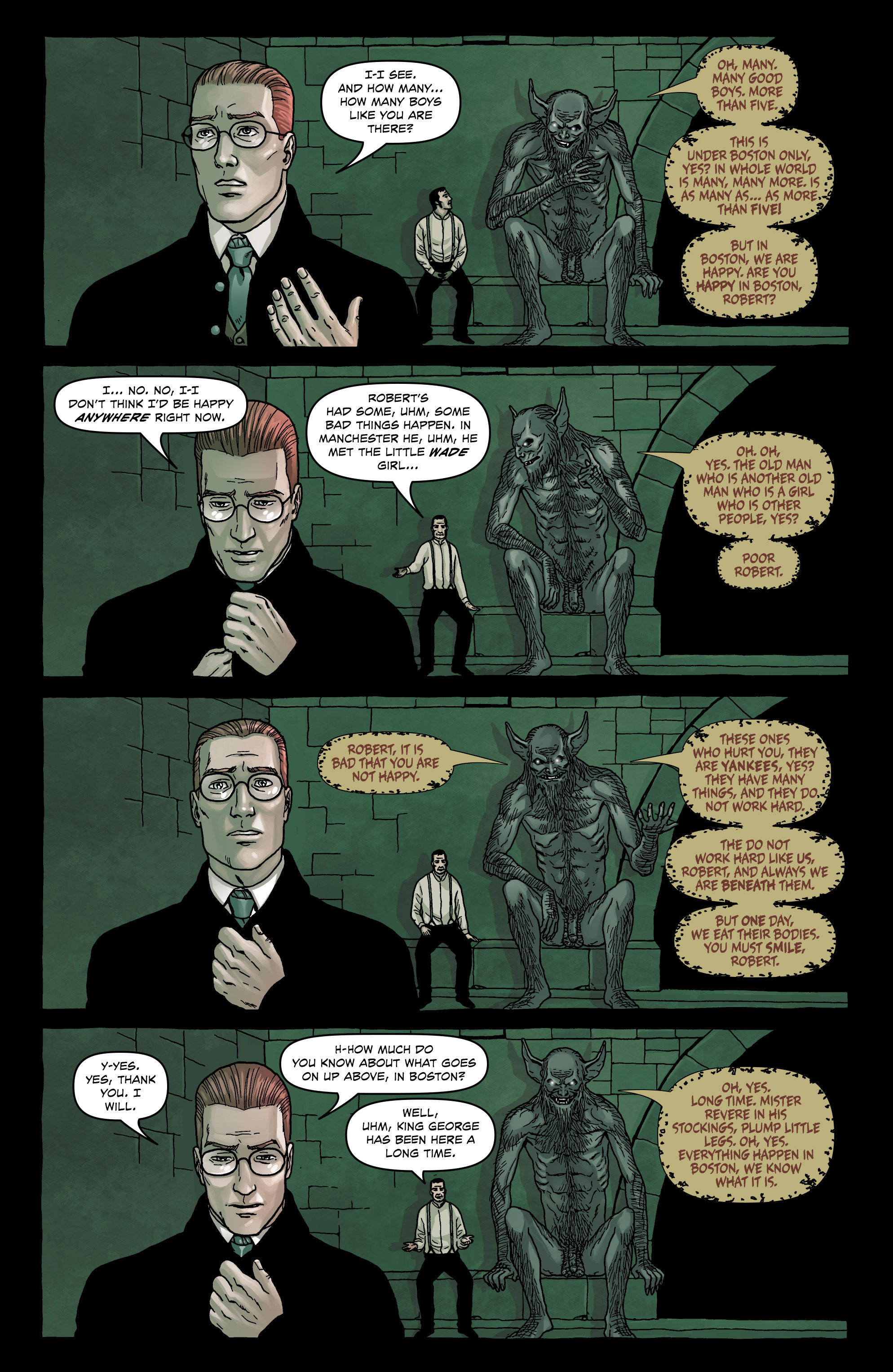
The repetition in the perspective and background highlights a sort of anergia in Burrows’ line, a kind of disinterest in the psychological effects of lighting; the terror in this underworld is imperceptible and almost fully to be imagined by the reader.

Readers will also need to use their imaginations to determine what could have been in the alternative lives of a comic named Providence—the possibilities as you would expect are endless. In just the last month, a young artist by the name of Ian Bertram has shown what can be done to elevate a relatively sedate horror script in House of Penance.

House of Penance 1-23

But would the lack of photorealistic architecture affect our appreciation of Moore’s script and displace us from its everyday possibilities and ever present terrors? By the same token, would the dreams, fantasies, and terrors which haunt Providence’s North American underworld have been brought that much closer to us if we had someone other than Burrows to chart our course?

In the final analysis, it seems unlikely that Providence as a whole will attain the kind of status it probably deserves because of this weak link. If comics are to be seen as a truly collaborative process, then the wide disparity in achievement in Providence (between script and drawing) can often be ruinous if not quite tragic—a conductor and composer can only achieve so much with a tolerable orchestra. We can read the music and imagine its aborted pleasures but in comics, there will almost never be a second performance.


_____________


Addendum – Different Perspectives

(1)  Craig Fischer writing at The Comics Journal has a few short thoughts on Burrows’ work:

“I’ve talked up Providence among other comics fans, their opinions of Jacen Burrows have been wildly different, with some liking his cool, architectural approach, and others sorry that his art lacks gonzo energy. (One friend wishes that the splash page of Leticia’s rape had looked more “like a mind-blowing combo of Steve Ditko, Rory Hayes, and Henry Darger” and less like an airline safety brochure.)”

(2)  In the same vein, I asked a few of my own friends about Burrows art. First up is Domingos Isabelinho.

“…the art is stiff and the characters are lifeless, but what I can’t bear looking at is the computer coloring. It’s the worst thing that happened to comics ever, apart from the stupid stories, of course, but Alan Moore is never stupid. On the contrary, sometimes he’s too intelligent for his own good.”

(3)  I also had an email exchange with a working cartoonist (henceforth known as Cartoonist Z) and here are a sampling of his remarks:

“Jacen’s style reminds me of Steve Dillon’s work. I think because his faces and expressions are reminiscent of Dillon, and with him also being tied to Garth Ennis (like Dillon) on whatever slightly grotesque stories come out of Avatar. For me, Dillon is the standard for ‘good’ comic book art in America (clear storytelling/consistent art) and I feel Jacen’s works falls just short of that Dillon quality.

What I particularly like about his work is it’s completely realized. Meaning it’s not phototraced or pulling inspiration from conflicting voices. It’s drawn in his hand, in his own voice. If you showed me a few images of this I’d know it instantly as “that guy who works for Avatar.” What I think he has improved on is at times his work can be stiff, but here I’m impressed with things like his hands, some lively expressions, and of course a gross lumpy body or two.

One thing that sometimes bothers me about his art, and I think holds him back as a clean line style/detail guy, is that his backgrounds can tend to be off. Not in reference and detail, but sometimes in the basic use of perspective. Clean line style doesn’t let you get away with those minor hiccups. Whereas someone working in a bit more ‘artsy’ style (think Sienkiewicz) can use suggested brush marks, artistic fades, crosshatching, splatter, and spot blacks for quicker backgrounds that are impressionistic (and have a lot of wiggle room to be technically off but still work in the context of their respective styles).

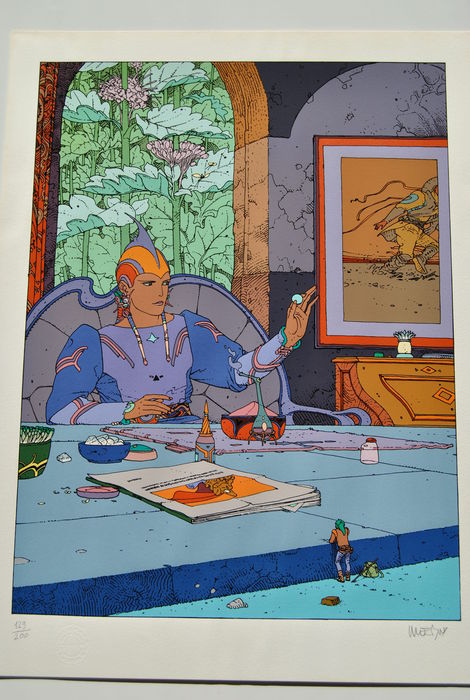
With Jacen’s clean line style, his use of perspective could stand to be tightened up. Examples of the very best working in this fashion are Moebius, Darrow, and Quitely. I can look at their work and use a ruler too learn perspective by finding the vanishing points and figuring out what they were thinking. Or simply just be mesmerized at their use of perspective, and how easily things exist and move within their environments. Jacen’s work isn’t at that level of skill yet.

Here’s some organic stuff I love, stuff that lets me know he has the potential to be really good. But for me right now his work feels like its good in spots.

Great face, eyes are alive.

NuclearNation_Header


Excellent expression for a small female figure.

NuclearNation_Header

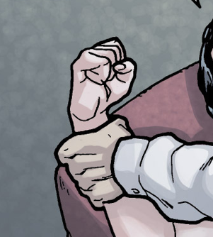
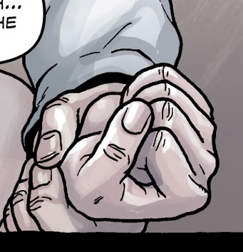
Nice hands. His work tends to be a bit stiff (and hands are particularly difficult for all artists), so you’d expect his hands to be as such, but they are pretty organic and expressive.

Burrows Hands 02

Burrows Hands 01


Terrible. I know this is supposed to be a painting or whatever in the comic but it breaks the one big thing Jacen has going for his art—that consistent voice. I talk about this a lot with comic book making. You can read a great comic with stick figures as long as it’s drawn honestly and in the same voice.

NuclearNation_Header

It’s why a little kid’s drawing can resonate with you. It’s honest. Not in the romantic sense but in the mechanical sense. This painting in the middle of the comic is just an absolute turd. Terrible drawing. Terrible Photoshop coloring. It doesn’t fit in with the art whatsoever. As such, all of his flaws are amplified and made apparent. It just doesn’t work. I’d much rather Jacen draw the painting in his current style and just have the colorist color it slightly different. Or even color the same and color hold (lighten) the line art.

Notice how Moebius handles paintings and posters in environments. It’s all the same voice.

NuclearNation_Header

To better get across my point of his backgrounds being close but not exact. I picked a few things out to draw over.

Neonomicon 01

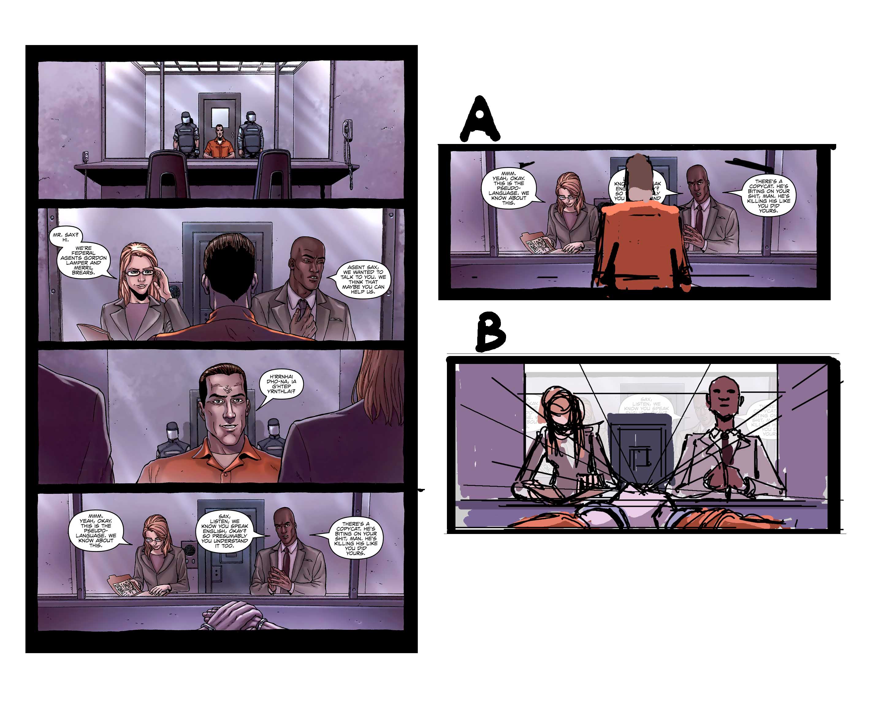
On this page here, let’s look at panel four. I like the concept of the cuffed hands being in the foreground, but the figures in the background aren’t engaged in the scene. As of now they are too far back from the inmate (based on the established distance in panels 2 and 3). So to make the drawing ‘right’ (referring back to my earlier point that clean line style perspective needs to be exact), you’d have to put the inmate back into the shot (version A); or keep the great concept of the hands in the foreground, but actually move the camera down to the hands, moving the vanishing point lower and allowing the vanishing point to guide the rest of the drawing. The lowered vanishing point would mean more of an upshot on the officers in the mid ground (version B).

This allows for a much more engaging shot, really establishing a foreground, mid-ground and background, and creates all kinds of nice overlaps which creates the perception of depth. I also think, storytelling wise, the reader would feel the investigators urgency and get sucked to a greater extent into the story. I feel that Jacen’s work while clearly thought out in a storyboard type of way, can sometimes fall flat in the finish and not engage up to its full potential. In this sense, every so often an environment while referenced and detailed accurately can just feel ‘there’, and doesn’t feel 100% lived in. I hope this over draw brings a little bit of clarity to that point.”


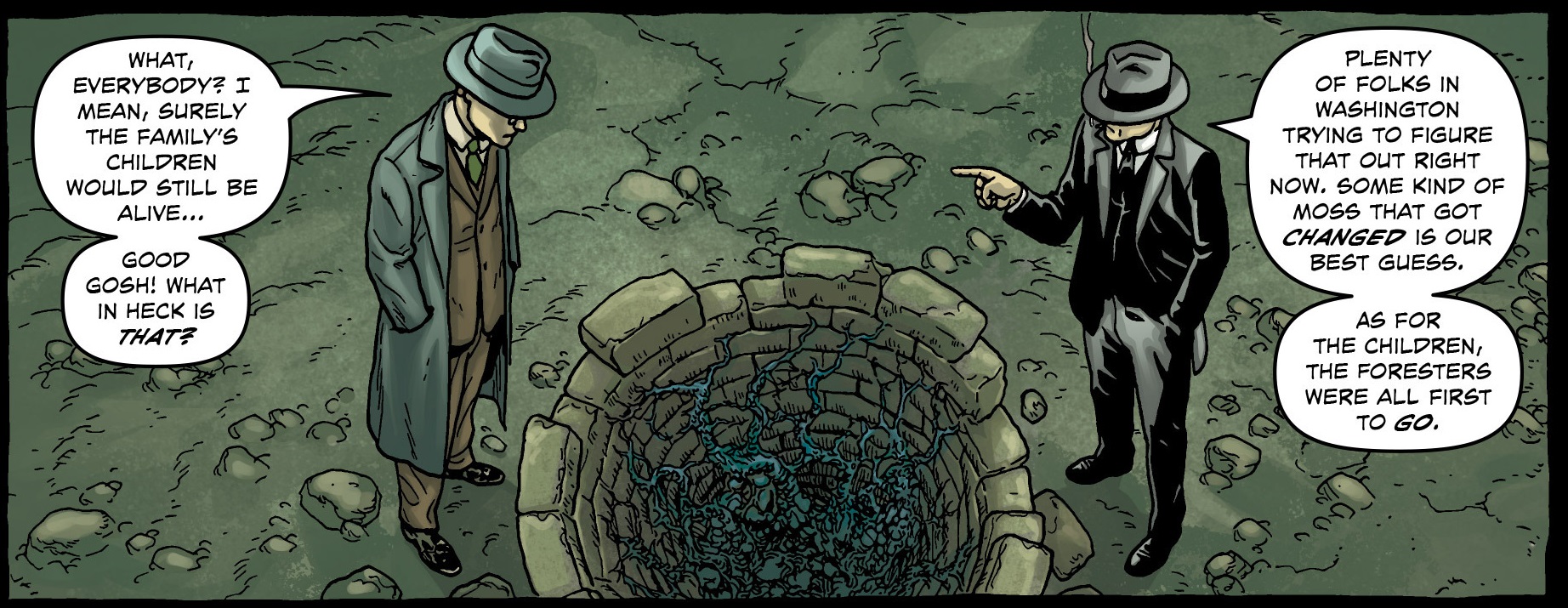
Let’s look at panel one of this page.

Providence Well 01

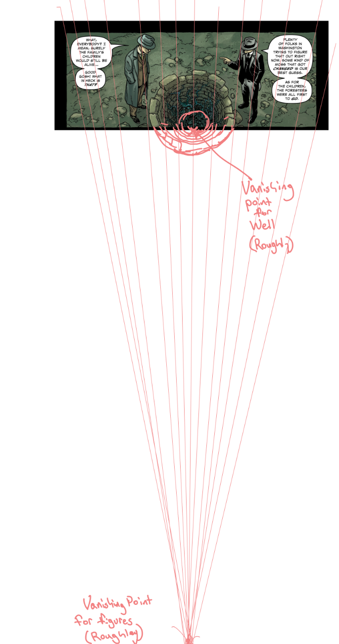
Mechanically speaking the perspective is off. The figures have a different vanishing point than the well. You would either have to pick the vanishing point for the well or for the figures, and that vanishing point must dictate all objects in the environment.

Here the well perspective is corrected to align with the figures.

Providence Well 02

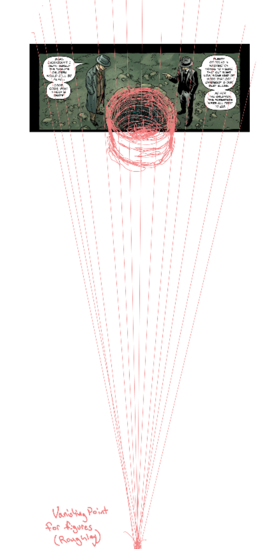
It’d be tougher to align the figures with the well perspective at this point. A quick rough if we did correct it that way.

Providence Well 03

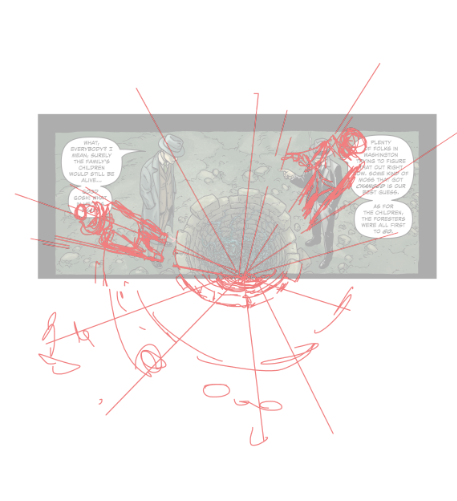
To correct what Jacen already has down I’d choose to handle it as such.

Providence Well 04

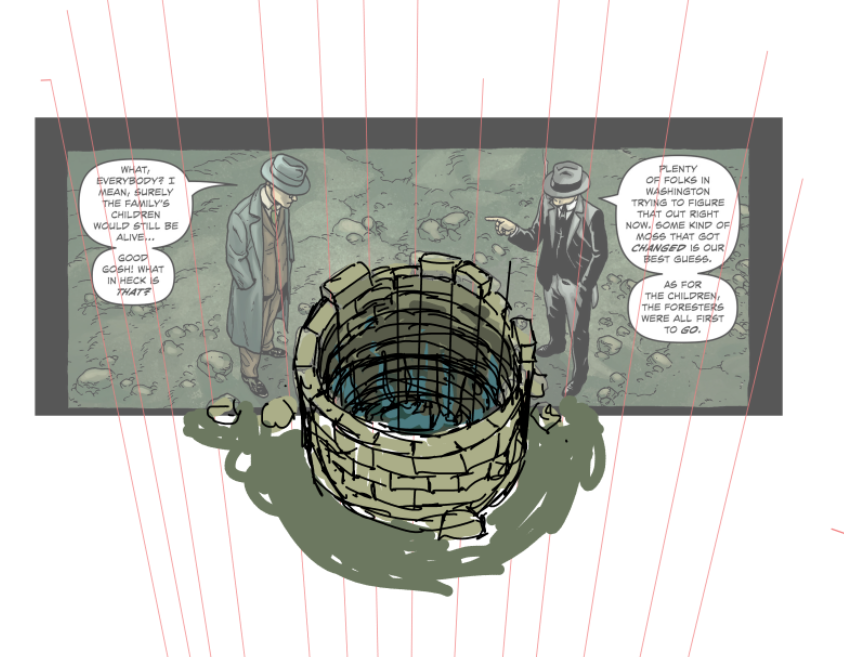
I believe with a little more care when it comes to the mechanical workings of perspective and environment drawing, Jacen would level up as an artist. I hope these over draws help clarify my perspective.”

(4)  Jacen Burrows on his first experience working on an Alan Moore script (Neonomicon):

Bleeding Cool: Well, Alan’s famous for long involved script descriptions that at the end say “but if you have a better way, do that instead”. What changes, if any, did you make while working on the book?

JB: I haven’t made any that I can think of off hand. I pride myself on trying to get as close as I can to the writer’s vision. It’s kind of a game for me. I think I must have a little OCD buried in the back of my mind somewhere that this kind of thing triggers.


(5)  Mahendra Singh on Jacen Burrows (added 27th May 2016)

Jacen’s Providence work is pretty much the current American corporate comix house-style for realism. He’s a younger artist and his draftsmanship and cropping (the latter is very important in his style) are indicative of this. They will improve over time although there is a potential to devolve into a slick, hack-style if he’s not self-aware. In short, he is a competent artist with a full set of competent skills but is still going through an apprentice phase. The flow of his panels and the on-off draftsmanship need improving but I suspect that he knows this. The worst thing he could do, if he wishes to do seriously good work, is continue drawing for fanboyish tastes. The inherent limitations and demands of this material are going to wreck him.

It’s the same old story: do work that pays and also destroys your talent or do work that no one cares about and that will allow you to become a real artist. Jacen is on the cusp of that decision. He can draw and he can tell a story, he needs to pull it all together by throwing off the shackles of this corporate style.

The Blind Men and the Elephant

1

Hanabusa Itcho, Blind Monks Examining an Elephant. Itcho, by the way, not Hokusai, contrarily to popular myth, coined the word “manga.”

Speaking of stories… you know the parable: the blind men feel different parts of an elephant’s body and, afterwards, they disagree on what an elephant looks like. Such is the nature of truth; knowing only part of it we can’t grasp… speaking of pictures, the whole picture. In another version the men and the elephant are in a dark room, so, as the great Mevlana Rumi put it in this version: “If each had a candle and they went in together/ The differences would disappear[.]” If you didn’t get it already, and there are absolutely no reasons for you to know where I’m heading, I’m referring to the Eddie Campbell vs. Suat Tong or the “picturaries” (as I called them) vs. “literaries” controversy. I guess that the differences of opinion can be extended in an “us vs. them” kind of way to The Hooded Utilitarian (the non-essentialists) vs. The Comics Journal (the former Comics Comics – a great name to describe their philosophy echoing Eugeni Dors’ “painting-painting”). As I see it there are really two disputes, not just one: the aforementioned “various ways to look at an elephant” (Eddie vs. Suat) and the essentialist debate (THU vs. TCJ). I’ll try to address the two.

I’m worlds apart from Rumi’s greatness and I don’t believe that the differences will be solved by my saintly intervention, but, in a true meta-critical stance, I’ll try to do my best. I’ll state from the start that, obviously, I’m an interested part in this debate. Coming from a “picturaries” background, I graduated in Studio Art, I pass as one of the literaries. I don’t see myself as one, though. To explain why let me examine the core (as I see it, of course) of the text that started the whole thing: Eddie Campbell’s “The Literaries” at TCJ’s website:

What appears at first to be taking a more stringent view is in fact applying irrelevant criteria. It dismantles the idea of a comic and leaves the parts hopelessly undone.

See that elephant over there? Besides, this is where the two debates converge: essentialist Eddie views literary criteria applied to comics as misguided because the true applicable criteria must be about pictures. And yet, what does Eddie consider to be literary specifically? The story or, the plot. The only problem is that in comics the drawings are the story too. To prove it I don’t need to go any further than Lee and Kirby’s (et al.) case in point below, given to us as an example of non-literary excellency in the aforementioned “The Literaries” blog post:

2

 Stan Lee (w), Jack Kirby (p), Frank Giacoia (i), Sam Rosen (l), anon. (c), “The Blitzkrieg of Batroc!,” Tales of Suspense #85, January 1967 (page # 8).

Curiously enough in the above example it’s the words that are self-referential and non-diegetic while the images tell the whole story: two characters beat the crap out of each other. If story equals literature who’s a literary now? Eddie Campbell himself inadvertently acknowledges this when he says:

Now, I am cognizant of the fact that the multitude of kids reading that Captain America were just thinking about what Cap and Batroc were doing to each other.

Exactly so because they were reading a story (the use of the word “reading” is, if you ask me, a co-option by the literary field because those putative kids were interpreting images). Why did this co-option of everything narrative by literature occur? Eddie Campbell didn’t invent it. It’s one of the dogmas of Modernist art of the Greenbergian kind. But Clement Greenberg didn’t invent it either. Here’s what Paul Cézanne said according to Joachim Gasquet, writing in 1912/13 (not exactly a reliable source, but still…):

I don’t like literary painting. […] [T]o want to force the expression of nature, to twist the trees, to make the stones grimace like Gustave Doré, or even to refine like da Vinci, that’s all still literature.

And yet Eddie Campbell doesn’t go that far. What he likes in the above page is clearly the expression (here’s what he says about a performance by Billie Holiday; we can’t compare comics with literature, but, apparently, it is OK to compare comics with literature if in a song; Eddie isn’t much of an essentialist, after all, even if he used the very word “essence” below):

I’m not talking here about technique, a set of applications that can be learned, or about an aesthetic aspect of the work that can be separated from the work’s primary purpose. The performer’s story is the essence of jazz music. The question should not be whether the ostensible “story,” the plot and all its detail, is worth our time; stories tend to all go one way or another. The question should be whether the person or persons performing the story, whether in pictures or speech or dance or song, or all of the above, have made it their own and have made it worthy.

So, Eddie Campbell wants us to pay attention to the artist’s expression (Cézanne/Gasquet would call him a literary I’m afraid). That’s one blind man feeling the elephant and I don’t deny his importance and value. But what about the other blind men? Don’t they feel equally important parts of the beast? Why this rage against the story?

I can’t talk for others, but what I value in a comic isn’t the story per se. What I really value is the meaning. This may be clichéd, but so be it: I believe that great artists reach some kind of truth. (They may be as blind as Itcho’s monks, but they’re very good feeling the little part of reality that interests them.) Doing so I considered already that the technical skills of the artists and writers, their ability to convey feelings (their expression or lack thereof because an artist may choose to convey ideas mainly) were capably handled. This isn’t an either or kind of situation. That’s why the claim that we literaries value Fun Home over Cliff Sterrett doesn’t make any sense (it’s an obvious straw man). Besides, meaning can be found in every mark that the artists and writers create on the page. I don’t see why meaning has to be associated with story and why story has to be associated with literature. By claiming meaning for my main criterion am I calling it the whole elephant? Maybe I am, but I’m as biased as the next guy. Why choose this elephant instead of that one is my next question? 

That leads us to the essentialist problem (counseled reading: Leonardo da Vinci’s Paragone): why can I compare a comic with another art artifact? Because meaning is something that we can find in every work of art. Exalting the comicness of comics to us non-essentialists doesn’t make much sense: yes, a comic is not a piece of music, but can’t we find cadences, internal rhythms in a comic? Again, why do we accept that those qualities are in music alone and not everywhere? Yes a drawing in a comic may be read in a narrative context (so, now the story is important again?; Eddie goes in and out of his philosophies as it suits his arguments), but aren’t these drawings lines and textures and compositions as all other drawings?

I could go on, but I prefer to analyze Lee and Kirby’s (et al.) page above from my point of view. I must acknowledge first the fact that it is a segment of a larger story (ten pages). I never write about stories that I’ve never read or are in progress, so I’m breaking one of my rules here… for now… This is wrong because, I don’t know?, judging a comic by one of its pages is the same thing as judging a book by its cover, isn’t it (that’s what Eddie kind of did in Kurtzman’s case)? Also, doing so, it seems to me, dismantles the idea of a comic and leaves the parts hopelessly undone, right? Gérard Genette said that there are two readings in a comics page:

in [visual] forms of narrative expression, such as the [fumetti] or the comic strip (or a pictorialstrip, like the pre-della of Urbino, or an embroidered strip, like the “tapestry” of Queen Matilda), which, while making up sequences of images and thus requiring a successive or diachronic reading, also lend themselves to, and even invite, a kind of global and synchronic look—or at least a look whose direction is no longer determined by the sequence of images.

(As a side note: it’s interesting to realize that the great critic and theorist, one of the literaries if I ever saw one, acknowledges the existence of visual narratives while Eddie doesn’t or tactically avoids acknowledging them.) The successive diacronic reading (what Pierre Fresnault-Deruelle called the linear reading) of words and images gives the reader the succession of events, the narrative. The global synchronic look (what Fresnault-Deruelle called the tabular reading) gives the viewer more of an aesthetic feeling. Both readings exist in all comics and the latter is what Eddie and Noah are talking about when they speak of “something else” and “ab ex.” I doubt that many will read the above page in a linear way (what’s the point: it’s just two guys in funny costumes fighting), but I will do just that:

What we have here is a nine panel grid, a static page layout if there ever was one, which isn’t bad for the intended purpose: the page layout contrasts with the action going on inside the panels. The first panel shows Batroc in one of Kirby’s famous foreshortenings. Another of Kirby’s tropes is the character invading the gutter as seen subtly here. What’s interesting in these three panels is Batroc’s leg in the air pointing up. In the second strip what’s pointing up are Captain America’s hand (when he receives a blow) and, again, Batroc’s arm and hands. Those who have limbs pointing up are losing balance and, hence, are losing the fight. The last strip is pretty much the consummation of the scene with Batroc falling on his back. The last panel depicts post-action fatigue and domination if you know what I mean. The guy who fell into the passive role in the missionary position was feminized and lost the fight. Also interesting is the back of Batroc in the second panel mirroring Cap’s back in the 7th, but with opposite meanings: powerlessness in Batroc’s case and absolute power for Cap. So, not only do these images tell a story, maybe it’s not exactly the story intended for the frantic one (i. e. the infant reader). 

What does the global synchronic look tell us, then? First of all there’s a rhythm of circular speed lines and straight shock lines (notice how Cap’s are a lot more powerful than Batroc’s sissified ones) constructing a texture that gave Noah the ab ex aspect that he mentioned. These are there to underline the violence and speed of the actions, but, more than that, to unify and create a relentless cadence in the page design. Here, again, the page functions differently in the three strips: a vertical thin speed line is counteracted in the next panel by a more powerful also vertical one. Things begin to change in that very panel though because the rhythm becomes horizontal until, at the end, returning to vertical completing a full circle with Cap’s might (in crescendo) replacing Batroc’s frailty. The full shot is consistently applied, but the feet deny that on panels one, two, five, six, seven, eight (it’s a device used by Kirby frequently: the characters don’t fit – as a curio see here the same effect used in 1109!). Cap starts on the viewer/reader’s opposite side to end up near his/her standpoint inverting positions with Batroc, in a kind of dance, as we have seen above. The 180 degree rule is broken from panel two to three. The point of view changes around the fighters. There’s a curious symmetry in the page with a kind of knot at the center. The last panel has no gutter (or has a virtual gutter) to show that something changed: the positions are now the same as those in the first panel, but Cap circles his prey in triumph (the symbolic order was restored; citizens may calmly eat their freedom fries again – Batroc, if you don’t know, is French and speaks with a heavy French accent – notice also the stereotypical pencil moustache and beard; I know that Europe was a female, so, it’s only natural that Batroc had to lose in combat against a macho American hero). The colors are loud and out of sync at some places. The background colors divide the page in, more or less, a dynamic diagonal. (If you allow me a personal note I always liked the imperfections of the old coloring.) Cap is garbed in white and primary colors (red and blue), Batroc is secondary colored (orange and purple). Looking at their colors alone no one can deny who will win. All this may seem exhilarating to Eddie, but I suspect that nostalgia plays a role also: “for me this page, and others of a similar stripe, opened up a whole new different way of thinking about comics (I was nine; I’d been thinking about them for quite a few years).”

Who are these people though? From now on Eddie will call me a literary, I’m afraid, but I insist, how come?, I analyzed drawings until now, nothing else! When Eddie asks and answers quite absurdly “how does that Marvel comic stand up if you take away the pictures? It doesn’t.” I say it does, a bit, but not that page above and why is that? That’s right: because if the pictures disappear the story disappears too. Storywise it’s interesting to note the micro-use of the known formula of popular tales (identified by Propp) “win-lose-win.”  

“The Blitzkrieg of Batroc!” is a superhero ten-pager with the usual macho boasting, dick waving contest and misogyny of old comics. The plot (oops!) is simple enough: Cap fights Batroc to save Agent 13 of Shield (aka Sharon Carter). After a plot twist Batroc and Cap team up against agents of Hydra to save the mam’selle who, obviously, has an infatuation for the gallant Nationalist hero. How many times do we need to read another damsel in distress kind of story? I want my time back! See how those nine pages did lack for a full appreciation of the comic?

Am I denying all the good compositional things that I said above about page 8? Of course not, but why should I forget everything else either? And isn’t the final product more important than just an aspect of the whole thing? What’s the meaning of this comic according to your truly? Woman, even if they’re agents of Shield, are frail little creatures who need the strong Nationalist hero to save them from the bad bad guys (that Manicheism again! Jeez!). Jack Kirby may have made the superhero genre his own, but he certainly didn’t make it worthy.

Even worse: the apparently good things said above about page 8 aren’t ultimately in the service of a formula as noted already? (As I said elsewhere, the game is rigged: the dashing Nationalist hero always wins.) And how about the innocuous violence? Isn’t it going to give the impression to the frantic ones that it’s OK to beat the crap out of the bad guys (violence is an abstraction, after all)? Are the frantic ones, or their modern day descendents, doing it right now somewhere, on this poor planet Earth, in the holy name of the plutocracy?

DWYCK: What’s the Story?

celimene_street_t

The discussion fostered by cartoonist Eddie Campbell’s essay on comics and how they work, entitled “The Literaries,” published last month at TCJ.com, has been alternately fascinating and frustrating. Characteristically for the comics community, blogosphere reactions were divided roughly into two camps: fanboys cheering him for tracing a line in the sand against the naysayers who would hold comics to higher standards, and those same naysayers, saying, well, nay to the most superficial parts of his piece without noticing the beam in their own eye.

Campbell’s polemic was voiced in part against Ng Suat Tong’s touchstone essay “EC Comics and the Chimera of Memory” published in The Comics Journal in 2003, and recently republished here. At the time, the essay was a brilliant corrective to fanboy orthodoxy, helping usher in a more mature approach to comics criticism that refused to isolate comics from the wider cultural field, but rather attempted to judge an acknowledged comics classic by the yardstick of major achievements in other media. Unsurprisingly, the work of Kurtzman, Feldstein, Craig, Krigstein, Wood, Ingels, Williamson, Davis, Elder, et. al. seemed less than great when compared to Aristophanes, Anne Frank, Goya, Giotto, Citizen Kane, Van Gogh, The Romance of Three Kingdoms, Catch-22, and La Grande Illusion.

Suat’s essay, which followed in the tradition staked out by Gary Groth at The Comics Journal through the previous decade-and-half, was a highly illuminating exercise, and a prophetic one in that a large part of serious comics criticism since then has been preoccupied to the point of obsession with making similar comparisons. For obvious historical reasons, comics aficionados have been affected by status anxiety since at least Gilbert Seldes, and comics fandom has been plagued by it to the point of insularity. And the particular tendency at play here has been on the rise in the last decade as comics have experienced increased cultural and institutional acceptance.

Let us leave the fanboys aside and concentrate on the critics. I will forego discussing Suat’s querulous and ungenerous riposte, which only does his original piece disservice and focus on Robert Stanley Martin’s trenchant critique instead. Denying Campbell almost the entirety of his argument, Robert insists that he and others writing from similar perspectives do indeed take comics seriously as a visual medium, calling Campbell’s assertion of a literary bias a “straw man.” He further unapologetically insists upon focusing primarily on story in any comic that tells one, taking into consideration visuals only “as a means to an end which happens to be that story’s realization.” In Robert’s caricature of Campbell, the latter considers story “irrelevant”, preferring to focus instead on details of design, execution, or detail—on “flash.” He understandably asserts that this straw man (sorry Robert, but it is what it is) should not “be taken the least bit seriously.”

OK, Campbell’s piece is not rigorously argued and one can point to inconsistencies, but Robert nevertheless seems to be missing the point. Campbell does not dismiss ‘story’ (as I will forthwith call it, for reasons about to become clear) as an integral element to comics, but rather extends the concept of story to the images themselves:
 

…the art is to be found in the story the cartoonist tells in his graphic strokes, his deployment of the whole panoply of cartoon effects and ways of seeing and representing. In the work of an exceptional artist there can be a whole other story happening.

 
celimene_shop_t

Campbell’s point is not just basic to criticism of visual art, but also reflects a perspective so commonplace that it has become a truism, namely that the value of a story lies as much in how it is told as what it tells. Leaving aside the problematic discussion of form and content and the eagerness with which many comics critics want to separate them, this is at the crux of Campbell’s argument and is exemplified well in his Billie Holiday analogy: it is her performance of a song like “Who Wants Love”, rather than the words themselves that make it a great song when she sings it.

In his response to Campbell, Noah Berlatsky seems to agree with this basic premise, but uses that song as an example of how Campbell is so overeager to separate comics from literature that he overlooks the ways in which her performance is precisely that. This is not a discussion I want to engage at length here—Robert and Noah are clearly right that comics can be seen as a form of literature, and especially that attempting to segregate the form leads to insularity, but I do not see how such an endeavor is implied by Campbell’s argument. He merely warns against insisting too assiduously that comics be measured against, and according to the logic of, whatever standard one might posit from a wider cultural field. If you ask for The Romance of Three Kingdoms when reading Two-Fisted Tales you are bound to be disappointed, as Suat rightly pointed out in his original piece, but more importantly you are liable to miss out on whatever genuine artistic value is offered by Kurtzman and his collaborators, whether their efforts compare favorably to those of Luo Guanzhong in the final tally or not.

A great work of literature, or other work of art, might be a fine aesthetic ideal to keep in mind when criticizing comics, but formally and conceptually it can blinker you to how comics work if you insist on its priority. Of course you can compare comics with works in other media, but hopefully we can all agree that they work in the distinct ways and in the distinct tradition that make them comics, and that paying attention to these help us understand and appreciate them better than if we apply the logic of a different art form to them more or less wholesale. Campbell oversells his argument when he calls comparisons with other media ‘irrelevant criteria’, but his basic point—that we should try paying closer attention to how comics work and what they do—is a good one.

celimene_attic_t

But is it one we need to be reminded of? As we have seen, Robert insists that Campbell’s identification of a literary bias is wrong, but is it? Let us take a look at Suat’s EC piece: in more than 5,000 words discussing plot, character, theme, and ideology—i.e. ‘story’—comments on the visuals of the EC comics are relegated to a few laudatory adjectives. They never really become part of the argument, even as they pertain to ‘story’ elements. More confusingly, Suat argues in one place (discussing Krigstein and Feldstein’s “Master Race”) that form and content can and should be separated: “a feeble story, no matter how masterfully executed, should not be excused on the basis of mere thematic maturity”, but almost immediately follows this by saying it can not: “style and content cannot be divorced in what is clearly a narrative story.” Which one is it?

Or we could look at Robert’s extended body of comics reviews. One understands why he so emphatically describes the visual aspects of comics as “means to an end.” While perceptive and often expansive when it comes to the ‘story’ aspects of the comics, he generally relegates visuals to a few, adjective-laden sentences, good on declaration but less on explanation or analysis. His critique of E. C. Segar is particularly telling: Popeye’s high points for him are the anomalous moments of satire in certain stories, which as I have discussed elsewhere seems to me a perfect illustration of how evaluating cartooning by its literary ‘content’ may blind one to its more obvious qualities—in Segar’s case the kinetic humor, absurdist wit, and visual originality of his cartooning.

Noah, for his part, is less wedded to high culture frameworks of evaluation. Nevertheless, his response to Campbell carries intimations of the literary bias at issue here. Despite his attentive visual analysis, his final take on the Kirby-Lee Captain America page is a classic example of reading rather than looking. To him, the page is a self-reflexive performance by the authors—its anti-literary turn a celebration of Kirby’s ‘Ab-Ex’ flexing of drawing chops. Where does Noah get this idea? Well, the obvious place would be the caption at the top of the page, written by Lee, which presents it as such.

This is a misunderstanding of Kirby’s work. Reading the story in question attentively, or really reading any of the prime sixties Marvel material, it should be clear that there is a tension between image and text, a tension that precisely has to do with Kirby and Lee’s working method, as Campbell also notes. Lee is indeed a self-reflexive writer who is all about performance (sometimes delightfully so), but such terms hardly describe Kirby’s artistic sensibility. Invariably earnest, he was never a showoff and the Campbellian story he tells, beyond the ‘story’ of Captain America versus Batroc, is one of pain and perseverance, of the human condition. Literary or not, it is a story very much at odds with Lee’s writing and one that reveals itself only if one pays attention to his cartooning instead of reading its labeling.

Similarly revealing is Noah’s analysis of Holiday’s performance of “Who Needs Love.” He describes it as great because of her ironic distance to the banal lyrics, which enables her to imbue them with greater meaning that their hack writer ever imagined. This might be right in a sense, but the process seems to me much simpler: Holiday recognizes that clichés contain truth and is able to bring out this truth in a performance that is necessarily unironic. The anxiety of academically schooled critics around cliché tends to lead them into contorted and unnecessary arguments such as Noah’s when faced with it. This seems to a major reason why those products of popular culture that have genuine aesthetic value—in casu certain comics—tend to fare badly when subjected to the kind of scrutiny taught at the academy. In this context Campbell’s fairly straightforward point is worth listening to.

But how can one deny the precedence of more straightforwardly literary ‘story’ told in these comics, as Campbell is accused of doing here? And should one do so? Not necessarily, but on the other hand I see no reason to give it absolute priority. The ‘story’ is obviously an important part of the vast majority of comics and critical engagement with it can yield important insights, as it indeed often does in the writings of Suat, Robert, and Noah. My problem with the discourse as presented, however, is with the apparent—and in Robert’s case outright—denial that other approaches might be equally fruitful. That the drawings are always a means to an end, that the non-literary parts of these comics are outweighed in importance by the literary ones.

This appears generally to be less of a problem with criticism of comics of obvious literary ambition, such as those by Campbell himself,* and more with traditional genre comics. The context of these works is mass culture and as such tends toward the sub-literary. There is no question that a lot of this material is disposable, but fastidious comparison with works predominantly understood in terms of high art seems to me a blunt instrument remarkably unsuited to understanding what qualities some of it might possess. It also encourages a bizarre hierarchy of comics genres in which an unobjectionably well-crafted comic created in a high literary context, such as Fun Home, is automatically better than one created to entertain young readers, such as Astérix. Where Persepolis by its very conception is superior to Polly and Her Pals. A prescriptive and unenlightening view of art stuck in the elitist framework of high modernism. It has long since been shown how dogmatically elitist approaches to genre literature are problematic, so there is little reason to import them directly into comics criticism.

celimene_night_t

Ultimately modernist elitism is unable to explain why certain comics (or works in other media) telling simplistic ‘stories’ and offering cheap thrills endure while most others do not, in any way other than by referring to their level of craft or (*shudder*) their pandering. Some might find this adequate, and it is doubtless true in many cases, but it still fails to explain adequately why certain comics despite their flimsy premise present so powerful, original, and enduring a vision.

Robert very perceptively associates efforts to identify such qualities in genre comics with auteur theory. His take on it is negative, and auteur theory has of course been deconstructed as often happens to theories without strict methodologies, but it might yet prove useful in the present context. It seems to me that Robert’s characterization of at least its American iteration is biased and reductive: if the ideal indeed was to eschew ‘story’ at all costs, its usefulness would obviously be limited. I am willing to be corrected, but that is not how auteur theory was taught to me. In any case, it seems to me absurd to suggest that the filmmakers championed by the French auteur critics—from Vigo and Renoir to Hawks and Hitchcock—worked to subvert their screenplays, as Robert suggests. The majority of them were expert storytellers.

As I understand it, auteur theory rather emphasizes how a sufficiently original or otherwise powerful creative vision inexorably emerges in any work that the creator is involved in, regardless of the constraints, commercial or otherwise, under which it is created. Such a perspective seems to me eminently suited to comics, perhaps even more so than to film because comics are created by fewer people, often a single person. Of course there is the danger of lazy criticism of the kind Robert berates, where Jack Kirby is compared to Homer, but such dangers abound with every method.

I realize now that I was probably working on principles akin to auteur theory in my attempts on this site to explain why I find Tintin and Popeye to be fascinating works of art. But let me offer another example, and get to the images you have been looking at while reading. As this whole ‘literaries’ debacle was unfolding last month, I was reading for the first time since childhood Raymond Macherot’s third Chlorophylle story, Pas de Salami pour Célimène (‘No Salami for Célimène’, 1955). For those unfamiliar with it, Chlorophylle was a funny animal series aimed at kids originally published in Le Journal de Tintin. Basically an adventure series, it situates its protagonists, the Dormouse Chlorophylle and his friend Minimum (whom I suppose is a field vole), in scenarios fraught with danger and mystery. Macherot was an environmentalist before the fact and all-round progressive who incorporated into his comics elements of social and political satire, but he generally kept things fairly simple, if always entertaining.

Where the first two Chlorophylle books take place in the countryside and feature the struggle by a ragtag group of small animals against an incursion of rats—a clear parallel to the Nazis—Pas de Salami substitutes an urban setting to tell what is basically a detective story. Chlorophylle and Minimum are Holmes and Watson investigating the disappearance of salami from the local butcher shop, as well as the connected disappearance of a mouse child. Their primary antagonist is a femme fatale-type cat, the Célimène of the title (appropriately named after the elusive love interest of Alceste in Molière’s Le Misanthrope). It turns out that she runs an extortion racket, kidnapping mice to force their loved ones to steal food for her. But it also becomes evident that the culprit our heroes seek is not her, but somebody in their own ranks.

I remembered nothing of this plot, and even less of the supporting cast, when I sat down to reread the book. What I did remember from childhood readings was the mood and setting of the story. The deserted streets and interiors of the city at night, against which the story plays out; the empty shop floors and dusty attics; the dimly lit sidewalks and overgrown back lots. While the ‘story’ as such is fine and carries several surprises as well as interesting character moments, it is to me in the evocation of this environment, this city belonging to somebody else (the humans), that the true power and beauty of the comic resides. It is what had stayed with me since childhood and it is what resonated upon reacquainting myself with it.

I am not talking about just world-building here, although that can be an important element, but rather the kind of story told in ‘graphic strokes and by deployment of the whole panoply of cartoon effects and ways of seeing and representing’ that Campbell talks about. It is a story that only resonates further when one learns that Macherot drew it just after moving for work reasons from the countryside to Brussels, where he never felt at ease. Such behind the scenes knowledge is unnecessary, however, to experience its poetry of detail and sense of alienation. Other comics could give you much the same ‘story’, but only this one could give you that. It may not be Proust, but it is certainly a worthy work of art.

The critic R. Fiore calls such an understanding ‘the experience of comics.’ Campbell references Fiore’s capsule summation of the idea in a comments thread somewhere, but the Fiore himself clarifies it further in a recent comics review:

The Experience of Comics is a notion I half-baked some time ago to account for why comics strips can have a far greater aesthetic impact than their subject matter would imply. For example, at least five of those ten greatest newspaper comics strips cited above [in the review] hardly ever expressed an idea that wasn’t trite, absurd or patently false. The outlandish coincidences of Dick Tracy, the utter escapism of Wash Tubbs, the cracker barrel philosophy of Little Orphan Annie, these are elements that in prose would not have gotten past the lowliest hack pulp editor. What sustains this substance is the experience of inhabiting the subjective world the cartoonist creates. The writer of poetry or prose however vivid his imagery must depend on the reader’s internal image of the things he describes. The cartoonist doesn’t merely describe a tree, he determines what trees look like. And so with every person and object in the cartoonist’s world. While a painter also creates a subjective world, a painting or drawing is not a narrative. Where a painting or drawing begins and ends in one image, by implication one comic strip panel could follow another into infinity. If the cartoonist’s subjective world is vivid enough all the narrative really has to do is be engaging enough to draw the reader into it. This is why bad writing will defeat even the most accomplished comic art. Rather than drawing you into the comic strip, bad writing pushes you out.

As Fiore implies, all handcrafted images do this to a certain extent—albeit not always sequentially—so there is really little reason to give it a separate name. And the logic can be extended to photographic and digital images too, albeit with modifications. When you have images, there are non-literary forces at play and ignoring them or regarding them merely as a means to a literary end is reductive. And even though fandom has long fetishized drawing, it remains a critical blind spot.

celimene_lot_t

* An example is Robert’s excellent essay on Eddie Campbell’s work, in which he integrates a perceptive analysis of Campbell’s narrative drawing. I may be wrong, but reading it seems to me as if the questions elicited by Campbell’s literary ambition prompted similar questions of the visuals. His discussion of Campbell’s debt to Henry Miller for example, for example, explains how Campbell’s drawings visualize the associative nature of Miller’s prose. Since we’re in critical mode here, I suppose I would argue that Robert takes less notice of how Campbell’s impressionistic tenor roots his meandering wit as a writer in cognitive realism, evoking like few cartoonists the visuality of memory. But that’s just building on an stimulating analysis.

Did You Steal Your Eyes, I Wonder?

We’re all drunkards here. Harlots.
Joylessly we’re stuck together.
On the walls, scarlet
Flowers, birds of a feather

Pine for clouds. Your black pipe
Makes strange shapes rise.
I wear my skirt tight
To my slim thighs.

Windows tightly shut.
What’s that? Frost? Thunder?
Did you steal your eyes, I wonder,
From a cautious cat?

O my heart, how you yearn
For your dying hour…
And that woman dancing there
Will eternally burn.
— Anna Akhmatova, 1913, trans. from the Russian by D.M. Thomas

The meaning in words is hard to find, and some say the meaning’s not the art. So watch the images, I guess. Flat concupiscence on the page — scarlet openings. The sin in your head you can’t wash out; a thought bubble scribbled around the edge gets you off like a child. Put that smoke in the pipe, father, and up it goes — a border for those thighs. Tight together the windows like panels squeeze; one furry cat for a close up, cute marketing genius. And then the picture that moves and doesn’t move; time’s a space — a sequence in hell or melodrama.

I’m not sure how not to think of harlots, nor the drunkards staggering and never saying “drunk”. Stay in the lines, words, and we’ll look over here, at the icon that sings and will save us if only we gouge out our eyes.
 
_________
The entire roundtable Attack of the Literaries is here.
 

Eddie Campbell on How the Literaries Turned Hamlet Into a Plot Summary

This week we’re running a series of replies to a piece Eddie Campbell ran in The Comics Journal. Eddie Campbell himself was kind enough to post an interesting series of replies in comments. I thought I’d highlight them below…so here’s Campbell’s further thoughts on the literaries.

Jaelinque wrote: “The original Campbell’s piece is perplexing. Or am I the only one seeing confusion between ‘literary quality’ and complexity/sophistication of the plot there? As if a ‘literary’ element of a work of art equals the retelling of its plot. This… is not how literature works. True, you can’t explain the value of Casablanca by its plot, but it’s not like you can do it for Anna Karenina either.”

You are very right. A couple of years back I was asked to write a blurb for Nicki Greenberg’s comics adaptation of Shakespeare’s Hamlet. I wrote succinctly about the ways in which Nicki’s cartoons added to, enhanced and decorated the original, to the best of my ability. When I later saw a dummy of the book I was surprised to see that my blurb had been replaced by a plot summary. I got on the phone and argued the matter, saying you wouldn’t put a plot summary on the back of Shakespeare’s Shakespeare, why are you doing it on the back of Greenberg’s? In the end my original blurb was reinstated in an edited form.
A quick check on the internet shows that they are back to using the plot summary:
“Denmark is in turmoil. The palace is seething with treachery, suspicion and intrigue. On a mission to avenge his father’s murder, Prince Hamlet tries to claw free of the moral decay all around him. But in the ever-deepening nest of plots, of plays within plays, nothing is what it seems. Doubt and betrayal torment the Prince until he is propelled into a spiral of unstoppable violence.”
source:
http://www.thenile.com.au/books/Nicki-Greenberg/Shakespeares-Hamlet/9781741756425/?gclid=CNr7iuDHsrUCFUE3pgoddiAAew

You are right to say this is not how literature should work. But a book publisher seems to think it’s how comics should work. Is this a depressing sign of the times, or a depressing sign of the relative esteem in which comics are held?
_____
In that online ad for the book, there is little about it being Nicki Greenberg’s graphic rendition of the play. It is presented as though it was, not even just the words, but just the plot, which is less than everything. Anybody with half a brain can get the plot in an instant google. The space allotted to that summary is surely wasted. It should have been a clever lure, if not mine then somebody else’s. Or am I overestimating ordinary people?
____
Before anybody goes making stuff up again, my original blurb went like this (from the back of the book, as finally published):

“The finest thing about Shakespearean drama is that the work can be restaged for every generation and in so many different ways. In Nicki Greenberg’s version, Hamlet is played by an inkblot with a crowquill in his scabbard. The settings sparkle; the interior of the castle has a decor of suspended clock parts, curious only until we realise that “time is out of joint.” Polonius pops in and out of a sheet of paper as he reads Hamlet’s letter to Ophelia, and Ophelia walks us physically through the botanicals so we don’t need opera glasses to follow the symbolism of the flowers. Greenberg’s adaptation of The Great Gatsby was entirely in monochrome and it’s exciting this time around to see her unpack a palette of riotous colour.”

I didn’t think of it at the time, but this is a precise example of my original argument. Book publisher doesn’t quite get comics and wants to replace apt description of the work, from an artist and former self-publisher of comics, with a potted plot summary. And we’re talking about Hamlet.


hamlet_panel01
From Nicki Greenberg’s Hamlet (more images here.

)
 

Batroc! Fights! Billie Holiday!!!!!

In his recent piece decrying the comparison of comics to literature, Eddie Campbell, somewhat surprisingly, argues that it might be better to compare comics to jazz.

By way of a comparison, think of the great Billie Holiday singing “Strange Fruit”. It is a fine literary poem, set to music, and its author could have found no better singer to put it across. But a die-hard fan of Billie Holiday, the kind who has most of her recordings, is more likely to put on something from her earlier Columbia series of recordings, like “You’re a Lucky Guy” or “Billie’s Blues” (“I ain’t good looking, and my hair ain’t curled.”). A good number of the songs she had to sing during that period weren’t particularly good songs by high critical standards, and she didn’t have much choice in the matter, but the important thing is the musical alchemy by which she turned them into something precious. That and the happy accident of the first rate jazz musicians she found herself playing with, such as Teddy Wilson and Lester Young. Every time she sang she told her own story, whatever the material she was working with. I’m not talking here about technique, a set of applications that can be learned, or about an aesthetic aspect of the work that can be separated from the work’s primary purpose. The performer’s story is the essence of jazz music. The question should not be whether the ostensible ‘story,’ the plot and all its detail, is worth our time; stories tend to all go one way or another. The question should be whether the person or persons performing the story, whether in pictures or speech or dance or song, or all of the above, have made it their own and have made it worthy.

The truth is that this analysis is a little garbled. “Strange Fruit” is a mediocre song in no small part because the lyrics are lugubrious — the song’s lurid imagery and emotion sink into a clogged and ponderous earnestness. On the other hand, while it’s true that some of Holiday’s early sides weren’t especially great lyrically, many of them were. She sang “Summertime,”by Gershwin, arguably one of the greatest lyrics in the American songbook. She sang “A Fine Romance,” which means you get to hear Billie Holiday declaim, with great relish, “You’re calmer than the seals/In the arctic ocean/ At least they flap their fins/To express emotion.” She sang “St. Louis Blues” and “Nice Work If You Can Get It”. And, again, even a piece of fluff like the song “Who Wants Love?” is, in its simple unpretension, a good bit better lyrically than the overwrought “Strange Fruit.”

In other words, Campbell takes one of Holiday’s worst written song, declares it one of the best written, and then says that other tracks were better despite the writing rather than because of it.

But be that as it may. Let’s take Campbell’s contention at face value. We can look at “Who Wants Love?” which, as I said, doesn’t have especially great lyrics. “Love is a dream of weaving moonbeams in patterns rare/Love is a child believing/Stories of castles in the air” — that could be worse, but anytime you’re comparing love to moonbeams and having children build castles in the air, you’re not exactly in the realm of great poetry. So I think it’s fair to see this as an instance of a great artist trying to make mediocre material her own.


Campbell in his discussion seems to be suggesting that the content of Holiday’s songs is entirely beside the point; that the story, or lyrics, can be put aside, and the song can become purely about the artist’s achievement. But the achievement isn’t separate from the content…and Holiday doesn’t ignore the lyrics, or their slightness. Rather, her performance is in no small part about acknowledging and using the nothing she’s given. In her first words, she draws out that title, “Who wants love?”, putting more weight on it than the offhand phrase can bear — and so suggesting an intensity that can’t be contained in the song. That’s continued throughout; her exquisite sense of timing — swinging phrases so they stretch out against the beat — doesn’t ignore the song so much as emphasize her distance from it. She doesn’t mean what she’s saying, because what she’s saying doesn’t have enough meaning — not enough joy,not enough sorrow, not enough life.

The slightness of the song, then — its weak writing — becomes, for Holiday, a resource. And, as such, the weak writing is no longer weak. Holiday makes the writing mean more than the writer meant; it is not, as Campbell says, that she is telling her own story whatever the words say, but rather that her interpretation of the words is a great story. Campbell suggests that the song is not literary, but that Holiday makes it great anyway. What I’m saying, on the contrary, is that part of how Holiday makes the song great is that she transforms the words into great literature. And again, she does that not by ignoring what the words tell her — not by eschewing the literary — but by paying closer attention to what the words are saying and doing than the writer did, or than almost anyone can. Holiday’s triumph as a singer is in no small part her triumph as a reader — and as a writer. To deprive her of her literariness is I think in no small part to denigrate her art.

So let’s turn now to the Stan Lee/Jack Kirby page that Campbell presents as an example of counter-literariness and “improvisation” — a word that, coming as it does shortly after the discussion of Billie Holiday, can’t help but suggest jazz.

image005-650x970

Campbell argues that this page is shaped importantly by the fact that it used the Marvel method. The art came first, and then the writing was done afterwards. Thus, Campbell argues, the Lee/Kirby collaboration “tends to elude conventional literary analysis.” For Campbell, the anti-literariness of the page is a result of process, and so the most important aesthetic content of the sequence, its most essential comicness, is dictated not by the creators, but by what are basically commercial logistics.

As I said,Campbell’s fear of, and misunderstanding of, conventional literary analysis reduced Holiday’s achievement. By the same token, his eagerness to place comics formally beyond the bounds of the literary denigrates the conscious artistry of Lee and Kirby. That’s in no small part because the conscious artistry in this page is precisely about addressing the literary.

Like the Billie Holiday song, the page’s narrative is pretty much empty genre default. Holiday used nuance and subtlety to explore the distance between her and her tropes. Kirby, on the other hand, employs stentorian volume to belligerently bash down the distinction between speech and noise altogether. The fight scene occurs nowhere in no space; the actors throwing themselves together in a series of almost contextless poses against a background of expressionist, blaring lines.Towards the end, Batroc starts to disappear altogether into the sturm und drung; his hands floating in an explosion of purple, his body returning to the white space that bore it.

Lee’s captions here, are, then, not mere filligree — they actually show a remarkable attentiveness to what Kirby is doing. As Campbell says, the captions establish additional characters — not just Cap and Batroc, but Jack and Stan, as well as the reader as audience. Moreover, Lee’s winking text boxes present the page not as a narrative about the battle between Cap and Batroc, but as a performance by Kirby (and, indeed, by Lee himself.) Thus, the heroic narrative is not about Captain America’s victory, but about Kirby’s Ab-Ex dramatic self-assertion — not about the triumphant outcome of battle, but about the triumphant rush of forms across the page.

Campbell, then, is right that Lee and Kirby are sidelining the superhero narrative. He’s wrong, however, to see that sidelining as formal or default. It isn’t that the comics form naturally or automatically eschews literariness. It’s that Lee and Kirby on this particular page are, very consciously, eschewing the literary. Campbell is in effect taking the particular achievement of Lee and Kirby, and ascribing it to comics as a whole. It’s like reading Moby Dick and concluding that literature is awesome because it has whales in it.

Moreover, while I think it is right in some sense to say (as I do above) that Lee and Kirby are turning away from the literary, it’s pretty important to realize that that turning away presupposes and requires a quite thorough investment in, and understanding of, the literary and how it functions in their art. In fact, I think that you get a better sense of what they’re doing if you see it, not as pushing aside the literary entirely, but rather as substituting one story for another.

Specifically, Lee and Kirby substitute for the story of Cap the story of Jack. The page is not about Cap’s feats, but — deliberately, insistently — about Kirby’s. Thus, the story Campbell tells about this page — that it is about Kirby and comicness rather than about Cap and his story — is itself a story. And it’s a story that Lee and Kirby are quite aware of, and which they deliberately chose to tell.

Which, since Campbell has raised the issue, brings up the question — how does the story Lee and Kirby are telling compare to the story Billie Holiday is telling?

For me, at least, the answer is clear enough. While the Lee/Kirby page has its virtues, the Holiday song is a much greater work of art. This is again, in large part, because Holiday and her band accept, understand, and then work with, the inconsequentiality of the song. Listen, for example, to the Bunny Berigan solo — all bright, brassy good spirits, until that final, wavering, hesitant dropping note reveals the cheer as a bittersweet facade. Berigan isn’t using words, but he’s absolutely telling a story — and that story is about how what the pop song can’t say is a song in itself. Tied up in the vapid tune, Berigan slips free by acknowledging that he can’t get free — his capitulation, his vulnerability, is his triumph.

Kirby’s insistent triumph, on the other hand, is his capitulation. There is no space in the Batroc battle for vulnerability or vacillation. Instead, the art booms out the greatness of Kirby without qualification — which is a problem inasmuch as the greatness is thoroughly and painfully qualified. The story Kirby is telling may be about his own mastery of form, but that mastery can’t escape from the stale genre conventions — and, worse, seems oblivious to its own hidebound inevitability. If Kirby is truly such a heroic individual, why does the individuality seem to resort to such half-measures? The art seems to boast of its thoroughgoing idiosyncrasy and extremity — but when it comes down to it, it won’t and can’t abandon the by-the-numbers battle for full on abstraction. Why can’t we just have bursts of colored lines in every panel? Why not turn the forms actually into forms, rather than leaving them as recognizable combatants? In this context, Lee’s captions almost seem like taunts, praising “Jolly Jack’s great actions scenes” as beyond words, when they are, in fact, perfectly congruent with the hoariest narrative clichés. The hyperbolic indescribable fight scene is, after all, just a fight scene. Holiday knows and uses the fact that her pop song is just a pop song, but Kirby the uncontainable doesn’t even seem to realize how thoroughly he has been contained.

You could certainly argue that the Batroc battle is more successful than I think it is. You might insist, for example, that Kirby’s struggle with the stupid superhero milieu is a kind of tragedy, and that the interest is in seeing him pull something worthwhile from the dreck. Again, that’s not exactly what I get out of it, but if you wanted to do a reading that told that story, I’d be willing to listen.

Whatever one’s evaluation of Kirby, there does in fact have to be an evaluation. If the point of art is to reveal whether the artist performing a story has made it their own and has made it worthy, then there has to be some possibility that the artist in question has not done either. But Campbell’s refusal to countenance comparison, his insistence that (following R. Fiore) comics are comics and that that is there main virtue, comes perilously close to making the comicness of comics their sole virtue. Comicness becomes the all in all — so that the production method of the corporate behemoth in whose bowels Kirby toiled becomes more important than whatever Kirby was doing within those bowels. In an effort to put Kirby beyond criticism by bashing literariness, Campbell paradoxically ends up elevating the genre narrative, with no way to praise Kirby’s efforts (successful or otherwise) to leave those narratives behind. If literature has nothing to do with comics, then Kirby’s efforts to blow up genre narrative into abstraction and form become meaningless. If Kirby can’t fail, then he can’t succeed, either.

The truth, of course, is that art simply isn’t segregated the way Campbell wants it to be. There is literariness in comics, just as there is rhythm in prose and imagery in music. Artists — even comics artists — don’t fit themselves into boxes. Why shouldn’t a singer or an artist tell stories and think about narrative? What favor do you do them by pretending that they can’t or won’t react to and use the words and the narratives that are part and parcel of their chosen mediums? I like Kirby less than I like Billie Holiday, but both of them are greater artists than Eddie Campbell will allow.
_____________
You can read the entire roundtable on Eddie Campbell and the literaries here.

The Comics Journal and Eddie Campbell: In Defense of Shit and Poor Logic

Once upon a time, there was a bastion of comics criticism which, it has been opined, stood against the hordes of barbarians trumpeting the works of John Byrne, Todd McFarlane and assorted other idolaters of caped beings. But time withers all, and like Saint Gregory of Rome, the rulers of that holy organ negotiated a separate peace with the hordes — the “empire” surviving but now a rotten shambles and a mockery of what it once stood for. It has been said that the purported ideals of that magazine never existed in the first place. That past is debatable, the present less so.

What was once a hotbed of disagreement and debate has now become one of affirmation and boot licking acceptance. The rallying cry heard last week was a sermon to the converted, an affirmation of the god-like status of various revered cartoonists — that their comics remain untarnished by dint of an indefinable comic-ness

Like many rallying cries, Campbell’s piece is long on rhetoric but short on substance. His primary example as to the brilliance of the EC War line is the cover to Two-Fisted Tales #26.

Two Fisted Tales 26

“Some say us marines retreated from the Changjin Reservoir! …Heck!…we didn’t retreat! We just advanced in another direction!” – Harvey Kurtzman

“Let me fix the Kurtzman war comic in the reader’s mind before moving on. Here is the cover of Two-Fisted Tales #26, March 1952. There is a whole story in it and the way the story is told is quite sophisticated. A soldier in the middle of a historical action is already referring to it in the past tense. The first time I saw Kurtzman’s war comic art I wondered how on Earth he was able to get away with something so radical as that choppy cartooning, so far removed from what one would expect in war art…”  – Eddie Campbell

Now Campbell gives my name quite a bit of play in his article. He mentions it again here as if I was denying Kurtzman’s skillful storytelling in certain stories done for the EC war line — as if no juice could possibly be pressed from mediocre fruit. I would ask interested readers to read the article he cites to see for themselves if I have denied Kurtzman’s talent for cartooning as Campbell’s hysterical pronouncements seem to suggest.

Readers not predisposed to give Campbell carte blanche might be slightly confused by the logic of his arguments. The second half of his article assails us with an example of a superior comic-ness which deserves praise, but his half-hearted readings of the EC war comics don’t match this aesthetic appeal and simply revert to typical descriptions of the narrative and the art—Kurtzman’s “choppy cartooning” and the questionable narrative genius of the cover illustration in question:

 “…there is a whole story in it” with “a soldier in the middle of a historical action […] already referring to it in the past tense.”

The first question one should ask is why this is especially notable or the mark of a great talent for comics. Are the soldier’s words a prophetic utterance which lodges itself into the entire fabric of Kurtzman’s Changjin Reservoir issue, or is it a philosophical discursion on the paradoxical nature of time and fate?

For those not inclined to read the comic or use their brains, let me just say that the answer is “no” to both these possibilities  My suggestions seem utterly ridiculous because the answer is plainly obvious to any reader who regards the cover as a whole. There can be little doubt that the illustration and narrative communicate the language of cover advertising and propaganda.

The disheveled fighting man carrying his wounded comrade; the brilliant brush work twisting and turning—melding the two into one single beast straggling across a snow swept battle field; defiantly disabusing all non-combatants and the foolish crowd of onlookers (journalists and naysayers) of the possibility of any lack of bravery or incompetence. This is not a place for cowards or laggards but one for heroes (misunderstood, at the bottom of the chain of command, injured, or dead), who are not fighting for any abstract concept but just to survive.

What Campbell’s statement suggest is a solitary interest in technicalities, and how this differentiates him from the fans who flocked to superhero conventions during comic’s early years, I’m not entirely sure. When it comes to the spiritual content of Kurtzman’s work, he seems quite deaf or purposefully blind.

Lodged within Campbell’s thin description are other questions —whether we should judge a piece of art as a whole or by its parts; and if we accept that art can achieve greatness purely on the basis of its narrative skill or artistry, is that artistry of a level that we can forgive almost everything else (McCay’s Little Nemo comes to mind immediately).

Kim Thompson latches on to this in the comments section and I quote:

“Complaining that a comic is no good because the story is no good is like complaining that water isn’t a good liquid because oxygen isn’t wet. Bravo, Mr. Campbell.” – Kim Thompson

Thompson’s metaphor is of course thoroughly imperfect since oxygen is frequently found in its “wet” state in our modern world but let’s see what he’s getting at here. In Thompson’s comment, comics are likened to water, which every elementary school kid is taught is composed of hydrogen and oxygen atoms.  In other words, through the combination of art (hydrogen) and story (oxygen), a new, fastidious, and fabulous art form is created known as comics (water). This art form bears only a cursory relation to those things which constitute it and is neither art nor story but something entirely new which obeys no “laws” of aesthetics except those which are conjured up in the rectum of Eddie Campbell (and, maybe, his editor Dan Nadel).

Of course, this line of thought is irrelevant if one assumes that a cartoonist-critic is interested purely in the utilitarian aspects of the art in question. If one simply wants to emulate Kurtzman’s drawing line or his almost extradiegetic storytelling, the absolute quality of the art in question is extraneous.

If we mean to be “critics” interested in the formation (or reassertion) of a canon, then the absolute aesthetic appeal of a comic takes on more importance. This was certainly one of the motivations behind The Comics Journal‘s Top 100 comics list (where the EC line plays a prominent part) — a list mired in the concept that as the roots of comics reside in degradation and populism, they should conform to and be judged by those criteria only.  As such, when The Comics Journal Top 100 comics list was produced, it was not so much an exercise in choosing comics of artistic merit but a process of choosing the best smelling shit — shit which, presumably, has no relevance or connection to the world at large.

Campbells’ other argument for the genius of the EC war comics comes at the close of his piece:

“If comics are any kind of art at all, it’s the art of ordinary people. With regard to Kurtzman’s war comics, don’t forget that the artists on those books were nearer to the real thing than you and I will ever be. Jack Davis and John Severin were stationed in the Pacific, Will Elder was at the liberation of Paris. Maybe we should pay attention to the details.”

In this, he trots out an age old argument in buttressing these comics — their authenticity. And who can doubt this? For participation in war and killing (voluntarily or involuntarily) is self-legitimizing — the only truth when it comes to battle. The entire fighting corpus is like a single amoeba with a single mind and a single all-encompassing viewpoint. And why even consider the enemy, the dead, the relatives of the dead, or those who oppose war? Can a cartooning genius ever be limited in his vision or politics? Can he ever be sentimental and derivative? Can a cartooning genius ever be wrong?

_____


The other points in Eddie Campbell’s article will be dealt with in the rest of the roundtable.