I wrote a piece on women’s magazines recently over at the Atlantic. While I was working on it, it occurred to me that fashion editorials are basically as series of images, linked by themes or characters. Which is to say, they are, in some sense, comics.
You can take that “in some sense” there more or less seriously, as you wish. Personally, I”m not necessarily all that interested in trying to figure out what does or does not qualify as a comic. I thought it might be interesting, though, to look at a fashion editorial from the perspective of comics, and vice versa, and see what the similarities and differences say about one or the other or both.
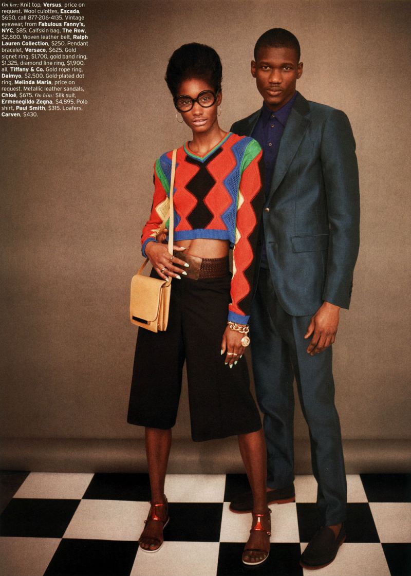
So, somewhat at random, and somewhat because I like it, I decided to talk specifically about Retro-fitted, an editorial in the April issue of Elle. I’ll be posting the images below, but you can see the entire thing at this link. The female model is Melody Monrose; the male model is Koné Sindou; the photographer is Mariano Vivanco, and the stylist is Beth Fenton.
This is going to be in the nature of brainstorming rather than thesis and argument…so I’ve separated it into some subtopics, and we’ll see how it goes.
Splash Pages
In a post last month, Kailyn Kent pointed talked about the way in which comics both fetishizes and can be nervous about splash pages. Kailyn linked this to the fact that the splash pages’ monumentality, and its focus on a single image, tends to replicate the look and experience of gallery art. Comics, then, likes splash pages because they suggest high status and seriousness. At the same time, creators like Chris Ware, attuned to the gallery scene and comics’ relation to it, sometimes seem uncomfortable with the splash page, or try to undermine it, precisely to turn away from its gallery connotations, or reassert comics comicsness.
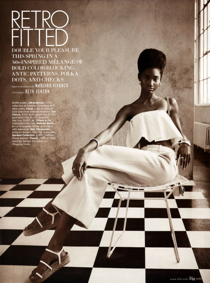
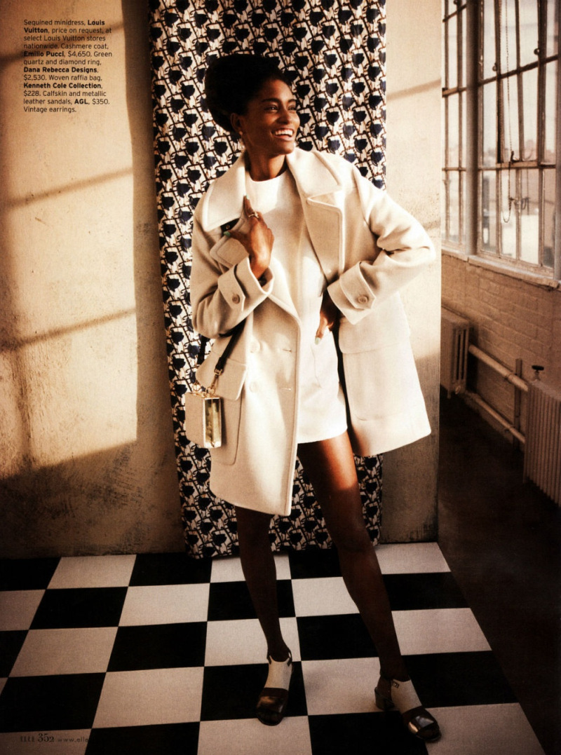
As this suggests, though, there are other possible contexts for splash pages. Obviously, this page, with the title and credits positioned dramatically off to the side in the image’s negative space, strongly recalls title pages from comics. But really most images in fashion editorials — taking up as they do the entire page — would qualify as splace pages in comics.
Splash pages, then, recall, not just fine art, but advertising — which could arguably turn Kailyn’s analysis on its head. Splash pages could be, not upmarket, but down, connoting, not seriousness, but gaudy commodification — as, perhaps, attested by the fact that splash pages are often the most high-priced pages on the comics art market.
If monumentality is a sign of trash rather than class, that could in turn explain why high-quality literary comics like Maus or Persepolis prefer small black and white images and few, if any, splash pages. Part of the literariness, and of the highbrow credibility, is avoiding comics’ links to advertising’s garish boldness and drama.
I don’t think that Kailyn’s analysis and mine have to be exclusive — especially since fashion photography has its own complicated relationship with high art. But it does seem worth thinking about the ways in which the dialogue between comics and art isn’t always, or doesn’t always have to be, a dialogue. There may be other voices speaking.
Fashion of the Literaries
Oue recent roundtable talked about whether comics should be seen in relation to the literary or not. This ends up also being a debate about whether comics should be seen, or judged, as high art — with literary and narrative qualities seen as highbrow standards, and comicness being seen as evading them through the lowbrow energy of the image.
How do fashion editorials fit into that debate? Confusedly, since, while there are series of images, and perhaps even characters, there is generally not narrative. If comics’ essence is non-literary, then, it seems like in some sense fashion editorials might be seen as more essentially comics than comics themselves.
Part of that essential comicness, you could argue, is the way the images push away from meaning or language towards abstraction. In the tradition of Whistler’s Mother, perhaps, the woman in the image seems to be less there for herself than as an exercise in a musical distribution of space — the checked tile floor (a motif throughout the editorial), the broad vertical stripes of the dress, the grid of the chairback, the tight horizontal stripes of her sweater, carefully posed casual position, mirroring the chairs’ stiff curve, and the way she’s dramatically pushed off to one side. The patterns and the composition, are more important than what is being shown; she’s a surface rather than a body.
The body is surely important as well, though — as, for that matter, are the words, which may not tell a story, but do label the image, telling you price points for each not-surface-but-thing. The models position — head down, hand cupping her chin with the fingers almost shielding her face, suggests, perhaps, a kind of embarrassment at the crass commerce floating in white text over there on the wall. If writing is literary, then the literary here is not highbrow; rather it is distinctly low-culture. No matter how the image looks optimistically towards art, the words float leadenly behind it, staining abstraction with the nattering economics of signification.
What Are You Looking At?
Fashion photography presents bodies to be looked at. Those looking at the bodies are generally women…and the bodies looked at are, also, generally women.
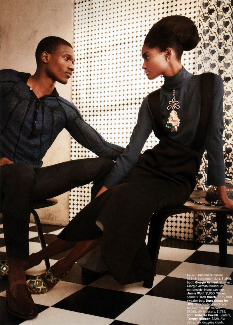
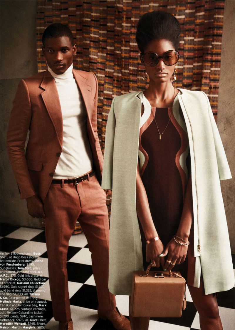
The image above — with a man and a woman looking at each other, doesn’t so much change this dynamic as underline it. The man looks at the woman with intense, romantic interest, just as the reader of the editorial has been looking at this same woman with romantic interest. The woman looks at the man with intense romantic interest — just as the reader of the editorial has been gazing with intense romantic interest. The fact that the mutual inter-gender erotic gaze is meant to accentuate, rather than supplant, the same-gender erotic gaze is emphasized by the strongest visual element of the picture — the almost comically dramatic, borderline yonic necklace dangling down the women’s front.
If the female gaze is eroticized in women’s magazines devoted to women’s bodies, it seems reasonable to suggest that the male gaze may be eroticized in magazines devoted to male bodies. “Men’s magazines devoted to male bodies” seems like a reasonable description of the majority of superhero comics. The fact that scantily clad, preposterously proportioned women frequent these comics as well, again, like the image above, merely emphasizes the fact that these magazines for men are devoted to erotic looking — occasionally at women’s bodies, but more often at male ones.
The point here isn’t that comics are homoerotic, necessarily. Sharon Marcus has argued that, in many cases, women looking erotically at women functions as a part of heterosexual female identity, not lesbianism. The same could be said of superhero comics for men. Men gazing intently at men is a standard part of male heterosexual identity for many comics readers — and, for that matter, moviegoers.
Bodies, Time, and Space
Fashion photography pretty much includes at least one body in every image.
To look at fashion editorials as comics is to realize that this is not something which separates the two. On the contrary, most comics are almost as obsessed with bodies as fashion is. You may get a few panels of setting the scene or camera-panning over landscapes, but in most comics, in most panels, you see a human being (or an in-some-way humanized dog or cat or funny animal.)
Generally, I think, this is seen as logistical; to show somebody doing something in comics, you have to show their body over and over. Repetition creates narrative and time.
Fashion editorials, though, make you wonder. They have no narrative, and there is no real sense of time passing. Yet they still often use the same body and the same face — the same person — repeated in image after image.
You could say that, again, it’s just logistics — one model modeling is easier to schedule/cheaper to pay than 12, or however many, models modeling. No doubt there’s something to that. But it’s also true, I think, that the familiarity and the variation is a delight in itself.
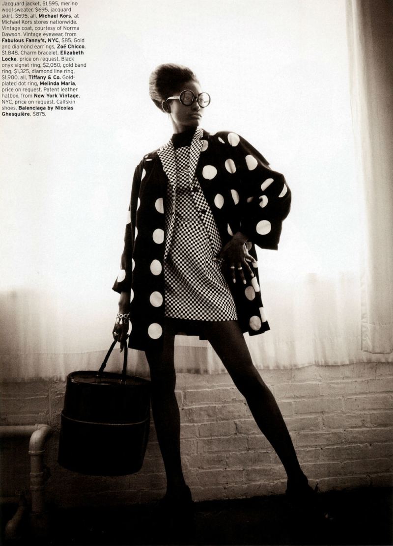
In the preceding three pictures near the end of the editorial, we see a full length, dynamic pose; a full length more demure pose — and then a dramatic close-up.
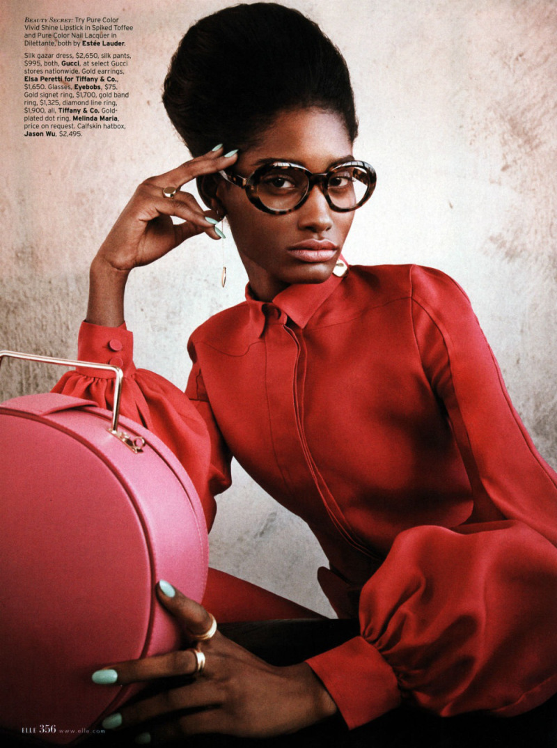
Much of the punch here comes from the bright color of the blouse and those dramatic expressive (Ditko?) hands, one eloquently touching her head, the other in the extreme foreground looking impossibly long and elegant— partially because of the nails, partially because the sleeve is pulled back from the wrist, and partially because the model just has amazing hands. But the image is also striking because it’s this woman, seen, up till now, mostly at a distance, and now, suddenly, brought forward.
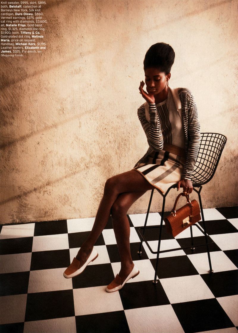
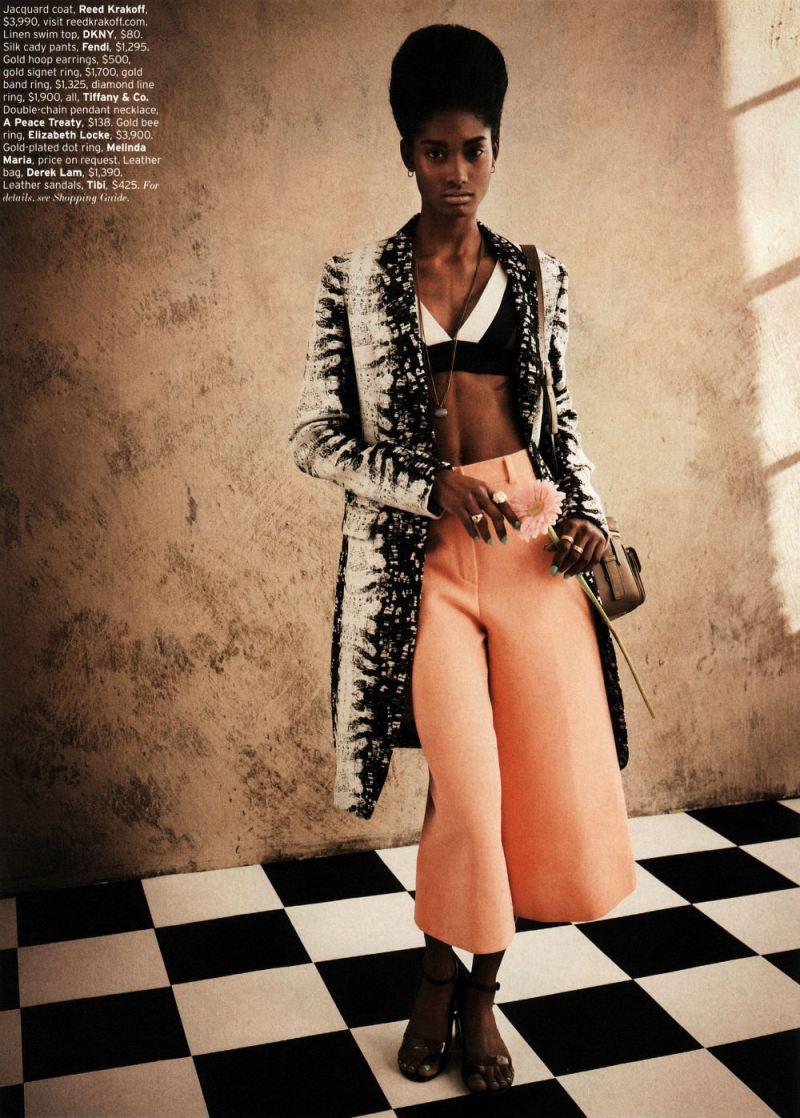
Similarly, the last image
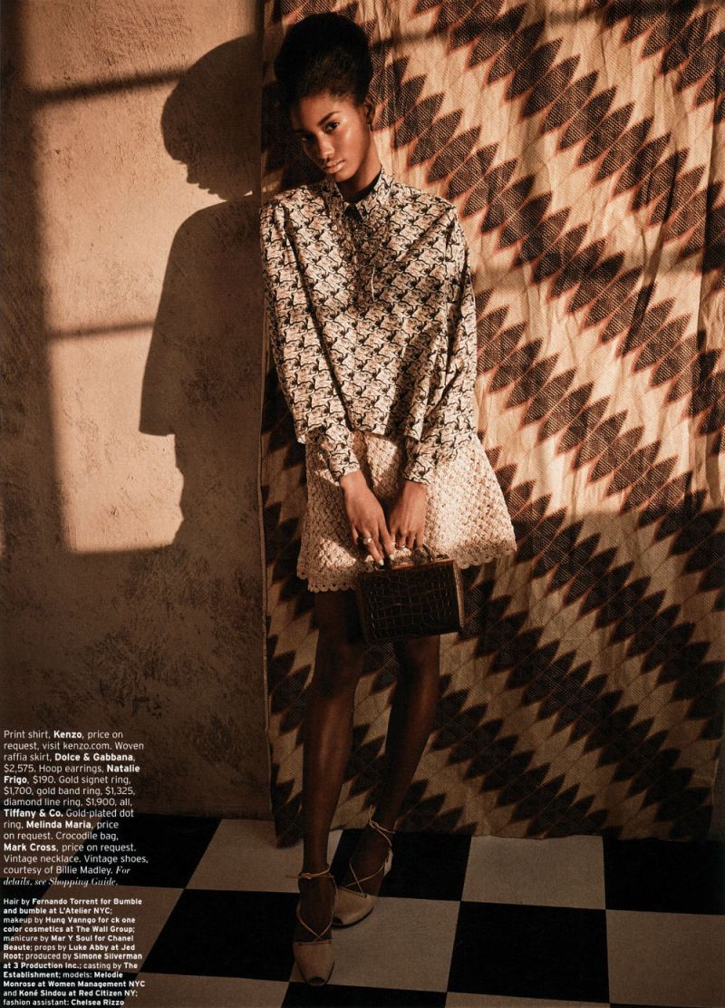
Relies for its effect to some extent on the contrast with what came before. Instead of bold colors and bright light, we have earth tones and shadows; instead of looking right at us challengingly, her pose is demure, her gaze indirect. It seems to me like a deliberate anti-climax; a quiet grace note — which, again, gets much of its allure from the sense, not just of intimacy, but of increased intimacy compared to what has gone before.
You could argue that contrary to what I said earlier, this suggests a narrative, or the passage of time. Indeed, I think it points to the extent to which any identity is implicated, or filled up with, time; part of what we recognize in a self, or in a body, is that it’s the same self, or the same body. As Lacan says, there’s a delight in that recognition, and energy in (what Lacan sees as the illusion) of making the self coherent.
But if the repetition of bodies inevitably makes fashion editorials into pleasurable narratives, you could also perhaps say that narratives inevitably make comics into pleasurable repetitions of bodies. Or, in other words, from the perspective of fashion, the repeated selves in comics are not a logistical byproduct, but a pleasure and a goal in themselves.
_____________
I think there are other topics to talk about here: the link between commodified images and retro-nostalgia, for example, or the differing place of race and tokenism in comics and fashion. But since I’ve now posted the last image from the editorial, this seems like a good place to end things. I am curious — has anyone ever seen any discussion of fashion editorials as comics, or in relation to comics? I figure I can’t be the first, but a quick google search doesn’t really turn up anything. If anyone has links or references, let me know.
Deborah Turbeville’s work is very comics and was originally done for Vogue (mostly, I think): http://madinkbeard.com/archives/deborah-turbeville-past-imperfect
Also a few pieces in this set are from Paris Vogue and are quite comic like in their use of panels, time, and narrative: http://madinkbeard.com/archives/madinkbeard-no-2-supplement
It’s not related to fashion, but there’s a whole “ism” without an “ism,” in this case, named Narrative art (70s mainly). It includes Jean le Gac, Christian Boltanski, and my favorite, Jochen Gerz (it’s not that I’ve searched much, but I can’t find their work from the Narrative Art period anywhere). There’s also Gerhard Richter’s monumental Atlas.
Derik, those examples are so interesting. Fashion is such a magpie, it totally makes sense that it would pick up on comics.
Is there an example of influence going the opposite way? I guess (and I didn’t think of this!) there’s Paradise Kiss…and that can’t be the only fashion manga. I wonder about the US though…. In Japan, where comics don’t automatically mean “guys,” I think the connection is maybe more obvious/marketable….
I should look at Paradise Kiss specifically in relation to fashion editorials maybe sometime….
Narrative Art, Rome, 1974.
@Noah – well, there’s Katy Keene of course and various subsequent fashion pages in Archie comics etc.
Huh…never heard of her. Though it makes sense for Archie…again, much more of a female audience than a lot of American comics….
Actually; there’s that O’Neil Sekowsky WW comic which is all fashion and her trying on new clothes….
I can absolutely see the connection between fashion models and super heroes. Growing up, I wanted to be Sailor Moon (Sailor Jupiter actually, but whatever.) She was a human with flaws and she was a school girl like I was, even if she was older– and oh, she had an awesome uniform.
I absolutely loved watching her transform every episode into her magical outfit which was, frankly, pretty sexualized. Nevertheless, the appeal was that she was powerful and attractive in a way that girls wanted to be (so not necessarily the way men wanted women to be–many guys just “don’t get” fashion on the runway, after all.)
The act of wearing clothing is the act of inhabiting a fantasy, and that’s what is so appealing about fashion. We don’t just gaze at the models; we consume them. In this act of cannibalism we hope to take on their powers and mannerisms. The clothing presents a narrative and a history of the person wearing the outfit–consumption creates identity. Instead of speech balloons, the skirt tells the story of where the woman is going and who she is and what her income level is like. Why else do I spend so much time on Pinterest staring at street style that I won’t be able to afford in a billion years? Because clothing is a story and so is photography.
I will point out though that my “romantic gaze” on the woman is different than it is for the man. The woman is more like an avatar that I can download and embody. There’s definitely homoeroticism in most male magazines as well (and sports culture, but I won’t get into that now.)As long as people of the same sex perform for one another with their bodies, then we can’t really call that behaviour 100% straight.
And I absolutely ADORE Paradise Kiss. NaNa, too, (written by the same author) constructs the characters’ identity through fashion choice, though not in the same way as Paradise Kiss. In Shojo managa, there’s a sub-genre of comics called “Magical Girl” where the outfits that the girls wear while on super-hero duty are pretty important. See: Cardcaptor Sakura.
Er, and just to clarify: I don’t mean that homosocial bonding or erotic gazing at someone of the same sex makes a person homosexual, but that there is a level of homoeroticism that is compatible with heterosexual identity.
Sailor Moon is an awesome example…and that’s a great comment.
We should do a fashion and comics roundtable, damn it. Maybe sometime after the music one…
And Nana is wonderful. There are a bunch of articles on Yazawa on the site if you want to poke around….
I would say Jamie McKelvie’s non-Marvel work (and some of his Marvel work) gets a lot of influence from fashion and fashion-centric graphic design principles. That’s the first thing I thought of when I looked at his work on Phonogram.
I feel that if more comics artists acknowledged the kinds of parallels you point out in this article between comics and fashion then there wouldn’t be so many works that instantly look dated when they come out!
@Noah, I think Kate Keene is totally up your alley. As with Harry G. Peter, there’s something about Bill Woggon’s drawing style that seemed a bit removed from the mainstream of its time. Even at Archie Comics it had a look all its own:
http://a4.ec-images.myspacecdn.com/images02/7/ab11078337544ce994f509add17dc58f/l.jpg
Also, JK Snyder’s Fashion in Action that ran originally as a back-up feature in Tim Truman’s SCOUT in the eighties is worth a look:
http://welldefined.blogspot.com/2006/08/fashion-in-action-returns-in-new.html
Whoah…that Woggons drawing is bizarre. I think her head is out of proportion? Whatever the exact cause, she just looks wrong….
Do a Google image search on Bill Woggon to see many other great examples of his stuff.
Also, Trina Robbins’ work, both as a cartoonist and as a historian of comics has addressed the intersection of fashion and comics.
Noah: “Whoah…that Woggons drawing is bizarre. I think her head is out of proportion? Whatever the exact cause, she just looks wrong….”
The head doesn’t belong to the body. What’s wrong is the neck.
For me (as with Domingos, perhaps) it keeps coming back to fine art, even though it’s not really more basic or elevated than fashion or comics. But art that focuses on fashion really looks a lot more like comics– largely because of dramatic and idealized figures.
The most recent big time fashionista artist is Elizabeth Peyton, whom I don’t completely adore. But then there’s Barkley Hendricks, who I do adore.
Oh wait, Nick freaking Cave (the visual artist not the crooner). There’s your missing link for this whole discussion.
Continuing half out of topic: here’s one of Jean le Gac’s vintage pieces.
A recent trip to the Morgan Library reminded me of this recent exhibit. Didn’t make it to the show, but the catalogue was pretty intriguing and certainly made me think in terms of comics and cartooning:
http://www.themorgan.org/collections/works/IlluminatingFashion/default.asp
Marvel once published a rather bizarre series called ‘Dakota North’, about a woman private eye working in the fashion industry. Great art by Tony Salmons.
“Fashion is such a magpie, it totally makes sense that it would pick up on comics.”
Noah: I wonder if that’s really what it is. Certainly photo-sequences/series are fairly common (Muybridge for an early example that if it doesn’t predate comics as a whole (Topffer, etc) it does predate the American comic strip). There’s also the european photonovels as a possible influence, which I guess do have a comics-based origin.
Speaking of Chris Ware and splash pages (snark snark) it is amusing that Art Nouveau drafters and printmakers (Winsor McCay included) made much of both panoramas and fashion.
Pingback: Comics A.M. | This weekend, it’s MoCCA Arts Fest | Robot 6 @ Comic Book Resources – Covering Comic Book News and Entertainment
Derik, I always thought of photonovels as a kind of comic…though maybe they aren’t usually thought of that way?
The Splash pages in Melmoth and Jaka’s story strike me as Dave Sim trying to be literary. Interestingly he went on to do Glamourpuss, a fashion magazine parody. Interesting might not be the best word.
Russell Patterson