Militant Homosexual Dress

mlesbianfront
 

mlesbianback
 

mlesbianside

Militant homosexual dress: made for the Portland, Oregon Dyke March, summer 2005, bias cut, floor length, one shoulder, camouflage print dress (held up with a bra and extra elastic from left armpit, around the back to right shoulder replacing the missing bra strap). Mixed media (printed cotton canvas, safety pins, green bra, extra elastic).

________

Dyke marches are about lesbian visibility, about showing that we actually exist (and there are enough of us to stop traffic), that we vary greatly, and that we’re a community. But dyke marches don’t actually seem to vary that much. Even in Chicago, they are mostly white, and every one I have been to has been mostly young; they are often not so much about community as cliquey-ness. That is, there is a group of organizers and a lot of their friends and the rest are on the periphery. It seems that most of the non-white lesbians show up for the main event, Pride, rather than the small, day-before side show that is the dyke march. Part of that is that pride parades have an older organizational strategy (developed over many years to accommodate increasingly diverse notions of queerness) where in order to insure that people from various communities show up, they invite representatives from those communities to be on the organizational committee. Dyke marches seem to rely on the organizational structure of new media. Namely, put an idea out there on the internet and it will spread on its own (though it is a distinct possibility that the information IS spreading to everyone the organizers have envisioned it spreading to already).

Overall verdict from the dyke march: this dress didn’t work. It’s unclear whether it just didn’t read, was too femmy, not punk rock enough, etc. The net effect was no one talked to us the whole afternoon, which felt odd. It’s highly anomalous for me to walk around wearing something I’ve made and not receive comments from strangers — in any city, on any day, let alone when marching alongside folks, when people usually want to talk. At the Portland Dyke March, the connected dykes in dresses wore cocktail dresses and combat boots, something I’ve worn since — yes — some of them were in baby shoes.

One day in Chicago, on the #55 through the south side (I was on my way to Noah’s house!) I sat behind a pair of U of C babydykes, who were talking in code about one of them going on testostorone (as an early stage of a f to m gender transition) — and they were probably using needles that a friend of mine supplied. Yet there was no nod in my direction, as would have been subculturally …. had they recognized me as anything other than het (or perhaps, other than femme). The person who did talk to me was an older African-American gentleman wearing a very nice fedora who complimented me on my hat (a grey fur-felt trilby). We all miss and catch opportunities to create minor, temporary super-communities via such conversational practices for using clothing (and other corporeal media – hair, piercings, etc.) to simultaneously acknowledge and yet work across difference.

Dyke marches bill themselves as a new lesbian consciousness, a deliberate attempt to get away from Michigan Women’s Music Festival style, folk rock scenes which (in addition to bad taste in music) purposefully excluded/exclude transgendered lesbians. This transformation is laudable (and I’m often both on its side and included by it). What’s going on is not a case of people simply wanting to hang out with their friends: it’s something broader, a political vision. Yet the actual effect is to represent a gay sub-utopia that (unlike hip-hop, for example) doesn’t acknowledge its basis in specific social circles.

______
This is part of the Gay Utopia project, originally published in 2007. A map of the Gay Utopia is here.

Superheroine Dress Code

“We just happen to show a little more skin when we get to the ladies,” says Image Comics artist Todd McFarlane, explaining that the portrayal of women as sex objects in comics is a natural byproduct of the genre’s generally exaggerated style. “As much as we stereotype the women, we also do it with the guys. They are all beautiful. So we actually stereotype both sexes.”

McFarlane was trying to plug the PBS documentary Superheroes: The Never Ending Battle (it starts October 8), but his comments, and those of Kick-Ass writer Mark Millar trivializing rape (“I don’t really think it matters. It’s the same as, like, a decapitation. It’s just a horrible act to show that somebody’s a bad guy”), pissed off plenty of fans. Garth Ennis combines the two approaches—rape and lady skin—in The Boys when his Superman stand-in Homelander compels newcomer Starlight to give him and his teammates blowjobs before taking a Sharpie to her costume and drawing in navel-deep cleavage: “New costume concept for you. They want something a bit more photogenic.”

McFarlane co-founded Image in the 90s, The Boys premiered in 2006, Kick-Ass in 2008, so that might be the problem. These Cro-Magnons are behind the times. Todd thinks he’s just obeying the testosterone-driven norms that give him no choice but to draw scantily clad, super-breasted, Barbie-legged uber-women. But if that’s true, why is the comic book population of anatomically impossible porn gals in decline?

A friend of mine, Carolyn Cocca, spent her summer staring at T&A. She studied 14,599 comic book panels, adding a checkmark to her tallies only if a particular tit or ass cheek “was just about to fall out.” She didn’t count mere cleavage or skintight curves unless they included a panel-dominating breast “larger than a woman’s head.” The results? “Female characters,” she reports, “were portrayed in more panels and less likely to be objectified in the early 2010s than they were in the mid-2000s or mid-1990s in the same titles.” Carolyn is also chair of Politics, Economics & Law at SUNY’s Old Westbury College, so her expertise in quantitative analysis is larger than Todd, Mark, and Garth’s breast-sized heads combined.

Professor Cocca’s not alone in critiquing the absurd poses male artist inflict on their female subjects. The internet is busting out with parodies of McFarland inhabitants:

Alexander Salazar asks what if male superheroes were drawn like female superheroes with some very bare-chested and shorts-bulging results.

Kelly Turnbull refashions the entire Justice League in Wonder Woman style.

Steve Niles has similar fun with the Avengers.

Multiple artists take aim at Hawkeye.

Michael Lee Lunsford dares the impossible by drawing superheroines fully clothed.

John Raptor’s “reality”-based superheroine includes “practical underwear” and “legs like tree trunks.”

Ami Angelwings’s Escher Girls documents a disturbing range of anatomical impossibilities.

The list goes on, and for good reason. Though Carolyn’s sample shows a decrease in objectification, practically all of the comics she looked at show at least some. “Had I counted each depiction of cleavage or of extraordinary shapeliness in spandex or of focus on clothed curves,” she explains, “this number would have been almost exactly the same as the number of panels depicting women.”

If you’re wondering how things got so far out of proportion, you need to travel back to the Dark Age of the late 80s. This was a primitive time, when the dictates of the Comics Code still ruled the multiverse. As far as “Costume,” it decreed “Females shall be drawn realistically without undue emphasis on any physical quality.” That’s what the Comics Authority had been saying since 1954, only with the phrase “undue emphasis on” swapping out “exaggeration of” in 1971. It wasn’t much of a reboot, which might explain why the 1989 revision stripped off so much more. Under the new heading “ATTIRE AND SEXUALITY,” the update declared: “Costumes in a comic book will be considered to be acceptable if they fall within the scope of contemporary styles and fashions.”

Doesn’t sound very revolutionary till you see Wonder Woman in a 1994 thong. In his defense, artist Mike Deodato Jr. said he preferred drawing monsters anyway.

WW thong

The superheroine bikini cut deepened again in the 2000s as the Code teetered toward collapse. Marvel dropped it in 2001. Image never had it. Either way, we’re looking at plenty of T&A for Carolyn’s tally sheets during the two decade range. Arguably, this was the multiverse before the cleavage-confining Code trussed up the free market. Breast abounded in the early 50s, enough to alarm the U.S. Senate into holding hearings and the industry to impose self-censorship.

But lest you think this is a plug for big government regulation, the current superheroine fashion trend suggests the post-Code market could be growing out of its prurient adolescence all on its own. The new changes aren’t being imposed from above but grown from below. Welcome to 21st century grassroots feminism.

Though there’s still reason to show a little skin. “Reality”-based runner Camille Herron was the first female finisher in an Oklahoma marathon last year—a feat all the more impressive since she was wearing a full-body Spider-Man suit at the time. She also beat the previous Guinness Book record holder for a women’s marathon run in a superhero costume by twenty minutes. Imagine how fast she’d be in shorts.

Camille Herron

My daughter’s running role model, 23-year-old Alexi Pappas, wins races in a Spider-Man singlet. And yet she, like any professional female runner, just happens to wear the equivalent of a bikini bottom below it.

Alexi Pappas in Spider-Man singlet

Why? I have no idea. But I don’t see male runners at my daughter’s meets in anything as revealing. You can call them all beautiful, but the female-half of her high school track team races in skintight short shorts. They’re apparently regulation-sized and yet also a violation of the school’s dress code—which means her half of the team can’t practice in the uniforms they compete in.

I bought her a Flash t-shirt for her sixteenth birthday, “fitted” because she stopped wearing baggy tops in middle school. Except now wishes she hadn’t given them all to Goodwill. Forget fashion, she says, they’re perfect for running.

running girl

The Radiant Touch of Commerce

Last week Charles Reece, Sarah Shoker and I had a conversation in comments about authenticity, plastic surgery, commerce, make-up and other things. Along those lines, I thought it might be interesting to talk about this back-cover ad for from the May issue of Vogue for the Touche Éclat make-up pen, featuring models Jourdan Dunn and Ginita Lapina.
 

vogue back

 
“Le Tent Touche Éclat covers imperfections while letting your natural radiance shine through,” according to the copy.

As that suggests, the ad, like a lot of fashion, is deliberately playing with tropes of naturalness and artificiality. The make-up pens stand in for cigarettes — which in turn stand-in for phalluses, so that applying make-up becomes, all at once, socially (not to mention physicaly) dangerous, a tease for a male(?) viewer and an assertion of sexual power. Moreover, the two women — with their similar smooth styling, poses, head tilts, and standard smoldering stares — double each other, artificially cloning the others’ look. White becomes mimicking of a (natural?) black, while black becomes a micmicking of a (natural?) white. The doubling creates a standard (everyone is doing it) and suggests there is no unitary standard (doubling is uncanny.) Similarly, the weird gold nowhere against which they pose contrasts with the simplicity of their outfits; Dunn’s black dress is so low cut that she’s au natural for all practical purposes, while Lapina appears in unadorned black (with plunging neckline.)

IN part, the ad uses the natural/artificial binary as a lever to commodify naturalness. Dunn and Lapina become multiplied, deindividualized icons — carefully arranged compositional elements in someone’s, or everyone’s, golden dream. The repetition of their diverse natural, individual selves tends to make those selves, in their naturalness and diversity, replicable, and therefore available and purchaseable. With makeup, you two can be as individual as them.

You need this individuality, or uniqueness, or (if you prefer) authenticity if the transaction is going to be appealing or exciting. It’s not just being able to purchase a replicable thing; it’s the sense that the replicable thing purchased is special. That’s the appeal of the interracial models. But it’s also the appeal of the inevitably controversial cigarette imagery. And, for that matter, of the connotations you set up when you put a black woman and a white woman together, each wielding a penis substitute — cultural discourses around prison butches and interracial lesbianism are buried, but not, imagery like this suggests, utterly forgotten. As Tom Frank has pointed out over and over, controversy and rebellion sell; nonconformity is the most exciting conformity of all.
 

JD_YSL_Touche_Eclat_SS_2012.jpg.scaled696-1

 
The market, then, takes any form of authenticity or individuality, and turns it into an image of itself, so you’re buying back your own natural radiance to be applied artificially, or purchasing markers of rebellion (interracial mixing, lesbianism, cigarettes) just like everybody else.

touche_eclat_2

Capitalism’s de-authentification of everything can certainly be depressing and constricting, demanding that women conform their real bodies to impossible standards (I’m sure the image here has been extensively photshopped, like all images in fashion mags.) On the other hand, though, it’s hard not to see some appeal in the artificiality as well. Where is this world we are being shown, where race is interchangeable, where deviant sexuality is glamourous and fabulous rather than marginalized and persecuted, where beautiful bodies float free of social stricture or even — as cigarettes become mere style icons — fear of cancer? It’s easy to say, well, interracial fraternization and even hints of lesbianism aren’t scandalous any more — but that “any more” is pretty recent. Forty years ago, this image would probably have been unprintable in a mainstream publication. Today, it’s being used to sell cosmetics.

If the problem with capitalism is that it makes rebellion conventional, then the upside of capitalism is that it makes rebellion conventional. And the way it does that, in part, is through a relentless assault on authenticity.There is no norm but the market, before whom the only differences that matter are desires, and all desires are equal. Everything is surface and style, which means that every proscription — against blacks, against gays, against smoking — is waved away as long as you are beautiful enough and have the right products.

That gold, glowing background, then, can be seen as capitalism itself — the mystic n-space that turns bodies and individuals into their own perfect replicas. The only morality there is that little bit of glowing glamor you can grab, the only pleasure the thrill of letting that glamor swallow the self in its brightness. Is disappearing into the brightness freedom, or is it nothing left to lose? It probably depends on what you had to lose in the first place, ow what you think you can get in exchange for your soul. Or maybe, as Waylon Jennings said in an authentic, wise song you can purchase in replicable digital form on I-Tunes, “Sometimes it’s heaven, sometimes it’s hell, sometimes I don’t even know.”
 

JDunn_GLapina_YSL_Touche_Eclat.jpg.scaled696

Comics vs. Fashion Editorials

I wrote a piece on women’s magazines recently over at the Atlantic. While I was working on it, it occurred to me that fashion editorials are basically as series of images, linked by themes or characters. Which is to say, they are, in some sense, comics.

You can take that “in some sense” there more or less seriously, as you wish. Personally, I”m not necessarily all that interested in trying to figure out what does or does not qualify as a comic. I thought it might be interesting, though, to look at a fashion editorial from the perspective of comics, and vice versa, and see what the similarities and differences say about one or the other or both.
 

melody-monrose-by-mariano-vivanco-for-elle-us-april-2013-1

 
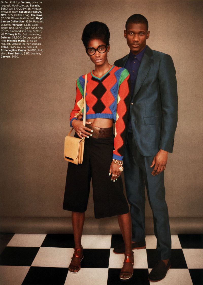
So, somewhat at random, and somewhat because I like it, I decided to talk specifically about Retro-fitted, an editorial in the April issue of Elle. I’ll be posting the images below, but you can see the entire thing at this link. The female model is Melody Monrose; the male model is Koné Sindou; the photographer is Mariano Vivanco, and the stylist is Beth Fenton.
 
This is going to be in the nature of brainstorming rather than thesis and argument…so I’ve separated it into some subtopics, and we’ll see how it goes.
 
Splash Pages

In a post last month, Kailyn Kent pointed talked about the way in which comics both fetishizes and can be nervous about splash pages. Kailyn linked this to the fact that the splash pages’ monumentality, and its focus on a single image, tends to replicate the look and experience of gallery art. Comics, then, likes splash pages because they suggest high status and seriousness. At the same time, creators like Chris Ware, attuned to the gallery scene and comics’ relation to it, sometimes seem uncomfortable with the splash page, or try to undermine it, precisely to turn away from its gallery connotations, or reassert comics comicsness.
 

melody-monrose-by-mariano-vivanco-for-elle-us-april-2013

 
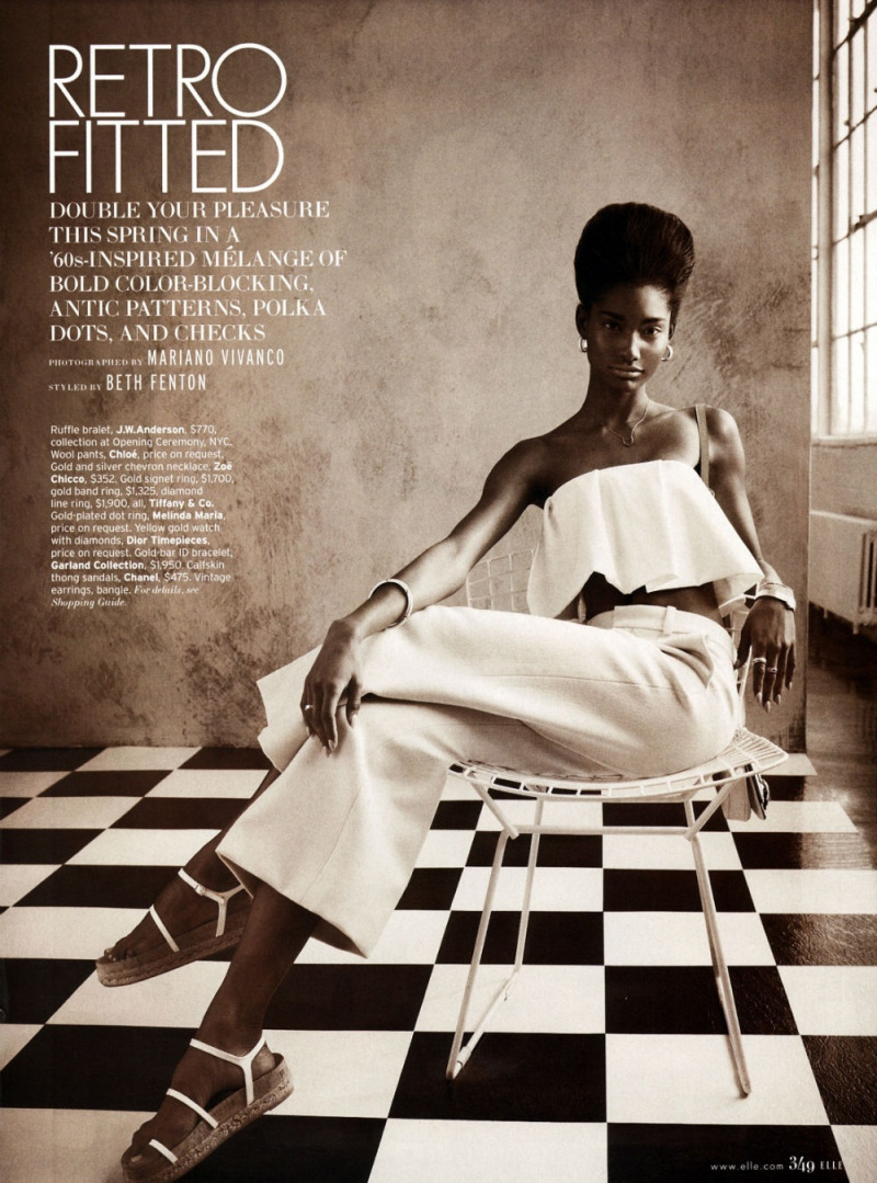
As this suggests, though, there are other possible contexts for splash pages. Obviously, this page, with the title and credits positioned dramatically off to the side in the image’s negative space, strongly recalls title pages from comics. But really most images in fashion editorials — taking up as they do the entire page — would qualify as splace pages in comics.

Splash pages, then, recall, not just fine art, but advertising — which could arguably turn Kailyn’s analysis on its head. Splash pages could be, not upmarket, but down, connoting, not seriousness, but gaudy commodification — as, perhaps, attested by the fact that splash pages are often the most high-priced pages on the comics art market.

If monumentality is a sign of trash rather than class, that could in turn explain why high-quality literary comics like Maus or Persepolis prefer small black and white images and few, if any, splash pages. Part of the literariness, and of the highbrow credibility, is avoiding comics’ links to advertising’s garish boldness and drama.
 

melody-monrose-by-mariano-vivanco-for-elle-us-april-2013-2

 
I don’t think that Kailyn’s analysis and mine have to be exclusive — especially since fashion photography has its own complicated relationship with high art. But it does seem worth thinking about the ways in which the dialogue between comics and art isn’t always, or doesn’t always have to be, a dialogue. There may be other voices speaking.
 
Fashion of the Literaries
 
Oue recent roundtable talked about whether comics should be seen in relation to the literary or not. This ends up also being a debate about whether comics should be seen, or judged, as high art — with literary and narrative qualities seen as highbrow standards, and comicness being seen as evading them through the lowbrow energy of the image.

How do fashion editorials fit into that debate? Confusedly, since, while there are series of images, and perhaps even characters, there is generally not narrative. If comics’ essence is non-literary, then, it seems like in some sense fashion editorials might be seen as more essentially comics than comics themselves.
 

melody-monrose-by-mariano-vivanco-for-elle-us-april-2013-3

 
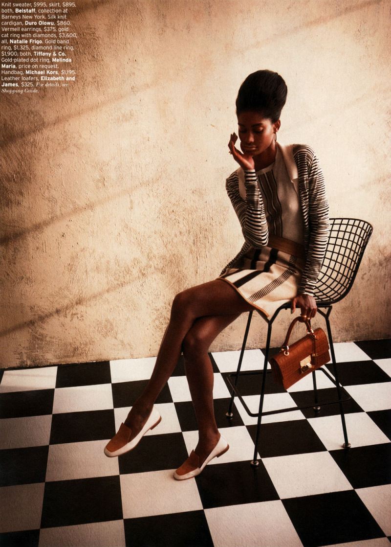
Part of that essential comicness, you could argue, is the way the images push away from meaning or language towards abstraction. In the tradition of Whistler’s Mother, perhaps, the woman in the image seems to be less there for herself than as an exercise in a musical distribution of space — the checked tile floor (a motif throughout the editorial), the broad vertical stripes of the dress, the grid of the chairback, the tight horizontal stripes of her sweater, carefully posed casual position, mirroring the chairs’ stiff curve, and the way she’s dramatically pushed off to one side. The patterns and the composition, are more important than what is being shown; she’s a surface rather than a body.

The body is surely important as well, though — as, for that matter, are the words, which may not tell a story, but do label the image, telling you price points for each not-surface-but-thing. The models position — head down, hand cupping her chin with the fingers almost shielding her face, suggests, perhaps, a kind of embarrassment at the crass commerce floating in white text over there on the wall. If writing is literary, then the literary here is not highbrow; rather it is distinctly low-culture. No matter how the image looks optimistically towards art, the words float leadenly behind it, staining abstraction with the nattering economics of signification.
 

melody-monrose-by-mariano-vivanco-for-elle-us-april-2013-4

 
What Are You Looking At?

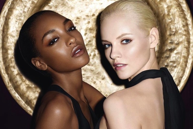
Fashion photography presents bodies to be looked at. Those looking at the bodies are generally women…and the bodies looked at are, also, generally women.
 

melody-monrose-by-mariano-vivanco-for-elle-us-april-2013-5

 
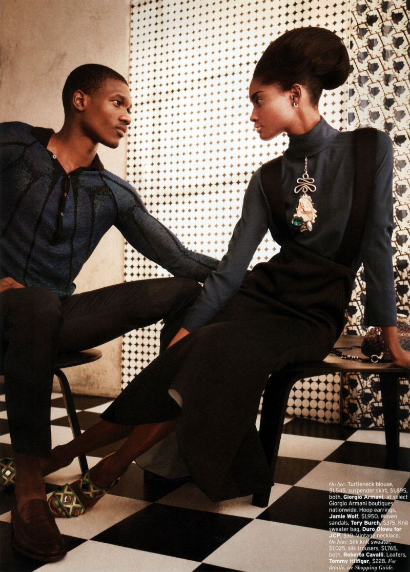
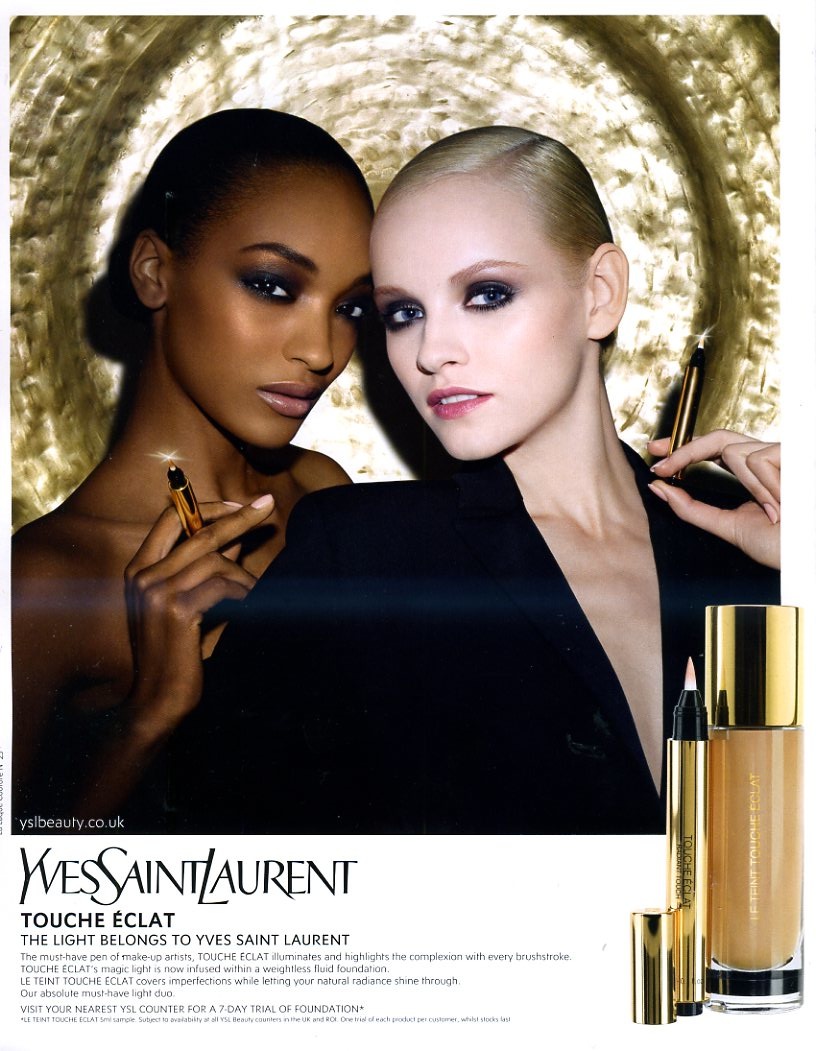
The image above — with a man and a woman looking at each other, doesn’t so much change this dynamic as underline it. The man looks at the woman with intense, romantic interest, just as the reader of the editorial has been looking at this same woman with romantic interest. The woman looks at the man with intense romantic interest — just as the reader of the editorial has been gazing with intense romantic interest. The fact that the mutual inter-gender erotic gaze is meant to accentuate, rather than supplant, the same-gender erotic gaze is emphasized by the strongest visual element of the picture — the almost comically dramatic, borderline yonic necklace dangling down the women’s front.

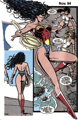
If the female gaze is eroticized in women’s magazines devoted to women’s bodies, it seems reasonable to suggest that the male gaze may be eroticized in magazines devoted to male bodies. “Men’s magazines devoted to male bodies” seems like a reasonable description of the majority of superhero comics. The fact that scantily clad, preposterously proportioned women frequent these comics as well, again, like the image above, merely emphasizes the fact that these magazines for men are devoted to erotic looking — occasionally at women’s bodies, but more often at male ones.

The point here isn’t that comics are homoerotic, necessarily. Sharon Marcus has argued that, in many cases, women looking erotically at women functions as a part of heterosexual female identity, not lesbianism. The same could be said of superhero comics for men. Men gazing intently at men is a standard part of male heterosexual identity for many comics readers — and, for that matter, moviegoers.
 
Bodies, Time, and Space

Fashion photography pretty much includes at least one body in every image.
 

melody-monrose-by-mariano-vivanco-for-elle-us-april-2013-6

 
To look at fashion editorials as comics is to realize that this is not something which separates the two. On the contrary, most comics are almost as obsessed with bodies as fashion is. You may get a few panels of setting the scene or camera-panning over landscapes, but in most comics, in most panels, you see a human being (or an in-some-way humanized dog or cat or funny animal.)
 

melody-monrose-by-mariano-vivanco-for-elle-us-april-2013-7

 
Generally, I think, this is seen as logistical; to show somebody doing something in comics, you have to show their body over and over. Repetition creates narrative and time.

Fashion editorials, though, make you wonder. They have no narrative, and there is no real sense of time passing. Yet they still often use the same body and the same face — the same person — repeated in image after image.

You could say that, again, it’s just logistics — one model modeling is easier to schedule/cheaper to pay than 12, or however many, models modeling. No doubt there’s something to that. But it’s also true, I think, that the familiarity and the variation is a delight in itself.

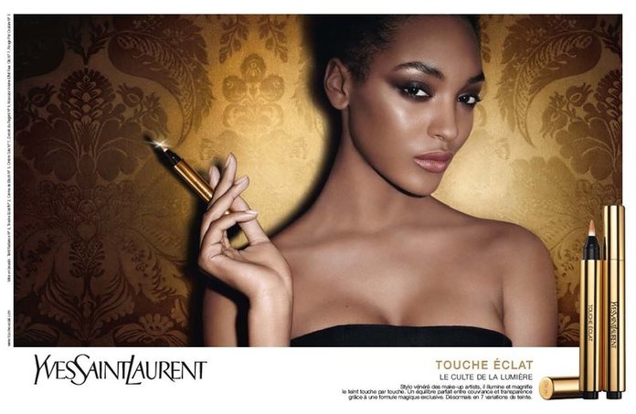
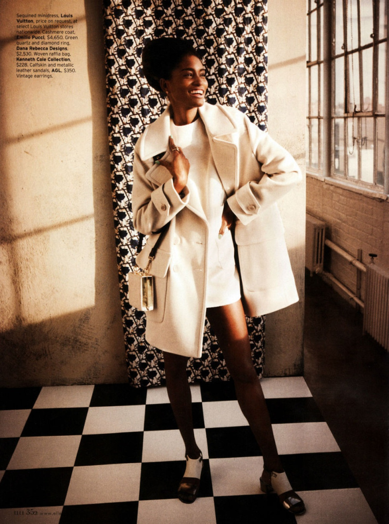
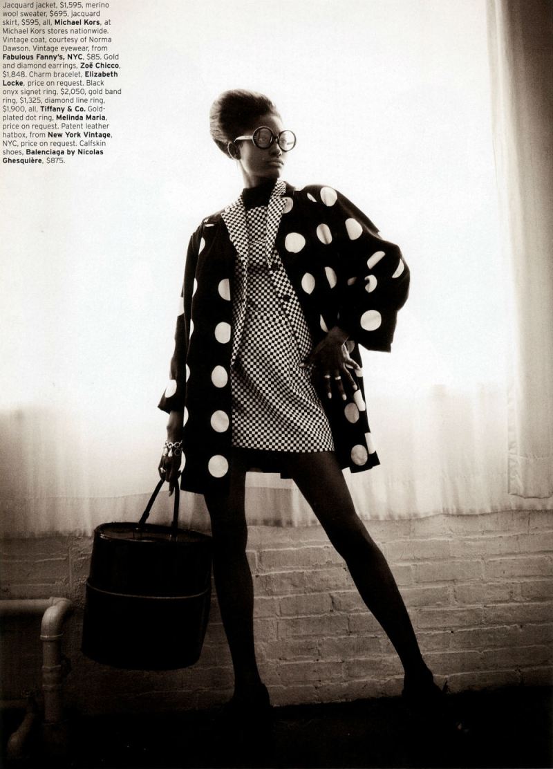
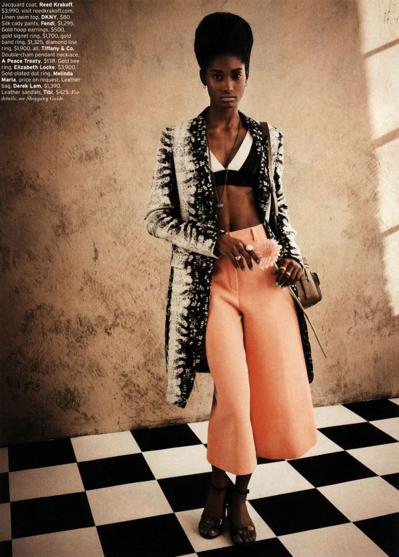
In the preceding three pictures near the end of the editorial, we see a full length, dynamic pose; a full length more demure pose — and then a dramatic close-up.
 

melody-monrose-by-mariano-vivanco-for-elle-us-april-2013-8

 
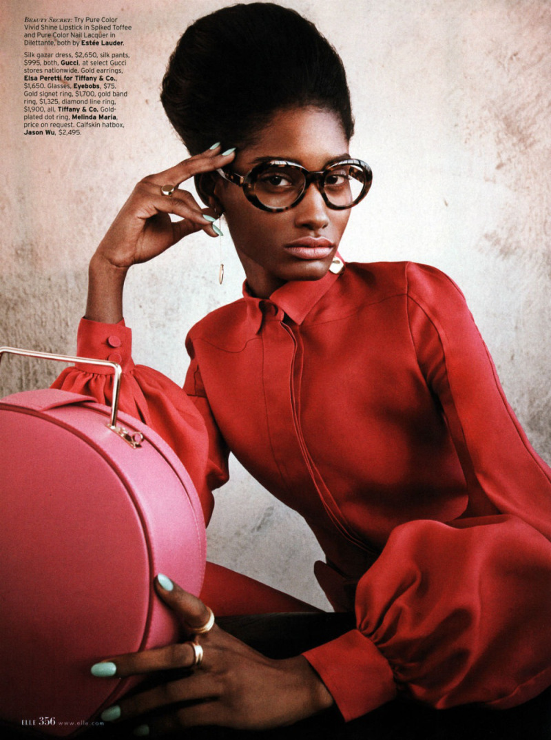
Much of the punch here comes from the bright color of the blouse and those dramatic expressive (Ditko?) hands, one eloquently touching her head, the other in the extreme foreground looking impossibly long and elegant— partially because of the nails, partially because the sleeve is pulled back from the wrist, and partially because the model just has amazing hands. But the image is also striking because it’s this woman, seen, up till now, mostly at a distance, and now, suddenly, brought forward.

Similarly, the last image
 

melody-monrose-by-mariano-vivanco-for-elle-us-april-2013-9

 
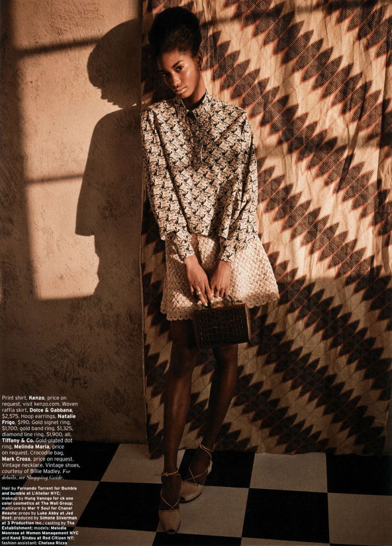
Relies for its effect to some extent on the contrast with what came before. Instead of bold colors and bright light, we have earth tones and shadows; instead of looking right at us challengingly, her pose is demure, her gaze indirect. It seems to me like a deliberate anti-climax; a quiet grace note — which, again, gets much of its allure from the sense, not just of intimacy, but of increased intimacy compared to what has gone before.

You could argue that contrary to what I said earlier, this suggests a narrative, or the passage of time. Indeed, I think it points to the extent to which any identity is implicated, or filled up with, time; part of what we recognize in a self, or in a body, is that it’s the same self, or the same body. As Lacan says, there’s a delight in that recognition, and energy in (what Lacan sees as the illusion) of making the self coherent.

But if the repetition of bodies inevitably makes fashion editorials into pleasurable narratives, you could also perhaps say that narratives inevitably make comics into pleasurable repetitions of bodies. Or, in other words, from the perspective of fashion, the repeated selves in comics are not a logistical byproduct, but a pleasure and a goal in themselves.
_____________

I think there are other topics to talk about here: the link between commodified images and retro-nostalgia, for example, or the differing place of race and tokenism in comics and fashion. But since I’ve now posted the last image from the editorial, this seems like a good place to end things. I am curious — has anyone ever seen any discussion of fashion editorials as comics, or in relation to comics? I figure I can’t be the first, but a quick google search doesn’t really turn up anything. If anyone has links or references, let me know.

Dystopian Fashion

Hollywood loves dystopias. They’re blockbusters with brains – mass market morsels with box office potential just waiting for grad students and culture writers to dissect, contextualize, and elevate. Regardless of whether the movie is meant to be camp or self-serious, the stories and themes need to be as intricately drawn as the world creation of fantasy films and novels, yet still rooted in some recognizable reality. In the simplest, and perhaps most confusing of terms, a dystopia is the opposite of a utopia. Dystopias aren’t the same as post-apocalyptic anarchy. That might be the origin of the dystopia, but after the chaos comes control. In a dystopia, the miserable structures are institutionalized – whether by a government, a corporation, or technology.

On one level, dystopias are entirely artifice. Everything is manufactured and tightly controlled to support whatever claim the controlling force has given for its power, from language, to information, to material goods. Individuals are dehumanized, and uniformity reigns. But with all the deconstruction of the plots and themes and texts and Cave allegories, it’s easy to overlook how the films are styled to show the audience a new and bleak world. What might seem an afterthought can become one of the most important elements of telling the visual story, exposing informative elements and details of the society that’s been created. Along these lines, I’m most interested in how wardrobe choices can illuminate something crucial about the world of a film.

Or: what will we wear when everything turns to shit? And why does it matter?

Why, for example, do all of the characters in the “real world” of The Matrix have to wear thin, holey, ill-fitting sweaters? What, beyond its blatant gesture to noir, is the meaning or significance of Rick Dekard’s trench coat? Why do all of the clothes in Children of Men just look…normal? In this essay I want to examine the great costumes in Gattaca and The Hunger Games — two examples of films with particularly weird dystopian fashion — to suggest some ways to think about costumes in the broader context of Hollywood’s visions of Dystopia.

Just as there are half a dozen varieties of dystopias in films, the costumes are similarly varied. Broadly speaking costumes in these films tend to fit into three categories: minimalist, over-the-top gaudy and garish, or retro poverty. Even something as straightforward as minimalist clothes can mean different things in different films. In Los Angeles Plays Itself Thom Anderson notes that films like to put the bad guys in modernist homes. Though of course not the point of modernist designs, the starkness of the sleek minimalism can easily be manipulated to signify some sort of deranged obsession with the superficial. Perhaps the ubiquity of high design might make that jump more difficult today, but with the right tone and the introduction of a pre-established villain, the minimalist home itself becomes the opposite of the calm utopia it was intended to be. Instead, the home becomes sinister, vapid and empty, not only of furniture, but of tenderness and humanity too. In other words, the good guys are never as well dressed as the bad guys.

Andrew Niccol’s 1997 film Gattaca presents the audience with a “not-too-distant future” where potential is predetermined by genetics. Employment and educational opportunities and advancement are set from birth, and liberal eugenics are used to manipulate genes to ensure the best possible outcome for people before they are even born. In this world, there are the successful and there are the defective and there is no real in between. Your genes tell the only story that employers need to know. Ethan Hawke’s Vincent is one of the defectives, with a life projection of only 30 years due to a heart condition who uses the black market to assume the identity of a genetically ideal person in order to become an astronaut.

The clothes in the world of the genetically superior are sleek, modern, and minimalist. The men wear impeccably tailored suits, All of the colors are either dark or neutral. Men and women wear their hair slicked back neatly and tightly. At the highest level of genetic perfection, and correspondingly prestigious places of employ, everything is pressed and starched. The white cotton shirts that peek out of the somewhat androgynous suits are flawless. In essence, no individuality needs to be shown through the clothing, because anything that you’d ever need to learn about a person you could learn through a simple gene report. Though we never find out where the mandates for these sorts of clothes originate, it would be reasonable to think that it likely started with the government or a corporation. In Gattaca, individual agency is rare. But the clothes represent an implicit acceptance of the world that they’re in – the shame of their flaws and individuality are so deeply ingrained in all of the characters that a different way of life and dress likely does not even occur to them. Even Jude Law’s crippled Jerome who doesn’t leave his home dresses in bespoke suits and vests.

Those outside of this top echelon still dress in muted colors, but the outfits are ever so slightly more rumpled. The cops and private investigators sport noir like Fedoras and unassuming suits. Those at the lowest level, the janitors, wear uniforms too. Everyone has their place, and every place has its predictable dress. No one would be mistaken as being part of an elevated status. Genetic makeup and class are intertwined.

There’s a brief suggestion of subversion when Uma Thurman’s Irene goes out for the night with her hair down and wavy, in a form fitting gold sequin gown. In this scene she even acknowledges that the pianist that they’re watching couldn’t play as beautifully as he does without his flaw (extra fingers). Perhaps the wild hair and seductive gown represent individuality peeking through outside of the workplace. But the shame permeates the night off too. Work, perfection, and the company define and shackle our characters, and it’s where this otherwise “perfect” society starts to crack. Though it might be beneficial for insurance agencies and companies to know the exact genetic potential of all of its employees, once genetic discrimination becomes institutionalized, leaving no room for individual advancement or self-betterment, the individuals begin to falter. Jude Law’s character commits sucidie after realizing that his life in a wheelchair in this society is no life at all. Afraid of their own humanity and fearful of flaws, the characters resign themselves to the standards of their own society, reinforced by dress and presentation. It’s not an injustice, it’s just the way things are. Ethan Hawke’s character subverts the system only for his individual gain by conforming to its expectations – altering himself to meet their demands and exfoliating away as much of himself as possible.

Gary Ross’s adaptation of The Hunger Games is somewhat more simplistic and ultimately more frustrating. In this post-revolution world, there are the haves and the have nots and material goods are the only determinant. In the movie we get no explanation as to why the society is divided as it is. Why do the people in the Capitol get to be there? Intelligence? Money? Birth? Maybe it doesn’t matter. Much has already been made about the disappointment that some avid fans of the book felt upon seeing some of the film’s representations of the costumes, but for our purposes we’re only going to talk about what we actually saw on screen in light of what the movie tells us about the world.

Those in the Capitol dress in lavish and gaudy clothes, reeking of invasive and discriminating excess that suggests both Marie Antoinette and a 1980s Wall Street Banker. The ladies wear puffy sleeves, full faces of white makeup, 1920s bee-stung lips, and neon shade of hair color. The men wear sparkly suits and facial hair so intricate that it resembles a tattoo. Grooming and appearance are clearly of great importance in the Capitol and everyone who resides there has both the money and the time to execute these looks daily.

In contrast, Katniss’s mining town of District 12 looks straight out of Harding-era West Virginia coal towns, with the earthy colored trousers and suspenders for the men, and modest knee length, short sleeved cotton dresses for the women. Makeup is non-existent, hair color is natural, and faces are smeared with soot. This is supposed to be a desperate people. Putting the citizens of District 12 in frocks that look like they were transported from The Great Depression could be a way to keep morale down. Not only do they have to lead miserable, impoverished lives, but they don’t even get any updated poverty clothes. It’s likely this was just an affectation of the movie, though, trying to make poverty look prettier thanks to the blinding revisionism of a style of clothes almost 100 years old.

Excusing the poverty porn of District 12, the initial division is striking. The contrast between Katniss in her drab blue dress and Effie in her magenta power suit sharing the same stage perfectly conveys the vast wealth disparity. Effie has everything, and Katniss has nothing. But once the film moves forward, and the tributes are transported to the capitol, things become less coherent. After examining the controlled and limited options for dress in Gattaca, The Hunger Games looks like it is verging on potential anarchy already. The varieties of dress are just too great. Everyone in the Capitol is so loudly individualistic, authoritarian control is hard to reconcile. But perhaps this is where The Hunger Games is a bold departure from the Gattaca-like uniformity. The control and the power is so pleasing to folks in the Capitol that they are willing to support the state since it allows them a superficial leniency in dress and decoration.

The makeovers for the tributes, though, seem inconsequential to the society in the movie. It’s all for show and entertainment and essentially looks like little more than fattening the pig before the slaughter, and has little to do with the power structures in place. Perhaps the fire costume was indeed more subversive in the books, but in the filmed adaptation it was more difficult to find the significance.

We could assume that the effeminate clothes and seemingly relaxed gender standards in The Capitol represent the government’s half hearted way of convincing those privileged enough to live there that they are indeed part of a liberal society. But when we step back and look at the evil oppressors in The Capitol as those in the districts might, it seems a strange choice on the part of the author and filmmaker to dress the bad guys effeminately. Is the point to just scoff at the excess and stop there, or is there something inherently dangerous in equating gay identity with the immorality of The Capitol? It becomes even more problematic considering the fact that beyond the suggestive clothes and makeup, we don’t see any sort of realized gay identity on screen – things are aggressively heteronormative. The ambiguity of the purpose of putting the bad guys in effeminate clothing ends up hurting the story, because it shouldn’t be a question that we have to ask, and it is irresponsible to leave it to unclear.

There are many other films to investigate. Sometimes clothes are just clothes, but in these dystopian films, they can be as meaningful and telling as a working knowledge of Huxley and Plato, even when the choices don’t quite seem to work.

Seeing and Being Seen

In the March Harper’s Bazaar, there was a spread by Chinese artist Liu Bolin. Bolin usually paints himself to blend into backgrounds, making a “powerful commentary on the individual and society,” as the Harper’s blurb says.

However, for the Harper’s spread, Liu painted, not himself, but other people. Specifically, he painted designers standing against their clothes and fabrics.


Angela Misoni, by Liu Bolin

In this context, the vanishing figures become less about the way individuals are overwhelmed by society, and more about the fashion industries obsession with visibility and identity. Fashion is a world in which you look obsessively, fetishistically, at (generally coded) straight female models, and in which you don’t look — as obsessively? as fetishistically? at (not all, but disproportionately gay and male) designers.


Alber Elbaz by Liu Bolin

The guy painted above, for example, is Alber Elbaz. Bolin shows him fading into his own dresses, while mannequin’s cavort visibly around him. The Women here are seen, but what’s seen isn’t really them — or maybe it’s truer to say that all they are is what is seen; they’re defined by surface. Elbaz, on the other hand, is no surface; his truth is the dresses, but you can’t see him there. Fashion, then, is a collaboration between those defined by appearance and those whose appearance is erased. Bolin’s pictures make that tension and its frisson more clear — the way in which fashion is both hiding in plain sight and appearing though unseen. The designers insist that they enjoy being behind the scenes (“All I try to do is be invisible,” says Elbaz), but they clearly are having fun, too, taking center stage in their own work for once. The point, perhaps, isn’t so much to hide or to be seen as it is to have some control over the look that defines you — as desired, as other, as absent. Or as Elbez says, “I think it’s a choice: to make clothes to make women visible or to be a star and to always be visible. I always preferred to be on the other side of the street and disappear.”


Jean Paul Gaultier by Liu Bolin

Looking at this series made me think again about Ken Parille’s recent piece over at tcj.com. Ken argues that the fully-costumed male body in comic books is a sign of repressed same-sex desire. Or as Ken says:

One explanation for the male cover-up—as for all cover-ups—is that there’s something to hide. Just as the mandatory Burka expresses fears about female bodies and male desire, the superhero costume reflects similar sexual anxieties. We often think of the mainstream superhero comic as a “power fantasy” without acknowledging its sexual dimension: it’s an erotic power fantasy. Perhaps some readers would be willing to admit that heroic tales are fantasies: “I would like to have the super power a superman has.” They might be less inclined to admit that these stories are heterosexual male domination fantasies: “I would like to have the power to control hot females” (yet to admit this would be to acknowledge that these comics’ chivalric code is a sham). Most readers would find it far too scary to recognize that these comics may be homoerotic fantasies: “Watching male bodies in close contact in the male-centric DCMV turns me on.” The hidden body is an unconscious emblem of forbidden same-sex desire.

I don’t have any doubt that idealized, fetishized male superhero bodies are objects of same-sex male desire. But…is it really the case that the more covered male body is less open to same-sex desire? Surely the full-body latex look is itself thoroughly fetishized? Would the Liefield drawing before really be any more sexualized if it had a boob window?

I wonder if the full-body coverage for (most) superheroes, then, might have less to do with disavowing a homosocial investment which couldn’t really be much more obvious anyway, and more to do with seeing and being seen.

Or, to put it another way, the issue is not that men are resisting desiring men, but rather that the kind of men that men imagine themselves desiring in comics are men who are covered. Why, after all, do supeheroes wear costumes in the first place? They wear them, as Elbaz says, to be invisible — or to be someone else. Bruce Wayne doesn’t want to be Bruce Wayne, the wounded child. He wants to be someone bigger, more powerful, more mysterious — a sexy-cool daddy behind what Ken aptly calls the “bat-burka.”

It’s interesting in this context to note that the few male superheroes that do show a lot of skin tend not to really be wearing costumes. Prince Namor, for example, isn’t really a supehero; he’s not dressed up to fight crime and/or hide from his childhood trauma. Similarly, the hypersexualized, phallicly-named Hulk comes busting out of his clothes whether he will or no. These characters are not deploying the power and mastery of clothes; they are not diegetically wearing a hood to control how they look. The characters were never playing with seeing and being seen to begin with; therefore, they might as well let it all hang out (for the delight, presumably, of readers of all genders.)

Fashion and costumes isn’t just about who is sexy and who is not; it’s about who is seen and how and in what way. Superhero men are sexualized — but unlike superhero women, they are sexualized in ways which figures them as covered lookers rather than as exposed lookees. I don’t think that’s because comic-book readers are afraid to own their sexual fantasies; rather, I think it’s a sign of what their sexual fantasies are and how they work. Visibility and invisibility are not just symptoms of desire; they are aspects of desire itself.

The World Fashioned

On the recommendation of Sharon Marcus, I recently watched The September Issue — a documentary about the making of the September 2007 issue of American Vogue.

Ostensibly the film focuses on icy editor Anna Wintour, but as many reviewers have noted, the real star of the proceedings is stylist Grace Coddington, who tromps about the Vogue offices in flats and a shapeless black something, bird’s nest red hair flying off every which-a-way, mothering the models and midwifing gorgeous confections like this:

Continue reading