Hooliganism, High School Crime and Giant Snakes

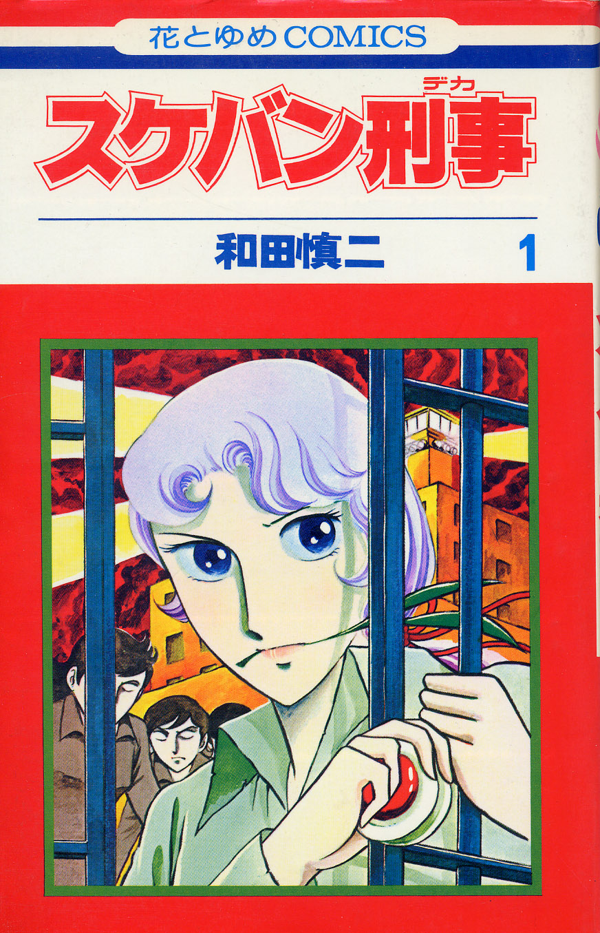
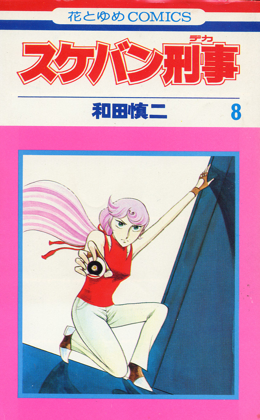
In 2010 I wrote a post about one of my three favorite manga/anime/TV/Live action movie series, Hana no Asuka-gumi. Asuka is indeed a righteous girl gang series, but it is not the oldest, nor the most successful. That honor has to go to what is one of the most awesomely outrageous series ever made, Sukeban Deka.

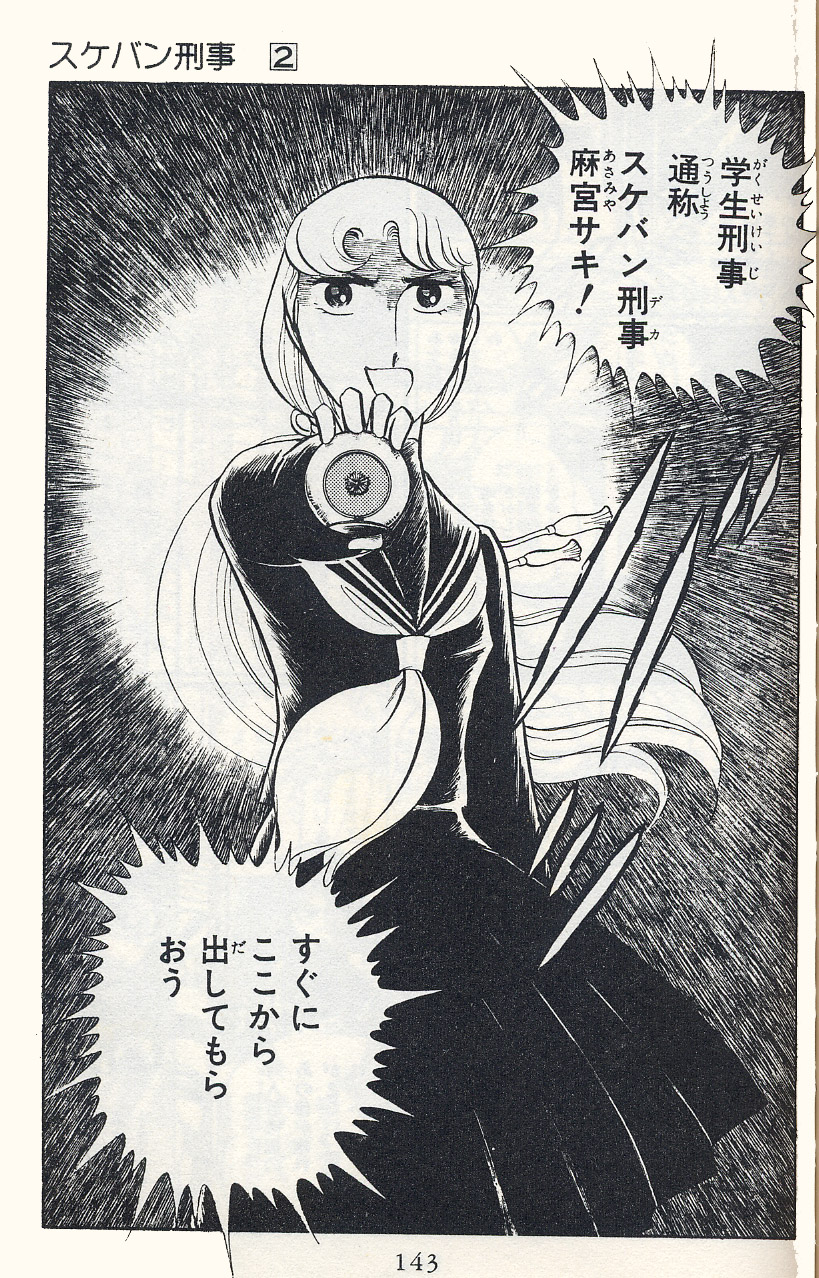
Life has not been kind to Asamiya Saki. At 16, she is doing time in a juvenile detention center for various crimes, when the police come to her with a nefarious deal – her mother is on death row for the murder of her father. If Saki works for the police to infiltrate high schools and root out criminal organizations, they’ll take her mother off death row. Saki agrees and becomes the Sukeban Deka – the Deliquent Detective.

The manga series, which ran from 1976 – 1982 in the pages of Hana to Yume magazine, was the first, the darkest and in many ways the craziest, of the three massively popular gang girl series. The manga spawned a live-action TV series that ran for three seasons from 1985-1987, in which the name “Asamiya Saki” becomes a title passed down through generations from the first Asamiya Saki to her successors. These were followed by two live-action movies in 1987 and 1988, in which two of the actresses that played Saki in the TV series reprise their roles. In 1991, an anime OVA, which covers the first arc of the manga was made (and for the finale alone, as Saki fights the evil high school crime leader on a burning oil tanker in the middle of the ocean, it’s totally worth seeing.) And, finally, in 2007 the series was resurrected for a brilliant homage/finale, distributed in English as Yo-Yo Cop, in which the original TV Saki, Yuki Saito, makes a cameo as the new Saki’s mother. All but the manga and TV series are available for purchase in English and I can’t stress strongly enough that you should at least see Yo-Yo Cop, because it’s pure genius.

Once Saki agrees to work with the police, she’s told that they can’t actually release her from prison…she has to escape on her own. With the help of her jail friends, Saki escapes and makes her way to the police, where she is given a Yo-Yo as a weapon (since minors can’t carry weapons, a proscription that Saki occasionally breaks when needed.) In the Yo-Yo is the Chrysanthemum seal, which Saki displays to let the bad guys know she is an official representative of the police. (Much as the protagonist of Mito Koumon displays the Shogun’s seal to let the bad guys know they were caught red-handed and by whom.)

Saki is taken under the wing of a half-Japanese, half-American named Jin who acts as mentor and boss. Jin and Saki eventually fall for each other, but they are never actually a couple in the course of the series.

As Sukeban Deka, Saki is enrolled in various schools long enough to draw the attention – and eventually the wrath – of the local criminal bosses. Saki takes down the gang, then the bosses and transfers away to the next school. In the course of the 22 volumes of the manga, Saki loses her memory, ends up on the west coast of the US for a while,  and then the east coast of the US for a while, until she regains her memory. Towards the end, Saki is transferred to one last post – in a juvenile detention center, rather than a regular high school. And this time, her enemy is not another student, but the evil warden himself, who raises giant snakes. Saki defeats the warden, of course. The final arc is the darkest, as she faces an adult criminal overlord. She wins, but at the sacrifice of…well, everything. Jin and she are finally united in death.

And death it is, as Wada Shinji makes perfectly clear on the last page. There will be no sequels of this series, as there were of Hana no Asuka-gumi or continuations as there were with YajiKita Gakuen Douchuuki. In fact, when the resurrections of those series brought girl gang manga back into the limelight a few years ago, Sukeban Deka was re-released as is, with no new material created.

The art style Wada used rode the line between shoujo and shounen at a time when it was massively unpopular to do so. Saki might be shown with “shock!” eyes, or with a murderously intense expression, and action shots were quite common. This style left its mark on many a mid-80s series, including Asuka and YajiKita . It’s not unfair to say that we might never have had a Revolutionary Girl Utena, or PreCure if we had not first had had Sukeban Deka.


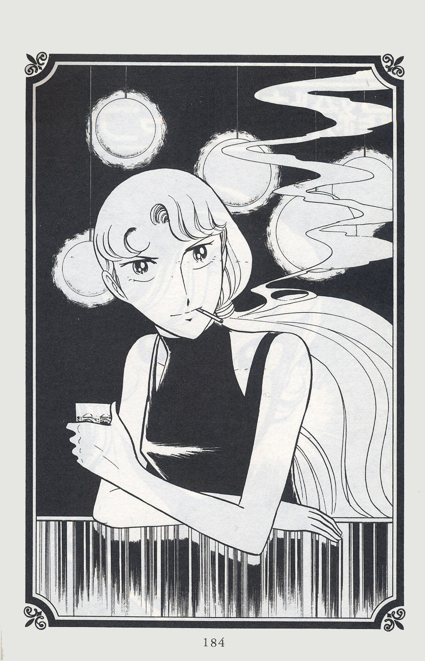
My collection of obscura includes a Saki figurine and a Sukeban Deka Yo-Yo. But it’s this one still from the manga that is my most prized possession of Saki. This image of 16-year old Saki on her off hours, drinking and smoking will never again be replicated in today’s sanitized manga world. Sukeban Deka is a paean to a world that is lost, a world that contained high school crime syndicates, gang girl violence and giant snakes.

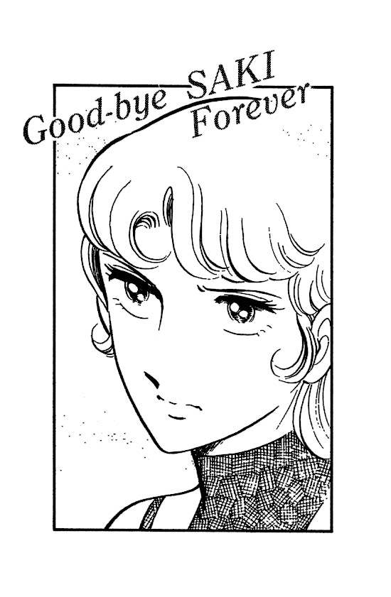
Good bye Saki – forever.

Weirdness and Conscience in the Work of Craig Norton

Craig Norton’s recent show is a different beast than what you’ll find in galleries around Chelsea and the New York art scene. Tim Came Home From the War and Isn’t Timmy Anymore, at Jim Kempner Gallery until June 23rd, is an emotional and explicit rendering of the schizophrenic divide between America at war and at home, and the egregious neglect of veterans. Norton is also a hyper-realistic and self-taught draftsman who makes narrative art. These factors are not the taboos they were fifty years ago, but they are no longer typical in contemporary art either. To compare, the famous Gagosian Gallery is showing a famous photographer’s gargantuan, historic prints of other famous people. I’m currently writing this piece next door, in a miniscule gallery called Family Business, where we are exhibiting a group show entirely comprised of sticks.

Conceptual strength and skillful execution are crucial to the success of any art work, past or present, even if the faces of these terms have changed. In Tim Came Home… concept and skill manifest in ways the wider public would expect them to—ironically, this quality makes him an outsider in today’s art world.  I hope Norton’s pop-out, transfixing murals can function as a gateway for casual viewers into contemporary art, and a call for artists to consider the perspective of those unversed in it.

Norton’s work rejects the idea that art is by nature morally and politically apathetic, ineffective, and/or isolated, ideas that philosophers, artists and critics have argued for centuries. Artists periodically challenge this claim, but perhaps no population rejects it more often than those outside of the art market, whose faith that art ‘matters’ may be the art world’s most regular misguided compliment, (and art has suffered for it through many censorships and its co-option by propaganda.) Along these lines, many still believe that art is a showcase of technical skill, and that virtuosity isn’t inherently absurd.   Norton caters to these ideas, but in doing so, his work also fulfills conservative expectations about ‘art’ that we have a good reason to question. Tim Came Home… is a riveting, provocative show, but it lets the art-world context essentially “talk behind its back,” rather than directly address the inherent weirdness of politicized art in the contemporary gallery.

Today's Enemy, Tomorrow's Friend

Norton’s work is not only political, but fascinatingly journalistic. Reminiscent of the Wall Street Journal portraits, Norton renders faces, hands and firearms out of tiny marks and stipples. Oftentimes the hands and faces are blown out of proportion, which distorts the figures into punchy homunculi, and brushes caricature without slipping into it. The clothing and bodies are made of boldly colorful wallpaper collages. He ‘draws’ folds with wood-relief style incisions. This mimicry of print illustration is bolstered by the fact that he designed the installation to tell a story. Instead of accompanying a news article, Tim Came Home… could be read as the article itself, or as a history museum exhibit where the story is told through the dioramas alone.

Detail from No Welcome Mat

The effectiveness of the hanging contributed to the shows emotional resonance, but also to what is problematic about it. From a strictly “graphic narrative in the gallery” perspective, I was thrilled to see the show explore the layout’s control over the narrative. Tim Came Home… was hung two different ways, which created two different ‘stories.’

Initially, the viewer would walk into the gallery and encounter a crowd of happy, urban passerby. Viewers would then typically start over to the left, with No Welcome Mat.

No Welcome Mat


This crowd scene erupts into the first, with injured veterans parachuting down into the unworried crowd. Moving to the right, around the front desk, the second act focuses on the tragic integration of these two worlds. The first is a military funeral. The second is called My Daddy is A Decorated War Veteran, where a young girl claws at her face, before a crumpled man and a shotgun.

My Daddy Was A Decorated War Hero

The forceful disruption of the “side scrolling”, frieze-like perspective allows you to peer straight through the wall, to the scene behind the girl, and at an impossible angle inside the coffin. The effect is very moving.


Another Casual Casualty of War

 Unfortunately, gallery visitors sometimes didn’t notice the “second act” around the desk.  The Jim Kempner Gallery rehung the show so that visitors first emerge to see My Daddy Is… No Welcome Mat still begins the show, but the scene doesn’t bleed into the urban passerby. Instead, the warfare peters out into negative space, and a small pocket of the passerby lead back into My Daddy Is…. Around the desk, the two parts of the military burial flank the rest of the happy-go-lucky city-dwellers. Life goes on, and no one is the wiser—the second hanging, while a compromise of the original vision, is rhythmically more complex, less melodramatic, and damning.

various figures

Norton’s past work focused on the Civil Rights movement, and he was challenged about his right, as a white man, to depict moments as iconic as Martin Luther King Jr.’s arrest. Norton responds in his personal statement, “I make art about mankind. Lots of people care only about their own identity groups… and I’m not going to sit back and do nothing because the victims are different from me. It’s a human issue.” He goes on to say “Art is the way I bring about awareness and dialogue—and hopefully inspire change.”            

This statement plays into the editorial feel, where a piece documents and somewhat universalizes the particular. Norton doesn’t comment on the role or the effect of the gallery context on his plea. The gallery is treated like a culturally heralded space, where people seek meaning, information, and often go to look at pretty things. This is not untrue, but it ignores other currents too. At the risk of being grotesque, art is a luxury commodity, and fetishistic, which the neutrality of the gallery amplifies. The art world is also a complex and hierarchical social scene that partially takes place in the gallery, transforming openings and installations into sets to act inside of. A truly thorough contemplation of a work will consider the historical context and precedents of the piece. Norton’s work is a little strange in that it appears to be descended from editorial illustration more than anything.  This does not mean that Norton’s work doesn’t belong there, but that the conditions of its “immigration” are unusual and inextricable.

Is the art gallery a useful place to encounter Tim Came Home…? Ultimately, yes— it does raise awareness for an important social issue, even if the scenario is ironic. But is a private collection a useful place for this piece? How about an art museum? Is Norton’s work best designed for public spaces?  If Norton’s wish for awareness and dialogue attaches a use-value to his work, certain environments could be more successful than others, and Norton’s work would also violate ‘art for art’s sake.’ No big deal: art pour l’art has been rejected before, and chances are it’s a mental illusion, (people use art without admitting to it, and for reasons they can’t articulate.) Finally, Norton’s arresting photorealism individualizes the subjects, but it is also hypnotic, exciting the eye with spectacle of torment, violence, and artistic wizardry. Norton’s process receives a paragraph of the artist’s statement before the political component is even discussed.

I apologize: I won’t attempt to answer these questions in this review, but the questions themselves are illustrative. An artist doesn’t have to have a fully elaborated concept to start working. Here, the ideas and context don’t dovetail together to create an Eureka moment—instead, Tim Came Home highlights the mess of understandings about what art is and what it does. Which are, more than ever, important questions to ask.

All photographs are courtesy of the artist and Jim Kempner Gallery


Tim Came Home From the War and Isn’t Timmy Anymore

Jim Kempner Gallery, May 12th – June 23rd, 2012

Monthly Stumblings # 16: M. S. Bastian, Isabelle L.

Bastokalypse by M.S. Bastian and Isabelle L.

Is context everything? Maybe not, but it means a lot…

Simply put Bastokalypse is a book depicting genocide and war. So far so good (or not, of course… nothing is simple, as Sempé would put it…), the problem is that the authors, M. S. Bastian and Isabelle L., use the derisive ironic expression typical of comical comics as transformed by the Gary Panter, Mark Beyer ratty line aesthetic school (aka Art Brut).

What’s the difference between Bastokalypse and Zbigniew Libera’s Lego Concentration Camp art piece, then? (The comparison is not mine: being a orihon, concertina bound book – see below -, Bastokalypse has a long drawn strip on one side and an essay about the iconography of violence by Konrad Tobler on the other; Libera’s toys are part of a long list of references summoned by Tobler; more about this later.)

Bastokalypse by M. S. Bastian and Isabelle L., Verlag Scheidegger & Spies, 2010.

 From left to right: Goch Museum director Stephan Mann, Isabelle L., M. S. Bastian, 2010 (Bastokalypse is on display in the background). (See also here.)

 Zbigniew Libera’s Correcting Device: Lego Concentration Camp (1996).

As a gallery comic Bastokalypse is a continuous sequence of black-and-white paintings: 32 canvases (3 ½ x 5 ½ feet each), forming a continuous 168 feet long drawn strip. The book has 32 action packed double-page spreads in baroque, claustrophobiac, horror vacui, nightmarish, compositions. Numerous cultural references  collapse the difference between high and low: from Ronald McDonald to Pablo Picasso’s Guernica, from Gary Panter’s Valise to Jacques Callot’s La Pendaison (The Hanging Tree) and Otto Dix’s Der Krieg (The War)…

Pablo Picasso, Mark Beyer, Ghost Face, Jack…

Picasso again, José Guadalupe Posada, 9/11.

On the other hand, here’s how Stephen C. Feinstein described Zbigniew Libera’s Correcting Device: Lego Concentration Camp:

Each unit of the seven-box set contained a different aspect of a concentration camp. The larger boxes showed the entire concentration camp, with buildings, gallows (one showing an inmate being hanged), and inmates behind barbed wire or marching in line in and out of the camp. An entry gate similar to the stylized “Arbeit Macht Frei” entry point at Oswiecim is included, although without the German inscription. The guards, in black shiny uniforms, came from the regular LEGO police sets. The inmates came from LEGO medical or hospital sets. A second box showed a crematoria belching smoke from three chimneys, with sonnderkammando [sic] or other inmates carrying a corpse from the gassing room. The smaller boxes depict a guard bludgeoning an inmate, medical experiments, another hanging, and a commandant, reminiscent of something more from the Soviet Gulag than the Nazi concentration camp system, as he is bedecked with medals and wears a red hat. Some faces on both inmates and guards are slightly manipulated with paint, to make mouth expressions turn down into sadness for the inmates, and upwards in some form of glee for the guards. The last box is one full of possessions, the type of debris painted by other artists and inspired by the vast array of loots collected by the S.S. in the Kanada warehouses at Birkenau.

Libera calls his Pop cum Conceptual Art projects (i. e.: toys) “Correcting Devices” because he supposedly wants to correct the wrong info given to children about the world. José Cardoso did a brilliant analysis (in Portuguese, though) of this particular Libera work. He did it using as theoretical framework the visual rhetoric findings of the Belgian mu group. He basically concludes that, with a few changes (the suppression of the vivid colors, typical of the Lego construction toys, for instance) Libera’s Lego Concentration Camp functions in the interpenetration rhetorical mode: two distant spaces meet in a third space where both may co-exist at the same time. This third space is constructed by the viewers according to their interpretation. Said rhetorical mode is often used to provoke laughter, for instance, in Monty Python’s famous Greek vs. German philosophers soccer match.

Interpenetration in Bastokalypse exists between all the aforementioned serious historical and cultural references and a tradition of comical caricature dating back to newspaper comics and animation during the first half of the 20th century.  This tradition was revived and transformed during the second half of the same century by the underground and alternative movements.

The way in which we represent the Shoah has been a matter of debate for decades, of course. Libera’s Correcting Device: Lego Concentration Camp was, as expected, polemical from the beginning. Stephen C. Feinstein:

During May 1997, Libera was invited to display his other pop art pieces in the Polish pavilion at the Venice Biennale, but was asked by Jan Stanislaw Wojciechowski, the curator, not to bring Lego. […]  He wound up withdrawing from the exhibition.

I don’t know the reasons why people found the Lego concentration camp offensive. Maybe they associate a toy with children’s puerile pleasure trivializing (and, in a way, mocking) the Holocaust? Anyway, nothing seems to shock people much these days. In more recent times a set was purchased by the Jewish Museum in New York and  the Museum of Modern Art in Warsaw acquired Libera’s concentration camp from a Norwegian art collector for $71,800. The consensus seems to be that Libera’s piece is a criticism of the manipulation of young people by educative systems. Also, the Lego connection is a criticism of corporate culture.

I’ll bring to the table another decisive factor, in my humble opinion, of course: Libera’s work is part of a high art tradition that legitimizes it and narrows the set of possible interpretations. In other words: it brings with it all the weight of what French sociologist Pierre Bourdieu called cultural capital.

Does Bastokalypse share the same privilege? The publishers and curators who support Isabelle L. and M. S. Bastian’s work surely try: galleries in Switzerland (Labo and Papier Gras) specialized in the exhibition and support of the comics avant-garde and graphic art in general function like other more mainstream gallery venues.  Konrad Tobler’s essay tries to give the work a theoretical frame that includes it among many illustrious and not so illustrious (in a post-modern mish-mash) forefathers.

Do they succeed? I’m not so sure. I, for one, view Bastokalypse as an interesting and impressive effort (ten years in the making), but also as a message that’s undermined by its own expression collapsing in the process. Is M. S. Bastian’s and Isabelle L.’s irony completely intended? If not, they delude themselves, if it is I can’t accept it. Call me square if you will or whatever, but I will say it just the same: in the name of the victims.  Comparing Bastokalypse with Francisco de Goya’s Los desastres de la guerra (The Disasters of War) or even with Jacques Tardi’s C’était la guerre de tranchées (It Was the War of the Trenches) doesn’t save it from being inconsistent (the comparison with Art Spiegelman’s Maus is more apt though: both books come from the same place; the difference is that Maus’ (in)expression is a lot more distanced). To end this post in a positive note: I don’t exactly dislike the Posadesque, dance of death, carnivalesque, derisive feel of it all. In the end we’re nothing: Bastokalypse blows up our feelings of self-importance. I may not exactly like it, but, with a few exceptions, that’s what comics have done best for decades…


Adolph Hitler, Mark Beyer, a mutant Mickey Mouse, and one of Charles Burns’ goons (M. S. Bastian and Isabelle L. avoided the controversial depiction of the Shoah).

Time Spent With An Invisible Book: Recent Work by Jeff Gabel

Half of Jeff Gabel’s recent gallery show doesn’t exist anymore. You can probably track down a series of graphite miniatures, but even these were “installed” into the walls with captioning that spilled off or back onto the drawings, now permanently lost.  The other two walls beheld a giant, micrographic mural composed of text from the same source, the very out-of-print Salware oder die Magdalena von Bozen by Carl Zuckmayer, (English title The Moons Ride Over.) Chicken-scratched in pencil, the mural developed over the course of the show. By the end of the first day, it was possible to see a face and swirling patches. By the next week there was a fist, and then the lips of a second face appeared. Finally, like a sandpainting, the walls were painted over a day or so after the mural was finished.

The ephemerality of the installation was striking for several reasons. It was spontaneously announced, and it had a very flexible deadline. Half the show was uncollectible, and a charming sense of installation-for-installation’s sake pervaded the space. Additionally, The Very Best of Firmin Graf Salawar dej Stries engages many technological developments, (the usual suspects: mass production and distribution, the collapsing of language and media-specific borders, the rise of visual communication and marketing,) but tells the wrong story about them, and without being nostalgic. The Moon Rides Over was not a book that reached millions and was fragmented through a slew of iterations, even if it was a product of the same market forces. Gabel’s work was an elaboration of a cultural accident, his encounter with a book that failed to be a classic, didn’t make money, and became disposable. This is the forgotten flip side of a culture that is increasingly focused on omnipresent and socialized entertainment. The Very Best of Firmin… evidences that encountering a forgotten paperback and administering your private translations, interpretations and visualizations is as revealing of our cultural climate as going to seeing the new Great Gatsby movie, or The Hunger Games, or reading the originals.

Walking around the show, visitors are surrounded by snippets of stories, but with no clear place to start reading. The most memorable passages share an exaggerated, (and maybe ironic,) visual intensity—a gleaming fish snagged by a woman’s hand, an electric shock, the narrator stranded in the glow of a country inn. Its easy to tell that the story is set in the European Alps, where a group of aristocrats carouse and converse on the grounds of a mansion. There is a good supply of misanthropic monologues about art, sex and war, and from what can be gleaned of Gabel’s show, The Moons Ride Over appears to be a stereotypically modernist novel.  But grasping who Firmin, Thomas, Magdalena, Mena and Mario are is difficult, akin to piecing a whole person together from a bit of eavesdropping.

Gabel further muddles visual and literary aspects in his line-work. The miniatures might not be micrographic, but its sometimes hard to tell, as the snatches of graphite resemble his handwriting.

The separation between handwriting and drawing is clearer on the micrographic murals, where the text itself makes up the images. While Gabel’s handwriting is scratchy and casual, the letters are unambiguously drawn and easy to read. I was surprised by this. The doodly, unfinished quality of much of Gabel’s work supports the uncomfortable over-analysis of his biographical work, which better resemble margin notes in a high school library book than developed theorizing. Gabel’s work captures the indulgence and desperation of the eureka moment, where the insight’s implausibility is not grasped until the thought is embarrassingly put to paper. I was impressed to see that Gabel cleanly renders the text while maintaining a adolescent aura. However, the murals lacked the mysterious snail-trail pencil-work of his miniatures, and I felt that the drawings would have benefited from the layering of more text, which would have given them more weight.

If the timing was right, it was possible to catch Gabel at work.  I was lucky to run into him the third of four times I visited the show. If I had not asked him, I would never have known that the mural depicted Firmin and the narrator, Thomas. I would never have guessed that the book wasn’t about Firmin in the first place, and that Gabel selected passages that involved him. While I’m reluctant to favor an artist’s interpretation of his work, or treat him like an ambassador to it, Gabel’s presence was built into the show. After I had just walked into the gallery one Saturday, and he asked me for a synonym of “glowing,” I knew there was no going back.

Gabel is a librarian and linguistic auto-didact living in Brooklyn, who taught himself German and stumbled across a copy of the book. On his first read, he was confused by the plot, which involves supernatural (but non-werewolf) moon cycles, incest, and two love interests with the same name. He began to better grasp the book on his second and third time through, when it then began to bloom. While he became increasingly aware of the book’s flaws, he has found its moments too. For example, he’s the first to admit that the prose is unforgivably clunky, but can quickly turn to passages of unassuming and unconscious brilliance, like an enraptured, non-pejorative likening of Firmin’s wife to a cow. But Gabel is honest—he never implies that it was unjust for this book to have been forgotten, and understands that his fascination with it is idiosyncratic and biographical. One brilliant passage doesn’t forgive The Moon Rides Over, but its also worth questioning what is damning it in the first place.

Gabel finished his eighth reading of the book, and has explored it through several projects at this point. I find it touching, maybe wishfully so, to see him working so deeply with such an obscurity. He’s not becoming a Proust scholar, and The Moon Rides Over has no community of fans. But isn’t this the fate of most art out there, that when a work does not become phenomenon, it is treated as a failed attempt? Sometimes you watch a very weird film on TV late at night, or you find a paperback in the trash, or you spend the entire afternoon listening to a iffy local group on Bandcamp. And the point is not that you found something secretly brilliant, and you’ve gained 500 points of social cache. The point is not that you can share this secretly brilliant thing with your friends, or that you scratched something off your bucket list, or that you are studying it anthropologically. There are reasons that the book never became a phenomenon, but in a world with exploding amounts of entertainment and artistic choices, can we justify spending time on something that falls short? Especially as entertainment and art are further and further conflated.

The Very Best of Firmin… is uplifting, but not sentimentally. It’s not that I’d like to see all the terrible books in the world ‘given the attention they truly deserve.’ Gabel’s work suggests that what is meaningful about reading is the way we absorb, process, adapt and translate a story, the way the mind can warp and reorganize it, fixate on certain visuals, forget others, and convert the book into something else.

Adaptation is a huge part of this. Linda William’s research with melodramas shows that great stories/franchises have ‘leapt’ from books to stage plays to merchandising since the nineteenth century. In The Very Best of Firmin…, Gabel performs a counter-intuitive translation—where a film version is more accessible than a book, a book is much more accessible than a gallery installation somewhere in the middle of SoHo. Yet his adaptation of The Moons Ride Over into a gallery context is key. Contemporary fine art suffers an enormous schism between canonical mystique and personal practice. The juxtaposition of a mass-produced print and your sister’s watercolor can be found in many households. Gabel’s work skirts the public and the personal, the artifact and the heirloom, genius and the work-only-its-mother-could-love, and makes it hard to tell where one side begins, and the other ends. The show is also a reminder of how much art is not making the jump into digital, and will be doubly lost—it is very difficult to find a copy of The Moons Ride Over, just as it will be a little hard to find a record of this show.

Finally, from the very specific perspective of comics as gallery art, Gabel engages multiple layers of illustration, from the flourishing of the visual in the text, to the micrography and miniatures, to the warp and weft of interpretation. The Very Best of Firmin… didn’t adapt and illustrate The Moons Ride Over as much as explore the psychology of an un-rigorous adaptation and illustration.  Perhaps ‘interpretation,’ ‘translation,’ ‘adaptation’ and ‘illustration’ are just facets of the same mental mechanism at play whenever we read something and pass it on. And while human exchange favors certain works over others, great meaning can be taken from a poor book, simply from spending enough time with it.


Images courtesy of the artist and Spencer Brownstone Gallery 

Wikipedia page for Jeff Gabel

Spencer Brownstone Gallery: Jeff Gabel

Learning to Care at the Feet of Maurice Sendak

The deal went like this – Dad would read me a story, I would go to sleep. Nothing in that deal said I couldn’t be a little f$%*!er about which stories I wanted him to read. My favorite was Zorro, followed closely by Fury, the Wonder Horse, which I insisted on calling Furry, just to piss. him. off. I still laugh at that one.

I also really liked a book called Pierre. I called it “Pierre: the boy who said ‘I don’t care,'” but its real name is Pierre: A Cautionary Tale in Five Chapters and a Prologue.

For it me, it was one of the smallest books in my collection of Golden Readers and picture books, part of the Nutshell Library, along with One Was Johnny, Alligators All Around,  and Chicken Soup with Rice.

I’m old enough to have been too old to care when Really Rosie came out as an animation in 1975, with songs based on the above books. It was no more than amusing, really. I recalled the books of my youth, of course, but that was like a million years ago, when I was a baby!! No way I was getting excited about baby stuff. Chicken Soup With Rice was still pretty cool, though.

When Really Rosie went Off-Broadway musical, I was in college and still, honestly, didn’t care. I mean, sure, it was cool, and a whole new generation would learn to love Sendak, but I had no money, wasn’t ever going to see it and besides, musicals were so….

It’s only natural that when I became an adult that baby stuff became interesting again. And of course, by that time I had lost that little Nutshell Library collection of books. Amazingly, after looking around, I found the very same 1962 edition I originally owned. So, clearly Sendak hadn’t yet become the household name he is now. This was still in the pre – Where the Wild Things Are days.  But that’s not the moral – the moral is, like Pierre, I learned to care.

If you read the social feeds this week, you’d think that Where the Wild Things Are was Sendak’s greatest work. Maybe it is, I don’t know…and I don’t care. When I think of his work, I think of alligators, crocodiles and lions that may or may not eat children if they don’t care enough for their surroundings.

One of the things I genuinely enjoyed about Sendak’s books was the cheerfully typical selfishness of the children that populated them. Whether they were singing paeans of joy to chicken soup with rice as they did bizarre and dangerous things, or running off from their bedrooms to become monsters, there was shockingly little consequence to their actions. The children riding the crocodile were not eaten, Pierre, although eaten, was fine in the end. Real and fake monsters are not the enemy of children that adults seems to think. The lion doesn’t eat Pierre because he is inherently dangerous – after all, he gives the boy fair warning.  He does it because Pierre clearly needs an object lesson in manners and his parents aren’t holding up their end of the deal.

My Dad had bought that Nutshell Library because when he was young, Sendak lived in the basement of the building he lived in.  Years before Sendak came out in a New York Times interview, my Dad told me that everyone referred to him as the “fag in the basement.” It was a tale told to me many decades after the fact, with a nostalgic smile, as if that was a cute, harmless nickname.

I sometimes imagine Sendak huddling in the basement, sensing the disdain with which he was regarded by the other tenants. I have no doubt that the children – those very same children Sendak wrote for, and are now beloved by as adults – were warned away from him, as if he were diseased.

Or maybe, Sendak didn’t really care.

Pierre, by Maurice Sendak, narrated by Tammy Grimes

Gallery Cartoonists

I didn’t think that comics were very relevant to the contemporary art scene until I started visiting Manhattan’s galleries. Since then, I’ve seen show after show directly engage in techniques, ideas and presentations that would be familiar to the comics community, and sync well with the theories of Scott McCloud. I’ve become intrigued by the gallery space as an alternative publishing format to the book and strip, and by a possible, invisible class of ‘gallery cartoonists’ experimenting and developing sequential art unsupervised by the mainstream, independent and web- comics markets.

By “gallery cartoonists” I’m referring to artists whose practices and approaches resemble or are in dialogue with the practices and approaches historically associated with cartooning and comic books.  I think the present gallery climate is more hospitable to these practices and approaches than its ever been.


Jeff Gabel at Spencer Brownstone Gallery, "I'd rather push my Harley than ride a Honda&quot


For example, as galleries emphasize curating and installation more than ever before, (a shift that largely occurred in the 90s,) curators are increasingly conscious of the gallery space and exhibit as a phenomenological whole. Curators pay attention to the juxtaposition of objects within the show, of objects and accompanying text, (the wall labels, for example,) and how the show is encountered by attendees in both space and time. Some of these decisions have analogues in comics making, and McCloud’s theories can be easily applied to them.

The prevalence of ‘cartooning’ in the gallery might seem like old hat, especially with the popularity of artists like Takashi Murakami. Caricature is one end of a spectrum of figural representation that has been extensively explored by modern and contemporary, Western artists– and in many more periods and places than that. But as the rules about figural and pictorial representation loosen, particularly about what is too indulgently pretty, exploitatively commercial, and genuinely subversive, the full range of cartooning is welcome as relevant artistic practice.

‘Anything goes’ in the art world right now, and marketing continues to perfect itself, so it is revitalizing to find artists examining what makes an object immediately meaningful– what irresistibly draws people to a face, or, when and where and how do people look for and process narrative where it doesn’t obviously exist. Not only does this exploration restore significance to the art world, ( i.e. art that demands to be looked at, art that is rewarding to be looked at,) but it examines how these attractions impact our lives outside of the gallery space. The comics community has been exploring sequence and caricature from the get-go, but I’m attracted to the automatic sociopolitical implications that occur (or are projected) as soon as these explorations are brought into the gallery.

This is not to say that comics or book-arts haven’t been successfully exhibited before. The Cartoon Art Museum and The Museum of Comics and Cartoon Art do great work. Personally, I’ve helped curate a large book-arts show at Carleton College in Northfield, MN. Additionally, “gallery cartooning” doesn’t exclude hanging pages from an existing book on a wall. Interacting with a mounted page can be elucidating and stirring. The re-contextualization can call attention to details that are easy to miss, or that the printing eradicated. The works can benefit from the small amount of effort it takes to walk between each piece, crane your neck, and subconsciously register that you are experiencing it in a public space.


My favorite page-hanging comes from the Walker Art Museum’s retrospective of the work of Alec Soth. Amongst his massive photographic prints, Soth exhibited his artist book, “The Loneliest Man in Missouri.” Rather than mount the book in its entirety, or as an excerpt, Soth adapted the book to the gallery walls, rearranging a selection of pages to create a new but related reading, and ended the series with the video of what was only a still in the book. The two versions of the work, one for exhibition and one for private reading, compliment and complicate each other.

Still, I’m not a fan of just hanging pages and calling it a day. For example, The Portland Art Museum hung R Crumb’s Book of Genesis in its entirety. The show was an unimaginative leviathan that tangled confusingly through several galleries like a doomed game of Snake. Or, when curators excerpt pages from entire careers, too much of the emphasis is placed on the technical skill or historical value of the page– an uncomfortably “natural history” approach to comics. To be honest, I’m not sympathetic to the use of the gallery context to elevate comic art. Not only are there more efficient and inspiring ways to do this, but art history somewhat regards the gallery context as both a joke and a problem. It makes me uncomfortable when the comics community doesn’t register this.

This is also not to dismiss the historic antagonism between the comics and art industries. The comics world has repeatedly found the art world predatorial and bigoted– mocking and making no concessions to forms of labor and nostalgia it neither appreciates nor participates in. Of course I’m talking about Roy Lichtenstein.  The collision course of comics with appropriation art was probably inevitable, fueled by miscommunication, mistaken entitlement and mistaken identities on both sides, and culminated in honest human tragedy. The ghost of Lichtenstein floats over most discussions of comics and fine art. This is partially because people assume that the conversation stops with Lichtenstein.

It doesn’t, at least not in the “art world.”  And it doesn’t stop with superheroes either. Or Peanuts. Or Maus. Or New Yorker cartoons. One gallerist rebuffed my initial gallery+comics skepticism when he told me that he represents “a cartoonist.” I have also been referred to the ubiquity of “cartoonists” in other stables. Celebrity gallerist David Zwirner represents Marcel Dzama, Raymond Pettibon and R. Crumb (!) alongside Donald Judd and Dan Flavin. I personally have not detected much irony, condescension or dismissal in people’s attitudes toward comic art, including in book and narrative form. Rather, its been a reliable and rewarding conversation starter.

It might just be in my head, but I’ve encountered an allure that’s vaguely reminiscent of the neo-primitivist longings of the turn of the 20th century, as if cartoons and comic book artists were spared the corruption of the art-market through their isolation, their blissful ignorance, (and troublingly, their associations with childhood.) I find this both problematic and flattering. Its also possible that people are just being nice. Or think I’m talking about New Yorker cartoons. Or aren’t aware that Marvel and DC still make comic books. Whatever the reason,  I don’t think the ‘art world’ believes that comics and cartoons are an embarrassing thing (de facto) to make, and finds them a stimulating thing to talk about. And while this enthusiasm might be fueled by a general, effusive nostalgia, (i.e. I remember enjoying reading these as a child,) I find it refreshingly separated from a specific, visual nostalgia. In terms of books, many high-brow consumers are only now discovering comics narratives and styles that appeal to them. They are not invested in invoking or reliving comic’s stylistic past– particularly house styles. What made comics kitsch was how they looked. The variety of styles and approaches comics enjoy now make them an art—or simply, art.

In terms of gallery art, artists, critics and collectors are very interested in the strengths and approaches of cartooning and comic making— including but not limited to the psychologizing of figures and environments, unseen but implied causality, text + image, and spacio-temporal experience.  But they do not identify these strengths and approaches as belonging to comic books, and I don’t believe that these approaches are imports from comics into gallery art. They are facets that are common to both, but sometimes have been better studied as ‘caricature,’ ‘cartooning’ and ‘comics.’ The entire history of figural representation is comprised of choices and simplifications that could be referred to as caricature. And a gutter can exist between two paintings.

In a gallery, sequence and character are unmoored from an explicit narrative, but that doesn’t make an application of McCloud’s or any other theorists’ ideas invalid. In any case, I predict that our narrative facility is still engaged without it, and I’d argue that much recent, brilliant work in comics allows its gutters, sequence, and associative qualities to thwart clear storytelling.

This is my current roadmap for wandering through this topic, if that makes any sense. Most immediately, in this column I’ll be covering gallery shows in New York, expanding (or at least extending,) the conversation on Lichtenstein, and applying McCloud’s theories to non-comics art work. I apologize that my definition of “gallery cartooning” is horrifically undefined– all I have right now are a few observations and a hypothesis, and am excited to see my understanding of the situation trumped, trampled and if I’m lucky, ironically supported in these future investigations. I hope you’ll keep reading, and until then, thank you.


Monthly Stumblings # 15: John Porcellino

“Christmas Eve” by John Porcellino in King-Cat Comics & Stories # 72

John Porcellino’s mini-comic series King-Cat Comics & Stories is approaching issue # 75. At the current pace it probably will reach that unusual landmark, in the world of zines, in time to celebrate 25 years of continuous publication.

When it started, in 1989, John Porcellino was an art student attending Northern Illinois University. He graduated, but, in his own words in an interview with Zak Sally (The Comics Journal # 241, February 2002, 49):

[…]making paintings involves a lot of stuff I don’t want to be involved with. In order to have that process, you’re dependent on all these other people and institutions[…]

To tell you the truth, I’ve been there too so, I empathize with someone who stopped painting. Like John Porcellino, though, I can’t fully understand why I stopped either. Here’s what he has to say in the next page of the aforementioned interview:

[…]I was a crazy painter, I loved painting. I loved art. And, at some point I just panicked or freaked out or something. I started tearing it all down instead of putting it together. I still wonder about what happened and what was I afraid of.

Artists with poor social skills tend to avoid competition. They may also view the art market as a morally corrupt place eager for them to sell-out. Anyway, what’s interesting is that the rarefied world of self-published comics was, for John Porcellino, an affirmation of integrity, a cry of freedom and a sign of a life style (an attitude), more than anything else: “Drawing your own comic and putting it together in this day and age really is a revolutionary act” (John P. dixit).

I can’t remember when my eyes crossed a Porcellino drawing, but I’m quite sure that his apparent art training and the complete lack of mainstream comics tropes in his work attracted me immediately. John P. cites many influences: the Chicago 60s funk art scene (the Hairy Who group with Jim Nutt et al), post-punk music (Husker Dü, whose song Perfect Example gave John’s first graphic novel its title, etc…). On the comics side of things John Porcellino cites Lynda Barry, Matt Groening, Gary Panter, and a few Fantagraphics publications, but, above all, because of the self-publishing and DIY total control involved, Julie Doucet’s Dirty Plotte (the zine, not the comic).

Well Wread Whead by Jim Nutt, 1967.

John Porcellino’s minimalist art style is a reason for some incomprehension. This is understandable because the comics subculture is incredibly conservative vis-à-vis art styles. Being anti-intellectual it doesn’t accept concepts behind the visual style. John P. felt this and justified himself in a two-pager published in King-Cat # 21 (September 1991): “Well Drawn Funnies # Ø.”

John Porcellino justifies himself in King-Cat # 21.

In an interview with Jeff LeVine (Destroy All Comics # 3, August 1995, 6) Porcellino said that his art style was a conscious choice aimed at a straight-forward, easy to understand, simple, reading. He also characterized his art as populist distancing himself from the high art market. There are two mistakes in the above statements: the first one Porcellino corrected quite humorously in the Sally interview (64) when he said: “People do not say, “Oh, I can’t figure this out, it’s got shading!””; the second mistake is the fact that Porcellino’s art is not populist, on the contrary (his assumption that the average Joe, Porcellino’s words, prefers simpler drawings is completely wrong: most people are more easily attracted by naturalistic, detailed, art showing a display of technique proficiency than to simple, if elegant, drawings).  Because that’s what John Porcellino’s best drawings are: well balanced compositions where graphic patterns (leaves, grass, the asphalt) play a slow rhythm. There’s a low-key sweet, quiet,  melancholic visual music playing in Porcellino’s backgrounds. As he put it, better than I ever could, it’s: “A really simple grace.” A Schulzian ode to suburbia…

John P.’s art style is a delicate balance. So delicate that it stops working (or stops fully working) if some of the components disappears: the supra-mentioned patterns;  the childish descriptive geometry like perspective; the cartoonish, very simple, characters; the transparency given to the drawings by the negative space; the continuous thin lines that always maintain the same width.

Page from “In Walked Bud,” King-Kat Comics and Stories # 50, May 1996.

In the above page, for example, the simple fact that the lines’ width changes changed everything. In my humble opinion these are no longer great Porcellino drawings. On the other hand, the addition of color on the cover below (the use of colored pencils is a smart move on Porcellino’s part because it’s in accordance with the childish perspective) adds a lot to the Porcellino feel of the image.

A German anthology of Porcellino’s comics, September 1998.

The first thirty issues of King-Cat are heavily indebted to Punk aesthetics, but the story “October” in King-Cat # 30, changed it all. According to Porcellino, again (51):

There was a real sensibility shift there… before that story, King-Cat was a little goofier, more of a catch-all, here’s-what-I’m-up-to kind of thing. That strip really marked a shift from the more spontaneous work to a more reflective style of looking back at my life. I remember thinking when I did that story that it was different, in a way that I liked. The mood of that strip was very true. To me. My mentality changed with that strip, about comics and what I could do with them…


Porcellino’s Punk phase: King-Cat Classix Vol. 1, 1990.

 The poetic, quiet, ending of “October” as published in King-Cat Classix Vol. 3, September 1994 (originally published in 1991).

Zen Buddhism entered the picture at some point improving Porcellino’s stories immensely. From then on his little vignettes are like haikus. Tom Gill was kind enough to answer a question of mine about the Zen Buddhist concept of evaporation related to the work of Yoshiharu Tsuge. To quote him:

Evaporation, or jôhatsu in Japanese, is an important cultural trope in Japan. Certainly it relates to the Zen Buddhist idealization of “nothingness” (mu) […]. To disappear, to become nothing: that is the dream of Zen thinkers. In Tsuge’s works, (1) death, (2) escape, (3) enlightenment, (4) laziness/irresponsibility, are intertwined concepts. To evaporate is to die, to escape from responsibility, to disappear to a perhaps more enlightened elsewhere. As well as the philosophical/religious aspect of this metaphor there is also a political/sociological one. Tsuge’s semi-autobiographical heroes reject the materialism of mainstream society, or simply cannot relate to it. To be lazy, to refuse/fail to conform to the socially sanctioned image of the “salaryman” is a kind of statement, aligning one with a romantic, escapist, world-renouncing strand in Japanese culture.

All of the above could be said about the political implications of John Porcellino’s mini-comics run, but it fits like a glove to his story “Christmas Eve” published in King-Cat Comics and Stories # 72. I’ll end this post with the comparison below. As Tsuge put it (in an interview with Susumu Gondô, 1993):

[I travel] not only to get free from daily life, [the point of travel for me] is also in the relationship with nature to become oneself a point in the landscape.

Adding pantheism to the mix it’s difficult to find two more kindred spirits.

 Panel from “Christmas Eve,” King Cat Comics and Stories # 72, November 2011.

Illustration by Yoshiharu Tsuge as published in a special volume of his complete works, 1994.