Lego System

libera  lego   pudelko_6194625

 
I first encountered Zbigniew Libera’s LEGO concentration camp kits (1996) when I was writing on Art Spiegelman’s Maus. Both Libera and Spiegelman, famously, used a medium typically associated with children in a self-effacing attempt to depict the Holocaust. Libera’s work offered an interesting counterpoint to Maus because, despite the apparent conceptual similarities, while Spiegelman’s masterpiece has been almost universally celebrated, Libera has been called an anti-Semite, has been asked to withdraw his work from exhibitions, and has been accused (perhaps correctly) of offering a glib pop-culture commentary on the largest and genocide – the most terrible event – in human history. I wanted to examine the two texts beside one another in order to work out what made them different and how each reflected the politics of Holocaust representation. Ultimately, as inevitably happens, the work took a different shape and when the time came to submit the final draft of my manuscript I had said everything I wanted to say about Maus but Libera had been reduced to a footnote and, finally, removed entirely. The Lego System kits still bother me, though, and I would like to explore why they bother me here.

Libera worked with the LEGO Corporation of Denmark to produce three kits, each made up of seven boxes of Lego. Each box contains all of the materials needed to construct a Lego simulacra of some aspect of a Nazi death camp. Boxes include buildings, a gallows, inmates, guards, and barbed wire. The scenes depicted include a lynching, the beating of an inmate, medical experiments, and corpses being carried from the gas chambers.

One way we might read Libera’s work is as a hyperbolic form of historiographical metafiction, a term coined by Linda Hutcheon in A Poetics of Postmodernism to describe works which show ‘fiction to be historically conditioned and history to be discursively structured.’ By adopting an abstract form and a demonstrably impossible alternative history, certain texts, Hutcheon argues, point implicitly to the failure of any representation to capture the ineffable reality of historical events. The impossibility of articulation is doubly true of the Holocaust which, as many, many critics and writers have argued, defies our capacity for either imagination or expression. If we were to read Libera’s Lego System in such a vein then we would understand his use of a toy to depict the Holocaust as (like Spiegelman’s Maus) demonstrative of the failure of any means of articulation to approximate to the torture, humiliation, and murder of millions.

I understand this line of argument but I can not subscribe to it as a blanket excuse for every ironic or self-consciously inaccurate attempt to depict the Holocaust. Concessions made to the concept of historical accuracy with regards to the Nazi killing project are in danger of offering a degree of legitimacy to more extreme revisionist perspectives. Under the umbrella of representational impossibility Libera’s work unnecessarily distorts what occurred; his commandant, as Stephen C. Feinstein argues, bears more similarity to the Soviet gulag than the Nazi death camp and the entry gate lacks the well-known inscription. He appears to see the historiographical metafiction argument as license to abandon any form of historical accuracy.

Even if full representation is impossible, I can not help but feel that where we can offer accuracy we have a moral obligation to do so. The ‘how’ of the Holocaust, Robert Eaglestone argues, should never be neglected in favour of artistic license. Inaccuracies (of which there is a wide spectrum from allegory to outright lies and denial) are dangerous to understanding. To foreground a fundamental responsibility to historical truth in Shoah art and literature is to echo the final line of Levi’s introduction to If This Is A Man: ‘[i]t seems to me unnecessary to add that none of these facts are invented’. After the terror inflicted during the Holocaust, the Nazi’s attempts to destroy the camps and remove evidence of what had gone on, and subsequent attempts in some quarters at revisionism and denial, an earnest attempt at fidelity, even if true representation is impossible, is, I can not help but feel, imperative. It is here, incidentally, where Libera and Spiegelman part ways – while Maus articulates a failure to represent the Holocaust, Spiegelman went to great pains to research and, where possible, accurately depict his subject.

It would be easy, then, to simply dismiss Lebera’s Lego System as an ironic, transparently provocative, and deeply offensive play on, what is for others, an earnest and hard-fought attempt to bring some understanding to the worst event in human history. While I stand by my earlier assertions, I find it hard to dismiss the Lego kits as entirely vapid. I find the fact that the kits were built using existing Lego parts (modified slightly using paint in some cases) as an unsettling assertion of Horkheimer and Adorno’s argument that rather than being an aberration in an otherwise rational society, the anti-Semitism which informed the Shoah had roots in the pervading logic of pre-World War II European cultures. The component parts of genocide, the Lego kits could be read to assert, not only pre-date the Holocaust, but continue into modern society. The Holocaust did not occur in spite of, but relied upon the industrial model which built, and continues to build modern civilisation (the factory, trains, timekeeping, coordination, a drive toward efficiency). The reproducibility of the Lego medium (Libera made three sets but some people asked if they would become commercially available) suggests, terrifyingly, that the events (loosely) depicted can not be safely confined to history, but can easily be reconstructed from those apparently innocuous elements upon which modern society has been built. As Spiegelman asserts ‘Western Civilization ended at Auschwitz. And we still haven’t noticed.’

I am, of course, not the first writer to find myself grappling with these questions when it comes to Holocaust representation, and in many ways I find myself treading already well-worn pathways. I find myself simultaneously recoiling from the apparently glib treatment of the Holocaust in Libera’s Lego System, while simultaneously wondering if the confinement of the Nazi killing project to history (of which the argument for Holocaust exceptionalism is a component) is a way for us to avoid confronting the possibility of its reproducibility.

A Look at Green Fairy, the Pinnacle of Furry Genre Fiction

To begin, an important caveat: I’m not a big reader of furry genre fiction.

I am, though, a furry and a keen reader, so I find myself attracted to furry writers and booksellers, furry books and reviews. When pressed, I say that I don’t read much furry fiction because I don’t think it’s going to be very good.

I recently decided it was time for a rethink. My interest has been piqued over the years by people writing about furry books, by furry writers in general, and by my exposure to a few furry short stories. I found the best of them to be well-constructed and enjoyable, if a bit disposable.

I’m also slightly fascinated by those people who write furry books for a living. Their job feels a bit claustrophobic to me, writing as they are to a small but engaged audience – like a tiny version of the sci-fi readership – a tough demographic.

Successful authors will win a dedicated following, but the bulk will struggle to find a critical mass of fans. If you enjoy writing, how do you decide whether to upload it for all-comers on SoFurry, or to publish it for sale?

I figured the best place to start would be to read the best furry fiction available. I asked around on Twitter and got a strong recommendation for Green Fairy, by Kyell Gold1. (Disclosure: I’ve met Kyell, and we get along well.)

It’s fair to say that Green Fairy is an ambitious work. It doesn’t tell a straightforward story and it doesn’t include explicit sex scenes, as with many of Gold’s other works. Green Fairy mixes accessible ideas with higher pretensions: in some ways it’s a teenage coming-out story, in others it’s about the value of art itself. It succeeds in its attempt to be a readable, enjoyable book; but it fails in its aspirations to literature.

Roughly, the book follows the story of Sol: a young gay wolf simultaneously trying to manage competing pressures from his internet boyfriend, his father, and school life. He’s a baseball player who has recently lost his starting place in the team, a move possibly precipitated by an embarrassing erection-in-the-shower incident. Sol has to contend with homophobic abuse and bullying in school, and pressure from his father at home.

In many ways, I’m a natural reader for Green Fairy. I’m furry, gay, and know my way around a sports field. Much of Sol’s experiences in Green Fairy are familiar to me, and Gold’s descriptions of school and sport life have a ring of truth.

That’s all good, but Gold runs into trouble with the structure of Green Fairy. Sol is reading a book for a school assignment called Confession, and soon enough the chapters of Green Fairy switch between Sol’s life and sections of Confession itself: a book-within-a-book. This is key to the novel, as aspects of Confession start to intrude on Sol’s day-to-day life.

Confession is introduced as a translation from a 1920s French novel. However it’s not at all convincing. Gold adopts a rather stiff style for the Confession sections, a style that makes me question the skills of his fictional translator. I think the best way to make this example is to compare the opening sentences of Green Fairy and Confession.

Green Fairy: “Sol was only reading a news story about a college student who’d killed himself, but the student had been gay, so when the young wolf’s fur prickled with the feeling of someone watching staring at him, he hid the story behind the picture of a car at some local auto dealer’s website.”

Confession: “Dear père, I know that this is not what you meant when you said you wanted all of Lutèce to speak my name.”

Green Fairy‘s opening sentence is terrific. We learn a lot about Sol – he’s self-conscious, probably gay, possibly considering suicide – and the sentence has a beautiful rhythm as Sol’s attention shifts from himself to his worry about how he is seen from the outside. We know that Sol is trying to hide aspects of himself from the world. (There is also a hint of the literary convention that any book that opens with suicide must close with suicide: Green Fairy doesn’t quite go that far, but suicide is a key plot point towards the story’s conclusion.)

Confession‘s opening sentence has me contemplating, if not my will to go on living, at least the will to go on reading. It’s stilted to the point of being hard to follow. The phrase “not what you meant when you said you wanted” is a discordant succession of clanging syllables. And why oh why would our fictional translator not translate “père” to “father”?

Gold’s intent is pretty clear. He is trying to write Confession in a different style to that of Green Fairy. It’s a good idea, but his attempts to make Confession sound (1) French; and (2) old; are played far too broadly. The remainder of the opening paragraph of Confession manages to drop terms like “scurrilous” and “bourgeoisie”, as well as wheeling out such boilerplate Frenchified cheese as a reference to beheaded monarchy. I’m happy to say, at least, that Confession gets better as it goes.

The book-within-a-book structure is a tough trick to pull off. Both books need to stand alone to be believable, yet they must inter-relate in a way that makes sense. Even the mighty Vladimir Nabokov was unable to completely succeed: his 1962 novel, Pale Fire, has a 999-line poem at its heart, supposedly composed by a peer of Robert Frost. And Nabokov, one of the great novelists, is not a Frost-quality poet. Assertions of the genius of Pale Fire‘s poet and the quality of his 999-line poem (which are integral to the book’s story) just don’t ring true.

Where greats like Nabokov stumble, others faceplant. The Art of Fielding by Chad Harbach is a 2001 book with a lot of elements in common with Green Fairy. They both have a central gay romance, the plot is driven by school/college hierarchies and the mental health of the main character, and both books are about baseball. The hero of The Art of Fielding owns a supposedly legendary book about the psychology of baseball – also called The Art of Fielding – which he slavishly follows and regularly references. The problem is that The Art of Fielding (the book within the novel) is mind-boggling faux-new-age poppycock, ludicrous if considered as a stand-alone entity, let alone as a work of great wisdom and inspiration.

Green Fairy fails because its execution doesn’t live up to its aspiration. Gold laudably sets himself a tough task, but fails to pull it off. C’est la vie.

Green Fairy is, of course, a furry novel. It is set, more or less, in today’s world but with anthropomorphic animals instead of humans. This is both the novel’s biggest strength and greatest weakness.

In his review of Green Fairy for Flayrah, Fred Patten praises Gold for his “signature worldbuilding”. His mixture of anthropomorphics with the real world is genuinely vibrant, and species differences have a real effect on the lives of the characters. Gold makes scent important to his wolf characters, otters live in and around water, and so forth.

Reading about animal-people is very pleasant, acting as a kind of wish-fulfilment for the furry reader. It helps make the book emotionally affecting and generally more engaging. Unfortunately, and perhaps inevitably, Gold’s furry universe doesn’t hold up.

Gold’s furry characters live in our world. Green Fairy takes place partly in 1920s France – replete with Parisian landmarks like Les Halles and the Moulin Rouge – and partly in present-day America, with mundane schools, sporting scholarship programmes, cars, geopolitics, technology, and so forth.

The facade of this world crumbles when it becomes clear that the furry aspects of Gold’s universe are in fundamental conflict with his real world setting.

It is probably fair to say that this is an unavoidable problem. Writers can create from-scratch universes where only furries exist, or they can create slightly different versions of our world where furries co-exist with humans. But stories where furries exist in today’s world in place of humans, like Green Fairy, run into problems. It is, I suspect, a limitation of the genre.

Gold is smart enough to avoid obvious instances of logical dissonance, stopping short each time he threatens to create a contradiction. Also to his credit, he doesn’t try to resolve potential contradictions by tediously attempting to over-explain things. He is walking a fine line. On one hand, he provides enough information for the story to be grounded in reality; on the other, he holds back detail when logical contradictions loom on the horizon.

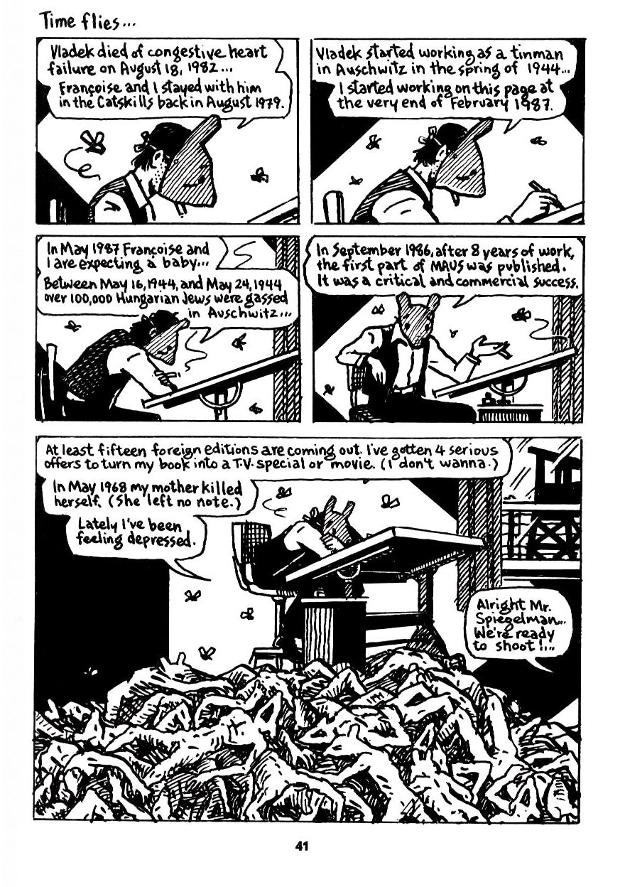
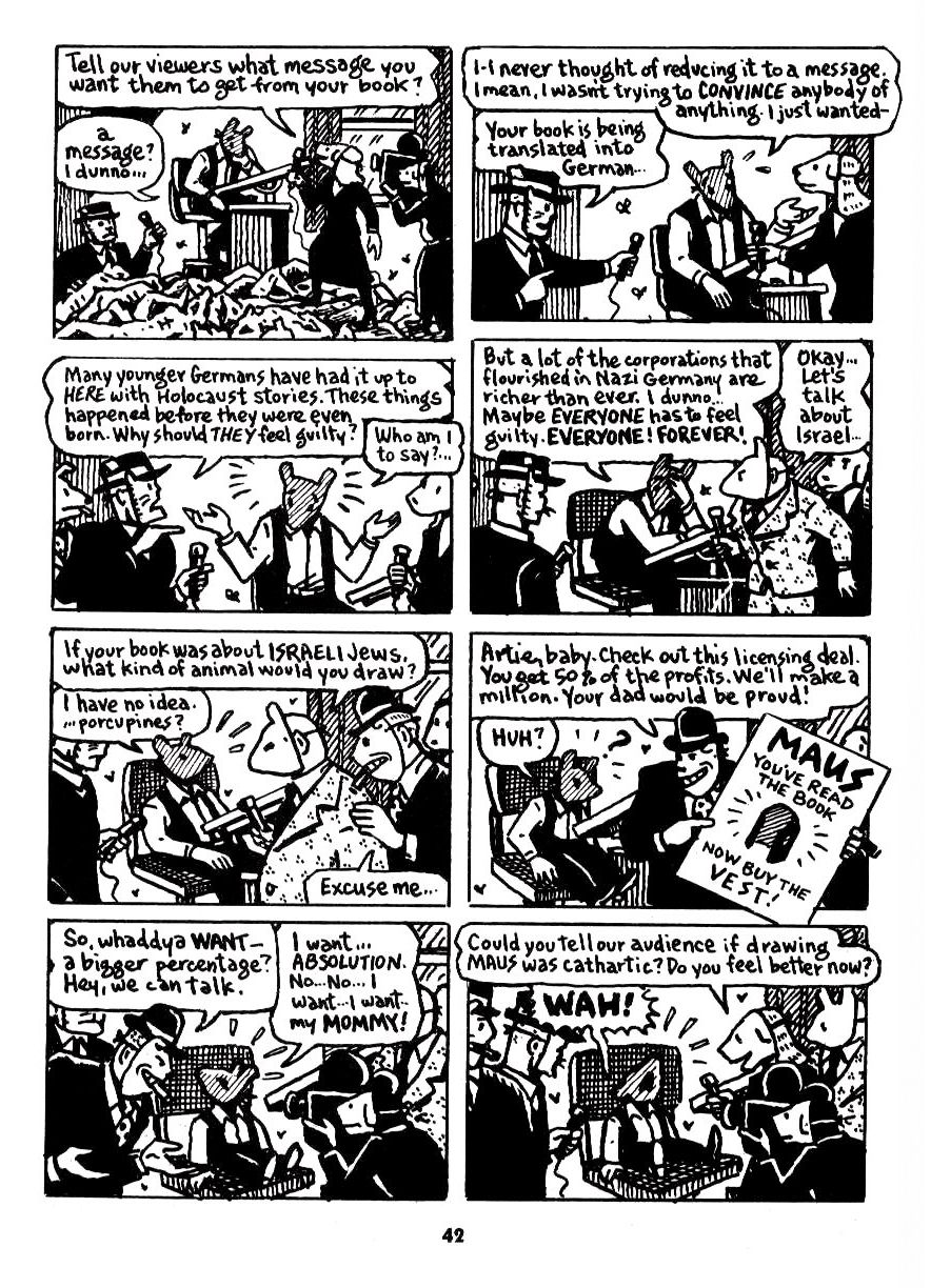
Art Spiegelman walks a similarly fine line, and similarly stumbles, in Maus, his Pulitzer Prize winning graphic novel. Maus is a true story, following Spiegelman’s father during the Holocaust, with the Jews drawn as mice and the Nazis as cats. It’s a simple enough metaphor, but one that fails once characters from other races get involved. Spiegelman’s solution is to draw two pages – two boring, irrelevant pages – showing himself trying to decide how to draw his French wife. Spiegelman tries to make these two pages relevant to Maus by dropping a couple of vaguely racist comments – his wife is a ‘frog’ and he calls himself prejudiced against Jewish women – but this feels less like a comment on the ubiquity of inherent racism, more like an attempt to distract from his admission that his metaphor has failed.
 

Maus_species

 
The furries of Green Fairy aren’t used as a blunt metaphor like the mice and cats of Maus, but Gold has the same challenges of retaining the integrity of his universe. Gold, thankfully, doesn’t go all intrusive-author on us like Spiegelman, but the logical problems are still there.

For starters, there are biological problems. The students of Green Fairy‘s Richfield High, heterosexual and homosexual, very obviously regard one another as potential romantic partners. There is no suggestion that there is any problem with mixed-species coupling, and indeed it’s a running gag that Sol’s platonic female friend (Meg) wants to give the appearance that their relationship is a sexual one.

The problem comes about when you look at the parents of each of the students: they are all single-species. Meg the otter has two otter parents, Sol the wolf has wolf parents, and so forth. The operation and physical reality of each household is (in part) defined by the species of the family unit, such as the otters living around water, and the characters tend to refer to other families in this way.

It’s easy to see how Gold is backed into a corner: on one hand he wants a rich, multi-species furry world, and on the other he wants each household to be defined by a single family species. But these two things are incompatible, barring perhaps some unmentioned but recently-repealed species apartheid law.

Similarly, Gold runs into problems when he explores the difference between carnivores, omnivores, and herbivores – one of the sources of conflict that drives Green Fairy‘s plot. Some of our furries are eating meat, and Gold makes a passing reference to non-anthro animals being used for food. This solves one problem but introduces a whole host of others: how can Gold’s animal-person society consider this ethical (or at least unworthy of comment when the ethics of vegetarianism is raised)? Who is farming these animals – are anthro cows raising and slaughtering non-anthro cows? And surely our animal-people would feel some kinship with their non-anthro counterparts, especially the more intelligent species, like wolves?
 

Harvest_cows

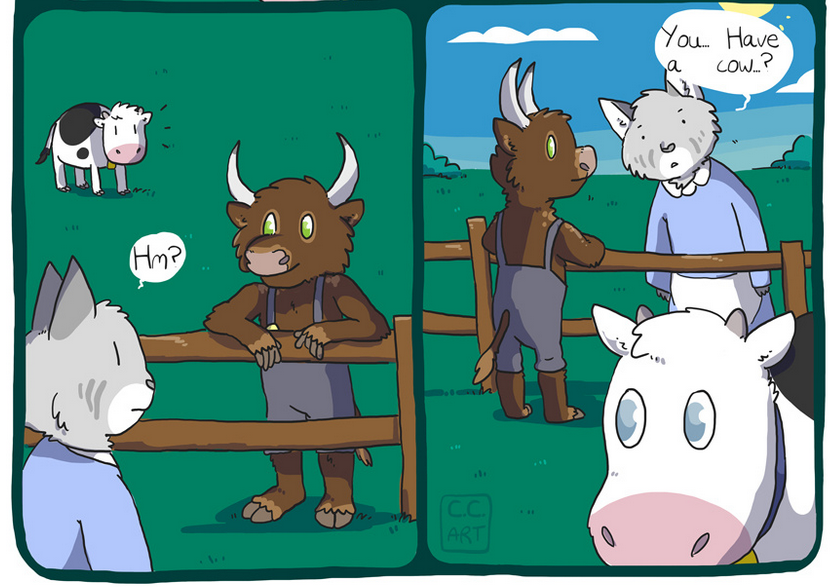
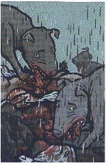
From Claire C’s comic Harvest

 
Gold doesn’t answer these questions, and nor should he. It would be boring, and undoubtedly lead to deeper logical problems, short of Green Fairy taking an unexpected twist into some Gulliver’s Travels-esque dystopia. But while his decision to elide this difficulty is correct, the difficulty still exists.

Gold’s characters have mundane problems: a budding romance, or bullying, or a place in a sports team. These are modest and subtle drivers. Gold’s plot relies on conflict caused by such social pressures, for example Sol’s desire to hide his homosexuality, or his efforts to win back his spot on the baseball team. But it’s difficult to care for the characters in thrall to the pressures of Green Fairy‘s universe, because Green Fairy‘s universe doesn’t hold up to scrutiny.

Interestingly, Gold makes intimations towards the natural challenges of his multi-species and multi-cultural society. Sol’s baseball rival is a young, talented coyote, who is driven to prove himself to the baseball team’s alpha wolf clique. Sol’s failure to keep his spot is especially embarrassing because his rival is considered ‘lesser’ in the eyes of his father, who comes across as a little bigoted (speciesist?).

In conversation with another parent, Sol’s father explains why Sol is playing backup:

“One of those ‘yotes from the trailer park,” Sol’s father said finally. “Tough, scrappy…”

[…]

The words don’t seem to register with the other wolf. “Y’know, once those trailer kids set their mind on somethin’…” He shook his head. “Don’t get between one of them and a steak, know what I’m sayin’?”

This is the language of casual racism, and it’s notable that it’s spoken by the older generation. It’s easy to replace “‘yote” with a racial minority, consider the apparent economic disadvantage of the group, and see that Gold is weaving elements from our own human social experience into his furry world. It is obvious to the reader that Sol’s father and his friend are wrong to mark an entire species/racial group with broad generalizations, in this case roughly “poor” and “recalcitrant”. Sol disagrees without saying so, and the reader empathizes with the conflict between his desires to keep mum and to speak up.

I bring up this example because it illustrates two things. Firstly, it demonstrates Gold’s quality as a writer, using a few efficient lines to get across a complex idea. Secondly, his intimations of racism are edging into dangerous territory. If species differences in Green Fairy are akin to racial differences, Gold appears to be drawing parallels between a single species (coyotes) and an American racial minority.

Other species in Green Fairy are similarly marked. There are a couple of Siberian foxes in the book, both of which are of Russian origin (one speaks in delightfully broken English). Here, again, species seems to relate directly to race.

This is dangerous because it appears that some species stand for single racial minorities, but that the other species collectively stand in for a racial majority – ostensibly white people, displaying as they do the trappings of suburban affluence. The idea that individual diversity occurs within a white population but that other racial groups can be collected as a discrete ‘other’ is wildly racist. Gold, of course, doesn’t say anything of the sort. But, to me at least, this is an unintended problem with the foundation of Green Fairy‘s world.

To be clear – there are no elements of Green Fairy that could be construed as even vaguely racist. This is simply an example of the problems Gold introduces by taking our world, and replacing humans with anthro characters. The drama and plot of Green Fairy are driven by familiar social pressures, and racial tension is a part of that. The problem isn’t with Gold’s treatment of race, it’s with the premise of his universe. Art Spiegelman has exactly the same problem with Maus.

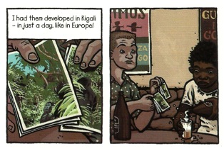
The most obvious problem with Green Fairy, at least the paperback version, has nothing to do with Kyell Gold. It’s the illustrations. There are a dozen or so drawings by Rukis in the book, showing certain key scenes.
 

GreenFairy_frontCover

 
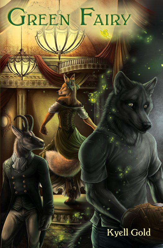
Rukis is a fine illustrator. The front cover of Green Fairy in particular is excellent. Less successful are the scenes captured by her art inside the book, mostly of action scenes, from a dance inside the Moulin Rouge through to an attempted rape. These drawings are DOA. Compared with Gold’s engaging and evocative prose, Rukis’s art is lifeless and flat. She would have been better served, perhaps, by providing character portraits of Gold’s main players.

It makes me wonder what on earth illustrations are doing in Green Fairy in the first place. The last time I read a book with pictures, I was 9 years old, and the story was about a kangaroo who went on adventures. Maybe this is a furry genre convention? Do furry books usually include picture?

Despite Green Fairy‘s problems, Gold’s writing skill stands out. The structure of Green Fairy would be challenging for any writer, and on the whole he executes well. Even the Confession sections markedly improve as the book goes on. It makes me wonder if Gold wasn’t learning as he wrote, starting on unfamiliar ground but finding his feet as he progressed through the story. If so, it’s testament to his skills as a writer – he starts formal and stiff, but ends with a bit of rhythm and flourish. I suspect that Gold should have rewritten the opening sections of Confession once he had found his voice, much like a real translator would do.

It’s not just the structure of Green Fairy which is complex, but Gold’s themes. His story is driven by conflicting social pressures, as would be familiar to any high school student, amplified by Sol’s unusual combination of competing hopes and dreams. Gold writes with clarity, and the plot has great energy despite Sol’s introspective nature.

I was particularly impressed by Gold’s development of Sol’s antagonists. Sol feels bullied at the beginning of the book, yet Gold avoids creating cardboard cut-out enemies. The motivations of Sol’s antagonists become apparent as the plot moves forward, and we can sympathize with them even while they engage Sol in emotional, physical, or sexual conflict. We don’t spend any time with these other characters directly, so we never get detailed insight into their thoughts. Instead, Gold humanizes them with context, providing hints that Sol notices but can’t dispassionately process, so that the reader has information that Sol does not. This is skilful writing by any measure.

Gold manages to invoke the emotional instability and general drama of being a teenager, both with Sol and with his fellow students. To be young is to be self-centred, and Gold understands that the characters will treat any event as if it is somehow personal. His single major female character, Meg, is Sol’s age but more emotionally mature, able to more effectively empathize with others but still prone to her own bouts of self-focussed drama. Gold’s older characters are, on the whole, a lot more moderate in their emotional expression.

Gold uses the natural teenage tendency to be self-conscious and self-critical to push his characters around. If anything, he holds back a touch, as if he can’t quite drive his characters too close to the edge – Sol is never really humiliated or embarrassed (although of course Sol doesn’t really see it that way). Yet Gold knows that we all remember what it was like to be in high school, and his emotional manipulation of the reader is deft, especially in the opening chapters. I found it very easy to empathize with Sol.

Even better is Gold’s writing on sport. Sport is a notoriously difficult topic for a writer, particularly action sequences. Sports fiction writing must balance the need for basic explanation, context, and the inevitable sports jargon, all while maintaining continuity of style. Too often sports writing devolves into a dry listing of events, all action and no thought. Many writers choose to avoid action scenes altogether, by narrating the action in hindsight, as remembered rather than as experienced.

Throughout Green Fairy (excluding the Confession sections), Gold retains an urgent tense, and we get to experience events as Sol experiences them. He retains this urgency through the short baseball sections, and it’s clear that Gold has a strong feel for the mechanics and psychology of the sport. He understands that sport is experienced twice: once in reality and again in hindsight. In reality things happen in a fraction of a second, where actions and decisions are unconscious. It’s in hindsight that post hoc reasoning gets applied, and over time the logic of hindsight replaces the instinct of action – the rationalization becomes the reality. And so when Sol gets it wrong on the baseball field, an unlucky bounce transmogrifies into an error that demonstrates Sol’s emotional weakness.

Gold also understands what it means to be an expert on the sporting field. Even in a long game like baseball, a state of ‘flow’ can occur, where actions and decisions happen automatically and time melts away. Sol is an experienced baseballer and manages to achieve this state from time to time, and accordingly Gold has these sections over in a flash. When Sol is struggling, Gold – excruciatingly – takes his time.

This is another obvious point of comparison to Chad Harbach’s Art of Fielding, where baseball is also a central focus of the story. Gold’s treatment of baseball in Green Fairy is comfortably more assured than Harbach’s, as is his treatment of social pressures in a school environment, and of hidden homosexuality, and – for that matter – his humour. Gold’s writing stands above Harbach’s… and to put this in context, Harbach received a $650,000 advance for Art Of Fielding, and an HBO series is planned.

Green Fairy‘s main limitation, in my opinion, is Gold’s decision to make it a furry book. The presence of furry characters, in place of humans, causes Gold no end of predictable problems, and this comes at the detriment of the book as a whole. And while, as a furry, I (subjectively) liked reading about Gold’s animal-people and found it easy to engage with them, a non-furry Green Fairy would be objectively better.

Gold is a terrific writer. He is no great stylist, but he is clear, efficient, and subtle in his plotting and character manipulation. His attempt to balance several writing styles in Green Fairy, although not entirely successful, demonstrates his ambition to create something special. Furry readers are lucky to have him, and it’s no surprise that he has a dedicated following.

Green Fairy is good… for a furry book. I have no doubt that my recommendations were fair, and that it stands out as a high point of the genre. But it doesn’t compare favourably to non-furry books, and unfortunately this seems to be due to the furry component itself.

Is the furry genre self-limiting? Goodness knows there is a lot of writing out there in furry, which means a lot of hay and very few needles. And still there may not yet be a great furry book. Any suggestions?
_______
1.There was one other popular recommendation: God of Clay, by Ryan Campbell. Unfortunately I couldn’t find a way to buy a copy without incurring an enormous shipping charge. I’ll buy God of Clay next time I’m at an American convention.

Matt Healey tweets at @jmhorse.

Unethical Empathy: A Case for J.P. Stassen’s Deogratias

20 years ago, by the end of July, the genocide in Rwanda had ground slowly to a halt as the Rwandan Patriotic Front took control of all but a small margin of the country. I was only 12 years old, but had followed the news coming out of the tiny east African country with an interest bordering on obsession. The images were appalling: row after row of hastily constructed huts and tents, children not much older than me carrying water down dusty roads for miles, a rail-thin mother nursing her baby among piles of cloth. The piles of cloth resolved into human-shaped forms, but they didn’t move. These stood in stark contrast to the bright floral dresses and poufy hair of Christine Shelley, the Clinton administration’s State Department Spokesman, as she awkwardly avoided the “g-word.” Video crews passed through filthy camps, and on occasion, the news anchor warned viewers of upcoming “graphic footage,” usually a wide keloid scar, sometimes spread across a handsome young man’s cheek. It wasn’t until years later that I realized how ambivalent these images were: reporters had largely been dispatched to refugee camps in bordering Uganda and Zaire, where survivors were forced to live alongside those who had tried to kill them.

My experience of horror and pained sympathy was retrospectively unmoored from my ethical stance. I had no idea for whom I had felt, which felt very ominous. This prompted a more critical eye: “Who is being shown here? Where is their suffering coming from? To what end?” It also provoked suspicion of my emotions: “Who am I feeling for? And what is the point of feeling anyways?”

During my graduate program, I was reminded of the source of these questions during two key events. I was invited by my advisor and mentor Gary Weissman to TA a Literature of the Holocaust class, and rather than giving me the job most TAs are tasked with (grading mounds of papers), he insisted I co-teach the course. It was an honor I didn’t take lightly, and I spent weeks researching, trying to better understand how to frame debates about the representation of the Holocaust in an advanced classroom. The course went through works like Elie Weisel’s Night and Primo Levi’s Survival in Auschwitz, as well as Art Spieglman’s Maus. By the time we hit Maus, both Gary and I were frustrated (and occasionally unnerved) by some of the responses from students. As we plowed through midterm papers, we kept coming across a phrase again and again: “walking a mile in their shoes.” I’ll return to that in a moment.

The other key event, not long after TAing for Gary, was when the man who would become my husband handed me J.P. Stassen’s Deogratias: A Tale of Rwanda, a fictional graphic novel following the title character through his lives in the pre- and post-genocide landscapes. In the era before the genocide, he is depicted as a normal young man: going to school, working, getting drunk, and attempting to woo two sisters. In the era afterward, he resembles the images of the refugees I had seen so many years before: torn, dirty shirt, dull, haunted eyes, slouching towards the hope of a bender. His search for urwagwa, a banana beer, is relentless, and only 26 pages into this 79 page work, Deogratias is rendered bestial, becoming a dog as he creeps on all fours through the landscape back to an open tin-roofed shack not quite the width of a bed. Moving back and forth between the present and the past with the title character’s memories as a sort of frame, readers are introduced to a small cast of characters. Deogratias is in love with two Tutsi sisters, Apollinaria and Benina, who are the daughters of Venetia, a local woman and sometime-prostitute. Apollinaria is the product of Venetia’s affair with Father Prior, a Catholic missionary, who is a mentor to Brother Philip. Brother Philip is new to Rwanda, and earnest in his desire to help. The French Sergeant is a more cynical character, as is Julius, an Interahamwe leader (the Interahamwe were the Hutu youth militias responsible for the bulk of killing during the genocide). More minor characters include Augustine, a man of the Twa ethnic group, and Bosco, a Rwandan Patriotic Front officer who has become a drunk after his work to help stop the genocide. Much of the graphic novel is devoted to “slices of life,” brief moments and short conversations that would be casual in any other context.

The Rwandan Genocide took place over 100 days in 1994, starting in April the day after a plane carrying President Habyarimana was shot down. While there was a plan in place in the government to slaughter all Tutsis, this was not a “top-down” genocide. As Mahmoud Mamdani discusses in When Victims Become Killers, the Rwandan Genocide was distinct from the Holocaust in part because a large proportion of the population took part in the killing. Between 600,000 and a million Tutsis were killed by a minimum of 200,000 genocidaires in a country of 11 million. While the differences are significant, it is also worth remarking on the similarities. The Rwandan Genocide was as “efficient” as the Holocaust. Unlike Western media representations of the violence, this was not “Africa as usual”. It was a tragedy that was the combined result of decades of colonial rule, Western reluctance to intervene in an area with few natural resources, racial enmities manipulated through the use of propaganda, French support of the genocidal government, a toothless U.N. Peacekeeping force, and many, many other factors.

Deogratias is not the first graphic novel to explore genocide, and certainly is not the most famous. That honor goes to Spiegelman’s landmark Maus, which explored his father’s experiences during the Holocaust and Spiegelman’s own difficulty with both his father and recounting his story. His visual conceit in this work employed a variety of animals (Jews as mice, Germans as cats, etc.) to highlight the factors of race, ethnicity, and nationality in the genocide. Maus is hyper-self-reflexive, Spiegelman frequently weaving scenes of his arguments with his father in the present day among illustrations of his father’s recollections. It is a powerful work interrogating racism, memory, intergenerational relationships, the effects of historical trauma on a family, and what it means to tell a story. As such, it is very “talky”—Spiegelman litters the page with questions and anecdotes, deftly balancing the textual and visual elements of the graphic form.

Deogratias, in contrast, is an intensely quiet graphic novel. The title character rarely speaks, and while we see the pre-genocide world partially through his memories, he never contextualizes them, or connects them to the silent, dirty man we see in the post-genocide era. The characters who speak in the pre-genocide era have relatively normal lives and normal concerns. The characters who speak in the post-genocide era carefully avoid any reference to the events of April-July 1994. What I find perhaps most important about Deogratias is the extent to which Stassen emphasizes the unreliability of images and the emotional responses they provoke in readers.

The comic opens with Deogratias staring blankly into an open-air café set in a hotel. A smiling white man hails him, inviting him to sit and drink. The man, later identified as a French sergeant, attempts to show Deogratias pictures from his recent tour of the gorilla preserves in Rwanda (among Rwanda’s only “natural resources”). One panel is entirely filled with these vacation photographs, so readers may assume that we are sharing Deogratias’s point-of-view, but the following panel reveals that in fact he is not looking at the photographs (see Figure 1). He is staring intently at the beer he is pouring into the glass, while the French sergeant looks briefly confused.
 

figure 1

Figure 1

 
At first glance, this would appear to be a relatively minor event in a graphic narrative about genocide, but in fact, it lays out the primary thesis: attempts to “see through the eyes” of those who went through the genocide are always partial, and are limited by the relative privilege of the reader.

This recalls what I found in the Literature of the Holocaust course while struggling to explain to students why “walking a mile in their shoes” was perhaps an inappropriate phrase. While we read novels and memoirs, the imaginative closure students experienced while attempting to envision what was being explained in the text prompted them to fantasize “seeing” the Holocaust. While not the worst use of the imagination—after all, we rely on texts to help us better understand the world—it also underscores an often-overlooked issue: to what extent is it ethical to create metaphors between one’s own experiences and situations of extremity?

Maus, because of its form, offered a corrective against the impulse to closely identify with experiences distant from our own positions of relatively safe U.S. citizens. When one looks at a panel, one is simultaneously invited to see through a window into the world and reminded that what they are seeing is mediated. Students were intensely interested in Maus, but were also able to see the characters’ experiences as distinct from their own lives and emotions.

Deogratias takes the ethical self-reflexivity inherent in the graphic narrative form and uses it to emphasize what the reader generally cannot see from their vantage point in the Global North. The tourism photographs of gorillas are the most common image out of Rwanda aside from those of the genocide, which, as I mentioned above, are often not properly images of Rwanda at all.

Stassen narrows this distance when depicting the pre-genocide era by showing scenes that could occur anywhere in the world. For example, Deogratias waits for Apollinaria outside of school, eager to present her with a comic book as a present. The large heart on the cover suggests its topic is romance, but when we look at the panels through Apollinaria’s perspective, we see a lonely woman on a couch, as well as the corner of a panel depicting an upset or disappointed man (see Figure 2).
 

figure 2

Figure 2

 
Deogratias asks her “if we could do the same things as in those stories?” at which point, Apollinaria rejects both the gift and the sentiment. The comic, meant to communicate his love for her, reveals the opposite; the page Apollinaria views shows abandonment and frustration. Immediately afterward, Deogratias is approached by Apollinaria’s sister Benina. Deogratias hides his tears, and promptly presents Benina with the same comic book. Unlike Apollinaria, Benina sees a scene of passionate kissing, overlain by the same question Deogratias had posed to her sister, which is more successful in this case (see Figure 3).
 

figure 3

Figure 3

 
As readers, we are prompted to connect with, if not identify with Deogratias. He is the main character, and while his intentions are not always pure, his actions are understandable; he is a teen trying to figure out his way in the world. In addition to the scene’s familiarity—many young men have struggled to woo young women with gifts—it is important to note the ambivalence of the images received by each sister. Neither sees “the whole picture,” wherein the comic depicts both suffering and passion, and only Benina sees the image that Deogratias intends.

In the post-genocide era, however, the reader watches Deogratias as the memories become too strong, and he physically transforms into a dog. The transformation recalls one of the most ominous aspects of post-genocide Rwanda. In Philip Gourevitch’s We Wish to Inform You That Tomorrow We Will Be Killed with Our Families, he recounts that “The nights were eerily quiet in Rwanda. After the birds fell silent, there were hardly even any animal sounds. I couldn’t understand it. Then I noticed the absence of dogs. What kind of country had no dogs?” (147). The RPF had killed them all because the dogs were eating the corpses.

Deogratias’s transformation is symbolically representative of the trauma undergone by the country. In his continued presence, he is a manifestation also of what is absent in the present day. Over the course of the comic, it becomes clear that not all of the characters we saw in the past have survived to today, but it remains unclear how precisely Deogratias escaped their fates. As a sympathetic Hutu who was intimately connected with a Tutsi family, he would have surely been one of the targets for the Interahamwe. Occasional stray references during the course of the comic suggest he may have been complicit, but at those moments, he retreats into happy memories. It is not until Brother Philip returns and sees Deogratias that the reader understands that Deogratias has been systematically poisoning all of those complicit in the genocide, from the French sergeant to Bosco to Julius.

In addition, Deogratias’s role in the genocide is revealed. In a scene from the genocide itself, the Interhamwe are depicted retreating to the Turquoise Zone. Augustine comes looking for Venetia, Apollinaria, and Benina, and Julius crudely describes the sisters’ rape and murder at the hands of Deogratias and others. The reader is left to wonder why he would be the protagonist.

Herein lies two major aspects of why Deogratias is an essential work. In the first place, it emphasizes how point-of-view in graphic narratives can provide important insights for what it is to “empathize” with images. As readers, we exist in a privileged space in relation to these characters: a space of safety wherein we can choose not to look. Furthermore, what we are shown when we choose to look is suspect as well, because what we see may be only partial. We may misinterpret it. Both the provisional nature of images and the chance of misinterpretation suggest that images can lead us to dangerous conclusions. In the case of the Rwandan Genocide, we conflated perpetrators with victims. We misrecognized the violence as something “naturally African,” something that happens in those places.

The second aspect Deogratias expertly negotiates is the extent to which the reader is allotted access to victim experience, and what victim experiences can be emotionally legible. By invoking empathetic identification with a perpetrator, to some extent Stassen is suggesting a broader complicity in the genocide than simply those hundreds of thousands that did the killing. At the end of the graphic novel, we see through Deogratias’s eyes as the bodies of Benina and Apollinaria are eaten by dogs (see Figure 4). In this moment, we are both visually identified with the culprit and are shown an image from the genocide itself—one considerably more extreme than we saw during those months in 1994.
 

figure 4

Figure 4

 
When readers in the Global North seek to “walk a mile in someone’s shoes,” it is perhaps an honest desire to understand experiences of extremity, but we rarely want to recognize where our paths lay in relation to the ones down which we vicariously traipse. Deogratias is a powerful precisely because it exposes us not to the subjective experiences of the victims, but to that of the perpetrator. I am not asserting that victims’ stories are unimportant. I am asserting that Deogratias reminds us that the object of our empathy may not be deserving of it, and that, perhaps more importantly, from our vantage point in relation to the Rwandan Genocide, we were considerably closer to the bystanders who did nothing than to the victims who suffered.

Voices from the Archive: Caroline Small on the Failures of Comics Symbolism

This is from a ways back, when Caro would theorize at length in comments threads.

Caroling Small: Questions about storytelling and representation and all those things are literary themes. But literary narrative is also a lot about the manipulation of device. Device is higher level than prosecraft, and lower level than theme. Maus fails at the level of the sophistication of its devices. It relies too heavily on symbolism, and straight symbolism in literature is less sophisticated than the more elaborate deployment of metaphor or metonymy. This is why so many literary people sneer at it getting the Pulitzer: it’s a good instance of “medium-specificity constituting a free pass.”

Symbolism is a component of metaphor on some level, but literary metaphor is bidirectional whereas symbols are unidirectional. The technical definition of a symbol is something like “using a concrete object to represent an abstract idea,” although the “concrete object” can be a “figure of speech.” (Notice the visual reference there to “figure” — in pure prose, a symbol is metaphorically concrete, but it still has to be concrete to qualify as a symbol.) But in literary metaphor the concrete drops away; instead you are juxtaposing two — preferably more — relatively ungrounded and fluid abstractions and having them structure each other.

(It’s also important to guard against the metaphor itself then functioning as a symbol; it needs to be integrated back into the narrative in some way, so that the metaphor illuminates character or theme or casts the plot in a different light, etc.)

This all happens very self-consciously in postmodern fiction, which calls attention to these things happening and generally integrates a self-consciousness about device into the theme, so that device in some way is always referenced by the theme. However, with the exception of the self-conscious self-referentiality, it happens in non-pomo fiction too — in Shakespeare, in Shaw, in Austen, in every literary writer. To get to something that uses symbols as directly as Maus you have to go back to the great Renaissance allegories — and they are so much more elaborate in the sheer quantity of symbols. There’s no puzzle to Maus — and Watchmen isn’t nearly as puzzling as The Fairie Queen.

So the more you’re able to connect a myriad of abstractions to each other and to the devices used to build the narrative, the more literary the work is. If there aren’t multiple abstractions interacting independently of whatever is happening concretely (so abstractions that are not symbols) and working in the service of the theme, the work is not literary.

Ware’s pretty explicit about his imagocentrism and his concern with the materiality of the page. But images are definitionally concrete. What happens when you’re imagocentric and concerned with the materiality of the page is you elide this layer of device and have a closer interweave between the concrete materiality and the highest abstractions of theme. This is a medium-specific property of comics — indeed of visual art — that makes it more difficult to build “literary” — or logophilic — narratives.

Even visual abstraction is concrete in the sense I’m using the word here, because it is working at that epistemological limit where the distinction “abstract/concrete” that is so native to, even constitutive of, the logos breaks down and you are faced with the material, visual word, evacuated of meaning. This is why the Imaginary and Symbolic are so named: the shift from the image-world, where the abstract is concrete, to the symbolic where they’re separated so that the concrete can be made to represent the abstract — that is the emergence of the logos (or in poststructural-ese, the founding gesture of differance).

Ware and Gilbert and to a lesser extent Clowes are all overtly concerned with the visual aspects of representation — it’s extremely hard to be a cartoonist and not be. This does not make them bad; this is not a criticism. It doesn’t even entirely exclude them from being thought of as a graphic mode of “literature”. But it does make them significantly less logophilic. Eddie Campbell might honestly be the only person working in a narrative mode in English who doesn’t fall victim to this — and an awful lot of people will derogate him by saying his work is either “mere illustration” or too verbose/literary. But he really seems to understand what’s missing, what’s different.

And, you know, honestly, on a much, much less sophisticated and theoretical plane, the actual prose that there is in American comics generally just blows. It’s ugly and colloquial and the writers apparently have the vocabulary of an average high-schooler. Regardless of how much prose you include in a comic, every single word of the prose you include should be _amazing_ — or you should pay someone to write it for you. If you love words, you put in great words. Period.

Illustrated children’s books, including but not limited to comics that include children in their readership, tend to be BRILLIANT at that, actually. But it’s really easier in children’s books, because the ideas are simpler, because there are less moving pieces — you can work with one device at a time rather than having to make the prose engage multiple devices simultaneously as well as multiple themes.


maus_2_038

Maus and Marketing

This is probably my least favorite page in Maus.

maus_2_038

This page doesn’t have the design problems that I taked about over here, and, which Mahendra Singh elaborated on.
 

11-page-from-Maus-I-650x948

 
The second page is cramped and confused; the first is not a masterpiece of design or anything, but the simple four panel grid at the top is effective; the flies the visual tip off to the gruesome reveal of the corpses around the drawing board.

What’s interesting, though, is that, while one is sub-competent and the other is effective, both use the same basic formula. You also see it here:
 

the-complete-maus-art-spiegelman-edicion-25-aniversario_iZ20XvZxXpZ4XfZ133298867-449709627-4.jpgXsZ133298867xIM

 
In each, the page is set up as a reveal. The top visuals keep your eyes focused on neutral images, and then the bottom opens up into the horrible truth. That horrible truth is always the same truth; namely the Holocaust, symbolized with a crude obviousness either by the (poorly drawn) Nazi flag, or the Auschwitz gate, or (most viscerally) by a huge pile of dead bodies. the importance of the Holocaust is emphasized each time both by its position as revelation, and by its scale. In his page design, Spiegelman tells us, over and over, that the Holocaust is huge and that it leaps out at you.

That is not, I would argue, an especially insightful take on the Holocaust; it turns it into a pulp adrenaline rush. Those pages each seem like they’d work as well, or actually better, if you substituted Dr. Doom for the Holocaust in each case. IF you’re going to set up a supervillain behind the curtain melodrama, best to be talking about an actual supervillain. Hollywood effects work best with Hollywood content; trying to add drama to an actual genocide comes across as cheap and presumptuous.

Interestingly, Spiegelman himself is somewhat aware of this, and on the page I’ve shown here, and in the following page, he tries to address it.
 

maus_2_038
maus_2_039

Spiegelman here is discussing, and decrying, the Hollywoodization of his book. These pages are from the second part of Maus, after the first part had gone the pre-Internet version of viral. The “reveal” of the final panel is both of the corpses and of the book’s success — the foreign language editions, the TV and movie offers. You could see the bodies as symbols of Spiegelman’s innocent alt-comix purity — a kind of spiritual death, underlined by the reference to his mother’s suicide. The off-panel declaration that “We’re ready to shoot!” links the media explicitly to the Nazi murderers; Spiegelman, as tortured artist besieged by popularizers and reporters, is positioned as a tormented victim of the gas chambers.

Defenders of Maus will no doubt argue that these pages are ironized. For example, Eric Berlatsky (that’s my brother!) writes:

Spiegelman is sure to implicate himself when he depicts Artie at the outset of chapter two of Maus II. Sitting at his drawing table, in front of television interviewers, Artie discusses the commercial success of the first volume of his book while sitting atop a pile of anthropomorphic mouse corpses. He is depicted not as a mouse, but as a man wearing a mouse mask, performing Jewishness for commercial gain. The simultaneously humorous and threatening depiction of the American advertiser offering a license deal for Artie vests (“Maus. You’ve read the book now buy the vest!” [42]) indicates how Artie (and Spiegelman himself) uses the past not merely to recall it in the present, but for his own profit and on the backs of the Jews his book is purportedly “remembering.” Artie displays a questionable connection to the past in order to participate in the circulation of power and profit.

Eric, then, suggests that Spiegelman is intentionally undermining himself; that he’s implicating himself in the marketing of the book and the performance of Jewishness.

I’d agree that the page raises the questions that Eric discusses. But is the effect really to undermine Spiegelman? The sympathy in that second page remains resolutely with Artie, who is being “shot.” He is the sensitive artist/victim (reduced to actually infantilized crying at the end) while callous reporters and interlocutors try to make a buck or score stupid points off the corpses stacked around his desk. The shallowness and duplicity of the media is emphasized by Spiegelman’s use of masks here; because they are drawn in profile, where we can see the mask-strings, the reporters comes across as macabre and deceptive.

Spiegelman is drawn in profile on the first layout, too. You’re in his head though, and he’s alone; it doesn’t feel like he’s concealing something, but like he’s trapped; the mouse mask victimizes him, and connects him to the dead victims (who aren’t wearing masks.) And then from that bottom reveal and through the next page, Artie is drawn mostly looking out at the reader; you can’t really see the mask. It’s as if the dead bodies have made him a “real” Mouse. In addition, the presence of the reporters ends up being validating; the contrast between their clear masks and his “natural” features shows clearly who has the right to speak — they’re crass desire to commercialize the corpses around his desk positions Artie as feeling caretaker; the only one who truly understands the horror. Thus, the dialogue is mostly the reporters asking aggressive questions and Artie as genius artist undermining them with wit and humble brag, followed by sensitive breakdown. The low point is probably when Artie blithely suggests he would draw Israelis as porcupines — a smirking one-liner that both dismisses the very real problem that Israel poses for Spiegelman’s Jews-as-mice-as-victims metaphor and glibly ties into ugly Zionist narratives positioning Israeli aggression as righteous defense.

The real failure of these pages, though, is Spiegelman’s utter refusal to grapple with his own responsibility for the commodification he’s supposedly decrying. IF you really don’t want your Holocaust story to be easily consumable, there are ways of doing that, from Celan’s impenetrable poems silence to Philip K. Dick’s oblique, quiet puzzle-box The Man in the High Castle. The critical and commercial success of Maus is not an accident; it’s the result of the deliberately unchallenging way in which Spiegelman presented the material. And that makes his wailing about the burden of success (which he, again, explicitly compares to the horrors of Auschwitz) insupportably presumptuous. The page itself, with its build-up to the big gothic reveal, uses pulp tropes to dramatize the Holocaust. The quite clichéd juxtaposition of feeling artist and unfeeing reporters/media is also an easy cultural narrative. Even the revelation of Spiegelman as man, rather than as mouse, doesn’t so much undermine the iconography (we still get the shock of anthropomorphic corpses) as it shows us the hand behind the image. Tortured genius is hardly a new marketing meme.

In short, Maus, in numerous ways, is an effort of deliberate middle-brow popularization. And part of that popularization is the elevation of Spiegelman himself; the genius interpreter, speaking from his pain as corpses overwhelm his drawing board. The bitter irony of Maus’ success is that the book’s defenders end up in the position of Spiegelman’s masked Nazi-like philistines,scrabbling joyfully amidst the corpses. And from the pile, finally, they lift Artie himself, circled by flies, the genius who realized that if comics marketed genocide, genocide in return would market comics.

The Good Draftsman: Of Mice and Men

The word “draftsmanship” is the loud, boozy, best-friend’s-sister of the artistic lexicon; available to all, understood by few. It’s a word which has come up in recent reviews of Art Speigelman’s exhibit at the Jewish Museum in New York. Some critics have raved over Speigelman’s draftsmanship, others have pooh-poohed it. The word itself seems misunderstood by some readers and critics or perhaps its older meaning is no longer even applicable in modern comix and illustration.

Draftsmanship is the quality of someone’s drawing (not just their rendering or painting). Like many qualities, it is not strained, it droppeth as the gentle rain of heaven and soaks the pages of both those that give and those that take. There is both good and bad draftsmanship and here’s the crux: how do you tell them apart?

In our post-modern, relativistic times, where nothing is certain except the fact that nothing is certain, readers of a philosophical bent will spit up their breakfast pablum at the implications of the above question. My reply to them is simple: if you refuse to make judgements, that in itself is a judgment and you’re probably oppressing someone, somewhere with your double-plus-judgemental refusal to make judgements. Naturally, my own judgements are non-judgemental, that’s the temporary prerogative of all soapboxes. I have no doubt that many HU readers will bring their own, equally sturdy soapboxes to the party later on and deliver some equally non-judgemental counter-judgements.

Good draftsmanship is an accurate, visually logical and harmonious depiction of reality. No genuine, long-term success in drawing is possible without first mastering realistic figure drawing, no matter how symbolic the style. The ability to make a human being look human or a horse to look horsey or a Princess telephone to look princessy — regardless of the level of symbolic distortion and compression — that is the basis of superior draftsmanship. But that is only part of it.

Draftsmanship is not just making clean contour drawings, and it is not at all about copying photographs. Good draftsmanship is the harmony, accuracy and design of reality processed through the eye and expressed through the hand. It can be as telegraphically crisp as a Japanese ukiyo print or as exuberantly messy as one of Blutch’s brilliantly inked pages.

Blutch_MilesDavis
Blutch: Miles Davis

Good draftsmanship means that everything looks good, even when it looks ugly. This is where things get slippery. Our eyeballs operate by the logic of a non-verbal grammar and a good drawing is always, without exception, “spoken” in this abstract language — otherwise it is visual gibberish. I think that for comix readers and critics — many of whom seem to prefer using literary techniques to analyze comix — this concept is a head-scratcher. Perhaps this is one reason why so few artists write comix criticism; the verbalization of visual rules for even a professional audience is tricky, for a general audience it’s nearly impossible at times.

So, in art-school parlance, good draftsmanship means depicting reality with complete design fluency on every level. Any symbolic compressions of reality are designed so that the trained, so-called good eye is always satisfied by the parts and the sum of the parts. The core mark is always reality.
 

11-page-from-Maus-I-650x948

 
In any case, let’s look at a page from Maus, a page specifically posted by one critic as an example of the high quality of Spiegelman’s exhibit. Maus is many things, most of them good … but the draftsmanship is not.

The drawing of individual elements, such as the mouse-heads, is ungainly, even for cartooning. It is not that they should look more like real mice, that would be silly. The shapes/textures/lines are all where they should be to facilitate general navigation but they seem somehow squeezed into place. Taken individually, many of the shapes are inelegant and unsteady and note one thing: there are precious few lines of beauty.

Much of the detailing — clothing, hands, shading — is turgid and clotted, an effect exacerbated by the mono-width linework. Monowidth line-work needs air to breathe, and if you must cramp it, it must be fastidiously designed on every level, not just the over-all page level.

The rendering of volumes necessary to show the thrust of objects in space is often crude … example: the far-left mouse in the final panel needs his cheekbones and orbital bones indicated fluently. Yes, it’s a cartooney mouse but then why is it hatched? It would have been better to use a few simple interior contour lines to delineate the subsidiary planes.

In general, if one wants to use a weak, monotone contour system with fast, cursory crosshatching, the accuracy of shapes must be perfect. Here, the optically long lines (mostly describing backgrounds) are trembly and indecisive, the curved lines (mostly describing animate objects) lack the snap and bravura of the classic line of beauty. With pen and ink, one must always make a decision about how much of the hand’s presence should be visible on the page. You can go the slow Hergé route and hide the hand entirely or you can take the fast Herriman route and let the hand’s muscularity and nimbleness run amuck. Spiegelman’s inking style favours expressiveness but his draftsmanship betrays his aims. His hand is going faster than his eye can think.
 

kley1

kley2

 
Heinrich Kley comes to mind as the successful epitome of this style of draftsmanship (see the two illos above). His hand is nervous but his eye is confident, thanks to his draftsmanship, his mastery of reality. In Kley, one senses the shape governing every line, even if the line is still searching for it. His hand is confident of the eye’s automatic guidance. Shapes and lines are rhythmically linked — a basic tenet of good visual grammar.

But in this Spiegelman page, the shapes are not “magnetizing” the lines in the same way, his nervousness stems from a lack of confidence in internally visualizing the reality being described. Roughly speaking, the visual, reality-based grammar governing the naturally pleasing agreement between contours, volumes and lines is too weak to please the eye consistently.

Spiegelman is not a superior draftsman, and I doubt if he himself thinks that he is one. Frankly, who of us are really good draftsmen? Not I … and it is not even necessary for Spiegelman’s purpose. He has made a living in the publications field for a long time and knows the score: do the best page you can at the time and above all, make it fit the story. There are better looking pages in Maus and in other works of his.

In fact, his usual style of story-telling does not require good draftsmanship and in a work such as Maus, a certain visual crudeness is more emotionally effective than a cleaner, crisper hand would have been.

Spiegelman’s work has never been about draftsmanship anyway, he’s a verbal illustrator, especially pre-Maus. He is also, to the eternal gratitude of everyone who makes comix in North America, the guy who made us at least semi-respectable to both a better class of reader and the people who send us royalty cheques. Younger readers have no idea how difficult it was to get the NYC suits to take you seriously before RAW began cracking the glass ceiling.

Most American golden and silver and iron-age corporate comix were nothing more than the step-and-repeat of modular, symbolic marks designed to rubberstamp the reader’s eyes into a stupor. Draftsmanship took a backseat to speed. And the draftsmanship of many contemporary comix is even more laughable in its absence. Too many North American comix are made by talented writers who cannot get into print by writing alone and must take up cartooning to tell stories. And the bar for comix submissions is lower than other fictions simply because the bar for visual competency is often set by non-visual editors, readers and critics.

Cartooning is now the default mode of drawing in North America, in both illustration and comix. It’s cheaper to purchase because it’s easier to execute and doesn’t require expensive, specialized training. And most cartooning is poorly drawn since the level of symbolic reduction is usually so extreme that the slightest defect is multiplied ten-fold and spoils the entire effect.

In any case, as I get older and crankier, I care less and less for the stories and thematic concepts of most comix, I look at only the pictures. My Holy Grail is a sequential art where the drawing is the meaning* as much as the story or words, perhaps even more so, to the point where the visual grammar will express a story in its own universal language. In fact, sequential art is the only popular visual art form which has the potential to utilize draftsmanship at this level, to make the medium and the message precisely the same. Music, architecture and dance still do this regularly. Why not comix?

*I think that Matt Madden’s experiments in constrained comix, his Oubapian work, is a major step in this direction. The implications of what he and others like him are doing may result in comix evolving into genuinely visual, absolute art at last. And to those that think that contemporary gallery art has this absolute value, I beg to differ. Any visual art form which requires a verbal explanation to understand the “message” is not visual art at all.
____
Mahendra Singh’s website is here.

In the Shadow of Mediocre Page Design

Jed Perl very satisfyingly tore into Art Spiegelman over at the New Republic, pointing out that he is incredibly pompous and can’t draw worth a damn. That led to a chat on facebook where I claimed that Spiegelman’s page design was pretty much crap, and was told I was wrong by various folks.

So what the hey, Dan Nadel was gushing over at tcj about the same Jewish Museum Spiegelman show that underwhelmed Perl. Here’s one page Nadel singled out to illustrate his piece.
 

11-page-from-Maus-I-650x948

The train on top of the bridge is bung up against the panels below, so that it looks like some sort of cap perched atop the panels. The sense of motion is really confused too.The train goes from right to left up top, and but in the next row of panels the direction of reading makes it seem to go left to right. Spiegelman tries to fix this by shifting the image leftward in the second panel so you can see the next window, but that doesn’t so much create leftward motion as it just makes the motion of the page even more or a mess, especially since the window borders and the panel borders are exactly parallel, and so tend to visually distract get confused with one another.

I can’t for the life of me think of an explanation for why Spiegelman wanted to make the top of the page look like a decorative hat, or why he’d want to have you thinking about which direction the train is going in. I guess, though, you could argue that the confusion and clutter of the panels at the top is supposed to make the swastika pop. But that ends up feeling cheap; the top doesn’t work by itself, and setting everything up for a big reveal seems manipulative. That’s only intensified by the way the flag folds in such a wannabe but not actually lifelike way — Spiegelman’s melodramatic touch a la the splash of red in Schindler’s List.

Maybe the ham-fisted clutter and the transparent melodrama are supposed to be ham-fisted and transparent, undermining identification and foregrounding the comicness of the comic. Spiegelman deliberately combines incompetence and glibness to show us that this isn’t really a true image of the Holocaust, but a poorly designed and manipulative representation of the Holocaust. Maus is so great because it’s so self-consciously mediocre.