Anti-Manga, The Anti-Classics Way

This October, London’s Breakdown Press published Masahiko Matsumoto’s The Man Next Door, the second in their new art manga collection. Curated by art historian Ryan Holmberg and featuring Breakdown’s characteristic risograph technique, the anthology of four stories highlights much of what makes the young collection such a unique aesthetic proposition.

The collection is heir to the “Masters of Alternative Manga” line, one of the two that Holmberg helmed for Picturebox, Inc. Only one volume came out before Picturebox announced that it wouldn’t produce any new books, an anthology of short stories by cult author Seiichi Hayashi called Gold Pollen and other stories. (Two books came out in the other collection, called “Ten Cent Manga” : Tezuka’s highly entertaining The Mysterious Underground Men and the less accessible Last of the Mohicans, by underappreciated pioneer Shigeru Sugiura.)
 

09ff2e29b2d1bbb272318c9bdff65140

 
While the Ten Cent Manga series remains orphaned, the Alt Manga collection has sparked the interest of other publishers, and what should have been the follow-up to Gold Pollen, an anthology of shorts by Tadao Tsuge titled Trash Market, will be published by Canada’s venerable Drawn & Quarterly. Tadao, the younger brother of alt manga superstar Yoshiharu Tsuge, was a fixture of the GARO magazine in the late 60’s and early 70’s, and an obsessive chronicler of social anxieties in a Japan still haunted by the war.

The D&Q connection makes perfect sense in the light of their previous interests in manga publishing. The Breakdown Press one is less intuitive, and the particularities of its inception are a big part of what makes it so original and exciting.

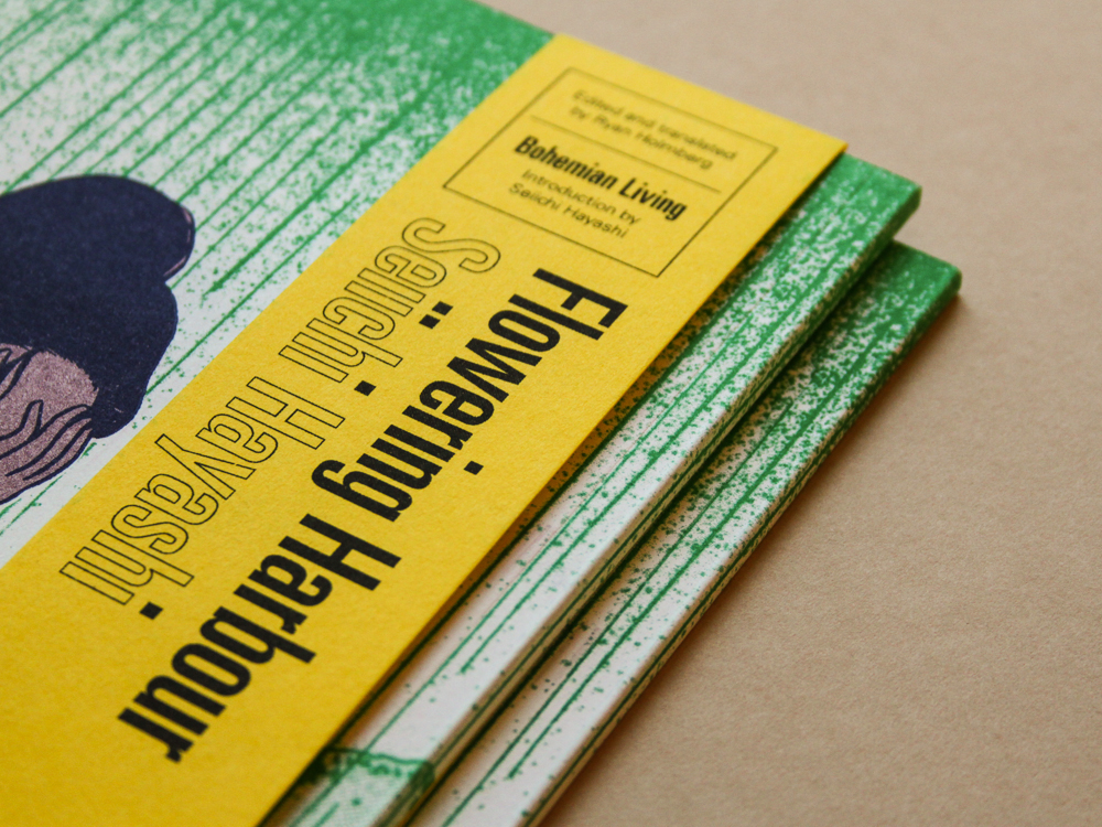
The London-based publisher is distinctly inspired by zine culture. They printed all their first books using a Risograph machine, a piece of Japanese office equipment that blends screen printing and photocopy, and which has proved very popular recently among underground publishers. They met Holmberg while he was in England for a fellowship at the Sainsbury Institute for the Study of Japanese Art & Culture. The institute and the Japan Foundation were looking to invite Hayashi to England, and “I wanted to do something to commemorate the event”, says Holmberg. Breakdown Press happened to be looking for that kind of projects, and the planets aligned. They settled on a 1969 story of loneliness and rural exodus, Flowering Harbour ; Holmberg wrote an introduction and translated an article by Hayashi, while Breakdown Press’s first published author and de facto art director Joe Kessler handled the design and printing with Victory Press. The result, a 40-page, 5.4” by 7.6”, perfect-bound book, resembles neither the mass-produced commercial manga nor the large hardcovers of other classics collections. As Breakdown’s Simon Hacking explains, “What we really loved about the Flowering Harbour project was the opportunity to work with a cartoonist who is much more established and revered than any we’d worked with before, but to do so in a format that matched our existing output. Printing the book using a Risograph at the printer we’ve used for all of our books, and getting Joe Kessler […] to design the book allowed us to make a 40-year-old comic from the other side of the world feel like part of our line.”

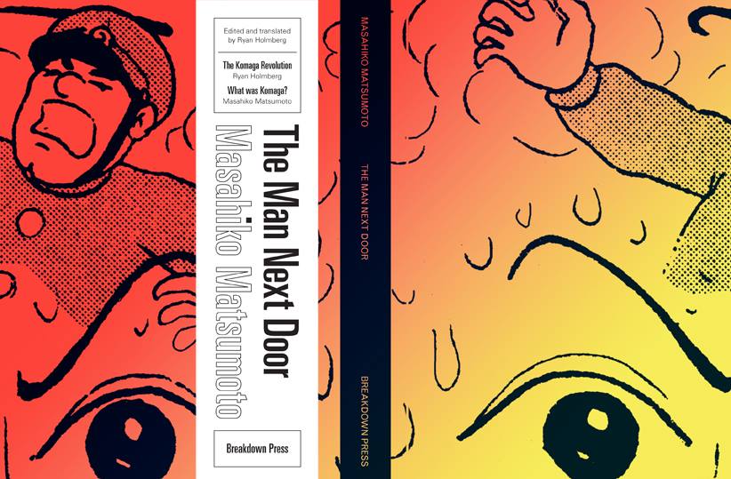
On September 23rd, the Cartoon Museum in London launched the “Gekiga” exhibition, an occasion for Holmberg and Breakdown to publish another short piece of comic history. The Man Next Door collects four stories (including the titular “Man Next Door”) by Masahiko Matsumoto, the least known but most discreetly influential of the members of the Gekiga Workshop (more famous peers being Golgo 13 creator Takao Saito and comic giant Yoshihiro Tatsumi, who later told – and in a way rewrote – the story of the gekiga revolution). Again, Holmberg wrote an introduction and translated a 2004 article by the author himself. Kessler designed the book and the Risograph was put to good use. Each story is printed in its own colour, a great detail since all anthologies nowadays are printed in black, while the magazines themselves often used colored ink.
 

10614349_289399171260889_8183266200203472394_n

 
The homemade touch of the books and the “opportunistic” character of the line-up manage a strange feat : they make the works feel current. Their origins and historical context are obviously explained, but the articles in the books themselves are introductions : short, to-the-point and easily digested. They don’t break the spell that preserves these strange little books from the “glass dome” curse of patrimonial anthologies. And for those who would like to delve much deeper than that, Holmberg actually accompanies each release with lengthy and much-researched discussions on the authors and stories as part of his TCJ column “What was alternative manga ?”.

But as fascinating as the experiment has been so far, its most exciting developments are still to come. Because Breakdown Press are at exactly the right moment in their history, in terms of size and ambition, to tackle some big, crazy projects. Starting with a reputedly unpublishable masterpiece of alt comics, the experimental anti-manga of Sasaki Maki. Despite the enduring success of Maki’s Complete Comic Works in Japan, Holmberg had up to now failed to have an anthology edited in English. “I remember pitching a Maki collection to Dan Nadel at PictureBox many many years ago, 5 or 6 years ago, and he said, no way! no story = no sales.”
 

maki1

 
Admittedly, the short stories Maki drew in the 60’s and 70’s are among the most abstruse ever produced, but strolling through this seemingly meaningless interweaving of political, symbolic and pop imagery is an experience like few others. For every fan of the psychedelic era, or anybody interested in seeing what Japanese counterculture looked like at the height of its creative drive, this is essential reading. And it’s no wonder that the best-selling (though himself often obscure) novelist Haruki Murakami defines the artist as the defining voice of the period. “With my novels, he confesses in the foreword to Maki’s Japanese collection, I try to do for this generation what Sasaki Maki did for mine.”
 

maki2

 
Though the anthology, scheduled for the beginning of 2015, won’t have the same look as the mini-manga published so far, it will certainly have the Breakdown feel, especially since Joe Kessler is now their official house art director. And if their latest offerings, printed in offset for greater versatility, are any measure, it is going to look gorgeous. Of course, it’s not like anybody involved is hoping for great financial success, but even if it all goes terribly wrong, let’s hope that the initiative will spark many copycats. Because these little classics feel different, and new, and imply in their own humble way that the range of what small press can do has suddenly broadened.

Abstract Comics

Note: This review of Abstract Comics was written close to three years ago. It was proposed to Art in America in the fall of 2009 and submitted for publication that November or December. Overbooking in the book reviews department, I was told, delayed its publication. Finally the following summer, sensing its age as a review and the need to jumpstart things before it was too late, I offered to expand the article into a feature length essay on the wider subject of abstraction in recent comics, including figurative and/or narrative ones like Dash Shaw’s Body World, Joshua Cotter’s Driven by Lemons, and Brian Chippendale’s If ‘n Oof. That proposal was likewise accepted, but then the magazine’s head editor was ousted. The new head editor, after another six months’ consideration, finally paid me a kill fee. I thought I might write the expanded version nonetheless and submit it to an academic journal, but then got busy with other things and lost interest.

If I were to write on this topic today, there are many things I would change. It is, however, precisely this thinking that has kept this piece buried inside my computer, where it does no one any good. Thank you to Andrei Molotiu and Derik Badman for pushing me in recent months to publish the review regardless. So here it is, more or less in the state it was three years ago. Keep in my mind it was written for an art world publication. There were also word count restrictions, hence its clipped nature. What you see here, if I remember correctly, was already about 300 words over length. I said I would change many things today, including its tone, but the core opinions and suggestions I still stand by.

*******************
 
Since the 1990s, there has been a rising tide against the word in comics. It has begun to gel into something like a movement, made up of artists, critics, and editors alike, involving both the creation and promotion of new wordless comics in a variety of genres as well as the republishing and anthologizing of related work from the past.

So-called “abstract comics” is one of the more extreme fronts. It names a form of wordless comics that not only dispenses with the word, but also those things traditionally allied with it, like speech, sound, plot, and interiority. Abstract comics has been a fringe genre, disseminated largely through blogs and self-published and small press booklets. With the publication of Abstract Comics: the Anthology (Fantagraphics, 2009), it has gained a more secure foothold in print.

The book collects work from 1968 to the present. It includes comics luminaries like R. Crumb, Gary Panter, and Lewis Trondheim, but is focused on new names from the past decade. Most of the work is deeply indebted to modernist abstraction, from Kandinsky’s dispersions and Cubist papier collé, to the nested squares of Albers and Abstract Expressionist blots and drips – all typically set into narrative motion across a handful of panels or pages.

Museum modernism also weighs heavily on the framing of the anthology. In his introduction, Andrei Molotiu, artist, art historian, and blogmaster of the same-titled Abstract Comics site, describes the genre as a whole in terms derived from a mix of vitalist philosophy and a classical modernist model of reflexive reduction. He writes:

Reduced to the medium’s most basic elements – the panel grid, brushstrokes or penstrokes, and sometimes color – they [abstract comics] highlight the formal mechanisms that underlie all comics, such as the graphic dynamism that leads the eye (and the mind) from panel to panel, or the aesthetically rich interplay between sequentiality and page layout.

In the same vein, Molotiu describes standard narrative structure as an “excuse to string panels together” and abstract comics as a distillation of the medium to the “feeling of sequential drive, the sheer rhythm of narrative or the rise and fall of a story arc.” In the artist profiles at the end of the book, Mark Badger – contributor of a maximalist geometric abstraction in comics form – laments how images in comics are “unable to claim their real power” while subordinated to narrative or representation. “Hopefully,” he continues, “this book will be one shot in claiming back comics from the typists.”

Abstract Comics thus offers itself as a manifesto in the tradition of high modernist art, without the extremism of its historical predecessors, but nonetheless sharing their characteristic denigration of narrative and the verbal sign as well as their calls to power through purification. The anthology, unfortunately, does not make the strongest case for the vigor of the movement it promotes. Much of the collected work is visually weak, and the modernist formalist discourse to which the book is indebted ceased to have any real traction after the socio-political and linguistic turns of art in the 1960s. Molotiu expends much of the introduction excavating precursors for this “genre without a proper tradition” from the oeuvres of art-world masters like Kandinsky, DeKooning, Alechinsky, and Johns, with only passing mention of relevant precedents within the comics medium itself. Trying to legitimize comics vis a vis the art historical canon can sometimes be self-defeating, and here it has the unintended effect of casting abstract comics as little more than a super-belated reworking of formalist painting. Especially considering the online presence of “abstract comics” and the computer-based creation of many of the contributions, it would perhaps have been more fruitful to explore the relationship of the genre to the return of various forms of abstraction in the computer age, beginning with Neo-Geo in the early 80s and then internet art and laptop music after the 90s. Instead, the top two-thirds of each page of Molotiu’s introduction are given over to rows of dingbats, a cute waste of valuable space and another statement of preference for pure aesthetic form over verbal discourse. One is left to dig through the artist profiles of Abstract Comics and the personal webpages cited therein to get any real sense of specificity to individual works and the promise that some do hold.

As is clear to any reader, the dominant trope of abstract comics is metamorphosis. Molotiu heralds work that “tells no stories other than those resulting from the transformation and interaction of shapes across a comic page.” Andy Bleck’s Haring-esque work is typical. Anthropomorphic blobs twist and tangle in goofball dances that are half cartoon tribal mating ritual and half protoplasm on a wet mount microscope slide. The contributions of the two most prominent Europeans in the anthology, Trondheim and Ibn al Rabin, make it clear that the defining figure of metamorphosis is the amoeba. Both of their works are short comedies featuring blobs swallowing nuclei and other blobs. There is a basic vitalist conceit at work here: to boil the comics medium down to pure formal dynamism entails exploring also the most basic forms of animate life.

by Andy Bleck

Most of the works are as entropic as they are dynamic, involving not only the transformation of form and energy, but also their disorganization and dissipation. Molotiu’s own works are a case in point. Produced with the aid of a scanner, “The Panic” begins with compound masses whose biomorphism once again evokes the biology lab. Over the course of a handful of panels, the masses pull apart into small globules.

Chaos, similarly, is a recurring motif. Alexy Sokolin’s “Life, Interwoven” layers ballpoint pen lines until almost the entire page is obliterated. Tim Gaze’s untitled collages are a gore-fest of inky smears and splatter, further mutilated through a technique similar to the cut-ups of William Burroughs and Brion Gysin. Billy Mavreas’ “Border Suite” again evokes the cut-up, now run repeatedly through a copy machine until all that is left is disintegrated borderlines and dispersed dust motes. In Abstract Comics as well as other statements on “sequential dynamism” in comics, Molotiu makes the musical analogy to opera. From these works, however, it is clear that noise and glitch aesthetics would be more apt in some cases.

Other works also manipulate source material. Proprietor of the reliable MadInkBeard blog, Derik A. Badman’s Flying Chief is one of the more intriguing contributions to the anthology. He has redrawn panels from a 1950 Tarzan comic without the characters, words, speech balloons, or captions. More so than abstraction or entropy, this strategy of absenting is highly effective in frustrating the viewer’s desire for an organizing figure. Badman’s image of a world without human agency raises more pointed questions than other contributors’ protozoan land before time and scenes of cosmological chaos.

Derik Badman, “Flying Chief”

Noah Berlatsky also runs a comics blog, The Hooded Utilitarian. His two one-page works are also in this appropriationist vein. He has taken pages from Asterix and X-men and redrawn them in such a mutilated fashion that frames and figure-ground relationships are splayed and then refused into an abstract mesh. There is a strong bit of Kandinsky in the results, but it’s also important to perceive amputated bodies akin to those of early Dali or later Sue Williams.

In these, as in a number of works in the anthology, there is an interest in what might be termed a logic of “vestigiality”: the organ divorced from its original function but still maintained, so that it oftentimes comes to impose upon the organism that had abandoned it. Might this principle also underlie the metamorphic comics? After all, their plasmatic substances have a striking resemblance to the spongy, pneumatic contours of the speech or thought balloon. If so, it seems that the abstraction of comics against the word and its supports is never total, but rather marked with traces of partial amputation. Abstract comics share this feature with many wordless comics, from pantomime works that gesticulate histrionically to make up for the ban on verbal expression, to indie comics around themes of melancholia, speechlessness, and pre-linguistic primitivism.

It is curious that Abstract Comics opens with R. Crumb’s “Abstract Expressionist Ultra Super Modernistic Comics,” first published in Zap Comix no. 1 (1968). First of all, its principle of non-sequitur juxtaposition is quite at odds with the smooth, linear sequentiality or serial modulation that characterizes most other works in the anthology. Secondly and more importantly, Crumb’s work was meant as a derisive parody precisely of the kind of genuflection to high modernism that Abstract Comics represents.

R. Crumb, “Abstract Expressionist Ultra Super Modernist Comics

Crumb is not alone. Burlesque has long served as a kind of prophylactic for comics artists against the perceived obscurantism and puffery of high art. A few years ago, designer Craig Yoe popularized an adequately lowbrow name for this mindset: “arf,” which is Popeye’s laugh, but comes off as a portmanteau of “art” and “barf.” At the very least, Abstract Comics represents a welcome willingness to look upon high art from the perspective of comics without such juvenile anxieties. One hopes that the future of the genre is towards aesthetic paradigms with greater contemporary relevance.

Ryan Holmberg on Tsuge and Tatsumi

Ryan Holmberg has left a bunch of interesting comments on Suat’s essay about Tatsumi. I thought I’d highlight some of them here.

Here’s the first.

I realize I am commenting on a two-month old post, but I just now read it.

I agree with the basic crux of this analysis of Tatsumi. I think it is harsh but fair when it comes to metaphor and sexual values. In that era of Tatsumi’s work every oblong is a phallus and every hole a vagina, no doubt, and the misogyny is unmistakable.

Given this – given that Tatsumi’s work is unsubtle – I have to say your review is about as obvious as Tatsumi’s work. I sympathize with the desire to serve up a corrective to the promotional garbage that fills the press, but you are fighting straw men. I am not sure if you are saying much more than what any of us who have had doubts about Tatsumi’s glory have thought at one time or the other.

You were fairly generous about the menstrual flowers in Tsuge’s Red Flowers. Why is it that clichéd sexual euphemisms are okay in a pastoral “literary” genre but not in pulp? Is the problem that the cicadas and babbling brooks are peeled away?

Also, on what basis are Tatsumi’s drawings “crude” and “inept”? For the most part (some exceptions), they seem pretty finished to me, and work perfectly well for what he was trying to do. “Unpolished skills?” He was a 15-year veteran in 1970.

“A failure to move beyond what remains totally acceptable in modern day manga”? You mean manga then? If so, tell me who was doing stories like Tatsumi’s in 1970, aside from Tsuge. Second, Tatsumi was black-listed by Shonen Magazine, supposedly (according to Tatsumi in “Gekiga kurashi”) after their print-run fell after publishing one of his works) – clearly he was not “totally acceptable.”

Also, “Tatsumi was no different from those individuals (the factory mangaka)”? Just on the basis of a lack of character types? I think you also mention pressing deadlines as a reason for how the work looks the way it does. I doubt it. At this point, he was writing for very few weeklies (this changes in the mid 70s, after the period in question). An artist like him with a 15 year career, having produced hundreds of pages a month for many years, do you think writing one 20 page story per month was rush work? At least be generous enough to assume that the artist knew what he was doing and had complete control over the product. He might not have been a poet or a Kojima Goseki-caliber draftsman, but he was also not an amateur.

Again, I sympathize with your basic distaste. But not with the venting.

And here’s a follow up.

The difference in finish between Projectionist and Forked Road is obvious, and as you pointed out it probably has something to do with Tatsumi`s circumstances at the end of the 60s. (Side note: your quote about Tatsumi having a bunch of artists working for him…I think that means artists writing comics for the magazine-anthologies he was publishing, not assistants for his own work…but I will have to check this.) But first of all Projectionist-type crude drawing has a long tradition in kashihon comics in Japan (this is the point where is moving from kashihon to magazines), so I don`t think it can be chalked up to lack of time or skill, and the increase in finish over those two years also has to do with the different standards of the manga monthlies and weeklies, not just a personal aesthetic decision on Tatsumi`s part. That doesnt make the work better or worse, but I think one should, especially when critiquing an artist so harshly, have some consideration for context.

And one more.

Just quickly, on Imamura, I haven’t watched these in years, but the Pornographers maybe, Insect Woman, Ningen johatsu (probably not in English). They are much more humorous than Tatsumi, but there is some overlapping setting and gender views. The impact of Nikkatsu films is also big on all of the Gekiga artists, from the Action stuff to the romantic stuff. To me, Tatsumi belongs in that world.

As for Tatsumi’s busy schedule in the late 60s, when he started doing those dirty-men stories. His prose (versus manga) autobiography “Gekiga kurashi,” published last year, has a bit on this period. It says in short, the mid 60s were a difficult time. Then an editor from a second-tier magazine name Gekiga Young commissioned 2 x 8 pages a month from him, which he claims was hard work given his publishing venture. The editor apparently requested lots of revisions, less speech balloons, etc for a tighter more visual product. I would have to check, but these are probably the short works in Pushman. He also thanks the editor for getting him inspired about making manga again.

Later, he talks about how he had a long standing feeling against using assistants, arguing that one’s work should be one’s own. He says that in 1974 he had to swallow his pride and hire two assistants to complete a commission from Shukan Manga Sunday (a weekly). I will have to do more poking around, but the way things are worded here is that this was a turning point in the way he made comics. Maybe at the height of his popularity in the late 50s he had assistants, but given the economic difficulties of kashihon publishing in the mid 60s, I doubt he had them then.

Do click through the links, as there are additional remarks by Ryan, and comments by Suat and others.