Bill did a post about coloring in the Watchmen comic and movie, inspiring me to finally get to this post I’ve been sitting on for some time now.
A little while back Tucker Stone and I coblogged our way through the 2nd phonebook volume of Bob Haney Brave and Bold stories. Our mutual favorite of the tales was an amazing Batman/Deadman crossover, which is pretty easily The Best Batman Story I’ve Ever Read.
Anyway, after we’d finished the series, Tucker (who, unlike me, occasionally visits comics stores) purchased and sent me a copy of the original Batman/Deadman team-up which he’d found in one of those storied longboxes. If I’d found it myself, of course, I would have just kept it…but Tucker’s a better person than I am (like Kim Deitch…and probably most other folks for that matter….)
But to get back to the point at hand; I was especially excited to see the original artwork, because I was curious how the color would affect the visuals. The story is a bleak noir, for the most part, so black and white suited it well, I thought. I wasn’t sure whether the color would help or hinder.
I think overall it helps. I’m not sure who the colorist is (could it be Aparo himself? Probably not…though I know he did his own inks) but whoever had the chores does a very nice job. Take the panel below:
The muted blues in the costume and the weird neutral orange/red background actually accentuate the shadow on the face; Batman ends up looking pretty scruffy, which I think is just right.
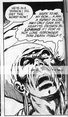
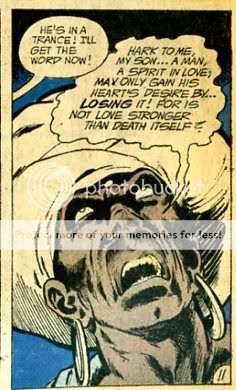
Similarly, this image is great in black and white:
But I think it’s equally good in color; where, again, the brown really brings out the crazy shadow, actually emphasizing the noir feel rather than detracting from it. (Plus it really drives home the “this is a minority bit” — if you’re going to be racist, I guess it’s best to be as explicit as possible. Or, actually, maybe not, on second thought….)
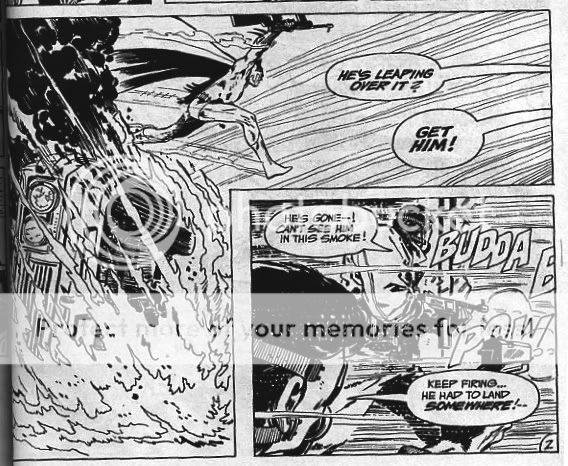
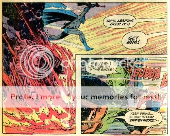
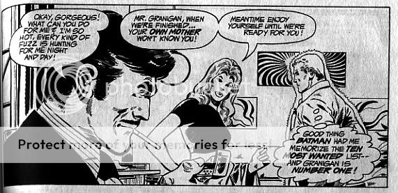
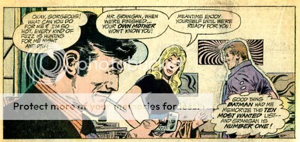
The panel below is improved too, I think; in black and white it’s not clear where your eye is supposed to go. With the yellow and red added, the contrast is much clearer. I love the way the car is turned more or less red to match the flames, so you have basically a few solid areas of color; yellow, black, red…and even white, as the speech bubbles are nicely incorporated into the aesthetics of the image as well. It emphasizes the stylization of the flames and of the truck…and really of the whole composition. It has a poster art, almost constructivist feel.
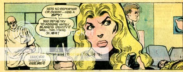
Everything doesn’t work equally well. The color on the lips here makes Lilly (the woman in the center) look oddly unnatural.
Though, on the other hand, I think the color helps add to her dyspeptically fierce expression here:
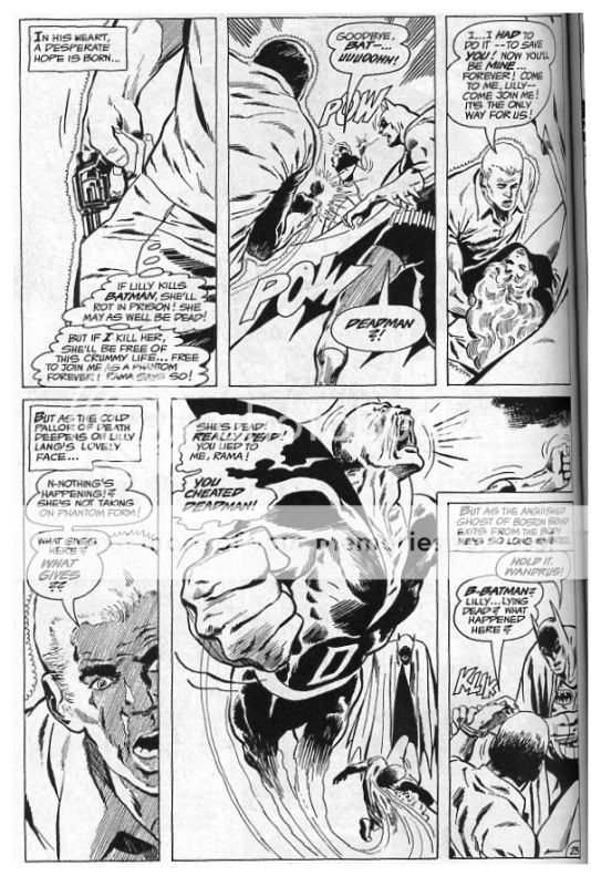
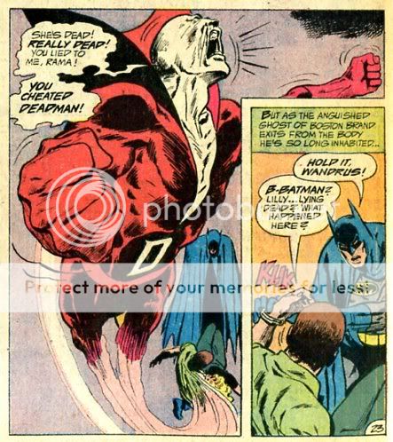
And I love the way the touch of red shading makes Deadman’s path out of the body here more solid; it’s almost like he’s at the end of a twisty ectoplasmic fabric; an effect which is present, but more muted, in the black and white:
So the color was quite successful overall, I think. Things really were better back there in the days before computers….


Sweet post! I really would pay a few bucks more for color in those phonebook editions myself. Plus: where’s the letters pages? And the ads!
The colorist: Tatjana Wood?
I remember that alot of the really good coloring jobs in that era were by her.
Can anyone confirm this? If so, let’s go have a drink, you are as big a geek as I.
O the brain cells that never learned any kind of mathematics retain this information and yield it up gladly.