Maus and Marketing

This is probably my least favorite page in Maus.

maus_2_038

This page doesn’t have the design problems that I taked about over here, and, which Mahendra Singh elaborated on.
 

11-page-from-Maus-I-650x948

 
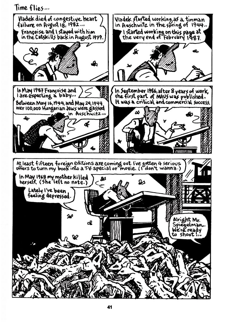
The second page is cramped and confused; the first is not a masterpiece of design or anything, but the simple four panel grid at the top is effective; the flies the visual tip off to the gruesome reveal of the corpses around the drawing board.

What’s interesting, though, is that, while one is sub-competent and the other is effective, both use the same basic formula. You also see it here:
 

the-complete-maus-art-spiegelman-edicion-25-aniversario_iZ20XvZxXpZ4XfZ133298867-449709627-4.jpgXsZ133298867xIM

 
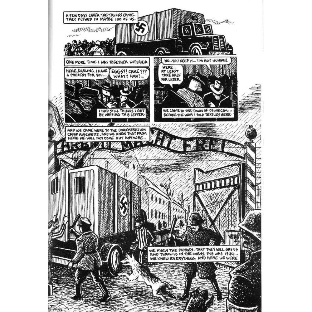
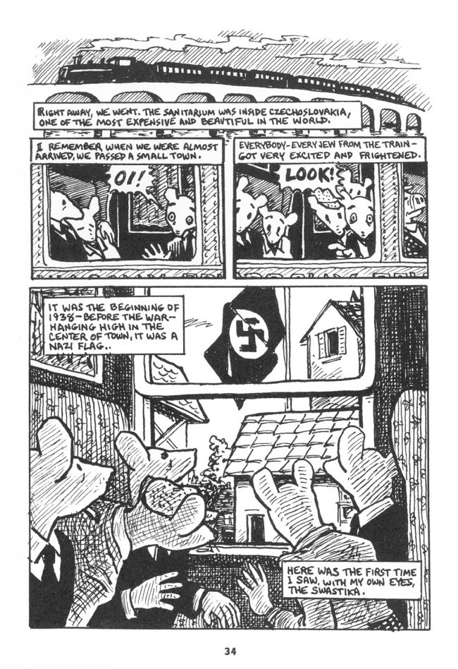
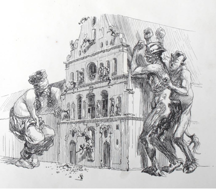
In each, the page is set up as a reveal. The top visuals keep your eyes focused on neutral images, and then the bottom opens up into the horrible truth. That horrible truth is always the same truth; namely the Holocaust, symbolized with a crude obviousness either by the (poorly drawn) Nazi flag, or the Auschwitz gate, or (most viscerally) by a huge pile of dead bodies. the importance of the Holocaust is emphasized each time both by its position as revelation, and by its scale. In his page design, Spiegelman tells us, over and over, that the Holocaust is huge and that it leaps out at you.

That is not, I would argue, an especially insightful take on the Holocaust; it turns it into a pulp adrenaline rush. Those pages each seem like they’d work as well, or actually better, if you substituted Dr. Doom for the Holocaust in each case. IF you’re going to set up a supervillain behind the curtain melodrama, best to be talking about an actual supervillain. Hollywood effects work best with Hollywood content; trying to add drama to an actual genocide comes across as cheap and presumptuous.

Interestingly, Spiegelman himself is somewhat aware of this, and on the page I’ve shown here, and in the following page, he tries to address it.
 

maus_2_038
maus_2_039

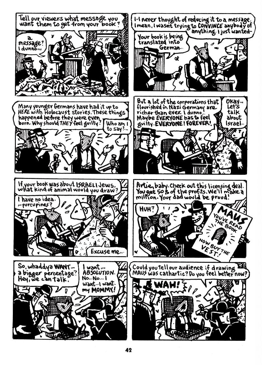
Spiegelman here is discussing, and decrying, the Hollywoodization of his book. These pages are from the second part of Maus, after the first part had gone the pre-Internet version of viral. The “reveal” of the final panel is both of the corpses and of the book’s success — the foreign language editions, the TV and movie offers. You could see the bodies as symbols of Spiegelman’s innocent alt-comix purity — a kind of spiritual death, underlined by the reference to his mother’s suicide. The off-panel declaration that “We’re ready to shoot!” links the media explicitly to the Nazi murderers; Spiegelman, as tortured artist besieged by popularizers and reporters, is positioned as a tormented victim of the gas chambers.

Defenders of Maus will no doubt argue that these pages are ironized. For example, Eric Berlatsky (that’s my brother!) writes:

Spiegelman is sure to implicate himself when he depicts Artie at the outset of chapter two of Maus II. Sitting at his drawing table, in front of television interviewers, Artie discusses the commercial success of the first volume of his book while sitting atop a pile of anthropomorphic mouse corpses. He is depicted not as a mouse, but as a man wearing a mouse mask, performing Jewishness for commercial gain. The simultaneously humorous and threatening depiction of the American advertiser offering a license deal for Artie vests (“Maus. You’ve read the book now buy the vest!” [42]) indicates how Artie (and Spiegelman himself) uses the past not merely to recall it in the present, but for his own profit and on the backs of the Jews his book is purportedly “remembering.” Artie displays a questionable connection to the past in order to participate in the circulation of power and profit.

Eric, then, suggests that Spiegelman is intentionally undermining himself; that he’s implicating himself in the marketing of the book and the performance of Jewishness.

I’d agree that the page raises the questions that Eric discusses. But is the effect really to undermine Spiegelman? The sympathy in that second page remains resolutely with Artie, who is being “shot.” He is the sensitive artist/victim (reduced to actually infantilized crying at the end) while callous reporters and interlocutors try to make a buck or score stupid points off the corpses stacked around his desk. The shallowness and duplicity of the media is emphasized by Spiegelman’s use of masks here; because they are drawn in profile, where we can see the mask-strings, the reporters comes across as macabre and deceptive.

Spiegelman is drawn in profile on the first layout, too. You’re in his head though, and he’s alone; it doesn’t feel like he’s concealing something, but like he’s trapped; the mouse mask victimizes him, and connects him to the dead victims (who aren’t wearing masks.) And then from that bottom reveal and through the next page, Artie is drawn mostly looking out at the reader; you can’t really see the mask. It’s as if the dead bodies have made him a “real” Mouse. In addition, the presence of the reporters ends up being validating; the contrast between their clear masks and his “natural” features shows clearly who has the right to speak — they’re crass desire to commercialize the corpses around his desk positions Artie as feeling caretaker; the only one who truly understands the horror. Thus, the dialogue is mostly the reporters asking aggressive questions and Artie as genius artist undermining them with wit and humble brag, followed by sensitive breakdown. The low point is probably when Artie blithely suggests he would draw Israelis as porcupines — a smirking one-liner that both dismisses the very real problem that Israel poses for Spiegelman’s Jews-as-mice-as-victims metaphor and glibly ties into ugly Zionist narratives positioning Israeli aggression as righteous defense.

The real failure of these pages, though, is Spiegelman’s utter refusal to grapple with his own responsibility for the commodification he’s supposedly decrying. IF you really don’t want your Holocaust story to be easily consumable, there are ways of doing that, from Celan’s impenetrable poems silence to Philip K. Dick’s oblique, quiet puzzle-box The Man in the High Castle. The critical and commercial success of Maus is not an accident; it’s the result of the deliberately unchallenging way in which Spiegelman presented the material. And that makes his wailing about the burden of success (which he, again, explicitly compares to the horrors of Auschwitz) insupportably presumptuous. The page itself, with its build-up to the big gothic reveal, uses pulp tropes to dramatize the Holocaust. The quite clichéd juxtaposition of feeling artist and unfeeing reporters/media is also an easy cultural narrative. Even the revelation of Spiegelman as man, rather than as mouse, doesn’t so much undermine the iconography (we still get the shock of anthropomorphic corpses) as it shows us the hand behind the image. Tortured genius is hardly a new marketing meme.

In short, Maus, in numerous ways, is an effort of deliberate middle-brow popularization. And part of that popularization is the elevation of Spiegelman himself; the genius interpreter, speaking from his pain as corpses overwhelm his drawing board. The bitter irony of Maus’ success is that the book’s defenders end up in the position of Spiegelman’s masked Nazi-like philistines,scrabbling joyfully amidst the corpses. And from the pile, finally, they lift Artie himself, circled by flies, the genius who realized that if comics marketed genocide, genocide in return would market comics.

The Good Draftsman: Of Mice and Men

The word “draftsmanship” is the loud, boozy, best-friend’s-sister of the artistic lexicon; available to all, understood by few. It’s a word which has come up in recent reviews of Art Speigelman’s exhibit at the Jewish Museum in New York. Some critics have raved over Speigelman’s draftsmanship, others have pooh-poohed it. The word itself seems misunderstood by some readers and critics or perhaps its older meaning is no longer even applicable in modern comix and illustration.

Draftsmanship is the quality of someone’s drawing (not just their rendering or painting). Like many qualities, it is not strained, it droppeth as the gentle rain of heaven and soaks the pages of both those that give and those that take. There is both good and bad draftsmanship and here’s the crux: how do you tell them apart?

In our post-modern, relativistic times, where nothing is certain except the fact that nothing is certain, readers of a philosophical bent will spit up their breakfast pablum at the implications of the above question. My reply to them is simple: if you refuse to make judgements, that in itself is a judgment and you’re probably oppressing someone, somewhere with your double-plus-judgemental refusal to make judgements. Naturally, my own judgements are non-judgemental, that’s the temporary prerogative of all soapboxes. I have no doubt that many HU readers will bring their own, equally sturdy soapboxes to the party later on and deliver some equally non-judgemental counter-judgements.

Good draftsmanship is an accurate, visually logical and harmonious depiction of reality. No genuine, long-term success in drawing is possible without first mastering realistic figure drawing, no matter how symbolic the style. The ability to make a human being look human or a horse to look horsey or a Princess telephone to look princessy — regardless of the level of symbolic distortion and compression — that is the basis of superior draftsmanship. But that is only part of it.

Draftsmanship is not just making clean contour drawings, and it is not at all about copying photographs. Good draftsmanship is the harmony, accuracy and design of reality processed through the eye and expressed through the hand. It can be as telegraphically crisp as a Japanese ukiyo print or as exuberantly messy as one of Blutch’s brilliantly inked pages.

Blutch_MilesDavis
Blutch: Miles Davis

Good draftsmanship means that everything looks good, even when it looks ugly. This is where things get slippery. Our eyeballs operate by the logic of a non-verbal grammar and a good drawing is always, without exception, “spoken” in this abstract language — otherwise it is visual gibberish. I think that for comix readers and critics — many of whom seem to prefer using literary techniques to analyze comix — this concept is a head-scratcher. Perhaps this is one reason why so few artists write comix criticism; the verbalization of visual rules for even a professional audience is tricky, for a general audience it’s nearly impossible at times.

So, in art-school parlance, good draftsmanship means depicting reality with complete design fluency on every level. Any symbolic compressions of reality are designed so that the trained, so-called good eye is always satisfied by the parts and the sum of the parts. The core mark is always reality.
 

11-page-from-Maus-I-650x948

 
In any case, let’s look at a page from Maus, a page specifically posted by one critic as an example of the high quality of Spiegelman’s exhibit. Maus is many things, most of them good … but the draftsmanship is not.

The drawing of individual elements, such as the mouse-heads, is ungainly, even for cartooning. It is not that they should look more like real mice, that would be silly. The shapes/textures/lines are all where they should be to facilitate general navigation but they seem somehow squeezed into place. Taken individually, many of the shapes are inelegant and unsteady and note one thing: there are precious few lines of beauty.

Much of the detailing — clothing, hands, shading — is turgid and clotted, an effect exacerbated by the mono-width linework. Monowidth line-work needs air to breathe, and if you must cramp it, it must be fastidiously designed on every level, not just the over-all page level.

The rendering of volumes necessary to show the thrust of objects in space is often crude … example: the far-left mouse in the final panel needs his cheekbones and orbital bones indicated fluently. Yes, it’s a cartooney mouse but then why is it hatched? It would have been better to use a few simple interior contour lines to delineate the subsidiary planes.

In general, if one wants to use a weak, monotone contour system with fast, cursory crosshatching, the accuracy of shapes must be perfect. Here, the optically long lines (mostly describing backgrounds) are trembly and indecisive, the curved lines (mostly describing animate objects) lack the snap and bravura of the classic line of beauty. With pen and ink, one must always make a decision about how much of the hand’s presence should be visible on the page. You can go the slow Hergé route and hide the hand entirely or you can take the fast Herriman route and let the hand’s muscularity and nimbleness run amuck. Spiegelman’s inking style favours expressiveness but his draftsmanship betrays his aims. His hand is going faster than his eye can think.
 

kley1

kley2

 
Heinrich Kley comes to mind as the successful epitome of this style of draftsmanship (see the two illos above). His hand is nervous but his eye is confident, thanks to his draftsmanship, his mastery of reality. In Kley, one senses the shape governing every line, even if the line is still searching for it. His hand is confident of the eye’s automatic guidance. Shapes and lines are rhythmically linked — a basic tenet of good visual grammar.

But in this Spiegelman page, the shapes are not “magnetizing” the lines in the same way, his nervousness stems from a lack of confidence in internally visualizing the reality being described. Roughly speaking, the visual, reality-based grammar governing the naturally pleasing agreement between contours, volumes and lines is too weak to please the eye consistently.

Spiegelman is not a superior draftsman, and I doubt if he himself thinks that he is one. Frankly, who of us are really good draftsmen? Not I … and it is not even necessary for Spiegelman’s purpose. He has made a living in the publications field for a long time and knows the score: do the best page you can at the time and above all, make it fit the story. There are better looking pages in Maus and in other works of his.

In fact, his usual style of story-telling does not require good draftsmanship and in a work such as Maus, a certain visual crudeness is more emotionally effective than a cleaner, crisper hand would have been.

Spiegelman’s work has never been about draftsmanship anyway, he’s a verbal illustrator, especially pre-Maus. He is also, to the eternal gratitude of everyone who makes comix in North America, the guy who made us at least semi-respectable to both a better class of reader and the people who send us royalty cheques. Younger readers have no idea how difficult it was to get the NYC suits to take you seriously before RAW began cracking the glass ceiling.

Most American golden and silver and iron-age corporate comix were nothing more than the step-and-repeat of modular, symbolic marks designed to rubberstamp the reader’s eyes into a stupor. Draftsmanship took a backseat to speed. And the draftsmanship of many contemporary comix is even more laughable in its absence. Too many North American comix are made by talented writers who cannot get into print by writing alone and must take up cartooning to tell stories. And the bar for comix submissions is lower than other fictions simply because the bar for visual competency is often set by non-visual editors, readers and critics.

Cartooning is now the default mode of drawing in North America, in both illustration and comix. It’s cheaper to purchase because it’s easier to execute and doesn’t require expensive, specialized training. And most cartooning is poorly drawn since the level of symbolic reduction is usually so extreme that the slightest defect is multiplied ten-fold and spoils the entire effect.

In any case, as I get older and crankier, I care less and less for the stories and thematic concepts of most comix, I look at only the pictures. My Holy Grail is a sequential art where the drawing is the meaning* as much as the story or words, perhaps even more so, to the point where the visual grammar will express a story in its own universal language. In fact, sequential art is the only popular visual art form which has the potential to utilize draftsmanship at this level, to make the medium and the message precisely the same. Music, architecture and dance still do this regularly. Why not comix?

*I think that Matt Madden’s experiments in constrained comix, his Oubapian work, is a major step in this direction. The implications of what he and others like him are doing may result in comix evolving into genuinely visual, absolute art at last. And to those that think that contemporary gallery art has this absolute value, I beg to differ. Any visual art form which requires a verbal explanation to understand the “message” is not visual art at all.
____
Mahendra Singh’s website is here.

Abortion and Violence

This first appeared a while back on Splice Today.

Abortion is an act of violence. There’s not really any way to get around that. Therefore, if you oppose violence, you should oppose abortion — or so Ross Douthat argues in his column a bit back at the New York Times.

Douthat focuses specifically on the recent media flurry around Kermit Gosnell, a doctor in Philadelphia who specialized in gory, late term, unsafe abortions. The left wing and feminist media had covered Gosnell extensively, arguing that he was a horrible, bloody example of the results of Pennsylvania’s tight restrictions on late-term termination of pregnancy. Mainstream meida, however, had been less interested in covering the case. In Douthat’s view, this was because the mainstream media knew that its viewers would be horrified and disturbed by the details. Douthat argues that feminist and committed pro-choice advocates have made their peace with the violence of abortion. Others, though are more conflicted. For those in the “mushy middle” as Douthat says, the revelation of the brutality of abortion is off-putting — and so the mushily pro-choice mainstream media avoided the story.

Or, as Douthat sums up his argument:

To respond effectively to the doubts about abortion that fetal snipping summons up, pro-choice advocates would need arguments that (to rephrase Senior’s language) acknowledge and come to terms with the goriness of third-trimester abortions while simultaneously persuading the conflicted and uncommitted of their validity, and that somehow take ownership of the “violence” and “gruesomeness” of abortion (to borrow Harris’s words) without giving aid and comfort to the pro-life cause. And in the absence of such arguments, the pro-choice response to Gosnell feels either evasive and euphemistic, or else logically consistent in ways that tend to horrify the unconvinced — and in either case, inadequate to the challenge his case presents to the cause of abortion rights.

I think Douthat’s argument is right as far as it goes. Gosnell highlights the violence of abortion, and when people see that violence, they are repulsed.

What Douthat fails to note, though, is that restricting abortion is also violent — and sometime gruesomely so. Pregnancy is an intimate and difficult process; birth, as even men are aware, is extremely painful. To force someone to carry a baby to term and give birth against their will is to subject them to months of coercion ending in terrible physical pain. In extreme cases, as when the mother’s life is endangered by the pregnancy, refusal to allow abortions can be a death sentence. In cases of rape or incest, the outlawing of abortion can consign a woman to hideous, inhuman psychological trauma.  This is why Todd Akins and his ilk try to deny that abortion from rape can occur — because, if they once admit that it can, the cruelty and violence of the radical pro-life position becomes painfully clear.

Douthat suggests that the mushy middle would be moved to oppose abortion, or at least late term abortion, if it only understood how hideous and violent the pro-choice position is.  One might argue, on the contrary, that if the mushy middle really thought about cases of rape or incest or where the mother’s life is threatened, they would see how hideous and violent the pro-life position is. But the truth is that the abortion debate has been going on for a really long time; pro-life groups have fully publicized the violence and gruesomeness of late term abortions; pro-choice groups have fully publicized the violence and cruelty of denying abortion in cases of rape or when the mother’s life is threatened.

The mushy middle remains the mushy middle not because people don’t understand the violence, but rather because they understand that, on this issue, there is no escape from violence. On the one hand, there are dead fetuses; on the other, there are tortured women. Douthat suggests we can have clean hands if we step away from the first…but that’s only because he’s ignoring the second. Those in the mushy middle may not have thought about the issue as much as he has, but their confusion and ambivalence seems considerably more honest.

This is why, now, as ever, the best approach to abortion is to make it, wherever possible, unnecessary — by making contraception easily available, by providing sex ed, by improving social services so that raising children is not such an economic burden. Once a woman is pregnant with a child she does not want, your only option is to use state force to inflict violence against an actual human in the name of preventing violence to a potential human.  I’m pro-choice in pretty much all circumstances, but I understand why some people come down in a different place. Douthat, in his column, quotes several pro-choice writers acknowledging the violence of their position.  I wish Douthat was honest enough to acknowledge the violence of his.
 

Abortion Anniversary