Upstream Color: Less Than Meets The Eye

upstream_explainer5

Almost a decade ago, Shane Carruth’s film Primer took the Grand Jury Prize at Sundance.  Shot for only $7,000, and looking like at least a million bucks, Primer was a low-key, hyperrealistic take on the time travel film in which two friends invent a machine that allows them to go a handful of hours backwards in time.  They end up playing the stock market and becoming increasingly paranoid and sociopathic, betraying first their business partners and then each other.

Primer is a textbook “has potential” movie.  Written, directed, produced by and starring Carruth, it displayed a great command of atmospherics and visuals while not quite working as a story. All time travel narratives must eventually either cheat or collapse under the weight of their own paradoxes, and when Primer eventually falls, it falls hard into a swamp of incoherence that borders on incompetence. Yet the movie seems to add up to something at the end, and is shot and edited in a fashion that makes it appear as if the filmmakers understand what is going on, even if you the viewer do not. This led many to mistakenly infer that Primer was smarter than they and anoint it a deep and meaningful film. Still, it was a first film, and made for next to nothing, and showed that Carruth was a filmmaker of promise. It also helped give rise to a new strain of low(ish)-budget, small-scale, personal science fiction films.  Films like Brit Marling’s Another Earth or Duncan Jones’s Moon were both better than Primer, but it’s hard to imagine either would’ve gotten the attention they did without it.

Now Carruth is back with Upstream Color, another low budget, contemplative science fiction movie in which he wears even more hats, directing, writing, starring, cinematographing, composing, casting and designing the film. Upstream Color is a rare beast, a true auteurist science fiction work where every detail is the result of one man’s vision. It also demonstrates conclusively that Carruth’s skeptics were right. Upstream Color is ultimately an empty experience that squanders an interesting premise on meaningless beauty and mood.

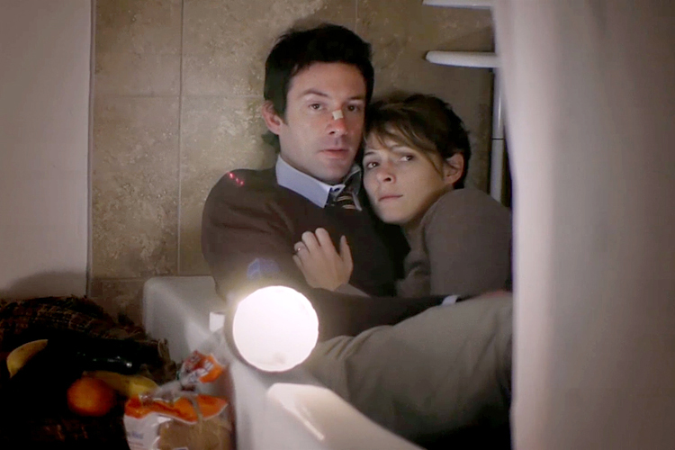
Upstream Color is about a parasite that goes through three different life cycles. In the first, it’s a small white worm growing in plants. In the second, it grows inside humans, making them, in the immortal words of Khan Noonien Singh, highly susceptible to suggestion. In the third, it grows inside pigs.  When the film opens, we see a man (he’s billed simply as “Thief”) cultivating the plant-stage parasites. He drugs a woman named Kris and infects her with it. Thief uses his total control over her to force to do all sorts of ponderous stuff like writing down passages of Walden on pieces of paper and then making paper chains of them. He also cleans out her bank account and gets her to pull all the equity out of her home and give it to him. Sometime later, a man billed only as The Sampler uses low frequency sound waves to summon her to his farm, where he extracts the parasite and puts it in a pig.

Soon, having lost everything and gone to work at a copy shop, Kris meets and finds herself mysteriously drawn to Jeff, a disgraced businessman who works for a hotel chain. Jeff, of course, is a victim of Thief as well, and we soon learn that their parasites were put into pigs who have since mated.

This is not a bad premise for a sci-fi film. Mind control parasites are, of course, an old saw, used in everything from Star Trek to Bodyworld to Fringe, but the added side-effect of the human-pig connection is a nice twist. One could imagine any number of things that could be done with the idea, from a Dickian paranoid parable of loss of control in love to a Michael DeForge freakout about the human body, to a searing indictment of the food industry.

Upstream Color decides that the best thing it can think of to do with this idea is to have Kris and Jeff fall intensely, cinematically in love, which is to say they stare at each other in intensely lit locations, sometimes breaking from this to either have emotional breakdowns or say ponderous bushwa into the ether. Then it digresses into a long segment featuring The Sampler wandering around nature recording various sounds and turning them into musical notes and spying on people (apparently he can turn invisible). In the end, Kris and Jeff are able to defeat The Sampler through means that make no sense but prominently feature a quinoa salad, retrieving rocks from a swimming pool, and more quotes from Walden. After killing the Sampler, they track down all the other victims of the parasite and start a cooperative farm.

Carruth tries to save the rapidly-deflating soufflé of Upstream Color’s plot by shooting the whole thing like The Tree of Life, constantly cutting between images, highlighting subjectivity, using deep-focus, voice-over, and a rapidly circling camera to overwhelm the viewer with beauty.  The problem is that, love it or hate it, The Tree of Life is actually about something and the cinematic techniques on display in the film are part and parcel of the philosophical inquiry into which it entersUpstream Color, meanwhile, is deploying these techniques to paper over a fundamental emptiness, just as Primer deploys the climactic-montage-with-recycled-voice-over trick of The Usual Suspects and The Sixth Sense to make it seem as if it’s headed towards some kind of revelation in its conclusion.

In many ways, Carruth might better be understood as a composer who works with images than an actual filmmaker. But as the film defaults to mood every time it should head towards meaning, the various gestures begin to feel manipulative, cynical rather than creative. As the friend I saw it with quipped to me over e-mail, “it was like a bad and spooky techno arrangement which seems at least to have the benefit of ambiguity until you realize it’s a cover of Riders On The Storm.”  Upstream Color, then, exists at the intersection of The Beauty Problem and The Weird Shit Problem. Like a lot of so-called experimental art, it substitutes compositional beauty and oddballity for substance. It has the perfect alibi, “you just don’t get it, man,” which is, in its own way true. You don’t get it, man. There’s nothing to get.

Comics Tourism: Destination Brussels

IMG_6257

 
If you are at all serious about the comics medium and you have not visited and/or thought about visiting Brussels, you should really start to reconsider your thinking. It’s one thing to read that Belgians regard Bande dessinée (BD) as an important artform and it’s another thing entirely to actually experience a mature, mainstream comics culture firsthand in a European setting that’s more alike than alien to an American visitor.

It doesn’t matter if you don’t speak French and it’s probable that you don’t speak Flemish, either. But because the country is bilingual, most signage is printed in English (and often in German as well) on the theory that it’s just as easy to print things in three or four languages as it is to print in two. English is prevalent because of the sheer variety of international visitors – Brussels is the capital of the EU, the headquarters of NATO and is a major international banking, business and convention center. Still, learning another language because you want to has the net effect of making you look less jingoistic and xenophobic than your peers and it opens up an entire world of comics you probably know less about than you think.

Brussels bills itself as the capital of the ninth art, but it was also the epicenter of the Art Nouveau movement. Several prominent Art Nouveau architects designed buildings in and around the city center that still stand. One of the more famous architects was Victor Horta, who designed a wholesale fabric store that now houses the Belgian Comic Strip Center. Lovingly restored in the 80s and beautifully maintained, the building is a work of art in and of itself.
 

IMG_6260

 
The museum features a permanent exhibition about Herge and Tintin, along with exhibits on other prominent Belgian creators, most notably Peyo and EP Jacobs. The top floor is dedicated space for rotating exhibitions – it’s currently dedicated to a retrospective of Willy Vandersteen and a celebration of the 75th anniversary of Spirou. The reading room contains over 3,000 albums and is open to anyone who has purchased admission to the museum. The museum bookstore is fantastic and has token English, German and Spanish sections. If you only have time to visit one thing in Brussels, this should be it.
 

IMG_6139

 
Scattered throughout the city center are a variety of BD-related murals that have been commissioned by the local government, private businesses and associations. These murals are indicated on maps that are handed out by the Brussels tourism board and they are considered to be a major tourist attraction. The city center looks huge on the map, but the blocks are not very big and are very walkable; wandering around looking for murals is a great way to see a large part of it.

Many of the major characters created by Belgian artists are featured in these murals, but Tintin shows up more often than most. Herge is the favorite son of Brussels and is easily one of the city’s biggest claims to fame. There is an entire Herge museum found just outside Brussels, not far from Herge’s house. If you are a Tintin fan, it is very easy to gorge yourself on the character – the Tintin Boutique is just around the corner from the Grand Place de Bruxelles and features every Tintin related piece of merchandise you could ever want, including (but not limited to) towels, dress shirts, figurines, framed prints, stuffed animals, keychains and playsets.
 

IMG_6265

 
My favorite part of the BD culture in Brussels is the sheer number and variety of stores. From the random boutique book store in the St Hubert Gallery that had Jordan Crane, Alec Longstreth and a translation of Duncan the Wonder Dog to the big stores on the main drag, BD seems to be everywhere. The local FNAC store (sort of like Best Buy, with much less emphasis on household appliances) had more space dedicated to BD than it did to either DVDs or CDs.

The real destination stores, however, are Brüsel and Multi BD. They are obviously aimed at different demographics and approach the sale of BD in completely different ways. Brüsel has a gallery in the basement and top floor and seems to have a much more curatorial approach to what they sell – they don’t try to have everything in stock, just those things that they think are worthwhile to carry. They also have comics in English, Spanish and German as well as the obligatory Flemish.
 

IMG_6390

 
Multi BD is a lot more comprehensive and is your go-to destination if you are looking for book three of that fantasy series from Dargaud that you cannot seem to find anywhere else. Interestingly, Multi BD seems to have a better selection of alternative/small press comics in both English and French than Brüsel does – and places this material right in the front of the shop as the first thing that a customer encounters when they walk in the door.

Neither of these is in the kind of space where you’d find the local Games Workshop franchise – both occupy two fairly large storefront spaces on a major thoroughfare and are within easy walking distance of each other. And neither seems to be hurting for business. More importantly, their primary demographic is not children, but adults of all genders with money. The market is centered around 48 page hardbound albums (although there is a greater flexibility in formats than there used to be) which tend to run about 12 Euros apiece and go up in price relative to the page count.
 

IMG_6364

 
Another shopping destination is the Comics Village on the Grand Sablon, which features a store downstairs and a pretty good restaurant upstairs. If you go here, make sure you buy your books after you eat, to take advantage of the discount. The book selection here overlaps what you can find at Brüsel or Multi BD, but is much less robust and aimed at a much more general audience, as you would expect from a venue that markets itself as a theme restaurant and sidewalk café that happens to have a store. They also have copies of Tintin lying around in the restaurant so that kids have something to read while they are eating lunch.

What I found most interesting about all of these stores is that it’s easier to find manga than it is to find American superhero comics and there is usually a better selection of the former. Manga often gets its own prominent corner while American superheroes generally get an out-of-the way shelf. Other English-language comics are found in translation more prominently – Strangers in Paradise, Prophet, Whiteout and Making Comics – to name only a few titles. It is almost as if these stores considered superheroes to be just another genre instead of the foundation of the market and stocked them accordingly. Also of note: American floppies are almost completely absent, probably because graphic novels fit the local buying patterns better.

The other place to look for BD in Brussels is among the used bookstores along the Rue du Midi – only a few blocks from Multi BD and Brüsel. Most second hand bookstores have a large selection of used BD albums which are worth flipping through, if only to see the sheer volume and variety of material that you have never heard of (often for good reason). Along the same street is Le Dépôt, a used bookstore that is entirely dedicated to BD. Here, more than anywhere else, I got a real sense of the depth of the French BD market and how much of it was completely unknown to me. As with the best stores of this kind, it is entirely possible to spend hours lost in the stacks, constantly surprised by things you had no idea could be considered commercial.

Once you have exhausted all of the obvious options, one of the more off the beaten path attractions is a house that was also designed by Victor Horta called Maison Autrique. This townhouse is now a museum that has hosted a variety of small, comics-related exhibits. The whole endeavor of restoration and curatorship of the townhouse is obviously a labor of love and among those lovers are local creators François Schuiten and Benoît Peeters. Albums from their Obscure Cities BD series is available in the museum’s blink-and-you’’ll-miss-it bookstore and there is a major callout to one of the characters in that series hiding in the attic of the house. Schuiten’s artwork is heavily influenced by Art Nouveau and he has also authored a book with Lonely Planet that suggests possible walking tours of the city’s architecture. It is possible to get a greater appreciation of their work just by wandering around the more beautiful buildings of the city – including this one.
 

Schuiten

François Schuiten, from the Belgian Comic Strip Center

 
More than anything else, what Brussels offers a world-class city that features comics as a foundation of their tourism and local identity year-round and not just for a week a year. What other city does that? Besides, they sell fresh waffles in the streets and have good beer. And make sure you try the mussels.

Oddity: Uderzo and Jacobs

The Frenchman Albert Uderzo attained international fame as the cartoonist half of the team that produced one of the most successful comics characters of all time: Asterix the Gaul. Prior to drawing Asterix, however, Uderzo had spent some 15 years drawing other characters — most of whom are presented in this montage:

albert-uderzo-personnages-11

Wait a minute… up there in the right-hand corner…that blue-clad superhero looks suspiciously like an American character, Captain Marvel Jr., as published by Fawcett Comics in the U.S.A.

What gives?

It seems that in 1950, the Belgian comics weekly Bravo (fl.1936 — 1950) licensed Captain Marvel Jr. and decided to create its own stories:

The serial ran for sixteen issues and was seen no more. Here’s some of Uderzo’s original art:

au

Young Albert Uderzo

Bravo was also responsible for another odd artistic pairing.

In 1942, Bravo was serialising the famed comic strip creation of Alex Raymond (1909–1956), Flash Gordon. Belgium was then under Nazi Germany’s occupation; so when Germany declared war on the United States in 1941, the supply of strips from the U.S.A. dried up completely. This was awkward, as Bravo was right in the middle of a storyline. So Bravo commissioned another artist to finish the story, and five final episodes were written and drawn — after which, the occupiers banned all American comics outright. A sample of this ersatz Flash:

Nazis and Fascists had an ambiguous relationship to American pop culture. On the one hand, they officially loathed it for its cosmopolitanism, its supposed degeneracy.

Typical is this German poster attacking degenerate (‘entartete) music, i.e. jazz; note the Star of David on the stereotyped Negro’s lapel:

entartete-musik-poster

And yet…the German army, the Wehrmacht, had its own official touring jazz bands! American pop culture continued to be prized, and the authorities had to make uneasy compromises.

For instance, Mussolini’s Fascist government once banned the Popeye comic strip. but the popular uproar of protestation was so intense that soon the adventures of “Braccio di Ferro” returned to Italian newspapers.

And Hitler’s favorite movie, reportedly, was Disney’s Snow White, of which he owned a personal print. Indeed, the popularity of Mickey Mouse and company was so great in Germany that Nazi propaganda circulated the  notion that Walt Disney wasn’t American, but Spanish!

To return to that faux Flash Gordon: the author? Edgar P. Jacobs (1904–1987).

62191

Edgar P. Jacobs

Jacobs was the creator of another tremendously successful and influential comic, after the war: Blake and Mortimer.

The blanket Nazi ban on American strips turned out to be a boon for Jacobs, as he was asked to replace Flash Gordon with an original science-fiction strip; the result was the highly imaginative Le Rayon U, a major step in his development as a cartoonist.

from ‘Le Rayon U’

Jacobs was also key in “re-looking” Tintin, the famed creation of GeorgeHergé’ Remi (1907–1983) — and the war was largely responsible for that, as well.

One  effect on comics of the war was an acute paper shortage. Herge’s publisher, Casterman, informed him that it could no longer print his usual 100-plus page albums; henceforth they were to be limited to 62 story pages; to compensate, they would switch from black-and-white to color. This set a standard format for French and Belgian comics albums that endures until today.

Jacobs standardised the pastel color schemes typical of Tintin and other “clear line” comics; he also extensively redrew the older albums for the new format. His influence on the look of Tintin is second only to Hergé’s.

herge6

Edgar P. Jacobs, Jacques van Melkebeke, and Hergé in 1944. Van Melkebeke was Herge’s editor during the Occupation, and served time for collaboration.

I hope to post on occasion other oddities of artist/subject matchups… and would be grateful for any suggestions!

John Hennings on How Country Music Got More Racist

I really liked this comment John Hennings left last week about Brad Paisley’s “Accidental Racist”, so I thought I’d highlight it here.

Noah, I agree in general with your points about this song, and I enjoyed this essay, but I think you got the title wrong. You correctly assert that country music got more racist, but you don’t explain how. At the risk of stating the obvious, I think it was an unfortunate side effect of the polarization during the Civil Rights Movement. But I don’t think that’s the whole story of what happened to country music, and I don’t think racism, per se, is the problem with the song.

You and my fellow commentators are right to point to country’s current vacuity as one source of the trouble. Country music is far from uniquely Southern and Western, but it is identifiably so. Like other forms of music from the poor, rural places, it is borne of hard times. Despite the current economic struggles, times aren’t as hard for most of us hillbillies as they were in Hank Snow’s day, so country music now has less to say. We’re also not as isolated, so country music is less distinctive.

The culture that made Jimmie Rodgers and Louis Armstrong the men they were is severely endangered. The Starbucks reference in “Accidental Racist” is a good indicator. Prosperity and progress have made the lives in the flyover states (regardless of color) more similar to those on Long Island or in Orange County than to those of Roy Acuff or DeFord Bailey. Many rural kids listen to pop, hip-hop and rock growing up. They don’t start voluntarily listening to country until they get jobs and families. Country music now talks about the responsible grown-up lifestyle more than other music, so we mature into people for whom country music speaks.

Had “Accidental Racist” been the integrated, honest modern equivalent of “Blue Yodel #9?, Paisley and LL Cool J would have commiserated over the petty politics of their homeowners’ association, or the difficulty of getting your children into the best schools. Those aren’t compelling issues, but they’re genuine.

In the South, we also listen to country because it is identity music. So are related forms like southern rock, gospel, blues, dirty south hip-hop, and gangstagrass. We associate country with our traditional culture — the slower pace of Southern life; the connection to the land; and the greater emphasis on family, community, hospitality, and faith. The attraction is even more powerful if none of those things describe our lives anymore. The irony of this nostalgia is that when we were children, the homogenization had already begun.

I grew up in classically (not to say stereotypically) rural Southern surroundings and circumstances. I love “The Ballad of Curtis Loew” maybe more than any other Lynyrd Skynyrd song. For me, that is saying a lot. The Ballad is about a homeless, black, blues guitarist and the white child who would scrounge money and defy his parents to hear him play. It could easily have happened in the racially mixed town I grew up in. In my mind’s eye, it did. It is an honest song that makes a statement about human equality. That statement may not be quite as organic or “accidental” as the statement in Blue Yodel #9, but it is nearly so, and it is neither preachy nor flat-footed. “Accidental Racist,” in contrast, seems more like the narrative of a frustrated suburbanite, awkwardly stumbling through race issues for which his primary preparatory life experiences were those very special episodes of “Diff’rent Strokes” and “The Facts of Life.”

On second thought, maybe it is an honest song, after all.

I’ll add one more word of defense for Brad Paisley. When he and I were kids growing up, white and black Southerners considered the Confederate battle flag a symbol of the South and Southern culture. More defensively, it was a badge of our us-against-them attitude toward those who believed themselves our superiors. White supremacist groups actively re-branded the flag and made it a symbol of slavery and racism. Where I lived, that took effect a little before I graduated high school, much to our vocal lament. I don’t know if that was contemporaneous with the rest of our society. This was pre-internet; we were frequently behind y’all when it came to zeitgeist awareness.

Interestingly, with the notable exception of England, Southerners in many European countries also lead simpler, more agrarian, lifestyles than their more cosmopolitan countrymen. So when football teams from southern Italy or southern Germany play their northern rivals, you can expect some fan to fly the Confederate battle flag.


images

Eric Berlatsky on Why Before Watchmen May Be (Slightly) Better Than That

B3.Eddie-caseworkerEric Berlatsky (that’s my brother!) suggested that William Leung’s post about Before Watchmen may have been (a little) too harsh. I thought I’d reprint his comments here.

I do think that, based on this, that Minutemen looks like a pretty awful piece of garbage filled with wrongheaded decisions, and aesthetic missteps. StiIl, I do think some of William’s claims here don’t stand up to scrutiny (like Irrelevant’s above). The scene where Comedian calls his colleagues a “bunch of fags”, threatens to kill them, etc. (and is then followed by the “ironic” cartoony “hero” panel-“What a Man!”) really doesn’t make Blake look positive. Rather, it suggests he is the monster we remember from Watchmen (if anything, more monstrous, since Blake has his human moments in the original). The scene in which Dollar Bill is homophobic doesn’t suggest much more than that he is homophobic (incredibly common stance at the time…and even now, believe it or not). The fact that the Minutemen cover up the rape doesn’t mean that Cooke is doing so (in fact, I think he probably assumes we read Watchmen and “saw” what really happened, etc., so any counter-claims by characters come off as patently false. Sally talks about the cover up for PR purposes in the original, I think.) I haven’t read Minutemen, am unlikely to, and don’t want to defend it, but some of the arguments made here aren’t actually supported by the evidence William himself presents, which then makes me somewhat suspicious of the other criticisms.

I can’t speak to Cooke’s portrayal of HJ and CM, and if it’s as negative as William says, then it’s an atrocity that deserves to be critiqued…Moore’s portrayal of HJ really isn’t pleasant though. In Watchmen, HJ is a sadist who gets off on other people’s pain (and not only in a consensual, we-all-agreed-to-it-beforehand kind of way), something Eddie has figured out and exploits. As William notes above, his brutal beatings of criminals is as disturbing as Rorschach’s. Is his sadism and brutality associated with his homosexuality? Maybe not directly, but it treads kind of close to some invidious stereotypes. Captain Metropolis comes off somewhat better, but is the ineffectual, passive, stereotypical “bottom” who rarely, if ever, has any depth to his character beyond that.

If anything, it would have been nice had Cooke countered these stereotypes in some way rather than deepening and exacerbating them…but I don’t think Moore’s portrayal of either of these characters is especially nuanced…and it’s often not very positive (restaurant scene notwithstanding). To be clear, I’m not saying that all portrayals of gay life need to be positive, but the gay male characters in Watchmen tend to be both shallow (drawn with broad strokes) and verging on the negatively stereotypical. The other example is Sally’s husband, whom she implies may be gay at one point in the text pieces.

The choice of having Laurie wearing smiley-face earrings, and re-enacting some of her father’s moves/actions even makes sense in some ways, since the “like father/like daughter” theme is definitely part of Watchmen (particularly in the clothes she wears…the yellow pajamas, and, at the end, the shift to black leather…reflect her father’s similar shift). Obviously, Laurie is formed by her mother and their reconciliation is touching…but the influence (genetic and subconscious) of Blake is also important to her character.

The choice of having her kung-fu moves reflecting Blake’s sexual assault of her mother is just terrible, though….even repulsive.

For these reasons, I kind of feel like Cooke IS trying to use/deepen the themes and subtleties of the original, but that he is incapable of doing so, is incredibly clumsy, etc…which leads to both a lack of subtlety and offensiveness. Moore investigates sensitive and complex issues and treats them, for the most part, with respect and insight. Based on the examples above, Cooke’s attempt to deal with those same issues seems incredibly ham-fisted, but I’m not sure I’m willing to buy the claim that it turns Blake into a “good guy”–or even an attractive anti-hero.

Maybe I’ll read it if my library gets a copy…if I can stomach it

Utilitarian Review 6/1/13

News

We have social media buttons! Check at the end of every post. Thanks so much to Derik Badman for sticking them on there.

Also…I’m going to be in San Francisco next week. So if you’re an HU reader/writer and you live in SF and would like to meet up, let me know and we’ll try to make it happen.
 
On HU

Featured Archive Post: Anne Ishii on Hayao Mayazaki and women in anime.

Chris Gavaler on the politics of Star Trek: Into Darkness

William Leung explains just why Darwyn Cooke’s Before Watchmen work is horrible. Part 1, Part 2,

Patrick Carland talks about queer resistance in Coraline and ParaNorman.

Chris Gavaler on the Great Gatsby as supervillain.

Me on the virtues of retrograde daddy fantasies in Astro City.
 
Utilitarians Everywhere

At the Atlantic I wrote about:

— whether fans own fan fiction and Amazon’s new fan fiction venture.

— how men experience sexism.

At Splice Today I wrote about:

why everyone else is so stupid

how to be a hack writer.

 
Other Links

Tucker and Abhay do their thing.

Josh Marshall on honoring traitors on Memorial Day.

Melinda Beasi on feminism in Basara.
 

basara-dreams-sm

The Boring Daddy of Astro City

In his long essay on Darwyn Cooke’s Before Watchmen work, William Leung convincingly, and even devastatingly, portrayed Cooke as a reactionary tool. Alan Moore and Dave Gibbons in Watchmen deliberately set out to undermine and deconstruct the assumptions behind superheroic archetypes and narratives. Cooke, Leung argues, set about reconstructing them. Or as Leung puts it:

Whereas Moore was interested in demolishing heroic stereotypes in order to explore the humanity beneath, Cooke is more interested in reinforcing stereotypes in order to prescribe for humanity what is and isn’t heroic. Under Cooke’s revision, a critique of heroic constructs has reverted to a defence of heroic constructs.

I am entirely convinced by Leung’s argument that Cooke’s Before Watchmen is a vile, steaming pile of shit. I’d like to make a brief case, though, that reconstucting heroic sterotypes isn’t necessarily evil or wrong-headed. Even, possibly, the “heroic power fantasy of heterosexual males”, which Leung sneers at, might in some cases be a force for good.

So if we want to discuss the virtues of reactionary nostalgic heterosexual male power fantasies, we should maybe take our eyes off of Before Watchmen (please God) and look instead at Kurt Busiek and Brent Anderson’s Astro City.

Astro City came out around 1995, it looks like — and I don’t think there’s much question that it’s in conversation, at least partially, to Watchmen. Its reaction is, moreover, like Cooke’s, reactionary. Where Moore and Gibbons show superheroes as damaged, perverse, violent psychopaths with delusions of grandeur, Busiek and Anderson return deliberately, nostalgically, to a mostly unproblematized vision of superheroes as do-gooding power fantasy. You see that from the very first page of the first issue, which presents us with that ur-super fantasy — the dream of flying.
 

astro008

 
The twist here is that the infantile power fantasy of flight belongs, not to a powerless adolescent or man/boy, but to a superhero — specifically to the Samaritan, Astro City’s Superman analog. Samaritan can actually fly himself — but he’s so busy he doesn’t have time to enjoy it. The adolescent power fantasy is doubled back and turned into an adult de-responsibility fantasy. Instead of the narrative targeting boys who wish they had the power of men, it targets men who wish they were boys. Comics, once offering the promise of larger than life abilities and adventures for children, here become a nostalgic icon of an essentially smaller than life lack of clutter. It’s not the flight that is exciting (Samaritan can fly, after all) but the space to dream about flight. The comic’s first page, in other words, is a dream of a dream — or a dream of a comic. It deliberately charges, or romanticizes, its own comicness.

On the one hand, you could say that this remythologizes what Watchmen demythologized. And it does in a way. But it’s a particular kind of remythologizing — one which is very aware, even incessantly aware, of its own mythmaking. Traditional superheroes were exciting and noble. Watchmen’s superheroes were exciting and ugly. Astro City’s superheroes are…boring. Deliberately boring. In this first story about the Samaritan, his adventures have all the kinetic oomph of a 9 to 5 desk job. A lot of the action is described in off-hand text boxes without ever being shown (“pyramid assassins in Turkey and a nasty chronal rift in Stuttgart. A lot of mid-air antics….”) Even when we do see the superstunts, it has an air of anticlimax, as in the battle with the Living Nightmare.
 

astro009

 
I really like that top right panel; Samaritan is supposed to be ducking, but he ends up just looking old and bent; some middle aged guy in a funny suit waiting for the super-villain bus. And then, in the final text block, he’s making mental notes for himself about how he’s going to have to consult a doctor “provided I survive this.”

In fact, in comparison to the low-key narrated super-heroics, it’s only the 9 to 5 desk job which comes alive. The Samaritan’s secret identity, Asa, works as a fact checker, and when he does, he actually gets to talk to people. The office chit chat seems much more real than the weirdly distanced superheroics…except for those moments when the weirdly distanced superheroics start to sound like office chit chat, as in the bottom panel here.
 

astro010

 
Unsurprisingly, Samaritan is as disconnected from his sexuality as from his dreams of freedom. Busiek and Anderson show him fact checking a story about the city’s most beautiful women, and eating his heart out because he has no time for romance in his life. We’ve gone from the sexlessness of adolescent power fantasies to Watchmen’s twisted sexuality to a sexlessness not of innocence, but of getting older and just not having a whole lot of time.

Samaritan’s heroism, his goodness, starts, then, to look like the heroism, or goodness, of going in to work and doing a job. It’s heroism as middle-aged slog; all responsibility, no fun at all.

So traditional superhero narratives show how cool it is to be a man and save everyone. Watchmen deconstructs that by showing how the desire to be a superman and save everybody is ridiculous, perverse, and dangerous. Busiek and Anderson reject Watchmen’s dour vision, and reconstruct superheroism — but with a twist. The manliness they present is a fantasy in many ways of seflessness and disempowerment. The real superhero is good, because the real superhero has no power. Comics fantasy becomes, not a pattern of dangerously empowered masculinity, but a kind of nostalgic safety valve — the dream of childishness that lets daddy be a good daddy. Superheroes become a strategy, not of validating power, but of subordinating the powerful to the good.

Busiek and Anderson’s vision of masculinity is both traditional and reactionary. Samaritan is man as responsible caretaker; boring father as heroic non-entity. No doubt Alan Moore and Dave Gibbons had a point when they suggested via the Comedian/Dr. Manhattan/Ozymandias that these uber-daddy fantasies involve megalomania and other unpleasantness. But, on the other hand, is an unhinged mass murderer really more real or true in some absolute sense than a guy with a day job? Samaritan’s dreams of flying my be unreal and even silly, but on behalf of boring father’s everywhere, I wonder if that really has to be such a bad thing.