
 Comics are both a substantial art form and a commercial industry. Thus, it is not surprising that the cover of a comic can play multiple roles. The cover is usually the first (and sometimes only) part of the work seen by consumers before purchase. Nevertheless, covers are not purely merchandising: A cover is also a part of the work of art proper, and thus should (or, at the very least, legitimately can) be taken into consideration when interpreting, evaluating, and decoding the narrative contained in that work. Given that comic book covers are often created by someone distinct from the artists who craft the narrative portion of the comic found between the covers, interesting questions arise with regard to how the content of the cover art influences our interpretation of the work as a whole.
Two questions arise immediately:
- What role should the content of the cover art play in our interpretation of the comic as a whole when the cover seems to conflict with the narrative found inside the comic?
- What role should the content of the cover art play in our interpretation of the comic as a whole when the cover references other comics (or other pictorial art)?
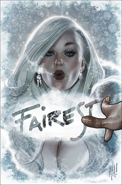
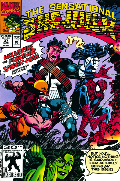 Of course, sometimes the cover of a comic is just a playful exercise in metafiction, with broken fourth walls and other types of silliness that usually (although not always) are meant to have no real bearing on our understanding of the story contained inside the comic. Such is likely the right reading of this She-Hulk cover (although,given that the She-Hulk often engages in metafictional strategies within the narrative proper, the right reading of this example is likely more complex). But in other cases, things are more involved. Let’s look at two sorts of example. The most obvious sort of case is where the content of the cover can outright contradict the the content of the interior pages. This can happen in three ways, all three of which are illustrated by Adam Hughes’ cover for Fairest #3.
- The narrative content of the cover can conflict with the narrative found in the interior pages: Hughes Fairest cover depicts the Snow Queen playfully writing the word “Fairest” on the frosted window. But this contradicts the interior content in two ways: It is unlikely that the character in question is the sort to do anything playfully, and there are no panes in the windows of her castle as depicted in the interior pages.
- The appearance of characters on the covers can conflict with their appearance within the interior pages: On the same cover, the Snow Queen is depicted with pink skin, but within the interior pages she is consistently drawn with bluish-white skin.
- The cover art can incorporate the title of the comic into the art itself (thereby implying that the characters have metafictional knowledge of the title of the comic in which they appear, and thus have knowledge that they are fictional characters). The Snow Queen’s inscription of “Fairest” on the window functions this way, while there is no indication within the interior pages that there is any sort of metafictional fourth wall breakage.
Given these sorts of conflict between cover and interior content, we are (or at the very least, I am) left wondering exactly how the content of this cover is meant to fit into an overall interpretation and assessment of the narrative. Is the Snow Queen playful, or not? Does she have blue/white skin, or pink skin? Does she know she is fictional?
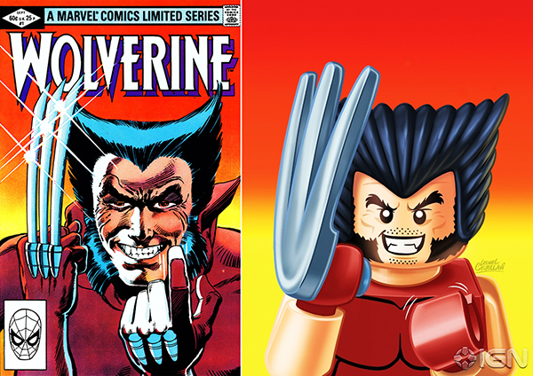 Another sort of question arises when cover artists reference other (typically iconic or important) comic covers. A particularly interesting example of this phenomenon arose with the LEGO minifig covers that appeared on Marvel comics as part of a tie-in with the Marvel Superhero LEGO sets and videogame. These covers raise interesting questions about the appearance of characters: Are we meant to imagine that Wolverine (the canonical Marvel character) temporarily looked like a LEGO minifig? Or that he could have? In short, if the cover is a legitimate part of the work as a whole, and thus provide some information regarding the appearance of the characters, exactly what information should we take from this cover?
There are other questions that arise from this sort of cover, however. The LEGO Wolverine cover references the iconic cover to the first issue of the seminal Wolverine limited series. Is this merely to be taken to be an homage? Or should we interpret the narrative within the pages of the most recent issue with the older limited series especially in mind? These questions are raised, but seem to be left unanswered, by the cover art itself.
So, how should we interpret covers in mainstream superhero comics?
Okay… often the writer probably has no input on the cover, and often a different artist is assigned to the cover than the interior. Due to this, I’d say covers should be given very little interpretive weight, though more interpretive weight is possible if the regular artist is shown to have a role in the cover.
For example on Tom Strong Todd Klein stated ” Often I created the cover copy (the words on the cover), but Alan Moore contributed the top line for this one that will provide an extra laugh after you read the issue.”
http://kleinletters.com/TomStrongCovers.html
While there’s no reason in principle you couldn’t interpret an Alan Moore story through Todd Klein written cover copy, I don’t see any reason why it would be a good idea.
As to your question “The LEGO Wolverine cover references the iconic cover to the first issue of the seminal Wolverine limited series. Is this merely to be taken to be an homage? Or should we interpret the narrative within the pages of the most recent issue with the older limited series especially in mind?”
If the narrative references the classic Wolverine series in some way, I’d say that’s fair game. That’s often the case of Tom Strong covers. If the narrative does not then it’s probably just a case of an artist drawing something “cool”.
Maybe the thing to do is to see the cover as a related work of art? Not unlike a movie based on the book. So…you could talk about how the two (comic and cover) are different, how they’re similar, how they reference each other (or don’t.)
I believe that the cover formerly served one purpose and now does another–related responsibilites, but still different in purpose.
Basically until the 90’s a comic cover was specifically designed to catch the reader’s eye and get them interested in the content of the story. You often had a clip from the interior of the story, a highlight so to speak of what was going on inside to get the reader interested enough to open the book, read for a bit and say, “wow, because of the cover, I need to find out what happens in this story.” You purchase it, take it home, read it and the questions are answered. Covers, especially from the 60s had lots of copy on them, and often had characters speaking, saying things out of context or out of character that still made you say, “Why is Superman being such a jerk to Jimmy? I better buy the comic and read to find out.” In many ways the covers were diversions or purposeful red herrings, but the intent was to get the reader to purchase to find out more of the story. Also, covers were usually done by the same person who did the interior of the comic and at that point in time, it was kind of a slap in the face for the interior artist to NOT be the one to do the cover.
Like so many things in the world of comics, that changed during the 90s. With their focus on style over substance the cover became a bigger marketing tool to just get the comic noticed at the newstand. There was a huge glut of titles, so companies had to find new and interesting ways to get their title to stand out against all the competition. Comic covers became high art, painted, digitally produced, 3-D, holofoiled, die-cut and so forth. Most of the time now, comic covers have very little to do with the actual content of the story. Most of the previous copy is gone, replaced by the names of the creative teams. Adam Hughes has ceased to be a interior artist and is now a cover artist…and it makes business sense because comics with his covers sell better than those with an artist who is less of a name, even if that artist does all the interiors. People are buying comics exclusively for the covers now, as opposed to the content.
There is a dichotomy now–as Noah states, they are only related works of art now, but we see the same thing in classic literature. The covers of Ballantine’s Thomas Hardy books come from classic art, but have no actual bearing or original relationship with the text itself. There is also an analog in the pornography business–if a Playboy cover has a female “celebrity” (including their Playmates of the Year) then that person, (with rare exception–Jessica Alba) actually appears in the magazine. If the cover has a female non-celebrity, most often than not, that woman does not appear in that issue of the magazine. If a woman appears on the cover of Penthouse, however, she almost always appears in the content of the magazine.
I am personally of the opinion that the cover should reflect the content, especially using the same artist. I hate looking at a beautiful comic cover and then seeing that the interior art is atrocious. I would much rather have a nice art book featuring the cover art than single issues with a pretty cover that I want, but lousy interior art.
In the Fairest and Wolverine LEGO examples above, the cover is just a cover–it is a gimmick to get noticed. In the She-hulk comic it actually deals with the content. The covers are both there to get noticed, but one is a signifier of the narrative and the other is signifier and signified in one.
As a kid reading in the 70s, I think I saw covers as the equivalent of advertising billboards. Or, perhaps more accurately, movie posters–the ones you walk past as you purchase your ticket. They often got a range of things “wrong,” ie the cover artist wasn’t otherwise involved in the project and so drew the scene snippet and the characters/costumes as if based on a third-hand telling of the contained narrative–which, in fact, they did. The cover, like a movie poster, wasn’t part of the reality of the story but a kind of commentary on it, a summary or variation based on it. Also, covers, even more crassly than most other kinds of advertising, openly mislead. That was part of the meta-game: how far could the cover misrepresent the content of the story without crossing some extremely very vague line of consumer integrity.
Covers are a strange beast, and the question about where they stand relative content yields a lot of answers. The best approximation I can think of would be movie posters, which are supposed to advertise/signal content (as opposed to contribute to content). That said, because the cover is attached to the content, the publisher can get away with more integration. If we extend the movie metaphor, it functions like the opening credits.
That having been said, the intertextual dimension to comic book covers seems like a way to signal membership in the fan community. As in, “Hey, you like comics and so do we, we even like the same comics, buy this!”
Oh, and I’d be remiss if I didn’t mention that back in the Silver Age, DC editors would settle on a cover and then ask writers to build a story around it.
I think Noah’s comment (and most of the other comments above that develop the idea in one way or another) is pretty much on the mark – the cover is a related work of art. But then the challenge, of course (as theorists and critics) is to determine exactly what the relationship is, and how this relationship effects our interpretation of the contents (since a reading of any work of art is usually richer for taking into account relevant aspects of related works).
I think Nate’s comment about comic narratives that are structured around a pre-existing cover (or cover idea) is particularly interesting. The famous ‘first silver age comic’ Flash cover comes to mind along these (or at least similar) lines: the content of the cover – the Flash running out of a strip of film – has little direct, obvious relevance to the story told on the interior pages (which, at best, involve metafictional interaction between the Silver Age Flash and his Golden Age alter-ego, but no metafictional elements specifically involving film). But in this case it is pretty obvious that reflecting on the content of the cover provides a richer reading of the initially apparently disconnected narrative contained in the comic.
I’m doing research for my thesis and I found this page while looking for information about the purposes or functions of comic book covers. This discussion made me rethink of the assumptions I’d made about the relationship between cover and story/characters. I wonder if you could help me. Do you know of any other articles/books/papers that deal with this topic? Thank you!