
This is the second installment in the PencilPanelPage roundtable on panel layout and Theirry Groensteen’s work (The System of Comics, Comics and Narration). Check out Adrielle Mitchell’s first installement in the series here!
 In Comics and Narration Thierry Groensteen introduces a four-part taxonomy by which we (or at least he) categorizes comics in terms of the nature and structure of panel layout. The taxonomy consists of different ways in which the payout of the panels might be more or less regular:
- Do all pages have the same panel layout (or are they all variations on a single such template, etc.)?
- Are all the tiers of panels on a particular page (or all the tiers in the comic, etc.) the same height?
- Are all the panels within a single tier (or all the panels on a page, or all the panels in the comic, etc.) the same width?
- What is the number of panels placed on each page (i.e. what is the density of the page)?
A page for which the answer to (2) and (3) is affirmative is a waffle-iron grid. Further, the more variation with respect to (2) and (3) found on a page, the more irregular the page. Factoring in (1), we also have a criterion for measuring (roughly) the regularity of the panel layout of an entire comic.
 The density of panels on a particular page – i.e. criterion (4) – while discussed at the same time as the first three criteria, is somewhat orthogonal to measuring the regularity of a page although variation in density from page to page obviously increases the irregularity of the comic in the relevant sense. Clearly, however, if the number of panels on a page varies from page to page, then as a matter of geometrical fact their layout must as well – thus, with regard to measuring regularity criterion (4) is redundant, subsumed under criterion (1).
This taxonomy is interesting, and allows us to categorize comics in terms of three distinct (although not completely independent) dimensions: the regularity of panel height (on a page), the regularity of panel width (in a tier or on a page), and the uniformity of these when considered page-to-page. Taxonomy is, of course, a wonderful tool for analysis and explanation, but a taxonomy is only as good as the explanation of, and analysis of, the relevant phenomena that it provides.
 Digression: One pet peeve of mine is the tendency of scholar in the humanities – comics scholars definitely included – who propose taxonomies as if a system of categories is an intellectual end in and of itself (and as if they are following a more ‘scientific’ methodology). A taxonomy is a tool, however, not a result.
So, the obvious question is this: Are there any theoretical questions that can be answered by attending to the complex geometrical framework for analyzing comics panel layout provided by Groensteen? Groensteen seems to think so: he argues that, in general, the more regular the panel layout, the better the comic and its narrative (all else being equal). His argument for this claim is somewhat indirect – he identifies a regularity-eschewing ‘movement’ in comics, which he calls the neo-baroque and characterizes as preferring:
… the destructuring of the hyperframe by images that bleed off the edge of the page and intrusions into the gutter, the use of multiple insets, the maximization of the contrast between large background images and the inset panels, the vertical or horizontal elongation of panels (as if to achieve a shape as far removed from the square as possible!), and the frequent stacking of very narrow horizontal panels… (Comics and Narration p. 47).
Groensteen stridently disapproves of such strayings from the waffle-iron way of truth:
It is as if the simple succession of panels was no longer deemed sufficient to ensure the production of meaning: the apparatus must become more sophisticated (or more hysterical) by piling special effect upon special effect (Comics and Narration, p. 47).
It is worth noting that Groensteen’s complaints have a bit of a Euro-elitist tone to them: He explicitly blames the neo-baroque movement on the pernicious influence of manga (pp. 47, 61) and 1980s American superhero comics (p. 47, fn. 17, p. 61).
Setting this aside, however, it is worth asking whether Groensteen could be right: Are some panel layouts (and maximally regular waffle-iron grids in particular) better suited for effective narratives than others? There are two possible questions one could ask here:
- In general, are comics better the more regular their panel layout?
- If comics had to restrict itself to a single layout, would a more regular layout be better than a less regular one?
 Groensteen seems to think the answer to the first question is affirmative, but I just can’t see how this could be the case. As many scholars have argued (and see the predecessor to this post by Adrielle for some evidence) panel layout can be carefully attuned to the type of story being told and the way in which the teller is telling it, resulting in narrative effects that are both theoretically interesting and likely unachievable by other, more ‘traditional’ means. Chris Ware’s work, for example, would be far less compelling had it been produced in a regular 3×3 grid (interestingly, Ware somehow gets a pass from Groensteen, despite his vast deviations from panel regularity in Groensteen’s sense.)
More promising, perhaps, is the second question (although it is not, I think, what Groensteen himself has in mind): If all comics had to be produced with the exact same panel layout, would a regular one be preferable? The answer here might be affirmative – it might be the case that a regular waffle-grid is neutral in a certain formal sense, so that it is amenable to functioning in all sorts of different narrative environments in a non-interfering manner (although the positive contributions of panel layout of the sort mentioned in the previous paragraph would be ruled out). Of course, certain metafictional comics that make direct use of panel layout would be impossible. But the second weaker claim regarding super-regular waffle grids does not seem immediately absurd in the way the first does.
So, are some panel layouts inherently superior to others?
I’d be interested if anyone thinks some layouts are superior to others…seems a little like asking “are some letters superior to others?” Very interesting point about the way Groensteen’s preference for the grid is about protecting European comics from the evil influence of foreigners, west and east, too.
The regular 9-panel-a-page layout of Watchmen seems to me inherently superior, not least because it allows for spectacular exceptions (the opening splashes of the last issue, the horizontal panels of the prison rescue issue.)
There are absolutely better ways to lay out panels than others. Being pretty to look at should always be subordinate to clear and unambiguous story flow.
Imagine a novel where big chunks of words are pulled out of sequence and stacked or staggered — albeit in a pleasing way — across the page. That’s what artists are doing when they jumble up panel sequences, or place panels in patterns that the eye cannot easily and intuitively follow.
There is a comics “grammar” just as surely as there is literary grammar, and if one screws around with it, they will put off more readers than impress.
Groensteen is quite cosmopolitan about comics, and has written extensively about manga, so I find the comment about his “Euro-elitist” tone a bit baffling. In general, his work is very far from trying to shore up European borders against (Noah’s phrase) “the evil influence of foreigners.” Indeed, IIRC, he has at times criticized other Francophone comics scholars for privileging a too-narrow canon of Franco-Belgian works.
That said, I find his description of the so-called neo-baroque compelling, because I think it accurately describes the reigning aesthetic in current American superhero comics and their genre cousins in the floppy-to-GN market. Indeed this passage struck me as spot-on:
…the destructuring of the hyperframe by images that bleed off the edge of the page and intrusions into the gutter, the use of multiple insets, the maximization of the contrast between large background images and the inset panels, the vertical or horizontal elongation of panels (as if to achieve a shape as far removed from the square as possible!), and the frequent stacking of very narrow horizontal panels…
McCloud’s discussion of clarity vs. intensity in Making Comics comes to mind here. Or, to take a recent example, my own puzzled, sometimes frustrated, reading of Emma Rios’s work in Pretty Deadly, with its penchant for Chaykin-style insets that IMO don’t add essential narrative info and often confuse me. These moments that court confusion, of course, also boost the intensity of the work–there’s a real “swinging for the fences” quality about it, which I find charming even as it frustrates me.
I would say, no, there is no such thing as an inherently superior layout. These judgments are genre-specific. Cue Rusty Witek’s excellent essay on contrasting “modes” of comics in the Smith & Duncan-edited Critical Approaches to Comics.
I find myself really wanting to push back on the implied notion that the waffle-grid is somehow “neutral” rather than a matter of custom and frequent use. This style has evolved over time and in our particular social and cultural context, right? It may be an effective way to convey a linear, sequential visual narrative but it is hardly the pinnacle of form and function.
The most effective comics creators shape their aesthetic and formal choices to suit the tone, characterization, and conflict and if a more experimental layout can help convey that, then a so-called neutral grid would do a disservice to the story. I think what’s really at issue here may be overuse, sloppy execution…
I see the point that R. Maheras is making, but for what it’s worth, there are novelists who *do* pull out big chunks of words out of sequence on the page – in print and even through hypertext online. But I think punctuation might be an even better comparison. Plenty of novelists over the years have dispensed with quotation marks, paragraph breaks, and other physical markers – stream-of-conscious narration, for instance – in order to convey a particular affect. (Comparisons to poetry here are also useful.) These are not just aesthetic choices and sometimes the ability to thwart readerly expectations is exactly the point.
I read the Groensteen book, and I guess I’m not so sure he sees the waffle as intrinsically better. Maybe better for the conveyance of “plot” or “narrative,” but that is not the only thing comics can do (as Groensteen discusses himself). It may be better for clarity of temporal progression, but not as great for other things. Even that is questionable, I guess, but I don’t think Groensteen is big on “preferring” certain formal features to others. He’s always talking about the flexibility of comics as a form and how different combinations of features can create different effects out of those features.
The idea that the artwork in comics should be subordinate to the story is bandied about quite often, generally in a tone as if it were the merest common sense. This
utilitarian dictum implies that the actual story exists somewhere, aside from the art- overlaid by the art, perhaps? But there is no actual structure behind the art, like some sort of a scaffolding holding up the visuals. The story is inferred/made by the reader from the art that is being presented on the page. It’s a visual art form.
The ‘form follows function’ rule is also a quietly logocentric argument, which favours the method of verbal scripting ( not to mention the element of class distinction between writer and artist about which mr. Romberger has written eloquently on this very site) and limits the medium to linear storytelling- limits it, in fact, to storytelling. As if that is all there is. Velasquez’s Las Meninas tells no story (or it tells a thousand( each depending upon the viewer), but it has something to say. Personally, i think if we want this medium to be able to bear all the artistic potential that is regularly ascribed to it, we should not be too preoccupied with the stories being told but focus instead upon what a work has to say, which, in a visual medium, is carried to a great extent by how it’s said. Hooray for oddly-shaped panels. Or do we not allow our singers inflection, diction? No singer, no song.
Hooray for oddly-shaped panels!
“Superior” here would seem to mean “invisible”, in the sense that the panels don’t disturb the transmission of the narrative. If that’s all the comic is aiming to achieve then probably a regular grid layout is the better choice. I feel the question is related to whether we’re talking about visual storytelling (where I would understand the idea that the art be subordinate to the story) vs sequential art.
Lots of good stuff going on here – I’ll just make two comments:
Qiana: While I agree that much of the formal features we expect so see in comics are conventional, I would be careful about the extent to which we view the waffle-grid itself as purely conventional – or “hardly the pinnacle of form and function”.
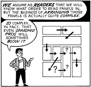
In fact, the waffle grid is an extremely good (but not perfectly maximal) answer to the following rather precise mathematical question: How can one divide a bounded region of space into a sequence r1, r2,… rn of n non-overlapping regions (panels) of equal area so as to minimize the distance between each region and the next region (i.e. the distance between panel rm and rm+1). If n = a x b, then a comics-standard a x b grid is, mathematically speaking, a really good answer to this question (slightly better: the a x b grid where we switch reading directions on alternate lines). So although it has evolved, it has evolved in the direction of a mathematically near-ideal solution.
Charles: I agree with you that Groensteen is not usually Euro-elitist in the sense I intended here (which is I think exactly the – not complimentary – sense you took me to intend). That’s why I found Comics and Narration so odd (there are lots of things I don’t like about the book, by the way – see my earlier post on cosplay on this blog, for example). He makes a big deal about trying to include comics from other cultures/traditions/etc., but when you really dig into those sections (other than his discussion of American alternative artists such as Ware) he really spends most of the relevant passages either finding such comics wanting (in comparison to European comics) or blames recent ‘excesses’ of European comics on the pernicious influence of these other traditions.
There’s nothing wrong with “oddly-shaped” panels if the eye can follow them without losing its way. It also doesn’t matter if there are 20 panels on a page, or simply one — as long as it aids in the story-telling process. The goal of a good comics artist is to combine the words and pictures into a coherent viewing experience. If the artist tries to be too clever or obscure, or simply does not understand what they are doing, the reading experiences for the majority of customers will suffer.
“The goal of a good comics artist is to combine the words and pictures into a coherent viewing experience.”
You’re assuming the creator’s main goals are storytelling and clarity. But everyone isn’t trying to be Hemingway, you know? There are other possible goals, and that doesn’t mean folks are necessarily pretentious, it just means people may have other interests.
Of course, writing that subverts/ignores grammar and narrative is always going to have a minority appeal. It does go against our brain wiring. Have you ever tried reading some of that Burroughs cut-up stuff? You start wishing he’d shot you along with his wife.
Here are a couple of examples where I used a simple, but what I believe is effective, page layout to tell a story. I tried to make the transition from panel to panel as unobtrusive as possible. There are sometimes instances where, in hindsight, I may have added a panel here or there to smooth out things even more, but at some point during the creative process you have to eventually just go with what you have.
http://i1381.photobucket.com/albums/ah203/rmaheras/Monday-On-Sirius-4-Page-4-Maelstrom-6-1990-120dpi_zps296f2f39.jpg
http://i1381.photobucket.com/albums/ah203/rmaheras/SS-PG2-100dpi_zpsf98cab3d.jpg
“There’s nothing wrong with “oddly-shaped” panels if the eye can follow them without losing its way.”
Yes indeed. While the waffle iron grid might be the most ‘invisible,’ as Thom says, as a child reading comics, I remember feeling that it stood in the way of being able to connect to the story. It felt didactic, and it was harder to immerse myself in the story. So I didn’t read comics until I discovered manga, where the use of diagonal ‘slicing’ panels, and the decompressed pacing, drew me into the comic in a way that Golden and Silver age superhero comics hadn’t. I think I was drawn to these panel techniques with 90s superhero comics too, but always was too discouraged by the continuity references, the musculature, and the maximalism of the art.
My opinions have slightly changed since then, but about ten years ago, I would have said that the waffle iron grid is abstract and distant, while irregular panels preserve a sort of ‘life-feel.’ Its a bit synesthetic: some moments feel like ‘horizontal’ moments, and others are ‘circle inset’ moments, and others are ‘jutting shard’ moments.
And how my opinion has changed now– I’m more cynical, and see it less as a ‘comics resembling life,’ as much as ‘comics resembling cinema.’ Those oddly shaped panels recreate the sense of a camera’s panning and cutting.
‘the reading experiences for the majority of customers will suffer’ ( Maheras)
‘writing that subverts grammar/ narrative is always going to have a minority appeal’ (‘Jack’)
So many assumptions in those sentences there. To unpack: that comics are closer to literature (writing/ reading) than to visual art; that they somehow ought to aim for mass
appeal; that failure to do so/ challenging the viewer means making the viewer ‘suffer’; that the ‘customer’ can and must only be pleased by an unchallenging, intellectually
unengaging experience of a narrative nature. By inference, that comics/art must at all times simply entertain.
Like Noah says, approaches may differ. Neither needs to supersede the other.
Oddly-sizes panels may even be a sign of each of those at different times.
No, I didn’t mean to imply that comics or any kind of art should aim for mass appeal or be intellectually unchallenging. I was mostly thinking of Qiana pointing out that some novelists pull out big chunks of words out of sequence on the page. Formal experimentation at that level is a hard sell, at least for me. But I realize that it other, smarter people feel differently–recently I read essay by Michael Chabon about his love for Finnegans Wake. Russ, I think you and Mickey Spillaine are the only people I’ve seen refer to a writer’s audience as customers.
Noah wrote: “You’re assuming the creator’s main goals are storytelling and clarity. But everyone isn’t trying to be Hemingway, you know? There are other possible goals, and that doesn’t mean folks are necessarily pretentious, it just means people may have other interests.”
Uh, yeah.
Why do sequential art if you don’t care about storytelling and clarity.
Besides, in most instances I’ve seen where sequential art failed miserably — usually in mainstream comics — there was no lofty experimental design on the part of the artist. They just didn’t know, didn’t care, or didn’t understand what it was they were supposed to be accomplishing.
Yes, absolutely, mainstream storytelling failing miserably at- well, at mainstream storytelling; that happens too often.
But: why do sequential art if you don’t care about storytelling and clarity?
Well, if you want to make images that carry meaning in sequence, but a meaning that
favours ambiguity over clarity, and a sequence that isn’t necessarily a story. Can we allow for that much?
There are lots of comics/sequential art practicioners who don’t have storytelling and/or clarity as their first priority (or sometimes even as a priority) and whose art does not suffer for it (quite the contrary!) One of my favorites: Ibn Al Rabin (Mattieu Baillif).
R. Maheras, why are you so against an artist playing around with how a reader is forced to move across a page? Playing with panels can be an effective way to distort and manipulate the passage of time or the flow of events within a narrative. It all depends on how an artist chooses to tell their story. You also limit the potential of comics by defining their supreme achievement as clarity of storytelling. What about the energy created by placing two images in juxtaposition to one another, as seen in Gary Panters work, or the non linear nature of the work of manga artist Seiichi Hayashi? Playing with panels and images is just another tool for a cartoonist to utilize in order for them to achieve their desired effect.
Sam — I guess it’s because I look at comics art as a form of sequential communication — like speech, literature, or mathematics. Communication shouldn’t be ambiguous. And while some latitude is fine (Yoda’s twist on the English language, for examples, works), too much unskilled dicking around with the process makes effective communication impossible.
As Picasso reportedly said, “Learn the rules like a pro, so you can break them like an artist.” The fact is, many comics artists don’t understand the rules, and don’t know what they are doing well enough to effectively break the rules.
And while some people might think it’s interesting to, say, speak only using nouns, the rest of us might find it annoying as hell. And I certainly wouldn’t want to sit through an entire by speech Mr. Noun.
I think confusion can be a powerful tool. If the piece keeps you on the on the brink of (not) understanding what’s going on, it increases your involvement with the piece. You have to work more as a reader, and the experience becomes more collaborative and less dictated by the author.
Of course, a confusing shitty super-hero story is still a shitty super-hero story.
“And while some people might think it’s interesting to, say, speak only using nouns, the rest of us might find it annoying as hell.”
Sure. But some of us find clear pulp storytelling can be really tedious as well. Different strokes and all that.
“many comics artists don’t understand the rules”
I’d say those artists whose work you don’t like don’t produce stories you don’t like because they don’t understand your rules, they’ve just rejected them and follow different rules instead.
Response Russ, subject Nouns: B.S.
Actually, there are many languages that permit fluid noun-only speech. It’s possible in Chinese, for instance…
The act of drawing is a primal one. An area of human endeavour that stirs up, and explores, deep taboos and fascinations across all cultures; its shared pedigree with magical and shamanic practices is obvious and well-documented. The eventual drawing in which the act results can be an amazingly accurate record of so many variables that existed at the moment of its inception ( albeit in an unquantifiable manner), that it would not be unfair to say that the residue of the act
contains a great many elements of the act itself. The drawing therefore embodies the very act of its making, and to look at a drawing means to look at a drawing being made. Simultaneously, then, the viewer becomes complicit in the act, as his/her gaze ‘activates’ the drawing, erasing the line between observer and actor. This illustrates very clearly its link to magical, the shamanic, which too seeks to transcend, or at least ignore, the limitations of space and time and self as commonly defined. If this is true of a single drawing, what is the power of a series of images linked
in succession, whose expansion in space inculcates in the viewer an awareness of time while at the same time showing them as not-time, demands of her/him to navigate its path along with its maker, to fill in its gaps, leaping as it were from peak to mountainous peak?
Drawing at its apex is sacrament, liturgy, ceremony: its codifications are not those of language and reason, but those that point to ecstacy; it is a dance.
I disagree with the notion that a grid is somehow neutral look at this page by Kirby
http://welcometotripcity.com/wp-content/uploads/2011/11/cap.batroc.KIRBY_.jpg
the grid is integral to its sense of action, it serves as a static plane for the dynamic action to occur in. If you were to use a different type of paneling the character drawings would have entirely a different kind of energy, the images would be far less static and monumental. The grid doesn’t disappear as you look at it, because you don’t look at each image in the grid separately, you look at the whole page and piece it together.
I also find the idea that a grid is necessary for people to understand the story to be really condescending to the visual literacy of a reader, comics is a poetic language not prose, you shouldn’t need to spell it all out for people. There should be space for some kind of subtlety.
Kirby used a very formalized approach in most of his work from the late 60’s and the 70’s, utilizing a grid-like structure that varied in layout on each page, but rarely changing the number of panels. The format allowed him to draw quickly, which was necessary due to the amount of titles he was working on, and also gave him a set space and structure in which to tell his story. I think this is the major strength of using the grid, as it locks the reader into a groove and moves them through the story, and since it is so regular, anything like a splash page or spread will have more impact.
Pallas — They are not “my” rules, just as the rules of the English language are not “my” rules.
All I’m saying is if someone wants to use an existing form of communication to reach an audience, it needs to be in a format most of the target audience can understand. If it isn’t, you have failed your job as a communicator.
If everyone in your audience understands noun-only communications, then knock yourself out.
This doesn’t mean you can’t experiment, stretch the envelope, etc. It just means that if you do so, be prepared to slash the size of your audience.
In the 1980s, for example, I drew a comic strip titled “Binary Funnies.” While the pictures were conventional, all of the dialogue was in binary code. I knew that 99 percent of the people who read the strip were not going to decode the strip, but I figured it would be fun for the few that did.
Another five-page strip I drew had no dialogue or narration, and encompassed a time frame of 60 million years. That one however, since it had no dialogue, could conceivably reach a far wider audience since there would be no language barriers.
Experimentation is fine. Just don’t expect your audiences to go out of their way to embrace your indulgences. They won’t.
Binary funnies: http://i1381.photobucket.com/albums/ah203/rmaheras/binary-funnies-120dpi_zpsecdbf504.jpg
“Experimentation is fine. Just don’t expect your audiences to go out of their way to embrace your indulgences.”
But some audiences prefer and/or enjoy experimentation. For that matter, manga with its varying and more adventurous use of page layout, has a substantially bigger audience worldwide than Western grid page layout.
Noah — During the 1980s, I “read” native, un-translated manga in Japan for six years. Once I got used to “reading from back-to-front, I had a fundamental understanding of what was going. And I’m not sure why you think Japanese comics are more “adventurous” in layout.
Their panels often have gutters, just like American comic books. and while some manga artists vary the panel layouts, they are still laid out so the reader can intuitively follow them. They may not utilize a rigid nine-panel grid, but neither do American comic books — even back in the Silver Age. If you look at Kirby throughout his career, his panel placement and format varied all over the place. Yet, with all of his experimentation and innovation, storytelling was always his number one priority.
Ditto for manga, which, as you point out, has a substantially bigger audience. Manga puts the “mass” in mass communication.
“and while some manga artists vary the panel layouts, they are still laid out so the reader can intuitively follow them. ”
I’ve spoken to western comics readers who can’t figure out whether to read up to down or right to left in certain typical manga layouts. I believe you when you say YOU don’t have a problem with it- but I find you claim that manga is “intuitive” rather puzzling, it’s no more intuitive than a typical American comic, and possibly less.
I agree with Noah that manga is more “adventurous” in layout than traditional american comics. For one thing, there is no consistent grid because the japanese reader would not know whether to read up to down or right to left if the page was symmetrically laid out. Their writing system can go either way.
You’ll never find a Watchmen style grid in a manga, as far as I can tell.
Whoops, just noticed you already made the point of the 9 panel grid.
This is an example of a typical manga layout where the western reader will not know whether to read right to left or up to down FYI
http://www.lambiek.net/artists/image/t/tezuka/tezuka_astroboy.jpg
Another example from Tezuka:
http://www.lambiek.net/artists/image/t/tezuka/tezuka_phoenix.jpg
Isn’t that Astroboy page flipped? (The Dark Horse reprints all were, I think?) In which case, the slight diagonal slope between the two columns should guide the eye down, rather than across — although my own eye immediately goes to Tenma at the (almost) top right, before I’ve even started reading the page. Dunno if that’s because I’ve read too much unflipped manga, or because of the dense blacks there…
Discussions of which grids are easy to read — often people forget that elements within the panel can guide our eye to the (intended) next, even when the grid by itself is ambiguous
By the way, the translated ASCII code dialogue for “Binary Funnies” is below. As you can see, it’s an old joke, but the joke wasn’t really the point. The point was transformative dialogue. And to be honest, from a visual point of view, I found the binary code word balloons pleasing to the eye.
Why does a fireman wear red suspenders?
Search me!
To keep his pants up!
!!!
“In which case, the slight diagonal slope between the two columns should guide the eye down, rather than across ”
For you and me Jones, i agree. But I’ve spoken to some comic literate western readers who read it in the wrong order, and apparently can’t train their eyes to stop reading it wrong. For then, the desire to read horizontally before vertically overrides any hint it should be read vertically.