
After reading The Time Machine in 1900, Henry James wrote to H. G. Wells: “You are very magnificent. . . . I rewrite you much, as I read—which is the highest praise my damned impertinence can pay to an author.” It’s a strange compliment, and he expanded it two years later: “my sole and single way of perusing the fiction of Another is to write it over—even when most immortal—as I go. Write it over, I mean, re-compose it, in the light of my own high sense of propriety and with immense refinements and embellishments. . . to take it over and make the best of it.”
James’s damned impertinence turned his highest praise into an actual invitation to collaborate with Wells on a science fiction novel: “Our mixture would, I think, be effective. I hope you are thinking of doing Mars—in some detail. Let me in there, at the right moment—or in other words at an early stage . . . .” The two authors shared a literary agent, James B. Pinker, and James wanted to take over and make the best of a Wells manuscript before Pinker saw it: “to secure an ideal collaboration . . . I should be put in possession of your work in its . . . pre-Pinkerite state. Then I should take it up and give it the benefit of my vision. After which, as post-Pinkerite—it would have nothing in common with the suggestive sheets received by me, and yet we should have labored in sweet unison.” He ends his letter “your faithful finisher.”
This is a bizarre request. Give me your rough draft to rework however I wish. Wells declined. Of course Wells declined. But first he tested whether the offer was one-sided, asking to peruse the notes to James’ next novel, The Ambassadors. Although James had a “carefully typed” 20,000-word prospectus, he did not share it with Wells. “A plan for myself, as copious and developed as possible, I always draw up,” he explained, but “such a preliminary private outpouring . . . isn’t a thing I would willingly expose to an eye but my own.” And he wouldn’t expose it to another’s over-writing hand either. He was his own finisher.
James’s notion of an “ideal collaboration” is laughably outside the norms of literary authorship, but it also reveals the damned impertinence of comic book production norms. Pencillers hand over “suggestive sheets” to inkers, or “finishers,” who literally draw over them, refining and embellishing according to their own sense of propriety. That includes erasing. It may be some lowly office helper—Stan Lee in his earliest days—holding the eraser, but it’s the inker who decides what stays and what goes. James’s final pages “would have nothing in common” with Wells’ erased and overwritten rough draft. And yet the plot, the chapter structure, the scene-by-scene movement—what comic book creator would call the layouts and breakdowns—they would still be Wells’. Reworking a sentence—adding flourishes, curving the grammar for new stylistic effects, while preserving and augmenting some paraphrasable meaning—that’s an inker’s job.
Four years later, after reading Wells’ The Future of America, James wrote again, revealing his inking style: “you tend always to simplify overmuch . . . But what am I talking about, when just this ability and impulse to simply—so vividly—is just what I all yearningly envy you?—I who was accursedly born to touch nothing save to complicate it.”
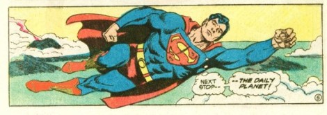
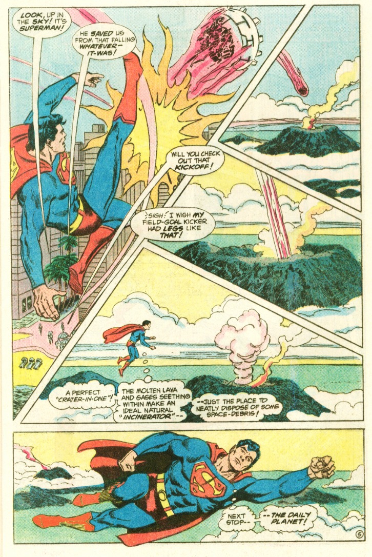
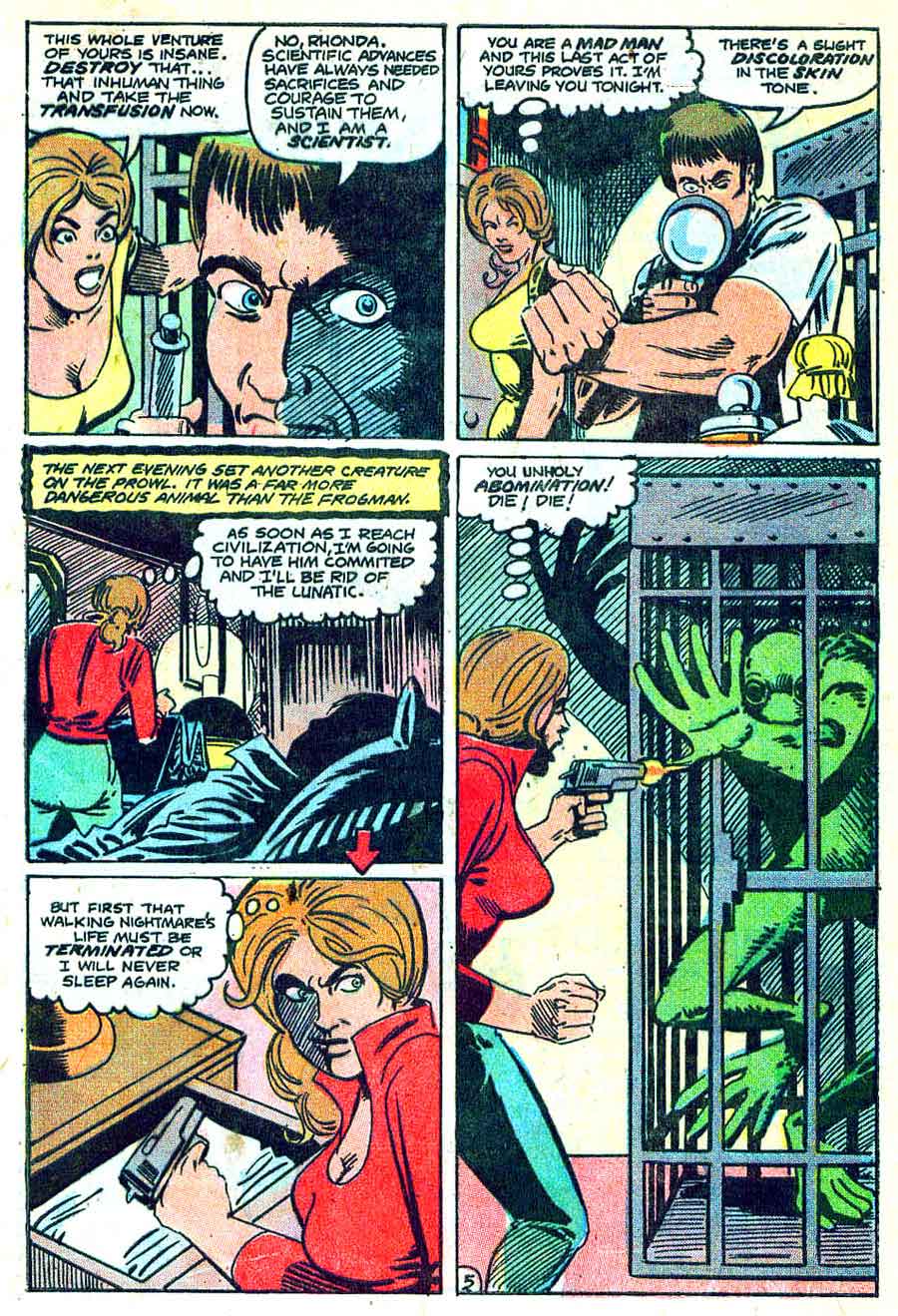
James would have added complexity to Wells’ overly simplified language—how Eric Shanower inked Curt Swan’s pencils for The Legend of Aquaman.
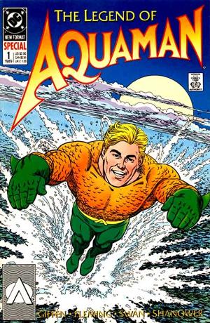
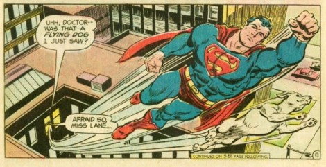
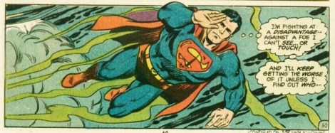
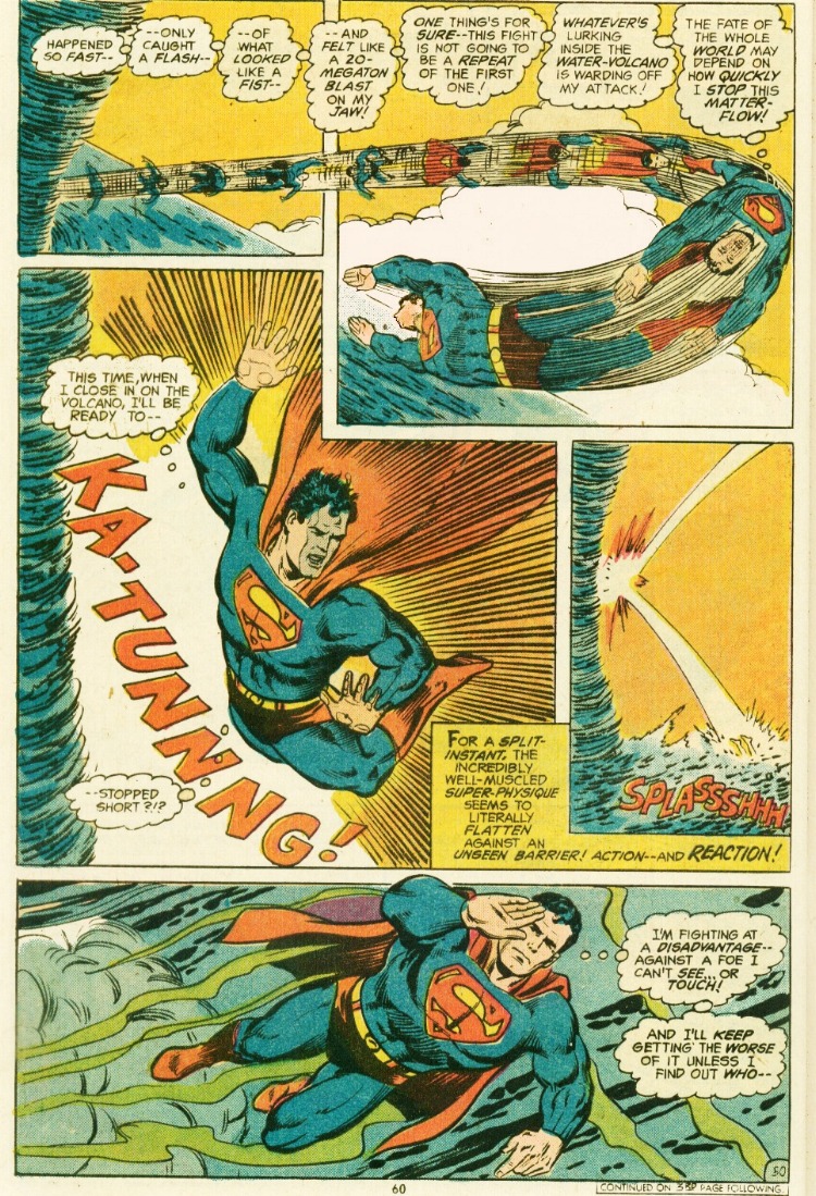
Swan was nearing the end of his career in 1989, but according to Mark Waid (via Eddy Zeno’s Curt Swan: A Life in Comics) Swan considered the special issues a personal high point. The face, the anatomy, the foreshortened movement, those are recognizably Swan, but look at the background, the clouds, the meticulously scalloped waves, that’s Shanower, an artist renown for his details. His Age of Bronze is almost calligraphic in its precision, each scallop of chain mail a painstaking wonder.
Would Wells have benefited from such a finish by James? Probably. But Swan wasn’t always grateful for Shanower’s efforts. During a visit to my campus, Shanower told a table of professors how he would erase Swan’s background buildings in order to correct all the perspectives errors. Swan didn’t thank him. He thought Shanower was wasting his time, but, like Wells in James’ “ideal collaboration,” his opinions were irrelevant once the sheets were in Shanower’s hands.
Compare Shanower’s chain mail and seas scallops to the inked versions of Swan by other artists, and you’ll see what Swan considered an appropriate attention to detail. Bob Hughes at Who Drew Superman? credits Swan for dominating Superman during that other Bronze Age while collaborating with a dozen different artists. Bob Oksner inked Superman No. 287 in 1975:
Vince Colletta inked Superman Spectacular in 1977:
And Al Williamson inked Superman No. 410 in 1985:
Look at the full-page layouts, and you’ll also see Swan’s signature breakdown: the top 2/3rds divided into 4-5 panels, anchored by a bottom rectangle featuring Superman flying toward the right margin:
The Swan-Oksner background buildings look pretty detailed to my eye–though some of those perspective lines might be a tad wonky beyond Superman’s right shoulder. The Swan-Colletta and Swan-Williamson backgrounds are comparatively sparse. In fact, sparseness was Vince Colletta’s signature “style.” Though his best work is revered for its own Shanower-esque precision, other artists dislike his high sense of propriety.
Editors kept Colletta employed because he got his work in on time, but pencillers, like Wells, avoided the sweet unison of collaboration. Joe Sinnott (who also inked plenty of Jack Kirby’s Fantastic Four pages) said Colletta “wrecked” his romance stories because Colletta “would eliminate people from the strip and use silhouettes, everything to cut corners and make the work easier for himself.” Marvel writer Len Wein agreed that Colletta “ruined” art, and Steve Ditko and later Kirby refused to work with him.
Ditko, like Wells, preferred to ink himself. PencilInk documents a range of examples (Amazing Spider-man No. 3, 1963; Monster Hunters No. 8, 1976; Iron Man Annual No. 11, 1990):
But sometimes even Ditko would have to willingly expose his preliminary outpourings for the benefit of another artist’s vision. Wayne Howard, for example, inked House of Mystery No. 247 in 1976:
And Dan Adkins inked Superboy No. 257 in 1979:
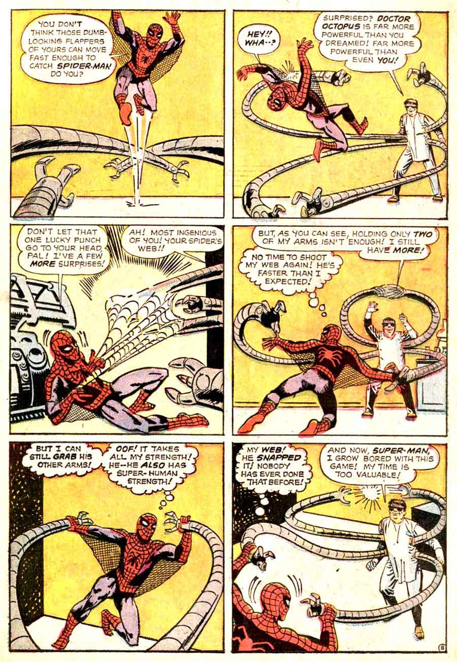
But the most discordant of Ditko’s finishers was John Byrne. As an artist used to getting top-billing as both writer and penciller, he, like James, took possession of Ditko’s pages, applying his own immense refinements and embellishments. Look at Avengers Annual No. 13 from 1984:

The thug’s left foot–only Ditko would draw the impossibly upturned sole. But that’s a Byrne mouth on Captain America, the musculature too. When Mr. Fantastic appears, he seems to have beamed in from Byrne’s Fantastic Four run, but that’s a glaringly Ditko-esque face grinning open-mouthed beside him:
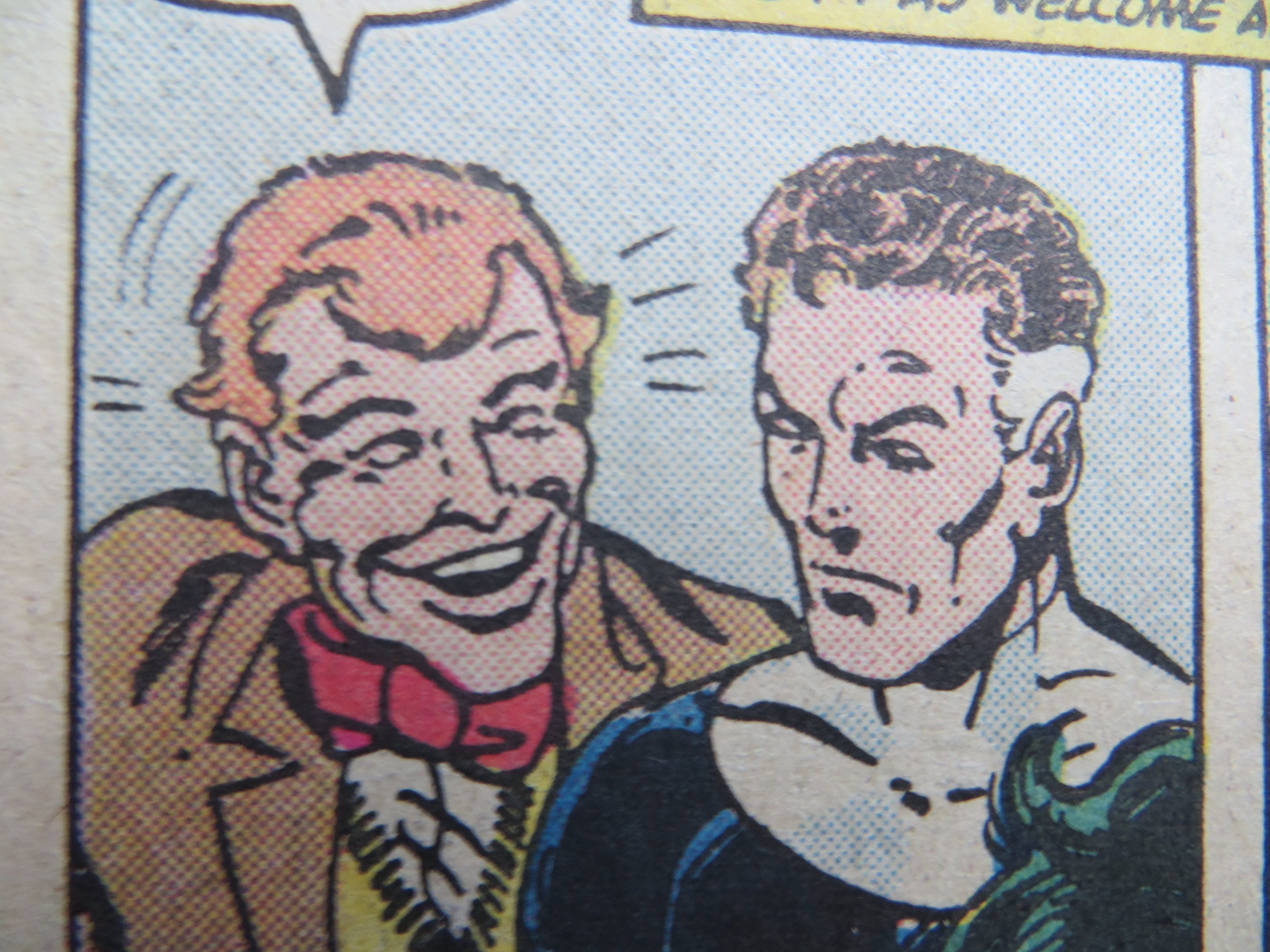
The mixture of the two is even stranger:
Is this what a Wells-James collaboration looks like? James would have placed his name first–though only because cutting Wells from the credit box entirely wouldn’t be an option too. That’s what Alexander Dumas did with his collaborators. Auguste Maquet co-authored both The Count of Monte Cristo and The Three Musketeers, but it’s only Dumas on the covers because Maquet was his employee, what Marvel calls “work for hire.” Maquet produced rough drafts for his boss to write-over. He later sued for co-credit, but the French courts ruled in favor of Dumas.
In comics, the prestige position is reversed. Swan and Kirby had so many inkers because their editors wanted them pencilling as many titles as possible. At Marvel, the penciller was the primary creator, laying out stories with empty captions and balloons for the so-called writers to fill-in. In Kevin Smith’s Chasing Amy, Jason Lee plays Ben Afflleck’s inker and takes insult when called a “tracer.” Lee’s name also appears below Affleck’s in the actual credits. By the end of the film, Lee has ended their collaboration. H. G. Wells was wise never to begin one with Henry James.
[And if you’d like to read more about their correspondence, check out Nicholas Delbanco’s Group Portrait: Joseph Conrad, Stephen Crane, Ford Madox Ford, Henry James and H. G. Wells. ]
Wonderful.
Funny, I just bought this Aquaman Special recently, exactly because of this odd mixture of artists. The actual story even has three layers of authorship, with Giffen doing the breakdowns. I only flipped through it so far but it seems to be one of the gayest superhero books ever, lots of nude wrestling and tying.
Which brings me right to the next point – maybe you guys just saw this post on tumblr too: John Byrne complaining about Bob Layton’s “greasy”, “slimy” and “queer” inks:
http://comicartistevolution.tumblr.com/post/130595615471/johnbyrnedraws-incredible-hulk-annual-7-page
Anyway, back to the issue of the article – I actually think this way of combining artists is quite fascinating as it adds yet another layer of mystery to the fabricated and subconscious world of superhero comics. Another link to myths and fairy tales, you can never be sure who the author is, because there isnt just one.
This reminds me of a Kevin Nowlan post about an old Punisher comic he inked: http://kevinnowlan.blogspot.com/2010/05/punisher-6-page-seven.html
Also Charles Burns over John Romita Jr:
http://40.media.tumblr.com/4200b7ee6565d33761a2e0c9191f5366/tumblr_ntp3mi9Ikz1ru7lgno9_1280.jpg
http://41.media.tumblr.com/863c012739ce31a753c7666e8dfd2fc2/tumblr_ntp3mi9Ikz1ru7lgno4_1280.jpg
http://41.media.tumblr.com/95a17bff4302f3d98ff21a06f7975026/tumblr_ntp3mi9Ikz1ru7lgno1_1280.jpg
or Miller inking a Spiderman sketch by Kirby – you can tell they both don’t really know what to do with this skinny Ditko character:
http://marvel1980s.blogspot.de/2011/05/1987-jack-kirby-and-frank-millers.html
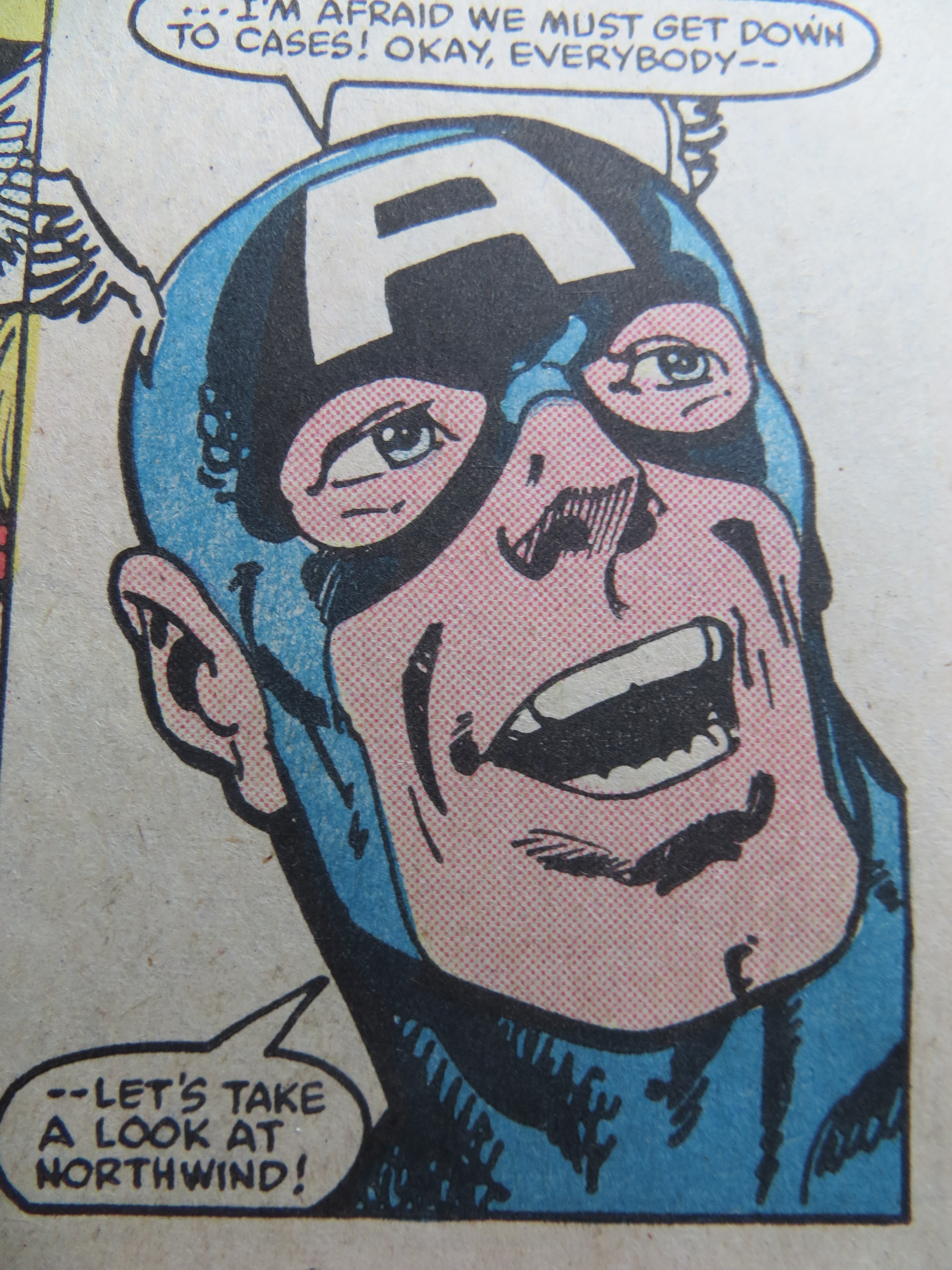
I know these are all exceptions but even that goofy Captain America face in the article, its just great how weird superhero comics are. Its something other art forms can’t offer and i wouldn’t want to miss it.
I’ll see your Ditko-Byrne, and raise you a Ditko-Janson: http://bit.ly/1FVXDGw
Ditko inked a couple of stories over Kirby pencils; I remember those looking weird, too.
Dunno if people here will know, but who was inking Swan at his peak in the early 60s? (I know it was Murphy Anderson later on, but I much prefer his Weisinger-era stuff)
George Klein, if youre looking for the one who gave Superman a receding hairline?
http://dccomicsartists.com/superart/curtswan.htm
“you can never be sure who the author is, because there isnt just one”
I’m just starting to work on an article for the journal American Literature that has a call for papers about comics and queer theory. I hope to make exactly the argument you just expressed, Tim, specifically through the a lens of gender and sexuality analysis, ie Byrne’s comment about “queer inks”
Thanks, Tim
Chris – unfortunately I don’t know much queer/gender theory, but that sounds quite interesting. Hope your text will be available online as well.
Makes me wonder, were there every any gay superhero creators (before, say, the 80s) or has it really just been a subconscious thing all those years?
The Vince Colletta Wikipedia page is well-balanced with regard to positives and negatives yet you decided only to crib the derogatory stuff.
George Perez’ inks over Swan in Whatever Happened to the Man of Tomorrow always seemed like a mismatch to me. The thinking behind that – at least from an artistic point of view – is as confused as the Shanower pairing.
“were there every any gay superhero creators (before, say, the 80s)”
Either Kavalier or Klay, I can’t remember which.
re: “Vanishing” Vince Colletta — speaking personally, I disliked his Thor inks long before I’d ever heard about his “controversial” methods. That feathery line on Thor’s muscles — ugh, just not right for Kirby.
That was Perez? That’s actually great because that issue was about being fundamentally discordant. Alan Moore’s story so violates the tone of the bronze age Superman, it was oddly upsetting to see a Swan-drawn Krypto die, or watch that old fashioned, barrel-chested Superman dealing with emotional trauma. Perez-Swan captures that contradiction too.
Franklin, you make a fair point. I was looking only for examples of conflict between inkers and pencillers, so included Colletta on those grounds, which ignores all of his well-received work.
I don’t think anyone should cut Colletta any slack. He deliberately wrecked the artwork of his colleagues to make a buck.
Only half of Whatever Happened to the Man of Tomorrow was inked by Perez.
Thats a good argument for how the mismatch might work to the advantage of the story, but I’m not entirely convinced.You could equally argue the terrible artwork in the earlier part of Moore’s Supreme run set the right tone – hey, its a nineties superhero comic – but its still terrible. The Schaffenberger inks in the Action half of Whatever…. were an improvement.
I have a soft spot for Colleta on Kirby, at least on Thor; not to excuse his alterations, but I read those stories as a kid in the British reprints – nice and big in black and white – long before I knew about anything like that. His feathery line gave Thor an ancient feel that worked well.
Although even to a ten year old, he seemed very wrong for those FF episodes he inked.
I would agree Swan clashes more with Moore’s writing than Perez’ inks. Think thats why that story never worked for me, hard to take it serious when you somehow keep expecting the just-a-dream-conclusion. Swan’s art just doesnt create this sense of doom, its like Adam West acting out The Dark Knight Returns.
As for Colletta’s rushed work, i would never blame a guy trying to make a living but always the corporation that doesn’t pay enough to have the precarious assembly line worker survive on jobs properly exectued. Think Marvel and DC were happy to have him?
“Either Kavalier or Klay, I can’t remember which”
haha ok not sure i get it but thanks for pointing out that book, never heard of it
I loved the incongruity of having the Curt Swan Superman wandering around in this terrible doomsday story. It was thoroughly creepy and wrong.
Didn’t seem like a doomsday story. More nostalgic than creepy to be honest. Fun but almost bloodless like the death of Supergirl in Crisis.
Ahh… maybe I wasn’t being clear earlier.
I agree with Noah – its specifically the mismatched Perez inks that don’t work for me. Swan seems essential – Moore was writing with him in mind, wasn’t he?
Swan and Schaffenberger drawing this story kind of feels like them visiting their own funeral … hmm now that i write this i feel someone else already said that somewhere. Anyway, i just think Swan wasn’t really that great at that point anymore, the art had no energy anymore. Like this scene when it is revealed what Mxyzptlk actually looks like and it was supposed to be horrifying – it was just weak and not scary at all.
… but i also can see the point of Chris, Noah and Sean – in this case, Swan’s art works because it doesn’t work.