Charles Schulz: High Anxiety

The following was originally done as a presentation for Art Spiegelman’s seminar, “Comix: Marching Into the Canon” at Columbia University in 2007. I think it suited Art’s humor to assign me to do the required audio-visual presentation on a cartoonist we both perceived as far from my usual range of interest. He certainly did me a service in that while I also grew up with Peanuts, the process of making my power point slideshow and commentary added greatly to my appreciation of Charles Schulz’s comics artistry. Click on the images to enlarge.
___________________________________

“Style…should be in a continuing state of some evolution, while at the same time, it embodies a handy set of tools, a vocabulary for dealing with the experience one is describing, or for defining, often obliquely, the special nature of one’s own presence in the midst of this experience.…” -Donald Phelps
___________________________________

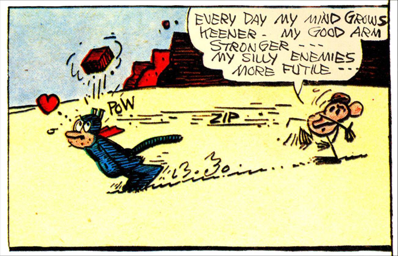
An important influence on Charles Schulz was George Herriman’s Krazy Kat, the early zenith of comic art: simplified, expressive ink line drawings in concert with each other and with thoughtful language.
___________________________________

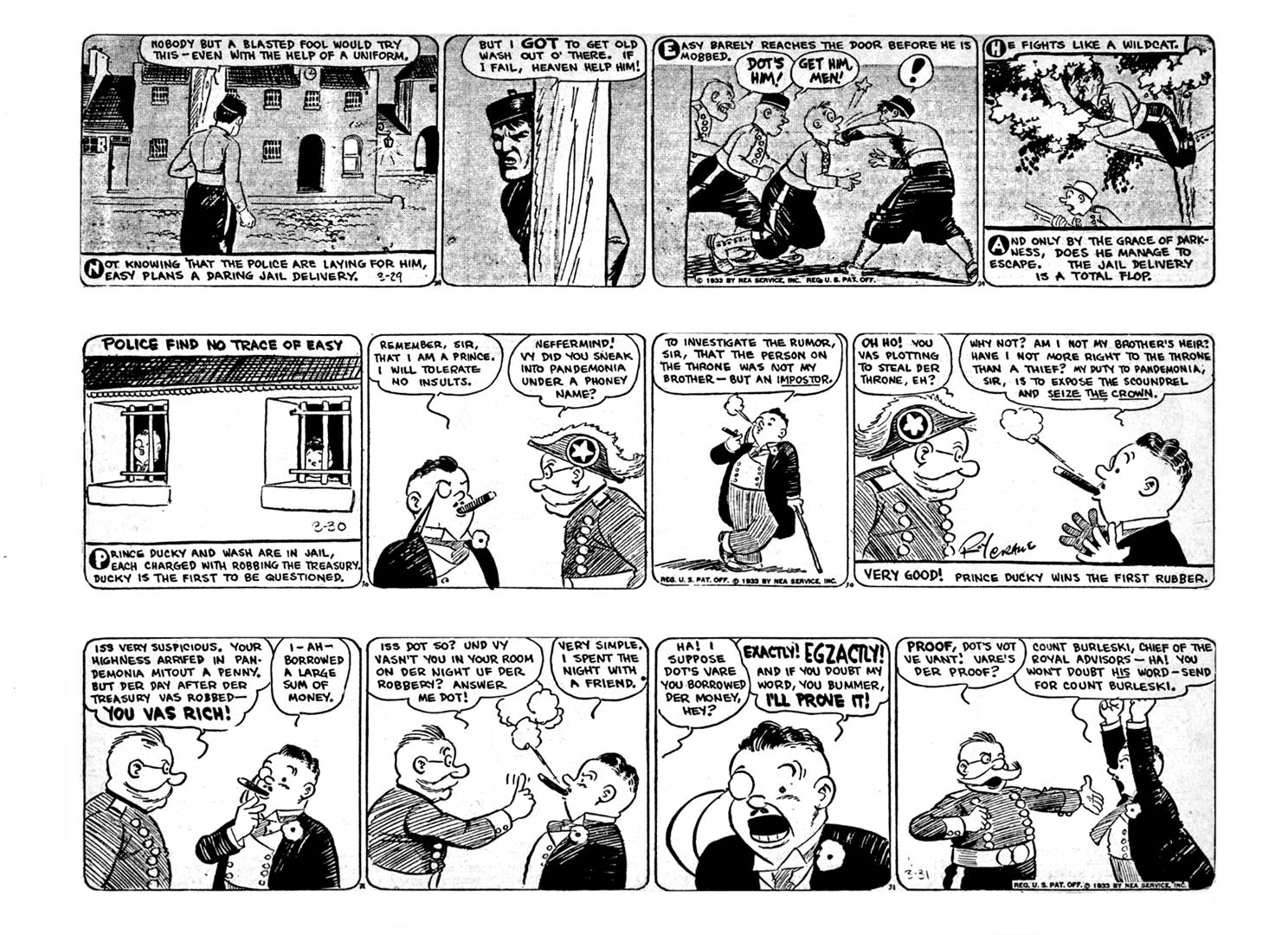
Schulz’s favorite cartoonist was Roy Crane, whose storytelling in Wash Tubbs mixes aspects of cartooning and realism. Crane’s work has a lot of clear white space, a feeling of air around the characters on the pages.
___________________________________

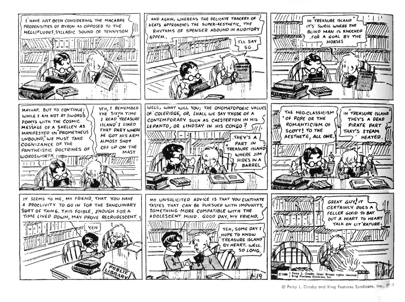
Another key influence, Skippy by Percy Crosby: the class consciousness of children who are vastly separated in terms of education, and a breezy pen and ink style.
___________________________________

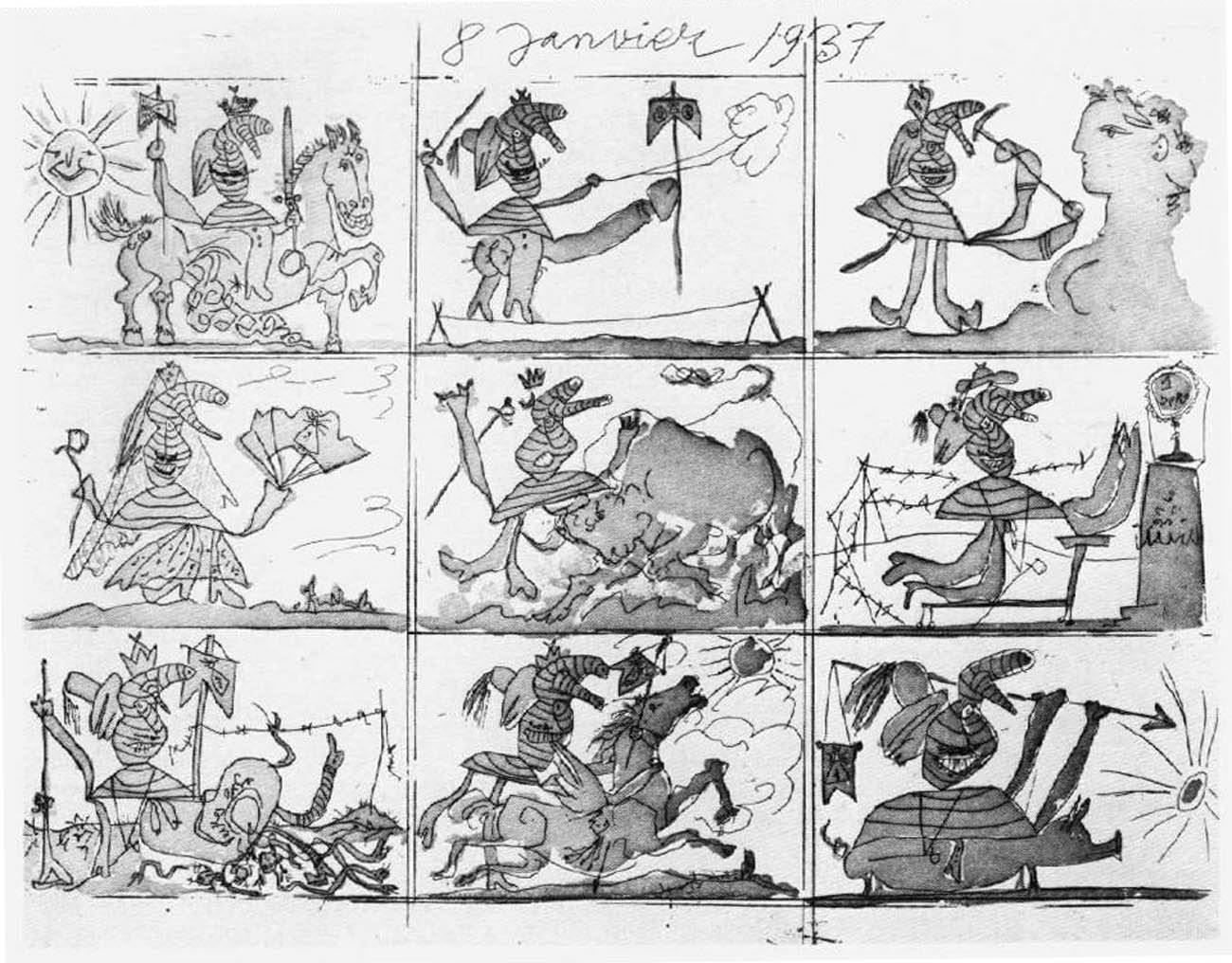
An actual comic strip by Pablo Picasso, another of Schulz’s favorites. I like how the main bandaged figure is kept somewhat on-model.
___________________________________

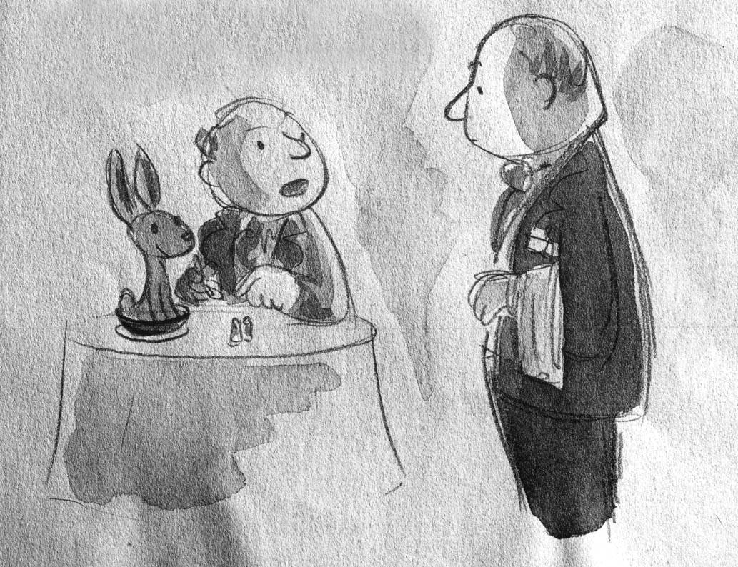
“Waiter! There’s a hare in my soup!”


Schulz wanted to be a New Yorker cartoonist, but didn’t have the nerve to submit his samples, like this one. One of his accomplishments was to successfully fuse the pared-down, elegant drawing and sophisticated irony of the New Yorker cartoon style to comic strips.
___________________________________

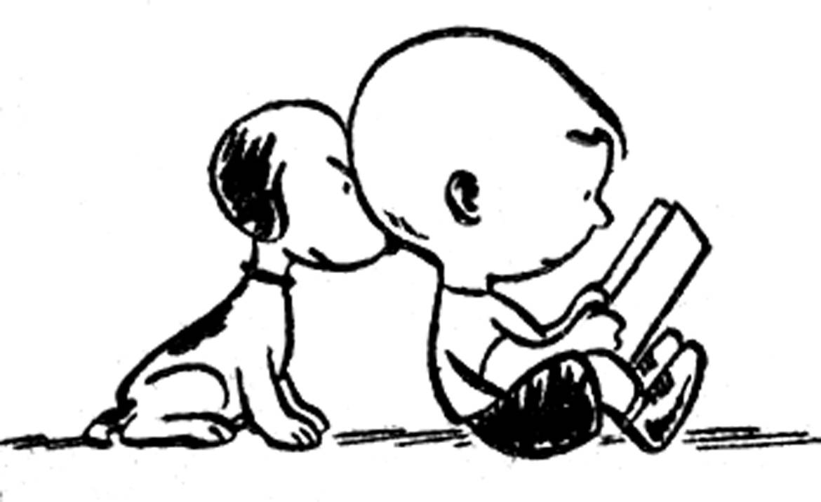
A charming drawing from L’il Folks, his precursor strip to Peanuts.
___________________________________


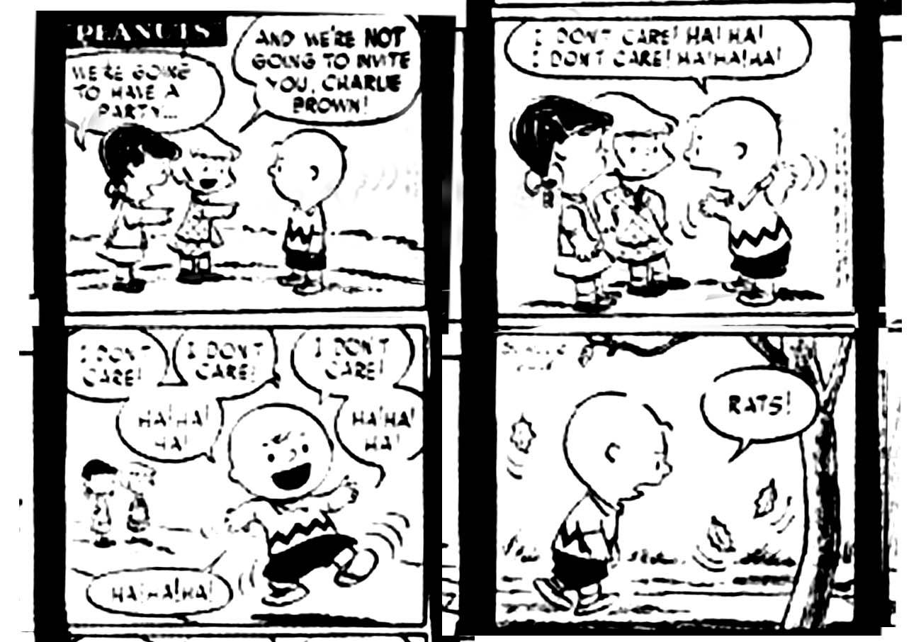
Peanuts debuted in 1950. Schulz immediately began pushing the envelope with his characters. Charlie Brown’s isolation and depression is omnipresent. In this very early strip he has a virtually hysterical reaction to being ostracized. Much humor is based on pain, and Schulz’s children were often all about pain.
___________________________________

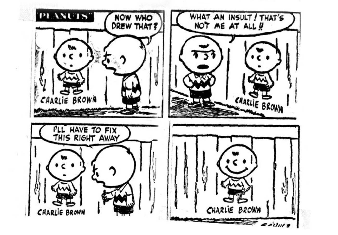
This shows Charlie Brown’s self-image: as a happy kid. This was not borne out by the next 50 years of daily strips.
___________________________________

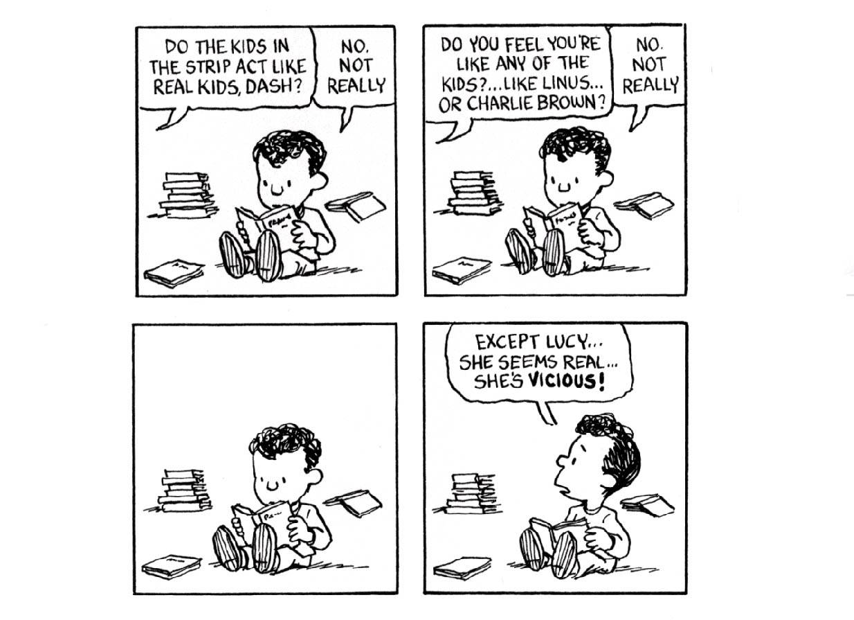
Charlie Brown became instantly recognizable. Contemporary popularity does not ensure one’s place in history, but in addition to creating indelible characters that resonate deeply in the American consciousness, Schulz was able to use his form to express complex sociological and psychological observations.
___________________________________

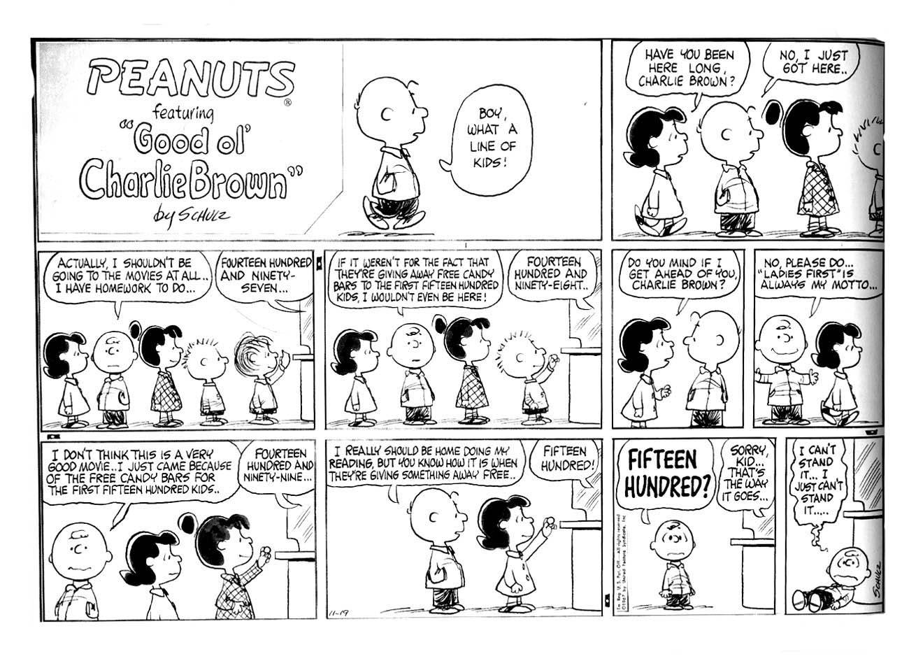
It is often quite a dark picture of life that Schulz give us. In this case Charlie Brown is not paying attention, which the calculating Lucy takes advantage of, along with his chivalry. But what he is saying is that he is neglecting more important matters to go to a bad movie, just to get something for free. Perhaps Lucy does him a favor, he is overreacting and should go home to his homework. As well, if his chivalry was real, he would have been happy to give up his place to his female friend.
___________________________________

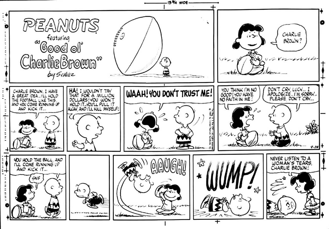
Optimism is unfounded. The manipulative Lucy tells Charlie all women can’t be trusted, specifically their “tears.” The behaviors of Lucy and the other female characters could take their own separate analysis, Schulz still has issues from childhood that he lays out.
___________________________________

Schulz didn’t like Lucy’s character but she suited his storytelling purposes so well that she became essential. All of his characters have issues themselves, and with each other. Themes of abusive relationships and unrequited love are all over Peanuts. This panel refers back to Krazy and Ignatz.
___________________________________

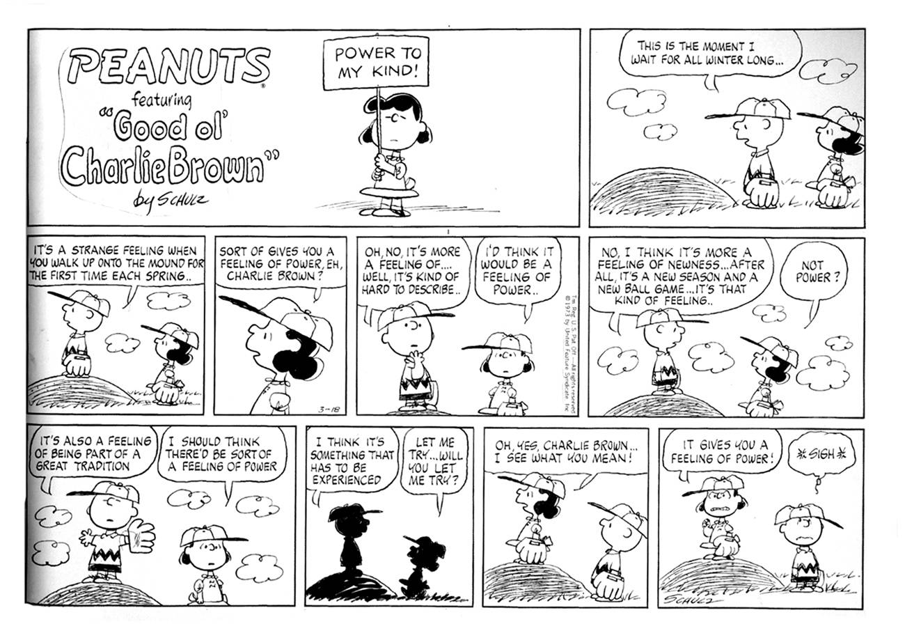
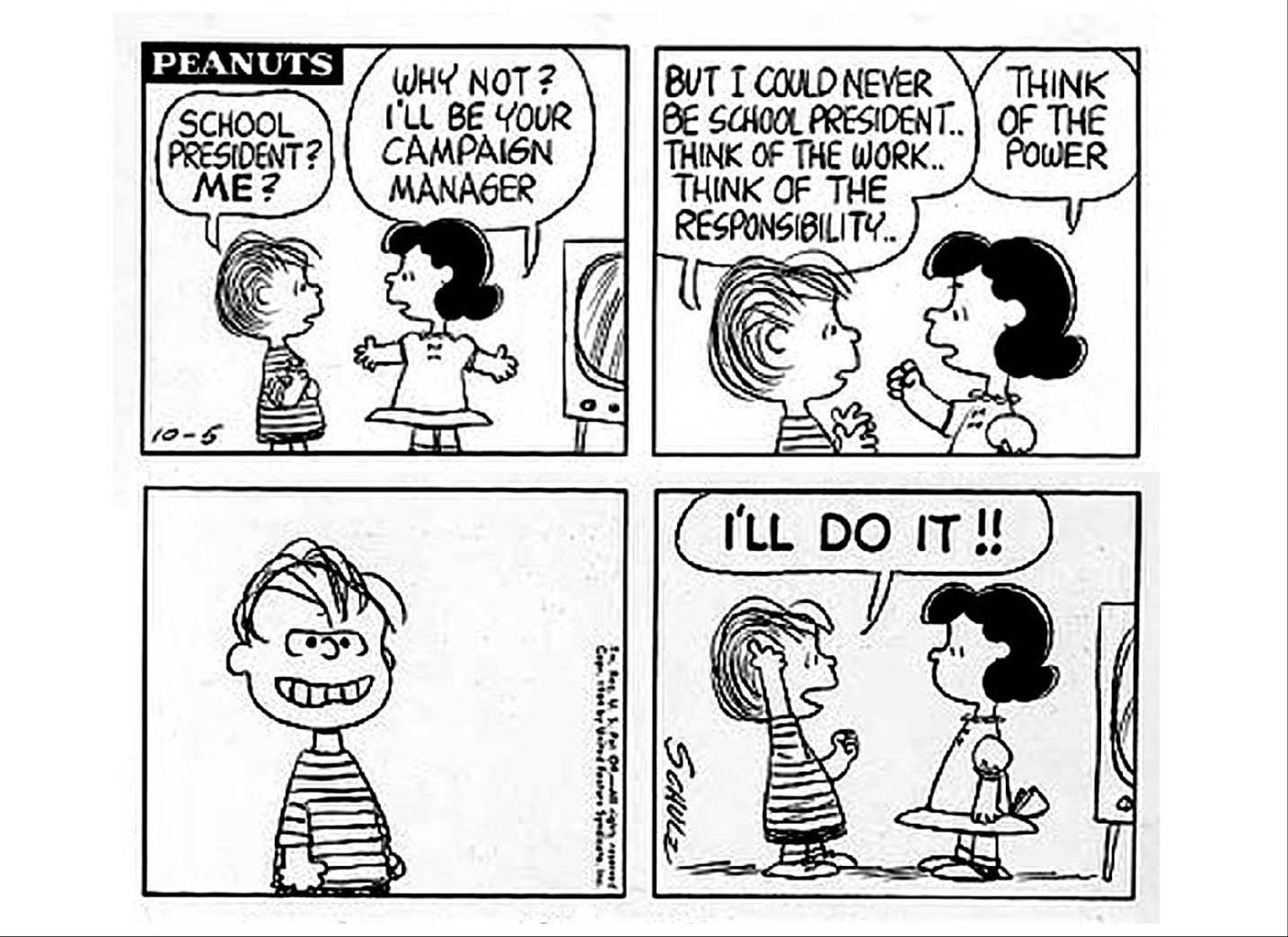
Here Lucy relentlessly corrupts Charlie Brown’s long-awaited moment of pleasure, the first day of baseball season. Schulz decried the decline of American sportsmanship. He refined his concepts and evolved his drawing for clarity and simplicity of expression; ideal as a vehicle for his ideas, and ideal for efficiently producing a daily strip.
___________________________________

Schulz said he thought Charlie Brown deserved some of the abuse he got because he was arrogant. In Marxian terms he is in false consciousness, fixed in a cycle of failure and disconnection. He can never achieve any status. His creator, though, retained the means of production. Schulz controlled his creation and did his own work with no assistants.
___________________________________

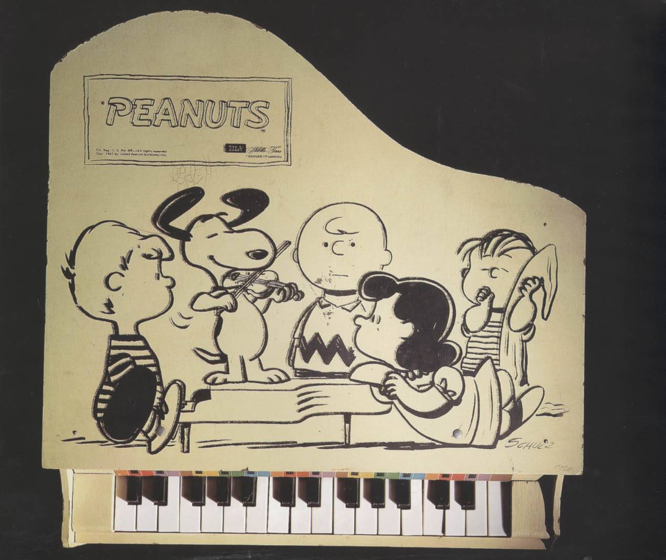
Even the product drawings extend his themes. In this group Schroeder is a prodigy being seduced by the tormentor Lucy. Linus, when he’s not oblivious as he is here, is capable of acts of extraordinary dexterity. Snoopy plays violin, speaks French, and has Van Gogh and Andrew Wyeth paintings in his doghouse. Look at the expression on Charlie Brown’s face. Is it incomprehension? Jealousy? Embarrassment? What can Charlie Brown do? Charlie Brown is in the center, but feels marginalized. He looks at us, or at the void.
___________________________________

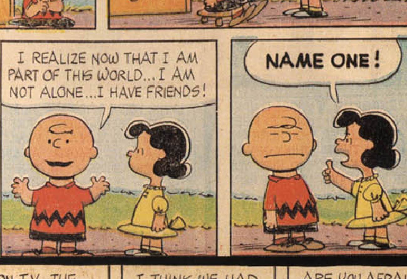
This reminds me of the beginning of Maus, where little Art is deserted by his buddies and runs to his dad, crying. Vladek says, “Your friends? Lock them together in a room with no food for a week…then you could see what it is, friends.”
___________________________________

Art Spiegelman’s perfectly timed version.
___________________________________

“It’s kind of a parody of the cruelty that exists among children. Because they are struggling to survive.” -Charles Schulz
___________________________________

“These children affect us because in a certain sense they are monsters…because we realize that if they are monsters it is because we, the adults, have made them so.” -Umberto Eco
___________________________________

Al Capp said: “The Peanuts characters…wound each other with the greatest enthusiasm. Anyone who sees theology in them is a devil-worshiper.”
___________________________________

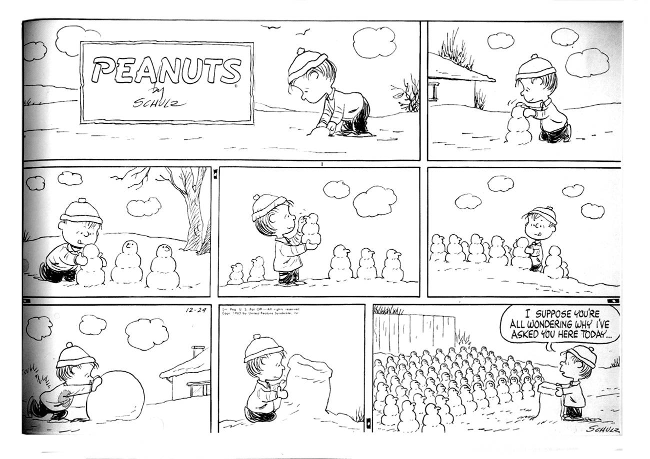
Linus is not a monster, he’s Lucy’s little brother, and we see him here building himself someone that will listen to him. Is it an Army, is that a cannon? No, a congregation and pulpit. Linus has evangelical Lutheran leanings. This reminds me of Roy Crane, it’s a beautiful strip.
___________________________________

Linus humbles Charlie Brown with his visionary imagination. Linus frequently quotes the New Testament in context.
___________________________________

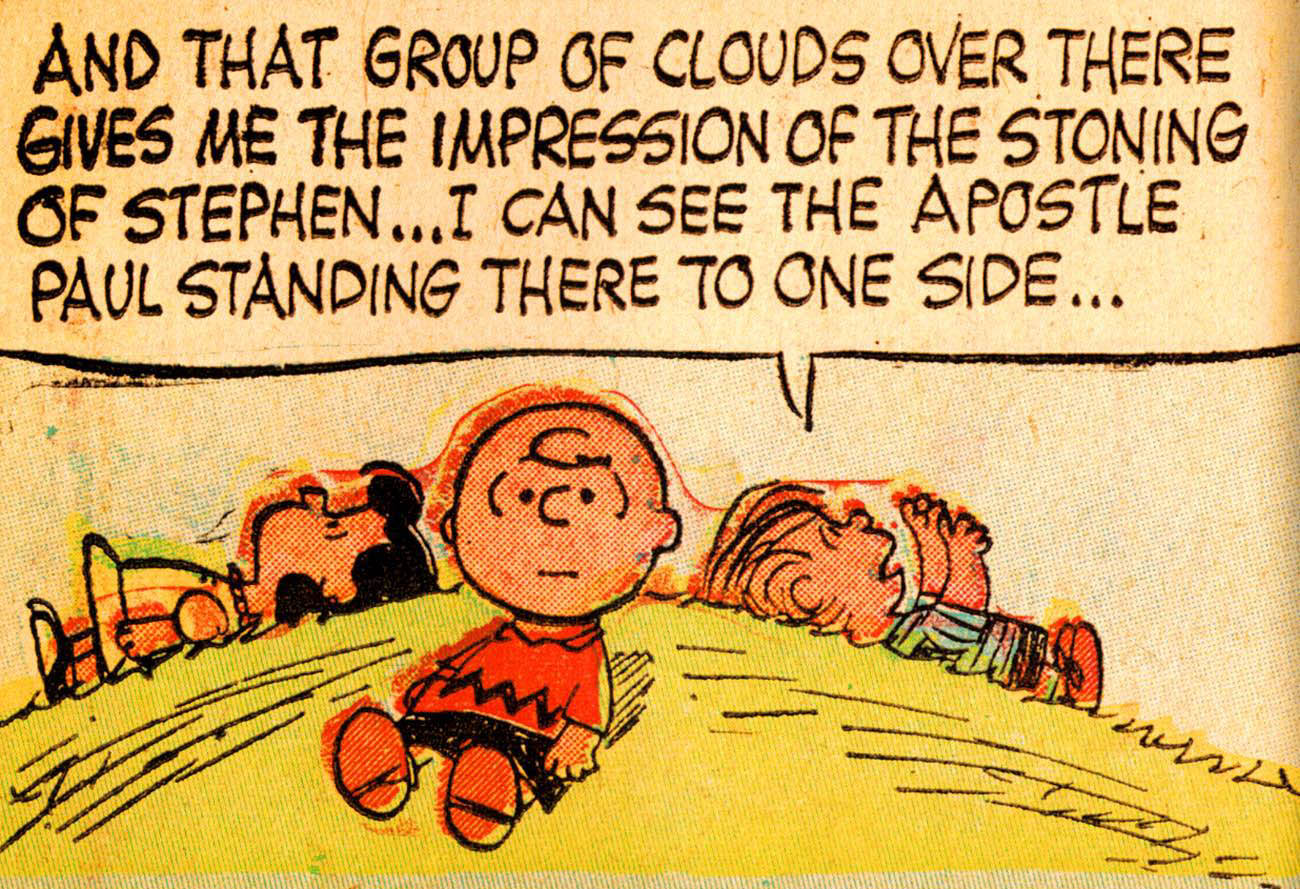
A philosophical debate on the mound, tiny children grappling with crucial issues, Linus contextualizing. This picture has formal and abstract compositional qualities, balanced in harmony (like “The Feast in the House of Levi” or “The Last Supper”).
___________________________________

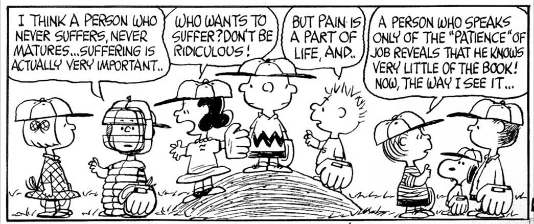
Schulz’s output was as often more humorous or lyrical strips, but I have chosen to focus on his more serious aspects, because that terrible irony expressed through masterful use of his medium is what elevates his work to Art.
___________________________________

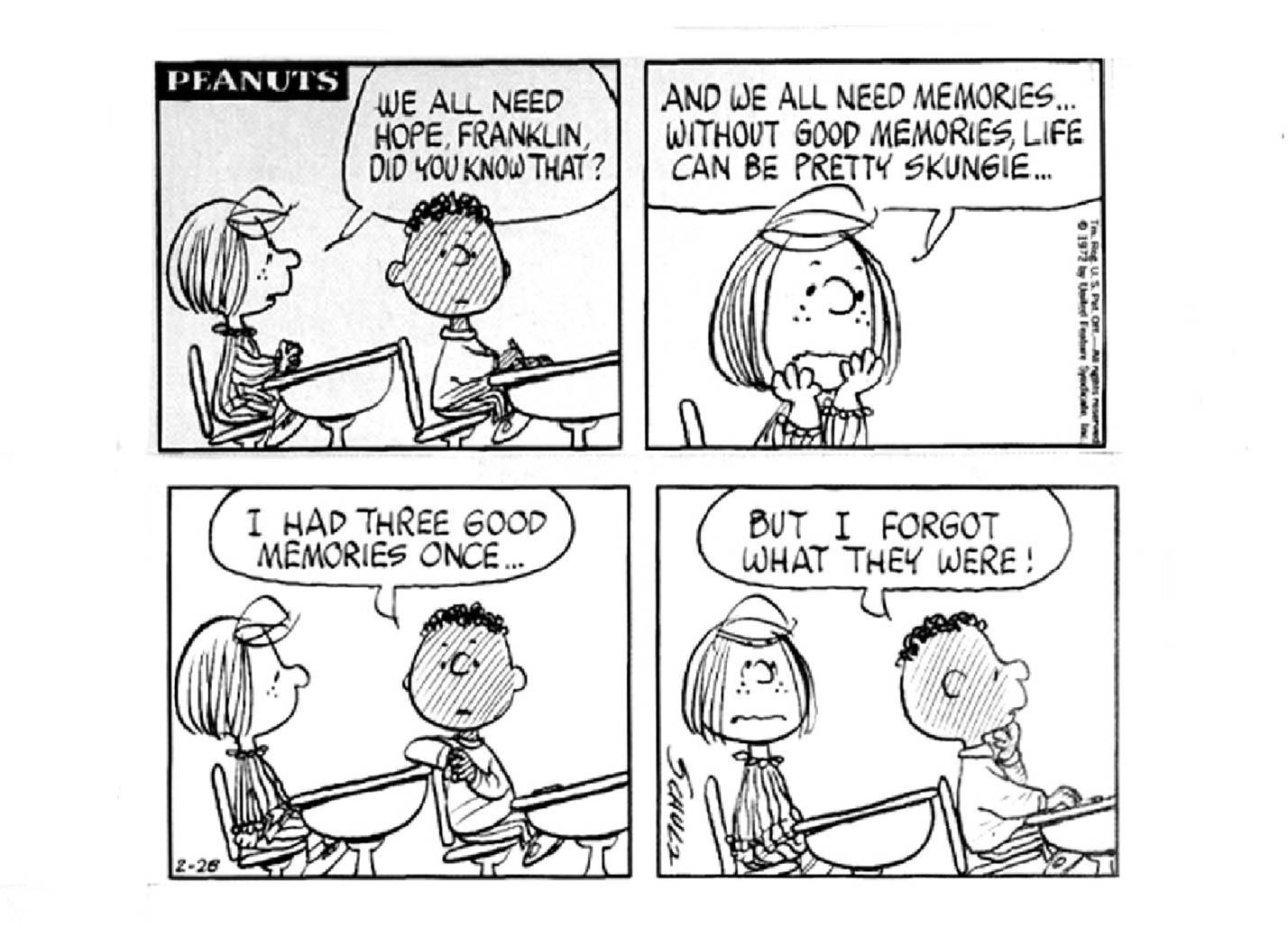
Schulz introduced an African American character in 1968, Franklin, whose father was in Vietnam. Franklin has no memories, which embodies the critiques of colonialism and speaks of the quandary of the descendants of African chattel slaves, cut off from their history. I may be reading into it with hindsight, but Schulz was by all accounts a voracious reader.
___________________________________

Is the Artist influenced by society, or does Art influence society? In Schulz’s case both apply. Schulz explored major issues in his strip, which becomes impressive when you realize that such feelings were delivered to 360 million readers.
___________________________________

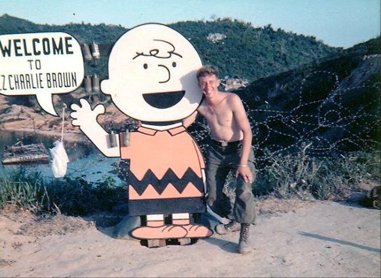
This is Landing Zone Charlie Brown in Vietnam, 1968. I can’t imagine how Schulz felt if he saw this.
___________________________________

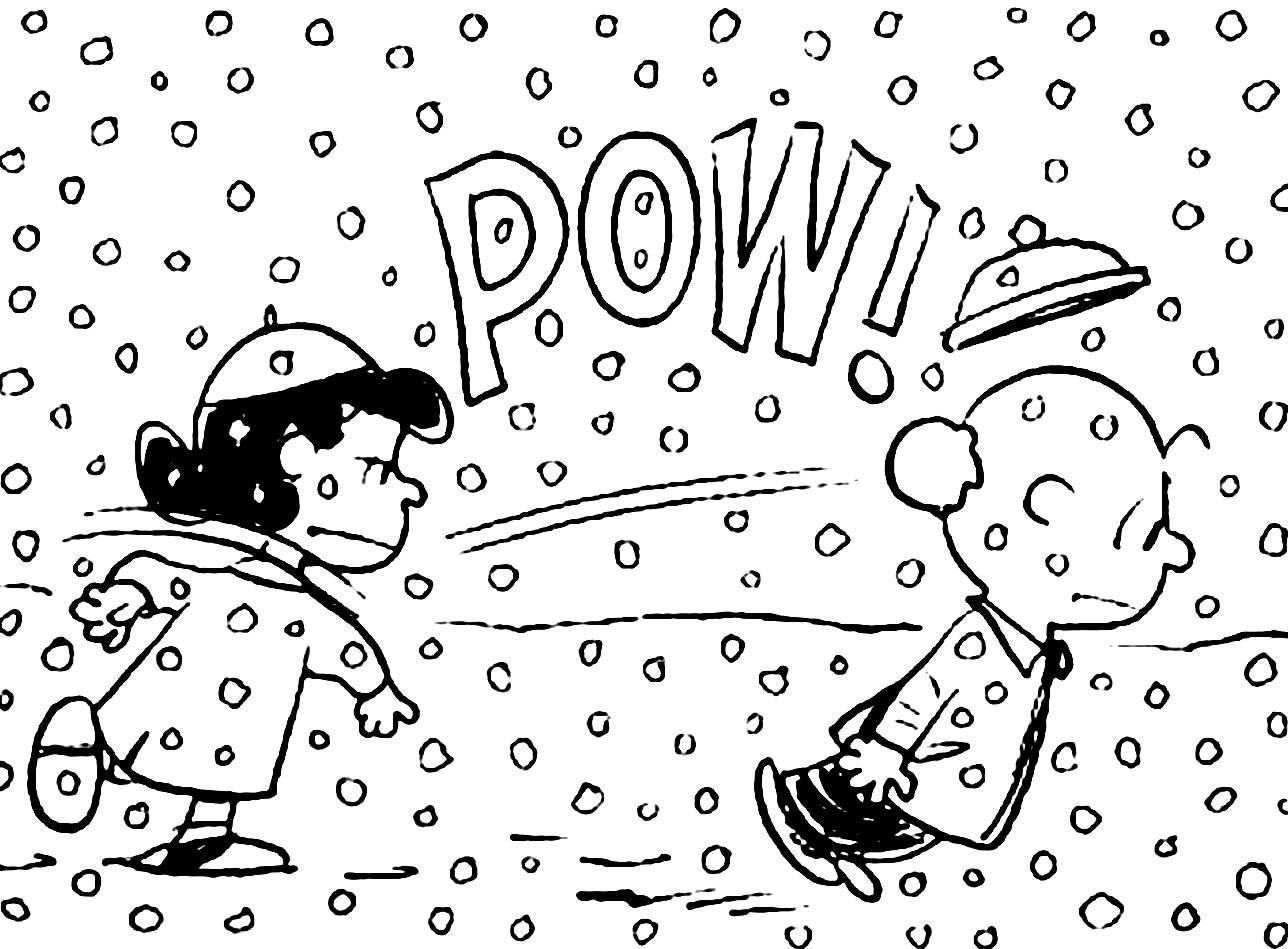
In this hard world, even gentle Linus is momentarily seduced by Lucy’s cynical litany. Even though conceptually adult, Peanuts was on the comics page. Children like me who grew up with this strip were being informed by Schulz’s observations.
___________________________________

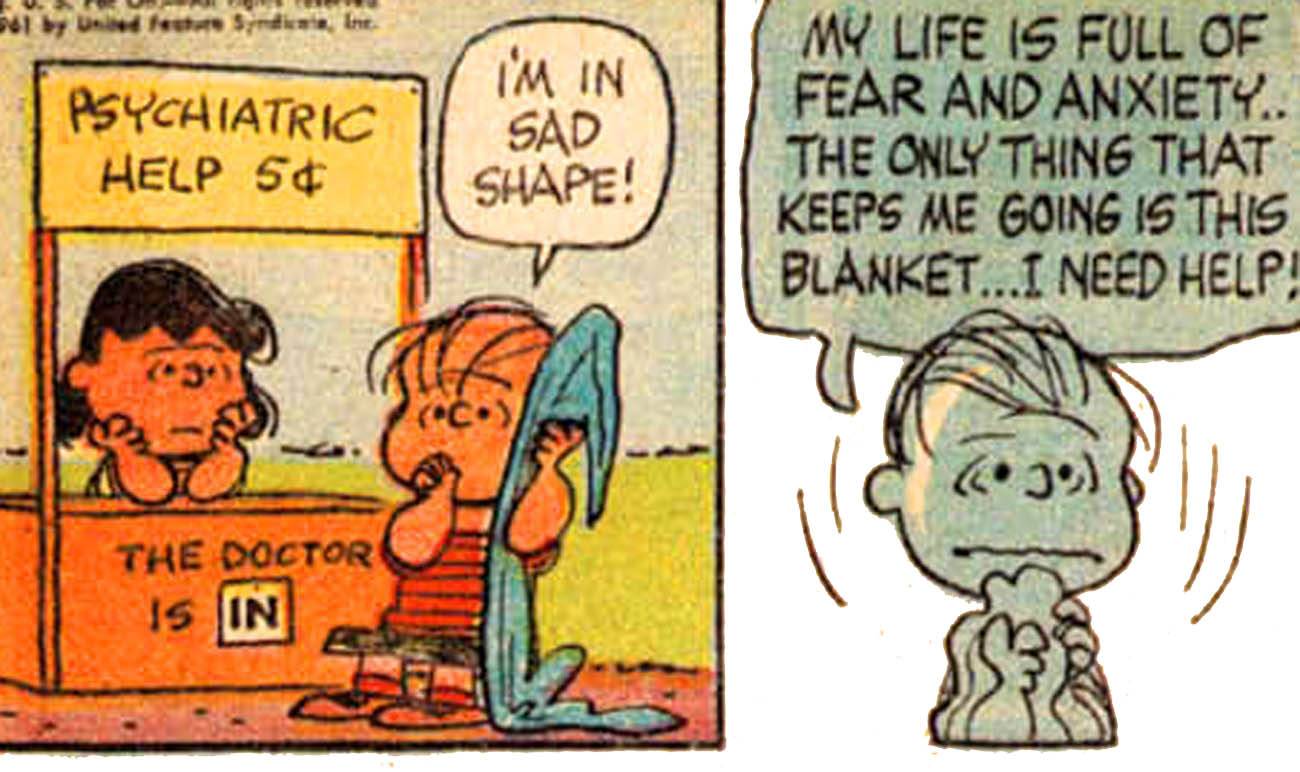
With horrible logic Schulz made truth-teller Lucy a psychiatric therapist. And, sometimes faith is not enough for Linus, who is often overcome by high anxiety. His security blanket has been entered into the psychiatric lexicon. The level of fear of these children, their apprehensions in dealing with a world that seems forever out of their control is what has always stuck with me when I thought of Schulz’s work.
___________________________________

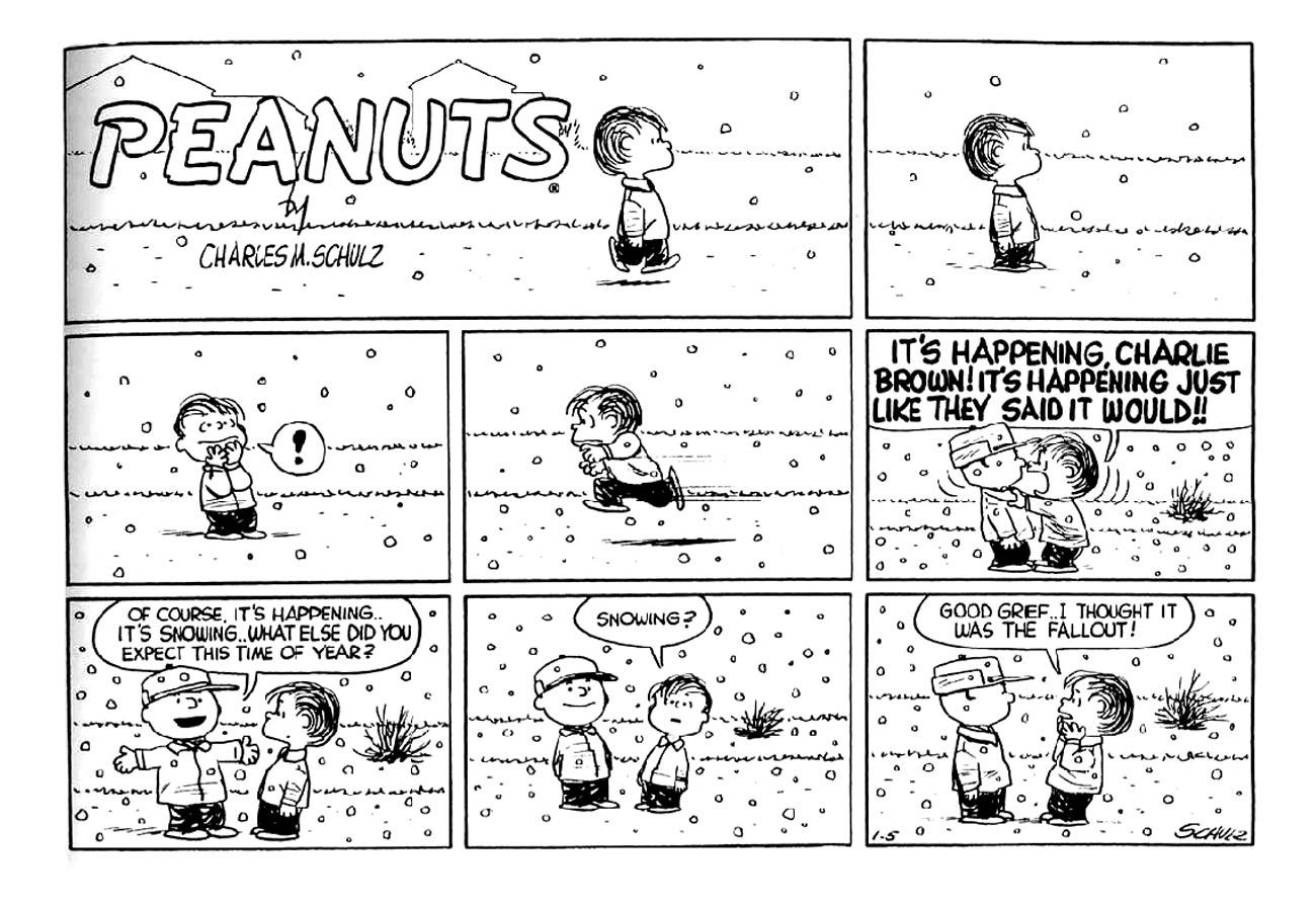
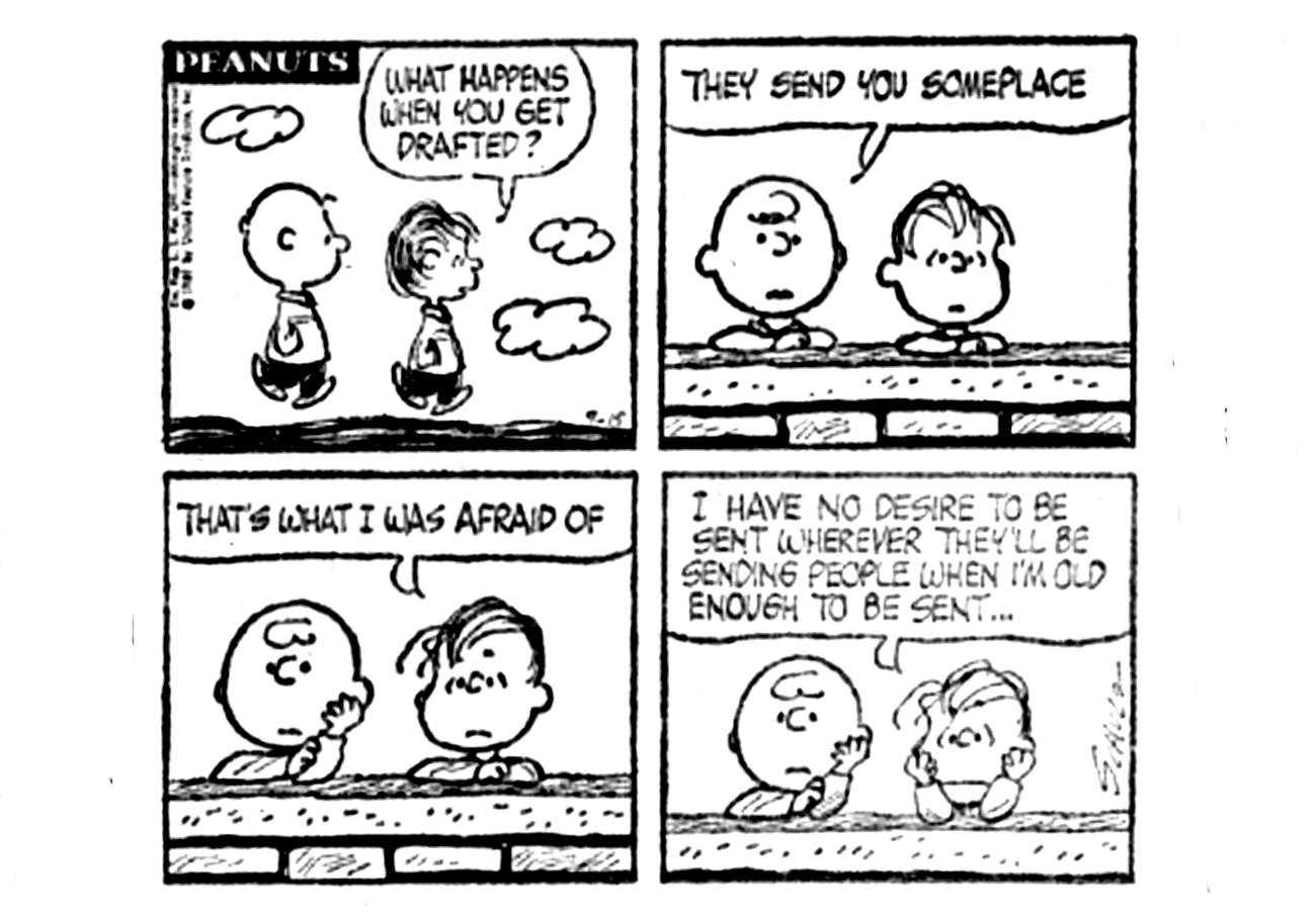
I remember this one well from when I saw it as a child, it was a clear expression of it’s time. This gets right to the “nut” of it, for me. It tormented me for a while in preparing this presentation. What is it about these characters, their shape? It was right there on the edge of my brain, something almost subliminal. I then had a little Peanuts epiphany.

Schulz was drafted in 1943, spent two years training, and then served in Germany as the war wound down. At one point his platoon camped in a swamp near Dachau. He said that what he remembered most about the war was loneliness. But suddenly…


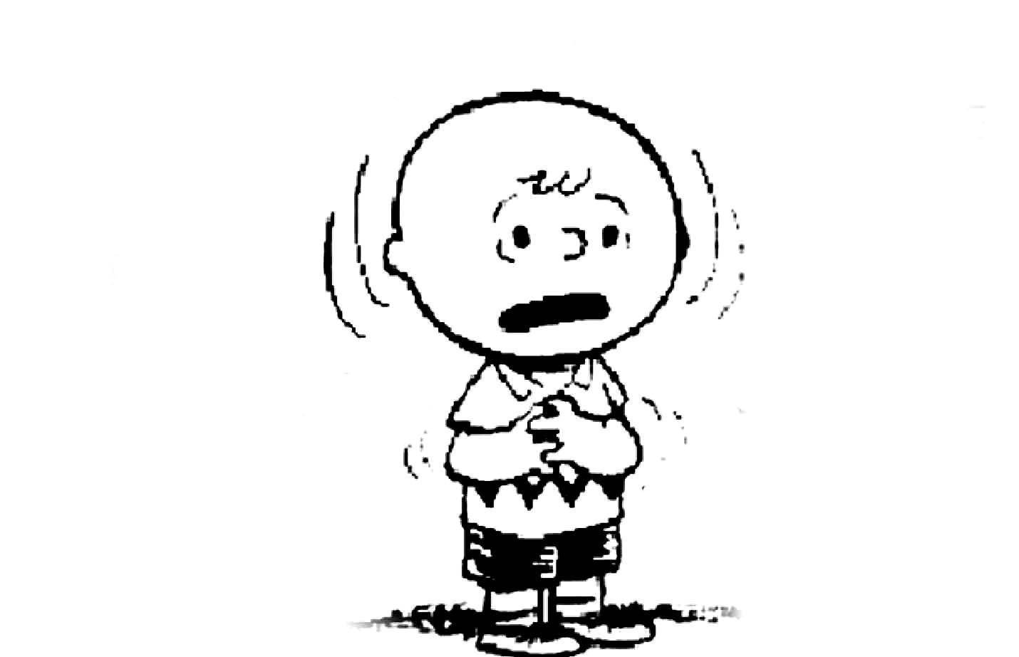
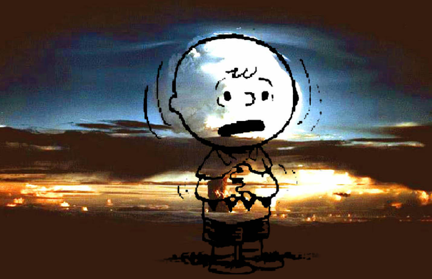
…”everything changed.” I think this monstrous act to end a monstrous war imprinted on Schulz. The form of Charlie Brown, all tied up with fear and guilt, aligns with the alien image. He is the inheritor of the world we have built. Charlie Brown is the bomb.

___________________________________

___________________________________

Sammy Harkham: Naturalism and Specificity

Sammy Harkham’s Crickets #3 rivals in substance and importance two other comics that were published in a similar format: David Mazzucchelli’s Rubber Blanket #3 and Daniel Clowes’ Eightball #23. Harkham seems to be best known for editing the chameleonic, graphically revolutionary anthology Kramer’s Ergot and he has served his artistic community well with those efforts. However, Harkham’s own work is among the best in KE.

A careless moment, from Lubavich, Ukraine 1876

His Lubavitch, Ukraine, 1876 in the sixth issue depicts the artist’s namesake living in an orthodox community way back in the day in an intimate and momentarily heart-stopping tale. Harkham conveys a delicacy of gesture rarely seen in a medium that has been dedicated largely to overstatement and explosive violence. That is not to say he is entirely adverse to spectacle, his sprawling post-apocalyptic cover for the impressively oversized Kramer’s Ergot #7 is gorgeous, but his single page broadsheet strip in that issue has a touch of Hergé and Frank King and reads like a pivotal moment near the end of a very sweet unmade Coen bros. film.

The latest issue of Harkham’s solo comic Crickets is subtitled “Sex Morons” and this is an apt description of the characters in the two major stories inside. The first is a reprint of The New Yorker Story, which probably should have appeared in The New Yorker itself, but instead ran in Vice, the iconoclastic and often disturbing free magazine of fashion, politics and youth culture. In four dense pages, Harkham shows the final crisis in the midlife of a writer and Yale professor as he cheats on his wife, fails to care for his daughter and betrays his colleague. A lot of information is packed into a short piece which seems oddly realistic, given how cartoony the drawings are.

Ogden achieves stasis, from The New Yorker Story.

Harkham’s earlier fantasies and vignettes seem more freeform or improvisational, with hermetic, interiorized visuals. By that I mean non-referenced, non-observational drawings with some apparent influence from artists such as E.C. Seger and other early daily/Sunday comic strip artists, along with hints of Moebius, Chester Brown and Al Columbia. By contrast, the narratives in Crickets #3 are informed by research into the particular times and places shown. The stories veer towards a form of naturalism, perhaps closer in spirit to the more serious and/or historical comics narratives long produced in Europe by artists such as Jacques Tardi and Vittorio Giardino.

The condensed but ultracoherent narrative style of The New Yorker Story carries through into the main story, Blood of a Virgin. Harkham has a talent for dialogue and he draws believable continuity and nuanced expressions. His storytelling is clear and his page designs, panel framings and lettering incorporations are elegantly composed. His hand is light and his line is still cartoony in that it increasingly evokes the direct but fragile emotionality of Charles Schulz, but now it also recalls the vigorous simplicity of Roy Crane’s Wash Tubbs.

I wrote to Harkham with some questions about the work in Crickets #3. “There is an emotional clarity you can get across with characters in comics that can be a hinderance or a real asset depending on what you are doing/aiming for,” he told me. “Cartooning is knowing how to use the sickeningly stupid blunt emotion of each panel and build something emotionally complex of it. This really came together for me working on The New Yorker Story. The panels were so small, the most important thing was that they were easy to read. So that meant I didn’t have room to make beautiful drawings or to be vague about what was happening in a given panel.” Still, for all their functionality the drawings are beautiful, particularly when the visual parameters that they describe are qualified and given body by the color overlay. Harkham often uses a single additional color in his work. Here, the pale olive layer affords the spare drawings considerable weight, space and light.

Harkham's L.A.

Harkham says, “I don’t really strive for realism, but more for specificity.” To that end, he researched the trappings and landscape of the period shown in Blood of a Virgin. He says, “I wanted to do a story about Los Angeles. Much of the inspiration to work on it is driving around the city and day dreaming, looking at old college yearbooks and photos and getting excited to draw a weird pair of woman’s shorts or a haircut or living room.” As someone who came of age in the 1970s and realizing Harkham wasn’t born until the next decade, I’d have to say his story is as close as I’d like to come to reliving those years. Somehow, he perfectly captures the bleak feel of 1972, as the ideals of the 1960s coagulated into opportunism and excess.

Harkham’s protagonist Seymour fights for a chance to write and direct his first feature film while working a day job editing trailers for Val Reed, a producer of exploitation films. He holds his temper as his boss insists on buying his “werewolf script” cheap. Seymour is given to understand that whatever film emerges from the process will bear little resemblance to what he wrote, and that the job of directing the project will most likely be given to another man. He must eat these indignities, because he needs his mentor’s help and connections.

The story is told in a cinematic style, in other words the sequencing and viewing angles chosen by the artist simulate the vantages of a camera moving around the characters and environment. It also deals with cinema. Harkham imbeds the story with specifics of the then-contemporaneous LA and the horror movie culture and filmmaking process of the time. There are several explicitly instructional micropanel passages in Blood of a Virgin, including one that depicts Seymour editing film at his job.

The Moviola grind

“I worked on those manual editing bays at CalArts,” says Harkham. “I went back to refresh my memory when drawing the comic.” I showed Harkham’s editing sequences to my friend, animator and commercial director M. Henry Jones, who said, “That’s a Steenbeck, no, wait…hmmm, maybe it’s a KEM….okay, he’s got that right, but he’s using a flat plate….actually, I think it’s a Moviola. Wow, look, he drew the trim bin. And the bit about trying to use the phone with strips of film hanging around your neck…nice. When I’d hit the floor, I’d just stay there.” As usual, it is a little hard to nail Henry down, but he attests to the basic accuracy of the process that Harkham drew.

“I also spoke with Joe Dante about what the daily life of being an editor back then was like. Very similar to being a cartoonist—solitary hours, bad backs,” Harkham says. He characterizes Dante, director of The Howling, Gremlins and Small Soldiers, as one of “that first wave of ‘monster kids’ who grew up watching Universal horror movies on tv, reading Famous Monsters of Filmland, the generation of guys who wanted to work in horror and sci-fi and didn’t look at it like a stepping stone to legitimate cinema, but a place to BE. Kind of like comics.” As with Seymour, Dante was initially a writer for horror zines like FMoF and Castle of Frankenstein. He began his film career working for exploitation movie mogul Roger Corman in the period Harkham depicts, in a similar capacity to that endured by Seymour. Dante’s early film Hollywood Boulevard was created when Corman bet another producer that he could make a film in a week. Like the project Seymour is unwillingly used for, the movie was assembled using extra footage from other productions. But under examination, there is more to “Blood” than these correspondences.

Off he goes, from Poor Sailor

The story explores themes also seen in Harkham’s earlier work Poor Sailor, wherein a young husband realizes his dreams of adventure at the expense of his arm and the lives of his brother and his wife. In Blood, Harkham depicts experiences which might be considered common to young couples who are trying to get ahead in their careers while (supposedly) sharing the responsibilities of small children. He shows both vantage points on the marriage and motivates both partners’ actions. Seymour’s passage through the story is deliberately timed. He keeps a tight schedule for work, always having to considering the delays of LA traffic, but is often late when it comes to his family. At one point, he promises to be home at a certain time and is on his way out the door from work, but then stops to watch some “sadist” footage with a co-worker. Forty-five minutes later, he’s late and has brought the wrong thing home.

Seymour makes dinner for his wife and himself, but she must eat hers alone because he “has to” take what is ostensibly a business call. Much later, his plate is cold and he’s still on the phone, now simply blabbing about film trivia. Then he is frustrated that his wife does not respond to his advances and that she cannot listen as he reasons a way to tolerate working on his now-adulterated dream project, because she is exhausted from taking care of the baby on her own. Seymour shares some of the childrearing, but his resentment and impatience are obvious when he tries to skip his “turn” and grabs the baby’s leg too tight while changing a diaper.

Seymour keeps his overtired wife awake by watching a version of the then-common pathetically absurd late night horror film hosts on TV until he finally falls asleep. In a moody two-page passage, Harkham renders the tonal-scale test pattern that used to come up after a TV station signed off for the night with a set of square panels of Seymour loudly snoring. His wife finally kicks him out of the room with a dictate to take the garbage out. Seymour sleepwalks outside into the misty wee hours, a scene reminiscent of the fog-enshrouded sets of classic horror films, as well as of the hypnotic dreamscape meditations of Harkham’s friend and contemporary Kevin Huizenga.

Harkham often deals with brittle relations between men and women. In Blood of a Virgin odd things are done to women, often involved with covering their heads and faces. Seymour meets Joy at the house of some “effects guys” who are making a cast from her head. The careless FX artists hurt her by forgetting to apply vasaline to her eyelashes and brows at the beginning of the casting process.* Joy and Seymour worked together on productions in the past and a closer link is implied. She had apparently attempted suicide since he’d last seen her, she has healed cuts on her arm. Was it connected to something he had done?

The costuming of the characters for the Hollywood Halloween party that is the centerpiece of the story is telling. Joy dresses as death, Seymour’s “costume” consists only of a scar on his cheek, his unnamed wife dresses as a clown. Her presence at the party is specifically requested by his boss, but she is unable to attend because the babysitter doesn’t show up. She resignedly removes the clown suit and makup as Seymour leaves alone, and the relief he feels is the first of a series of overt infidelities.

Seymour gets a break and hits a new low.

This three-panel sequence is indicative of the layers of irony that Harkham imbeds in his orchestrations of word and image. The dense overlapping lettering of the first two panels does not close down their general feeling of openness of composition, it represents the apparently chaotic but interconnecting sounds of a family. In the third panel, despite what Seymour is saying as he slithers out, the perspective of the background contracts, encasing him, doors are closed, his arm is behind him in submission to an accusatory click.

At the party, Seymour proceeds to get wasted and becomes involved in a coked-up, sexually violent subparty. The worst of it happens across from a gentle page containing twenty-four square panels that show Seymour’s spouse changing diapers, putting the baby to sleep, making cookies, being made to feel old by a group of trick-or-treaters, smoking a cigarette and being ignored by their neighbor—the contrast of maybe-death and life, of the perverse and the mundane is powerful.

Joy takes her lumps again.

Back at the party and furthering the overarching motif, Seymour “accidentally” elbows Joy in the face when she surprises him while wearing her skeleton mask….there’s much more, but I do not want to continue except to note that Seymour justifies his behavior over the night to himself as a reaction to the oppression of time.

For all of Harkham’s more accessable qualities, such as clarity, accuracy, and his thoughtful handling of human relationships, his work has a transgressive edge that becomes sharper when one considers his comic as an object. The images on the exterior covers are unsavory. They are printed in black underlaid with a reddish purple that amplifies an aura of extreme sleaze…but why does it present so? On the front cover, the white logo is done in a generic psychedelic style of the late 1960s, early 1970s. A woman is drawn with slashing ink brushwork and wash, close to the picture plane reclining against a window, in black panties and vinyl boots, her legs spread and a breast exposed, her head and other breast covered with a checkered cloth. The cover color can then be seen as that of blood or otherwise a color of bodily interiority and in such proximity to female genitalia, evokes the “blood of a virgin” or perhaps menstrual blood. On the back cover, the drawing is done in a cheesey cartoon style like the gags in old men’s magazines. In the foreground, a man in a bonnet or nun’s habit sweats as he ogles the buttocks of a woman in dancer’s tights bending over before him, in apparently refined setting. The subtitle runs in white letters along the bottom, in Italian.

Hidden on the inside front and back covers are two elaborate line drawings printed with full color separations, which have the aspect of illustrations in The New Yorker. The subjects are carefully posed and give the impression of absolute stillness. On the inside front cover, a woman in Victorian dress stands in an elegantly furnished, high-ceilinged room. Her face is covered with a black dripping substance (ink? tar?), reemphasizing the motif of women with obscured faces. She holds a butterfly and the angle of her raised arm echoes that of the pallid, phallic candles leaning from a wall fixture. The inside back cover shows a room with modern furniture and a Van Gogh painting on the wall. A green, cut-off male head is laying on the floor, dripping green gore. A red woman lays on her back on the floor, her legs on a coffee table, her head under the skirt of an easy chair, her arm raised as she makes the peace or V for victory sign.

The images on the covers relate to the stories, if obliquely. Perhaps the head on the floor on the inside back cover is the same as that on the table of the feeble late light TV horror hosts. In three of the four covers, women’s heads are obscured. The scene on the front cover reflects a sequence in the main story, but with some discrepancies. The checkered cloth over her head is different than that seen in the story. In our contemporary context, a covered female head brings to mind the practices of the Taliban and the checkered fabric also reminds one alternatively of Arab headgear and an all-American picnic lunch. Her position and the color might also suggest a return to the womb. The design and images presented to the reader make the package look like a particularly cheap and degraded vintage fetish mag, in seeming denial of the sophistication of the sensitive cartooning bound within.

Right: the published cover

If the covers were stapled inside out, it might be a more commercial product…or not. One wonders, in a time so challenging to print media, what sells more magazines, refined drawings or pornography? Some online vendors are using Harkham’s original cover concept to represent the issue. Harkham’s decision to use the crimson cover was probably only possible because the book is self-published. It affects the possibilities for store display, the impact on the potential customer and the overall reading of the work.

The intended audience comes into question. Truthfully, your standard superhero comic cover is often no less psychosexual, but the cover for Crickets #3 is encoded with some powerful porn signifiers. Is the comic directed to men who read porn, who also might form a significant part of the comics public and who might not be married? In my mind, married or cohabitating readers with small children would be the prime demographic for, and the optimum beneficiaries of the cautionary aspects of, what lies within these covers. Then, are men the only audience for something that looks like porn? Questions and ironies multiply in Sammy Harkham’s strongest work to date.

________________________________________

*Another micropanel “how-to” in Blood of a Virgin explains the process of building an exploding head, using a model cast from the mold made of Joy’s head. Harkham made a short film with similar SFX that is online: at sammyharkham.com or at youtube.com.

________________________________________

Sources

George, Milo. “Moving Pictures:The Sammy Harkham Interview.” The Comics Journal #259. Seattle: Fantagraphics, 4/2004.

Harkham, Sammy. Crickets #3. LA: self-published, 2010.
Harkham, Sammy. Poor Sailor. Madera, CA: Ginko Press, 2005.
Harkham, Sammy. “Lubavitch, Ukraine 1876.” Kramer’s Ergot #6. Buenaventura Press, 7/2006.
Harkham, Sammy. Correspondence with the author, Feb 8-10, 2011.

McConnell, Robin. “Sammy Harkham.” Inkstuds: Interviews with Cartoonists. Greenwich, Nova Scotia, Canada: Conundrum Press, 2010.

Romberger, James. The Affordances of Parametric Images. Online at Comic Art Forum

“Then Protest!”

by James Romberger

François Truffaut’s films are most often analyzed in terms of their cinematic structure and the interpersonal relationships of their stories, and these qualities do account for a good part of their appeal. His films are not considered particularly political in the context of his contemporaries of the French New Wave. However, Truffaut does critique the forces that shaped his world: the destructive nationalism and militarism that crush people and culture in their wake, and the patriarchal structures that keep women the longest-suffering victims of oppression on the planet. Since women do not share equal rights with men, gender relations are political. Truffaut made some sincere efforts to explore those dynamics.

Truffaut’s 1962 film Jules and Jim bears reexamination in this light. In his adaptation of Henri-Pierre Roché’s semi-autobiographical novel Jules et Jim, the director compresses the whole to fit within the confines of a movie that is an hour and three quarters long. Truffaut chooses passages from the book and recombines them to create new meanings unique to his production. He alters the real people and events that inspired the original text, to construct a new narrative about female autonomy and fidelity in love, and affords key correspondences between the early pivotal scene on the bridge and the ending. Truffaut also extends beyond the WWI scenes of the book to incorporate his more personal references in the form of veiled and overt references to WWII: he “post-actively” incorporates his memories of his childhood in occupied Paris and his perception of the deep repercussions in France from the collaboration of some of the country’s citizens with fascism.

The credit sequence immediately foreshadows Truffaut’s intent. It recontextualizes an incidental dart game played in the book to become a metaphor of sexualized violence: a competition to penetrate a target. The title characters of Jules and Jim are young artists of bohemian Paris before World War I, who compete for the love of their lives. They and their relationships mirror Roché’s own experience. Jim is meant to represent Roché, an extremely influential high cultural connector who, among other networking flourishes, introduced Picasso to Gertrude Stein. But Roché’s acute sophistication and legendary promiscuity are not so present in Jim, in the film portrayed as a man without the courage of his convictions and underplayed by the tall, hesitant Henri Serre.
Continue reading

Toth, Internalized

by James Romberger

Since I am precisely the type of brutally obsessive yet overly sensitive observer that qualifies me to write for The Hooded Utilitarian, I am unable to ignore a few references I have seen online to my “fannish adoration” of the work of genius cartoonist Alex Toth. Answering them also gives me the opportunity to address some critical shortfalls that I have seen in the literature about Toth.

I do feel that Toth’s work is head and shoulders above that of most artists who have worked in the medium thus far. I and many other artists find Toth to be a great teacher. It is instructive to figure out how and why his odd approach works so well. Artists may not see his art in the same way as someone who is not an artist, but there are also many, many non-artists who appreciate the depth of Toth’s skills—and some who do not.

A critique that is often leveled at Toth should be dispensed with. Unfortunately, in order to appreciate his work, one must overlook the quality of the writing in most of the stories he drew. That can be said for every four-color comic book artist that worked with writers. But some seem to blame the artist for this. Even though Toth had higher artistic standards than his contemporaries, he was not any more responsible than they were for the texts they worked with. If not for bad scripts, there would be no Toth comic book art and in fact, there would be no comics at all.

Continue reading

Wojnarowicz’s Apostasy

by James Romberger

“Ants are the only insects to keep pets, use tools, make war and capture slaves.” — David Wojnarowicz

A Fire in My Belly, a film with a depiction of fire ants swarming over a crucifix, was removed from the Hide/Seek exhibition at the National Portrait Gallery of the Smithsonian through the intercession of the president of the Catholic League, William Donahue and the Ohio Republican and House Minority Leader John Boehner, who had not seen the film in question. In the center of the current controversy over this act of censorship is the late artist David Wojnarowicz, who did attack the Catholic Church and other politically active religious institutions repeatedly—and for good reasons.

David’s oeuvre was never only about his reactions to organized religion, nor was it ever only about the AIDS crisis. Certainly the disease that would kill him in 1992 gave his work a powerful impetus, but David always took a greater global view. He examined the way that the natural world works and how our relationships with each other and the planet fit within the continually shifting narrative of history. He also expressed a complex interiority as he engaged with different media to make his sometimes lyrical, sometimes enraged or explicit, but always thoughtful and heartfelt art.

David took on heroic proportions because of his outspoken response to the AIDS epidemic. He watched his friends falling around him. After his own diagnosis in 1988, he made a concerted effort to understand the disease and to combat the people and institutions that he was able to identify as enablers of the virus through their homophobia and suppression of information. David protested the New York archdiocese with Act-Up at St. Patrick’s Cathedral, for the Church’s closure of health care clinics in the middle of an epidemic and for their condemnation of condoms, safe sex, birth control and reproductive rights. When in 1989 David described Cardinal O’Conner as a “fat cannibal from that house of walking swastikas up on fifth avenue” in his essay for the catalog of Witnesses: Against Our Vanishing, a exhibition funded by the NEA, he faced censorship and a subsequent national reaction not unlike the current turmoil.

But even earlier, in 1986 and 1987 as he watched his mentor, the photographer Peter Hujar, waste away and die, David believed the Roman Catholic Church had abandoned everyone he loved. He knew that some gay men find closeted refuge in priesthood, while their Church publicly preaches against homosexuality. David wrote in a biographical outline that he “remembered beatings and having to kneel on bags of marbles” in Catholic school at the age of eight. The imagery of Catholicism suffused his work from the beginning. David’s friend and my partner, the interdisciplinary artist Marguerite Van Cook says he had “a crisis of faith,” certainly his beliefs were sorely tested. He knew even then of the widespread pedophiliac component of the Church, and mentioned to us that he knew the infamous Father Bruce Ritter of Covenant House. In 1990, Wojnarowicz became national news once more after his work was used by the Reverend Donald Wildmon’s American Family Association to lobby against NEA funding for the arts. After successfully suing the Christian fundamentalists for defamation, David posed questions about the separation of church and state:

“Do some politicians have a direct communication with God?…Should one person’s interpretation of God determine whether another person lives or dies?…How many members of minorities are afraid to speak if they think they are the only ones who feel the way they do?…Does the denial of information that causes people to become ill and die a permissible thing?…Would it be a crime if that denial of information only killed people you didn’t feel comfortable with?”

A Fire in My Belly has been defended as being about AIDS and not about his anger towards the Church, but David’s later motivations should not be retrospectively applied to a film that he made earlier. The Smithsonian has posted a “Q&A” on their website which claims, “This imagery was part of a surrealistic video collage filmed in Mexico expressing the suffering, marginalization and physical decay of those who were afflicted with AIDS.” However, what is being shown on Youtube and elsewhere online is not the original film, its intent has been changed because elements have been added that are misplaced in time. The versions in circulation now both have imposed soundtracks and their meaning is altered with added imagery that was made years later. David made A Fire in My Belly in 1986, before he was diagnosed with AIDS.

I am one of the few who saw David’s original film. He showed it to me privately at his apartment (formerly Hujar’s residence, over the movie theater on 2nd Avenue) in 1987 when we began collaboration on our graphic novel Seven Miles a Second. He had me sit in front of his big TV, next to his baby elephant’s skeleton and insisted that I watch his Mexican film. What followed was an assault on my senses, a view of a world completely out of control. The strobed, often violent scenes of wrestlers, cock and bull fights, lurid icons, impoverished dwellings, clanking engines, an enslaved monkey, cripples begging for coins, for bread, a burning, spinning globe—it was a picture of indifference to the value of life, Mexico as a grinding machine of poverty and cruel spectacle. I didn’t enjoy the experience. The images and soundtrack combined to create a powerful feeling of unease and angst. I was obviously shaken as it ended, but David just laughed. We moved on to discuss our intention for the comic book, still the afteraffects were hard to shake. He told me later that he had disassembled that first version.

The film in all its incarnations connects strongly to Mexican Diaries, the second show David did at Ground Zero, the gallery that Marguerite Van Cook and I co-directed from 1984 to 1987 (obviously, named long before 9/11). David showed with us because he liked our own artwork and because we offered him shows unfettered by any restraints at a time when he was disillusioned with the art world system. In their quest for success, the galleries of the East Village were turning away from their initial wildness. The Neo-Geo movement encouraged highly polished presentations, more like the staid Soho scene that we all reacted against in the first place. Marguerite embodies the punk ethic of embracing change and encouraged our artists to make concise conceptual statements as gallery-transformative installations. For my part I wanted their most intense expression, to befit a gallery called Ground Zero, the epicenter.

David’s first show with us in December 1985, You Killed Me First, gave us both our wish. It was a horrific, anti-commercial installation that David said had an intended similarity to Marcel Duchamp’s voyeuristic final work. The gallery was made over to resemble an empty garbage-strewn lot, lit only by a broken window. The patrons could enter this forbidding alley to look though the window and see a scene that resembled a panel from E.C. Comics’ Tales from the Crypt. Three dessicated corpses sat around a decomposing thanksgiving feast, their blood spattered on the walls, while a TV in the corner played a looped film, also titled You Killed Me First.

The Cinema of Transgression’s most sophisticated photographer, Richard Kern, directed the film that stands as one of the most effective works of the entire movement. David channeled his own father to play the violent patriarch, while Karen Finley did a piercing performance as the mother. An ingenue called Lung Leg played their gothish daughter. After a series of conflicts with her family, the girl murders them all at dinner. The installation was contextualized by the film, which revealed to the viewer that the putrid crime scene before them was the result of a violent reaction to bullying and abuse. Also, David in effect kills his Dad and himself, since it is his cadaver slumped to the right.

In Semiotext(e), David’s confidante, the photographer Marion S. expressed the artist’s satisfaction with the piece: “he really loved making that movie with Richard…and the installation at James and Marguerite’s that related to the film. It was so scary, so great, and so exciting.”

For his next solo show at Ground Zero a year later, David made five paintings. They were inspired by a trip to Mexico where he shot A Fire in My Belly, his next film project. Mexican Diaries opened in January of 1987, so the images in the show were all painted in 1986, despite the later dating that has been ascribed to them in books about David. The paintings share their imagery with the film, which is dated in its credits as done in 1986.

You Killed Me First, installation views, 1985.

The paintings and the film inform each other. Portrait of Bishop Landa, the painting with the paper-mache head of Jesus seen exploding in the video, had a substantial number of live fireworks glued to it. The opening reception for the show was packed. We had to guard the painting against the self-immolating artist Joe Coleman, who insisted in lurking nearby, waving his lit cigar. The piece survived the opening, only to be destroyed for the filming of A Fire in My Belly. Our slide shows the relationships between the painting and the film, in the prominent fire-breather, also seen to dramatic effect in the film, in the overarching intent of the piece as a portrait and in the significance of its destruction.

Portrait of Bishop Landa. Mixed media, 1986.

Bishop Landa is profiled on Wikipaedia:
Diego de Landa (12 November 1524–1579) was a Spanish Bishop of the Roman Catholic Archdiocese of Yucatán. He left valuable information on pre-Columbian Maya civilization, and…destroyed much of that civilization’s history, literature, and traditions…Landa was in charge of bringing the Roman Catholic faith to the Maya peoples after the Spanish conquest…After hearing of Roman Catholic Maya who continued to practice idol worship, he ordered an Inquisition in Mani ending with a ceremony called auto de fé. During the ceremony on July 12, 1562, at least forty Maya codices and approximately 20,000 Maya cult images were burned.

Portrait of Bishop Landa was a literally explosive piece about the destruction of culture as a means of control, in other words, about censorship. David uses Landa to represent the way the Church’s views are still pressed on the world. Landa takes on the face of Christ to do violence. Christ breaks out of the flatness of the painting, the modern, the 3-dimensional supplants the flat visual iconography of the Incan civilization. It is a collision of cultures, each with their own chaotic violence. In the film, David consigns religion with its politics and theater, its suffering and sacrifice to the flames.

Mexican Crucifix, acrylic and collage on panel, 1986

The large multitych Mexican Crucifix furthers the theme that Catholicism functions in Mexico as a means of control, to indoctrinate people from a young age through just enough religious education to have a passive acceptance of their state of poverty and ignorance. The religious components in the paintings of Mexican Diaries are more prominent than any reference to AIDS, and this could also be said of his original version of A Fire in My Belly.

A large piece called Street Kid that alludes to David’s own often-homeless adolescence was papered with Mexican wanted posters and overlaid with wrestling graphics and a giant bandaged hand holding a few coins that is seen in the Youtube edit of the film. The painting was reproduced in the Art In America review of our exhibition, but years later I saw it again in the back room of PPOW and it had been completely altered. David had covered the entire piece with a dense lattice of winding green vines, nearly obscuring the original image.

Street Kid, acrylic and collage, 1986

David began his travels in Mexico with filmmaker Tommy Turner. In our show was a painting called Tommy’s Illness, a pale color field with the likeness of our mutual friend sleeping in the center while eidetic imagery floats about him: a place setting, the meal a Virgin Mary icon, a linear turtle superimposed on a cactus, a heart with an arrow through it and a procession of monsters such as Frankenstein. At Ground Zero, a Mexican marionette identical to the one seen dancing and burning in the film was suspended over the painting as part of the work.

Tommy’s Illness (Mexico City), acrylic and collage, 1986, sans marionette.

David wrote that driving through Mexico, he felt as if he was “passing through the future of New York City…rolling through neighborhoods more and more desperate until suddenly in the middle of it all we rolled into a spanking new section.” He describes “a day filled with rich people and poor people; a day of diamond rings on lifeless fingers, a day of armless and legless men in the dawn…” He later worked on various photomontages using isolated imagery from the footage he shot there. He made a tiny painting of a suited organ grinder’s monkey, also seen in the film, that he told us was Hujar’s favorite of the pieces in the show.

Untitled, acrylic, 1986

There was a soundtrack on the film David showed me in 1986, he turned it up loud. The original score was a collection of his tape-recorded incidental noise mixed with snatches of industrial music, which was equally as chaotic as the images. It was not the tape-recorded ACT-UP demo that the National Portrait Gallery’s curators added to their edit. The Diamanda Galás score that is attached to the Youtube version is also a later addition, but one which is more in keeping with the feel of the original soundtrack. According to the Washington City Paper, Galás’ “music was part of a seven-minute edit of the 13-minute work made after Wojnarowicz died in 1992.” But, Galás was David’s friend and the symbolism she adds is apt:

“THIS IS THE LAW OF THE PLAGUE was composed in 1986. I will presume this is the music composition upon which David’s film FIRE IN THE BELLY was based, or with which he felt a strong affinity…My liturgical treatment of LEVITICUS is a march of the priests and lawmakers forcing the unclean from the gates of the City into warehouses out of town, and is very gently illustrated by David’s depiction of the crucified Christ covered with ants. Ants are only one of the many insects and animals that would cover a man removed from his village and deposited in a leper asylum.”

David’s original title and the Youtube version with a detail of Street Kid

When David shot the film that he used in A Fire in My Belly, he was traveling through Mexico shooting whatever caught his eye. He made a script for editing purposes (with no indications for the soundtrack) which is in the collection of NYU’s Fales Library, along with the fragments of David’s film that were chosen for the exhibition at the Smithsonian’s National Portrait Gallery by curators Jonathan Katz and David C. Ward. I have not been able to find information about their process to know if Katz and editor Bart Everly used the script to guide the editing of their version.

I did once see a document that David made for a film that was left in the care of his friend and collaborator Marion S. It was a very carefully worked-out storyboard elaborating how disparate bits of film would be montaged, to form a sort of moving version of what his later photographic art pieces look like, the ones that have the circular insets, i.e. all parts of the film would be moving and shifting, within the insets as well as the overall backgrounds. Marion says that “life didn’t give us enough time to go through with the project.” She prefers not to continue a joint work in the absence of her partner.

But not everyone is as concerned as Marion with ensuring the integrity of David’s art. Even before the film was removed from the show, David’s voice had been recontextualized. The Smithsonian’s curator Katz says that the film was “edited in terms of length, not to remove content. We felt the imperative to represent David Wojnarowicz’s work as he designed it. We included every scene that’s in the video, we just truncated the length.” Notwithstanding this explanation, the fragments of A Fire in My Belly from the Fales collection were altered and an anachronistic soundtrack was added to a film that was thought to be silent. The images of David with his lips sewn shut are also misplaced in time. They are from Rosa von Praunheim and Phil Zwickler’s 1989 film Silence=Death and impose a focus on the AIDS crisis on a work from a time just before David primarily dedicated his work to his ordeal with AIDS. Unfortunately, some of the response to the Smithsonian’s subsequent removal of the film from Hide/Seek has thus far also suppressed David’s intent regarding religion.

David said, ‘Draw me huge, smashing 5th Avenue.’ From Seven Miles a Second, 1996.

David Wojnarowicz’s own feelings about nationalism and the imposed borders of “the preinvented world” aside, he was a great American artist and so his work has a place in any institution dedicated to presenting and preserving the American experience. It would be difficult if not impossible to find a work by Wojnarowicz that does not address religion on some level, let alone other controversial issues. Still, whether or not freedom of religion entitles religious institutions to be exempt from criticism should be subject to debate, as well as if the Smithsonian failed in their trust.

__________________________________

Photographs by Karen Ogle

You Killed Me First David Wojnarowicz w/Richard Kern, Ground Zero, 10/12/1985-1/05/1986

Mexican Diaries David Wojnarowicz, Ground Zero, 1/07/1987-1/25/1987

Courtesy of Ground Zero/The Arteries Group

A Fire in My Belly copyright 2011 by the Wojnarowicz Estate

Wojnarowicz’s final painting: Why the Church Can’t/Won’t Be Separated from the State. Mixed media, 1991. Courtesy of PPOW and the Wojnarowicz Estate.

Seven Miles a Second copyright 2011 by Romberger /Van Cook and the Wojnarowicz Estate

____________________________________

SOURCES

David Wojnarowicz: A Definitive History of Five or Six Years on the Lower East Side. Interviews by Sylvère Lotringer. Ed. Giancarlo Ambrosino. NY: Semiotext(e), 2006.

Scholder, Amy, ed. Fever: The Art of David Wojnarowicz. NY: Rizzoli, 1999.

Smith, Paul, “David Wojnarowicz at Ground Zero,” Art in America, 9/1987, pg. 182-83.

Wojnarowicz, David. “Postcards From America: X-Rays from Hell.” Witnesses: Against Our Vanishing (catalog) NY: Artist’s Space, 1989.

Wojnarowicz, David. In the Shadow of Forward Motion (catalog). NY: PPOW, 1989.

Wojnarowicz, David. Tounges of Flame. (catalog) Illinois State University, 1990.

Wojnarowicz, David. Brush Fires in the Social Landscape. NY: Aperature, 1994.

Wojnarowicz, David, James Romberger and Marguerite Van Cook. Seven Miles a Second. NY: DC/Vertigo Verite, 1996.

Diamanda Galás’ statement about A Fire in My Belly

Q&A with “Hide/Seek” curators Jonathan Katz and David C. Ward

Smithsonian Q&A Regarding the “Hide/Seek” Exhibition

Wikipedia on Bishop Landa

Toth vs. Kubert

by James Romberger

In “Man of Rock,” Bill Schelly’s recent biography of Joe Kubert, the well-respected graphic novelist and former DC editor says that he and Alex Toth knew each other well from “way, way back” in the 1940s when they were teenaged cartoonists. Kubert is two years older than Toth, which may have seemed like a lot to them then. He says that at sixteen Toth worked “like a dog–his intensity overwhelming.” While I don’t get the sense that Kubert and Toth were ever especially close as friends, they shared studios and social contacts, and both artists worked for early DC editor Sheldon Mayer. A talented artist in his own right, Mayer was a volatile editor. Toth recalled that Mayer tore up one of his early stories. Kubert says that he saw Mayer “verbally rip a guy apart…and take original pages and fling them right across the room,” but notes that he was not treated in this way, perhaps because he was “bigger.”

Both artists claim Mayer as a key formative influence. In later years when Kubert acheived editorial positions, his relationship with Toth changed as it became one of management and labor. Toth’s efforts for editor Kubert on two stories appears to be the key to their mutual disaffection. Neither party understood the other’s motivations, but as a result, a major Toth work was rejected to be lost to posterity, their friendship ended and in later years Kubert was criticized by Toth. Kubert’s own accounts of their conflicts are inconsistent.

At St. John in 1954 Toth drew a 5 page story for editor Kubert’s title Tor Vol. 1 #3. Danny Dreams was done in a fertile period of discovery for Toth, contemporaneous with his early masterpiece The Crushed Gardenia, as he was formulating his mature pared-down style. Kubert says in a letter printed in 1999 in Toth: Black and White that the story was “drawn close to printed page size—beautiful tight artwork,” but in an interview done in 2006 for Alter Ego Kubert says he was “shocked” and “disappointed” with the work when he first saw it. Perhaps because the original art was so small, or maybe because its simplicity at that time was not what the more detail-oriented Kubert expected, he mistook the economy of line that marks Toth’s great later work for laziness. Or, perhaps it was because Toth omits the folds of most of the ears of the characters in Danny Dreams and draws them as empty curved shapes.

Danny Dreams: flat ears, small art. Tones by Bill Black.

Continue reading

Cursing the Darkness: The Last Horrors of Alex Toth

Fear and suspense can be effectively created by the inference of the unknown. What is shown can be less harrowing than what is implied and then forms in the imagination of the reader. The late cartoonist Alexander Toth disliked drawing explicit horror and violence in the style of E.C., what he called “gore-gulping grind and grunge.” His preferred taste was for adventure fare appropriate for general audiences. However, throughout his career as an interpretive comic artist, he worked mainly on short stories for anthology titles and so he drew many horror stories. The artists of Toth’s generation drew comics primarily for children. When called upon to actually show ghouls and demons, he most often made them as flimsy as the harmless monsters he designed for children’s TV cartoons. Still, Toth is one of the greatest of America’s horror comics stylists because he believably renders the emotions of characters who face shadowy, barely-seen terrors.

As a cartoonist, Toth remains in a league of his own. His succinct, seemingly effortless realism is underlaid with intuitive storytelling and a consummate artistry gained from observation, research, inspiration and dedicated effort. At his best, Toth’s stories fully immerse the reader because he found a way to believe the stories himself. His characters act. Their gestures, movements and expressions are thoughtfully rendered. Everything in his comics is elegantly composed in deep space and insofar as it was in his power to do so, accurately drawn.

Toth’s son Eric recalls that his father “would never use scrap for anything,” that any research he did was committed only to his memory. Toth was like a human camera akin to his primary influence, the brilliant draftsman and graphic journalist Noel Sickles, but with a much more pronounced talent than his idol for dramatic narrative and oblique design. Because of the breadth of his abilities, Toth was highly in demand for designs and storyboards in the much more lucrative field of television animation, but he continued to draw comics because he loved the form.

In the mid-1970s, Toth’s wife Guyla suffered through an initial round of cancer treatments. His general aspect understandably darkened and he had already felt that values were declining in the world. He began to speak and write against the antihero image, which was then becoming prevalent throughout popular culture. He saw it as a negative influence in comics, and in the scripts he was asked to draw. As his wife’s condition worsened, Toth began to withdraw from comics and from the world in general. His work for Warren’s magazines Creepy and Eerie stands as some of the best of his career, but a look at his late works for that publisher also shows the narrowing of his sensibilities.

In 1975, a time Toth called an “awful trauma” for his wife and himself, he drew a pair of stories written for Eerie by Steve Skeates about The Hacker, a Jack the Ripper clone. It was impossible for Toth to avoid rendering the bloodletting that the stories demanded. Both episodes also show extensive editorial tampering with Toth’s artwork. During Bill Dubay’s tenure as editor of the Warren magazines, panel borders and lettered captions were often reversed to negative by the production staff. On Tothfans.com in the early 2000s, Toth annotated several of his Warren stories from this period and repeatedly excoriated “damn Dubay” because the alterations interfered with his painstaking orchestration of word and image.

Reversed borders and captions destroy continuity, from The Hacker’s Last Stand.

In his first installment, The Hacker Is Back in Creepy #65, Toth used linear crosshatching to create tonal values, a technique rarely seen in his work. However, the printed story has additional watery grey tones that are clearly applied by another hand. To my eyes, it has the look of a halftoned version of color art. At this time, Warren was running color sections in their magazines and this story might have originally been intended for that purpose. Toth applied tones himself to the second story, The Hacker’s Last Stand in Creepy #67, but the reversed borders and captions muddy his designs and in some places make the work nearly unreadable.

He liked DuBay’s successor, Louise Jones (now Simonson) much better, even though his captions continued to be reversed. Toth wrote his next four Warren stories, all involving subjects of interest to the artist such as U.F.O.s, photography and the early days of film, all without any gruesome spectacle. The artist apparently had something of a phone crush on his editor. In a column written in 1999, his comments about Jones-Simonson are over the top: he calls her “deliciously-irresistibly-sweet,” says he would “walk on hot coals for her” and refers to Walt Simonson as a “lucky devil.” His story Kui from Creepy #79 (1976) features a heroine named Louise, who looks remarkably like Jones (albeit with blackened eyeballs) and becomes caught in a trap-laden pyramid with her explorer lover, who in turn seems to be drawn as a self-portrait.

This is not meant to imply that Jones intended any seduction. She was cajoling work from a notoriously difficult artist, but traumatized people can act oddly and a lonely and obsessive artist might grasp at any sign of appreciation or affection. Perhaps Guyla’s illness and hospitalizations deprived him of his muse, so Toth deflected that role to a friendly feminine voice on the telephone. Regardless, given the end of Kui, Toth seems to have punished them both for his own wayward imagination. Ironically, the same issue of Comic Book Artist that features Toth’s still-enraptured descriptions of his former editor also has an interview with Jones-Simonson, who describes Toth as “brilliant” and as “a very cool guy,” but then claims she had a “long-distance crush” on John Severin. One can only imagine Toth’s reaction when he read this, as he surely did: “damn Severin!”

Toth’s comics work ceased for several years, until he finally returned in Creepy #114 (1980) with The Reaper, his last great horror masterpiece. He both drew and lettered Archie Goodwin’s effective story about a biotech lab worker stricken by a tumor. The Reaper is an impressive piece which bookends Toth’s career as a reflection of, and advancement upon, his early masterpiece The Crushed Gardenia from Who Is Next? #5 (1953), which was done just prior to his conscription into the Army. A short crime story by an unknown writer, The Crushed Gardenia is Toth’s breakthrough of high design in psychological comics narrative.

In The Crushed Gardenia, Toth transcends Sickles and Caniff to find his own way.

The spare script inspired Toth’s most plastic, angular drawing and a singular elegance in sequencing and panel structure. He controls all aspects of his pages, lettering the job himself. The distortions of the character drawings reflect the mental state of the sociopathic protagonist. Of Gardenia, Toth wrote to Greg Theakston, “my drawing/storytelling/ characterizations took a new road in this story. I’d found other ways to approach the script-get the feel of it-low key, really–’til action demanded hotting-up–and, design was used more aggressively–so the work wasn’t ‘newsreel-literal’–but had an abstract element in and out of its strung-together continuity.”

The Reaper also features an antisocial lead and throughout, the attenuated oddness of the drawing echoes the idiosyncratic and also somewhat Baltic appearance of the characters that the Hungarian artist drew in Gardenia. However, Reaper pushes farther than Gardenia into the stylization of drawing and page design. It reflects more recent influences: one can see traces of the clear lines of Moebius and the brisk, elegant brushwork of Hugo Pratt, both artists that Toth admired.

The Reaper, page 2: graphic contrast and othering.

As in all the stories that Toth inked and lettered himself, the incorporation of the text is part of the design of the pages. Throughout his career, he experimented with different forms of lettering and sound effects and tried variations on caption, balloon and tail shapes. In comics, a tail is usually a double line that converges to a point, which hangs from a word balloon and aims at a speaking character. In The Crushed Gardenia, the tips of Toth’s balloon tails hang open and at times converge with the characters’ heads. In The Reaper, the speech balloons have interiorized tails, a single line contained inside the balloon that is inclined in the direction of the speaker. They resemble pressure dials, or clock faces ticking away the progress to disaster. They also contain, quarantine or privatize the confidential conversations taking place in a doctor’s office and a secured laboratory.

In many of his works of the 1960s and thereafter, Toth often subdivides character monologues into multiple balloons, which he distributes in such a way as to lead the reader’s eyes through the narrative and create visual rhythms on the page. In Reaper he does this several times so that the speech balloons multiply into curves across the pages. There are no spaces between the panel borders except to accommodate captions. The panels throughout the story press together or overlap and when overlaid with the staccato clock/dial balloons, form a compositional density that compresses time and adds urgency to the narrative.

The Reaper, page 3: speech balloons multiply into curves which lead back to the protagonist’s "breast" in panel 1.

Toth renders the main character unsympathetically as effeminate and bitter. Biolab technician John Andrews’ escalating fear and isolation in his disease create a resentment of the masses of “healthy people” who are oblivious to his suffering, and so he takes a vial of smallpox from his job and looses it in the world. John is a compact, well-dressed and sophisticated man who seems modeled on actor Claude Rains, but also apparently wears eyeliner.

The first time I read this story, John brought to my mind the pedophile played by Dirk Bogarde in the Visconti film Death in Venice, who drains of life on the beach with his makeup running down his face, as the plague closes in.

Skater hater: The Reaper, page 6, an interactive patterned composition with nuanced gestures.

Toth’s depictions in this story indulge in some visual “othering.” In the prologue which depicts Egyptians and Africans dealing with plagues from the past, Toth entirely blackened their skin, which is graphically effective but also serves to obscure and flatten these figures. He also feminizes the eyes of Dr. Barnett, the corpulent head of the lab where John works. The story alternates sequences back and forth in time, between John’s doctor visit and his subsequent grappling with his condition, and a tour of the lab facility that Dr. Barnett gives to a visiting Presidential advisor, Syms. Toth artfully reveals the inept security and lax containment of the lab, as well as the integrity of the atypically badly-drawn (read: ineffectual) Syms.

The Reaper, page 8: superlative page architecture, pathetic safety protocols.

The horror of The Reaper is not supernatural but rather is in the realm of the possible, and so the story carries a weight that is rarely seen in Toth’s comics. The artist works here at the height of his abilities, but it was to be his final solo art job on a horror story. Toth tried to draw more comics, but his depression and his perfectionism worked against him. He would be sent scripts and begin to work on them, sometimes drawing multiple versions of the first few pages of the stories, only to abandon them.

Left: Alex Toth’s self-rejected page. Right: published page by Dan Adkins from Creepy #123 (1980).

It hardly seems fair to hold Dan Adkin’s polished but standard (and unfortunately swipe-laden) effort up against the work of an artist as accomplished and complex as Toth, but a comparison of the two versions of the page above from Harriman’s Monsters is instructive. Toth not only adds a comprehensive design strategy tied to accurate visual references to film production, he also rewrites and refines the captions and dialogue while lettering the story. Still, he gave up and sent the script back to the editor because he felt his art “was too slick and far afield of my usual approach”, a rationale he later could not justify, even to himself. This example of Toth’s inability to complete work emphasizes how terrible his blockage was and how great the loss was to comics as a medium.

Though Jones left and Bill DuBay resumed as editor in 1980, Toth returned to Warren’s pages with his self-written magnum opus Bravo For Adventure (in The Rook #3 and #4, 1980), a fairly straightforward B-movie on paper. He also inked five stories that were pencilled by Leo Duranona, Alexis Romeo, Leo Summers and Carmine Infantino. One can only guess his reasons for doing these. In 1979, Toth had been commissioned by a fan to ink a Jack Kirby drawing. He considered the result to be “inhibited…the whole thing was a mistake,” but perhaps it opened his mind to doing futher collaborations with pencillers. Inking completed pencils might have enabled Toth to avoid the blockage he was experiencing otherwise.

Summers inked by Toth, from the same issue of Creepy as the Adkins page above.

The Toth-inked stories have the feel of experiments and hold clues about his visual thinking. His own sensibilities of light and contrast can be seen in how he chooses to interpret the pencils, especially if one is familiar with the styles of the respective pencillers. Leo Summers’ drawings for an earlier Warren story are clearly influenced by Noel Sickles’ famous illustrations for Hemingway’s The Old Man and The Sea. Perhaps that inspired Toth to ink Summers pages in Kiss of the Plague that are actually far grislier than anything in The Hacker. Several explicitly-drawn impalings are countered by a cartoony but still frightening ghoul at the end. Toth here takes the opportunity to do some unique tonal work, which displays shifts of focus where the artist allowed his markers to bleed.

Infantino inked by Toth, from Circus of the Bizarre, Creepy #125 (1981).

The collaboration with his old friend, former DC executive Carmine Infantino is also remarkable in that so much of its loose, expressive cartooning resembles the art of Harvey Kurtzman, and that the caged family on the final page so aptly represent the extinction of Toth’s wholesome American archetypes. This is his last horror comics page. His final efforts for Warren were not in the horror genre, but rather are his two sophisticated Torpedo stories in Vampirella (#108 and #110, 1982). Through 1983 he wrote and drew a few stories for alternative publishers and pencilled several stories for DC, all were in the adventure mode he loved and those were his final completed comics.

When Guyla died in 1985, he shut down almost completely. He began two decades of letters, mailing a profusion of postcards and sketches to friends and fans until his death in 2006. Toth had written to inker Terry Austin in 1980 that he didn’t want to contribute further to a medium that he believed was destroying itself, “…and so I expectorate, and curse the coming darkness.” Without his wife, for him the world was a bleak and degraded place. His final published horror work was his cover for Robin Snyder’s anthology Murder in 1986. It eloquently embodies his state of isolation. It is a fully rendered color composition of great intensity: a glistening face constricted in a grimace of utmost terror, caught on the tilted, receeding event horizon of a massive black border.

References:

Auad, Manuel. Alex Toth. 1995. Northhampton, Ma.: Kitchen Sink.

Austin, Terry. A.T.T.A. Boy Productions, Inc. Alter Ego, Vol. 3, No. 63, 12/2006.

Cook, David. Alex Toth Biography. 
http://www.tothfans.com/adisplay.php?a=359

Cooke, Jon B. Weezie Jones Simonson. Comic Book Artist #4, Spring, 1999.

Hitchcock, John and Alex Toth. Dear John. 2006. Octopus Press.

Theakston, Greg (Ed.) Alex Toth: Edge of Genius Vol. 1. 2007. New York: Pure Imagination.

Toth, Alex. Before I Forget. Comic Book Artist #4, Spring, 1999.

Toth, Alex. Under The Covers. Jack Kirby Collector #34, 3/2002.

Vandeboncoeur, Jim. Alex Toth: a Comic Art Index. Comic Book Artist #11, 1/2001.

Remembering Alex Toth – Part 2, Transcript of panel discussion with David Armstrong (moderator), Irwin Hasen, Dana Palmer, Eric Toth, Mike Royer, Paul Power, Rubén Procopio, John Hitchcock and Tom de Rosier. San Diego Comic-Con, July 23rd, 2006.
http://www.tothfans.com/adisplay.php?a=368