Unspent Love or, Things I Wish I Told You by Shannon Gerard
Shannon Gerard is a Canadian multimedia artist (aren’t they all these days?) based in Toronto. She presented her book / webcomic Unspent Love as follows:
Originally drawn and written as a series of online vignettes for the comics publisher Top Shelf Productions, Unspent Love addresses themes such as hope, fear, and human frailty. The project was later produced as a multi-media bookwork with the support of Open Studio’s Nick Novak Fellowship (2010).
A third iteration at YYZ Artist’s Outlet in Toronto will evolve the project in a series of narrative images, unfolding between November 2010 and October 2011. The experimental space of the wall allows imaginative storytelling possibilities to develop through layering, time-lapsed animation and wheat pasting.
The Open Studio hand-bound artist’s book that Shannon mentions above is gorgeous, as you can see below:
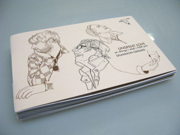
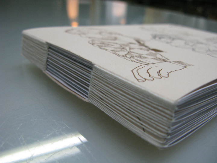
Unspent Love, or Things I Wish I Told You, Open Studio, 2010.
In an interview Shannon Gerard said;
I am just telling pretty simple stories from my life — anyone can do that. And I am using materials and methods that a lot of people can understand and recognize. Also the stories are personal, so I want the books to have definite evidence of the hand of the artist all over them [in the lettering, for instance].
[M]ost of my books so far have been about all of the love and fear and losses and hope and fragility of relationships either beginning, ending or never totally materializing.
In another interview Shannon Gerard quotes Lynda Barry saying that what she does is “autobifictionalography.” This means that her autobiography has some fiction mixed just like every fictional narrative has some autobiographical subtext.
Shannon Gerard’s drawing method relies exclusively on photos of family and friends acting. This has some advantages, but also some disadvantages. As she puts it in her Inkstuds interview (she disclaimed correctly that she’s not one – a stud, I mean):
In a lot of cases I trace right over top of photographs. That is really limiting in terms of like line quality an’ there’s definitely limitations to it in that way.
Watch also Women in Comics.
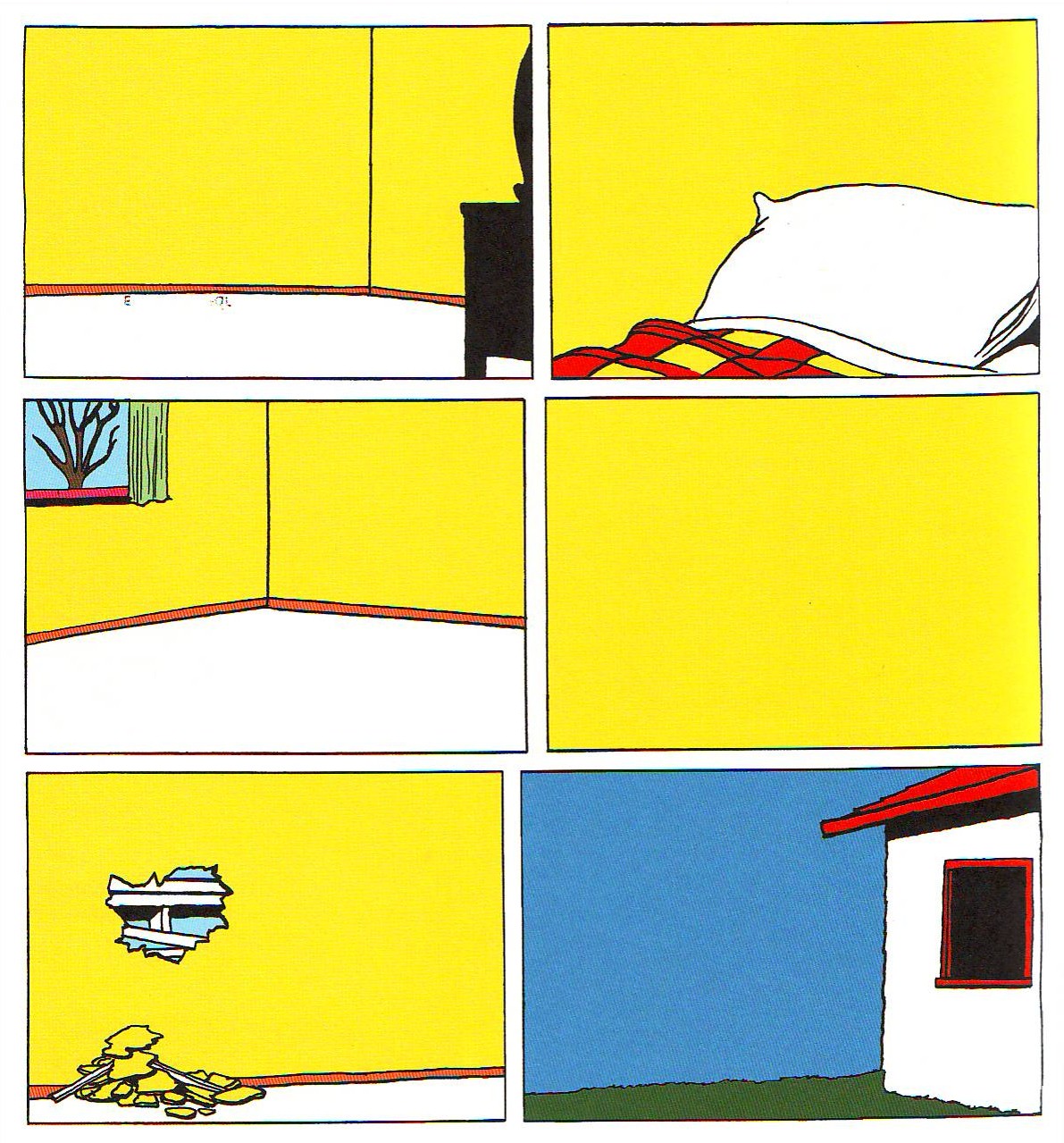
The characters in Unspent Love have an individuality that is rarely seen in comics, but the drawings have something of a mechanical feel to them. The regularity of the lines, the absence of shading, remind me of the clear line. Even so during the last half decade a progress can be detected in Shannon Gerard’s drawing abilities: the tracing look vanished replaced by a more fluid naturalism:
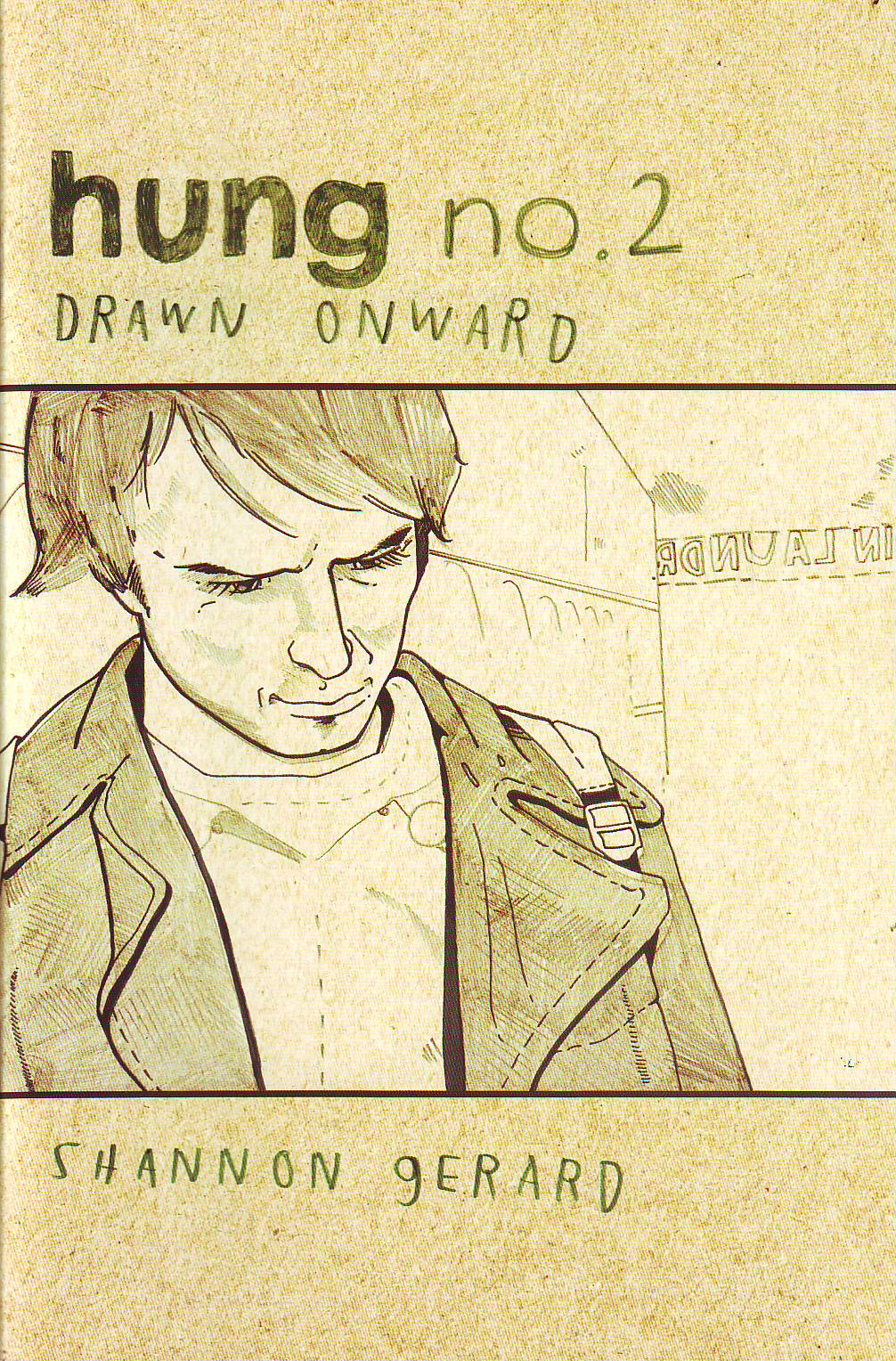
Hung # 2, Drawn Onward, Self-Published, 2006.
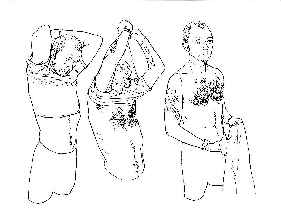
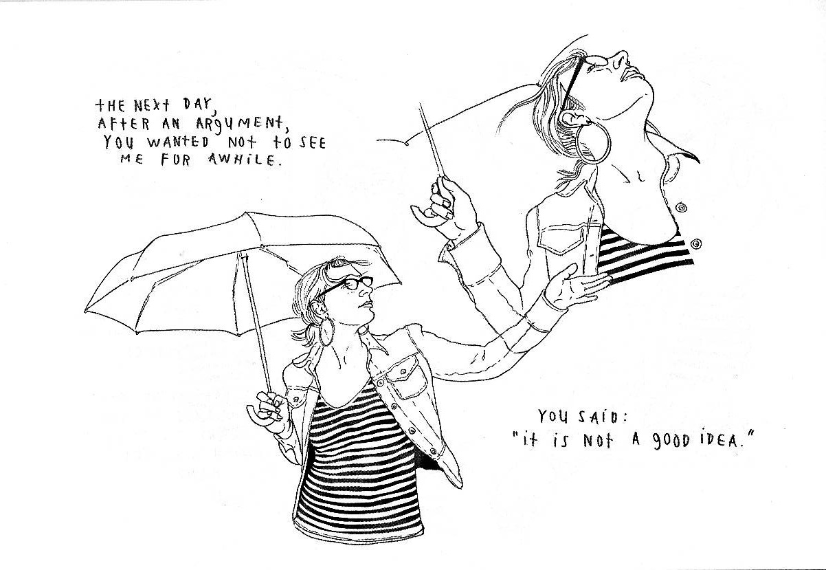
Unspent Love, or Things I Wish I Told You, Open Studio, 2010.
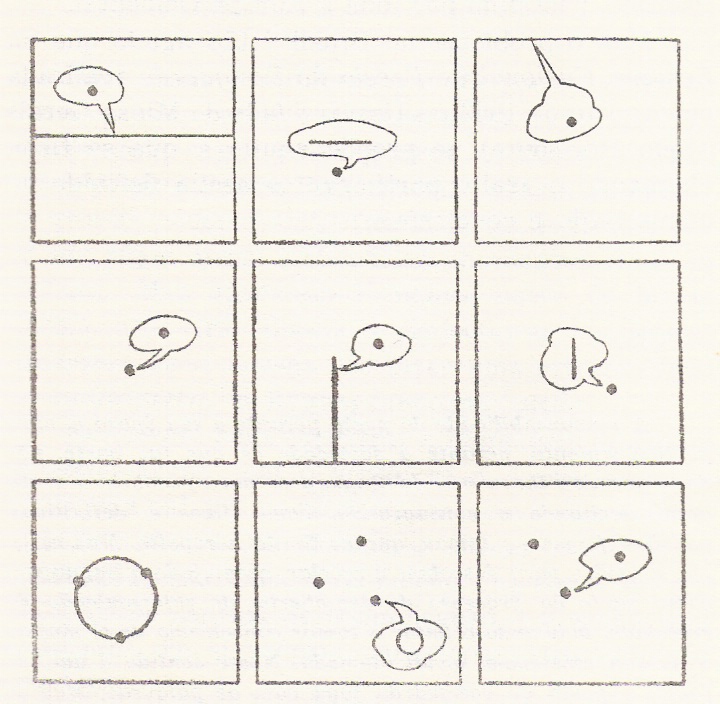
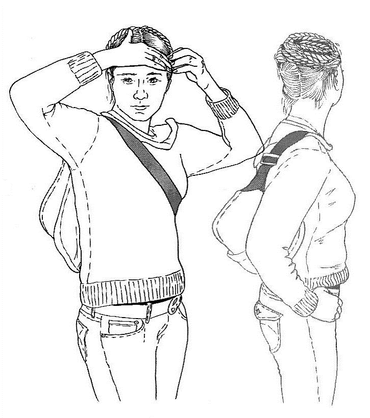
If I understood correctly (and I really don’t know if I did), Shannon Gerard, says in her Inkstuds interview that she compensates the lack of spontaneity of her drawings with a creative approach to page layout. In fact one of her trademarks is the depiction of the same character in various positions in fictional and reading time and fictional and page space. This is the same effect that gave Italian comics artist Gianni de Luca his place in the pantheon:
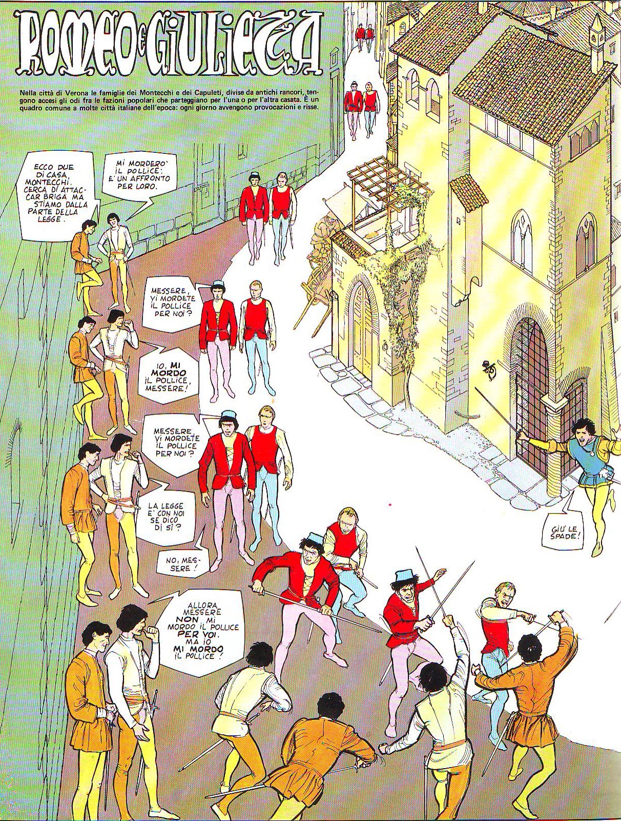
“Romeo e Giulietta”‘s first page (Romeo and Juliet) by William Shakespeare and Gianni de Luca, Epipress, 1977.
Unspent Love, or Things I Wish I Told You, Open Studio, 2010.
One of the most interesting aspects in Unspent Love are the image-text relations. Mostly the image shows a character and the words describe a situation. This leads to the problem of focalization. Being autobiographical (or, you know… autobifictionalographical…) the narrator is a fictional character (s/he always is) somewhat related to the artist-writer, but that’s not what I read-see in other instances: what I read is an interior monologue uttered by the character that I’m seeing. There’s a complex creative system at play because the actors play Shannon Gerard’s own stories: her interior voice mixes with their bodies in an oblique relation. In one particular case (my favorite section of the book, the wedding) the images and the words don’t describe the same point in time creating a lapse that is quite jarring.
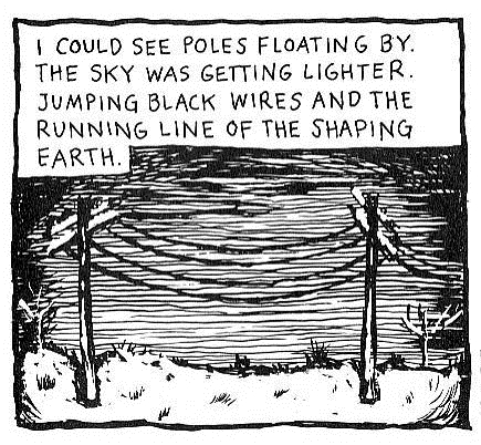
An interior voice and an exterior image of the world in one of Shannon Gerard’s (and mine) favorite cartoonists’ stories.
Panel from “The most Obvious Question” by Lynda Barry, Raw, High Culture For Lowbrows, Vol. 2 # 3.
Reading Unspent Love we may think that the text leads the narration (if we can call it that) while the images are just illos. Nothing is further from the truth: if we know how to decode them the drawings give us crucial information about the characters (did I mention already that the characterization in Unspent Love is exquisite?): I’m talking about their mood: dreamy, absent minded, loving, joyful, etc… but also their taste in clothes, mannerisms… etc… In her Inkstuds interview Shannon Gerard says that the drawings interpret the narrative. I say that the drawings are part of the narrative.
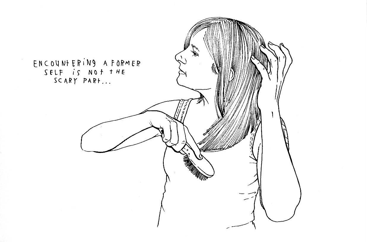
A disjunction between image and text, or is it?
Unspent Love, or Things I Wish I Told You, Open Studio, 2010.
As part of trash culture comics in the restrict field have been poorly written, with some exceptions, of course, throughout their history. Words fail me to express how much I admire Shannon Gerard for bringing adult themes and great writing to comics (and I don’t mean the usual adolescent tripe that passes for adult in the comicsverse). Unspent Love has strengths precisely where your average comic fails miserably. Shannon Gerard’s writing is not only beautifully poetic (she doesn’t like the word because it’s too pretentious; what kind of a world is this, in which an artist feels embarrassed for being a poet?), it’s also full of great ideas. Discover those ideas yourselves, if you didn’t already, because revealing them here would mean spoiling your fun…
I don’t want to finish this post without mentioning Sword of My Mouth, a Post-Rapture Graphic Novel (a post-apocalyptic story written by Jim Munroe and drawn by Shannon Gerard, No Media Kings / IDW, 2010) and Hung (a self-published comic book miniseries to go along with her thesis – see below – the cover of issue number two is reproduced above: Hung # 1, Never Odd Or Even, 2005; Hung # 2, Drawn Onward, 2006; Hung # 3, Lonely Tylenol, 2007).
Shannon Gerard wrote a thesis about autobiography in comics (Drawn Onward, Representing the Autobiographical Self In the Field of Comic Book Production, York University, 2006). Here’s how she presents her book:
The recent proliferation of once underground comic books in the popular media has spawned a vibrant body of critical work about the form and its cultural meanings. Perhaps owing to its relative infancy, the field of comics 1 scholarship, while enthusiastic, has been inconsistent. The current debate seems to be over exactly which analytical approach to take. The search for a suitable critical template has led some scholars to consider comics from the perspective of literary criticism. Other academics use the lexicon of the art critic to focus on the formal design concerns of cartoonists, or attempt to locate the format 2 within an art historical context. Due to the sequential narrative element of comics, many film studies majors have embraced the genre. Given that the reading of comics bears much in common with other fan-based and emotionally resonant sub-cultures like alternative music, a cultural studies perspective seems to provide another piece to the puzzle. However, as comic books represent a unique hybrid of various literary traditions, visual art movements and cultural perspectives, not one of these approaches works in isolation.
Since comics are resistant to conventional analysis, the resulting limited academic work can be frustrating, but I believe the inherent tensions in the field of comic book production are its greatest strength. As with any field of study, these intersections provide dynamic places for various existing ideas to pool together and for new ideas to crystallize. The pronounced interdisciplinary anxieties of comics scholarship make it one of the most exciting areas of inquiry to recently emerge in the academy. Broadly, my thesis attempts to highlight some of the frictions between these varied fields so that a better vocabulary for talking and writing about comic books can develop.
More specifically, my interest is in considering comic books as a form of life writing. I am focused on the autobiographical work of several artists currently working in North America, namely Lynda Barry, Chester Brown, Seth, Matt Blackett, and Shary Boyle. As this paper shall set out, the work of these five artists further demonstrates the complex narrative possibilities presented by the particular conventions of comic book design.
In the context of examining the life writing practices of other comic book artists, I aim not only to expand my academic engagement with comic books but also to develop my own visual art practice. Together with this paper, my thesis takes the shape of three short autobiographical comic books. The union of creative and academic work represented by my thesis is meant to echo the various cultural discourses which meet in the comic book format.
1 A letter S is used at the end of the word “comics” in terms such as “comics history” or “comics scholarship” to specify that a field of study is being discussed. The singular word “comic” sounds too much like an adjective. The term “comic history” might be misread to indicate a historical account of something quite hilarious.
2 Where possible, I have tried to avoid the use of the word “format” as it implies a limited view of comic books as a series of design choices. On the other hand, the word “genre” does not indicate the wide range of creative sub-categories within the field of production. In some ways, the inclusion of such flattening terms is problematic to my aims, but in others, it highlights the basic tension of my struggle for a suitable vocabulary.
To read the book’s first thirteen pages: click on “Preview” on the right.