Bite Marx

Since Melinda Beasi wrote about Twilight here earlier this week, I thought I’d follow up with this essay, which ran in an edited form at the Chicago Reader.
________________
Twilight fans always make a fuss about Team Edward versus Team Jacob, but they might as well be plumping for Team Effete Aristocrat versus Team Colorful Earthy Ethnic Stereotype.

As with all things Twilight, the tropes work not because of their subtlety, but because of the absolute ham-fisted earnestness with which they are deployed. Eclipse is the book where the Edward/Bella/Jacob triangle attains an apotheosis of melodramatic angst-ridden preposterousness. As such, it’s also arguably the book where the bone-headed stereotyping is most thoroughly exploited. What sets the tween heart racing is not that Bella has two boyfriends, but that she has two romance narratives to choose from — narratives of differing but equally venerable pedigree.

In this corner, there’s Edward Cullen. Edward is extravagantly cultured, and ridiculously wealthy. He composes classical ballads, writes in an immaculate hand, and buys his sister a Porche as an offhand gift. Like a real product of the upper crust, he lives with his brothers and sisters, who are all also paired up as husbands and wives. His family is, moreover, obsessed with blood, and has amorphous connections to Italy. He’s foreign, exciting, steeped in ancient traditions, and deeply, ludicrously white. He’s the noble prince come to whisk Bella out of her life and into a deliciously decadent life of luxury and romance. Meyer name-drops Darcy and Heathcliff and Romeo, but Edward has at least as much in common with Prince Charming.

And in this corner, there’s Jacob Black. Jacob is the opposite of upper-class. An Indian living on reservation land, he transforms simultaneously into a werewolf and a laundry list of invidious racial stereotypes. He’s literally hot-blooded — werewolves have higher than normal temperatures, just as vampires have lower than normal ones. Jacob also has massive self-control issues; whenever he gets angry or upset, he starts to shake violently and then turns into a giant deadly wolf. He’s also hairy, frequently bare-chested, and…good with tools! He also eats a prodigious amount — as opposed to the uber-cultured Edward, who doesn’t eat at all.

If Edward is the aristocrat who treats Bella like a delicate queen, Jake is the swarthy, sweaty working-class hero who won’t take no for an answer. Edward will barely allow himself to kiss Bella; Jake, on the other hand, literally overpowers her when he wants a smooch and she’s reluctant. With Edward, Bella always has to be careful; with Jake she gets to be a little bit wild — riding motorcycles, cliff diving, and generally getting in touch with her inner wolf/teen delinquent. If Edward’s the prince whisking away the scullery maid a la Cinderella, Jake is the virile commoner dragging the frigid aristocrat down into the sensual muck a la Titanic.

Romance as a genre has always been just about as obsessed with class as it has been with gender. Differences in social standing are both great drivers of plot (“I’ll never allow you to marry that piece of trash!”) and sexy in their own right. The boy next door (played in Twilight by Bella’s poor, ordinary, never-had-a-chance classmate Mike Newton) is dull — there’s nothing romantic about winding up with the person everybody expects you to wind up with. But a prince to pull you up to the castle or a gardener to drag you down in the muck — that’s an exotic tale to set the heart racing and the bodices ripping.

Meyer’s genius (if you want to call it that) is to have figured out a way to repurpose the same old clichés for an era in which not even tweens want to admit to fetishizing either those on the top of the social scale or those on the bottom. Edward is enchantingly attractive not because he has gobs of money and cultural capital, but rather because he’s an immortal mysterious vampire whose body goes all sparkly in the sun. Jacob is excitingly exotic not because Indians make better lovers, but because he’s an impulsive superstrong werewolf. And the two don’ t want to kill each other because of class or racial animosities (which would obviously be really distasteful), but because vampires don’t like werewolves. When Jacob calls Edward “bloodsucker,” it’s a literal description, not a Marxist critique. When Edward calls Jacob “dog,” it’s because he grows fur and runs around on all fours not — despite all appearances — because it’s a racial slur.

Ultimately, of course, the dog lies down with the bloodsucker; the alabaster prince and the dusky gardener both love Bella so much that they set aside their differences to defend her. Social harmony descends on a world which never had any class antagonisms to begin with. A triumph of tolerance and goodwill? Well, maybe not. Certainly, to see the same old idiocies revived and venerated under a thin PC patina is irritating. How many generations are girls going to be waiting for their prince, anyway? And when exactly are we going to stop shamelessly exploiting the minorities just so that we can tell ourselves how sexy they look down there on the dung heap where we have so summarily deposited them?

But, on the other paw…there is something to be said for that thin patina. If there are stupid fantasies to be disseminated, maybe it’s better to have them be clearly labeled as fantasies. Edward’s not a prince; he’s a vampire. Jacob’s not out of control because he’s an Indian, but because he’s a werewolf. That’s no doubt splitting hairs (as it were) — but those are hairs that I’d as soon see split as not. If there’s one thing that romance consistently tells us, after all, it’s that differences matter.

Bound to Blog: Wonder Woman #23

Wonder Woman #22 was probably the worst one of Marston/Peter’s run…so bad, in fact, that I wondered whether significant parts of it might not have been ghosted.

Issue #23 is much better. It’s not one of the series high points — and notably, like 22, it has three short stories rather than one long epic, a change which I presume must be related to Marston’s sickness (he actually died of cancer in May 1947, which is this issue’s cover date.) Still, whether Marston was writing shorter stories on his death bed, or whether these are leftover scripts that he had lying about unpublished (and they can’t be too old, because they’re post-war) the result is perfectly acceptable, if not great.

As the Holiday girl there in the lower right indicates, the first story is a paradise island adventure. All the more welcome since Harry Peter seems to be in fine form; that picture of WW sitting on the telephone wires waiting for her robot plane with the buildings slanting down vertiginously in the background is pretty fantastic.

Anyway in this story Amazons are disappearing from paradise island’s beach. This gives Hippolyta a chance to watch as her viewfinder presents her with a Perils of Pauline moment:

Anyway, the viewfinder breaks inopportunely, shattered by a bolt from Odin, whose Valkyries are flying down to Paradise Island to kidnap Amazons. Why you ask? Well….

Odin has captured heroes (i.e. veterans) and wants them to go to earth to incense others to fight. But the heroes are tuckered out; all they want to do is sleep. Since his Valkyries can’t get the men to fight, Odin tells them to kidnap Amazons so *they* can get the heroes to go to war again.

As usual with Marston, the gender politics are delightfully convoluted. Obviously, the main instigator of warfare is the sadistic male patriarch, Odin. But the male “heroes” are shown throughout as being soft, manipulable, and not especially violent — they need a strong female hand if they’re going to be effective fighters. So in some sense it’s really women who are the embodiment of military virtues.

The funniest panel here is the bottom one, where the male heroes claim to be sick of being ruled by women “who want us to fight” — the implication being that they’re perfectly happy to be ruled by women who don’t want them to fight.

The rest of the page is interesting as well, though; the Valkyries have encased WW and Amazons and Holiday Girls in energy to trap them and turn them into Valkyries themselves. The purple energy happens in this case to look like the outline of Russian dolls…and of course, standing stock still in their various outfits, the transforming women look more than a little like dolls themselves (with special wing attachments!) I talked about the connection between Wonder Woman and doll stories before. In this case, the Valkyries eroticized dominance/appreciation of the Amazons is both about enjoying femininity *and* enjoying martial virtues. In fact, there’s barely an *and* there; for Marston, the more effectively militant you are, the more feminine you are (at least if you’re a woman.)

Which is why, in the middle right pane abovel, Aphrodite emphasizes that WW and the Holiday Girls are “courageous, loving girls” — the point being that courage and loving femininity go together. The natural conclusion is shown in the bottom left panel, where Odin, the supposed wargod, just gives up and offs himself (throwing down his phallic sword) when WW robs him of his Valkyries.

That page is pretty great in other ways as well, with winged Holiday girls and winged Amazons flying about with sky kangas and that magnificently phallic spaceship that Steve is piloting. I especially like the way the spaceship in the upper left panel mirrors the motion of the sky kanga in the upper right — as if the ubermaleness is just an image of, or subsumed within, the undulating sea of femininity. Maleness seems part of the harmonious whole of femininity rather than an opposition to it.

I also love that middle left panel; the scribbly sky-kangas and the valkyries being tied up here and tied up there, with scale all off-kilter so everybody looks like paper doll cutouts. This is definitely one of Peter’s most Henry Darger moments.

And as long as I’m gushing about Peter — check out this horse.

Or this bizarre backlit Etta as femme fatale from the second story.

This weird Egyptian ghost rising from the tomb is pretty fantastic too….

And how about this ancient Egyptian headgear?

Storywise there’s not a whole lot going on here; Marston makes some noises about the evil dangers of superweapons and generally suggests he doesn’t want the world to go to war again. It’s fine…but the art is definitely the main thing here.

The third story is the most interesting of the lot. It’s a tale from WW’s childhood, explaining the origin of the giant sky kanga’s. Also, incidentally, it lets us know that before there were sky kangas, the Amazons rode on giant bunnies. What is the origin of the giant bunnies? That, alas remains a mystery….

As always, Peter’s animal drawings are something special. The lines of the giant bunny and the giant kanga flow sensuously; the whole page is filled with sensuous curves. And the sensuousness adamently includes the prepubescent Wonder Woman herself; her short frilly flared red dress placed in the center of the composition.

In Between Women: Friendship, Desire, and Marriage in Victorian England, Sharon Marcus argues that the eroticization of female children was a common iconographic trope of Victorian fashion illustration, as well as of Victorian society more broadly.

Victorian culture represented girls as epistemological paradoxes, so innocent that they could be intensively eroticized without raising comment. But unlike images and stories that eroticized girls for a mixed audience of men and women, fashion imagery displayed girls in erotic dynamics with adult women for the delctation of a female audience. In The History of Sexuality, Foucault argued that the intensification of family ties in the nineteenth century also sexualized them, and fashion plates show that in the process all cross-generational ties were eroticized, including those between adult women and girls…. Designed to be objects of an appreciative female gaze inside and outside the image, girls in fashion plates also embody a desire to look at and touch a woman, a desire figured as both self-abasing and self-important.

Marston reproduces this dynamic even more self-consciously than the fashion plates:

WW’s “childish tricks” (involving, essentially, disrobing at super-speed before her mother), lead Hippolyta to remember her daughter’s actual childhood. The eroticized affection between mother and daughter is then displayed (via film) for the delectation of an all-female audience.

In her discussion of the Victorians, Marcus follows her look at fashion illustration with an analysis of debates about corporal punishment in women’s magazines of the period. Said debates involved numerous women writing to the magazines to describe, in detail, their own experiences with corporal punishment — descriptions which dwelt on the removal of clothes, the physical sensations of whipping and being whipped, and other immodest details. All of this, according to one magazine editor “aroused…intense, not to say passionate interest.”

Here’s one letter which Marcus quotes.

I put out my hands, which she fastened together with a cord by the wrists. Then making me lie down across the foot of the bed, face downwards, she very quietly and deliberately, putting her left hand around my waist, gave me a shower of smart slaps with her open right hand…. Raising the birch, I could hear it whiz in the air, and oh, how terrible it felt as it came down, and as its repeated strokes came swish, swish, swish on me!

Marcus notes that “Corporal punishment is where pornography, usually considered a masculine affair, intersects with fashion magazines targeted at women.” She adds that “flagellation scenarios represented, interpellated, and excited women as well as men, and that the power differences inherent in scenes of discipline and punishment were erotically charged in any gender configuration.”

So here’s some scenes of the young WW being disciplined as little girls ought.

That upper right panel, in particular, eroticizes the adult mother and the child daughter in exactly the same way; both are bound side by side, with Peter’s stylized drawing and the wrappings deemphasizing the age difference; they look like different sized dolls rather than like mother and daughter.

Peter emphasizes the connection, and the parallel fetishization, of mother and daughter in other ways as well:

Mother and daughter both attack in the same way; leaping up to grab the antagonist by the neck. And in both cases, the attack is, I’d argue, fetishized; Hippolyta’s straight posed stiffness emphasizes the curves of her dress and of her breast. In the second sequence, Peter shows us, in both panels, WW’s underwear beneath that short miniskirt.

In addition, of course, any display of female power is eroticized for Marston, as is any display of female disempowerment. As with the corporal punishment fantasies Marcus describes, the woman empowered and the woman disempowered are both subjects of the fantasy. So it’s as exciting to see WW in the cage as to see her breaking out of it:

Note in the bottom left panel that we see her underwear again…and that her crotch is level with her mother’s face. The energized swoops of motion lines; the violent rescue of the damsel in distress — this is a typical erotic fantasy, not any the less so because it involves daughter/mother rather than hero/heroine.

You see it again here; the Amazon being unwrapped is decidedly butch; her shoulder-width emphasized by the narrowing of her lower body caused by the wrapping. Young WW, with her dress flaring up as always, is decidedly femme. But in this case the femme is rescuing the butch, rather than the other way around — a role reversal which I’m certain Marston appreciated.

And speaking of role reversals:

The sky riders who the Amazons initially assumed were men are, as it turns out, masked women. Thus Aphrodite’s law preventing men from setting foot on Paradise Island is not broken. Or, to put it another way, men are not the defilers of Aphrodite’s virgin soil — women are. Inevitably, the sky raiders are stripped to their underwear and bound under the watching eyes of the Amazon. In defeat, the powerful men are feminized — though, since this is Marston, the feminization is actually their triumph, as they will now (eventually) become reeducated and made Amazons (better than any man!)

Marcus notes that the Victorians created eroticized images of and narratives about women for women. The fashion plates allowed women to experience powers and pleasures around control and consumption of female bodies that were, in other areas, reserved for men. In a somewhat analagous way, it’s worth pointing out that the eroticization of children in WW is meant to be consumed primarily, not by adults, but by children. The hints of adult pleasure, power, dominance, and submission, leavened with childish adventure and playfulness — the very things that made Frederic Wertham choke up his soup — were, I’d guess, exactly the features which appealed to children of every gender.

Plus, of course, sky kangas.

Doubly Good

There’s a moment in Lilli Carré’s minicomic “The Thing about Madeline” where you really get that you’re reading a real story and not another installment in the Saga of the Mundane. It’s a little later than the point where that story actually begins: not where Madeline meets her doppelganger/self for the first time – that’s just a plot twist – but when Madeline the First gets “into the habit of watching herself through windows”:

Robert Stanley Martin correctly identified this moment as the place where the story’s main narrative idea slips from metaphor into dramatic irony, as the doppelganger is able to find the happiness in her life that Madeline could not. His review is so spot on I’m just going to link to it rather than trying to cover those aspects of the narrative myself.

But those panels also mark the place where the visuals take over doing that metaphorical work that the narrative leaves behind: the images of double Madeline continue to manifest the theme of alienation from oneself and one’s life while the plot (and facial expressions) hold up the ironic narrative.

What’s particularly beautiful and satisfying about this is not just that the visuals effortlessly carry significations that would become increasingly labored in prose. It’s also that the comic itself is now doubled right along with Madeline: the themes of alienation and happiness continue side-by-side formally in the same way that Alienated Madeline and her Happy Doppelganger populate the narrative. What this allows, then, is two separate story arcs: a literal one about Madeline and the Doppelganger, and a sustained metaphorical one about the relationship between alienation and happiness. Toward the end of the book, when Happy Madeline is visited by her own Alienated Doppelganger, the scenes from the beginning are recast – on a second read or in retrospect, it’s possible to see Happy Doppelganger and Happy Madeline as the same “character.” In that reading, self-alienation is always lurking and, as Robert points out, the easy moralizing criticisms of Alienated Madeline are much harder to make. The powers of circumstance and perspective get attention in a way they could not if the story had stayed more personal, eschewing that metaphorical strand.

Carré’s work always balances very deftly on the line between ironic detachment and literary self-awareness, both traditional dramatic irony as well as the more formalist kind. Her characters often have these very distinctive noses that are a mashup of Mary Poppins and Raggedy Ann, and they alone are sufficient to make her drawing style immediately recognizable. In the case of The Thing about Madeline, this stylistic quirk works as support for the formal edifice: they mark the characters as “drawn,” and the effect of this signature is to anchor those characters to the visual plane of the comic. They restrict the universality of the characters and contribute to our sense of detachment from them.

That signature nose is absent from Carré’s most recent animated film, Head Garden, one of the selections for the 2010 SPX Animation Showcase.

Head Garden from Lilli Carré on Vimeo.

Instead, the face carries the metaphor, more directly. The facial features are less “cartoony” and more influenced by “art” faces like the ones discussed here and in comments. For me, the loss of this creative “signature” lets the animation breathe and allows the critical, slighly neurotic self-awareness of ironic detachment to mutate into the genuine double entendre that marks the best literary characterizations. The physical marker of style is less overt, but there is no loss of metaphorical sophistication (relatively at least; the animation’s metaphors are less ambitious than the mini-comic’s). The characters have become less “self-conscious”, although less well-developed in this less narrative piece, and I think because of this, the seams between the form and its significance are better hidden. I don’t think that’s just an effect of the film as opposed to comics. Identification with these characters is less detached even in still frames, despite the much more distant narrative characterization.

It seems to be a one-off, though; Nine Ways to Disappear maintains the signature style, as do Carré’s previous animations. (The nose is put to exceptional effect in What Hits the Moon; watch the way it sustains the character’s identity as her face ages around it.) But I think the comparison illustrates some of the limitations of too much “handwriting”: after awhile, it begins to feel like deliberate self-citation. Unless the handwriting is used in some meaningful way, it can interfere with other effects. Head Garden is still discernably Lilli Carré, but in the absence of that distinctively marked facial feature, her graceful but slightly awkward lines — like the talented too-tall girl in ballet class — get to take center stage. I hope to see a sustained story from her in the style of Head Garden sometime soon.

=========================================================

This review is based on the black-and-white mini-comic version of The Thing about Madeline. More information on the SPX Animation Showcase is available here.

Not a Superhero Comic, But It is Plenty Violent

The Girl With the Dragon Tattoo

Written by Stieg Larsson
Translated by Reg Keeland

Every mainstream reviewer seems to love this novel. It’s an international bestseller that’s spawned two sequels and has already been made into a movie. All this despite the fact that the author is dead and Swedish. My reaction, however, was “meh.” Other than the Swedish names that I can’t pronounce, there’s nothing in this book that sets it apart from any typical crime thriller.

Don’t get me wrong, it’s not a terrible novel. The mystery at the heart of the story is well-crafted, and I didn’t notice any glaring plot holes. The pacing is brisk, except for a few lengthy discussions of Swedish finance. The translation from the original Swedish produced a few awkward lines, but nothing memorably ridiculous.

 But much of the novel’s appeal depends on whether the reader identifies with the main character, Mikael Blomkvist. As shameless Mary Sues go, Blomkvist could give Superman a run for his money. Blomkvist is a middle-aged, left-leaning journalist and magazine editor, just like Stieg Larsson. He also happens to be one of those courageous and brilliant journalists who’s dedicated to THE TRUTH. And he’s irresistible to the ladies without even trying (I’m not joking about that last part, he gets as much play as James Bond per film). Perhaps if I were a middle-aged Swedish journalist, I might find Blomkvist appealing. As it is, he’s somebody else’s empowerment fantasy, and I just feel left out.

Although Blomkvist is the protagonist, the titular girl with the dragon tattoo is Lisbeth Salander, an anti-social hacker who helps Blomkvist solve the big mystery. The inspiration for Salander is rather odd. According to a longtime friend, Larsson admitted that as a teenager he failed to intervene when he witnessed a woman being gang-raped. So the character of Salander was supposed to be his attempt at redemption, and the writer’s redemption came from the character’s rape-revenge narrative. (Spoiler Alert!) Midway into the novel Salander is orally and anally raped by her legal guardian. Salander eventually gets a fitting revenge, but the novel never spends much time on her reactions or development. Despite his desire for redemption, Larsson is always more interested in the trials and tribulations of his thinly drawn author-avatar. The plot focuses on Blomkvist and the big mystery, Salander becomes his sidekick and eventually his lover, and the rape-revenge storyline ends up being much more exploitative than Larsson probably intended.

The entire novel, in fact, seems like an effort to have a sexy violence cake and eat it too. On the surface, the novel takes the uncontroversial stance that raping women is bad. But this is still a crime thriller, and the genre requires a certain amount of depravity. The numerous instances of sexualized violence are not simply elements of the story, they’re the driving force behind the plot and the novel’s most notable feature (besides the unpronounceable Swedish names). I’d go so far as to say that the sexualized violence is one of the novel’s main selling points. The forbidden thrill of sexual violence can be secretly and safely indulged so long as it’s coupled to the condemnation of the same sexual violence.

But I’d be lying if I said the sexualized violence actually offended me. Mostly, I was just bored. This novel is not some glorious, genre-busting breakthrough. It’s nothing more and nothing less than competent pulp, Scandinavian style.

Twilight & the Plight of the Female Fan

When Noah first asked me if I’d like to write a guest post for The Hooded Utilitarian, he mentioned that he’d be especially interested in something about Twilight. I admit I originally balked at the idea. Though I’ve vocally defended the series’ fans, I haven’t read the novels, and my only significant reaction to the first volume of Yen Press’ graphic novel adaptation was that it was more readable than I expected.

That last statement should not be taken as a condemnation of Twilight by any means. The truth is, I’m simply not its audience. I like a good romance as much as the next middle-aged married lady, but even those who dismiss the genre would be foolish to assume that all romances are created equal. Simply put, I’m too old for Twilight. While my teenaged self might not have fully comprehended Stephanie Meyer’s bloodlust = regular ol’ lust metaphor (not that it’s especially subtle), she would have felt it in a profound way. It would have resonated with her on a deeply personal level. I was pretty innocent as a teen, and the concept of even kissing a boy was both enticing and mind-blowingly terrifying, much like Bella’s first kiss with her sparkly, bloodthirsty suitor, deep in the secluded woods.

Now in my forties, I know all too well that sex is the least terrifying element of romance. Love’s true horrors prey on the heart and mind, and there’s nothing you can buy at Walgreens to help protect them. Looking in at Twilight from the reality of weary adulthood, it’s difficult to muster patience for Edward’s martyred bad-boy act (just as it’s difficult to stomach Bella’s fascination with it) but I can recognize it as something that, if it was written for me at all, was written for the me of a very different time and place.

A second read-through of the graphic novel has only cemented my original opinion of it, but even so, I feel a kind of kinship to the series’ young fans. Having spent my entire life obsessed with some kind of fiction or another–books, television, musicals, manga–I can appreciate their need to experience the series over and over again, to talk about it with friends, and to proselytize everyone they meet. Sure, it’s obnoxious, but how many long-time genre fans can honestly claim that’s never been them? I know I can’t.

Earlier this year, just before the first volume of the Twilight graphic novel was released, I made a post in my blog about the manga and anime fandom’s treatment of Twilight fans. In that post, I cited a few overtly misogynistic comments made by male fans, and proposed a theory that the real “problem” with Twilight fans in the eyes of fandom is that they are overwhelmingly girls. That’s a pretty easy accusation to make against nearly any genre fandom. We’ve all heard stories of women who’ve been ogled, condescended to, or otherwise mistreated in comic book shops, at conventions, in online forums and so on, and most of us have experienced this at some point or another ourselves.

What I think I missed back when I wrote that post, however, is something far sadder than a bunch of paranoid fanboys making an angry fuss on the internet. What’s more disturbing to me now–something I began to see bubbling up in comments and responses to that post–is a trend of women in manga and comics fandoms deliberately distancing themselves from other women (or from works created by/for women in the medium, teen romances or otherwise) as an apparent matter of pride. Don’t get me wrong. I’m not suggesting that women have an obligation to like works created by other women, or even the women themselves. We like what we like, and there’s not a lot more to be said about that.

The thing is, we are saying more. We’re ranting and denying and over-explaining ourselves, all in an attempt to ensure that we can’t be associated with anything “girly.” Take, for instance, this recent post from Molly McIsaac at iFanboy.com, “Turning Japanese: A Starter Guide to (Shoujo) Manga” (and let me apologize to her now for choosing her as my example). In this post, Ms. McIsaac strives to cut through all the girly stuff and point readers to some shoujo manga with “good, solid stories and strong characters.”

We’ll gloss over the fact that she likens shoujo manga to Craig Thompson’s Blankets (which, as a story of one man’s coming to terms with his spirituality, most closely resembles a particular brand of seinen, if anything at all), and that none of her shoujo “staples” goes back any further than 1996. All any of this indicates is that she’s fairly new to the medium and has yet to really experience its breadth (and hell, some of that older shoujo is pretty hard to find in print). None of this has anything to do with my problem.

What I’m getting around to here is the fact that Ms. McIsaac seems to feel that she has to offer up disclaimers for reading shoujo manga at all. I’m also bothered by the strong implication that manga for girls is antithetic to solid stories and strong characters. “However, do not allow shoujo manga to intimidate you,” she says. “Although it is aimed primarily at young women, there are plenty of good, solid stories that are considered shoujo that I believe most people can enjoy.” If even women feel they need to make these kinds of excuses while recommending manga written for (and primarily by) women and girls, how can we expect any of that work or the fans who read it to be respected by the larger fandom?

Again, I’d like to apologize to Molly McIsaac. This attitude about girls’ comics has most likely been passed down to her by scores of female fans who came before, shuttling around borrowed volumes of Boys Over Flowers to each other with quiet embarrassment, wishing they looked just a little less sweet and sparkly.

Honestly, I’ve done this myself. How many times have I complained about the hot pink Shojo Beat branding on the outside of Viz’s editions of NANA, claiming that it trivializes the series and makes it embarrassing to read on the plane? (The answer is, “Many, many times.”) Yet I can think of several pink, sparkly, decidedly “girly” manga (at least one of which is written for little girls) that are more well-constructed, deftly plotted, and philosophically-minded than many of the comics I’ve seen published for, say, boys or adult males. Though these manga are certainly girly, they’re hardly lightweight. Even so, just two years ago, I sat in on a convention panel at a nearby women’s college, where one of the pro panelists (a female sci-fi writer) told the entire room full of young women that all shoujo manga was plotless high school romance and that whenever she saw girls looking in the manga section at her local comic shop, she’d direct them towards “more interesting things like Bone.”

What does any of this have to do with Twilight? Well, nothing and everything, I suppose. If female manga and comics fans have any hope of adjusting men’s attitudes about our presence in “their” fandom, we really need to start by adjusting our own. I’m probably never going to really like Twilight (in graphic novel form or otherwise)… or Black Bird, or Make Love and Peace, or any number of particular girls’ and women’s comics I’ve picked up and discarded for various reasons.

I’m also never going to like Mao Chan, KimiKiss, Toriko, the Color trilogy, or any number of other comics I’ve rejected that were written for boys or men. Yet the existence of these boys’ and men’s series I don’t like has never made me feel like I have to apologize for or explain why I still read things like Fullmetal Alchemist, Children of the Sea, or Black Jack. “Well, it’s written for guys, but it’s still good, I swear!” That’s a sentiment I have yet to see expressed by comics fans on the internet, female or otherwise.

So what is it about “girly” comics that puts us so on the defensive? Are we seeking approval from male fans? Do we believe we have to publicly reject all things stereotypically feminine in order to obtain (or maintain) credibility in fandom? If so, I submit that we’re actually playing right into the attitudes that kept us alienated in the first place. And if we’re doing it to establish credibility amongst ourselves, we’ve lost to them completely.

– Read Melinda’s reviews and discussion of manga, manhwa, and other East Asian-influenced comics at her blog, Manga Bookshelf.

The Crisis of the Collaborative Cartoonist

By James Romberger

Thought forms in the mind as a combination of word and image. For that reason, cartooning is a direct, intimate means to communicate subjective thought to a reader. This is why many of the greatest comics are by artists who write their own narratives. Still, it is rare that a single person can both draw and write well, much less produce a work of blinding genius; one can spend a lifetime mastering either discipline. However, a writer’s words can be brought to life by an artist of the prerequisite abilities, one who can accomplish what in a film might require an unlimited budget and even pass beyond, to the unfilmable. The comics form offers infinite possibilities to writers and artists who are willing to work together. But the focus on autonomy in alternative comics has left collaboration largely in the hands of comics’ mainstream, where it has been greatly influenced by the economics and labor/management relationships of periodical publishing. The reader’s indulgence is asked for a short history of those relationships, as a prelude to an explanation of the artist’s contribution to the collaborative process in comics.

Bullpen variations

“Bullpen” comic book production was initiated in 1936 by groundbreaking cartoonist Will Eisner and his partner Jerry Iger to meet the rising demand for content in the new medium of the comic book. Studio staff was divided into an assembly line of piece-workers: writer, penciller (which might subdivide to layout, character and/or background artist), inker, letterer, and colorist. The bullpen became standard for comics because it was expedient to publish books on time and made it so no one creative person was wholly responsible for, or entirely invested in, what was claimed by publishers as properties done by “work-for-hire” employees. Comics history is crowded with “ghost” creators like Carl Barks and Bill Finger, who worked in near or actual anonymity and were not compensated fairly for their contributions. For many years, that was the accepted status quo.

In the early 1950s at E.C. an odd exception to the standard sweatshop mold led to some of the best comics published to date. Editor Harvey Kurtzman recognized that in comics, the crux of storytelling is in the layout or breakdown that integrates text with image, the pencil drawings that establish the structure and style of the design. The layout finds the flow of viewpoint and character interaction. Kurtzman made articulately composed page diagrams for all of his stories with every basic element drawn roughly in place, which his artists then rendered to finish. Still, individual stylists like Wallace Wood and John Severin did some of their finest work for Kurtzman’s war comics “Two-Fisted Tales” and “Frontline Combat.” Kurtzman demanded a high degree of accurate detail for period stories; his artists respected his guiding intent and invested their drawings with research, observational realism and great passion. Kurtzman also grasped the importance of color and worked side-by-side with colorist Marie Severin to enhance his narratives immeasurably. In these atypical collaborations, Kurtzman was the writer and also the primary storytelling artist. His finishing artists acted more as elaborators, but it was they who signed the stories, Kurtzman only took credit as editor.

Another version of the Bullpen was introduced with what became known as the “Marvel method” in the 1960s. Editor Stan Lee enlisted artists such as Jack Kirby, Steve Ditko and Gene Colan to draw their stories from brief plots outlined by Lee in a short note or phone call, or to invent the stories from whole cloth themselves and make notes that described the narrative and suggested dialogue in the page margins. After the fact, Lee added captions and balloons based on those notes, in his words a job often “like filling in a crossword puzzle.” Lee was able to do this because on their own, these experienced storytelling artists could initiate and motivate characters, construct their environments and produce complete comic book page sets. For what often amounted to copy-writing, Lee claimed full writer credit and pay. In this arrangement, the pencillers were also uncredited plotters and co-writers.

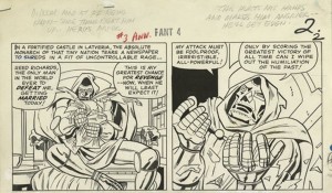
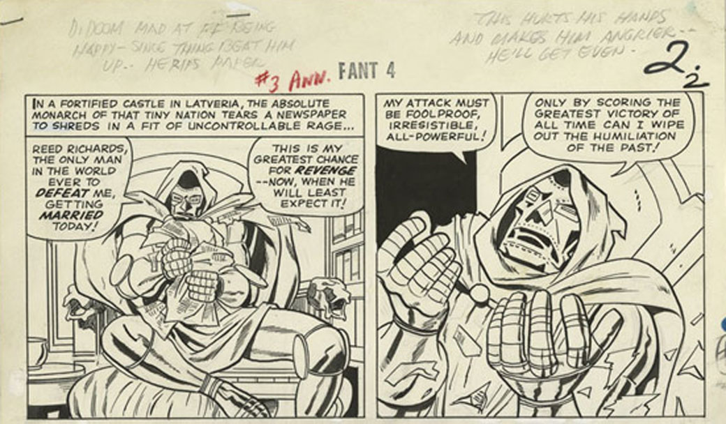
Jack Kirby writes continuity, which Stan Lee ignores, from the original art for Fantastic Four Annual #3, 1963

In particular, Kirby was the single greatest driving force in the foundation of Marvel’s popular multimedia empire; his creative input on “The Fantastic Four” alone encompassed a multitude of imaginative characters and settings. To be fair, Lee helped make the books successful with his unifying voice; in the letters pages and in his “Bullpen Bulletins” he created an illusion of family that resonated with young readers. He did plot and write some of the stories and he credited his artists (for their art) prominently. But Lee also failed to defend his collaborators’ interests to management. According to Kirby biographer Mark Evanier, promises were made to Kirby about royalties that were not kept and Kirby found no one to address his concerns to but Lee, who said, “I have nothing to do with that.” Kirby subsequently left the company rather than be further exploited. Kirby’s children still struggle to gain any portion of the multibillions Marvel makes from the comics, films and merchandising derived from their father’s work.

Too many battles were fought by the artists and writers of comics for their rights to be detailed here, but in the early 1980s, major publishers instituted “creator-owned” contracts for special projects in which artists and writers share copyright as co-authors, on an equal footing. Mainstream comics are still closely overseen by an editor, who selects teams and then acts as intermediary to writer and artist, even in creator-owned projects. The editor can facilitate their best efforts and contribute greatly to the storytelling by honing the creator’s individual contributions, depending on the sensitivity and sensibility of their recommendations or dictates. Some other holdovers from the bullpen days are still present in mutated form. While some artists finish their own pencil drawings in ink, others still have their pencils inked or finished by other artist. Inexplicably, though color makes a profound impact on the reader, the colorist still holds the lowest-paid job in comics. Perhaps as a consequence, few artists in comics do their own color, which is now most often applied by digital artists, with mixed results. Also, while alternative cartoonists often prefer to letter in their hand, mainstream artists do not and digital fonts have supplanted hand lettering almost entirely, not least because digital balloons and captions are editable until the last moments before publication. Whatever the rationale for their use, digital typesetting loses the qualities of illumination that are an important advantage of the comics form. Inkers, colorists and letterers of varying degrees of skill and artistry can greatly enhance, or ruin a book. But, it should be reiterated that the penciller controls the layout and storytelling and so is the primary artist.

Make It So

Currently in mainstream comics, an editor works with a writer to provide an artist with a document that resembles a movie script. This text describes the settings, the personalities, speech and actions of the depicted characters, as well as the trajectory and intent of the scenes. However complete this may sound, it’s not; the artist’s job is daunting. In a film, the lion’s share of the credit does not usually go to the writer, but to the director, the person in charge of the product of a largely visual medium. In comics, the artist must engage complex skills that approximate everything that would be involved in making a movie: direction, cinematography, casting, actors, production design, set design, lighting, costume, makeup, special effects and every other function, including that of the person who tapes around the actor’s feet to mark where they were standing.

One challenge for the cartoonist is that one’s “actors” must play their parts with well-timed reactions and believable emotions, expressions and gestures. That is no small feat of itself. The characters must reflect the diverse variability of human form. They must also be recognizable (“on-model”) from all angles or lines of sight, as must the settings, objects, vehicles and fashions, which also must all be true as possible to the time and place depicted, down to the smallest necessary detail. All of the depicted persons, environs and objects must also be executed in perspective and reflect the influences of light and the natural elements. In other words, the artist must understand and render everything that in a film is recorded by a cameraman. Like animators, cartoonists visualize movement within three-dimensional space as they simulate the viewpoint of a weightless steadicam; they engage a complex form of draftsmanship that can be described as “motion perspective.”


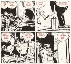
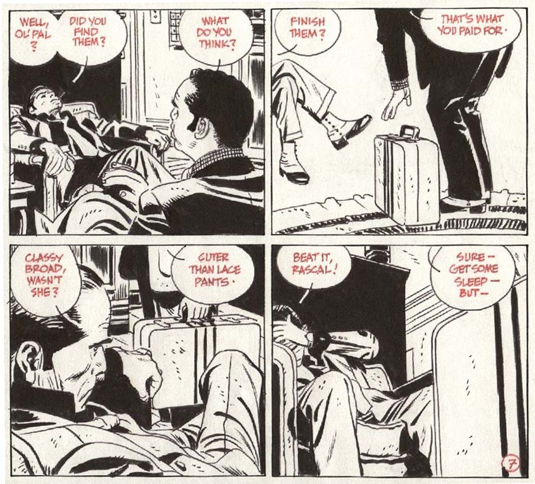
Alex Toth, motion perspective from the original art for “Torpedo.”

Quintessential moments must be chosen to freeze in panels. A further complication is that the characters must be composed in each panel in their order of speaking, as indicated by the script. The refined composition of each panel acknowledges not only the design of the images viewed simultaneously in direct proximity on the page and on the facing page (a two-page “spread”), but also those throughout the entire narrative. The illusion of movement occurs in the spaces between panels, where positive and negative space flip, creating visual rhythms that sync with the beats of the broken-down blocks of words, as the reader’s eye is led where the artist wants it to go. At the layout stage, artists might expand upon, or deviate significantly from a script in order to make a story work effectively. For instance, the addition of panels can serve to compress time or make actions clearer, captions can be bumped to panels behind or forward in order to gain room for a larger drawing, captions can be added or deleted to clarify character. In truth, it would be difficult if not impossible to find a cartoonist who did not add many acting characters, objects, architecture, flora and fauna of their own device throughout the execution of a given story, all of which contribute substance to the narrative.

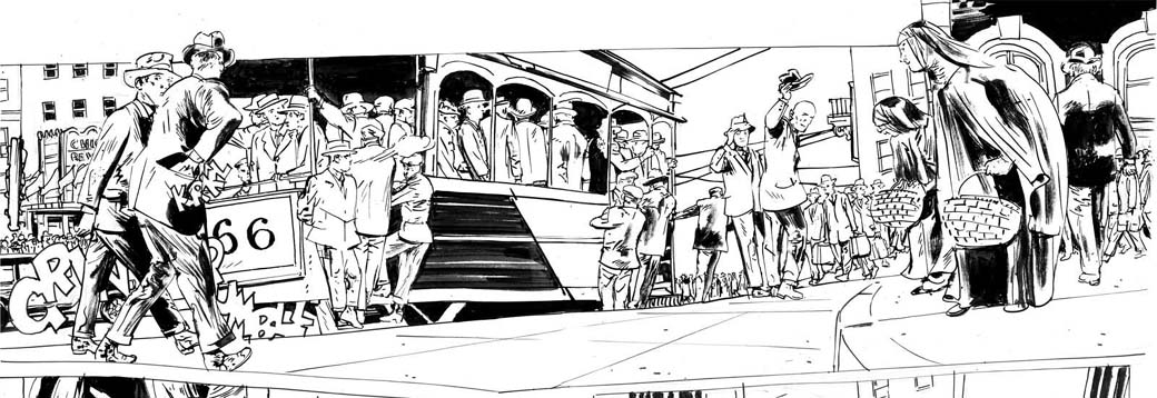
Artist Tony Salmons notes three seemingly innocent words often seen in scripts, “a crowd gathers.” Salmons says, “A writer scripts or merely plots this line down on paper and goes on to the next scene. I spend an entire day researching, casting, lighting and acting out that crowd. Is it an opium den? SF or Hong Kong? Texas? German beer garden? Rainbow room at 30 Rock? What kind of crowd? If I do it with total commitment the considerations can go way beyond this. And the writer’s contribution is 3 words, ‘A crowd gathers.'” No matter what the story requires, the artist must make it so.


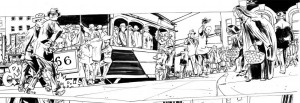
Tony Salmons, detail from the original art for “The Strange Adventures of H.P. Lovecraft.”

Additionally, ideas occur in the process of drawing. The artist may see a better way to articulate a scene after it has been laid out, when the story has achieved sufficient form that new visual potentials emerge. Artist P. Craig Russell has detailed one of the artist’s many unique contributions to comics storytelling, a technique he aptly calls “parallel narrative,” sequences invented by the artist that diverge from the script to depict scenes that are not in the text, that are intended by the artist to counterpoint the text. In comics, the onus is on the artist to make the story work. For that, the artist must find ways to “believe” what they are drawing, to feel the motivations of the players, the touch of a lover, the heat of battle or the cold night wind of the desert and express them to the reader.

Comics demand an immersion on the part of the artist that goes far beyond the job description of an illustrator. Illustrations are derivative entities that are subordinate to text, isolated visualizations which can operate either as redundant to the words or as commentary on the words, ranging from literal to oblique. In comics, the text is most often visually subordinate. The images are imbedded with far more information than the words. The words represent sounds and qualify the images. The text need not say something that is clearly shown in the pictures. Illustrations can enhance or challenge the reader’s visualization of prose, but comics are a full-blown realization of narrative, with the intimate interactivity of a book and with more potential for expansive spectacle than film.

For most of comics’ short history, the writing was often the weakest element and so highly skilled interpretive cartoonists have longed to work with better scripts. As the graphic novel gains ground in the book trade, more serious writers will want to explore the form. This could result in more sophisticated and revelatory collaborative efforts. It should be made clear that comic artists are usually paid more per page than writers, but for as long as credits have been given, artists have willingly shared them equally with writers. But now, the equilibrium of credit has slipped askew. Increasingly one sees collaborative books credited and publicized with the emphasis on the writer alone. Such selective crediting causes further chain reactions. In the catalog listings of libraries and booksellers, the “Author” is listed first. In the case of graphic novels, it is assumed that the name credited as “writer” is the “author,” unless specified otherwise. The artist might not even be included in bibliographic data unless credited by the publisher as a “co-author.” Amazon’s default system for graphic novels lists writers as “author” while artists are diminished to “illustrator”, a subordinate creator and in no way a “co-author.”

This diminution of the artist’s perceived role in comics has repercussions for alternative and mainstream artists alike. Artist Jillian Tamaki spoke of her process collaborating on the graphic novel “Skim” with her cousin, the writer Mariko Tamaki: “(Mariko) was not precious about it. It was basically just a play and there was no description of what they were doing when they said something, or where they were…it was me putting the pacing in, and the rhythms and the timing and the backgrounds….it took about two years.” But when “Skim” was nominated for a Canadian book award, the writer was the only one cited for the honor. Writer Alan Moore makes sure that his artists share equal credit, but Neil Gaiman’s name dominates the cover of the exquisite book P. Craig Russell made of “Coraline.” It can and has been claimed that it is Gaiman’s name that sells books, but a case can also be made that Russell’s mastery of the comics medium is such that his adaptations of Gaiman’s prose stories are more resonant in their form than the comic books that the writer has scripted. Even as the medium is poised to evolve into a sophisticated art form, critics often closely analyze what they perceive as “the writing” of a given book, but ignore or barely describe the art, perhaps because they are unaware of the interrelativity of text and art in comics, or perhaps because the publisher’s packaging and promotion tells them that the writer is the primary creator.

This trend will discourage thoughtful non-writing or interpretive artists from involvement with the medium. Because of the labor-intensive nature of comic art, a graphic novel can take an artist years, even decades to complete. In the current climate, collaborative comics become much less worthwhile for the artist. The remedy to this situation falls to the individuals who work in comics. Artists should avoid the “illustrator” label and stipulate a co-authorship credit for themselves in their contracts. They might find that there already is a co-authorship stipulation in their contracts, which has not been honored by the publisher’s packaging and publicity arms, or that there is some ambiguity in the distinction between “co-creator” and “co-author,” or they could discover that there is a contractual clause which calls for “credit according to current practice.” This means that the more artists allow themselves to get less credit, the more it becomes current practice. Also, writers could heed Alan Moore’s positive example and not allow their credit to override that of their partners. Both creators should ensure that their publishers direct their design and promotional departments to incorporate the contractually stipulated credits and see that book trade entities correctly list them. The alternative is that artists accept a diminished role and lose their hard-won rights.

In the end, the credit issue is about more than just the bruised egos of artists and writers. Debates about the validity of authorship itself are set aside when the realities of book publishing and movie deals come into play. A great comic need not ever be made into a movie if it resonates sufficiently within the parameters of its form, but when films are made and when book royalties accrue, artists and writers should share in the credit and proceeds as co-authors. For the artist, comics are a difficult form and the work involved in a graphic novel is not undertaken lightly. If his or her contributions to the whole experience of reading are seen as expendable tools of the writer, the evolution of comics is at risk.

Sources

Jack Kirby scan courtesy of the Howell-Kalish collection. From the Jack Kirby Museum’s Original Art Digital Archive.

Evanier, Mark. Kirby: King of Comics. New York: Abrams, 2008. p. 157.

Green, Karen. Words and Music…er, Images. Comic Adventures in Academia, column on Comixology website, 4/3/2009:
http://www.comixology.com/articles/212/Words-and-Music-er-Images

Lee, Stan with George Mair. Excelsior! The Amazing Life of Stan Lee. 2002. New York: Fireside/Simon and Schuster, p.146.

Russell, P. Craig. Parallel Narrative. Video series posted online: www.pcraigrussell.net
or http://vodpod.com/watch/1296908-pcr-tv-parallel-narrative-murder-mysteries-part-1

Salmons, Tony. Quote from private correspondence. August, 2010.

Tamaki, Jillian. Quote from transcript of panel discussion: Inside Out: Self and Society in Comic Art. Moderator: Calvin Reid. St. Mark’s Church, Howl! Festival, 9/10/2008:
http://www.comicsculture.net/

Utilitarian Review 8/28/10

TCJ.com Kerfuffle

This week on the TCJ.com mainpage Caroline Small, Ng Suat Tong and I participated in a roundtable on the Best American Comics Criticism anthology edited by Ben Schwartz. Jeet Heer, Brian Doherty, and Ben Schwartz himself also participated. In comments other critics joined in, including Rob Clough, Ken Parille, Robert Stanley Martin, and Kent Worcester. So check it out if you haven’t already.

Oh, and there’s a comment thread on the roundtable here as well which includes a discussion of French language and Japanese comics criticism.

On HU

Domingos Isabelinho discussed Dominique Goblet’s and Nikita Fossoul’s Chronographie.

Kinukitty talked about European fashion magazines, Dave Mustaine, and Makoto Tateno’s Yokan Premonition.

In a guest post, teacher and artist Sean Michael Robinson explained that it’s a good thing for art teachers when students are into anime and manga.

JR Brown wrote an extensive article about the history of the pretty boy in Japanese art.

I reviewed Issue #22 of the Marston/Peter run on Wonder Woman.

Vom Marlowe talked about gender issues in the young adult prose series Percy Jackson and the Olympians.

And a music download of Beatlesesque pop.

Utilitarians Everywhere

Caroline Small is going to be on the Critic’s Roundtable panel at SPX, along with many other illustrious folks. (Via Robot6.)

Critics’ Panel: How We Judge
3:00 | Brookside Conference Room
The accessibility of online publishing alongside traditional media has enabled a diversity of critical voices who are addressing the broad spectrum of comics being published today. A diverse group of critics will discuss the disparate bases for their own critical opinions, and the extent to which they regard different kinds of work in different ways. Join moderator Bill Kartalopoulos for a discussion with Johanna Draper Carlson (Comics Worth Reading), Gary Groth (The Comics Journal), Tim Hodler (Comics Comics), Chris Mautner (Robot 6), Joe McCulloch (Jog the Blog/Comics Comics), Ken Parille (Blog Flume), and Caroline Small (The Hooded Utilitarian).

At the Chicago Reader I review JimCollins’ Bring on the Books for Everybody.

In The Gift of Death, Derrida concludes that literature is an empty, parasitic untheology, constantly seeking forgiveness for its meaninglessness. Ever the tenured radical, he sees this revelation as an affront to the academic establishment. But cultural studies is a more callow establishment than Derrida anticipated, and members like Collins don’t have a problem with emptiness. On the contrary, Collins is “delighted” just to find that literary fiction “forms part of the cultural mixes” that modern cultural consumers “assemble with such gusto to articulate who they are, and what is crucially important to them.” The content of their identities and concerns is utterly beside the point. Are they Nazis? Misogynists? Drooling idiots? As long as they embrace it with gusto, who cares? The point of literature is to make a statement regardless of what’s said. By the same token, Collins is aware that, say, The Oprah Show is witheringly stupid and the movie version of The English Patient is an apologia for imperialism—but he can’t bring himself to take the next step, which would be admitting that some of the detritus of popular culture deserves to be scorned.

On Splice Today I talk about the new film The Last Exorcism in light of the criticism of James Baldwin.

For Baldwin, the bed floating, the fluid spitting, and special-effects gouting, were all part of a willful disavowal. The little girl with the deep voice uttering curses is an innocent possessed by the devil…but Baldwin argues that the upper-middle-class milieu in which she sits and writhes is anything but innocent, and that the movie is therefore an example of (in various senses) bad faith. Baldwin notes that at the end of the film, the “demon-racked little girl murderess kisses the Holy Father, and she remembers nothing.” This convenient amnesia is, for Baldwin, emblematic of America’s penchant for forgetting what they have done, to whom, and for what ends.

At Madeloud I have some recommendations for sexadelic lounge music. Groovy!

Other Links

R. Fiore was inspired by our Popeye roundtable to write a really entertaining appraisal of the Fleischer Popeye cartoons.