The First Superhero?

Golem-film

 
I’ve been assembling an ur-team of Avengers for my book On the Origin of Superheroes, and my first-ever superhero award goes to the Golem. He’s super-strong, impervious to pain, and, when made from clay, can even shapeshift a bit. On the downside, he’s dumb in both senses and so requires close supervision. Sorcerers and programmers beware.

“There is nothing more uncanny than something that is almost human,” says Margaret Atwood. “All our stories about robotics are stories like that. It’s what we have always worried about. It’s the sorcerer’s apprentice story: He learns how to do the charm; he doesn’t know how to turn it off. It’s the Golem story: You make the Golem, you activate it, it’s supposed to do your work for you, and then it runs amok.”

Atwood’s Oryx and Crake trilogy features a genetically engineered species of designer humans, but they’re too mellow to cause the survivors of her apocalypse much trouble. When it comes to magic brooms and water buckets running amok, I picture Mickey Mouse, but Goethe published his poem “The Sorcerer’s Apprentice” while Napoleon was still waging France’s Revolutionary Wars.

Apparently Goethe cribbed the tale from Lucian’s Philopseudes, c. 150 CE, though the word “golem” is even older. It means “shapeless mass” in Hebrew, which is the description of Ben Grimm that Stan Lee typed up for Jack Kirby in 1960: “He’s sort of shapeless—he’s become a THING.” Kirby drew a giant bumpy rock monster that turned orange at the printer’s. I don’t know if either had the Golem in mind, but Fantastic Four writer Karl Kesel did when he decided forty years later that Ben’s full name was Benjamin Jacob Grimm.
 

thing jewish

 
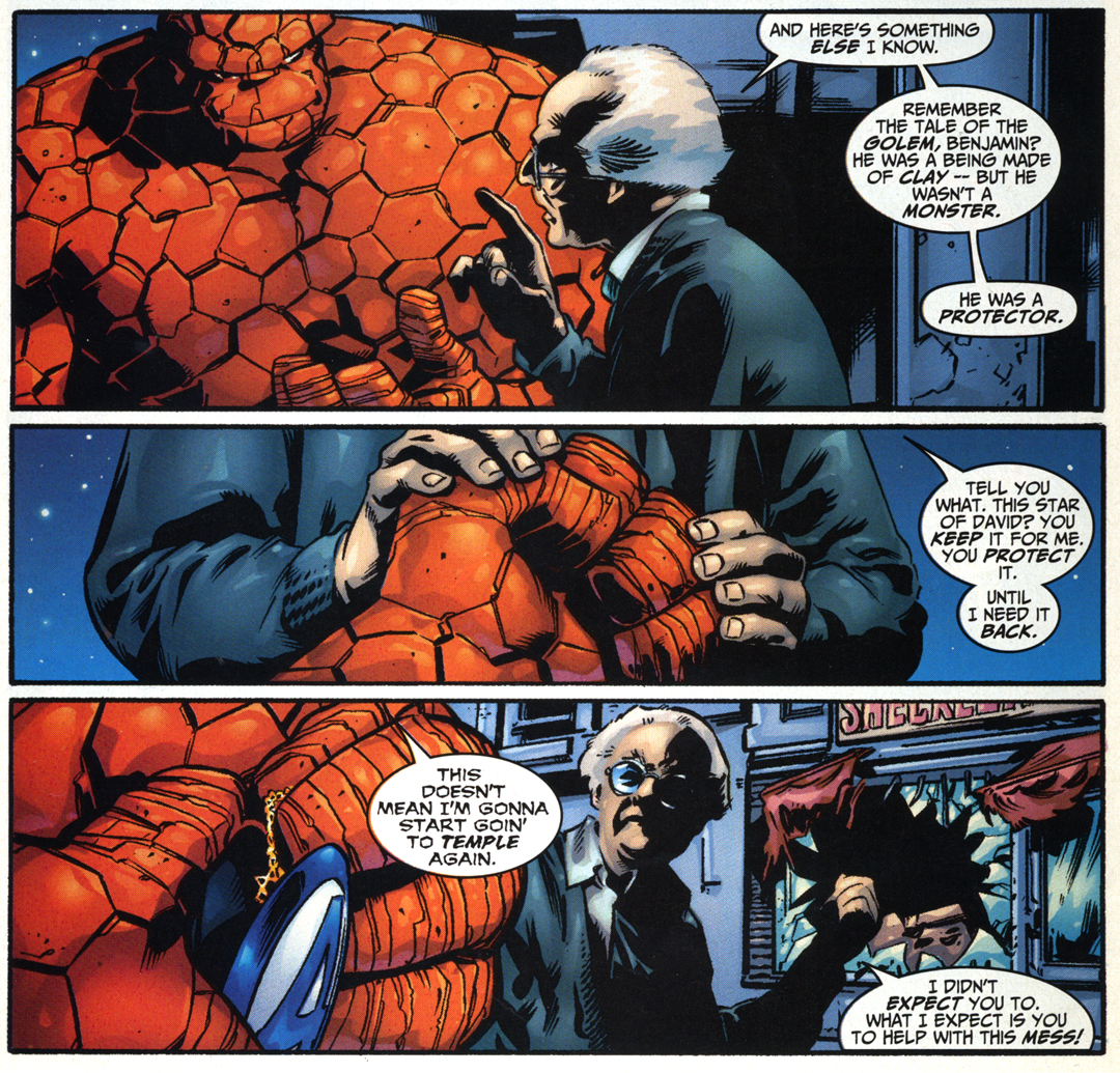
Benjamin grew up going to synagogue as a kid and could still recite Torah passages from memory, so he probably knows that “golem” first appears in Psalms 139:16 (“my substance, yet being unperfect”) when David praises God for creating him. The Talmud (c. 200 CE) uses the term to describe Adam’s creation too: “In the first hour, his dust was gathered; in the second, it was kneaded into a shapeless mass.” But jump forward another couple hundred years, and a passage mentions the first living golem: “Rabbah created a man, and sent him to Rabbi Zera. Rabbi Zera spoke to him, but received no answer. Thereupon he said unto him: ‘Thou art a creature of the magicians. Return to thy dust.’”

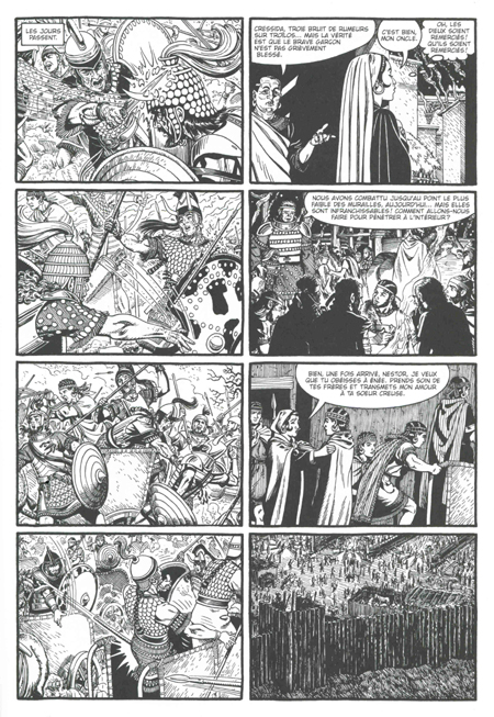
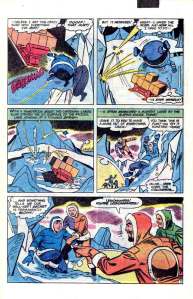
Apparently they weren’t all that hard to manufacture. All Pygmalion had to do was pray to Venus to bring his ivory statue Galatea to life. Daedalus soldered his golem Talos from bronze. If you’re up on your Kabbalistic techniques, Sefer Yetzirah (The Book of Formation) gives a how-to, but Aryeh Kaplan warns apprentices not to attempt it alone. Virgin dirt is also key. Marvel was still printing on pulp paper in 1974, which is why their Strange Tales Golem only ran three issues. Writer Len Wein gave the legend his best superheroic spin:

In centuries agon, they had called him a myth, a creature formed of stone and clay and the blood of a people’s oppression—a moving monolith who rose before the yoke of  tyranny—shattered it in his monumental fists—then vanished into the sands of time—there to be almost forgotten—until today! Now once more he rises—summoned from his eons-long sleep to protect those he loves.

marvel golem

 
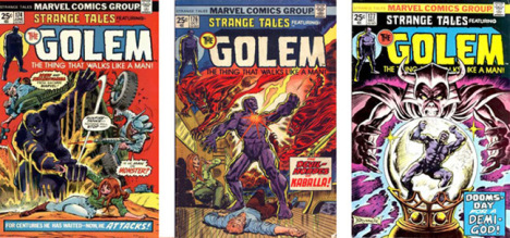
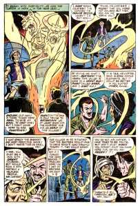
Marvel tries not to take sides in the Palestine-Israeli conflict, declaring it

a war of territory, of ideologies—fought with great fervor but with little gain—fought with loaned weaponry wielded by men—men charged with love of country and the courage of their convictions, but men nonetheless—aye, as in all wars before this, fought by men—imperfect, all-too-human men.

But those the Golem loves are the family of Jewish archeologists who dig him up, while General Omar leads an army of marauding rapists who pillage the archeological camp and machinegun the grandfather. Uncle Abraham’s dying tear reanimates the creature. “Eyes of a camel!” shouts one of the keffiyeh-wearing soldiers. “The statue—it lives!”

Michael Chabon’s golem surfaces for far less dramatic adventures. His amazing Kavalier and Clay find its coffin filled

to a depth of about seven inches, with a fine powder, pigeon-gray and opalescent, that Joe recognized at once from boyhood excursions as the silty bed of the Moldau . . . . The speculations of those who feared that the Golem, removed from the shores of the river that mothered it, might degrade had been proved correct.

My wife and I sat along the banks of the Moldau (AKA Vltava) sipping Budvar in a Prague café in 1996. The ground was too paved to be termed virginal, but the city has a legion of statues and tourist shop figurines already prepped for animation. Prague is to Golem as Metropolis is to Superman. The tales proliferated there like magic brooms in the 1800s. One named Josef protected Jews from a supervillainous Emperor with the additional superpower of invisibility—so basically half of the Fantastic Four. Benjamin Kuras, author of As Golems Go, explains why Golem still adventures in the Czech Republic:

After living through the Austro-Hungarian Empire, Nazism and decades of communism, the Czechs are drawn to a character with supernatural powers that will help liberate them from oppression.

rur

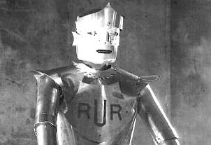
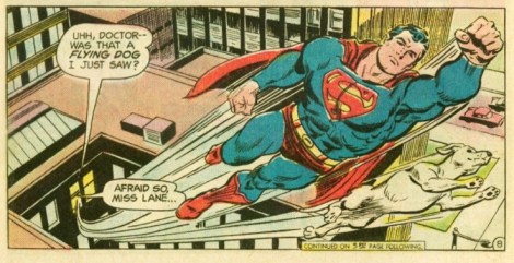
The Golem is also the original “robot,” a Czech word for “laborer” or “slave.” Karel ?apek’s play R.U.R. (AKA “Rossum’s Universal Robots”) unleashed them on the world, resulting in the extinction of the human race in 1920. Despite the nuts-and-bolts contraptions in promo shots, Kapek’s robots are the flesh-and-blood variety, more like clones or Philip Dick’s sheep-dreaming replicants. Carl Burgos had the same idea when he drew the Human Torch for Marvel Comics No. 1 in 1939. The flames were one of those unintended “run amok” side effects, but rather than burning Brooklyn to the ground, the almost human Torch gets his superpower under control (bringing our Fantastic Four tally to 75%) and vows to help humanity even though humanity tried to seal him in a steel and concrete cage.
 

marvel comics 1

 
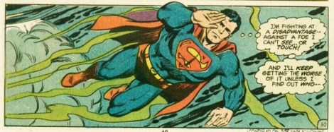
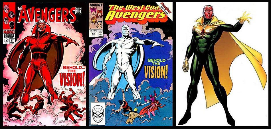
The Human Torch fizzled in the forties and wandered out to the desert to die—the same fate Wein copied for his Golem. The evil robot Ultron rebuilt the Torch’s burnt-out corpse in 1968, and he was reborn as my favorite childhood superhero, the Vision. But then the original Torch erupted from a secret grave in the 80s, so the Vision was never really the Torch but a copy soldered from spare parts. Only, no wait, that’s not it either, because next it turns out the Vision and the Torch are in fact the same synthoid split in two when a time-traveling supervillain manipulated the timeline. Except then the Vision half was ripped apart by She-Hulk, and his identity may or may not inhabit the sentient armor of the time-traveler’s teen-age self, while his soul returned in a team of Dead Avengers before Tony Stark reassembled his body. And don’t even get me started whether that body is the kind with buzzing wires and clanking pistons or the kind with synthetic organs that gurgle and fart.
 

vision_gallery_02

 
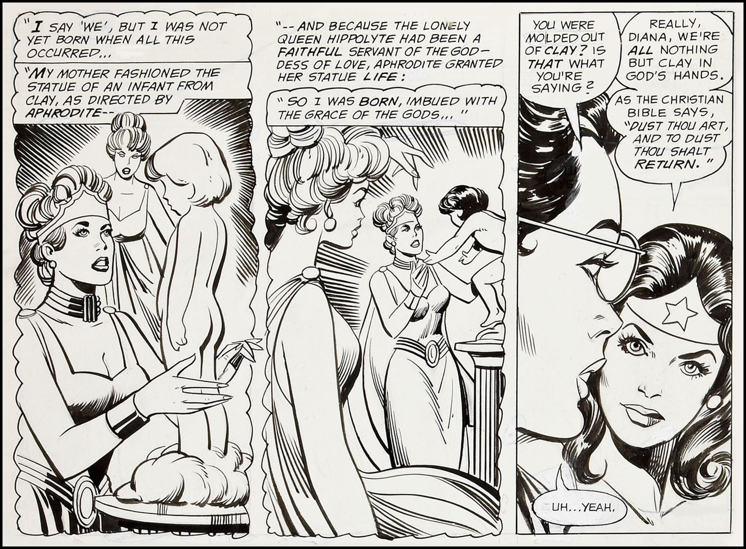
Human animation is simpler. My wife returned from Prague pregnant with our daughter. King David praises God for “cover[ing] me in my mother’s womb,” but we followed a very different nuts and bolts process. Though nothing like the Thing, my daughter has been running amok for eighteen years now. She looks a lot more like the clay statue Hippolyte sculpted and, with the help of her gods William Marston and Harry G. Peter, brought to life in 1941—making Wonder Woman the original comic book Golem. Sadly, she’s not available for my team of First Avengers.
 

wonder woman made of clay

(Non) Super (Non) Direction

Superheroes are supposed to be amazing. They can leap tall buildings, run faster than a speeding whoosh, and see sights that no sighter has ever sighted.

And yet, on film, superheroes are, visually, banal.


That’s a little documentary about Kurosawa’s use of movement. At about 4:30, the video compares scenes from Joss Whedon’s the Avengers —and shows pretty definitively that Whedon does basically nothing with the camera, with his actors, or with his composition. The Avengers might be the world’s most powerful mortals, but Whedon films them with the dynamism of grey, flatulent paint (though I’m sure Kurosawa would film flatulent paint with panache, if he felt like it.)

Whedon is an unusually blah director, but superhero films in general aren’t known for their visual distinctiveness. Look at this sequence from Peyton Reed’s Ant-Man.


There’s some effort to promote visual interest there. The camera beings moving away from Ant-Man, and then flips so you’re moving towards Henry Pym and Hope. Once your close to Pym and Hope, the door slams, and then there’s a zoom towards the keyhole, followed by a shot back to Ant-Man, who races towards the door. The back and forth of the camera, from Scott to Pym to Scott to Pym, could be seen as mirroring the (humorously) repetitious failed attempts. And there’s a nice comic moment when you see him racing towards the door, and then the shot on the other side as he smashes against it, leaving his impact to your imagination.

But while the sequence is workmanlike enough, it’s not exactly impressive or memorable. The back and forth of the camera doesn’t feel especially regulated or meaningful. Notice the last shot of Ant-Man before we switch back to the door closing, for example. The camera is stationary; it’s no longer pulling away from him. the sense of motion is frittered away; the shot doesn’t add to the tension or the sense of motion. It just reminds you that Ant-Man is still standing there. Similarly, the first run at the door doesn’t really use the camera pacing to create suspense. Instead, after all the build-up, there are just a bunch of shots: moving in on the keyhole, cut to Ant-Man closing his mask with a flourish, then running, then watching him run through the keyhole, then a flash of blue, then the sound of impact. It’s haphazard and disjointed; there isn’t a clear rhythm or build, which means that there isn’t a sense of anticipation or failure. As a result, most of the work of the scene is up to the Foley artist, for the thud-into-the-door sound effect.


In contrast, the scene from Hitchock’s The Birds uses orchestrates shot/reverse shot movement to build suspense throughout. The cuts come quicker and quicker throughout the scene as the inevitable disaster looms, culminating in what are essentially freeze frame snapshots of Tippi Hedren’s horrified face as the explosion rips through Bodega Bay. And then of course there’s that marvelous move upwards to the bird’s eye view, looking down on the flames forming a slash across the city, with the bird’s squawking in triumph before they swoosh down to do more damage.

It’s kind of cruel to compare a couple of random big-budget hacks to Kurosawa and Hitchcock, obviously. But, on the other hand, Hitchcock, at least, was a Hollywood hack too; The Birds was a suspense picture that was meant for box office success (and did fairly well at that.) Given the buckets of money the studios throw at the Marvel films, it seems like they could find a director with rudimentary visual skill, if they wanted to.


Guy Ritchie’s not one of the all time greats of cinema or anything, but The Man from U.N.C.L.E. has some visual flair. I like the sequence at about :45 where the camera rushes in for a close up at the first car, then pulls back and in the same (presumably digitally enhanced take) rushes forward for a close up of the trailing car. It provides a nice sense of speed and urgency—again, not breathtaking, but fun—which is more than can be said for the direction in Avengers or Ant-Man.

Of course, Man From U.N.C.L.E. bombed, while Avengers and Ant-Man were mega-hits. The sameness of the Marvel films (and the fact that Daredevil, on television, is somewhat more visually adventurous) suggests deliberation. Marvel could have hired Guy Ritchie to direct one of their properties; they haven’t bothered because they figure boring is best. The direction is meant to be bland, because they figure (rightly or wrongly) that audiences wants superheroes who are bland. We want heroes, apparently, who are not too interesting, or surprising, or exciting. We want superadventures that keep to the superconventions.

Utilitarian Review 10/9/15

ed2e284b804bf973866bca057f75796a

 
Wonder Woman News

Nice piece at the History of BDSM site summarizing my arguments about WW and bondage.

On HU

Featured Archive Post: Sarah Shoker on high fantasy as subversive literature.

Robert Stanley Martin with on sale dates of comics from mid 1948.

Petar Duric on the Sly Cooper games and class hierarchy.

Chris Gavaler on comics inking and Henry James.

On Xasthur and the circle of metal.

A short piece on loving to hate/hating to love Mandy Moore.

Me on Stendahl Syndrome and never getting out of the patriarchy.
 
Utilitarians Everywhere

At Slate I wrote about Jojo Moyes and romance with a sad ending (and a happy one.

At Playboy

—I interviewed Mistresse Matisse, about her work in sex work activism.

—I wrote about Meryl Streep’s T-shirt and suffragette’s history with racism.

—I wrote about the Kunduz hospital bombing and how atrocities are always going to be part of war (which is why you shouldn’t go to war.)

At Pacific Standard I wrote about Alison Bass’ book Getting Screwed and how laws against sex workers were less harsh in the past than they are now.

At the Rumpus I talked about Percival Everett’s new book and the good and bad of African-American literature’s marginalization.

At Splice Today I wrote about

—how Lawrence Lessig is an idiot.

A.O. Scott and conventional snobbery.
 

Other Links

Justin Lehmiller on the relative health of people in monogamous and open relationships.

Tim Sommer on why Kraftwerk should be in the Rock and Roll hall of fame.

Rebecca Thorpe on how rural representatives vote against prison reform to keep jobs in their districts.

Patriarchy in You

stendhal-syndrome-2

 
According to Andrew Cooper, you can read the Stendahl Syndrome as a winking parody of critical fears of horror movies. In the film, Detective Anna Manni (Asia Argento) is violently raped by a serial predator. The rapist manages to capture her because she suffers from Stendahl Syndrome—a psychological condition which causes her to be overcome, and even experience hallucinations, when viewing art. Anna, then, is the incredibly overly receptive viewer of critics’ nightmares; her whole view of reality is transformed by aesthetic experience. Little wonder, then, that the rape/revenge plot of the film she is in leads her to perdition. Morally censorious critics imagine that watching films causes violence; Anna, the overly sensitive viewer, observes her rapist and becomes him. She does manage to take her revenge, but after doing so, she becomes psychotic herself. Through the power of art, the detective changes to the murderer. End of joke.

There’s another, less ironic way to take the film, though. Most rape/revenge films are narratively linear, and set. You start out with a healthy, unmarked woman; she is abused, suffers, strikes back, and destroys her tormenter.

The Stendahl Syndrome scrambles this—not with the rather obvious chronological trickery of Irreversible, but through more subtly letting the emotional and narrative components of the story shift out of true. Anna begins to experience trauma when she goes to an art gallery, before she is raped. And rather than a singular event, the rape is reenacted; first by Anna, who begins to dress as a man, and then molests her boyfriend, and then by the rapist, who attacks other women, and then re-kidnaps Anna. Finally, Anna murders the rapist in revenge—but that doesn’t end the story. Instead, the narrative grinds on, with the rapist apparently back from the dead—until it turns out it’s not the rapist, but Anna herself who is murdering her own lovers and friends. The rapist is inside her, she says; being violated, and then enacting violence herself, has turned her into him. She becomes the abusive patriarch who assaulted her.

Psycho, and Hitchcock in general, seem like an obvious touchstone here; as in Hitchcock’s films, the movie world seems to gleefully conspire against the beautiful protagonist, creating switchback complications to destroy and humiliate her. But unlike in Hitchcock, the film affect is always, firmly with Anna, which means the complications don’t seem like trickery, but like grotesque unfairness. The movie even says, just about outright, that it is rigged against Anna; it is art itself which disorients her and traumatizes her before the rapist can.

Again, Anna’s susceptibility to art could be a meta-comment that art doesn’t actually work like this; a painting doesn’t make you hallucinate, a film doesn’t make you a murderer. But the antipathy of art within the film could also be an acknowledgement of the antipathy of the film itself—and, metaphorically, of the antipathy of the world outside the film.

Sexual violence and patriarchy aren’t neatly contained in a narrative of (provisional) redemption. Instead, they leak out everywhere. Anna is traumatized before she is traumatized; her rapist continues to haunt her not only after the rape, but after his death. The violence to her is not only real, but symbolic—and is so overwhelming that she can’t even separate the violence from her self. Her relationship to her own sexuality, and her own violence, is inseparable from what has been done to her—and what has been done to her isn’t just the rape, but the vision in which the rape occurs, which precedes it and enables it.

One of many false climaxes in The Stendahl Syndrome occurs during Anna’s second rape. She has been tied down to a bed, and the rapist, having finished his work, leaves to amuse himself in some other way before coming back to finish her. There’s graffitti on the walls of the chamber, and her syndrome kicks in, causing her to hallucinate. Her powerful thrashing allows her to free herself. She kills her attacker when he returns in an extremely satisfying scene. Art serves as inspiration for empowerment — the message of many revenge films which seek to uplift, whether Fury Road or Ex Machina.

But Anna can’t get out of the film. Once she has tied herself to the tropes of suspense and violence and patriarchy, she can’t undo the knots. If Stendahl Syndrome is a parody of the idea that aesthetics can corrupt, it’s also a parody of the idea that aesthetics can save and liberate. Instead, in the Stendahl Syndrome, art and life collaborate together to create a hierarchy from which there is no escape, a dream of violence that doesn’t end.

Love to Hate/Hate to Love

This ran at Madeloud way back when.
______
 

Amanda_Leigh

 
Mandy Moore
Amanda Leigh
[Storefront]

Two Stars

Listen To: “Everblue,” “Song About Home,” “Merrimack River (Reprise)”

I was swept away by the first rapturous chords of Mandy Moore’s last album Wild Hope — and I’ve been more or less bitterly falling out of love with it ever since. I can’t resist those folk-pop tunes under the layers and layers of pristine production and the slightly hoarse vocals — but, gah, the remorselessly earnest phrasing…the self-help lyrics…and, for that matter, the saccharine folk-pop tunes under the layers and layers of pristine production. It’s like drifting off to sea in a romantic coracle with your one true love and then becoming desperately seasick and barfing over the side. And then you realize your true love is actually a rotting zombie mannequin — but jeez, she doesn’t look so bad, does she? And then, hey, it’s time to vomit over the side again. And then back to the not unpleasing zombie mannequin. And so on and on, over and over again. Oh god, make it stop.

Moore’s latest, Amanda Leigh, does nothing to free me from my painful and embarrassing dilemma. The album does head for a slightly different neck of the pop sugarscape : Moore has said she was inspired in part by Paul McCartney’s Ram, and as that would indicate, the languorous washes are leavened with a good bit more pep and fuss. But the basic algorithm remains the same: seduce, sucker punch, repeat — and not in a good way. “Song About Home” is a fine, jazzy Joni Mitchell impersonation; “Love to Love Me Back” on the other hand, demonstrates with a numbing finality that even mixing in Joni Mitchell can’t redeem crappy country radio tropes. “Merrimack River” is a pretty enough melody with an importunate and irritating waltz tempo; “Merrimack River (Reprise)”, though, resets the tune from guitar to piano and strings, adds some minor tunings and for a minute or so you’ve got a nice collision between Debussy and a carnival. “I Could Break Your Heart Any Day of the Week” is another absolutely egregious country radio clunker. “Those calendar girls, they got nothing on me!” Moore throbs, with a calculated spunk that she really seems to be clueless enough to have mistaken for sexy. The song is complete and utter crap…except for an odd dissonant bridge about 1:40 in, where the anthemic cheer shakes, stutters, and almost dissolves into something Syd Barrett could recognize. If only it would last…but no, our five seconds are up and we’re back to the shiny, happy people shit.

Amanda Leigh, in other words, is a fickle flirt. Avoid her siren song altogether and listen to something you can trust, like Linda Perhacs or, hell, Pat Benatar. But…if I have to pledge my troth to one track on this album, I guess it would be “Everblue,” an aching dirge soaked in amorphous longing and regret. Moore’s singing is her finest on the album. From the moment she comes in a perfect half-beat early, she emphasizes her breathing, and the heavy in-out seems to slow the pace even more, until even nonsense doggerel like “I have felt the ground, I’ve seen the seeds /Out of which grew golden wings” seems weighted down with meaningful melancholy.

Of course, some genius sprinkled in additional sighing wind effects, which are both dumb in their own right and tread dangerously close to self-parody. It’s probably just as well, though. If too much of my faith were restored, I might be tempted to buy her next album. No good could come of that.

Xasthur and the Circle of Metal

This ran on Metropulse, way, way back.
_______________________
 

images

 
For centuries, scholars believed that metalness was a straight continuum, with bands like Slayer at the top end and performers like, oh, say…Debussy at the bottom. In recent years, though, researchers have discovered that the truth is somewhat different. Beyond St. Vitus, beyond Celtic Frost, out where the black dooms drone, we now know metal curves, and Stephen O’Mally, like a wily ourobourous, takes his tail in his teeth only to discover he’s chomping on the smiling visage of Danny Elfman.

Xasthur’s new album doesn’t sound like Danny Elfman at all, really. But on it, one-man-band Malefic maybe takes a step or two around the circle in that direction that I wish he hadn’t. At his spiky, buzzing best — as on 2002’s Nocturnal Poisoning — Malefic was right in the soul of black, with static and keyboards and shrieking vocals and drums all fusing in a single hissing howl of knives and hate. Xasthur was fierce, brutal, and unrelenting.

And then, on All Reflections Drained, Malefic relents. Oh sure, he breathes out something approaching his trademark evil at the beginning of “Inner Sanctum Surveillance,” or in the middle of “Masquerade of Incisions.” But for the most part, the album just backs off everything a bit — the buzz, the static the shrieks — and all of a sudden we’re listening to a soundtrack for the apocalypse rather than experiencing the apocalypse itself.

What’s even worse is that slowly, horribly, as you listen it becomes clear that Xasthur was always just an inch away from …restful. And…pleasant. Like Jesu, or…Sigur Ros. And, don’t get me wrong, I like Jesu and Sigur Ros. But I liked the old Xasthur more.

Henry James Inked Me

henry james

After reading The Time Machine in 1900, Henry James wrote to H. G. Wells: “You are very magnificent. . . . I rewrite you much, as I read—which is the highest praise my damned impertinence can pay to an author.” It’s a strange compliment, and he expanded it two years later: “my sole and single way of perusing the fiction of Another is to write it over—even when most immortal—as I go. Write it over, I mean, re-compose it, in the light of my own high sense of propriety and with immense refinements and embellishments. .  . to take it over and make the best of it.”

James’s damned impertinence turned his highest praise into an actual invitation to collaborate with Wells on a science fiction novel: “Our mixture would, I think, be effective. I hope you are thinking of doing Mars—in some detail. Let me in there, at the right moment—or in other words at an early stage . . . .” The two authors shared a literary agent, James B. Pinker, and James wanted to take over and make the best of a Wells manuscript before Pinker saw it: “to secure an ideal collaboration . . . I should be put in possession of your work in its . . . pre-Pinkerite state. Then I should take it up and give it the benefit of my vision. After which, as post-Pinkerite—it would have nothing in common with the suggestive sheets received by me, and yet we should have labored in sweet unison.” He ends his letter “your faithful finisher.”

This is a bizarre request. Give me your rough draft to rework however I wish. Wells declined. Of course Wells declined. But first he tested whether the offer was one-sided, asking to peruse the notes to James’ next novel, The Ambassadors. Although James had a “carefully typed” 20,000-word prospectus, he did not share it with Wells. “A plan for myself, as copious and developed as possible, I always draw up,” he explained, but “such a preliminary private outpouring . . . isn’t a thing I would willingly expose to an eye but my own.” And he wouldn’t expose it to another’s over-writing hand either. He was his own finisher.

James’s notion of an “ideal collaboration” is laughably outside the norms of literary authorship, but it also reveals the damned impertinence of comic book production norms. Pencillers hand over “suggestive sheets” to inkers, or “finishers,” who literally draw over them, refining and embellishing according to their own sense of propriety. That includes erasing. It may be some lowly office helper—Stan Lee in his earliest days—holding the eraser, but it’s the inker who decides what stays and what goes. James’s final pages “would have nothing in common” with Wells’ erased and overwritten rough draft. And yet the plot, the chapter structure, the scene-by-scene movement—what comic book creator would call the layouts and breakdowns—they would still be Wells’. Reworking a sentence—adding flourishes, curving the grammar for new stylistic effects, while preserving and augmenting some paraphrasable meaning—that’s an inker’s job.

Four years later, after reading Wells’ The Future of America, James wrote again, revealing his inking style: “you tend always to simplify overmuch . . . But what am I talking about, when just this ability and impulse to simply—so vividly—is just what I all yearningly envy you?—I who was accursedly born to touch nothing save to complicate it.”

James would have added complexity to Wells’ overly simplified language—how Eric Shanower inked Curt Swan’s pencils for The Legend of Aquaman.
 

300px-Aquaman_Special_1989

 
Swan was nearing the end of his career in 1989, but according to Mark Waid (via Eddy Zeno’s Curt Swan: A Life in Comics) Swan considered the special issues a personal high point. The face, the anatomy, the foreshortened movement, those are recognizably Swan, but look at the background, the clouds, the meticulously scalloped waves, that’s Shanower, an artist renown for his details. His Age of Bronze is almost calligraphic in its precision, each scallop of chain mail a painstaking wonder.
 

6-_Eric_Shanower_extrait_-_L_Age_de_bronze_3_Tahison_2e_partie_-_janvier_-_2010

 
Would Wells have benefited from such a finish by James? Probably. But Swan wasn’t always grateful for Shanower’s efforts. During a visit to my campus, Shanower told a table of professors how he would erase Swan’s background buildings in order to correct all the perspectives errors. Swan didn’t thank him. He thought Shanower was wasting his time, but, like Wells in James’ “ideal collaboration,” his opinions were irrelevant once the sheets were in Shanower’s hands.

Compare Shanower’s chain mail and seas scallops to the inked versions of Swan by other artists, and you’ll see what Swan considered an appropriate attention to detail. Bob Hughes at Who Drew Superman? credits Swan for dominating Superman during that other Bronze Age while collaborating with a dozen different artists. Bob Oksner inked Superman No. 287 in 1975:
 

Superman287-08

Vince Colletta inked Superman Spectacular in 1977:

SupermanSpec77-50

And Al Williamson inked Superman No. 410 in 1985:

superman410-05

Look at the full-page layouts, and you’ll also see Swan’s signature breakdown: the top 2/3rds divided into 4-5 panels, anchored by a bottom rectangle featuring Superman flying toward the right margin:

Superman287-08 (2)     SupermanSpec77-50 (2)    superman410-05 (2)

 
The Swan-Oksner background buildings look pretty detailed to my eye–though some of those perspective lines might be a tad wonky beyond Superman’s right shoulder.  The Swan-Colletta and Swan-Williamson backgrounds are comparatively sparse. In fact, sparseness was Vince Colletta’s signature “style.” Though his best work is revered for its own Shanower-esque precision, other artists dislike his high sense of propriety.

Editors kept Colletta employed because he got his work in on time, but pencillers, like Wells, avoided the sweet unison of collaboration. Joe Sinnott (who also inked plenty of Jack Kirby’s Fantastic Four pages) said Colletta “wrecked” his romance stories because Colletta “would eliminate people from the strip and use silhouettes, everything to cut corners and make the work easier for himself.” Marvel writer Len Wein agreed that Colletta “ruined” art, and Steve Ditko and later Kirby refused to work with him.

Ditko, like Wells, preferred to ink himself. PencilInk documents a range of examples (Amazing Spider-man No. 3, 1963; Monster Hunters No. 8, 1976; Iron Man Annual No. 11, 1990):

AMAZING-SPIDER-MAN-003_011Monster-Hunters-08-20Iron-Man-An11-(43)

But sometimes even Ditko would have to willingly expose his preliminary outpourings for the benefit of another artist’s vision. Wayne Howard, for example, inked House of Mystery No. 247 in 1976:

Superboy-v1-257-13

And Dan Adkins inked Superboy No. 257 in 1979:

House-of-Mystery-247p

But the most discordant of Ditko’s finishers was John Byrne. As an artist used to getting top-billing as both writer and penciller, he, like James, took possession of Ditko’s pages, applying his own immense refinements and embellishments. Look at Avengers Annual No. 13 from 1984:

comics 002

The thug’s left foot–only Ditko would draw the impossibly upturned sole. But that’s a Byrne mouth on Captain America, the musculature too. When Mr. Fantastic appears, he seems to have beamed in from Byrne’s Fantastic Four run, but that’s a glaringly Ditko-esque face grinning open-mouthed beside him:

comics 003

The mixture of the two is even stranger:

comics 004

 
Is this what a Wells-James collaboration looks like? James would have placed his name first–though only because cutting Wells from the credit box entirely wouldn’t be an option too. That’s what Alexander Dumas did with his collaborators. Auguste Maquet co-authored both The Count of Monte Cristo and The Three Musketeers, but it’s only Dumas on the covers because Maquet was his employee, what Marvel calls “work for hire.” Maquet produced rough drafts for his boss to write-over. He later sued for co-credit, but the French courts ruled in favor of Dumas.

In comics, the prestige position is reversed. Swan and Kirby had so many inkers because their editors wanted them pencilling as many titles as possible. At Marvel, the penciller was the primary creator, laying out stories with empty captions and balloons for the so-called writers to fill-in. In Kevin Smith’s Chasing Amy, Jason Lee plays Ben Afflleck’s inker and takes insult when called a “tracer.” Lee’s name also appears below Affleck’s in the actual credits. By the end of the film, Lee has ended their collaboration. H. G. Wells was wise never to begin one with Henry James.
 

hg_wells_787445

 
[And if you’d like to read more about their correspondence, check out Nicholas Delbanco’s Group Portrait: Joseph Conrad, Stephen Crane, Ford Madox Ford, Henry James and H. G. Wells. ]